What Is Continuous Authentication?

Technology users today are spoiled when it comes to the types of devices and the variety of platforms they can use to stay connected to work and social groups. They can access their accounts from anywhere and at any time — as long as they can authenticate their identities.

However, the process of authentication as we know it has remained largely static. The user provides a system with their credentials at the time of access, the system matches it against its database of user data. Then the system provides the user access to the network credentials are successfully validated.

Open ID Connect Authentication With OAuth2.0 Authorization

In the previous decade, Open Authorization (OAuth) has emerged as an industry-standard protocol for authorization. Today, almost, every web application, mobile application uses OAuth 2.0 (latest version of OAuth) for authorization.

OAuth 2.0 is used by tech giants like Facebook, Google, and Twitter. It allows the users to give information about their accounts with third-party applications or websites. It is also used to provide mechanisms for user authentication. So, this has led many developers and API providers to incorrectly conclude that OAuth is itself an authentication protocol and, thus, they use it to perform authentication. The question here is: are they right in doing that?

Ktor: a Kotlin Web Framework

Ktor is an asynchronous web framework written in and designed for Kotlin. Allowing the more impressive features of Kotlin, such as coroutines, to not only be used but supported. Typically, Spring is my go-to general framework, and usually what I use when I need to put a REST API together. However, after recently attending a London Kotlin meetup where there was a presentation on Ktor, I decided I’d try something new for once. That is how I ended up here, writing a blog post about Ktor. So, this post is a learning experience for both you and me. 

Implementation

Dependencies

buildscript {
  ext.kotlin_version = '1.3.41'
  ext.ktor_version = '1.2.2'

  repositories {
    mavenCentral()
  }
  dependencies {
    classpath "org.jetbrains.kotlin:kotlin-gradle-plugin:$kotlin_version"
  }
}

apply plugin: 'java'
apply plugin: 'kotlin'

// might not be needed but my build kept defaulting to Java 12
java {
  disableAutoTargetJvm()
}

// Ktor uses coroutines
kotlin {
  experimental {
    coroutines "enable"
  }
}

compileKotlin {
  kotlinOptions.jvmTarget = "1.8"
}
compileTestKotlin {
  kotlinOptions.jvmTarget = "1.8"
}

dependencies {
  // Kotlin stdlib + test dependencies

  // ktor dependencies
  compile "io.ktor:ktor-server-netty:$ktor_version"
  compile "io.ktor:ktor-jackson:$ktor_version"
  // logback for logging
  compile group: 'ch.qos.logback', name: 'logback-classic', version: '1.2.3'
  // kodein for dependency injection
  compile group: 'org.kodein.di', name: 'kodein-di-generic-jvm', version: '6.3.0'
}


What Is New in .NET Core 3.0?

After the recent arrival of Visual Studio 2019, Microsoft defined a large number of new highlights coming in .NET Core 3.0. .NET Core 3.0 won't ship until later this year, but it's accessible as a review in VS 2019, so designers can give it a shot (with a straightforward change).

The three primary features of .NET Core 3, Hunter, an executive of Microsoft stated, are:

Esri Startup Program

I had the opportunity to meet with Katie Decker, Community Manager for the Esri Startup Program, during the Esri 2019 User Conference. 21 of the more than 400 companies participating in the program from around the world were at the event presenting their solutions and exhibiting their technology.

The program is for companies founded less than three years ago that build software platform-as-a-service products and have less than $1 million in revenue. More than 30 start-ups have graduated after receiving free software, services, support, training, and content for up to three years to help with product development and feature expansion. This gives emerging businesses the tools and data to build mapping and location analytics capabilities into their products. 

Data and Location Services

I had the opportunity to meet with several members of Esri's data and location services team while attending Esri's 2019 user conference in San Diego.

Esri is an aggregator, curator, and developer of data. All of the  data is aggregated on Ersi.com, and Esri has been recognized as having the most accurate data in a vendor accuracy study with rich datasets:

Real-Time Stream Processing With Apache Kafka Part One

Today, with the rise of IoT and Smart Devices, we are generating data at an unprecedented speed. With distributed computing, data is generated somewhere and processed somewhere else. Sensors or UI on devices capture some data (manual or automated) as an event and send it to some other unit for processing. This happens continuously.

These events may be processed at a fixed rate or in bursts, resulting in a stream of events. This process is known as an Event Stream. In most scenarios, these events are generated at a very high speed (seconds or even milliseconds). So, we need to process these event streams at the same or higher processing rate.

Telling the Story of Graphic Design

Let me just frame this for you: we're going to take a piece of production UI from a Sketch file, break it down into pieces of information and then build it up into a story we tell our friends. Our friends might be hearing, or seeing, or touching the story so we are going to interpret and translate the same information for different people. We're going to interpret the colors and the typography and even the sizes, and express them in different ways. And we really want everyone to pay attention. This story mustn't be boring or frustrating; it's got to be easy to follow, understand and remember. And it's got to, got to, make sense, from beginning to end.

I've asked my colleague Katie to choose a component she has designed in Sketch. I'll go through and mark it up (we mainly use SCSS, Twig and Craft but the templating language is not very important), then she will respond briefly. Hopefully I'll get most of it right, and then one or two things wrong, so we can look at how things get lost during handoff.

In white label or framework type front-end, the focus is on building pieces that are as flexible and adaptable as possible, as content and style-agnostic as possible (within the scope of the product), because you simply will never know where the code is going and for what, ultimately it is being used. But recently I moved to a web design agency, which has a complete inversion of this focus. It is particular. It is bespoke. It's all about really deeply engaging with the particular client you have and the particular clients they have, and designing something that suits them, as a tailor would.

Working so closely with a graphic designer like Katie, with highly finished pixel-spaced UI, instead of directly from wireframes or stories is an adjustment and an education, but there are still lots of things I can bring to the table. Chiefly: document design.

Document design, which admittedly is just the old semantic web with an accessibility hat on, is really looking at graphic design, engaging with it as a system of communication, and translating the underlying purpose of the colors/type/layout into an accessible, linearizable, and traversable DOM. It's HTML, kids. It's just HTML. You'd think we all knew it by now… but look around you. You'd be wrong!

Katie has slung me a Sketch file chock full of artboards, and she's pretty great at writing out what she wants so I don't have to think too hard:

Event card

First I look through the whole UI file and figure out what is actually a card on this site — it turns out there are six or seven components that use this paradigm. Let's make some observations:

Zoom out on section of artboards
Another card, classes this time.
  • A card is a block of meta data about a page on the site.
  • It has an image/media and metadata — it's a media object.
  • It's shown in a group of objects.
  • That group is always typed (there's no view where there are search results and news articles and classes are all mixed up).
  • Each object has a single link to a page and no other actions.
  • Each object has a call to action (Book, etc.).
  • Each object may have times, categories, badges, and calls to action.
  • Each object must have media, title, and link.

So a card is the major way my user is going to find their way around this site. They are going to be clicking through guided pathways where they get a set of cards they can choose from, based on top pages like "what's on" or "classes." They're not getting options on this card. It's not really an interactive element — it's a guide, an index card, that sets her onto her path: in this case a purchase path where she books a ticket for a show at this arts centre.

Before going on, let me just frame this for you:

Imagine you were looking at a flyer for a show and discussing it on the phone. If you actually wanted to go to this show in real life. What would you do? You wouldn't just read the flyer out, would you? That's the text. And it might have all kinds of random stuff on it if you started literally at the top. You wouldn't start with "Twentieth Century Fox" or "Buy Hot Dog Get Cola Free" or "Comedy Drama Musical Family Friendly." (I would actually hang up on you if you did!) And you wouldn't simply describe the color or fonts. That's the CSS. You'd talk through the information on the flyer. You'd say, "It's The Greatest Showman and it's on Tuesday, starts at 7:30. It's at the Odeon on Oxford Street by the tram." Right?

This is the document. Keep that person on the phone in your mind.

Count, group, and name

So let's say we'll deliver a card as the inside of a list item. We want a group and that group should be countable. We've already named the page with an <h1> so we'll introduce and describe the group with a heading, an <h2>. First we'll name it, then we'll deliver it, so someone using a screen reader can:

  1. Get the list signaled in the headings overview.
  2. Get a count up front of the number of items on a page.
  3. Know they can skip to the next list item to get the next card.
  4. Know they can skip the group at any point and go to the next page — the pagination is the very next element and it will be labelled as a landmark.

See the Pen
Cards delivered as a countable list with descriptive heading
by limograf (@Sally_McGrath)
on CodePen.

Anchor

In this particular case, I'm gonna wrap this whole card in an anchor element (<a>). There's only one link on the card and I want to front load that information so someone can click as soon as they know it's the right card, instead of having to search forward for the action. A big clickable area is nice too, though of course that can be taken too far and make an interface a sort of booby trap! But these cards are not too enormous and I can see they have a nice gutter around them, so there's a rest space that will reduce accidental clicking for people with more limited dexterity.

Title

Event card "title" element

Then we'll jump down a heading level and mark up the name of each show as a heading, an <h3>. The designer has made this type the focus and we will too. Some people browse super fast by jumping to the next heading, then next heading, so I'm not going to put any important information before the heading — they'll jump right over it. I will put the image there, though, as I know in this case, I can't get meaningful image descriptions from the API so those images are hidden and have empty alt attributes. Now the user can guess (correctly in my case) that the developer is actually describing the content in some meaningful way and might flip back to headings overview (list headings level 3) and just get a list of the shows.

Now let's deliver our metadata. Let's list it:

  • Badge
  • Date/Time
  • Categories

Badge

Event card "badge" element

This seems to be something the venue adds to a card to highlight it. As a developer, I can't immediately see why a user would look for this, but it's emphasized strongly by the designer, so I'll make sure it stays in. Katie has moved the badge up out of the flow, but I know that with a headings jump our user could miss it. So I'll just put the wording directly after the title, I think. I'll either put it first or last, so make it easier to account for in a non-visual browse and not be too crazy paving in a tabbing, visual browse.

<p class="c-card__badge"><abbr title="Harrow Arts Centre">HAC</abbr> Highlight.</p>

...But on second thought, I won't put an <abbr> after all. It's the brand color, so it's really a statement of ownership by this venue, and we've already said HAC a million times by now, so the user knows where they are.

<p class="c-card__badge">HAC Highlight </p>

See the Pen
Badge
by limograf (@Sally_McGrath)
on CodePen.

A quick aside: the 'badging' is very specific to this organisation. They want to show people clearly and quickly which events they've programmed themselves, and which are run by other organizations who've hired their venue.

Date/Time

Event card "date/time" element

Now date and time. Katie is keying me in to this decision point by styling the dates in bold. Dates are important. I'm going to pop it in an <h4>, because I'm thinking it looks like someone might be quickly scanning a page of events looking for the matinee, for example, or looking for a news article published on a particular day. I don't always put dates into headings, especially if there are millions on a page, but I do always make sure they're in a <time> element with a complete value so the <time>Thu</time> or <time>Mon</time> Katie has specified is read out as comprehensible English words "Thursday" instead of garblage. I could also have used hidden completion or <abbr> with a title.

Categories/ Tags

Event card "categories/tags" element

Next come the categories, and I'm putting them after badge and date. This section is next in the visual order reading top-to-bottom, left-to-right, of course, but it also seems to be deprioritized: it's been pushed down on the left and the type is smaller. This works for our linear storytelling. As a rule, we don't want people to sit through repeated or more general content (cinema, cinema, cinema) to get to unique or more specific content (Monday, Tuesday, Wednesday). Remember, we are inside our card: we know it has already been sorted in a few general ways (news, show, class, etc), so it's likely to have a lot of repeated pieces. We want to ensure that the user will go from specific to general if we can.

There is a primary category that is sorted first and then some other categories sometimes. I won't deliver this as a countable list as there's mostly just one category, and loads of lists of one item is not much use. But I will put a little tag beforehand because otherwise, it's a slightly impenetrable announcement. MOVEMENT! SPOKEN WORD! (I mean, you can work it out retrospectively, but we always try to name things first and then show them, in linear order. This isn't Memento.) I used to use title="" fairly heavily but I've gotten complaints about the tooltip so I route around. Note the use of colon or full stop to give us a "breath." That's a nice bit of polish.

<p class="c-card__tags h-text--label>
  <span class="h-accessibility">Categories: </span>
{% for category in categories.all() %}
  <span class="c-card__tag c-tag">{{category}}{% if not loop.last %} / {% endif %}</span>
{% endfor %}</p>

Also I'm hard-coding in my spaces to make sure the categories never run together into complete garblage even with text compression or spaceless rendering turned on somewhere down the pipeline. (This can happen with screen readers and spans and it's rather alarming!)

There's a piece of this design I will do in the CSS but haven't really pulled into the document design: the color-coding on primary category. I am not describing the color to the reader as it seems arbitrary, not evocative. If there were some subtextual element to the color coding beyond tagging categories (if horticultural classes were green, say), then I might bring it through, but in this case it's a non-verbal key to a category, so we don't want it in our verbal key.

I'm sorting the primary category to the front of the category paragraph, but I'm not labeling it as primary. This is because there's a sorting filter before this list that sorts on primary category, and it's my surmise that it would be easier and less annoying to select a category from that dropdown than to read through each card saying Categories Primary Category Music Secondary Categories Dance. I could be wrong about that! Striking a balance between useful and too much labeling is sometimes a bit tricky. You have to consider the page context. We may be building components but our user is on a page.

See the Pen
Dummies in page context
by limograf (@Sally_McGrath)
on CodePen.

Action

Event card "action" element

Last, the action. The direction to the user, to Book, or Learn More, or whatever it is, has been styled as a button. It's not actually a button, it's just a direction, so I'll mark it up as a span in this case. I definitely want this to come last in the linear document. It's a call to action and also a signal that we've reached the end of this card. The action is the exit point in both cases: if the user acts, we go to the target entry; if they do not, we go to the next card. We definitely never want any data to come after the action, as they might have left by then.

See the Pen
Card
by limograf (@Sally_McGrath)
on CodePen.

My conclusion

This markup, which counts, groups, and names data, delivers linear and non-linear interactions. The page makes sense if you read it top to bottom, makes sense if you read parts of it out of context, and helps you jump around.

Katie, over to you...

Katie Parry, designer

What an ace article! Really interesting. (I particularly like that "," "," etc. on cards are read as "Monday," "Tuesday"... smart!)

One thing that struck me is that using assistive tech means users get information served to them in a "set" order that we've decided. So, unless there's a filter, someone browsing for dance events, for example, has to sit/tab through a title, badge, dates, and maybe several other categories to find out whether an event's for them or not. Bit tiresome. But that's not something you've got wrong — it's just how the internet works. Something for me to think about in the future.

Most of our clients are arts and cultural venues that need to sell tickets for events so I design a lot of event cards. They're one of the very first things I'll work on when designing a site. (Before even settling on a type hierarchy for the rest of the site.)

Thinking visually, here's how I'd describe the general conventions of an event card:

  • It must look like a list – so people understand how to use it.
  • It needs to provide enough information for folks to decide if they're interested or not. (The minimum information is likely an image, title, date, and link.)
  • It needs to include a clear call to action — usually a link to find out more information.
  • It needs to be easily scannable, visually.

Making information visually scannable is a pretty straightforward case of ensuring every information type (e.g. image, title, date, category, link) is sitting in the same place on every card and follows a clear hierarchy.

I focus a lot on typography in my work anyway but clearly: titles are styled to be highly prominent; dates are styled the same as each other but are different from titles; categories look different again – so that folks can easily pick-out the information they're interested in from simply scanning the page. I'm composing the card for the user, saying, "Hey, look here's the event's name, this is when it's on — and here's where you go to get your tickets!"

The type styles – and particularly the spacing between them – are doing a lot of work, so I will point out here that the spacings are not quite right in the code sample:

Spacing between the title and dates, dates and button, and button and piping don't match the design.

This is important. Users need to be able to scan information quickly as they aren't all looking for the same thing in order to make the decision to go to an event. Too much or too little space between elements can be distracting.

Here, let me tighten that up for you:

See the Pen
Card with accurate spacings
by limograf (@Sally_McGrath)
on CodePen.

Perfect!

Some people just want a general mooch at what's coming up at their local venue. Others may have seen an advert for a specific show that tickles their fancy, and want to buy tickets. There are people who love music but don't care for theatre who just want a list of gigs; nothing else. And some folks who feel like going out at the weekend but aren't that fussed about what it is they go to. So, I design cards to be easy to scan — because most users aren't at all reading from top to bottom.

Despite the conventions I just laid out, cards certainly don't all look the same — or work in the same way — across projects.

There is always a tension in web design between making an interface familiar to the user and original to the client. Custom typefaces and color palettes do a lot here, but the other piece of it is through discovery.

I spend time reading-up about a client, including who their audience is by reading what they say on review sites and social media, as well as working directly with the client. Listening to people talk through how they work, what feedback they get from their audience/users often uncovers some interesting little nuggets which influence a design. Developers aren't typically involved much in discovery, which is something I'd like to change, but for now, I need to make it super-clear to Sally what's special about this event card for each new project. I write many, many (many) notes on Sketch files, but find they can tend to get lost, so sometimes we have a spreadsheet defining particular functionality.

And soon a data populator instead! :P

See the Pen
Cards in page context, scraped from production
by limograf (@Sally_McGrath)
on CodePen.

The post Telling the Story of Graphic Design appeared first on CSS-Tricks.

Datalist is for suggesting values without enforcing values

Have you ever had a form that needed to accept a short, arbitrary bit of text? Like a name or whatever. That's exactly what <input type="text"> is for. There are lots of different input types (and modes!), and picking the right one is a great idea.

But this little story is about something else and applies to any of them.

What if the text needs to be arbitrary (like "What's your favorite color?") so people can type in whatever, but you also want to be helpful. Perhaps there are a handful of really popular answers. Wouldn't it be nice if people could just select one? Not a <select>, but a hybrid between an input and a dropdown. Hold on though. Don't make your own custom React element just yet.

That's what <datalist> is for. I just used it successfully the other day so I figured I'd blog it because blogging is cool.

Here are the basics:

See the Pen
Basic datalist usage
by Chris Coyier (@chriscoyier)
on CodePen.

The use case I was dealing with needed:

  1. One <input type="text"> for a username
  2. One <input type="text"> for a "flag" (an aribtrary string representing a permission)

I probably wouldn't do a <datalist> for every username in a database. I don't think there is a limit, but this is sitting in your HTML, so I'd say it works best at maybe 100 options or less.

But for that second one, we only had maybe 3-4 unique flags we were dealing with at the time, so a datalist for those made perfect sense. You can type in whatever you want, but this UI helps you select the most common choices. So dang useful. Maybe this could be useful for something like a gender input, where there is a list of options you can choose, but it doesn't enforce you actually choose one of them.

Even lesser known than the fact that <datalist> exists? The fact that it works for all sorts of inputs besides just text, like date, range, and even color.

The post Datalist is for suggesting values without enforcing values appeared first on CSS-Tricks.

Tom’s Tech Notes: API Management Essentials and Use Cases

Welcome to another episode of Tom's Tech Notes! As per usual, DZone's research analyst Tom Smith has interviewed a host of industry experts to see what they have to say about APIs and API management.

This podcast is in preparation for our upcoming API Management Trend Report, which launches on DZone.com on August 5. Our Trend Reports have replaced DZone's traditional research guides. The main changes? Trend Reports are released more frequently and are more focused on narrower topics. You'll still get the same high-quality expert articles and cutting edge research and analysis.

How to Analyze Your Code Quality in 10 Minutes With Sonarqube and Docker

Introduction

All of us might have authored some code in various languages and might have shared the code in various platforms like Github or StackOverflow. We often just see whether the code is working but do not analyze the code using static code analysis tools because of the complexity of setting it up. Not anymore! In this article, I will show you how you can quickly setup Sonarqube with Docker in less than ten minutes and check your code quality. 

Steps for Analyzing Your Code

Setup Docker

Install the latest version of Docker. Since I have a Windows 10 Home machine, I have used Docker Toolbox for Windows. 

Google Cloud Changes in the Wake of Enterprise-Level Computing Transformation

It wouldn’t be wrong to state that the cloud computing arena has evolved beyond human contemplation over the past decade with companies usually at loggerheads when it comes to putting forth the first piece of technological innovation. Be it making development tools available for the users or increasing the efficacy of cognitive functions and machine learning principles, PaaS or Platform-as-a-Service has taken center-stage in this cloud-driven market. That said, at present, the competition has settled between Microsoft Azure, Google Cloud, IBM Cloud, and AWS, in regard to Enterprise-level cloud computing and other relatable strategies pertaining to digital transformation.

While AWS keeps leading the market with pioneered innovations, Microsoft has caught up courtesy of its pivotal role in the development of enterprise computing and IaaS offerings with the 365 Suite helping clients manage workloads with ease. IBM has also made a name for itself with a rich vein of security services, leaving Google anxious for necessary changes.

Automatic Sharing and Loading RDS Snapshots Using Lambda

We have a scenario where we have a production and a staging account. In these accounts, we have RDS databases deployed. The RDS is set up to create an automatic snapshot once a day. For testing and validation purposes we want to keep the data in the staging environment current we want to load the daily snapshot from the production account into the staging account.

To accomplish this I created two lambdas. The first one runs in production and copies the latest snapshot and then shares it with the staging account. The second lambda runs in the staging account and renames the current database, loads the snapshot into a new database and then deletes the old database.

Test Data Management Lagging Behind Automation in Testing: 10 Reasons Why That’s a Problem

Test Data Management: Still a Problem Worth Solving

The latest QA industry research suggests that Test Data Management (TDM) has remained static at many organizations, in spite of all the advances in test automation and move towards DevOps.

In fact, the tools and techniques used to provision test data remain largely the same as when the Curiosity Software team first began in QA, some 30 years ago. 65% of organizations still use production data in testing. 36% mask it and 30% subset data before provisioning it to test environments. Meanwhile, just 18% synthesize data using automated techniques. [i]  

Going to the Cloud With the Finance Team

Introduction

The intention of this article is to increase the awareness of financial aspects related to cloud operations as I believe that it doesn't get much attention, yet it is crucial to be successful in the cloud. I hope DevOps teams could use their financial knowledge to win the confidence of financial decision-makers so they can push their innovative ideas easily. Finance teams could play a lead role in making digital companies more successful and this area could lead to a whole new career path for them. I hope both domains will find some value in reading this article.

Background

Cloud computing has been the center of attention in today’s IT world. Gartner predicts cloud computing-related revenue would hit the $330 billion mark by 2022. In today’s digital world, cloud computing forms the nucleus of the business. However, perhaps due to the fact that much of the attention has been given to technical aspects, cloud finance has drawn less attention. However, as more and more enterprises are entering cloud space, experts have started discussions on the subject. If you consider the latest trends in cloud computing, most of them have close links to this subject.

9 Popular Ecommerce Products to Sell Online in 2019

The ecommerce industry is booming.

People are buying products online more than ever before. Nearly anything you can imagine can be purchased on the Internet and delivered to your doorstep. It’s a great time to be a consumer.

But as an entrepreneur, you can leverage this craze by creating your own ecommerce shop.

You can take advantage of this opportunity and start an online store from virtually anywhere with Internet access. While technology has made it easier than ever for consumers to buy, it’s also easier than ever before to start an online business.

Sure, there are a handful of things that you need to figure out. You’ll have to create a website, choose an ecommerce platform, pick a web hosting service, and learn how to market your brand online.

But before you get ahead of yourself and start all of that, you need to figure out what you’re going to sell.

Lately, I’ve been talking to so many entrepreneurs who want to sell online, but they just don’t know what to offer. That’s what inspired me to write this guide.

Using in-depth research and trend analysis, I’ve come up with a list of nine popular products that you can sell online in 2019. Use this guide as an inspiration for your ecommerce shop.

1. Groceries

When most people think about selling products online, they automatically think of new gadgets or products that are designed for everyday use around the house. Or they try to think of something innovative that will solve a common problem.

However, it seems like people rarely think to sell food.

Consumers are buying everything else online, so why not groceries? It’s something that everyone uses on a daily basis.

Take a look at the current and projected growth of online grocery sales in the United States alone.

Online Grocery Sales

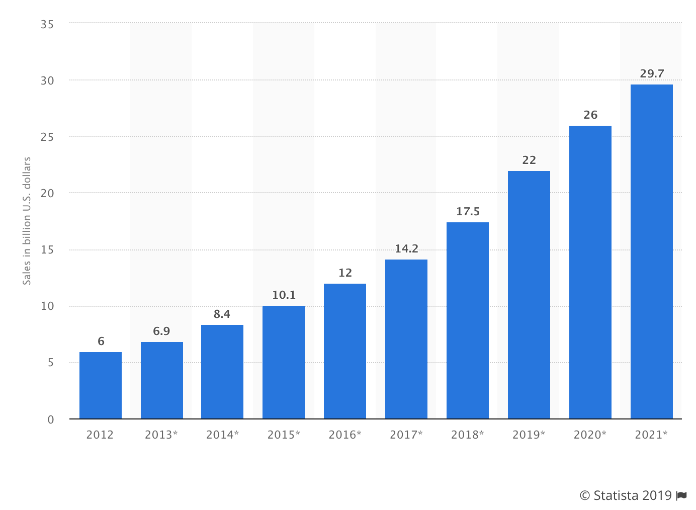
By 2021, experts predict that this will become a $30 billion industry.

Furthermore, the online food and beverage industry is growing at 18% year-over-year

While the majority of grocery shopping still takes place in physical store locations, the ecommerce grocery movement is the way of the future. So this is a great chance for you to jump on board before the market gets too saturated.

There are seemingly endless opportunities here. You could sell anything from snacks, to produce, to prepared and pre-packaged meals.

Ultimately, there is plenty of money to be made in this space if you’re able to carve out the right niche. Just make sure you educate yourself about the legal aspects of selling food online, as the regulations are different from selling other products.

2. Electric scooters

If you live near any major American city, you’ve probably seen the rise of electric scooter usage over the last couple of years.

Depending on the area, this trend has seemingly taken over the streets and sidewalk.

Companies like Bird, Lime, and Razor are pioneering the scooter ridesharing industry. Even bigger names like Uber and Lyft have entered the e-scooter space.

The idea behind ridesharing scooters is great.

Essentially, riders just use a mobile app to locate and start a scooter. Then they ride to a destination and park it anywhere. They are charged based on usage and everything is handled through the mobile app.

With this trend growing in popularity, it seems like more and more people want to own electric scooters, as opposed to just using the rideshare options.

In 2018, there were roughly 44 million electric scooters and electric bicycles sold worldwide. That number is expected to reach 50 million in 2020.

This is a great opportunity for you to seize. That’s because high-end products can be sold at a higher price point.

Research shows that the average cost of an electric scooter is roughly $300. But some high-end models can retail for more than double that amount.

3. Virtual reality headsets

Virtual reality and augmented reality are increasing in popularity.

If you read my blog on a regular basis, you know that augmented reality already made my list of the top mobile trends that are dominating 2019. I also wrote about how augmented reality is impacting the future of SEO.

But now I want to take a moment to talk about the business opportunity for the virtual reality market. First, let me clarify the differences between AR and VR.

AR uses overlays on computer-generated screens to put digital figures into real-world images. For example, AR can be used on a smartphone to play games like Pokemon Go.

As the name implies, VR puts users into a virtual world, using more specialized and sophisticated equipment, like a VR headset.

Take a look at the growth of VR and AR users in the United States.

VR AR Growth

As you can clearly see from the graph, both VR and AR users are growing each year.

There are more AR users, simple because augmented reality is easier to use and doesn’t require special equipment.

With that said, the number of virtual reality headset users is still continuing to grow and carve out a good-sized market share in this niche.

In 2017, there were roughly 11 million VR headset users in the US. That number has already doubled and will reach 26.5 million users by 2021.

There are lots of potential consumers to target with this product. According to a virtual reality headset review by The Verge, VR headsets have quite the price range. Inexpensive headsets can be bought for less than $100, while higher-end models retail for upwards of $800.

4. Smart speakers

As long as we’re on the technology subject, I figured this would be a good time to talk about smart speakers. This is another trend that’s growing in popularity.

Today, in 2019, there are more than 74 million smart speaker owners in the United States.

However, this only makes up 26% of US Internet users, meaning that there is still plenty of room for growth in this space.

China has that most smart speaker owners in the world, with 85 million. But this makes up just 10% of the country’s total Internet users. Again, this proves a high global demand for the product, with tons of room for growth in the category.

Speaking of growth, look at the number of households in America that have a smart speaker.

Smart Speakers

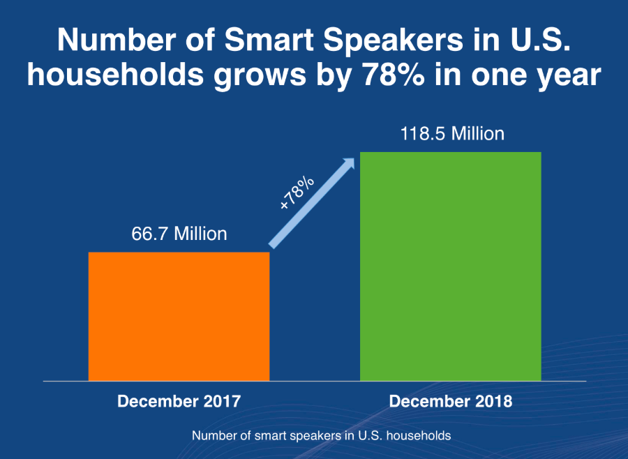
There was a 78% growth rate between 2017 and 2018.

Here’s a crazier statistic. More than half of smart speaker owners have two or more devices.

This means that current smart speaker owners are still potential customers for you. This product is a great opportunity to sell online via your ecommerce shop.

5. Vapor products

E-cigarettes and electronic vaporizers, better known as “vapes” are growing in popularity.

There are several different components to vapor products. There is the device itself, which operates by heating a liquid solution. Then there are the flavored liquids, usually containing nicotine. Plus there are other accessories as well, and these products come in all different shapes and sizes.

Just to be clear, I’m not here to talk about the health risks of vaping or anything like that. Nor am I encouraging the use of e-cigarettes or nicotine products.

But like every other product on this list, I’m simply identifying market trends and sharing the information with you. These trends are telling me that it’s a hot category.

By 2023, the global vapor market is expected to reach $43 billion. That’s a 15% compound annual growth rate for five years. The figures are impressive, to stay the least.

There is definitely a market for this product, and plenty of money to be made by selling vapor products online. Just make sure you comply with all of the legal regulations associated with selling vapes and accessories through an ecommerce shop.
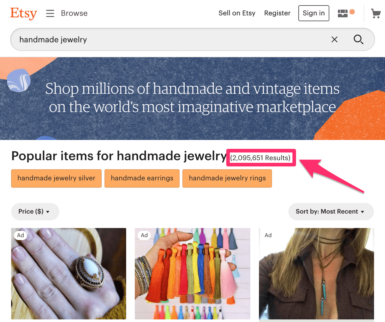
6. Jewelry

Jewelry is another product category with seemingly endless opportunities for online sales.

You can target men, women, children, and teenagers with high-end diamonds, low-end rings, and everything in between. There are so many options for products and targets in this industry.

Plus, you can even make jewelry by hand. More than 2 million handmade jewelry products are sold on Etsy.

Etsy

Studies show that the global online jewelry market is expected to grow at a CAGR of nearly 16% between now and 2022.

According to Shopify, ecommerce only represents 4-5% of all jewelry sales worldwide. However, that number is expected to be 10-15% by 2020.

What does this mean? Jewelry sales, like most products, are starting to trend in the ecommerce direction. There is so much room for growth in the coming years with this product category.

7. Digital courses and learning material

You don’t always need to sell tangible products on your ecommerce shop. You can also sell digital goods like ebooks or online learning courses.

This is another booming industry.

According to Forbes, the e-learning industry is going to reach $325 billion by 2025.

There are so many potential customers here as well. In fact, 77% of corporations in the US use online learning tools. E-learning increases retention rates by up 60%.

So if you’re good at something, take advantage of it. Teach others how to do whatever it is that you know best.

Product content like blogs, ebooks, and videos. Then sell those digital goods online.

The best part about this is the low overhead. Your only costs will be running your website, processing transactions, and your time. Everything else is just straight profit.

8. Drones

The drone market is segmented into two categories.

  • Consumer
  • Commercial

There’s actually a military category too, but that’s not really relevant for ecommerce purposes.

While you might be tempted to just target the average Joe who wants to flow a drone around his neighborhood, you might want to consider the commercial market as well. Check out the growth of commercial drones over the years.

Drones

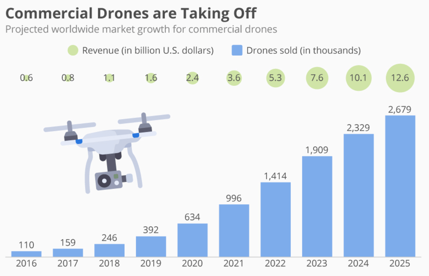
Between now and 2025, the global commercial drone market is expected to grow by roughly 700%. Now is the time to jump on this trend to get your share of the action.

You can still go after consumers as well. The unit sales of personal drones dominate 94% of the market. However, this only represents 40% of the total revenue share, since commercial drones are typically priced higher.

9. Clothing and accessories

It may sound simple, obvious, or boring, but the online clothing industry is huge.

But in order to be successful here, you definitely need to go after a niche. Trying to sell to anyone and everyone will be too competitive to survive.

By 2023, revenue from online clothing, footwear, and accessories in the US is expected to surpass $145.7 billion. That’s up from $93 billion in 2017.

58% of Americans have purchased clothing online.

Again, this is another industry where you have tons of options. There are different types of people to target, and countless options of products to sell at varying price points. Ultimately, there’s lots of money to be made selling clothes online.

Conclusion

There has never been a better time to sell products online. Starting an ecommerce store is easy, and consumers are continuing to buy products on the Internet more and more each year.

But what should you sell online?

Use this list as a reference. Unlike other similar posts that you’ll find online, I took the time to actually research industries and trends. I didn’t just pull random products out of thin air.

That’s why this information is so valuable. If you can set up your ecommerce shop around these trends, it has a much greater chance of being successful.