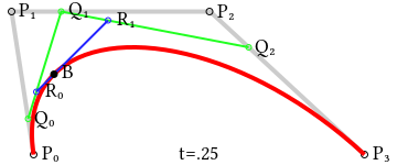
Feature flags are commonly used constructs and have been there for a while. But in the last few years, things have evolved and feature flags are playing a major role in delivering continuous risk-free releases. In general, when a new feature is not fully developed and we still want to branch off a release from the mainstream, we can hide our new feature and toggle it off in production. Another use-case is when we want to release our feature to only a small percentage of users, we set the feature 'on' for a segment/geography and set it 'off' for the rest of the world. The capability to toggle a feature on and off without doing a source code change gives the developer an extra edge to experiment with conflicting features with live traffic. Let us deep dive into more details about feature flags and an example implementation in Springboot.
Things To Consider When We Are Introducing a New Feature Flag
Establish a consistent naming convention across applications, to make the purpose of the feature flags easily understandable by other developers and product teams.
Where to maintain feature flags?
In the application property file: Toggle features based on environment. Useful for experimenting in development while keeping features off in production.
In configuration server or vault: Let's imagine you are tired after a late-night release, and your ops team calls you at 4 am, to inform you the new feature is creating red alerts everywhere in monitoring tools, here comes the Feature toggle to your rescue. First, turn the feature 'off' in the config server and restart compute pods alone,
In database or cache: Reading configs or flag values from a database or an external cache system like Redis, you don't have to redeploy or restart your compute, as the values can be dynamically read from the source at regular intervals, pods get updated value without any restart.
You can also explore open-source or third-party SDKs built for feature flags, a handful of them are already in the market. They also come with additional advantages that help in the lifecycle management of feature flags.
Welcome back to my long read about building better components — components that are more likely to be found, understood, modified, and updated in ways that promote adoption rather than abandonment.
In the previous installment in the series, we took a good look through the process of building flexible and repeatable components, aligning with the FRAILS framework. In this second part, we will be jumping head first into building adoptable, indexable, logical, and specific components. We have many more words ahead of us.
Adoptable
According to Sparkbox’s 2022 design systems survey, the top three biggest challenges faced by teams were recently:
Overcoming technical/creative debt,
Parity between design & code,
Adoption.
It’s safe to assume that points 1. and 2. are mostly due to tool limitations, siloed working arrangements, or poor organizational communication. There is no enterprise-ready design tool on the market that currently provides a robust enough code export for teams to automate the handover process. Neither have I ever met an engineering team that would adopt such a feature! Likewise, a tool won’t fix communication barriers or decades worth of forced silos between departments. This will likely change in the coming years, but I think that these points are an understandable constraint.
Point 3. is a concern, though. Is your brilliant design system adoptable? If we’re spending all this time working on design systems, why are people not using them effectively? Thinking through adoption challenges, I believe we can focus on three main points to make this process a lot smoother:
Naming conventions,
Community-building,
(Over)communication.
Naming Conventions
There are too many ways to name components in our design tool, from camelCasing to kebab-casing, Slash/Naming/Conventions to the more descriptive, e.g., “Product Card — Cart”. Each approach has its pros and cons, but what we need to consider with our selection is how easy it is to find the component you need. Obvious, but this is central to any good name.
It’s tempting to map component naming 1:1 between design and code, but I personally don’t know whether this is what our goal should be. Designers and developers work in different ways and with different methods of searching for and implementing components, so we should cater to the audience. This would aid solutions based on intention, not blindly aiming for parity.
Figma can help bridge this gap with the “component description field” providing us a useful space to add additional, searchable names (or aliases, even) to every component. This means that if we call it a headerNavItemActive in code but a “Header link” in design with a toggled component property, the developer-friendly name can be added to the description field for searchable parity.
The same approach can be applied to styles as well.
There is a likelihood that your developers are working from a more tokenized set of semantic styles in code, whereas the design team may need less abstract styles for the ideation process. This delta can be tricky to navigate from a Figma perspective because we may end up in a world where we’re maintaining two or more sources of truth.
The advice here is to split the quick styles for ideation and semantic variables into different sets. The semantic styles can be applied at the component level, whereas the raw styles can be used for developing new ideas.
As an example, Brand/Primary may be used as the border color of an active menu item in your design files because searching “brand” and “primary” may be muscle memory and more familiar than a semantic token name. Within the component, though, we want to be aliasing that token to something more semantic. For example, border-active.
Note: Some teams go to a further component level with their naming conventions. For example, this may become header-nav-item-active. It’s hyper-specific, meaning that any use outside of this “Header link” example may not make sense for collaborators looking through the design file. Component-level tokens are anoptionalstep in design systems. Be cautious, as introducing another layer to your token schema increases the amount of tokens you need to maintain.
This means if we’re working on a new idea — for example, we have a set of tabs in a settings page, and the border color for the active tab at the ideation stage might be using Brand/Primary as the fill — when this component is contributed back to the system, we will apply the correct semantic token for its usage, our border-active.
Do note that this advice is probably best suited to large design teams where your contribution process is lengthier and requires the distinct separation of ideation and production or where you work on a more fixed versioning release cycle for your system. For most teams, a single set of semantic variables will be all you need. Variables make this process a lot easier because we can manage the properties of these separate tokens in a central location. But! This isn’t an article about tokens, so let’s move on.
Community-building
A key pillar of a successful design system is advocacy across the PDE (product, design, and engineering) departments. We want people to be excited, not burdened by its rules. In order to get there, we need to build a community of internal design system advocates who champion the work being done and act as extensions of the central team. This may sound like unpaid support work, but I promise you it’s more than that.
Communicating constantly with designers taught me that with the popularity of design systems booming over the past few years, more and more of us are desperate to contribute to them. Have you ever seen a local component in a file that is remarkably similar to one that already exists? Maybe that designer wanted to scratch the itch of building something from the ground up. This is fine! We just need to encourage that more widely through a more open contribution model back to the central system.
How can the (central) systems team empower designers within the wider organization to build on top of the system foundations we create? What does that world look like for your team? This is commonly referred to as the “hub and spoke” model within design systems and can really help to accelerate interest in your system usage goals.
“There are numerous inflection points during the evolution of a design system. Many of those occur for the same fundamental reason — it is impossible to scale a design system team enough to directly support every demand from an enterprise-scale business. The design system team will always be a bottleneck unless a structure can be built that empowers business units and product teams to support themselves. The hub and spoke (sometimes also called ‘core + federated’) model is the solution.”
In simple terms, a community can be anything as small as a shared Slack/Teams channel for the design system all the way up to fortnightly hangouts or learning sessions. What we do here is help to foster an environment where discussion and shared knowledge are at the center of the system rather than being tacked on after the components have been released.
The team at Zalando has developed a brilliant community within the design team for their system. This is in the form of a sophisticated web portal, frequent learning and educational meetings, and encouraging an “open house” mindset. Apart from the custom-built portal, I believe this approach is an easy-to-reach target for most teams, regardless of size. A starting point for this would be something as simple as an open monthly meeting or office hours, run by those managing your system, with invites sent out to all designers and cross-functional partners involved in production: product managers, developers, copywriters, product marketers, and the list goes on.
For those looking for inspiration on how to run semi-regular design systems events, take a look at what the Gov UK team have started over on Eventbrite. They have run a series of events ranging from accessibility deep dives all the way up to full “design system days.”
Leading with transparency is a solid technique for placing the design system as close as possible to those who use it. It can help to shift the mindset from being a siloed part of the design process to feeding all parts of the production pipeline for all key partners, regardless of whether you build it or use it.
Back to advocacy! As we roll out this transparent and communicative approach to the system, we are well-placed to identify key allies across the product, design, and engineering team/teams that can help steward excellence within their own reach. Is there a product manager who loves picking apart the documentation on the system? Let’s help to position them as a trusted resource for documentation best practices! Or a developer that always manages to catch incorrect spacing token usage? How can we enable them to help others develop this critical eye during the linting process?
This is the right place to mention Design Lint, a Figma plugin that I can only highly recommend. Design Lint will loop through layers you’ve selected to help you find possibly missing styles. When you write custom lint rules, you can check for errors like color styles being used in the wrong way, flag components that aren’t published to your library, mark components that don’t have a description, and more.

Each of these advocates for the system, spread across departments within the business, will help to ensure consistency and quality in the work being produced.
(Over)communication
Closely linked to advocacy is the importance of regular, informative, and actionable communication. Examples of the various types of communication we might send are:
That’s a lot! This is a good thing, as it means there is always something to share among the team to keep people close, engaged, and excited about the system. If your partners are struggling to see how important and central a design system is to the success of a product, this list should help push that conversation in the right direction.
I recommend trying to build a pattern of regularity with your communication to firstly build the habit of sharing and, secondly, to introduce formality and weight to the updates. You might also want to decide whether you look forward or backward with the updates, meaning at the start or end of a sprint if you work that way.
Or perhaps you can follow a pattern as the following one:
Changelog/release notes are sent on the final day of every sprint.
“What’s next?” is shared at the start of a sprint.
Cool resources are shared mid-sprint to help inspire the team (and to provide a break between focus work sessions).
Small wins are shared quarterly.
Survey results are shared at the start of every second quarter.
Hiring updates are shared as they come up.
Outside of the system, communication really does make or break the success of a project, so leading from the front ensures we’re doing everything we can.
Indexable
The biggest issue when building or maintaining a system is knowing how your components will be used (or not used). Of course, we will never know until we try it out (btw, this is also the best piece of design advice I’ve ever been given!), but we need to start somewhere.
Design systems should prioritize quality over speed. But product teams often work in “ship at all costs” mode, prioritizing speed over quality.
“What do you do when a product team needs a UI component, pattern, or feature that the design system team cannot provide in time or is not part of their scope?”
What this means is starting with real-world needs and problems. The likelihood when starting a system is that you will create all the form fields, then some navigational components, and maybe a few notification/alerts/callouts/notification components (more on naming conventions later) and then publish your library, hoping the team will use those components.
The harsh reality is, though, the following:
Your team members aren’t aware of which components exist.
They don’t know what components are called yet.
There is no immediate understanding of how components are translated into code.
You’re building components without needing them yet.
As you continue to sprint on your system, you will realize over time that more and more design work (user flows, feature work) is being pushed over to your product managers or developers without adhering to the wonderful design system you’ve been crafting. Why is that? It’s because people can’t discover your components! (Are they easily indexable?)
This is where the importance of education and communication comes into play. Whether it’s from design to development, design to copywriting, product to design, or brand to product, there is always a little bit more communication that can happen to ease these tensions within teams. Design Ops as a profession is growing in popularity amongst larger organizations for this very purpose — to better foster and facilitate communication channels not only amongst disparate design teams but also cross-functionally.
Note: Design Ops refers to the practice of integrating the design team’s workflow into the company’s broader development context. In practical terms, this means the design ops role is responsible for planning and managing the design team’s work and making sure that designers are collaborating effectively with product and engineering teams throughout the development process.
Back to discoverability! That communication layer could be introduced in a few ways, depending on how your team is structured. Using the channel within Slack or Teams (or whichever messaging tool you use) example from before, we can have a centralized communication channel about this very specific job — components.
Here’s an example message:
Within this channel, the person/s responsible for the system is encouraged to frequently post updates with as much context as is humanly possible.
For example:
What are you working on now?
What updates should we expect within the next day/week/month?
Who is working on what components?
How can the wider team support or contribute to this work?
Are there any blockers?
Starting with these questions and answers in a public forum will encourage wider communication and understanding around the system to ultimately force a wider adoption of what’s being worked on and when.
Secondly, within the tools themselves, we can be over-the-top communicative whilst we create. Making heavy use of the version history feature within Figma, we can add very intentional timestamps on activity, spelling out exactly what is happening, when, and by whom. Going into the weeds here to effectively use that section of the file as mini-documentation can allow your collaborators (even those without a paid license!) to get as close to the work as possible.
Additionally, if you are using a branch-based workflow for component management, we encourage you to use the branch descriptions as a way to achieve a similar result.
Note: If you are investigating a branch workflow within a large design organization, I recommend using them for smaller fixes or updates and for larger “major” releases to create new files. This will allow for a future world where one set of designers needs to work on v1, whereas others use v2.
Naming Conventions
Undoubtedly, the hardest part of design system work is naming things. What I call a dropdown, you may call a select, and someone else may call an option list. This makes it extremely difficult to align an entire team and encourage one way of naming anything.
However, there are techniques we can employ to ensure that we’re serving the largest number of users of our system as possible. Whether it’s using Figma features or working closer with our development team, there is a world in which people can find the components they need and when they need them.
I’m personally a big fan of prioritizing discoverability over complexity at every stage of design, from how we name our components to frames to entire files. What this means is that, more often than not, we’re better off introducing verbosity, rather than trying to make everything as concise as possible.
This is probably best served with an example!
What would you call this component?
Dropdown.
Popover.
Actions.
Modal.
Something else?
Of course, context is very important when naming anything, which is why the task is so hard. We are currently unaware of how this component will be used, so let’s introduce a little bit of context to the situation.
Has your answer changed? The way I look at this component is that, although the structure is quite generic — rounded card, inner list with icons — the usage is very specific. This is to be used on a search filter to provide the user with a set of actions that they can carry out on the results. You may:
Import a predefined search query.
Export your existing search query.
Share your search query.
For this reason, why would we not call this something like search actions? This is a simplistic example (and doesn’t account for the many other areas of the product that this component could be used), but maybe that’s okay. As we build and mature our system, we will always hit walls where one component needs to — or can be — used in many other places. It’s at this time that we make decisions about scalability, not before we have usage.
Other options for this specific component could be:
Action list.
Search dropdown.
Search / Popover.
Filter menu.
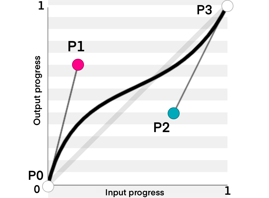
Logical
Have you ever been in a situation where you searched for a component in the Figma Assets panel and not been sure of its purpose? Or have you been unsure of the customization possible within its settings? We all have!
I tend to find that this is the result of us (as design systems maintainers) optimizing for creation and not usage. This is so important, so I’ll say it again:
We tend to optimize for the people building the system, not for the people using it.
The consumers/users of a system will always far outweigh the people managing it. They will also be further away from the decisions that went into making the component and the reasons behind why it is built the way it is.
Here are a few hypothetical questions worth thinking through:
Why is this component called a navbar, and not a tab-bar?
Why does it have four tabs by default and not three, like the production app?
There’s only one navbar in the assets list, but we support many products. Where are the others?
How do I use the dark mode version of this component?
I need a tablet version of the table component. Should I modify this one, or do we have an alternative version ready to be used?
These may seem like familiar questions to you. And if not, congratulations, you’re doing a great job!
Figma makes it easy to build complexity into components, arguably too easy. I’m sure you’ve found yourself in a situation where you create a component set with too many permutations or ended up in a world where the properties applied to a component turn the component properties panel into what I like to call “prop soup.”
A good design system should be logical (usable). To me, usability means:
Speed of discovery, and
Efficient implementation of components.
The speed of discovery and the efficient implementation of components can — brace yourself! — sometimes mean repetition. That very much goes against our goals of a don’t repeat yourself system and will horrify those of you who yearn for a world in which consolidation is a core design system principle but bear with me for a bit more.
The canvas is a place for ideation and flexibility and a place where we need to encourage the fostering of new ideas fast. What isn’t fast is a confused designer. As design system builders, we then need to work in a world where components are customizable but only after being understood. And what is not easily understandable is a component with an infinite number of customization options and a generic name. What is understandable is a compact, descriptive, and lightweight component.
Let’s take an example. Who doesn’t love… buttons? (I don’t, but this atomic example is the simplest way to communicate our problem.)
Here, we have one component variant button with:
Four intentions (primary, secondary, error, warning);
Two types (fill, stroke);
Three different sizes (large, medium, small);
And four states (default, hover, focus, inactive).
Even while listing those out, we can see a problem. The easy way to think this through is by asking yourself, “Is a designer likely to need all of these options when it comes to usage?”
With this example, it might look like the following question: “Will a designer ever need to switch between a primary button and a warning one?” Or are they actually two separate use cases and, therefore two separate components?
To probably no one’s surprise, my preference is to split that component right down into its intended usage. That would then mean we have one variant for each component type:
Primary,
Secondary,
Error (Destructive),
Warning.
Four components for one button! Yes, that’s right, and there are two huge benefits if you decide to go this way:
The Assets panel becomes easier to navigate, with each primary variant within each set being visually surfaced.
The designer removes one decision from component usage: what type to use.
Let’s help set our (design) teams up for success by removing decisions! The design was intentionally placed within brackets there because, as you’re probably rightly thinking, we lose parity with our coded components here. You know what? I think that’s totally fine. Documentation and component handover happen once with every component, and it doesn’t mean we need to sacrifice usability within the design to satisfy the front-end framework composability. Documentation is still a vital part of a design system, and we can communicate component permutations in a method that meets design and development in the middle.
Auto Layout
Component usability is also heavily informed by the decision to use auto layout or not. It can be hard to grapple with, but my advice here is to go all in on using auto layout. Not only does it help to remove the need for eyeballing measurements within production designs, but it also helps remove the burden of spacing for non-design partners. If your copywriter needs to edit a line of text within a component, they can feel comfortable doing so with the knowledge that the surrounding content will flow and not “break” the design.
Note: Using padding and gap variables within main components can remove the “Is the spacing correct?” question from component composition.
Auto layout also provides us with some guardrails with regard to spacing and margins. We strive for consistency within systems, and using auto layout everywhere pushes us as far as possible in that direction.
Specific
We touched on this in the “usable” section, but naming conventions are so important for ensuring the discoverability and adoption of components within a system.
The more specific we can make components, the more likely they are to be used in the right place. Again, this may mean introducing inefficiencies within the system, but I strongly believe that efficiency is a long-term play and something we reach gradually over time. This means being incredibly inefficient in the short term and being okay with that!
Specific to me means calling a header a header, a filter a filter, and a search field a search field. Doesn’t it seem obvious? You’re right. It seems obvious, but if my Twitter “name that component” game has taught me anything, it’s that naming components is hard.
Microsoft Fluent 2 doesn’t have a search field. Instead, it has a “combobox” component with a typeahead search function.
Sure, the intentions may be different between a combobox and a search field or a search bar, but does your designer or developer know about these subtle nuances? Are they aware of the different use cases when searching for a component to use? Specificity here is the sharpest way for us to remove these questions and ensure efficiency within the system.
As I said before, this may mean that we end up performing inefficient activities within the system. For example, instead of bundling combobox and search into one component set with toggle-able settings, we should split them. This means searching for “search” in Figma would provide us with the only component we need, rather than having to think ahead if our combobox component can be customized to our needs (or not).
Conclusion
It was a long journey! I hope that throughout the past ten thousand words or so, you’ve managed to extract quite a few useful bits of information and advice, and you can now tackle your design systems within Figma in a way that increases the likelihood of adoption. As we know, this is right up there with the priorities of most design systems teams, and I firmly believe that following the principles laid out in this article will help you (as maintainers) sprint towards a path of more funding, more refined components, and happier team members.
And should you need some help or if you have questions, ask me in the comments below, or ping me on Twitter/Posts/Mastodon, and I’ll be more than happy to reply.
Further Reading
“Driving change with design systems and process,” Matt Gottschalk and Aletheia Délivré (Config 2023) The conference talk explores in detail how small design teams can use design systems and design operations to help designers have the right environment for them.
Gestalt 2023 — Q2 newsletter In this article article, you will learn about the design systems roadmaps (from the Pinterest team).
“Awesome Design Tokens” A project that hosts a large collection of design token-related articles and links, such as GitHub repositories, articles, tools, Figma and Sketch plugins, and many other resources.
“The Ondark Virus” (D’Amato Design blog) An important article about naming conventions within design tokens.
“API?” (RedHat Help) This article will explain in detail how APIs (Application Programming Interface) work, what the SOAP vs. REST protocols are, and more.
“Responsive Web Design,” by Ethan Marcotte (A List Apart) This is an old (but gold) article that set the de-facto standards in responsive web design (RWD).
“Fixed aspect ratio images with variants” (Figma file, by Luis Ouriach — CC-BY license) Aspect ratios are hard with image fills, so the trick to making them work is to define your breakpoints and create variants for each image. As the image dimensions are fixed, you will have much more flexibility — you can drag the components into your designs and use auto layout.
Mitosis Write components once, run everywhere; compiles to React, Vue, Qwik, Solid, Angular, Svelte, and others.
“Create reusable components with Mitosis and Builder.io,” by Alex Merced A tutorial about Mitosis, a powerful tool that can compile code to standard JavaScript in addition to frameworks and libraries like Angular, React, and Vue, allowing you to create reusable components.
“VueJS — Component Slots” (Vue documentation) Components can accept properties (which can be JavaScript values of any type), but how about template content?
“Magic Numbers in CSS,” by Chris Coyier (CSS Tricks) In CSS, magic numbers refer to values that work under some circumstances but are frail and prone to break when those circumstances change. The article will take a look at some examples so that you know what they are and how to avoid the issues related to their use.
“Figma component properties” (Figma, YouTube) In this quick video tip, you’ll learn what component properties are and how to create them.
“Create and manage component properties” (Figma Help) New to component properties? Learn how component properties work by exploring the different types, preferred values, and exposed nested instances.
“Using auto layout” (Figma Help) Master auto layout by exploring its properties, including resizing, direction, absolute position, and a few others.
“Add descriptions to styles, components, and variables” (Figma Help) There are a few ways to incorporate design system documentation in your Figma libraries. You can give styles, components, and variables meaningful names; you can add short descriptions to styles, components, and variables; you can add links to external documentation to components; and you can add descriptions to library updates.
“What is digital asset management?” (IBM) A digital asset management solution provides a systematic approach to efficiently storing, organizing, managing, retrieving, and distributing an organization’s digital assets.
”Search fields (Components)” (Apple Developer) A search field lets people search a collection of content for specific terms they enter.
“Search — Components Overview” (Material Design 3) Search lets people enter a keyword or phrase to get relevant information.
“Combobox — Components” (Fluent 2) A combobox lets people choose one or more options from a list or enter text in a connected input; entering text will filter options or allow someone to submit a free-form answer.
“Design maturity results ‘23,” (UK Dept. for Education) The results of the design maturity survey carried out in the Department for Education (UK), September 2023.
“Design Guidance and Standards,” (UK Dept. for Education) Design principles, guidance, and standards to support people who use the Department for Education services (UK).
“Sparkbox’s Design Systems Survey, 2022 (5th edition)” The top three biggest challenges faced by design teams: are overcoming technical/creative debt, parity between design & code, and adoption. This article reviews in detail the survey results; 183 respondents maintaining design systems have responded.
“The hub and spoke design system model,” by Robin Cannon (IBM) No design system team can scale enough to support an enterprise-scale business by itself. This article sheds some light on IBM’s hub and spoke model.
“Building a design system around collaboration, not components” (Figma, YouTube) It’s easy to focus your design system on the perfect component, missing out on the aspect that’ll ensure your success — collaboration. Louise From and Julia Belling (from Zalando) explain how they created and then scaled effectively their internal design system.
“Friends of Figma, DesignOps” (YouTube interest group) This group is about practices and resources that will help your design organization to grow. The core topics are centered around the standardization of design, design growth, design culture, knowledge management, and processes.
“Linting meets Design,” by Konstantin Demblin (George Labs) The author is convinced that the concept of “design linting” (in Sketch) is groundbreaking for digital design and will remain state-of-the-art for a long time.
“How to set up custom design linting in Figma using the Design Lint plugin,” by Daniel Destefanis (Product Design Manager at Discord) This is an article about Design Lint — a Figma plugin that loops through layers you’ve selected to help you find missing styles. You can check for errors such as color styles being used in the wrong way, flag components that aren’t published to your library, mark components that don’t have a description, and so on.
“Design Systems and Speed,” by Brad Frost In this Twitter thread, Brad discusses the seemingly paradoxical relationship between design systems and speed. Design systems make the product work faster. At the same time, do design systems also need to go slower?
“Ship Faster by Building Design Systems Slower,” by Josh Clark (Principal, Big Medium) Design systems should prioritize quality over speed, but product teams often have “ship at all costs” policies, prioritizing speed over quality. Actually, successful design systems move more slowly than the products they support, and the slower pace doesn’t mean that they have to be the bottleneck in the process.
Design Systems, a book by Alla Kholmatova (Smashing Magazine) Often, our design systems get out-of-date too quickly or just don’t get enough traction in our companies. What makes a design system effective? What works and what doesn’t work in real-life products? The book is aimed mainly at small to medium-sized product teams trying to integrate modular thinking into their organization’s culture. Visual and interaction designers, UX practitioners, and front-end developers particularly, will benefit from the knowledge in this book.
“Making Your Collaboration Problems Go Away By Sharing Components,” by Shane Hudson (Smashing Magazine) Recently UXPin has extended its powerful Merge technology by adding npm integration, allowing designers to sync React component libraries without requiring any developer input.
“Taking The Stress Out Of Design System Management,” by Masha Shaposhnikova (Smashing Magazine) In this article, the author goes over five tips that make it easier to manage a design system while increasing its effectiveness. This guide is aimed at smaller teams.
“Around The Artifacts Of Design Systems (Case Study),” by Dan Donald (Smashing Magazine) Like many things, a design system isn’t ever a finished thing but a journey. How we go about that journey can affect the things we produce along the way. Before diving in and starting to plan anything out, be clear about where the benefits and the risks might lie.
“Design Systems: Useful Examples and Resources,” by Cosima Mielke (Smashing Magazine) In complex projects, you’ll sooner or later get to the point where you start to think about setting up a design system. In this article, some interesting design systems and their features will be explored, as well as useful resources for building a successful design system.
Kilian Valkhof has a good one this week, You don’t need JavaScript for that, as part of the HTMLHell yearly Advent Calendar (of blog posts). He opens with the rule of least power:
Choose the least powerful language suitable for a given purpose.
That’s fun for us CSS nerds, because CSS is a pretty low language when it comes to building websites. (It doesn’t mean you should try to write an accordion component in Assembly.) It means, as he puts it:
On the web this means preferring HTML over CSS, and then CSS over JS.
If you’re at the JS level already, it means preferring JS over a JS framework or meta language. It’s not that those things aren’t valuable (Heck, one of the purposes of CodePen is making using language abstractions and library easier) it’s that, well, it’s just a better idea to go lower level. There is less to download, less to break, higher chances of the browser optimizing it, higher chances it will be accessible, higher chances it will last over time. That stuff matters.
Killian opens with a custom “toggle” component, and really, component is probably too strong a word. It’s just a styled HTML checkbox. It’s not even all that much CSS, and no JS is used at all, to make this:
While I was reading, where I thought Killian was going was using an <input type="checkbox"> actually turn on and off features on a website. That’s the kind of thing that feels like definite-JavaScript territory, and yet, because of the classic “Checkbox Hack” (e.g. using the :checked selector and selector combinators) we actually can control a lot of a website with just a checkbox.
The ability to do that, control a website with a checkbox, has increased dramatically now that we have :has() in CSS. For instance:
<body>
  ... literally anywhere deep in the bowels of the DOM ...
  <input class="feature" type="checkbox">
We don’t have to worry about where in the DOM this checkbox is anymore, we can style anything there like this now:
body:has([.feature:checked]) .literally-anything {
  /* do styles */
}
We can start the styling choices way up at the body level with :has(), looking for that checkbox (essentially a toggle), and style anything on the page on if it is checked or not. That feels extraordinarily powerful to me.
Speaking of the mental crossover between CSS and JavaScript, Yaphi Berhanu’s Write Better CSS By Borrowing Ideas From JavaScript Functions was interesting. CSS doesn’t actually have functions (but just wait for it!) but that doesn’t mean we can’t consider how our thinking about the code can relate. I liked the bit about considering too many parameters vs not enough parameters. Yaphi connects that idea too too many selectors with too many repeat declarations, and yeah I can get behind that.
But where my mind goes is taking that lesson and trying to apply it to Custom Properties. I have seen (and written!) CSS that just takes Custom Property usage just too far — to the point where the code feels harder to reason about and maintain, not easier.
Like if you were going to make a variable for an animation…
Maybe you love that? But I think it’s already going too far. And it could easily go further, since you could have another whole set of variables that set default fallbacks, for example.
It depends on what you want to do, but if your goal is simply “reusability” then doing like…
And then using it when you needed it is closer to baby bear’s porridge.
Little reminder: don’t sleep on View Transitions.
We won’t know what Interop 2024 will do until January, but based on the amount of upvotes from the proposals, I think it stands a good chance.
Jeremy Keith has a well measured take in Add view transitions to your website. It’s got links to good resources and examples on using it, like Tyler’s Gaw’s great post. It ends with an update and warning about how maybe it’s not such a great idea because it may “poison the feature with legacy content”. Meaning if too many people do this, the powers that be will be hesitant to change anything, even for the better. I agree that would suck if such a choice is made, as I do think there is room for improvement (e.g. transition groups). I dunno though, I think because this stuff is literally behind a feature flag, that’s enough of an at your own risk warning. If they want to change something that breaks any code I’ve shipped, I’m cool with that. I know the stakes.
I think we’ll start seeing more interesting examples and experiences soon. And! Gotchas! Like Nic Chan’s View transitions and stacking context: Why does my CSS View Transition ignore z-index? It is confusing. It’s like the elements kinda stop being elements when that are being transitioned. They look like elements, but they are really temporary rasterized ghosts. You can still select them with special pseudo element selectors though, so you should be able to get done what you need.
There is this inherit complexity with doing the whole Dark Mode / Light Mode thing on websites. There is both a system-wide preference that you can choose to honor, and that’s a good idea. And it’s likely that a site implementing this also offers a UI toggle to set the theme. So that’s two separate bits of preference you need to deal with, and the code likely handles them separately.
/* No theme has been set, or override set to light mode */
html:where(:not([data-theme])),
:root[data-theme=light] {
  --color: black;
  --background: antiquewhite;
  /* … and all your other "variables" */
}

/* Apply dark mode if user preferences call for it, and if the user hasn't selected a theme override */
@media (prefers-color-scheme: dark) {
  html:where(:not([data-theme])) {
    --color: ghostwhite;
    --background: midnightblue;
    /* … and all your other "variables" */
  }
}

/* Explicitly set the properties for the selected theme */
:root[data-theme=dark] {
  --color: ghostwhite;
  --background: midnightblue;
  /* … and all your other "variables" */
}
If you read though that I think you’ll see, you need @media to deal with system preferences, then the HTML attributes to deal with a direct-set preference, and one needs to overlap the other.
Enter Style Queries. What they really are is: “when an element has a certain custom property and value, also do this other stuff.” Christopher’s “future approach” using them is more code, but I’d agree that’s more clean and readable.
/* Optionally, we can define the theme variable */
@property --theme {
  syntax: '<custom-ident>'; /* We could list all the themes separated by a pipe character but this will do! */
  inherits: true;
  initial-value: light;
}

/* Assign the --theme property accordingly */
html:where(:not([data-theme])),
:root[data-theme=light] {
  --theme: light;
}

@media (prefers-color-scheme: dark) {
  html:where(:not([data-theme])) {
    --theme: dark;
  }
}

:root[data-theme=dark] {
  --theme: dark;
}

/* Then assign the custom properties based on the active theme */
@container style(--theme: light) {
  body {
    --color: black;
    --background: antiquewhite;
    /* … and all your other "variables" */
  }
}

@container style(--theme: dark) {
  body {
    --color: ghostwhite;
    --background: midnightblue;
    /* … and all your other "variables" */
  }
}
Check out Christopher’s article though, there is a lot more to go over.
Let’s end with a little good ol’ fashioned CSS enthusiasm.
For many, many years, creating high-quality websites largely meant that designers had to fight what felt like an uphill battle to somehow make their ideas work in browsers. At the same time, sentences like “I’m really sorry, but this solution you designed just can’t be done with CSS” […]
This has now changed to the opposite.
Want to emulate and confidently design a layout that leverages the potential of CSS Grid in any of the major design tools like Figma, Adobe XD, or Sketch? Not possible.
I still keep Sass around, as well as PostCSS, for things that CSS just wont ever be able to do (nor should it), but they’re fading into the background, rather than being at the forefront of my mind when writing styles. And for small, simple projects, I don’t use them at all. Just pure CSS. I haven’t found it lacking.
Gatsby is a true Jamstack framework. It works with React-powered components that consume APIs before optimizing and bundling everything to serve as static files with bits of reactivity. That includes media files, like images, video, and audio.
The problem is that there’s no “one” way to handle media in a Gatsby project. We have plugins for everything, from making queries off your local filesystem and compressing files to inlining SVGs and serving images in the responsive image format.
Which plugins should be used for certain types of media? How about certain use cases for certain types of media? That’s where you might encounter headaches because there are many plugins — some official and some not — that are capable of handling one or more use cases — some outdated and some not.
That is what this brief two-part series is about. In Part 1, we discussed various strategies and techniques for handling images, video, and audio in a Gatsby project.
This time, in Part 2, we are covering a different type of media we commonly encounter: documents. Specifically, we will tackle considerations for Gatsby projects that make use of Markdown and PDF files. And before wrapping up, we will also demonstrate an approach for using 3D models.
Solving Markdown Headaches In Gatsby
In Gatsby, Markdown files are commonly used to programmatically create pages, such as blog posts. You can write content in Markdown, parse it into your GraphQL data layer, source it into your components, and then bundle it as HTML static files during the build process.
Let’s learn how to load, query, and handle the Markdown for an existing page in Gatsby.
Loading And Querying Markdown From GraphQL
The first step on your Gatsby project is to load the project’s Markdown files to the GraphQL data layer. We can do this using the gatsby-source-filesystem plugin we used to query the local filesystem for image files in Part 1 of this series.
npm i gatsby-source-filesystem
In gatsby-config.js, we declare the folder where Markdown files will be saved in the project:
Let’s say that we have the following Markdown file located in the project’s ./src/assets directory:
---
title: sample-markdown-file
date: 2023-07-29
---

# Sample Markdown File

Lorem ipsum dolor sit amet, consectetur adipiscing elit. Sed consectetur imperdiet urna, vitae pellentesque mauris sollicitudin at. Sed id semper ex, ac vestibulum nunc. Etiam ,


bash
lorem ipsum dolor sit

## Subsection

Lorem ipsum dolor sit amet, consectetur adipiscing elit. Sed consectetur imperdiet urna, vitae pellentesque mauris sollicitudin at. Sed id semper ex, ac vestibulum nunc. Etiam efficitur, nunc nec placerat dignissim, ipsum ante ultrices ante, sed luctus nisl felis eget ligula. Proin sed quam auctor, posuere enim eu, vulputate felis. Sed egestas, tortor
This example consists of two main sections: the frontmatter and body. It is a common structure for Markdown files.
Frontmatter Enclosed in triple dashes (---), this is an optional section at the beginning of a Markdown file that contains metadata and configuration settings for the document. In our example, the frontmatter contains information about the page’s title and date, which Gatsby can use as GraphQL arguments.
Body This is the content that makes up the page’s main body content.
We can use the gatsby-transformer-remark plugin to parse Markdown files to a GraphQL data layer. Once it is installed, we will need to register it in the project’s gatsby-config.js file:
Restart the development server and navigate to http://localhost:8000/___graphql in the browser. Here, we can play around with Gatsby’s data layer and check our Markdown file above by making a query using the title property (sample-markdown-file) in the frontmatter:
{
  "data": {
    "markdownRemark": {
      "html": "<h1>Sample Markdown File</h1>\n<p>Lorem ipsum dolor sit amet, consectetur adipiscing elit. Sed consectetur imperdiet urna, vitae pellentesque mauris sollicitudin at."
      // etc.
    }
  },
  "extensions": {}
}
Notice that the content in the response is formatted in HTML. We can also query the original body as rawMarkdownBody or any of the frontmatter attributes.
Next, let’s turn our attention to approaches for handling Markdown content once it has been queried.
Using DangerouslySetInnerHTML
dangerouslySetInnerHTML is a React feature that injects raw HTML content into a component’s rendered output by overriding the innerHTML property of the DOM node. It’s considered dangerous since it essentially bypasses React’s built-in mechanisms for rendering and sanitizing content, opening up the possibility of cross-site scripting (XSS) attacks without paying special attention.
That said, if you need to render HTML content dynamically but want to avoid the risks associated with dangerouslySetInnerHTML, consider using libraries that sanitize HTML input before rendering it, such as dompurify.
The dangerouslySetInnerHTML prop takes an __html object with a single key that should contain the raw HTML content. Here’s an example:
To display Markdown using dangerouslySetInnerHTML in a Gatsby project, we need first to query the HTML string using Gatsby’s useStaticQuery hook:
import * as React from "react";
import { useStaticQuery, graphql } from "gatsby";

const DangerouslySetInnerHTML = () => {
  const data = useStaticQuery(graphqlquery {
      markdownRemark(frontmatter: { title: { eq: "sample-markdown-file" } }) {
        html
      }
    });

  return <div></div>;
};
Now, the html property can be injected into the dangerouslySetInnerHTML prop.
import * as React from "react";
import { useStaticQuery, graphql } from "gatsby";

const DangerouslySetInnerHTML = () => {
  const data = useStaticQuery(graphqlquery {
      markdownRemark(frontmatter: { title: { eq: "sample-markdown-file" } }) {
        html
      }
    });

  const markup = { __html: data.markdownRemark.html };

  return <div dangerouslySetInnerHTML={ markup }></div>;
};
This might look OK at first, but if we were to open the browser to view the content, we would notice that the image declared in the Markdown file is missing from the output. We never told Gatsby to parse it. We do have two options to include it in the query, each with pros and cons:
Use a plugin to parse Markdown images. The gatsby-remark-images plugin is capable of processing Markdown images, making them available when querying the Markdown from the data layer. The main downside is the extra configuration it requires to set and render the files. Besides, Markdown images parsed with this plugin only will be available as HTML, so we would need to select a package that can render HTML content into React components, such as rehype-react.
Save images in the static folder. The /static folder at the root of a Gatsby project can store assets that won’t be parsed by webpack but will be available in the public directory. Knowing this, we can point Markdown images to the /static directory, and they will be available anywhere in the client. The disadvantage? We are unable to leverage Gatsby’s image optimization features to minimize the overall size of the bundled package in the build process.
The gatsby-remark-images approach is probably most suited for larger projects since it is more manageable than saving all Markdown images in the /static folder.
Let’s assume that we have decided to go with the second approach of saving images to the /static folder. To reference an image in the /static directory, we just point to the filename without any special argument on the path.
The react-markdown package provides a component that renders markdown into React components, avoiding the risks of using dangerouslySetInnerHTML. The component uses a syntax tree to build the virtual DOM, which allows for updating only the changing DOM instead of completely overwriting it. And since it uses remark, we can combine react-markdown with remark’s vast plugin ecosystem.
Let’s install the package:
npm i react-markdown
Next, we replace our prior example with the ReactMarkdown component. However, instead of querying for the html property this time, we will query for rawMarkdownBody and then pass the result to ReactMarkdown to render it in the DOM.
import * as React from "react";
import ReactMarkdown from "react-markdown";
import { useStaticQuery, graphql } from "gatsby";

const MarkdownReact = () => {
  const data = useStaticQuery(graphqlquery {
      markdownRemark(frontmatter: { title: { eq: "sample-markdown-file" } }) {
        rawMarkdownBody
      }
    });

  return <ReactMarkdown>{data.markdownRemark.rawMarkdownBody}</ReactMarkdown>;
};
markdown-to-jsx
markdown-to-jsx is the most popular Markdown component — and the lightest since it comes without any dependencies. It’s an excellent tool to consider when aiming for performance, and it does not require remark’s plugin ecosystem. The plugin works much the same as the react-markdown package, only this time, we import a Markdown component instead of ReactMarkdown.
npm i markdown-to-jsx
import * as React from "react";
import Markdown from "markdown-to-jsx";
import { useStaticQuery, graphql } from "gatsby";

const MarkdownToJSX = () => {
  const data = useStaticQuery(graphqlquery {
      markdownRemark(frontmatter: { title: { eq: "sample-markdown-file" } }) {
        rawMarkdownBody
      }
    });

  return <Markdown> { data.markdownRemark.rawMarkdownBody }</Markdown>;
};
We have taken raw Markdown and parsed it as JSX. But what if we don’t necessarily want to parse it at all? We will look at that use case next.
react-md-editor
Let’s assume for a moment that we are creating a lightweight CMS and want to give users the option to write posts in Markdown. In this case, instead of parsing the Markdown to HTML, we need to query it as-is.
Rather than creating a Markdown editor from scratch to solve this, several packages are capable of handling the raw Markdown for us. My personal favorite is
react-md-editor.
import * as React from "react";
import { useState } from "react";
import MDEditor from "@uiw/react-md-editor";

const ReactMDEditor = () => {
  const [value, setValue] = useState("**Hello world!!!**");

  return <MDEditor value={ value } onChange={ setValue } />;
};
The plugin also comes with a built-in MDEditor.Markdown component used to preview the rendered content:
import * as React from "react";
import { useState } from "react";
import MDEditor from "@uiw/react-md-editor";

const ReactMDEditor = () => {
  const [value, setValue] = useState("**Hello world!**");

  return (
    <>
      <MDEditor value={value} onChange={ setValue } />
      <MDEditor.Markdown source={ value } />
    </>
  );
};
That was a look at various headaches you might encounter when working with Markdown files in Gatsby. Next, we are turning our attention to another type of file, PDF.
Solving PDF Headaches In Gatsby
PDF files handle content with a completely different approach to Markdown files. With Markdown, we simplify the content to its most raw form so it can be easily handled across different front ends. PDFs, however, are the content presented to users on the front end. Rather than extracting the raw content from the file, we want the user to see it as it is, often by making it available for download or embedding it in a way that the user views the contents directly on the page, sort of like a video.
I want to show you four approaches to consider when embedding a PDF file on a page in a Gatsby project.
Using The <iframe> Element
The easiest way to embed a PDF into your Gatsby project is perhaps through an iframe element:
import * as React from "react";
import samplePDF from "./assets/lorem-ipsum.pdf";

const IframePDF = () => {
  return <iframe src={ samplePDF }></iframe>;
};
It’s worth calling out here that the iframe element supports lazy loading (loading="lazy") to boost performance in instances where it doesn’t need to load right away.
Embedding A Third-Party Viewer
There are situations where PDFs are more manageable when stored in a third-party service, such as Drive, which includes a PDF viewer that can embedded directly on the page. In these cases, we can use the same iframe we used above, but with the source pointed at the service.
It’s a good reminder that you want to trust the third-party content that’s served in an iframe. If we’re effectively loading a document from someone else’s source that we do not control, your site could become prone to security vulnerabilities should that source become compromised.
Using react-pdf
The react-pdf package provides an interface to render PDFs as React components. It is based on pdf.js, a JavaScript library that renders PDFs using HTML Canvas.
To display a PDF file on a <canvas>, the react-pdf library exposes the Document and Page components:
Document: Loads the PDF passed in its file prop.
Page: Displays the page passed in its pageNumber prop. It should be placed inside Document.
We can install to our project:
npm i react-pdf
Before we put react-pdf to use, we will need to set up a service worker for pdf.js to process time-consuming tasks such as parsing and rendering a PDF document.
Now, we can import the Document and Page components, passing the PDF file to their props. We can also import the component’s necessary styles while we are at it.
import * as React from "react";
import { Document, Page } from "react-pdf";

import { pdfjs } from "react-pdf";
import "react-pdf/dist/esm/Page/AnnotationLayer.css";
import "react-pdf/dist/esm/Page/TextLayer.css";

import samplePDF from "./assets/lorem-ipsum.pdf";

pdfjs.GlobalWorkerOptions.workerSrc = "https://unpkg.com/pdfjs-dist@3.6.172/build/pdf.worker.min.js";

const ReactPDF = () => {
  return (
    <Document file={ samplePDF }>
      <Page pageNumber={ 1 } />
    </Document>
  );
};
Since accessing the PDF will change the current page, we can add state management by passing the current pageNumber to the Page component:
One issue is that we have pagination but don’t have a way to navigate between pages. We can change that by adding controls. First, we will need to know the number of pages in the document, which is accessed on the Document component’s onLoadSuccess event:
This provides us with everything we need to embed a PDF file on a page via the HTML <canvas> element using react-pdf and pdf.js.
There is another similar package capable of embedding a PDF file in a viewer, complete with pagination controls. We’ll look at that next.
Using react-pdf-viewer
Unlike react-pdf, the react-pdf-viewer package provides built-in customizable controls right out of the box, which makes embedding a multi-page PDF file a lot easier than having to import them separately.
Since react-pdf-viewer also relies on pdf.js, we will need to create a service worker as we did with react-pdf, but only if we are not using both packages at the same time. This time, we are using a Worker component with a workerUrl prop directed at the worker’s package.
Note that a worker like this ought to be set just once at the layout level. This is especially true if you intend to use the PDF viewer across different pages.
Next, we import the Viewer component with its styles and point it at the PDF through its fileUrl prop.
import * as React from "react";
import { Viewer, Worker } from "@react-pdf-viewer/core";

import "@react-pdf-viewer/core/lib/styles/index.css";

import samplePDF from "./assets/lorem-ipsum.pdf";

const ReactPDFViewer = () => {
  return (
    <>
      <Viewer fileUrl={ samplePDF } />
      <Worker workerUrl="https://unpkg.com/pdfjs-dist@3.6.172/build/pdf.worker.min.js"></Worker>
    </>
  );
};
Once again, we need to add controls. We can do that by importing the defaultLayoutPlugin (including its corresponding styles), making an instance of it, and passing it in the Viewer component’s plugins prop.
Again, react-pdf-viewer is an alternative to react-pdf that can be a little easier to implement if you don’t need full control over your PDF files, just the embedded viewer.
There is one more plugin that provides an embedded viewer for PDF files. We will look at it, but only briefly, because I personally do not recommend using it in favor of the other approaches we’ve covered.
Why You Shouldn’t Use react-file-viewer
The last plugin we will check out is react-file-viewer, a package that offers an embedded viewer with a simple interface but with the capacity to handle a variety of media in addition to PDF files, including images, videos, PDFs, documents, and spreadsheets.
import * as React from "react";
import FileViewer from "react-file-viewer";

const PDFReactFileViewer = () => {
  return <FileViewer fileType="pdf" filePath="/lorem-ipsum.pdf" />;
};
While react-file-viewer will get the job done, it is extremely outdated and could easily create more headaches than it solves with compatibility issues. I suggest avoiding it in favor of either an iframe, react-pdf, or react-pdf-viewer.
Solving 3D Model Headaches In Gatsby
I want to cap this brief two-part series with one more media type that might cause headaches in a Gatsby project: 3D models.
A 3D model file is a digital representation of a three-dimensional object that stores information about the object’s geometry, texture, shading, and other properties of the object. On the web, 3D model files are used to enhance user experiences by bringing interactive and immersive content to websites. You are most likely to encounter them in product visualizations, architectural walkthroughs, or educational simulations.
There is a multitude of 3D model formats, including glTF OBJ, FBX, STL, and so on. We will use glTF models for a demonstration of a headache-free 3D model implementation in Gatsby.
The GL Transmission Format(glTF) was designed specifically for the web and real-time applications, making it ideal for our example. Using glTF files does require a specific webpack loader, so for simplicity’s sake, we will save the glTF model in the /static folder at the root of our project as we look at two approaches to create the 3D visual with Three.js:
Using a vanilla implementation of Three.js,
Using a package that integrates Three.js as a React component.
Using Three.js
Three.js creates and loads interactive 3D graphics directly on the web with the help of WebGL, a JavaScript API for rendering 3D graphics in real-time inside HTML <canvas> elements.
Three.js is not integrated with React or Gatsby out of the box, so we must modify our code to support it. A Three.js tutorial is out of scope for what we are discussing in this article, although excellent learning resources are available in the Three.js documentation.
We start by installing the three library to the Gatsby project:
npm i three
Next, we write a function to load the glTF model for Three.js to reference it. This means we need to import a GLTFLoader add-on to instantiate a new loader object.
import * as React from "react";
import * as THREE from "three";

import { GLTFLoader } from "three/addons/loaders/GLTFLoader.js";

const loadModel = async (scene) => {
  const loader = new GLTFLoader();
};
We use the scene object as a parameter in the loadModel function so we can attach our 3D model once loaded to the scene.
From here, we use loader.load() which takes four arguments:
The glTF file location,
A callback when the resource is loaded,
A callback while loading is in progress,
A callback for handling errors.
import * as React from "react";
import * as THREE from "three";

import { GLTFLoader } from "three/addons/loaders/GLTFLoader.js";

const loadModel = async (scene) => {
  const loader = new GLTFLoader();

  await loader.load(
    "/strawberry.gltf", // glTF file location
    function (gltf) {
      // called when the resource is loaded
      scene.add(gltf.scene);
    },
    undefined, // called while loading is in progress, but we are not using it
    function (error) {
      // called when loading returns errors
      console.error(error);
    }
  );
};
Let’s create a component to host the scene and load the 3D model. We need to know the element’s client width and height, which we can get using React’s useRef hook to access the element’s DOM properties.
import * as React from "react";
import * as THREE from "three";

import { useRef, useEffect } from "react";

// ...

const ThreeLoader = () => {
  const viewerRef = useRef(null);

  return <div style={ { height: 600, width: "100%" } } ref={ viewerRef }></div>; // Gives the element its dimensions
};
Since we are using the element’s clientWidth and clientHeight properties, we need to create the scene on the client side inside React’s useEffect hook where we configure the Three.js scene with its necessary complements, e.g., a camera, the WebGL renderer, and lights.
useEffect(() => {
  const { current: viewer } = viewerRef;

  const scene = new THREE.Scene();

  const camera = new THREE.PerspectiveCamera(75, viewer.clientWidth / viewer.clientHeight, 0.1, 1000);

  const renderer = new THREE.WebGLRenderer();

  renderer.setSize(viewer.clientWidth, viewer.clientHeight);

  const ambientLight = new THREE.AmbientLight(0xffffff, 0.4);
  scene.add(ambientLight);

  const directionalLight = new THREE.DirectionalLight(0xffffff);
  directionalLight.position.set(0, 0, 5);
  scene.add(directionalLight);

  viewer.appendChild(renderer.domElement);
  renderer.render(scene, camera);
}, []);
Now we can invoke the loadModel function, passing the scene to it as the only argument:
useEffect(() => {
  const { current: viewer } = viewerRef;

  const scene = new THREE.Scene();

  const camera = new THREE.PerspectiveCamera(75, viewer.clientWidth / viewer.clientHeight, 0.1, 1000);

  const renderer = new THREE.WebGLRenderer();

  renderer.setSize(viewer.clientWidth, viewer.clientHeight);

  const ambientLight = new THREE.AmbientLight(0xffffff, 0.4);
  scene.add(ambientLight);

  const directionalLight = new THREE.DirectionalLight(0xffffff);
  directionalLight.position.set(0, 0, 5);
  scene.add(directionalLight);

  loadModel(scene); // Here!

  viewer.appendChild(renderer.domElement);
  renderer.render(scene, camera);
}, []);
The last part of this vanilla Three.js implementation is to add OrbitControls that allow users to navigate the model. That might look something like this:
import * as React from "react";
import * as THREE from "three";

import { useRef, useEffect } from "react";
import { OrbitControls } from "three/examples/jsm/controls/OrbitControls";
import { GLTFLoader } from "three/addons/loaders/GLTFLoader.js";

const loadModel = async (scene) => {
  const loader = new GLTFLoader();

  await loader.load(
    "/strawberry.gltf", // glTF file location
    function (gltf) {
      // called when the resource is loaded
      scene.add(gltf.scene);
    },
    undefined, // called while loading is in progress, but it is not used
    function (error) {
      // called when loading has errors
      console.error(error);
    }
  );
};

const ThreeLoader = () => {
  const viewerRef = useRef(null);

  useEffect(() => {
    const { current: viewer } = viewerRef;

    const scene = new THREE.Scene();

    const camera = new THREE.PerspectiveCamera(75, viewer.clientWidth / viewer.clientHeight, 0.1, 1000);

    const renderer = new THREE.WebGLRenderer();

    renderer.setSize(viewer.clientWidth, viewer.clientHeight);

    const ambientLight = new THREE.AmbientLight(0xffffff, 0.4);
    scene.add(ambientLight);

    const directionalLight = new THREE.DirectionalLight(0xffffff);
    directionalLight.position.set(0, 0, 5);
    scene.add(directionalLight);

    loadModel(scene);

    const target = new THREE.Vector3(-0.5, 1.2, 0);
    const controls = new OrbitControls(camera, renderer.domElement);
    controls.target = target;

    viewer.appendChild(renderer.domElement);

    var animate = function () {
      requestAnimationFrame(animate);
      controls.update();
      renderer.render(scene, camera);
    };
    animate();
  }, []);

  <div style={ { height: 600, width: "100%" } } ref={ viewerRef }></div>;
};
That is a straight Three.js implementation in a Gatsby project. Next is another approach using a library.
Using React Three Fiber
react-three-fiber is a library that integrates the Three.js with React. One of its advantages over the vanilla Three.js approach is its ability to manage and update 3D scenes, making it easier to compose scenes without manually handling intricate aspects of Three.js.
We begin by installing the library to the Gatsby project:
npm i react-three-fiber @react-three/drei
Notice that the installation command includes the @react-three/drei package, which we will use to add controls to the 3D viewer.
I personally love react-three-fiber for being tremendously self-explanatory. For example, I had a relatively easy time migrating the extensive chunk of code from the vanilla approach to this much cleaner code:
Thanks to react-three-fiber, we get the same result as a vanilla Three.js implementation but with fewer steps, more efficient code, and a slew of abstractions for managing and updating Three.js scenes.
Two Final Tips
The last thing I want to leave you with is two final considerations to take into account when working with media files in a Gatsby project.
Bundling Assets Via Webpack And The /static Folder
Importing an asset as a module so it can be bundled by webpack is a common strategy to add post-processing and minification, as well as hashing paths on the client. But there are two additional use cases where you might want to avoid it altogether and use the static folder in a Gatsby project:
Referencing a library outside the bundled code to prevent webpack compatibility issues or a lack of specific loaders.
Referencing assets with a specific name, for example, in a web manifest file.
Secondly, you can never be too cautious when embedding third-party services on a website. Replaced content elements, like <iframe>, can introduce various security vulnerabilities, particularly when you do not have control of the source content. By integrating a third party’s scripts, widgets, or content, a website or app is prone to potential vulnerabilities, such as iframe injection or cross-frame scripting.
Moreover, if an integrated third-party service experiences downtime or performance issues, it can directly impact the user experience.
Conclusion
This article explored various approaches for working around common headaches you may encounter when working with Markdown, PDF, and 3D model files in a Gatsby project. In the process, we leveraged several React plugins and Gatsby features that handle how content is parsed, embed files on a page, and manage 3D scenes.
This is also the second article in a brief two-part series that addresses common headaches working with a variety of media types in Gatsby. The first part covers more common media files, including images, video, and audio.
Do you manage a WordPress site for researchers, scholars, or educators? Use these plugins to easily add footnotes, citations, a table of contents, or a glossary to academic or research content.
WordPress offers many plugins that make it easier for sites publishing academic content, scientific research, technology papers, or even instructional courses online to adhere to scholarly standards.
In this guide, we’ll cover useful plugins that will help you establish authority, enhance credibility, provide additional context and information, improve user experience, and aid in knowledge dissemination.
Note: scholarly or technical content also often requires presenting data visually. See our WordPress data visualization plugins article for help with this.
Let’s get right into it…
Adding Footnotes in WordPress
In addition to being an academic writing requirement, footnotes can be used for:
Clarification: Provide additional explanations, definitions, or background information on specific terms, concepts, or data mentioned on your website.
Source Attribution: Cite sources and give credit to external references, studies, or research to support the content you are presenting online.
Legal Compliance: Certain industries or topics may require you to provide proper attribution and references to comply with legal and ethical guidelines.
For example, if you work in or run a technology company, you may want include footnotes in articles about your products to reference scientific studies or industry reports that support your product’s claims and features. Or, you may want to publish an excerpt of a book, ebook, or research that includes footnotes and reproduce these footnotes on your excerpt.
WordPress Footnotes Plugins
One of the most time-consuming aspects of academic writing is manually creating footnotes. Fortunately, WordPress offers plugins that automate this process, allowing you to focus more on your research and writing.
The plugins below provide simple and intuitive interfaces for adding footnotes, and they will automatically format and number them correctly on your site:
CM Footnotes
CM Footnotes
With the CM Footnotes plugin installed, you can effortlessly add footnotes to any page or post on your WordPress site.
An example of a page with footnotes generated by the CM Footnotes plugin.
The plugin has a user-friendly interface that allows you to add footnotes with just a few clicks. You can also customize the styles and designs of the footnotes and use a shortcode to place footnotes anywhere in your content, with unique link symbols for each definition.
CM Footnotes – General Settings tab.
Additionally, you can enable autoscrolling from the footnote link to the definition at the bottom of the page.
Modern Footnotes
Modern Footnotes
Modern Footnotes is another plugin that lets you easily insert footnotes into your posts. The plugin offers two methods of displaying footnotes: tooltips and expandable footnotes.
On desktop, footnotes will appear as a tooltip when the user clicks on the number, while on mobile, footnotes will expand as a section below the current text.
With Modern Footnotes, you can display footnotes differently for desktop and mobile users.
You can also customize the styles of your footnotes by overriding the default footnotes styles in the custom CSS of your site.
Modern Footnotes Settings screen.
This plugin makes adding footnotes to your content straightforward and is compatible with Gutenberg/block editor as well. You can easily insert footnotes using a simple shortcode or the Gutenberg block. Sequential numbers are automatically associated with each footnote.
Easy Footnotes
Easy Footnotes
The Easy Footnotes plugin lets you add footnotes into your website’s content without requiring any coding skills.
Clicking on the footnote label will take the user down the page to the corresponding footnote at the bottom of the WordPress post. Each footnote at the bottom of the post has a icon that can be clicked to return to that particular footnote within the post copy.
Add footnotes with tooltips.
The plugin has very minimal settings and is quite easy for any beginner to use.
Easy Footnotes settings panel.
You can set a custom footnote label and can even display footnotes on the front/home page of your site. Footnotes are inserted using a shortcode.
Blank Footnotes
Blank Footnotes
Blank Footnotes lets you create footnotes using markdown notation.
It’s important to note that only footnotes are recognized with this plugin, and no other markdown tags will be taken into account.
To add footnotes, simply add a shortcode to your content and customize the styles and designs to fit your preferences.
The footnotes will appear in the exact location where you’ve inserted them, and users can easily navigate back to the text mode by clicking on the footnote number.
Enter reference numbers in the popup to create footnotes.
This plugin is compatible with the Gutenberg editor as well as the Classic Editor and doesn’t require any additional configuration, but it’s recommended to use a caching plugin (e.g. Hummingbird) to improve the overall site speed and performance.
Footnotes Made Easy
Footnotes Made Easy
With Footnotes Made Easy, you can add footnotes to posts and pages and restrict displaying footnotes on specific page types.
The plugin is very user-friendly and a footnote can be added just by inserting double parentheses within a sentence. The inserted footnotes are displayed at the bottom of the page or post.
Add footnotes and tooltips easily to content with Footnotes Made Easy.
Footnotes can also be displayed in the form of tooltips using jQuery. The plugin has many configurations that make it easy to customize the footnotes according to your needs from the WordPress admin panel.
Footnotes Made Easy settings panel.
Generally, inserting footnotes in paginated posts is quite hard. But this plugin makes it easy. But this plugin makes it easy. You can start the footnotes numbering at any number using a tag. And referencing an already-added footnote is quite simple as well.
You can also combine several identical footnotes into one single note.
Adding Citations in WordPress
Citations are used by content publishers to give credit to the original sources of information, ideas, or content included in their work. Whether you’re quoting directly, paraphrasing, or summarizing, giving proper credit through citations is a fundamental aspect of responsible content creation.
Citations can serve multiple purposes. For example:
Academic and Professional Standards: In academic and many professional settings, proper citation is required. It showcases the writer’s ability to engage with and contribute to the existing body of knowledge.
Credibility: Citations add credibility by showing that the writer has conducted research to present content based on reliable and reputable sources of information.
Ethical Use: Properly citing sources is an ethical practice that shows respect for the intellectual property of others. It shows readers that your site values and honors the work of other researchers, writers, and creators.
Transparency: Citations allow your readers to verify the accuracy and authenticity of your information and delve deeper into subjects they are interested in.
Avoiding Plagiarism: Plagiarism, which is using someone else’s work without proper attribution, can have serious consequences. Citations help to avoid accidentally using someone else’s work without permission.
Citations can also be used in a variety of business applications. For example, a financial consulting firm may write a blog post on their website about investment strategies and include citations from well-known economists, financial institutions, or academic research to support their recommendations.
Citations typically include information such as the author’s name, the title of the work, the publication date, and relevant publication details like the name of the book, journal, or website.
Also, the format of the citation can vary depending on the style being used (e.g., APA, MLA, Chicago), so it’s important to be consistent and follow the guidelines of the chosen style.
WordPress Citations Plugins
Maintaining accurate and consistent citations is essential for academic writing. However, manually managing citations can be a tedious and error-prone task.
The WordPress plugins listed below offer solutions that simplify the process of adding and managing citations, allowing you to import bibliographic information from various sources, automatically format citations according to different citation styles (such as APA or MLA), and even generate bibliographies or reference lists with just a few clicks:
Zotpress
Zotpress
Zotpress lets you add in-text citations and display bibliographies and searchable libraries from Zotero, a free cross-platform reference manager that lets you collect, organize, annotate, cite, and share research with others online.
Zotpress lets you display items from Zotero libraries on your WordPress site.
Zotpress offers different styling options and you can select the style of your choosing. The plugin also provides a widget you can insert in any page or post type. Thumbnail images from the media library and open library are also supported.
Citations can be easily inserted into content by simply pasting the shortcode generated. The plugin lets you search for items using the autocomplete search bar. Visitors can browse your citation library by collection or tag and download citations from your pages/posts.
You can also customize citations and other items using custom CSS in the plugin’s Options screen.
Zotpress Options screen
WP-BibTeX
WP-BibTeX
With WP-BibTeX, you can easily generate a bibliography-style text for your publications by inputting all the relevant details through a shortcode.
WP-BibTeX output preview.
Additionally, you also have the option to customize the links displayed on the page for every citation, including the ability to add a new link for downloading code.
Using the new “highlighted” format, the plugin lets you create an item with a featured image on the left. And by adding the overlay attribute to the shortcode you can create overlaid media like a GIF or video that appears when the mouse hovers over the item.
Bibtex Opyions screen
The plugin supports BibTeX entry types such as articles, books, inproceedings, mastersthesis, phdthesis, and unpublished.
Adding A Glossary in WordPress
A glossary can be valuable for sites publishing content with technical or industry-specific terminology. A glossary can help to define, clarify, and explain specialized terms or jargon used within the business’s industry and improve user experience by providing definitions within the site’s content itself, so users won’t need to leave the page or site to conduct separate searches.
An example of a site that could benefit from using a glossary would be a healthcare website focused on medical conditions. Including a glossary section to explain medical terms, symptoms, and treatment options would help site users to better understand complex medical information.
WordPress Glossary Plugins
Here are some useful plugins for adding and managing a glossary in WordPress:
Glossary
Glossary
Glossary for WordPress automatically generates word lists and styled tooltips using the content provided. The generated terms and definitions are grouped in a glossary or dictionary section and are linked automatically to corresponding words within posts and pages.
Glossary automatically links every instance of a term (or set of terms) to a predefined list of definitions.
The plugin is compatible with both the classic WordPress editor and the Gutenberg editor. The free version of the plugin offers a range of features, including automatic linking of every instance of a term to a predefined list of definitions.
You can group terms by category and create vertical archives of terms through shortcodes.
The plugin also allows you to activate its features in specific pages, archives, taxonomies, and custom post types, among other options.
You can apply a highlight or a tooltip on hover to linked terms, style tooltips by choosing from three templates, and link terms to internal or external locations.
Other features include the ability to add a dedicated icon to highlight external links and integration with Gutenberg blocks and ChatGPT.
CM Tooltip Glossary
CM Tooltip Glossary
CM Tooltip Glossary automatically identifies glossary terms in your posts or pages and then adds links to a dedicated glossary page, which contains the respective term’s definition.
Hovering over the linked glossary term will display a tooltip containing the definition of the term.
Hover over linked terms to view glossary definitions as a tooltip.
You can filter and limit the length of words displayed on the tooltip. Instead of displaying the glossary definition, excerpts can also be displayed on the tooltip.
The plugin also generates a glossary index that contains a list of all of the terms used across your website along with their definitions for easy access. You can even control the location and area where the tooltip appears, as well as limit its length and appearance.
In the free version, the glossary index is limited to a maximum of 500 terms.
Encyclopedia Lite
Encyclopedia Lite
Encyclopedia Lite allows you to create and manage a knowledge base, dictionary, glossary, or wiki. It offers a range of features, including automatic indexing, unique URLs for every content, SEO-friendly URL structure, and the ability to classify items by tags and categories.
You can also filter items by letter and cross-link them throughout your site.
Encyclopedia Lite is more than glossary. It’s also a Wiki, Knowledgebase, and more!
The plugin is compatible with various languages and content types, supports user rights and capabilities, has a clean and intuitive user interface and supports multimedia elements and shortcodes, and integrates with WordPress menus and RSS feeds.
Additionally, it offers a search function, auto-complete and item suggestions, and widgets for displaying items, tags, and categories in your sidebar.
WordPress Tooltips
WordPress Tooltips
WordPress Tooltips is a powerful and easy-to-use jQuery tooltip solution that allows you to add text, images, videos, audio, and social links to tooltip boxes.
You can add tooltips to post titles, content, excerpts, tags, archive, menu items, and gallery images.
WordPress Tooltips detects and adds tooltip effects on tooltip terms automatically.
The plugin supports a glossary too. A glossary can be inserted with a simple shortcode and it has a dedicated glossary settings panel where you can configure various styles for your glossary.
You can manage all the tooltip keywords and content from the WordPress admin panel.
You do not need a tooltip shortcode as the plugin will detect and add tooltip effects on tooltip terms automatically. The plugin is also compatible with most of the gallery and slideshow plugins as well.
Adding a Table of Contents in WordPress
Long academic articles can sometimes overwhelm readers, making it difficult for them to find the information they need.
A table of contents (ToC) provides a concise overview of your content’s structure and allows readers to jump to the sections that most interest them. By incorporating a table of contents in lengthy articles, guides, comprehensive user manuals, or technical documentation, you enable readers to navigate through your content more easily and improve readability, comprehension, understanding, and engagement.
WordPress Table of Contents (ToC) Plugins
The WordPress plugins below will automatically scan your content and generate an organized table of contents based on your headings and add anchor links that allow readers to jump directly to specific sections, eliminating the need for manual updates and enabling your readers to navigate through your content more easily:
Joli Table Of Contents
Joli Table Of Contents
Joli ToC is a performance-friendly, user-friendly plugin that runs incredibly fast without relying on jQuery or bloated code. The ToC can be inserted using a block in the Gutenberg editor.
It has plenty of customization options. You can hide or edit specific headings from the ToC. The plugin by default picks up headings generated by third-party shortcodes and blocks, this includes the headings that don’t appear in the editor but are available in the front end.
Joli Table Of Contents
The plugin offers two variants of toggle: a classic Text toggle and a modern Icon toggle to give your website a modern look.
It also includes pre-defined CSS variables that can be used to override the plugin’s default styles to create unique styles.
Easy Table of Contents
Easy Table of Contents
Easy ToC automatically creates a table of contents for your posts, pages, and custom post types by scanning the page/post content for headings.
It works with the Classic Editor and Gutenberg editor and is compatible with other popular page builders like Divi, Elementor, WPBakery Page Builder, and Visual Composer.
Easy Table of Contents
You need to select the post types in which the table of contents should appear and the plugin will automatically insert the table of contents into the page.
The plugin offers a variety of customization and multiple built-in ToC themes that you can choose. You can customize the appearance of the ToC either using the built-in themes and can create your own from scratch.
You can also choose between several bullet formats, and hierarchies, and can even selectively enable or disable ToC on a post-by-post basis.
If you prefer not to insert the table of contents in the post content, you can use the widget and place the table of contents in the sidebar of a page. The widget highlights the sections currently visible on the page.
Table of Contents Plus
Table of Contents Plus
Table of Contents Plus automatically creates a table of contents for long pages, posts, and custom post types.
It not only inserts a ToC but also generates a sitemap that lists pages and/or categories across your entire website. By default, the table of contents block appears before the first heading on a page, enabling you to add a page summary or introduction.
Table of Contents Plus lets you add a page summary or introduction before inserting a ToC.
You can customize settings such as display position, the minimum number of headings before an index is displayed, and other appearance options from the WordPress admin panel.
It offers other advanced options to further tweak behavior, such as excluding undesired heading levels like h5 and h6 from being included, disabling the output of the included CSS file, adjusting the top offset, and more.
Customizations can also be added to the shortcodes to override the default behavior, such as special exclusions on a specific page or to hide the table of contents block.
This plugin is suitable for both beginners as well as advanced users.
Simple ToC
Simple ToC
Simple ToC lets you easily insert a Table of Contents for your posts and pages by adding the SimpleToC block. The block provides a nested list of links to all the headings found in your post or page.
You can also configure the maximum depth of the table of content in the blocks’ sidebar and customize it to your liking, and even add your own heading by using a normal heading block and hiding the default “Table of Contents” headline.
Simple TOC
This plugin works with the Gutenberg editor and requires zero configuration. It produces minimal HTML output and does not add any JavaScript or CSS unless you activate the accordion menu.
You can style SimpleToC with Gutenberg’s native group styling options and it will inherit the style of your theme. You can also customize it with background and text color, choose between an ordered or bullet HTML list, and control the maximum depth of the headings.
The plugin is also compatible with many popular plugins and themes, including AMP plugins.
Publish Smarter, Not Harder
If you publish scholarly research or educational content, incorporating footnotes, citations, indexes, table of contents, or glossaries will enhance credibility, improve user experience, provide access to valuable information faster, and help to establish your site as a reliable source of knowledge in your industry or field.
Every website has its own unique design and branding, so it’s important that the footnotes, citations, glossaries, and tables of contents match the overall style of your website to ensure a cohesive and visually appealing presentation.
The plugins listed above will allow you to transform your content into professionally structured and SEO-optimized articles and present information in your WordPress site in an organized and reader-friendly manner by automating the generation of footnotes, glossaries and tables of contents, simplifying citation management, and offering customizable styles to align with your website’s design.
If you’re looking for a solid, fully managed, and expertly-supported platform to host sites and/or content for an educational institution, check out CampusPress. It’s the WordPress platform many of the world’s largest and well-known academic institutions choose to host their WordPress sites and blogs.
CampusPress will not only manage all the technical aspects of hosting your site securely and reliably, they also include many pre-installed and useful plugins for higher education and schools.
CSS is mainly known as a language based on a set of property-value pairs. You select an element, define the properties, and write styles for it. There’s nothing wrong with this approach, but CSS has evolved a lot recently, and we now have more robust features, like variables, math formulas, conditional logic, and a bunch of new pseudo selectors, just to name a few.
What if I tell you we can also use CSS to create an array? More precisely, we can create an array of colors. Don’t try to search MDN or the specification because this is not a new CSS feature but a combination of what we already have. It’s like we’re remixing CSS features into something that feels new and different.
For example, how cool would it be to define a variable with a comma-separated array of color values:
--colors: red, blue, green, purple;
Even cooler is being able to change an index variable to select only the color we need from the array. I know this idea may sound impossible, but it is possible — with some limitations, of course, and we’ll get to those.
Enough suspense. Let’s jump straight into the code!
An Array Of Two Colors
We will first start with a basic use case with two colors defined in a variable:
--colors: black, white;
For this one, I will rely on the new color-mix() function. MDN has a nice way of explaining how the function works:
The color-mix() functional notation takes two <color> values and returns the result of mixing them in a given colorspace by a given amount.
The trick is not to use color-mix() for its designed purpose — mixing colors — but to use it instead to return one of the two colors in its argument list.
:root {
  --colors: black, white; /* define an array of color values */
  --i: 0;

  --_color: color-mix(in hsl, var(--colors) calc(var(--i) * 100%));
}

body {
  color: var(--_color);
}
So far, all we’ve done is assign the array of colors to a --colors variable, then update the index, --i, to select the colors. The index starts from 0, so it’s either 0 or 1, kind of like a Boolean check. The code may look a bit complex, but it becomes clear if we replace the variables with their values. For example, when i=0:
--_color: color-mix(in hsl, black, white 0%);
This results in black because the amount of white is 0%. We mixed 100% black with 0% white to get solid black. When i=1:
--_color: color-mix(in hsl, black, white 100%);
I bet you already know what happens. The result is solid white because the amount of white is 100% while black is 0%.
Think about it: We just created a color switch between two colors using a simple CSS trick. This sort of technique can be helpful if, say, you want to add a dark mode to your site’s design. You define both colors inside the same variable.
The trick is manipulating the gradient to extract the colors based on the index. By definition, a gradient transitions between colors, but we have at least a few pixels of the actual colors defined in the array while we have a mixture or blend of colors in between them. At the very top, we can find red. At the very bottom, we can find purple. And so on.
What if we increase the size of the gradient to something really big?
.box {
  --colors: red, blue, green, purple; /* color array */
  --n: 4; /* length of the array */
  --i: 0; /* index of the color [0 to N-1] */

  background:
    linear-gradient(var(--colors)) no-repeat
     0 calc(var(--i)*100%/(var(--n) - 1)) /* position */
     /100% calc(1px*infinity);  /* size */
}
Note: I used no-repeat in the background property. That keyword should be unnecessary, but for some reason, it’s not working without it. It might be that browsers cannot repeat gradients that have an infinite size.
The following demo illustrates the trick:
After that, we can make our gradient very big by, once again, multiplying it by infinity. This time, infinity calculates the gradient’s width and height.
We place the gradient at the top to zoom in on the top color:
background-position: top;
Then we rotate the gradient to select the color we want:
from calc((var(--i) + 1) * -1turn / var(--n))
It’s like having a color wheel where we only display a few pixels from the top.
Since what we have is essentially a color wheel, we can turn it as many times as we want in any direction and always get a color. This trick allows us to use any value we want for the index! After a full rotation, we get back to the same color.
Note that CSS does have a mod() function. So, instead of the conical gradient implementation, we can also update the first method that uses the linear gradient like this:
.box {
  --colors: red, blue, green, purple; /* color array */
  --n: 4; /* array length  */
  --i: 0; /* index  */

  --_i: mod(var(--i), var(--n)); /* the used index */
  background:
    linear-gradient(var(--colors)) no-repeat
     0 calc(var(--_i) * 100% / (var(--n) - 1)) /* position */
     / 100% calc(1px * infinity);  /* size */
}
I didn’t test the above code because support for mod() is still low for such a function. That said, you can keep this idea somewhere, as it might be helpful in the future and is probably more intuitive than the conic gradient approach.
What Are The limitations?
First, I consider this approach more of a hack than a CSS feature. So, use it cautiously. I’m not totally sure if there are implications to multiplying things by infinity. Forcing the browser to use a huge gradient can probably lead to a performance lag or, worse, accessibility issues. If you spot something, please share them in the comments so I can adjust this accordingly.
Another limitation is that this can only be used with the background property. We could overcome this with other tricks, like using background-clip: text to manipulate text color. But since this uses gradients, which are only supported by specific properties, usage is limited.
The two-color method is safe since it doesn’t rely on any hack. I don’t see any drawbacks to using it on real projects.
Wrapping Up
I hope you enjoyed this little CSS experimentation. We went from a simple two-color switch to an array of colors without adding much code. Now if someone tells you that CSS isn’t a programming language, you can tell them, “Hey, we have arrays!”
Now it’s your turn. Please show me what you will build using this trick. I will be waiting to see what you make, so share below!
In Part 1 of this series, we peeked at how to add i18n to a Gatsby blog using a motley set of Gatsby plugins. They are great if you know what they can do, how to use them, and how they work. Still, plugins don’t always work great together since they are often written by different developers, which can introduce compatibility issues and cause an even bigger headache. Besides, we usually use plugins for more than i18n since we also want to add features like responsive images, Markdown support, themes, CMSs, and so on, which can lead to a whole compatibility nightmare if they aren’t properly supported.
How can we solve this? Well, when working with an incompatible, or even an old, plugin, the best solution often involves finding another plugin, hopefully one that provides better support for what is needed. Otherwise, you could find yourself editing the plugin’s original code to make it work (an indicator that you are in a bad place because it can introduce breaking changes), and unless you want to collaborate on the plugin’s codebase with the developers who wrote it, it likely won’t be a permanent solution.
Sure, that might sound intimidating, but adding i18n from scratch to your blog is not so bad once you get down to it. Plus, you gain complete control over compatibility and how it is implemented. That’s exactly what we are going to do in this article, specifically by adding i18n to the starter site — a cooking blog — that we created together in Part 1.
This starter includes a homepage, blog post pages created from Markdown files, and blog posts authored in English and Spanish.
What we will do is add the following things to the site:
Localized routes for the home and blog posts,
A locale selector,
Translations,
Date formatting.
Let’s go through each one together.
Create Localized Routes
First, we will need to create a localized route for each locale, i.e., route our English pages to paths with a /en/ prefix and the Spanish pages to a path with a /es/ prefix. So, for example, a path like my-site.com/recipes/mac-and-cheese/ will be replaced with localized routes, like my-site.com/en/recipes/mac-and-cheese/ for English and my-site.com/recipes/es/mac-and-cheese/ for Spanish.
In Part 1, we used the gatsby-theme-i18n plugin to automatically add localized routes for each page, and it worked perfectly. However, to make our own version, we first must know what happens underneath the hood of that plugin.
What gatsby-theme-i18n does is modify the createPages process to create a localized version of each page. However, what exactly is createPages?
How Plugins Create Pages
When running npm run build in a fresh Gatsby site, you will see in the terminal what Gatsby is doing, and it looks something like this:
success open and validate gatsby-configs - 0.062 s
success load plugins - 0.915 s
success onPreInit - 0.021 s
success delete html and css files from previous builds - 0.030 s
success initialize cache - 0.034 s
success copy gatsby files - 0.099 s
success onPreBootstrap - 0.034 s
success source and transform nodes - 0.121 s
success Add explicit types - 0.025 s
success Add inferred types - 0.144 s
success Processing types - 0.110 s
success building schema - 0.365 s
success createPages - 0.016 s
success createPagesStatefully - 0.079 s
success onPreExtractQueries - 0.025 s
success update schema - 0.041 s
success extract queries from components - 0.333 s
success write out requires - 0.020 s
success write out redirect data - 0.019 s
success Build manifest and related icons - 0.141 s
success onPostBootstrap - 0.164 s
⠀
info bootstrap finished - 6.932 s
⠀
success run static queries - 0.166 s — 3/3 20.90 queries/second
success Generating image thumbnails — 6/6 - 1.059 s
success Building production JavaScript and CSS bundles - 8.050 s
success Rewriting compilation hashes - 0.021 s
success run page queries - 0.034 s — 4/4 441.23 queries/second
success Building static HTML for pages - 0.852 s — 4/4 23.89 pages/second
info Done building in 16.143999152 sec
As you can see, Gatsby does a lot to ship your React components into static files. In short, it takes five steps:
Source the node objects defined by your plugins on gatsby-config.js and the code in gatsby-node.js.
Create a schema from the nodes object.
Create the pages from your /src/page JavaScript files.
Run the GraphQL queries and inject the data on your pages.
Generate and bundle the static files into the public directory.
And, as you may notice, plugins like gatsby-theme-i18n intervene in step three, specifically when pages are created on createPages:
success createPages - 0.016 s
How exactly does gatsby-theme-i18n access createPages? Well, Gatsby exposes an onCreatePage event handler on the gatsby-node.js to read and modify pages when they are being created.
The createPages process can be modified in the gatsby-node.js file through the onCreatePage API. In short, onCreatePage is a function that runs each time a page is created by Gatsby. Here’s how it looks:
page holds the information of the page that’s going to be created, including its context, path, and the React component associated with it.
actions holds several methods for editing the site’s state. In the Gatsby docs, you can see all available methods. For this example we’re making, we will be using two methods: createPage and deletePage, both of which take a page object as the only parameter and, as you might have deduced, they create or delete the page.
So, if we wanted to add a new context to all pages, it would translate to deleting the pages being created and replacing them with new ones that have the desired context:
Since we need to create English and Spanish versions of each page, it would translate to deleting every page and creating two new ones, one for each locale. And to differentiate them, we will assign them a localized route by adding the locale at the beginning of their path.
Let’s start by creating a new gatsby-node.js file in the project’s root directory and adding the following code:
Note: Restarting the development server is required to see the changes.
Now, if we go to http://localhost:8000/en/ or http://localhost:8000/es/, we will see all our content there. However, there is a big caveat. Specifically, if we head back to the non-localized routes — like http://localhost:8000/ or http://localhost:8000/recipes/mac-and-cheese/ — Gatsby will throw a runtime error instead of the usual 404 page provided by Gatsby. This is because we deleted our 404 page in the process of deleting all of the other pages!
Well, the 404 page wasn’t exactly deleted because we can still access it if we go to http://localhost:8000/en/404 or http://localhost:8000/es/404. However, we deleted the original 404 page and created two localized versions. Now Gatsby doesn’t know they are supposed to be 404 pages.
To solve it, we need to do something special to the 404 pages at onCreatePage.
Besides a path, every page object has another property called matchPath that Gatsby uses to match the page on the client side, and it is normally used as a fallback when the user reaches a non-existing page. For example, a page with a matchPath property of /recipes/* (notice the wildcard *) will be displayed on each route at my-site.com/recipes/ that doesn’t have a page. This is useful for making personalized 404 pages depending on where the user was when they reached a non-existing page. For instance, social media could display a usual 404 page on my-media.com/non-existing but display an empty profile page on my-media.com/user/non-existing. In this case, we want to display a localized 404 page depending on whether or not the user was on my-site.com/en/not-found or my-site.com/es/not-found.
The good news is that we can modify the matchPath property on the 404 pages:
This solves the problem, but what exactly did we do in matchpath? The value we are assigning to the matchPath is asking:
Is the page path /404/?
No: Leave it as-is.
Yes:
Is the locale in English?
Yes: Set it to match any route.
No: Set it to only match routes on that locale.
This results in the English 404 page having a matchPath of /*, which will be our default 404 page; meanwhile, the Spanish version will have matchPath equal /es/* and will only be rendered if the user is on a route that begins with /es/, e.g., my-site.com/es/not-found. Now, if we restart the server and head to a non-existing page, we will be greeted with our usual 404 page.
Besides fixing the runtime error, doing leave us with the possibility of localizing the 404 page, which we didn’t achieve in Part 1 with the gatsby-theme-i18n plugin. That’s already a nice improvement we get by not using a plugin!
Querying Localized Content
Now that we have localized routes, you may notice that both http://localhost:8000/en/ and http://localhost:8000/es/ are querying English and Spanish blog posts. This is because we aren’t filtering our Markdown content on the page’s locale. We solved this in Part 1, thanks to gatsby-theme-i18n injecting the page’s locale on the context of each page, making it available to use as a query variable on the GraphQL query.
In this case, we can also add the locale into the page’s context in the createPage method:
And this is the {markdownRemark.frontmatter__slug}.js page query:
query RecipeQuery($frontmatter__slug: String, $locale: String) {
  markdownRemark(frontmatter: {slug: {eq: $frontmatter__slug}, locale: {eq: $locale}}) {
    frontmatter {
      slug
      title
      date
      cover_image {
        image {
          childImageSharp {
            gatsbyImageData
          }
        }
        alt
      }
    }
    html
  }
}
Now, if we head to http://localhost:8000/en/ or http://localhost:8000/es/, we will only see our English or Spanish posts, depending on which locale we are on.
Creating Localized Links
However, if we try to click on any recipe, it will take us to a 404 page since the links are still pointing to the non-localized recipes. In Part 1, gatsby-theme-i18n gave us a LocalizedLink component that worked exactly like Gatsby’s Link but pointed to the current locale, so we will have to create a LocalizedLink component from scratch. Luckily is pretty easy, but we will have to make some preparation first.
Setting Up A Locale Context
For the LocalizedLink to work, we will need to know the page’s locale at all times, so we will create a new context that holds the current locale, then pass it down to each component. We can implement it on wrapPageElement in the gatsby-browser.js and gatsby-ssr.js Gatsby files. The wrapPageElement is the component that wraps our entire page element. However, remember that Gatsby recommends setting context providers inside wrapRootElement, but in this case, only wrapPageEement can access the page’s context where the current locale can be found.
Let’s create a new directory at ./src/context/ and add a LocaleContext.js file in it with the following code:
// ./src/context/LocaleContext.js

import * as React from "react";
import { createContext } from "react";

export const LocaleContext = createContext();
export const LocaleProvider = ({ locale, children }) => {
  return <LocaleContext.Provider value={locale}>{children}</LocaleContext.Provider>;
};
Next, we will set the page’s context at gatsby-browser.js and gatsby-ssr.js and pass it down to each component:
// ./gatsby-browser.js & ./gatsby-ssr.js

import * as React from "react";
import { LocaleProvider } from "./src/context/LocaleContext";

export const wrapPageElement = ({ element }) => {
  const {locale} = element.props.pageContext;
  return <LocaleProvider locale={locale}>{element}</LocaleProvider>;
};
Note: Restart the development server to load the new files.
Creating LocalizedLink
Now let’s make sure that the locale is available in the LocalizedLink component, which we will create in the ./src/components/LocalizedLink.js file:
// ./src/components/LocalizedLink.js

import * as React from "react";
import { useContext } from "react";
import { Link } from "gatsby";
import { LocaleContext } from "../context/LocaleContext";

export const LocalizedLink = ({ to, children }) => {
  const locale = useContext(LocaleContext);
  return <Link to={`/${locale}${to}`}>{children}</Link>;
};
We can use our LocalizedLink at RecipePreview.js and 404.js just by changing the imports:
// ./src/components/RecipePreview.js

import * as React from "react";
import { LocalizedLink as Link } from "./LocalizedLink";
import { GatsbyImage, getImage } from "gatsby-plugin-image";

export const RecipePreview = ({ data }) => {
  const { cover_image, title, slug } = data;
  const cover_image_data = getImage(cover_image.image.childImageSharp.gatsbyImageData);

  return (
    <Link to={/recipes/${slug}}>
      <h1>{title}</h1>
      <GatsbyImage image={cover_image_data} alt={cover_image.alt} />
    </Link>
  );
};
// ./src/pages/404.js

import * as React from "react";
import { LocalizedLink as Link } from "../components/LocalizedLink";

const NotFoundPage = () => {
  return (
    <main>
      <h1>Page not found</h1>
      <p>
        Sorry 😔 We were unable to find what you were looking for.
        <br />
        <Link to="/">Go Home</Link>.
      </p>
    </main>
  );
};

export default NotFoundPage;
export const Head = () => <title>Not Found</title>;
Redirecting Users
As you may have noticed, we deleted the non-localized pages and replaced them with localized ones, but by doing so, we left the non-localized routes empty with a 404 page. As we did in Part 1, we can solve this by setting up redirects at gatbsy-node.js to take users to the localized version. However, this time we will create a redirect for each page instead of creating a redirect that covers all pages.
We won’t see the difference right away since redirects don’t work in development, but if we don’t create a redirect for each page, the localized 404 pages won’t work in production. We didn’t have to do this same thing in Part 1 since gatsby-theme-i18n didn’t localize the 404 page the way we did.
Changing Locales
Another vital feature to add is a language selector component to toggle between the two locales. However, making a language selector isn’t completely straightforward because:
We need to know the current page’s path, like /en/recipes/pizza,
Then extract the recipes/pizza part, and
Add the desired locale, getting /es/recipes/pizza.
Similar to Part 1, we will have to access the page’s location information (URL, HREF, path, and so on) in all of our components, so it will be necessary to set up another context provider at the wrapPageElement function to pass down the location object through context on each page. A deeper explanation can be found in Part 1.
Setting Up A Location Context
First, we will create the location context at ./src/context/LocationContext.js:
// ./src/context/LocationContext.js

import * as React from "react";
import { createContext } from "react";

export const LocationContext = createContext();
export const LocationProvider = ({ location, children }) => {
  return <LocationContext.Provider value={location}>{children}</LocationContext.Provider>;
};
Next, let’s pass the page’s location object to the provider’s location attribute on each Gatsby file:
For the next step, it will come in handy to create a file with all our i18n details, such as the locale code or the local name. We can do it in a new config.js file in a new i18n/ directory in the root directory of the project.
The last thing is to remove the locale (i.e., es or en) from the path (e.g., /es/recipes/pizza or /en/recipes/pizza). Using the following simple but ugly regex, we can remove all the /en/ and /es/ at the beginning of the path:
/(\/e(s|n)|)(\/*|)/
It’s important to note that the regex pattern only works for the en and es combination of locales.
Now we can create our LanguageSelector component at ./src/components/LanguageSelector.js:
We get our i18n configurations from the ./i18n/config.js file instead of the useLocalization hook that was provided by the gatsby-theme-i18n plugin in Part 1.
We get the current locale through context.
We find the page’s current pathname through context, which is the part that comes after the domain (e.g., /en/recipes/pizza).
We remove the locale part of the pathname using the regex pattern (leaving just recipes/pizza).
We render a link for each available locale except the current one. So we check if the locale is the same as the page before rendering a common Gatsby Link to the desired locale.
Now, inside our gatsby-ssr.js and gatsby-browser.js files, we can add our LanguageSelector, so it is available globally on the site at the top of all pages:
The last thing to do would be to localize the static content on our site, like the page titles and headers. To do this, we will need to save our translations in a file and find a way to display the correct one depending on the page’s locale.
Page Body Translations
In Part 1, we used the react-intl package for adding our translations, but we can do the same thing from scratch. First, we will need to create a new translations.js file in the /i18n folder that holds all of our translations.
We will create and export a translations object with two properties: en and es, which will hold the translations as strings under the same property name.
// ./i18n/translations.js

export const translations = {
  en: {
    index_page_title: "Welcome to my English cooking blog!",
    index_page_subtitle: "Written by Juan Diego Rodríguez",
    not_found_page_title: "Page not found",
    not_found_page_body: "😔 Sorry, we were unable find what you were looking for.",
    not_found_page_back_link: "Go Home",
  },
  es: {
    index_page_title: "¡Bienvenidos a mi blog de cocina en español!",
    index_page_subtitle: "Escrito por Juan Diego Rodríguez",
    not_found_page_title: "Página no encontrada",
    not_found_page_body: "😔 Lo siento, no pudimos encontrar lo que buscabas",
    not_found_page_back_link: "Ir al Inicio",
  },
};
We know the page’s locale from the LocaleContext we set up earlier, so we can load the correct translation using the desired property name.
The cool thing is that no matter how many translations we add, we won’t bloat our site’s bundle size since Gatsby builds the entire app into a static site.
// ./src/pages/index.js

// etc.

import { LocaleContext } from "../context/LocaleContext";
import { useContext } from "react";
import { translations } from "../../i18n/translations";

const IndexPage = ({ data }) => {
  const recipes = data.allMarkdownRemark.nodes;
  const locale = useContext(LocaleContext);

  return (
    <main>
      <h1>{translations[locale].index_page_title}</h1>
      <h2>{translations[locale].index_page_subtitle}</h2>
      {recipes.map(({frontmatter}) => {
        return <RecipePreview key={frontmatter.slug} data={frontmatter} />;
      })}
    </main>
  );
};

// etc.
// ./src/pages/404.js

// etc.

import { LocaleContext } from "../context/LocaleContext";
import { useContext } from "react";
import { translations } from "../../i18n/translations";

const NotFoundPage = () => {
  const locale = useContext(LocaleContext);

  return (
    <main>
      <h1>{translations[locale].not_found_page_title}</h1>
      <p>
        {translations[locale].not_found_page_body} <br />
        <Link to="/">{translations[locale].not_found_page_back_link}</Link>.
      </p>
    </main>
  );
};

// etc.
Note: Another way we can access the locale property is by using pageContext in the page props.
Page Title Translations
We ought to localize the site’s page titles the same way we localized our page content. However, in Part 1, we used react-helmet for the task since the LocaleContext isn’t available at the Gatsby Head API. So, to complete this task without resorting to a third-party plugin, we will take a different path. We’re unable to access the locale through the LocaleContext, but as I noted above, we can still get it with the pageContext property in the page props.
// ./src/page/index.js

// etc.

export const Head = ({pageContext}) => {
  const {locale} = pageContext;
  return <title>{translations[locale].index_page_title}</title>;
};

// etc.
// ./src/page/404.js

// etc.

export const Head = ({pageContext}) => {
  const {locale} = pageContext;
  return <title>{translations[locale].not_found_page_title}</title>;
};

// etc.
Formatting
Remember that i18n also covers formatting numbers and dates depending on the current locale. We can use the Intl object from the JavaScript Internationalization API. The Intl object holds several constructors for formatting numbers, dates, times, plurals, and so on, and it’s globally available in JavaScript.
In this case, we will use the Intl.DateTimeFormat constructor to localize dates in blog posts. It works by creating a new Intl.DateTimeFormat object with the locale as its parameter:
const DateTimeFormat = new Intl.DateTimeFormat("en");
The new Intl.DateTimeFormat and other Intl instances have several methods, but the main one is the format method, which takes a Date object as a parameter.
const date = new Date();
console.log(new Intl.DateTimeFormat("en").format(date)); // 4/20/2023
console.log(new Intl.DateTimeFormat("es").format(date)); // 20/4/2023
The format method takes an options object as its second parameter, which is used to customize how the date is displayed. In this case, the options object has a dateStyle property to which we can assign "full", "long", "medium", or "short" values depending on our needs:
const date = new Date();

console.log(new Intl.DateTimeFormat("en", {dateStyle: "short"}).format(date)); // 4/20/23
console.log(new Intl.DateTimeFormat("en", {dateStyle: "medium"}).format(date)); // Apr 20, 2023
console.log(new Intl.DateTimeFormat("en", {dateStyle: "long"}).format(date)); // April 20, 2023
console.log(new Intl.DateTimeFormat("en", {dateStyle: "full"}).format(date)); // Thursday, April 20, 2023
In the case of our blog posts publishing date, we will set the dateStyle to "long".
And just like that, we reduced the need for several i18n plugins to a grand total of zero. And we didn’t even lose any functionality in the process! If anything, our hand-rolled solution is actually more robust than the system of plugins we cobbled together in Part 1 because we now have localized 404 pages.
That said, both approaches are equally valid, but in times when Gatsby plugins are unsupported in some way or conflict with other plugins, it is sometimes better to create your own i18n solution. That way, you don’t have to worry about plugins that are outdated or left unmaintained. And if there is a conflict with another plugin, you control the code and can fix it. I’d say these sorts of benefits greatly outweigh the obvious convenience of installing a ready-made, third-party solution.
Personally, I get tired of the antics at the start of any new project. I’m a contractor, too, so there’s always some new dependency I need to adopt, config files to force me to write the way a certain team likes, and deployment process I need to plug into. It’s never a fire-up-and-go sort of thing, and it often takes the better part of a working day to get it all right.
There are a lot of moving pieces to a project, right? Everything — from integrating a framework and establishing a component library to collaboration and deployments — is a separate but equally important part of your IDE. If you’re like me, jumping between apps and systems is something you get used to. But honestly, it’s an act of Sisyphus rolling the stone up the mountain each time, only to do it again on the next project.
That’s the setup for what I think is a pretty darn good approach to streamline this convoluted process in a way that supports any common project structure and is capable of enhancing it with visual editing capabilities. It’s called Codux, and if you stick with me for a moment, I think you’ll agree that Codux could be the one-stop shop for everything you need to build production-ready React apps.
Codux is More “Your-Code” Than "Low-Code"
I know, I know. "Yay, another visual editor!" says no one, ever. The planet is already full of those, and they’re really designed to give folks developer superpowers without actually doing any development.
That’s so not the case with Codux. There are indeed a lot of "low-code" affordances that could empower non-developers, but that’s not the headlining feature of Codux or really who or what it caters to. Instead, Codux is a fully-integrated IDE that provides the bones of your project while improving the developer experience instead of abstracting it away.
Do you use CodePen? What makes it so popular (and great to use) is that it "just" works. It combines frameworks, preprocessors, a live rendering environment, and modern build tools into a single interface that does all the work on "Save". But I still get to write code in a single place, the way I like it.
I see Codux a lot like that. But bigger. Not bigger in the sense of more complicated, but bigger in that it is more integrated than frameworks and build tools. It _is_ your framework. It _is_ your component library. It _is_ your build process. And it just so happens to have incredibly powerful visual editing controls that are fully integrated with your code editor.
That’s why it makes more sense to call Codux “your code” instead of the typical low-code or no-code visual editing tools. Those are designed for non-developers. Codux, on the other hand, is made for developers.
In fact, here’s a pretty fun thing to do. Open a component file from your project in VS Code and put the editor window next to the Codux window open to the same component. Make a small CSS change or something and watch both the preview rendering and code update instantly in Codux.
That’s just one of those affordances that really polish up the developer experience. Anyone else might overlook something like this, but as a developer, you know how much saved time can add up with something like this.
Code, Inspect And Debug Together At Last
There are a few other affordances available when selecting an element on the interactive stage on Codux:
A style panel for editing CSS and trying different layouts. And, again, changes are made in real-time, both in the rendered preview and in your code, which is visible to you all the time — whether directly in Codux or in your IDE.
A property panel that provides easy access to all the selected properties of a component with visual controllers to modify them (and see the changes reflected directly in the code)
An environment panel that provides you with control over the rendering environment of the component, such as the screen or canvas size, as well as the styling for it.
Maybe Give Codux A Spin
It’s pretty rad that I can fire up a single app to access my component library, code, documentation, live previews, DOM inspector, and version control. If you would’ve tried explaining this to me before seeing Codux, I would’ve said that’s too much for one app to handle; it’d be a messy UI that’s more aspiration than it is a liberating center of development productivity.
No lying. That’s exactly what I thought when the Wix team told me about it. I didn’t even think it was a good idea to pack all that in one place.
But they did, and I was dead wrong. Codux is pretty awesome. And apparently, it will be even more awesome because the FAQ talks about a bunch of new features in the works, things like supporting full frameworks. The big one is an online version that will completely remove the need to set up development environments every time someone joins the team, or a stakeholder wants access to a working version of the app. Again, this is all in the works, but it goes to show how Codux is all about improving the developer experience.
And it’s not like you’re building a Wix site with it. Codux is its own thing — something that Wix built to get rid of their own pain points in the development process. It just so happens that their frustrations are the same that many of us in the community share, which makes Codux a legit consideration for any developer or team.
Oh, and it’s free. You can download it right now, and it supports Windows, Mac, and Linux. In other words, you can give it a spin without buying into anything.
Internationalization, or i18n, is making your content understandable in other languages, regions, and cultures to reach a wider array of people. However, a more interesting question would be, “Why is i18n important?”. The answer is that we live in an era where hundreds of cultures interact with each other every day, i.e., we live in a globalized world. However, our current internet doesn’t satisfy its globalized needs.
Did you know that 60.4% of the internet is in English, but only 16.2% percent of the world speaks English?
Yes, it’s an enormous gap, and until perfect AI translators are created, the internet community must close it.
As developers, we must adapt our sites’ to support translations and formats for other countries, languages, and dialects, i.e., localize our pages. There are two main problems when implementing i18n on our sites.
Storing and retrieving content. We will need files to store all our translations while not bloating our page’s bundle size and a way to retrieve and display the correct translation on each page.
Routing content. Users must be redirected to a localized route with their desired language, like my-site.com/es or en.my-site.com. How are we going to create pages for each locale?
Fortunately, in the case of Gatsby and other static site generators, translations don’t bloat up the page bundle size since they are delivered as part of the static page. The rest of the problems are widely known, and there are a lot of plugins and libraries available to address them, but it can be difficult to choose one if you don’t know their purpose, what they can do, and if they are compatible with your existing codebase. That’s why in the following hands-on guide, we will see how to use several i18n plugins for Gatsby and review some others.
The Starter
Before showing what each plugin can do and how to use them, we first have to start with a base example. (You can skip this and download the starter here). For this tutorial, we will work with a site with multiple pages created from an array of data, like a blog or wiki. In my case, I choose a cooking blog that will initially have support only for English.
Start A New Project
To get started, let’s start a plain JavaScript Gatsby project without any plugins at first.
npm init gatsby
cd my-new-site
For this project, we will create pages dynamically from markdown files. To be able to read and parse them to Gatsby’s data layer, we will need to use the gatsby-source-filesystem and gatsby-transformer-remark plugins. Here you can see a more in-depth tutorial.
npm i gatsby-source-filesystem gatsby-transformer-remark
Inside our gatsby-config.js file, we will add and configure our plugins to read all the files in a specified directory.
As you can see, we will use a new ./src/content/ directory where we will save our posts. We will create a couple of folders with each recipe’s content in markdown files, like the following:
Each markdown file will have the following structure:
---
slug: "mac-and-cheese"
date: "2023-01-20"
title: "How to make mac and cheese"
cover_image:
    image: "./cover.jpg"
    alt: "Macaroni and cheese"
locale: "en"
---

Step 1
Lorem ipsum...
You can see that the first part of the markdown file has a distinct structure and is surrounded by --- on both ends. This is called the frontmatter and is used to save the file’s metadata. In this case, the post’s title, date, locale, etc.
As you can see, we will be using a cover.jpg file for each post, so to parse and use the images, we will need to install the gatsby-plugin-imagegatsby-plugin-sharp and gatsby-transformer-sharp plugins (I know there are a lot 😅).
npm i gatsby-plugin-image gatsby-plugin-sharp gatsby-transformer-sharp
We will also need to add them to the gatsby-config.js file.
And go to http://localhost:8000/___graphql, where we can make the following query:
query Query {
  allMarkdownRemark {
    nodes {
      frontmatter {
        slug
        title
        date
        cover_image {
          image {
            childImageSharp {
              gatsbyImageData
            }
          }
          alt
        }
      }
    }
  }
}
And get the following result:
{
  "data": {
    "allMarkdownRemark": {
      "nodes": [
        {
          "frontmatter": {
            "slug": "/mac-and-cheese",
            "title": "How to make mac and cheese",
            "date": "2023-01-20",
            "cover_image": {
              /* ... */
            }
          }
        },
        {
          "frontmatter": {
            "slug": "/burritos",
            "title": "How to make burritos",
            "date": "2023-01-20",
            "cover_image": {
              /* ... */
            }
          }
        },
        {
          "frontmatter": {
            "slug": "/pizza",
            "title": "How to make Pizza",
            "date": "2023-01-20",
            "cover_image": {
              /* ... */
            }
          }
        }
      ]
    }
  }
}
Now the data is accessible through Gatsby’s data layer, but to access it, we will need to run a query from the ./src/pages/index.js page.
Go ahead and delete all the boilerplate on the index page. Let’s add a short header for our blog and create the page query:
// src/pages/index.js

import * as React from "react";
import {graphql} from "gatsby";

const IndexPage = () => {
  return (
    <main>
      <h1>Welcome to my English cooking blog!</h1>
      <h2>Written by Juan Diego Rodríguez</h2>
    </main>
  );
};

export const indexQuery = graphql`
  query IndexQuery {
    allMarkdownRemark {
      nodes {
        frontmatter {
          slug
          title
          date
          cover_image {
            image {
              childImageSharp {
                gatsbyImageData
              }
            }
            alt
          }
        }
      }
    }
  }
`;

export default IndexPage;
Displaying Your Content
The result from the query is injected into the IndexPage component as a props property called data. From there, we can render all the recipes’ information.
// src/pages/index.js

// ...
import {RecipePreview} from "../components/RecipePreview";

const IndexPage = ({data}) => {
  const recipes = data.allMarkdownRemark.nodes;

  return (
    <main>
      <h1>Welcome to my English cooking blog!</h1>
      <h2>Written by Juan Diego Rodríguez</h2>
      {recipes.map(({frontmatter}) => {
        return <RecipePreview key={frontmatter.slug} data={frontmatter} />;
      })}
    </main>
  );
};

// ...
The RecipePreview component will be the following in a new directory: ./src/components/:
If we go to http://localhost:8000/, we will see all our recipes listed, but now we have to create a custom page for each recipe. We can do it using Gatsby’s File System Route API. It works by writing a GraphQL query inside the page’s filename, generating a page for each query result. In this case, we will make a new directory ./src/pages/recipes/ and create a file called {markdownRemark.frontmatter__slug}.js. This filename translates to the following query:
And it will create a page for each recipe using its slug as the route.
Now we just have to create the post’s component to render all its data. First, we will use the following query:
query RecipeQuery {
  markdownRemark {
    frontmatter {
      slug
      title
      date
      cover_image {
        image {
          childImageSharp {
            gatsbyImageData
          }
        }
        alt
      }
    }
    html
  }
}
This will query the first markdown file available in our data layer, but to specify the markdown file needed for each page, we will need to use variables in our query. The File System Route API injects the slug in the page’s context in a property called frontmatter__slug. When a property is in the page’s context, it can be used as a query variable under a $ followed by the property name, so the slug will be available as $frontmatter__slug.
query RecipeQuery {
  query RecipeQuery($frontmatter__slug: String) {
    markdownRemark(frontmatter: {slug: {eq: $frontmatter__slug}}) {
      frontmatter {
        slug
        title
        date
        cover_image {
          image {
            childImageSharp {
              gatsbyImageData
            }
          }
          alt
        }
      }
      html
    }
  }
}
The page’s component is pretty simple. We just get the query data from the component’s props. Displaying the title and date is straightforward, and the html can be injected into a p tag. For the image, we just have to use the GatsbyImage component exposed by the gatsby-plugin-image.
The last thing is to use the Gatsby Head API to change the page’s title to the recipe’s title. This can be easily done since the query’s data is also available in the Head component.
// src/pages/recipes/{markdownRemark.frontmatter__slug}.js

//...

export const Head = ({data}) => <title>{data.markdownRemark.frontmatter.title}</title>;
With all this finished, we have a functioning recipe blog in English. Now we will use each plugin to add i18n features and localize the site (for this tutorial) for Spanish speakers. But first, we will make a Spanish version for each markdown file in ./src/content/. Leaving a structure like the following:
Inside our new Spanish markdown files, we will have the same structure in our frontmatter but translated to our new language and change the locale property in the frontmatter to es. However, it’s important to note that the slug field must be the same in each locale.
gatsby-plugin-i18n
This plugin is displayed in Gatsby’s Internationalization Guide as its first option when implementing i18n routes. The purpose of this plugin is to create localized routes by adding a language code in each page filename, so, for example, a ./src/pages/index.en.js file would result in a my-site.com/en/ route.
I strongly recommend not using this plugin. It is outdated and hasn’t been updated since 2019, so it is kind of a disappointment to see it promoted as one of the main solutions for i18n in Gatsby’s official documentation. It also breaks the File System API, so you must use another method for creating pages, like the createPages function in the Gatsby Node API. Its only real use would be to create localized routes for certain pages, but considering that you must create a file for each page and each locale, it would be impossible to manage them on even medium sites. A 20 pages site with support for five languages would need 100 files!
gatsby-theme-i18n
Another plugin for implementing localized routes is gatsby-theme-i18n, which will be pretty easy to use in our prior example.
We will first need to install the gatsby-theme-i18n plugin and the gatsby-plugin-react-helmet and react-helmet plugins to help add useful language metadata in our <head> tag.
As you can see, the plugin configPath points to a JSON file. This file will have all the information necessary to add each locale. We will create it in a new ./i18n/ directory at the root of our project:
Note:To see changes in the gatsby-config.js file, we will need to restart the development server.
And just as simple as that, we added i18n routes to all our pages. Let’s head to http://localhost:8000/es/ or http://localhost:8000/en/ to see the result.
Querying Localized Content
At first glance, you will see a big problem: the Spanish and English pages have all the posts from both locales because we aren’t filtering the recipes for a specific locale, so we get all the available recipes. We can solve this by once again adding variables to our GraphQL queries. The gatsby-theme-i18n injects the current locale into the page’s context, making it available to use as a query variable under the $locale name.
query RecipeQuery($frontmatter__slug: String, $locale: String) {
  markdownRemark(frontmatter: {slug: {eq: $frontmatter__slug}, locale: {eq: $locale}}) {
    frontmatter {
      slug
      title
      date
      cover_image {
        image {
          childImageSharp {
            gatsbyImageData
          }
        }
        alt
      }
    }
    html
  }
}
Localizing Links
You will also notice that all Gatsby links are broken since they point to the non-localized routes instead of the new routes, so they will direct the user to a 404 page. To solve this, gatsby-theme-i18n exposes a LocalizedLink component that works exactly like Gatsby’s Link but points to the current locale. We just have to switch each Link component for a LocalizedLink.
// ./src/components/RecipePreview.js

+ import {LocalizedLink as Link} from "gatsby-theme-i18n";
- import {Link} from "gatsby";

//...
Changing Locales
Another vital feature to add will be a component to change from one locale to another. However, making a language selector isn’t completely straightforward. First, we will need to know the current page’s path, like /en/recipes/pizza, to extract the recipes/pizza part and add the desired locale, getting /es/recipes/pizza.
To access the page’s location information (URL, HREF, path, and so on) in all our components, we will need to use the wrapPageElement function available in the gatsby-browser.js and gatsby-ssr.js files. In short, this function lets you access the props used on each page, including a location object. We can set up a context provider with the location information and pass it down to all components.
First, we will create the location context in a new directory: ./src/context/.
// ./src/context/LocationContext.js

import * as React from "react";
import {createContext} from "react";

export const LocationContext = createContext();

export const LocationProvider = ({location, children}) => {
  return <LocationContext.Provider value={location}>{children}</LocationContext.Provider>;
};
As you can imagine, we will pass the page’s location object to the provider’s location attribute on each Gatsby file:
// ./gatsby-ssr.js & ./gatsby-browser.js

import * as React from "react";
import {LocationProvider} from "./src/context/LocationContext";

export const wrapPageElement = ({element, props}) => {
  const {location} = props;

  return <LocationProvider location={location}>{element}</LocationProvider>;
};
Note: Since we just created the gatsby-ssr.js and gatsby-browser.js files, we will need to restart the development server.
Now the page’s location is available in all components through context, and we can use it in our language selector. We have also to pass down the current locale to all components, and the gatsby-theme-i18n exposes a useful useLocalization hook that let you access the current locale and the i18n config. However, a caveat is that it can’t get the current locale on Gatsby files like gatsby-browser.js and gatsby-ssr.js, only the i18n config.
Ideally, we would want to render our language selector using wrapPageElement so it is available on all pages, but we can’t use the useLocazication hook. Fortunately, the wrapPageElementprops argument also exposes the page’s context and, inside, its current locale.
Let’s create another context to pass down the locale:
// ./src/context/LocaleContext.js

import * as React from "react";
import {createContext} from "react";

export const LocaleContext = createContext();

export const LocaleProvider = ({locale, children}) => {
  return <LocaleContext.Provider value={locale}>{children}</LocaleContext.Provider>;
};
The last thing is how to remove the locale (es or en) from the path (/es/recipes/pizza). Using the following simple but ugly regex, we can remove all the /en/ and /es/ at the beginning of the path:
/(\/e(s|n)|)(\/*|)/
It’s important to note that the regex pattern only works for the en and es combination of locales.
Get our i18n config through the useLocalization hook.
Get the current locale through context.
Get the page’s current pathname through context, which is the part that comes after the domain (like /en/recipes/pizza).
We remove the locale part of the pathname using a regex pattern (leaving just recipes/pizza).
We want to render a link for each available locale except the current one, so we will check if the locale is the same as the page before rendering a common Gatsby Link to the desired locale.
Now inside our gatsby-ssr.js and gatsby-browser.js files, we can add our LanguageSelector:
The last detail to address is that now the non-i18n routes like http://localhost:8000/ or http://localhost:8000/recipes/pizza are empty. To solve this, we can redirect the user to their desired locale using Gatsby’s redirect in gatsby-node.js.
Note: Redirects only work in production! Not in the local development server.
With this, each page that doesn’t start with the English or Spanish locale will be redirected to a localized route. The wildcard * at the end of each route says it will redirect them to the same path, e.g., it will redirect /recipes/mac-and-cheese/ to /en/recipes/mac-and-cheese/. Also, it will check for the specified language in the request’s origin and redirect to the locale if available; else, it will default to English.
react-intl
react-intl is an internationalization library for any React app that can be used with Gatsby without any extra configuration. It provides a component to handle translations and many more to format numbers, dates, times, etc. Like the following:
FormattedNumber,
FormattedDate,
FormattedTime.
It works by adding a provider called IntlProvider to pass down the current locale to all the react-intl components. Among others, the provider takes three main attributes:
Will format the given values to Spanish and render:
15.000

23/1/2023

19:40
But if the locale attribute in IntlProvider was en, it would format the values to English and render:
15,000

1/23/2023

7:42 PM
Pretty cool and simple!
Using react-intl With Gatsby
To showcase how the react-intl works with Gatsby, we will continue from our prior example using gatsby-theme-i18n.
We first will need to install the react-intl package:
npm i react-intl
Secondly, we have to write our translations, and in this case, we just have to translate the title and subtitle on the index.js page. To do so, we will create a file called messajes.js in the ./i18n/ directory:
// ./i18n/messages.js

export const messages = {
  en: {
    index_page_title: "Welcome to my English cooking blog!",
    index_page_subtitle: "Written by Juan Diego Rodríguez",
  },
  es: {
    index_page_title: "¡Bienvenidos a mi blog de cocina en español!",
    index_page_subtitle: "Escrito por Juan Diego Rodríguez",
  },
};
Next, we have to set up the IntlProvider in the gatsby-ssr.js and gatsby-browser.js files:
// ./gatsby-ssr.js & ./gatsby-browser.js

import * as React from "react";
import {LocationProvider} from "./src/context/LocationContext";
import {LocaleProvider} from "./src/context/LocaleContext";
import {IntlProvider} from "react-intl";
import {LanguageSelector} from "./src/components/LanguageSelector";
import {messages} from "./i18n/messages";

export const wrapPageElement = ({element, props}) => {
  const {location} = props;
  const {locale} = element.props.pageContext;

  return (
    <LocationProvider location={location}>
      <LocaleProvider locale={locale}>
        <IntlProvider messages={messages[locale]} locale={locale} defaultLocale="en">
          <LanguageSelector />
          {element}
        </IntlProvider>
      </LocaleProvider>
    </LocationProvider>
  );
};
And use the FormattedMessage component with an id attribute holding the desired translation key name.
And as simple as that, our translations will be applied depending on the current user’s locale. However, i18n isn’t only translating all the text to other languages but also adapting to the way numbers, dates, currency, and so on are formatted in the user’s regions. In our example, we can format the date on each recipe page to be formatted according to the current locale using the FormattedDate component.
As you can see, we feed the component the raw date and specify how we want to display it. Then the component will automatically format it to the correct locale. And with the year, month, and day attributes, we can further customize how to display our date. In our example, the date 19-01-2023 will be formatted the following way:
English: January 19, 2023

Spanish: 19 de enero de 2023
If we want to add a localized string around the date, we can use react-intl arguments. Arguments are a way to add dynamic data inside our react-intl messages. It works by adding curly braces {} inside a message.
The arguments follow this pattern { key, type, format }, in which
key is the data to be formatted;
type specifies if the key is going to be a number, date, time, and so on;
format further specifies the format, e.g., if a date is going to be written like 10/05/2023 or October 5, 2023.
In our case, we will name our key postedOn, and it will be a date type in a long format:
Note: For the date to work, we will need to create a new Date object with our date as its only argument.
Localizing The Page’s Title
The last thing you may have noticed is that the index page’s title isn’t localized. In the recipes pages’ case, this isn’t a problem since it queries the already localized title for each post, but the index page title doesn’t. Solving this can be tricky for two reasons:
You can’t use Gatsby Head API directly with react-intl since the IntlProvider doesn’t exist for components created inside the Head API.
You can’t use the FormattedMessage component inside the title tag since it only allows a simple string value, not a component.
However, there is a workaround for both problems:
We can use react-helmet (which we installed with gatsby-theme-i18n) inside the page component where the IntlProvider is available.
We can use react-intl imperative API to get the messages as strings instead of the FormmatedMessage component. In this case, the imperative API exposes a useIntl hook which returns an intl object, and the intl.messages property holds all our messages too.
react-i18next is a well-established library for adding i18n to our react sites, and it brings the same and more features, hooks, and utils of react-intl. However, a crucial difference is that to set up react-i18next, we will need to create a wrapper plugin in gatsby-node.js while you can use react-intl as soon as you install it, so I believe it’s a better option to use with Gatsby. However, there already are plugins to set up faster the react-i18next library like gatsby-plugin-react-i18next and gatsby-theme-i18n-react-i18next.
Conclusion
The current state of Gatsby and especially its plugin is precarious, and each year its popularity goes lower, so it’s important to know how to handle it and which plugins to use if you want to work with Gatsby. Despite all, I still believe Gatsby is a powerful tool and is still worth starting a new project with npm init gatsby.
I hope you found this guide useful and leave with a better grasp of i18n in Gatsby and with less of a headache. In the next article, we will explore an in-depth solution to i18n by creating your own i18n plugin!
I am currently working on research linked to a project on creating a complete guide to developing a UI kit as a technical system. In the first stage, I collected technical decisions, requirements, and possible solutions by analyzing open-source and proprietary UI kits. My initial plan was to to dive deep into every detail after collecting the main decisions that were made in dozens of such UI kits.
At my main workplace, an open-source UI kit is used under the hood. I soon noticed that it was difficult to understand its API when it came to anything related to colors.
I had many questions:
Which tasks does the kit’s API solve?
Which concepts does its API implement?
How is the API implemented?
What should I know before starting to implement such mechanics in a UI kit from scratch?
What are the best practices?
I decided to temporarily interrupt my data collection and dive deep into this topic. In this article, I want to share some things that I’ve learned. I suppose that I’m not the only one who has such questions, and this article’s goal is to answer these questions to save you time. It will also help me not to burn out and to continue my research work.
How to deal with colors is one of many technical decisions. It incorporates many subdecisions and relates to other decisions, such as:
How to implement theme switching — according to user action or the OS setting?
How to provide theme configuration for different system levels?
In the article, I’ll cover two parts. First, we’ll look at base operations, which include the definition and use of colors and known issues and practices related to color. Secondly, we’ll look into an approach to solving tasks by analyzing existing solutions and understanding the connections between them.
Some code examples will contain Sass and TypeScript, but these aren’t the focus of this article. You will hopefully come to understand a model that you can implement with the tools of your choice.
Also, I’d like to warn you against trying to create your own UI kit. The subdecisions that I mentioned aren’t done consciously. You will see that even implementing a small part of a kit, such as the definition and use of colors, is not as easy as it seems at first glance. Can you imagine the complexity of developing an entire system?
It contains a lot of best practices (I have compared it with others).
It’s one of the most popular UI kits in open-source software (at least according to the GitHub stars).
I have a lot of experience in using and customizing it.
As for Fluent UI React Northstar:
It contains a lot of best practices (I’ve also compared it with others);
It’s used in large-scale enterprise projects.
It contains new concepts that simplify the public API and implementation based on previous experience developing UI kits (see the Fluent UI Web readme).
As a bonus, you will understand how to use the APIs of these UI kits.
To achieve the article’s goals, we will follow a few steps:
Consider which tasks are required to be solved.
Define the terms and their meaning. Without a common language, it would be hard for us to understand each other.
“A project faces serious problems when its language is fractured. Domain experts use their jargon, while technical team members have their own language tuned for discussing the domain in terms of design.
The terminology of day-to-day discussions is disconnected from the terminology embedded in the code (ultimately the most important product of a software project). And even the same person uses different language in speech and in writing so that the most incisive expressions of the domain often emerge in a transient form that is never captured in the code or even in writing.
Translation blunts communication and makes knowledge crunching anemic.”
— Domain-Driven Design Tackling Complexity in the Heart of Software, Eric Evans, Addison-Wesley, 2004
Consider problems we might encounter and how to solve them.
Illustrate solutions by considering the implementation of reference UI kits.
Follow the example of the best reference.
Let’s dive in!
Colors Mechanics Model
Terminology
Let’s say that our ultimate goal is to provide the ability to switch themes. In this case, the following concepts come into play:
Color, hue This refers to the type of color (red, blue, and so on). The term we’ll use in this article is “color”.
Color shade, color gradient, color variant, color tone Color may be determined by hue, brightness, and saturation. The term we’ll use in this article is “color variant”.
“One important detail about Munsell’s color system is that he divided the color space into three new dimensions: The hue determined the type of color (red, blue, and so on), the value determined the brightness of the color (light or dark), and the chroma determined the saturation of the color (the purity of the color). These dimensions are still used to this day in some representations of the RGB color model.”
Color palette This is a set of variants of color. We’ll refer to it in this article as “color palette”.
Design tokens These are general component property names from a design point of view. The term we’ll use in this article is “visual properties”. For example:
border,
text,
background.
Color scheme, theme, color theme A color scheme is created to impose some constraints. The term we’ll use in this article is “color scheme” because “theme” is more general than “color scheme” (encompassing font size and so on). For example, a color scheme might:
contain only variants of the color pink,
be tailored to light or dark illumination of the space around the device,
be tailored to people with vision impairment,
be tailored to specific device constraints.
Producing Operations With Color
We’ll consider basic operations such as defining and using color.
Color is defined according to various color model notations (RGB, HSL, etc.).
In the case of development of a digital user interface, a color scheme is created to color UI components. Each UI component might have a different color for its various properties in each scheme. For example, the background color of a call-to-action button might be red or blue depending on the current theme.
So, how can colors be represented?
How to Name Variables?
If you just name variables according to their color, you will get into a situation where a variable named redColor should have a blue color value in another scheme.
Also, the components that show an error state should still be able to use the red color from the redColor variable. So, another layer of abstraction needs to be introduced to solve the problem.
This additional layer organizes colors by their function (for example, error state) or visual property name (for example, background). It acts as a color scheme.
It’s interesting that organization by function was already introduced to CSS properties.
Each value in the layer’s structure would be mapped to the color palette value by color name and color variant.
How To Remember Use Cases?
After adding colors to the layer, you might encounter a minor problem — how to remember their use cases:
I remember the very first time I tried Sass on a project. The first thing I wanted to do was variablize my colors. From my naming-things-in-HTML skillz, I knew to avoid classes like .header-blue-left-bottom because the color and position of that element might change. It’s better for them to reflect what it is than what it looks like.
So, I tried to make my colors semantic, in a sense — what they represent, not what they literally are:
But I found that I absolutely never remembered them and had to constantly refer to where I defined them in order to use them. Later, in a ‘screw it’ moment, I named colors more like…
I found that to be much more intuitive, with little, if any, negative side effects. After all, this isn’t crossing the HTML-CSS boundary here; this is all within CSS and developer-only-facing, which puts more of a narrow scope on the problem.”
In the initial stage of the project, writing comments next to the variables might help. And creating a dictionary might help to communicate with a design team in subsequent stages.
“The use of dictionaries as a means to establish a common understanding of terms has already proved its benefits in various software-related fields. Literature on software project management recommends the usage of a project glossary or dictionary that contains a description of all terms used in a project. This glossary serves as a reference for project participants over the entire project life cycle.”
— Concise and Consistent Naming, Florian Deissenboeck, Markus Pizka, 2006, Software Qual J
Now we understand why just using color names wouldn’t work. But it points to the solution for another minor problem: defining names for variants of a particular color.
How To Define Names For Color Variants?
The solution is simple. Just add numbers as suffixes to the names. The advantage of this approach is that adding a new color will be easy, and the suffix will tell you that the color is a variant of another color. But this is still hard to remember.
$gray-1: #eee;
$gray-2: #ccc;
$gray-3: #555;
Another approach is to give a unique name to each color. This approach is the least convenient because names wouldn’t have any useful information, and you would have to remember them. You would need to define the names or use a name generator, which is an unnecessary dependency.
Using a scale from 10–100 with a tone at each ten is by far the simplest. A purple-10 will understandably be the lighter tone in comparison to a purple-50. The familiarity of such an approach allows the system to grow predictably.
The approach provides maximum useful information by name. Also, it can cover more cases if a prefix is added. For example, the prefix “A” can denote an accent color. As explained in the Material UI documentation:
A single color within the palette is made up of a hue, such as “red”, and shade, such as “500”. “red 50” is the lightest shade of red (pink!), while “red 900” is the darkest. In addition, most hues come with “accent” shades, prefixed with an A.
A disadvantage is that the cascade will change if you ever have to add an intermediate color with a brightness variant. For example, if you have to add a color between gray-10 and gray-20, then you might replace gray-20 and then have to adjust the following color values (gray-30, gray-40, and so on).
Also, any solution comes with potential maintenance issues. For example, we would have to ensure that all color definitions have all possible variants in order to avoid a scenario where we have gray-20 but not red-20.
One approach to solving problems is Material Design’s color system. One of the values of this guide is that it doesn’t contain details of technical implementation, but rather focuses on concepts containing only important information.
Illustrating Solutions
Let’s look at an implementation from top to bottom.
In the siteVariables key of the theme configuration, the colors palette is located in the colors key, and the color scheme is in the colorScheme key. They are explicitly separated.
Color Palette
A color palette is an object. Interestingly, some color values are defined with transparency, and the palette contains colors named according to their function.
“Colors in Teams color palette have the following categorization.
Primitive colors
This part of the palette contains colors that, semantically, cannot have any tints. This group is represented by two colors, black and white — as there is nothing blacker than black and nothing whiter than white.
[...]
Natural colors
This part of the palette includes colors from those that are the most commonly used among popular frameworks (blue, green, gray, orange, pink, purple, teal, red, yellow). Each color includes at least ten gradients; this allows us to satisfy the most common needs.
This decision is experienced from Material UI and allows us to define more variants than by using semantical naming (lightest, lighter, etc.). However, there is no requirement for a client to define all the gradient values for each color — it is just enough to define those that are actually used in the app.
[...]
Contextual colors
This part of the palette may include brand color as well as danger, success, info colors, and so on.”
The value in the object’s key by color name may be an object containing keys such as a color variant or just a color string literal of a specific color model.
From the point of view of this factor, let’s consider only the differences.
Fluent UI React Northstar
Adding a postfix denoting the brightness of color was chosen as the approach to name variables. The color palette contains colors named by their function and common color names (red, green, and so on). The color scheme groups color by visual properties combined with states.
Material UI
Adding a suffix denoting the brightness of the color and a prefix denoting the accent color was decided on as the approach to naming variables. The color palette contains colors named by their common color names (red, green, and so on). The color scheme groups color by visual properties and function.
I would use the Fluent UI React Northstar as the reference for implementation because it accords with the given terminology. If the topics that were mentioned in the introduction as not being considered were to be considered, then the choice might have been different.
Conclusion
Let’s summarize the key points:
If you want to implement something, examine the best references in order to avoid reinventing the wheel, and focus instead on finding solutions to unresolved problems.
During the examination process, you will encounter solved tasks and terms. Make a summary of them.
Choose the best solutions according to your task’s requirements and limitations.
Choose the best reference that corresponds with the solutions that you chose.
Implement by following the best reference.
If you want to dig into color theory, I strongly recommend the book Programming Design Systems, written by Rune Skjoldborg Madsen.
I would like to thank Andrey Antropov, Daniyal Gabitov, and Oleksandr Fediashov for their suggestions for improvement and valuable additions. I would also like to thank the editors of Smashing Magazine for their assistance.
More often than not, web engineers always have causes to build out forms, from simple to complex. It is also a familiar pain in the shoe for engineers how fast codebases get incredibly messy and incongruously lengthy when building large and complex forms. Thus begging the question, “How can this be optimized?”.
Consider a business scenario where we need to build a waitlist that captures the name and email. This scenario only requires two/three input fields, as the case may be, and could be added swiftly with little to no hassle. Now, let us consider a different business scenario where users need to fill out a form with ten input fields in 5 sections. Writing 50 input fields isn’t just a tiring job for the Engineer but also a waste of great technical time. More so, it goes against the infamous “Don’t Repeat Yourself” (DRY) principle.
In this article, we will focus on learning to use the Vue components, the v-model directive, and the Vue props to build complex forms in Vue.
The v-model Directive In Vue
Vue has several unique HTML attributes called directives, which are prefixed with the v-. These directives perform different functions, from rendering data in the DOM to manipulating data.
The v-model is one such directive, and it is responsible for two-way data binding between the form input value and the value stored in the data property. The v-model works with any input element, such as the input or the select elements. Under the hood, it combines the inputted input value and the corresponding change event listener like the following:
<!-- Input element -->
<input v-model="inputValue" type="text">

<!-- Select element -->
<select v-model="selectedValue">
  <option value="">Please select the right option</option>
  <option>A</option>
  <option>B</option>
  <option>C</option>
</select>
The input event is used for the <input type= "text"> element. Likewise, for the <select> … </select>, <input type= "checkbox"> and <input type= "radio">, the v-model will, in turn, match the values to a change event.
Components In Vue
Reusability is one of the core principles of Software Engineering, emphasizing on using existing software features or assets in a software project for reasons ranging from minimizing development time to saving cost.
One of the ways we observe reusability in Vue is through the use of components. Vue components are reusable and modular interfaces with their own logic and custom content. Even though they can be nested within each other just as a regular HTML element, they can also work in isolation.
Vue components can be built in two ways as follows:
Without the build step,
With the build step.
Without The Build Step
Vue components can be created without using the Vue Command Line Interface (CLI). This component creation method defines a JavaScript object in a Vue instance options property. In the code block below, we inlined a JavaScript string that Vue parses on the fly.
template: `
  <p> Vue component without the build step </p>
  `
With The Build Step
Creating components using the build step involves using Vite — a blazingly fast, lightweight build tool. Using the build step to create a Vue component makes a Single File Component (SFC), as it can cater to the file’s logic, content, and styling.
<template>
  <p> Vue component with the build step </p>
</template>
In the above code, we have the <p> tag within the HTML <template> tag, which gets rendered when we use a build step for the application.
Registering Vue Components
Creating a Vue component is the first step of reusability and modularity in Vue. Next is the registration and actual usage of the created Vue component.
Vue components allow the nesting of components within components and, even more, the nesting of components within a global or parent component.
Let’s consider that we stored the component we created using the build step in a BuildStep.vue file. To make this component available for usage, we will import it into another Vue component or a .vue, such as the root entry file. After importing this component, we can then register the component name in the components option property, thus making the component available as an HTML tag. While this HTML tag will have a custom name, the Vue engine will parse them as valid HTML and render them successfully in the browser.
From the above, we imported the BuildStep.vue component into the App.vue file, registered it in the components option property, and then declared it within our HTML template as <BuildStep />.
Vue Props
Vue props, otherwise known as properties, are custom-made attributes used on a component for passing data from the parent component to the child component(s). A case where props can come in handy is when we need a component with different content but a constant visual layout, considering a component can have as many props as possible.
The Vue prop has a one-way data flow, i.e., from the parent to the child component. Thus, the parent component owns the data, and the child component cannot modify the data. Instead, the child component can emit events that the parent component can record.
We updated the HTML template with the interpolated buildType, which will get executed and replaced with the value of the props that will be passed down from the parent component.
We also added a props tag in the props option property to listen to the props change and update the template accordingly. Within this props option property, we declared the name of the props, which matches what we have in the <template> tag, and also added the props type.
The props type, which can be Strings, Numbers, Arrays, Boolean, or Objects, acts as a rule or check to determine what our component will receive.
In the example above, we added a type of String; we will get an error if we try to pass in any other kind of value like a Boolean or Object.
Passing Props In Vue
To wrap this up, we will update the parent file, i.e., the App.vue, and pass the props accordingly.
Now, when the build step component gets rendered, we will see something like the following:
Vue component with the build step
With props, we needn’t create a new component from scratch to display whether a component has a build step or not. We can again declare the <BuildStep /> component and add the relevant build type.
Likewise, just as for the build step, when the component gets rendered, we will have the following view:
Vue component without the build step
Event Handling In Vue
Vue has many directives, which include the v-on. The v-on is responsible for listening and handling DOM events to act when triggered. The v-on directive can also be written as the @ symbol to reduce verbosity.
<button @click="checkBuildType"> Check build type </button>
The button tag in the above code block has a click event attached to a checkBuildType method. When this button gets clicked, it facilitates executing a function that checks for the build type of the component.
Event Modifiers
The v-on directive has several event modifiers that add unique attributes to the v-on event handler. These event modifiers start with a dot and are found right after the event modifier name.
<form @submit.prevent="submitData">
 ...
<!-- This enables a form to be submitted while preventing the page from being reloaded. -->
</form>
Key Modifiers
Key modifiers help us listen to keyboard events, such as enter, and page-up on the fly. Key modifiers are bound to the v-on directive like v-on:eventname.keymodifiername, where the eventname could be keyup and the modifiername as enter.
<input @keyup.enter="checkInput">
The key modifiers also offer flexibility but allow multiple key name chaining.
<input @keyup.ctrl.enter="checkInput">
Here the key names will listen for both the ctrl and the enter keyboard events before the checkInput method gets called.
The v-for Directive
Just as JavaScript provides for iterating through arrays using loops like the for loop, Vue-js also provides a built-in directive known as the v-for that performs the same function.
We can write the v-for syntax as item in items where items are the array we are iterating over or as items of items to express the similarity with the JavaScript loop syntax.
List Rendering
Let us consider rendering the types of component build steps on a page.
In the code block above, the steps array within the data property shows the two types of build steps we have for a component. Within our template, we used the v-for directive to loop through the steps array, the result of which we will render in an unordered list.
We added an optional key argument representing the index of the item we are currently iterating on. But beyond that, the key accepts a unique identifier that enables us to track each item’s node for proper state management.
Using v-for With A Component
Just like using the v-for to render lists, we can also use it to generate components. We can add the v-for directive to the component like the following:
<BuildStep v-for="steps in buildSteps" :key="steps.id"/>
The above code block will not do much for rendering or passing the step to the component. Instead, we will need to pass the value of the step as props to the component.
<BuildStep v-for="steps in buildSteps" :key="steps.id" :buildType="steps.step" />
We do the above to prevent any tight fixation of the v-for to the component.
The most important thing to note in the different usage of the v-for is the automation of a long process. We can move from manually listing out 100 items or components to using the v-for directive and have everything rendered out within the split of a second, as the case may be.
Building A Complex Registration Form In Vue
We will combine everything we have learned about the v-model, Vue components, the Vue props, the v-for directive, and event handling to build a complex form that would help us achieve efficiency, scalability, and time management.
This form will cater to capturing students’ bio-data, which we will develop to facilitate progressive enhancement as business demands increase.
Setting Up The Vue App
We will be scaffolding our Vue application using the build step. To do this, we will need to ensure we have the following installed:
Now we will proceed to create our Vue application by running the command below:
# npm
npm init vue@latest vue-complex-form
where vue-complex-form is the name of the Vue application.
After that, we will run the command below at the root of our Vue project:
npm install
Creating The JSON File To Host The Form Data
We aim to create a form where users can fill in their details. While we can manually add all the input fields, we will use a different approach to simplify our codebase. We will achieve this by creating a JSON file called util/bio-data.json. Within each of the JSON objects, we will have the basic info we want each input field to have.
As seen in the code block above, we created an object with some keys already carrying values:
id acts as the primary identifier of the individual object;
inputvalue will cater to the value passed into the v-model;
formdata will handle the input placeholder and the labels name;
type denotes the input type, such as email, number, or text;
inputdata represents the input id and name.
These keys’ values will be passed in later to our component as props. We can access the complete JSON data here.
Creating The Reusable Component
We will create an input component that will get passed the props from the JSON file we created. This input component will get iterated on using a v-for directive to create numerous instances of the input field at a stretch without having to write it all out manually. To do this, we will create a components/TheInputTemplate.vue file and add the code below:
In the above code block, we achieved the following:
We created a component with an input field.
Within the input field, we matched the values that we will pass in from the JSON file to the respective places of interest in the element.
We also created props of modelValue, formData, type, and inputData that will be registered on the component when exported. These props will be responsible for taking in data from the parent file and passing it down to the TheInputTemplate.vue component.
Bound the modelValue prop to the value of the input value.
Added the update:modelValue, which gets emitted when the input event is triggered.
Registering The Input Component
We will navigate to our App.vue file and import the TheInputTemplate.vue component from where we can proceed to use it.
Here we imported the TheInputTemplate.vue component into the App.vue file, registered it in the components option property, and then declared it within our HTML template.
If we run npm run serve, we should have the following view:
At this point, there is not much to see because we are yet to register the props on the component.
Passing Input Data
To get the result we are after, we will need to pass the input data and add the props to the component. To do this, we will update our App.vue file:
<template>
  <div class="wrapper">
    <div v-for="bioinfo in biodata" :key="bioinfo.id">
      <TheInputTemplate v-model="bioinfo.inputvalue":formData= "bioinfo.formdata":type= "bioinfo.type":inputData= "bioinfo.inputdata"/>
    </div>
  </div>
<script>
//add imports here
import biodata from "../util/bio-data.json";
export default {
  name: 'App',
 //component goes here
  data: () => ({
    biodata
  })
}
</script>
From the code block above, we achieved several things:
We imported the bio-data JSON file we created into the App.vue file. Then we added the imported variable to the data options of the Vue script.
Looped through the JSON data, which we instantiated in the data options using the Vue v-for directive.
Within the TheInputTemplate.vue component we created, we passed in the suitable data to fill the props option.
At this point, our interface should look like the following:
To confirm if our application is working as it should, we will open up our Vue DevTools, or install one from https://devtools.vuejs.org if we do not have it in our browser yet.
When we type in a value in any of the input fields, we can see the value show up in the modelValue within the Vue Devtools dashboard.
Conclusion
In this article, we explored some core Vue fundamentals like the v-for, v-model, and so on, which we later sewed together to build a complex form. The main goal of this article is to simplify the process of building complex forms while maintaining readability and reusability and reducing development time.
If, in any case, there will be a need to extend the form, all the developer would have to do is populate the JSON files with the needed information, and voila, the form is ready. Also, new Engineers can avoid swimming in lengthy lines of code to get an idea of what is going on in the codebase.
Note: To explore more about handling events within components to deal with as much complexity as possible, you can check out this article on using components with v-model.
The CSS Working Group gave that a thumbs-up a couple weeks ago. The super-duper conceptual proposal being that we can animate or transition from, say, display: block to display: none.
It’s a bit of a brain-twister to reason about because setting display: none on an element cancels animations. And adding it restarts animations. Per the spec:
Setting the display property to none will terminate any running animation applied to the element and its descendants. If an element has a display of none, updating display to a value other than none will start all animations applied to the element by the animation-nameproperty, as well as all animations applied to descendants with display other than none.
That circular behavior is what makes the concept seemingly dead on arrival. But if@keyframes supported any display value other thannone, then there’s no way for none to cancel or restart things. That gives non-none values priority, allowing none to do its thing only after the animation or transition has completed.
Miriam’s toot (this is what we’re really calling these, right?) explains how this might work:
We’re not exactly interpolating between, say, block and none, but allowing block to stay intact until the time things stop moving and it’s safe to apply none. These are keywords, so there are no explicit values between the two. As such, this remains a discrete animation. We’re toggling between two values once that animation is complete.
This is a helpful example because it shows how the first frame sets the element to display: block, which is given priority over the underlying display: none as a non-none value. That allows the animation to run and finish without none cancelling or resetting it in the process since it only resolves after the animation.
This is the example Miriam referenced on Mastodon:
We’re dealing with a transition this time. The underlying display value is set to none before anything happens, so it’s completely out of the document flow. Now, if we were to transition this on hover, maybe like this:
.hide:hover {
  display: block;
  opacity: 1;
}
…then the element should theoretically fade in at 200ms. Again, we’re toggling between display values, but block is given priority so the transition isn’t cancelled up front and is actually applied after opacity finishes its transition.
At least that’s how my mind is reading into it. I’m glad there are super smart people thinking these things through because I imagine there’s a ton to sort out. Like, what happens if multiple animations are assigned to an element — will none reset or cancel any of those? I’m sure everything from infinite animations, reversed directions, and all sorts of other things will be addressed in time.
Today we’ll walk through the creation of a 3D packaging box that folds and unfolds on scroll. We’ll be using Three.js and GSAP for this.
We won’t use any textures or shaders to set it up. Instead, we’ll discover some ways to manipulate the Three.js BufferGeometry.
This is what we will be creating:
Scroll-driven animation
We’ll be using GSAP ScrollTrigger, a handy plugin for scroll-driven animations. It’s a great tool with a good documentation and an active community so I’ll only touch the basics here.
Let’s set up a minimal example. The HTML page contains:
a full-screen <canvas> element with some styles that will make it cover the browser window
a <div class=”page”> element behind the <canvas>. The .page element a larger height than the window so we have a scrollable element to track.
On the <canvas> we render a 3D scene with a box element that rotates on scroll.
To rotate the box, we use the GSAP timeline which allows an intuitive way to describe the transition of the box.rotation.x property.
gsap.timeline({})
    .to(box.rotation, {
        duration: 1, // <- takes 1 second to complete
        x: .5 * Math.PI,
        ease: 'power1.out'
    }, 0) // <- starts at zero second (immediately)
The x value of the box.rotation is changing from 0 (or any other value that was set before defining the timeline) to 90 degrees. The transition starts immediately. It has a duration of one second and power1.out easing so the rotation slows down at the end.
Once we add the scrollTrigger to the timeline, we start tracking the scroll position of the .page element (see properties trigger, start, end). Setting the scrub property to true makes the transition not only start on scroll but actually binds the transition progress to the scroll progress.
Now box.rotation.x is calculated as a function of the scroll progress, not as a function of time. But the easing and timing parameters still matter. Power1.out easing still makes the rotation slower at the end (check out ease visualiser tool and try other options to see the difference). Start and duration values don’t mean seconds anymore but they still define the sequence of the transitions within the timeline.
For example, in the following timeline the last transition is finished at 2.3 + 0.7 = 3.
gsap.timeline({
    scrollTrigger: {
        // ...
    },
})
    .to(box.rotation, {
        duration: 1,
        x: .5 * Math.PI,
        ease: 'power1.out'
    }, 0)
    .to(box.rotation, {
        duration: 0.5,
        x: 0,
        ease: 'power2.inOut'
    }, 1)
    .to(box.rotation, {
        duration: 0.7, // <- duration of the last transition
        x: - Math.PI,
        ease: 'none'
    }, 2.3) // <- start of the last transition
We take the total duration of the animation as 3. Considering that, the first rotation starts once the scroll starts and takes ⅓ of the page height to complete. The second rotation starts without any delay and ends right in the middle of the scroll (1.5 of 3). The last rotation starts after a delay and ends when we scroll to the end of the page. That’s how we can construct the sequences of transitions bound to the scroll.
To get further with this tutorial, we don’t need more than some basic understanding of GSAP timing and easing. Let me just mention a few tips about the usage of GSAP ScrollTrigger, specifically for a Three.js scene.
Tip #1: Separating 3D scene and scroll animation
I found it useful to introduce an additional variable params = { angle: 0 } to hold animated parameters. Instead of directly changing rotation.x in the timeline, we animate the properties of the “proxy” object, and then use it for the 3D scene (see the updateSceneOnScroll() function under tip #2). This way, we keep scroll-related stuff separate from 3D code. Plus, it makes it easier to use the same animated parameter for multiple 3D transforms; more about that a bit further on.
Tip #2: Render scene only when needed
Maybe the most common way to render a Three.js scene is calling the render function within the window.requestAnimationFrame() loop. It’s good to remember that we don’t need it, if the scene is static except for the GSAP animation. Instead, the line renderer.render(scene, camera) can be simply added to to the onUpdate callback so the scene is redrawing only when needed, during the transition.
// No need to render the scene all the time
// function animate() {
//     requestAnimationFrame(animate);
//     // update objects(s) transforms here
//     renderer.render(scene, camera);
// }

let params = { angle: 0 }; // <- "proxy" object

// Three.js functions
function updateSceneOnScroll() {
    box.rotation.x = angle.v;
    renderer.render(scene, camera);
}

// GSAP functions
function createScrollAnimation() {
    gsap.timeline({
        scrollTrigger: {
            // ...
            onUpdate: updateSceneOnScroll
        },
    })
        .to(angle, {
            duration: 1,
            v: .5 * Math.PI,
            ease: 'power1.out'
        })
}
Tip #3: Three.js methods to use with onUpdate callback
Various properties of Three.js objects (.quaternion, .position, .scale, etc) can be animated with GSAP in the same way as we did for rotation. But not all the Three.js methods would work.
Some of them are aimed to assign the value to the property (.setRotationFromAxisAngle(), .setRotationFromQuaternion(), .applyMatrix4(), etc.) which works perfectly for GSAP timelines.
But other methods add the value to the property. For example, .rotateX(.1) would increase the rotation by 0.1 radians every time it’s called. So in case box.rotateX(angle.v) is placed to the onUpdate callback, the angle value will be added to the box rotation every frame and the 3D box will get a bit crazy on scroll. Same with .rotateOnAxis, .translateX, .translateY and other similar methods – they work for animations in the window.requestAnimationFrame() loop but not as much for today’s GSAP setup.
Note: This Three.js scene and other demos below contain some additional elements like axes lines and titles. They have no effect on the scroll animation and can be excluded from the code easily. Feel free to remove the addAxesAndOrbitControls() function, everything related to axisTitles and orbits, and <div> classed ui-controls to get a truly minimal setup.
Now that we know how to rotate the 3D object on scroll, let’s see how to create the package box.
Box structure
The box is composed of 4 x 3 = 12 meshes:
We want to control the position and rotation of those meshes to define the following:
unfolded state
folded state
closed state
For starters, let’s say our box doesn’t have flaps so all we have is two width-sides and two length-sides. The Three.js scene with 4 planes would look like this:
let box = {
    params: {
        width: 27,
        length: 80,
        depth: 45
    },
    els: {
        group: new THREE.Group(),
        backHalf: {
            width: new THREE.Mesh(),
            length: new THREE.Mesh(),
        },
        frontHalf: {
            width: new THREE.Mesh(),
            length: new THREE.Mesh(),
        }
    }
};

scene.add(box.els.group);
setGeometryHierarchy();
createBoxElements();

function setGeometryHierarchy() {
    // for now, the box is a group with 4 child meshes
    box.els.group.add(box.els.frontHalf.width, box.els.frontHalf.length, box.els.backHalf.width, box.els.backHalf.length);
}

function createBoxElements() {
    for (let halfIdx = 0; halfIdx < 2; halfIdx++) {
        for (let sideIdx = 0; sideIdx < 2; sideIdx++) {

            const half = halfIdx ? 'frontHalf' : 'backHalf';
            const side = sideIdx ? 'width' : 'length';

            const sideWidth = side === 'width' ? box.params.width : box.params.length;
            box.els[half][side].geometry = new THREE.PlaneGeometry(
                sideWidth,
                box.params.depth
            );
        }
    }
}
All 4 sides are by default centered in the (0, 0, 0) point and lying in the XY-plane:
Folding animation
To define the unfolded state, it’s sufficient to:
move panels along X-axis aside from center so they don’t overlap
Transforming it to the folded state means
rotating width-sides to 90 deg around Y-axis
moving length-sides to the opposite directions along Z-axis
moving length-sides along X-axis to keep the box centered
Aside of box.params.width, box.params.length and box.params.depth, the only parameter needed to define these states is the opening angle. So the box.animated.openingAngle parameter is added to be animated on scroll from 0 to 90 degrees.
Nice! Let’s think about the flaps. We want them to move together with the sides and then to rotate around their own edge to close the box.
To move the flaps together with the sides we simply add them as the children of the side meshes. This way, flaps inherit all the transforms we apply to the sides. An additional position.y transition will place them on top or bottom of the side panel.
let box = {
    params: {
        // ...
    },
    els: {
        group: new THREE.Group(),
        backHalf: {
            width: {
                top: new THREE.Mesh(),
                side: new THREE.Mesh(),
                bottom: new THREE.Mesh(),
            },
            length: {
                top: new THREE.Mesh(),
                side: new THREE.Mesh(),
                bottom: new THREE.Mesh(),
            },
        },
        frontHalf: {
            width: {
                top: new THREE.Mesh(),
                side: new THREE.Mesh(),
                bottom: new THREE.Mesh(),
            },
            length: {
                top: new THREE.Mesh(),
                side: new THREE.Mesh(),
                bottom: new THREE.Mesh(),
            },
        }
    },
    animated: {
        openingAngle: .02 * Math.PI
    }
};

scene.add(box.els.group);
setGeometryHierarchy();
createBoxElements();

function setGeometryHierarchy() {
    // as before
    box.els.group.add(box.els.frontHalf.width.side, box.els.frontHalf.length.side, box.els.backHalf.width.side, box.els.backHalf.length.side);

    // add flaps
    box.els.frontHalf.width.side.add(box.els.frontHalf.width.top, box.els.frontHalf.width.bottom);
    box.els.frontHalf.length.side.add(box.els.frontHalf.length.top, box.els.frontHalf.length.bottom);
    box.els.backHalf.width.side.add(box.els.backHalf.width.top, box.els.backHalf.width.bottom);
    box.els.backHalf.length.side.add(box.els.backHalf.length.top, box.els.backHalf.length.bottom);
}

function createBoxElements() {
    for (let halfIdx = 0; halfIdx < 2; halfIdx++) {
        for (let sideIdx = 0; sideIdx < 2; sideIdx++) {

            // ...

            const flapWidth = sideWidth - 2 * box.params.flapGap;
            const flapHeight = .5 * box.params.width - .75 * box.params.flapGap;

            // ...

            const flapPlaneGeometry = new THREE.PlaneGeometry(
                flapWidth,
                flapHeight
            );
            box.els[half][side].top.geometry = flapPlaneGeometry;
            box.els[half][side].bottom.geometry = flapPlaneGeometry;
            box.els[half][side].top.position.y = .5 * box.params.depth + .5 * flapHeight;
            box.els[half][side].bottom.position.y = -.5 * box.params.depth -.5 * flapHeight;
        }
    }
}
The flaps rotation is a bit more tricky.
Changing the pivot point of Three.js mesh
Let’s get back to the first example with a Three.js object rotating around the X axis.
There’re many ways to set the rotation of a 3D object: Euler angle, quaternion, lookAt() function, transform matrices and so on. Regardless of the way angle and axis of rotation are set, the pivot point (transform origin) will be at the center of the mesh.
Say we animate rotation.x for the 4 boxes that are placed around the scene:
const boxGeometry = new THREE.BoxGeometry(boxSize[0], boxSize[1], boxSize[2]);
const boxMesh = new THREE.Mesh(boxGeometry, boxMaterial);

const numberOfBoxes = 4;
for (let i = 0; i < numberOfBoxes; i++) {
    boxes[i] = boxMesh.clone();
    boxes[i].position.x = (i - .5 * numberOfBoxes) * (boxSize[0] + 2);
    scene.add(boxes[i]);
}
boxes[1].position.y = .5 * boxSize[1];
boxes[2].rotation.y = .5 * Math.PI;
boxes[3].position.y = - boxSize[1];
For them to rotate around the bottom edge, we need to move the pivot point to -.5 x box size. There are couple of ways to do this:
wrap mesh with additional Object3D
transform geometry of mesh
assign pivot point with additional transform matrix
could be some other tricks
If you’re curious why Three.js doesn’t provide origin positioning as a native method, check out this discussion.
Option #1: Wrapping mesh with additional Object3D
For the first option, we add the original box mesh as a child of new Object3D. We treat the parent object as a box so we apply transforms (rotation.x) to it, exactly as before. But we also translate the mesh to half of its size. The mesh moves up in the local space but the origin of the parent object stays in the same point.
const boxGeometry = new THREE.BoxGeometry(boxSize[0], boxSize[1], boxSize[2]);
const boxMesh = new THREE.Mesh(boxGeometry, boxMaterial);

const numberOfBoxes = 4;
for (let i = 0; i < numberOfBoxes; i++) {
    boxes[i] = new THREE.Object3D();
    const mesh = boxMesh.clone();
    mesh.position.y = .5 * boxSize[1];
    boxes[i].add(mesh);

    boxes[i].position.x = (i - .5 * numberOfBoxes) * (boxSize[0] + 2);
    scene.add(boxes[i]);
}
boxes[1].position.y = .5 * boxSize[1];
boxes[2].rotation.y = .5 * Math.PI;
boxes[3].position.y = - boxSize[1];
The idea and result are the same: we move the mesh up ½ of its height but the origin point is staying at the same coordinates. That’s why rotation.x transform makes the box rotate around its bottom side.
Option #3: Assign pivot point with additional transform matrix
I find this way less suitable for today’s project but the idea behind it is pretty simple. We take both, pivot point position and desired transform as matrixes. Instead of simply applying the desired transform to the box, we apply the inverted pivot point position first, then do rotation.x as the box is centered at the moment, and then apply the point position.
You can find a nice implementation of this method here.
I’m using geometry translation (option #2) to move the origin of the flaps. Before getting back to the box, let’s see what we can achieve if the very same rotating boxes are added to the scene in hierarchical order and placed one on top of another.
const boxGeometry = new THREE.BoxGeometry(boxSize[0], boxSize[1], boxSize[2]);
boxGeometry.translate(0, .5 * boxSize[1], 0);
const boxMesh = new THREE.Mesh(boxGeometry, boxMaterial);

const numberOfBoxes = 4;
for (let i = 0; i < numberOfBoxes; i++) {
    boxes[i] = boxMesh.clone();
    if (i === 0) {
        scene.add(boxes[i]);
    } else {
        boxes[i - 1].add(boxes[i]);
        boxes[i].position.y = boxSize[1];
    }
}
We still animate rotation.x of each box from 0 to 90 degrees, so the first mesh rotates to 90 degrees, the second one does the same 90 degrees plus its own 90 degrees rotation, the third does 90+90+90 degrees, etc.
Back to the flaps. Flaps are made from translated geometry and added to the scene as children of the side meshes. We set their position.y property once and animate their rotation.x property on scroll.
With all this, we finish the animation part! Let’s now work on the look of our box.
Lights and colors
This part is as simple as replacing multi-color wireframes with a single color MeshStandardMaterial and adding a few lights.
const ambientLight = new THREE.AmbientLight(0xffffff, .5);
scene.add(ambientLight);
lightHolder = new THREE.Group();
const topLight = new THREE.PointLight(0xffffff, .5);
topLight.position.set(-30, 300, 0);
lightHolder.add(topLight);
const sideLight = new THREE.PointLight(0xffffff, .7);
sideLight.position.set(50, 0, 150);
lightHolder.add(sideLight);
scene.add(lightHolder);

const material = new THREE.MeshStandardMaterial({
    color: new THREE.Color(0x9C8D7B),
    side: THREE.DoubleSide
});
box.els.group.traverse(c => {
    if (c.isMesh) c.material = material;
});
Tip: Object rotation effect with OrbitControls
OrbitControls make the camera orbit around the central point (left preview). To demonstrate a 3D object, it’s better to give users a feeling that they rotate the object itself, not the camera around it (right preview). To do so, we keep the lights position static relative to camera.
It can be done by wrapping lights in an additional lightHolder object. The pivot point of the parent object is (0, 0, 0). We also know that the camera rotates around (0, 0, 0). It means we can simply apply the camera’s rotation to the lightHolder to keep the lights static relative to the camera.
function render() {
    // ...
    lightHolder.quaternion.copy(camera.quaternion);
    renderer.render(scene, camera);
}
So far, our sides and flaps were done as a simple PlaneGeomery. Let’s replace it with “real” corrugated cardboard material ‐ two covers and a fluted layer between them.
First step is replacing a single plane with 3 planes merged into one. To do so, we need to place 3 clones of PlaneGeometry one behind another and translate the front and back levels along the Z axis by half of the total cardboard thickness.
There’re many ways to move the layers, starting from the geometry.translate(0, 0, .5 * thickness) method we used to change the pivot point. But considering other transforms we’re about to apply to the cardboard geometry, we better go through the geometry.attributes.position array and add the offset to the z-coordinates directly:
fconst baseGeometry = new THREE.PlaneGeometry(
    params.width,
    params.height,
);

const geometriesToMerge = [
    getLayerGeometry(- .5 * params.thickness),
    getLayerGeometry(0),
    getLayerGeometry(.5 * params.thickness)
];

function getLayerGeometry(offset) {
    const layerGeometry = baseGeometry.clone();
    const positionAttr = layerGeometry.attributes.position;
    for (let i = 0; i < positionAttr.count; i++) {
        const x = positionAttr.getX(i);
        const y = positionAttr.getY(i)
        const z = positionAttr.getZ(i) + offset;
        positionAttr.setXYZ(i, x, y, z);
    }
    return layerGeometry;
}
For merging the geometries we use the mergeBufferGeometries method. It’s pretty straightforward, just don’t forget to import the BufferGeometryUtils module into your project.
To turn a mid layer into the flute, we apply the sine wave to the plane. In fact, it’s the same z-coordinate offset, just calculated as Sine function of the x-attribute instead of a constant value.
function getLayerGeometry() {
    const baseGeometry = new THREE.PlaneGeometry(
        params.width,
        params.height,
        params.widthSegments,
        1
    );

    const offset = (v) => .5 * params.thickness * Math.sin(params.fluteFreq * v);
    const layerGeometry = baseGeometry.clone();
    const positionAttr = layerGeometry.attributes.position;
    for (let i = 0; i < positionAttr.count; i++) {
        const x = positionAttr.getX(i);
        const y = positionAttr.getY(i)
        const z = positionAttr.getZ(i) + offset(x);
        positionAttr.setXYZ(i, x, y, z);
    }
    layerGeometry.computeVertexNormals();

    return layerGeometry;
}
The z-offset is not the only change we need here. By default, PlaneGeometry is constructed from two triangles. As it has only one width segment and one height segment, there’re only corner vertices. To apply the sine(x) wave, we need enough vertices along the x axis – enough resolution, you can say.
Also, don’t forget to update the normals after changing the geometry. It doesn’t happen automatically.
I apply the wave with an amplitude equal to the cardboard thickness to the middle layer, and the same wave with a little amplitude to the front and back layers, just to give some texture to the box.
The surfaces and cuts look pretty cool. But we don’t want to see the wavy layer on the folding lines. At the same time, I want those lines to be visible before the folding happens:
To achieve this, we can “press” the cardboard on the selected edges of each panel.
We can do so by applying another modifier to the z-coordinate. This time it’s a power function of the x or y attribute (depending on the side we’re “pressing”).
function getLayerGeometry() {
    const baseGeometry = new THREE.PlaneGeometry(
        params.width,
        params.height,
        params.widthSegments,
        params.heightSegments // to apply folding we need sufficient number of segments on each side
    );

    const offset = (v) => .5 * params.thickness * Math.sin(params.fluteFreq * v);
    const layerGeometry = baseGeometry.clone();
    const positionAttr = layerGeometry.attributes.position;
    for (let i = 0; i < positionAttr.count; i++) {
        const x = positionAttr.getX(i);
        const y = positionAttr.getY(i)
        let z = positionAttr.getZ(i) + offset(x); // add wave
        z = applyFolds(x, y, z); // add folds
        positionAttr.setXYZ(i, x, y, z);
    }
    layerGeometry.computeVertexNormals();

    return layerGeometry;
}

function applyFolds(x, y, z) {
    const folds = [ params.topFold, params.rightFold, params.bottomFold, params.leftFold ];
    const size = [ params.width, params.height ];
    let modifier = (c, size) => (1. - Math.pow(c / (.5 * size), params.foldingPow));

    // top edge: Z -> 0 when y -> plane height,
    // bottom edge: Z -> 0 when y -> 0,
    // right edge: Z -> 0 when x -> plane width,
    // left edge: Z -> 0 when x -> 0

    if ((x > 0 && folds[1]) || (x < 0 && folds[3])) {
        z *= modifier(x, size[0]);
    }
    if ((y > 0 && folds[0]) || (y < 0 && folds[2])) {
        z *= modifier(y, size[1]);
    }
    return z;
}
The folding modifier is applied to all 4 edges of the box sides, to the bottom edges of the top flaps, and to the top edges of bottom flaps.
With this the box itself is finished.
There is room for optimization, and for some extra features, of course. For example, we can easily remove the flute level from the side panels as it’s never visible anyway. Let me also quickly describe how to add zooming buttons and a side image to our gorgeous box.
Zooming
The default behaviour of OrbitControls is zooming the scene by scroll. It means that our scroll-driven animation is in conflict with it, so we set orbit.enableZoom property to false.
We still can have zooming on the scene by changing the camera.zoom property. We can use the same GSAP animation as before, just note that animating the camera’s property doesn’t automatically update the camera’s projection. According to the documentation, updateProjectionMatrix() must be called after any change of the camera parameters so we have to call it on every frame of the transition:
The image, or even a clickable link, can be added on the box side. It can be done with an additional plane mesh with a texture on it. It should be just moving together with the selected side of the box:
function updatePanelsTransform() {

   // ...

   // for copyright mesh to be placed on the front length side of the box
   copyright.position.copy(box.els.frontHalf.length.side.position);
   copyright.position.x += .5 * box.params.length - .5 * box.params.copyrightSize[0];
   copyright.position.y -= .5 * (box.params.depth - box.params.copyrightSize[1]);
   copyright.position.z += box.params.thickness;
}
As for the texture, we can import an image/video file, or use a canvas element we create programmatically. In the final demo I use a canvas with a transparent background, and two lines of text with an underline. Turning the canvas into a Three.js texture makes me able to map it on the plane:
Tables allow us to organize data into grid-like format of rows and columns. Scanning the table in one direction allows users to search and compare the data while scanning in the other direction lets users get all details for a single item by matching the data to their respective table header elements.
Tables often rely on having enough screen space to communicate these data relations effectively. This makes designing and developing more complex responsive tables somewhat of a challenge. There is no universal, silver-bullet solution for making the tables responsive as we often see with other elements like accordions, dropdowns, modals, and so on. It all depends on the main purpose of the table and how it’s being used.
If we fail to consider these factors and use the wrong approach, we can potentially make usability worse for some users.
In this article, we’re going to be strictly focused on various ways we can make tables on the web responsive, depending on the data type and table use-case, so we’re not going to cover table search, filtering, and other similar functionalities.
If you are interested in improving user experience (UX) for tables and other UI elements beyond just responsiveness, make sure to check out Smashing Magazine’s incredibly useful Smart Interface Design Patterns workshop, which covers best practices and guidelines for various UI components, tables included.
Short Primer On Accessible Tables
Before diving into specific responsive table patterns, let’s quickly go over some best practices regarding design and accessibility. We’ll cover some general points in this section and other, more specific ones in later examples.
Design And Visual Features
First, we need to ensure that users can easily scan the table and intuitively match the data to their respective table header elements. From the design perspective, we can ensure the following:
Use proper vertical and horizontal alignment (“A List Apart” covers this in their article).
Design a table with clear divisions and optimal spacing between rows and cells.
Table header elements should stand out and be styled differently from data cells.
Consider using alternate background color for rows or columns (“zebra stripes”) for easier scanning.
ARIA Roles
We want to include proper ARIA attributes to our table element and its descendants. Applying some CSS styles like display: block or display: flex (to create responsive stacked columns) may cause issues in some browsers. In those cases, screen readers interpret the table element differently, and we lose the useful table semantics. By adding ARIA labels, we can fix the issue and retain the table semantics.
Including these roles in HTML manually could become tedious and prone to error. If you are comfortable about using JavaScript for adding additional markup, and you aren’t using a framework that generates static HTML files, you can use this handy little JavaScript function made by Adrian Roselli to automatically add ARIA roles to table elements:
function AddTableARIA() {
  try {
    var allTables = document.querySelectorAll("table");
    for (var i = 0; i < allTables.length; i++) {
      allTables[i].setAttribute("role", "table");
    }
    var allRowGroups = document.querySelectorAll("thead, tbody, tfoot");
    for (var i = 0; i < allRowGroups.length; i++) {
      allRowGroups[i].setAttribute("role", "rowgroup");
    }
    var allRows = document.querySelectorAll("tr");
    for (var i = 0; i < allRows.length; i++) {
      allRows[i].setAttribute("role", "row");
    }
    var allCells = document.querySelectorAll("td");
    for (var i = 0; i < allCells.length; i++) {
      allCells[i].setAttribute("role", "cell");
    }
    var allHeaders = document.querySelectorAll("th");
    for (var i = 0; i < allHeaders.length; i++) {
      allHeaders[i].setAttribute("role", "columnheader");
    }
    // This accounts for scoped row headers
    var allRowHeaders = document.querySelectorAll("th[scope=row]");
    for (var i = 0; i < allRowHeaders.length; i++) {
      allRowHeaders[i].setAttribute("role", "rowheader");
    }
    // Caption role not needed as it is not a real role, and
    // browsers do not dump their own role with the display block.
  } catch (e) {
    console.log("AddTableARIA(): " + e);
  }
}
However, keep in mind the following potential drawbacks of using JavaScript here:
Users might choose to browse the website with JavaScript turned off.
The JavaScript file may not be downloaded or may be downloaded much later if the user is browsing the website on an unreliable or slow network.
If this is bundled alongside other JavaScript code in the same file, an error in other parts of the file might prevent this function from running in some cases.
Adding An a11y-Friendy Title
Adding a title next to the table helps both sighted users and users with assistive devices get a complete understanding of the content.
Ideally, we would include a caption element inside the table element as a first child. Notice how we can nest any HTML heading element as a child to maintain the title hierarchy.
<table>
  <caption>
    <h2>Top 10 best-selling albums of all time</h2>
  </caption>

   <!-- Table markup -->
</table>
If we are using a wrapper element to make the table scrollable or adding some other functionality that makes the caption element not ideal, we can include the table inside a figure element and use a figcaption to add a title. Make sure to include a proper ARIA label on either the table element or a wrapper element and link it to a figcaption element:
<figure>
  <figcaption id="caption">Top 10 best-selling albums of all time</figcaption>
  <table aria-labelledby="caption"><!-- Table markup --></table>
</figure>
<figure>
  <figcaption id="caption">
    <h2>Top 10 best-selling albums of all time</h2>
  </figcaption>
  <div class="table-wrapper" role="group" aria-labelledby="caption" tabindex="0">
    <table><!-- Table markup --></table>
  </div>
</figure>
There are other accessibility aspects to consider when designing and developing tables, like keyboard navigation, print styles, high contrast mode, and others. We’ll cover some of those in the following sections. For a more comprehensive guide on creating accessible table elements, make sure to check out Heydon Pickering’s guide and Adrian Roselli’s article which is being kept up to date with the latest features and best practices.
Bare-bones Responsive Approach
Sometimes we don’t have to make any major changes to our table to make it responsive. We just need to ensure the table width responds to the viewport width. That can be easily achieved with width: 100%, but we should also consider setting a dynamic max-width value, so our table doesn’t grow too wide on larger containers and becomes difficult to scan, like in the following example:
table {
  width: fit-content;
}
With the fit-content value, we ensure that the table doesn’t grow beyond the minimum width required to optimally display the table contents and that it remains responsive.
The table responds to viewport size, and it looks good on small screens, but on wider screens, it becomes difficult to scan due to the unnecessary space between the columns.
We can also ensure that the table max-width value always adapts to its content. We don’t have to rely on assigning a magic number for each table or wrap the table in a container that constrains the width to a fixed value.
This works well for simple tables that don’t require too much screen space to be effectively parsed and aren’t affected by word-break. We can even use fluid typography and fluid spacing to make sure these simple tables remain readable on smaller screens.
This is important to know because on some devices, like smartphones and tablets, scrollbars aren’t visible right away, and users might get the impression that the table is not scrollable.
Lea Verou and Roman Komarov have suggested using “scrolling shadows” to subtly indicate the scrolling direction using gradient background and background-attachment property. Using this property, we can set background gradient behavior when scrolling. We also use linear gradients as edge covers for shadows, so we gradually hide the shadow when the user has reached an edge and cannot scroll in that direction anymore.
Keep in mind that background-attachment property is not supported on iOS Safari and a few other browsers, so make sure to either provide a fallback or remove the background on unsupported browsers. We can also provide helpful text next to the table to make sure users understand that the table can be scrolled.
Forcing Table Cropping
We can also dynamically set the table column width to enforce table cropping mid-content, so the user gets a clear hint that the table is scrollable. I’ve created a simple function for this example. The last column will always get cropped to 85% of its size, and we’ll reduce the number of visible columns by one if we cannot show at least 5% of the column’s width.
function cropTable(visibleCols) {
  const table = document.querySelector("figure");
  const { width: tableWidth } = table.getBoundingClientRect();
  const cols = table.querySelectorAll("th, td");
  const newWidth = tableWidth / visibleCols;

  // Resize columns to fit a table.
  cols.forEach(function(col) {
    // Always make sure that col is cropped by at least 15%.
    col.style.minWidth = newWidth + (newWidth * 0.15) + "px";
  });

  // Return if we are about to fall below min column count.
  if (visibleCols <= MIN_COLS) {
    return;
  }

  // Measure a sample table column to check if resizing was successful.
  const { width: colWidth } = cols[0].getBoundingClientRect();

  // Check if we should crop to 1 column less (calculate new column width).
  if (colWidth * visibleCols > tableWidth + newWidth * 0.95) {
    cropTable(visibleCols - 1);
  }
}
This function might need to be adjusted to a more complex use case. Check the example below and see how the table column width responds to window resizing:
Stacking Approach (Rows To Blocks)
The stacking approach has been a very popular pattern for years. It involves converting each table row into a block of vertically stacked columns. This is a very useful approach for tables where data is not comparable or when we don’t need to highlight the hierarchy and order between items.
For example, cart items in a webshop or a simple contacts table with details — these items are independent, and users primarily scan them individually and search for a specific item.
As mentioned before, converting the table rows to blocks usually involves applying display: block on small screens. However, as Adrian Roselli has noted, applying a display property overrides native table semantics and makes the element less accessible on screen readers. This discovery was jarring to me, as I’ve spent years crafting responsive tables using this pattern without realizing I was making them less accessible in the process.
Big progress. Chrome 80 no longer drops semantics for HTML tables when the display properties flex, grid, inline-block, or contents are used. The new Edge (ChromiEdge) follows suit. Firefox still dumps table semantics for only display: contents. Safari dumps table semantics for everything.
— Adrian Roselli
For this example, we’ll use display: flex instead of using display: block for our stacking pattern. This is not an ideal solution as other browsers might still drop table semantics, so make sure to test the accessibility on various browsers and devices.
The stacking pattern might look nice initially and seems to be an elegant solution from a design perspective. However, depending on the table and data complexity, this pattern might significantly increase page height, and the user might have to scroll longer to reach the content below the table.
One improvement I found interesting was to show the primary data column (usually the first column) and hide the less important data (other columns) under an accordion. This makes sense for our example, as users would first look for a name by contact and then scan for their details in the row.
Now we have everything in place for showing and hiding table row details. We also need to keep in mind the screen reader support and toggle the aria-hidden property to hide secondary info from screen readers. We don’t need to toggle the ARIA property if we’re toggling the element visibility with the display property:
We’ll assign this function to the onclick attribute on our main table column elements to make the whole column clickable. We also need to assign proper ARIA labels when initializing and resizing the window. We don’t want incorrect ARIA labels applied when we resize the screen between two modes.
This approach significantly reduces table height on smaller screens compared to the previous example. The content below the table would now easily be reachable by quickly scrolling past the table.
Toggleable Columns Approach
Going back to our scrollable table example, in some cases, we can give users an option to customize the tableview by allowing them to show and hide individual columns, temporarily reducing table complexity in the process. This is useful for users that want to scan or compare data only by specific columns.
We’ll use a checkbox form and have them run a JavaScript function. We’ll only have to pass an index of the column that we want to toggle. We’ll have to hide both the columns in data rows in a table body and a table header element:
function toggleRow(index) {
  // Hide a data column for all rows in the table body.
  allBodyRows.forEach(function (row) {
    const cell = row.querySelector(`td:nth-child(${index + 1})`);
    cell.classList.toggle("hidden");
  });

  // Hide a table header element.
  allHeadCols[index].classList.toggle("hidden");
}
This is a neat solution if you want to avoid the stacking pattern and allow users to easily compare the data but give them options to reduce the table complexity by toggling individual columns. In this case, we’re using a display property to toggle the visibility, so we don’t have to handle toggling ARIA labels.
Table complexity and design depend on the use case and the data they display. They generally rely on having enough screen space to display columns in a way user can easily scan them. There is no universal solution for making tables responsive and usable on smaller screens for all these possible use cases, so we have to rely on various patterns.
In this article, we’ve covered a handful of these patterns. We’ve focused primarily on simple design changes with a scrolling table pattern and a stacking pattern and began checking out more complex patterns that involve adding some JavaScript functionality.
In the next article, we’ll explore more specific and complex responsive table patterns and check out some responsive table libraries that add even more useful features (like filtering and pagination) to tables out of the box.
Before we start with a deep dive into the details and the anatomy of a component, let’s start at a higher level and see what we’re working on within our design system.
Laying It All Out
Whether we’re at the beginning of our design systems journey or working on improving what we have, audits are a useful process to get clarity on what is actually used in our websites or apps. At the beginning of a design system, assuming it’s for an existing product, an audit of what design artifacts we have helps get an appreciation of the current state of play. You might use an online collaboration tool or walls in your office with printouts and post-its. Laying out what exists where and grouping and categorizing them helps to quantify what’s used ‘in the wild.’
From this, we can zoom in a little, picking one component at a time, and ask some questions about it: What is the purpose of this component? What is it for? Early on, this engages us with a line of questioning that seeks out the intent of a given component, giving clarity to the problem which is there to solve. Our components are a collection of solved problems, after all.
There may be a lot to go at, and there may be many variants of the same or similar-looking components out there already, so how do we rationalize them and go deeper into what they are?
Pick A Component
Let’s pick a component to dive into a little more. I’ll use our sign-up form on zeroheight for this example.
It’s a pretty simple form with simple elements, such as text, form inputs, buttons, links, and some kind of divider. There are many properties that we can already assume might be reusable. There’s some limited typography in here, some colors, and some interactive elements.
The use case for this form is quite clear: it enables you to sign in to your account. Is this the only component like this? I did a very quick audit and found a few others, such as our account creation and forgotten password forms. What’s their purpose? As we don’t yet have any other components, I’ll call this Form, but I know that in the future, that might change as the audit brings up other kinds of forms.
Systems Thinking, Breaking It Down, And Finding An Archetype
Part of the process is to abstract a component from a user journey and try to look at it from a system perspective:
What is it?
What use cases does it have?
How might people use it in their work?
This abstraction is also useful when we think about naming. This sign-in form isn’t called “account sign-in” or something so specific as that would make reuse clumsy in other contexts. Now, “sign in” becomes a use case for the Form component — an implementation of the generic properties to satisfy a user need and business challenges.
As we break down the constituent parts of these forms, we have some smaller elements that will, over time, have many use cases. We can’t predict at this stage what they might all be or their requirements, but we can start by being opinionated — do one job based on what we know and plan how we can make good changes as we learn more. This theme will come up more in the future as the design system matures as initial assumptions are challenged.
Recognizing that we can’t know everything at the start and building workflows or processes that enable us to adapt as we learn is really vital to the design system’s growth over time.
At its most abstract, we now have a collection of things that can be used together to make bigger things that can all relate to each other in various ways. We have a system map under the surface. If we break the instances of what will be our form component down a little further, we can look at its constituent parts.
Label
I’ve used two ways to visualize the form label, which I now feel should be a Label component as it has a few things going on: it has an additional part of the label to show if it should say it’s optional, and it may contain a link. Based on the audit, I don’t currently have a scenario where both of these things are present at once, but I should document that assumption as I go, as, by the looks of it, that may involve some more work on the layout.
I’ve used a simple red outline just to demark where the line height creates the space, but I can go further with this if I find it useful to show spacing between the label text and the optional copy.
This is where we get right into the anatomy of what these components are composed of: they’re described through various design decisions or parameters. As we zoomed in on our innocuous form label, we found that aside from the typography and color for the label text, it has some optional elements and potentially some internal logic (not showing these both at the same time).
We can map out how these things relate to each other:
Buttons
So far in the audit, I found two instances of buttons that we’ll call primary and secondary based on what I perceive their use cases to be. Both have subtle changes for their hover/focus states.
We can do more with these in the future in terms of giving a clearer sense of state, and as we look across other components, there may be other treatments or use cases of buttons to consider. For now, this helps us keep things simple and have something to break down and understand. Based on how these first instances of the buttons are today, I’ve redlined them to give some clarity and transparency to their composition.
Roughly examined, we have some properties we can play more with:
Text: font size and line height;
Spacing units;
Border: radius and width;
Height;
Fixed and full-width options.
This gives us our architectural or base instance of the button that we can not only create variants from but, later on, apply themes to. Documenting this generic abstraction or archetype of our button can be helpful as we question properties and wonder why things are a certain way. The initial audit gives us a view of how they are today; changes from this benefit from that additional context.
This kind of annotation helps critique an object or composition outside of its use cases and becomes a valuable stage of collaboration and challenging assumptions. While we’re often used to interrogating designs to extract values, annotations are far more explicit and get to the core of what a given component’s visuals are.
While we cite pixel values, that doesn’t imply that’s what the output is. At this stage, we’re working on a design tool and measuring in a consistent unit of measurement how it is rendered. In our live code, we might use a mix of px, %, ems/rems, and so on. We have many more choices that are appropriate for the medium we output to.
Inputs
From the audit, I found that our form field has a label (now a Label component with various properties) and the input element itself.
This similar presentation is used for text input as well as a select/drop-down element, and on focus, it changes the border color to highlight it for the user. By bringing these elements together, we can look at the overall composition of the Form Field component we want to build.
What we have here is a structure that we can work with: the overall composition of the Form Field with the Label and Input components with the spacing units we want to include. We’ve baked in some initial assumptions based on our audit:
There will be a label with these optional elements;
The input would also be a drop-down;
There will be no supplementary text;
Our spacing should be at the top (based on how it is today).
Adding this to a broader composition for the first part of our sign-in form. We stack some heading text with two instances of our Form Field component, a spacing unit, and a Button. For many of the other instances of the forms from our audit, we’re adding or subtracting the number of Form Fields or adding the divider with a secondary Button.
This is why a hierarchy of components helps with composition, and why Atomic Design became a great vehicle for describing it. Here, our layers could be described as follows:
Atoms: Label, Input, and Button;
Molecule: Form Field;
Organism: Sign-up Form, Sign-in Form, or Forgot Password Form.
Dependent on how much logic you’re comfortable with in your components, you might either have one User Access Form (for want of a better name) or create one per use case. Each use case could either live in the design system or be composed within the app that product teams work in. Again this comes back to what the scope of the design system is considered to be and the workflow of the team or teams in the organization.
Aside from being about visual properties, it’s also an opportunity to consider presentational logic: What should be a toggleable property such as showing/hiding? This basic logic being established early helps with knitting both our design tools with our coded component. An example of this could be how close Storybook’s visualization of “controls” is very similar to the component properties we now have in Figma.
Properties
From working up our composition and describing what it’s made of, I’ve abstracted a number of properties that we can use as part of the broader audit. From these components, I’ve found some uses of typography, some colors, spacing, and a border-radius, which tally with what we’d found in the button.
These are the smallest building blocks we currently have. When we lay them out like this, they’re kind of abstract. In that broader audit, what we will start to notice is the use of each of these categories of properties site-wide. Seeing each category like this helps us to ask questions: Do we have too many shades of grey? What should our typographic hierarchy be? Do we have use cases for our colors?
Many of these questions can be answered over time. Focusing on this first component, we can exploit these properties in a very literal sense as we create them in our design tool and in code — through design tokens.
Each of these categories and their value can be encoded in this way to give us a shared abstraction that we can work with across our specialisms. Tokens can bring us together through we name things and talk about them because they have shared values rather than those that need to be inspected or translated from one place to another.
Assigning some unique values to these properties, we can abstract the values and treat these as placeholders. This now means we have flexibility in our component should any of these change. It also enables us to plan some fun stuff for the future.
Themes
I like to think about themes as an application of brand — groups of properties that describe that implementation for a purpose or particular outcome. All of the properties we’ve looked at already could be described in different ways across themes, as well as others we haven’t attributed yet (such as border width on the input).
In this instance, we have a single brand and a single theme, but we can give ourselves options for future changes by setting up some relationships between these values we have and their current use case. This is where it really gets fun!
With design tokens, though a prescribed format is on its way from the W3C community group, there are a lot of different ways that people structure them. Nathan Curtis does a great job of diving into some of these strategies, which you should check out. For the purpose of the journey we’re on, I’m going to explore a few concepts, such as core, semantic, and component-level tokens. Brad Frost has a great blog post that goes into greater depth about this aspect of our journey, looking at how you can structure your tokens for multiple brands with multiple themes.
Look at the tokens we’ve abstracted so far; we have a bunch of values. It’s not clear through all of them what their intent is. You can see core tokens often expressed very much like $color-pink-500 to define a mid-hued pink. Core tokens tend to be very specific and so aren’t all that flexible in the system, but they can be useful.
When we look at theming, having a semantic layer can be really important because these are placeholders for values that have a clear use case. You may see $color-action used for links or buttons, for example. You may either want to use semantic token naming directly to store your values or want to make references between tokens. Token aliases are ways of pointing the value of a token at a different design token. Here, $color-action would just refer to $color-pink-500. Our system could use the semantically named token, and we’re free to change the relationship to a core token (or its direct value) and see massive change. If you’re stuck for semantic names for your colors, you could always try Color Parrot (as is often the case, naming isn’t easy).
This becomes really powerful when we create a theme. Within our theme, we would have a collection of these references so that with a quick switch between token sets in our themes, many of these relationships would change from color to typography, spacing units, and so on. Pointing our design files or code at a new collection of tokens can evoke a lot of very broad change, very simply. It’s worth having a play with Token Zen Garden to play with themed token sets and see how powerful they can be.
It’s worth taking a look at Danny Banks and Lukas Oppermann’s posts on ways you can tackle dark mode, but there are many ways to think about this as a concept. You might often see “dark mode” described as a theme, which can be totally valid. I tend to think of either it as a sub-theme or mode. This, more often than not, just describes a color palette change. So when defining a theme structure, would we want to apply dark mode or any other we devise across our themes? This terminology then gives us the ability to think about hierarchy: in our given context, is a mode within a theme or a layer up from it in terms of how we structure our tokens and theme?
For the purposes of the journey on which we’re on, I’ll have our current look and feel stored as “default” and create a second theme called “soft.” The intent of this second theme would be to make a more fun, welcoming feel to the UI and keep it fun. Our structure might look a bit like this:
We can make more of the themes by being able to change the nature of our token relationships across them. We can do this by having tokens for our component’s properties. This might mean that your button background color becomes a design token, which points to a semantic color value within our current theme. In our “soft” theme, we may have an expanded range of colors available to us, so we want to change the relationships between some of our tokens.
A better example might be that in our “soft theme,” we want to make things more rounded. In our original theme, we so far had only one radius, but in “soft,” we might have many. This first difference in our themes might play out like this:
Tokenize As You Go
Through making changes across themes, we may find we want to enable more changes to our layout than we originally anticipated. Here the work is tokenizing a design decision within the component and adding the relationships or storing values for this new property to each theme. Our default theme would store the current value and abstract it from code or the design tool into a design token; our “soft” theme, in this instance, would then be free to do something different with it.
In our example, we may want to indent the label’s text to align with the content within the input field. We add a token for the component of $label-indent, and in the default theme, store a value of zero as the current layout is left aligned. In our “soft” theme, we can now create a relationship between this token and a spacing unit we already have defined.
I believe that in many of these things, we’re unlikely to get an ideal configuration from the start. We can follow some great articles and case studies but knowing how we can and should evolve our systems is really fundamental to maturing a design system. If we start with core tokens and get to a point where using semantic tokens makes sense, then introduce them and find a migration path. If you want a second theme, then we can make it a little easier by creating component-level design tokens and having sets of relationships between them.
Each new design change or challenge may then boil down to these tiniest of values within a sprawling system but in creating this network effect through our token relationships is where we get the real power. Who would’ve thought?
What Output Is Needed And By Who…When?
All of this process becomes quite academic if it’s not actually used in some kind of output from the system. On the whole, we should aim for the contents of our design tokens to be relatively platform agnostic as they’re describing design decisions, not how they may be output in code. For web-centric projects, it’s only natural to lean towards CSS.
Using a project such as Style Dictionary, you can take your tokens and run them through a process to generate the necessary outputs. For the web, that could be anything from vanilla CSS, Sass, LESS, or something more suited for CSS-in-JS. All of your tokens are collated into a single object and then run through some templating. It’s also possible to transform values at this point to change what’s stored to a format more desirable for the type of output you need. That may mean that you take a hex code color value and transform it to rgba or even UIColor for Swift when working with output for native iOS apps. The great thing about it is that you can get something generating really quickly but have the scope to create your own workflow from the API it exposes.
Very often, audits are started from what we can see on the live site or app, which makes total sense. Another dimension you can add to that is to do an audit of what exists in the code. This gives a more rounded view of the ecosystem you’re working with and also helps to plot what an evolutionary path might look like. Proving out a concept quickly with a single component and finding any pain points or room for improvements when it comes to workflow early can be invaluable.
Depending on the team or org structure, you might have multiple codebases. Here, scoping what you consider to be in your design system can help inform the rest of your process. If the scope of the system ends at documentation, it’s useful to agree on that early. Likewise, if it encapsulates live code, that can inform how processes need to work to enable that and empower the people using it. When we look at the output from our design tokens, these early scoping decisions may help determine what output(s) are needed to be consumed by what teams in what format.
The opportunity to bring the power that tokens can enable to be talking about and working with the same thing over copying values is massive.
Zoom Back Out
From our initial audit, we’ve gone pretty deep into the details and looked at this very atom-like structure. Looking at our layouts, spotting patterns, and use cases through to how we describe the properties and capabilities of these details and then make use of them through relationships.
As we zoom back out to look at our site or app, it’s more apparent how many properties these designs may have in common. With a different perspective, we can better appreciate similarities and differences and consider purpose and intent in our naming and structures. This gives us a network of objects that we pull together to solve user and business needs. The way that our tokens form this graph-like presentation in the minutiae is also often present and the very high level between people, teams, and organizations.
All of these layers matter to different people at different times, but they are all interconnected and need to work as part of a cohesive whole to really provide value and a great experience for everyone working with it. That can be pretty overwhelming. Take a deep breath. Start at something simple like a printout of an important user journey; break down and down again. Learn a lot as you go. Document it. Do the next one and the next. Spot the patterns, challenge your initial assumptions, and revise, improve and evolve the system.
If you’ve been working with JavaScript for a while, you may be fairly familiar with DOM (Document Object Model) and CSSOM (CSS Object Model) scripting. Beyond the interfaces defined by the DOM and CSSOM specifications, a subset of methods and properties are specified in the CSSOM View Module, providing an API for determining and manipulating DOM element geometry to render interesting user interfaces on the web.
The CSS Object Model (CSSOM) is a set of APIs allowing CSS manipulation from JavaScript. Just like the DOM provides the interface for manipulating the HTML, the CSSOM allows authors to read and manipulate CSS.
The CSSOM View is a module of CSS that contains a bunch of properties and methods, all bundled up to provide authors with a separate interface for obtaining information about the visual view of elements. The properties in this module are predominantly read-only and are calculated each time they are accessed — live values.
Currently, the CSSOM View Module is only a working draft and under revision in the W3C’s Table of Specification. Its essence, therefore, is to define these interfaces, both already existing and new, in a manner that can be compatible across browsers.
Why Do Geometry Methods and Properties Matter At All?
From my perspective, there are a few reasons to try understanding and using the CSSOM View properties and methods.
First, it is not that the everyday user interface requires movable components to achieve its most basic user stories. Unless you’re building a game interface, you may not always need to make stuff movable on your website. Geometry properties are useful despite these because the ability to programmatically manipulate the visual view of DOM elements gives developers more superpowers for implementing dynamic user interfaces.
Kanban boards are implemented because components can be dragged and dropped at relevant sections. More content is loaded as users scroll to the bottom of a document because scroll position values are readable. So, while it may not seem immediately obvious, it is through knowing the accurate size and position information of elements that these features are achievable.
Second, when viewing HTML documents in a web browser, DOM Elements are rendered in visual shapes, so they have a corresponding visual representation made viewable/visual by browsers. Accessing the live visual properties of these DOM elements through the CSSOM View properties and methods gives an advantage over the regular CSS properties. And then you ask how:
After setting the width and height properties of HTML elements in CSS, the CSS box-sizing property finally sets how an element’s total width and height are calculated. This creates an error-prone JavaScript if the value of our box-sizing changes.
Second, there’s hardly any way to read an exact numeric value of an element’s width set to auto. And sometimes, we need the width in exact pixels and sizes.
Finally, it just seems way more flexible and useful to have a set of read-only lives values that can be relied on when writing some other code that manipulates the elements based on the current live values.
Element Node Geometry
Offsets
Coordinates specified using the “offset” model use the top-left corner of the element being examined or on which an event has occurred. — MDN
Unlike other properties in the CSSOM View, offset properties are only available to HTMLElement nodes derived from the Element node. As such, you cannot read the offset properties of an SVGElement because they don’t exist.
Offset Left and Top
Using the read-only properties offsetLeft and offsetTop gives the x/y coordinates of an element relative to its offsetParent. The offsetLeft property returns the distance of the outer left border of the current element relative to the inner left border of the offsetParent while the offsetTop property returns the distance of the outer top border of the current element relative to the inner top border of the offsetParent.
Offset Parent
The offsetParent of any element is its nearest ancestor element which has a CSS position property that is not static, a <td>, <th>, or <table> element or at the base, the <body> element.
Offset Width and Height
These read-only properties provide the full outer size of element nodes. The offsetWidth is determined by calculating the total size of an element’s vertical borders, padding, and content, including any scrollbars that may exist. The offsetHeight is calculated in the same way using an element’s horizontal borders, padding, and content height.
Clients
Client Left and Top
In the most basic sense of it, these read-only properties give the size in pixels of an element’s left border width and the top-border width, respectively. In a deeper sense, however, the value of the clientLeft and clientTop properties of an element gives the relative coordinates of the inner side (outer padding) of that element from its outer side (outer border).
So, where a document has a right-to-left writing direction and left vertical scrollbars, the clientLeft will return coordinate values, including the size of the scrollbar. This is because the scrollbar displays between the inner side (outer padding) of that element from its outer side (outer border).
Client Width and Height
The read-only clientWidth and clientHeight properties of an element return the size of the area inside the element’s borders. The clientWidth property will return the size of an element’s content width and its vertical padding without the scroll bar. If there is no padding, then the clientWidth is just the size of that element’s content width. This is the same for the clientHeight property, which will return the size of an element’s content height plus horizontal padding, and in the absence of any padding, it will return just the content height as the clientHeight.
Scrolls
Scroll Left and Top
An element with no overflowing content on its x-axis or y-axis will return 0 when its scrollLeft and scrollTop properties are queried, respectively. An element’s scrollLeft property returns the distance in pixels that an element’s content is scrolled horizontally, while the scrollTop property gives the distance in pixels that an element’s content is scrolled vertically.
The pixels returned by the scrollLeft and scrollTop properties of an element are not always viewable in the scrollable viewport or client area due to the scrolling. The pixels can be viewed as representing the size of the area that has been scrolled away either to the left or to the top.
The scrollLeft and scrollTop properties are read-write properties, so their values can be manipulated.
Note: The scrollLeft and scrollTop properties may not always return whole numbers and can return floating point values.
Scroll Width and Height
The scrollWidth property of an element calculates its clientWidth plus the entire overflowing content on its left and right side, while the scrollHeight property calculates an element’s clientHeight plus the entire overflowing content on the element’s top and bottom side.
This is why if an element has no overflowing content on its x or y axes, its scrollWidth and scrollHeight properties will return the same values, respectively, as its clientWidth and clientHeight properties.
MDN explains the scrollWidth and scrollHeight property values as:
“… Equal to the minimum width or height the element would require in order to fit all the content in the viewport without using a horizontal or vertical scrollbar.”
Window and Document Geometry
The Window interface represents a window containing a DOM document; the document property points to the DOM document loaded in that window.
The geometry properties of the document loaded in the window and the window itself are relevant for several reasons. Sometimes we need to read the width of the entire viewport and the entire height of our document, other times, we even want to scroll a page to some definite extent and whatnot. Well, of course, the properties to read the relevant values and information are not left out in the CSSOM View Module.
Because there’s a root <html> element (labeled as Document.documentElement in the DOM) that defines the whole HTML document, we can also get the various height, width, and position properties of the HTML document by querying the root element.
Window Width and Height
The properties for calculating the width and height of the window are divided into inner and outer width and height properties. To calculate the outer width and height of the window, the outerWidth and outerHeight read-only properties are used, and they respectively return the width and height of the whole browser window.
To obtain the inner width and height of the window, the innerWidth and innerHeight properties are used. What is returned is the width and height (including scroll bars) of the entire viewport where the document is visible.
You may need to obtain the inner — viewport width or height of the window without the scrollbar and borders and, in such cases, use the clientWidth or clientHeight on the Document.documentElement, which is the root element representing the document.
Document Width and Height
We never set borders, padding, or margin values on the root element itself. Still, on elements contained in the Document, using the scrollWidth and scrollHeight properties on the root element Document.documentElement will return the document’s entire width and height.
Window and Document Scroll Values
Scroll Left and Top
As explored in the Element Node Geometry section, the scrollLeft and scrollTop properties return in pixels the size of the left or top scrolled away area of an element.
Thus, to determine the left or top scroll state of a document, using the scrollLeft and scrollTop properties on the Document.documentElement will return values representing the size of the part of the Document that has been scrolled away and is not visible in the window’s viewport.
The scroll state values of a document can alternatively and more preferably be obtained using the window.pageXOffset and window.pageYOffset values.
Window and Document Scroll Methods
We can programmatically scroll the page in response to certain user interactions using scroll methods defined in the CSSOM View Module. Let’s consider them.
The scroll() and scrollTo() Methods
These two window methods are basically the same methods and allow you to scroll the page to specific (x, y) coordinates in the Document. The coordinates values represent an absolute position from the top and left corners of the document itself.
To simply visualize this, let’s run this code:
window.scrollTo(0, 500);
//Scrolls the page vertically to 500 pixels from the page’s origin (0, 0).

window.scrollTo(0, 500);
//Page stays at the same point.
After running window.scrollTo(0, 500) the first time, an attempt to run it a second time does nothing because the page is already at an absolute position of 500 pixels from the Document’s origin on its y-axis.
The scroll() and scrollTo() methods define x and y parameters for corresponding arguments representing the number of pixels along the horizontal and vertical axes, respectively, that you want the page scrolled to or a dictionary of options containing top, left, and behavior values.
The behavior value determines how the scroll occurs. It could be "smooth", which gives a smooth scrolling effect, or "auto", which makes the scrolling like a quick jump to the specified coordinates.
The scrollBy() Method
This is a relative scroll method. It scrolls the page relative to its current position and does not regard the Document origin whatsoever.
To examine this method, let’s use the code example from the scroll() and scrollTo() methods section:
window.scrollTo(0, 500);
//Scrolls the page 500 pixels from the current position, say (0, 0), to (0, 500).

window.scrollTo(0, 500);
//Scrolls the page another 500 pixels from the current position to (0, 1000).
Coordinates
Coordinate systems are the bane of how positions of elements are defined in the CSSOM View methods and properties.
When specifying the location of a pixel in a graphics context, its position is defined relative to a fixed point in the context. This fixed point is called the origin. The position is specified as the number of pixels offset from the origin along each dimension of the context.
The CSSOM uses standard coordinate systems, and these are generally only different in terms of where their origin is located.
Window and Document Coordinates
While the CSSOM uses four standard coordinate systems, the client and page coordinate systems are the most used in the CSSOM View Module. The dimensions or positions of elements are usually defined relative to either the document or the viewport.
Client Coordinates (Window Relative)
I found no better description of client coordinates than the one from MDN:
The “client” coordinate system uses as its origin the top-left corner of the viewport or browsing context in which the event occurred. This is the entire viewing area in which the document is presented. Scrolling is not a factor.
Client coordinates values are similar to using position: fixed in CSS and are calculated from the view port’s top left edge.
Page Coordinates (Document Relative)
The “page” coordinate system gives the position of a pixel relative to the top-left corner of the entire Document in which the pixel is located. That means that a given point in an element within the document will keep the same coordinates in the page model unless the element moves (either directly by changing its position or indirectly by adding or resizing other content).
Page coordinates values are similar to using position: absolute in CSS and are calculated from the Document’s top left edge. The page-relative position of an element will always stay the same regardless of scrolling, while its window-relative position will depend on the document scrolling.
Element Coordinates
The Element.getBoundingClientRect() Method
This method returns an object called a DOMRect object whose properties are window-relative pixel positions and dimensions of an element. This is the one method you turn to when you need to manipulate an element relative to the viewport.
You should note that in certain cases, the returned DOMRect object does not always hold the same property values or dimensions for the same element. This is specifically true whenever transforms (skew, rotate, scale) are added to an element.
The reason for this is pretty logical:
In case of transforms, the offsetWidth and offsetHeight returns the element's layout width and height, while getBoundingClientRect() returns the rendering width and height. As an example, if the element has width: 100px; and transform: scale(0.5); the getBoundingClientRect() will return 50 as the width, while offsetWidth will return 100. — MDN
You can visualize this by clicking the display button in this pen below:
The object returned by the getBoundingClientRect() method holds six dimension properties of the element the method was called on. These properties are:
x and y properties return the x and y coordinates of the element’s origin relative to the window;
top and bottom properties return the y coordinates for the top and bottom edge of the element’s box;
left and right properties return x coordinates for the left and right edge of the element’s box;
height and width properties return the entire width and height of the element as if the element is set to box-sizing: border-box.
Mouse and Pointer Events Coordinates
All mouse or pointer event objects have coordinate properties that define both window-relative and document-relative coordinates where the mouse or pointer event occurs.
The window-relative coordinates for mouse events are stored in the clientX and clientY properties which denote the x and y coordinates, respectively.
On the other hand, the document-relative coordinates for mouse and pointer events are stored in the event object’s pageX and pageY properties for the x and y coordinates, respectively.
Use Cases
The APIs in the CSSOM View Module combine the most foundational yet useful methods and properties for accessing geometry properties of DOM Elements as rendered in the browser. Because these properties are live, they are more reliable in specific cases than their CSS values. But how can these APIs be used to create real-life user interface features?
We’d examine four everyday user interface solutions used in everyday modern websites and web apps that can be created using these APIs.
In this section, we will focus solely on the JavaScript code for implementing these user interface solutions, not the CSS nor HTML.
Scroll-to-top Component
The scroll-to-top button allows a user to quickly return to the top of the page with little effort. The CSSOM View API provides a simple method to achieve this with its scrollTo() and duplicate scroll() methods.
Here’s an implementation of the scroll-to-top button:
Then we register a handler for this event which executes (handles) what happens when this button is clicked. The code in the event handler calls the window’s scrollTo() method, with values that define the top of the page and the behaviour for the scroll.
For user experience, it’d definitely serve no use to see a scroll-to-top button if a user is already at the top of the page:
The code above displays the scroll-to-top button only when the user has scrolled some distance by using the window.pageYOffset value to determine how far the page has been scrolled. If the page has been scrolled up to 500 pixels to the top, the scroll-to-top component becomes visible, and if not, it stays invisible.
Infinite Scrolling
With its implementation in popular social media, infinite scrolling allows users to scroll down a page; more content automatically and continuously loads at the bottom, eliminating the user’s need to click the next page.
Can you guess how the browser knows to load more content as a user scrolls down the page? How does one determine when a user has reached the bottom?
We know that document.scrollHeight gives the total height of a document, document.clientHeight gives the size of the viewable screen or viewport, and document.scrollTop or window.pageYOffset gives the size of the part of the document that has been scrolled away to the top. Could we take an intuitive guess that if document.scrollTop + document.clientHeight >= document.scrollHeight, then the user has reached the bottom of the page? I think so.
This pen uses the infinite scrolling technique to load cards on a page until they reach their maximum count. At its most basic form, it imitates how e-commerce websites display search results for products. Let’s break down how this is achieved.
We use HTML and CSS to define the form and style of the cards container and the styles each element with the class of card should have. In our pen, we hard-code the first set of cards with HTML.
First, we get and assign to constants the following:
card container element, which is the parent element for all the cards;
status element that displays the current number of cards loaded.
We set a maximum on the number of cards that should be loaded on the page, and we also have a calculated value for the number of cards to be added to the page per load. So, we define a totalCardsNo and cardLoadAmount constants to store the values for the maximum number of cards and the number of cards to be added:
We need to write a test that checks when a user is at the bottom of the page and loads the cards. By our earlier guess, if document.scrollTop + document.clientHeight >= document.scrollHeight, then our user is at the bottom of the page.
In our pen, we add a scroll event listener to our document and use an arrow function to handle the scroll event. This function “handles” all card loading-related actions but does this only when the user is truly at the bottom of that page, that is, the condition document.scrollTop + document.clientHeight >= document.scrollHeight returns true:
document.addEventListener("scroll", (e) => {
  if (document.documentElement.scrollTop + document.documentElement.clientHeight >= document.documentElement.scrollHeight) {
    const children = cardContainer.children;
    lastIndex = children.length;
  }
});
Once the user is at the bottom of the page, we initialize a constant, children, to hold an HTMLCollection of all the currently loaded cards, which are the current children of the cardContainer. The length of children also represents the index (not an array-like index) of the last card, and we store that value in the lastIndex variable.
In our code, we use the value of the lastIndex to know whether to load more cards or whether we’ve reached the totalCardsNo after which we can no longer load cards. If the value of lastIndex is less than totalCardNo, we load more cards:
This second condition is contained in the first condition, and when it returns false, the event handler function adds no cards.
Animate on Scroll
One of the cooler features in websites and landing pages is components or elements that animate as the page is scrolled to a certain position (usually where the element should be visible) in a document.
Here’s a final result of a page with elements that animate on scroll. Let’s walk through how this is achieved:
Because the idea of animating an element on scroll depends on when the element becomes visible, we need a test to figure out when an element has become visible, that is, has entered the viewport.
Our visible context is the viewport — the window; we need viewport-relative coordinates of an element. Remember,
The Element.getBoundingClientRect() method returns a DOMRect object providing information about the size of an element and its position relative to the viewport.
In a vertically scrolled page, an element is visible when its getBoundingClientRect().top value is less than the viewport’s height. In our pen, this is the condition we test to decide when to animate our element.
To start, we first get and store all the elements we will be animating in an array:
Our test is summarised in this conditional below. There’s a slight addition to the simple condition that tests if the value of the element’s getBoundingClientRect().top is less than the height of the viewport (defined in document.documentElement.clientHeight).
We want the animation or transition on an element also to be visible, so adding 50 to an element’s getBoundingClientRect().top value sets a condition for the element to be animated when it is at least 50 pixels visible in the viewport:
Now we add a scroll event listener to our document and register a handler that checks if the element is 50 pixels visible on the viewport. If the condition returns true, the animated class is added to the visible element once and for all.
Range Slider
While they may vary in implementation and use, range sliders are one of the more common web components. They are input controls that allow users to select a value or change a state from a control or sliding bar.
Take a look at the final result of this pen, where I implement a basic slider:
We use HTML and CSS to define and style the elements designated with the classes .track and .thumb, respectively. A “drag” technique is the major implementation in sliders because the thumb is dragged within the track, which defines some sort of range.
So, we are getting and assigning the .track and .thumb elements to constants. Then we declare but don’t initialize the variables draggable and shiftX, to be used later:
const thumb = document.querySelector(".thumb");
const slider = document.querySelector(".track");
let draggable;
let x;
In its most basic sequence, drag-and-drop is achieved by:
Moving the pointer to the object.
Pressing and holding down the button on the mouse or other pointing device to “grab” the object (defined as a “pointerdown” event).
“Dragging” the object to the desired location by moving the pointer to that location is defined as a “pointermove” event).
“Drop” the object by releasing the button defined as a “pointerup” event).
These sequences of actions are each defined in UI Events, specifically, the mouse and pointer events. Because as we saw in the Mouse and Pointer Events Coordinates section, these mouse events have document-relative and window-relative coordinate properties, and we would use them to create a drag-and-drop algorithm for our slider.
Events need handlers, so we declare handlers for the pointerdown, pointermove, and pointerup events each. The first handler we declare is a prepDrag function for the pointerdown event. The pointerdown event fires whenever the mouse or pointer is pressed down on the element that has a listener for the event:
function prepDrag(event) {
  draggable = event.target;
  x = event.clientX - draggable.getBoundingClientRect().left;
  document.addEventListener("pointermove", startDrag);
  document.addEventListener("pointerup", endDrag);
}
The role of this handler is to prepare the element for moving. For instance, if the element was statically positioned, to prepare the element for a moving or “dragging” event, the prepDrag handler will have to set the element’s position to absolute or relative to be able to manipulate the element’s position through it’s top, left values.
Initialising the globally declared draggable and x in the prepDrag handler’s local scope makes the values accessible to the other handlers which will be executed in that scope.
Lastly, in this handler, we add the pointermove and pointerup event listeners to the document and not the thumb element. The reason is that the mousemove event triggers often, but not for every pixel. As such, it can cause unintended drag-and-drop responses. Adding the event listener to the document is a more reliable way to catch the mousemove event.
The second function, startDrag, handles the pointermove event, and it executes all the logic that determines how the thumb element moves and its positioning by manipulating its top and left style values:
We want to constrain the dragging of the thumb to the boundaries of the track, such that even if the pointer is moved out of the track while pressed down, the thumb doesn’t get dragged out too.
This is implemented by manipulating the left style value of the draggable only when the mouse event’s clientX property is within the width of the track. Thus, while the pointer is pressed down and moving, the draggable element’s left position style only changes if the mouse event’s clientX value is not less than the track’s offsetLeft value nor greater than the track’s getBoundingClientRect().right value.
The last function, endDrag, handles the pointerup event. It removes the pointermove and pointerup event listeners from the document:
function endDrag() {
  document.removeEventListener("pointermove", startDrag);
  document.removeEventListener("pointerup", endDrag);
}
Since these events are set to initiate in a continuous sequence, it makes sense that their handlers don’t continue to run once the pointerdown event (which begins the sequence) ends:
thumb.addEventListener("pointerdown", prepDrag);
Finally, we add a pointerdown event listener to the thumb element to register a handler for the very first event we listen for.
Conclusion
The use cases covered in this article merely scratch the surface of what is achievable with CSSOM View Module API.
When the heavy DOM manipulation is not considered, I believe the methods and properties in this API give us a lot of tools to customize the geometric properties of web components to suit various interface needs.
For most founders, selling a business (or part of it) can be a bittersweet experience. Letting go of something you’ve spent years building is always challenging.
But if you’re like many entrepreneurs, the idea of “cashing out” and reaping the rewards of your hard work is also very appealing. And moving forward with the next chapter of your life (which you only get so many of) can be very exciting.
Today we’re going to show you six of the most effective strategies for cashing out, so you can rest assured you’re getting the best deal you can.
The 7 Best Business Brokers for Selling a Business
Depending on your specific needs, there are a few different types of business brokers that can help you sell your business. After vetting countless brokers, here are the seven best:
Business Exits — Best for Maximizing Business Value and Sale Price
1. Make Sure You’re Selling The Right Way For YOUR Company
The best way to strategize when selling your company involves evaluating the type of company you’re selling. The right selling strategy can vary wildly depending on your business’s type, size, industry, and revenue level.
Some businesses are much easier to sell than others. For example, an ecommerce business that’s doing well is usually much easier to sell than a brick-and-mortar business.
The reason is simple: most buyers are looking for businesses with high growth potential and little downside risk. An online ecommerce business that’s already profitable and growing ticks both of those boxes quickly.
Brick-and-mortar businesses also carry other liabilities with them, such as employees, rent or property taxes, and other overheads. These can quickly become deal-breakers for buyers who are looking for a low-risk investment.
Selling a Small, Medium, or Large Business
The size of your business will significantly impact the sale process as well. Small businesses, which operate at under $50 million in revenue, are usually sold using a different process than larger enterprises.
The main reason is that more buyers are willing to purchase a small business outright. The total amount of money required to buy a small business is much less than that of a larger enterprise.
As such, the buyer pool for small businesses is usually much wider than that of a larger company.
This is good news for small business owners who are looking to sell. It means that you’ll have more potential buyers to choose from, and a better chance of finding the right fit for your business.
For larger companies, you’ll need the help of an investment bank or a business broker. The process of selling a large company is usually much more complex and requires a higher level of expertise as a part of your strategy.
Strategies for selling a smaller business include:
Selling to a strategic buyer
Selling to a financial buyer
Selling to management/employees
Listing your site on an online marketplace
Selling a larger business, on the other hand, usually involves:
Hiring an investment bank
Running a formal auction process
Connecting with private equity firms
Selling an Online Business
Online businesses can be wicked profitable, or they can be a total flop.
The good news is that buyers are usually more interested in online businesses that are profitable and have a solid growth trajectory.
The reason is simple: these businesses tend to be less risky and have a higher potential return on investment (ROI).
As such, you should expect to receive a higher multiple for your business if it falls into this category.
There are a few key things you’ll want to incorporate into your strategy to maximize the value of your business:
Ensure your business is actually profitable. This may seem like an obvious point, but you’d be surprised at how many businesses are sold that are actually losing money.
If your business is not profitable, you’ll likely have to accept a lower offer from a buyer.
Focus on growth. Buyers are interested in businesses that have the potential to grow quickly. If your business is stagnant or has been declining in recent months, you’ll likely have to accept a lower offer as well.
Diversify your revenue streams. Buyers are usually more interested in businesses that have multiple revenue streams, as this reduces the overall risk of the investment.
The best options for selling an online business include the following:
Auctioning your site on a site like MicroAcquire or Flippa
Cold outreach to find a strategic buyer in your niche
Networking on social media
Selling a Brick-and-Mortar Business
The process of selling a brick-and-mortar business is usually much more complex than that of an online business.
Since most brick-and-mortar businesses require some level of physical presence, it’s often difficult to find a buyer who is willing to purchase the business outright.
As such, you’ll likely need to negotiate a sale with a potential buyer.
The best way to sell a brick-and-mortar business is to hire a business broker. A broker will help you to find a buyer, and will also negotiate the terms of the sale on your behalf.
Another option is to seek private equity investment for a partial buyout of your business. This can be a good option if you’re looking to cash out some of your equity but still maintain a stake in the company.
Some strategies for selling a brick-and-mortar business include:
Hiring a business broker
Seeking private equity investment
Running a formal auction process
Selling to a strategic buyer in your niche
2. Decide If You’re Selling the Entire Business or Just a Part of It
Most strategies involve some level of this decision-making process, but it’s also important to consider it as a standalone strategy. Deciding whether or not you want to let go of the entire business is a major consideration that requires lots of strategizing and thought.
In the case of smaller businesses, it doesn’t usually make sense to sell just a part of the company. But for larger enterprises, it’s often necessary to sell only a portion of the business.
This is usually done for one of two reasons:
The business is too large to be sold outright, so the owner decides to sell off a division or subsidiary.
The owner wants to keep a stake in the company and continue to grow it.
In the case of many SaaS startups, for example, the CEO and co-founders will often sell a minority stake in the company to raise growth capital. This allows them to keep a controlling interest in the business while also cashing out some of their equity. The same is true of agency owners, ecommerce and direct-to-consumer (DTC) brands, and other businesses that have successfully scaled to a sizable revenue base.
There are also several reasons to sell an entire business:
The company is not meeting growth targets, and the owner wants to cash out.
The company is mature, and the owner is ready to retire.
The business operates in a declining industry, and the owner wants to get out before things worsen.
The owner is no longer interested in running the business and wants to move on to something else.
For businesses that have done well and show upside potential, it’s common for founders to sell a majority stake while retaining a minority position. This allows them to cash out some of their equity while still having a say in how the company is run.
On the other side of the coin, there are plenty of people who start or buy businesses just to scale them, sell them, and move on. This is especially common in the case of online businesses like blogs and affiliate sites.
The key here is to decide what you want to do with your business and then structure the sale accordingly.
If you’re only selling a part of the business, you’ll need to specify which assets and liabilities are included in the sale. This can be a complex process and will require the help of a lawyer or accountant.
3. Determine Your Business’s Value
This is the million-dollar question (literally). And it’s one that doesn’t have an easy answer, unfortunately. But there are some steps you can take to get a general idea of your business’s value.
The first thing you need to do is create a list of all the assets and liabilities that are included in the sale. This includes everything from accounts receivable and inventory to real estate and patents.
You’ll also need to create a pro forma profit and loss statement for the past three years. Doing so will give you a good idea of the business’s earning power and growth potential.
Once you have all this information, you can start to put together a valuation model, which will help you determine how much your business is worth based on various factors such as revenue, earnings, growth potential, and risk.
There are several different methods you can use to value a business, but the most common are the following:
The Discounted Cash Flow (DCF) Method
The DCF method is the most frequently used way to appraise a business. The principal it’s based on claims that a company is worth the totality of its future cash flows, discounted at an appropriate rate.
Business valuation using the DCF method.
To value a business via the DCF method, you’ll need to estimate the firm’s future cash flow and discount them back to the present day.
The Multiples Method
The multiples method is another common way to value a business. It’s based on the principle that a business is worth a multiple of a primary underlying financial metric, such as revenue, earnings, or EBITDA.
Business valuation using the multiples method.
The multiples method is based on enterprise value, which is the sum of a company’s equity value and its debt. To calculate the value of a business using the multiples method, you’ll need to find out what similar businesses have sold for and then apply a multiple to the metric you’re using (revenue, earnings, EBITDA, etc.).
The Earning Power Value (EPV) Method
The EPV method is a variation of the DCF method. It’s based on the principle that a business is worth the present value of its future earnings, discounted at an appropriate rate. It is mostly used for businesses that issue stock since it’s more accurate than the DCF method for businesses with high debt levels.
Business valuation using the EPV model.
To calculate the value of a business using the EPV method, you’ll need to forecast the company’s future earnings and discount them back to the present day.
Other Factors That Impact Business Value
Of course, money coming in and out isn’t the only thing that you should consider when you’re trying to value your business. There are a number of other factors that can impact the value of a company, including:
The industry the business is in: Certain industries are more valuable than others. And certain types of companies require different strategies. If you’re selling an ecommerce brand, for example, you’ll want to build an online personal brand and network with other DTC founders and private equity investors in the space. In some cases, they might even approach you to purchase your business without you needing to do any outreach.
The level of involvement from the CEO: If you’re a solopreneur, chances are your business isn’t valuable unless it’s completely autonomous. And if you’re a founder who plays a major role in its brand, selling it to someone else will cause its revenue to drop (or disappear). To maximize your business’s value—especially as a digital entrepreneur—build your personal brand on social media by showing your audience how you run your business with minimal involvement.
The level of scale: “Scale” does not equate to “a higher number of employees” or “greater revenue share.” In its simplest terms, “scale” equates to the amount you can increase your output without adding additional costs (e.g., employees, production equipment, marketing spend, etc.). When selling your business, be sure to focus on how efficient and scalable your business model is.
4. Decide How You Want to Sell the Business
Once you’ve decided to sell your business and have an idea of how much it’s worth, you’ll need to decide how you want to sell it. There are several different options available, each with its own pros and cons.
Using a Business Broker
If you’re not sure how to go about selling your business or don’t have the time to do it yourself, you can use a business broker.
Business brokers are professional middlemen who help buyers and sellers of businesses find each other and negotiate deals. They typically charge a commission of 5-10% of the sale price.
Selling to a Strategic Buyer
A strategic buyer is a company that’s in the same industry as the business being sold. They’re typically looking to acquire businesses in order to expand their market share, enter new markets, or add new products and services.
The main advantage of selling to a strategic buyer is that they typically pay more than other types of buyers since they’re looking to acquire the business as a means of furthering their own bigger-picture goals.
Strategies for finding strategic buyers include:
Networking with them on the social media platforms they hang out on: Chances are, your buyers will use social media on some level.
Listing Your Business Online
Selling your business online using a site like Flippa or BizBuySell is a relatively simple process. You’ll need to create a listing for your business, including information about the company, as well as photos and videos (if you have them).
Live listing page on Flippa.
Once your listing is live, it will appear in a scrollable feed with information like the asking price, revenue multiple, and earnings multiple. If a buyer is interested in your business, they’ll contact you to discuss further details.
Once you’ve reached an agreement, the buyer will pay a deposit (typically 10% of the asking price), and the escrow process will begin.
The main advantages of selling your business online are that it’s quick and easy. And since these platforms offer escrow protection, you don’t have to worry about getting paid.
The downside is that you’ll likely get a lower price for your business since buyers on these platforms are typically looking for bargain deals.
Selling to Your Employees
Another option for selling your business is to sell it to your employees. This is known as an employee stock ownership plan (ESP).
With an ESP, the company’s employees buy shares of the business from you, typically using a loan from a bank. Sellers who use this method don’t need to find a buyer, but they do need to be willing to give up some control over the business.
An ESP has several advantages, including tax breaks and the ability to keep the business in the family.
But it’s not right for everyone. For example, if you’re looking to retire soon or if you don’t think your employees are ready to run the business, then selling to your employees might not be the best option.
5. Prepare for Negotiation
Prepping for negotiation is critical, especially if you plan to sell to a private equity firm, which will try to get as favorable of a deal (for them) as possible. This can be a complicated process, so it’s important to have a clear idea of what you want (and what you’re willing to give up) before you start.
Some things to consider during the negotiation process include:
The price of the business: Get multiple private valuations ahead of time, so you know what your company is worth, then cross-reference each valuation. Then, go into the negotiation knowing exactly how valuable it is, and don’t take anything less.
The payment terms (e.g., all cash up front or payments over time): If someone offers you all cash up front, it’s a better deal for you and other shareholders because you’ll have less liability and quick access to your entire share of the company. If your buyer wants to pay over time, be sure to add more to the price.
The structure of the deal (e.g., stock sale, asset sale, etc.): In an asset sale, you’re selling off individual assets within the company. In a stock sale, you’re selling shares of that company. From a tax liability standpoint, asset sales result in higher tax liability for the seller. Stock sales are more favorable because of the lower capital gains rate, but they require you to give up your patents and intellectual property. If these things are a part of the deal, they should also drive the sale price of the business up in negotiation.
Who will be responsible for any outstanding debts or liabilities: If you pay off the debts for your business (should you have any), your business becomes much more valuable. When buyers approach you in negotiation, be sure to harp on this.
What, if any, restrictions will be placed on the buyer after the sale: If you need to sign a non-compete agreement or another contract that restricts your ability to make money on your expertise for a period of time, you should negotiate a higher sale price. Pitch companies on your opportunity cost of selling it without competing and their added benefit of having one fewer expert competitor in their marketplace.
You’ll also need to decide what, if anything, you’ll include in the sale. For example, will you sell the business as is, or will you include inventory, equipment, or other assets?
You’ll also want to think about what, if any, restrictions you’ll place on the buyer after the sale. For example, such as the ability to compete in your market or non-compete clauses.
It is best to prepare for any issues that may arise during the negotiation process as well, such as:
One or more stakeholders are misaligned on the key terms of the deal.
The buyer tries to lowball you on the sale price.
Someone backs out of the deal at the last minute.
If you’re not sure how to negotiate the sale of your business, there are plenty of resources available to help, including books, articles, and online courses.
6. Structure Your Purchase Agreement Carefully
Once you’ve reached an agreement with the buyer, it’s time to complete the sale. But this process involves strategies of its own, and most of them revolve around how you structure the deal and prepare for what comes next.
Your purchase agreement document outlines the terms of the sale, including the price, payment terms, and any other conditions that have been agreed upon. Once the purchase agreement is signed, the buyer typically pays a deposit (usually a percentage of the sale price). This deposit is held in escrow until the sale is complete.
Dividing your assets: In some business sales, the buyer will choose to retain some assets (or keep a royalty from them). This is usually the case for successful products with utility patents that have proven valuable for the business. Carefully consider which assets are important to you and which assets you want to get rid of, and clearly document them in your purchase agreement after weighing the pros and cons of each.
Retaining your liabilities: If your business faces any debt or liabilities, you’ll need to figure out what to do with them ahead of time. Assuming certain liabilities can leave you open to lawsuits further down the line, and if your goal is to forget about your business and move on to your next chapter, your best bet is to pay off your liabilities and hand over any legal ramifications to your new owner ahead of time.
Transferring ownership: This usually involves transferring the business’s assets (e.g., inventory, real estate, equipment) and liabilities (e.g., contracts, leases) to the buyer. When structuring your purchase agreement, you’ll want to weigh the good and the bad and structure your deal accordingly.
Utilizing legal counsel: Closing the deal usually takes place at a lawyer’s office, where the final paperwork is signed and the balance of the sale price is paid. To ensure you’re getting a
Once the sale is complete, you’ll need to update your records with the state and local governments. You’ll also want to notify your employees, customers, suppliers, and other business partners that you’ve sold the business.
Final Thoughts About Selling Your Business
Selling your business is a big decision, and it’s not something to be taken lightly. It requires strategy at every level of the sale, and there are several nuances that will be specific to your business.
But if you’re ready to move on, it can be a great way to cash in on your hard work and start anew. To get a better idea of what your buyers might be looking for, check out our blog post on how to buy a business to see what it’s like from your buyers’ perspective.
And if you want to learn how to start a business with hopes of an exit, follow our step-by-step guide.
We surf the web daily, and as developers, we tend to notice subtle details on a website. The one thing I take note of all the time is how smooth the animations on a website are. Animation is great for UX and design purposes. You can make an interactive website that pleases the visitor and makes them remember your website.
Creating advanced animations sounds like a hard topic, but the good news is, in CSS, you can stack multiple simple animations after each other to create a more complex one!
In this blog post, you will learn the following:
What cubic beziers are and how they can be used to create a “complex” animation in just one line of CSS;
How to stack animations after each other to create an advanced animation;
How to create a rollercoaster animation by applying the two points you learned above.
Note: This article assumes that you have basic knowledge of CSS animations. If you don’t, please check out this link before proceeding with this article.
Cubic Beziers: What Are They?
The cubic-bezier function in CSS is an easing function that gives you complete control of how your animation behaves with respect to time. Here is the official definition:
A cubic Bézier easing function is a type of easing function defined by four real numbers that specify the two control points, P1 and P2, of a cubic Bézier curve whose end points P0 and P3 are fixed at (0, 0) and (1, 1) respectively. The x coordinates of P1 and P2 are restricted to the range [0, 1].
Note: If you want to learn more about easing functions, you can check out this article. It goes behind the scenes of how linear, cubic-bezier, and staircase functions work!
But What Is An Easing Function?
Let’s Start With A Linear Curve
Imagine two points P0 and P1, where P0 is the starting point of the animation and P1 is the ending point. Now imagine another point moving linearly between the two points as follows:
This is called a linear curve! It is the simplest animation out there, and you probably used it before when you started learning CSS.
Next Up: The Quadratic Bezier Curve
Imagine you have three points: P0, P1 and P2. You want the animation to move from P0 to P2. In this case, P1 is a control point that controls the curve of the animation.
The idea of the quadratic bezier is as follows:
Connect imaginary lines between P0 and P1 and between P1 and P2 (represented by the gray lines).
Point Q0 moves along the line between P0 and P1. At the same time, Point Q1 moves along the line between P1 and P2.
Connect an imaginary line between Q0 and Q1 (represented by the green line).
At the same time Q0 and Q1 start moving, the point B starts moving along the green line. The path that point B takes is the animation path.
Note that Q1, Q2 and B do not move with the same velocity. They must all start at the same time and finish their path at the same time as well. So each point moves with the appropriate velocity based on the line length it moves along.
Finally: The Cubic Bezier Curve
The cubic bezier curve consists of 4 points: P0, P1, P2 and P3. The animation starts at P0 and ends at P3. P1 and P2 are our control points.
The cubic bezier works as follows:
Connect imaginary lines between (P0, P1), (P1, P2) and (P2, P3). This is represented by the gray lines.
Points Q0, Q1 and Q2 move along the lines (P0, P1), (P1, P2) and (P2, P3) respectively.
Connect imaginary lines between (Q0, Q1) and (Q1, Q2). They are represented by the green lines.
Points R0 and R1 move along the lines (Q0, Q1) and (Q1, Q2) respectively.
Connect the line between R0 and R1 (represented by the blue line).
Finally, Point B moves along the line connecting between R0 and R1. This point moves along the path of the animation.
If you want to have a better feel for how cubic beziers work, I recommend checking out this desmos link. Play around with the control points and check how the animation changes through time. (Note that the animation in the link is represented by the black line.)
Stacking Animations
Big animations with lots of steps can be broken down into multiple small animations. You can achieve that by adding the animation-delay property to your CSS. Calculating the delay is simple; you add up the time of all the animations before the one you are calculating the animation delay for.
For example:
animation: movePointLeft 4s linear forwards, movePointDown 3s linear forwards;
Here, we have two animations, movePointLeft and movePointDown. The animation delay for movePointLeft will be zero because it is the animation we want to run first. However, the animation delay for movePointDown will be four seconds because movePointLeft will be done after that time.
Therefore, the animation-delay property will be as follows:
animation-delay: 0s, 4s;
Note that if you have two or more animations starting at the same time, their animation delay will be the same. In addition, when you calculate the animation delay for the upcoming animations, you will consider them as one animation.
For example:
animation: x 4s linear forwards, y 4s linear forwards, jump 2s linear forwards;
Assume we want to start x and y simultaneously. In this case, the animation delay for both x and y will be zero, while the animation delay for the jump animation will be four seconds (not eight!).
animation-delay: 0s, 0s, 4s;
Creating The Rollercoaster
Now that we have the basics covered, it’s time to apply what we learned!
Understanding The Animation
The rollercoaster path consists of three parts:
The sliding part,
The loop part,
There will also be some animation to create horizontal space between the two animations above.
Setting Things Up
We will start by creating a simple ball that will be our “cart” for the rollercoaster.
I’ll use viewport width (vw) and viewport height (vh) properties to make the animation responsive. You are free to use any units you want.
The Sliding Part
Creating the part where the ball slides can be done using the cubic-bezier function! The animation is made up of 2 animations, one along the x-axis and the other along the y-axis. The x-axis animation is a normal linear animation along the x-axis. We can define its keyframes as follows:
@keyframes x {
  to {
    left: 40vw;
  }
}
Add it to your animation property in the ball path as follows:
animation: x 4s linear forwards
The y-axis animation is the one where we will use the cubic-bezier function. Let’s first define the keyframes of the animation. We want the difference between the starting and ending points to be so small that the ball reaches almost the same height.
@keyframes y {
  to {
    top: 29.99vh;
  }
}}
Now let’s think about the cubic-bezier function. We want our path to move slowly to the right first, and then when it slides, it should go faster.
Moving slowly to the right means that $P1$ will be along the x-axis. So, we know it is at (V, 0).
We need to choose a suitable V that makes our animation go slowly to the right but not too much so that it takes up the whole space. In this case, I found that 0.55 fits best.
To achieve the sliding effect, we need to move P2 down the y-axis (negative value) so P2=(X, -Y).
Y should be a big value. In this case, I chose Y=5000.
To get X, we know that our animation speed should be faster when sliding and slower when going up again. So, the closer X is to zero, The steeper the animation will be at sliding. In this case, let X = 0.8.
Now you have your cubic-bezier function, it will be cubic-bezier(0.55, 0, 0.2, -800).
Let’s add keyframes to our animation property:
animation: x 4s linear forwards,
    y 4s cubic-bezier(0.55, 0, 0.2, -5000) forwards;
This is the first part of our animation, so the animation delay is zero. We should add an animation-delay property because starting from the following animation, the animations will start at a different time than the first animation.
To create a circle (loop) in CSS, we need to move the circle to the center of the loop and start the animation from there. We want the circle’s radius to be 100px, so we will change the circle position to top: 20vh (30 is desired radius (10vh here)). However, this needs to happen after the sliding animation is done, so we will create another animation with a zero-second duration and add a suitable animation delay.
Create the keyframes:
@keyframes pointOfCircle {
  to {
    top: 20vh;
  }
}
Add this to the list of animations with duration = 0s:
animation: x 4s linear forwards,
    y 4s cubic-bezier(0.55, 0, 0.2, -5000) forwards, x2 0.5s linear forwards,
    pointOfCircle 0s linear forwards;
Add the animation delay, which will be 4.5s:
animation-delay: 0s, 0s, 4s, 4.5s;
The Loop Itself
To create a loop animation:
Create a keyframe that moves the ball back to the old position and then rotates the ball:
@keyframes loop {
  from {
    transform: rotate(0deg) translateY(10vh) rotate(0deg);
  }
  to {
    transform: rotate(-360deg) translateY(10vh) rotate(360deg);
  }
}
Add the loop keyframes to the animation property:
animation: x 4s linear forwards,
    y 4s cubic-bezier(0.55, 0, 0.2, -5000) forwards, x2 0.5s linear forwards,
    pointOfCircle 0s linear forwards, loop 3s linear forwards;
Add the animation delay, which will also be 4.5 seconds here:
We’re almost done! We just need to move the ball after the animation along the x-axis so that the ball doesn’t stop exactly after the loop the way it does in the picture above.
Add the keyframes:
@keyframes x3 {
  to {
    left: 70vw;
  }
}
Add the keyframes to the animation property:
animation: x 4s linear forwards,
    y 4s cubic-bezier(0.55, 0, 0.2, -800) forwards, x2 0.5s linear forwards,
    pointOfCircle 0s linear forwards, loop 3s linear forwards,
    x3 2s linear forwards;
In this article, we covered how to combine multiple keyframes to create a complex animation path. We also covered cubic beziers and how to use them to create your own easing function. I would recommend going on and creating your own animation path to get your hands dirty with animations. If you need any help or want to give feedback, you’re more than welcome to send a message to any of the links here. Have a wonderful day/night!