6 Strategies for Selling a Business

Sell your business now with Business Exits, the best platform for maximizing business value and sale price. Sign up now to access their private network of 20,000+ buyers netting a $30 billion cash pool.

For most founders, selling a business (or part of it) can be a bittersweet experience. Letting go of something you’ve spent years building is always challenging.

But if you’re like many entrepreneurs, the idea of “cashing out” and reaping the rewards of your hard work is also very appealing. And moving forward with the next chapter of your life (which you only get so many of) can be very exciting.

Today we’re going to show you six of the most effective strategies for cashing out, so you can rest assured you’re getting the best deal you can.

Quicksprout.com - how to sell a business using these 6 strategies

The 7 Best Business Brokers for Selling a Business

Depending on your specific needs, there are a few different types of business brokers that can help you sell your business. After vetting countless brokers, here are the seven best:

1. Make Sure You’re Selling The Right Way For YOUR Company

The best way to strategize when selling your company involves evaluating the type of company you’re selling. The right selling strategy can vary wildly depending on your business’s type, size, industry, and revenue level.

Are you selling:

Some businesses are much easier to sell than others. For example, an ecommerce business that’s doing well is usually much easier to sell than a brick-and-mortar business.

The reason is simple: most buyers are looking for businesses with high growth potential and little downside risk. An online ecommerce business that’s already profitable and growing ticks both of those boxes quickly.

Brick-and-mortar businesses also carry other liabilities with them, such as employees, rent or property taxes, and other overheads. These can quickly become deal-breakers for buyers who are looking for a low-risk investment.

Selling a Small, Medium, or Large Business

The size of your business will significantly impact the sale process as well. Small businesses, which operate at under $50 million in revenue, are usually sold using a different process than larger enterprises.

The main reason is that more buyers are willing to purchase a small business outright. The total amount of money required to buy a small business is much less than that of a larger enterprise.

As such, the buyer pool for small businesses is usually much wider than that of a larger company.

This is good news for small business owners who are looking to sell. It means that you’ll have more potential buyers to choose from, and a better chance of finding the right fit for your business.

For larger companies, you’ll need the help of an investment bank or a business broker. The process of selling a large company is usually much more complex and requires a higher level of expertise as a part of your strategy.

Strategies for selling a smaller business include:

  • Selling to a strategic buyer
  • Selling to a financial buyer
  • Selling to management/employees
  • Listing your site on an online marketplace

Selling a larger business, on the other hand, usually involves:

  • Hiring an investment bank
  • Running a formal auction process
  • Connecting with private equity firms

Selling an Online Business

Online businesses can be wicked profitable, or they can be a total flop.

The good news is that buyers are usually more interested in online businesses that are profitable and have a solid growth trajectory.

The reason is simple: these businesses tend to be less risky and have a higher potential return on investment (ROI).

As such, you should expect to receive a higher multiple for your business if it falls into this category.

There are a few key things you’ll want to incorporate into your strategy to maximize the value of your business:

  • Ensure your business is actually profitable. This may seem like an obvious point, but you’d be surprised at how many businesses are sold that are actually losing money.
  • If your business is not profitable, you’ll likely have to accept a lower offer from a buyer.
  • Focus on growth. Buyers are interested in businesses that have the potential to grow quickly. If your business is stagnant or has been declining in recent months, you’ll likely have to accept a lower offer as well.
  • Diversify your revenue streams. Buyers are usually more interested in businesses that have multiple revenue streams, as this reduces the overall risk of the investment.

The best options for selling an online business include the following:

  • Auctioning your site on a site like MicroAcquire or Flippa
  • Cold outreach to find a strategic buyer in your niche
  • Networking on social media

Selling a Brick-and-Mortar Business

The process of selling a brick-and-mortar business is usually much more complex than that of an online business.

Since most brick-and-mortar businesses require some level of physical presence, it’s often difficult to find a buyer who is willing to purchase the business outright.

As such, you’ll likely need to negotiate a sale with a potential buyer.

The best way to sell a brick-and-mortar business is to hire a business broker. A broker will help you to find a buyer, and will also negotiate the terms of the sale on your behalf.

Another option is to seek private equity investment for a partial buyout of your business. This can be a good option if you’re looking to cash out some of your equity but still maintain a stake in the company.

Some strategies for selling a brick-and-mortar business include:

  • Hiring a business broker
  • Seeking private equity investment
  • Running a formal auction process
  • Selling to a strategic buyer in your niche

2. Decide If You’re Selling the Entire Business or Just a Part of It

Most strategies involve some level of this decision-making process, but it’s also important to consider it as a standalone strategy. Deciding whether or not you want to let go of the entire business is a major consideration that requires lots of strategizing and thought. 

In the case of smaller businesses, it doesn’t usually make sense to sell just a part of the company. But for larger enterprises, it’s often necessary to sell only a portion of the business. 

This is usually done for one of two reasons:

  • The business is too large to be sold outright, so the owner decides to sell off a division or subsidiary.
  • The owner wants to keep a stake in the company and continue to grow it.

In the case of many SaaS startups, for example, the CEO and co-founders will often sell a minority stake in the company to raise growth capital. This allows them to keep a controlling interest in the business while also cashing out some of their equity. The same is true of agency owners, ecommerce and direct-to-consumer (DTC) brands, and other businesses that have successfully scaled to a sizable revenue base.

There are also several reasons to sell an entire business:

  • The company is not meeting growth targets, and the owner wants to cash out.
  • The company is mature, and the owner is ready to retire.
  • The business operates in a declining industry, and the owner wants to get out before things worsen.
  • The owner is no longer interested in running the business and wants to move on to something else.

For businesses that have done well and show upside potential, it’s common for founders to sell a majority stake while retaining a minority position. This allows them to cash out some of their equity while still having a say in how the company is run.

On the other side of the coin, there are plenty of people who start or buy businesses just to scale them, sell them, and move on. This is especially common in the case of online businesses like blogs and affiliate sites.

The key here is to decide what you want to do with your business and then structure the sale accordingly.

If you’re only selling a part of the business, you’ll need to specify which assets and liabilities are included in the sale. This can be a complex process and will require the help of a lawyer or accountant.

3. Determine Your Business’s Value 

This is the million-dollar question (literally). And it’s one that doesn’t have an easy answer, unfortunately. But there are some steps you can take to get a general idea of your business’s value.

The first thing you need to do is create a list of all the assets and liabilities that are included in the sale. This includes everything from accounts receivable and inventory to real estate and patents.

You’ll also need to create a pro forma profit and loss statement for the past three years. Doing so will give you a good idea of the business’s earning power and growth potential.

Once you have all this information, you can start to put together a valuation model, which will help you determine how much your business is worth based on various factors such as revenue, earnings, growth potential, and risk.

There are several different methods you can use to value a business, but the most common are the following:

The Discounted Cash Flow (DCF) Method

The DCF method is the most frequently used way to appraise a business. The principal it’s based on claims that a company is worth the totality of its future cash flows, discounted at an appropriate rate.

Screenshot of the discounted cash flow formula with mathematical equation.
Business valuation using the DCF method.

To value a business via the DCF method, you’ll need to estimate the firm’s future cash flow and discount them back to the present day.

The Multiples Method

The multiples method is another common way to value a business. It’s based on the principle that a business is worth a multiple of a primary underlying financial metric, such as revenue, earnings, or EBITDA.

Screenshot of business valuation us the multiples methods.
Business valuation using the multiples method.

The multiples method is based on enterprise value, which is the sum of a company’s equity value and its debt. To calculate the value of a business using the multiples method, you’ll need to find out what similar businesses have sold for and then apply a multiple to the metric you’re using (revenue, earnings, EBITDA, etc.).

The Earning Power Value (EPV) Method

The EPV method is a variation of the DCF method. It’s based on the principle that a business is worth the present value of its future earnings, discounted at an appropriate rate. It is mostly used for businesses that issue stock since it’s more accurate than the DCF method for businesses with high debt levels.

Screenshot of the earning power value method with example data.
Business valuation using the EPV model.

To calculate the value of a business using the EPV method, you’ll need to forecast the company’s future earnings and discount them back to the present day.

Other Factors That Impact Business Value

Of course, money coming in and out isn’t the only thing that you should consider when you’re trying to value your business. There are a number of other factors that can impact the value of a company, including:

  • The industry the business is in: Certain industries are more valuable than others. And certain types of companies require different strategies. If you’re selling an ecommerce brand, for example, you’ll want to build an online personal brand and network with other DTC founders and private equity investors in the space. In some cases, they might even approach you to purchase your business without you needing to do any outreach.
  • The level of involvement from the CEO: If you’re a solopreneur, chances are your business isn’t valuable unless it’s completely autonomous. And if you’re a founder who plays a major role in its brand, selling it to someone else will cause its revenue to drop (or disappear). To maximize your business’s value—especially as a digital entrepreneur—build your personal brand on social media by showing your audience how you run your business with minimal involvement.
  • The level of scale: “Scale” does not equate to “a higher number of employees” or “greater revenue share.” In its simplest terms, “scale” equates to the amount you can increase your output without adding additional costs (e.g., employees, production equipment, marketing spend, etc.). When selling your business, be sure to focus on how efficient and scalable your business model is.

4. Decide How You Want to Sell the Business

Once you’ve decided to sell your business and have an idea of how much it’s worth, you’ll need to decide how you want to sell it. There are several different options available, each with its own pros and cons.

Using a Business Broker

If you’re not sure how to go about selling your business or don’t have the time to do it yourself, you can use a business broker.

Business brokers are professional middlemen who help buyers and sellers of businesses find each other and negotiate deals. They typically charge a commission of 5-10% of the sale price.

Selling to a Strategic Buyer

A strategic buyer is a company that’s in the same industry as the business being sold. They’re typically looking to acquire businesses in order to expand their market share, enter new markets, or add new products and services.

The main advantage of selling to a strategic buyer is that they typically pay more than other types of buyers since they’re looking to acquire the business as a means of furthering their own bigger-picture goals.

Strategies for finding strategic buyers include:

Networking with them on the social media platforms they hang out on: Chances are, your buyers will use social media on some level.

Listing Your Business Online

Selling your business online using a site like Flippa or BizBuySell is a relatively simple process. You’ll need to create a listing for your business, including information about the company, as well as photos and videos (if you have them).

Screenshot of Flippa's marketplace webpage.
Live listing page on Flippa.

Once your listing is live, it will appear in a scrollable feed with information like the asking price, revenue multiple, and earnings multiple. If a buyer is interested in your business, they’ll contact you to discuss further details.

Once you’ve reached an agreement, the buyer will pay a deposit (typically 10% of the asking price), and the escrow process will begin.

The main advantages of selling your business online are that it’s quick and easy. And since these platforms offer escrow protection, you don’t have to worry about getting paid.

The downside is that you’ll likely get a lower price for your business since buyers on these platforms are typically looking for bargain deals.

Selling to Your Employees

Another option for selling your business is to sell it to your employees. This is known as an employee stock ownership plan (ESP).

With an ESP, the company’s employees buy shares of the business from you, typically using a loan from a bank. Sellers who use this method don’t need to find a buyer, but they do need to be willing to give up some control over the business.

An ESP has several advantages, including tax breaks and the ability to keep the business in the family.

But it’s not right for everyone. For example, if you’re looking to retire soon or if you don’t think your employees are ready to run the business, then selling to your employees might not be the best option.

5. Prepare for Negotiation 

Prepping for negotiation is critical, especially if you plan to sell to a private equity firm, which will try to get as favorable of a deal (for them) as possible. This can be a complicated process, so it’s important to have a clear idea of what you want (and what you’re willing to give up) before you start.

Some things to consider during the negotiation process include:

  • The price of the business: Get multiple private valuations ahead of time, so you know what your company is worth, then cross-reference each valuation. Then, go into the negotiation knowing exactly how valuable it is, and don’t take anything less.
  • The payment terms (e.g., all cash up front or payments over time): If someone offers you all cash up front, it’s a better deal for you and other shareholders because you’ll have less liability and quick access to your entire share of the company. If your buyer wants to pay over time, be sure to add more to the price.
  • The structure of the deal (e.g., stock sale, asset sale, etc.): In an asset sale, you’re selling off individual assets within the company. In a stock sale, you’re selling shares of that company. From a tax liability standpoint, asset sales result in higher tax liability for the seller. Stock sales are more favorable because of the lower capital gains rate, but they require you to give up your patents and intellectual property. If these things are a part of the deal, they should also drive the sale price of the business up in negotiation.
  • Who will be responsible for any outstanding debts or liabilities: If you pay off the debts for your business (should you have any), your business becomes much more valuable. When buyers approach you in negotiation, be sure to harp on this.
  • What, if any, restrictions will be placed on the buyer after the sale: If you need to sign a non-compete agreement or another contract that restricts your ability to make money on your expertise for a period of time, you should negotiate a higher sale price. Pitch companies on your opportunity cost of selling it without competing and their added benefit of having one fewer expert competitor in their marketplace.

You’ll also need to decide what, if anything, you’ll include in the sale. For example, will you sell the business as is, or will you include inventory, equipment, or other assets?

You’ll also want to think about what, if any, restrictions you’ll place on the buyer after the sale. For example, such as the ability to compete in your market or non-compete clauses.

It is best to prepare for any issues that may arise during the negotiation process as well, such as:

  • One or more stakeholders are misaligned on the key terms of the deal.
  • The buyer tries to lowball you on the sale price.
  • Someone backs out of the deal at the last minute.

If you’re not sure how to negotiate the sale of your business, there are plenty of resources available to help, including books, articles, and online courses.

6. Structure Your Purchase Agreement Carefully

Once you’ve reached an agreement with the buyer, it’s time to complete the sale. But this process involves strategies of its own, and most of them revolve around how you structure the deal and prepare for what comes next.

Your purchase agreement document outlines the terms of the sale, including the price, payment terms, and any other conditions that have been agreed upon. Once the purchase agreement is signed, the buyer typically pays a deposit (usually a percentage of the sale price). This deposit is held in escrow until the sale is complete.

  • Dividing your assets: In some business sales, the buyer will choose to retain some assets (or keep a royalty from them). This is usually the case for successful products with utility patents that have proven valuable for the business. Carefully consider which assets are important to you and which assets you want to get rid of, and clearly document them in your purchase agreement after weighing the pros and cons of each.
  • Retaining your liabilities: If your business faces any debt or liabilities, you’ll need to figure out what to do with them ahead of time. Assuming certain liabilities can leave you open to lawsuits further down the line, and if your goal is to forget about your business and move on to your next chapter, your best bet is to pay off your liabilities and hand over any legal ramifications to your new owner ahead of time.
  • Transferring ownership: This usually involves transferring the business’s assets (e.g., inventory, real estate, equipment) and liabilities (e.g., contracts, leases) to the buyer. When structuring your purchase agreement, you’ll want to weigh the good and the bad and structure your deal accordingly.
  • Utilizing legal counsel: Closing the deal usually takes place at a lawyer’s office, where the final paperwork is signed and the balance of the sale price is paid. To ensure you’re getting a

Once the sale is complete, you’ll need to update your records with the state and local governments. You’ll also want to notify your employees, customers, suppliers, and other business partners that you’ve sold the business.

Final Thoughts About Selling Your Business

Selling your business is a big decision, and it’s not something to be taken lightly. It requires strategy at every level of the sale, and there are several nuances that will be specific to your business.

But if you’re ready to move on, it can be a great way to cash in on your hard work and start anew. To get a better idea of what your buyers might be looking for, check out our blog post on how to buy a business to see what it’s like from your buyers’ perspective.

And if you want to learn how to start a business with hopes of an exit, follow our step-by-step guide.

How To Create Advanced Animations With CSS

We surf the web daily, and as developers, we tend to notice subtle details on a website. The one thing I take note of all the time is how smooth the animations on a website are. Animation is great for UX and design purposes. You can make an interactive website that pleases the visitor and makes them remember your website.

Creating advanced animations sounds like a hard topic, but the good news is, in CSS, you can stack multiple simple animations after each other to create a more complex one!

In this blog post, you will learn the following:

  • What cubic beziers are and how they can be used to create a “complex” animation in just one line of CSS;
  • How to stack animations after each other to create an advanced animation;
  • How to create a rollercoaster animation by applying the two points you learned above.

Note: This article assumes that you have basic knowledge of CSS animations. If you don’t, please check out this link before proceeding with this article.

Cubic Beziers: What Are They?

The cubic-bezier function in CSS is an easing function that gives you complete control of how your animation behaves with respect to time. Here is the official definition:

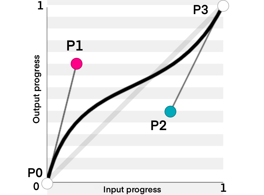
A cubic Bézier easing function is a type of easing function defined by four real numbers that specify the two control points, P1 and P2, of a cubic Bézier curve whose end points P0 and P3 are fixed at (0, 0) and (1, 1) respectively. The x coordinates of P1 and P2 are restricted to the range [0, 1].

Note: If you want to learn more about easing functions, you can check out this article. It goes behind the scenes of how linear, cubic-bezier, and staircase functions work!

But What Is An Easing Function?

Let’s Start With A Linear Curve

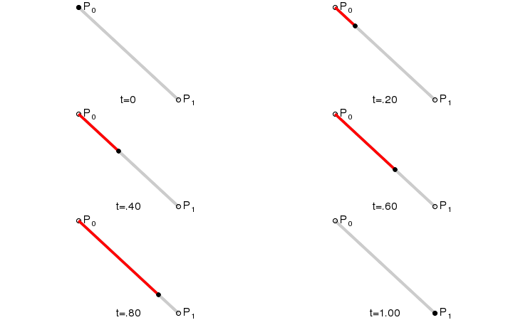
Imagine two points P0 and P1, where P0 is the starting point of the animation and P1 is the ending point. Now imagine another point moving linearly between the two points as follows:

Source: Wikipedia

This is called a linear curve! It is the simplest animation out there, and you probably used it before when you started learning CSS.

Next Up: The Quadratic Bezier Curve

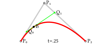
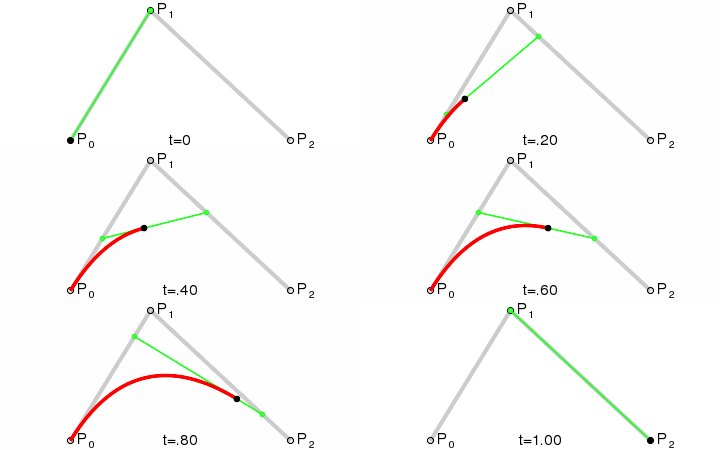
Imagine you have three points: P0, P1 and P2. You want the animation to move from P0 to P2. In this case, P1 is a control point that controls the curve of the animation.

The idea of the quadratic bezier is as follows:

  1. Connect imaginary lines between P0 and P1 and between P1 and P2 (represented by the gray lines).
  2. Point Q0 moves along the line between P0 and P1. At the same time, Point Q1 moves along the line between P1 and P2.
  3. Connect an imaginary line between Q0 and Q1 (represented by the green line).
  4. At the same time Q0 and Q1 start moving, the point B starts moving along the green line. The path that point B takes is the animation path.
Source: Wikipedia

Note that Q1, Q2 and B do not move with the same velocity. They must all start at the same time and finish their path at the same time as well. So each point moves with the appropriate velocity based on the line length it moves along.

Finally: The Cubic Bezier Curve

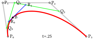
The cubic bezier curve consists of 4 points: P0, P1, P2 and P3. The animation starts at P0 and ends at P3. P1 and P2 are our control points.

The cubic bezier works as follows:

  1. Connect imaginary lines between (P0, P1), (P1, P2) and (P2, P3). This is represented by the gray lines.
  2. Points Q0, Q1 and Q2 move along the lines (P0, P1), (P1, P2) and (P2, P3) respectively.
  3. Connect imaginary lines between (Q0, Q1) and (Q1, Q2). They are represented by the green lines.
  4. Points R0 and R1 move along the lines (Q0, Q1) and (Q1, Q2) respectively.
  5. Connect the line between R0 and R1 (represented by the blue line).
  6. Finally, Point B moves along the line connecting between R0 and R1. This point moves along the path of the animation.
Source: Wikipedia

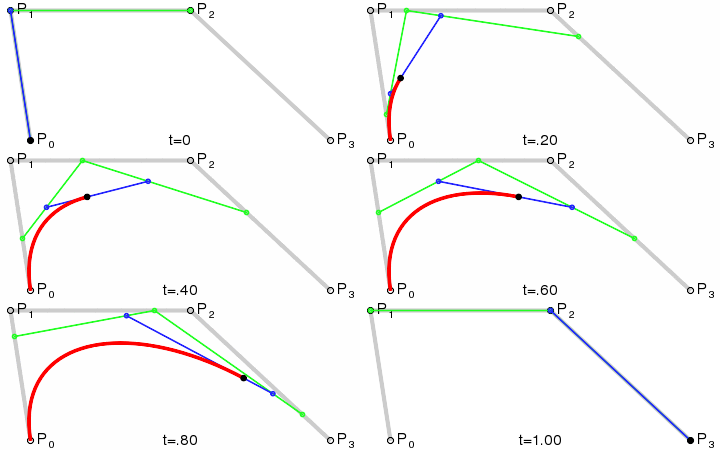
If you want to have a better feel for how cubic beziers work, I recommend checking out this desmos link. Play around with the control points and check how the animation changes through time. (Note that the animation in the link is represented by the black line.)

Stacking Animations

Big animations with lots of steps can be broken down into multiple small animations. You can achieve that by adding the animation-delay property to your CSS. Calculating the delay is simple; you add up the time of all the animations before the one you are calculating the animation delay for.

For example:

animation: movePointLeft 4s linear forwards, movePointDown 3s linear forwards;

Here, we have two animations, movePointLeft and movePointDown. The animation delay for movePointLeft will be zero because it is the animation we want to run first. However, the animation delay for movePointDown will be four seconds because movePointLeft will be done after that time.

Therefore, the animation-delay property will be as follows:

animation-delay: 0s, 4s;

Note that if you have two or more animations starting at the same time, their animation delay will be the same. In addition, when you calculate the animation delay for the upcoming animations, you will consider them as one animation.

For example:

animation: x 4s linear forwards, y 4s linear forwards, jump 2s linear forwards;

Assume we want to start x and y simultaneously. In this case, the animation delay for both x and y will be zero, while the animation delay for the jump animation will be four seconds (not eight!).

animation-delay: 0s, 0s, 4s;
Creating The Rollercoaster

Now that we have the basics covered, it’s time to apply what we learned!

Understanding The Animation

The rollercoaster path consists of three parts:

  1. The sliding part,
  2. The loop part,
  3. There will also be some animation to create horizontal space between the two animations above.

Setting Things Up

We will start by creating a simple ball that will be our “cart” for the rollercoaster.

1. Add this to the body of your new HTML file:

<div id="the-cart" class="cart"></div>

2. Add this to your CSS file:

.cart {
  background-color: rgb(100, 210, 128);
  height: 50px;
  width: 50px;
  border: 1px solid black;
  border-radius: 50px;
  position: absolute;
  left: 10vw;
  top: 30vh;
}

I’ll use viewport width (vw) and viewport height (vh) properties to make the animation responsive. You are free to use any units you want.

The Sliding Part

Creating the part where the ball slides can be done using the cubic-bezier function! The animation is made up of 2 animations, one along the x-axis and the other along the y-axis. The x-axis animation is a normal linear animation along the x-axis. We can define its keyframes as follows:

@keyframes x {
  to {
    left: 40vw;
  }
}

Add it to your animation property in the ball path as follows:

animation: x 4s linear forwards

The y-axis animation is the one where we will use the cubic-bezier function. Let’s first define the keyframes of the animation. We want the difference between the starting and ending points to be so small that the ball reaches almost the same height.

@keyframes y {
  to {
    top: 29.99vh;
  }
}}

Now let’s think about the cubic-bezier function. We want our path to move slowly to the right first, and then when it slides, it should go faster.

  • Moving slowly to the right means that $P1$ will be along the x-axis. So, we know it is at (V, 0).
    • We need to choose a suitable V that makes our animation go slowly to the right but not too much so that it takes up the whole space. In this case, I found that 0.55 fits best.
  • To achieve the sliding effect, we need to move P2 down the y-axis (negative value) so P2=(X, -Y).
    • Y should be a big value. In this case, I chose Y=5000.
    • To get X, we know that our animation speed should be faster when sliding and slower when going up again. So, the closer X is to zero, The steeper the animation will be at sliding. In this case, let X = 0.8.

Now you have your cubic-bezier function, it will be cubic-bezier(0.55, 0, 0.2, -800).

Let’s add keyframes to our animation property:

animation: x 4s linear forwards,
    y 4s cubic-bezier(0.55, 0, 0.2, -5000) forwards;

This is the first part of our animation, so the animation delay is zero. We should add an animation-delay property because starting from the following animation, the animations will start at a different time than the first animation.

animation-delay: 0s, 0s;

See the Pen Rollercoaster sliding part [forked] by Yosra Emad.

Adding Horizontal Space

Before making the loop, the ball should move along the x-axis for a short while, so there is space between both animations. So, let’s do that!

  • Define the keyframes:
@keyframes x2 {
  to {
    left: 50vw;
  }
}
  • Add it to the animation property:
animation: x 4s linear forwards,
    y 4s cubic-bezier(0.55, 0, 0.2, -5000) forwards, x2 0.5s linear forwards;

This animation should start after the sliding animation, and the sliding animation takes four seconds; thus, the animation delay will be four seconds:

animation-delay: 0s, 0s, 4s;

See the Pen Rollercoaster horizontal space [forked] by Yosra Emad.

The Loop Part

To create a circle (loop) in CSS, we need to move the circle to the center of the loop and start the animation from there. We want the circle’s radius to be 100px, so we will change the circle position to top: 20vh (30 is desired radius (10vh here)). However, this needs to happen after the sliding animation is done, so we will create another animation with a zero-second duration and add a suitable animation delay.

  • Create the keyframes:
@keyframes pointOfCircle {
  to {
    top: 20vh;
  }
}
  • Add this to the list of animations with duration = 0s:
animation: x 4s linear forwards,
    y 4s cubic-bezier(0.55, 0, 0.2, -5000) forwards, x2 0.5s linear forwards,
    pointOfCircle 0s linear forwards;
  • Add the animation delay, which will be 4.5s:
animation-delay: 0s, 0s, 4s, 4.5s;

The Loop Itself

To create a loop animation:

  • Create a keyframe that moves the ball back to the old position and then rotates the ball:
@keyframes loop {
  from {
    transform: rotate(0deg) translateY(10vh) rotate(0deg);
  }
  to {
    transform: rotate(-360deg) translateY(10vh) rotate(360deg);
  }
}
  • Add the loop keyframes to the animation property:
animation: x 4s linear forwards,
    y 4s cubic-bezier(0.55, 0, 0.2, -5000) forwards, x2 0.5s linear forwards,
    pointOfCircle 0s linear forwards, loop 3s linear forwards;
  • Add the animation delay, which will also be 4.5 seconds here:
animation-delay: 0s, 0s, 4s, 4.5s, 4.5s;

See the Pen Rollercoaster loop [forked] by Yosra Emad.

Adding Horizontal Space (Again)

We’re almost done! We just need to move the ball after the animation along the x-axis so that the ball doesn’t stop exactly after the loop the way it does in the picture above.

  • Add the keyframes:
@keyframes x3 {
  to {
    left: 70vw;
  }
}
  • Add the keyframes to the animation property:
animation: x 4s linear forwards,
    y 4s cubic-bezier(0.55, 0, 0.2, -800) forwards, x2 0.5s linear forwards,
    pointOfCircle 0s linear forwards, loop 3s linear forwards,
    x3 2s linear forwards;
  • Adding the suitable delay, here it will be 7.5s:
animation-delay: 0s, 0s, 4s, 4.5s, 4.5s, 7.5s;
The Final Output

See the Pen Rollercoaster Final [forked] by Yosra Emad.

Conclusion

In this article, we covered how to combine multiple keyframes to create a complex animation path. We also covered cubic beziers and how to use them to create your own easing function. I would recommend going on and creating your own animation path to get your hands dirty with animations. If you need any help or want to give feedback, you’re more than welcome to send a message to any of the links here. Have a wonderful day/night!

Delightful UI Animations With Shared Element Transitions API (Part 1)

Animations are an essential part of web design and development. They can draw attention, guide users on their journey, provide satisfying and meaningful feedback to interaction, add character and flair to make the website stand out, and so much more!

Before we begin, let’s take a quick look at the following video and imagine how much CSS and JavaScript would take to create an animation like this. Notice that the cart counter is also animated, and the animation runs right after the previous one completes.

Although this animation looks alright, it’s just a minor improvement. Currently, the API doesn’t really know that the image (shared element) that is being moved from the container to the overlay is the same element in their respective states. We need to instruct the browser to pay special attention to the image element when switching between states, so let’s do that!

Creating A Shared Element Animation

With page-transition-tag CSS property, we can easily tell the browser to watch for the element in both outgoing and incoming images, keep track of element’s size and position that are changing between them, and apply the appropriate animation.

We also need to apply the contain: paint or contain: layout to the shared element. This wasn’t required for the crossfade animations, as it’s only required for elements that will receive the page-transition-tag. If you want to learn more about CSS containment, Rachel Andrew wrote a very detailed article explaining it.

.gallery__image--active {
  page-transition-tag: active-image;
}

.gallery__image {
  contain: paint;
}

Another important caveat is that page-transition-tag has to be unique, and we can apply it to only one element during the duration of the animation. This is why we apply it to the active image element right before the image is moved to the overlay and remove it when the image overlay is closed and the image is returned to its original position:

async function toggleImageView(index) {
   const image = document.getElementById(js-gallery-image-${index});

  // Apply a CSS class that contains the page-transition-tag before animation starts.
  image.classList.add("gallery__image--active");

  const imageParentElement = image.parentElement;

  const moveTransition = document.createDocumentTransition();
  await moveTransition.start(() => moveImageToModal(image));

  overlayWrapper.onclick = async function () {
    const moveTransition = document.createDocumentTransition();
    await moveTransition.start(() => moveImageToGrid(imageParentElement));

    // Remove the class which contains the page-transition-tag after the animation ends.
    image.classList.remove("gallery__image--active");
  };
}

Alternatively, we could have used JavaScript to toggle the page-transition-tag property inline on the element. However, it’s better to use the CSS class toggle to make use of media queries to apply the tag conditionally:

// Applies page-transition-tag to the image.
image.style.pageTransitionTag = "active-image";

// Removes page-transition-tag from the image.
image.style.pageTransitionTag = "none";

And that’s pretty much it! Let’s take a look at our example with the shared element applied:

Customizing Animation Duration And Easing Function

We’ve created this complex transition with just a few lines of CSS and JavaScript, which turned out great. However, we expect to have more control over the animation properties like duration, easing function, delay, and so on to create even more elaborate animations or compose them for even greater effect.

Shared Element Transitions API makes use of CSS animation properties and we can use them to fully customize our state animation. But which CSS selectors to use for these outgoing and incoming states that the API is generating for us?

Shared Element Transition API introduces new pseudo-elements that are added to DOM when its animations are run. Jake Archibald explains the pseudo-element tree in his Chrome developers article. By default (in case of crossfade animation), we get the following tree of pseudo-elements:

::page-transition
└─ ::page-transition-container(root)
   └─ ::page-transition-image-wrapper(root)
      ├─ ::page-transition-outgoing-image(root)
      └─ ::page-transition-incoming-image(root)

These pseudo-elements may seem a bit confusing at first, so I’m including WICG’s concise explanation for these pseudo-elements and their general purpose:

  • ::page-transition sits in a top-layer, over everything else on the page.
  • ::page-transition-outgoing-image(root) is a screenshot of the old state, and ::page-transition-incoming-image(root) is a live representation of the new state. Both render as CSS replaced content.
  • ::page-transition-container animates size and position between the two states.
  • ::page-transition-image-wrapper provides blending isolation, so the two images can correctly cross-fade.
  • ::page-transition-outgoing-image and ::page-transition-incoming-image are the visual states to cross-fade.

For example, when we apply the page-transition-tag: active-image, its pseudo-elements are added to the tree:

::page-transition
├─ ::page-transition-container(root)
│  └─ ::page-transition-image-wrapper(root)
│     ├─ ::page-transition-outgoing-image(root)
│     └─ ::page-transition-incoming-image(root)
└─ ::page-transition-container(active-image)
   └─ ::page-transition-image-wrapper(active-image)
      ├─ ::page-transition-outgoing-image(active-image)
      └─ ::page-transition-incoming-image(active-image)

In our example, we want to modify both the crossfade (root) animation and the shared element animation. We can use the universal selector * with the pseudo-element to change animation properties for all available transition elements and target pseudo-elements for specific animation using the page-transition-tag value.

In this example, we are applying 400ms duration for all animated elements with an ease-in-out easing function, and then override the active-image transition easing function and setting a custom cubic-bezier value:

::page-transition-container(*) {
  animation-duration: 400ms;
  animation-timing-function: ease-in-out;
}

::page-transition-container(active-image) {
  animation-timing-function: cubic-bezier(0.215, 0.61, 0.355, 1);
}

Accessible Animations

It’s important to be aware of accessibility requirements when working with animations. Some people prefer browsing the web with reduced motion, so we must either remove an animation or provide a more suitable alternative. This can be easily done with a widely supported prefers-reduced-motion media query.

The following code snippet turns off animations for all elements using the Shared Element Transitions API. This is a shotgun solution, and we need to ensure that DOM updates smoothly and remains usable even with the animations turned off:

@media (prefers-reduced-motion) {
    /* Turn off all animations */
    ::page-transition-container(*),
    ::page-transition-outgoing-image(*),
    ::page-transition-incoming-image(*) {
        animation: none !important;
    }

    /* Or, better yet, create accessible alternatives for these animations  */
}

@keyframes fadeOut {
    from {
        filter: blur(0px) brightness(1) opacity(1);
    }
    to {
        filter: blur(6px) brightness(8) opacity(0);
    }
}

@keyframes fadeIn {
    from {
        filter: blur(6px) brightness(8) opacity(0);
    }
    to {
        filter: blur(0px) brightness(1) opacity(1);
    }
}

Now, all we have to do is assign the exit animation to the outgoing image pseudo-element and the entry animation to the incoming image pseudo-element. We can set a page-transition-tag directly to the HTML image element as it’s the only element that will perform this animation:

/* We are applying contain property on all browsers (regardless of property support) to avoid differences in rendering and introducing bugs */
.gallery img {
    contain: paint;
}

@supports (page-transition-tag: supports-tag) {
    .gallery img {
        page-transition-tag: gallery-image;
    }

    ::page-transition-outgoing-image(gallery-image) {
        animation: fadeOut 0.4s ease-in both;
    }

    ::page-transition-incoming-image(gallery-image) {
        animation: fadeIn 0.4s ease-out 0.15s both;
    }
}

Even the seemingly simple crossfade animations can look cool, don’t you think? I think this particular animation fits really nicely with the dark theme we have in the example.

/* We are applying contain property on all browsers (regardless of property support) to avoid differences in rendering and introducing bugs */
.product__dot {
  contain: paint;
}

.shopping-bag__counter span {
  contain: paint;
}

@supports (page-transition-tag: supports-tag) {
  ::page-transition-container(cart-dot) {
    animation-duration: 0.7s;
    animation-timing-function: ease-in;
  }

  ::page-transition-outgoing-image(cart-counter) {
    animation: toDown 0.3s cubic-bezier(0.4, 0, 1, 1) both;
  }

  ::page-transition-incoming-image(cart-counter) {
    animation: fromUp 0.3s cubic-bezier(0, 0, 0.2, 1) 0.3s both;
  }
}

@keyframes toDown {
  from {
    transform: translateY(0);
    opacity: 1;
  }
  to {
    transform: translateY(4px);
    opacity: 0;
  }
}

@keyframes fromUp {
  from {
    transform: translateY(-3px);
    opacity: 0;
  }
  to {
    transform: translateY(0);
    opacity: 1;
  }
}

And that is it! It amazes me every time how elaborate these animations can turn out with so few lines of additional code, all thanks to Shared Element Transitions API. Notice that the header element with the cart icon is fixed, so it sticks to the top, and our standard animation setup works like a charm, regardless!

See the Pen Add to cart animation - completed (2) [forked] by Adrian Bece.

Conclusion

When done correctly, animations can breathe life into any project and offer a more delightful and memorable experience to users. With the upcoming Shared Element Transitions API, creating complex UI state transition animations has never been easier, but we still need to be careful how we use and implement animations.

This simplicity can give way to bad practices, such as not using animations correctly, creating slow or repetitive animations, creating needlessly complex animations, and so on. It’s important to learn best practices for animations and on the web so we can effectively utilize this API to create truly amazing and accessible experiences or even consult with the designer if we are unsure on how to proceed.

In the next article, we’ll explore the API’s potential when it comes to transition between different pages in Single Page Apps (SPA) and the upcoming Cross-document same-origin transitions, which are yet to be implemented.

I am excited to see what the dev community will build using this awesome new feature. Feel free to reach out on Twitter or LinkedIn if you have any questions or if you built something amazing using this API.

Go ahead and build something awesome!

Many thanks to Jake Archibald for reviewing this article for technical accuracy.

References

SmartBiz Review

SmartBiz is an AI-powered financing platform that has funded more than 230,000 entrepreneurs. With fast and flexible financing options, SmartBiz matches you with the perfect lender to receive the loan you need. 

More than 60% of SmartBiz loans go towards women, minority, and veteran-owned businesses, as it aims to help any small business find reliable access to SBA, bank term, and custom financing. 

SmartBiz logo

SmartBiz Compared

SmartBiz did make our top list for the best SBA loans. The best loan service for most people, though, is Upstart, because of its quick funding time, flexible repayment terms, and you can qualify without a credit history. Apply for a small business loan today and check your rate with zero paperwork or hidden fees.

Want to read more about the top best startup business loans? We reviewed dozens of options and narrowed it down to the top six. If you want to scope out all of your options, see all of our top picks here.

About SmartBiz

SmartBiz is the number one facilitator in SBA 7(a) loans for less than $350,000, and with more than $9 billion delivered to businesses across 13 years, the company is trusted by many. The ultimate aim of SmartBiz is to ensure small businesses can apply for and secure low-cost funds from banks.

SmartBiz has evolved over the years—from one streamlined application to an AI-powered platform and reliable access to SBA, bank terms, and custom financing for any business type. SmartBiz works with a diverse team of technologists who work together to transform small business banking and keep the fees low. 

SmartBiz Products and Services

SmartBiz offers three different loans, including SBA, specific-term, and custom loans. All SBA loans have lower rates and longer terms, while specific-term bank loans offer fixed rates and shorter repayment terms and are an overall faster way to access funds. 

On the other hand, SmartBiz custom loans have both customizable repayment terms and interest rates. From lines of credit to invoice financing, SmartBiz can help you find the perfect loan for your needs. 

SmartBiz Health and Stability

SmartBiz was founded in 2009 by a team of financial service entrepreneurs and is a privately held company. The company has backing from leading venture capital firms, including Investor Growth Capital, Venrock, First Round Capital, Baseline Ventures, and SoftTech VC. SmartBiz has a total funding amount of $37 million as of 2022. 

Today, SmartBiz employs 51-100 people across its Austin and San Fransisco offices. With a 4.2-star rating on Glassdoor, it seems that SmartBiz offers a healthy work environment and diverse culture. 

And as the number one facilitator for SBA loans for small businesses, SmartBiz is a stable company that delivers every time.  

SmartBiz Pricing

SmartBiz is a free loan service with no hidden fees. You can apply for an SBA loan, a term loan, or custom financing in under five minutes online. Whether you run a small business, need a personal loan, or find yourself in a unique situation without the funds—SmartBiz can handle it all for you, entirely free

SmartBiz Pricing Structure

Because SmartBiz is a loan service, it doesn’t have a traditional pricing model. Instead, if SmartBiz accepts you for a loan, you will have to make repayments every month. The interest rate and repayment terms depend on how much money you borrow and what type of loan you choose. 

SmartBiz Pricing Comparison

SmartBiz’s interest rates for its SBA loans vary depending on the amount you borrow and your credit score. Any working capital and debt refinance loans from $30,000 to $50,000 have a variable interest rate of 9.25%. And for loans between $50,001 to $350,000, the variable rate is 8.25%. 

In comparison to other popular financing services, SmartBiz certainly offers higher interest rates. For example, Upstart’s interest rates start at 5.31%, and while Bluevine doesn’t offer SBA loans, its business lines of credit have a rate as low as 4.8%. 

Lendio is one of the only other financing services with similar interest rates to SmartBiz, with its maximum rates set at 8.25%. However, its minimum rates start at 5.75%—and with any company, the rate is indicative of how much money you borrow.

SmartBiz Trials and Guarantees

SmartBiz is a free forever loan service that only requires you to make repayments on accepted loans. SmartBiz guarantees that the soft credit pulls it conducts will not affect your credit score.

SmartBiz Startup Business Loans Review

Compared to other financing services, SmartBiz stands out for its SBA loans for small businesses and startups. You could benefit from SmartBiz’s service if you are looking for custom financing, SBA loans, or specific-bank term loans. 

SmartBiz is better for small businesses because of its custom financing options. Whether you need lines of credit or invoicing loans, SmartBiz can help kick your business off the ground. To see how SmartBiz stacks up against its competitors, check out our top picks for startup business loans.

What Makes SmartBiz Startup Business Loans Great

Screenshot of SmartBiz homepage
SmartBiz offers custom financing and flexible loans for small businesses.

SmartBiz helps you find flexible small business loans as quickly as possible. 

  • Custom financing: Whether traditional loans aren’t suitable for you due to time constraints, low revenue, or credit profile issues, SmartBiz offers custom financing solutions for any situation to help you find the loan that works best for you. With interest rates as low as 6.99%, bank term loan amounts of $30,000 to $500,000, and repayment terms of 24-60 months, you can pay off your loan quicker than you applied. SmartBiz offers different options, from lines of credit to invoicing loans, you can find a flexible funding solution with ease.
  • Quick and easy application: SmartBiz’s online application process is incredibly easy to do in three easy steps. You can fill out one single, streamlined application to find out if you’re pre-qualified for the loan. SmartBiz will request a few common documents, including personal and business tax returns, personal financial statements, profit and loss statements, balance sheets, and collateral. SmartBiz will then refer you to a lender that will most likely fund your business, to which you can access your capital and grow your business.
  • Fair eligibility requirements: To be eligible for a SmartBiz loan, there are a few requirements you need to prove. Unlike most financing services, SmartBiz doesn’t ask for unfair requirements. All SmartBiz asks is that your business is not in the following industries: gambling, life insurance, religious teaching, political and lobbying activities, oil wildcatting, mining, mortgage servicing, real estate development, bail bond, and pawn or private clubs. To be eligible for all SBA 7(a) loans, your business must be above two years old, and your credit score must be above 650. 
  • AI-powered solution for lenders: SmartBiz lending partners can benefit from its AI-powered technology solutions to create more approvals and optimized risk and resource management. This SmartBiz platform comes with application management, AI-powered automation, document capture, automated reviews, online file audit, and underwriting and closing features. You can efficiently manage all loan applications and create a customized lending experience. 
  • Refinancing options: You can choose to purchase or refinance commercial real estate through a SmartBiz SBA loan. All it takes is five easy steps, from pre-qualifying and providing financial information to accepting your letter of intent and conducting a property valuation, SmartBiz ensures you get your funds as quickly as possible.  

Where SmartBiz Falls Short

Screenshot of SmartBiz webpage for understanding SBA loan rates and fees
SmartBiz fees and interest rates vary depending on the size of the loan.

SmartBiz comes with different loan rates and fees, depending on how much money you borrow. 

  • High fees: SmartBiz definitely has higher fees than most of its competitors. For an SBA loan, fees for working capital include the following: $350,001 to $700,000 — 2.77% of the guaranteed portion; $700,001 to $1,000,000 — 3.27% of the guaranteed portion; and $1,000,001 to $5,000,000 — 3.5% of the guaranteed portion + 3.75%. Not only that, but it also has excess fees for applications and bank closures. For example, on top of the working capital fees, you also have to pay a $3,000 one-time application fee and a $450 bank closing cost, and third-party report charges may apply. 
  • Higher interest rates: The lowest interest rate that SmartBiz offers is around 6.99%, but that is for a custom financing option. If you are interested in an SBA loan, the minimum interest rate is between 8.25% and 9.25%, plus the prime rate of between 2.75% and 3.75%, which is high compared to other financial services that start between 4-5%. 
  • Customer support: According to a few reviewers, SmartBiz’s customer support is lacking in many ways. A few reviewers claimed that its customer service was slow while others said the representatives were unfriendly and unhelpful. Some reviewers went as far as to say they couldn’t even get in touch with SmartBiz’s customer support in the first place, which is unfortunate. 

SmartBiz Startup Business Loans Compared

While SmartBiz is a decent option for small businesses to take out an SBA loan or custom financing, the best financing service for most people is Upstart because of its quick funding time, and you can qualify without a credit history. 

SmartBiz Business Loans Review

Business loans can be an easy way for small business owners to find the funds to kickstart their business ventures. Everything that we discussed above regarding startup business loans applies to most business loans of any kind. However, we did discuss more about SBA loans and custom financing options, which can have more fees associated with them. 

Here is a quick look at how SmartBiz stacks up against some of the best financing services on the market today:

  • Bluevine — Best for established businesses seeking lines of credit up to $250,000 
  • Lendio — Best small business loan marketplace with 75+ lenders
  • OnDeck — Term loans and lines of credit for business owners with a 600+ FICO score
  • Fundbox — Best for new businesses in need of inventory or supplies from vendors
  • Funding Circle — Best small business lender for loan terms up to five years
  • Kabbage — Best for businesses with low monthly or annual revenue
  • Lending Club — Best P2P lending marketplace for business loans
  • Kiva — Microloans up to $10,000 at 0% interest for entrepreneurs
  • SmartBiz — Best for SBA loans up to $5 million with 25-year terms
  • Credibility Capital — Bank-backed loans for business owners with great credit 
  • CAN Capital — Best merchant cash advance for small businesses

SmartBiz Final Verdict

SmartBiz offers excellent custom financing options and SBA 7(a) loans for small businesses. If you need to find quick and easy funds, you can do so by utilizing SmartBiz’s AI-powered platform. 

With 13 years in the industry and $9 billion delivered to businesses across the U.S, SmartBiz is a reliable and stable company, and we would recommend SmartBiz to any small business that needs access to quick funds. 

Building A Retro Draggable Web Component With Lit

Back in the 90s, my first operating system was Windows. Now in the 2020s, I work primarily on building web applications using the browser. Over the years, the browser’s transformed into a wonderful and powerful tool that supports a wide world of rich applications. Many of these applications, with their complex interfaces and breadth of capabilities, would make even the hardiest turn-of-the-millennium programs blush.

Native browser features like web components are being adopted and used across the web by multinational companies and individual developers alike.

In case you’re wondering if anyone is using Web Components:

- GitHub
- YouTube
- Twitter (embedded tweets)
- SalesForce
- ING
- Photoshop web app
- Chrome devtools
- the complete Firefox UI
- Apple Music web client

— Danny Moerkerke (@dannymoerkerke) August 5, 2022

So, why not embrace the technology of the present by paying homage to the interfaces of the past?

In this article, I hope to teach you just that by replicating the iconic broken window effect.

We’ll be using web components, the browser’s native component model, to build out this interface. We’ll also use the Lit library, which simplifies the native web component APIs.

A lot of the concepts I talk about here are lessons I’ve learnt from building A2k, a UI library designed to help you create retro UI with modern tooling.

In this article, we’ll cover:

  • the basics of creating web components using Lit;
  • how to easily customize your component’s behavior using Lit’s built-in tools;
  • how to encapsulate reusable functionality;
  • how to dispatch and respond to events using advanced data flow methods.

It’s worth knowing your core HTML, CSS, and some basic JavaScript to follow along with this tutorial, but no framework-specific knowledge is required.

Getting Started

You can follow allow along in the browser using StackBlitz.

Once StackBlitz finishes setting up, you should see the following in the browser window:

Note: If you don’t want to use StackBlitz, you can clone the repo and run the instructions inside of the README.md file. You can also use the Lit VSCode for syntax highlighting and features.

Next, open up the project in your editor of choice. Let’s have a quick look to see what our starter code looks like.

index.html

We have a very barebones HTML file that does little more than import some CSS and a JavaScript file.

You may have also spotted a brand new element, the a2k-window element. You won’t have seen this before because this is the custom element we’ll be building ourselves. Since we haven’t created and registered this component yet, the browser will fall back to display the inner HTML content.

The Various .js Files

I’ve added a little boilerplate for some of the components and functions, but we’ll fill in the gaps over the course of this article(s). I’ve imported all of the necessary first and third-party code we’ll use throughout this article.

Bonus: Fonts

I’ve also added some retro fonts for fun! It’s a wonderful MS-2000-inspired font created by Lou. You can download it and use it in your own projects if you’re looking to inject a little millennium flavor into your designs.

Part 1: Building Our First Web Component

Writing Our Markup

The first thing we want to do is get a convincing-looking window element going. With just a few lines of code, we’ll have the following.

Let’s start by jumping into our a2k-window.js file. We’ll write a little boilerplate to get our component up and running.

We’ll need to define a class that extends Lit’s LitElement base class. By extending from LitElement, our class gets the ability to manage reactive states and properties. We also need to implement a render function on the class that returns the markup to render.

A really basic implementation of a class will look like this:

class A2kWindow extends LitElement {
  render() {
    return html`
      <div id="window">
        <slot></slot>
      </div>
    `;
  }
}

There are two things worth noting:

  • We can specify an element ID which is then encapsulated within the web component. Just like the top-level document, duplicate IDs are not allowed within the same component, but other web components or external DOM elements can use the same ID.
  • The slot element is a handy tool that can render custom markup passed down from the parent. For those familiar with React, we can liken it to a React portal that renders where you set the children prop. There’s more that you can do with it, but that’s beyond the scope of this article.

Writing the above doesn’t make our web component available in our HTML. We’ll need to define a new custom element to tell the browser to associate this definition with the a2k-window tag name. Underneath our component class, write the following code:

customElements.define("a2k-window", A2kWindow);

Now let’s jump back to our browser. We should expect to see our new component render to the page, but…

Even though our component has been rendered, we see some plain unstyled content. Let’s go ahead and add some more HTML and CSS:

class A2kWindow extends LitElement {
  static styles = css`
    :host {
      font-family: var(--font-primary);
    }

    #window {
      width: min(80ch, 100%);
    }

        #panel {
      border: var(--border-width) solid var(--color-gray-400);
      box-shadow: 2px 2px var(--color-black);
      background-color: var(--color-gray-500);
    }

    #draggable {
      background: linear-gradient(
        90deg,
        var(--color-blue-100) 0%,
        var(--color-blue-700) 100%
      );
      user-select: none;
    }

    #draggable p {
      font-weight: bold;
      margin: 0;
      color: white;
      padding: 2px 8px;
    }

    [data-dragging="idle"] {
      cursor: grab;
    }

    [data-dragging="dragging"] {
      cursor: grabbing;
    }
  `;

  render() {
    return html`
      <div id="window">
        <div id="panel">
          <slot></slot>
        </div>
      </div>
    `;
  }
}

There are a couple of things worth noting in the above code:

  • We define the styles scoped to this custom element via the static styles property. Due to how styles encapsulation works, our component won’t be affected by any external styles. However, we can use the CSS variables we’ve added in our styles.css to apply styles from an external source.
  • I’ve added some styles for DOM elements that don’t exist just yet, but we’ll add them soon.

A note on styles: Styling in Shadow DOM is a topic too large to delve into in this article. To learn more about styling in Shadow DOM, you can refer to the Lit documentation.

If you refresh, you should see the following:

Which is starting to look more like our Windows-inspired web component. 🙌

Pro tip: If you’re not seeing the browser apply the changes you’re expecting. Open up the browser’s dev tools. The browser might have some handy error messages to help you work out where things are failing.

Making Our Web Component Customizable

Our next step is to create the heading for our window component. A core feature of web components is HTML element properties. Instead of hardcoding the text content of our window’s heading, we can make it a property input on the element. We can use Lit to make our properties reactive, which triggers lifecycle methods when changed.

To do this, we need to do three things:

  1. Define the reactive properties,
  2. Assign a default value,
  3. Render the value of the reactive property to the DOM.

First off, we need to specify the reactive properties we want to enable for our component:

class A2kWindow extends LitElement {
  static styles = css`...`;

  static properties = {
    heading: {},
  };

  render() {...}
}

We’ll do this by specifying the static properties object on our class. We then specify the names of the properties we want, along with some options passed through as an object. Lit’s default options handle string property conversion by default. This means we don’t need to apply any options and can leave heading as an empty object.

Our next step is to assign a default value. We’ll do this within the component’s constructor method.

class A2kWindow extends LitElement {
  static styles = css`...`;

  static properties = {...};

    constructor() {
    super();

    this.heading = "Building Retro Web Components with Lit";
  }

  render() {...}
}

Note: Don’t forget to call super()!

And finally, let’s add a little more markup and render the value to the DOM:

class A2kWindow extends LitElement {
  static styles = css`...`;

  static properties = {...};

    constructor() {...}

    render() {
    return html`
      <div id="window">
        <div id="panel">
          <div id="draggable">
            <p>${this.heading}</p>
          </div>
          <slot></slot>
        </div>
      </div>
    `;
  }
}

With that done, let’s jump back to our browser and see how everything looks:

Very convincing! 🙌

Bonus

Apply a custom heading to the a2k-element from the index.html file.

Brief breather 😮‍💨

It’s wonderful to see how easily we can build UI from 1998 with modern primitives in 2022!

And we haven’t even gotten to the fun parts yet! In the next sections, we’ll look into using some of Lit’s intermediate concepts to create drag functionality in a way that’s reusable across custom components.

Part 2: Making Our Component Draggable

This is where things get a little tricky! We’re moving into some intermediate Lit territory, so don’t sweat if not everything makes perfect sense.

Before we start writing the code, let’s have a quick rundown of the concepts we’ll be playing with.

Directives

As you’ve seen, when writing our HTML templates in Lit, we write them inside the html literals tag. This allows us to use JavaScript to alter the behavior of our templates. We can do things like evaluating expressions:

html`<p>${this.heading}</p>`

We can return specific templates under certain conditions:

html`<p>
${this.heading ? this.heading : “Please enter a heading”}
</p>`

There will be times when we’ll need to step out of the normal rendering flow of Lit’s rendering system. You might want to render something at a later time or extend Lit’s template functionality. This can be achieved through the use of directives. Lit has a handful of built-in directives.

We’ll use the styleMap directive, which allows us to apply styles directly to an element via a JavaScript object. The object is then transformed into the element’s inline styles. This will come in handy as we adjust the position of our window element since the element’s position is managed by CSS properties. In short, styleMap turns:

const top = this.top // a variable we could get from our class, a function, or anywhere

styleMap({
    position: "absolute",
    left: "100px",
    top
})

into

"position: absolute; top: 50px; left: 100px;"

Using styleMap makes it easy to use variables to change styles.

Controllers

Lit has a number of handy ways to compose complex components from smaller, reusable pieces of code.

One way is to build components from lots of smaller components. For example, an icon button that looks like this:

The markup may have the following markup:

class IconButton extends LitElement {
    render() {
        return html`
            <a2k-button>
                <a2k-icon icon="windows-icon"></a2k-icon>
                <slot></slot>
            </a2k-button>
        `
    }
}

In the above example, we’re composing our IconButton out of two pre-existing web components.

Another way to compose complex logic is by encapsulating specific state and behavior into a class. Doing so allows us to decouple specific behaviors from our markup. This can be done through the use of controllers, a cross-framework way to share logic that can trigger re-renders in a component. They also have the benefit of hooking into the component’s lifecycle.

Note: Since controllers are cross-framework, they can be used in React and Vue with small adapters.

With controllers, we can do some cool things, like managing the drag state and position of its host component. Interestingly enough, that’s exactly what we plan to do!

While a controller might sound complicated, if we analyse its skeleton, we’ll be able to make sense of what it is and what it does.

export class DragController {
    x = 0;
    y = 0;
    state = "idle"

    styles = {...}

  constructor(host, options) {
    this.host = host;
    this.host.addController(this);
  }

  hostDisconnected() {...}

  onDragStart = (pointer, ev) => {...};

  onDrag = (_, pointers) => {...};
}

We begin by initialising our controller by registering it with the host component and storing a reference to the host. In our case, the host element will be our a2k-window component.

Once we’ve done that, we can hook into our host’s lifecycle methods, like hostConnected, hostUpdate, hostUpdated, hostDisconnected, and so on, to run drag-specific logic. In our case, we’ll only need to hook into hostDisconnected for clean-up purposes.

Finally, we can add our own methods and properties to our controller that will be available to our host component. Here we’re defining a few private methods that will get called during the drag actions. We’re also defining a few properties that our host element can access.

When onDrag and onDragStart functions are invoked, we update our styles property and request that our host component re-renders. Since our host component turns this style object into inline CSS (via the styleMap directive), our component will apply the new styles.

If this sounds complicated, hopefully, this flowchart better visualises the process.

Writing Our Controller

Arguably the most technical part of the article, let’s wire up our controller!

Let’s begin by completing the initialisation logic of our controller:

export class DragController {
    x = 0;
    y = 0;
    state = "idle";

  styles = {
    position: "absolute",
    top: "0px",
    left: "0px",
  };

  constructor(host, options) {
        const {
      getContainerEl = () => null,
      getDraggableEl = () => Promise.resolve(null),
    } = options;

    this.host = host;
    this.host.addController(this);
    this.getContainerEl = getContainerEl;

    getDraggableEl().then((el) => {
      if (!el) return;

      this.draggableEl = el;
      this.init();
    });
  }

    init() {...}

  hostDisconnected() {...}

  onDragStart = (pointer) => {...};

  onDrag = (_, pointers) => {...};
}

The main difference between this snippet and the skeleton from earlier is the addition of the options argument. We allow our host element to provide callbacks that give us access to two different elements: the container and the draggable element. We’ll use these elements later on to calculate the correct position styles.

For reasons I’ll touch on later, getDraggableEl is a promise that returns the draggable element. Once the promise resolves, we store the element on the controller instance, and we’ll fire off the initialize function, which attaches the drag event listeners to the draggable element.

init() {
  this.pointerTracker = new PointerTracker(this.draggableEl, {
    start: (...args) => {
      this.onDragStart(...args);
      this.state = "dragging";
      this.host.requestUpdate();
      return true;
    },
    move: (...args) => {
      this.onDrag(...args);
    },
    end: (...args) => {
      this.state = "idle";
      this.host.requestUpdate();
    },
  });
}

We’ll use the PointerTracker library to track pointer events easily. It’s much more pleasant to use this library than to write the cross-browser, cross-input mode logic to support pointer events.

PointerTracker requires two arguments, draggableEl, and an object of functions that act as the event handlers for the dragging events:

  • start: gets invoked when the pointer is pressed down on draggableEl;
  • move: gets invoked when dragging draggableEl around;
  • end: gets invoked when we release the pointer from draggableEl.

For each, we’re either updating the dragging state, invoking our controller’s callback, or both. Our host element will use the state property as an element attribute, so we trigger this.host.requestUpdate to ensure the host re-renders.

Like with the draggableEl, we assign a reference to the pointerTracker instance to our controller to use later.

Next, let’s start adding logic to the class’s functions. We’ll start with the onDragStart function:

onDragStart = (pointer, ev) => {
  this.cursorPositionX = Math.floor(pointer.pageX);
  this.cursorPositionY = Math.floor(pointer.pageY);
};

Here we’re storing the cursor’s current position, which we’ll use in the onDrag function.

onDrag = (_, pointers) => {
    this.calculateWindowPosition(pointers[0]);
};

When the onDrag function is called, it’s provided a list of the active pointers. Since we’ll only cater for one window being dragged at a time, we can safely just access the first item in the array. We’ll then send that through to a function that determines the new position of the element. Strap in because it’s a little wild:

calculateWindowPosition(pointer) {
  const el = this.draggableEl;
  const containerEl = this.getContainerEl();

  if (!el || !containerEl) return;

  const oldX = this.x;
  const oldY = this.y;

  //JavaScript’s floats can be weird, so we’re flooring these to integers.
  const parsedTop = Math.floor(pointer.pageX);
  const parsedLeft = Math.floor(pointer.pageY);

  //JavaScript’s floats can be weird, so we’re flooring these to integers.
  const cursorPositionX = Math.floor(pointer.pageX);
  const cursorPositionY = Math.floor(pointer.pageY);

  const hasCursorMoved =
    cursorPositionX !== this.cursorPositionX ||
    cursorPositionY !== this.cursorPositionY;

  // We only need to calculate the window position if the cursor position has changed.
  if (hasCursorMoved) {
    const { bottom, height } = el.getBoundingClientRect();
    const { right, width } = containerEl.getBoundingClientRect();

    // The difference between the cursor’s previous position and its current position.
    const xDelta = cursorPositionX - this.cursorPositionX;
    const yDelta = cursorPositionY - this.cursorPositionY;

    // The happy path - if the element doesn’t attempt to go beyond the browser’s boundaries.
    this.x = oldX + xDelta;
    this.y = oldY + yDelta;

    const outOfBoundsTop = this.y < 0;
    const outOfBoundsLeft = this.x < 0;
    const outOfBoundsBottom = bottom + yDelta > window.innerHeight;
    const outOfBoundsRight = right + xDelta >= window.innerWidth;

    const isOutOfBounds =
      outOfBoundsBottom ||
      outOfBoundsLeft ||
      outOfBoundsRight ||
      outOfBoundsTop;

    // Set the cursor positions for the next time this function is invoked.
    this.cursorPositionX = cursorPositionX;
    this.cursorPositionY = cursorPositionY;

    // Otherwise, we force the window to remain within the browser window.
    if (outOfBoundsTop) {
      this.y = 0;
    } else if (outOfBoundsLeft) {
      this.x = 0;
    } else if (outOfBoundsBottom) {
      this.y = window.innerHeight - height;
    } else if (outOfBoundsRight) {
      this.x = Math.floor(window.innerWidth - width);
    }

    this.updateElPosition();
    // We trigger a lifecycle update.
    this.host.requestUpdate();
  }
}

updateElPosition(x, y) {
    this.styles.transform = translate(${this.x}px, ${this.y}px);
}

It’s certainly not the prettiest code, so I’ve tried my best to annotate the code to clarify what’s going on.

To summarize:

  • When the function gets invoked, we check to see that both the draggableEl and containerEl are available.
  • We then access the element’s position and the cursor’s position.
  • We then calculate whether the cursor’s moved. If it hasn’t, we do nothing.
  • We set the new x and y position of the element.
  • We determine whether or not the element tries to break the window’s bounds.
    • If it does, then we update the x or y position to bring the element back within the confines of the window.
  • We update this.styles with the new x and y values.
  • We then trigger the host’s update lifecycle function, which causes our element to apply the styles.

Review the function several times to ensure you’re confident about what it does. There’s a lot going on, so don’t sweat if it doesn’t soak in straight away.

The updateElPosition function is a small helper in the class to apply the styles to the styles property.

We also need to add a little clean-up to ensure that we stop tracking if our component happens to disconnect while being dragged.

hostDisconnected() {
  if (this.pointerTracker) {
    this.pointerTracker.stop();
  }
}

Finally, we need to jump back to our a2k-window.js file and do three things:

  • initialize the controller,
  • apply the position styles,
  • track the drag state.

Here’s what these changes look like:

class A2kWindow extends LitElement {
  static styles = css`...`;

  static properties = {...};

  constructor() {...}

  drag = new DragController(this, {
    getContainerEl: () => this.shadowRoot.querySelector("#window"),
        getDraggableEl: () => this.getDraggableEl(),
  });

    async getDraggableEl() {
        await this.updateComplete;
        return this.shadowRoot.querySelector("#draggable");
    }

  render() {
    return html`
      <div id="window" style=${styleMap(this.drag.styles)}>
        <div id="panel">
          <div id="draggable" data-dragging=${this.drag.state}>
            <p>${this.heading}</p>
          </div>
          <slot></slot>
        </div>
      </div>
    `;
  }
}

We’re using this.shadowRoot.querySelector(selector) to query our shadow DOM. This allows us controller to access DOM elements across shadow DOM boundaries.

Because we plan to dispatch events from our dragging element, we should wait until after rendering has completed, hence the await this.updateComplete statement.

Once this is all completed, you should be able to jump back into the browser and drag your component around, like so:

(Large preview) Part 3: Creating The Broken Window Effect

Our component is pretty self-contained, which is great. We could use this window element anywhere on our site and drag it without writing any additional code.

And since we’ve created a reusable controller to handle all of the drag functionality, we can add that behavior to future components like a desktop icon.

Now let’s start building out that cool broken window effect when we drag our component.

We could bake this behavior into the window element itself, but it’s not really useful outside of a specific use case, i.e., making a cool visual effect. Instead, we can get our drag controller to emit an event whenever the onDrag callback is invoked. This means that anyone using our component can listen to the drag event and do whatever they want.

To create the broken window effect, we’ll need to do two things:

  • dispatch and listen to the drag event;
  • add the broken window element to the DOM.

Dispatching and listening to events in Lit

Lit has a handful of different ways to handle events. You can add event listeners directly within your templates, like so:

handleClick() {
    console.log("Clicked");
}

render() {
    html`<button @click="${this.handleClick}">Click me!</button>`
}

We’re defining the function that we want to fire on button click and passing it through to the element which will be invoked on click. This is a perfectly viable option, and it’s the approach I’d use if the element and callback are located close together.

As I mentioned earlier, we won’t be baking the broken window behavior into the component, as passing down event handlers through a number of different web components would become cumbersome. Instead, we can leverage the native window event object to have a component dispatch an event and have any of its ancestors listen and respond. Have a look at the following example:

// Event Listener
class SpecialListener extends LitElement {
    constructor() {
        super()

        this.specialLevel = '';
        this.addEventListener('special-click', this.handleSpecialClick)
    }

    handleSpecialClick(e) {
        this.specialLevel = e.detail.specialLevel;
    }

    render() {
        html`<div>
            <p>${this.specialLevel}</p>
            <special-button>
        </div>`
    }
}

// Event Dispatcher
class SpecialButton extends LitElement {
    handleClick() {
        const event = new CustomEvent("special-click", {
      bubbles: true,
      composed: true,
      detail: {
                specialLevel: 'high',
            },
    });

        this.dispatchEvent(event);
    }

    render() {
        html`<button @click="${this.handleClick}">Click me!</button>`
    }
}

Note: Don’t forget to check out the MDN resources if you need a refresher on native DOM Events.

We have two components, a listener and a dispatcher. The listener is a component that adds an event listener to itself. It listens to the special-click event and outputs the value the event sends through.

Our second component, SpecialButton, is a descendant of SpecialListener. It’s a component that dispatches an event on click. The code inside of the handleClick method is interesting, so let’s understand what’s going on here:

  • We create an event object by creating an instance of CustomEvent.
  • The first argument of CustomEvent is the name of the event we want to dispatch. In our case, it’s special-click.
  • The second argument of CustomEvent is the options argument. Here we’re setting three options: bubbles, composed, and detail.
  • Setting bubbles to true allows our event to flow up the DOM tree to the component’s ancestors.
  • Setting composed to true allows our event to propagate outside our element’s shadow root.
  • Finally, we dispatch our event by firing off this.dispatchEvent(event).

Once this happens, the listener will react to the event by invoking the handleSpecialClick callback.

Let’s go ahead and dispatch events from our drag controller. We’ll want to create an instance of CustomEvent with an event name of window-drag. We’ll want to set the composed and bubbles options to true.

We’ll then create the detail option with a single property: containerEl. Finally, we’ll want to dispatch the event.

Go ahead and try to implement this logic inside of the onDrag function.

Hint: We’ll want to dispatch the event from our dragging element. Don’t forget that we saved a reference to the element on the controller’s instance.

Before I go ahead and spoil the answer, let’s get our listener set up. That way, we’ll be able to determine whether we’ve wired up our event dispatcher correctly.

Jump into the script.js file and add the following lines:

function onWindowDrag() {
    console.log('dragging');
}

window.addEventListener('window-drag', onWindowDrag);

You can now jump into your browser, drag your element, and view the logs in the console.

You can check your solution against mine below:

onDrag = (_, pointers) => {
  this.calculateWindowPosition(pointers[0]);

    const event = new CustomEvent("window-drag", {
      bubbles: true,
      composed: true,
      detail: {
        containerEl: this.getContainerEl(),
      },
    });

  this.draggableEl.dispatchEvent(event);
};

Great! The only thing left to do is add the broken window element to the DOM every time we receive a drag event.

We’ll need to create a new broken window component that looks like the following:

Our broken window should look a little more than our regular window without any content. The markup for the component is going to be very straightforward. We’ll have nested divs, each responsible for different aspects of the element:

  • The outer-most div will be responsible for positioning.
  • The middle div will be responsible for appearance.
  • The inner-most div will be responsible for width and height.

Here’s the entire code for our broken window. Hopefully, by this point, nothing in the snippet below should be new to you:

export class BrokenWindow extends LitElement {
  static properties = {
    height: {},
    width: {},
    top: {},
    left: {},
  };

  static styles = css`
    #outer-container {
      position: absolute;
      display: flex;
    }

    #middle-container {
      border: var(--border-width) solid var(--color-gray-400);
      box-shadow: 2px 2px var(--color-black);
      background-color: var(--color-gray-500);
    }
  `;

  render() {
    return html`
      <div
        style=${styleMap({
          transform: `translate(${this.left}px, ${this.top}px)`,
        })}
        id="outer-container"
      >
        <div id="middle-container">
          <div
            style=${styleMap({
              width: `${this.width}px`,
              height: `${this.height}px`,
            })}
          ></div>
        </div>
      </div>
    `;
  }
}

window.customElements.define("a2k-broken-window", BrokenWindow);

Once you’ve created the component, we can check that it’s working correctly by adding the following to our index.html file:

<a2k-broken-window top="100" left="100" width="100" height="100"></a2k-broken-window>

If you see the following in your browser, then congratulations! Your broken window is working perfectly.

Bonus

You may have noticed that both our a2k-window component and our a2k-broken-window component share a lot of the same styles. We can leverage one of Lit’s composition techniques to abstract out the repeated markup and styles into a separate component, a2k-panel. Once we’ve done that, we can reuse a2k-panel in our window components.

I won’t give away the answer here, but if you want to give it a shot, the Lit documentation will help if you get stuck.

Rendering Our Broken Window On Drag

We’re at the last stop on our retro web component journey.

To create our broken window effect, we only need to do a handful of things:

  • Listen to the window-drag event;
  • Get access to the container’s styles;
  • Create a new a2k-broken-window element;
  • Set the top, left, height, width attributes to our new element;
  • Insert the broken window into the DOM.

Let’s jump into our script.js file:

function onWindowDrag(e) {
    ...
}

window.addEventListener("window-drag", onWindowDrag);

We’re listening to the window-drag event and setting up a callback that receives the event object when invoked.

function onWindowDrag(e) {
    const { containerEl } = e.detail;
  const { width, top, left, height } = containerEl.getBoundingClientRect();
}

window.addEventListener("window-drag", onWindowDrag);

The above bit of code is doing two things:

  • Accessing the containerEl from the detail object.
  • We’re then using the containerEl’s getBoundingClientRect function to get the element’s CSS properties.
function onWindowDrag(e) {
  const { containerEl } = e.detail;
  const { width, top, left, height } = containerEl.getBoundingClientRect();

  const newEl = document.createElement("a2k-broken-window");

  newEl.setAttribute("width", width);
  newEl.setAttribute("top", top);
  newEl.setAttribute("left", left);
  newEl.setAttribute("height", height);
}

Here we’re imperatively creating our broken window element and applying our styles. For anyone familiar with writing HTML with JavaScript (or even jQuery), this shouldn’t be a foreign concept. Now we’ll add our component to the DOM.

We need to be very specific about where we want to place the element. We can’t just append it to the body; otherwise, it’ll cover our main window element.

We also can’t write it as the first element of body; otherwise, the oldest window will appear above the newer windows.

One solution is to add our component into the DOM just before our container element. All the JavaScript devs out there might be eager to write their own script to manage this but luckily the window has the perfect function for us:

containerEl.insertAdjacentElement("beforebegin", newEl);

The above is a very handy function that gives us control over where an element gets added. This script inserts our new element before our container element.

Our finished script looks like this:

function onWindowDrag(e) {
  const { containerEl } = e.detail;
  const { width, top, left, height } = containerEl.getBoundingClientRect();

  const newEl = document.createElement("a2k-broken-window");

  newEl.setAttribute("width", width);
  newEl.setAttribute("top", top);
  newEl.setAttribute("left", left);
  newEl.setAttribute("height", height);

  containerEl.insertAdjacentElement("beforebegin", newEl);
}

window.addEventListener("window-drag", onWindowDrag);

Jump back to the browser and start dragging your window. You should now be seeing your cool window effect!

If your script isn’t working, then don’t worry! Open up your console and see if you can debug the problem(s). You can even run through the code snippets above and ensure everything’s been copied correctly.

Bonus

We’ve made a cool draggable effect by listening to the drag events and writing some custom logic inside the handlers.

But Microsoft did this 20 years ago. I’d love to see what cool effects the creative Smashing community can whip up instead! Here’s me having a little fun:

(Large preview)

Please bombard my Twitter with what you’ve created using this article. 😄

Conclusion

Thanks for making it to the end! We covered a lot of ground. I hope it’s helped you get comfortable writing web components with the wonderful Lit library. Most importantly, I hope you’ve enjoyed joining me in building something fun.

The draggable window is part of my web component UI library, A2k, which you can use in your own projects. You can give it a whirl by heading over to the GitHub repo.

If you’d like to support the project, you can follow me on Twitter for updates or leave the repo a GitHub star.

I would also love to offer a shout-out to Elliott Marquez, Lit Developer at Google, for being a technical reviewer.

JavaScript APIs You Don’t Know About

A couple of days ago, I revisited the awesome 2021 State of JS Survey. The state of JS is an online survey that collects data from developers around the world to see the most recent and upcoming trends in the JavaScript community. Among the data it collects, a section is dedicated to the native features JavaScript provides, listed by their usage and awareness. As you can imagine, among the most used features are popular ones like Optional chaining, Nullish coalescing, Websockets, and so on.

However, I wasn’t interested in the most used or known APIs. Instead, I was looking for the least known ones. I wanted to know which APIs we aren’t talking about enough, and among them, I found four pretty different APIs that are extremely useful:

In this article, we will see what they are, where we should use them, and how to use them.

Note: These APIs are all available in this demo.

Page Visibility API

This is a little-known web API that rates last fourth in awareness in the State of JS Survey. It lets you know when a user has left the page. To be precise, the API triggers an event whenever the page visibility status changes, either when the user minimizes or maximizes the window or switches the tab.

In the past, you had to use gimmicks to know if a user had switched tabs or minimized the window. The most popular was using the blur and focus browser events. Using these events would result in something like the following:

window.addEventListener("focus", function () {
    // User is back on the page
    // Do Something
});

window.addEventListener("blur", function () {
    // User left the page
    // Do Something
});

The previous code works but not as intended. Since the blur event is triggered when the page loses focus, it can be triggered when the user clicks the search bar, an alert dialog, the console, or the window border. So, blur and focus only tell us if the page is active but not if the content of the page is hidden or visible.

Use Cases

In general, we want to use the Page Visibility API to stop unnecessary processes when the user doesn’t see the page or, on the other hand, to perform background actions. Some specific cases can be:

  • to pause videos, image carousels, or animations when the user leaves the page;
  • if the page displays live data from an API, stop this behavior temporarily while the user is away;
  • to send user analytics.

How To Use It?

The Page Visibility API brings two properties and an event to access the page visibility status:

  • document.hidden
    It is globally available and read-only. Try to avoid it since it is now deprecated, but when accessed, it returns true if the page is hidden and false if it is visible.
  • document.visibilityState
    It is the updated version of document.hidden, but when accessed, it returns four possible values depending on the page visibility status: - visible
    The page is visible, or to be exact, it isn’t minimized nor in another tab. - hidden
    The page isn’t visible; it is minimized or in another tab. - prerender
    This is the initial state of a visible page when it is prerendering. A page’s visibility status may start at prerender and then change to another state, but it can’t change from another state to prerender. - unloaded
    The page is being unloaded from memory.
  • visibilitychange
    It’s an event provided by the document object that is triggered when the page visibilityState changes.
document.addEventListener("visibilitychange", () => {
    if (document.visibilityState === "visible") {
        // page is visible
    } else {
        // page is hidden
    }
});

To see how to use the Page Visibility API, let’s use it to pause a video and stop fetching resources from an API when the user leaves the page. To start, I will be using vite.js, which is an amazing tool to start a new project quickly:

npm create vite@latest unknown-web-apis

When asked to select a framework, select vanilla to create a vanilla javascript project. And once finished, go to the new folder, install the necessary npm packages and start the developer server:

  cd unknown-web-apis
  npm install
  npm run dev

Go to localhost:3000/, and you will see your Vite project up and running!

Firstly, we will direct to the /main.js file and delete all the boilerplate. Secondly, we will open /index.html, and inside the #app div tag, we will add a video element with any video file you want. I used a dancing Yoshi one. :)

<div id="app">
    <video controls id="video">
        <source src="./yoshi.mp4" />
    </video>
</div>

Back to /main.js, we will add an event listener to the document object listening to the visibilitychange event. We then can access the document.visibilityState property to see when the page is visible or hidden.

document.addEventListener("visibilitychange", () => {
    console.log(document.visibilityState);
});

You can go to the page’s console and see the page visibility status change when you minimize the window or switch to another tab. Now, inside the event listener, we can check the document.visibilityState property, pause the video when it is hidden, and play it when visible. (Of course, we first select the video element using document.querySelector().)

const video = document.querySelector("#video");

document.addEventListener("visibilitychange", () => {
    if (document.visibilityState === "visible") {
        video.play();
    } else {
        video.pause();
    }
});

Now the video stops whenever the user leaves the page. Another use of the Page Visibility API is to stop fetching unnecessary resources when the user doesn’t see the page. To see this, we will write a function to constantly fetch a random quote from the quotable.io API and pause this behavior when the page is hidden. Firstly, we will create a new div tag to store the quote in /index.html.

<div id="app">
    <video controls id="video">
        <source src="./yoshi.mp4" />
    </video>
    <div id="quote"></div>
</div>

Back in /main.js, we will use the Fetch API to make a call to the quotable.io endpoint https://api.quotable.io/random and then insert it into the quote div.

const quote = document.querySelector("#quote");

const getQuote = async () => {
try {
const response = await fetch("https://api.quotable.io/random");
const {content, author, dateAdded} = await response.json();
const parsedQuote = &lt;q&gt;${content}&lt;/q&gt; &lt;br&gt; &lt;p&gt;- ${author}&lt;/p&gt;&lt;br&gt; &lt;p&gt;Added on ${dateAdded}&lt;/p&gt;;
quote.innerHTML = parsedQuote;
} catch (error) {
console.error(error);
}
};

getQuote();

Let’s shortly explain what is happening right here. We first select the quote element from the DOM. We then declare the getQuote function, which is an async function that allows us to use the await keyword to wait until we fetch the data from the API. The data fetched is in JSON format, so we use the await keyword one more time to wait until the data is parsed into a JavaScript object. The quotable.io API gives us—among other things—the content, author, and dateAdded properties that we will inject and display into the quote div. This works, but the quote is only fetched once, so we can use setInterval() to call the function every 10 seconds.

const quote = document.querySelector("#quote");

const getQuote = async () => {
try {
const response = await fetch("https://api.quotable.io/random");
const {content, author, dateAdded} = await response.json();
const parsedQuote = &lt;q&gt;${content}&lt;/q&gt; &lt;br&gt; &lt;p&gt;- ${author}&lt;/p&gt;&lt;br&gt; &lt;p&gt;Added on ${dateAdded}&lt;/p&gt;;
quote.innerHTML = parsedQuote;
} catch (error) {
console.error(error);
}
};

getQuote();

setInterval(getQuote, 10000);

If the user minimizes the window or switches the tab, the page would still fetch the quotes, creating an unnecessary network load. To solve this, we can check if the page is visible before fetching a quote.

const getQuote = async () => {
    if (document.visibilityState === "visible") {
        try {
            const response = await fetch("https://api.quotable.io/random");
            const {content, author, dateAdded} = await response.json();
            const parsedQuote = &lt;q&gt;${content}&lt;/q&gt; &lt;br&gt; 
            &lt;p&gt;- ${author}&lt;/p&gt;&lt;br&gt; 
            &lt;p&gt;Added on ${dateAdded}&lt;/p&gt;;
            quote.innerHTML = parsedQuote;
        } catch (error) {
            console.error(error);
        }
    }
};

getQuote();

setInterval(getQuote, 10000);

Now, we will only fetch the quote if the page is visible to the user.

Support

Widely supported

Web Share API

What Is It?

The Web Share API is also among the least-known APIs but is extremely useful. It lets you access the operative system’s native sharing mechanism, which is especially useful to mobile users. With this API, you can share text, links, and files without the need to create your own sharing mechanisms or use third-party ones.

Use Cases

They are pretty self-explanatory. You can use it to share content from your page to social media or copy it to the user’s clipboard.

How To Use It?

The Web Share API gives us two interfaces to access the user’s sharing system:

  1. navigator.canShare()
    Accepts the data you want to share as an argument and returns a boolean argument depending on whether it is shareable.
  2. navigator.share()
    Returns a promise that will resolve if the sharing is successful. It invokes the native sharing mechanism and accepts the data you want to share as an argument. Note that it can only be called if a user has pressed a link or button, i.e., it requires transient activation. The share data is an object that can have the following properties:
-   `url`: URL to be shared,
-   `text`: text to be shared,
-   `title`: title to be shared,
-   `files`: array of `File` objects representing files to be shared.

To see how to use this API, we will recycle our prior example and make an option to share our quotes using the Web Sharing API. To start, we first have to make a share button in /index.html:

<div id="app">
    <video controls id="video">
        <source src="./yoshi.mp4" />
    </video>
    <div id="quote"></div>
    <button type="button" id="share-button">Share Quote</button>
</div>

We direct to /main.js and select the share button from the DOM. Then, we create an async function to share the data we want.

const shareButton = document.querySelector("#share-button");

const shareQuote = async (shareData) => {
    try {
        await navigator.share(shareData);
    } catch (error) {
        console.error(error);
    }
};

Now, we can add a click event listener to the shareButton element to callback the shareQuote function. Our shareData.text value will be the quote.textContent property and the shareData.url will be the page URL i.e the location.href property.

const shareButton = document.querySelector("#share-button");

const shareQuote = async (shareData) => {
    try {
        await navigator.share(shareData);
    } catch (error) {
        console.error(error);
    }
};

shareButton.addEventListener("click", () => {
    let shareData = {
        title: "A Beautiful Quote",
        text: quote.textContent,
        url: location.href,
    };

    shareQuote(shareData);
});

Now you can share your quotes with anyone through your native operative system. However, it is important to note that the Web Share API will only work if the context is secure, i.e., if the page is served over https:// or wss:// URLs.

Support

Poorly supported

Broadcast Channel API

What Is It?

Another API I want to talk about is the Broadcast Channel API. It allows browsing contexts to send and receive basic data from each other. Browsing contexts are elements like a tab, window, iframe, or anywhere a page can be displayed. Due to security reasons, communication between browsing contexts isn’t allowed unless they are of the same origin and use the Broadcast Channel API. For two browsing contexts to be of the same origin, they must share in their URL the same protocol (e.g. http/https), domain (e.g. example.com), and port (e.g. :8080).

Use Cases

The Broadcast Channel API is generally used to keep a page’s state synced across different tabs and windows to enhance user experience or for security reasons. It can also be used to know when a service is finished in another tab or window. Some examples are:

  • Log a user in or out across all tabs.
  • Detect when an asset is uploaded and show it across all pages.
  • Instruct a service worker to do some background work.

How To Use It?

The Broadcast Channel API involves a BroadcastChannel object that can be used to send messages to other contexts. Its constructor has only one argument: a string that will work as an identifier to connect to the channel from other contexts.

const broadcast = new BroadcastChannel("new_channel");

Once we have created a BroadcastChannel object with the same identifier across two contexts, the new BroadcastChannel object will have two available methods to start communicating:

  • BroadcastChannel.postMessage() to send a message across all connected contexts. It takes any kind of object as its only argument so that you can send a wide variety of data.
broadcast.postMessage("Example message");
  • BroadcastChannel.close() to close the channel and indicate to the browser that it won’t receive any more messages so it can collect them into the garbage.

To receive a message, the BroadcastChannel has a message event that we can listen to using an addEventListener or its onmessage property. The message event has a data property with the data sent and other properties to identify the context that sent the message, such as origin, lastEventId, source, and ports.

broadcast.onmessage = ({data, origin}) => {
    console.log(`${origin} says ${data}`);
};

Let’s see how to use the Broadcast Channel API by using our prior example. Our goal would be to make another browsing context with the same origin and display the same quote in both contexts. To do this, we will create a new folder named new-origin with a new /index.html and /main.js files inside.

The /new-origin/index.html will be a new HTML boilerplate with a #quote div inside:

<!DOCTYPE html>
<html lang="en">
    <head>
        <meta charset="UTF-8" />
        <link rel="icon" type="image/svg+xml" href="../favicon.svg" />
        <meta name="viewport" content="width=device-width, initial-scale=1.0" />
        <title>Vite App</title>
    </head>
    <body>
        <div id="quote"></div>
        <script type="module" src="./main.js"></script>
    </body>
</html>

In the /new-origin/main.js file, we will create a new broadcast channel and select the #quote element from the DOM:

const broadcast = new BroadcastChannel("quote_channel");
const quote = document.querySelector("#quote");

And in our prior /main.js file, we will create a new BroadcastChannel object and connect it to the "quote_channel". We will also modify the getQuote function to send the quote as a message to other contexts.

const broadcast = new BroadcastChannel("quote_channel");

//...

const getQuote = async () => {
try {
const response = await fetch("https://api.quotable.io/random");
const {content, author, dateAdded} = await response.json();
const parsedQuote = &lt;q&gt;${content}&lt;/q&gt; &lt;br&gt; &lt;p&gt;- ${author}&lt;/p&gt;&lt;br&gt; &lt;p&gt;Added on ${dateAdded}&lt;/p&gt;;
quote.innerHTML = parsedQuote;
broadcast.postMessage(parsedQuote);
} catch (error) {
console.error(error);
}
};

Back in the /new-origin/main.js file, we will listen to the message event and change the quote.innerHTML each time a new quote is sent.

const broadcast = new BroadcastChannel("quote_channel");
const quote = document.querySelector("#quote");

broadcast.onmessage = ({data}) => {
    quote.innerHTML = data;
};

Now you can see how the quote in http://localhost:3000/new-origin/ changes to the quote in http://localhost:3000. You can also notice how the quote doesn’t change when the http://localhost:3000 tab is hidden since it only fetches a quote when its page visibility status is visible.

Support

Widely supported

Internationalization API

What It Ss?

When developing a web page or app, it’s extremely common to need to translate its content across other languages to reach a wider audience. However, just translating your page’s text to whichever language you need isn’t enough to make your content available to speakers of that language since things like dates, numbers, units, and so on are different across countries and may cause confusion to your users.

Let’s say you want to display the date “November 8, 2022” on your webpage like “11/8/22”. This data can be read in three distinct ways depending on the reader’s country:

  • “November 8, 2022” or MM/DD/YY by people from the US.
  • “August 11, 2022” or DD/MM/YY by people from Europe and Latam.
  • “August 22, 2011” or YY/MM/DD by people from Japan, China, and Canada.

This is where the Internationalization API (Or I18n API) comes to solve formatting issues across different languages and regions. The I18n API is an amazing tool that has several uses, but we won’t delve into them to not overcomplicate this article.

How To Use It?

The I18n API uses locale identifiers to work. A locale identifier is a string that expresses the user’s language, country, region, dialect, and other preferences. To be precise, a locale identifier is a string that consists of subtags separated by hyphens. Subtags represent user preferences like language, country, region, or script and are formatted in the following way:

  1. “zh”: Chinese (language);
  2. “zh-Hant”: Chinese (language) written in traditional characters (script);
  3. “zh-Hant-TW”: Chinese (language) written in traditional characters (script) as used in Taiwan (region).

There are more subtags to address more users’ preferences (if you want to learn more, you can check the RFC definition of language tags), but to keep it short, the I18n API uses these locale identifiers to know how to format all the language-sensitive data.

To be more precise, the I18n API provides an Intl object that brings a bunch of specialized constructors to work with language-sensitive data. In my opinion, some of the most useful Intl constructors for internationalization are:

  • Intl.DateTimeFormat()
    Used to format dates and times.
  • Intl.DisplayNames()
    Used to format language, region, and script display names.
  • Intl.Locale()
    Used to construct and manipulate locale identifier tags.
  • Intl.NumberFormat()
    Used to format numbers.
  • Intl.RelativeTimeFormat()
    Used to format relative time descriptions.

For our example, we will focus on the Intl.DateTimeFormat() constructor to format the quote’s dateAdded property depending on the user locale. The Intl.DateTimeFormat() constructor takes two arguments: the locale string that defines the date formatting convention and the options objects to customize how to format the dates.

The Intl.DateTimeFormat() created object has a format() method that takes two arguments: the Date object we want to format and the options object to customize how to display the formatted date.

const logDate = (locale) => {
    const newDate = new Date("2022-10-24"); // YY/MM/DD
    const dateTime = new Intl.DateTimeFormat(locale, {timeZone: "UTC"});
    const formatedDate = dateTime.format(newDate);
    console.log(formatedDate);
};

logDate("en-US"); // 10/24/2022
logDate("de-DE"); // 24.10.2022
logDate("zh-TW"); // 2022/10/24

Note: On the Intl.DateTimeFormat constructor’s options argument, we set the timeZone property to "UTC" so the date isn’t formatted to the user’s local time. In my case, the date is parsed to “10/23/2022” without the timeZone option.

As you can see, the dateTime.format() changes the date depending on the locale’s date formatting convention. We can implement this behavior on the quotes’ date using the navigator.language global property, which holds the user’s preferred locale. To do this, we will create a new function that takes a date string (in YYYY-MM-DD format) and returns the date formatted depending on the user’s locale.

const formatDate = (dateString) => {
    const date = new Date(dateString);
    const locale = navigator.language;
    const dateTimeFormat = new Intl.DateTimeFormat(locale, {timeZone: "UTC"});

    return dateTimeFormat.format(date);

};

We can add this function inside the getQuote() function to parse the dateAdded date.

const getQuote = async () => {
    if (document.visibilityState === "visible") {
        try {
            const response = await fetch("https://api.quotable.io/random");
            const {content, author, dateAdded} = await response.json();
            const parsedQuote = &lt;q&gt;${content}&lt;/q&gt; &lt;br&gt; 
            &lt;p&gt;- ${author}&lt;/p&gt;&lt;br&gt; 
            &lt;p&gt;Added on ${formatDate(dateAdded)}&lt;/p&gt;;
            quote.innerHTML = parsedQuote;
            broadcast.postMessage(parsedQuote);
        } catch (error) {
            console.error(error);
        }
    }
};

With this, our quotes are localized to the user’s preferred language! In my case, my navigator.language value is "en", so my dates are formatted to MM/DD/YY.

Support

Widely supported

Conclusion

After reading this article, you can now flex about knowing the existence of these APIs and how to use them. Even though they were ranked last in awareness in the State of JS Survey, they are extremely useful, and knowing how to use them will definitely enhance your developing experience. The fact that these powerful APIs aren’t very known means that there are still useful APIs you and I still don’t know about, so it’s the perfect time to explore and find that API that will simplify your code and save you a ton of time developing.

I hope you liked this article and until the next time!

Interpolating Numeric CSS Variables

We can make variables in CSS pretty easily:

:root {
  --scale: 1;
}

And we can declare them on any element:

.thing {
  transform: scale(--scale);
}

Even better for an example like this is applying the variable on a user interaction, say :hover:

:root {
  --scale: 1;
}

.thing {
  height: 100px;
  transform: scale(--scale);
  width: 100px;
}

.thing:hover {
  --scale: 3;
}

But if we wanted to use that variable in an animation… nada.

:root {
  --scale: 1;
}

@keyframes scale {
  from { --scale: 0; }
  to { --scale: 3; }
}

/* Nope! */
.thing {
  animation: scale .25s ease-in;
  height: 100px;
  width: 100px;
}

That’s because the variable is recognized as a string and what we need is a number that can be interpolated between two numeric values. That’s where we can call on @property to not only register the variable as a custom property, but define its syntax as a number:

@property --scale {
  syntax: "<number>";
  initial-value: 1;
  inherits: true;
}

Now we get the animation!

You’re going to want to check browser support since @property has only landed in Chrome (starting in version 85) as of this writing. And if you’re hoping to sniff it out with @supports, we’re currently out of luck because it doesn’t accept at-rules as values… yet. That will change once at-rule()becomes a real thing.


Interpolating Numeric CSS Variables originally published on CSS-Tricks, which is part of the DigitalOcean family. You should get the newsletter.

Understanding Consistency Level in the Milvus Vector Database

Have you ever wondered why sometimes the data you have deleted from the Milvus vector database still appear in the search results?

A very likely reason is that you have not set the appropriate consistency level for your application. Consistency level in a distributed vector database is critical as it determines at which point a particular data write can be read by the system.

Therefore, this article aims to demystify the concept of consistency and delve into the levels of consistency supported by the Milvus vector database.

What Is Consistency?

Before getting started, we need to first clarify the connotation of consistency in this article, as the word "consistency" is an overloaded term in the computing industry. Consistency in a distributed database specifically refers to the property that ensures every node or replica has the same view of data when writing or reading data at a given time. Therefore, here we are talking about consistency as in the CAP theorem.

For serving massive online businesses in the modern world, multiple replicas are commonly adopted. For instance, online e-commerce giant Amazon replicates its orders or SKU data across multiple data centers, zones, or even countries to ensure high system availability in the event of a system crash or failure. This poses a challenge to the system - data consistency across multiple replicas. Without consistency, it is very likely that the deleted item in your Amazon cart reappears, causing a very bad user experience.

Hence, we need different data consistency levels for different applications. And luckily, Milvus, a database for AI, offers flexibility in consistency level, and you can set the consistency level that best suits your application.

Consistency in the Milvus Vector Database

The concept of consistency level was first introduced with the release of Milvus 2.0. The 1.0 version of Milvus was not a distributed vector database, so we did not involve tunable levels of consistency then. Milvus 1.0 flushes data every second, meaning that new data are almost immediately visible upon their insertion and Milvus reads the most updated data view at the exact time point when a vector similarity search or query request comes.

However, Milvus was refactored in its 2.0 version, and Milvus 2.0 is a distributed vector database based on a pub-sub mechanism. The PACELC theorem points out that a distributed system must trade off between consistency, availability, and latency. Furthermore, different levels of consistency serve different scenarios. Therefore, the concept of consistency was introduced in Milvus 2.0, and it supports tuning levels of consistency.

Four Levels of Consistency in the Milvus Vector Database

Milvus supports four levels of consistency:  strong, bounded staleness, session, and eventualAnd a Milvus user can specify the consistency level when creating a collection or conducting a vector similarity search or query. This section will continue to explain how these four levels of consistency are different and which scenario they are best suited for.

1. Strong

Strong is the highest and the most strict level of consistency. It ensures that users can read the latest version of data.

strong

An illustration of strong consistency.


Google Analytics 4 Now Integrates With Our Beehive Plugin (For Free)

Universal Analytics is out and Google Analytics 4 is the way forward. In keeping with the times, our free Beehive plugin now integrates with GA4. Learn more about the integration and the advantages of Google’s new analytics overlord.

Earlier this year, Google announced that Google Analytics 4 will be permanently replacing the much beloved Universal Analytics from July 1, 2023.

If you’re using Universal Analytics and haven’t already switched over to the new GA4, we’ll give you the necessary info on what needs to be done.

Plus, we’ll also talk about some of the best GA4 features and how it now easily integrates with our free Beehive plugin.

Continue reading, or jump ahead using these links:

How To Connect Google Analytics 4 To Beehive

Since its inception, Beehive has been tightly integrated with Google Analytics – and as of the plugin’s newest release, now caters to GA4.

It adds a customizable GA dashboard to WordPress, so tracking user behavior can be done from one convenient location.

Beehive stats UI GA4
GA4 stats in Beehive’s UI; a thing of beauty.

As already mentioned, connecting Google Analytics 4 to Beehive is quick and easy.

There are two different ways to connect:

  1. Direct with Google – uses Google’s shared API to display tracking statistics in your site’s wp-admin.
  2. Via GA’s Measurement ID – allows data to be sent to a GA account property.

Once connected, Beehive makes all of your most important stats available to you at a glance – from your most-visited pages to your most-popular referral platforms, and more.

Want a full overview of the plugin’s most powerful tools and features?

Read our how to get the most out of Beehive article.

Now that you’re all set with your Beehive integration, let’s cover some of the best features GA4 brings to the table, that Universal Analytics does not.

Google Analytics 4 Vs. Universal Analytics – What You Need To Know

Why is Google Sunsetting Universal Analytics?

The biggest reason Google is discontinuing Universal Analytics is that UA was originally built to report-on and track independent sessions, rather than considering the multiple touch points visitors will have with any given website.

Google thought this method of measurement and reporting was outdated, and it’s where Google Analytics 4 comes into the picture.

Because GA4 on the other hand, runs across the web, apps, and doesn’t rely exclusively on cookies. It also uses an event-based model to deliver more accurate, user-based reporting.

What is an event-based model?

According to Google: “An event allows you to measure a distinct user interaction on a website or app.”

For example: Loading a page, clicking a link, and completing a purchase – these are all interactions you can measure with events.

GA4 Reports Snapshot
GA4 Reports Snapshot.

Finally GA4 is a lot more privacy-focused than UA, for example, it does not store user IP addresses.

Upgrading Universal Analytics Properties To Google Analytics 4

Google Analytics 4 is now the default for all new properties created in your Google Analytics account.

And depending on the date you created a GA property, you may or may not need to upgrade it.

More specifically:

  • If you created your property before October 14, 2020, you’re likely using a Universal Analytics property.
  • If you created your property after October 14, 2020, you’re likely using a Google Analytics 4 property already (no action is required).

But you can also create a new GA4 property from an existing Universal Analytics property and they will be nicely integrated.

If you need help, Google has put together this detailed guide on switching to GA4 and upgrading properties.

Tracking Link Clicks in Google Analytics 4 Vs. Universal Analytics

When it comes to button and link tracking a big downside with Universal Analytics is that it tracks data based on pageviews and requires the help of Google Tag Manager – a tool that can be time-consuming and complicated for newer users.

GA4 on the other hand, is based on entirely different tracking protocols and is built to handle event tracking out-of-the-box.

Enhanced measurements in Events
Enhanced measurements in Events.

Some events will still require the help of GTM to track properly, but most can be handled directly with GA4 (e.g., link click tracking).

Does Google Analytics 4 work with Data Studio?

The connection with Data Studio is a critical element for GA users.

GA4 connects with Data Studio in exactly the same way that UA does. Even better, new GA4 reports have more data visualization options in Data Studio.

If you want more reporting options you can also use BigQuery, which is freely included with GA4 and can take your insights to the next level.

A summary of the key GA4 features and differences:

  • Uses events instead of session-based data
  • Includes privacy controls (cookie-less measurement, behavioral & conversion modeling)
  • Predictive capabilities offer guidance without complex models
  • Direct integrations to media platforms help drive actions on your website or app

Putting Google Analytics 4 to Work for You

Getting insights into the client journey and funneling that into the growth of a business is very powerful information to have at your fingertips.

Unleash the power of your web and app data from the industry leader in analytics, by putting GA4 directly in your WordPress dashboard with Beehive.

Install Beehive for free, or sign up for the free WPMU DEV plan, which includes Beehive, plus a whole suite of WP plugins and site management tools.

Collective #723


Collective 723 item image
Our Sponsor

Get 33% Off On Our 10th Anniversary

Enjoy our biggest discount ever for the WordPress plugin with the most incredible collection of responsive sliders, hero, website, and special effects templates. (No coding required ever!)

Enjoy 33% Off!


Collective 723 item image

Svelvet

Svelvet is a lightweight Svelte component library for building interactive node-based flow diagrams.

Check it out


Collective 723 item image

Flowful

Boost productivity with procedurally generated ambient music that you can listen to for free.

Check it out


Collective 723 item image

Cloudscape

Cloudscape offers user interface guidelines, front-end components, design resources, and development tools for building intuitive, engaging, and inclusive user experiences at scale.

Check it out


Collective 723 item image

OpenAI API

The OpenAI API can be applied to virtually any task that involves understanding or generating natural language or code.

Check it out


Collective 723 item image

Lyra

Fast, in-memory, typo-tolerant, full-text search engine written in TypeScript

Check it out


Single Element Loaders: The Bars

We’ve looked at spinners. We’ve looked at dots. Now we’re going to tackle another common pattern for loaders: bars. And we’re going to do the same thing in this third article of the series as we have the others by making it with only one element and with flexible CSS that makes it easy to create variations.

Article series

Let’s start with not one, not two, but 20 examples of bar loaders.

What?! Are you going to detail each one of them? That’s too much for an article!

It might seem like that at first glance! But all of them rely on the same code structure and we only update a few values to create variations. That’s all the power of CSS. We don’t learn how to create one loader, but we learn different techniques that allow us to create as much loader as we want using merely the same code structure.

Let’s make some bars!

We start by defining the dimensions for them using width (or height) with aspect-ratio to maintain proportion:

.bars {
  width: 45px;
  aspect-ratio: 1;
}

We sort of “fake” three bars with a linear gradient on the background — very similar to how we created dot loaders in Part 2 of this series.

.bars {
  width: 45px;
  aspect-ratio: 1;
  --c: no-repeat linear-gradient(#000 0 0); /* we define the color here */
  background: 
    var(--c) 0%   50%,
    var(--c) 50%  50%,
    var(--c) 100% 50%;
  background-size: 20% 100%; /* 20% * (3 bars + 2 spaces) = 100% */
}

The above code will give us the following result:

Like the other articles in this series, we are going to deal with a lot of background trickery. So, if you ever feel like we’re jumping around too fast or feel you need a little more detail, please do check those out. You can also read my Stack Overflow answer where I give a detailed explanation on how all this works.

Animating the bars

We either animate the element’s size or position to create the bar loader. Let’s animate the size by defining the following animation keyframes:

@keyframes load {
  0%   { background-size: 20% 100%, 20% 100%, 20% 100%; }  /* 1 */
  33%  { background-size: 20% 10% , 20% 100%, 20% 100%; }  /* 2 */
  50%  { background-size: 20% 100%, 20% 10% , 20% 100%; }  /* 3 */
  66%  { background-size: 20% 100%, 20% 100%, 20% 10%;  }  /* 4 */
  100% { background-size: 20% 100%, 20% 100%, 20% 100%; }  /* 5 */
}

See what’s happening there? Between 0% and 100%, the animation changes the background-size of the element’s background gradient. Each keyframe sets three background sizes (one for each gradient).

And here’s what we get:

Can you start to imagine all the possible variations we can get by playing with different animation configurations for the sizes or the positions?

Let’s fix the size to 20% 50% and update the positions this time:

.loader {
  width: 45px;
  aspect-ratio: .75;
  --c: no-repeat linear-gradient(#000 0 0);
  background: 
    var(--c),
    var(--c),
    var(--c);
  background-size: 20% 50%;
  animation: load 1s infinite linear;
}
@keyframes load {
  0%   { background-position: 0% 100%, 50% 100%, 100% 100%; } /* 1 */
  20%  { background-position: 0% 50% , 50% 100%, 100% 100%; } /* 2 */
  40%  { background-position: 0% 0%  , 50% 50% , 100% 100%; } /* 3 */
  60%  { background-position: 0% 100%, 50% 0%  , 100% 50%;  } /* 4 */
  80%  { background-position: 0% 100%, 50% 100%, 100% 0%;   } /* 5 */ 
  100% { background-position: 0% 100%, 50% 100%, 100% 100%; } /* 6 */
}

…which gets us another loader!

You’ve probably got the trick by now. All you need is to define a timeline that you translate into a keyframe. By animating the size, the position — or both! — there’s an infinite number of loader possibilities at our fingertips.

And once we get comfortable with such a technique we can go further and use a more complex gradient to create even more loaders.

Expect for the last two examples in that demo, all of the bar loaders use the same underlying markup and styles and different combinations of animations. Open the code and try to visualize each frame independently; you’ll see how relatively trivial it is to make dozens — if not hundreds — of variations.

Getting fancy

Did you remember the mask trick we did with the dot loaders in the second article of this series? We can do the same here!

If we apply all the above logic inside the mask property we can use any background configuration to add a fancy coloration to our loaders.

Let’s take one demo and update it:

All I did is updating all the background-* with mask-* and I added a gradient coloration. As simple as that and yet we get another cool loader.

So there is no difference between the dots and the bars?

No difference! I wrote two different articles to cover as many examples as possible but in both, I am relying on the same techniques:

  1. Gradients to create the shapes (dots or bars or maybe something else)
  2. Animating background-size and/or background-position to create the loader animation
  3. Adding mask to add a touch of colors

Rounding the bars

Let’s try something different this time where we can round the edges of our bars.

Using one element and its ::before and ::after pseudos, we define three identical bars:

.loader {
  --s: 100px; /* control the size */

  display: grid;
  place-items: center;
  place-content: center;
  margin: 0 calc(var(--s) / 2); /* 50px */
}
.loader::before,
.loader::after {
  content: "";
  grid-area: 1/1;
}
.loader,
.loader::before,
.loader::after {
  height: var(--s);
  width: calc(var(--s) / 5); /* 20px */
  border-radius: var(--s);
  transform: translate(calc(var(--_i, 0) * 200%));
}
.loader::before { --_i: -1; }
.loader::after { --_i:  1; }

That gives us three bars, this time without relying on a linear gradient:

Now the trick is to fill in those bars with a lovely gradient. To simulate a continuous gradient, we need to play with background properties. In the above figure, the green area defines the area covered by the loader. That area should be the size of the gradient and, if we do the math, it’s equal to multiplying both sides labeled S in the diagram, or background-size: var(--s) var(--s).

Since our elements are individually placed, we need to update the position of the gradient inside each one to make sure all of them overlap. This way, we’re simulating one continuous gradient even though it’s really three of them.

For the main element (placed at the center), the background needs to be at the center. We use the following:

.loader {
  /* etc. */
  background: linear-gradient() 50% / var(--s) var(--s);
}

For the pseudo-element on the left, we need the background on the left

.loader::before {
  /* etc. */
  background: linear-gradient() 0% / var(--s) var(--s);
}

And for the pseudo on the right, the background needs to be positioned to the right:

.loader::after {
  background: linear-gradient() 100% / var(--s) var(--s);
}

Using the same CSS variable, --_i, that we used for the translate, we can write the code like this:

.loader {
  --s: 100px; /* control the size */
  --c: linear-gradient(/* etc. */); /* control the coloration */

  display: grid;
  place-items: center;
  place-content: center;
}
.loader::before,
.loader::after{
  content: "";
  grid-area: 1/1;
}
.loader,
.loader::before,
.loader::after{
  height: var(--s);
  width: calc(var(--s) / 5);
  border-radius: var(--s);
  background: var(--c) calc(50% + var(--_i, 0) * 50%) / var(--s) var(--s);
  transform: translate(calc(var(--_i, 0) * 200%));
}
.loader::before { --_i: -1; }
.loader::after  { --_i:  1; }

Now, all we have to do is to animate the height and add some delays! Here are three examples where all that’s different are the colors and sizes:

Wrapping up

I hope so far you are feeling super encouraged by all the powers you have to make complex-looking loading animations. All we need is one element, either gradients or pseudos to draw the bars, then some keyframes to move things around. That’s the entire recipe for getting an endless number of possibilities, so go out and starting cooking up some neat stuff!

Until the next article, I will leave you with a funny collection of loaders where I am combining the dots and the bars!

Article series


Single Element Loaders: The Bars originally published on CSS-Tricks. You should get the newsletter.

Different Ways to Write CSS in React

We’re all familiar with the standard way of linking up a stylesheet to the <head> of an HTML doc, right? That’s just one of several ways we’re able to write CSS. But what does it look like to style things in a single-page application (SPA), say in a React project?

Turns out there are several ways to go about styling a React application. Some overlap with traditional styling, others not so much. But let’s count all the ways we can do it.

Importing external stylesheets

As the name suggests, React can import CSS files. The process is similar to how we link up CSS file in the HTML <head>:

  1. Create a new CSS file in your project directory.
  2. Write CSS.
  3. Import it into the React file.

Like this:

import "./style.css";

That usually goes at the top of the file where other imports happen:

import { React } from "react";
import "./Components/css/App.css";
function App() {
  return (
    <div className="main">
    </div>
  );
}
export default App;

In this example, a CSS file is imported into an App.js from the /Components/css folder.

Write inline styles

You may be used to hearing that inline styling isn’t all that great for maintainability and whatnot, but there are definitely situations (here’s one!) where it makes sense. And maintainability is less of an issue in React, as the CSS often already sits inside the same file anyway.

This is a super simple example of inline styling in React:

<div className="main" style={{color:"red"}}>

A better approach, though, is to use objects:

  1. First, create an object that contains styles for different elements.
  2. Then add it to an element using the style attribute and then select the property to style.

Let’s see that in context:

import { React } from "react";
function App() {
  const styles = {
    main: {
      backgroundColor: "#f1f1f1",
      width: "100%",
    },
    inputText: {
      padding: "10px",
      color: "red",
    },
  };
  return (
    <div className="main" style={styles.main}>
      <input type="text" style={styles.inputText}></input>
    </div>
  );
}
export default App;

This example contains a styles object containing two more objects, one for the .main class and the other for a text input, which contain style rules similar to what we’d expect to see in an external stylesheet. Those objects are then applied to the style attribute of elements that are in the returned markup.

Note that curly brackets are used when referencing styles rather than the quotation marks we’d normally use in plain HTML.

Use CSS Modules

CSS Modules… what the heck happened to those, right? They have the benefit of locally scoped variables and can be used right alongside React. But what are they, again, exactly?

Quoting the repo’s documentation:

CSS Modules works by compiling individual CSS files into both CSS and data. The CSS output is normal, global CSS, which can be injected directly into the browser or concatenated together and written to a file for production use. The data is used to map the human-readable names you’ve used in the files to the globally-safe output CSS.

In simpler terms, CSS Modules allows us to use the same class name in multiple files without clashes since each class name is given a unique programmatic name. This is especially useful in larger applications. Every class name is scoped locally to the specific component in which it is being imported.

A CSS Module stylesheet is similar to a regular stylesheet, only with a different extension (e.g. styles.module.css). Here’s how they’re set up:

  1. Create a file with .module.css as the extension.
  2. Import that module into the React app (like we saw earlier)
  3. Add a className to an element or component and reference the particular style from the imported styles.

Super simple example:

/* styles.module.css */
.font {
  color: #f00;
  font-size: 20px;
}

import { React } from "react";
import styles from "./styles.module.css";
function App() {
  return (
    <h1 className={styles.heading}>Hello World</h1>
  );
}
export default App;

Use styled-components

Have you used styled-components? It’s quite popular and allows you to build custom components using actual CSS in your JavaScript. A styled-component is basically a React component with — get ready for it — styles. Some of the features include unique class names, dynamic styling and better management of the CSS as each component has its own separate styles.

Install the styled-components npm package in the command line:

npm install styled-components

Next up, import it into the React app:

import styled from 'styled-components'

Create a component and assign a styled property to it. Note the use of template literals denoted by backticks in the Wrapper object:

import { React } from "react";
import styled from "styled-components";
function App() {
  const Wrapper = styled.div`
    width: 100%;
    height: 100px;
    background-color: red;
    display: block;
  `;
  return <Wrapper />;
}
export default App;

The above Wrapper component will be rendered as a div that contains those styles.

Conditional styling

One of the advantages of styled-components is that the components themselves are functional, as in you can use props within the CSS. This opens the door up to conditional statements and changing styles based on a state or prop.

Here’s a demo showing that off:

Here, we are manipulating the div’s display property on the display state. This state is controlled by a button that toggles the div’s state when clicked. This, in turn, toggles between the styles of two different states.

In inline if statements, we use a ? instead of the usual if/else syntax. The else part is after the semicolon. And remember to always call or use the state after it has been initialized. In that last demo, for example, the state should be above the Wrapper component’s styles.

Happy React styling!

That’s a wrap, folks! We looked at a handful of different ways to write styles in a React application. And it’s not like one is any better than the rest; the approach you use depends on the situation, of course. Hopefully now you’ve got a good understanding of them and know that you have a bunch of tools in your React styling arsenal.


Different Ways to Write CSS in React originally published on CSS-Tricks. You should get the newsletter.

The Guide To Windows High Contrast Mode

When we talk about accessibility, we tend to talk about many things — such as dark mode, keyboard navigation, prefers-reduced-motion, and screen readers — but there is one thing that does not receive that much attention: Windows High Contrast Mode (from now on, abbreviated as WHCM). This is a tendency I have seen in some websites at a point where we have normalized some practices that can harm users’ experience in WHCM. In this article, I want to explain what it is and give a good set of practices we can keep in mind to make our sites more usable with this mode.

About Windows High Contrast Mode

High Contrast mode is an accessibility feature that changes the look of our website and Windows applications by replacing the color of the different elements (like background, buttons, or text) with some user’s set up colors. This has multiple purposes, like increasing readability, reducing a website’s visual noise by removing certain elements (and by extension, allowing them to have a better focus), and giving users full control of the website’s contrast. You can check out by going to Settings, then clicking on Accessibility, and finally clicking on High Contrast.

To talk about some statistics, according to Melanie Richard in her talk “The tailored web: effectively honoring visual preferences”, around 4% of active devices use Windows High Contrast Mode, and thanks to WebAIM’s Survey of Users with Low Vision we can estimate that around 30% of users with low vision user Windows High Contrast Mode. All this should give you some perspective about the importance of making our website friendly with this mode.

The name “High Contrast Mode” is a bit misleading because the user can choose their preferred colors, leading to a color palette that has lower contrast than usual — which is not a very odd case. According to WebAIM’s survey, around 3% of users of Windows High Contrast Mode set it up to create a low contrast color pallete. The users with migraines or light sensitivity can do that to mitigate their disabilities’ impact. Just to give you a quick example:

I’m sure you understand the importance of making our website friendly with WHCM, and you might think that due to its nature of replacing a big part of our styles, making a website that works for that mode can be hard. Great news, it’s not! We just need to consider some important issues to ensure the user experience is not harmed.

Considerations About Windows High Contrast Mode

Despite how much control we lose when our website is displayed in WHCM, we can make it work without too much effort as long as we keep in mind some considerations. Before I start with that, I’d like you to keep in mind the golden rule with this mode: above all things, High Contrast Mode is about usability, and we need to respect that above any other aesthetics matter. Our biggest priority with this mode is easing readability and not harming the user experience in any way.

How can we ensure readability and usability works in WHCM? We can have certain important considerations for that:

Use Semantic HTML

This has been a very important topic when we talk about accessibility due to its importance for screen readers, and it’s very important in WHCM as well! Why? Because Windows will add the styles depending on the semantics of an element and not because of how it looks outside WHCM. A link will have the hyperlinks styles, a button will have the Button Text styles, and so on.

Some devs (for some reason) decide to use aria roles on divs to camouflage them as buttons for assistive technology. However, in WHCM, aria roles are irrelevant for Windows to determine which style to apply, so we depend on semantics to make our website works properly in this mode.

To validate this point, let’s check how a div that acts as real button and a link would behave in High Contrast Mode using the same styles.

<div role="button" class="button" tabindex=0>
  Not a button
</div>
<button class="button">
  Definitely a button
</button>
<a href="#" class="button">
  This is a link
</a>

.button {
  padding: 0.5em 1em;
  border: 2px solid hotpink;
  background-color: hotpink;
  width: fit-content;
  border-radius: 0.5em;
  font-size: 1.5rem;
  font-family: sans-serif;
  text-decoration: none;
  color: black;
}

In default settings, the div and the button will have the same colors but remember: users can change that. Let’s use this color palette, and let’s check the results:

Notice that semantics have a significant matter in WHCM for styling. Remember, in this mode, we have to focus on not harming the user’s experience, and choosing the wrong element can confuse users.

transparent Properties Are Useful!

When we style certain interactive components like buttons or links, we tend to remove certain properties with border: none, outline: none, or text-decoration: none because those properties might not match with our design system. Usually, that’s not a bad idea as long as you keep in mind things like hover or focus state for those components. For WHCM, however,it is a serious problem because background elements are completely overwritten, and we’ll depend on borders to differentiate those components from the background.

Just to give you an example, a very common design pattern I have seen is with the primary and secondary buttons, where the former has a background color and no border, and the latter has just a border and no background. It looks good, but when you see them under High Contrast Mode:

<button class="primary">
  Primary action
</button>
<button class="secondary">
  Secondary action
</button>

    button {
      font-size: 1.3em;
      padding: 0.5em 1em;
      border: none;
      font-family: sans-serif;
      border-radius: 0.4em;
      background-color: transparent;
    }

    .primary {
      background-color: hotpink;
    }

    .secondary {
      border: 2px solid hotpink
    }

The primary button can be easily mistaken for a normal text! This is where transparent borders come into play because transparencies will be visible under a High Contrast Mode. So by replacing the border property in the button element with this: 2px solid transparent, we’ll have this result:


    button {
      border: 2px solid transparent
    }

As you can imagine, that also happens with links if you use the property text-decoration-color: transparent, and with outlines if you use outline-color: transparent. Let’s check some quick examples about those properties.

text-decoration-color: transparent is useful if you’re using another element to represent a link in your site. Just to give an example, you can use background-image to animate the underline, as you can see in this video made by Kevin Powell. However, in WHCM, you’ll only depend on the color the user has in his settings, so if you want to give an additional visual cue, a transparent underline will work great there!

Outlines are a particularly important topic in this mode because some developers rely on other properties to add focus states to interactive elements — such as changing the background-color or even the box-shadow hack (even if it’s not necessary nowadays because now the outline will follow the element’s border-radius since Chrome 94 and Firefox 88). However, all those things are completely overwritten in this mode, so outline remains as the only reliable way to apply a focus state on an element in WHCM. Always keep that in mind: if you’re going to use something different than an outline to highlight a focus state in an element, add the property outline-color: transparent as a fallback to not missing a focus state in this mode.

Keep In Mind Scrollbars

Scrollbars can be styled, but does that mean we should style them? There are some usability and accessibility concerns about this topic. The one I want to bring here is the fact that, depending on how you style it in WHCM, they’ll look clunky in the best of cases, or they won’t be visible at all at worst of scenarios.

Is there a way to solve that? That depends on how you decide to style a scrollbar. Some people decide to use a solid color to fill the scrollbar’s thumb, and that does have a very easy fix. Let’s suppose we decided to style our scrollbar that way, then you will go for something like:


    ::-webkit-scrollbar {
      width: 20px; 
    }

    ::-webkit-scrollbar-track {
      background-color: #e4e4e4;
      border-radius: 100px;
    }

    ::-webkit-scrollbar-thumb {
      border-radius: 100px;
      background-color: green;
    }
    

As you might guess, the scrollbar won’t be visible in WHCM due to its background-color property being forcedly replaced. The great news is that we have already seen how to remediate this problem!

Transparent borders can cover this situation. You can use them to cover all the scrollbar’s thumb, and it’ll look like it’ll have a solid color (the one you choose as text color in settings) which will be pretty similar to how it works as a default scrollbar in this mode. To follow our previous example, if we use the property border: 10px solid transparent, it will make it look like it has a solid background in WHCM.

Be careful using this technique with scrollbar thumbs styled with box-shadow insets, though. If you do that, it’ll make it invisible. Not in WHCM, I mean invisible outside of it. You can check this problem in this scrollbar style made by Ahmad Shadeed, go to the scrollbar thumb styles, and add the same style we added before (border: 10px solid transparent) . You’ll see it’ll become invisible, a good way to make it visible (both regularly and in WHCM) is just using a smaller border (something like 2px instead of 10px) to make it look like this in WHCM:

It looks good! The only problem is that it looks a bit weird outside of WHCM, so keep this in mind if you decide to style a scrollbar using an inset box-shadow.

Remember that all that applies only to Chromium-based browsers, as Firefox has a different way to style scrollbars using scrollbar-color and scrollbar-width properties. The good news is that in WHCM, you won’t have to do a thing to make it work properly! The colors will be overwritten, and the scrollbar’s thumb will have the same color user has set up as text color.

Behavior Of Images

We have different ways to use images on a site: using the tag img, the background-image CSS property, using SVGs, and even CSS art! Let’s dig about those quickly. img tag will behave the same in WHCM, so let’s talk about the other three.

First, we have the background-image property — and this one will remain the same in WHCM as long as you’re using the url() value. A gradient made with background-image will be overwritten by WHCM’s background color. However, there is only one catch with this. Even though Firefox supports background images in High Contrast Mode since around 2018-2019, it won’t be visible if you put background-image in the body element.

You can try it out by seeing the CodePen I made to try to open it while using WHCM. So keep that in mind in case you’re using a background image like that.

That’s a bit problematic. Even when we normally want SVG to remain the same, there should be a way to manage those situations for specific scenarios. The good news is that, indeed, there is one! But let’s put a pin on this topic for now.

Keep in mind that this scenario only happens in Chromium-based browsers — Firefox has its own way to manage this. SVGs inside an anchor that use the currentColor property will receive the same color as the link color user has set up. It’ll even respect whatever color the theme uses as a visited link, as this picture shows:

Finally, we have CSS art. Due to its nature of using elements like box shadows and background gradients, you might guess it won’t look good in WHCM — and you’re absolutely right. Due to its artistic nature, it’s no big deal, so you should be fine. But, if it does have a purpose in your website, we need to look for a way to make it visible. Just a quick note about CSS art: remember you can — and should — make your CSS art accessible!

As long as you keep in mind those small suggestions, our website will be almost done for WHCM! As you saw, some elements would need some tweaks to make them work to their full extent in this mode, but luckily for us, CSS has a way to help us to get this last part of the job done!

Media Query Forced-Colors

Microsoft made an effort to create a standard to support WHCM, and the result of this work was the media query forced-colors, which will help us to detect if the browser or operating system has enabled a mode that limits a website’s styles to a user-chosen color palette. As you might guess, WHCM is the most popular choice among them.

This media query will act a bit differently due to how WHCM works. Some properties will be limited to certain values, some won’t be able to be overwritten at all, and we have new properties’ values to work with! But before digging into what we can do with this tool, let’s remember that WHCM (and other modes that restrict user’s color palettes) prioritize usability, and this is something we need to respect. So don’t use those properties unless it’s necessary to tweak some elements in your website to give it good usability in this mode.

With that said, let’s start talking about the media query itself. It has two values: none and active. The former will detect when there is no forced colors mode active, and the second one will detect when there is. Under forced colors mode, the next properties will be replaced with the ones that are set up by the user:

  • color
  • background-color
  • text-decoration-color
  • text-emphasis-color
  • border-color
  • outline-color
  • column-rule-color
  • -webkit-tap-highlight-color
  • SVG fill and stroke attributes

Additionally, there are some properties that will have a forced behavior:

Property Value
box-shadow none
text-shadow none
background-image none (unless it’s url() )
color-scheme light dark
accent-color auto
scrollbar-color (Firefox) auto

With that explained, let’s dig into two tools we have we can use to enhance the experience in this mode.

Forced-Color-Adjust

Now, how can we change how those properties behave? There is a way to avoid WHCM overwrites colors, and this is by using the property forced-color-adjust. This property has two values: auto and none, and it’ll let us decide if we want an element’s colors will be replaced by the user agent’s colors or not, respectively. Let’s check an example of how those work, and there aren’t better examples than the ones we left uncovered in the previous section!

Let’s check the link with the external link’s SVG we used earlier. Keep in mind that in Chromium-based browsers, this SVG won’t change its color to match the one that is used as a link color because SVGs have a default value of none. So, if we add the property forced-color-adjust: auto to our SVG as follows:

.inline-icon {
  /* Previous CSS properties */
  forced-color-adjust: auto;
}

This will be our result:

I know this section is about the media query itself, and usually, what you’d do is put that rule inside the media query like this:

@media screen and (forced-colors: active) {
  .inline-icon {
    forced-color-adjust: auto;
  }
}

That’s a valid approach (and, honestly, the most intuitive one). However, while I did some experiments for this article, I noticed that you can put this property in an element without the need to use the media query, and you’ll get the same result! And because this property will affect only the behavior of this element in a forced colors scenario, it won’t give you any unexpected behavior.

Now, with CSS art, we want the opposite to be true (again, as long as this CSS is necessary to give enough context to the user), so we can use forced-color-adjust: none in the art’s parent element, and now all of it will be visible in WHCM.

You may be thinking that this is not a common use case of forced-color-adjust: none, and you’d be right, so let’s check a more realistic one: showing color palletes on your website! Let’s take a look at any pallete generated by mycolor.space for example:

Those colors are not visible, and it’s an important part of the website, so if we go to the color container element and we add this property, we’ll solve this problem.

System Colors

Now let’s talk about colors. With media query forced-colors we have a handful of system colors we can use. You can see a list of colors in MDN’s documentation, and we can use this list of colors to replace certain properties. Using the property color: LinkText will make it look like a link, for example.

Just remember: those colors are closely related to HTML semantics, so maybe you’d be better changing an element to its correct tag instead of trying to change how it looks in WHCM. That doesn’t mean it doesn’t have its uses. We just have to be sure we are doing this for the right reasons. Which is a good reason to use this? Well, that depends on the complexity of what you are creating. Let’s take, as an example, this link I created with the help of the clip-path property.

.link {
  --clip-path: polygon(0% 0%, calc(100% - 0.8em) 0%, 100% 0.8em, 100% 100%, 0.8em 100%, 0% calc(100% - 0.8em));
  font-size: 2rem;
  padding: 0.1em;
  border: none;
  background-color: #0E0054;
  clip-path: var(--clip-path);
  font-family: sans-serif;
}

.link:focus {
  outline: none;
}

.link:focus span, .link:hover span {
  outline-offset: -0.5em;
  outline: 3px solid transparent;
  background-color: #0E0054;
  color: white;
  text-decoration-color: white;
}

.link span {
  display: inline-block;
  padding: 0.5em 1.2em;
  clip-path: var(--clip-path);
  background-color: white;
  color: #0E0054;
  text-decoration: underline #0E0054;
  text-underline-offset: 2px;
}

.link span {
  display: inline-block;
  padding: 0.5em 1.2em;
  clip-path: var(--clip-path);
  background-color: white;
  color: #0E0054;
  text-decoration: underline #0E0054;
  text-underline-offset: 2px;
}

Let’s make a quick check of the problems with this element in WHCM:

  • I used a background-color to mimic a border with this element, but because it’s a background, it won’t be visible in WHCM.
  • Even if I used a transparent outline to make a focus state in this mode, its color would be the one that the system uses as a link color, instead of the one WHCM’s usual outline color.

With this in mind, we can tweak system colors using the media query forced-colors to give enough visual feedback to users by showing them that that is a link.

@media screen and (forced-colors: active) {
  .link {
    background-color: LinkText;
  }

  .link:visited {
    background-color: VisitedText;
  }

  .link:focus span {
    outline-color: Highlight;
  }
}

Remember Firefox has a visited state color for links, so to respect that. We should add the VisitedText system color in the visited pseudo-class of our link. With that said, this is our result:

Another simple example of how we can use system colors to tweak the experience is something we saw in the previous section: scrollbars! Let’s suppose that, for some reason, transparent borders are not an option. In this case, we can use system colors to make our scrollbar looks good in this mode! Let’s come back to one of the examples we used previously, and instead of using a transparent border, we’ll use the media query to tweak the scrollbar’s thumb’s color.

::-webkit-scrollbar {
  width: 20px;
}

::-webkit-scrollbar-track {
  background-color: #e4e4e4;
  border-radius: 100px;
}

::-webkit-scrollbar-thumb {
  border-radius: 100px;
  background-color: green;
}

@media screen and (forced-colors: active) {
  ::-webkit-scrollbar-thumb {
    background-color: CanvasText;
  }
}

Other Uses Of This Media Query

As you read, forced-color-adjust and system colors are great tools to tweak our design if needed, but that’s not all we can do with this media query. Yes, we saw that some properties are restricted to certain uses, but most of them can be used normally! Remember, this is just to improve usability in WHCM, so there is no need to go too wild with that. Use it just when it’s needed.

Let’s come back to the clip-path link we used. You could decide that the approach to how it looks in WHCM is to use a simpler design, like maybe just using a regular bordered element. We can do that! Let’s ignore the CSS rules I used in my previous example, and let’s use those instead:

@media screen and (forced-colors: active) {
  .link {
    --clip-path: none;
    border: 3px solid transparent;
    border-radius: 8px;
  }

  .link:focus {
    outline: 3px solid transparent;
    outline-offset: 3px;
  }

  .link:focus span {
    outline: none;
  }
}

And this is our result:

With that approach, you still show the user this is a link, and you avoid any possible confusion with this topic. Uses of CSS properties in this media query can open some interesting doors to improve how sites work. You can remove a merely decorative image in this mode — with display: none (if you used an img tag) or background-image: none (if you added it with CSS) — if you consider it can bring a better experience — it might have very bright colors for users with migraine, or it can be a bit distracting, for example.

As long as you prioritize usability in your website with this mode, it should be good enough. However, most of the times you might not need it as long as you keep into consideration the previous suggestions I mentioned.

You can also use custom properties in this mode, which will lead to some interesting uses, as you can see in this article by Eric Bailey.

Other Resources

It’s important to note that in the case you still need to support Internet Explorer, media query forced-colors won’t work. If you want to know how to give support to High Contrast Mode in this browser, you can read about it in this article written by Greg Whitworth and this one by Adrian Roselli. For the topics covered in this article, you can read the following articles:

Wrapping Up

Windows High Contrast Mode is something I have seen some websites overlook, which can create problems for people who use this accessibility feature. The good news is that we have enough tools to make our website works great in WHCM, even more with Microsoft’s efforts to create the media query forced-colors — which opens new doors to make our sites look better in this mode. Just remember: it’s an accessibility and usability feature so keep this in mind when you want to tweak your project in this mode!

Further Reading On Smashing Magazine

Building Interoperable Web Components That Even Work With React

Those of us who’ve been web developers more than a few years have probably written code using more than one JavaScript framework. With all the choices out there — React, Svelte, Vue, Angular, Solid — it’s all but inevitable. One of the more frustrating things we have to deal with when working across frameworks is re-creating all those low-level UI components: buttons, tabs, dropdowns, etc. What’s particularly frustrating is that we’ll typically have them defined in one framework, say React, but then need to rewrite them if we want to build something in Svelte. Or Vue. Or Solid. And so on.

Wouldn’t it be better if we could define these low-level UI components once, in a framework-agnostic way, and then re-use them between frameworks? Of course it would! And we can; web components are the way. This post will show you how.

As of now, the SSR story for web components is a bit lacking. Declarative shadow DOM (DSD) is how a web component is server-side rendered, but, as of this writing, it’s not integrated with your favorite application frameworks like Next, Remix or SvelteKit. If that’s a requirement for you, be sure to check the latest status of DSD. But otherwise, if SSR isn’t something you’re using, read on.

First, some context

Web Components are essentially HTML elements that you define yourself, like <yummy-pizza> or whatever, from the ground up. They’re covered all over here at CSS-Tricks (including an extensive series by Caleb Williams and one by John Rhea) but we’ll briefly walk through the process. Essentially, you define a JavaScript class, inherit it from HTMLElement, and then define whatever properties, attributes and styles the web component has and, of course, the markup it will ultimately render to your users.

Being able to define custom HTML elements that aren’t bound to any particular component is exciting. But this freedom is also a limitation. Existing independently of any JavaScript framework means you can’t really interact with those JavaScript frameworks. Think of a React component which fetches some data and then renders some other React component, passing along the data. This wouldn’t really work as a web component, since a web component doesn’t know how to render a React component.

Web components particularly excel as leaf components. Leaf components are the last thing to be rendered in a component tree. These are the components which receive some props, and render some UI. These are not the components sitting in the middle of your component tree, passing data along, setting context, etc. — just pure pieces of UI that will look the same, no matter which JavaScript framework is powering the rest of the app.

The web component we’re building

Rather than build something boring (and common), like a button, let’s build something a little bit different. In my last post we looked at using blurry image previews to prevent content reflow, and provide a decent UI for users while our images load. We looked at base64 encoding a blurry, degraded versions of our images, and showing that in our UI while the real image loaded. We also looked at generating incredibly compact, blurry previews using a tool called Blurhash.

That post showed you how to generate those previews and use them in a React project. This post will show you how to use those previews from a web component so they can be used by any JavaScript framework.

But we need to walk before we can run, so we’ll walk through something trivial and silly first to see exactly how web components work.

Everything in this post will build vanilla web components without any tooling. That means the code will have a bit of boilerplate, but should be relatively easy to follow. Tools like Lit or Stencil are designed for building web components and can be used to remove much of this boilerplate. I urge you to check them out! But for this post, I’ll prefer a little more boilerplate in exchange for not having to introduce and teach another dependency.

A simple counter component

Let’s build the classic “Hello World” of JavaScript components: a counter. We’ll render a value, and a button that increments that value. Simple and boring, but it’ll let us look at the simplest possible web component.

In order to build a web component, the first step is to make a JavaScript class, which inherits from HTMLElement:

class Counter extends HTMLElement {}

The last step is to register the web component, but only if we haven’t registered it already:

if (!customElements.get("counter-wc")) {
  customElements.define("counter-wc", Counter);
}

And, of course, render it:

<counter-wc></counter-wc>

And everything in between is us making the web component do whatever we want it to. One common lifecycle method is connectedCallback, which fires when our web component is added to the DOM. We could use that method to render whatever content we’d like. Remember, this is a JS class inheriting from HTMLElement, which means our this value is the web component element itself, with all the normal DOM manipulation methods you already know and love.

At it’s most simple, we could do this:

class Counter extends HTMLElement {
  connectedCallback() {
    this.innerHTML = "<div style='color: green'>Hey</div>";
  }
}

if (!customElements.get("counter-wc")) {
  customElements.define("counter-wc", Counter);
}

…which will work just fine.

The word "hey" in green.

Adding real content

Let’s add some useful, interactive content. We need a <span> to hold the current number value and a <button> to increment the counter. For now, we’ll create this content in our constructor and append it when the web component is actually in the DOM:

constructor() {
  super();
  const container = document.createElement('div');

  this.valSpan = document.createElement('span');

  const increment = document.createElement('button');
  increment.innerText = 'Increment';
  increment.addEventListener('click', () => {
    this.#value = this.#currentValue + 1;
  });

  container.appendChild(this.valSpan);
  container.appendChild(document.createElement('br'));
  container.appendChild(increment);

  this.container = container;
}

connectedCallback() {
  this.appendChild(this.container);
  this.update();
}

If you’re really grossed out by the manual DOM creation, remember you can set innerHTML, or even create a template element once as a static property of your web component class, clone it, and insert the contents for new web component instances. There’s probably some other options I’m not thinking of, or you can always use a web component framework like Lit or Stencil. But for this post, we’ll continue to keep it simple.

Moving on, we need a settable JavaScript class property named value

#currentValue = 0;

set #value(val) {
  this.#currentValue = val;
  this.update();
}

It’s just a standard class property with a setter, along with a second property to hold the value. One fun twist is that I’m using the private JavaScript class property syntax for these values. That means nobody outside our web component can ever touch these values. This is standard JavaScript that’s supported in all modern browsers, so don’t be afraid to use it.

Or feel free to call it _value if you prefer. And, lastly, our update method:

update() {
  this.valSpan.innerText = this.#currentValue;
}

It works!

The counter web component.

Obviously this is not code you’d want to maintain at scale. Here’s a full working example if you’d like a closer look. As I’ve said, tools like Lit and Stencil are designed to make this simpler.

Adding some more functionality

This post is not a deep dive into web components. We won’t cover all the APIs and lifecycles; we won’t even cover shadow roots or slots. There’s endless content on those topics. My goal here is to provide a decent enough introduction to spark some interest, along with some useful guidance on actually using web components with the popular JavaScript frameworks you already know and love.

To that end, let’s enhance our counter web component a bit. Let’s have it accept a color attribute, to control the color of the value that’s displayed. And let’s also have it accept an increment property, so consumers of this web component can have it increment by 2, 3, 4 at a time. And to drive these state changes, let’s use our new counter in a Svelte sandbox — we’ll get to React in a bit.

We’ll start with the same web component as before and add a color attribute. To configure our web component to accept and respond to an attribute, we add a static observedAttributes property that returns the attributes that our web component listens for.

static observedAttributes = ["color"];

With that in place, we can add a attributeChangedCallback lifecycle method, which will run whenever any of the attributes listed in observedAttributes are set, or updated.

attributeChangedCallback(name, oldValue, newValue) {
  if (name === "color") {
    this.update();
  }
}

Now we update our update method to actually use it:

update() {
  this.valSpan.innerText = this._currentValue;
  this.valSpan.style.color = this.getAttribute("color") || "black";
}

Lastly, let’s add our increment property:

increment = 1;

Simple and humble.

Using the counter component in Svelte

Let’s use what we just made. We’ll go into our Svelte app component and add something like this:

<script>
  let color = "red";
</script>

<style>
  main {
    text-align: center;
  }
</style>

<main>
  <select bind:value={color}>
    <option value="red">Red</option>
    <option value="green">Green</option>
    <option value="blue">Blue</option>
  </select>

  <counter-wc color={color}></counter-wc>
</main>

And it works! Our counter renders, increments, and the dropdown updates the color. As you can see, we render the color attribute in our Svelte template and, when the value changes, Svelte handles the legwork of calling setAttribute on our underlying web component instance. There’s nothing special here: this is the same thing it already does for the attributes of any HTML element.

Things get a little bit interesting with the increment prop. This is not an attribute on our web component; it’s a prop on the web component’s class. That means it needs to be set on the web component’s instance. Bear with me, as things will wind up much simpler in a bit.

First, we’ll add some variables to our Svelte component:

let increment = 1;
let wcInstance;

Our powerhouse of a counter component will let you increment by 1, or by 2:

<button on:click={() => increment = 1}>Increment 1</button>
<button on:click={() => increment = 2}>Increment 2</button>

But, in theory, we need to get the actual instance of our web component. This is the same thing we always do anytime we add a ref with React. With Svelte, it’s a simple bind:this directive:

<counter-wc bind:this={wcInstance} color={color}></counter-wc>

Now, in our Svelte template, we listen for changes to our component’s increment variable and set the underlying web component property.

$: {
  if (wcInstance) {
    wcInstance.increment = increment;
  }
}

You can test it out over at this live demo.

We obviously don’t want to do this for every web component or prop we need to manage. Wouldn’t it be nice if we could just set increment right on our web component, in markup, like we normally do for component props, and have it, you know, just work? In other words, it’d be nice if we could delete all usages of wcInstance and use this simpler code instead:

<counter-wc increment={increment} color={color}></counter-wc>

It turns out we can. This code works; Svelte handles all that legwork for us. Check it out in this demo. This is standard behavior for pretty much all JavaScript frameworks.

So why did I show you the manual way of setting the web component’s prop? Two reasons: it’s useful to understand how these things work and, a moment ago, I said this works for “pretty much” all JavaScript frameworks. But there’s one framework which, maddeningly, does not support web component prop setting like we just saw.

React is a different beast

React. The most popular JavaScript framework on the planet does not support basic interop with web components. This is a well-known problem that’s unique to React. Interestingly, this is actually fixed in React’s experimental branch, but for some reason wasn’t merged into version 18. That said, we can still track the progress of it. And you can try this yourself with a live demo.

The solution, of course, is to use a ref, grab the web component instance, and manually set increment when that value changes. It looks like this:

import React, { useState, useRef, useEffect } from 'react';
import './counter-wc';

export default function App() {
  const [increment, setIncrement] = useState(1);
  const [color, setColor] = useState('red');
  const wcRef = useRef(null);

  useEffect(() => {
    wcRef.current.increment = increment;
  }, [increment]);

  return (
    <div>
      <div className="increment-container">
        <button onClick={() => setIncrement(1)}>Increment by 1</button>
        <button onClick={() => setIncrement(2)}>Increment by 2</button>
      </div>

      <select value={color} onChange={(e) => setColor(e.target.value)}>
        <option value="red">Red</option>
        <option value="green">Green</option>
        <option value="blue">Blue</option>
      </select>

      <counter-wc ref={wcRef} increment={increment} color={color}></counter-wc>
    </div>
  );
}

As we discussed, coding this up manually for every web component property is simply not scalable. But all is not lost because we have a couple of options.

Option 1: Use attributes everywhere

We have attributes. If you clicked the React demo above, the increment prop wasn’t working, but the color correctly changed. Can’t we code everything with attributes? Sadly, no. Attribute values can only be strings. That’s good enough here, and we’d be able to get somewhat far with this approach. Numbers like increment can be converted to and from strings. We could even JSON stringify/parse objects. But eventually we’ll need to pass a function into a web component, and at that point we’d be out of options.

Option 2: Wrap it

There’s an old saying that you can solve any problem in computer science by adding a level of indirection (except the problem of too many levels of indirection). The code to set these props is pretty predictable and simple. What if we hide it in a library? The smart folks behind Lit have one solution. This library creates a new React component for you after you give it a web component, and list out the properties it needs. While clever, I’m not a fan of this approach.

Rather than have a one-to-one mapping of web components to manually-created React components, what I prefer is just one React component that we pass our web component tag name to (counter-wc in our case) — along with all the attributes and properties — and for this component to render our web component, add the ref, then figure out what is a prop and what is an attribute. That’s the ideal solution in my opinion. I don’t know of a library that does this, but it should be straightforward to create. Let’s give it a shot!

This is the usage we’re looking for:

<WcWrapper wcTag="counter-wc" increment={increment} color={color} />

wcTag is the web component tag name; the rest are the properties and attributes we want passed along.

Here’s what my implementation looks like:

import React, { createElement, useRef, useLayoutEffect, memo } from 'react';

const _WcWrapper = (props) => {
  const { wcTag, children, ...restProps } = props;
  const wcRef = useRef(null);

  useLayoutEffect(() => {
    const wc = wcRef.current;

    for (const [key, value] of Object.entries(restProps)) {
      if (key in wc) {
        if (wc[key] !== value) {
          wc[key] = value;
        }
      } else {
        if (wc.getAttribute(key) !== value) {
          wc.setAttribute(key, value);
        }
      }
    }
  });

  return createElement(wcTag, { ref: wcRef });
};

export const WcWrapper = memo(_WcWrapper);

The most interesting line is at the end:

return createElement(wcTag, { ref: wcRef });

This is how we create an element in React with a dynamic name. In fact, this is what React normally transpiles JSX into. All our divs are converted to createElement("div") calls. We don’t normally need to call this API directly but it’s there when we need it.

Beyond that, we want to run a layout effect and loop through every prop that we’ve passed to our component. We loop through all of them and check to see if it’s a property with an in check that checks the web component instance object as well as its prototype chain, which will catch any getters/setters that wind up on the class prototype. If no such property exists, it’s assumed to be an attribute. In either case, we only set it if the value has actually changed.

If you’re wondering why we use useLayoutEffect instead of useEffect, it’s because we want to immediately run these updates before our content is rendered. Also, note that we have no dependency array to our useLayoutEffect; this means we want to run this update on every render. This can be risky since React tends to re-render a lot. I ameliorate this by wrapping the whole thing in React.memo. This is essentially the modern version of React.PureComponent, which means the component will only re-render if any of its actual props have changed — and it checks whether that’s happened via a simple equality check.

The only risk here is that if you’re passing an object prop that you’re mutating directly without re-assigning, then you won’t see the updates. But this is highly discouraged, especially in the React community, so I wouldn’t worry about it.

Before moving on, I’d like to call out one last thing. You might not be happy with how the usage looks. Again, this component is used like this:

<WcWrapper wcTag="counter-wc" increment={increment} color={color} />

Specifically, you might not like passing the web component tag name to the <WcWrapper> component and prefer instead the @lit-labs/react package above, which creates a new individual React component for each web component. That’s totally fair and I’d encourage you to use whatever you’re most comfortable with. But for me, one advantage with this approach is that it’s easy to delete. If by some miracle React merges proper web component handling from their experimental branch into main tomorrow, you’d be able to change the above code from this:

<WcWrapper wcTag="counter-wc" increment={increment} color={color} />

…to this:

<counter-wc ref={wcRef} increment={increment} color={color} />

You could probably even write a single codemod to do that everywhere, and then delete <WcWrapper> altogether. Actually, scratch that: a global search and replace with a RegEx would probably work.

The implementation

I know, it seems like it took a journey to get here. If you recall, our original goal was to take the image preview code we looked at in my last post, and move it to a web component so it can be used in any JavaScript framework. React’s lack of proper interop added a lot of detail to the mix. But now that we have a decent handle on how to create a web component, and use it, the implementation will almost be anti-climactic.

I’ll drop the entire web component here and call out some of the interesting bits. If you’d like to see it in action, here’s a working demo. It’ll switch between my three favorite books on my three favorite programming languages. The URL for each book will be unique each time, so you can see the preview, though you’ll likely want to throttle things in your DevTools Network tab to really see things taking place.

View entire code
class BookCover extends HTMLElement {
  static observedAttributes = ['url'];

  attributeChangedCallback(name, oldValue, newValue) {
    if (name === 'url') {
      this.createMainImage(newValue);
    }
  }

  set preview(val) {
    this.previewEl = this.createPreview(val);
    this.render();
  }

  createPreview(val) {
    if (typeof val === 'string') {
      return base64Preview(val);
    } else {
      return blurHashPreview(val);
    }
  }

  createMainImage(url) {
    this.loaded = false;
    const img = document.createElement('img');
    img.alt = 'Book cover';
    img.addEventListener('load', () =&gt; {
      if (img === this.imageEl) {
        this.loaded = true;
        this.render();
      }
    });
    img.src = url;
    this.imageEl = img;
  }

  connectedCallback() {
    this.render();
  }

  render() {
    const elementMaybe = this.loaded ? this.imageEl : this.previewEl;
    syncSingleChild(this, elementMaybe);
  }
}

First, we register the attribute we’re interested in and react when it changes:

static observedAttributes = ['url'];

attributeChangedCallback(name, oldValue, newValue) {
  if (name === 'url') {
    this.createMainImage(newValue);
  }
}

This causes our image component to be created, which will show only when loaded:

createMainImage(url) {
  this.loaded = false;
  const img = document.createElement('img');
  img.alt = 'Book cover';
  img.addEventListener('load', () => {
    if (img === this.imageEl) {
      this.loaded = true;
      this.render();
    }
  });
  img.src = url;
  this.imageEl = img;
}

Next we have our preview property, which can either be our base64 preview string, or our blurhash packet:

set preview(val) {
  this.previewEl = this.createPreview(val);
  this.render();
}

createPreview(val) {
  if (typeof val === 'string') {
    return base64Preview(val);
  } else {
    return blurHashPreview(val);
  }
}

This defers to whichever helper function we need:

function base64Preview(val) {
  const img = document.createElement('img');
  img.src = val;
  return img;
}

function blurHashPreview(preview) {
  const canvasEl = document.createElement('canvas');
  const { w: width, h: height } = preview;

  canvasEl.width = width;
  canvasEl.height = height;

  const pixels = decode(preview.blurhash, width, height);
  const ctx = canvasEl.getContext('2d');
  const imageData = ctx.createImageData(width, height);
  imageData.data.set(pixels);
  ctx.putImageData(imageData, 0, 0);

  return canvasEl;
}

And, lastly, our render method:

connectedCallback() {
  this.render();
}

render() {
  const elementMaybe = this.loaded ? this.imageEl : this.previewEl;
  syncSingleChild(this, elementMaybe);
}

And a few helpers methods to tie everything together:

export function syncSingleChild(container, child) {
  const currentChild = container.firstElementChild;
  if (currentChild !== child) {
    clearContainer(container);
    if (child) {
      container.appendChild(child);
    }
  }
}

export function clearContainer(el) {
  let child;

  while ((child = el.firstElementChild)) {
    el.removeChild(child);
  }
}

It’s a little bit more boilerplate than we’d need if we build this in a framework, but the upside is that we can re-use this in any framework we’d like — although React will need a wrapper for now, as we discussed.

Odds and ends

I’ve already mentioned Lit’s React wrapper. But if you find yourself using Stencil, it actually supports a separate output pipeline just for React. And the good folks at Microsoft have also created something similar to Lit’s wrapper, attached to the Fast web component library.

As I mentioned, all frameworks not named React will handle setting web component properties for you. Just note that some have some special flavors of syntax. For example, with Solid.js, <your-wc value={12}> always assumes that value is a property, which you can override with an attr prefix, like <your-wc attr:value={12}>.

Wrapping up

Web components are an interesting, often underused part of the web development landscape. They can help reduce your dependence on any single JavaScript framework by managing your UI, or “leaf” components. While creating these as web components — as opposed to Svelte or React components — won’t be as ergonomic, the upside is that they’ll be widely reusable.


Building Interoperable Web Components That Even Work With React originally published on CSS-Tricks. You should get the newsletter.

Cool CSS Hover Effects That Use Background Clipping, Masks, and 3D

We’ve walked through a series of posts now about interesting approaches to CSS hover effects. We started with a bunch of examples that use CSS background properties, then moved on to the text-shadow property where we technically didn’t use any shadows. We also combined them with CSS variables and calc() to optimize the code and make it easy to manage.

In this article, we will build off those two articles to create even more complex CSS hover animations. We’re talking about background clipping, CSS masks, and even getting our feet wet with 3D perspectives. In other words, we are going to explore advanced techniques this time around and push the limits of what CSS can do with hover effects!

Cool Hover Effects series:

  1. Cool Hover Effects That Use Background Properties
  2. Cool Hover Effects That Use CSS Text Shadow
  3. Cool Hover Effects That Use Background Clipping, Masks, and 3D (you are here!)

Here’s just a taste of what we’re making:

Hover effects using background-clip

Let’s talk about background-clip. This CSS property accepts a text keyword value that allows us to apply gradients to the text of an element instead of the actual background.

So, for example, we can change the color of the text on hover as we would using the color property, but this way we animate the color change:

All I did was add background-clip: text to the element and transition the background-position. Doesn’t have to be more complicated than that!

But we can do better if we combine multiple gradients with different background clipping values.

In that example, I use two different gradients and two values with background-clip. The first background gradient is clipped to the text (thanks to the text value) to set the color on hover, while the second background gradient creates the bottom underline (thanks to the padding-box value). Everything else is straight up copied from the work we did in the first article of this series.

How about a hover effect where the bar slides from top to bottom in a way that looks like the text is scanned, then colored in:

This time I changed the size of the first gradient to create the line. Then I slide it with the other gradient that update the text color to create the illusion! You can visualize what’s happening in this pen:

We’ve only scratched the surface of what we can do with our background-clipping powers! However, this technique is likely something you’d want to avoid using in production, as Firefox is known to have a lot of reported bugs related to background-clip. Safari has support issues as well. That leaves only Chrome with solid support for this stuff, so maybe have it open as we continue.

Let’s move on to another hover effect using background-clip:

You’re probably thinking this one looks super easy compared to what we’ve just covered — and you are right, there’s nothing fancy here. All I am doing is sliding one gradient while increasing the size of another one.

But we’re here to look at advanced hover effects, right? Let’s change it up a bit so the animation is different when the mouse cursor leaves the element. Same hover effect, but a different ending to the animation:

Cool right? let’s dissect the code:

.hover {
  --c: #1095c1; /* the color */

  color: #0000;
  background: 
    linear-gradient(90deg, #fff 50%, var(--c) 0) calc(100% - var(--_p, 0%)) / 200%, 
    linear-gradient(var(--c) 0 0) 0% 100% / var(--_p, 0%) no-repeat,
    var(--_c, #0000);
  -webkit-background-clip: text, padding-box, padding-box;
          background-clip: text, padding-box, padding-box;
  transition: 0s, color .5s, background-color .5s;
}
.hover:hover {
  color: #fff;
  --_c: var(--c);
  --_p: 100%;
  transition: 0.5s, color 0s .5s, background-color 0s .5s;
}

We have three background layers — two gradients and the background-color defined using --_c variable which is initially set to transparent (#0000). On hover, we change the color to white and the --_c variable to the main color (--c).

Here’s what is happening on that transition: First, we apply a transition to everything but we delay the color and background-color by 0.5s to create the sliding effect. Right after that, we change the color and the background-color. You might notice no visual changes because the text is already white (thanks to the first gradient) and the background is already set to the main color (thanks to the second gradient).

Then, on mouse out, we apply an instant change to everything (notice the 0s delay), except for the color and background-color that have a transition. This means that we put all the gradients back to their initial states. Again, you will probably see no visual changes because the text color and background-color already changed on hover.

Lastly, we apply the fading to color and a background-color to create the mouse-out part of the animation. I know, it may be tricky to grasp but you can better visualize the trick by using different colors:

Hover the above a lot of times and you will see the properties that are animating on hover and the ones animating on mouse out. You can then understand how we reached two different animations for the same hover effect.

Let’s not forget the DRY switching technique we used in the previous articles of this series to help reduce the amount of code by using only one variable for the switch:

.hover {
  --c: 16 149 193; /* the color using the RGB format */

  color: rgb(255 255 255 / var(--_i, 0));
  background:
    /* Gradient #1 */
    linear-gradient(90deg, #fff 50%, rgb(var(--c)) 0) calc(100% - var(--_i, 0) * 100%) / 200%,
    /* Gradient #2 */
    linear-gradient(rgb(var(--c)) 0 0) 0% 100% / calc(var(--_i, 0) * 100%) no-repeat,
    /* Background Color */
    rgb(var(--c)/ var(--_i, 0));
  -webkit-background-clip: text, padding-box, padding-box;
          background-clip: text, padding-box, padding-box;
  --_t: calc(var(--_i,0)*.5s);
  transition: 
    var(--_t),
    color calc(.5s - var(--_t)) var(--_t),
    background-color calc(.5s - var(--_t)) var(--_t);
}
.hover:hover {
  --_i: 1;
}

If you’re wondering why I reached for the RGB syntax for the main color, it’s because I needed to play with the alpha transparency. I am also using the variable --_t to reduce a redundant calculation used in the transition property.

Before we move to the next part here are more examples of hover effects I did a while ago that rely on background-clip. It would be too long to detail each one but with what we have learned so far you can easily understand the code. It can be a good inspiration to try some of them alone without looking at the code.

I know, I know. These are crazy and uncommon hover effects and I realize they are too much in most situations. But this is how to practice and learn CSS. Remember, we pushing the limits of CSS hover effects. The hover effect may be a novelty, but we’re learning new techniques along the way that can most certainly be used for other things.

Hover effects using CSS mask

Guess what? The CSS mask property uses gradients the same way the background property does, so you will see that what we’re making next is pretty straightforward.

Let’s start by building a fancy underline.

I’m using background to create a zig-zag bottom border in that demo. If I wanted to apply an animation to that underline, it would be tedious to do it using background properties alone.

Enter CSS mask.

The code may look strange but the logic is still the same as we did with all the previous background animations. The mask is composed of two gradients. The first gradient is defined with an opaque color that covers the content area (thanks to the content-box value). That first gradient makes the text visible and hides the bottom zig-zag border. content-box is the mask-clip value which behaves the same as background-clip

linear-gradient(#000 0 0) content-box

The second gradient will cover the whole area (thanks to padding-box). This one has a width that’s defined using the --_p variable, and it will be placed on the left side of the element.

linear-gradient(#000 0 0) 0 / var(--_p, 0%) padding-box

Now, all we have to do is to change the value of --_p on hover to create a sliding effect for the second gradient and reveal the underline.

.hover:hover {
  --_p: 100%;
  color: var(--c);
}

The following demo uses with the mask layers as backgrounds to better see the trick taking place. Imagine that the green and red parts are the visible parts of the element while everything else is transparent. That’s what the mask will do if we use the same gradients with it.

With such a trick, we can easily create a lot of variation by simply using a different gradient configuration with the mask property:

Each example in that demo uses a slightly different gradient configuration for the mask. Notice, too, the separation in the code between the background configuration and the mask configuration. They can be managed and maintained independently.

Let’s change the background configuration by replacing the zig-zag underline with a wavy underline instead:

Another collection of hover effects! I kept all the mask configurations and changed the background to create a different shape. Now, you can understand how I was able to reach 400 hover effects without pseudo-elements — and we can still have more!

Like, why not something like this:

Here’s a challenge for you: The border in that last demo is a gradient using the mask property to reveal it. Can you figure out the logic behind the animation? It may look complex at first glance, but it’s super similar to the logic we’ve looked at for most of the other hover effects that rely on gradients. Post your explanation in the comments!

Hover effects in 3D

You may think it’s impossible to create a 3D effect with a single element (and without resorting to pseudo-elements!) but CSS has a way to make it happen.

What you’re seeing there isn’t a real 3D effect, but rather a perfect illusion of 3D in the 2D space that combines the CSS background, clip-path, and transform properties.

Breakdown of the CSS hover effect in four stages.
The trick may look like we’re interacting with a 3D element, but we’re merely using 2D tactics to draw a 3D box

The first thing we do is to define our variables:

--c: #1095c1; /* color */
--b: .1em; /* border length */
--d: 20px; /* cube depth */

Then we create a transparent border with widths that use the above variables:

--_s: calc(var(--d) + var(--b));
color: var(--c);
border: solid #0000; /* fourth value sets the color's alpha */
border-width: var(--b) var(--b) var(--_s) var(--_s);

The top and right sides of the element both need to equal the --b value while the bottom and left sides need to equal to the sum of --b and --d (which is the --_s variable).

For the second part of the trick, we need to define one gradient that covers all the border areas we previously defined. A conic-gradient will work for that:

background: conic-gradient(
  at left var(--_s) bottom var(--_s),
  #0000 90deg,var(--c) 0
 ) 
 0 100% / calc(100% - var(--b)) calc(100% - var(--b)) border-box;
Diagram of the sizing used for the hover effect.

We add another gradient for the third part of the trick. This one will use two semi-transparent white color values that overlap the first previous gradient to create different shades of the main color, giving us the illusion of shading and depth.

conic-gradient(
  at left var(--d) bottom var(--d),
  #0000 90deg,
  rgb(255 255 255 / 0.3) 0 225deg,
  rgb(255 255 255 / 0.6) 0
) border-box
Showing the angles used to create the hover effect.

The last step is to apply a CSS clip-path to cut the corners for that long shadow sorta feel:

clip-path: polygon(
  0% var(--d), 
  var(--d) 0%, 
  100% 0%, 
  100% calc(100% - var(--d)), 
  calc(100% - var(--d)) 100%, 
  0% 100%
)
Showing the coordinate points of the three-dimensional cube used in the CSS hover effect.

That’s all! We just made a 3D rectangle with nothing but two gradients and a clip-path that we can easily adjust using CSS variables. Now, all we have to do is to animate it!

Notice the coordinates from the previous figure (indicated in red). Let’s update those to create the animation:

clip-path: polygon(
  0% var(--d), /* reverses var(--d) 0% */
  var(--d) 0%, 
  100% 0%, 
  100% calc(100% - var(--d)), 
  calc(100% - var(--d)) 100%, /* reverses 100% calc(100% - var(--d)) */ 
  0% 100% /* reverses var(--d) calc(100% - var(--d)) */
)

The trick is to hide the bottom and left parts of the element so all that’s left is a rectangular element with no depth whatsoever.

This pen isolates the clip-path portion of the animation to see what it’s doing:

The final touch is to move the element in the opposite direction using translate — and the illusion is perfect! Here’s the effect using different custom property values for varying depths:

The second hover effect follows the same structure. All I did is to update a few values to create a top left movement instead of a top right one.

Combining effects!

The awesome thing about everything we’ve covered is that they all complement each other. Here is an example where I am adding the text-shadow effect from the second article in the series to the background animation technique from the first article while using the 3D trick we just covered:

The actual code might be confusing at first, but go ahead and dissect it a little further — you’ll notice that it’s merely a combination of those three different effects, pretty much smushed together.

Let me finish this article with a last hover effect where I am combining background, clip-path, and a dash of perspective to simulate another 3D effect:

I applied the same effect to images and the result was quite good for simulating 3D with a single element:

Want a closer look at how that last demo works? I wrote something up on it.

Wrapping up

Oof, we are done! I know, it’s a lot of tricky CSS but (1) we’re on the right website for that kind of thing, and (2) the goal is to push our understanding of different CSS properties to new levels by allowing them to interact with one another.

You may be asking what the next step is from here now that we’re closing out this little series of advanced CSS hover effects. I’d say the next step is to take all that we learned and apply them to other elements, like buttons, menu items, links, etc. We kept things rather simple as far as limiting our tricks to a heading element for that exact reason; the actual element doesn’t matter. Take the concepts and run with them to create, experiment with, and learn new things!


Cool CSS Hover Effects That Use Background Clipping, Masks, and 3D originally published on CSS-Tricks. You should get the newsletter.

Understanding Weak Reference In JavaScript

Memory and performance management are important aspects of software development and ones that every software developer should pay attention to. Though useful, weak references are not often used in JavaScript. WeakSet and WeakMap were introduced to JavaScript in the ES6 version.

Weak Reference

To clarify, unlike strong reference, weak reference doesn’t prevent the referenced object from being reclaimed or collected by the garbage collector, even if it is the only reference to the object in memory.

Before getting into strong reference, WeakSet, Set, WeakMap, and Map, let’s illustrate weak reference with the following snippet:

// Create an instance of the WeakMap object.
let human = new WeakMap():

// Create an object, and assign it to a variable called man.
let man = { name: "Joe Doe" };

// Call the set method on human, and pass two arguments (key and value) to it.
human.set(man, "done")

console.log(human)

The output of the code above would be the following:

WeakMap {{…} => 'done'}

man = null;
console.log(human)

The man argument is now set to the WeakMap object. At the point when we reassigned the man variable to null, the only reference to the original object in memory was the weak reference, and it came from the WeakMap that we created earlier. When the JavaScript engine runs a garbage-collection process, the man object will be removed from memory and from the WeakMap that we assigned it to. This is because it is a weak reference, and it doesn’t prevent garbage collection.

It looks like we are making progress. Let’s talk about strong reference, and then we’ll tie everything together.

Strong Reference

A strong reference in JavaScript is a reference that prevents an object from being garbage-collected. It keeps the object in memory.

The following code snippets illustrate the concept of strong reference:

let man = {name: "Joe Doe"};

let human = [man];

man =  null;
console.log(human);

The result of the code above would be this:

// An array of objects of length 1. 
[{…}]

The object cannot be accessed via the dog variable anymore due to the strong reference that exists between the human array and object. The object is retained in memory and can be accessed with the following code:

console.log(human[0])

The important point to note here is that a weak reference doesn’t prevent an object from being garbage-collected, whereas a strong reference does prevent an object from being garbage-collected.

Garbage Collection in JavaScript

As in every programming language, memory management is a key factor to consider when writing JavaScript. Unlike C, JavaScript is a high-level programming language that automatically allocates memory when objects are created and that clears memory automatically when the objects are no longer needed. The process of clearing memory when objects are no longer being used is referred to as garbage collection. It is almost impossible to talk about garbage collection in JavaScript without touching on the concept of reachability.

Reachability

All values that are within a specific scope or that are in use within a scope are said to be “reachable” within that scope and are referred to as “reachable values”. Reachable values are always stored in memory.

Values are considered reachable if they are:

  • values in the root of the program or referenced from the root, such as global variables or the currently executing function, its context, and callback;
  • values accessible from the root by a reference or chain of references (for example, an object in the global variable referencing another object, which also references another object — these are all considered reachable values).

The code snippets below illustrate the concept of reachability:

let languages = {name: “JavaScript”};

Here we have an object with a key-value pair (with the name JavaScript) referencing the global variable languages. If we overwrite the value of languages by assigning null to it…

languages = null;

… then the object will be garbage-collected, and the value JavaScript cannot be accessed again. Here is another example:

let languages = {name: “JavaScript”};

let programmer = languages;

From the code snippets above, we can access the object property from both the languages variable and the programmer variable. However, if we set languages to null

languages = null;

… then the object will still be in memory because it can be accessed via the programmer variable. This is how garbage collection works in a nutshell.

Note: By default, JavaScript uses strong reference for its references. To implement weak reference in JavaScript, you would use WeakMap, WeakSet, or WeakRef.

Comparing Set and WeakSet

A set object is a collection of unique values with a single occurrence. A set, like an array, does not have a key-value pair. We can iterate through a set of arrays with the array methods for… of and .forEach.

Let’s illustrate this with the following snippets:

let setArray = new Set(["Joseph", "Frank", "John", "Davies"]);
for (let names of setArray){
  console.log(names)
}// Joseph Frank John Davies

We can use the .forEach iterator as well:

 setArray.forEach((name, nameAgain, setArray) =>{
   console.log(names);
 });

A WeakSet is a collection of unique objects. As the name applies, WeakSets use weak reference. The following are properties of WeakSet():

  • It may only contain objects.
  • Objects within the set can be reachable somewhere else.
  • It cannot be looped through.
  • Like Set(), WeakSet() has the methods add, has, and delete.

The code below illustrates how to use WeakSet() and some of the methods available:

const human = new WeakSet();

let paul = {name: "Paul"};
let mary = {gender: "Mary"};

// Add the human with the name paul to the classroom. 
const classroom = human.add(paul);

console.log(classroom.has(paul)); // true

paul = null;

// The classroom will be cleaned automatically of the human paul.

console.log(classroom.has(paul)); // false

On line 1, we’ve created an instance of WeakSet(). On lines 3 and 4, we created objects and assigned them to their respective variables. On line 7, we added paul to the WeakSet() and assigned it to the classroom variable. On line 11, we made the paul reference null. The code on line 15 returns false because WeakSet() will be automatically cleaned; so, WeakSet() doesn’t prevent garbage collection.

Comparing Map and WeakMap

As we know from the section on garbage collection above, the JavaScript engine keeps a value in memory as long as it is reachable. Let’s illustrate this with some snippets:

let smashing = {name: "magazine"};
// The object can be accessed from the reference.

// Overwrite the reference smashing.
smashing = null;
// The object can no longer be accessed.

Properties of a data structure are considered reachable while the data structure is in memory, and they are usually kept in memory. If we store an object in an array, then as long as the array is in memory, the object can still be accessed even if it has no other references.

let smashing = {name: "magazine"};

let arr = [smashing];

// Overwrite the reference.
smashing = null;
console.log(array[0]) // {name: 'magazine'}

We’re still able to access this object even if the reference has been overwritten because the object was saved in the array; hence, it was saved in memory as long the array is still in memory. Therefore, it was not garbage-collected. As we’ve used an array in the example above, we can use map too. While the map still exists, the values stored in it won’t be garbage-collected.

let map = new Map();

let smashing {name: "magazine"};

map.set(smashing, "blog");

// Overwrite the reference.
smashing = null;

// To access the object.
console.log(map.keys());

Like an object, maps can hold key-value pairs, and we can access the value through the key. But with maps, we must use the .get() method to access the values.

According to Mozilla Developer Network, the Map object holds key-value pairs and remembers the original insertion order of the keys. Any value (both objects and primitive values) may be used as either key or value.

Unlike a map, WeakMap holds a weak reference; hence, it doesn’t prevent garbage collection from removing values that it references if those values are not strongly referenced elsewhere. Apart from this, WeakMap is the same as map. WeakMaps are not enumerable due to weak references.

With WeakMap, the keys must be objects, and the values may be a number or a string.

The snippets below illustrate how WeakMap works and the methods in it:

// Create a weakMap.
let weakMap = new WeakMap();

let weakMap2 = new WeakMap();

// Create an object.
let ob = {};

// Use the set method.
weakMap.set(ob, "Done");

// You can set the value to be an object or even a function.
weakMap.set(ob, ob)

// You can set the value to undefined.
weakMap.set(ob, undefined);

// WeakMap can also be the value and the key.
weakMap.set(weakMap2, weakMap)

// To get values, use the get method.
weakMap.get(ob) // Done

// Use the has method.
weakMap.has(ob) // true

weakMap.delete(ob)

weakMap.has(ob) // false

One major side effect of using objects as keys in a WeakMap with no other references to it is that they will be automatically removed from memory during garbage collection.

Areas of Application of WeakMap

WeakMap can be used in two areas of web development: caching and additional data storage.

Caching

This a web technique that involves saving (i.e. storing) a copy of a given resource and serving it back when requested. The result from a function can be cached so that whenever the function is called, the cached result can be reused.

Let’s see this in action. Create a file, name it cachedResult.js, and write the following in it:

 let cachedResult = new WeakMap();
 // A function that stores a result.
function keep(obj){
if(!cachedResult.has(obj){
  let result = obj;
  cachedResult.set(obj, result);
  }
return cachedResult.get(obj);
}


let obj = {name: "Frank"};

let resultSaved = keep(obj)

obj = null;

// console.log(cachedResult.size); Possible with map, not with WeakMap

If we had used Map() instead of WeakMap() in the code above, and there were multiple invocations on the function keep(), then it would only calculate the result the first time it was called, and it would retrieve it from cachedResult the other times. The side effect is that we’ll need to clean cachedResult whenever the object is not needed. With WeakMap(), the cached result will be automatically removed from memory as soon as the object is garbage-collected. Caching is a great means of improving software performance — it could save the costs of database usage, third-party API calls, and server-to-server requests. With caching, a copy of the result from a request is saved locally.

Additional Data

Another important use of WeakMap() is additional data storage. Imagine we are building an e-commerce platform, and we have a program that counts visitors, and we want to be able to reduce the count when visitors leave. This task would be very demanding with Map, but quite easy to implement with WeakMap():

let visitorCount = new WeakMap();
function countCustomer(customer){
   let count = visitorCount.get(customer) || 0;
    visitorCount.set(customer, count + 1);
}

Let’s create client code for this:

let person = {name: "Frank"};

// Taking count of person visit.
countCustomer(person)

// Person leaves.
person = null;

With Map(), we will have to clean visitorCount whenever a customer leaves; otherwise, it will grow in memory indefinitely, taking up space. But with WeakMap(), we do not need to clean visitorCount; as soon as a person (object) becomes unreachable, it will be garbage-collected automatically.

Conclusion

In this article, we learned about weak reference, strong reference, and the concept of reachability, and we tried to connect them to memory management as best we could. I hope you found this article valuable. Feel free to drop a comment.

Improving Icons for UI Elements with Typographic Alignment and Scale

Utilizing icons in user interface elements is helpful. In addition to element labeling, icons can help reinforce a user element’s intention to users. But I have to say, I notice a bit of icon misalignment while browsing the web. Even if the icon’s alignment is correct, icons often do not respond well when typographic styles for the element change.

I took note of a couple real-world examples and I’d like to share my thoughts on how I improved them. It’s my hope these techniques can help others build user interface elements that better accommodate typographic changes and while upholding the original goals of the design.

Example 1 — Site messaging

I found this messaging example on a popular media website. The icon’s position doesn’t look so bad. But when changing some of the element’s style properties like font-size and line-height, it begins to unravel.

Identified issues

  • the icon is absolutely positioned from the left edge using a relative unit (rem)
  • because the icon is taken out of the flow, the parent is given a larger padding-left value to help with overall spacing – ideally, our padding-x is uniform, and everything looks good whether or not an icon is present
  • the icon (it’s an SVG) is also sized in rems – this doesn’t allow for respective resizing if its parent’s font-size changes

Recommendations

Screenshot of the site messaging element. It is overlayed with a red-dashed line indicating the icon's top edge and a blue-dashed line indicating the text's topmost point. The red-dashed line is slightly higher than the blue-dashed line.
Indicating the issues with aligning the icon and typography.

We want our icon’s top edge to be at the blue dashed line, but we often find our icon’s top edge at the red dashed line.

Have you ever inserted an icon next to some text and it just won’t align to the top of the text? You may move the icon into place with something like position: relative; top: 0.2em. This works well enough, but if typographic styles change in the future, your icon could look misaligned.

We can position our icon more reliably. Let’s use the element’s baseline distance (the distance from one line’s baseline to the next line’s baseline) to help solve this.

Screenshot of the site messaging element. It is overlayed with arrows indicating the baseline distance from the baseline of one line to the next line's baseline.
Calculating the baseline distance.

Baseline distance is font-size * line-height.

We’ll store that in a CSS custom property:

--baselineDistance: calc(var(--fontSize) * var(--lineHeight));

We can then move our icon down using the result of (baseline distance – font size) / 2.

--iconOffset: calc((var(--baselineDistance) - var(--fontSize)) / 2);

With a font-size of 1rem (16px) and line-height of 1.5, our icon will be moved 4 pixels.

  • baseline distance = 16px * 1.5 = 24px
  • icon offset = (24px16px) / 2 = 4px

Demo: before and after

Example 2 – unordered lists

The second example I found is an unordered list. It uses a web font (Font Awesome) for its icon via a ::before pseudo-element. There have been plenty of great articles on styling both ordered and unordered lists, so I won’t go into details about the relatively new ::marker pseudo-element and such. Web fonts can generally work pretty well with icon alignment depending on the icon used.

Identified issues

  • no absolute positioning used – when using pseudo-elements, we don’t often use flexbox like our first example and absolute positioning shines here
  • the list item uses a combination of padding and negative text-indent to help with layout – I am never able to get this to work well when accounting for multi-line text and icon scalability

Recommendations

Because we’ll also use a pseudo-element in our solution, we’ll leverage absolute positioning. This example’s icon size was a bit larger than its adjacent copy (about 2x). Because of this, we will alter how we calculate the icon’s top position. The center of our icon should align vertically with the center of the first line.

Start with the baseline distance calculation:

--baselineDistance: calc(var(--fontSize) * var(--lineHeight));

Move the icon down using the result of (baseline distance – icon size) / 2.

--iconOffset: calc((var(--baselineDistance) - var(--iconSize)) / 2);

So with a font-size of 1rem (16px), a line-height of 1.6, and an icon sized 2x the copy (32px), our icon will get get a top value of -3.2 pixels.

  • baseline distance = 16px * 1.6 = 25.6px
  • icon offset = (25.6px32px) / 2 = -3.2px

With a larger font-size of 2rem (32px), line-height of 1.2, and 64px icon, our icon will get get a top value of -12.8 pixels.

  • baseline distance = 32px * 1.2 = 38.4px
  • icon offset = (38.4px64px) / 2 = -12.8px

Demo: before and after

Conclusion

For user interface icons, we have a lot of options and techniques. We have SVGs, web fonts, static images, ::marker, and list-style-type. One could even use background-colors and clip-paths to achieve some interesting icon results. Performing some simple calculations can help align and scale icons in a more graceful manner, resulting in implementations that are a bit more bulletproof.

See also: Previous discussion on aligning icon to text.


Improving Icons for UI Elements with Typographic Alignment and Scale originally published on CSS-Tricks. You should get the newsletter.

Cool Hover Effects That Use CSS Text Shadow

In my last article we saw how CSS background properties allow us to create cool hover effects. This time, we will focus on the CSS text-shadow property to explore even more interesting hovers. You are probably wondering how adding shadow to text can possibly give us a cool effect, but here’s the catch: we’re not actually going to make any shadows for these text hover effects.

text-shadow but no text shadows?

Let me clear the confusion by showing the hover effects we are going to build in the following demo:

Without looking at the code many of you will, intuitively, think that for each hover effect we are duplicating the text and then independently animating them. Now, if you check the code you will see that none of the text is actually duplicated in the HTML. And did you notice that there is no use of content: "text" in the CSS?

The text layers are completely made with text-shadow!

Hover effect #1

Let’s pick apart the CSS:

.hover-1 {
  line-height: 1.2em;
  color: #0000;
  text-shadow: 
    0 0 #000, 
    0 1.2em #1095c1;
  overflow: hidden;
  transition: .3s;
}
.hover-1:hover {
  text-shadow: 
    0 -1.2em #000, 
    0 0 #1095c1;
}

The first thing to notice is that I am making the color of the actual text transparent (using #0000) in order to hide it. After that, I am using text-shadow to create two shadows where I am defining only two length values for each one. That means there’s no blur radius, making for a sharp, crisp shadow that effectively produces a copy of the text with the specified color.

That’s why I was able to claim in the introduction that there are no shadows in here. What we’re doing is less of a “classic” shadow than it is a simple way to duplicate the text.

Diagram of the start and end of the hover effect.

We have two text layers that we move on hover. If we hide the overflow, then the duplicated text is out of view and the movement makes it appear as though the actual text is being replaced by other text. This is the main trick that that makes all of the examples in this article work.

Let’s optimize our code. I am using the value 1.2em a lot to define the height and the offset of the shadows, making it an ideal candidate for a CSS custom property (which we’re calling --h):

.hover-1 {
  --h: 1.2em;

  line-height: var(--h);
  color: #0000;
  text-shadow: 
    0 0 #000, 
    0 var(--h) #1095c1;
  overflow: hidden;
  transition: .3s;
}
.hover-1:hover {
  text-shadow: 
    0 calc(-1 * var(--h)) #000, 
    0 0 #1095c1;
}

We can still go further and apply more calc()-ulations to streamline things to where we only use the text-shadow once. (We did the same in the previous article.)

.hover-1 {
  --h: 1.2em;   

  line-height: var(--h);
  color: #0000;
  text-shadow: 
    0 calc(-1*var(--_t, 0em)) #000, 
    0 calc(var(--h) - var(--_t, 0em)) #1095c1;
  overflow: hidden;
  transition: .3s;
}
.hover-1:hover {
  --_t: var(--h);
}

In case you are wondering why I am adding an underscore to the --_t variable, it’s just a naming convention I am using to distinguish between the variables we use to control the effect that the user can update (like --h) and the internal variables that are only used for optimization purposes that we don’t need to change (like --_t ). In other words, the underscore is part of the variable name and has no special meaning.

We can also update the code to get the opposite effect where the duplicated text slides in from the top instead:

All we did is a small update to the text-shadow property — we didn’t touch anything else!

Hover effect #2

For this one, we will animate two properties: text-shadow and background. Concerning the text-shadow, we still have two layers like the previous example, but this time we will move only one of them while making the color of the other one transparent during the swap.

.hover-2 {
  /* the height */
  --h: 1.2em;

  line-height: var(--h);
  color: #0000;
  text-shadow: 
    0 var(--_t, var(--h)) #fff,
    0 0 var(--_c, #000);
  transition: 0.3s;
}
.hover-2:hover {
  --_t: 0;
  --_c: #0000;
}

On hover, we move the white text layer to the top while changing the color of the other one to transparent. To this, we add a background-size animation applied to a gradient:

And finally, we add overflow: hidden to keep the animation only visible inside the element’s boundaries:

.hover-2 {
  /* the height */
  --h: 1.2em;

  line-height: var(--h);
  color: #0000;
  text-shadow: 
    0 var(--_t,var(--h)) #fff,
    0 0 var(--_c, #000);
  background: 
    linear-gradient(#1095c1 0 0) 
    bottom/100% var(--_d, 0) no-repeat;
  overflow: hidden;
  transition: 0.3s;
}
.hover-2:hover {
  --_d: 100%;
  --_t: 0;
  --_c: #0000;
}

What we’ve done here is combine the CSS text-shadow and background properties to create a cool hover effect. Plus, we were able to use CSS variables to optimize the code.

If the background syntax looks strange to you, I highly recommend reading my previous article. The next hover effect also relies on an animation I detailed in that article. Unless you are comfortable with CSS background trickery, I’d suggest reading that article before continuing this one for more context.

In the previous article, you show us how to use only one variable to create the hover effect — is it possible to do that here?

Yes, absolutely! We can indeed use that same DRY switching technique so that we’re only working with a single CSS custom property that merely switches values on hover:

.hover-2 {
  /* the height */
  --h: 1.2em;

  line-height: var(--h);
  color: #0000;
  text-shadow: 
    0 var(--_i, var(--h)) #fff,
    0 0 rgb(0 0 0 / calc(var(--_i, 1) * 100%) );
  background: 
    linear-gradient(#1095c1 0 0) 
    bottom/100% calc(100% - var(--_i, 1) * 100%) no-repeat;
  overflow: hidden;
  transition: 0.3s;
}
.hover-2:hover {
  --_i: 0;
}

Hover effect #3

This hover effect is nothing but a combination of two effects we’ve already made: the second hover effect of the previous article and the first hover effect in this article.

.hover-3 {
  /* the color  */
  --c: #1095c1;
  /* the height */
  --h: 1.2em;

  /* The first hover effect in this article */
  line-height: var(--h);  
  color: #0000;
  overflow: hidden;
  text-shadow: 
    0 calc(-1 * var(--_t, 0em)) var(--c), 
    0 calc(var(--h) - var(--_t, 0em)) #fff;
  /* The second hover effect from the previous article */
  background: 
    linear-gradient(var(--c) 0 0) no-repeat 
    calc(200% - var(--_p, 0%)) 100% / 200% var(--_p, .08em);
  transition: .3s var(--_s, 0s), background-position .3s calc(.3s - var(--_s, 0s));
}
.hover-3:hover {
  --_t: var(--h);
  --_p: 100%;
  --_s: .3s
}

All I did was copy and paste the effects from those other examples and make minor adjustments to the variable names. They make for a neat hover effect when they’re combined! At first glance, such an effect may look complex and difficult but, in the end, it’s merely two relatively easy effects made into one.

Optimizing the code with the DRY switching variable technique should also be an easy task if we consider the previous optimizations we’ve already done:

.hover-3 {
  /* the color  */
  --c: #1095c1;
  /* the height */
  --h: 1.2em;

  line-height: var(--h);  
  color: #0000;
  overflow: hidden;
  text-shadow: 
    0 calc(-1 * var(--h) * var(--_i, 0)) var(--c), 
    0 calc(var(--h) * (1 - var(--_i, 0))) #fff;
  background: 
    linear-gradient(var(--c) 0 0) no-repeat
    calc(200% - var(--_i, 0) * 100%) 100% / 200% calc(100% * var(--_i, 0) + .08em);
  transition: .3s calc(var(--_i, 0) * .3s), background-position .3s calc(.3s - calc(var(--_i, 0) * .3s));
}
.hover-3:hover {
  --_i: 1;
}

Hover effect #4

This hover effect is an improvement of the second one. First, let’s introduce a clip-path animation to reveal one of the text layers before it moves:

Here’s another illustration to better understand what is happening:

Diagram of the start and end of the text hover.

Initially, we use inset(0 0 0 0) which is similar to overflow: hidden in that all we see is the actual text. On hover, we update the the third value (which represent the bottom offset) using a negative value equal to the height to reveal the text layer placed at the bottom.

From there, we can add this to the second hover effect we made in this article, and this is what we get:

We are getting closer! Note that we need to first run the clip-path animation and then everything else. For this reason, we can add a delay to all of the properties on hover, except clip-path:

transition: 0.4s 0.4s, clip-path 0.4s;

And on mouse out, we do the opposite:

transition: 0.4s, clip-path 0.4s 0.4s;

The final touch is to add a box-shadow to create the sliding effect of the blue rectangle. Unfortunately, background is unable to produce the effect since backgrounds are clipped to the content area by default. Meanwhile, box-shadow can go outside the content area.

.hover-4 {
  /* the color  */
  --c: #1095c1;
  /* the height */
  --h: 1.2em;
  
  line-height: var(--h);
  color: #0000;
  text-shadow: 
    0 var(--_t, var(--h)) #fff,
    0 0 var(--_c, #000);
  box-shadow: 0 var(--_t, var(--h)) var(--c);
  clip-path: inset(0 0 0 0);
  background: linear-gradient(var(--c) 0 0) 0 var(--_t, var(--h)) no-repeat;
  transition: 0.4s, clip-path 0.4s 0.4s;
}
.hover-4:hover {
  --_t: 0;
  --_c: #0000;
  clip-path: inset(0 0 calc(-1 * var(--h)) 0);
  transition: 0.4s 0.4s, clip-path 0.4s;
}

If you look closely at the box-shadow, you will see it has the same values as the white text layer inside text-shadow. This is logical since both need to move the same way. Both will slide to the top. Then the box-shadow goes behind the element while text-shadow winds up on the top.

Here is a demo with some modified values to visualize how the layers move:

Wait, The background syntax is a bit different from the one used in the second hover effect!

Good catch! Yes, we are using a different technique with background that produces the same effect. Instead of animating the size from 0% to 100%, we are animating the position.

If we don’t specify a size on our gradient, then it take up the full width and height by default. Since we know the height of our element (--h) we can create a sliding effect by updating the position from 0 var(--h) to 0 0.

.hover-4 {
  /* ... */
  background: linear-gradient(var(--c) 0 0) 0 var(--_t, var(--h)) no-repeat;
}
.hover-4:hover {
  --_t: 0;
}

We could have used the background-size animation to get the same effect, but we just added another trick to our list!

In the demos, you also used inset(0 0 1px 0)… why?

I sometimes add or remove a few pixels or percentages here and there to refine anything that looks off. In this case, a bad line was appearing at the bottom and adding 1px removed it.

What about the DRY switch variable optimization?

I am leaving this task for you! After those four hover effects and the previous article, you should be able to update the code so it only uses one variable. I’d love to see you attempt it in the comments!

Your turn!

Let me share one last hover effect which is another version of the previous one. Can you find out how it’s done without looking at the code? It’s a good exercise, so don’t cheat!

Wrapping up

We looked at a bunch of examples that show how one element and few lines of CSS are enough to create some pretty complex-looking hover effects on text elements — no pseudo elements needed! We were even able to combine techniques to achieve even more complex animations with a small amount of effort.

If you’re interested in going deeper than the four text-shadow hover effects in this article, check my collection of 500 hover effects where I am exploring all kinds of different techniques.


Cool Hover Effects That Use CSS Text Shadow originally published on CSS-Tricks. You should get the newsletter.