One thing that has long surprised (and saddened) me is that the clip-path property, as awesome as it is, only takes a few values. The circle() and ellipse() functions are nice, but hiding overflows and rounding with border-radius generally helps there already. Perhaps the most useful value is polygon() because it allows us to draw a shape out of straight lines at arbitrary points.
The sad part comes in when you find out that clip-path doesn't accept path(). C'mon it's got path in the name! The path syntax, which comes from SVG, is the ultimate syntax. It allows us to draw literally any shape.
More confusingly, there already is a path() function, which is what properties like offset-path take.
The talk goes into the shape-outside property and how it can't use path(). It also goes into the fact that we can change the d property of a literal <path>.
I don't really blame anyone, though. This is weird stuff and it's being implemented by different teams, which inevitably results in different outcomes. Even the fact that SVG uses unit-less values in the <path> syntax is a little weird and an anomaly in CSS-land. How that behaves, how values with units behave, what comma-syntax is allowed and disallowed, and what the DOM returns when asked is plenty to make your head spin.
Anyway! Along comes Firefox with an implementation!
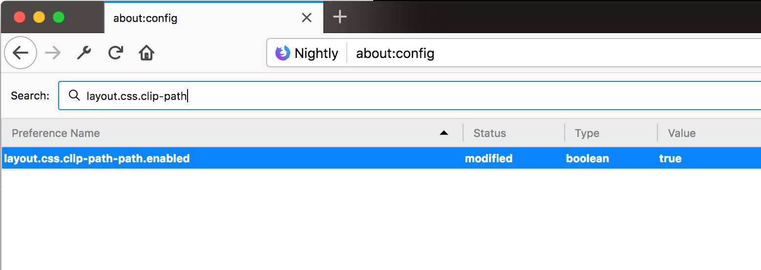
Does anyone know if clip-path: path() is behind a flag in chrome or something. Can't seem to find it, but they do support offset-path: path(), so figured they would support both.
Here's that flag in Firefox (layout.css.clip-path-path.enabled):
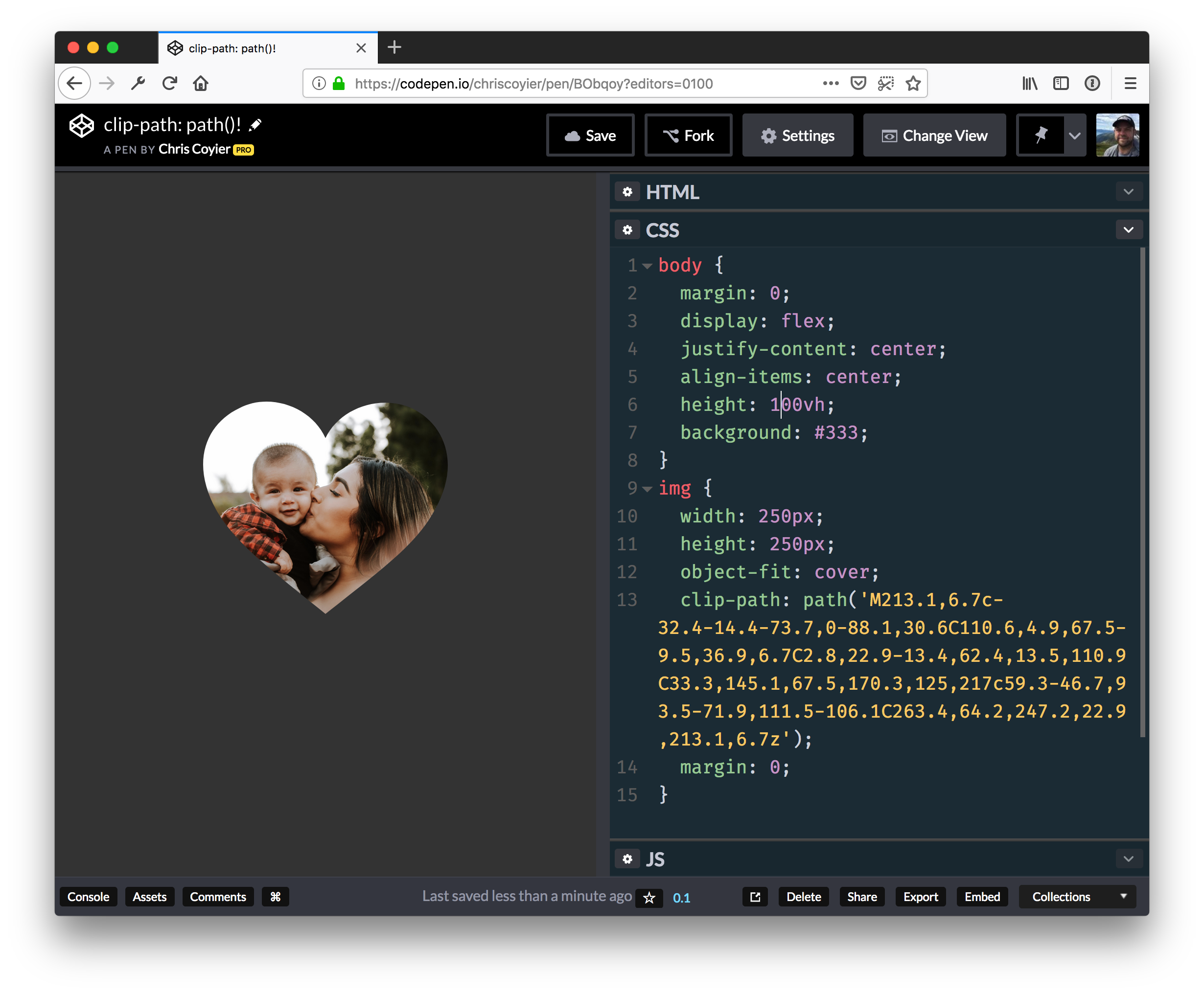
And here's a demo... you'll see a square in unsupported browsers and a heart in the ones that support clip-path: path(); — which is only Firefox Nightly with the flag turned on at the time of this writing.
CSS Shapes Level 1 has been available in Chrome and Safari for a number of years, however, this week it ships in a production version of Firefox with the release of Firefox 62 — along with a very nice addition to the Firefox DevTools to help us work with Shapes. In this article, I’ll take a look at some of the things you can do with CSS Shapes. Perhaps it’s time to consider adding some curves to your designs?
What Are CSS Shapes?
The CSS Shapes specification Level 1 defines three new properties:
shape-outside
shape-image-threshold
shape-margin
The purpose of this specification is to allow content to flow around a non-rectangular shape, something which is quite unusual on our boxy web. There are a few different ways to create shapes, which we will have a look at in this tutorial. We will also have a look at the Shape Path Editor, available in Firefox, as it can help you to easily understand the shapes on your page and work with them.
In the current specification, shapes can only be applied to a float, so any shapes example needs to start with a floated element. In the example below, I have a PNG image with a transparent background in which I have floated the image left. The text that follows the image now flows around the right and bottom of my image.
What I would like to happen is for my content to follow the shape of the opaque part of the image, rather than follow the line of the physical image file. To do this, I use the shape-outside property, with the value being the URL of my image. I’m using the actual image file to create a path for the content to flow around.
Note that your image needs to be CORS compatible, so hosted on the same server as the rest of your content or sending the correct headers if hosted on a CDN. Browser DevTools will usually tell you if your image is being blocked due to CORS.
This method of creating shapes uses the alpha channel of the image to create the shape, as we have a shape with a fully transparent area, then all we need do is pass the URL of the image to shape-outside and the shape path follows the line of the fully opaque area.
Creating A Margin
To push the line of the text away from the image we can use the shape-margin property. This creates a margin between the line of the shape and the content running alongside it.
In the case above, we have the image displayed on the page and then the text curved around it. However, you could also use an image as the path for the shape in order to create a curved text effect without also including the image on the page. You still need something to float, however, and so for this, we can use Generated Content.
In this example, we have inserted some generated content, floated it left, given it a width and a height and then used shape-outside with our image just as before. We then get a curved line against the whitespace, but no visible image.
Using A Gradient For Our Shape
A CSS gradient is just like an image, which means we can use a gradient to create a shape, which can make for some interesting effects. In this next example, I have created a gradient which goes from blue to transparent; your gradient will need to have a transparent or semi-transparent area in order to use shapes. Once again, I have used generated content to add the gradient and am then using the gradient in the value for shape-outside.
Once the gradient becomes fully transparent, then the shape comes into play, and the content runs along the edge of the gradient.
Using shape-image-threshold To Position Text Over A Semi-Opaque Image
So far we have looked at using a completely transparent part of an image or of a gradient in order to create our shape, however, the third property defined in the CSS Shapes specification means that we can use images or gradients with semi-opaque areas by setting a threshold. A value for shape-image-threshold of 1 means fully opaque while 0 means fully transparent.
A gradient like our example above is a great way to see this in action as we can change the shape-image-threshold value and move the line along which the text falls to more opaque areas or more transparent areas. This property works in exactly the same way with an image that has an alpha channel yet is not fully transparent.
This method of creating shapes from images and gradients is — I think — the most straightforward way of creating a shape. You can create a shape as complex as you need it to be, in the comfort of a graphics application and then use that to define the shape on your page. That said, there is another way to create our shapes, and that’s by using Basic Shapes.
CSS Shapes With Basic Shapes
The Basic Shapes are a set of predefined shapes which cover a lot of different types of shapes you might want to create. To use a basic shape, you use the basic shape type as a value for shape-outside. This type uses functional notation, so we have the name of the shape followed by brackets (inside which are some values for our shape).
The options that you have are the following:
inset()
circle()
ellipse()
polygon()
We will take a look at the circle() type first as we can use this to understand some useful things which apply to all shapes which use the basic shape type. We will also have a look at the new tools in Firefox for inspecting these shapes.
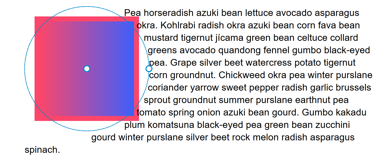
In the example below, I am creating the most simple of shapes: a circle using shape-outside: circle(50%). I’m using generated content again, and I have given the box a background color, and also added a margin, border, and padding to help highlight some of the concepts of using CSS Shapes. You can see in the example that the circle is created centered on the box; this is because I have given the circle a value of 50%. That value is the <shape-radius> which can be a length or a percentage. I’ve used a percentage so that the radius is half of the size of my box.
This is a really good to time have a look at the shape that has been created using the Firefox Shape Path Editor. You can inspect the shape by clicking on the generated content and then clicking the little shape icon next to the property shape-outside; your shape will now highlight.
The Shape Path Editor highlights the circle shape (Large preview)
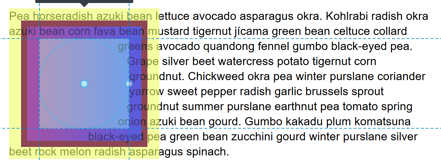
You can see how the circle extends to the edge of the margin on our box. This is because the initial reference box used by our shape is margin-box. You already know something of reference boxes if you have ever added box-sizing: border-box to your CSS. When you do this, you are asking CSS to use the border-box and not the default content-box as the size of elements. In Shapes, we can also change which reference box is used. After any basic shape, add border-box to use the border to define the shape or content-box to use the edge of the content (inside the padding). For example:
You will see the circle appear to become much smaller. It is now using the width of the content — in this case the width of the box at 150px — rather than the margin box which includes the padding, border, and margin.
The content-box is the edge of the content of the square we created with our generated content (Large preview)
Inspecting your element in Firefox DevTools will also show you the reference boxes so you can choose which might give you the best result with your particular shape.
Reference boxes highlighted in Firefox (Large preview)
The Position Value
A second value can be passed to circle() which is a position; if you do not pass this value, it defaults to center. However, you can use this value to pull your circle around. In the next example, I have positioned the circle by using shape-outside(50% at 30%); this changes where the center of the circle is positioned.
Something useful to know is that the same <basic-shape> values can be used as a value for clip-path. This means that after creating a shape, you can clip away the image or background color that extends outside of the shape. In the example below, I am going to do this with our example gradient background, so that we end up with a circle that has text curved around from our square box.
All of the above concepts can be applied to our other basic shapes. Now let’s have a quick look at how they work.
inset()
The inset() value defines a rectangle. This might not seem very useful as a float is a rectangle, however, this value means that you can inset the content wrapping your shape. It takes four values for top, right, bottom, and left plus a final value which defines a border radius.
In the example below, I am using the values to inset the content on the right and bottom of the floated image, plus adding a border radius around which my content will wrap using shape-outside: inset(0 30px 100px 0 round 40px). You can see how the content is now over the background color of the box:
An ellipse is a squashed circle and as such needs two radii for x and y (in that order). You can then push the ellipse around just as with circle using the position value. In the example below, I am creating an ellipse and then using clip-path with the same values to remove the content outside of my shape.
In the above example, I also used shape-margin to demonstrate how we can use this property as with our image generated shapes to push the content away.
polygon()
Creating polygon shapes gives us the most flexibility, as our shapes can be created with three or more points. The value passed to the polygon needs to be three or more pairs of values which represent coordinates.
It is here where the Firefox tools become really useful as we can use them to help create our polygon. In the below example, I have created a polygon with four points. In the Firefox DevTools, you can double-click on any line to create a new point, and double-click again to remove it. Once you have created a polygon that you are happy with, you can then copy the value out of DevTools for your CSS.
As CSS Shapes are applied to a float, in many cases the fallback is that instead of seeing the content wrap around a shape, the content will wrap around a floated element (in the way that content has always wrapped around floats). Browsers ignore properties they do not understand, so if they don’t understand Shapes, it doesn’t matter that the shape-outside property is there.
Where you should take care would be in any situation where not having shapes could mean that content overlaid an area which made it difficult to read. Perhaps you are using Shapes to push content away from a busy area of a background image, for example. In that case, you should first make sure that your content is usable for the non-Shapes people, then use Feature Queries to check for support of shape-outside and overwrite that CSS and apply the shape. For example, you could use a margin to push the content away for non-Shapes visitors and remove the margin inside your feature query.
.content {
    margin-left: 120px;
}

@supports (shape-outside: circle()) {
    .content {
        margin-left: 0;
        /* add the rest of your shapes CSS here */
    }

}
With Firefox releasing their support we now only have one main browser without support for Shapes — Edge. If you want to see Shapes support across the board you could go and vote for the feature here, and see if we can encourage the implementation of the feature in Edge.
Find Out More About CSS Shapes
In this article, I’ve tried to give a quick overview of some of the interesting things that are possible with CSS Shapes. For a more in-depth look at each feature, check out the Guides to CSS Shapes over at MDN. You can also read a guide to the Shape Path Editor in Firefox.
This is a guest contribution from JT Ripton, a Freelance writer from Tampa.
Image via Flickr by auggie tolosa
Intellectual property law protects much of the content that you enjoy on the internet. Though you aren’t always required to pay to enjoy this content, that doesn’t make it free for all types of use. Since many intellectual property laws haven’t yet been adapted specifically for the Internet, here’s a rundown of the basics you can use to safely guide your decisions.
Photos and Images are Not Free for Use
Quick and simple searches like Google Images make it seem like the Internet is overflowing with free photos and images. However, copyright law protects most of these photos. If you’re looking for images you can post on your blog, you need to look for those with a Creative Commons license. You can also pay for rights to use certain images.
Creative Commons Licenses Come in Different Forms
Creative Common licenses give you access to various forms of intellectual property. There are many different types of Creative Commons licenses. Before using something that’s protected under this type of license, you must carefully look at it to decide exactly how you can use the image. Some licenses allow commercial use while others do not. Some allow you to alter an image while others stipulate that it must stay in its original form. Attribution is typically required.
Most Movies, Music, and Television are Protected
Although there are many sites where you can get access to movies, television shows, and music for free, these downloads are typically illegal. Though the sites themselves are not violating any laws, you are if you share or download copyrighted material. You can legally view some movies and shows online, but you cannot download them. Network sites often show recent episodes of popular shows and sites like Netflix and Hulu offer access to movies and shows with a paid subscription.
Plagiarism Isn’t Just for School Papers
You undoubtedly learned about the dangers of plagiarism in high school and college, but these laws’ importance doesn’t end when you’re finished writing term papers and dissertations. Whether you have a blog yourself or you write for others, you cannot reproduce another’s intellectual property and take credit for it as your own. Cite your sources, use quotation marks when needed, and try to limit your works to your own unique ideas as much as possible. Referencing another article and quoting from a book are fine. Reposting an entire article or chapter of a published piece are not.
Permission Trumps All
When in doubt about a work, simply ask for permission to use it. Just as the Internet make it easy to find works, so too does it make it easy to contact creators. Many will gladly give you the necessary permissions when requested.
The Internet is a great forum for sharing everything from thoughts and ideas to your original photos, films, and musical works. However, it’s essential that you always think about who has the rights to the content in question and act so that you do not violate them.
JT Ripton is a Freelance writer from Tampa, FL, he writes about several of his interests including, blogging, all things tech, and useful tips and idea’s for a myriad of things. He likes to write to inform and intrigue.
5 Intellectual Property Laws about the Internet Bloggers Need to Know http://www.problogger.net/archives/2013/08/16/5-intellectual-property-laws-about-the-internet-bloggers-need-to-know/ http://www.problogger.net/archives/category/miscellaneous-blog-tips/feed/ @ProBlogger» Miscellaneous Blog Tips Blog Tips to Help You Make Money Blogging – ProBlogger http://www.problogger.net/wp-content/plugins/podpress/images/powered_by_podpress_large.jpg


