Recruiting and hiring call center employees can be a pain, but it doesn’t have to be so bad. For example, depending on the roles you’re looking to hire, you may not even have to write a job description—because you can just use ours instead. Below, we’ve put together four of […]
New month, new wallpapers! To cater for a fresh dose of colorful inspiration on a regular basis, we embarked on our monthly wallpapers journey more than 13 years ago. It’s the perfect occasion for creatives to put their artistic skills to the test, indulge in a little project just for fun, or tell the story they’ve always wanted to tell. Of course, it wasn’t any different this time around.
In this post, you’ll find beautiful, unique, and inspiring wallpapers for April 2024. Created with love by artists and designers from across the globe, they come in versions with and without a calendar and can be downloaded for free. As a little bonus goodie, we also added some April favorites from our wallpapers archives to the collection — maybe you’ll rediscover one of your almost-forgotten favorites in here, too? A big thank you to everyone who shared their designs with us this month! Happy April!
You can click on every image to see a larger preview,
We respect and carefully consider the ideas and motivation behind each and every artist’s work. This is why we give all artists the full freedom to explore their creativity and express emotions and experience through their works. This is also why the themes of the wallpapers weren’t anyhow influenced by us but rather designed from scratch by the artists themselves.
Submit a wallpaper! Did you know that you could get featured in our next wallpapers post, too? We are always looking for creative talent.
Oceanic Wonders
“Celebrate National Dolphin Day on April 14th by acknowledging the captivating beauty and importance of dolphins in our oceans!” — Designed by PopArt Studio from Serbia.
“Live life to the fullest by daring to dream big, seizing every moment with purpose, and embracing challenges as opportunities for growth. Cultivate meaningful relationships, savoring shared experiences and creating lasting memories. Find joy in the ordinary, appreciate the beauty of the world around you, and always strive to make a positive impact, leaving a legacy of fulfillment and happiness.” — Designed by Hitesh Puri from Delhi, India.
“Through this design, I aim to capture the essence of Baisakhi, a celebration of gratitude, unity, and the bountiful blessings of nature. In creating my Baisakhi artwork, I was inspired by the timeless imagery of wheat fields and dancing figures. The golden grains symbolize abundance and prosperity, while the lively dancers represent the joyous spirit of the harvest season.” — Designed by Cronix Web from the United States.
“Inspired by the timeless tradition of giving and sharing during Eid, my wallpaper design depicts the happiness of being together with family, the soft light of the Eid moon, and the cheerful feeling of celebration.” — Designed by Cronix Web from the United States.
“Our April calendar needs not mark any special occasion — April itself is a reason to celebrate. It was a breeze creating this minimal, pastel-colored calendar design with a custom lettering font and plant pattern, for the ultimate spring feel.” — Designed by PopArt Studio from Serbia.
“Despite the threat that has befallen us all, we all look forward to the awakening of a life that spreads its wings after every dormant winter and opens its petals to greet us. Long live spring, long live life.” — Designed by LibraFire from Serbia.
“March 26 was Solitude Day. To celebrate it, here is the picture about the loneliest house in the world. It is a real house, I found it on Youtube.” — Designed by Vlad Gerasimov from Georgia.
“Inspired by the Black Forest, which is beginning right behind our office windows, so we can watch the perpetual circle of nature, when we take a look outside.” — Designed by Nils Kunath from Germany.
“‘Sweet spring is your time is my time is our time for springtime is lovetime and viva sweet love,’ wrote E. E. Cummings. And we have a question for you. Is there anything more refreshing, reviving, and recharging than nature in blossom? Let it inspire us all to rise up, hold our heads high, and show the world what we are made of.” — Designed by PopArt Studio from Serbia.
“This month is International Guitar Month! Time to get out your guitar and play. As a graphic designer/illustrator seeing all the variations of guitar shapes begs to be used for a fun design. Search the guitar shapes represented and see if you see one similar to yours, or see if you can identify some of the different styles that some famous guitarists have played (BTW, Prince’s guitar is in there and purple is just a cool color).” — Designed by Karen Frolo from the United States.
“We love the art direction, story, and overall cinematography of the ‘Wildest Dreams’ music video by Taylor Swift. It inspired us to create this illustration. Hope it will look good on your desktops.” — Designed by Kasra Design from Malaysia.
“It’s spring already, my favorite season! You can smell it, you can see it, you can feel it in the air. Trees blossom, the grass is smiling at the sun, everything is so eager to show itself.” — Designed by Vane Kosturanov from Macedonia.
“April is the month of spring or autumn depending where you live on the globe! It’s also the second rainiest month of the year. I was inspired by one simple motif to illustrate rain, birds, and flowers. So whether you witness rainy days or colorful ones… enjoy April!” — Designed by Rana Kadry from Egypt.
“My inspiration was the arrival of spring that transmits a sense of calmness and happiness through its beautiful colors.” — Designed by Margarida Granchinho from Portugal.
“I designed this playful and fun wallpaper inspired by nature that is present during the early spring.” — Designed by Marla Gambucci from the United States.
“The day revolves around parents taking their children to work to expose them to future job possibilities and the value of education. It’s been an annual event since 1992 and helps expose children to the possibilities of careers at a young age.” — Designed by Ever Increasing Circles from the United Kingdom.
Electronic voices have been destined to answer phone calls ever since Bell Labs invented the Voder machine at the tail-end of the 1930s. These days, everybody and their mother has been greeted by an IVR (interactive voice response) phone system to walk them through a customer service calling menu in […]
Hey all you wonderful developers out there! In this post we are going to explore the use of :has() in your next web project. :has() is relatively newish but has gained popularity in the front end community by delivering control over various elements in your UI. Let’s take a look at what the pseudo class is and how we can utilize it.
Syntax
The :has() CSS pseudo-class helps style an element if any of the things we’re searching for inside it are found and accounted for. It’s like saying, “If there’s something specific inside this box, then style the box this way AND only this way.”
:has(<direct-selector>) {
  /* ... */
}
“The functional :has() CSS pseudo-class represents an element if any of the relative selectors that are passed as an argument match at least one element when anchored against this element. This pseudo-class presents a way of selecting a parent element or a previous sibling element with respect to a reference element by taking a relative selector list as an argument.”
For a more robust explanation, MDN does it perfectly
The Styling Problem
In years past we had no way of styling a parent element based on a direct child of that parent with CSS or an element based on another element. In the chance we had to do that, we would need to use some JavaScript and toggle classes on/off based on the structure of the HTML. :has() solved that problem.
Let’s say that you have a heading level 1 element (h1) that is the title of a post or something of that nature on a blog list page, and then you have a heading level 2 (h2) that directly follows it. This h2 could be a sub-heading for the post. If that h2 is present, important, and directly after the h1, you might want to make that h1 stand out. Before you would have had to write a JS function.
This JS function is looking for all the h1’s that have a h2 proceeding it, and applying a class of highlight-content to make the h1 stand out as an important article.
New and improved with modern day CSS coming in hot! The capabilities of what we can do in the browser have come a long way. We now can take advantage of CSS to do things that we traditionally would have to do with JavaScript, not everything, but some things.
New School Way – CSS
h1:has(+ h2) {
    color: blue;
}
Throw Some :has() On It!
Now you can use :has() to achieve the same thing that the JS function did. This CSS is checking for any h1 and using the sibling combinator checking for an h2 that immediately follows it, and adds the color of blue to the text. Below are a couple use cases of when :has() can come in handy.
:has Selector Example 1
HTML
<h1>Lorem, ipsum dolor.</h1>
	<h2>Lorem ipsum dolor sit amet.</h2>
	<p>Lorem, ipsum dolor sit amet consectetur adipisicing elit. Eius, odio voluptatibus est vero iste ad?</p>

	<h1>Lorem, ipsum dolor.</h1>
	<h2>Lorem ipsum dolor sit amet.</h2>
	<p>Lorem, ipsum dolor sit amet consectetur adipisicing elit. Eius, odio voluptatibus est vero iste ad?</p>

	<h1>This is a test</h1>
	<p>Lorem, ipsum dolor sit amet consectetur adipisicing elit. Eius, odio voluptatibus est vero iste ad?</p>
CSS
h1:has(+ h2) {
    color: blue;
}
:has Selector Example 2
A lot of times we as workers on the web are manipulating or working with images. We could be using tools that Cloudinary provides to make use of various transformations on our images, but usually we want to add drop shadows, border-radii, and captions (not to be confused with alternative text in an alt attribute).
The example below is using :has() to see if a figure or image has a figcaption element and if it does, it applies some background and a border radius to make the image stand out.
HTML
<section>
	<figure>
		<img src="https://placedog.net/500/280" alt="My aunt sally's dog is a golden retreiver." />
		<figcaption>My Aunt Sally's Doggo</figcaption>
	</figure>
</section>
Lol the last time I used it I was building keyboard functionality into a tree view, so I needed to detect states and classes of sibling elements, but it wasn’t in Firefox yet so I had to find another solution. 🫠
It is great to see how community members are using modern CSS to solve real world problems, and also a shout out to Abbey using it for accessibility reasons!
Things to Keep in Mind
There are a few key points to keep in mind when using :has() Bullet points referenced from MDN.
The pseudo-class takes on specificity of the most specific selector in its argument
If the :has() pseudo-class itself is not supported in a browser, the entire selector block will fail unless :has() is in a forgiving selector list, such as in :is() and :where()
The :has() pseudo-class cannot be nested within another :has()
Pseudo-elements are also not valid selectors within :has() and pseudo-elements are not valid anchors for :has()
Conclusion
Harnessing the power of CSS, including advanced features like the :has() pseudo-class, empowers us to craft exceptional web experiences. CSS’s strengths lie in its cascade and specificity…the best part, allowing us to leverage its full potential. By embracing the capabilities of CSS, we can drive web design and development forward, unlocking new possibilities and creating groundbreaking user interfaces.
Google Secret Manager is a cloud service where you can store sensitive data such as passwords, database credentials, encryption keys or any other confidential information that you don’t want to hardcode in your application’s source code. You can also set up an expiration time for the secret and the Google Secret Manager will automatically delete the secret after the specified time.
The following guide explains how you can use Google Apps Script to access secrets stored in the Google Secret Manager. But before we proceed, let’s first create a secret in the Google Secret Manager.
2. Go to the Library section of your Google Cloud project and enable the Secret Manager API.
3. Go to the IAM & Admin > IAM section of your Google Cloud. Click on Grant Access and add the Secret Manager Secret Accessor role to the Google account from which you want to access the secrets stored in the Google Secret Manager.
Create a Secret in Google Secret Manager
Now that you have enabled the Secret Manager API and granted access to your Google account, let’s create a new secret in the Google Secret Manager.
Go to the Secret Manager and click on the Create Secret button to create a new secret.
Give your secret a name and add the secret value - this could be a plain text string, or you can upload a binary file up to 64KB in size. If you would like the secret to expire after a certain time, you can set an expiration time for the secret.
In the above example, I have created a secret named MyBankPassword with the value MySuperSecretPassword. Google Secret Manager will automatically assign a version number (1) to the secret. You cannot change the secret value once it has been saved but you can create a new version of the secret with a different value.
Access Google Secret Manager from Google Apps Script
Now that you have created a secret in the Google Secret Manager, let’s write a Google Apps Script that will fetch the secret value from the Google Secret Manager.
Go to script.new to create a new Google Apps Script project. Go to the Project Settings and enable the Show appsscript.json manifest file in editor option. Switch to the appsscript.json tab and add the following OAuth scopes to the manifest file:
Next, add the following function to your Google Apps Script project. Replace the project_id, secret_id, and version_id variables with the actual values of your secret.
The project_id is the project number of your Google Cloud project and can be found in the Google Cloud Console here.
After you have added the function to your Google Apps Script project, run the main function to fetch the secret value from the Google Secret Manager and log it to the Google Apps Script Logger.
constmain=()=>{const project_id ='<<YourProjectId>>';const secret_id ='<<YourSecretId>>';const secret_value =getSecretValue_({ project_id, secret_id });
Logger.log('The secret value for %s is %s', secret_id, secret_value);};constgetSecretValue_=({ project_id, secret_id, version_id =1})=>{const endpoint =`projects/${project_id}/secrets/${secret_id}/versions/${version_id}:access`;const api =`https://secretmanager.googleapis.com/v1/${endpoint}`;const response = UrlFetchApp.fetch(api,{method:'GET',headers:{Authorization:`Bearer ${ScriptApp.getOAuthToken()}`,'Content-Type':'application/json',},muteHttpExceptions:true,});const{ error, payload }=JSON.parse(response.getContentText());// If there was an error, throw an exception// The secret may not exist or the user may not have access to itif(error){thrownewError(error.message);}// The secret value is Base64-encoded, so we need to decode itconst bytes = Utilities.base64Decode(payload.data);const base64 = bytes.map((byte)=>`%${byte.toString(16).padStart(2,'0')}`).join('');const secretValue =decodeURIComponent(base64);return secretValue;};
Do you want to restrict some of your WordPress content to registered or paid users?
Often, bloggers use subscriptions or one-time payment models to monetize content on their websites. This is easy to set up if you have the right WordPress plugin.
In this article, we will show you how to restrict content to registered users in WordPress.
Why Restrict Content to Registered Users?
If you are running a membership site or want to monetize your WordPress blog, then restricting content access is a great way to make money online.
You can lock specific pages and encourage users to subscribe to a premium plan to access the exclusive content.
For example, let’s say you have multiple guides on your site. You can turn them into an eBook and restrict that content to paying members only. Similarly, if you have a video section or online courses, then you can lock them for your paid subscribers.
Restricting content to registered users also helps build a community. You can set up a forum, a Facebook group, or a Discord server exclusively for members. This way, you can add more value for registered users.
That said, let’s look at how you can easily restrict content in WordPress for registered users. We will share 2 methods using a premium and a free plugin. You can click the links below to jump to your preferred method:
Method 1: Restrict Content to Registered Users Using MemberPress (Recommended)
The easiest way to lock content access is by creating memberships using the MemberPress plugin. It is the best membership plugin for WordPress and helps you make money by charging a one-time or recurring fee for exclusive content.
MemberPress is a premium plugin, and you will need at least the Basic plan to get started. WPBeginner users can enjoy up to 60% off by using our MemberPress coupon.
First, you will need to download and install the MemberPress plugin. If you need help, then please see our guide on how to install a WordPress plugin.
Upon activation, you will need to head to MemberPress » Settings from the WordPress dashboard and head to the ‘License’ tab.
From here, simply enter the license key and click the ‘Activate License Key’ button. You can find the key in your MemberPress account area.
After that, you will need to switch to the ‘Payments’ tab and add a payment gateway. Go ahead and click the ‘+ Add Payment Method’ button.
MemberPress works with many top payment providers like PayPal, Stripe, and Authorize.net.
Simply enter a name for your payment option and click the ‘Gateway’ dropdown menu to select a service.
Step 2: Create Membership Levels
Once you’ve connected a payment provider to MemberPress, the next step is to create different membership levels. With each membership, you can specify the level of access a user has for viewing restricted content.
To start, simply go to MemberPress » Memberships from the WordPress admin panel and click the ‘Add New’ button.
Next, you can enter a title for your new membership and add a description if you want.
In the right panel, you will see options for setting the price and expiration of your membership plan. For instance, you can select the billing type as recurring or one-time and choose the interval to be yearly, monthly, weekly, or custom.
After that, you can scroll down to the Membership Options meta box.
Here, you will see different options for editing the registration button text, customizing permissions, and other membership options.
Once you are satisfied with the membership level, simply click the ‘Publish’ button.
Now, go ahead and repeat these steps to create as many membership plans as you want.
Step 3: Restricting Content in WordPress for Registered Users
After setting up membership plans, the next step is to lock content on your site for registered users.
To start, you can head to the MemberPress » Rules page and then click the ‘Add New’ button.
On the next screen, you select the content to protect and set up conditions for accessing it.
First, you can click the dropdown menu under ‘Protected Content’ and pick the piece of content you want to restrict.
MemberPress offers multiple conditions to choose from. There is an option to protect all content, pages under certain categories or tags, a single post or page, and more.
If you want to restrict multiple pages, then you can create a category on your site, pick the ‘All Content with Category’ option, and choose multiple pieces of content to restrict.
Similarly, you can also add tags to specific pages and use the ‘All Content with Tag’ option in MemberPress to restrict access.
For the sake of this tutorial, we choose to protect a ‘A Single Page’ and then enter the title of the page.
Next, you will need to click the dropdown menu under ‘Access Conditions’ and select the ‘Membership’ option.
From here, MemberPress will ask you to select a membership level to allow access to the content.
You can also add multiple membership levels by clicking the ‘+’ icon under Access Content and selecting the memberships that can view your content.
Next, you can scroll down to the ‘MemberPress Unauthorized Access’ metabox.
Here, you will find options to show what logged-out or unregistered users will see when trying to view the content.
When you are done, you can simply scroll to the top.
From here, click the ‘Save Rule’ button.
You’ve now successfully restricted content for registered users on your WordPress website.
MemberPress also allows you to create a pricing page, redirect unregistered users to the pricing page, set up a login form, and much more.
Method 2: Lock Content to Registered Users Using Restrict Content (Free)
If you are looking for a free way to restrict content to registered users, then you can use the free plan of the Restrict Content Pro plugin.
To start, you will need to visit the Restrict Content Pro website and click the ‘Get Started’ button.
After that, you can sign up for a free account.
Simply click the ‘Get started’ button under the Free plan.
Next, you will see a popup window.
Go ahead and enter your email address and click the ‘Get Your Free Plugin’ button.
Once you click the button, you will receive an email from Restrict Content Pro with the download link for the free plugin.
From here, you can download the plugin and then install and activate it. If you need help, then please see our guide on how to install a WordPress plugin.
Step 1: Set Up the Restrict Content Plugin
Upon activation, you can head to Restrict » Settings from the WordPress admin panel and go to the ‘General’ tab.
Next, you need to select your registration, success, account management, edit profile page, and billing update pages.
After that, you must click on the ‘Payments’ tab to configure your payment gateway. You will be asked to choose a currency and then select your payment gateways.
For instance, you can click the ‘Connect with Stripe’ button and follow the onscreen instructions to configure the payment service.
Next, you can switch to the ‘Misc’ tab.
There are some important options available in this tab. You can set up login page redirects, disable account sharing, control form CSS, send IPN emails, and set up reCAPTCHA for registration forms to prevent spam registrations.
Step 2: Create Subscription Levels for Restricted Content
Now, we are ready to create subscription levels for your restricted content.
For example, you can create a subscription level ‘Premium‘ and set a price for it. When you are restricting content on your website, you will be able to choose the subscription level a user must have in order to access that content.
To get started, you can head to Restrict » Memberships Levels from the WordPress dashboard.
Creating a subscription level in Restrict Content Pro is simple. Simply give your subscription level a title, a description, and a price. You can set the price to zero if you want to create a subscription level for registered non-paying users.
You can choose the duration of a subscription level or set it to 0 to make the duration unlimited.
Lastly, you need to set the status to ‘Active’ and choose the ‘User Role‘ that will be assigned to people after signing up.
Once you are done, simply click the ‘Add Membership Level’ button.
You can now repeat this step to add as many membership levels as you want on your website.
Step 3: Lock Content for Registered Users
Now, you are ready to lock content for registered users. Go ahead and edit any post or page on your website.
In the content editor, scroll down to the ‘Restrict this content’ meta box. From here, click the dropdown menu under ‘Member access options’ and pick the ‘Members of membership level(s)’option.
After that, you will see multiple options.
Go ahead and choose the ‘Members of specific membership levels’ option and pick the membership level that can access this content.
That’s it. You’ve successfully locked content for registered users using the Restrict Content Pro plugin.
Bonus: Set Up Content Locking to Grow Your Email List
Content locking is a technique where users must take an action to view content. For instance, you can lock specific pages or guides and encourage people to sign up for your email newsletter or pay a fee to view the content.
The easiest way of setting up content locking in WordPress is by using OptinMonster. It is the best lead generation and conversion optimization software that helps you boost sales, grow your email list, and get more conversions.
OptinMonster offers prebuilt campaign templates and a drag-and-drop builder, making it super easy to customize your campaigns. It also has powerful display rules, which let you choose when and where the campaign will be displayed.
You can enable the Lock Content option from the Display Rules settings and choose whether to blur or remove the locked content.
Then, OptinMonster will restrict access to the blog post or landing page until a user performs the desired action, like entering their email address.
Private Sub DrawRays()

        Dim StepX As Double
        Dim StepY As Double
        Dim VertX As Double
        Dim VertY As Double
        Dim HorizX As Double
        Dim HorizY As Double
        Dim MapX As Long
        Dim MapY As Long
        Dim HorizDist As Double
        Dim VertDist As Double
        Dim WallDistance As Double
        Dim RayHeight As Double
        Dim RayRadians As Double
        Dim RadiansSteps As Double
        Dim RayCount As Long
        Dim RayCounts As Long
        Dim OffSetGrid As Long


        RayCount = imgverticalline.Width

        MapX = Player.MapX
        MapY = Player.MapY
        RadiansSteps = Radian60 / RayCount

        RayRadians = (Player.Radians - Radian30)
        RayCounts = 0
        Do While RayCounts < RayCount
            If (RayRadians > Radian360) Then RayRadians = 0.001
            'Check for horizontal intersections:

            If RayRadians >= 0 And RayRadians <= Math.PI Then 'Facing down
                HorizY = (Fix(player.PosY / ObjectSize) * ObjectSize) + ObjectSize ' Calculate grid position
                HorizX = player.PosX + (HorizY - player.PosY) / Math.Tan(RayRadians)
                StepY = ObjectSize
            ElseIf RayRadians = 0 Or RayRadians = Math.PI Then
                HorizY = player.PosY
                HorizX = player.PosX
            Else 'Facing Up
                HorizY = (Fix(player.PosY / ObjectSize) * ObjectSize) - 1
                HorizX = player.PosX + (HorizY - player.PosY) / Math.Tan(RayRadians)
                StepY = -ObjectSize
            End If

            StepX = StepY / Math.Tan(RayRadians)
            MapX = GetPositionMap(HorizX)
            MapY = GetPositionMap(HorizY)


            Do
                If MapX < 0 Or MapX > 9 Or MapY < 0 Or MapY > 9 Then Exit Do
                If levelmap0(MapY, MapX) = Color.Black Then Exit Do
                HorizX = HorizX + StepX
                HorizY = HorizY + StepY

                MapX = GetPositionMap(HorizX)
                MapY = GetPositionMap(HorizY)

            Loop


            HorizDist = Math.Abs((player.PosX - HorizX) / Math.Cos(RayRadians))

            'Check for vertical intersections:
            If RayRadians < Radian90 Or RayRadians > Radian270 Then 'Facing right
                VertX = (Fix(Player.PosX / ObjectSize) * ObjectSize) + ObjectSize ' Calculate grid position
                VertY = player.PosY + (player.PosX - VertX) * -Math.Tan(RayRadians)
                StepX = ObjectSize
            ElseIf RayRadians = Radian90 Or RayRadians = Radian270 Then
                VertY = Player.PosY
                VertX = Player.PosX
            Else 'Facing left
                VertX = (Fix(Player.PosX / ObjectSize) * ObjectSize) - 1
                VertY = player.PosY + (player.PosX - VertX) * -Math.Tan(RayRadians)
                StepX = -ObjectSize
            End If

            StepY = StepX * Math.Tan(RayRadians)
            MapX = GetPositionMap(VertX)
            MapY = GetPositionMap(VertY)

            Do
                If MapX < 0 Or MapX > 9 Or MapY < 0 Or MapY > 9 Then Exit Do
                If levelmap0(MapY, MapX) = Color.Black Then Exit Do
                VertX = VertX + StepX
                VertY = VertY + StepY

                MapX = GetPositionMap(VertX)
                MapY = GetPositionMap(VertY)
            Loop

            VertDist = Math.Abs((player.PosX - VertX) / Math.Cos(RayRadians))
            Dim VertColor As Color

            If VertDist <= HorizDist Then
                WallDistance = VertDist
                OffSetGrid = VertY Mod ObjectSize
                VertColor = Color.Aqua
            Else
                OffSetGrid = HorizX Mod ObjectSize
                WallDistance = HorizDist
                VertColor = Color.Blue
            End If

            WallDistance = WallDistance * Math.Cos(RayRadians - player.Radians) 'avoiding the Fish Effect
            RayHeight = (ObjectSize / WallDistance) * 200 ' is the height screen\
            If (OffSetGrid = ObjectSize) Then RayHeight -= 1
            'picWall1.DrawTextureVerticalLine(A.MemoryHDC, OffSetGrid, Fix(RayHeight * 4), RayCounts, 5)
            imgverticalline.ForeColor(RGB(VertColor.R, VertColor.G, VertColor.B))
            imgverticalline.DrawLine(RayCounts, imgverticalline.Height / 2 - RayHeight \ 2, RayCounts, imgverticalline.Height / 2 + RayHeight \ 2)
            RayRadians = RayRadians + RadiansSteps
            RayCounts = RayCounts + 1
        Loop

    End Sub
Visual IVRs (Interactive Voice Response) combine traditional IVR technology with visual elements such as images, videos, and menus that make for a fast, user-friendly experience. In call centers where there’s a large volume of incoming calls and customer inquiries to handle, visual IVRs can help customers get their answers more […]
I went to a site that sells wood veneer slat paneling. They make a nice range of products and seem reputable. However, on completing my order I found that my payment options were limited to
shoppay
paypal
gpay
I have never seen a legitimate site that would not let me pay by credit card. There was a chat option and when I clicked on that it opened a chat window where I typed a question, and was immediately told to continue the chat on whatsapp. To do that I woud have to install a QR code reader on my phone, scan the given QR code, then install an app on my phone. Then link my phone to my laptop.
Or I could continue with the whatsapp web app. When I chose that I was immediately led down the rabbit hole again where I would have to install apps on my phone. Then link my phone to my laptop.
The only phone number provided was not a toll free number.
As a first time buyer I was offered a 10% discount on my first order. They emailed me the discount code. Entering the code on the purchase page did apply the discount. The email had an option of "if you have questions just reply to this email". When I did that I got "invalid recipient" and the email was never sent.
I've bought plenty of stuff from Amazon, and even from etsy. I never had this problem. This is not the way to run an online business.
We are often asked about using WordPress for enterprise websites. Is WordPress a good choice for enterprise?
An enterprise website typically refers to a large website with millions of page views. It may also refer to websites run by big-name brands or corporations.
Normally, these organizations have slightly different requirements than small business websites. They need flexible scalability, better access controls, tighter security, and improved performance.
In this article, we’ll look at WordPress for enterprise and share our tips on using WordPress for large-scale enterprise projects.
Here is a break-down of the topics we’ll cover in this article:
WordPress is the world’s most popular website builder, powering more than 43% of all websites on the internet.
In terms of CMS (content management system) software, WordPress dominates the market with a 65% market share. (source: CMS Market Share Study)
The immense popularity of WordPress is due to its flexibility, freedom, and ease of use.
The same reasons that make WordPress a great choice for smaller and medium-sized businesses also make it an excellent option for enterprise clients.
Costs – As a free, open-source platform, WordPress makes it easier to control costs at the enterprise level with the freedom to choose between different providers for hosting, development, support, and administration.
Add-ons and Integrations – With over 59,000 free WordPress plugins, there are a ton of ready-to-use add-ons for WordPress. Want to use a third-party email marketing service or payment gateway? Chances are that there is already an integration available for WordPress.
Expertise – As the most popular platform, plenty of people with high levels of expertise are available for you to hire. Whether you want to hire a developer, SEO manager, or system administrator, you’ll find the best people with years of experience with WordPress.
Security – As open-source software, WordPress is heavily scrutinized for security best practices by the world’s leading security experts. This assures you that if a vulnerability is found, it will be quickly reported and almost immediately patched.
All of this sounds good, but what about the concerns regarding WordPress usage in the enterprise?
Let’s address some of those misconceptions.
Debunking Myths About WordPress in Enterprise
Anything as popular as WordPress often faces myths, stereotyping, and misconceptions.
Generally, such myths are fuelled by competing alternatives to sell their own products or services.
Let’s look at some of those misconceptions about WordPress and debunk them from an enterprise software point of view.
1. WordPress is For Blogs Only
If you look back at the history of WordPress, you’ll find out that it started to solve a blogging software requirement.
That was two decades ago.
Soon after its start, WordPress evolved into a CMS and a full-fledged platform to make any types of websites.
It powers more than 43% of all websites and is used by all sorts of businesses. This includes businesses, big-name brands, popular online stores, subscription-based businesses, software companies, and more.
2. If WordPress is That Great, Why is it Free?
A misconception about WordPress being free is that people think of free as in free coffee. Which WordPress is not.
Users still need to pay for hosting, buying domain name, pay for third-party tools, and more.
WordPress is free, as in ‘freedom.’ It is an open-source software, meaning anyone can download it freely and build whatever they need.
Enterprises widely use free software like WordPress because it helps them cut costs. The biggest tech companies in the world use free software, including Google, Meta, Microsoft, Amazon, and countless others.
Another misconception is that WordPress is less secure than some other software.
Considering the size of WordPress’s market, it is significantly leaps and bounds ahead of any competing software available in terms of security.
Being open source and a crucial component of the Internet ecosystem, its code is consistently monitored, tested, and scrutinized by the world’s top security analysts.
With just some very basic WordPress security setup, it can be further strengthened. From an enterprise perspective, those common-sense security precautions are normal best practices.
The popular game Angry Birds uses WordPress for their website. They use it to make a highly interactive website showcasing videos, sliders, game stories, and more.
With these successful examples in mind, what should you know before using WordPress for enterprise?
Whether you are an enterprise client considering hiring a WordPress agency or an agency taking on a new enterprise customer, the following essential tips will help you easily navigate those challenges.
1. Choose The Right WordPress Enterprise Hosting
One of the major concerns of enterprise clients is the scalability of the platform.
It should be able to handle very high traffic simultaneously, with little to no impact on performance.
This is why you must choose a WordPress hosting platform made specifically for enterprise-grade clients.
We recommend using SiteGround. Their scalable cloud hosting platform is the most flexible managed WordPress enterprise hosting on the market.
You can choose from different levels of server resources for your needs and easily increase them by adding more RAM and processing power as needed.
You can also turn on auto-scaling, which automatically scales server resources in the event of a sudden traffic spike.
It includes daily backups, free CDN, built-in server-level caching, and enhanced security. Not to mention their incredibly outstanding support. Hosting with SiteGround Cloud is like having your own team of DevOps taking care of your hosting infrastructure.
WPBeginner is also hosted on SiteGround’s dedicated cloud cluster. Check out our case study of why we switched to SiteGround.
Need a SiteGround alternative? Take a look at WP Engine. They are the premium among the premium WordPress hosting platforms.
WP Engine offers a rock-solid hosting infrastructure suitable for enterprise. Trusted by top WordPress agencies and several Fortune 500 companies, WP Engine provides unbeatable performance and security.
2. Set up Enterprise Level Security
Security is one of the major concerns for enterprise websites. Poor security could have devastating consequences for an organization’s finances and reputation.
You are halfway there if you follow our earlier advice and select the top enterprise-grade WordPress hosting.
These hosting companies follow the highest security standards to protect your website from malicious attacks.
The next step is to set up a website application firewall (WAF). Now, depending on your hosting provider, you may already have WAF available under your hosting plan.
For instance, SiteGround offers Cloudflare CDN, which provides dual advantages of a CDN and a Web Application Firewall.
However, if your hosting provider doesn’t offer a built-in WAF, then we recommend using Sucuri. It is the best WordPress firewall on the market.
It blocks malicious requests, DDoS and Brute Force attacks, and other suspicious activities before they reach your hosting server.
It also comes with a CDN, which helps you further reduce load on your hosting server while providing faster page load times for your users.
That being said, no website security system is complete without preparing for the worst, which brings us to our next tip: backups.
3. Make Your Own Backups for Redundancy
Almost all enterprise-grade hosting providers offer daily backups and have redundancies built into their systems. This means you won’t lose all your data if something happens to one of their data centers.
This all sounds good on the paper. However, you must always ensure that you have your own backups stored safely as well.
This allows you to control all your website data instead of relying upon your hosting company.
For enterprise-level WordPress backups, we recommend VaultPress by JetPack. You’ll need a paid JetPack plan that includes VaultPress backups.
VaultPress makes incremental backups, which means your backups are always up-to-date. It offers easy 1-click restoration, a full archive of 30-day activity (depending on your site’s overall size), and 10GB of cloud storage.
All Duplicator backup files are fully encrypted to ensure they are secure regardless of where you store them. You can keep as many backups as you want and choose which data to store.
As for storage, you can choose from any of the top cloud storage service providers, including Google Drive, Dropbox, Amazon S3, Microsoft Onedrive, or any Amazon S3-compatible storage provider. You can even store backups on separate servers using SFTP.
4. SEO for Enterprise Level Publications
In a recent study of WordPress for Enterprise, 34% of participating websites were in the Publishing / Media, and 12% were in the Marketing / Advertising industries.
WordPress is an SEO-friendly platform by design. However, at the enterprise level, you would need extra tools and controls to ensure that your content is highly optimized for SEO.
It comes with the most comprehensive set of SEO features you’ll need, including easy on-page optimization tools, advanced schema.org markup support, easy integration with Google Search Console and other webmaster tools, built-in content analysis, headline analyzer, and more.
It allows you to leverage AI to generate SEO titles and descriptions or track internal links across your website.
Most importantly, it comes with SEO user roles that enable website administrators to manage access to crucial areas of the website properly.
Learn more about All in One SEO features that make it the most powerful SEO toolkit for enterprise websites.
For an enterprise project, you may need to give specific users access to different areas of the website to do their jobs.
For instance, you may want writers to be able to submit their articles and editors to review them. You may also want to set up permissions so only authorized users can publish content or change the website.
WordPress comes with a robust user roles and permissions management system out of the box. You can assign user roles that give them specific permissions on the website.
For other things, like SEO, you can use All in One SEO to give your SEO team access to areas where they need to work.
You can even create custom user roles where you can combine different permissions.
For better publishing tools, we recommend using PublishPress. It is a publishing suite for WordPress that gives you robust access control and editorial workflow tools.
It comes with several plugins to improve publishing workflows on a WordPress website. Whether you want to let multiple authors collaborate, add a checklist for writers, create custom user roles, or schedule content updates, PublishPress has you covered.
Many enterprise clients need to serve multilingual content for audiences in different regions.
WordPress does not support multilingual content out of the box. However, there are two excellent routes that enterprise clients take to manage multilingual websites.
The first one is to build a WordPress multisite network. This allows you to have a subdomain or directory for each language. Each subsite can use the same theme and plugins but localized content.
The downside of this method is that it can quickly get quite complicated to manage. Search Engines may consider sub-domains to be unique sites, and if you run an eCommerce store, this adds an extra layer of complexity.
TranslatePress allows you to easily translate any content on your WordPress website, including WordPress themes and plugins.
It has a robust translation management system that makes it super easy to manage all the languages you want to add to your site. It has an easy language switcher, allowing users to select a language.
Plus, with TranslatePress, you can easily add translator accounts and outsource translation tasks to third-party agencies.
Alternative solution: WPML is an equally capable WordPress multilingual plugin.
Frequently Asked Questions About WordPress for Enterprise
Following are some of the most commonly asked questions about WordPress for the enterprise that our users have asked us.
1. Is WordPress good at the enterprise level?
Yes. WordPress is excellent at the enterprise level. It is flexible and highly customizable for any enterprise-grade website. Plus, it is open-source, which gives enterprise clients more options to build upon it. This is why even the top tech companies like Microsoft, Meta, Nvidia, and many more prefer it as a CMS solution for their enterprise websites.
2. What does enterprise WordPress mean?
Enterprise WordPress means WordPress for large businesses, multinational companies, big publication companies, non-profits and government agencies, universities, and more. At the enterprise level, these organizations may need additional scalability, security, and customization features compared to regular WordPress websites.
3. How much a WordPress website costs at the enterprise level?
The costs of a WordPress website at the enterprise level usually end at the highest. WordPress needs a more robust hosting infrastructure at the enterprise level to ensure scalability, security, and redundancies. Costs are also associated with any custom development of plugins and themes, additional third-party integrations, system administration, maintenance, and ongoing support. Depending on a business’s need, it could cost thousands of dollars monthly.
We hope this article gave you a good understanding of WordPress for enterprise and busted common myths about WordPress at the enterprise level.
You may also want to take a look at our complete WordPress security guide, which talks more about securing WordPress websites, or take a look at our comprehensive list of essential WordPress plugins for all kinds of websites, including enterprise websites.
If you liked this article, then please subscribe to our YouTube Channel for WordPress video tutorials. You can also find us on Twitter and Facebook.
I have had my fair share of projects that have given me life because of what I accomplished, as well as those that have cost me life when I reflect on the terrible stress they caused. I know I’m not unique that way; sometimes, my work makes me feel like a rock star and other times, I question whether I should be a developer at all. Some projects test you — like really test you.
In the first week of December 2023, I got a contract to rebuild an entire web app from the ground-up using a new technology designed to be launched alongside a “new year, new system” initiative heading into 2024.
I think you know where this is going. I built up a lot of confidence heading into the project but soon found that I had bitten off way more than I could chew. The legacy code I inherited was the epitome of “legacy” code, and its spaghetti nature needed more than one developer to suss out. The project looked doomed from the beginning, and I hadn’t even written a line of code!
I quit the job. After weeks of stress-laden sleep, I simply couldn’t stomach the work. I actually dreaded work altogether. And with that dread came doubts about my career and whether I should start looking outside the industry.
Is this starting to sound familiar?
That job wasn’t just a project that posed a personal challenge; no, it was a battle for my mental health. I was officially burned out. Thankfully, I was relieved of some pressure when, to my surprise, the client was weirdly understanding and offered to bring in an additional developer to share the load. That really helped, and it gave me what I needed to roll my sleeves back up and finish the job.
Is This Success?
The project launched, and the client was happy with it. But I still experience aftershocks, even today, where the trauma from that contract seeps back in and reminds me just how awful it was and the extent to which it made me question my entire career.
So, even though the project was ultimately a success, I wouldn’t say it was “successful.” There was a real non-monetary cost that I paid just for taking the job.
I’m sure it is the same for you. We’ve all had stressful projects that push us to the brink of what feels like self-destruction. It’s clear because there are so many other articles and blog posts about it, all offering insightful personal advice for relieving stress, like exercise, sleep, and eating right.
In fact, as I reflected back on projects that predated this one particular nightmare, I realized there had been other projects I’d taken that had likely contributed to the burnout. Interestingly, I found a few common threads between them that I now use as “warning flags” going into new work.
All of our experiences are unique to us, and there is no standard recipe for managing stress and protecting your mental health. Advice in this area is always best described as “your mileage may vary” for no other reason than that it is scoped to a specific individual. True, one’s experiences can go so far as to help someone through a tough situation. I find it’s the same thing with self-help books — the best advice is usually the same advice found elsewhere, only articulated better or in a way that resonates with you.
Think of this article as more of my personal story of experiences safeguarding my mental health when finding myself in super specific work situations.
The Urgent Hotfix
Remember that project with the “comfortable” deadline? Yeah, me neither. It’s that common thing where you ask when the project needs to be completed, and you get back a sarcastic “last Tuesday.”
In this particular instance, it was a usual Monday morning. There I was, still in bed, happily rested after a fulfilling weekend. Then Slack started blasting me with notifications, all of which were in the vein of,
“Hey, users can’t make payments on the app — urgent!”
You can fault me for having Slack notifications enabled early on a Monday. But still, it killed my good mood and practically erased whatever respite I gained from the weekend. But I got up, headed over to the laptop, and began working as quickly as the day had started.
The timeline for this sort of fix is most definitely a “due last Tuesday” situation. It’s urgent and demands immediate attention at the expense of dropping everything else. There’s nothing easygoing about it. The pressure is on. As we were all trying to fix the bug, the customer support team also added to the pressure by frequently reporting the rising number of users having difficulties processing payments.
We read through this huge codebase and ran different kinds of tests, but nothing worked. I think it was around 40 minutes before the deadline that a colleague came across a Reddit post (dated six years ago or so) that had the solution in it. I tell you, that bug stood no chance. We finally got the payment system up and running. I was relieved, but at what cost?
What I Learned About HotFixes
Urgent hotfixes are a reality for most developers I know. They sort of come with the territory. But allowing them to take away your well-earned peace of mind is all too easy. A day can go from peaceful to panicking with just one Slack notification, and it may happen at any time, even first thing on a Monday morning.
What I’d Do Differently
It’s funny how Slack is called “Slack” because it really does feel like “slacking off” when you’re not checking in. But I can tell you that my Slack notifications are now paused until more reasonable hours.
Yes, it was a very real and very urgent situation, but allowing it to pull me completely out of my personal time wasn’t the best choice. I am not the only person on the team, so someone else who is already readily available can take the call.
After all, a rested developer is a productive developer, especially when faced with an urgent situation.
The Pit Of Procrastination
I once got myself into a contract for a project that was way above my skill set. But what’s that thing developers love saying, “Fake it ’til you make it,” or something like that? It’s hard to say “no” to something, particularly if your living depends on winning project bids. Plus, I won’t lie: there’s a little pride in not wanting to admit defeat.
When I accepted the job, I convinced myself that all I needed was two full days of steady focus and dedication to get up to speed and knock things out. But guess what? I procrastinated.
It actually started out very innocently. I’d give myself a brain break and read for 30 minutes, then maybe scroll through socials, then switch to YouTube, followed by… you get the picture. By the time I realize what happened, I’m several hours off schedule and find stress starting to harbor and swell inside me.
Those half hours here and there took me right up to the eleventh hour.
Unfortunately, I lost the contract as I couldn’t hit my promised timeline. I take full responsibility for that, of course, but I want to be honest and illustrate the real consequences that happen when stress and fear take over. I let myself get distracted because I was essentially afraid of the project and wasn’t being honest with myself.
What I Learned About Procrastination
The “fake it ’til you make it” ethos is a farce. There are relatively “safe” situations where getting into unfamiliar territory outside your skillset is going to be just fine. However, a new client with a new project spending new money on my expertise is not one of them.
Saying “yes” to a project is a promise, not a gamble.
And I’m no longer gambling with my client’s projects.
What I’d Do Differently
Learning on the job without a solid plan is a bad idea. If a project screams “out of my league,” I’ll politely decline. In fact, I have found that referring a client to another developer with the right skill set is actually a benefit because the client appreciates the honesty and convenience of not having to find another lead. I actually get more work when I push away the work I’m least suited for.
The Unrealistic Request
This happened recently at a startup I volunteered for and is actually quite funny in hindsight. Slack chimed in with a direct message from a marketing lead on the team:
“Hi, we are gonna need to add an urgent feature for a current social media trend. Can you implement it ASAP?”
It was a great feature! I dare say I was even eager to work on it because I saw its potential for attracting new users to the platform. Just one problem: what exactly does “ASAP” mean in this instance? Yes, I know it’s “as soon as possible,” but what is the actual deadline, and what’s driving it? Are we talking one day? One week? One month? Again, startups are famous for wanting everything done two weeks ago.
But I didn’t ask those questions. I dropped everything I was doing and completed the feature in two weeks’ time. If I’m being honest, there was also an underlying fear of saying “no” to the request. I didn’t want to disappoint someone on my team.
That’s the funny part. “ASAP” was really code for “as soon as possible with your current workload.” Was that communicated well? Definitely not. Slack isn’t exactly the best medium for detailed planning. I had a lot more time than I thought, yet I let myself get swept up by the moment. Sure, I nailed the new feature, and it did indeed attract new users — but again, at what cost? I patted myself on the back for a job well done but then swiveled my chair around to realize that I was facing a pile of work that I let mount up in the meantime.
And thus, the familiar weight of stress began taking its typical toll.
What I Learned About Unrealistic Requests
Everything has a priority. Someone else may have a pressing deadline, but does it supersede your own priorities? Managing priorities is more of a juggling act, but I was treating them as optional tasks that I could start and stop at will.
What I’d Do Differently
There are two things I’d do differently next time an unrealistic request comes up:
First, I’ll be sure to get a firm idea of when the request is actually needed and compare it to my existing priorities before agreeing to it.
Second, I plan on saying “no” without actually saying it. How different would the situation have been had I simply replied, “Yes, if...” instead, as in, “Yes, if I can complete this thing I’m working on first, then I’d be happy to jump on that next.” That puts the onus on the requester to do a little project management rather than allowing myself to take on the burden carte blanche.
The 48-Hour Workday
How many times have you pulled an all-nighter to get something done? If the answer is zero, that’s awesome. In my experience, though, it’s come up more times than I can count on two hands. Sometimes it’s completely my doing; I’ll get sucked into a personal side project or an interesting bug that leads to hours passing by like minutes.
I have more than a few friends and acquaintances who wear sleepless nights like merit badges as if accumulating them is somehow a desirable thing.
The most recent example for me was a project building a game. It was supposed to be pretty simple: You’re a white ball chasing red balls that are flying around the screen. That might not be the most exciting thing in the world, but it was introducing me to some new coding concepts, and I started riding a wave I didn’t want to leave. In my head, this little game could be the next Candy Crush, and there was no way I’d risk losing success by quitting at 2:00 a.m. No way.
To this day, the game is sitting dormant and collecting digital dust in a GitHub repository, unfinished and unreleased. I’m not convinced the five-day marathon was worth it. If anything, it’s like I had spent my enthusiasm for the job all at once, and when it burned me out, I needed a marathon stretch of sleep to get back to reality.
What I Learned About All-Nighters
The romanticized image of a fast-typing developer sporting a black hoodie in a dark room of servers and screens only exists in movies and is not something to emulate. There’s a reason there are 24 hours in a day instead of 48 — we need breaks and rest, if for nothing else, to be better at what we do. Mimicking a fictional stereotype is not the path to becoming a good developer, nor is it the path to sustainable living conditions.
What I’d Do Differently
I’m definitely more protective of the boundaries between me and my work. There’s a time to work, just as there’s a time for resting, personal needs, and even a time for playing.
That means I have clearly defined working hours and respect them. Naturally, there are days I need to be adaptable, but having the boundaries in place makes those days the exception as opposed to the rule.
I also identify milestones in my work that serve as natural pauses to break things up into more manageable pieces. If I find myself coding past my regular working hours, especially on consecutive days, then that’s an indication that I am taking on too much, that I am going outside of scope, or that the scope hasn’t been defined at all and needs more definition.
Bugged By A Bug
There are no escaping bugs. As developers, we’re going to make mistakes and clean them up as we go. I won’t say I enjoy bugfixes as much as developing new features, but there is some little part of me at the same time that’s like, “Oh yeah, challenge accepted!” Bugs can often be approached as mini puzzles, but that’s not such a bad thing.
But there are those bugs that never seem to die. You know, the kind you can’t let go of? You’re absolutely sure that you’ve done everything correctly, and yet, the bug persists. It nearly gets to the point where you might be tempted to blame the bug on the browser or whatever dependency you’re working with, but you know it’s not. It sticks with you at night as you go to bed.
Then comes the epiphany: Oh crap, it’s a missing X. And X is usually a missing semicolon or anything else that’s the equivalent of unplugging the thing and plugging it back in only to find things are working perfectly.
I have lots of stories like this. This one time, however, takes the cake. I was working on this mobile app with React Native and Expo. Everything was going smoothly, and I was in the zone! Then, a rendering error cropped up for no clear reason. My code compiled, and all the tests passed, but the app refused to render on my mobile device.
So, like any logical developer, I CTRL + Z’d my way back in time until I reached a point where I was sure that the app rendered as expected. I still got the same rendering error.
That was when I knew this bug was out for my blood. I tried every trick I knew in the book to squash that thing, but it simply would not go away. I was removing and installing packages like a madman, updating dependencies, restarting VS Code, pouring through documentation, and rebooting my laptop. Still nothing.
For context: Developers typically use Expo on their devices to render the apps in real-time when working with React Native and Expo. I was not, and therein lies the problem. My phone had decided to ditch the same Wi-Fi network that my laptop was connected to.
All I had to do was reconnect my phone to the network. Problem solved. But agony in the process.
What I Learned About Bugfixes
Not every code bug has a code solution. Even though I had produced perfectly valid scripts, I doubted my work and tackled the issue with what’s natural to me: code.
If I had stepped back from my work for even a moment, then I probably would have seen the issue and saved myself many hours and headaches. I let my frustration take over to the extent that the bug was no longer a mini puzzle but the bane of my existence. I really needed to read my temperature level and know when to take a break.
Bugs sometimes make me doubt my credibility as a developer, especially when the solution is both simple and right under my nose the entire time — likenetwork connectivity.
What I’d Do Differently
There’s an old Yiddish saying: To a worm in horseradish, the world is horseradish. You may recognize it as the leading quote in Malcolm Gladwell’s What the Dog Saw and Other Adventures. It’s closely related to other common sayings along the lines of, “To a hammer, everything is a nail.”
In addition to trying to look at bugs from a non-horseradish perspective, I now know to watch my frustration level when things start feeling helpless. Take breaks. Take a walk. Eat lunch. Anything to break the cycle of rumination. It’s often in that moment of clarity that the puzzle finally starts to come together.
The Meeting-Working Imbalance
I don’t like meetings, and I’m sure many developers would agree with me on that. They’re somewhat of a necessary evil right? There’s value, for example, in the weekly standups for checking in on the team’s progress and staying on the same page as far as what’s coming up in the following week of planning.
If only that was the one single meeting I had to attend on a given day.
Let me describe one particular day that I feel is emblematic of what I think is a common conflict between time spent in meetings and time spent working. I got to my workspace and was ready for the usual half-hour weekly team check-in. It went a little over, which was fine, but it did mean I had to rush to the next meeting instead of having a little buffer between the two. That meeting was a classic one, the type where everyone wants a developer in the room in case something technical comes up but never does, leaving me bored and dividing my attention with my actual work.
We had five meetings that day. In my book, that’s a full day completely wasted because I was unable to get around to writing any code at all, save for a few lines I could squeeze in here and there. That’s no way to work, but is unfortunately a common pattern.
What I Learned About Meetings
Meetings have to happen. I get that. But I’ve learned that not every meeting is one that I personally need to attend. In many cases, I can get the gist of what happened in a meeting by watching the recording or reading the project manager’s notes. I now know that meetings can “happen” in lots of ways, and what comes from them can still be learned asynchronously in many instances.
What I’d Do Differently
From here on out, I am asking (politely, of course) whether my attendance is mandatory or not when certain meetings come up. I also ask if I can either prepare something for the group in advance or get caught up to speed after the meeting has happened.
Conclusion
That’s it! These are a handful of situations I have found myself in the past couple of years. It’s funny how seemingly small events are able to coalesce and reveal patterns of behavior. There’s a common thread of stubbornness running through them that has opened my eyes to the way I work and how I manage my mental health.
I’m sure it is the same for you. What times can you remember when stress, anxiety, and frustration consumed you? Are you able to write them down? Do you see a pattern forming? I believe doing this sort of mental inventory is valuable because you start to see specific things that trigger your feelings, and with that, it’s possible to recognize and avoid them in the future.
Do you want to improve accessibility on your WordPress site?
When building a website, accessibility often gets neglected, which can create a poor user experience (UX). Ideally, you want your WordPress site to be user-friendly and inclusive to all individuals, regardless of their needs.
In this article, we will show you how to improve the accessibility of your WordPress website.
Why Is Accessibility Important for My WordPress Site?
In web design, accessibility refers to techniques used to make a website easier to use for people with disabilities. Some visitors use assistive technologies to navigate the web, like screen readers for people with visual impairments and keyboard navigation for folks who cannot use a mouse.
There are some common best practices that are recommended by experts to make websites more accessible. They help make sites more inclusive and user-friendly for everyone, regardless of ability.
By prioritizing accessibility, more people will be able to navigate your WordPress website and explore your content. If you run an online store, then you will also increase your chances of converting users into customers.
Accessibility is also important for search engine optimization (SEO). Google values websites with good user-friendliness. Besides making your website more responsive for mobile devices, you can also prioritize inclusivity in your web design to improve rankings.
Additionally, if you are a business website owner and the front end of your site is inaccessible, then you could face legal consequences.
The Americans with Disabilities Act (ADA) states that consumers can file a complaint if a site does not comply with accessibility guidelines. What’s more, your reputation could get ruined, which could result in financial losses.
How Does WordPress Make My Website More Accessible?
WordPress has several built-in functionalities to help users make their WordPress websites accessible. For example, by default, you can add alternative text (alt text) and title attributes to images so that screen readers can read them out loud for users with visual impairments.
WordPress has also made it mandatory for all new and updated code in WordPress to follow its accessibility coding standards. This is to ensure WordPress developers comply with best practices for accessibility when creating themes and plugins.
Other than that, WordPress includes features that make it easy for users with disabilities to build their own websites, like the accessibility mode for adding widgets.
With all this in mind, WordPress is not entirely accessible out of the box. As a website owner, it’s important to take extra steps to help your site meet accessibility standards.
We have broken down this guide into a few easy tips to improve your WordPress website’s accessibility. You can use these quick links to navigate to a specific section:
1. Get Familiar With the Web Content Accessibility Guidelines (WCAG)
First things first, we recommend reading the Web Content Accessibility Guidelines (WCAG). These are the standards laid out by the W3C Web Accessibility Initiative (WAI) for users to make their websites more accessible.
You can check out the WCAG 2.1 and WCAG 2.2 updates for starters. If both documents seem too long to read, then feel free to bookmark this quick reference instead.
2. Use an Accessibility-Ready WordPress Theme
Accessibility-ready themes have met the minimum accessibility standards that the WordPress theme review team has set.
Using an accessible WordPress theme does not mean your website will automatically comply with all accessibility requirements, as you still have to make some tweaks on your own. However, it can give you a jumpstart to making your website more accessible.
At the very least, an accessibility-ready theme will have:
Menus that can be navigated using the keyboard alone.
Good color contrast that makes the content readable for users with visual impairments.
Semantically correct HTML, which helps assistive technologies understand the content and structure of a web page.
If you want to take things a step further, you may also want to check if the theme has ARIA attributes in it. These attributes are like extra information that complements your theme’s HTML to make a website even easier to navigate for assistive technologies.
The easiest way to look for an accessibility-ready theme is by going to Appearance » Themes on your WordPress dashboard. Then, click ‘Add New Theme.’
From here, select ‘Feature Filter’ and choose ‘Accessibility Ready.’
Feel free to add more filters to find the theme that matches your exact needs.
Now, scroll down and click ‘Apply Filters.’
You will then see some accessibility-ready themes on the screen.
Upon activation, you need to go to Settings » WP Accessibility to configure the plugin.
Let’s take a look at each section of the settings page.
Add Skip Links
In the first section of the plugin settings, you can use skip links on your website, and this setting is enabled by default. A skip link allows users to jump directly to the content section of a post or page.
This is an extremely useful feature for people using screen readers. Without a skip link, they will have to listen to everything displayed on your website, including your navigation menus, before they reach the content part.
If your theme already uses skip links, then you will see a notification confirming that.
Accessibility Toolbar
The WP Accessibility plugin comes with an accessibility toolbar.
When you enable it, the plugin will add a toolbar on your website where users can resize fonts or view your site in high-contrast color mode.
This lets your users select the options they need to make the page easier to read.
To enable the toolbar, simply check the ‘Font size’ and ‘Contrast’ checkboxes.
There are also settings where you can control the toolbar’s font size and placement.
If you make changes to these settings, then make sure you click the ‘Update Toolbar Settings’ button to store your settings.
This is what the toolbar looks like on our test website.
Accessibility Fixes
WP Accessibility also provides several accessibility fixes that could solve potential issues on your site. You can go through each option and see if you need it.
Some recommended settings will be checked by default. These options prevent links from opening in new windows, display an error when you submit an empty search submission, and remove the tabindex HTML attribute where it is not needed to simplify keyboard navigation.
If you are using an accessibility-friendly theme that has already enabled some of these features, then you will see a message confirming this at the top of the section.
Don’t forget to click the ‘Update Miscellaneous Settings’ button to store your changes.
Accessibility Features
The plugin also provides a few options to help make your content more accessible.
The first group of settings makes images easier to handle for those using screen readers.
There are also options to display summaries at the top of your posts and pages. This allows those with screen readers to hear a summary of the content before deciding to listen to the entire article.
If you change any of these options, then please remember to click the ‘Update Accessibility Features’ button.
Testing & Admin Experience
Next, you will find some settings that let you improve the accessibility of your WordPress admin area and help with testing.
This section is more technical, so make sure you consult the plugin’s documentation before checking the boxes.
Make sure you click the ‘Update Accessibility Tools’ button to save your changes.
Remove Title Attributes
This section lets you remove the title attribute from tag clouds.
The title attribute is considered to be useless by some accessibility experts. Most screen readers usually ignore the title attribute and instead read the anchor text.
This setting is enabled by default, but if you change it, then make sure you click the ‘Update Title Attributes Settings’ button.
4. Check Your Website’s Color Contrast
Color contrast means the difference between the text color and background color. It’s a very important part of website accessibility because it can affect how readable your website content is for people with poor vision and color blindness.
To meet web accessibility standards, regular text should have a high contrast of at least 4.5 to 1. This means the text needs to be 4.5 times brighter than the background.
For larger text, the requirement is a bit less, at 3 to 1. This means a slightly lower contrast is acceptable. The same rule applies to graphics and user interface elements, such as form input borders.
The WP Accessibility plugin has a built-in color contrast checker that you can use.
In the plugin settings, simply scroll down to the Color Contrast Tester section and choose a foreground color (the color you will use for your text) and its background color.
Then, click ‘Check Color Contrast.’
The plugin will then tell you if the colors pass or do not pass the contrast test.
Here’s what the result looks like:
Alternatively, you can use the free WebAIM Contrast Checker. As with the previous tool, you will only need to select a foreground color and a background color.
This tool not only tests your color contrast but also shows you what the colors may look like as normal and large text, as well as graphical objects and user interface components.
Besides being useful for search engines, alt text is helpful for screen readers to describe images to individuals with visual impairments.
Previously, we mentioned that WordPress has a built-in feature for adding alt text. The process is pretty easy, and you can read all about setting it up in the following guides:
Expert Tip: If you want to automatically set a consistent alt text format for all of your images, then you can use All in One SEO’s Image SEO tool.
6. Add Labels to All Form Fields
If you have forms on your website, then you will want to make sure that you use the appropriate labels for each form element. This includes form fields, buttons, menus, and so on.
The WCAG recommends adding labels to all form elements to make it easier for assistive tools to identify and relay information about each one to users.
Furthermore, adding clear and descriptive labels is a good web design practice. By helping users understand what each form field is for, user errors are less likely to occur, and more people will be able to submit their forms.
If you are not sure how to create great forms, then we recommend checking out WPForms. It’s the best WordPress form builder that makes it super easy to customize forms to your exact needs, including improving them for accessibility.
You can read more about WPForms in our WPForms review. Also, check out these guides on how to create forms in WordPress:
Heading tags are HTML tags that can mark the titles or subtitles of a web page. This way, your content is much more organized and easier to follow.
These tags also help tools like screen readers generate a navigable outline for users with visual impairments. This will allow them to jump between sections and understand your content’s overall structure.
Anchor or link text is basically the clickable words or phrases in a link. You can usually tell which text is linked because it will be in a different color.
Often, bloggers will use the link text ‘click here’ or ‘read more’ to direct visitors to a page.
This is not a good practice for accessibility because it doesn’t give any information about where the link goes. This makes it hard for people using assistive technologies to understand the purpose of the link.
That’s why it’s best to use descriptive anchor text instead. This means using words that describe what the content is about when you click the link.
For example, let’s say that you want to add a link to an article about the best WordPress hosting in this sentence: ‘Follow this guide to learn about the best WordPress hosting services on the market.’
Instead of adding the link to ‘Follow this guide’ or anywhere else in that sentence, you should insert it into ‘best WordPress hosting services.’ This way, the user gets an overview of what they will find in the linked content
9. Add Captions or Transcripts to Video and Audio Content
One of the main struggles for users with hearing disabilities is the inability to understand spoken content in videos and audio. That’s why a lot of video content creators and podcasters add captions or transcripts.
At WPBeginner, we strongly discourage you from uploading videos to your own website because they can slow your site down. Instead, it’s best to use services like YouTube or Vimeo, both of which have built-in tools for adding captions.
As for audio content, you may want to consider using a transcription service to convert speech to text easily. This way, you won’t need to manually create a written version of your audio content.
After installing the plugin, you can simply go to the block editor of your page or post. If you scroll down to the meta box section, you will find an Accessibility Checker that identifies your accessibility issues.
Another option is to perform a UX audit, which basically means checking your website to see if it has a good user experience. Just head over to our UX audit guide for more information.
Last but not least, we encourage you to ask for your user feedback. While testing can get you results, getting feedback from actual visitors who use your site’s accessibility features can provide much more accurate insights.
UserFeedback is the best plugin for this job. It lets you create surveys to collect your users’ opinions and thoughts. There are also templates for website design feedback, so you won’t have to create the survey from scratch.
If you work in an outbound call center, you know how important it is to hone your skills and keep outperforming the competition. At the same time, you also know not to waste time with useless gimmicks and low-level advice that was written by AI in two seconds. What you […]
Wireless keyboards offer convenience and flexibility, and shortcuts allow users to type without being tethered to their computer or device. However, like any electronic device, wireless keyboards can encounter issues that disrupt their functionality. One common problem...
Did you know that up to 70% of businesses fail to include an effective CTA (call to action) in their marketing?
Unfortunately, when it comes to landing pages, most visitors won’t take action without a clear nudge in the right direction.
I’ve spent years helping businesses create landing pages that convert, and I’ve learned that a well-written CTA can make the biggest difference in turning someone from a casual visitor into a paying customer.
Since effective CTAs drive conversions on your WordPress website or online store, they need to be laser-focused and inspire immediate action.
In this article, I will list the CTA best practices to follow for guaranteed landing page conversions.
Note: This is a guest post by John Turner, the co-founder of SeedProd, the best landing page builder plugin. We publish an expert column on WPBeginner every Thursday. This is an invite-only column, meaning we don’t accept unsolicited guest post offers.
I will cover quite a few topics in this post. Here’s a handy list so you can jump to the section you are most interested in:
1. Add a Single CTA Per Page to Show the User a Clear Path Forward
Let’s start with the most important CTA best practice. Typically, you should only have only one call to action on a page.
If you want to move your WordPress website visitors to take action, then you need to be crystal clear on what that action is and state it clearly.
Avoid the temptation to add multiple calls to action to a landing page. This can confuse your readers, and they may have difficulty deciding between the options.
This is known as choice paralysis. When faced with multiple choices, a person may hesitate because they are not sure which option is best. The best way to move forward isn’t clear.
In my experience, only having one CTA per page will have more impact on increasing conversions than anything else. In fact, limiting your landing page to a single CTA can increase clicks by over 371% and grow sales by a huge 1,617%.
So, make sure you include a single, clear call to action. This presents a straightforward path for the user to move forward, resulting in more conversions. Or, if you have a long page and want to include multiple calls to action, then make sure that they have the same CTA message.
2. Use Strong and Compelling Language to Drive Action
If you want your visitors to act on your CTA, then you need to use actionable language that clearly tells them what they need to do next.
That means using strong action verbs, such as ‘get’, ‘start’, ‘shop’, ‘download’, and ‘subscribe’.
I find that action verbs convey a sense of confidence and authority. They tell users what you want them to do in a clear and assertive way.
Here are a few good examples of action-packed CTAs:
Get Exclusive Access
Start Saving Today
Shop New Arrivals
Download Your Free Guide
Subscribe for Free Updates
Make sure you keep your CTAs short and sweet so they are easy to scan and digest. ‘Get a free reader’ is a great example of a short, action-oriented CTA from Square.
Wherever possible, you should also use urgency or scarcity language. This offers a powerful incentive for the user to take action now:
Claim Your Discount Before It’s Gone
Hurry, Limited Time Offer!
Don’t Miss Out on This Deal!
Reserve Your Spot Now (limited availability)
Always be creative and customize your call to action to the specific campaign. Compared with vague, generic CTAs, customized CTAs convert 42% more visitors.
3. Use Benefit-Driven Language to Incentivize the User
Using benefit-driven CTAs with emotional language can create a desire that motivates the user to actually act.
When crafting your call to action, you will want to make sure you briefly highlight the benefits you are offering and explain what the users will gain by taking action. If they can see what’s in it for them, then they will be more motivated to click.
To do this well, you need to understand what motivates your target audience and you may want to use benefit-driven verbs like ‘unlock’, ‘discover’, ‘boost’, and ‘save’.
Let’s say that your current CTA simply says ‘Download Now’. This lets your users know what to do but doesn’t offer any motivation.
A better call to action would be ‘Download Your Free Guide Today’. This highlights the benefit and adds urgency.
Another example is Aura’s landing page. They use the benefit-driven CTA ‘Get Protection Now’.
Notice the words just above the call to action. They support the CTA by mentioning another benefit of saving 70% and the word ‘today’ adds urgency. I will show you how you can strengthen your CTA with supporting copy later in this article.
Here are some more examples of benefit-driven CTAs you can use as inspiration:
Unlock Exclusive Discounts
Boost Your Productivity
Save Big Today
Build Your Skills
When you incorporate benefit-driven language like this, you speak directly to the user’s needs and desires. This transforms your CTA from an instruction into a compelling invitation.
4. Place Your CTA on a Button for More Clicks
Placing your CTA on a button is a simple way to boost conversions. A button is highly noticeable, easy to customize, and clearly wants to be clicked.
Studies show that this works well. In fact, a company called Copyblogger reported a significant 45% increase in clicks when they switched to CTAs in the shape of a button.
You can easily add a call to action button to your landing pages using the WordPress block editor or a page builder plugin.
For example, SeedProd templates let you create landing pages easily and already contain a call to action button. It’s also super easy to customize its color, text, and appearance to match your campaign.
Before we move to my next point, I want to share my favorite tip about making your CTA buttons more effective. Studies show that buttons with an arrow icon at the end can increase conversions by a further 26%.
You can see in the screenshot below that we do this on our own website. We also add a sense of urgency by using the word ‘Now’.
Notice that we made the button more visible by using a contrasting color and placing it in multiple locations. That brings us to our next point.
5. Create Highly Visible CTA Buttons That Get Noticed
It goes without saying that no one will click a button they don’t see. Luckily, there are lots of ways to make your call to action unmissable.
The best way to make your CTA button stand out is to use a bright color that contrasts with the color scheme of your landing page. Make sure the button text is large and readable.
You will find simple settings to do this in the block editor and landing page plugins like SeedProd.
Try different sizes and positions to see what looks best. Plus, make sure you place the button high enough on the page that your visitors don’t have to scroll before they see it.
If you created a long-form landing page, then it’s important to place your call to action at intervals throughout the page. This will make sure that your readers can always see the call to action as they scroll down the page and you will also reinforce its message.
I also like to get the maximum clicks from my CTA buttons by making them accessibility-friendly. You can add alt text to the CTA button to make it visible to people using screen readers. That’s 7 million users in the United States alone.
6. Support Your CTA With Extra Landing Page Copy
Because the copy of a good CTA button is short and focused, you will need to reinforce the value it offers with some extra text on the landing page.
This shouldn’t be too long and should appear near the call to action. Here’s a great example from the OptinMonster website.
Notice their supporting copy ‘Watch the video’ appears right under the CTA button. Video content works well on landing pages because it provides helpful information without complicating the page with too much extra written content.
You will need to make sure that any supporting copy is consistent with the CTA. This will create a seamless user experience that reinforces the message of your call to action.
For example, let’s say you decided on this benefit-focused CTA button:
Then the supporting text could say ‘Claim your limited-time discount of 15% off’, and the page title might say ‘Black Friday Week 15% Off Everything’.
By keeping your landing page copy short and simple, you can keep the focus on your call to action and maximize conversions.
7. Use A/B Testing and Analytics to Improve Your CTA
Finally, I recommend testing different calls to action to discover the best variation for your website. You can try changing up the wording, using different colors and shapes, and experimenting with button placement.
To measure which CTA version works best, you will need to perform A/B split testing. This is where you create different versions of your call to action and other landing page elements to test how they affect user behavior.
Just remember to test only two versions of your CTA at a time to make sure the measurements are accurate and helpful. This will let you see clearly if one button style works better than the other or which CTA copy gets the most attention.
For example, a company called Unbounce did split testing on two very similar calls to action. The first said ‘Start your free 30-day trial’ and the second ‘Start my free 30-day trial’. They were surprised to learn there was a 90% increase in click-through rate with such a small change in the second version.
You can try similar experiments with different CTAs on your website. You may not see a 90% improvement, but you can test CTA variations to see which one works better.
I also like to use an analytics solution or heatmap tool to monitor the on-page behavior of my website visitors. This shows me what my users do before they click the CTA and gives me ideas on optimizing my landing page and call to action button.


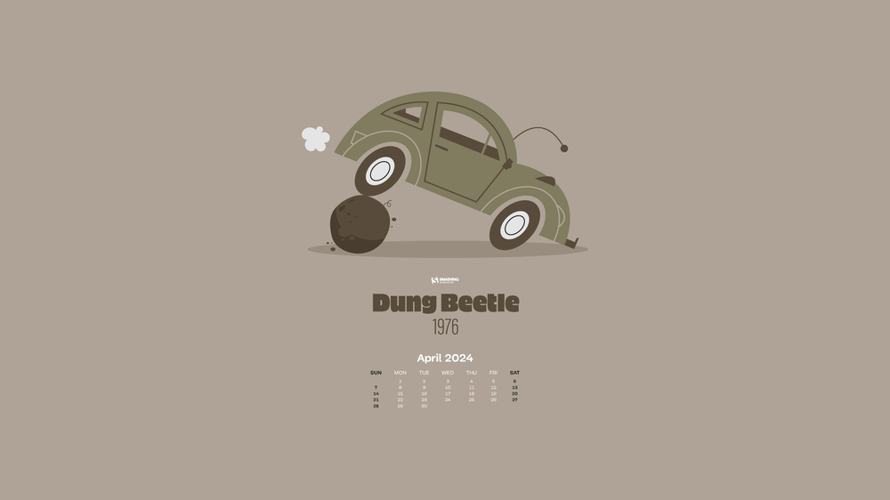
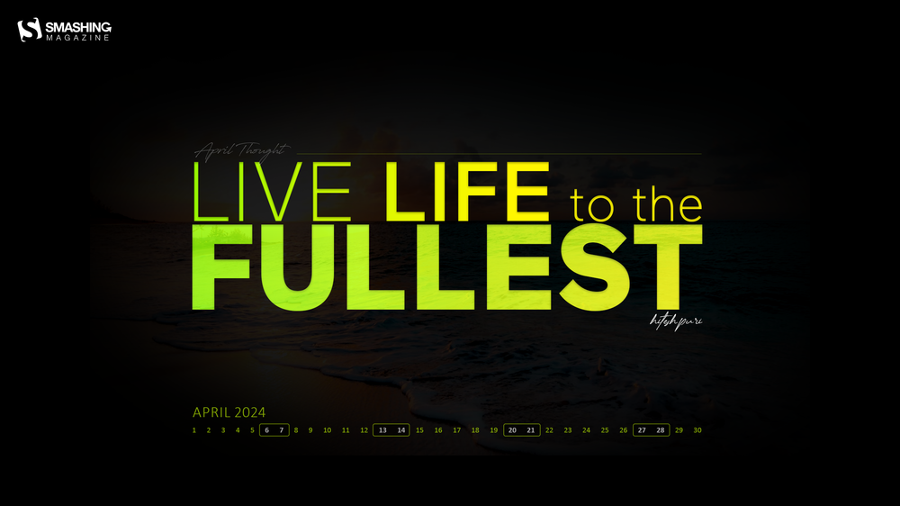


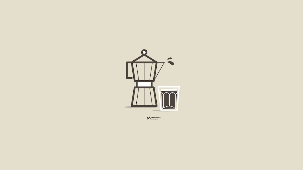


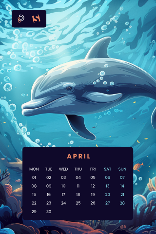
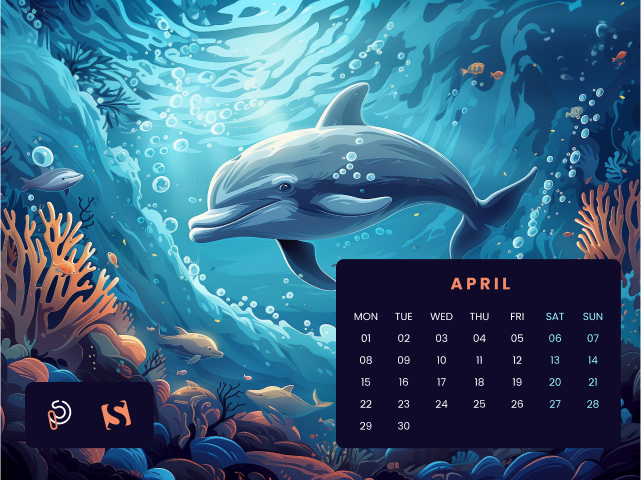
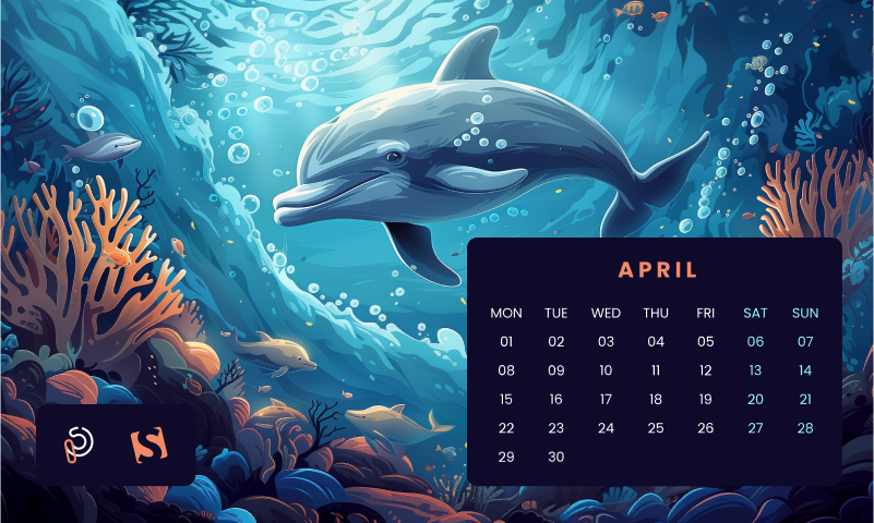
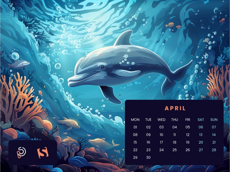
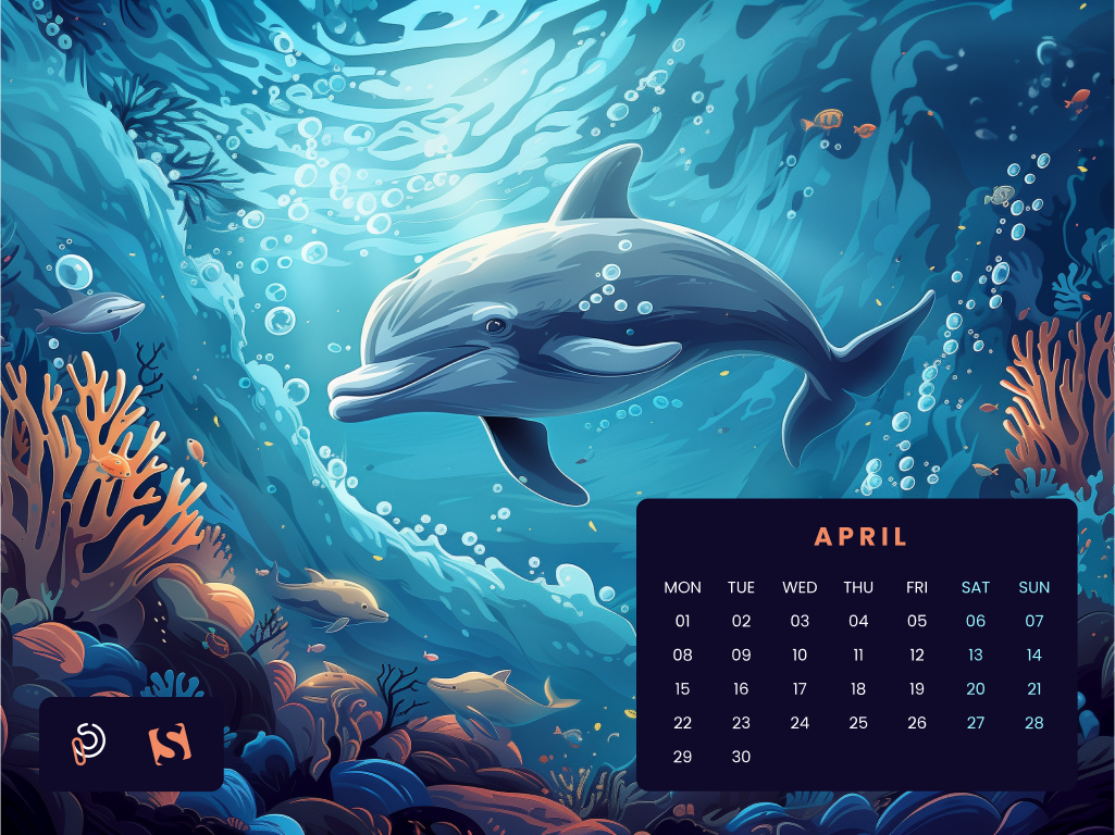
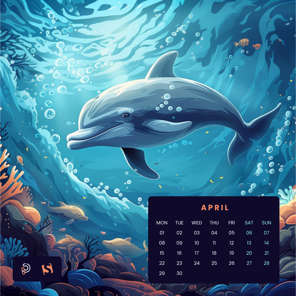
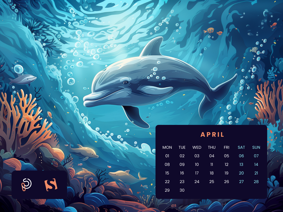
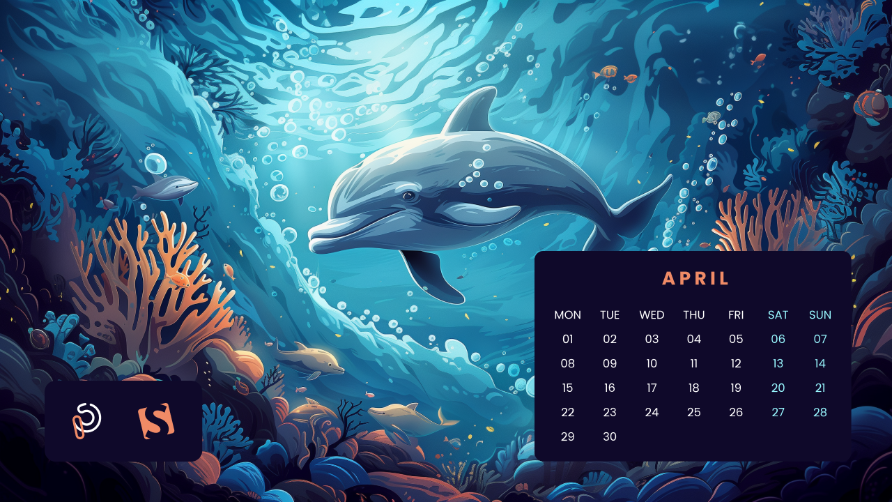
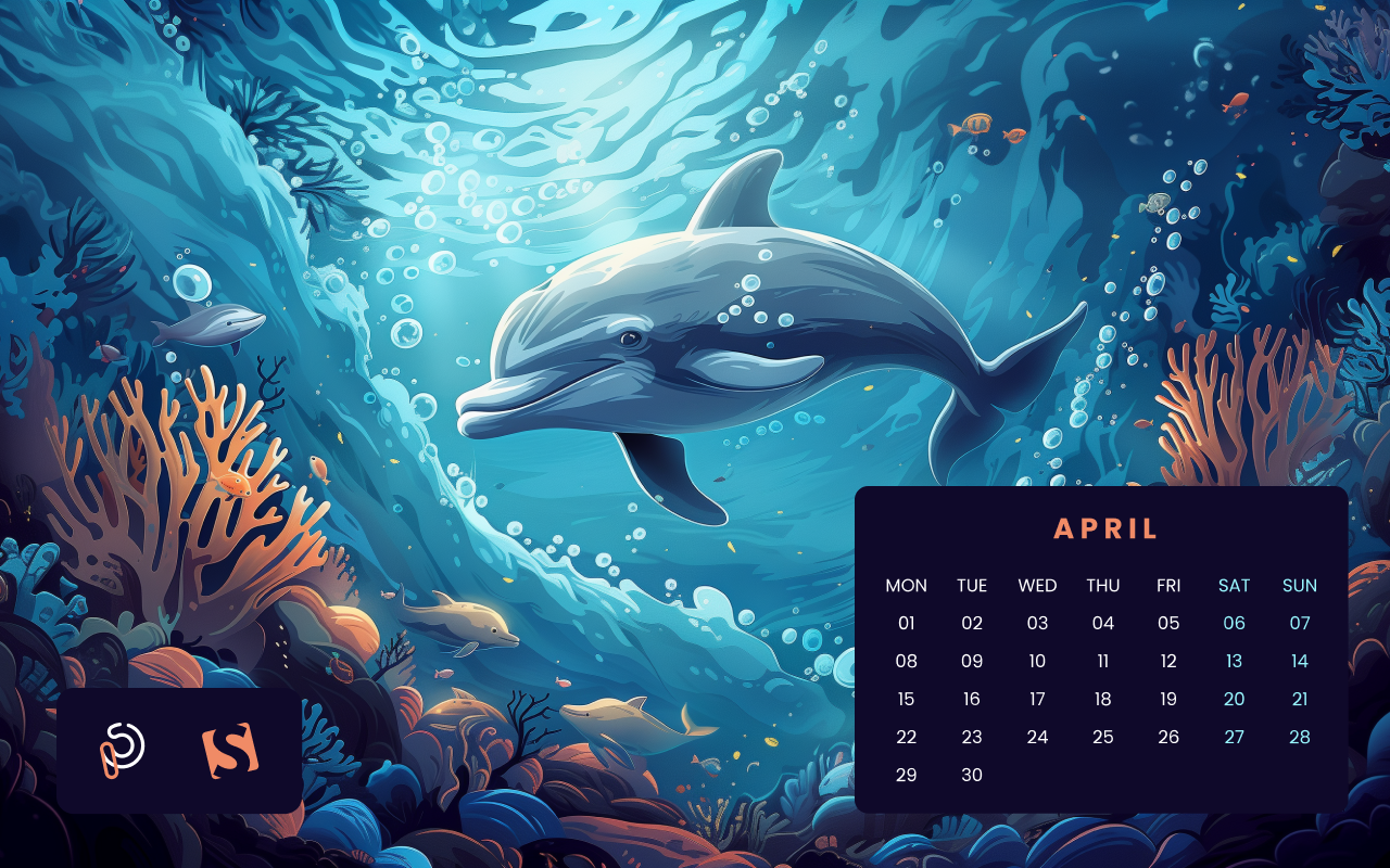
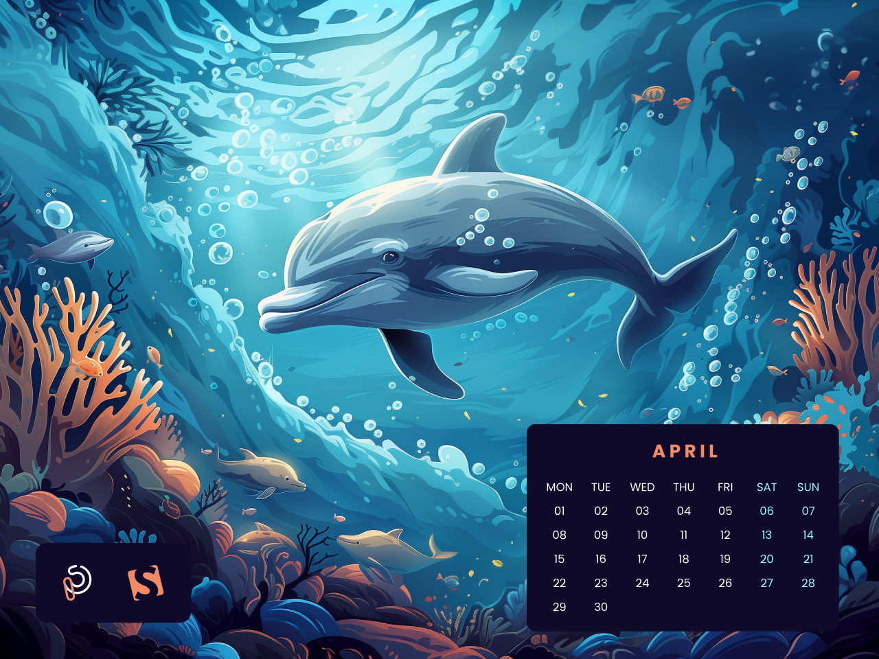
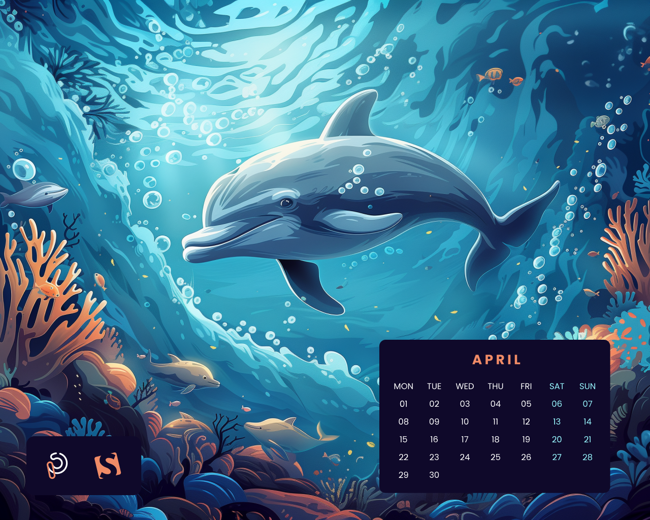
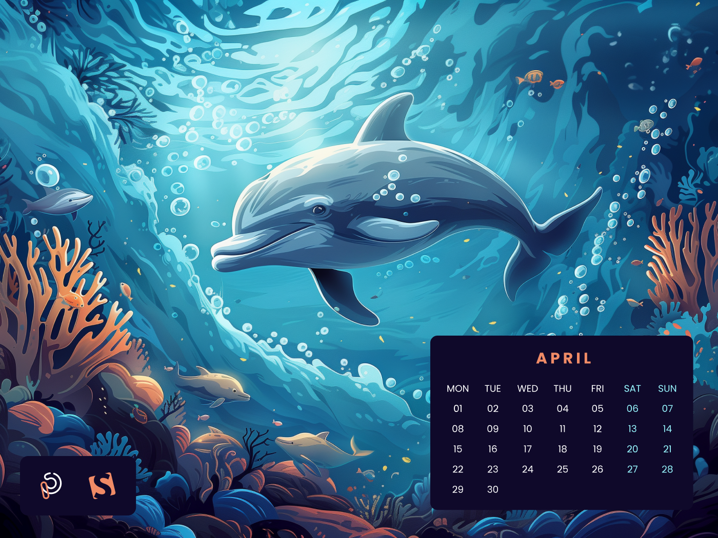
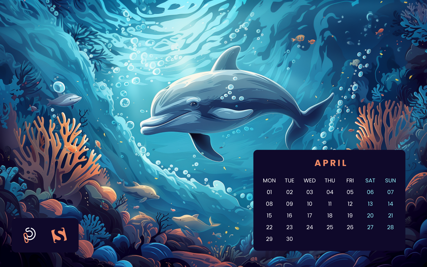
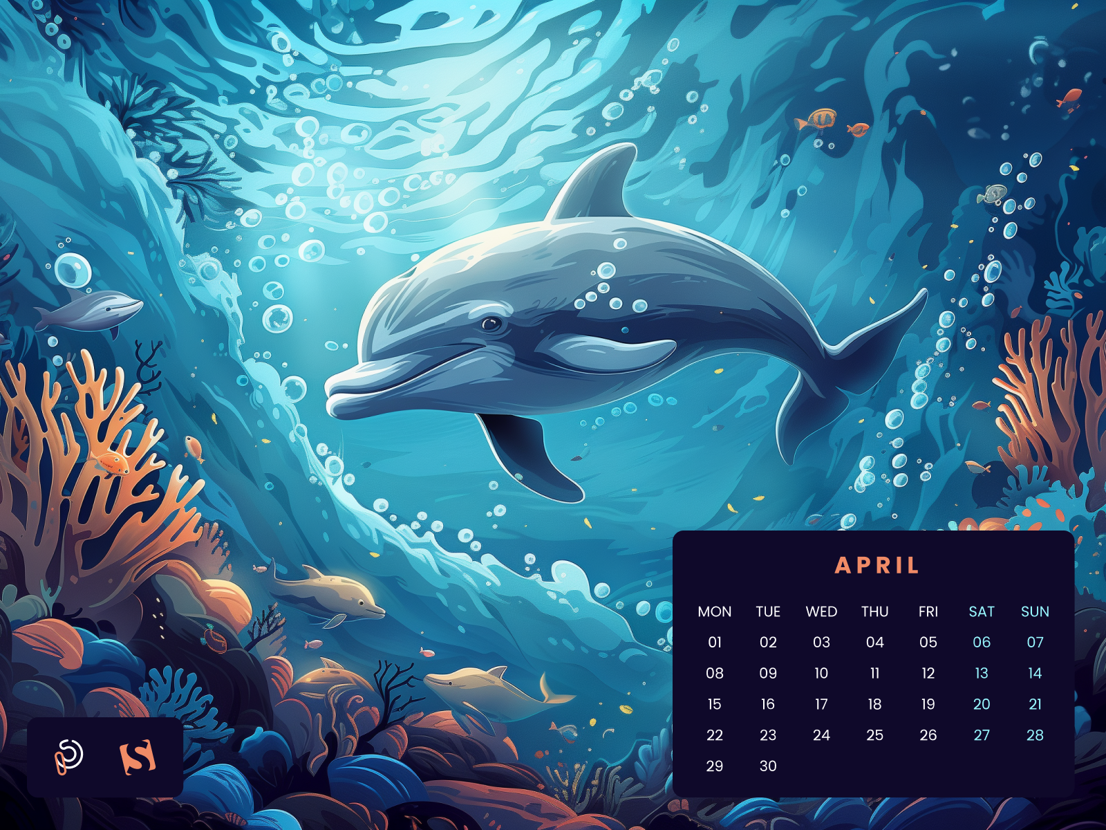
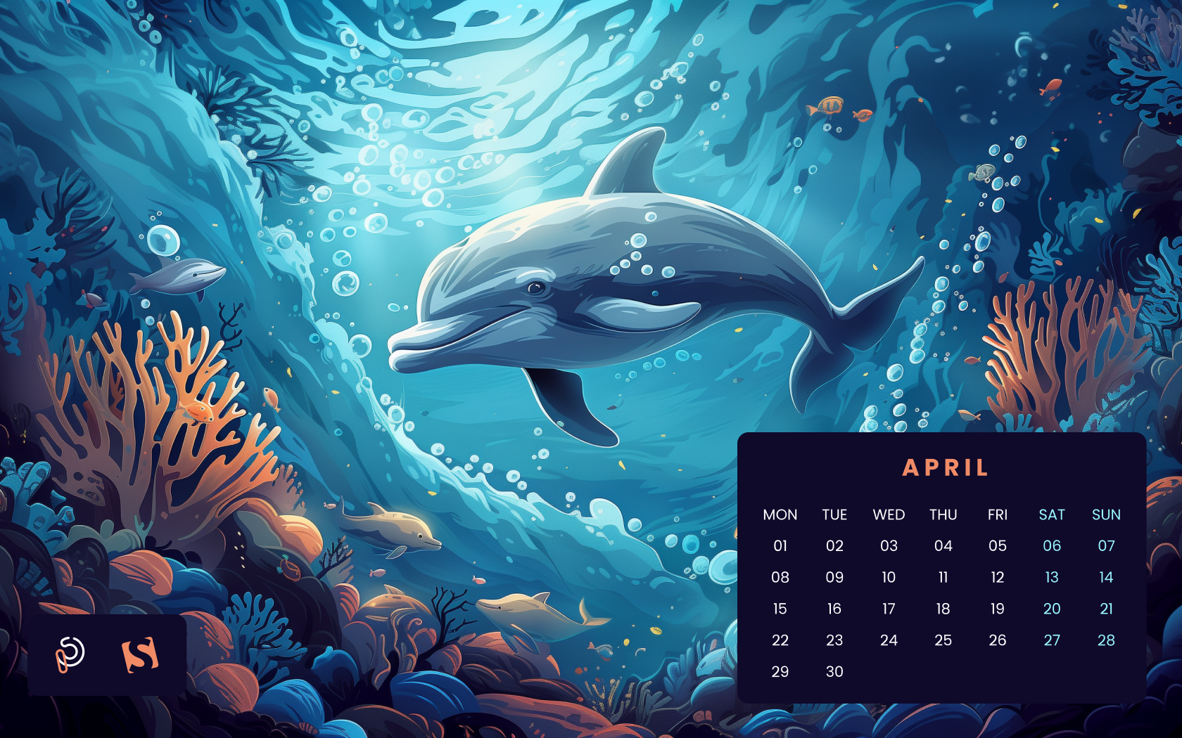
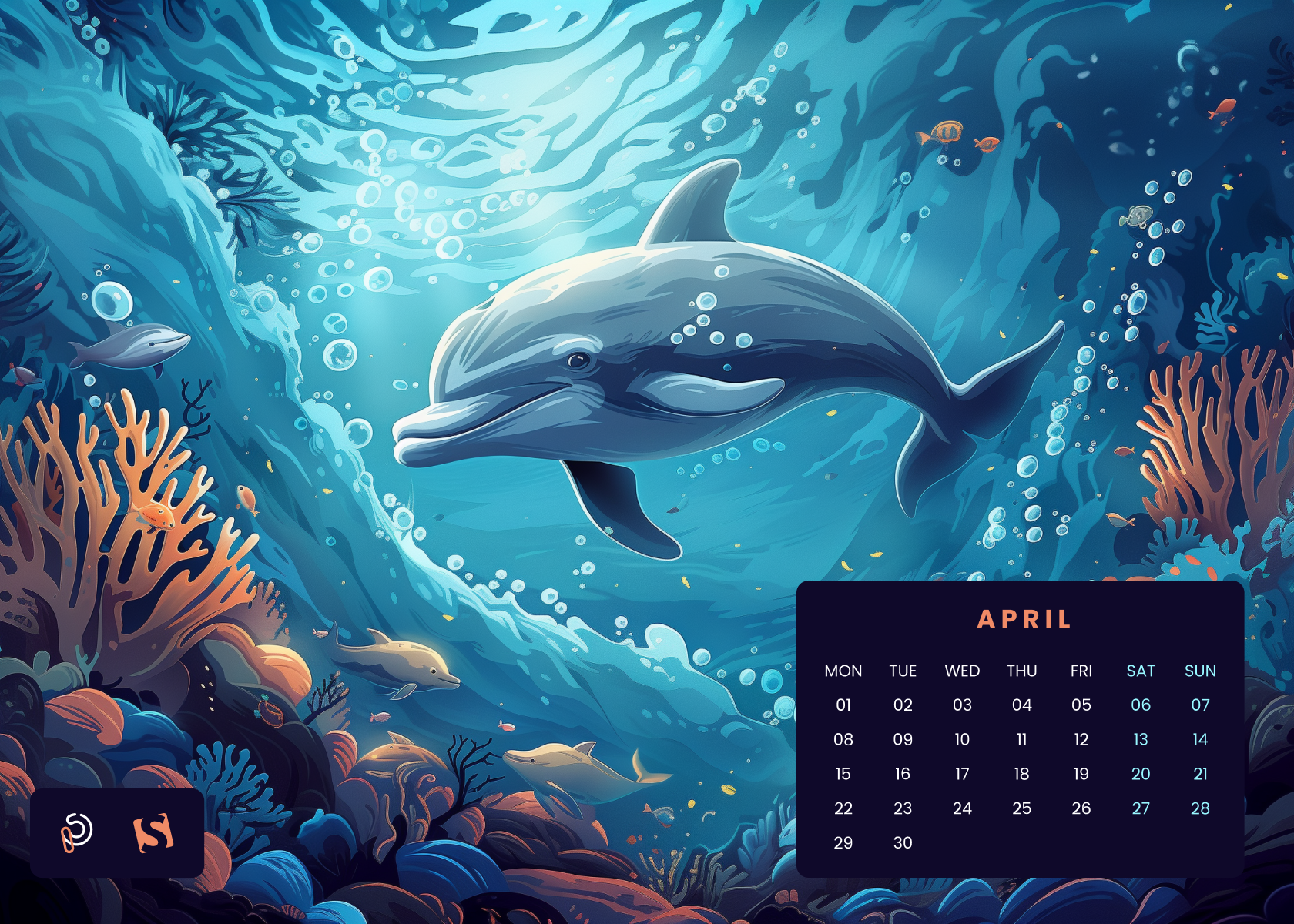
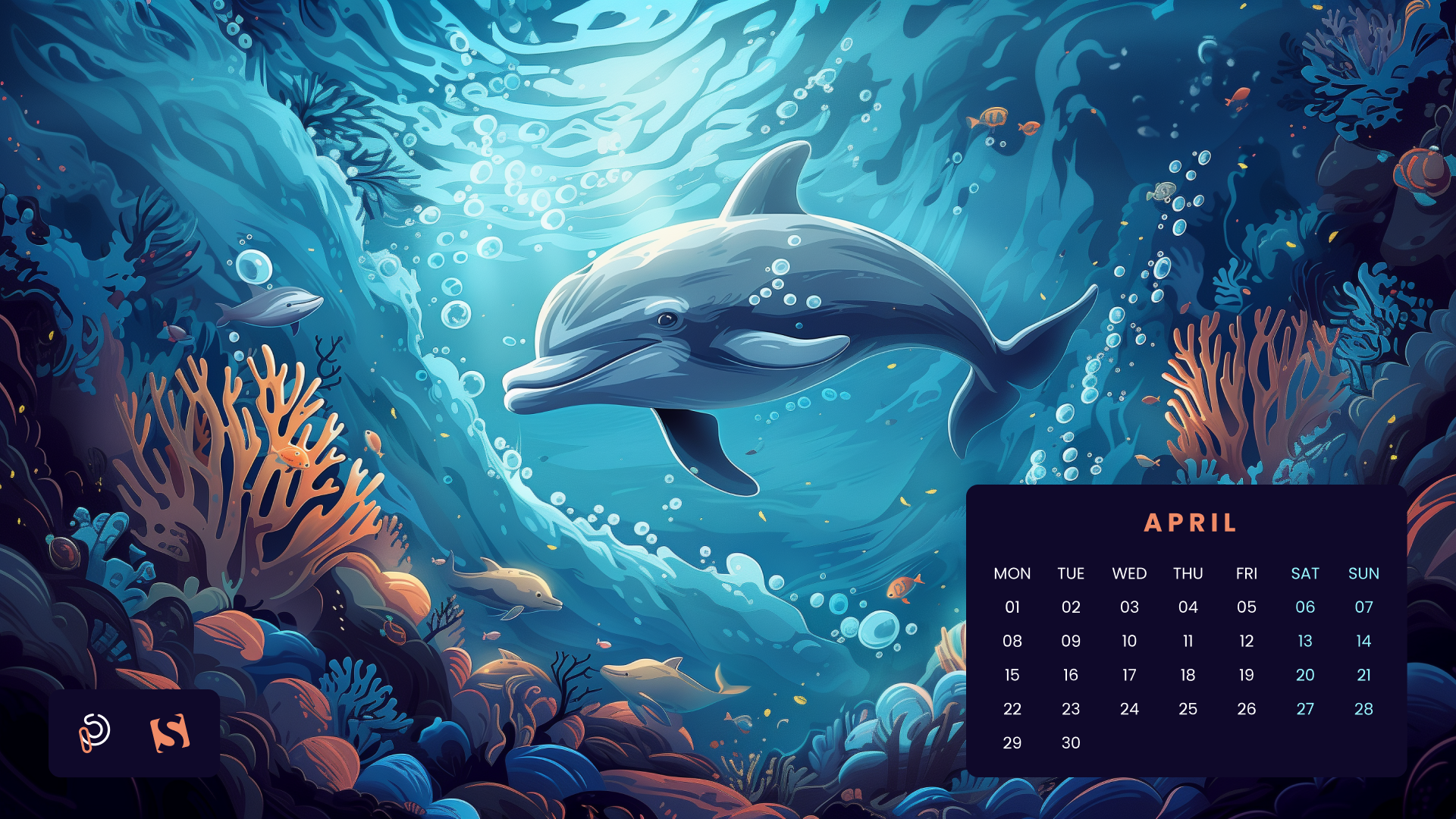
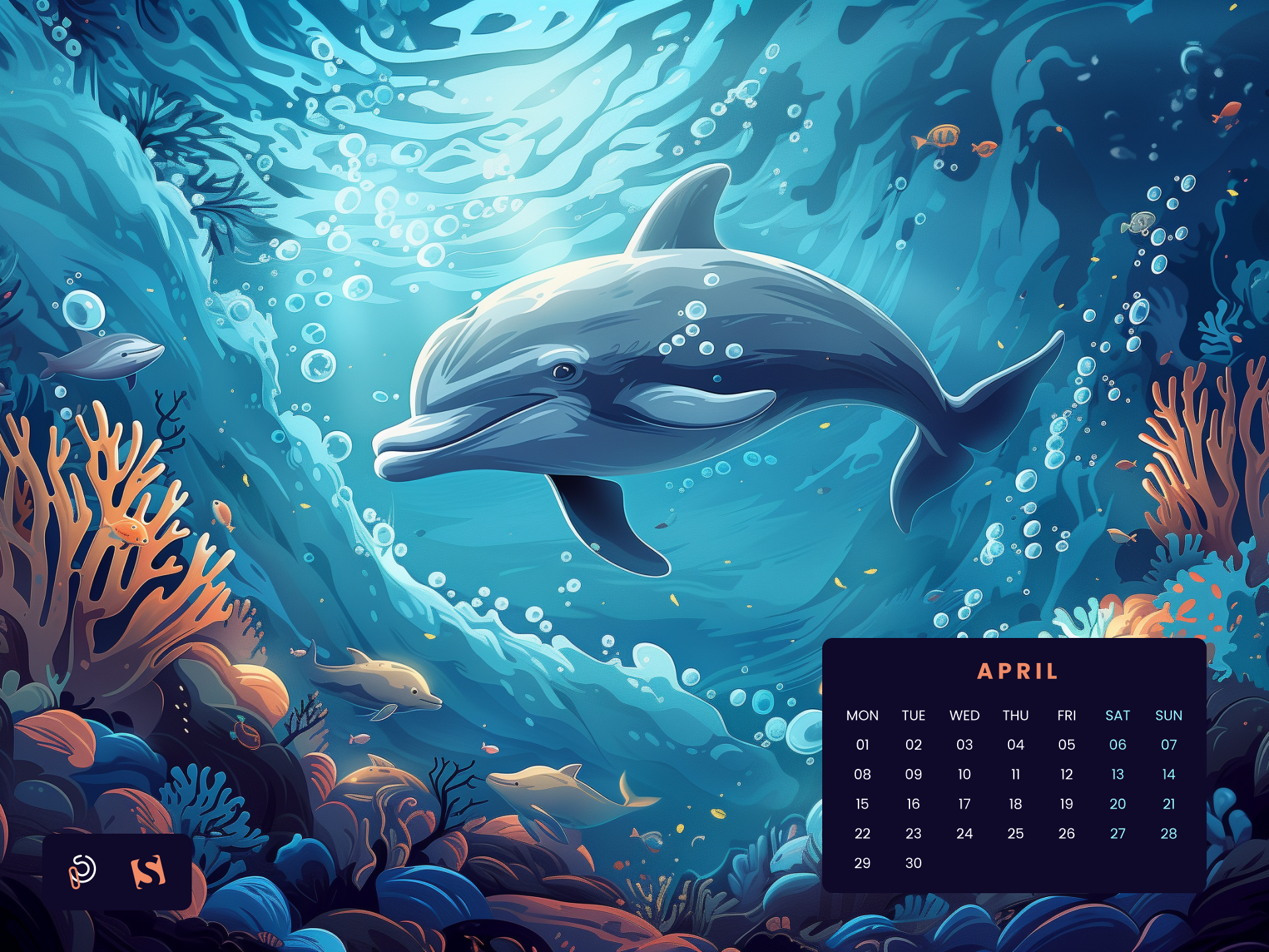
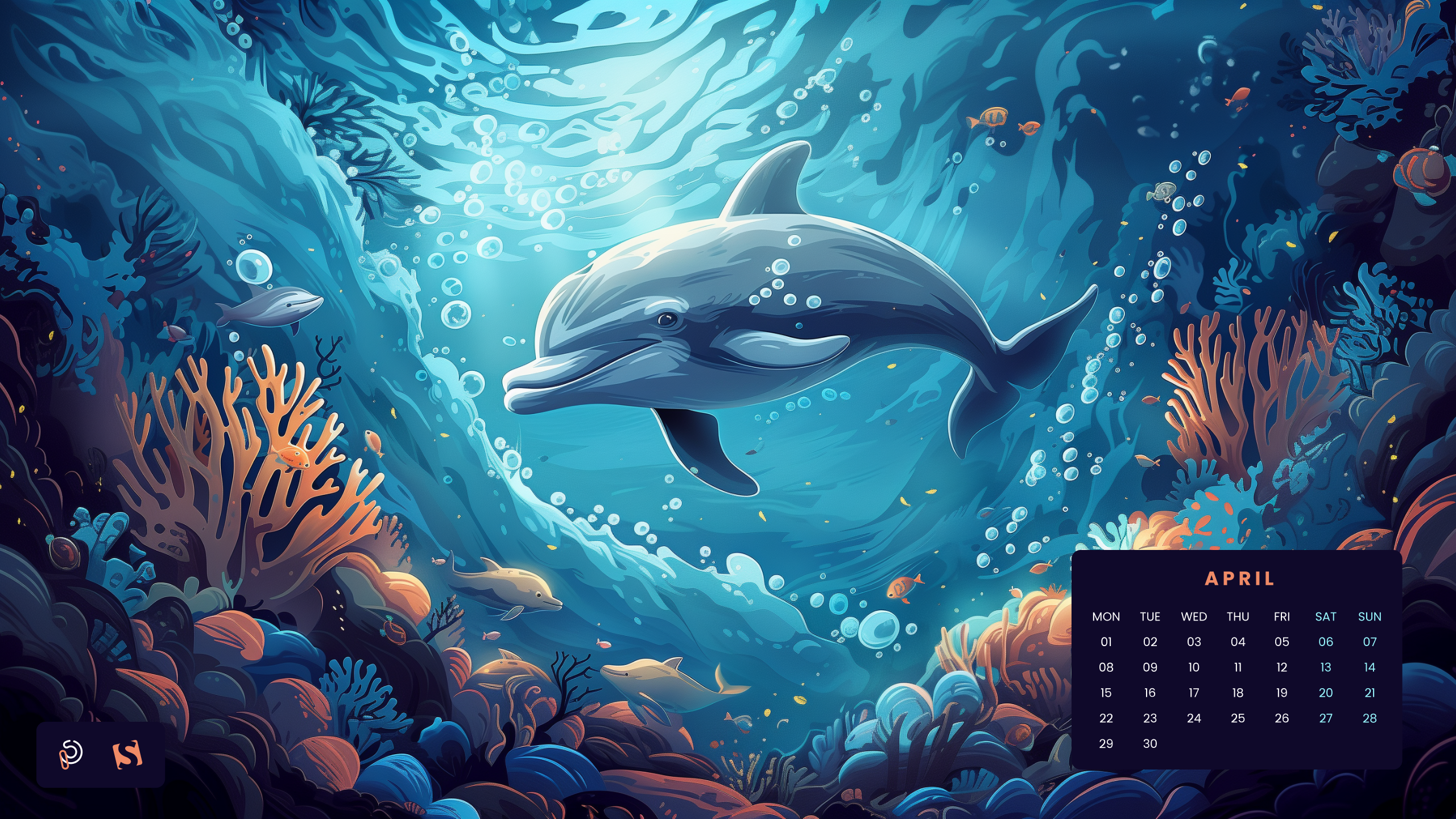
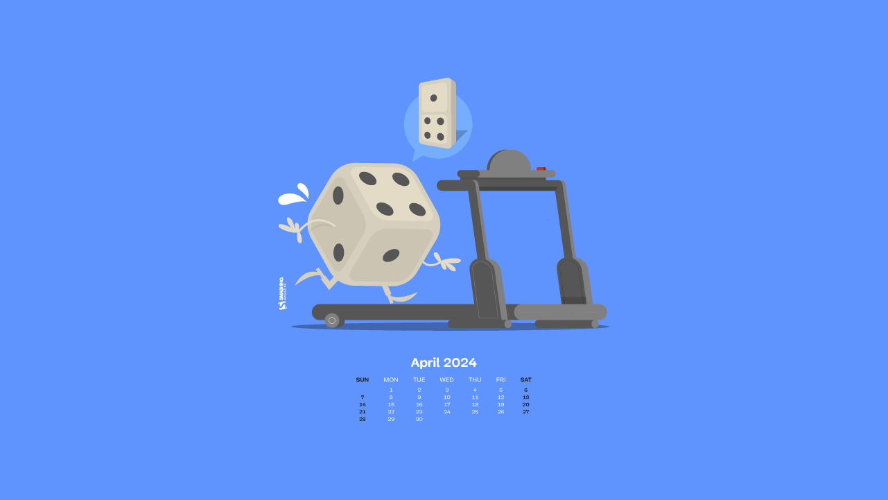
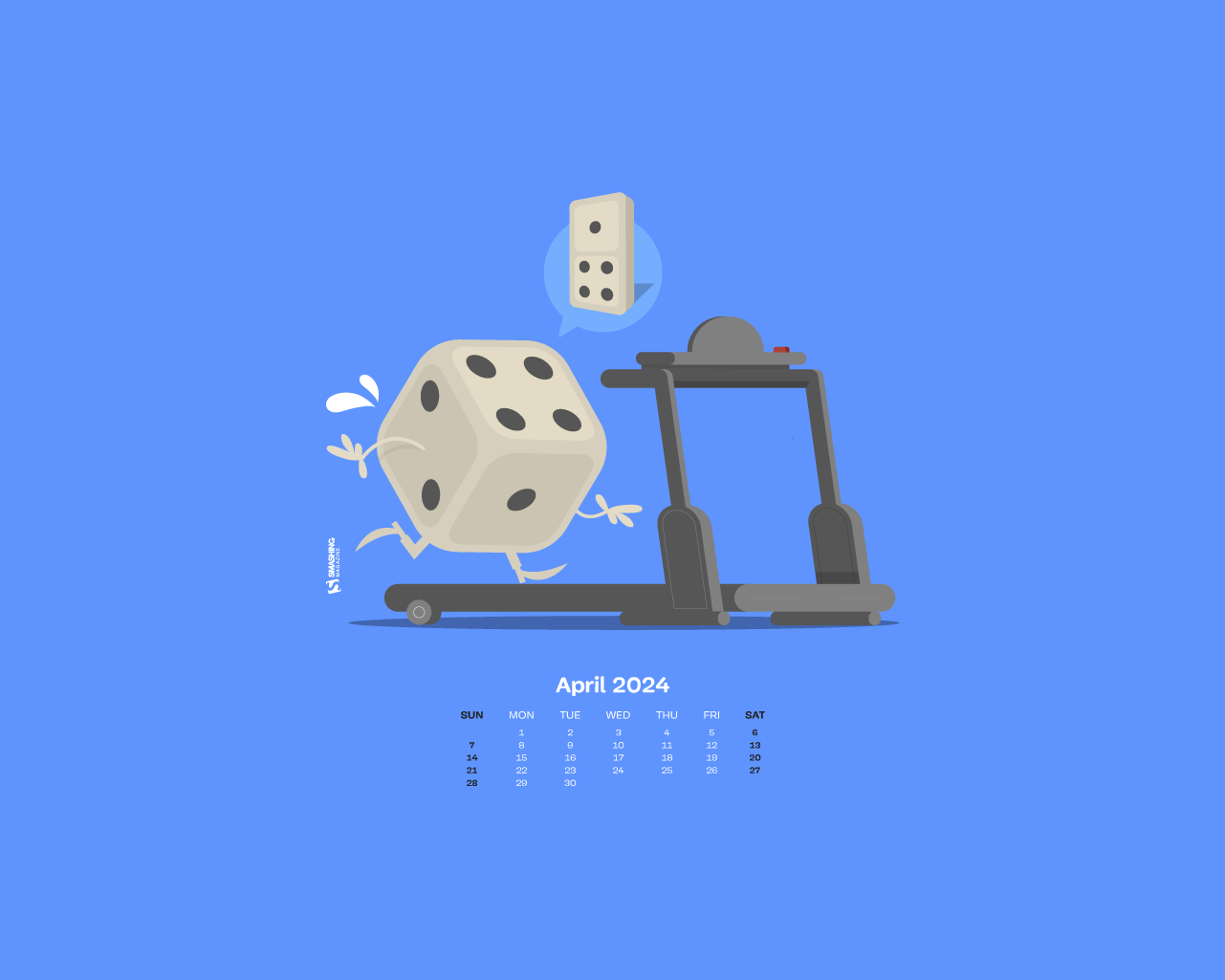
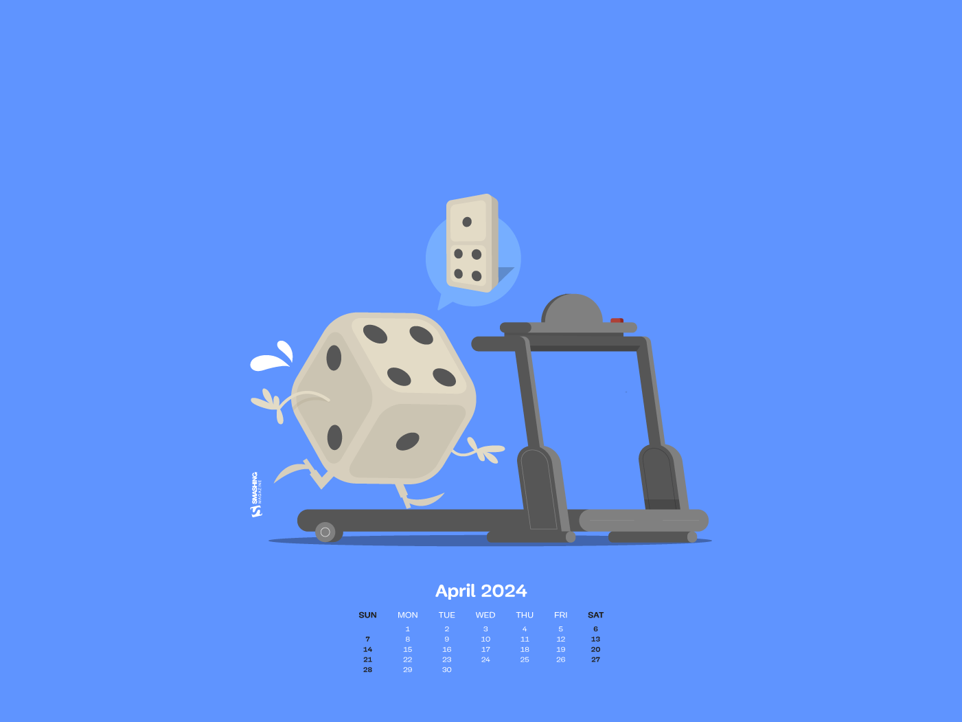
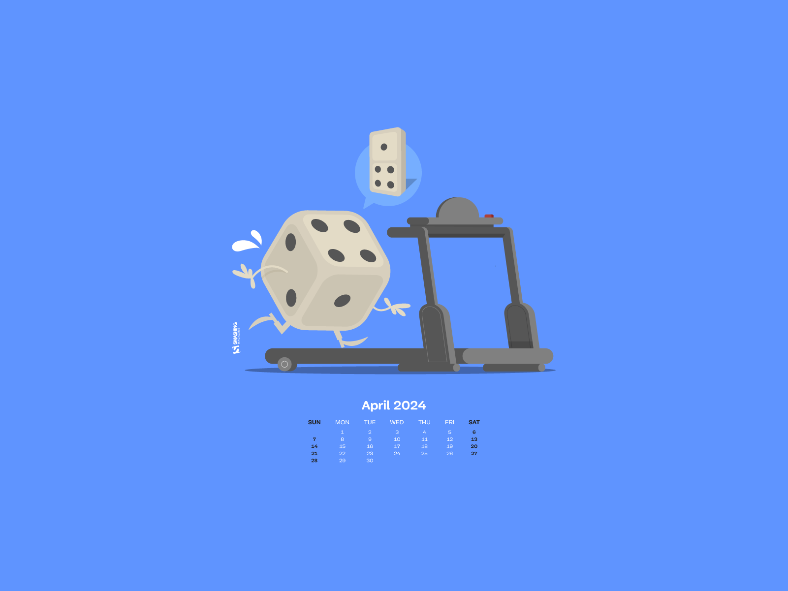
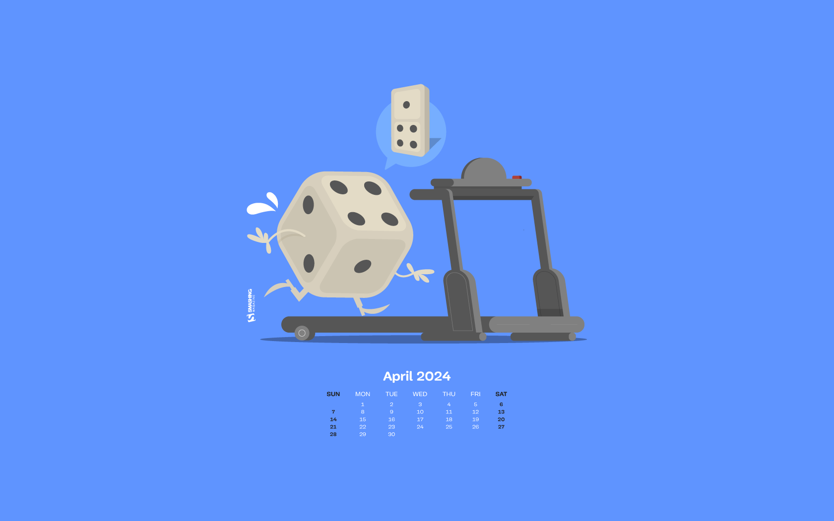
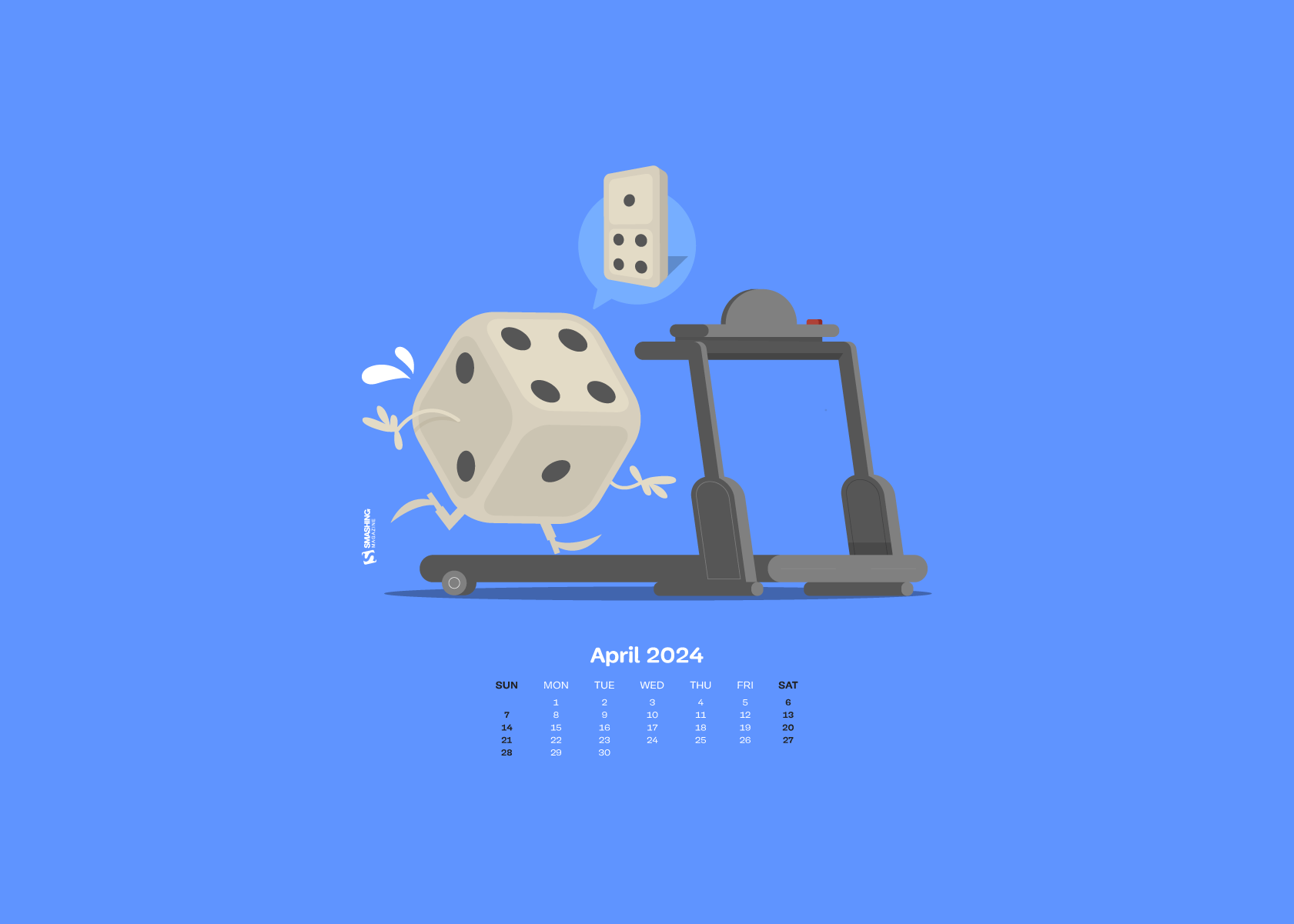
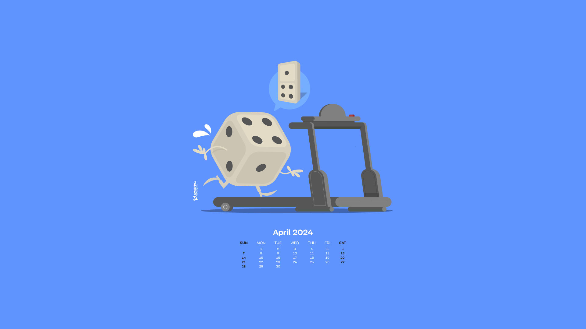
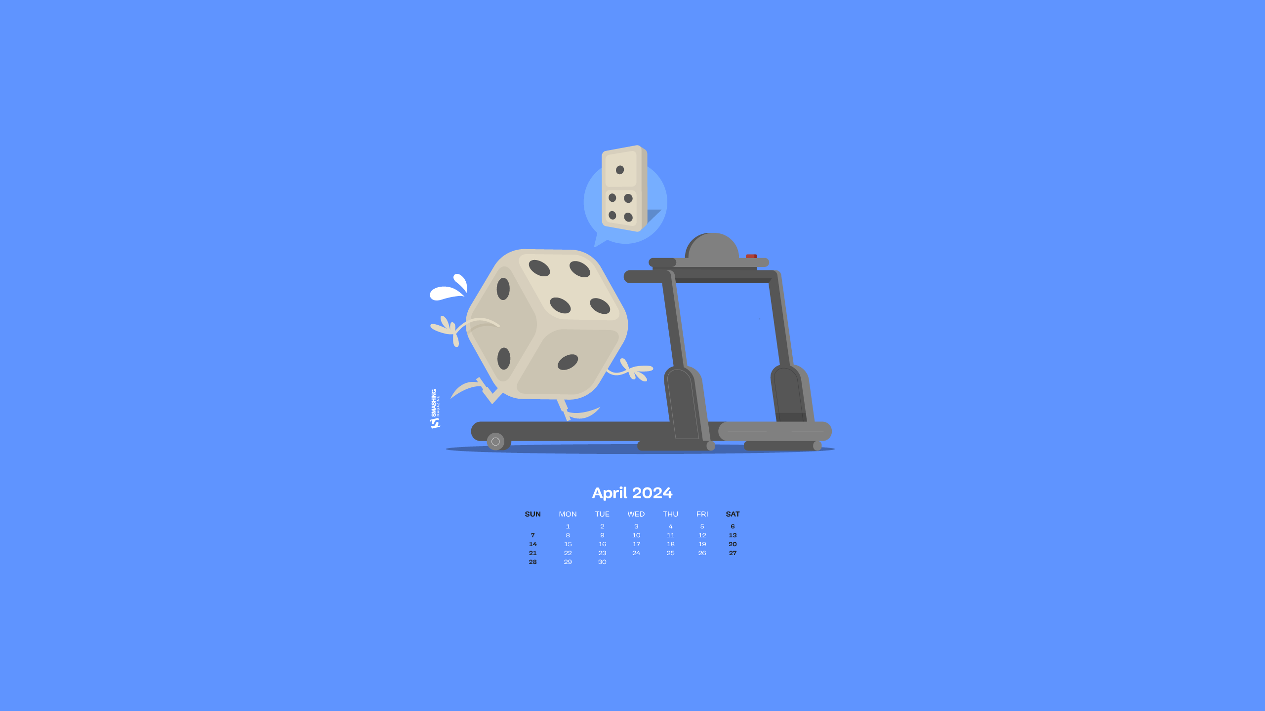
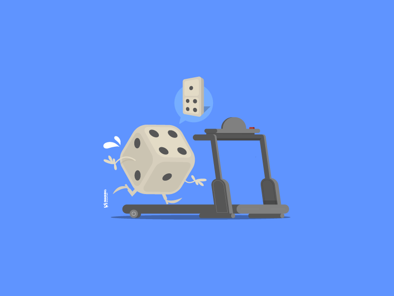
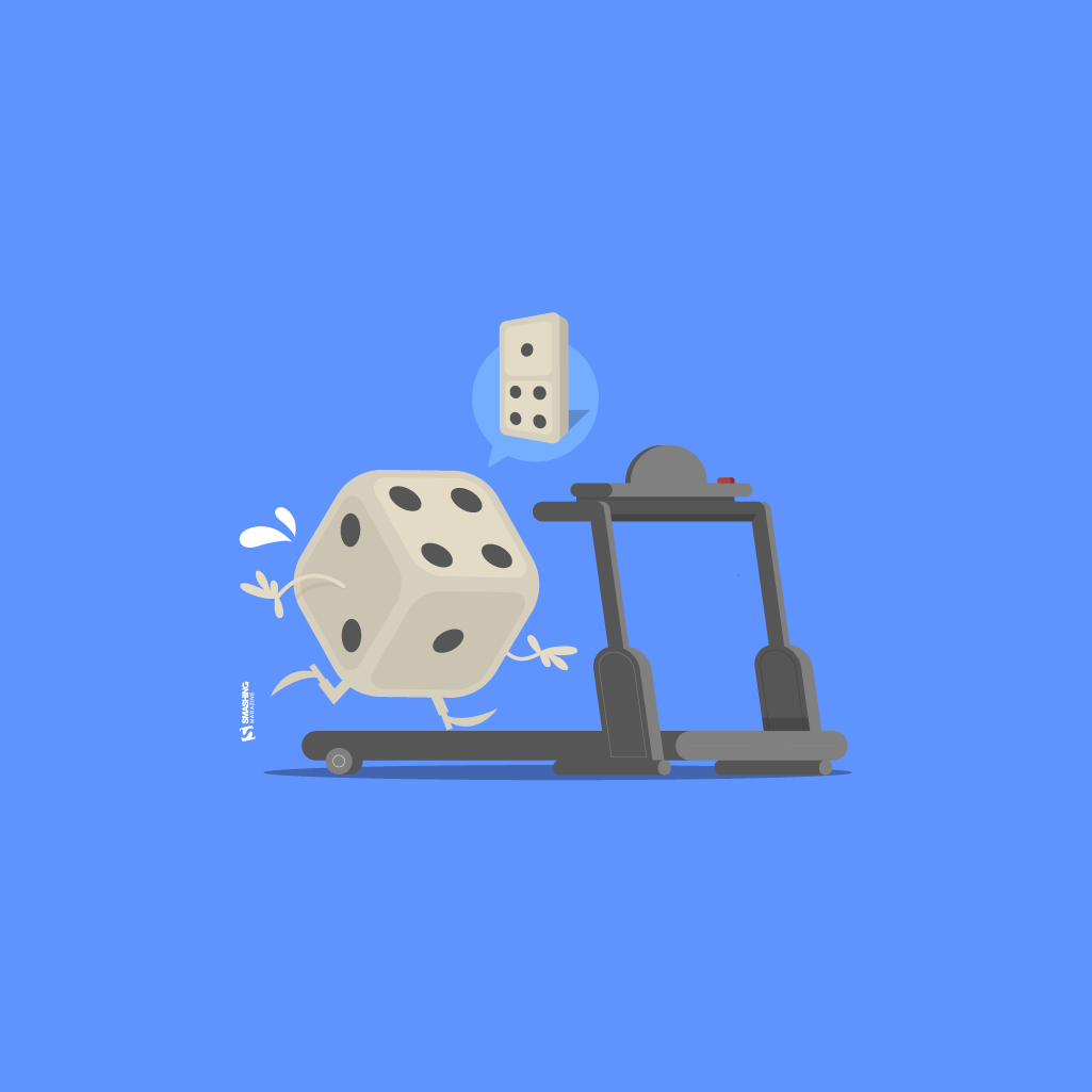
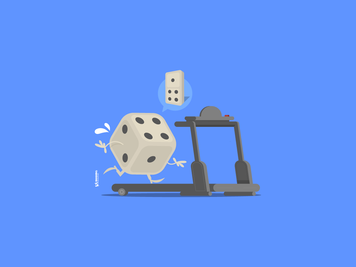
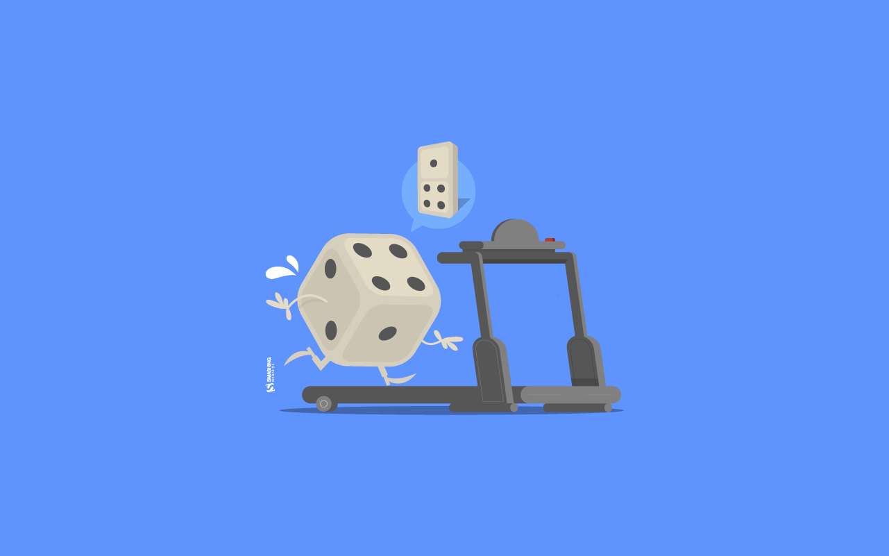
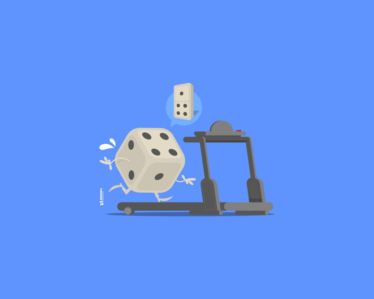
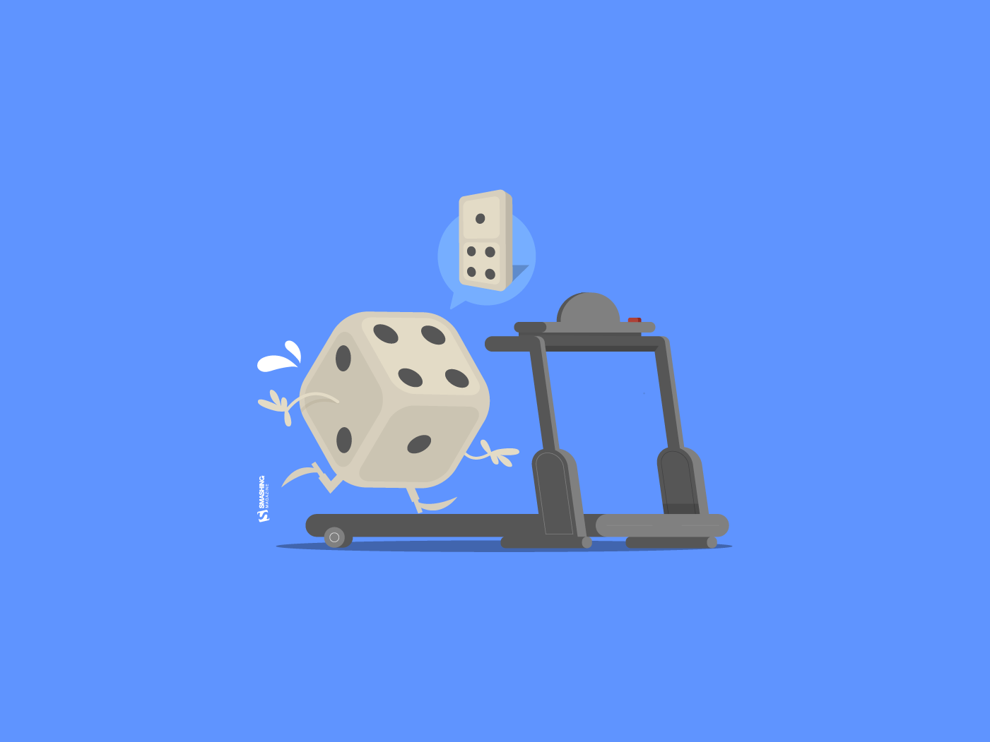
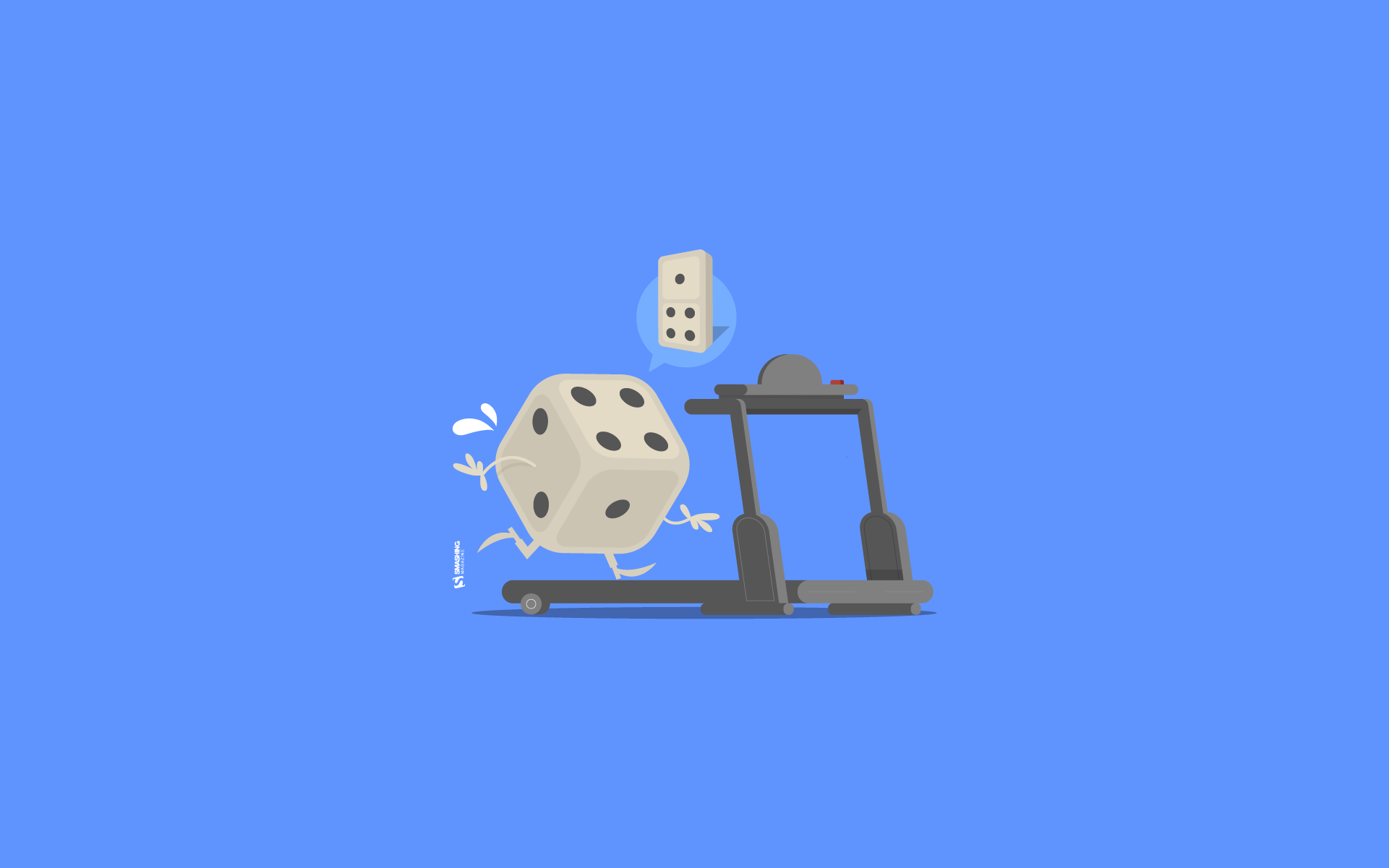
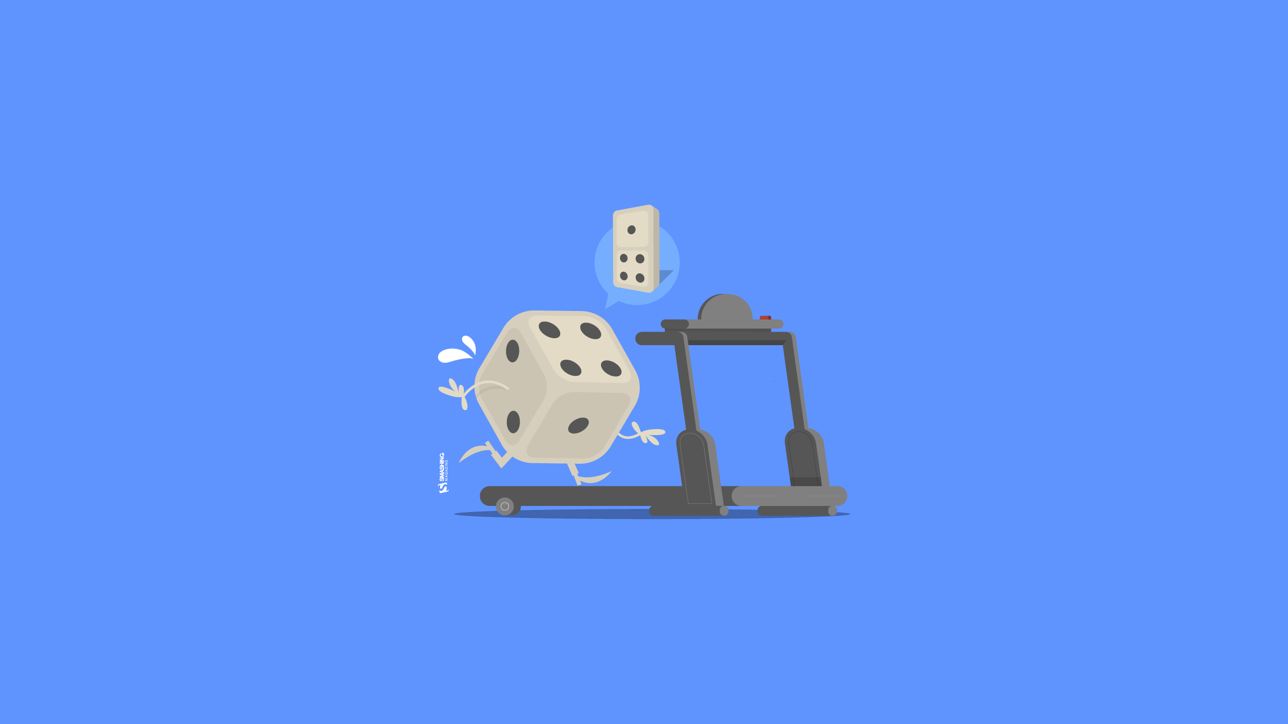
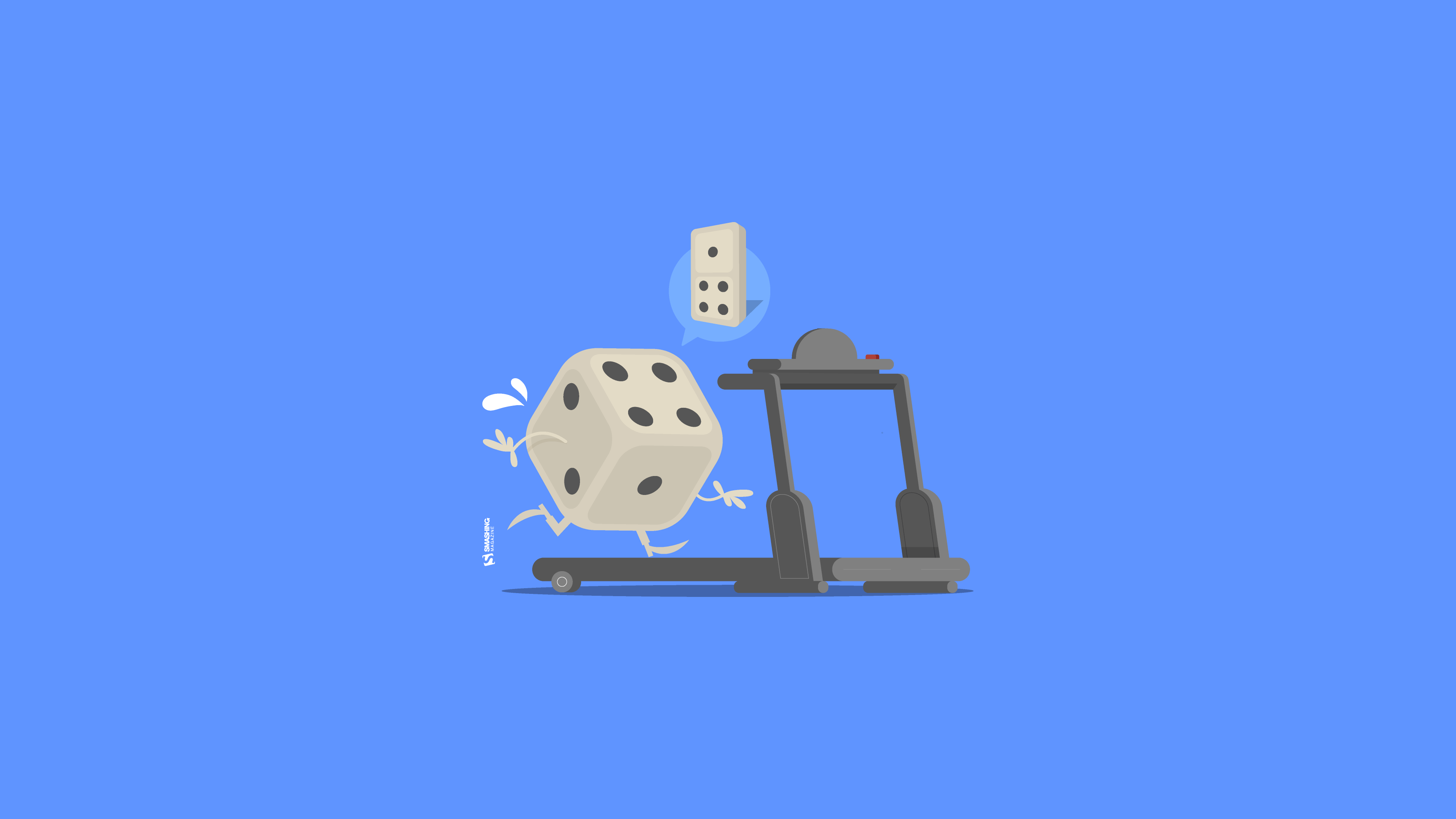
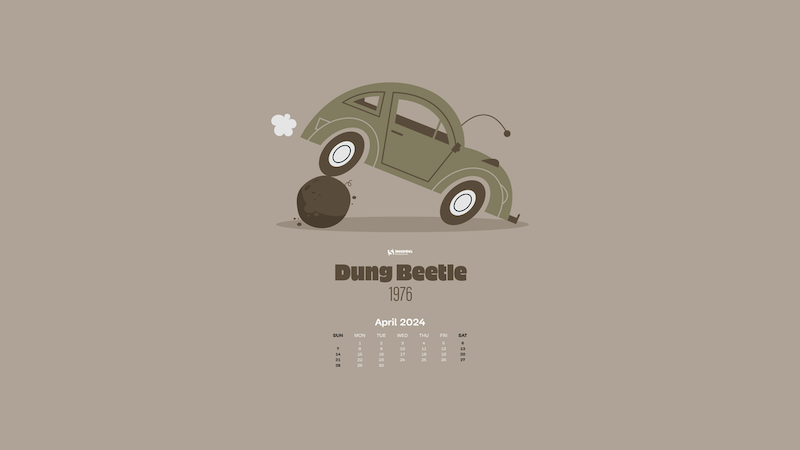
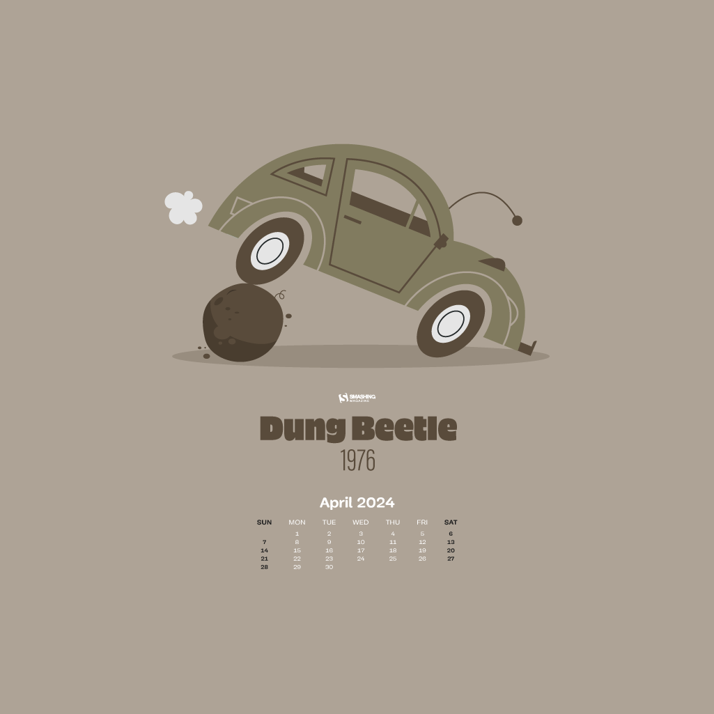
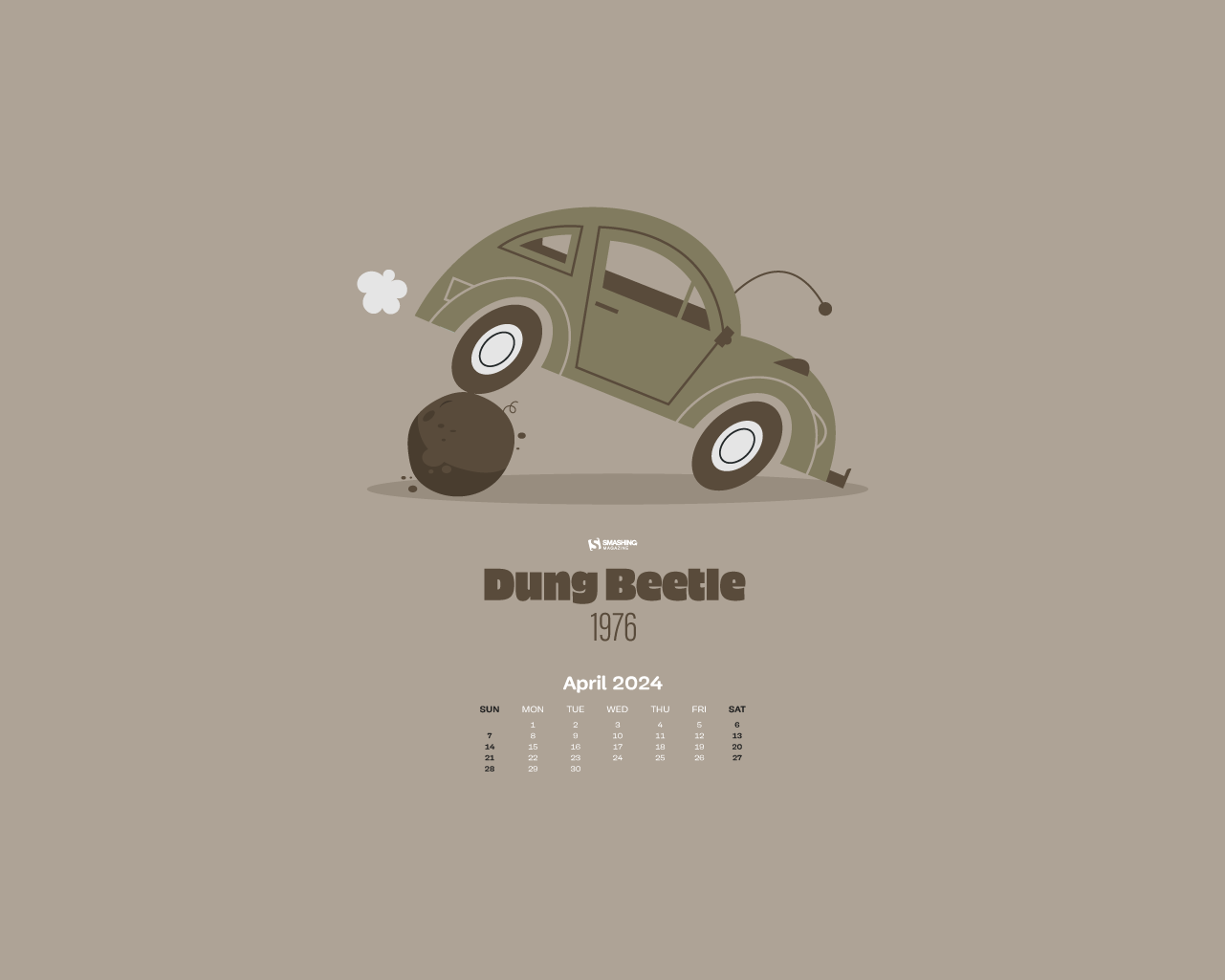
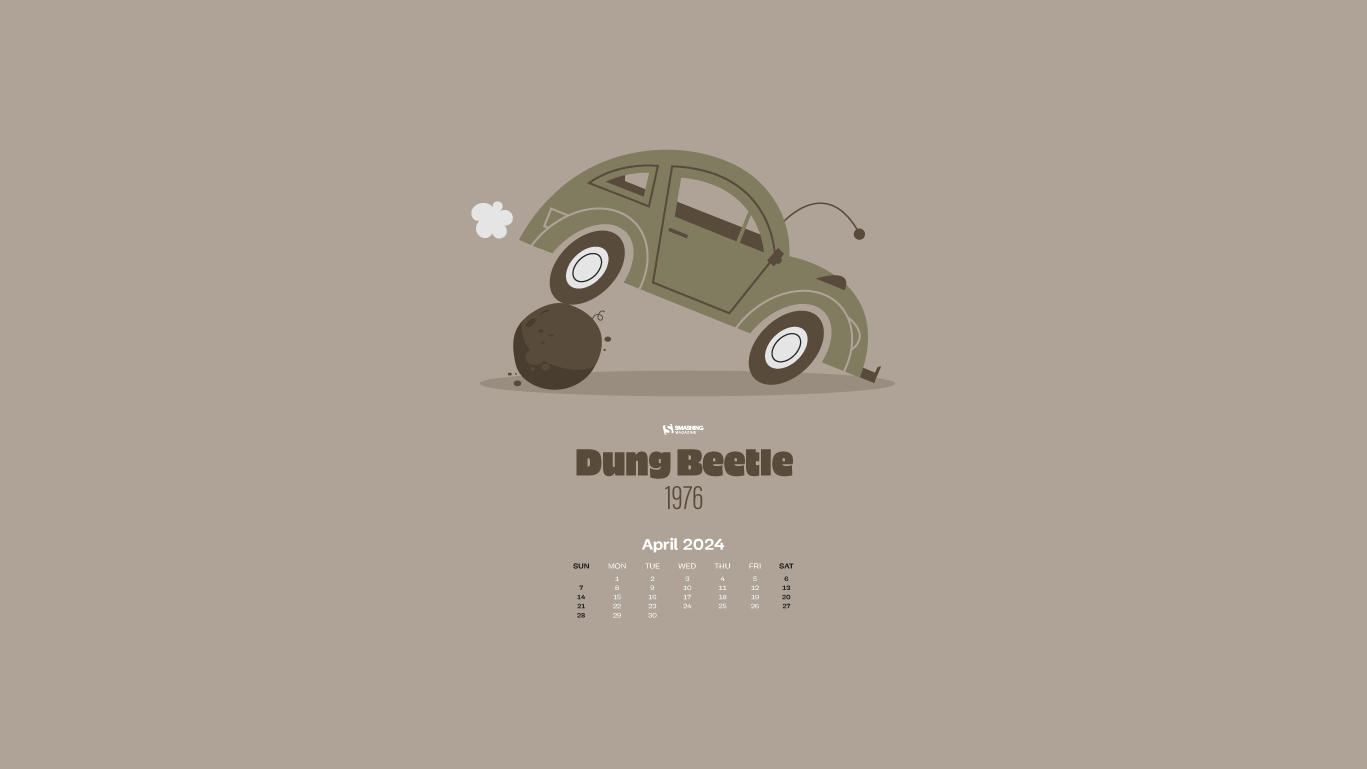
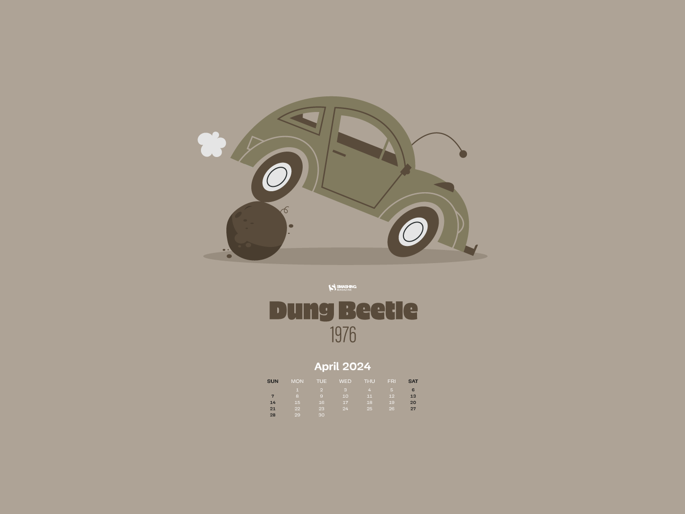
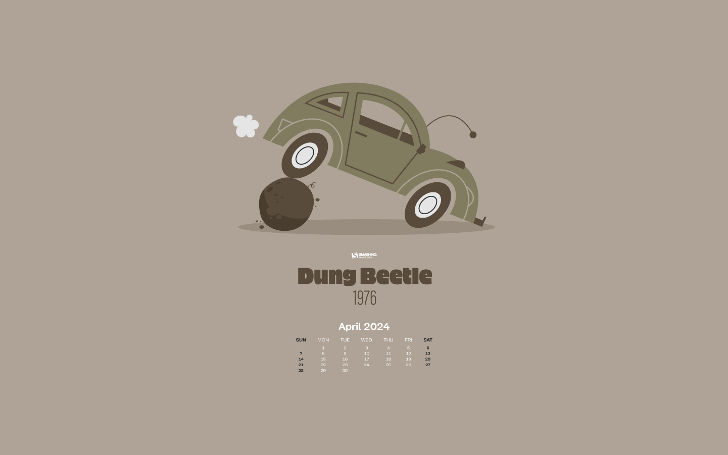
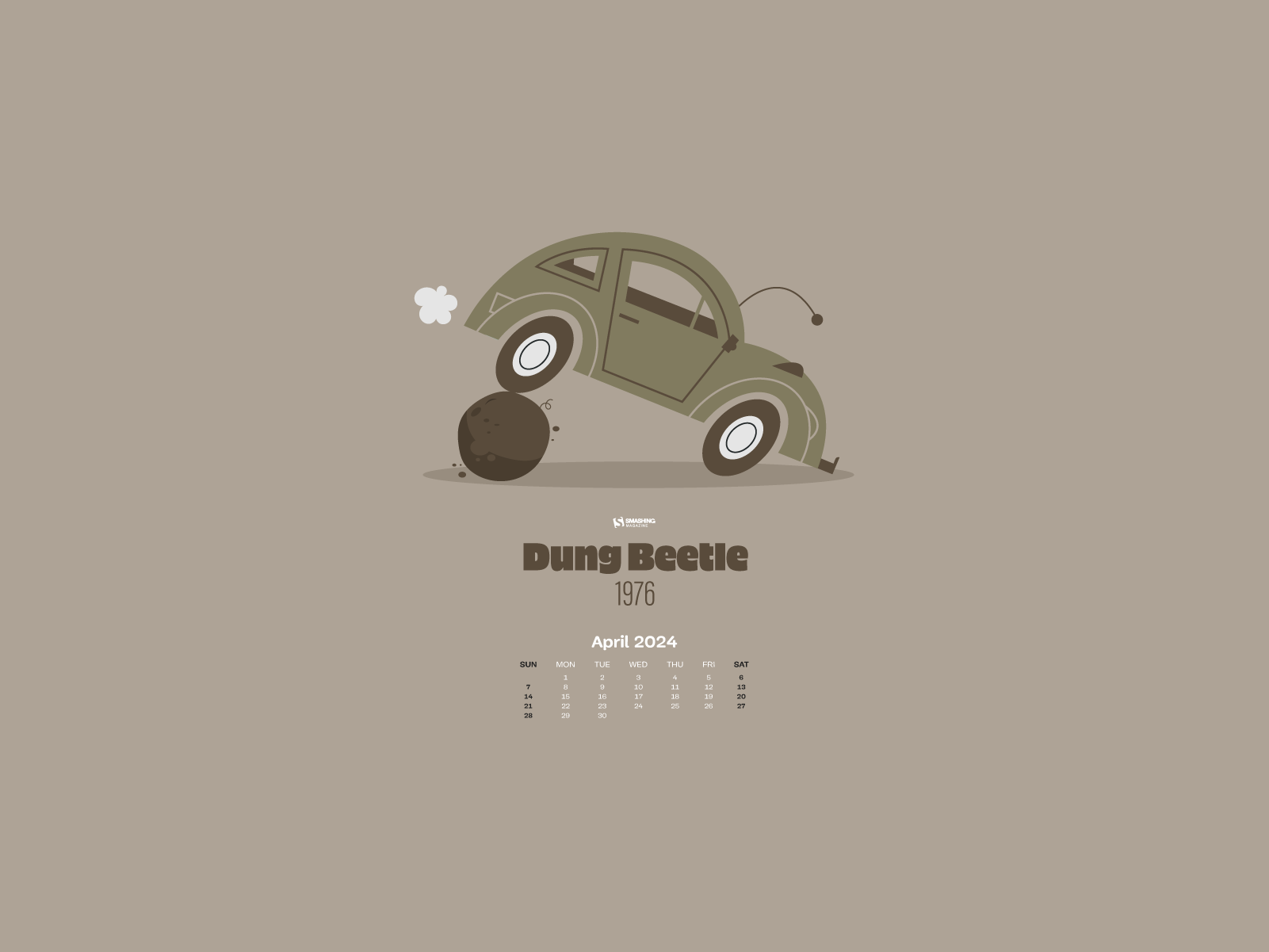
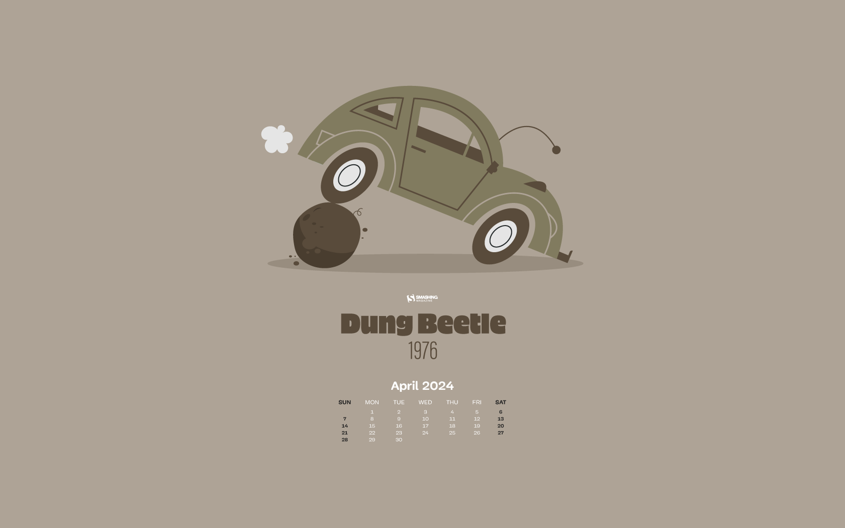
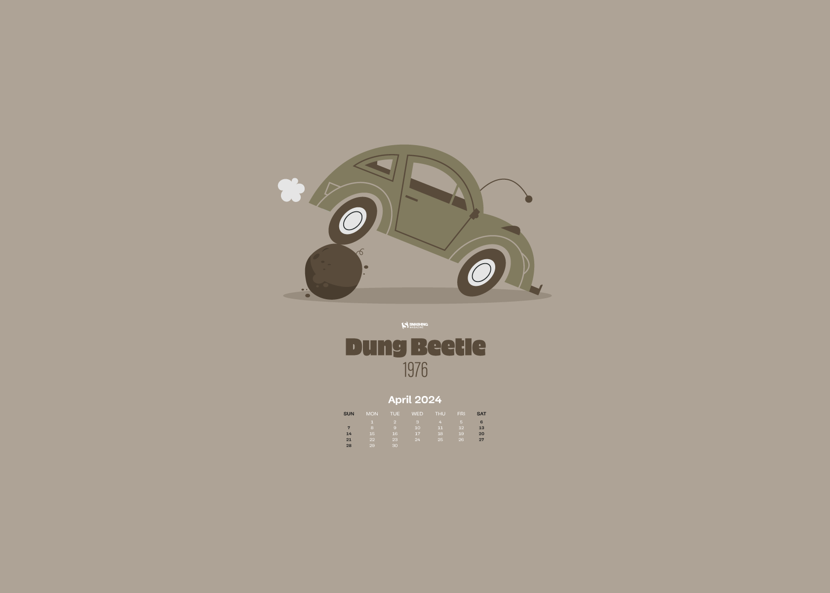
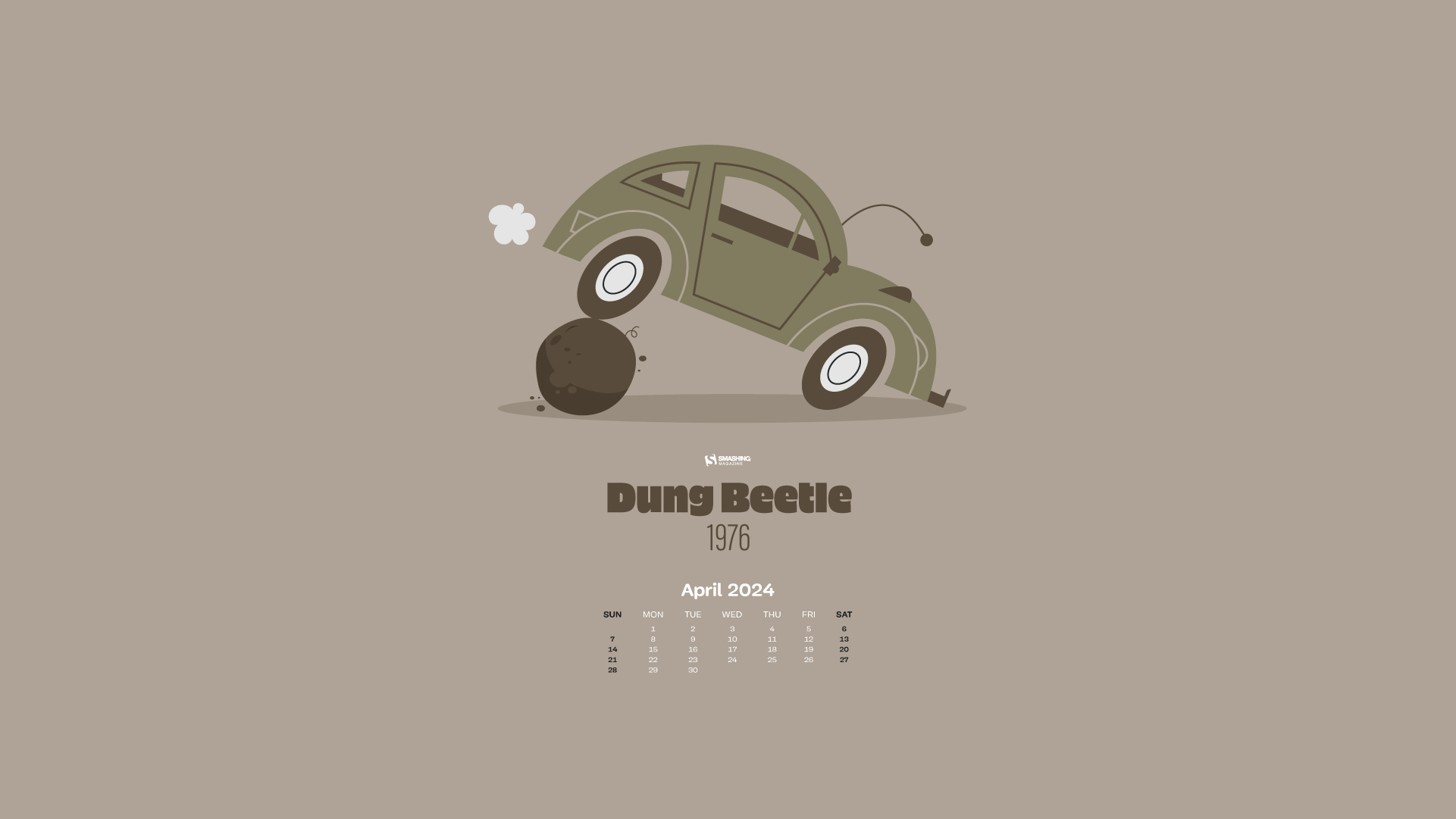
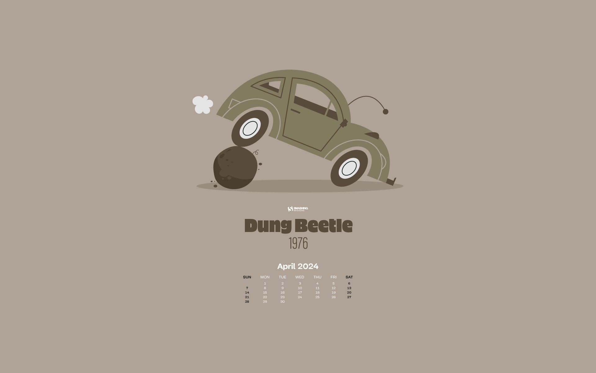
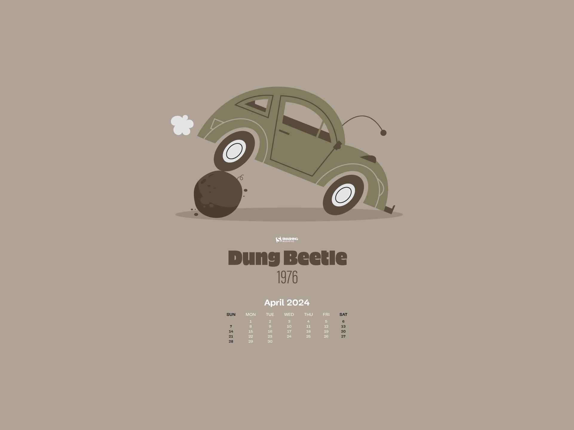
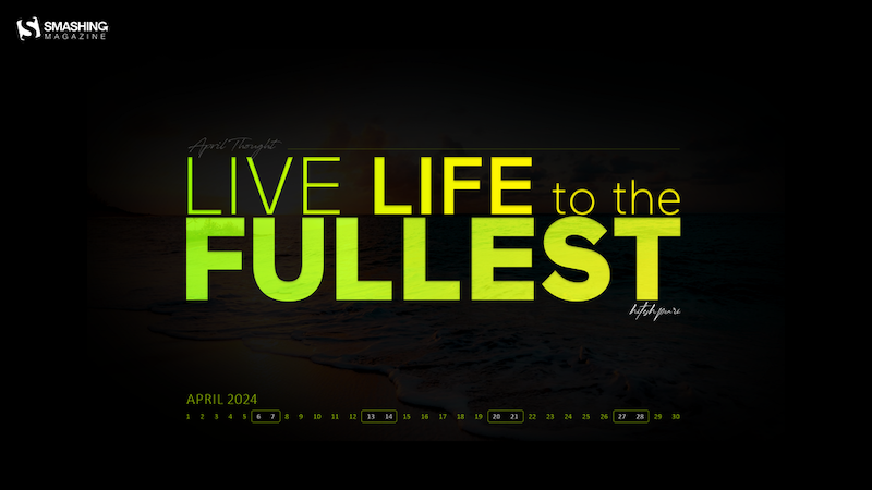
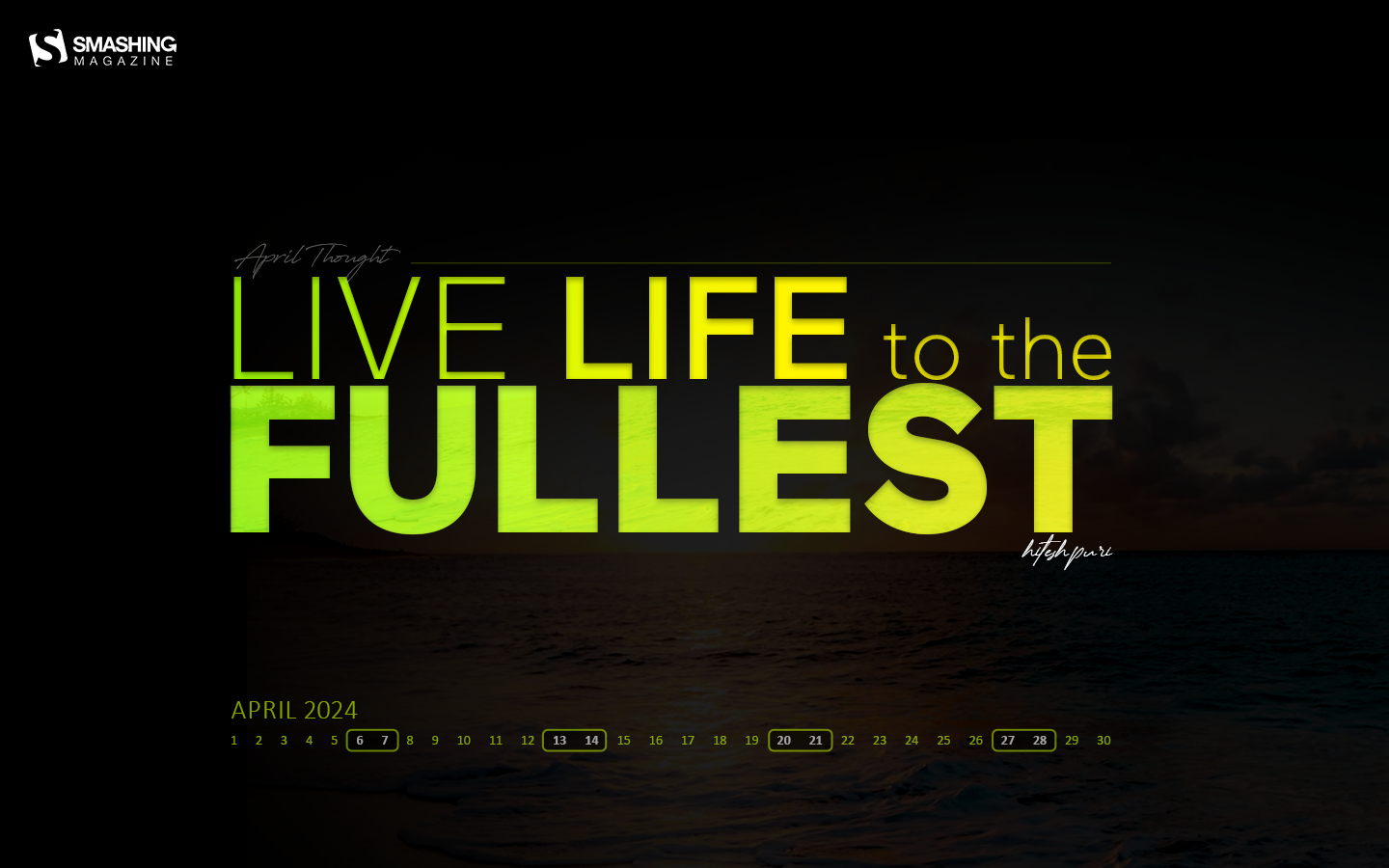
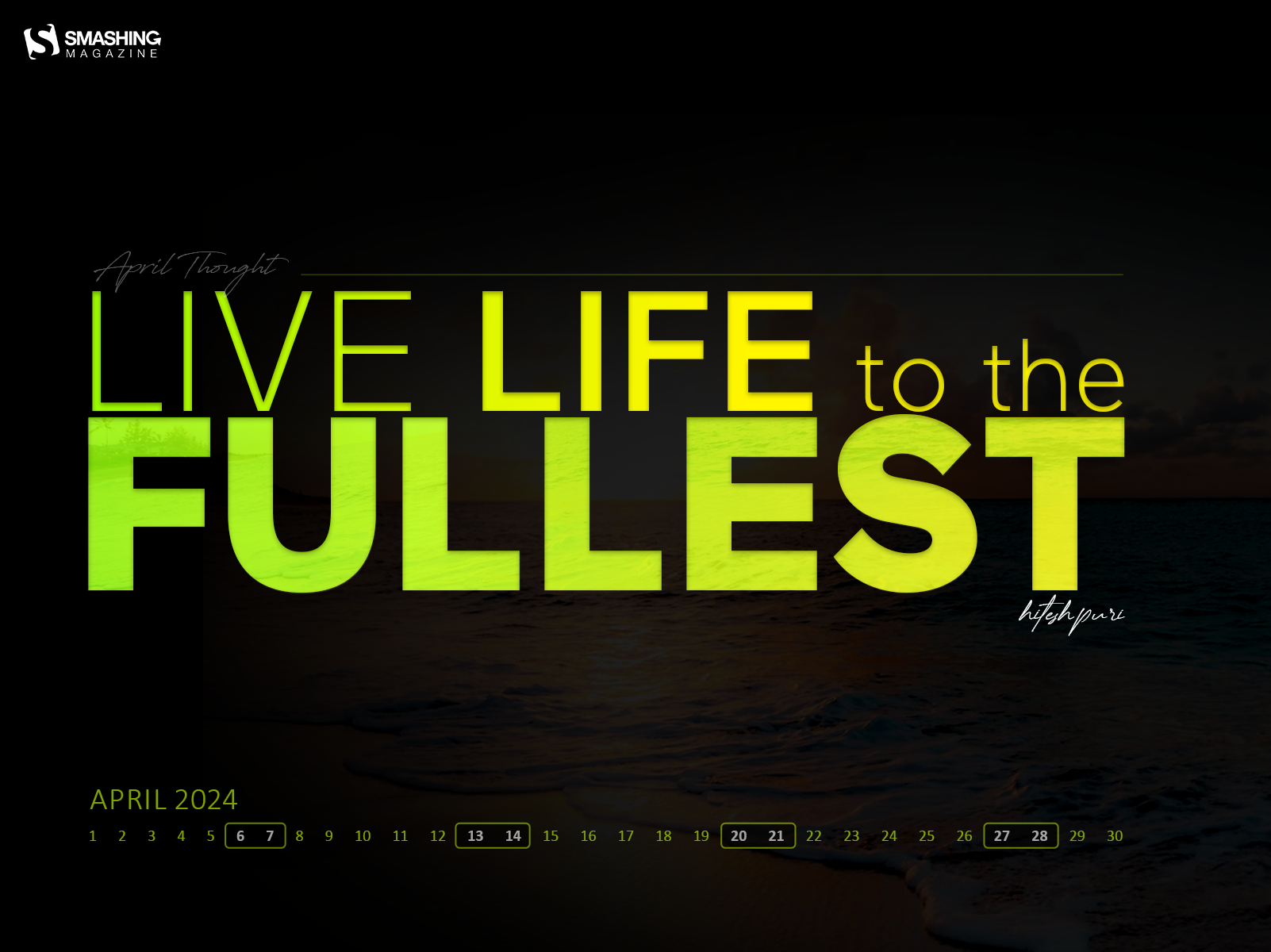
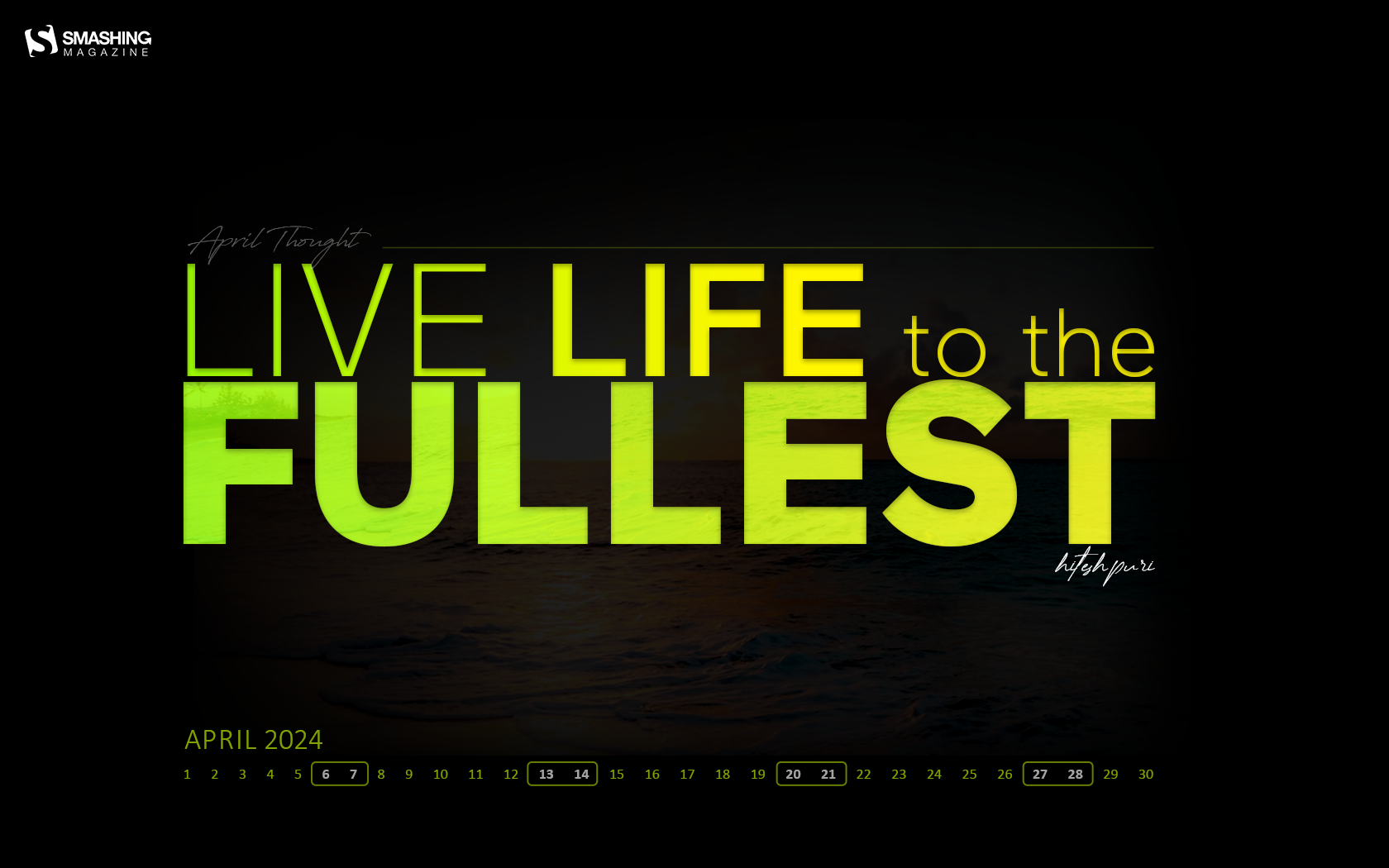
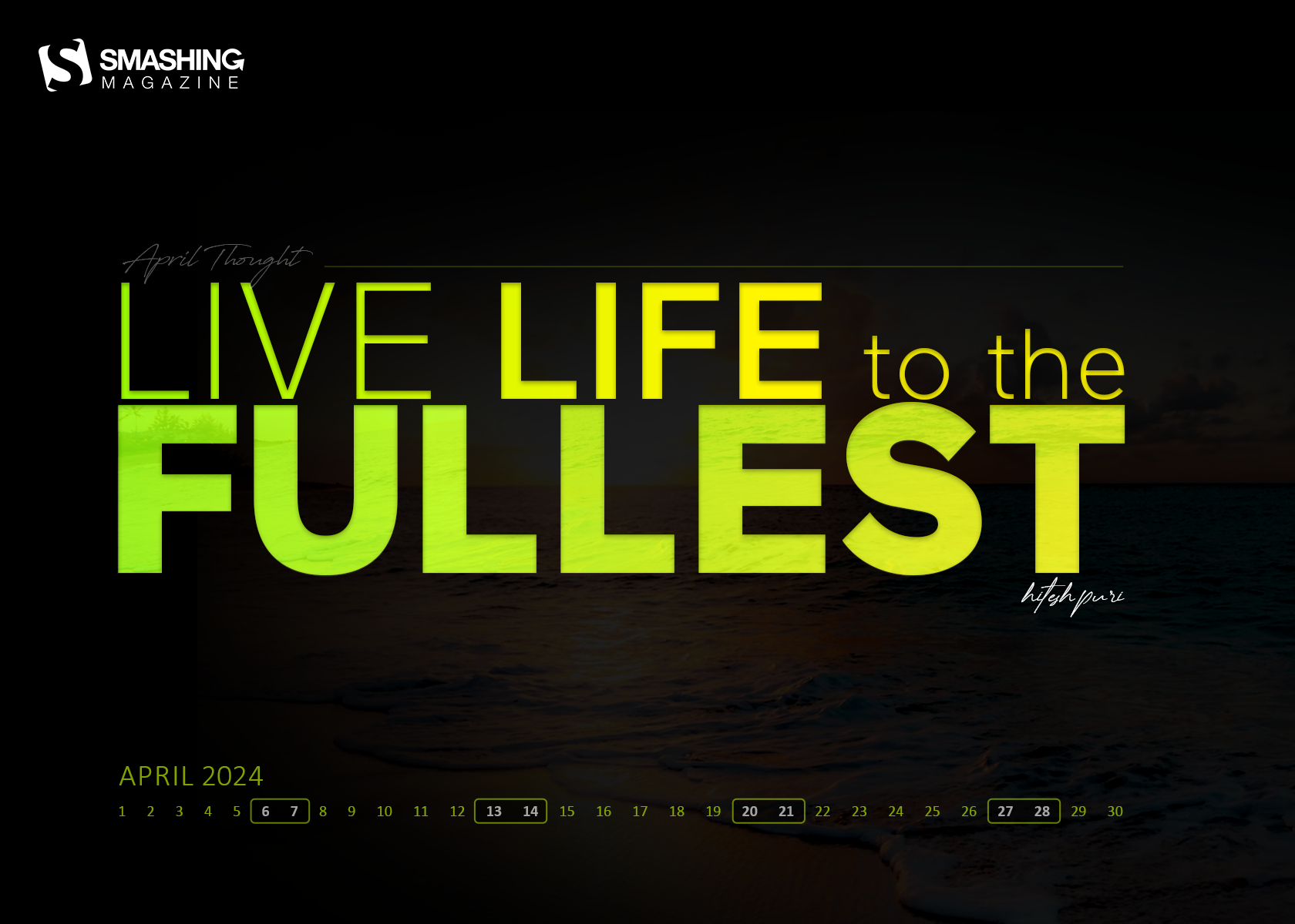
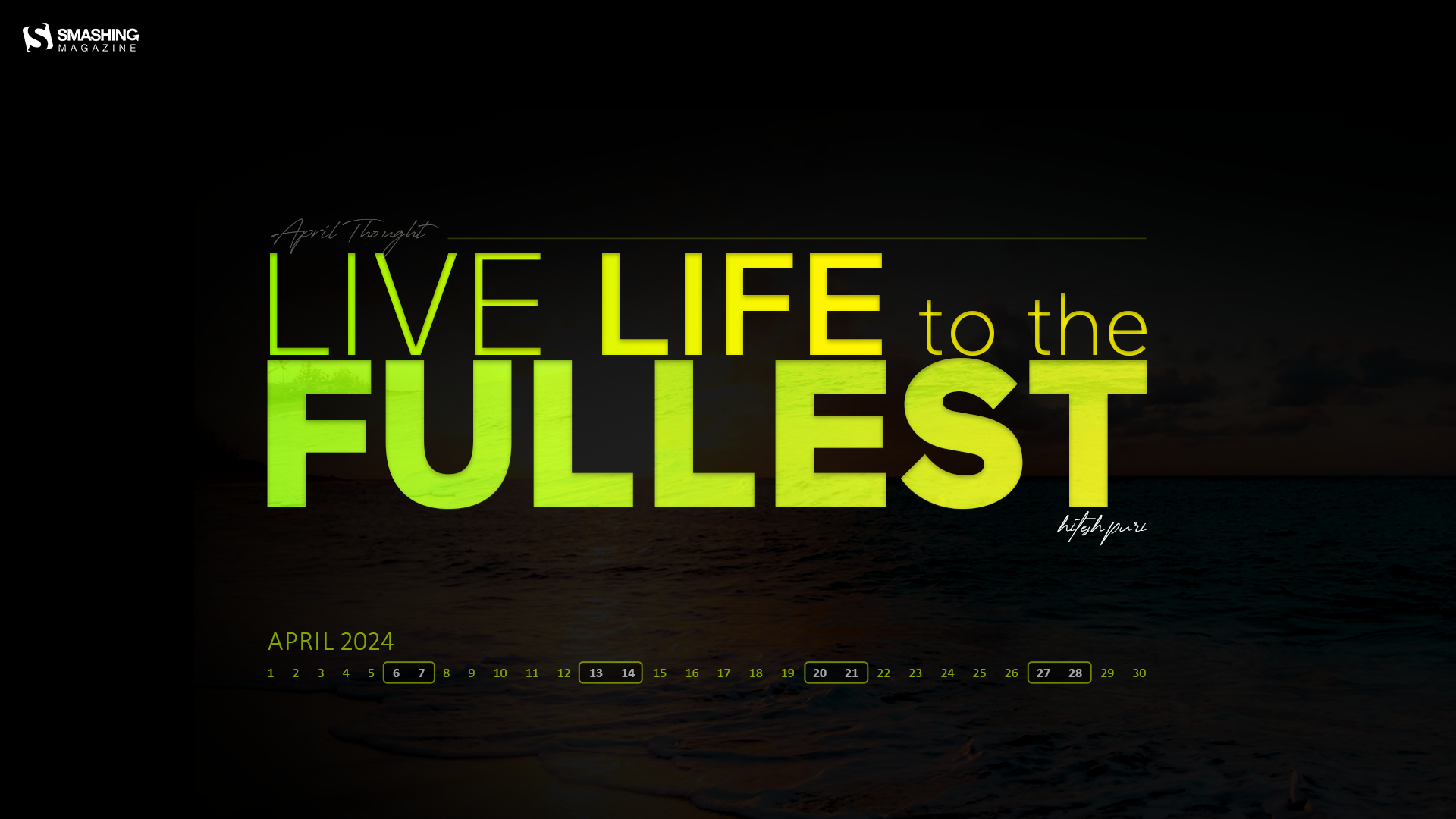
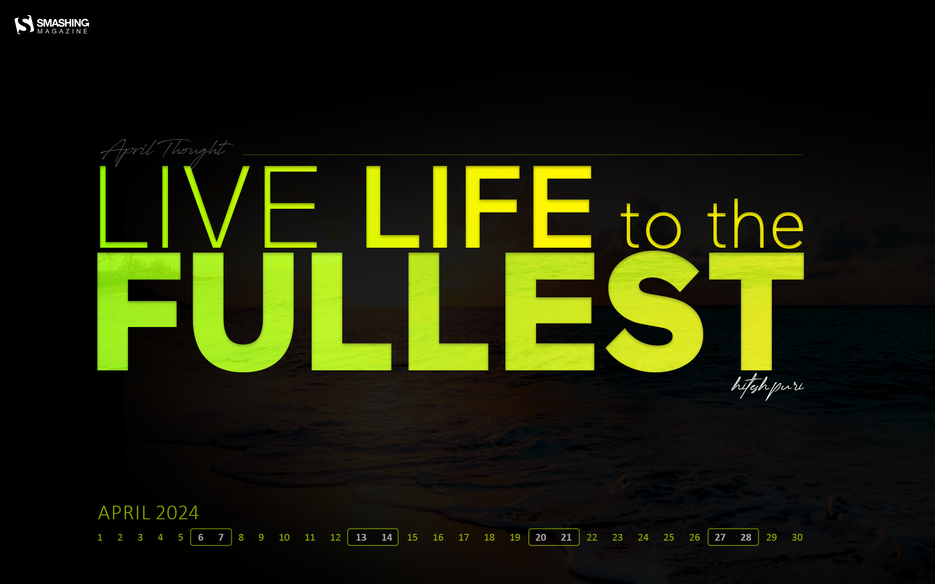
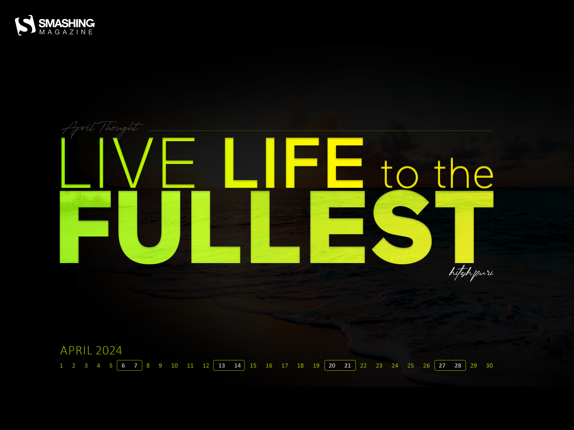
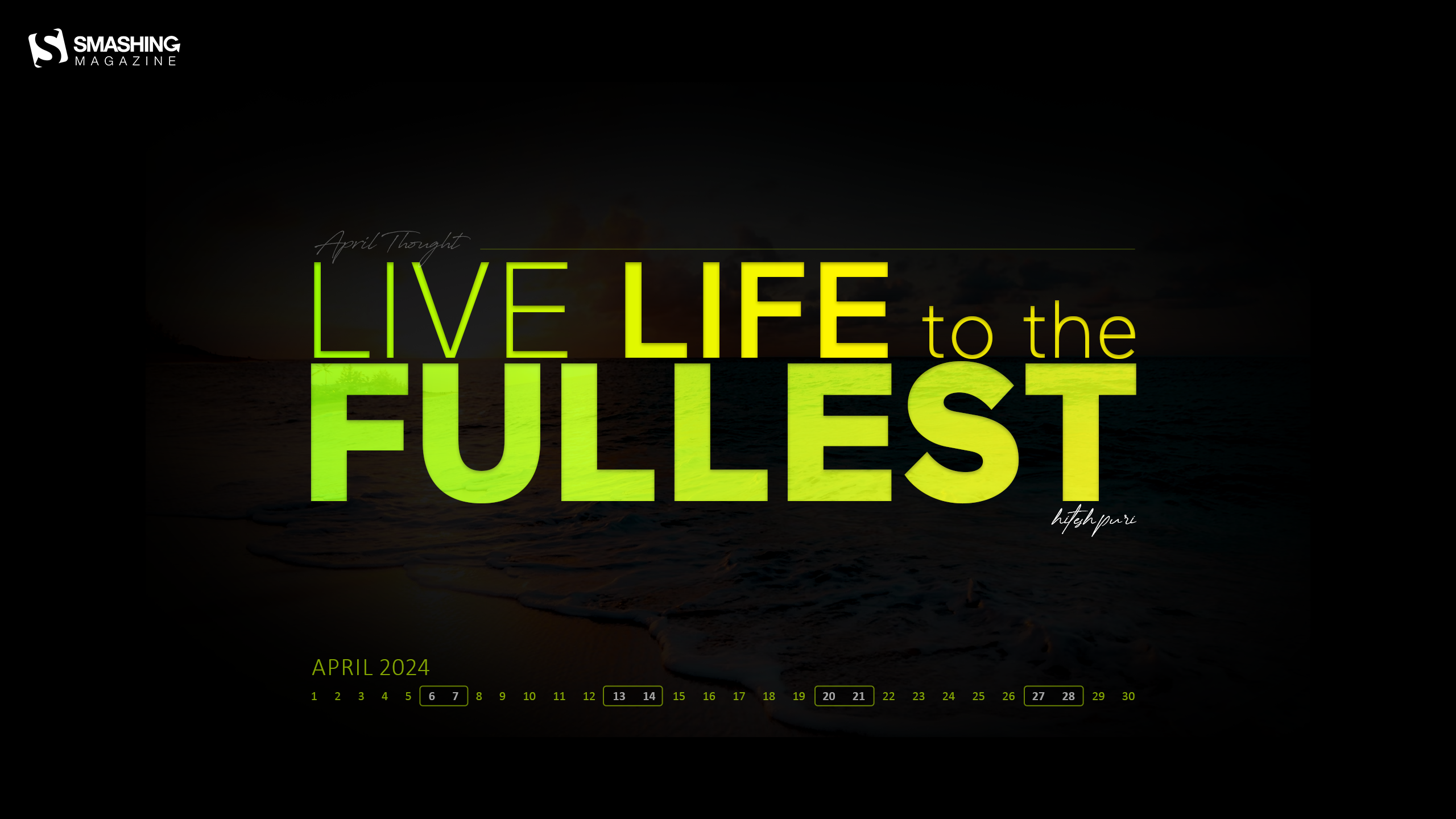
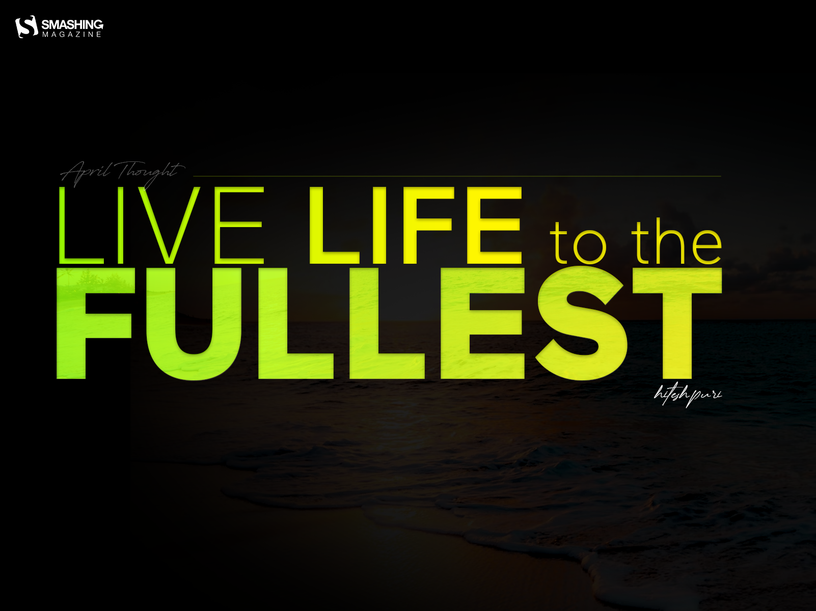
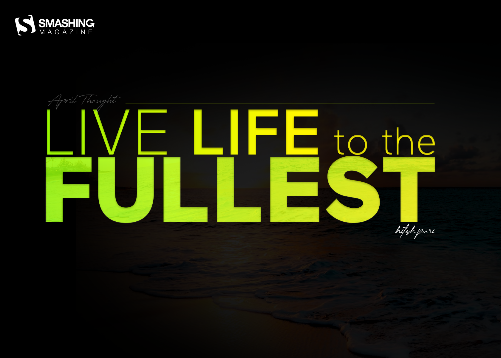
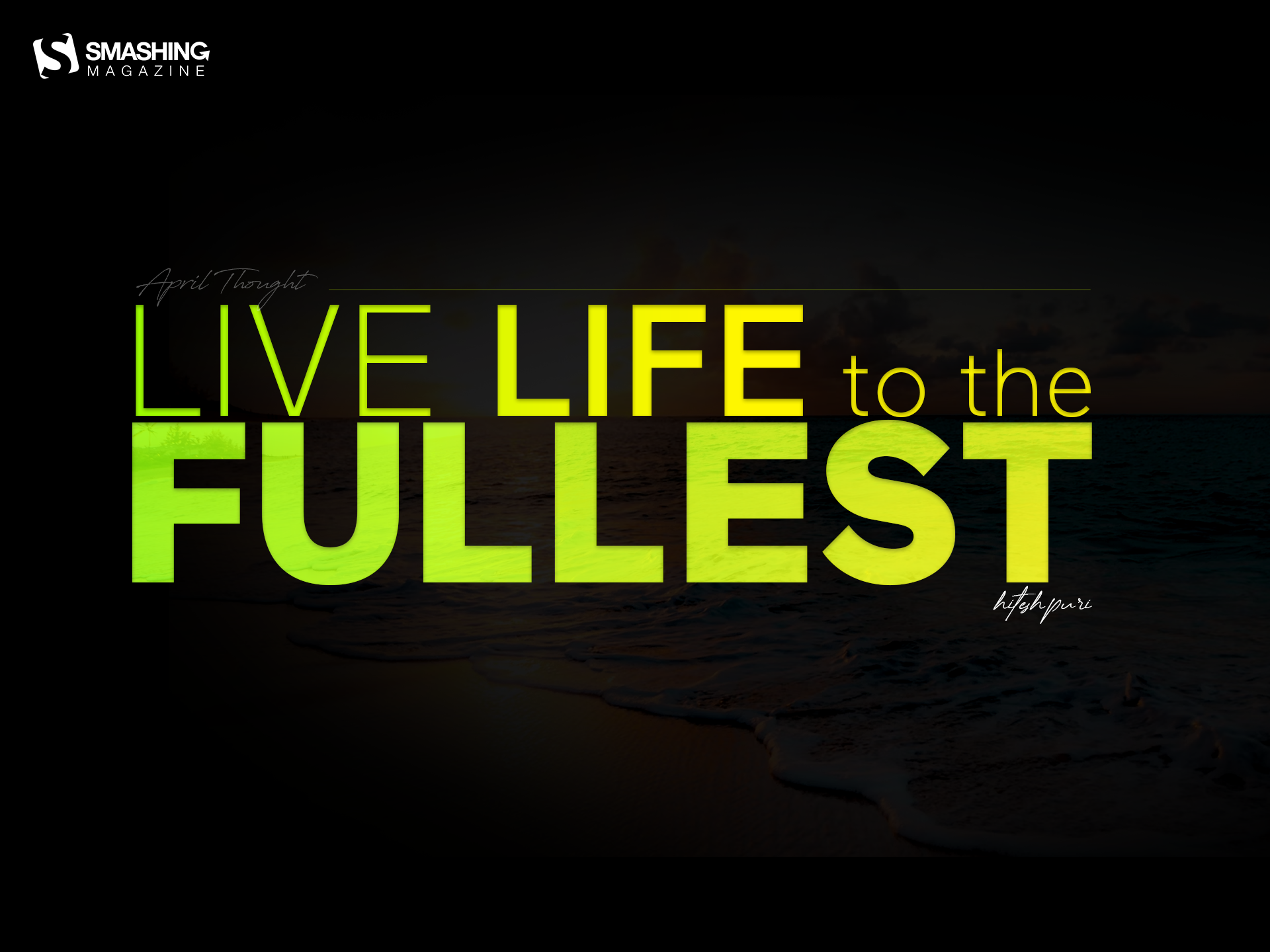
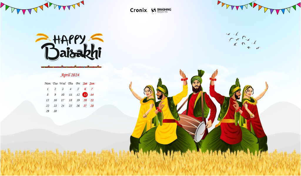
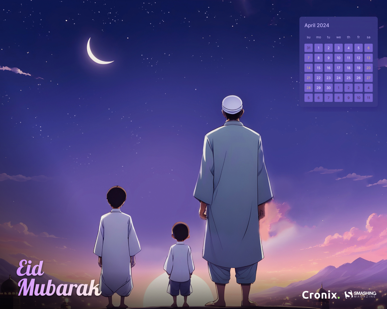
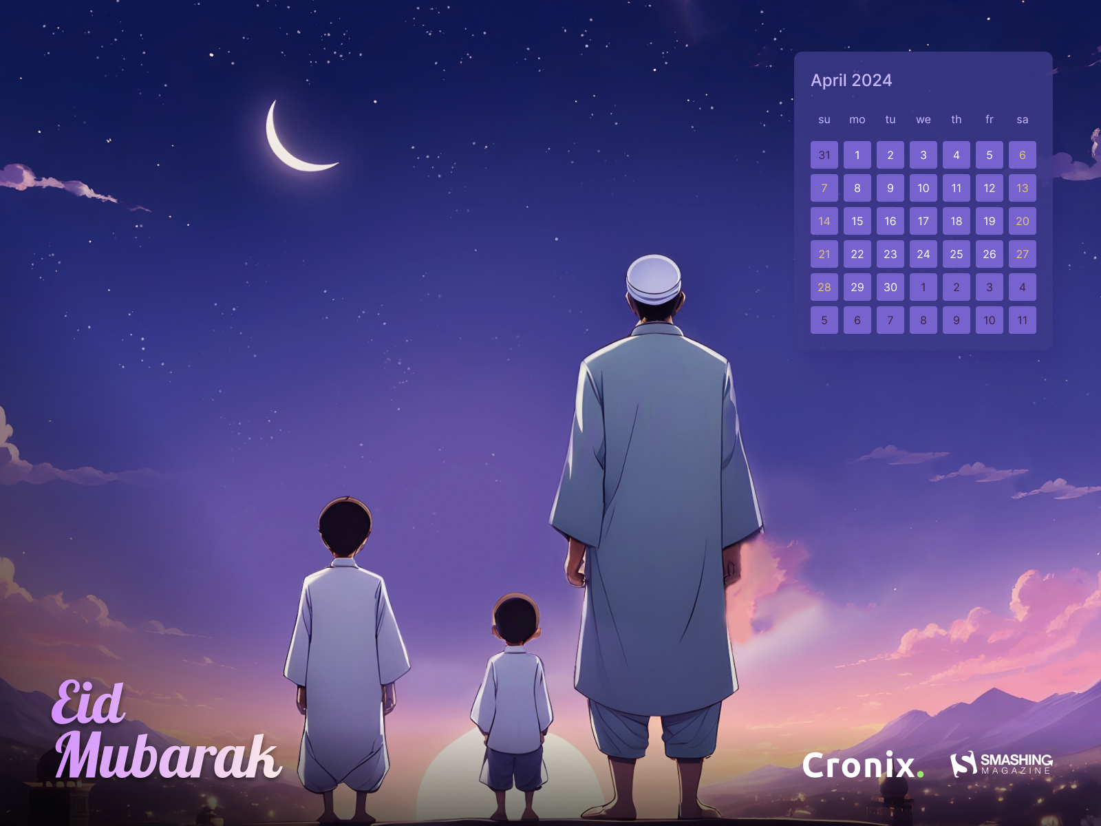
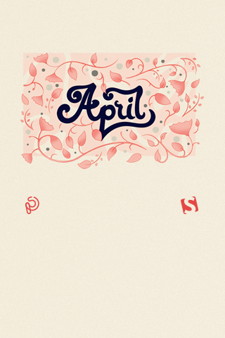
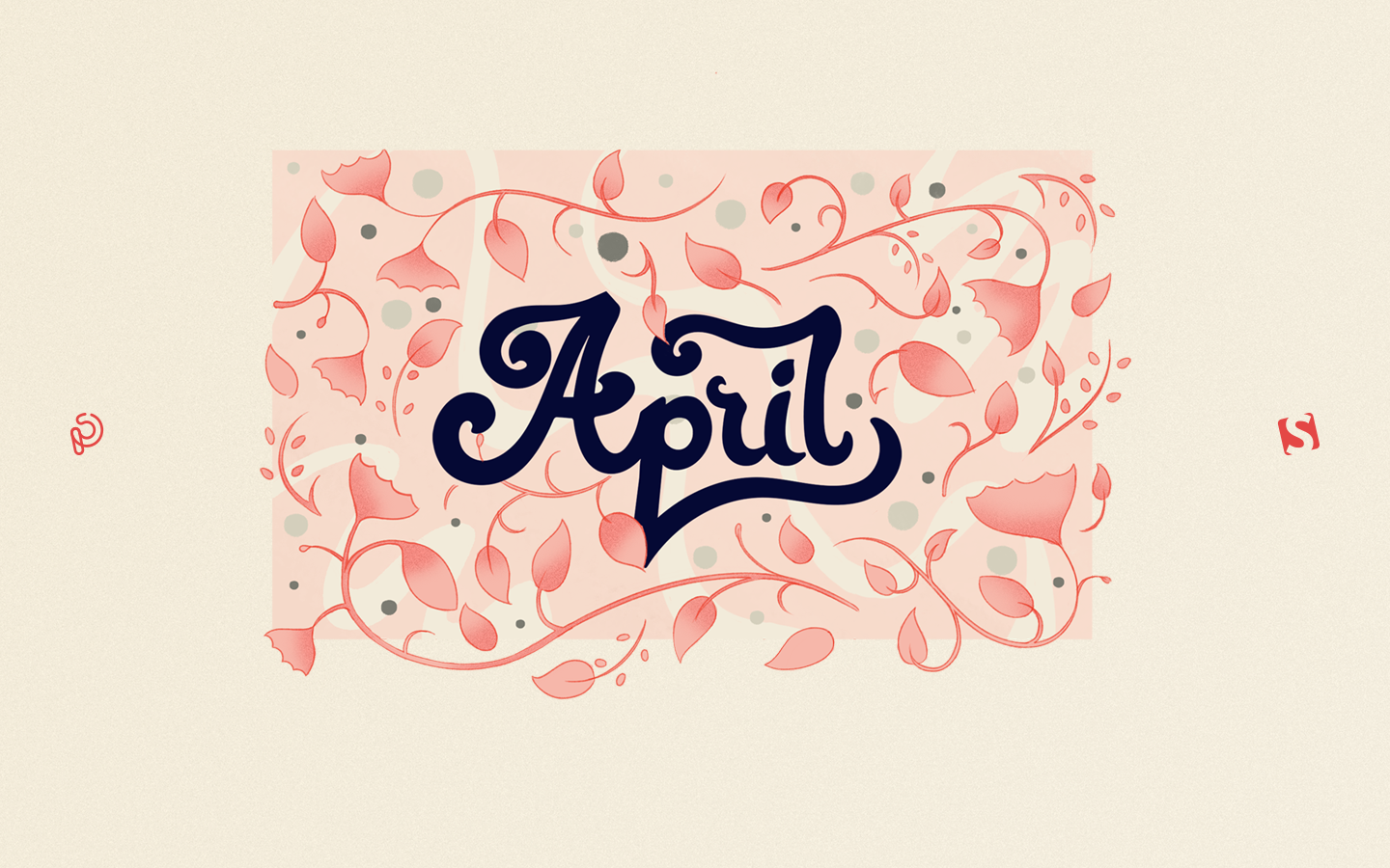
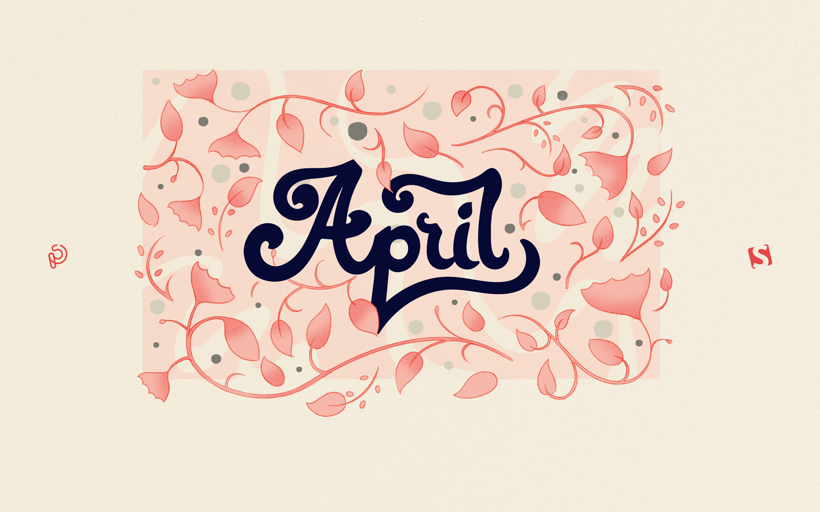
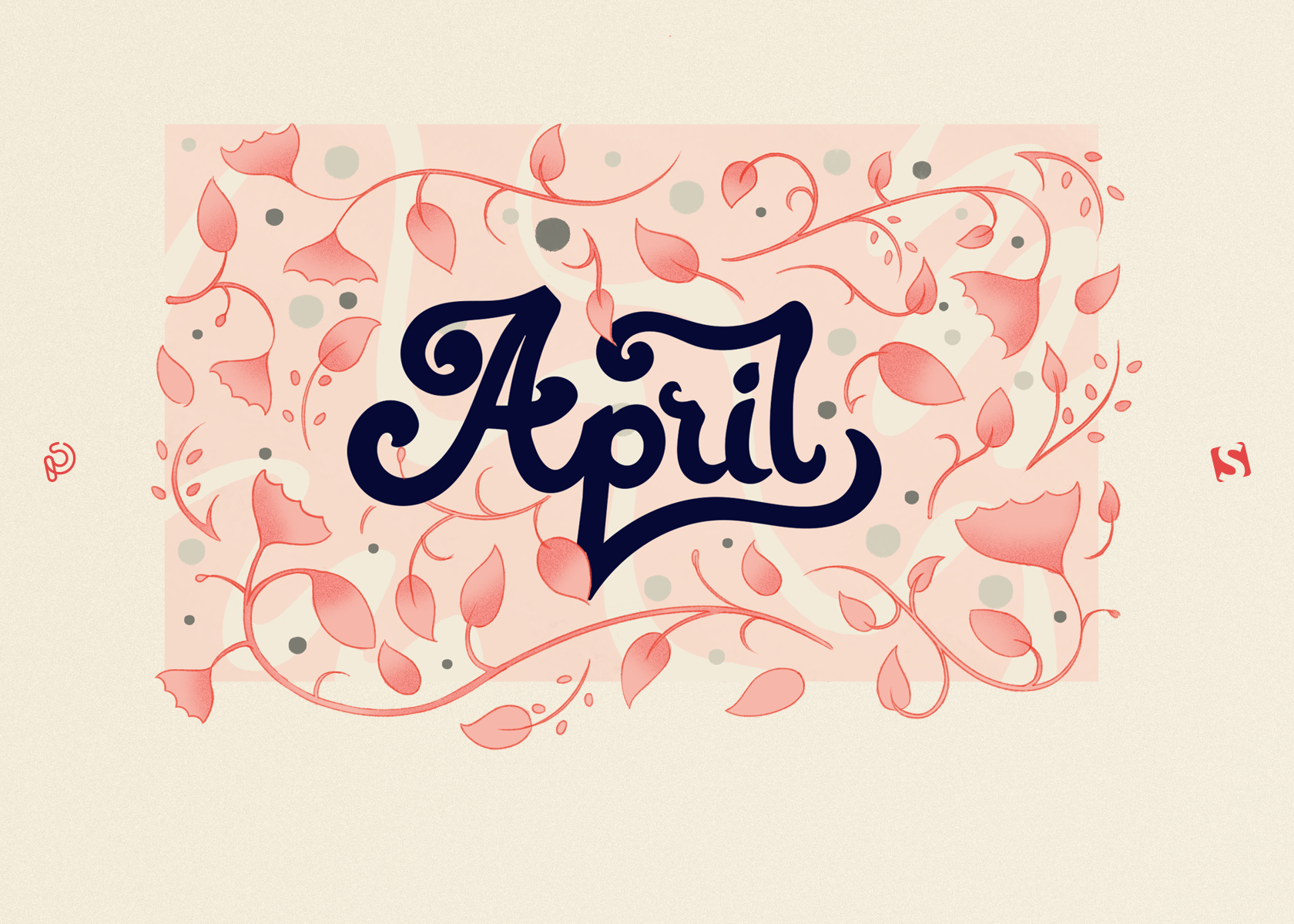
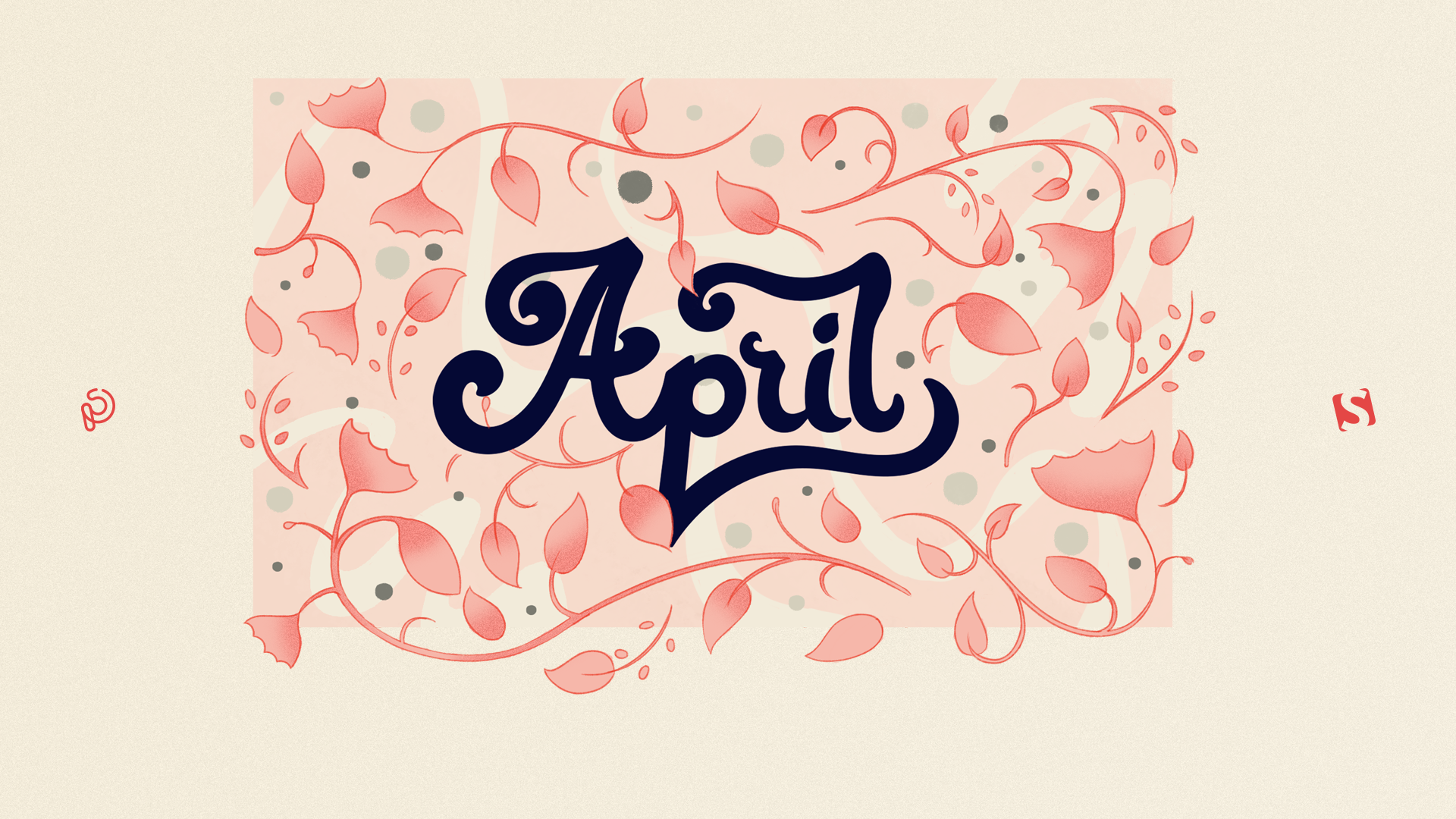
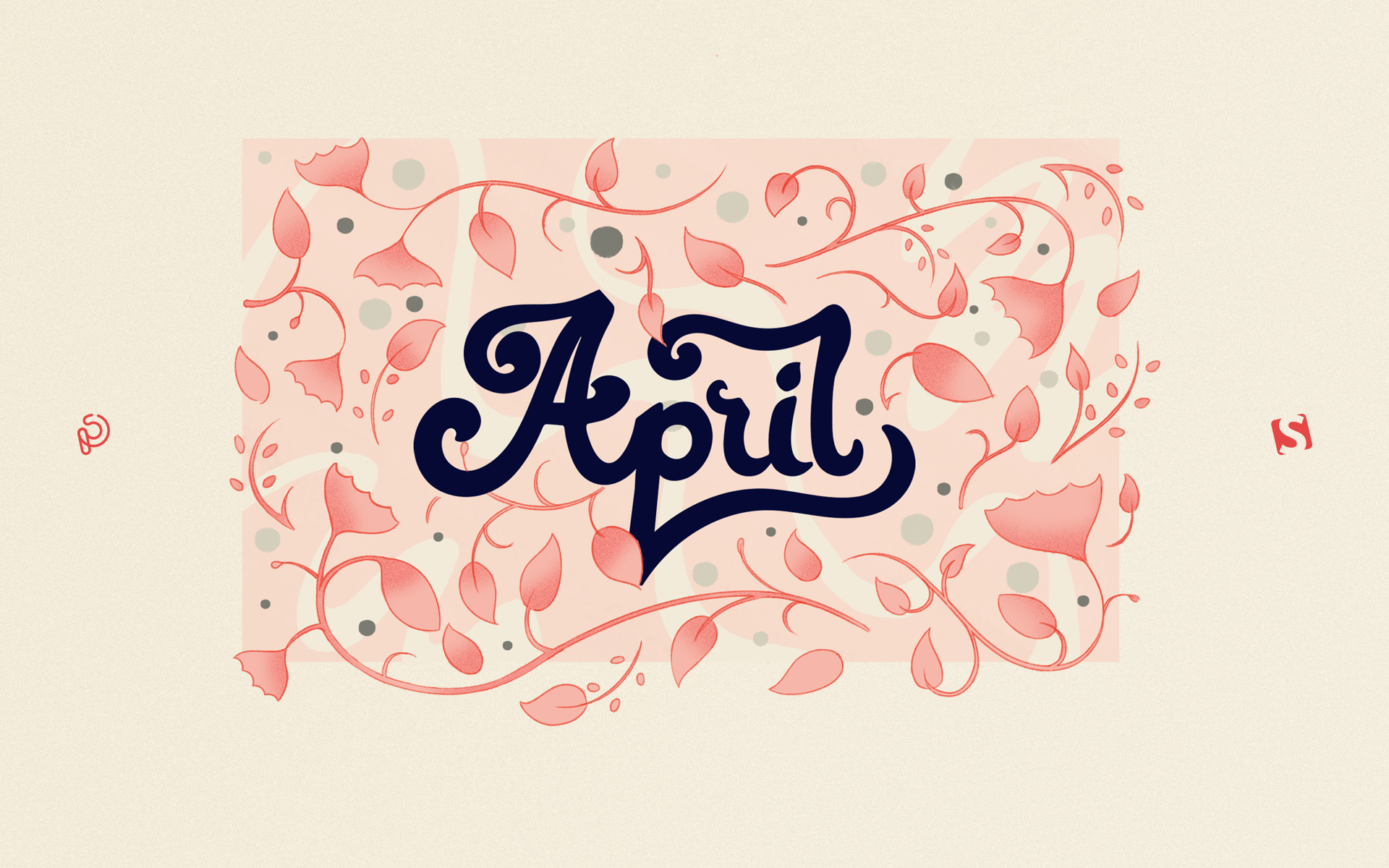
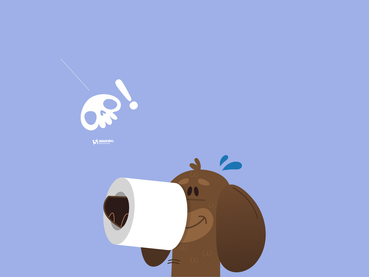
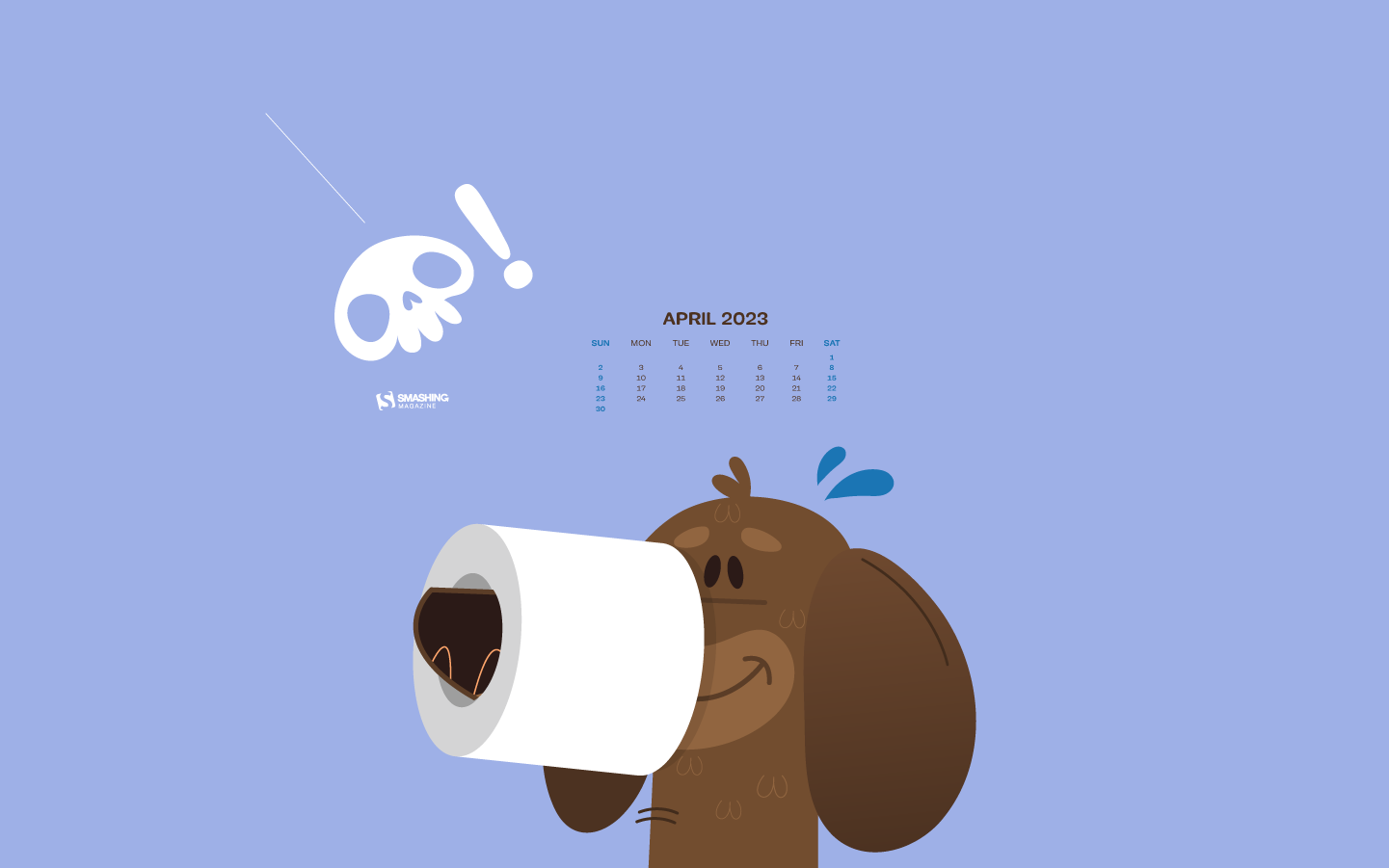
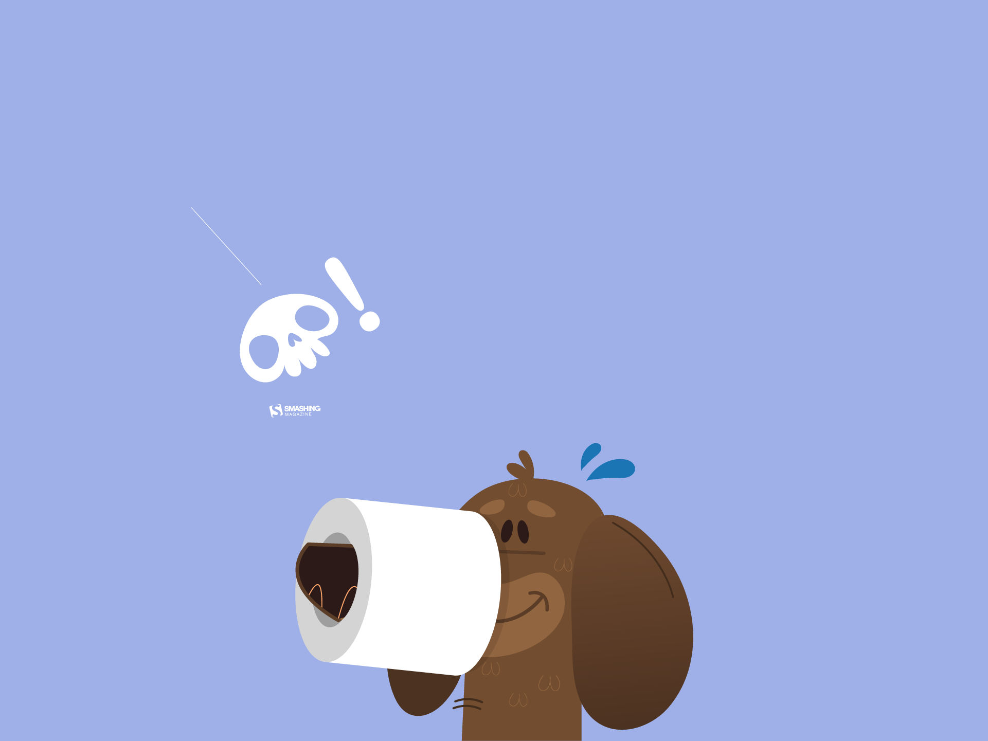
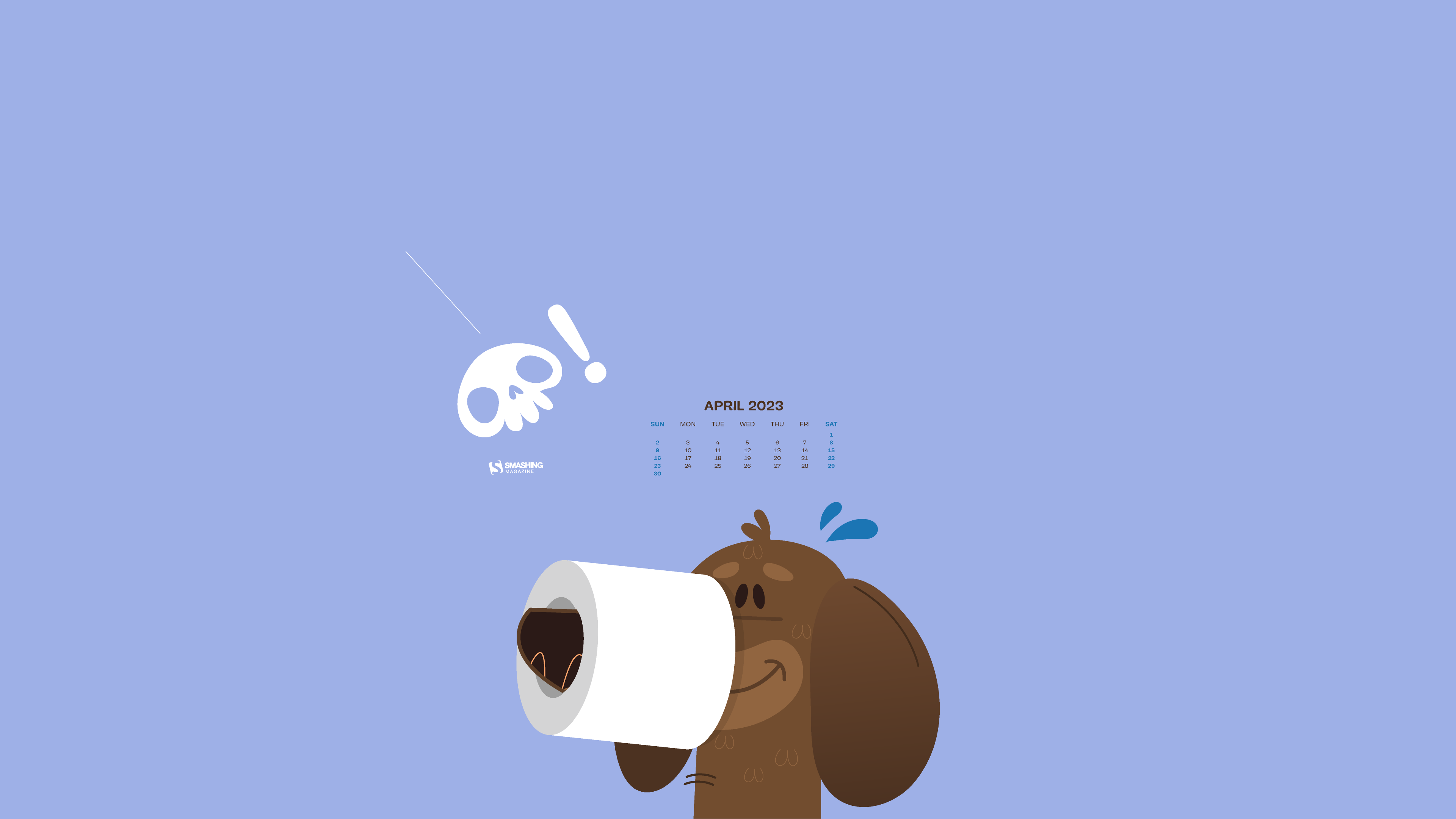
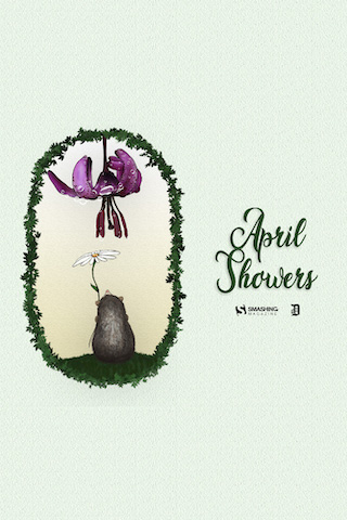
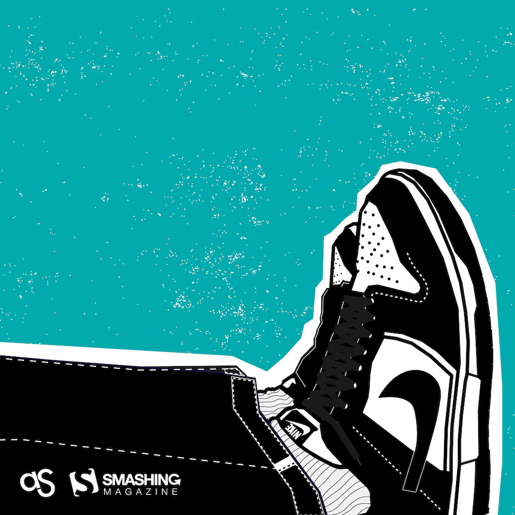