Acquired.com has announced the release of a new API-powered payment solution that the company claims will allow businesses to pay partners in just a few seconds. Additionally, the solution will provide visibility into the status of the transfer.
If you use Firefox and manage multiple websites that use different Content Management Systems and have a hard time keeping track of the various URLs to their backends, consider using the CMS Backend Opener Firefox extension created by Andy R.
Once installed, you can use either a keyboard shortcut (Alt + Y) or press a button within the browser and it will automatically open the login page for the detected CMS in a new window.
The extension uses the CMS meta-tag: Generator to detect which CMS is being used. The following CMS’ are supported:
Typo3
Typo3 Neos
Joomla
WordPress
Django
Shopware (beta)
Magento (beta)
Drupal
Contao
Weblication
WebsiteBaker
CMSQLite
Oxid
Although the extension has not been updated in two years, I tested it on Firefox 67.0.4 on my MacBook Pro and it worked without any issues. I typically use a bookmark to browse to WP-Admin but this is more convenient, especially on WordPress.com.
I’ve also learned that if you have Pretty Permalinks enabled in WordPress, you can type /login or /admin after your domain and it will typically load the login page.
Honeypot, a tech-focused job platform based in Europe, has produced a documentary that offers a fascinating look at the origins of GraphQL. The 28-minute video explores how quickly the project began to have an impact on the wider tech industry after Facebook publicly released it as an open source project.
GraphQL co-founder Nick Schrock, who was interviewed along with fellow co-creators Lee Byron and Dan Schafer, said the documentary “captured both the urgency and joy of the early months of the GraphQL.” It was filmed over two months in San Francisco and Berlin, where Honeypot runs the GraphQL Conf in cooperation with Prisma.
GraphQL began as an internal project at Facebook that was born out of necessity as the tech industry began to shift towards providing better mobile experiences for users. At that time, Facebook’s native apps were just a thin wrapper around the mobile website.
“The inability of a large technology company to adjust to a technology shift as big as the mobile shift is the type of thing that will consign a seemingly unstoppable empire to the grave in a matter of a few years,” Schrock said.
Facebook decided to re-write the Facebook iOS app but the APIs they had at that time were inadequate for creating the Newsfeed. A new Newsfeed API was written simultaneously to be used with the new mobile app. Facebook for iOS 5.0, released in 2012, was a native re-write of the app and also the first time GraphQL was deployed in the wild. Following that release, its use was expanded beyond just the Newsfeed to encompass most of the functionality offered in Facebook’s iOS app.
Facebook shared GraphQL with the world at React Europe 2015 and published the GraphQL spec later in 2015. They explained that their goal was to design what they thought was the ideal API for frontend developers and work backwards with the technology.
GraphQL’s creators were surprised at how fast the uptake was after making the project public. Engineers at Airbnb, Twitter, and Github were early adopters and their experiences are shared in the documentary with interviews from the community. The problems GraphQL’s creators encountered in scaling their mobile experience were not specific to Facebook. Other companies had similar problems and the demand for GraphQL in the industry was already there. Within six months, the team saw implementations of GraphQL in many of the major programming languages. They realized how important the project was to the industry after GitHub announced in 2016 that its public API would be a GraphQL API:
Using GraphQL on the frontend and backend eliminates the gap between what we release and what you can consume. We really look forward to making more of these simultaneous releases. GraphQL represents a massive leap forward for API development. Type safety, introspection, generated documentation, and predictable responses benefit both the maintainers and consumers of our platform.
The documentary tells the story of how GraphQL began the first three years as a solution to internal problems at Facebook but expanded to become a community tool that was initially adopted by hobbyists and then incorporated into the products of large tech companies. GraphQL co-founder Lee Byron predicts that the project is entering the next phase of its life and “heading towards becoming an industry standard and one that’s collaborative.”
There’s no way to measure the number of APIs that are being built around GraphQL, but the query language is now used in both internal and external APIs at major companies like Pinterest, Intuit, Coursera, Walmart, Shopify, PayPal, KLM, NBC News Digital, Credit Karma, Wayfair, and Yelp. Since it can be used in combination with REST APIs, GraphQL’s rapid adoption is not necessarily a good predictor for the end of REST architecture, but it’s a trend that is worth following. This widespread adoption began with just a handful of engineers who saw GraphQL’s promise at React Europe 2015, built tools to optimize development, and advocated for using GraphQL at their companies.
“I totally underestimated the power of these open source communities,” Schrock said. “We had to rely on this community of poeple to form spontaneously and then build implementations of this in different languages and then actually productionize it and build an entire tool ecosystem around it. I didn’t think that was ever going to work, and I was totally wrong. If an idea makes sense to people and it clicks with their mind and they can see the vision, they are actually willing to do a lot of work in order to see it executed and share their work, and it’s a pretty remarkable thing to see.”
The energy in the GraphQL documentary is inspiring and the story shares many parallels with other open source projects that have gained widespread adoption through passionate communities. Check out the full documentary below:
Tabs are a fairly common feature on many websites, especially e-commerce stores. E-commerce store owners usually use tabs in the product description area, where they split reviews, description, technical specs and so on into multiple tabs. Still, tabs have found use in many other different types of websites, not just e-commerce websites. Even the official […]
Having a unique and creative website that draws users in is no longer an option. In 2019 websites must have these features. Boring and old-style sites are no longer feasible because they do not draw attention or make users want to explore further. Visitors should have a unique experience. A functional and clean website is essential and will often make or break your customer’s experience.
A good website will bring in so many more visitors and will rank better in search engines for many different reasons. Plus, a website can be both great-looking and functional. These days, you do not need to sacrifice one for the other because both are very doable.
The average person will make a judgement on your website in about seven seconds. So, in that short amount of time, your site will need to get and hold their attention. If you fail to gain their attention in that time, more often than not the user will lose interest and move on.
Thankfully this article is here to save you and teach you what not to do when building a website. We’ll help you avoid some common mistakes and the subtle issues that you may not have thought about. Even if your website is already built, take a look to see if you may have made any of these mistakes. It’s not too late to make a change.
Too Much Information at Once
We have all visited a website and have been completely overwhelmed with information. When a website presents too much at once, users will be distracted from what you want to communicate. Inundating users with too much information, text or pictures will leave them confused.
Try to have your website segmented appropriately and have a section for everything. This will avoid any confusion and will make your visitors happy.
Not Enough Going On
This mistake is the complete opposite of the first one. When a website has little-to-no information displayed, it can also leave the user confused. Minimalism is big right now, but there is an appropriate limit to the trend.
When visitors come to your site, they should be presented with what is necessary for them to know. Users want to know who you are and what you can offer them. Then, after viewing this, they will further explore your website. That’s when you present them with more detailed information about what you do.
Not Mobile Friendly
We have all had the experience of trying to browse a website on our phone that is not properly optimized for small screens. This is very frustrating and headache-inducing because, in 2019, it is expected that your website will be mobile friendly.
50% of people said that they are less likely to use a website if it is not mobile friendly. Even if these users like your business, they will opt to use a competitor’s site that is mobile friendly. Avoid this mistake, because not only will it frustrate users it will drive them to right to your competition’s door.
Making Information Too Difficult to Find
When important information is difficult to find, users will be perplexed. A website should have important information like hours, locations, frequently asked questions, phone number, email and about sections in easy-to-find spots.
Placing this information near the search bar or header of your website makes it easy to locate. Burying these details is a major mistake that you’ll want to avoid.
Pop-ups and Over Use of Distractions
Everybody hates visiting a website for the first time and being blasted with popup after popup. Asking users to subscribe to your newsletter, create an account, disable their ad blocker, and many more things is an immediate turn off for users.
Google recently warned users to avoid these types of pop ups and advertisements due to their intrusiveness. This is a very common mistake. You can still do these things on your website, but do it sparingly and make sure it does not affect the user experience negatively.
Using Too Many Sliders
Slideshows can be an efficient way to present information to users, but ultimately, they should be avoided. They tend to mess with the user’s attention. For example, someone may be reading the information on one slide and then suddenly it advances to the next one.
This removes the control from your website visitors. Users should always be in control of what they are doing. Your website is not a middle school history presentation, so avoid the making the slideshow mistake on your website.
Website Speed
A speedy website is very important. As I mentioned above, you have about seven seconds to draw the user’s attention. If your webpage does not load quickly within those seven seconds, then you will probably lose a visitor or potential customer.
Some things you cannot control when it comes to performance, such as the user’s internet speed and device used. But what you can control is simple. Overloading your homepage with content and long videos will affect the loading speed. Avoid this mistake by keeping it simple when building your website.
It’s All About the User
Building a great website may seem like a daunting task. As we’ve seen, there are a lot of potential mistakes for designers to make.
However, when you keep users in mind, you’ll know that you’re on the right path. Ensure that your site is easy to use, accessible and mobile friendly. That’s the best way to position yourself for success.
Learn about the new Basis Universal image format that was designed to produce very small file sizes and to be decoded on graphic cards instead of the CPU. An article by Ada Rose Cannon.
In this article, Miriam Suzanne takes a deeper dive into the ‘CSS Custom Properties for Cascading Variables’ specification to ask, “Why are they called custom properties, how do they work in the cascade, and what else can we do with them?”
Hidde de Vries takes a look at how “good” client-side code improves the experience of users of assistive technologies, and how we can use accessibility trees to help verify our work on the user experience.
Learn about synthesizers via Ableton’s interactive website. Play with a synth in your browser and learn to use the various parts of a synth to make your own sounds.
Did you know that WordPress comes with a built-in feature that allows you to undo changes and go back to a previous version of a post?
This feature is called Post Revisions or simply Revisions.
Most of us make mistakes when writing. Sometimes you might wish that you hadn’t deleted what you wrote earlier. Revisions allow you to fix that by going back in time and undoing the changes.
In this article, we will show you how to easily undo changes in WordPress with post revisions. We will also show you how to easily manage post revisions in WordPress.
Here is an overview of the topics we’ll cover in this guide:
Post revisions is a WordPress feature that allows you to undo changes and go back to an earlier version of your posts and pages.
For each draft you are working on, WordPress automatically saves a temporary revision. This type of revision is called auto-save.
WordPress stores an auto-save every 60 seconds. It also automatically replaces the older version with the new auto-save.
The autosave feature helps you restore the content if something goes wrong before you can save it. For example, if your browser crashed or your computer hanged while writing, then you can restore your latest draft from the autosave.
WordPress also saves post revisions each time a user clicks on the save, update, or publish button. Unlike auto-saves, these revisions are permanently stored in the WordPress database.
You can locate, browse, and revert back to any of these revisions from the post edit screen.
Why You Should Use Post Revisions
Almost every WordPress user can benefit from post revisions. Writing great content requires a lot of tweaking and edits. Post revisions allow you to see your process and take a bird’s eye view of how your post has evolved.
You can then switch between different states of your draft, make changes, and make your article perfect for publishing.
For multi-author WordPress sites, post revisions allow editors to easily manage the work of multiple authors. You can see who made changes to an article, what changes they made, and so on.
That being said, let’s take a look at how to use post revisions to improve your WordPress posts and pages.
How to use Post Revisions to Undo Changes in WordPress
WordPress displays the number of revisions under the ‘Document’ panel on the post/page edit screen.
You can find that on the right-hand side of your post editor screen. Clicking on the ‘Revisions’ will take you to post revisions screen.
The post revision screen will show you the latest revision of the post with a scrollbar on top. Sliding the button on the scroll bar will take you to earlier revisions of the post.
Changes made in each revision will be highlighted in green and pink colors. On the top, you can see the user who made these changes, time, and other information.
WordPress will also let you know if a revision is an autosave or a draft.
You can use the next and previous buttons to move around revisions.
Plus, you can check the box on top that says ‘Compare any two revisions’. Doing so will split the scrollbar button into two, and you can take each button to a different revision and compare the difference between two distant revisions.
To restore a revision, you can simply click on Restore This Revision or Restore This Autosave button.
WordPress will restore the selected revision as your current post revision, and you can then save it as a draft.
Keep in my mind that restoring to an earlier revision will not delete the latest version of your post. Instead, WordPress will store it in the database as another revision.
Using post revisions with Classic WordPress editor
In case you haven’t upgraded your WordPress to Gutenberg and still using the Classic Editor, then you’ll find the post revisions in the publish meta box on the right panel of the post/page edit screen.
To view the post revisions, you can simply click the ‘Browse’ link next to the number of revisions. Apart from this, the post revisions work similarly in both the Classic Editor and Gutenberg.
Limiting Post Revisions in WordPress
All post revisions are stored in your WordPress database. Due to this, many users worry that too many revisions can slow down their websites.
It is not true.
WordPress skips post revisions when making database calls on the front end. It only looks for revisions on the post edit screen, or when you are actually browsing revisions.
You can still control and limit post revisions in WordPress. We’ll show you two different methods to do that you can choose one that best suits you.
1. Limit post revisions in WordPress using plugin
The easiest way to manage WordPress post revisions is by using a plugin. This allows you to control revisions from the WordPress admin area.
Upon activation, you need to visit Settings » Writing page and scroll down to WP Revisions Control section.
From here you need to enter the number of revisions you want to store for each post type and then click on the ‘Save Changes’ button to store your settings.
WP Revisions Control will now limit the post revisions stored in your WordPress database.
The plugin also allows you to delete revisions for an individual post. Simply edit the post where you want to delete revisions and scroll down below the editor.
You can limit the revisions for this post only or delete them by clicking on the ‘Purge these revisions’ button.
2. Limit WordPress post revisions manually
WordPress allows you to control how many revisions you want to keep for an article. To limit post revisions, simply add this code to your WordPress site’s wp-config.php file.
define( 'WP_POST_REVISIONS', 10 );
Don’t forget to replace 10 with the number of revisions you want to keep for each post.
How to Delete Old Post Revisions in WordPress
Old post revisions are perfectly harmless, and you don’t need to delete them in most cases. However, if you have a very large website with thousands of articles, then deleting old post revisions can help you reduce backup sizes.
Upon activation, go to Settings » Writing page and select the post types where you want to disable revisions feature.
Don’t forget to click on the save changes button to store your settings.
If you don’t want to use the plugin, then you can also do the same thing manually by adding this code to your wp-config.php file.
define('WP_POST_REVISIONS', false );
This code disables WordPress post revisions feature on your website. It will still allow WordPress to save one autosave and one revision in your browser storage.
We hope this article helped you learn how to use WordPress post revisions to undo changes and how to manage post revisions for larger sites. You may also want to see our beginners guide on managing your editorial workflow in WordPress.
If you liked this article, then please subscribe to our YouTube Channel for WordPress video tutorials. You can also find us on Twitter and Facebook.
You may have heard (or even issued the call) that “we can just use lazy loading!” when looking for a way to slim down a particularly heavy web page.
Lazy loading is a popular technique for gradually requesting images as they come into view, rather than all at once after the HTML of the page has been parsed. It can reduce the initial page weight, and help us hit our performance budgets by requesting images when they're needed.
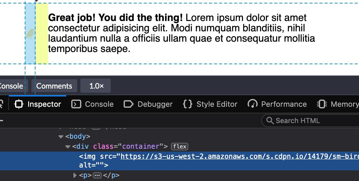
Yikes! Well, that's kinda okay, I guess. It makes sense that the image would bump right up against the text like that because we haven’t set a width on the image. Ideally, though, we’d like that image to have a fixed width and then the text should take up whatever space is left over.
This looks great in Chrome. But wait, what? If we inspect the image tag in Firefox DevTools, we’ll find that it’s not the width value that we set at all:
We could use min-width to force the image to the 50px width we want:
img {
  min-width: 50px;
  margin-right: 20px;
}
Buuuuuuut, that only sets helps with the width so we've got to put a margin in as well.
img {
  min-width: 50px;
  margin-right: 20px;
}
There we go. That's better in Firefox and still works in Chrome.
The even longer answer
I realized the image is getting the squished treatment because we need to use the flex-shrink property to tell flex items not to decrease in size, regardless of whether or not they have a width.
All flex-items have a flex-shrink value of 1. We need to set the image element to 0:
If we set the flex-shrink value to 0 and the flex-basis value to the default width we want the image to be, then we can get rid of the width property altogether.
That flex-shrink property solves a ton of other problems and is pretty dang important if you want to start using flexbox. Here’s another example why: I stumbled upon yet another problem like the one above and I mentioned it in a recent edition of the newsletter. I was building a navigation component that would let users scroll left and right through multiple items. I noticed the following problem when checking my work:
That longer navigation item shouldn’t break into multiple lines like that — but I finally understood why this was happening, thanks to the previous issue. If you set the flex-shrink property to 0 then it will tell each item in this navigation not to shrink and instead assume the width of the content instead, like this:
And, yes, we can go the extra step once again to use the flex property instead, this time using auto as the flex-basis since we want the maximum amount of space for all items to be considered when divvying up space in the navigation container.
This is the July 2019 edition of "This Month in WordPress with CodeinWP." For the WordPress community, June is synonymous with WordCamp Europe. The biggest WordPress event somehow gets bigger every year, and 2019 tore the records to shreds with the largest number of registrations ever seen. As a result, we are dedicating this month’s news entirely to WCEU.
Last month, I had a conversation on Twitter about the difference between “scoped” styles (generated in a build process) and “nested” styles native to CSS. I asked why, anecdotally, developers avoid the specificity of ID selectors, while embracing “scoped styles” generated by JavaScript? Keith Grant suggested that the difference lies in balancing the cascade* and inheritance, i.e. giving preference to proximity over specificity. Let’s take a look.
Importance defined by the !important flag, and style origin (user > author > browser)
Specificity of the selectors used (inline > ID > class > element)
Source Order of the code itself (latest takes precedence)
Proximity is not mentioned anywhere — the DOM-tree relationship between parts of a selector. The paragraphs below will both be red, even though #inner p describes a closer relationship than #outer p for the second paragraph:
See the Pen [Cascade: Specificity vs Proximity](https://codepen.io/smashingmag/pen/OexweJ/) by Miriam Suzanne.
<section id="outer">
  <p>This text is red</p>
  <div id="inner">
    <p>This text is also red!</p>
  </div>
</section>
#inner p {
  color: green;
}

#outer p {
  color: red;
}
Both selectors have the same specificity, they are both describing the same p element, and neither is flagged as !important — so the result is based on source-order alone.
BEM And Scoped Styles
Naming conventions like BEM (“Block__Element—Modifier”) are used to ensure that each paragraph is “scoped” to only one parent, avoiding the cascade entirely. Paragraph “elements” are given unique classes specific to their “block” context:
See the Pen [BEM Selectors & Proximity](https://codepen.io/smashingmag/pen/qzPyeM/) by Miriam Suzanne.
These selectors still have the same relative importance, specificity, and source order — but the results are different. “Scoped” or “modular” CSS tools automate that process, re-writing our CSS for us, based on the HTML. In the code below, each paragraph is scoped to its direct parent:
See the Pen [Scoped Style Proximity](https://codepen.io/smashingmag/pen/NZaLWN/) by Miriam Suzanne.
<section outer-scope>
  <p outer-scope>This text is red</p>
  <div outer-scope inner-scope>
    <p inner-scope>This text is green!</p>
  </div>
</section>
p[inner-scope] {
  color: green
}

p[outer-scope] {
  color: red;
}
Inheritance
Proximity is not part of the cascade, but it is part of CSS. That’s where inheritance becomes important. If we drop the p from our selectors, each paragraph will inherit a color from its closest ancestor:
See the Pen [Inheritance: Specificity vs Proximity](https://codepen.io/smashingmag/pen/mZBGyN/) by Miriam Suzanne.
Since #inner and #outer describe different elements, our div and section respectively, both color properties are applied without conflict. The nested p element has no color specified, so the results are determined by inheritance (the color of the direct parent) rather than cascade. Proximity takes precedence, and the #inner value overrides the #outer.
But there’s a problem: In order to use inheritance, we are styling everything inside our section and div. We want to target the paragraph color specifically.
(Re-)Introducing Custom Properties
Custom properties provide a new, browser-native solution; they inherit like any other property, but they don’t have to be used where they are defined. Using plain CSS, without any naming conventions or build tools, we can create a style that is both targeted and contextual, with proximity taking precedence over the cascade:
See the Pen [Custom Props: Specificity vs Proximity](https://codepen.io/smashingmag/pen/gNGdaO/) by Miriam Suzanne.
The custom --paragraph property inherits just like the color property, but now we have control over exactly how and where that value is applied. The --paragraph property acts similar to a parameter that can be passed into the p component, either through direct selection (specificity-rules) or context (proximity-rules).
I think this reveals a potential for custom properties that we often associate with functions, mixins, or components.
Custom “Functions” And Parameters
Functions, mixins, and components are all based on the same idea: reusable code, that can be run with various input parameters to get consistent-but-configurable results. The distinction is in what they do with the results. We’ll start with a striped-gradient variable, and then we can extend it into other forms:
html {
  --stripes: linear-gradient(
    to right,
    powderblue 20%, pink 20% 40%, white 40% 60%, pink 60% 80%, powderblue 80%
  );
}
That variable is defined on the root html element (could also use :root, but that adds unnecessary specificity), so our striped variable will be available everywhere in the document. We can apply it anywhere gradients are supported:
See the Pen [Custom Props: Variable](https://codepen.io/smashingmag/pen/NZwrrm/) by Miriam Suzanne.
Functions are used like variables, but define parameters for changing the output. We can update our --stripes variable to be more function-like by defining some parameter-like variables inside it. I’ll start by replacing to right with var(--stripes-angle), to create an angle-changing parameter:
html {
  --stripes: linear-gradient(
    var(--stripes-angle),
    powderblue 20%, pink 20% 40%, white 40% 60%, pink 60% 80%, powderblue 80%
  );
}
There are other parameters we could create, depending on what purpose the function is meant to serve. Should we allow users to pick their own stripe colors? If so, does our function accept 5 different color parameters or only 3 that will go outside-in like we have now? Do we want to create parameters for color-stops as well? Every parameter we add provides more customization at the cost of simplicity and consistency.
There is no universal right answer to that balance — some functions need to be more flexible, and others need to be more opinionated. Abstractions exist to provide consistency and readability in your code, so take a step back and ask what your goals are. What really needs to be customizable, and where should consistency be enforced? In some cases, it might be more helpful to have two opinionated functions, rather than one fully-customizable function.
To use the function above, we need to pass in a value for the --stripes-angle parameter, and apply the output to a CSS output property, like background-image:
/* in addition to the code above… */
html {
  --stripes-angle: 75deg;
  background-image: var(--stripes);
}
See the Pen [Custom Props: Function](https://codepen.io/smashingmag/pen/BgwOjj/) by Miriam Suzanne.
I defined the --stripes function on the html element out of habit. Custom properties inherit, and I want my function available everywhere, so it makes some sense to put it on the root element. That works well for inheriting variables like --brand-color: blue, so we might also expect it to work for our “function” as well. But if we try to use this function again on a nested selector, it won’t work:
See the Pen [Custom Props: Function Inheritance Fail](https://codepen.io/smashingmag/pen/RzjRrM/) by Miriam Suzanne.
div {
  --stripes-angle: 90deg;
  background-image: var(--stripes);
}
The new --stripes-angle is ignored entirely. It turns out we can’t rely on inheritance for functions that need to be re-calculated. That’s because each property value is computed once per element (in our case, the html root element), and then the computed value is inherited. By defining our function at the document root, we don’t make the entire function available to descendants — only the computed result of our function.
That makes sense if you frame it in terms of the cascading --stripes-angle parameter. Like any inherited CSS property, it is available to descendants but not ancestors. The value we set on a nested div is not available to a function we defined on the html root ancestor. In order to create a universally-available function that will re-calculate on any element, we have to define it on every element:
See the Pen [Custom Props: Universal Function](https://codepen.io/smashingmag/pen/agLaNj/) by Miriam Suzanne.
The universal selector makes our function available everywhere, but we can define it more narrowly if we want. The important thing is that it can only re-calculate where it is explicitly defined. Here are some alternatives:
/* make the function available to elements with a given selector */
.stripes { --stripes: /* etc… */; }

/* make the function available to elements nested inside a given selector */
.stripes * { --stripes: /* etc… */; }

/* make the function available to siblings following a given selector */
.stripes ~ * { --stripes: /* etc… */; }
See the Pen [Custom Props: Scoped Function](https://codepen.io/smashingmag/pen/JQMvGM/) by Miriam Suzanne.
This can be extended with any selector logic that doesn’t rely on inheritance.
Free Parameters And Fallback Values
In our example above, var(--stripes-angle) has no value and no fallback. Unlike Sass or JS variables that must be defined or instantiated before they are called, CSS custom properties can be called without ever being defined. This creates a “free” variable, similar to a function parameter that can be inherited from the context.
We can eventually define the variable on html or :root (or any other ancestor) to set an inherited value, but first we need to consider the fallback if no value is defined. There are several options, depending on exactly what behavior we want
For “required” parameters, we don’t want a fallback. As-is, the function will do nothing until --stripes-angle is defined.
For “optional” parameters, we can provide a fallback value in the var() function. After the variable-name, we add a comma, followed by the default value:
var(--stripes-angle, 90deg)
Each var() function can only have one fallback — so any additional commas will be part of that value. That makes it possible to provide complex defaults with internal commas:
By setting fallback values in var() rather than defining the custom property explicitly, we ensure that there are no specificity or cascade restrictions on the parameter. All the *-angle parameters are “free” to be inherited from any context.
Browser Fallbacks Versus Variable Fallbacks
When we’re using variables, there are two fallback paths we need to keep in mind:
What value should be used by browsers without variable support?
What value should be used by browsers that support variables, when a particular variable is missing or invalid?
p {
  color: blue;
  color: var(--paragraph);
}
While old browsers will ignore the variable declaration property, and fallback to blue — modern browsers will read both and use the latter. Our var(--paragraph) might not be defined, but it is valid and will override the previous property, so browsers with variable support will fallback to the inherited or initial value, as if using the unset keyword.
That may seem confusing at first, but there are good reasons for it. The first is technical: browser engines handle invalid or unknown syntax at “parse time” (which happens first), but variables are not resolved until “computed-value time” (which happens later).
At parse time, declarations with invalid syntax are ignored completely — falling back on earlier declarations. This is the path that old browsers will follow. Modern browsers support the variable syntax, so the previous declaration is discarded instead.
At computed-value time the variable is compiled as invalid, but it’s too late — the previous declaration was already discarded. According to the spec, invalid variablevalues are treated the same as unset:
See the Pen [Custom Props: Invalid/Unsupported vs Undefined](https://codepen.io/smashingmag/pen/VJMGbJ/) by Miriam Suzanne.
html {
  color: red;

  /* ignored as *invalid syntax* by all browsers */
  /* - old browsers: red */
  /* - new browsers: red */
  color: not a valid color;
  color: var(not a valid variable name);

  /* ignored as *invalid syntax* by browsers without var support */
  /* valid syntax, but invalid *values* in modern browsers */
  /* - old browsers: red */
  /* - new browsers: unset (black) */
  --invalid-value: not a valid color value;
  color: var(--undefined-variable);
  color: var(--invalid-value);
}
This is also good for us as authors, because it allows us to play with more complex fallbacks for the browsers that support variables, and provide simple fallbacks for older browsers. Even better, that allows us to use the null/undefined state to set required parameters. This becomes especially important if we want to turn a function into a mixin or component.
Custom Property “Mixins”
In Sass, the functions return raw values, while mixins generally return actual CSS output with property-value pairs. When we define a universal --stripes property, without applying it to any visual output, the result is function-like. We can make that behave more like a mixin, by defining the output universally as well:
As long as --stripes-angle remains invalid or undefined, the mixin fails to compile, and no background-image will be applied. If we set a valid angle on any element, the function will compute and give us a background:
div {
  --stripes-angle: 30deg; /* generates the background */
}
Unfortunately, that parameter-value will inherit, so the current definition creates a background on the divand all descendants. To fix that, we have to make sure the --stripes-angle value doesn’t inherit, by resting it to initial (or any invalid value) on every element. We can do that on the same universal selector:
See the Pen [Custom Props: Mixin](https://codepen.io/smashingmag/pen/ZdXMJx/) by Miriam Suzanne.
In some cases, we need the parameter to be set dynamically from outside CSS — based on data from a back-end server or front-end framework. With custom properties, we can safely define variables in our HTML without worrying about the usual specificity issues:
See the Pen [Custom Props: Mixin + Inline Style](https://codepen.io/smashingmag/pen/qzPMPv/) by Miriam Suzanne.
Inline styles have a high specificity, and are very hard to override — but with custom properties, we we have another option: ignore it. If we set the div to background-image: none (for example) that inline variable will have no impact. To take it even farther, we can create an intermediate variable:
We can also re-frame our “mixin” as a “component” by applying it to an explicit selector, and making the parameters optional. Rather than relying on the presence-or-absence of --stripes-angle to toggle our output, we can rely on the presence-or-absence of a component selector. That allows us to set fallback values safely:
See the Pen [Custom Props: Component](https://codepen.io/smashingmag/pen/QXqVmM/) by Miriam Suzanne.
By putting the fallback inside the var() function, we can leave --stripes-angle undefined and “free” to inherit a value from outside the component. This is a great way to expose certain aspects of a component style to contextual input. Even “scoped” styles generated by a JS framework (or scoped inside the shadow-DOM, like SVG icons) can use this approach to expose specific parameters for outside influence.
Isolated Components
If we don’t want to expose the parameter for inheritance, we can define the variable with a default value:
[data-stripes] {
  --stripes-angle: to right;
  --stripes: linear-gradient(
    var(--stripes-angle, to right),
    powderblue 20%, pink 20% 40%, white 40% 60%, pink 60% 80%, powderblue 80%
  );
  background-image: var(--stripes);
}
These components would also work with a class, or any other valid selector, but I chose the data-attribute to create a namespace for any modifiers we want:
[data-stripes='vertical'] { --stripes-angle: to bottom; }
[data-stripes='horizontal'] { --stripes-angle: to right; }
[data-stripes='corners'] { --stripes-angle: to bottom right; }
See the Pen [Custom Props: Isolated Components](https://codepen.io/smashingmag/pen/agLaGX/) by Miriam Suzanne.
I often wish I could use data-attributes to set a variable — a feature supported by the CSS3 attr()specification, but not yet implemented in any browsers (see the resources tab for linked issues on each browser). That would allow us to more closely associate a selector with a particular parameter:
<div data-stripes="30deg">...</div>
/* Part of the CSS3 spec, but not yet supported */
/* attr(, ) */
[data-stripes] {
--stripes-angle: attr(data-stripes angle, to right);
}
In the meantime, we can achieve something similar by using the style attribute:
See the Pen [Custom Props: Style Selectors](https://codepen.io/smashingmag/pen/PrJdBG/) by Miriam Suzanne.
<div style="--stripes-angle: 30deg">...</div>


/* The `*=` atttribute selector will match a string anywhere in the attribute */
[style*='--stripes-angle'] {
  /* Only define the function where we want to call it */
  --stripes: linear-gradient(…);
}
This approach is most useful when we want to include other properties in addition to the parameter being set. For example, setting a grid area could also add padding and background:
[style*='--grid-area'] {
  background-color: white;
  grid-area: var(--grid-area, auto / 1 / auto / -1);
  padding: 1em;
}
Conclusion
When we start to put all these pieces together, it becomes clear that custom properties go far beyond the common variable use-cases we’re familiar with. We’re not only able to store values, and scope them to the cascade — but we can use them to manipulate the cascade in new ways, and create smarter components directly in CSS.
This calls for us to re-think many of the tools we’ve relied on in the past — from naming conventions like SMACSS and BEM, to “scoped” styles and CSS-in-JS. Many of those tools help work around specificity, or manage dynamic styles in another language — use-cases that we can now address directly with custom properties. Dynamic styles that we’ve often calculated in JS, can now be handled by passing raw data into the CSS.
At first, these changes may be seen as “added complexity” — since we’re not used to seeing logic inside CSS. And, as with all code, over-engineering can be a real danger. But I’d argue that in many cases, we can use this power not to add complexity, but to move complexity out of third-party tools and conventions, back into the core language of web design, and (more importantly) back into the browser. If our styles require calculation, that calculation ought to live inside our CSS.
All of these ideas can be taken much further. Custom properties are just starting to see wider adoption, and we’ve only begun to scratch the surface of what’s possible. I’m excited to see where this goes, and what else people come up with. Have fun!
With at least 500 million blogs online, blogging has turned into more than just a hobby. For many, it’s a livelihood, and can be a profitable one at that. Whether you write for fun or...


 Tabs are a fairly common feature on many websites, especially e-commerce stores. E-commerce store owners usually use tabs in the product description area, where they split reviews, description, technical specs and so on into multiple tabs. Still, tabs have found use in many other different types of websites, not just e-commerce websites. Even the official […]


