InstaReM Announces Branded Card Platform

InstaReM, a cross-border money transfer and payments company, has announced a new API-based platform that allows companies to deliver branded cards. The B2B platform allows third-party businesses to utilize InstaReM's ecosystem for payments and related issues. InstaReM ensures local compliance across geographies making branded cards feasible for businesses without such a robust infrastructure.

Anders Norén Release Free Chaplin Theme Designed for Block Editor, Theme Authors Discuss Better Ways to Promote Truly Free Themes

Anders Norén has released Chaplin, his 20th free WordPress theme, designed specifically for use with the block editor. Chaplin could be loosely described as an agency or business stye theme but the capabilities of the block editor enable users to create advanced page layouts that would suit many different types of websites.

The layout for the front page shown in the screenshots can be easily recreated by adding a new page, selecting “Cover Template” for the page template, and adding a featured image. Users can then add columns, images, and paragraph text using the block editor to recreate the structure of the demo. Norén has included detailed instructions in the theme’s readme.txt file for setting it up to look like the demo.

Font and color settings can both be found in the Customizer and these styles will be reflected in the block editor for a more realistic preview of the content. Chaplin comes with infinite scroll built in and additional settings for displaying and hiding specific post meta on archives and single posts. The theme has logo support, widget areas, a social menu with icons, sticky header support, and a search overlay. Check out the live demo to see all the features in action.

Shortly before the release of WordPress 5.0, Norén worked to get all of his themes compatible with the new block editor. Most of his previous themes were created to be niche-specific and easy to have looking just like the demo upon activation. One drawback was that the only way to really customize his themes was to create a child theme and add/or custom CSS, something that is out of reach for most WordPress users.

In a post introducing the theme, Norén described how the new block editor inspired him to start building themes differently than he had in the past.

“For a while, though, I’ve been thinking about how I could build a theme more customizable than the ones I’ve been making so far,” he said. “With the introduction of the Block Editor in WordPress 5.0, any page on a WordPress site can accommodate pretty much any layout, making WordPress itself a lot more flexible than it was just a year ago. If the Block Editor would enable users to create any layout on their site, and the theme would allow them to style the layouts however they want, then that could end up being pretty useful.”

Chaplin is a successful departure from Norén’s previously static themes that gives users more freedom simply by making the block editor the main vehicle for creating and rearranging the home page layout. No two customizations will look exactly alike because users can arrange blocks in any combination.

This theme is a good example of the possibilities that the block editor opens up for users who want more control of their sites’ layouts and content without having to wade through pages of documentation and dozens of panels of Customizer options. In many ways, themes that fully embrace the block editor are beginning to make older themes seem two-dimensional. This shift in focus is an important milestone in the evolution of theme development.

WordPress Theme Authors Discuss Better Ways to Promote Quality Themes on WordPress.org

Based on the community response to Chaplin’s release, it’s clear that there is a real demand for themes made specifically for the block editor. However, WordPress.org is not currently set up to promote themes like this.

If you filter for “block editor styles” and “wide blocks” when searching for themes, WordPress.org search currently returns just 26 themes.

Unless you already know about a specific theme and search for it, the best themes are difficult to find. The Featured and Popular Tabs inside WordPress’ theme browser do little to surface block-ready themes.

In a related discussion that popped up over the weekend, long time Theme Review Team member Justin Tadlock contends that the WordPress.org theme directory is “becoming little more than a crippleware distributor.” He is referring to those themes that do not enable users to further customize them but rather lock away certain features behind upsells.

“Essentially, many themes submitted are a ‘lite’ or ‘free’ version of a commercial theme with extremely reduced functionality,” Tadlock said. “For example, we had a theme author trying to upsell access to post formats (a core feature) the other day.”

Fellow Theme Review Team member Danny Cooper cited Elementor’s Hello Theme as one example of “the new breed of themes that only exist to ‘sell’ something else.”

Participants in the discussion suggested WordPress.org employ stricter enforcement of upsells or implement a more nuanced tag system that would identify themes that have some features locked for users who don’t purchase an upgrade. Others suggested theme authors meet the minimum accessibility requirements as a new threshold for entry into the directory, which would likely slash the number of themes waiting to be reviewed and incentivize companies to invest in accessibility testing to improve that process.

“Honestly, I would prefer all themes with upsell to be filtered out into their own section of the directory, so it’s clear to visitors what themes are free and what themes are ‘free,’ Norén said in response to the discussion. “It would also reduce the incentive for theme shops to flood the directory with crippled themes.”

Norén is one of a handful of theme authors who are submitting high quality themes to the directory that are truly free from upsells. In a time when it’s still not common to find new themes built specifically for the block editor, WordPress.org might benefit from featuring these themes in the same way it does for block-enabled plugins.

Thoughts of a Chronic Blamer

I didn't do it.

I have a long list of people I like to blame for the dysfunction I see in organizations. I blame Managers, Directors, CEOs, Testers, Salesmen, Recruiters, Architects, IT Engineers, Customers, Business Analysts, Help Desk, HR, Finance, Consultants, and Coaches.

I blame those with more experience and those just starting. I blame the courageous and the scared. I blame my friends, my foes, and my family. I blame those I understand and those I don’t. I am expert in everyone else’s problems.

The Many Ways to Include CSS in JavaScript Applications

Welcome to an incredibly controversial topic in the land of front-end development! I’m sure that a majority of you reading this have encountered your fair share of #hotdrama surrounding how CSS should be handled within a JavaScript application.

I want to preface this post with a disclaimer: There is no hard and fast rule that establishes one method of handling CSS in a React, or Vue, or Angular application as superior. Every project is different, and every method has its merits! That may seem ambiguous, but what I do know is that the development community we exist in is full of people who are continuously seeking new information, and looking to push the web forward in meaningful ways.

Preconceived notions about this topic aside, let’s take a look at the fascinating world of CSS architecture!

Let us count the ways

Simply Googling "How to add CSS to [insert framework here]" yields a flurry of strongly held beliefs and opinions about how styles should be applied to a project. To try to help cut through some of the noise, let’s examine a few of the more commonly utilized methods at a high level, along with their purpose.

Option 1: A dang ol’ stylesheet

We’ll start off with what is a familiar approach: a dang ol’ stylesheet. We absolutely are able to <link> to an external stylesheet within our application and call it a day.

<link rel="stylesheet" href="styles.css">

We can write normal CSS that we’re used to and move on with our lives. Nothing wrong with that at all, but as an application gets larger, and more complex, it becomes harder and harder to maintain a single stylesheet. Parsing thousands of lines of CSS that are responsible for styling your entire application becomes a pain for any developer working on the project. The cascade is also a beautiful thing, but it also becomes tough to manage in the sense that some styles you — or other devs on the project — write will introduce regressions into other parts of the application. We’ve experienced these issues before, and things like Sass (and PostCSS more recently) have been introduced to help us handle these issues

We could continue down this path and utilize the awesome power of PostCSS to write very modular CSS partials that are strung together via @import rules. This requires a little bit of work within a webpack config to be properly set up, but something you can handle for sure!

No matter what compiler you decide to use (or not use) at the end of the day, you’ll be serving one CSS file that houses all of the styles for your application via a <link> tag in the header. Depending on the complexity of that application, this file has the potential to get pretty bloated, hard to load asynchronously, and render-blocking for the rest of your application. (Sure, render-blocking isn’t always a bad thing, but for all intents and purposes, we’ll generalize a bit here and avoid render blocking scripts and styles wherever we can.)

That’s not to say that this method doesn’t have its merits. For a small application, or an application built by a team with less of a focus on the front end, a single stylesheet may be a good call. It provides clear separation between business logic and application styles, and because it’s not generated by our application, is fully within our control to ensure exactly what we write is exactly what is output. Additionally, a single CSS file is fairly easy for the browser to cache, so that returning users don’t have to re-download the entire file on their next visit.

But let’s say that we’re looking for a bit more of a robust CSS architecture that allows us to leverage the power of tooling. Something to help us manage an application that requires a bit more of a nuanced approach. Enter CSS Modules.

Option 2: CSS Modules

One fairly large problem within a single stylesheet is the risk of regression. Writing CSS that utilizes a fairly non-specific selector could end up altering another component in a completely different area of your application. This is where an approach called "scoped styles" comes in handy.

Scoped styles allow us to programmatically generate class names specific to a component. Thus scoping those styles to that specific component, ensuring that their class names will be unique. This leads to auto-generated class names like header__2lexd. The bit at the end is a hashed selector that is unique, so even if you had another component named header, you could apply a header class to it, and our scoped styles would generate a new hashed suffix like so: header__15qy_.

CSS Modules offer ways, depending on implementation, to control the generated class name, but I’ll leave that up to the CSS Modules documentation to cover that.

Once all is said and done, we are still generating a single CSS file that is delivered to the browser via a <link> tag in the header. This comes with the same potential drawbacks (render blocking, file size bloat, etc.) and some of the benefits (caching, mostly) that we covered above. But this method, because of its purpose of scoping styles, comes with another caveat: the removal of the global scope — at least initially.

Imagine you want to employ the use of a .screen-reader-text global class that can be applied to any component within your application. If using CSS Modules, you’d have to reach for the :global pseudo selector that explicitly defines the CSS within it as something that is allowed to be globally accessed by other components in the app. As long as you import the stylesheet that includes your :global declaration block into your component’s stylesheet, you’ll have the use of that global selector. Not a huge drawback, but something that takes getting used to.

Here’s an example of the :global pseudo selector in action:

// typography.css
:global {
  .aligncenter {
    text-align: center;
  }
  .alignright {
    text-align: right;
  }
  .alignleft {
    text-align: left;
  }
}

You may run the risk of dropping a whole bunch of global selectors for typography, forms, and just general elements that most sites have into one single :global selector. Luckily, through the magic of things like PostCSS Nested or Sass, you can import partials directly into the selector to make things a bit more clean:

// main.scss
:global {
  @import "typography";
  @import "forms";
}

This way, you can write your partials without the :global selector, and just import them directly into your main stylesheet.

Another bit that takes some getting used to is how class names are referenced within DOM nodes. I’ll let the individual docs for Vue, React, and Angular speak for themselves there. I’ll also leave you with a little example of what those class references look like utilized within a React component:

// ./css/Button.css

.btn {
  background-color: blanchedalmond;
  font-size: 1.4rem;
  padding: 1rem 2rem;
  text-transform: uppercase;
  transition: background-color ease 300ms, border-color ease 300ms;

  &:hover {
    background-color: #000;
    color: #fff;
  }
}

// ./Button.js

import styles from "./css/Button.css";

const Button = () => (
  <button className={styles.btn}>
    Click me!
  </button>
);

export default Button;

The CSS Modules method, again, has some great use cases. For applications looking to take advantage of scoped styles while maintaining the performance benefits of a static, but compiled stylesheet, then CSS Modules may be the right fit for you!

It’s worth noting here as well that CSS Modules can be combined with your favorite flavor of CSS preprocessing. Sass, Less, PostCSS, etc. are all able to be integrated into the build process utilizing CSS Modules.

But let’s say your application could benefit from being included within your JavaScript. Perhaps gaining access to the various states of your components, and reacting based off of the changing state, would be beneficial as well. Let’s say you want to easily incorporate critical CSS into your application as well! Enter CSS-in-JS.

Option 3: CSS-in-JS

CSS-in-JS is a fairly broad topic. There are several packages that work to make writing CSS-in-JS as painless as possible. Frameworks like JSS, Emotion, and Styled Components are just a few of the many packages that comprise this topic.

As a broad strokes explanation for most of these frameworks, CSS-in-JS is largely operates the same way. You write CSS associated with your individual component and your build process compiles the application. When this happens, most CSS-in-JS frameworks will output the associated CSS of only the components that are rendered on the page at any given time. CSS-in-JS frameworks do this by outputting that CSS within a <style> tag in the <head> of your application. This gives you a critical CSS loading strategy out of the box! Additionally, much like CSS Modules, the styles are scoped, and the class names are hashed.

As you navigate around your application, the components that are unmounted will have their styles removed from the <head> and your incoming components that are mounted will have their styles appended in their place. This provides opportunity for performance benefits on your application. It removes an HTTP request, it is not render blocking, and it ensures that your users are only downloading what they need to view the page at any given time.

Another interesting opportunity CSS-in-JS provides is the ability to reference various component states and functions in order to render different CSS. This could be as simple as replicating a class toggle based on some state change, or be as complex as something like theming.

Because CSS-in-JS is a fairly #hotdrama topic, I realized that there are a lot of different ways that folks are trying to go about this. Now, I share the feelings of many other people who hold CSS in high regard, especially when it comes to leveraging JavaScript to write CSS. My initial reactions to this approach were fairly negative. I did not like the idea of cross-contaminating the two. But I wanted to keep an open mind. Let’s look at some of the features that we as front-end-focused developers would need in order to even consider this approach.

  • If we’re writing CSS-in-JS we have to write real CSS. Several packages offer ways to write template-literal CSS, but require you to camel-case your properties — i.e. padding-left becomes paddingLeft. That’s not something I’m personally willing to sacrifice.
  • Some CSS-in-JS solutions require you to write your styles inline on the element you’re attempting to style. The syntax for that, especially within complex components, starts to get very hectic, and again is not something I’m willing to sacrifice.
  • The use of CSS-in-JS has to provide me with powerful tools that are otherwise super difficult to accomplish with CSS Modules or a dang ol’ stylesheet.
  • We have to be able to leverage forward-thinking CSS like nesting and variables. We also have to be able to incorporate things like Autoprefixer, and other add-ons to enhance the developer experience.

It’s a lot to ask of a framework, but for those of us who have spent most of our lives studying and implementing solutions around a language that we love, we have to make sure that we’re able to continue writing that same language as best we can.

Here’s a quick peek at what a React component using Styled Components could look like:

// ./Button.js
import styled from 'styled-components';

const StyledButton= styled.button`
  background-color: blanchedalmond;
  font-size: 1.4rem;
  padding: 1rem 2rem;
  text-transform: uppercase;
  transition: background-color ease 300ms, border-color ease 300ms;

  &:hover {
    background-color: #000;
    color: #fff;
  }
`;

const Button = () => (
  <StyledButton>
    Click Me!
  </StyledButton>
);

export default Button;

We also need to address the potential downsides of a CSS-in-JS solution — and definitely not as an attempt to spark more drama. With a method like this, it’s incredibly easy for us to fall into a trap that leads us to a bloated JavaScript file with potentially hundreds of lines of CSS — and that all comes before the developer will even see any of the component’s methods or its HTML structure. We can, however, look at this as an opportunity to very closely examine how and why we are building components the way they are. In thinking a bit more deeply about this, we can potentially use it to our advantage and write leaner code, with more reusable components.

Additionally, this method absolutely blurs the line between business logic and application styles. However, with a well-documented and well-thought architecture, other developers on the project can be eased into this idea without feeling overwhelmed.

TL;DR

There are several ways to handle the beast that is CSS architecture on any project and do so while using any framework. The fact that we, as developers, have so many choices is both super exciting, and incredibly overwhelming. However, the overarching theme that I think continues to get lost in super short social media conversations that we end up having, is that each solution has its own merits, and its own inefficiencies. It’s all about how we carefully and thoughtfully implement a system that makes our future selves, and/or other developers who may touch the code, thank us for taking the time to establish that structure.

The post The Many Ways to Include CSS in JavaScript Applications appeared first on CSS-Tricks.

A Little Reminder That Pseudo Elements are Children, Kinda.

Here's a container with some child elements:

<div class="container">
  <div>item</div>
  <div>item</div>
  <div>item</div>
</div>

If I do:

.container::before {
  content: "x"
}

I'm essentially doing:

<div class="container">
  [[[ ::before psuedo-element here ]]]
  <div>item</div>
  <div>item</div>
  <div>item</div>
</div>

Which will behave just like a child element mostly. One tricky thing is that no selector selects it other than the one you used to create it (or a similar selector that is literally a ::before or ::after that ends up in the same place).

To illustrate, say I set up that container to be a 2x3 grid and make each item a kind of pillbox design:

.container {
  display: grid;
  grid-template-columns: 1fr 1fr;
  grid-gap: 0.5rem;
}

.container > * {
  background: darkgray;
  border-radius: 4px;
  padding: 0.5rem;
}

Without the pseudo-element, that would be like this:

Six items in a clean two-by-two grid

If I add that pseudo-element selector as above, I'd get this:

Six items in a two-by-two grid, but with a seventh item at the beginning, pushing elements over by one

It makes sense, but it can also come as a surprise. Pseudo-elements are often decorative (they should pretty much only be decorative), so having it participate in a content grid just feels weird.

Notice that the .container > * selector didn't pick it up and make it darkgray because you can't select a pseudo-element that way. That's another minor gotcha.

In my day-to-day, I find pseudo-elements are typically absolutely-positioned to do something decorative — so, if you had:

.container::before {
  content: "";
  position: absolute;
  /* Do something decorative */
}

...you probably wouldn't even notice. Technically, the pseudo-element is still a child, so it's still in there doing its thing, but isn't participating in the grid. This isn't unique to CSS Grid either. For instance, you'll find by using flexbox that your pseudo-element becomes a flex item. You're free to float your pseudo-element or do any other sort of layout with it as well.

DevTools makes it fairly clear that it is in the DOM like a child element:

DevTools with a ::before element selected

There are a couple more gotchas!

One is :nth-child(). You'd think that if pseduo-elements are actually children, they would effect :nth-child() calculations, but they don't. That means doing something like this:

.container > :nth-child(2) {
  background: red;
}

...is going to select the same element whether or not there is a ::before pseudo-element or not. The same is true for ::after and :nth-last-child and friends. That's why I put "kinda" in the title. If pseudo-elements were exactly like child elements, they would affect these selectors.

Another gotcha is that you can't select a pseudo-element in JavaScript like you could a regular child element. document.querySelector(".container::before"); is going to return null. If the reason you are trying to get your hands on the pseudo-element in JavaScript is to see its styles, you can do that with a little CSSOM magic:

const styles = window.getComputedStyle(
  document.querySelector('.container'),
  '::before'
);
console.log(styles.content); // "x"
console.log(styles.color); // rgb(255, 0, 0)
console.log(styles.getPropertyValue('color'); // rgb(255, 0, 0)

Have you run into any gotchas with pseudo-elements?

The post A Little Reminder That Pseudo Elements are Children, Kinda. appeared first on CSS-Tricks.

Hey Scrum Master! Are You a Serving Leader?

There's no ego in Scrum team.

This is a blog about leadership: leadership in Scrum teams, communities, and business. It is also a blog about personal growth and offers a complimentary “action approach” to Scrum Masters, inspired by the book The Serving Leader.

The book covers five principles you need to know to implement servant leadership in your Scrum team and your organization.

Databases: Evolving Solutions and Toolsets

Software applications rely on databases to deliver data from an ever-increasing array of sources — securely, at scale, and in real time. From graph databases and specialized time-series databases to ensuring high performance and deploying across platforms, DZone's 2019 Guide to Databases dives into the technologies and best practices that help developers extract near-instantaneous insights from complex data.

iPage Web Hosting Review (2019)

Unlike some of the other web hosting providers on the market, iPage isn’t as well-known. But the company has been around for more than 20 years and hosts over one million websites with its two data centers.

If you stumbled upon iPage for web hosting, it’s probably because you were looking for an inexpensive hosting plan.

With hosting plans offered as low as $1.99 per month, that’s the major draw for this web host.

But the cheapest web host on the market isn’t always the best—or is it? That’s what inspired me to write this guide.

I’ve been getting lots of questions lately about my opinion on iPage. How does its low-cost factor into its performance?

For those of you who are looking for a budget web host, iPage might be an option for you to consider. But before you make that decision, read through this review to make sure you have as much information as possible.

iPage Web Hosting Plans

Before we talk about the pros, cons, and performance of iPage, I want to give you a brief overview of the plans that they offer. For a low-cost web host, they actually have quite a few options for you to choose from.

Shared hosting

iPage Web Hosting

Like most web hosts, the shared hosting plan from iPage is the least expensive option.

But what’s unique about this web host compared to other providers on the market is the lack of shared hosting plan options. Typically, web hosts offer at least two or three different pricing tiers for shared hosting, each with different features and benefits.

iPage, on the other hand, just has this one plan.

If you decide to use iPage’s shared hosting service, you’ll also get:

  • Free domain
  • Free SSL certificate
  • Free email addresses

You can host an unlimited number of domains on the shared plan as well.

Pricing starts at $1.99 per month if you sign up for a three-year contract. Rates for a two-year contract and one-year contract start at $2.49 per month and $2.99 per month, respectively.

VPS hosting

If you’re interested in a virtual private server, iPage has what you’re looking for. Unlike the shared plan, VPS hosting with iPage does come with different pricing tiers and plan options.

  • Basic VPS
  • Business VPS
  • Optimum VPS

Here’s a comparison of those three plans.

iPage VPS Hosting Plans

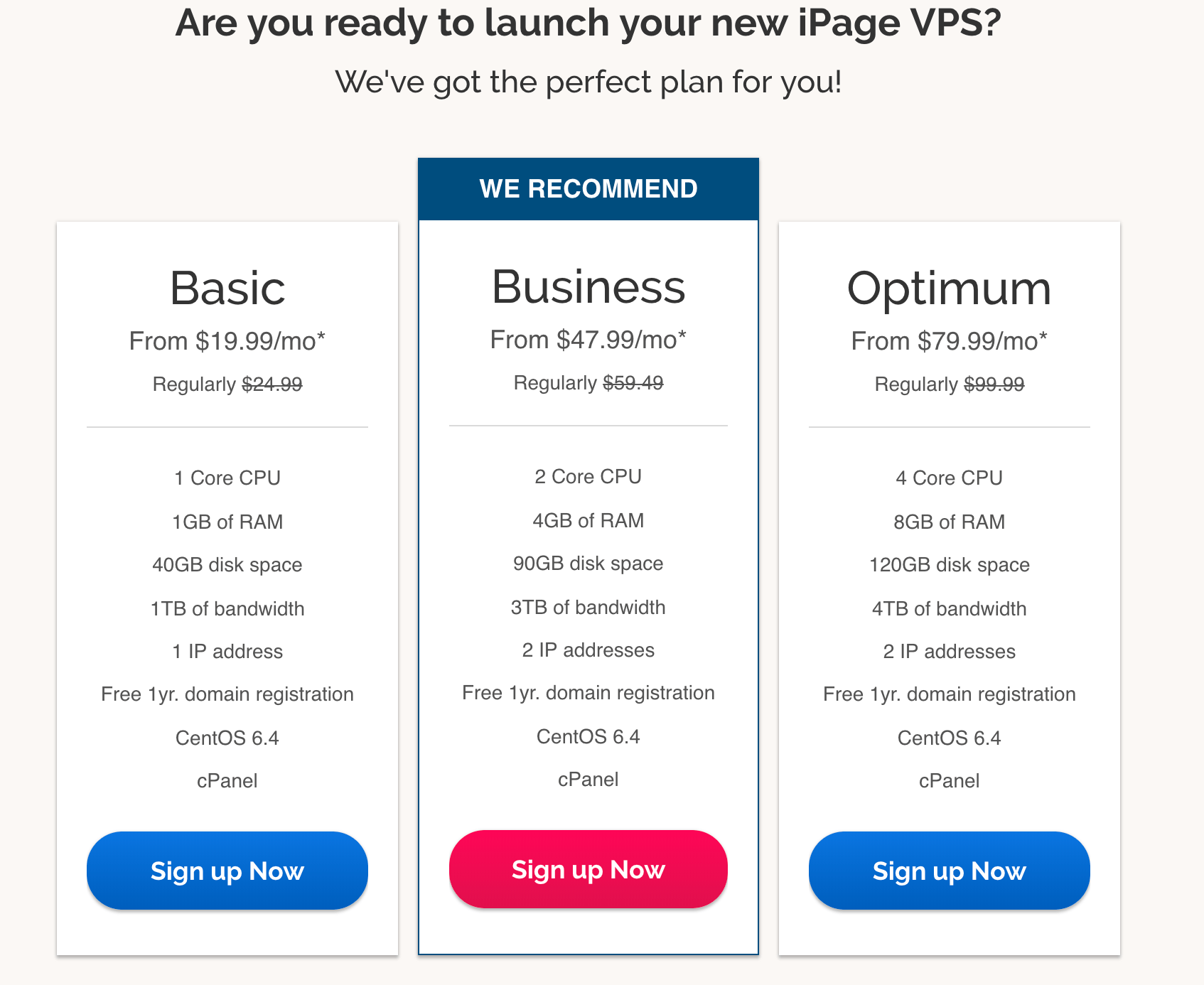
As expected, the more you pay, the more features you’ll get. CPU, RAM, disk space, and bandwidth increases at each tier.

While iPage has a reputation for being a low-cost web hosting provider, their VPS plans are not necessarily cheaper than other web hosts on the market. Their VPS services are priced about even to or higher than some other well-known hosting providers.

All of the pricing you see from the image above is the introductory offer for a three-year plan. Rates will increase when your plan renews and if you commit to a shorter term contract length.

With a VPS plan, you’ll have more customizable options. iPage will give you root access and the ability to customize your software and hosting environment.

Dedicated servers

iPage Dedicated Hosting

The dedicated servers from iPage are a step above the VPS plans. You can get up to 16GB of RAM, 1,000 GB of disk space, 15 TB, of bandwidth, and 5 IP addresses with a dedicated server

Introductory rates for a three-year contract are as follows:

  • Startup — $119.99 per month
  • Professional — $151.99 per month
  • Enterprise — $191.99 per month

Those plans renew at $149.99, $194.99, and $239.99. Again, for a budget web host, I wouldn’t necessarily say that those price points are cheap.

But the dedicated servers give you complete customization. There are no restrictions to your software and hosting environment, these plans were made for those of you with more technical skill levels.

You won’t be sharing any resources with other websites if you use a dedicated server from iPage.

WordPress hosting

iPage WordPress Hosting

iPage offers web hosting solutions specifically for WordPress. If you want to start building a new WordPress website, there are two plans for you to consider.

  • WP Starter — $3.75 per month
  • WP Essential — $6.95 per month

These rates are definitely more aligned with iPage’s reputation of being a low-cost web hosting provider.

Both plans come with unlimited storage, unlimited bandwidth, customized control panel, as well as some pre-installed themes and plugins. The WP Essential plan also has automatic malware removal, added security, and expert WordPress support.

The rates renew at $7.49 and $10.49 per month.

Benefits of iPage for web hosting

Now that you’ve had a chance to review the hosting options offered by iPage, it’s time for us to look at the best parts of this web host.

Low pricing

Based on the plans we’ve covered, you can see that iPage has a wide range of options to choose from. There are some budget hosting solutions, as well as some higher-end offers with added features and functionality.

But ultimately, iPage is best-known for its low pricing. With shared plans offered as low as $1.99 per month, it’s very appealing to new website owners who are on a budget.

The only drawback of this low pricing is that you need to commit for three years and pay for it upfront to get that rate. Unlike other web hosts on the market, iPage does not offer month-to-month plans.

Money-back guarantee

While iPage doesn’t offer free trials or month-to-month rates, the provider still stands behind their services. All plans come with a 30-day money-back guarantee.

It’s a “no questions asked” policy. If you’re unsatisfied for any reason, iPage will fully refund your hosting fees.

However, there is a non-refundable $15 fee if you registered your domain with iPage. They set this up to ensure that you won’t lose your domain if you want to transfer it to another provider.

I usually wouldn’t recommend a hosting provider that doesn’t offer some type of money-back promise. So the fact that iPage does this for their customers is definitely a positive. You can try them out knowing that you have a month to change your mind.

High uptime

At the end of the day, performance is really what matters the most. If your web host can’t keep your website up and running, then it’s essentially useless.

So, how well do iPage’s low-cost plans perform? Let’s take a look.

Hosting Facts conducted a study on the performance of 32 different web hosts. They calculated the average uptime rates for each host throughout the course of one year.

iPage Uptime

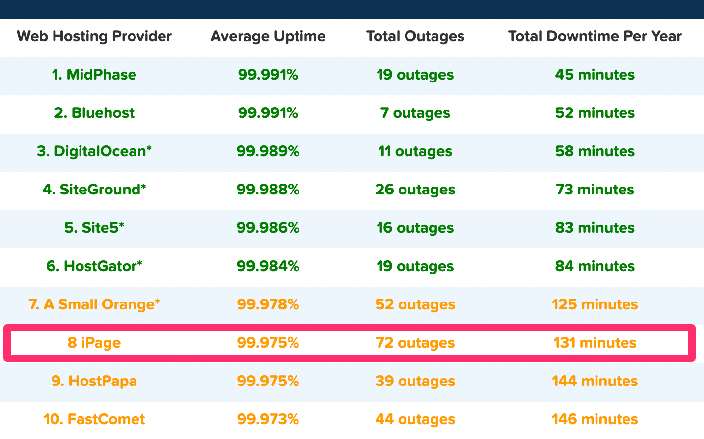
As you can see from the chart, iPage cracked the top 10, ranking eighth out of the 32 web hosts in the study. The average uptime rate of 99.975% in 2018 was good enough to land this provider in the top 25% of web hosts.

Overall, that’s a very strong uptime. I’d definitely be happy with that number, especially considering the fact that it’s achievable at such a low cost.

With that said, the length of their downtime was nearly triple the amount of the top host on the list. But I truthfully wasn’t expecting iPage to compete with those figures.

It’s also worth noting that unlike other web hosts, iPage doesn’t guarantee a certain uptime rate. So if they fail to meet a certain standard, you won’t be refunded or compensated in any way. However, they do offer uptime monitoring, so you’ll be notified if your site goes down.

Third-party tools

iPage is compatible with lots of third party tools and platforms. Here’s a list to name a few.

CMS tools:

  • WordPress
  • Drupal
  • Joomla

Forum tools:

  • Gbook
  • phpBB
  • SMF

Blogging tools:

  • PixelPost
  • B2evolution

Photo gallery tools:

  • ZenPhoto
  • Gallery2

iPage is also compatible with ecommerce solutions like Zen Cart, OpenCart, PrestaShop, AgoraCart, TomatoCart, and OSCommerce.

Helpful support

We already talked about the money-back guarantee. But beyond that, iPage also offers 24/7 phone and live chat support.

They also have an extensive knowledge base, with informative guides, tutorials, and lots of other helpful information about their platform, tools, and services.

So no matter what type of question you have or problem you run into, I’m confident that you’ll be able to get that solution resolved quickly and efficiently with iPage support.

Other considerations

As expected with a low-cost web hosting provider, iPage has its fair share of flaws. I’ll let you know about some of the downsides of using their services. You can use this information to see if these drawbacks are worth the low price.

Loading speed isn’t ideal

Again, performance is key when it comes to web hosting. Aside from uptime, which we already discussed, loading speed usually the next metric that we look at.

Check out the response times for an iPage test site over the past 12 months.

iPage Load Times

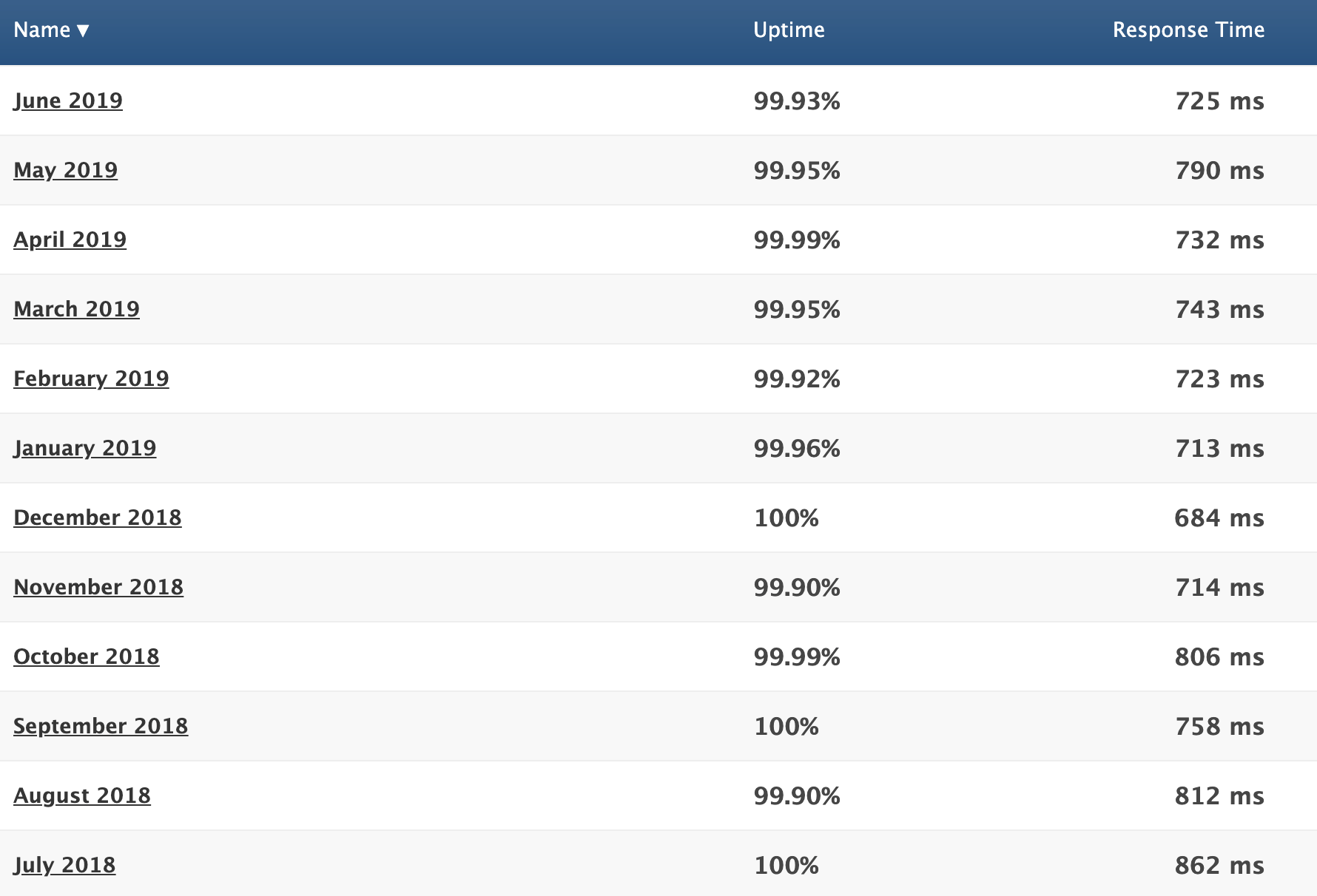
The average response time from this sample is 755 ms.

Honestly, it’s not terrible. But this number is a little too close to a full second page loading time for my liking.

Plus, this is just a test website. If you’re going to be adding pictures, video, and other media files to your site, it will slow down even more.

While iPage definitely doesn’t have the worst loading times we’ve seen, they certainly don’t have the best either.

Not a “green” web host

This may not be a big deal for some of you, but I figured it was still worth mentioning.

iPage used to have environmentally-friendly web hosting. They had a landing page explaining that they ran on wind power and had a certified green certificate. However, as of late last year, this page has been removed from their website. I tried to Google it and got a 404 error instead.

The web host no longer appears on the EPA Green Power Partner List either.

Extra fees for add-ons

iPage is a low-cost web hosting provider. I think it’s safe to say that we established that. However, their services end up costing more than you might think.

Even if you choose the lowest plan of $1.99 per month for three years, you’ll still have to pay extra for things like:

  • Domain privacy
  • Website security
  • Site backup and restore
  • Website builder

These are things that usually come free with other hosting providers.

iPage Addons

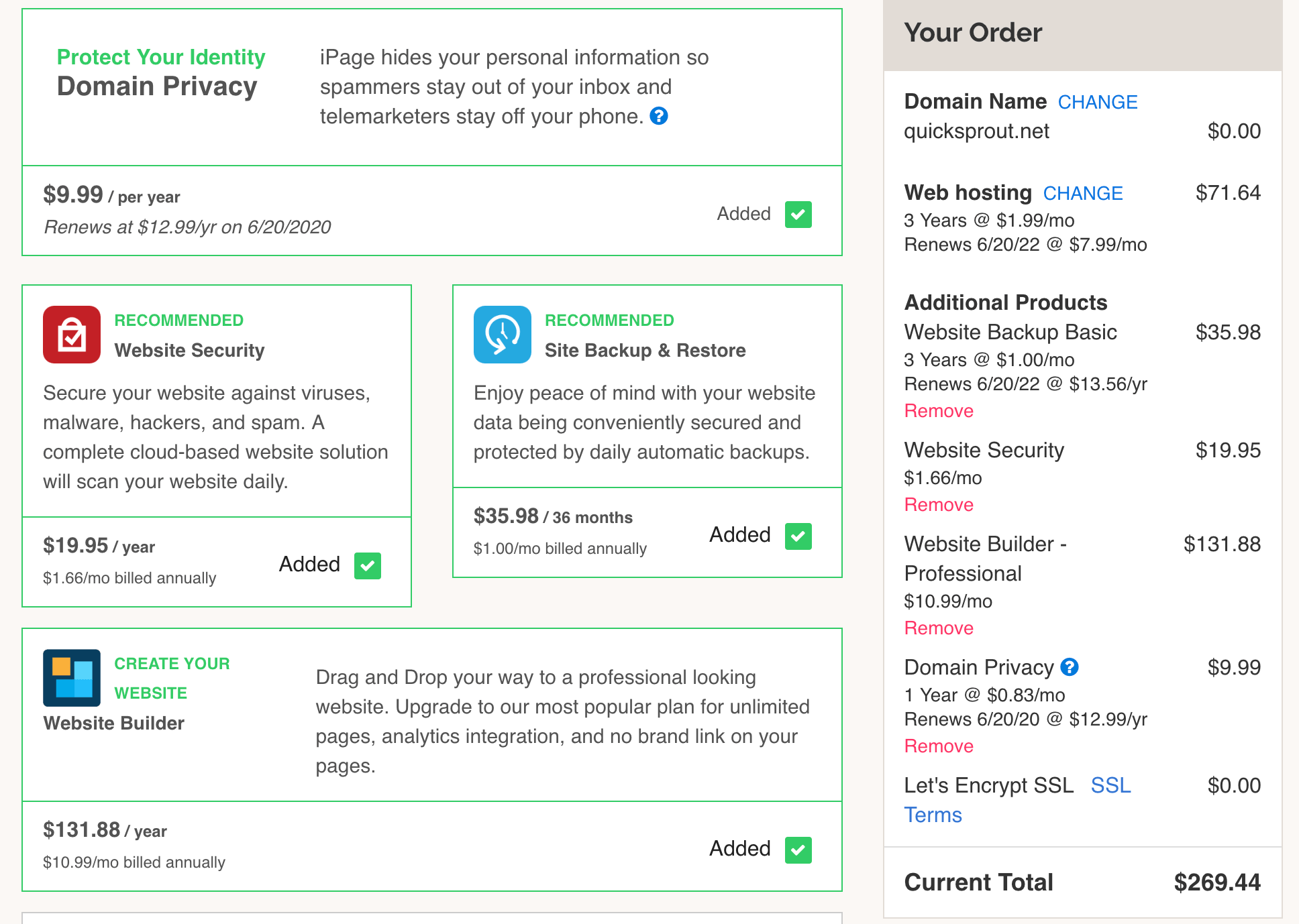
So in your head, you might be thinking $2 per month for 36 months is just $72. Not a bad deal, right?

But as you can see from this checkout page, you’ll end up paying significantly more than that amount for some pretty basic features.

Paid site migrations

To entice customers to switch providers, most web hosts will offer a free site migration. But iPage doesn’t do that for new customers.

It will cost you $150 for their tech support to move your site to iPage servers. That cost only covers one website, which is expensive. To put that into perspective for you, Bluehost also charges $150 for site migratations, but they’ll move up to five sites for that same rate.

Unless you’re a tech wizard, you probably don’t want to try and migrate your website on your own. So this is another cost that you’ll have to incur.

Conclusion

Do I recommend iPage for web hosting?

In short, yes. They have low-cost shared hosting plans, as well as options for VPS, dedicated servers, and WordPress hosting.

Just be aware that those advertised rates have some conditions attached to them. You’ll need to commit for three years to get the best price, and then your rates will go up when it’s time to renew. Plus, you’ll need to pay extra for all of your add-ons.

With all of that in mind, iPage is still a reputable and reliable web host with high uptime rates and great customer support.

For those of you who are on a budget but still aren’t sold on iPage, check out my list of the best cheap web hosting services for some alternative solutions.

Build a Spring Boot App With Secure Server-to-Server Communication via OAuth 2.0

Most OAuth 2.0 guides are focused around the context of a user, i.e. logging in to an application using Google, Github, Okta, etc. While this can be useful, these guides ignore server-to-server communication where there is no user and you only have one service connecting to another. Thankfully, Okta is here to lend a hand with this area of application security.

The OAuth 2.0 Client Credentials Grant type is exclusively used for scenarios in which no user exists (CRON jobs, scheduled tasks, other data workloads, etc.). This flow is less showy than other OAuth flows as there is no end user or browser. However, this is far easier to understand than the more complicated, user-centric OAuth 2.0 grant types. In this tutorial, we'll walk through the OAuth 2.0 Client Credentials Grant type and how you can deploy it for secure server-to-server communication in Spring Boot.

Your Boss’ Opinion of You Really Does Matter

Eliza from My Fair Lady is a classic representation of the Pygmalion effect. 
Photo Credit Wikimedia Commons

The Pygmalion effect is one of the more fascinating aspects of psychology, and should be one of the most understood aspects of modern management. It suggests that our performances can be directly influenced by the perceptions of our bosses. So if they think you’re going to be great, and act as though you’re going to be great, then the chances are, you will be great.

There has been no shortage of evidence to support this hypothesis, but one more will certainly do no harm. It comes from a Chinese study into teaching at a couple of universities in southern China.

DIY Wireless Magnetic Levitating Moon Lamp

If your child ever makes a special wish, you will do everything in your power to make it happen, right? So, my daughter's wish was a 'moon lamp'. And here is it: a magnetic, levitating (MagLev) wireless moonlight:

MagLev Wireless LED Moon

Basic Image Data Analysis Using Python: Part 2

Previously, we saw some of the very basic image analysis operations in Python. In this last part of basic image analysis, we’ll go through some of the following contents.

The following contents are the reflection of my completed academic image processing course in the previous term. So, I am not planning on putting anything into the production sphere. Instead, the aim of this article is to try and realize the fundamentals of a few basic image processing techniques. For this reason, I am going to stick to using SciKit-Image - numpy mainly to perform most of the manipulations, although I will use other libraries now and then rather than using most wanted tools like OpenCV

Collective #530


C530_chaos

Chaos Design

A fantastic writeup of a recent talk Adam Morse gave at Intuit for their Front End Summit.

Read it


C530_graphqldocu

GraphQL: The Documentary

This documentary explores the story of why and how GraphQL came to be and the impact it’s having on big tech companies worldwide.

Watch it


C530_shape

Shaping up Shape

Amol Kumar shares the story behind the development of the first-ever prototype for Shape.

Read it


C530_gitwtf

Git.WTF

A curated list of Git problems, frustrations, and tricks that can give you a solution in seconds.

Check it out


Collective #530 was written by Pedro Botelho and published on Codrops.

UX and Agile: A Match Made in Heaven for Software Users

If you really want to create the most value for your customer, you can't skimp on UX design.

We’ve all probably experienced it. We have this great project, we have this great interface, and suddenly UX (User Experience) comes in and points out all these flaws and stops things, making us scramble to catch up.

If you’ve had this happen, you know that the goal of a great interface, put out on time, isn’t met. So how can we change this?

What Ever Happened to Common Sense in Scrum?

You wouldn't drive like this, so why would try to lead your Scrum team like this? #bringcommonsensebacktoScrum

Agile Scrum is misunderstood by a large segment of practitioners. Scrum deliberately didn't spell out most of the actions required and that frankly has created quite a pandemonium.

This unclarity of action has created ‘theorists,' who run around with stopwatch in hand, staunchly advocating for so-called ‘assumed’ rules.

In my view, though, Scrum needs to be approached with common sense. A high discipline from the team is unquestionably a mandate. But having said that, exceptions and irregularities are expected when you deal with human beings.

15 Fun and Inspiring Examples of CSS Animation

CSS is a powerful coding language that can give style and personality to HTML. CSS animations, in particular, are created by transitioning between various CSS configurations over a period of time.

There are a lot of extremely practical cases for CSS animation, such as the ability to animate HTML elements without the use of JavaScript or Flash (although some do utilize JavaScript).

In this article, we’ll be taking a look at 15 lighthearted CSS animation projects to give you inspiration for your next endeavor. These are going to be practical applications that have a certain level of whimsy and fun to them. Hopefully, they’re just as fun to work on!

Google’s Game of the Year

Google’s Game of the Year

The Game of the Year animation for Google looks like a fairly simple CSS animation. It features the title text falling slightly, and the elements bumping into each other. While there is plenty of code that went into this, the core is animating the rotation of the elements after a delay.

Cascading Solar System

See the Pen
Cascading Solar System!
by Tady Walsh (@tadywankenobi)
on CodePen.

The author of cascading solar system obviously has an eye for humor, naming his project so that it also can be abbreviated as CSS. This is an impressive but unassuming animation that models the solar system in 2D. The orbits use a scaled rotation speed so that they’re all accurate to their real-world counterparts.

Gooey Menu

See the Pen
Gooey Menu
by Lucas Bebber (@lbebber)
on CodePen.

Menu animations are a pretty common use of CSS, and this gooey menu is no exception. This has plenty of small details, including a slight increase in size when hovering over the button, and then the bouncy, gelatinous animation when the menu expands.

Each individual button then highlights when hovered over. It is also a special treat to notice the subtle details. Take note of how the hamburger menu symbol collapses into an X and transforms back when you close the menu again.

Flying Birds at Fournier Père et Fils

Flying Birds at Fournier Père et Fils

This winery’s homepage features an animation that involves two birds flying across the screen. The process of applying this animation is actually fairly straightforward.

The first layer of animation is to animate the birds flapping their wings, which works much like a flipbook. The second step is the animated vertical and horizontal path that the bird follows, in order to make the speed and flight path look natural. This is done through keyframe animation. The best part is, this can be replicated across any number of birds, you will just need to vary the timing a little bit.

Ball Loading Animation

See the Pen
CSS loading animation
by Patrik Hjelm (@patrikhjelm)
on CodePen.

This loading animation is another simple one. It is a vertical line of seven circles that swing back and forth horizontally in a seemingly random pattern.

In terms of CSS code, each ball has its own short few lines of animation. Each ball has the same code except for the length of time that it takes to move side-to-side. This creates a variation between each element.

The rest of the code defines the keyframe points, so really it’s just selecting two keyframe points and varying the amount of time it takes for the circles to travel between them. While straightforward, this is often all you need for a loading screen!

Submarine

See the Pen
Submarine with CSS
by Alberto Jerez (@ajerez)
on CodePen.

This CSS exercise features a little red submarine roving the ocean. It has several simple animated elements that come together to make a very pleasing looking loop. This is a lot of keyframing and elements linked to each other, but it’s a fun inspiration for your own CSS projects!

Circles Loading Animation

See the Pen
Animated – SVG Loader
by Steven Roberts (@matchboxhero)
on CodePen.

Simple loading screens are one of the best ways to show off CSS, and these concentric circles are no different. The code is pretty quick and simple, essentially telling the circles to ease in and out of rotation at different intervals.

Since the shapes don’t actually change size, and just rotate around, it’s a pretty straightforward exercise in CSS! And it makes a great addition to any website.

Moving Background Mask

See the Pen
Animated – Background Mask
by Steven Roberts (@matchboxhero)
on CodePen.

At first glance, you might not realize there is an animation going on here. But look closely, and you’ll see the colored background slowly gliding down. This is an extremely subtle effect, but sometimes that’s what CSS is all about!

At its core, this is using masking as you might see in a photo or video editing software. It only displays the image on the masked layer, and moves the image along a path.

Flat Design Camera

See the Pen
Flat design camera with CSS animation
by Damien Pereira Morberto (@damienpm)
on CodePen.

This flat design camera image has a clever concept around it. Press the camera button, and it takes a picture! Well, sort of. The images are predetermined for this code, but the potential for more is there.

This CSS project has several small moving parts, such as the flashing red light on the left side, and the animation of the entire asset as the camera “prints” a photo. Overall, this definitely has some practical applications for any photo-related app that might access a user’s webcam.

Pulse Animation

See the Pen
Animated – SVG Pulse
by Steven Roberts (@matchboxhero)
on CodePen.

This is another simple but effective CSS animation. And that’s a trend here! Some of the best uses of CSS are straightforward and simple. No need to get overcomplicated with it.

This one just sends out a few circles that fade out when they expand to their fullest. It’s pretty easy to come up with and to replicate. So, this is a great place to start for a simple CSS project if you’re looking for inspiration as a newcomer to the language.

Bubbling Up

See the Pen
Animated – SVG Bubbles
by Steven Roberts (@matchboxhero)
on CodePen.

This bubble animation is made up of a few elements and animations. The first level of animation changes the bubble opacity and makes the image move vertically, so it looks like the bubbles rise up out of nothing.

The second level of animation creates a wobbling effect to make the bubbles look more alive and natural. This makes great use of keyframes, which really make CSS animations look smooth.

Google Now 3rd Party Apps

See the Pen
Google Now 3rd Party Apps
by Paweł Kuna (@codecalm)
on CodePen.

This animation is inspired by another designer’s concept that was made in After Effects, but this one does it just with CSS! It’s a cute flat icon pack that pops into existence and slides out. This CSS code makes heavy use of keyframes and timing the different elements as they pop in.

It’s basically just the same code for each icon, but time-adjusted appropriately. This is great inspiration for making something that is simple overall, but is complex when you put all the pieces together.

Hamburger Menu

See the Pen
Hamburger Icon CSS3 ONLY Animation
by Dawid Krajewski (@DawidKrajewski)
on CodePen.

Don’t let this simple hamburger menu fool you, it’s actually quite complicated. This doesn’t use any HTML or JavaScript and is entirely made in CSS.

What makes this complex is the fact that it doesn’t use HTML, so all of the shapes in this animation had to be created within CSS alone. From there, there is a lot of keyframe animation to construct the transformation between shapes. This should get you inspired to ditch the traditional HTML and try something different!

Perspective Split Text Animation

See the Pen
Perspective Split Text Menu Hover
by James Bosworth (@bosworthco)
on CodePen.

This animated menu looks simple on the outside but can make a big impact on any website. When you hover over the area, the text changes perspective to follow your mouse. When you hover over a specific block of text, it gets split in half.

The animation uses some different techniques to achieve these goals, so it’s a great inspiration as an exercise for practicing some advanced CSS skills.

Floating Ghost

See the Pen
ghost
by Beep (@scoooooooby)
on CodePen.

Let’s end with something fun! This adorable ghost just floats up and down, indefinitely. The image just eases in and out, up and down, and the shadow underneath expands and contracts. This simple animation is versatile and can be used as a loading screen or just about anything else!

A Moving Inspiration

CSS is a powerful tool in your web design pocket. Hopefully, these funny and lighthearted animations can inspire you to go out and create your own awesome concepts.

Always remember that you don’t have to make something just for productivity’s sake! You can create something just for fun – even if it serves no purpose. And who knows, maybe someone else will see it, and become inspired themselves.