Recently, some of our readers asked us about how to properly add image credits in WordPress.
Image credits are a way to let users know about the original creator of the image that you are using on your website. It shows good faith and also protects you from legal issues.
In this article, we will show you how to properly add image credits in WordPress. We will also talk more about why it is important, and what are the consequences of not doing it.
When and Why Add Image Credits in WordPress?
Images are highly engaging, and they make your blog posts look visually appealing. However, you cannot just copy any image from the web and add it to your blog posts.
All images on the internet are protected by copyright laws. You can only use them with permission from the copyright owner.
Some photographers and artists occasionally release their work under licenses that allow others to use their images. However, often these licenses require you to give proper credit to the original creator.
Why Adding Image Credit is Important?
All images on the internet are protected by copyright laws including the ones where you cannot see a copyright notice. This means you cannot use them on your website without permission.
If the image author specifically states that their photos can be re-used under licenses like creative commons, then you must add image credit and provide proper attribution to the original work.
It is really important to give proper image credit to comply with the copyright laws and avoid infringing upon someone’s rights.
It is a show of respect for other people’s work and creativity. It also protects you against legal issues and liabilities caused by violating intellectual property rights and copyright laws.
What are the Consequences of Not Giving Image Credits?
Many beginners believe that the internet is very large, and no one would even notice that they have used an image without permission.
This used to be true in the old days where you could get away with stealing images, but things are changing fast.
Now, there is an entire industry of lawyers who’re focused on recovering image copyright claims. They use reverse image search tools to send bulk cease and desist mails along with settle demand letters.
We know several bloggers and business owners who have paid hundreds of dollars in damages just for a single image.
If you are serious about growing your business online, then you need to take copyright laws seriously from day one.
Copyright laws are applicable globally. This means they apply regardless of where you or the original creator lives.
As mentioned above, the first most serious consequence is that you can be sued for violation of copyright laws. These legal troubles can cost a lot of money and may even destroy your website, and its reputation.
Copyright laws also apply to search engines like Google and web hosting companies.
The original copyright owner can file a DMCA complaint against your website to search engines which will force them to remove that content from search results.
They can also ask your hosting provider to remove the content in which case they will be legally obliged to ask you for the removal of the image. Some companies may just suspend your hosting account and inform you later.
How to Properly Add Image Credits in WordPress
WordPress lets you easily add image credits below an image. Here is how to properly add image credits in WordPress without using any extra plugin.
First, you need to upload the image to your WordPress post or page. Simply add an image block to the content editor and then click on the upload button to select an image from your computer.
You can also select a previously uploaded image by clicking on the media library button.
Once you select an image, it will automatically appear in the post editor. Below the image, you’ll see a prompt to ‘Write a caption’.
Captions can be used to describe an image or photograph. They can also be used to add image credit and give proper attribution to the original copyright owner.
You can add image credit text in the caption field. Some copyright owners may require you to also add a link back to the original source.
If they do, then you can simply click on the insert link button and add the link to the original file.
Once you are done, you can go ahead and save your changes.
How to Find the Image Credit and License Information
Most images you’ll find on the internet do not contain licensing information. This means that you don’t have permission to use those images.
Luckily, there are many websites where you can find images to use. However, some of these image websites may require you to provide attribution or image credit.
You can find this information on the image download page. For example, this is how Flickr shows licensing information on the image page.
Clicking on the link will provide you more details about the license. It will also describe if you need to give credit and how to properly do that.
How to Avoid Giving Image Credits in WordPress
You need to carefully read the license to understand how you are required to provide the image credit.
Most such licenses will explicitly require you to provide a link back to the original source.
Adding links to the photographer’s website or the photo is a bit problematic. In most cases, the link is not relevant to the actual content on your website. It would allow users to leave your website, and they may not come back.
This is why we recommend using royalty-free stock photo websites.
These websites curate photographs, images, and illustrations that do not require image credit. You can also use these images on business websites.
Following are our top picks for free stock photo websites:
Unsplash – A large collection of royalty-free photographs neatly organized in categories and tags.
Pixabay – One of the largest and most popular license-free images and photos
Public Domain Archive – A collection of images and photographs available under public domain
Picjumbo – Another large collection of royalty-free images
New Old Stock – A collection of vintage photographs that are now available under public domain
On WPBeginner, we extensively use Shutterstock which is a premium stock photo and illustration website.
The problem with stock images though is that these images are already used on thousands of websites. You may also struggle with finding the right image to accompany your articles.
The simplest way to fix this is by using your own original photographs and graphics. The challenge is that most users are not graphic designers.
Luckily, there are websites that allow you to easily create graphics to use on your website. These image editors come with drag and drop tools and ready-made templates to give you a good starting point.
Following are some of the best online graphic editing tools for beginners.
Canva – An easy to use graphic design tool for beginners to create custom logos, banners, images, infographs, charts, and more.
Piktochart – Easy to use tool to make beautiful presentations, banners, charts, and graphics
Pablo – Allows you to create beautiful graphics for social media and blogs.
PicMonkey – Another easy to use image editor for bloggers
We hope this article helped you learn how to add image credit in WordPress and why it is important. You may also want to see our guide on how to optimize your images for SEO and get more traffic.
If you liked this article, then please subscribe to our YouTube Channel for WordPress video tutorials. You can also find us on Twitter and Facebook.
As we know that WordPress acts as a medium where you can tell people about yourself and why you are here in the first place or what value your website can add to their lives....
The first ever WordCamp Asia has launched a teaser website and announced February 21-23, 2020, as the dates for the event. This will be the first regional WordCamp for the continent, which is home to 127 WordPress meetup chapters with 73,000 members across 23 countries, according to stats from lead organizer Naoko Takano. After four years in planning, and 137 WordCamps in 18 Asian countries and 52 cities, the region is finally ready to collaborate on a larger event that will bring its many diverse communities together.
“We hope that this first flagship event in the region can help the WordPress and open source community to grow even further,” Takano said. “We are really excited to be working on creating a place where community members can learn from and get inspired by each other.”
The organizing team has a vision to make the WordCamp welcoming, nurturing, and experimental. They are working to make it an inclusive, affordable, and interactive event. WordCamp Asia’s three-day program will begin with Contributor Day, followed by two days of presentations with an estimated 1,000 attendees.
Organizers have already put out the call for media partners, including magazines, newspapers, TV stations, radio stations, bloggers, influencers, WordPress enthusiasts and freelance journalists. The call for speakers will be open until mid-November 2019. Check out WordCamp Asia’s roadmap to get an idea of what to expect as the preparations continue.
Every day, the ProgrammableWeb team is busy, updating its three primary directories for APIs, clients (language-specific libraries or SDKs for consuming or providing APIs), and source code samples.
Just a few weeks after Apollo announced the release of Apollo Federation, the company has added managed federation to GraphQL across an organization. Managed federation provides analytics, CI, and collaboration to help teams work efficiency on distributed graphs. Additionally, teams can now leverage a single data graph for the entire organization.
Speaking of kinda douchey words, I'm reminded of one of my favorite sites on the internet: Unsuck It. Not only does it call out a ton of terms for being, uh, sucky, but suggests unsucky alternatives.
Bubble Up
Thank you for pointing out that issue. I’ll be sure to bubble that up.
Unsucked: Tell someone with more authority.
Powwow
Oh, yes! That’s very important to me. Let’s have a powwow about this first thing tomorrow.
Unsucked: Yet more unthinking appropriation of Native American culture. Meeting.
Block Comments is a new experimental plugin from Tom Nowell that replaces WordPress’ default comment form with a trimmed down version of the block editor. Nowell gave a presentation at WordCamp Europe 2019 about using blocks outside the editor, including on the frontend. Block Comments is one example he brought to life using the block list component along with some wrapper components.
The result is a comment form that offers the same UI as the WordPress editor but with a limited set of blocks appropriate for commenting and no block sidebar panel. This includes text-based and embed blocks, along with image upload via URL. It defaults to the paragraph block when the commenter clicks inside the form. Here is an example of using the block editor for a reply on the Twenty Nineteen theme:
For the most part, Block Comments should fit in with the style of the active theme, as shown below with an example using the Astrid theme. Nowell recommends users watch out for occasional clashes between the editor UI CSS and the theme’s CSS, since it is still early beta software.
Incorporating the block editor into commenting could make formatting easier for commenters with more options for expressing themselves. The plugin includes blocks for lists, quotes, code, embeds, headings, pre-formatted text, and other formats, all with Gutenberg’s built in preview. Commenters can immediately see how the comment will appear without having to struggle with using the correct format tags.
“I see it as a much more flexible form of those Tiny MCE visual comment forms,” Nowell said. “Except instead of just putting a toolbar on top and showing you bold and italic in-line, you can do more.”
Nowell said replies and threading work exactly the same with Block Comments enabled. The UI for the comment form is the only thing that changes, but the commenting system remains the same.
Bringing the block editor to comments is not yet on WordPress’ roadmap. The UI is different from the comment forms users have become accustomed to over the years of commenting on the internet. Some commenters may find it confusing if this is their first experience with WordPress’ block editor. For those who have used WordPress 5.0+ previously, the Gutenberg-powered comment form brings a little more unity to the front and backend posting experiences.
“It’s certainly not for every comment form, but I can see it being very useful in some situations, such as P2 blogs,” Nowell said. “As Gutenberg itself improves, it will too.”
Block Comments is currently available on GitHub where users can report any issues or conflicts. It is recommended to be used with the Gutenberg plugin installed for best results. It also doesn’t play well with the Classic Editor plugin, since that plugin removes the block editor hooks and styles.
I would not be surprised to see this experiment further developed for P2-powered blogs or even Jetpack comments , if the idea catches on. These avenues would provide a good testing ground for such a feature before it might be considered for WordPress core.
Have you ever visited a website and been stunned by a beautiful hover effect? Or have subtle UI animations left you feeling impressed with a site’s design? It may seem like a small detail, but hover animations can have a larger impact than you’d expect.
Good UI design means making interactive elements clear and visible, and hover effects can help you do just that. They look beautiful, and provide instant feedback when you hover over something that makes your UI easy to navigate.
These effects work particularly well in menu areas, but you can also use them on images, buttons, or other areas of your site too. These animations can leave a strong impression on people.
Today we’ve collected 17 awesome CSS hover effects, ranging from elegant menu and image hovers to more striking, unique animations. These are free for use under an MIT license, so try them on your site or use them as inspiration to create your own!
When you’re designing a website, don’t neglect UI design. It’s one of the most important parts of a website’s look. And while other details like the layout of UI items, fonts, and colors will take up most of your focus, a well-placed hover animation can make a big difference.
Animations can also help define your brand and the tone of your website, along with help to complement its style. A distinctive glitchy hover effect could brand you as a technology company, or gradient animations would work well on upbeat, colorful websites.
Code on CodePen is free to use with their license, so try out one of these CSS hover effects for yourself. Or use these beautiful animations as inspiration as you make your own unique effects.
Yonatan Doron wrote a post on Medium not long ago called "Art of Code — Why you should write more Pseudo Code." Love that title, as a fan of pseudo code myself. That is, writing "code" that describes something you want to do or communicate, but that isn't of any particular language and doesn't use any correct APIs or anything.
Taking this time to write commented pseudo code helps organize our thoughts and our motivation and plan the desired outcome code ahead. By doing so, one moment later when we venture through to start hacking we would always have this map or skeleton of our thoughts that can help us regain focus and increase our productiveness
When the user submits a form, then show a modal dialogue with an acknowledgment.” I then encouraged them to write a script …but I don’t mean a script in the JavaScript sense; I mean a script in the screenwriting or theatre sense. Line by line, write out each step that you want to accomplish. Once you’ve done that, translate each line of your English (or Portuguese) script into JavaScript.
I've seen educators use this technique time and time again. But it isn't just for teachers to use and students to learn from — it's for anyone's benefit. I find myself doing pseudo code before I write real code, sure, but I also leave it in place sometimes in code comments. Most commonly, I do it in Notion documents or in Slack conversations to get across a point.
Even simple ideas:
if env.dev
  stop email delivery
Anything with logic and branching or step-by-step bits benefits highly from it. Notice that code isn't valid code. It's not valid in any language I can think of. Sometimes, I'll throw in some random parenthesis or a semicolon out of muscle memory. Who cares? It's just about communicating an idea to myself or someone else.
if (grid is supported)
  use grid
else
  lay out things in a basic row with flexbox
It's natural. Chances are, they won't care about the syntax either, they'll just get the idea.
on form submit
  validate
  if errors
     show errors;
  else
     submit to api;
     if api success
        show ui success;
     else
        show ui fail;
(After writing these out, it made me think of uilang. Check out how the plain language code blocks work there.)
Yonatan's article was missing real-world pseudo code examples, so I asked around. Check out all these great examples!
My whole notebook is a pseudo...
These transfer to comments before I start coding so I know what I’m doing & what I’ve done later pic.twitter.com/9vfJYfweDh
I'm a little surprised at how much of it is on paper! That's pretty cool, really. Just weird for me as I very rarely use paper for anything. I probably should.
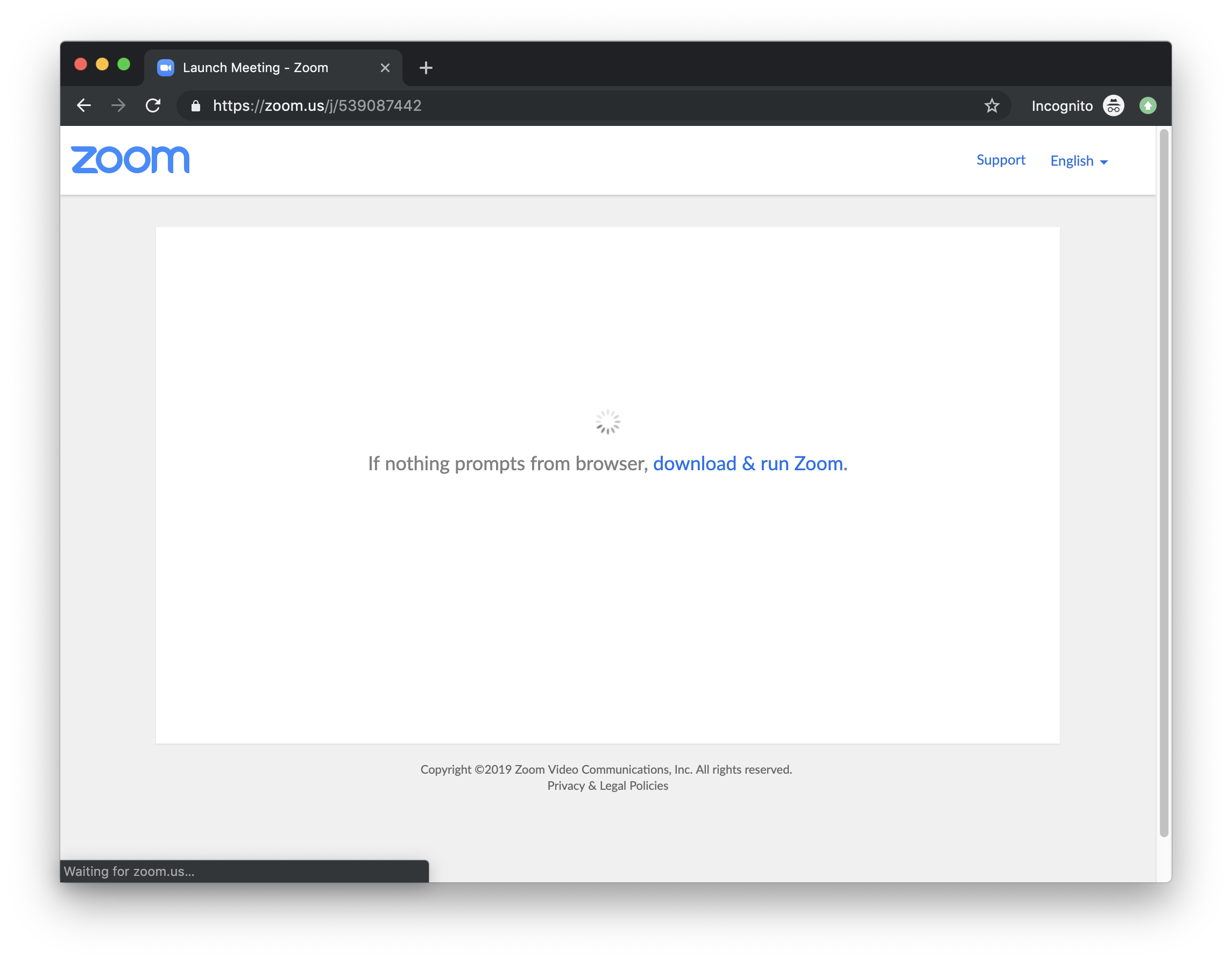
It's sorta sad by funny that that big Zoom vulnerability thing was ultimately related to web technology and not really the app itself.
There is this idea of custom protocols or "URL schemes." So, like gittower:// or dropbox:// or whatever. A native app can register them, then URLs that hit them get passed to the native app. iOS has "universal links" which are coming to the web apparently. (Atishay Jain has an excellent write-up on them.) But links like that don't leave much choice — they will open in the app. If your app has both web and native components, you might want to offer the user a choice. So, you use a regular URL instead.
In order for that web page to open up a native app, apparently, the tactic used by many is to have it communicate with a server running on localhost on your own computer which uses a URL scheme to open the native app. Clever, but I've heard sentiment from folks like:
I had no idea this software was running a localhost server on my machine
It feels weird that websites out on the wild internet can communicate with my localhost server
That's the way it is though. But there are some protections in place. Namely: CORS (Cross-Origin Resource Sharing). Ugh. I feel like I deal with some kind of CORS problem every week of my life. But it's important. It prevents XHR requests from websites that aren't specifically allowed. Imagine if you visit my website, and I have your browser shoot requests over to Facebook, hoping you are logged in so I can do things on your behalf. Bad. CORS doesn't prevent that, the same-origin policy of browsers prevents that. CORS is the mechanism to control that.
If my website tries to communicate with your website, and your website's response doesn't have an Access-Control-Allow-Origin header with my domain or *, it will fail. But not everything is subject to CORS restrictions. Images, for example, are not. We can link up images from any domain and they will return data.
Chris Foster thinks CORS and a lack of understanding of CORS was at the heart of the Zoom bug.
Zoom may have needed to get this feature out and did not understand CORS. They couldn’t make the AJAX requests without the browser disallowing the attempt. Instead, they built this image hack to work around CORS. By doing this, they opened Zoom up to a big vulnerability because n/ot only can the Zoom website trigger operations in the native client and access the response, but every other website on the internet can too.
This is often a source of confusion for newcomers because it's not immediately apparent what CORS is supposed to achieve. Firstly CORS is not a security measure in itself, it's actually the opposite: CORS is a way to circumvent the "Same Origin Policy" which is the security measure preventing you from making [AJAX] requests to a different domain.
Today’s users are quick to bounce away from a website if they can’t connect with a page’s content within 3 seconds. If your business features online appointment bookings, registrations, or making payments for events, you want the process to be super-simple.
Amelia is a WordPress appointment and event booking plugin that web designers love because it is easy to work with. Your clients and their customers will love it for the same reason since it provides a scheduling solution that is close to perfection.
We have created this article to show how Amelia keeps customers happy and can help a business to grow.
Events Functions in Amelia 2.0
It’s common knowledge that Amelia was already at the top of the class for appointment bookings plugins. A new set of events functions in Amelia 2.0 has made it even better. Amelia already has made spreadsheets items of historical interest only.
With 2.0 it can be used for even more events and occasions; whether they be single-day events to multi-day travel tours, classes, conferences, or seminars. Whatever the event, you can easily manage day-by-day detail bookings, recurring events, costs, etc.
Payments for Appointment and Event Scheduling
Managing prices and attendance for multiple day events is something you would not want to have to track manually. So, don’t!
Amelia’s integrations with WooCommerce, PayPal, and Stripe allow you to schedule a mix of event types while automatically streamlining the payments process – a “must have” feature in any all-encompassing booking solution. Currencies won’t present a problem either and you’ll receive SMS notifications as the payments roll in.
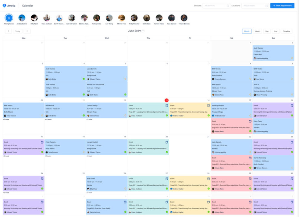
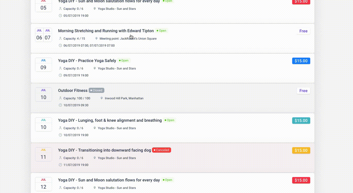
Events Calendar
Once you’ve entered your events, the Events Calendar becomes a central powerhouse for boosting registrations and payments. As we mentioned in the beginning, it’s super simple for users to view the panorama of events you’re offering – just a click away.
And, when a potential attendee selects an event from the calendar, he or she is guided through a step-by-step booking process. The calendar will automatically update an event’s availability and make a note when its maximum capacity is reached.
A truly neat feature is the UI for the event booker, payment processor, and events calendar. It’s the same UI for the you and for event attendees; and since data can move freely between these functions, registering for and managing events is as simple, satisfying, and mistake-free as possible.
There are additional Events Calendar options in Amelia 2.0 such as the ability to personalize what events will display based on status or your selections, the ability to create “invitation-only” events, and more. Click to read more about events and the Events Calendar.
Classes Booking
One of the things that makes the new Events Calendar such a powerful and useful feature is that the 2.0 version was built as a direct result of user feedback, a large part of which focused on the need for a specific solution. That need was for a solution that could streamline booking classes and payments in much the same way as appointments booking.
This was special. A variety of scheduling solutions and WP plugins for events already exist. But a practical solution of ongoing classes or group training, including payments, did not – until now.
Amelia 2.0 fully automates workshops, classes, and group training scheduling and payments. It doesn’t matter if they are single, multi-day, or recurring events. The scheduling and payments processes are streamlined, quick, and intuitive.
Spreadsheets are but a memory of times past.
Appointment and Event Scheduling You Can Really Use
Amelia has already been praised for its UI and UX. Did the Amelia 2.0 release make this plugin any better?
The short answer is – quite a bit.
New additions include the Gutenberg block and a pair of new languages – French and Dutch. As for the others; let’s take a look at what 4 of the most popular features look like now.
Admin Dashboard
Amelia gives its users an interactive dashboard summary of the business’s key performance indicators. KPI data is displayed in widgets, charts, and tables since KPIs are only of value when their actions are clear. It takes less than 5 seconds viewing Amelia’s dashboard to know where you stand.
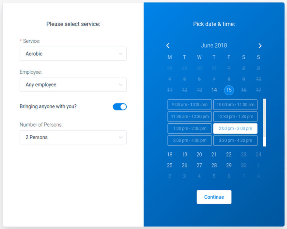
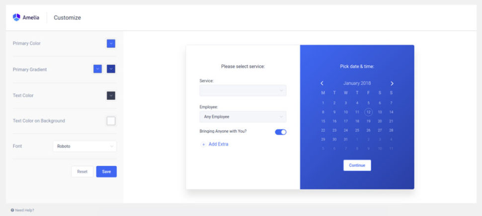
Booking Wizard
The front-end view step-by-step booking wizard that takes Amelia users effortlessly through their booking or purchasing process is one of the more popular of this plugin’s features.
Visitors are naturally inclined to prefer a smooth UX that allows them to easily choose the services, locations, dates, and payment details they want, and even make changes without leaving the page.
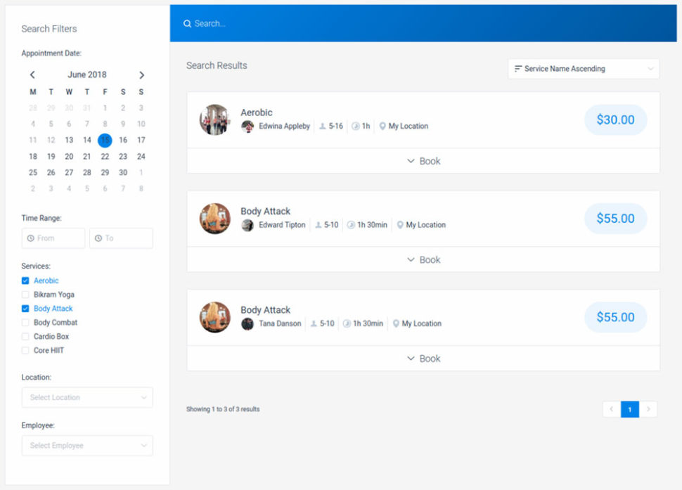
Search Booking Widget
Choosing among highlighted events isn’t always enough. There will be times when users will have a need to search for an event they want to book.
The search widget makes searching easy and once an event is located, it presents all the options and preferences available including preferred time, place, service, employee, etc.
Multiple Front-End Views and Customizable Design
By inserting any of the following WordPress shortcodes into a page or post, users can unlock the following Amelia front-end views:
Booking Search
Step-by-Step Booking
Services Catalogue, or the
Events Booking view
No matter which view is chosen, the viewer is presented with a minimalist, non-intrusive UI. Where colors are used, they can be adjusted to match your brand or website theme.
Conclusion
Amelia is a booking and payments plugin featuring front-end design flexibility and UX together with the back-end management tools and automation your business requires. Amelia goes about its business 24/7 in background mode so you can devote your time to other pressing business tasks and issues.
There’s no longer any reason to have to work with multiple plugins or install a scheduler on your site that’s not quite up to the task. Amelia 2.0 does it all.
Designing And Building A Progressive Web Application Without A Framework (Part 1)
Designing And Building A Progressive Web Application Without A Framework (Part 1)
Ben Frain
How does a web application actually work? I don’t mean from the end-user point of view. I mean in the technical sense. How does a web application actually run? What kicks things off? Without any boilerplate code, what’s the right way to structure an application? Particularly a client-side application where all the logic runs on the end-users device. How does data get managed and manipulated? How do you make the interface react to changes in the data?
These are the kind of questions that are simple to side-step or ignore entirely with a framework. Developers reach for something like React, Vue, Ember or Angular, follow the documentation to get up and running and away they go. Those problems are handled by the framework’s box of tricks.
That may be exactly how you want things. Arguably, it’s the smart thing to do if you want to build something to a professional standard. However, with the magic abstracted away, you never get to learn how the tricks are actually performed.
Don’t you want to know how the tricks are done?
I did. So, I decided to try building a basic client-side application, sans-framework, to understand these problems for myself.
But, I’m getting a little ahead of myself; a little background first.
Before starting this journey I considered myself highly proficient at HTML and CSS but not JavaScript. As I felt I’d solved the biggest questions I had of CSS to my satisfaction, the next challenge I set myself was understanding a programming language.
The fact was, I was relatively beginner-level with JavaScript. And, aside from hacking the PHP of Wordpress around, I had no exposure or training in any other programming language either.
Let me qualify that ‘beginner-level’ assertion. Sure, I could get interactivity working on a page. Toggle classes, create DOM nodes, append and move them around, etc. But when it came to organizing the code for anything beyond that I was pretty clueless. I wasn’t confident building anything approaching an application. I had no idea how to define a set of data in JavaScipt, let alone manipulate it with functions.
I had no understanding of JavaScript ‘design patterns’ — established approaches for solving oft-encountered code problems. I certainly didn’t have a feel for how to approach fundamental application-design decisions.
Have you ever played ‘Top Trumps’? Well, in the web developer edition, my card would look something like this (marks out of 100):
CSS: 95
Copy and paste: 90
Hairline: 4
HTML: 90
JavaSript: 13
In addition to wanting to challenge myself on a technical level, I was also lacking in design chops.
With almost exclusively coding other peoples designs for the past decade, my visual design skills hadn’t had any real challenges since the late noughties. Reflecting on that fact and my puny JavaScript skills, cultivated a growing sense of professional inadequacy. It was time to address my shortcomings.
A personal challenge took form in my mind: to design and build a client-side JavaScript web application.
On Learning
There has never been more great resources to learn computing languages. Particularly JavaScript. However, it took me a while to find resources that explained things in a way that clicked. For me, Kyle Simpson’s ‘You Don’t Know JS’ and ‘Eloquent JavaScript’ by Marijn Haverbeke were a big help.
If you are beginning learning JavaScript, you will surely need to find your own gurus; people whose method of explaining works for you.
The first key thing I learned was that it’s pointless trying to learn from a teacher/resource that doesn’t explain things in a way you understand. Some people look at function examples with foo and bar in and instantly grok the meaning. I’m not one of those people. If you aren’t either, don’t assume programming languages aren’t for you. Just try a different resource and keep trying to apply the skills you are learning.
It’s also not a given that you will enjoy any kind of eureka moment where everything suddenly ‘clicks’; like the coding equivalent of love at first sight. It’s more likely it will take a lot of perseverance and considerable application of your learnings to feel confident.
As soon as you feel even a little competent, trying to apply your learning will teach you even more.
Here are some resources I found helpful along the way:
Right, that’s pretty much all you need to know about why I arrived at this point. The elephant now in the room is, why not use a framework?
Why Not React, Ember, Angular, Vue Et Al
Whilst the answer was alluded to at the beginning, I think the subject of why a framework wasn’t used needs expanding upon.
There are an abundance of high quality, well supported, JavaScript frameworks. Each specifically designed for the building of client-side web applications. Exactly the sort of thing I was looking to build. I forgive you for wondering the obvious: like, err, why not use one?
Here’s my stance on that. When you learn to use an abstraction, that’s primarily what you are learning — the abstraction. I wanted to learn the thing, not the abstraction of the thing.
I remember learning some jQuery back in the day. Whilst the lovely API let me make DOM manipulations easier than ever before I became powerless without it. I couldn’t even toggle classes on an element without needing jQuery. Task me with some basic interactivity on a page without jQuery to lean on and I stumbled about in my editor like a shorn Samson.
More recently, as I attempted to improve my understanding of JavaScript, I’d tried to wrap my head around Vue and React a little. But ultimately, I was never sure where standard JavaScript ended and React or Vue began. My opinion is that these abstractions are far more worthwhile when you understand what they are doing for you.
Therefore, if I was going to learn something I wanted to understand the core parts of the language. That way, I had some transferable skills. I wanted to retain something when the current flavor of the month framework had been cast aside for the next ‘hot new thing’.
Okay. Now, we’re caught up on why this app was getting made, and also, like it or not, how it would be made.
Let’s move on to what this thing was going to be.
An Application Idea
I needed an app idea. Nothing too ambitious; I didn’t have any delusions of creating a business start-up or appearing on Dragon’s Den — learning JavaScript and application basics was my primary goal.
The application needed to be something I had a fighting chance of pulling off technically and making a half-decent design job off to boot.
Tangent time.
Away from work, I organize and play indoor football whenever I can. As the organizer, it’s a pain to mentally note who has sent me a message to say they are playing and who hasn’t. 10 people are needed for a game typically, 8 at a push. There’s a roster of about 20 people who may or may not be able to play each game.
The app idea I settled on was something that enabled picking players from a roster, giving me a count of how many players had confirmed they could play.
As I thought about it more I felt I could broaden the scope a little more so that it could be used to organize any simple team-based activity.
Admittedly, I’d hardly dreamt up Google Earth. It did, however, have all the essential challenges: design, data management, interactivity, data storage, code organization.
Design-wise, I wouldn’t concern myself with anything other than a version that could run and work well on a phone viewport. I’d limit the design challenges to solving the problems on small screens only.
The core idea certainly leaned itself to ‘to-do’ style applications, of which there were heaps of existing examples to look at for inspiration whilst also having just enough difference to provide some unique design and coding challenges.
Intended Features
An initial bullet-point list of features I intended to design and code looked like this:
An input box to add people to the roster;
The ability to set each person to ‘in’ or ‘out’;
A tool that splits the people into teams, defaulting to 2 teams;
The ability to delete a person from the roster;
Some interface for ‘tools’. Besides splitting, available tools should include the ability to download the entered data as a file, upload previously saved data and delete-all players in one go;
The app should show a current count of how many people are ‘In’;
If there are no people selected for a game, it should hide the team splitter;
Pay mode. A toggle in settings that allows ‘in’ users to have an additional toggle to show whether they have paid or not.
At the outset, this is what I considered the features for a minimum viable product.
Design
Designs started on scraps of paper. It was illuminating (read: crushing) to find out just how many ideas which were incredible in my head turned out to be ludicrous when subjected to even the meagre scrutiny afforded by a pencil drawing.
Many ideas were therefore quickly ruled out, but the flip side was that by sketching some ideas out, it invariably led to other ideas I would never have otherwise considered.
Now, designers reading this will likely be like, “Duh, of course” but this was a real revelation to me. Developers are used to seeing later stage designs, rarely seeing all the abandoned steps along the way prior to that point.
Once happy with something as a pencil drawing, I’d try and re-create it in the design package, Sketch. Just as ideas fell away at the paper and pencil stage, an equal number failed to make it through the next fidelity stage of Sketch. The ones that seemed to hold up as artboards in Sketch were then chosen as the candidates to code out.
I’d find in turn that when those candidates were built-in code, a percentage also failed to work for varying reasons. Each fidelity step exposed new challenges for the design to either pass or fail. And a failure would lead me literally and figuratively back to the drawing board.
As such, ultimately, the design I ended up with is quite a bit different than the one I originally had in Sketch. Here are the first Sketch mockups:
Initial design of Who’s In application (Large preview)
Initial menu for Who’s In application (Large preview)
Even then, I was under no delusions; it was a basic design. However, at this point I had something I was relatively confident could work and I was chomping at the bit to try and build it.
Technical Requirements
With some initial feature requirements and a basic visual direction, it was time to consider what should be achieved with the code.
Although received wisdom dictates that the way to make applications for iOS or Android devices is with native code, we have already established that my intention was to build the application with JavaScript.
I was also keen to ensure that the application ticked all the boxes necessary to qualify as a Progressive Web Application, or PWA as they are more commonly known.
On the off chance you are unaware what a Progressive Web Application is, here is the ‘elevator pitch’. Conceptually, just imagine a standard web application but one that meets some particular criteria. The adherence to this set of particular requirements means that a supporting device (think mobile phone) grants the web app special privileges, making the web application greater than the sum of its parts.
On Android, in particular, it can be near impossible to distinguish a PWA, built with just HTML, CSS and JavaScript, from an application built with native code.
Here is the Google checklist of requirements for an application to be considered a Progressive Web Application:
Site is served over HTTPS;
Pages are responsive on tablets & mobile devices;
All app URLs load while offline;
Metadata provided for Add to Home screen;
First load fast even on 3G;
Site works cross-browser;
Page transitions don’t feel like they block on the network;
Each page has a URL.
Now in addition, if you really want to be the teacher’s pet and have your application considered as an ‘Exemplary Progressive Web App’, then it should also meet the following requirements:
Site’s content is indexed by Google;
Schema.org metadata is provided where appropriate;
Social metadata is provided where appropriate;
Canonical URLs are provided when necessary;
Pages use the History API;
Content doesn’t jump as the page loads;
Pressing back from a detail page retains scroll position on the previous list page;
When tapped, inputs aren’t obscured by the on-screen keyboard;
Content is easily shareable from standalone or full-screen mode;
Site is responsive across phone, tablet and desktop screen sizes;
Any app install prompts are not used excessively;
The Add to Home Screen prompt is intercepted;
First load very fast even on 3G;
Site uses cache-first networking;
Site appropriately informs the user when they’re offline;
Provide context to the user about how notifications will be used;
UI encouraging users to turn on Push Notifications must not be overly aggressive;
Site dims the screen when the permission request is showing;
Push notifications must be timely, precise and relevant;
Provides controls to enable and disable notifications;
User is logged in across devices via Credential Management API;
User can pay easily via native UI from Payment Request API.
Crikey! I don’t know about you but that second bunch of stuff seems like a whole lot of work for a basic application! As it happens there are plenty of items there that aren’t relevant to what I had planned anyway. Despite that, I'm not ashamed to say I lowered my sights to only pass the initial tests.
For a whole section of application types, I believe a PWA is a more applicable solution than a native application. Where games and SaaS arguably make more sense in an app store, smaller utilities can live quite happily and more successfully on the web as Progressive Web Applications.
Whilst on the subject of me shirking hard work, another choice made early on was to try and store all data for the application on the users own device. That way it wouldn’t be necessary to hook up with data services and servers and deal with log-ins and authentications. For where my skills were at, figuring out authentication and storing user data seemed like it would almost certainly be biting off more than I could chew and overkill for the remit of the application!
Technology Choices
With a fairly clear idea on what the goal was, attention turned to the tools that could be employed to build it.
I decided early on to use TypeScript, which is described on its website as “… a typed superset of JavaScript that compiles to plain JavaScript.” What I’d seen and read of the language I liked, especially the fact it learned itself so well to static analysis.
Static analysis simply means a program can look at your code before running it (e.g. when it is static) and highlight problems. It can’t necessarily point out logical issues but it can point to non-conforming code against a set of rules.
Anything that could point out my (sure to be many) errors as I went along had to be a good thing, right?
If you are unfamiliar with TypeScript consider the following code in vanilla JavaScript:
console.log(`${count} players`);
let count = 0;
Run this code and you will get an error something like:
I’m getting some feedback on my idiocy before I even run the code! That’s the beauty of static analysis. This feedback was often like having a more experienced developer sat with me catching errors as I went.
TypeScript primarily, as the name implies, let’s you specify the ‘type’ expected for each thing in the code. This prevents you inadvertently ‘coercing’ one type to another. Or attempting to run a method on a piece of data that isn’t applicable — an array method on an object for example. This isn’t the sort of thing that necessarily results in an error when the code runs, but it can certainly introduce hard to track bugs. Thanks to TypeScript you get feedback in the editor before even attempting to run the code.
TypeScript was certainly not essential in this journey of discovery and I would never encourage anyone to jump on tools of this nature unless there was a clear benefit. Setting tools up and configuring tools in the first place can be a time sink so definitely consider their applicability before diving in.
There are other benefits afforded by TypeScript we will come to in the next article in this series but the static analysis capabilities were enough alone for me to want to adopt TypeScript.
There were knock-on considerations of the choices I was making. Opting to build the application as a Progressive Web Application meant I would need to understand Service Workers to some degree. Using TypeScript would mean introducing build tools of some sort. How would I manage those tools? Historically, I’d used NPM as a package manager but what about Yarn? Was it worth using Yarn instead? Being performance-focused would mean considering some minification or bundling tools; tools like webpack were becoming more and more popular and would need evaluating.
Summary
I’d recognized a need to embark on this quest. My JavaScript powers were weak and nothing girds the loins as much as attempting to put theory into practice. Deciding to build a web application with vanilla JavaScript was to be my baptism of fire.
I’d spent some time researching and considering the options for making the application and decided that making the application a Progressive Web App made the most sense for my skill-set and the relative simplicity of the idea.
I’d need build tools, a package manager, and subsequently, a whole lot of patience.
Ultimately, at this point the fundamental question remained: was this something I could actually manage? Or would I be humbled by my own ineptitude?
I hope you join me in part two when you can read about build tools, JavaScript design patterns and how to make something more ‘app-like’.
Picking up on our last tutorial on how to add smooth scrolling plus image animations to a page, we’d like to explore some more ideas for animations. We’ve made a small set of effects that show how you can apply some interesting transforms to elements like images and text while scrolling the page smoothly.
Attention: Note that the demos are experimental and that we use modern CSS properties that might not be supported in older browsers.
For the demos, we’ve created different (grid) layouts with images that have decorative elements and captions.
We’ve used background images that are wrapped in a division with its overflow set to hidden, so that we can animate the scale or translate of the inner images in some examples. There are many possibilities to explore, for example, rotating the images:
…or adding a blend mode to one of the moving elements:
As you can also see in Jesper Landberg’s smooth scroll with skew effect demo, you can use the acceleration to control the transform amount. So when you scroll faster, the elements distort more.
Here’s a little GIF to show a detail of one of the animations:
Note that when using the scale transform, the animations in Firefox don’t perform so smoothly.
We hope you enjoy this little set and find it inspirational.
Offering the best user experience is vital, more so if you run a membership or eCommerce website. When the success of your website depends heavily on user registration, you can leverage social logins to offer a great user experience on your registration, login and checkout pages among other places. Social login allows your users to […]
These days mobile apps can do just about anything, from playing games to monitoring residential security to mobile banking. But with the latest incorporation of this technology in the commercial sector, businesses are beginning to reap the rewards. Ask any business owner, “How do you define success?” The answers typically revolve around economic sustainability and [...]
Using different templates can be helpful when it comes to newsletter design. Click here to learn how to make a great newsletter by using templates. What if you could make a newsletter that everyone actually wanted to read? Digital newsletters usually feature a boring design that sends them right to the e-mail trash bin. But [...]


 Offering the best user experience is vital, more so if you run a membership or eCommerce website. When the success of your website depends heavily on user registration, you can leverage social logins to offer a great user experience on your registration, login and checkout pages among other places. Social login allows your users to […]