SimpleNexus, a developer of a digital mortgage platform for loan officers, borrowers, and real estate agents, today announced the availability of an API and webhooks that enable mortgage lenders to establish real-time data syncing between SimpleNexus and non-integrated third-party systems, including customer relationship management (CRM) platforms and loan origination systems (LOSs).
The web-platform-tests project is a massive suite of tests (over one million in total) which verify that software (mostly web browsers) correctly implement web technologies. It’s as important as it is ambitious: the health of the web depends on a plurality of interoperable implementations.
Although Bocoup has been contributing to the web-platform-tests, or “WPT,” for many years, it wasn’t until late in 2017 that we began collecting test results from web browsers and publishing them to wpt.fyi
Talk about doing God's work.
The rest of the article is about the incredible pain of scaling a test suite that big. Ultimately Azure Pipelines was helpful.
WordSesh is launching a new event aimed at WordPress enthusiasts living in the Middle East, Europe, and Africa. The 12-hour virtual event is scheduled for September 25, 2019, from 7:00-19:00 UTC. While the event has always been open to participants across the world, WordSesh “EMEA” will be the first to offer a schedule that is tailored to attendees living in the Eastern hemisphere.
Organizer Brian Richards said that hosting an event for this region has been on his mind ever since he took the reins of WordSesh in 2018.
“I switched to a 12-hour format to make the event easier to manage and attend, but I recognized immediately that I was alienating a huge portion of the audience by setting those 12 hours to track across my own timezone,” Richards said. “The primary goal here is to create an event that is more convenient to attend for people across Europe, Middle East, and Africa.”
WordSesh EMEA sessions will be conducted in English this time around and will also be live captioned just like the previous two events. The schedule will include ten 50-minute sessions (including Q&A) and three 15-minute sessions. All sessions will be recorded and available on WPSessions after the live event has ended.
Applications for speakers are already open. Each speaker receives a free coaching session for their presentation and a $250 stipend. The deadline to apply is August 9, 2019.
Richards said he has already had a few talks submitted on topics like image performance, mental health, and Gatsby.
“I’d love to see talks that angle around a case study or ‘recipe,’ (e.g. Here’s a thing I built, how I did it, and how you can too.),” he said. “I would also love to see more talks around the area of design, front-end workflows, and things like that. I’m most excited to host presenters who themselves are excited about an idea.”
With WordSesh officially going global in support of different timezones, Richards said he anticipates the next region will be Asia Pacific and is enthusiastic to organize it.
“I don’t know how many personal relationships I currently have across APAC to make a WordSesh for that region a reality – in terms of sponsors, speakers, and attendees – but it’s a big region and community, and it’s on my radar for 2020,” Richards said.
WordSesh EMEA will be the second WordSesh held this year. There were more than 1,000 attendees registered for the May 2019 event and 700 participated live throughout the day.
“WordSesh is one of the best attended WordPress events, which is very humbling,” Richards said. “I’m excited to see how many people attend WordSesh EMEA, given how much larger WCEU is relative to WCUS. WCEU 2019 had more than 2X the participants of WCUS 2018.”
He said he doesn’t anticipate that kind of disparity in attendance since it’s the first time for this event, but wouldn’t be surprised if the attendance at this event surpasses the May 2019 event.
The first WordSesh was held in April 2013 and is now six years running, thanks in part to Richards’ contagious enthusiasm for hosting it and his willingness to try new things in an effort to best serve the community. WordSesh EMEA will mark the seventh event in the series.
“I think the WordSesh events are popular because the broad WordPress community is a distributed-first body – not only the contributors, but also the majority of the agencies, product shops, and even client relationships,” Richards said.
“Thus, an event that caters to a distributed audience – watch from anywhere, replay at any time – feels like a pretty natural extension of how we already work and interact.”
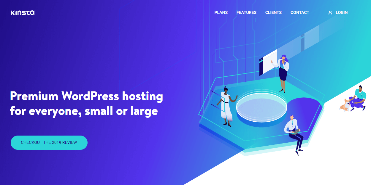
Kinsta is one of the most reputed managed WordPress hosting providers, powered by the Google Cloud Platform. In this article, we’ll review Kinsta’s managed WordPress hosting service and benchmark its performance. Kinsta WordPress Hosting What We’ll Cover Like most managed WordPress hosting providers, Kinsta offers top-notch performance and stellar support. However, what sets it apart […]
WordPress’ accessibility team is evaluating the possibility of organizing a virtual Global Accessibility Day, similar to the Polyglots’ Global Translation Day. This marathon-style contributor event has proven to be valuable for the Polyglots in terms of recruiting, onboarding, and fueling progress on translation projects.
Accessibility contributors proposed the idea at a meeting two weeks ago after discussing the team’s desire to have more representation at WordCamp contributor days. WordCamp Europe 2019 had a strong contingency of accessibility contributors, but being present on the ground in Berlin was not an option for the vast majority of the team.
“I heard different people saying that this Contributor Day was extremely useful, because they had the opportunity to talk in person and exchange ideas with a lot of other people,” Stefano Minoia said. “This is really good: if we want to push forward a project like WordPress, it’s extremely important to have the opportunity of working together at least once a year in person.”
Due to the relatively small size of the team and the expense associated with traveling to larger WordCamps, accessibility contributors do not often have the opportunity for in-person collaboration. A remote contributor day focused on accessibility was proposed as an alternative.
“We’re a small group with very little sponsorship,” Joe Dolson said during the initial discussion. “I don’t go to most WordCamps anymore, because the time and expense is just too great for me. I’ll probably go to my local WordCamp only, this year, if I have the time.”
Due to the nature of the work, Dolson anticipates the team may face some challenges in working around some of the constraints of collaborating through a virtual event.
“There are some tasks that work really well as remote contributor days; others are harder,” he said. “I’ve personally found it difficult to do accessibility contributor sharing remotely.”
A virtual contributor day could be helpful for some basic things like teaching new contributors how to use Trac, updating the handbook and documentation, and organizing sprints for jumpstarting larger tasks. There is no shortage of accessibility projects to work on, with the new block directory in the admin slated for this year, some major changes needed to improve navigation to Gutenberg’s advanced settings block sidebar, and more general Gutenberg issues.
One development that is working in the team’s favor is that Slack has improved the screen reader experience in the most recent update. Using threads was previously discouraged during accessibility team discussions due to their lack of navigability. Keyboard accessibility for getting around Slack should now be more streamlined than previous versions. This should help to improve remote collaboration for the accessibility team. Users can press CMD + ? to launch the list of available keyboard shortcuts in Slack.
All you need to get around Slack now is: • F6 to cycle through the UI • TAB to navigate through focusable elements • UP/DOWN to navigate through lists
As a first step towards organizing a 24-hour virtual event, WordPress’ accessibility team is working to put together a team of 10 or more people to lead the effort. Organizers will then determine the scope of the project, define the goals of the event, set a timeline, and begin the call for speakers and local meetups.
“The scope of the day can change based on the team,” Dolson said. “If we can’t do 24 hours, that’s fine, but the team has to come first.”
Anyone interested to help organize the event can sign up on the project’s public spreadsheet.
When someone says “web design,” it often puts an image in my head of a designer at a computer working in Adobe XD or Sketch. Because the final medium of the design is displayed on computer screens, web design is...
Divi is a revolutionary WordPress theme and visual page builder for WordPress. With Divi, you can build your website visually. Add, arrange and design content and watch everything happen instantly right before your eyes.
jExcel is a lightweight vanilla JavaScript plugin to create web-based interactive tables and spreadsheets compatible with Excel or any other spreadsheet software.
I had a little rant in me a few months ago about design systems: "Who Are Design Systems For?" My main point was that there are so many public and open source ones out there that choosing one can feel like choosing new furniture for your house. You just measure up what you need and what you like and pick one. But it just isn't that simple. Some are made for you, some makers want you to use them, and some just ain't.
... it’s important that you first define who a design system is for and what people should be able to do with it. When you have decided this, and start looking at the implementation for the level of flexibility you require, keep in mind that it’s okay to do something that’s different from what’s already out there. It’s easy to create a lot of flexibility or none at all, the trick is to get it just right.
The levels:
Zero customizability. Sometimes this is the point: enforcing consistency and making it easy to use (no config).
Build your own (BYO) theme. The other end of the spectrum: do whatever you want, fully cusomizable.
Guided theme building. This is baby bear. Like changing preprocessor values to change colors, but it can get fancier.
Here’s a fascinating look at The Guardian’s design system with a step-by-step breakdown of what's gone into it and what options are available to designers and developers. It shows us how the team treats colors, typography, layouts, and visual cues like rules and borders.
I’ve been struggling to think about how to describe design systems internally to folks and this is giving me a ton of inspiration right now. I like that this website has all the benefits of a video (great tone and lovely visuals) with all the benefits of a UI kit (by showing what options are available to folks).
This also loosely ties back into something Chris has been discussing lately, which is being mindful of knowing who a design system is for. Some are meant for internal use and others, some are meant for internal use but are openly available for people like contractors, and others are meant for varying degrees of external use. Here, The Guadian is not explicit about who their design system is for, but the description of it gives a pretty good hint:
A guide to digital design at the Guardian
So please, enjoy looking at this well-documented, highly interactive and gorgeous design system. At the same time, remember it's made for a specific use case and may not line up with all the needs of your project or organization. It sure is inspirational to look at, one way or the other!
Every website needs high-quality images, period. Headers, article and cover images, social media, icons – the list is endless. Even if you’re a photographer, you probably don’t have time to take a photo every time you need one. You could hire a professional photographer, but that costs a lot of money.
One great alternative is using free photography. Stock images have a bad reputation for being distracting and unhelpful, but there are plenty of beautiful, professional and entirely free photos available for use by web designers. And we’ve already found them for you – here are some of the best free photography resources out there.
With over 1,000,000 images, all free for commercial or noncommercial use, Unsplash is one of the best websites to find pictures. Photos are submitted by a massive community of open photographers and semi-strict guidelines ensure quality. If you need nature or portrait photography in particular, Unsplash has plenty of those to choose from.
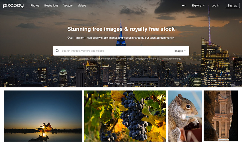
Pixabay is all about variety. In categories where other free resources may be lacking, such as in abstract works, illustrations and vectors, or technology/internet-related concepts, Pixabay photographers have you covered. There are quality guidelines, but anyone can submit.
Also check out the free stock videos, licensed under the same rules, and with the same variety of content!
StockSnap is another massive collection of free CC0 photos that includes business, nature, people, food, and a huge variety of other topics. StockSnap also has a good selection of more artistic content, such as flat-lay scenes and abstract wallpapers. With new photos every day, this is a great resource for stock images.
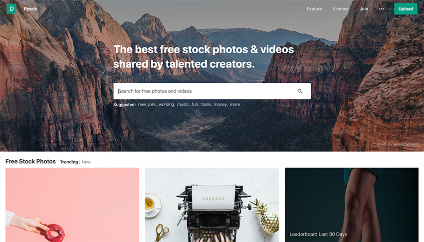
Pexels gets right to the point: Free stock photos and videos, for use anywhere, any time. Portrait photos seem especially popular. For photographers, photo challenges with prizes and PayPal donations are great incentives to participate, so you’ll see many high-quality photos here.
Burst is a project by Shopify that brings free photos to everyone – even people who don’t use Shopify. The photos are contributed by the community and categorized for easy searching. Portraits, animals, textures, nature photos and backgrounds are Burst’s specialty – especially ones that are made with business and e-commerce in mind.
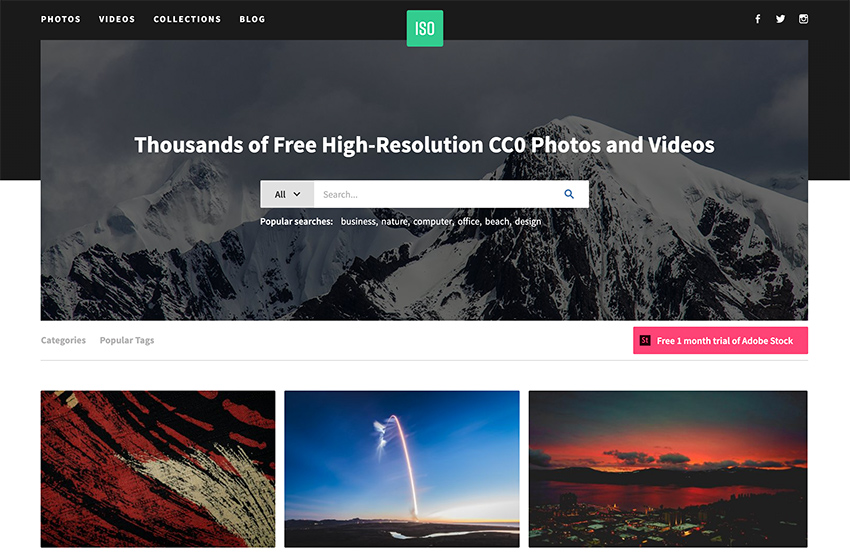
ISO Republic has a strong mix of trendy stock photos with high quality resolutions. The site also includes free stock video footage with easy-to-use search to filter what type of media you’re looking for. ISO Republic’s photo and videos are released under the same CC0 license.
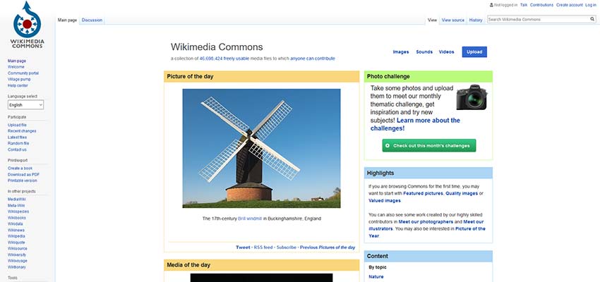
Wikimedia Commons is a great place to find free photographs, videos and even sounds that depict nearly any topic you can imagine. When using this resource be careful and always check the license – the only guarantee is that the photos are licensed under Creative Commons and are free. You may be required to display attribution or share alike. There are also no strict quality guidelines, so you may have to look through some photos that are unsuitable for professional use.
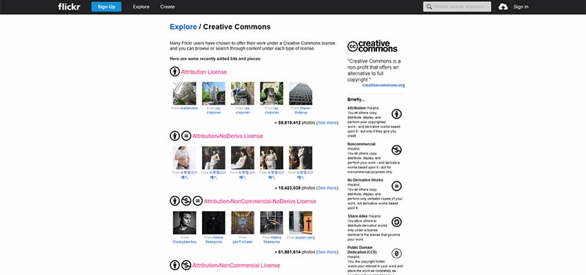
Flickr has helpfully categorized its Creative Commons and public domain uploads, down to sorting them by attribution, share alike and other requirements. The website is a simple image sharing and uploading service, so it has no quality guidelines. But you may still find a keeper in here.
High-Quality Free Photography
There are plenty of amazing free photos to use from a growing list of generous photographers. Whenever you use someone else’s work, make sure to check licensing and terms of service carefully. Some sites are free forever, while others allow you to use photos only under certain guidelines. It’s better to do the extra research rather than end up in hot water.
This article is part of a series in which I attempt to use the web under various constraints, representing a given demographic of user. I hope to raise the profile of difficulties faced by real people, which are avoidable if we design and develop in a way that is sympathetic to their needs.
Many of us are lucky enough to be on mobile plans which allow several gigabytes of data transfer per month. Failing that, we are usually able to connect to home or public WiFi networks that are on fast broadband connections and have effectively unlimited data.
But there are parts of the world where mobile data is prohibitively expensive, and where there is little or no broadband infrastructure.
People often buy data packages of just tens of megabytes at a time, making a gigabyte a relatively large and therefore expensive amount of data to buy. — Dan Howdle, consumer telecoms analyst at Cable.co.uk
Just how expensive are we talking?
The Cost Of Mobile Data
A 2018 study by cable.co.uk found that Zimbabwe was the most expensive country in the world for mobile data, where 1 GB cost an average of $75.20, ranging from $12.50 to $138.46. The enormous range in price is due to smaller amounts of data being very expensive, getting proportionally cheaper the bigger the data plan you commit to. You can read the study methodology for more information.
Zimbabwe is by no means a one-off. Equatorial Guinea, Saint Helena and the Falkland Islands are next in line, with 1 GB of data costing $65.83, $55.47 and $47.39 respectively. These countries generally have a combination of poor technical infrastructure and low adoption, meaning data is both costly to deliver and doesn’t have the economy of scale to drive costs down.
Data is expensive in parts of Europe too. A gigabyte of data in Greece will set you back $32.71; in Switzerland, $20.22. For comparison, the same amount of data costs $6.66 in the UK, or $12.37 in the USA. On the other end of the scale, India is the cheapest place in the world for data, at an average cost of $0.26. Kyrgyzstan, Kazakhstan and Ukraine follow at $0.27, $0.49 and $0.51 per GB respectively.
The speed of mobile networks, too, varies considerably between countries. Perhaps surprisingly, users experience faster speeds over a mobile network than WiFi in at least 30 countries worldwide, including Australia and France. South Korea has the fastest mobile download speed, averaging 52.4 Mbps, but Iraq has the slowest, averaging 1.6 Mbps download and 0.7 Mbps upload. The USA ranks 40th in the world for mobile download speeds, at around 34 Mbps, and is at risk of falling further behind as the world moves towards 5G.
As for mobile network connection type, 84.7% of user connections in the UK are on 4G, compared to 93% in the USA, and 97.5% in South Korea. This compares with less than 50% in Uzbekistan and less than 60% in Algeria, Ecuador, Nepal and Iraq.
The Cost Of Broadband Data
Meanwhile, a study of the cost of broadband in 2018 shows that a broadband connection in Niger costs $263 ‘per megabit per month’. This metric is a little difficult to comprehend, so here’s an example: if the average cost of broadband packages in a country is $22, and the average download speed offered by the packages is 10 Mbps, then the cost ‘per megabit per month’ would be $2.20.
It’s an interesting metric, and one that acknowledges that broadband speed is as important a factor as the data cap. A cost of $263 suggests a combination of extremely slow and extremely expensive broadband. For reference, the metric is $1.19 in the UK and $1.26 in the USA.
What’s perhaps easier to comprehend is the average cost of a broadband package. Note that this study was looking for the cheapest broadband packages on offer, ignoring whether or not these packages had a data cap, so provides a useful ballpark figure rather than the cost of data per se.
On package cost alone, Mauritania has the most expensive broadband in the world, at an average of $768.16 (a range of $307.26 to $1,368.72). This enormous cost includes building physical lines to the property, since few already exist in Mauritania. At 0.7 Mbps, Mauritania also has one of the slowest broadband networks in the world.
Taiwan has the fastest broadband in the world, at a mean speed of 85 Mbps. Yemen has the slowest, at 0.38 Mbps. But even countries with good established broadband infrastructure have so-called ‘not-spots’. The United Kingdom is ranked 34th out of 207 countries for broadband speed, but in July 2019 there was still a school in the UK without broadband.
The average cost of a broadband package in the UK is $39.58, and in the USA is $67.69. The cheapest average in the world is Ukraine’s, at just $5, although the cheapest broadband deal of them all was found in Kyrgystan ($1.27 — against the country average of $108.22).
Zimbabwe was the most costly country for mobile data, and the statistics aren’t much better for its broadband, with an average cost of $128.71 and a ‘per megabit per month’ cost of $6.89.
Absolute Cost vs Cost In Real Terms
All of the costs outlined so far are the absolute costs in USD, based on the exchange rates at the time of the study. These costs have not been accounted for cost of living, meaning that for many countries the cost is actually far higher in real terms.
I’m going to limit my browsing today to 50 MB, which in Zimbabwe would cost around $3.67 on a mobile data tariff. That may not sound like much, but teachers in Zimbabwe were striking this year because their salaries had fallen to just $2.50 a day.
For comparison, $3.67 is around half the $7.25 minimum wage in the USA. As a Zimbabwean, I’d have to work for around a day and a half to earn the money to buy this 50MB data, compared to just half an hour in the USA. It’s not easy to compare cost of living between countries, but on wages alone the $3.67 cost of 50 MB of data in Zimbabwe would feel like $52 to an American on minimum wage.
Setting Up The Experiment
I launched Chrome and opened the dev tools, where I throttled the network to a slow 3G connection. I wanted to simulate a slow connection like those experienced by users in Uzbekistan, to see what kind of experience websites would give me. I also throttled my CPU to simulate being on a lower end device.
I opted to throttle my network to Slow 3G and my CPU to 6x slowdown. (Large preview)
I installed ModHeader and set the ‘Save-Data’ header to let websites know I want to minimise my data usage. This is also the header set by Chrome for Android’s ‘Lite mode’, which I’ll cover in more detail later.
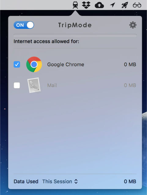
I downloaded TripMode; an application for Mac which gives you control over which apps on your Mac can access the internet. Any other application’s internet access is automatically blocked.
You can enable/disable individual apps from connecting to the internet with TripMode. I enabled Chrome. (Large preview)
How far do I predict my 50 MB budget will take me? With the average weight of a web page being almost 1.7 MB, that suggests I’ve got around 29 pages in my budget, although probably a few more than that if I’m able to stay on the same sites and leverage browser caching.
Throughout the experiment I will suggest performance tips to speed up the first contentful paint and perceived loading time of the page. Some of these tips may not affect the amount of data transferred directly, but do generally involve deferring the download of less important resources, which on slow connections may mean the resources are never downloaded and data is saved.
The Experiment
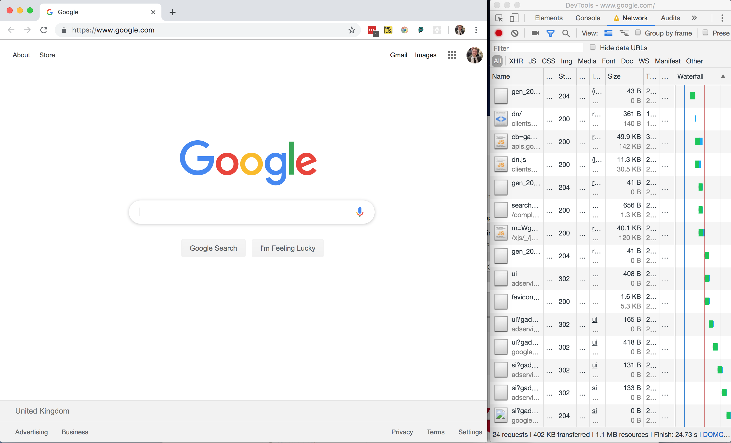
Without any further ado, I loaded google.com, using 402 KB of my budget and spending $0.03 (around 1% of my Zimbabwe budget).
All in all, not a bad page size, but I wondered where those 24 network requests were coming from and whether or not the page could be made any lighter.
Google Homepage — DOM
Chrome devtools screenshot of the DOM, where I’ve expanded one inline style tag. (Large preview)
Looking at the page markup, there are no external stylesheets — all of the CSS is inline.
Performance Tip #1: Inline Critical CSS
This is good for performance as it saves the browser having to make an additional network request in order to fetch an external stylesheet, so the styles can be parsed and applied immediately for the first contentful paint. There’s a trade-off to be made here, as external stylesheets can be cached but inline ones cannot (unless you get clever with JavaScript).
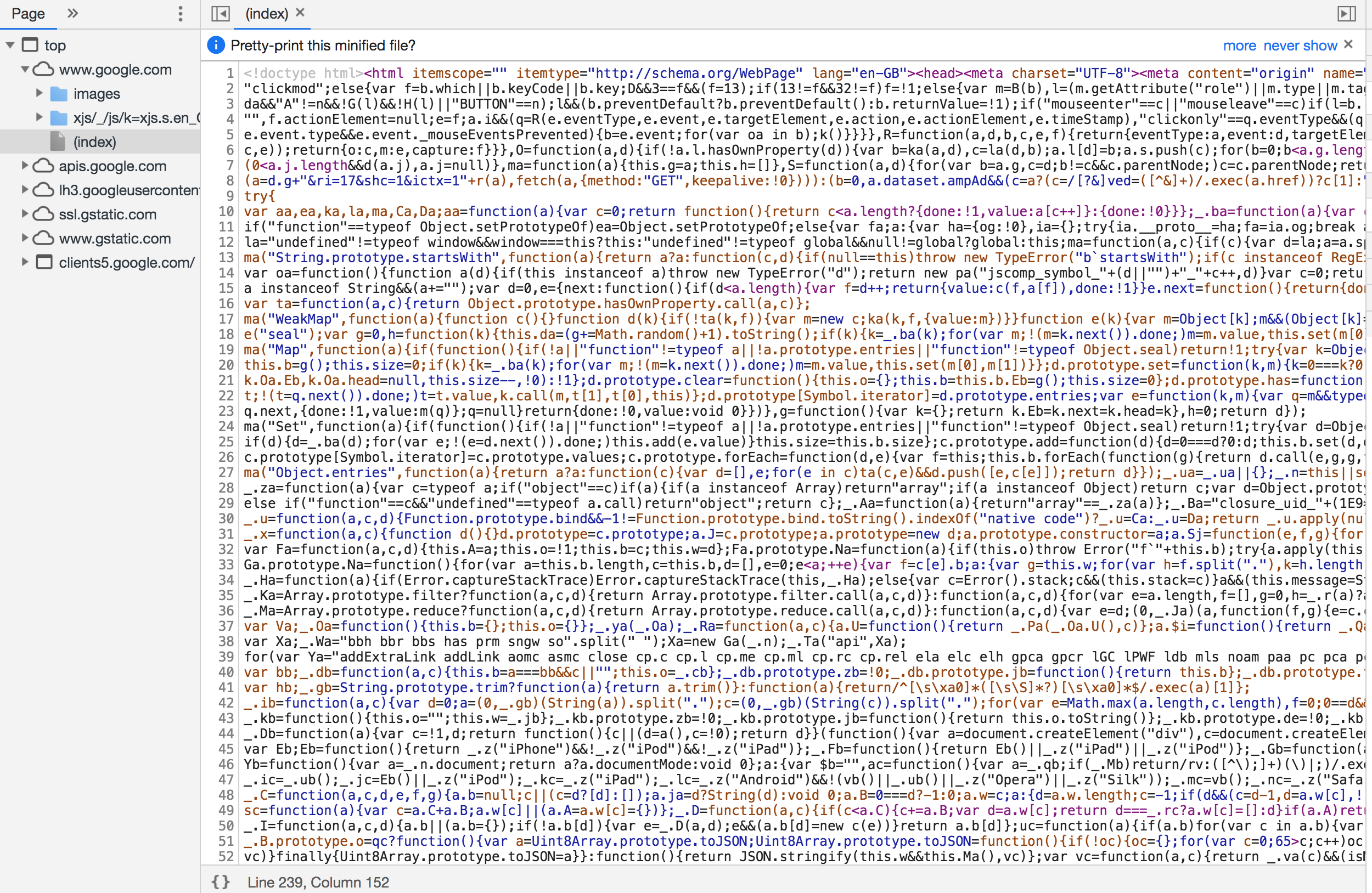
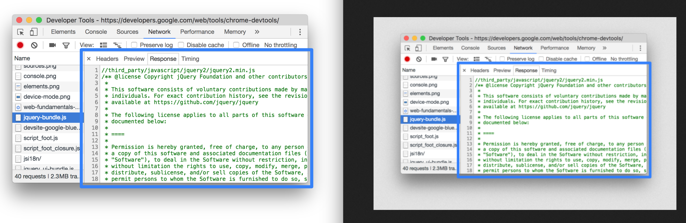
The devtools show a prettified version of the DOM. If you want to see what was actually downloaded to the browser, switch to the Sources tab and find the document.
Switching to Sources and finding the index shows the ‘raw’ HTML that was delivered to the browser. What a mess! (Large preview)
You can see there is a LOT of inline JavaScript here. It’s worth noting that it has been uglified rather than merely minified.
Performance Tip #2: Minify And Uglify Your Assets
Minification removes unnecessary spaces and characters, but uglification actually ‘mangles’ the code to be shorter. The tell-tale sign is that the code contains short, machine-generated variable names rather than untouched source code. This is good as it means the script is smaller and quicker to download.
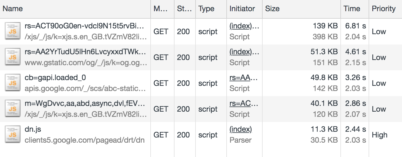
Even so, inline scripts look to be roughly 120 KB of the 210 KB page resource (about half the 60 KB gzipped size). In addition, there are five external JavaScript files amounting to 291 KB of the 402 KB downloaded:
Five external JavaScript files in the Network tab of the devtools. (Large preview)
This means that JavaScript accounts for about 80 percent of the overall page weight.
This isn’t useless JavaScript; Google has to have some in order to display suggestions as you type. But I suspect a lot of it is tracking code and advertising setup.
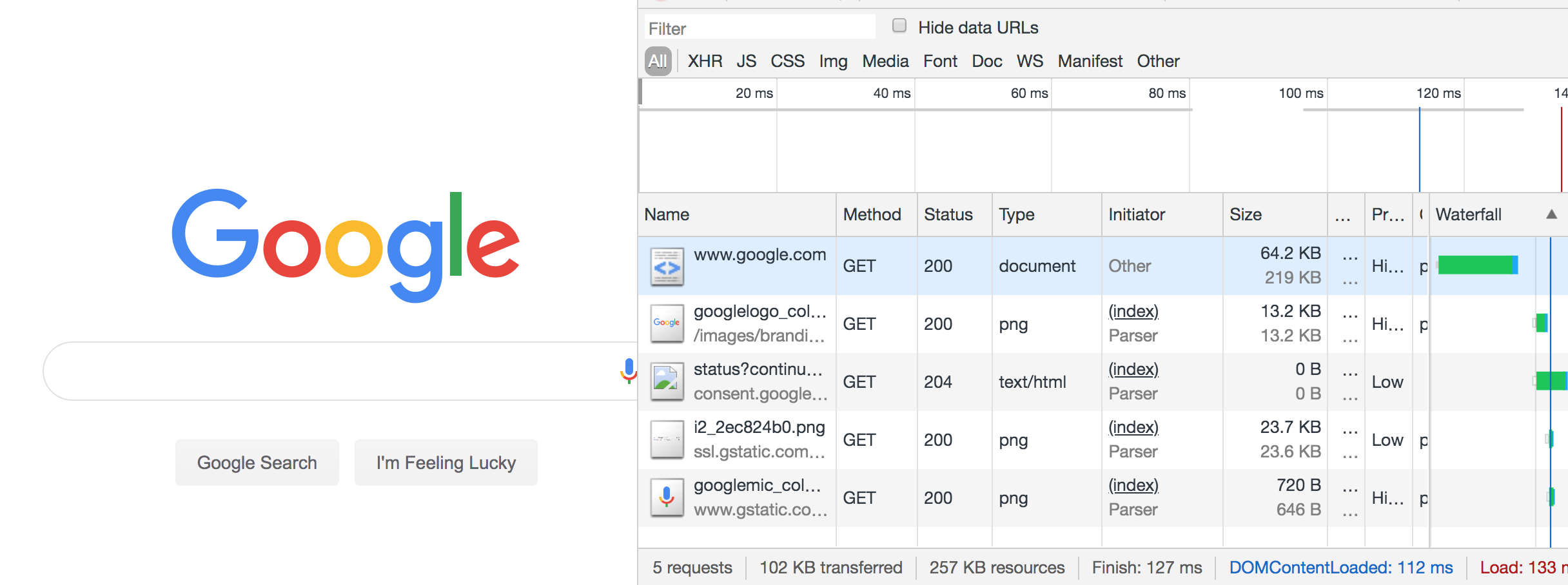
For comparison, I disabled JavaScript and reloaded the page:
The disabled JS version of Google search was only 102 KB and had just 5 network requests. (Large preview)
The JS-disabled version of Google search is just 102 KB, as opposed to 402 KB. Although Google can’t provide autosuggestions under these conditions, the site is still functional, and I’ve just cut my data usage down to a quarter of what it was. If I really did have to limit my data usage in the long term, one of the first things I’d do is disable JavaScript. It’s not as bad as it sounds.
Performance Tip #3: Less Is More
Inlining, uglifying and minifying assets is all well and good, but the best performance comes from not sending down the assets in the first place.
Before adding any new features, do you have a performance budget in place?
Before adding JavaScript to your site, can your feature be accomplished using plain HTML? (For example, HTML5 form validation).
Before pulling a large JavaScript or CSS library into your application, use something like bundlephobia.com to measure how big it is. Is the convenience worth the weight? Can you accomplish the same thing using vanilla code at a much smaller data size?
Analysing The Resource Info
There’s a lot to unpack here, so let’s get cracking. I’ve only got 50 MB to play with, so I’m going to milk every bit of this page load. Settle in for a short Chrome Devtools tutorial.
402 KB transferred, but 1.1 MB of resources: what does that actually mean?
It means 402 KB of content was actually downloaded, but in its compressed form (using a compression algorithm such as gzip or brotli). The browser then had to do some work to unpack it into something meaningful. The total size of the unpacked data is 1.1 MB.
As a general rule, always compress your assets, using something like gzip. But don’t use compression on your images and other binary files — you should optimize these in advance at source. Compression could actually end up making them bigger.
And, if you can, avoid compressing files that are 1500 bytes or smaller. The smallest TCP packet size is 1500 bytes, so by compressing to, say, 800 bytes, you save nothing, as it’s still transmitted in the same byte packet. Again, the cost is negligible, but wastes some compression CPU time on the server and decompression CPU time on the client.
Now back to the Network tab in Chrome: let’s dig into those priorities. Notice that resources have priority “Highest” to “Lowest” — these are the browser’s best guess as to what are the more important resources to download. The higher the priority, the sooner the browser will try to download the asset.
Performance Tip #5: Give Resource Hints To The Browser
The browser will guess at what the highest priority assets are, but you can provide a resource hint using the <link rel="preload"> tag, instructing the browser to download the asset as soon as possible. It’s a good idea to preload fonts, logos and anything else that appears above the fold.
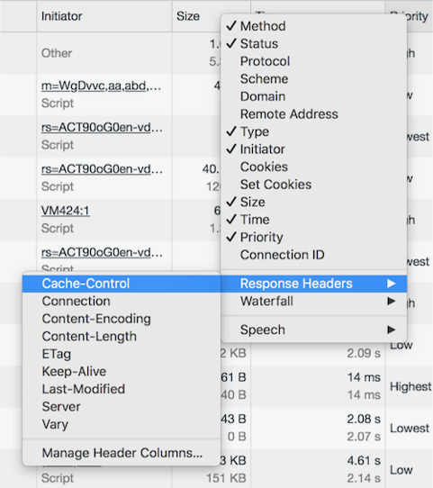
Let’s talk about caching. I’m going to hold ALT and right-click to change my column headers to unlock some more juicy information. We’re going to check out Cache-Control.
There are lots of interesting fields tucked away behind ALT. (Large preview)
Cache-Control denotes whether or not a resource can be cached, how long it can be cached for, and what rules it should follow around revalidating. Setting proper cache values is crucial to keeping the data cost of repeat visits down.
Performance Tip #6: Set cache-control Headers On All Cacheable Assets
Note that the cache-control value begins with a directive of public or private, followed by an expiration value (e.g. max-age=31536000). What does the directive mean, and why the oddly specific max-age value?
A mixture of max-age values and public/private. (Large preview)
The value 31536000 is the number of seconds there are in a year, and is the theoretical maximum value allowed by the cache-control specification. It is common to see this value applied to all static assets and effectively means “this resource isn’t going to change”. In practice, no browser is going to cache for an entire year, but it will cache the asset for as long as makes sense.
To explain the public/private directive, we must explain the two main caches that exist off the server. First, there is the traditional browser cache, where the resource is stored on the user’s machine (the ‘client’). And then there is the CDN cache, which sits between the client and the server; resources are cached at the CDN level to prevent the CDN from requesting the resource from the origin server over and over again.
A Cache-Control directive of public allows the resource to be cached in both the client and the CDN. A value of private means only the client can cache it; the CDN is not supposed to. This latter value is typically used for pages or assets that exist behind authentication, where it is fine to be cached on the client but we wouldn’t want to leak private information by caching it in the CDN and delivering it to other users.
A mixture of max-age values and public/private. (Large preview)
One thing that got my attention was that the Google logo has a cache control of “private”. Other images on the page do have a public cache, and I don’t know why the logo would be treated any differently. If you have any ideas, let me know in the comments!
I refreshed the page and most of the resources were served from cache, apart from the page itself, which as you’ve seen already is private, max-age=0, meaning it cannot be cached. This is normal for dynamic web pages where it is important that the user always gets the very latest page when they refresh.
It was at this point I accidentally clicked on an ‘Explanation’ URL in the devtools, which took me to the network analysis reference, costing me about 5 MB of my budget. Oops.
Google Dev Docs
4.2 MB of this new 5 MB page was down to images; specifically SVGs. The weightiest of these was 186 KB, which isn’t particularly big — there were just so many of them, and they all downloaded at once.
This is a loooong page. All the images downloaded on page load. (Large preview)
That 5 MB page load was 10% of my budget for today. So far I’ve used 5.5 MB, including the no-JavaScript reload of the Google homepage, and spent $0.40. I didn’t even mean to open this page.
What would have been a better user experience here?
Performance Tip #7: Lazy-load Your Images
Ordinarily, if I accidentally clicked on a link, I would hit the back button in my browser. I’d have received no benefit whatsoever from downloading those images — what a waste of 4.2 MB!
Apart from video, where you generally know what you’re getting yourself into, images are by far the biggest culprit to data usage on the web. A study of the world’s top 500 websites found that images take up to 53% of the average page weight. “This means they have a big impact on page-loading times and subsequently overall performance”.
Instead of downloading all of the images on page load, it is good practice to lazy-load the images so that only users who are engaged with the page pay the cost of downloading them. Users who choose not to scroll below the fold therefore don’t waste any unnecessary bandwidth downloading images they’ll never see.
If this page had implemented lazy loading as per the guide above, each of the 38 SVGs would have been represented by a 1 KB placeholder image by default, and only loaded into view on scroll.
Performance Tip #8: Use The Right Format For Your Images
I thought that Google had missed a trick by not using WebP, which is an image format that is 26% smaller in size compared to PNGs (with no loss in quality) and 25-34% smaller in size compared to JPEGs (and of a comparable quality). I thought I’d have a go at converting SVG to WebP.
Converting to WebP did bring one of the SVGs down from 186 KB to just 65 KB, but actually, looking at the images side by side, the WebP came out grainy:
The SVG (left) is noticeably crisper than the WebP (right). (Large preview)
I then tried converting one of the PNGs to WebP, which is supposed to be lossless and should come out smaller. However, the WebP output was *heavier* (127 KB, from 109 KB)!
The PNG (left) is a similar quality to the WebP (right) but is smaller at 109 KB compared to 127 KB. (Large preview)
This surprised me. WebP isn’t necessarily the silver bullet we think it is, and even Google have neglected to use it on this page.
So my advice would be: where possible, experiment with different image formats on a per-image basis. The format that keeps the best quality for the smallest size may not be the one you expect.
Notice the async keyword on the Google analytics script?
Google analytics has ‘low’ priority. (Large preview)
Despite being one of the first things in the head of the document, this was given a low priority, as we’ve explicitly opted out of being a blocking request by using the async keyword.
A blocking request is one that stops the rendering of the page. A <script> call is blocking by default, stopping the parsing of the HTML until the script has downloaded, compiled and executed. This is why we traditionally put <script> calls at the end of the document.
Performance Tip #9: Avoid Writing Blocking Script Calls
By adding the async attribute to our <script> tag, we’re telling the browser not to stop rendering the page but to download the script in the background. If the HTML is still being parsed by the time the script is downloaded, the parsing is paused while the script is executed, and then resumed. This is significantly better than blocking the rendering as soon as <script> is encountered.
There is also a defer attribute, which is subtly different. <script defer> tells the browser to render the page while the script loads in the background, and even if the HTML is still being parsed by the time the script is downloaded, the script must wait until the page is rendered before it can be executed. This makes the script completely non-blocking. Read “Efficiently load JavaScript with defer and async” for more information.
Anyway, enough Google dissecting. It’s time to try out another site. I’ve still got almost 45 MB of my budget left!
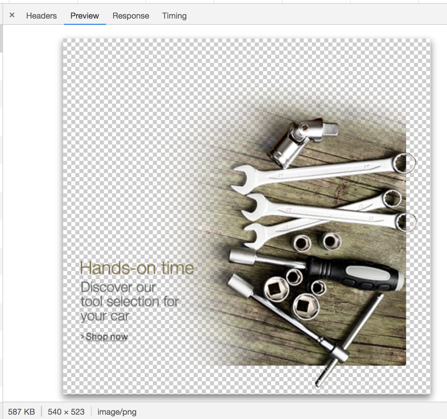
The Amazon homepage loaded with a total weight of about 6 MB. One of these was a 587 KB image that I couldn’t even find on the page. This was a PNG, presumably to have crisp text, but on a photographic background — a classic combination that’s terrible for performance.
This grainy image used over 1% of my budget. (Large preview)
In fact, there were a few several-hundred-kilobyte images in my network tab that I couldn’t actually see on the page. I suspect a misconfiguration somewhere on Amazon, but these invisible images combined chewed through at least 1 MB of my data.
How about the hero image? It’s the main image on the page, and it’s only 94 KB transferred — but it could be reduced in size by about 15% if it were cropped directly around the text and footballers. We could then apply the same background color in CSS as is in the image. This has the additional advantage of being resizable down to smaller screens whilst retaining legibility of text.
I’ve said it once, and I’ll say it again: optimising and lazy-loading your images is the single biggest benefit you can make to the page weight of your site.
Optimizing images provided, by far, the most significant data reduction. You can make the case JavaScript is a bigger deal for overall performance, but not data reduction. Optimizing or removing images is the safest way of ensuring a much lighter experience and that’s the primary optimization Data Saver relies on. — Tim Kadlec, Making Sense of Chrome Lite Pages
To be fair to Amazon, if I resize the browser to a mobile size and refresh the page, the site is optimized for mobile and the total page weight is only 2.1 MB.
Performance Tip #10: Don’t Make Assumptions About Data Connections
It’s difficult to detect if someone on a desktop is on a broadband connection or is tethering through a data-limited dongle or mobile. Many people work on the train like that, or live in an area where broadband infrastructure is poor but mobile signal is strong. In Amazon’s case, there is room to make some big data savings on the desktop site and we shouldn’t get complacent just because the screen size suggests I’m not on a mobile device.
Yes, we should expect a larger page load if our viewport is ‘desktop sized’ as the images will be larger and better optimized for the screen than a grainier mobile one. But the page shouldn’t be orders of magnitude bigger.
The initial ‘desktop’ load may have been 6 MB, but after sitting and watching it for a minute it had climbed to 8.6 MB as the lower-priority resources and event tracking kicked into action. This page weight includes almost 1.7 MB of minified JavaScript. I don’t even want to begin to look at that.
Performance Tip #11: Use Web Workers For Your JavaScript
Which would be worse — 1.7 MB of JavaScript or 1.7 MB of images? The answer is JavaScript: the two assets are not equivalent when it comes to performance.
A JPEG image needs to be decoded, rasterized, and painted on the screen. A JavaScript bundle needs to be downloaded and then parsed, compiled, executed —and there are a number of other steps that an engine needs to complete. Be aware that these costs are not quite equivalent. — Addy Osmani, The Cost of JavaScript in 2018
If you must ship this much JavaScript, try putting it in a web worker. This keeps the bulk of JavaScript off the main thread, which is now freed up for repainting the UI, helping your web page to stay responsive on low-powered devices.
I’m now about 15.5 MB into my budget, and have spent $1.14 of my Zimbabwe data budget. I’d have had to have worked for half a day as a teacher to earn the money to get this far.
Pinterest
I’ve heard good things about Pinterest’s performance, so I decided to put it to the test.
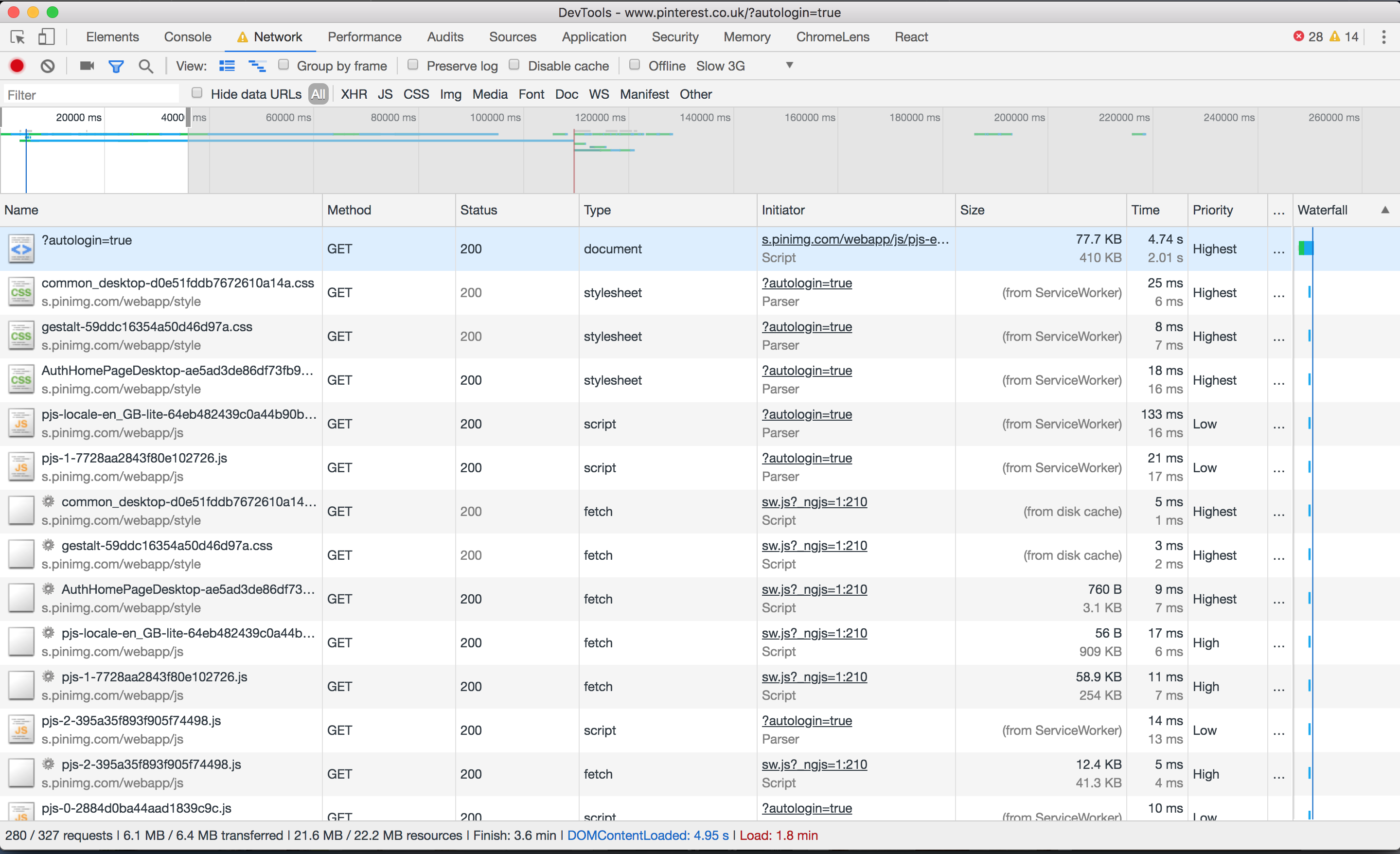
A staggering 327 requests, making 6.1 MB of data. (Large preview)
Perhaps this isn’t the fairest of tests; I was taken to the sign-in page, upon which an asynchronous process found I was logged into Facebook and logged me in automatically. The page loaded relatively quickly, but the requests crept up as more and more content was preloaded.
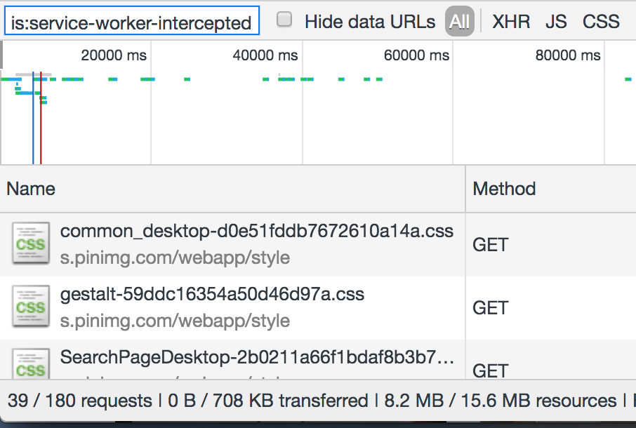
However, I saw that on subsequent page loads, the service worker surfaced much of the content — saving about half of the page weight:
8.2 / 15.6 MB resources, and 39 / 180 requests handled by the service worker cache. (Large preview)
The Pinterest site is a progressive web app; it installed a service worker to manually handle caching of CSS and JS. I could now turn off my WiFi and continue to use the site (albeit not very usefully):
You can’t do much when you’re offline. (Large preview)
Performance Tip #12: Use Service Workers To Provide Offline Support
Wouldn’t it be great if I only had to load a website once over network, and now get all the information I need even if I’m offline?
A great example would be a website that shows the weather forecast for the week. I should only need to download that page once. If I turn off my mobile data and subsequently go back to the page at some point, it should be able to serve the last known content to me. If I connect to the internet again and load the page, I would get a more up to date forecast, but static assets such as CSS and images should still be served locally from the service worker.
Content that rarely updates and is likely to be used quite regularly is a perfect candidate for service worker treatment. Dynamic sites with ever-changing news feeds aren’t quite so well suited for offline experiences, but can still benefit.
The second Pinterest page load was 443 KB. (Large preview)
Service workers can truly save the day when you’re on a tight data budget. I’m not convinced the Pinterest experience was the most optimal in terms of data usage – subsequent pages were around the 0.5 MB mark even on pages with few images — but letting your JavaScript handle page requests for you and keeping the same navigational elements in place can be very performant. The BBC manages a transfer size of just 3.1 KB for return-visits to articles that are renderable via the single page application.
So far, Pinterest alone has chewed through 14 MB, which means I’ve blown around 30 MB of my budget, or $2.20 (almost a day’s wages) of my Zimbabwe budget.
I’d better be careful with my final 20 MB… but where’s the fun in that?
Gamespot
I picked this one because it felt noticeably sluggish on my mobile in the past and I wanted to dig into the reasons why. Sure enough, loading the homepage consumes 8.5 MB of data.
The Gamespot homepage trickled up to 8.5 MB, and a whopping 347 requests. (Large preview)
6.5 MB of this was down to an autoplaying video halfway down the page, which — to be fair — didn’t appear to download until I began scrolling. Nevertheless…
I could only see half the video in my viewport — the right hand side was clipped. It was also 30 seconds long, and I would wager that most people won’t sit and watch the whole thing. This single asset more than tripled the size of the page.
Performance Tip #13: Don’t Preload Video
As a rule, unless your site’s primary mode of communication is video, don’t preload it.
If you’re YouTube or Netflix, it’s reasonable to assume that someone coming to your page will want the video to auto-load and auto-play. There is an expectation that the video will chew through some data, but that it’s a fair exchange for the content. But if you’re a site whose primary medium is text and image — and you just happen to offer additional video content — then don’t preload the video.
Think of news articles with embedded videos. Many users only want to skim the article headline before moving on to their next thing. Others will read the article but ignore any embeds. And others will diligently click and watch each embedded video. We shouldn’t hog the bandwidth of every user on the assumption that they’re going to want to watch these videos.
To reiterate: users don’t like autoplaying video. As developers we only do it because our managers tell us to, and they only tell us to do it because all the coolest apps are doing it, and the coolest apps are only doing it because video ads generate 20 to 50 times more revenue than traditional ads. Google Chrome has started blocking autoplay videos for some sites, based on personal preferences, so even if you develop your site to autoplay video, there’s no guarantee that’s the experience your users are getting.
If we agree that it’s a good idea to make video an opt-in experience (click to play), we can take it a step further and make it click to load too. That means mocking a video placeholder image with a play button over it, and only downloading the video when you click the play button. People on fast connections should notice no difference in buffer speed, and people on slow connections will appreciate how fast the rest of your site loaded because it didn’t have to preload a large video file.
Anyway, back to Gamespot, where I was indeed forced to preload a large video file I ended up not watching. I then clicked through to a game review page that weighed another 8.5 MB, this time with 5.4 MB of video, before I even started scrolling down the page.
What was really galling was when I looked at what the video actually was. It was an advert for a Samsung TV! This advert cost me $0.40 of my Zimbabwe wages. Not only was it pre-loaded, but it also didn’t end up playing anywhere as far as I’m aware, so I never actually saw it.
This advert wasted 5.4 MB of my precious data. (Large preview)
The ‘real’ video — the gameplay footage (in other words, the content) — wasn’t actually loaded until I clicked on it. And that ploughed through my remaining data in seconds.
That’s it. That’s my 50 MB gone. I’ll need to work another 1.5 days as a Zimbabwean schoolteacher to repeat the experience.
Performance Tip #14: Optimize For First Page Load
What’s striking is that I used 50 MB of data and in most cases, I only visited one or two pages on any given site. If you think about it, this is true of most user journeys today.
Think about the last time you Googled something. You no doubt clicked on the first search result. If you got your answer, you closed the tab, or else you hit the back button and moved onto the next search result.
With the exception of a few so-called ‘destination sites’ such as Facebook or YouTube, where users habitually go as a starting point for other activities, the majority of user journeys are ephemeral. We stumble across random sites to get the answers to our questions, never to return to those sites again.
Web development practices are heavily skewed towards optimising for repeat visitors. “Cache these assets — they’ll come in handy later”. “Pre-load this onward journey, in case the user clicks to read more”. “Subscribe to our mailing list”.
Instead, I believe we should optimize heavily for one-off visitors. Call it a controversial opinion, but maybe caching isn’t really all that important. How important can a cached resource that never gets surfaced again be? And perhaps users aren’t actually going to subscribe to your mailing list after reading just the one article, so downloading the JavaScript and CSS for the mail subscription modal is both a waste of data and an annoying user experience.
The Decline Of Proxy Browsers
I had hoped to try out Opera Mini as part of this experiment. Opera Mini is a mobile web browser which proxies web pages through Opera’s compression servers. It accounts for 1.42% of global traffic as of June 2019, according to caniuse.com.
Opera Mini claims to save up to 90% of data by doing some pretty intensive transcoding. HTML is parsed, images are compressed, styling is applied, and a certain amount of JavaScript is executed on Opera’s servers. The server doesn’t respond with HTML as you might expect — it actually transcodes the data into Opera Binary Markup Language (OBML), which is progressively loaded by Opera Mini on the device. It renders what is essentially an interactive ‘snapshot’ of the web page — think of it as a PDF with hyperlinks inside it. Read Tiffany Brown’s excellent article, “Opera Mini and JavaScript” for a technical deep-dive.
It would have been a perfect way to eek my 50 MB budget as far as possible. Unfortunately, Opera Mini is no longer available on iOS in the UK. Attempting to visit it in the app store throws an error:
It’s still available “in some markets” but reading between the lines, Opera will be phasing out Opera Mini for its new app — Opera Touch — which doesn’t have any data-saving functionality apart from the ability to natively block ads.
Opera desktop used to have a ‘Turbo mode’, acting as a traditional proxy server (returning a HTML document instead of OBML), applying data-saving techniques but less intensively than Opera Mini. According to Opera, JavaScript continues to work and “you get all the videos, photos and text that you normally would, but you eat up less data and load pages faster”. However, Opera quietly removed Turbo mode in v60 earlier this year, and Opera Touch doesn’t have a Turbo mode either. Turbo mode is currently only available on Opera for Android.
Android is where all the action is in terms of data-saving technology. Chrome offers a ‘Lite mode’ on its mobile browser for Android, which is not available for iPhones or iPads because of “platform constraints“. Outside of mobile, Google used to provide a ‘Data Saver’ extension for Chrome desktop, but this was canned in April.
Lite mode for Chrome Android can be forcibly enabled, or automatically kicks in when the network’s effective connection type is 2G or worse, or when Chrome estimates the page will take more than 5 seconds to reach first contentful paint. Under these conditions, Chrome will request the lite version of the HTTPS URL as cached by Google’s servers, and display this stripped-down version inside the user’s browser, alongside a “Lite” marker in the address bar.
‘Lite mode’ on Chrome for Android. Image: Google. (Large preview)
Lite mode shares the HTTPS URL with Google, therefore it makes sense that this mode isn’t available in Incognito. However other information such as cookies, login information, and personalised page content is not shared with Google — according to ghacks.net — and “never breaks secure connections between Chrome and a website”. One wonders why seemingly none of these data-saving services are allowed on iOS (and there is no news as to whether Lite mode will ever become available on iOS).
Data saver proxies require a great deal of trust; your browsing activity, cookies and other sensitive information are entrusted to some server, often in another country. Many proxies simply won’t work anymore because a lot of sites have moved to HTTPS, meaning initiatives such as Turbo mode have become a largely “useless feature“. HTTPS prevents this kind of man-in-the-middle behaviour, which is a good thing, although it has meant the demise of some of these proxy services and has made sites less accessible to those on poor connections.
I was unable to find any OSX or iOS compatible data-saving tool except for Bandwidth Hero for Firefox (which requires setting up your own data compression service — far beyond the technical capabilities of most users!) and skyZIP Proxy (which, last updated in 2017 and riddled with typos, I just couldn’t bring myself to trust).
Conclusion
Reducing the data footprint of your website goes hand in hand with improving frontend performance. It is the single most reliable thing you can do to speed up your site.
In addition to the cost of data, there are lots of good reasons to focus on performance, as described in a GOV.UK blog post on the subject:
More performant web pages are better for the battery life of the user’s device, and typically require less power on the server to deliver. A performant site is good for the environment.
We don’t have the power to change the global cost of data inequality. But we do have the power to lessen its impact, improving the experience for everyone in the process.
When building a website, using a CSS framework is a real time saver as it provides you with tools every web designer and front-end developer needs when crafting a site (other than good web hosting). A CSS framework is a software framework created to allow for easier, more standards-compliant web design using HTML/CSS. Many popular …
There are a lot of errors will occur when we use WordPress as our blogging platform. Some of the major ones are, WordPress not logging in, WordPress admin getting refreshed, enabled directory browsing, etc… Well, we are going to show you another major issue – WordPress is not sending emails to the email address. And [...]
Now let’s take a look at how to get the URL of images uploaded to your WordPress site.
First, you need to login to your WordPress admin area and click on the Media menu. Once done, it will open your media library where all your images and other media files are stored.
Next, you can use the search feature to find the image that you want to find the link of.
Once you click on the image, it will open a popup window with the image attachment details. You will see the image details in the right column and image preview on the left.
The right column displays all image details including file name, file type, upload date, file size, dimensions, and image metadata like image alt text, title, caption, description, image uploaded by, etc.
You will also see the image URL at the end. It is the link next to ‘Copy Link’ option.
You can simply copy the link and use it anywhere you like.
If you open the image URL in your browser, then you can see the full size original version of the image uploaded.
Finding Your WordPress Image URLs from the Frontend
The method shown above lets you get the URL of any image uploaded in WordPress, whether it is published live or not.
If you want to get the URL of images already published on your site, then you can get it from the frontend itself. It is much easier!
Open a page or post where the image is published and locate the image. After that, right-click on the image, and select ‘Open image in new tab’ option.
Once the image opens in the new tab, look at the URL in the address bar. That is your WordPress image URL.
Now you can copy the image address and use it anywhere you want.
It is pretty quick and straightforward!
How to Get the URL of GIFs, Videos, and PDFs in WordPress
As mentioned above, other media files like GIFs, videos, and documents like PDFs are also saved in the WordPress media library. You can easily find the URL of these files by following the same steps as shown above.
Go to Media » Library from your dashboard, and then click on a GIF, video, or document whose URL you want to see. After that, attachment details popup window will appear.
You can get the attachment URL next to the ‘Copy Link’ option on the right column.
We hope this article helped you to learn how to get the URL of images you upload in WordPress. You may also want to see our guide on basic image editing in WordPress.
If you liked this article, then please subscribe to our YouTube Channel for WordPress video tutorials. You can also find us on Twitter and Facebook.


 Kinsta is one of the most reputed managed WordPress hosting providers, powered by the Google Cloud Platform. In this article, we’ll review Kinsta’s managed WordPress hosting service and benchmark its performance. Kinsta WordPress Hosting What We’ll Cover Like most managed WordPress hosting providers, Kinsta offers top-notch performance and stellar support. However, what sets it apart […]


