Fads and platforms come and go, but one fact endures: Copywriting is the mechanism that allows businesses to make money...
The post 17 Perceptive Ways to Persuade with Modern Copywriting appeared first on Copyblogger.

Tips, Expertise, Articles and Advice from the Pro's for Your Website or Blog to Succeed

Fads and platforms come and go, but one fact endures: Copywriting is the mechanism that allows businesses to make money...
The post 17 Perceptive Ways to Persuade with Modern Copywriting appeared first on Copyblogger.

When building a website portfolio involves little more than slapping a bunch of pictures on a page, the author can’t expect to get decent results unless the pictures themselves are exceptionally good. Image order, size, organization, and text placement are important, as is the text itself.
Building a decent portfolio takes thought, effort, and the right tool for the job, and there are plenty of themes on the market that will give you a head start toward building a decent portfolio website.
There’s absolutely no need to settle for “decent” though. What you need to create something that’s truly awesome can (1) either involve a tremendous amount of hard work or (2) finding a theme that’s either dedicated to the job or doesn’t have any of the more common limitations or constraints that could prevent you from doing so.
The second approach is far easier, and the results are just as good.
As is the case with the following 8 WordPress themes:
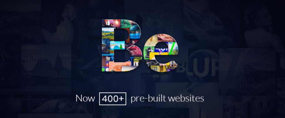
Bigger doesn’t necessarily always mean better, but in the case of premium multipurpose WordPress themes the biggest of them all, Be Theme, puts forth a pretty strong argument for being among the best.
Be Theme is easy to use and it gives web designers all kinds of flexibility thanks to its 40+ core features highlighted by a library of 450+ professionally- crafted, customizable pre-built websites. These pre-built websites cover specialty website types such as one-pagers, blogs, and portfolio websites. 30 industry sectors are covered as well.
A favorite among several pre-built websites that would be a portfolio website builder’s dream is BeAgency. While BeAgency can be used for a variety of business purposes, it’s beautiful Ajax portfolio has made it a favorite of many agencies seeking to showcase their work.
Be Theme is responsive and SEO-friendly and you can have a portfolio website you’ll be proud to own up and running in as little as 4 hours.
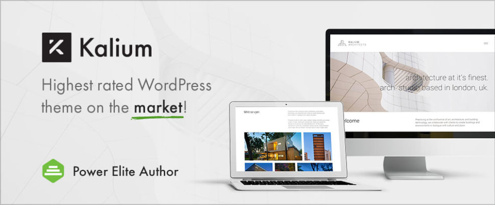
Minimalist in its design, powerful, and flexible is a good description of Kalium. This highly rated theme features an impressive selection of top-quality demos, layout designs, and theme options, together with a wide array of drag and drop content elements.
Website portfolio creators have a rich selection of design features and options to work with. A great deal of attention is directed toward portfolio design. Options include 2, 3, and 4-column formats with or without titles, and with or without margins, plus several Masonry-style layouts and options.
Browse Kalium’s showcase of user inspired and created websites and you should get a good idea of how this WordPress theme can help you create the “Perfect” portfolio website, or at least one that stands head and shoulders above the competitions’.
Kalium is well supported with documentation even though it’s easy to work with.
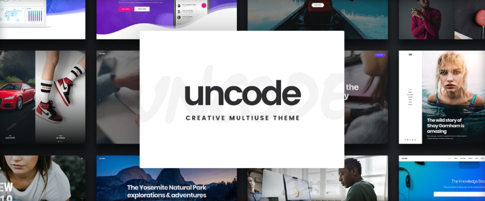
If building a pixel-perfect portfolio website is your goal, you’ll want a pixel-perfect creative WordPress theme to help you build it; which is precisely what you get with Uncode.
Although Uncode is a multipurpose theme, its real strength lies in helping users create superlative blog and portfolio websites. Its 50,000 sales to date and its standing as an all-time ThemeForest best seller more than suggest Uncode will be an outstanding choice for your upcoming portfolio website project.
Your portfolio will shine brightly and correctly on PC and handheld device screens alike, and the cascade options system guarantees you’ll have total control over your layout design.
If you have any doubts, visit the Uncode site and browse its showcase of user-created websites. Your doubts will vanish – guaranteed.
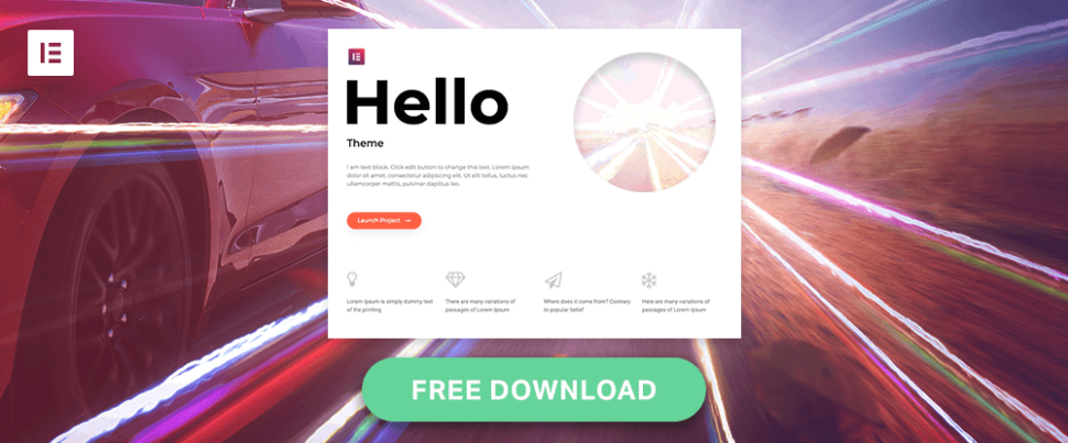
Hello is an excellent starter theme; and especially so for Elementor users. It’s worth noting that whenever Elementor tests a new upgrade, a major portion of the testing is done on Hello, the fastest and lightest WordPress theme on the market.
And, when you’re using Hello, you’ll pleasantly discover that there’s nothing to slow you down. Plugins can create problems, but not with this free, open-source theme.
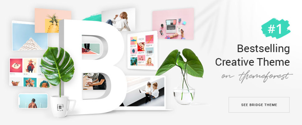
Bridge has established itself as the top-selling creative theme on ThemeForest. Its use by 110,000+ happy customers would seem to bear that out, but the real reason may be its 376+ pre-built websites backed up by a huge array of design aids and features and its open-ended customizability.
The Bridge theme is a perfect choice for building an engaging portfolio website, or any other type of business-oriented website.
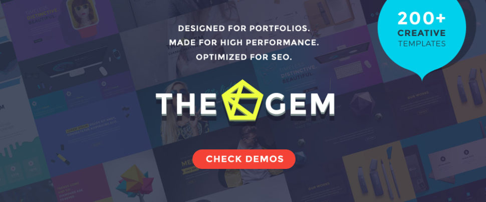
TheGem has acquired a solid reputation as the ultimate website-building tool. Since a significant percentage of its design elements, features, and options are dedicated to creating portfolios, it could be described as the ultimate portfolio website-building tool as well.
TheGem’s package includes 20+ portfolio designs, flexible page layouts, portfolio sliders, masonry, metro, and other portfolio grid options.
This multipurpose theme lends itself well to blog, portfolio, and eCommerce website building or, creating a website featuring all three entities. Artists, photographers, creative teams, and agencies have found a great deal to like about this premium theme.
An excellent selection of home and demo pages, a customizing tool, custom shortcodes, and the WPBakery page builder and Revolution Slider plugins are included in the package.
You’ve decided on formats and page layouts for your portfolio website, but you’re not done yet. You still have to import content, an area in which the design process can really slow down.
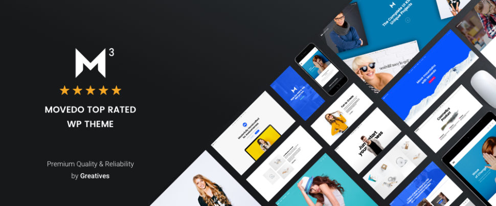
That won’t be the case with MOVEDO with its clean, modern design and easy to use import features. There are plenty of other exciting features as well that will ensure your portfolio website avoids any look of “sameness” compared to other portfolio websites and will stand out from the rest.
It’s always good to know that you have a few hundred multipurpose themes to choose among that appear to have what you need to create a portfolio website. Searching can take time however, and you might even have to undergo some trial and error activity before find one that really meets your needs.
It’s easier when you have only 8 themes to choose from. Since any one of these 8 will be more than up to the task, you’re faced with a can’t lose situation. Pick what you think will work best for you and you won’t be disappointed.
Read More at Portfolio WordPress Themes for Creatives: The best in 2019
As I’d always been at the top of my class during high school, I headed to art college full of confidence that one day I’d be an accomplished painter. This over-confidence didn’t last long though, because when I arrived, I found myself surrounded by conceptual artists, filmmakers, painters, performance artists, printmakers, and sculptors, who all seemed much more talented than I was.
This was especially true of my friend Ben, a gifted painter who went to his studio late every night to work on several large canvases. Ben’s paintings had incredible depth because he built up hundreds of subtle layers of paint over several months.
I didn’t have any of Ben’s patience. I needed to see results quickly, so my paintings were anything but deep or subtle. Compared to Ben’s, mine looked like paintings by numbers. It didn’t take me long to realise that painting just wasn’t the right medium for me.
Luckily, the course I’d chosen wasn’t structured, and it didn’t have a formal curriculum. This allowed students free movement between disciplines, so I moved from the painting studio to printmaking and spent the next few years happily making prints.
I found the printmaking process incredibly satisfying. I loved making prints from linocuts, and in much the same way that I’m often entirely absorbed by writing code today, I regularly lost myself carving thousands of tiny marks until the floor was covered in sharp shards of lino.
Printmaking and writing code have plenty in common. Both can quickly transform a blank canvas into finished work, without waiting weeks watching paint dry. Both benefit from regular iteration and testing. In fact, there’s very little difference—except inky hands — between running a test print and refreshing a browser window.

I haven’t cut lino for thirty years, but I still appreciate the art of printmaking. On a recent trip to London, I popped into Magma and picked up a copy of Pressing Matters. It’s an independently published magazine which “hones in on the people, passion and processes behind the art form of printmaking.” Its publishers hope to inspire newcomers to printmaking, but as I thumbed through its pages, I found there is plenty about the design of Pressing Matters which can inspire web designers too.
Andy Clarke
May 2019
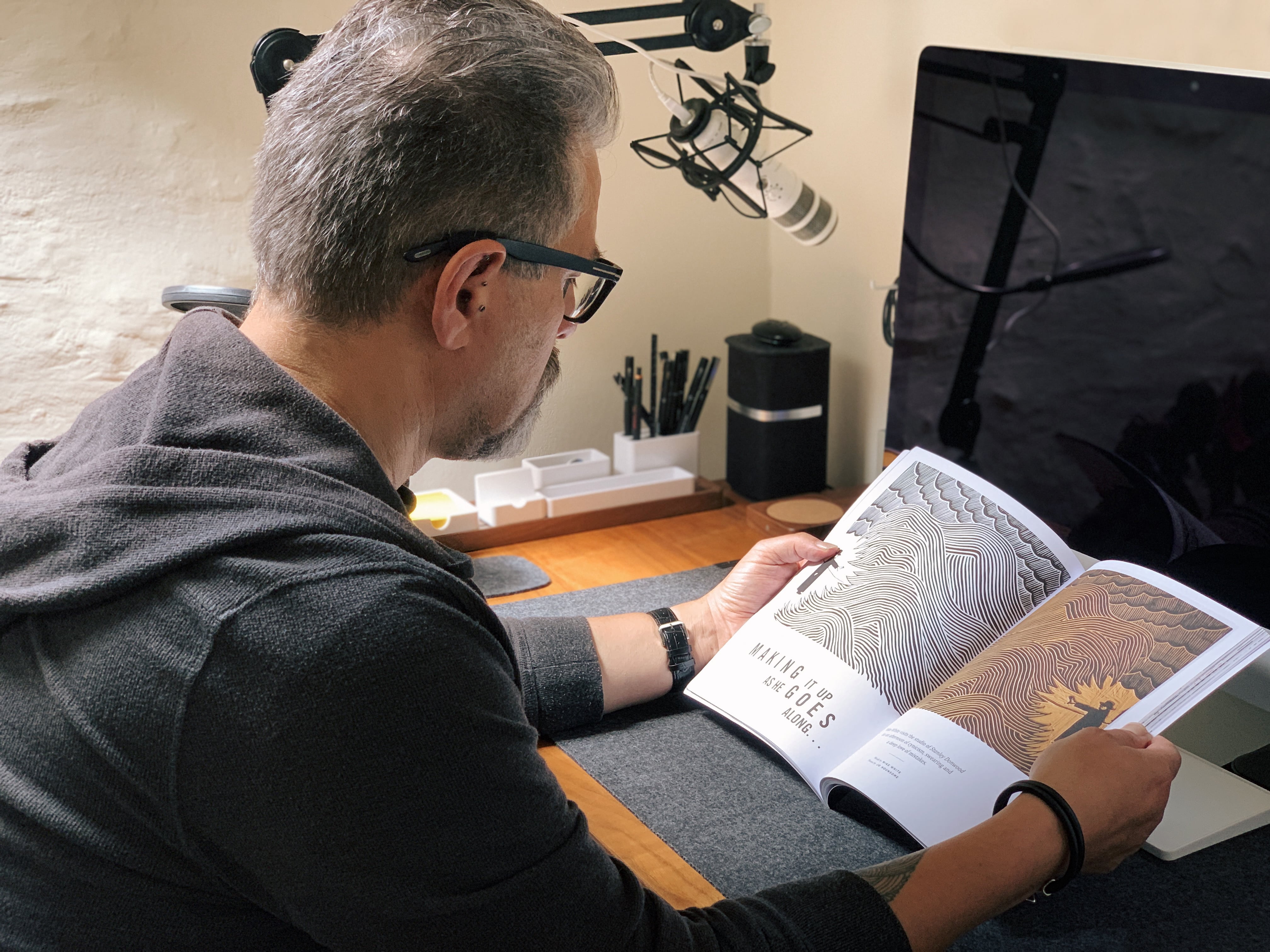
I may not have made any prints for thirty years, but I’m still fascinated by the process of printmaking as much as I appreciate the end results. Picking up a copy of Pressing Matters (pressingmattersmag.com) on a recent trip to my favourite magazine shop and flicking through its pages, I was immediately transported back to art school where my fingers were almost always covered in cuts from lino cutting tools, and I smelled like ink and turpentine.
Pressing Matters has a distinctive, but simple style. It uses a limited palette and often connects the colour of headlines and other typographic elements with colours found in nearby photographs and prints. The result is a design which feels connected.
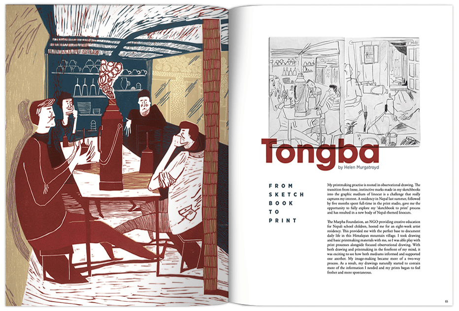
Pressing Matters’ Creative Director John Coe uses layout patterns which produce a rhythm which flows throughout the magazine. Differently sized modules speed you past pages packed with prints, then the pace slows to allow you to linger on larger artwork reproductions. These layouts frame the magazine’s content perfectly, and while they’re original, they’re also discreet enough not to detract from the subject matter.
What struck me about Pressing Matters initially was how the magazine includes a variety of layout styles but allowed for various types of content, but still maintains a high degree of consistency throughout.

When I looked closer at how its pages were constructed, I discovered a layered compound grid comprised of two and three columns running through the magazine. Using a compound grid makes perfect sense for a magazine devoted to printmaking, which itself often involves multiple layers of ink to form something deeper and richer than can be achieved with a single layer.
“

While many of Pressing Matters’ pages rely on symmetrical two or three- column layouts, it’s when the two and three-column grids are combined that the magazine really comes to life.
Not only is this grid adaptable to accommodate various types of content, the variety of possible layout permutations also allow for changes in visual pacing throughout the magazine.
I’ll teach you all about Karl Gerstner and his mobile grid later in this issue, but just like Gerstner’s iconic work for Capital magazine, Pressing Matters uses large facing images to slow reading down.
Whitespace opens up around running copy to allow for easy reading. Text wraps around the fluid shapes in images. Pages packed with prints are arranged masonry-style. Text split across two columns runs alongside images which are arranged on a three-column grid, and these techniques combine to create an engaging and enjoyable reading experience.

Pressing Matters proves that compound grids can have a profound effect on the experience of reading a magazine. The same layout principles which make Pressing Matters so appealing can also be applied to products and websites, despite them being very different media.
These principles are not new and they have guided art direction and design for decades. They matter just as much on the web as they do in the pages of a glossy magazine. Whether your readers are offline or on, grids are fundamental to their understanding of your stories, and you can use them for more than aligning content.
Next time you’re passing your nearest magazine store, pop in and pick up a copy of Pressing Matters. You won’t get inky fingers, but you will get your hands on inspiration for your next project.
Grids have a long and varied history in design, from the earliest books, through movements like constructivism and the International Typographic Style, right up to the present-day popularity of grids in frameworks like Bootstrap and material design.
A generation of product and website designers have grown up with grids from Bootstrap, the 960 Grid System before it, and even the Blueprint framework before that. In frameworks like these — and in plenty of work built on them — grids are used mostly for aligning content to columns.

When you use grids imaginatively, they do much, much more than align content. A grid brings cohesion to a composition. It helps people understand the stories you’re telling by suggesting hierarchies. Grids inform people what to read first, then next, and how much attention to give it.
They define the position of valuable information or a call to action. A thoughtfully chosen grid leads to a wealth of possibilities and any number of exciting designs.
The use of grids for web design has improved consistency, legibility, and usability, but using grids included with frameworks including Bootstrap has also led to a generation of homogenous layouts and uninspiring designs.
When I teach design classes, I often ask my students to draw what a grid means to them. Nine out of ten sketches twelve symmetrical columns. Symmetrical multi-column grids have become a staple mainly because twelve columns can be easily divided into halves, thirds, quarters, and eighths. Because they’re so easy to learn, grids like the ones included with Bootstrap have become a staple.
In fact, they’re now so ubiquitous that starting a new design without sketching three or four columns can be incredibly difficult as it involves changing your mental model and the way you think about grids. It’s important to know that symmetrical column-based grids are only one of several options. Compound grids are one of those options but despite the enormous flexibility they offer — something incredibly important for today’s multi-device designs — they’re rarely spoken of with product and website design.
Way back in July 2009, Diogo Terror wrote “Lessons From Swiss Style Graphic Design” for Smashing Magazine which mentions Karl Gerstner and includes many fabulous examples of Swiss Style Graphic Design.
In the 1940s and ’50s, designers including Josef Müller-Brockmann made using grids to create consistent and creative layouts one of the defining aspects in what became known as the International Typographic Style or Swiss Design.

Swiss artist and typographer Karl Gerstner was one of the first designers to exploit the creative flexibility of using grids, and it’s the compound grid which Gerstner designed in 1962 for Capital magazine that has become one of his best-known creations.

The concept behind Capital was to provide “a human view of economics, an economic view of humanity” and so its content and Gerstner’s design had to be accessible, clear, and engaging. Given the potential variety and unpredictability of Capital’s content, Gerstner also needed a grid which would help him to lay out any content consistently and without restrictions.

Gerstner designed what he called a “mobile grid,” although it’s not the type of mobile you and I are used to. This grid is the one most likely to be found when searching for compound grids, but it’s also the one most likely to baffle on first look.
The compound grid Gerstner designed for Capital looks incredibly complex when seen as it does above, so to explain how he created it — and how you can use it — I’m going to break Gerstner’s grid down into its constituent parts.

There are 58 columns and rows in Gerstner’s mobile grid, but he started with just one. Content in this single module fills the full width of the page.

Then Gerstner divided his single module into two columns and rows. Using two columns in this way results in a reassuring symmetrical design.
That large module can also be sub-divided into three columns and rows. Have you noticed how the gutters between the divisions in Gerstner’s grid are always the same size?

By splitting the large module into four, these columns of content feel formal, and the overall impression is that this design is a serious one.

When the full-page module is divided into five columns and separated into two spacial zones by a flowline, this design feels more technical. With Gerstner’s mobile grid, you can use each set of columns and rows separately. You can also turn them into a compound grid by either overlaying or stacking them.

Dividing the page into six columns and six rows of modules, enables an incredible variety of layout options. The flexibility of a compound grid comes from the interplay of two or more grids and how that affects the position and size of elements. This often makes a compound layout far more interesting than one grid in isolation.
A compound grid is two or more grids of any type — column, modular, symmetrical, and asymmetrical — on one page. They can occupy separate areas or overlap.
If you’re still unsure about using modular grids as Karl Gerstner did, you can start by making a compound by overlapping two column grids; one with two columns, the other with three.
It’s the interplay of the two grids which makes this compound layout more interesting than a single grid. The flexibility of a compound grid becomes apparent when I make the grid lines visible.

If you’re watching closely, you should notice how compound grids will take your design in a different direction than twelve symmetrical columns.
By laying a three-column grid over one with two columns, you create four columns where the outer two are twice the width of those on the inside. I like to think of this as a rhythmic pattern; 2|1|1|2.
By using any number of equally-sized columns or rows, your layouts form a consistent pattern and an even rhythm which does not change across the page. Think of each column as a beat and tap twelve of them on your desk. It doesn’t sound very inspiring, does it?
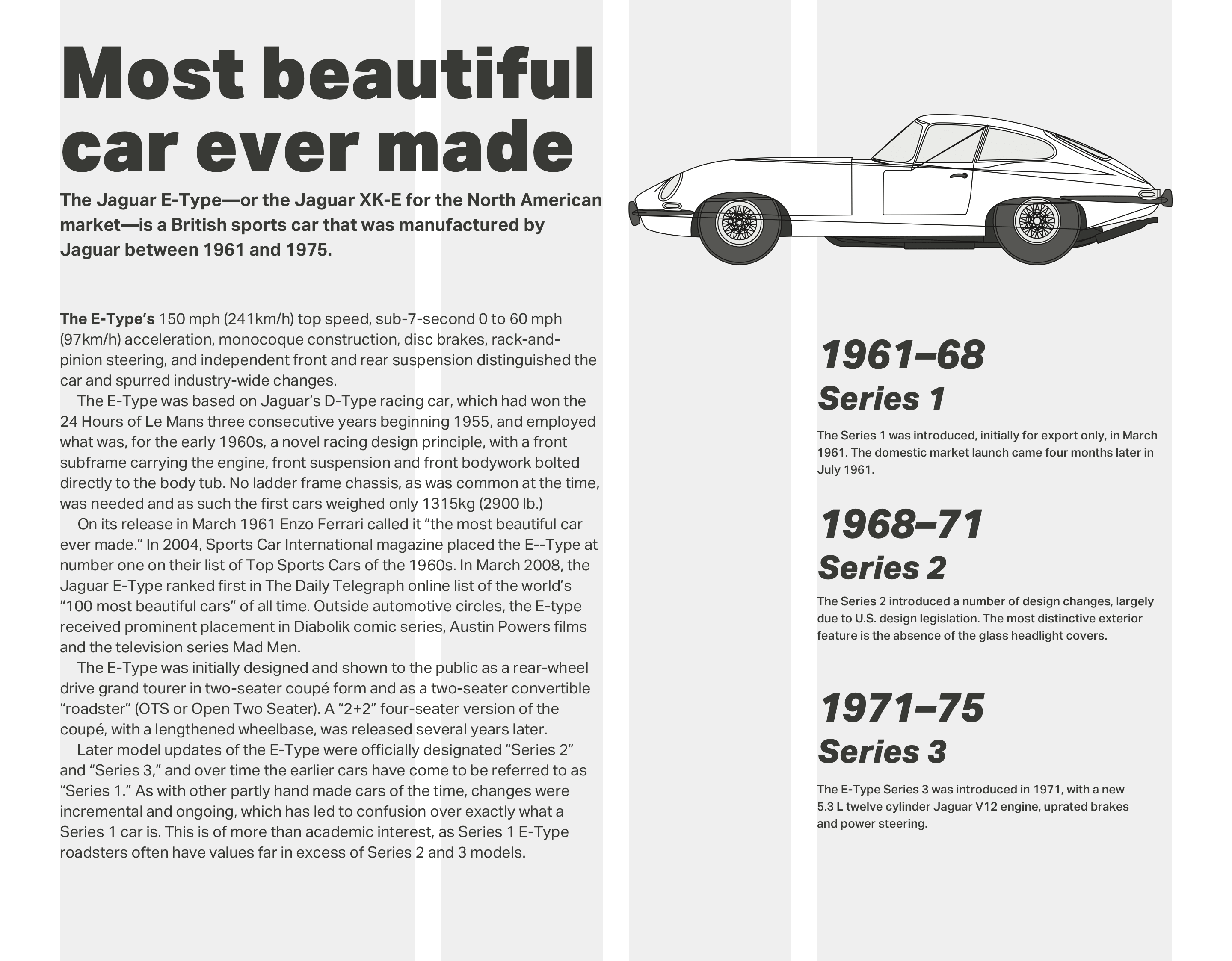
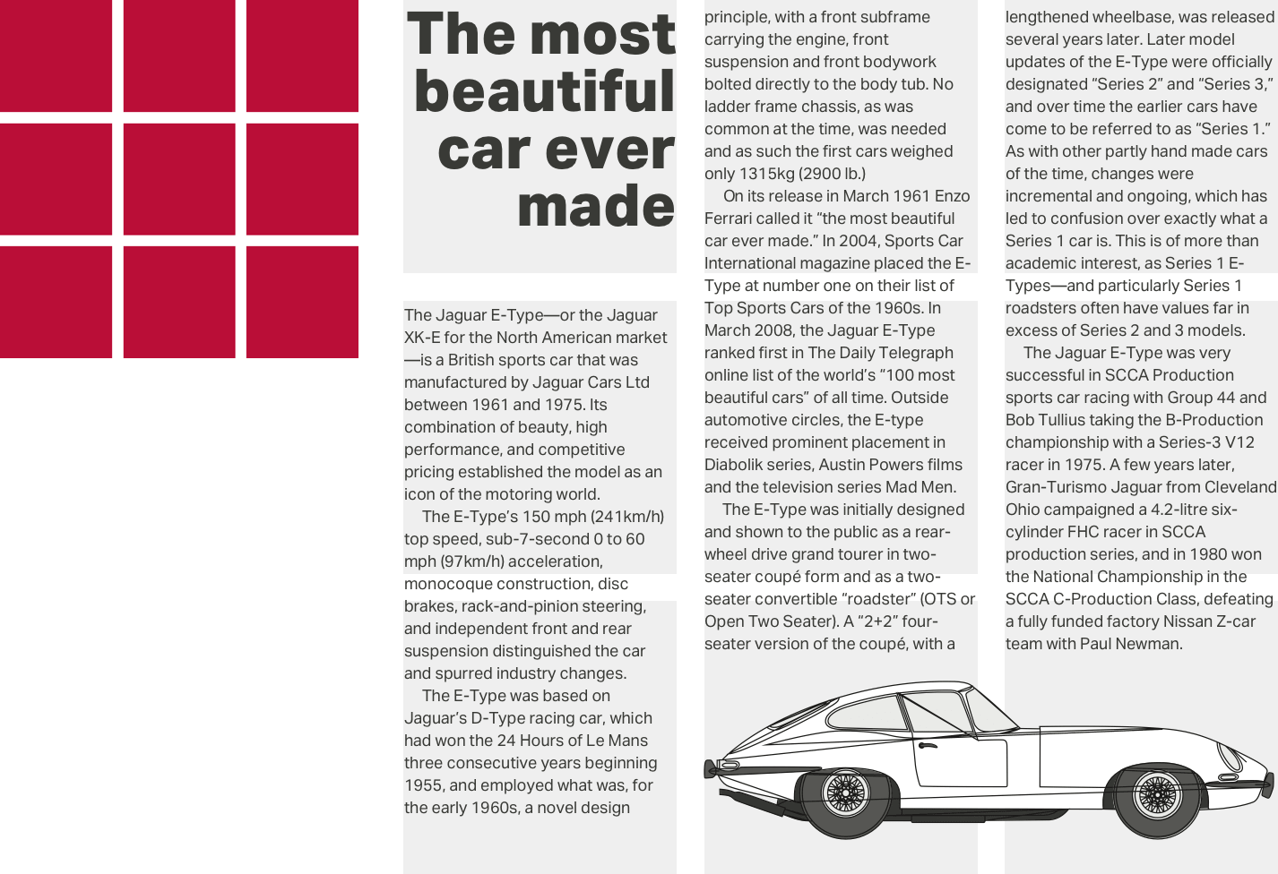
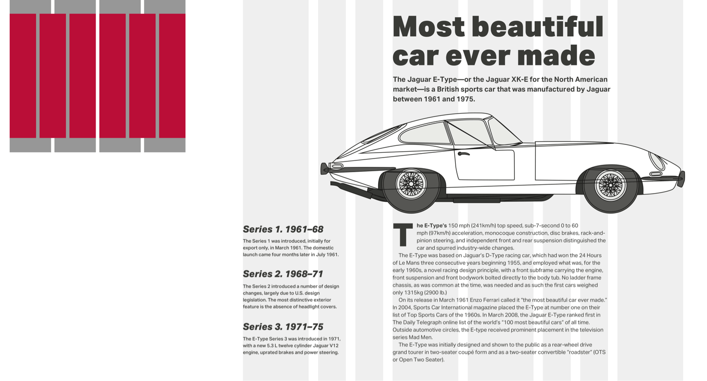
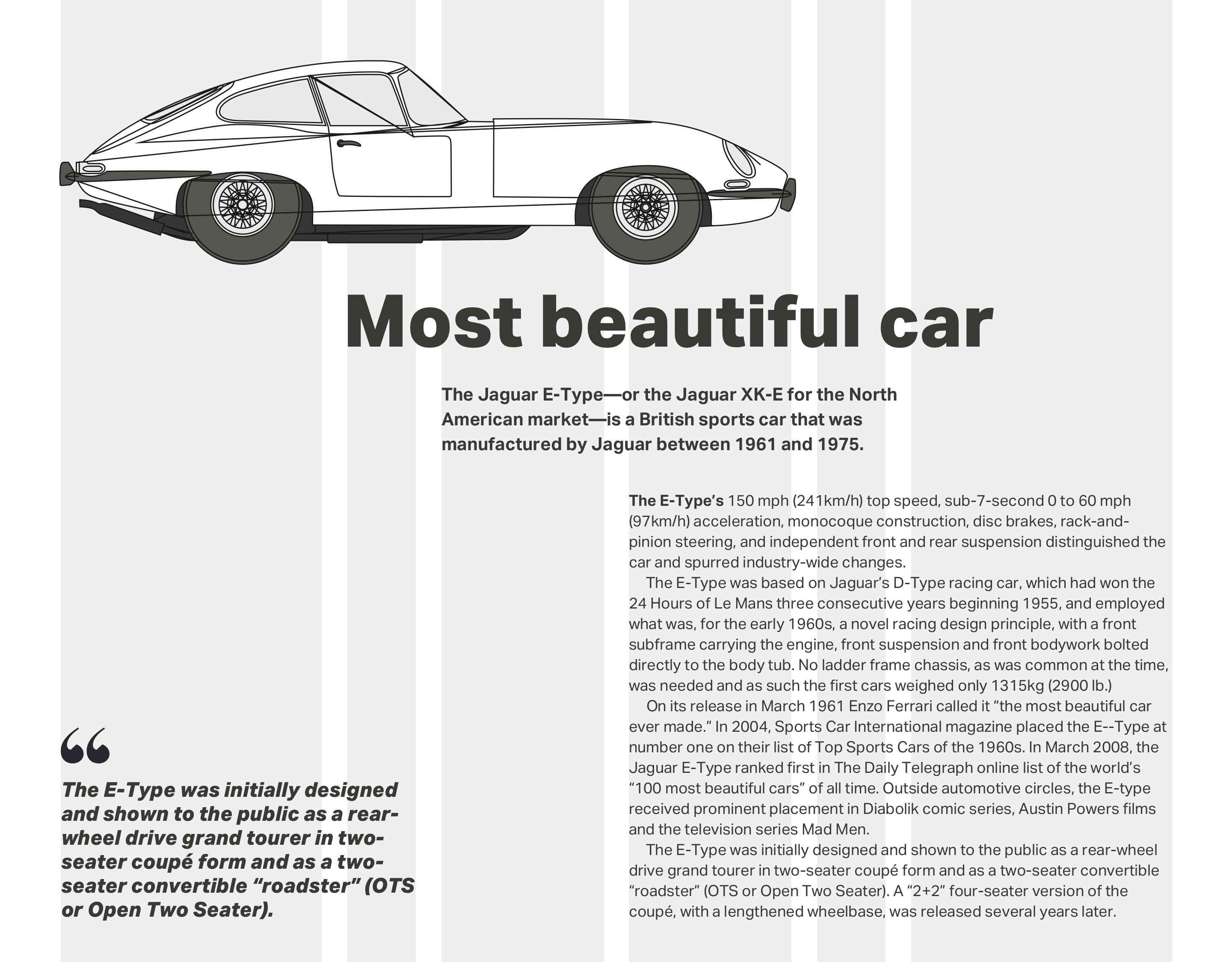
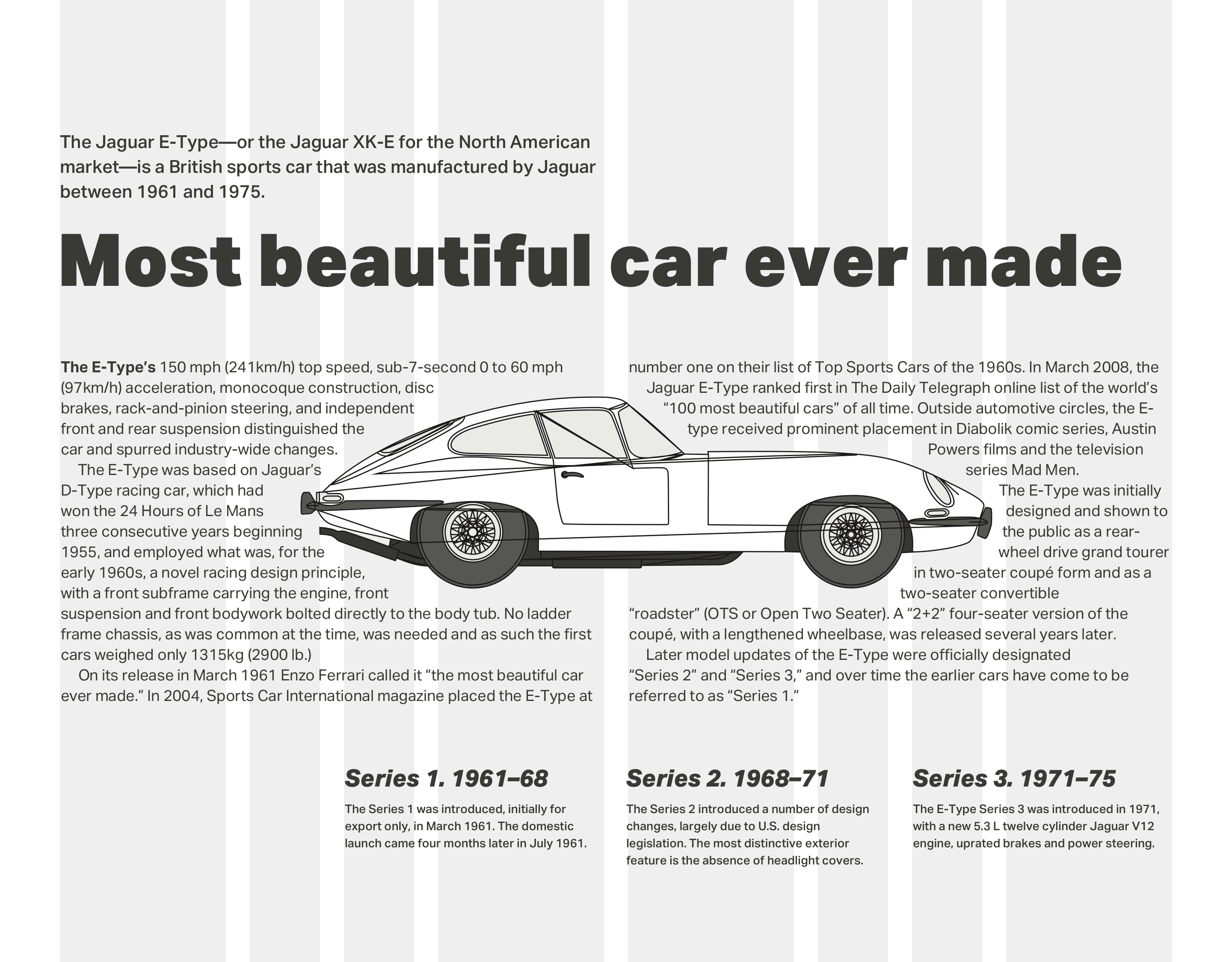
Compare that with the rhythm from a 2|1|1|2 pattern and you should understand how using compound grids can change both your mental model and the layouts you create. Using this 2|1|1|2 pattern for my first layout. I place the main body of content — including the headline, standfirst paragraph, and running text, into the first column in my two-column grid. I use a single column from my three-column grid to place supporting information about the Jaguar E-Type series, without question the most beautiful car ever made.
A blueprint image of that astounding automobile crosses the remaining space, creating a visual connection between the two areas of content.

For an altogether different design (above) — one which uses both layout and italic type to suggest the movement and speed of the E-Type — I stagger my standfirst paragraph and running text using grid lines from both the two-column and three-column grids.
Changing the compound formation to combine three-column and four-column grids (3+4) creates an altogether different rhythmic pattern of 3|1|2|2|1|3.

With a compound of two grids (above,) you might use widths from one or the other. Or you could combine widths from both to form columns which don’t conform to either. You can use these new widths to inform the sizes of images and text. While the standfirst paragraph starts on the three-column grid, the running text which follows begins on the four-column grid.

That same combination of grids (above) can make a very different impression by combining columns widths from both grids to inform the width of my column of running text. This column matches the width of my large vertical image to balance both sides of this design.

This time, I set the main block of running text across two columns and derived their widths by combining column units of 4 and 3.
As for those very narrow columns, whose width is only 1 unit, they’re perfect for informing the size of typographic elements including this bold drop cap.

Overlaying four columns with five (above) leads to a highly unusual rhythmic pattern of 6|1|4|3|3|4|1|6.
For this alternative design, I use that same pattern in a different way by running my text over three columns. I use the widths from the five-column grid to inform the width of my supporting information and the image of this E-Type’s curvy rear end.
In this version of the design (above,) a large image shows off the iconic shape of E-Type’s body and fills almost all the width of my page.
A solid block of running text sits directly under the Jaguar’s wheels and derives its width from both the four-column and six-column grids.
My next design (below) literally places the E-Type at the centre of the action and text wraps around it on both sides. Remember, it’s not necessary to fill every grid module with content. By limiting the width of my standfirst paragraph and leaving space elsewhere in the layout empty, I create a dynamic diagonal which adds energy and movement to this design.

Of all the possible grid combinations, the combination of four and six-column grids is the one I use most often in my work. It’s flexible enough to handle many different types of content and makes an incredible variety of compositions possible.

While the overall feeling from this final design feels balanced — largely due to a centred block of running text, the pull quote feels disconnected from the story as it occupies only the width from one column in the six-column grid. I can improve this design by aligning the edge of this quote to lines in the six-column grid, so it feels part of the story.
… (Box)

Rhythm is an essential factor, not just within the page, but also across the pages of an entire product or website. Compound grids are not only flexible enough to accommodate a wide variety of content types, but they also allow you to vary this visual pacing. Magazine designs often use differently sized areas to vary this pace. Repeating smaller modules speeds up the movement, while larger ones slow it down. People naturally spend longer looking at larger spacial zones, and we can use the same technique at particular moments in someone’s journey to slow them down and make them take notice.
You can combine column grids with hierarchical and even modular grids. When pages contain two separate subjects or different types of content, stacking grids can be a great way to make that difference more obvious.
At the top of this next page is a story about the Jaguar E-Type. Underneath there’s an altogether different story about the famous Le Mans 24 hour race. To leave someone in little doubt these stories are separate, use a different grid for each. I base the top story on a four-column grid, the bottom on a six.

Above, I make the difference between these two stories obvious by placing the second against a grey background. I also use paragraph spacing instead of first-line indentations.
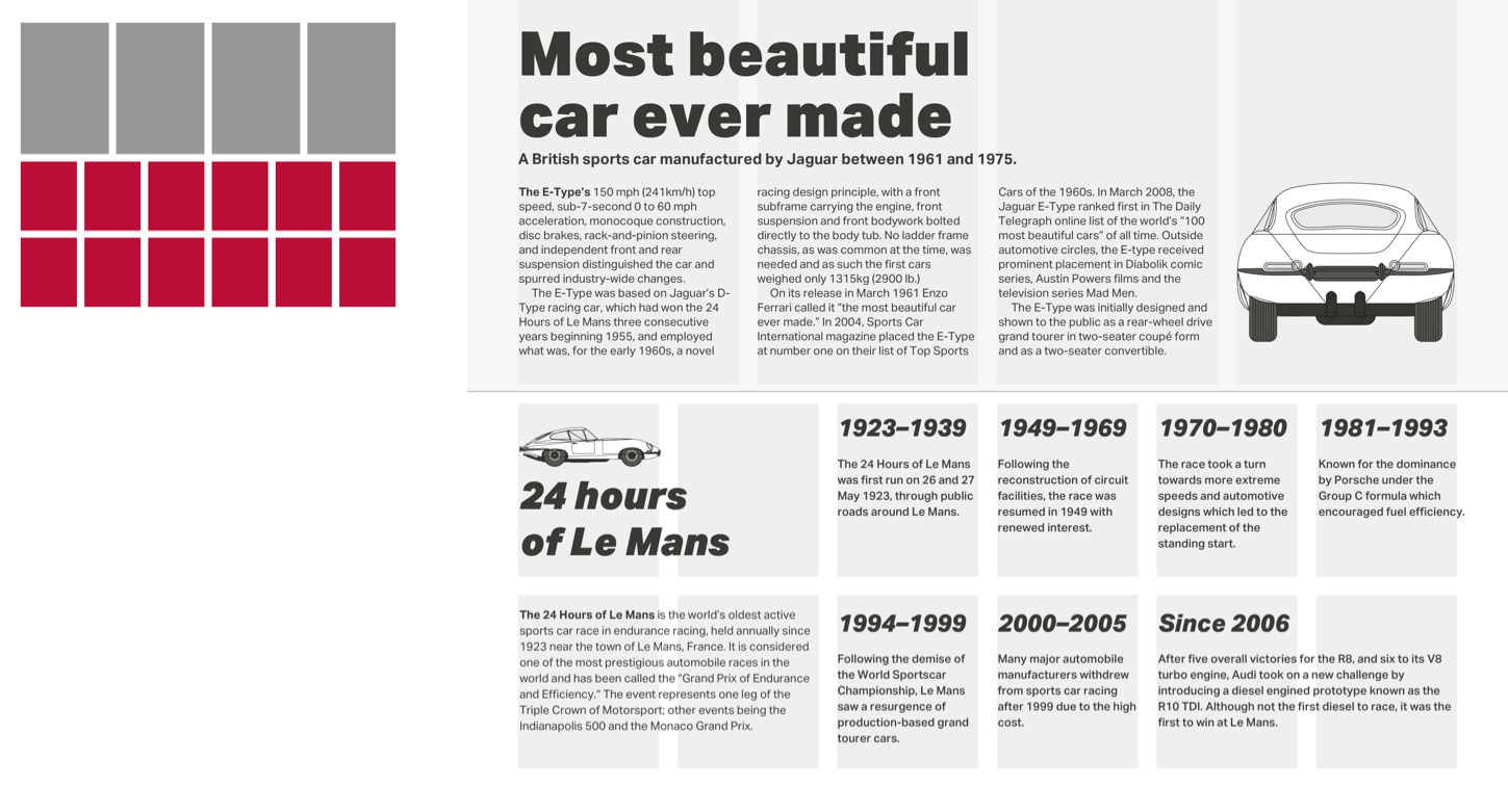
I make the difference between these two stories obvious by placing the first against a grey background. In the second story I also use bolder type and paragraph spacing instead of indenting the first line.
Karl Gerstner (1930–2017) was a Swiss artist and one of the most influential typographers. He began work when he was only 19, studied under Fritz Büler, and then went on to co-found GGK, one of the most successful Swiss creative agencies of the ’70s.
Books about Gerstner’s work have been out of print for decades, and copies often run to hundreds of Pounds so I wouldn’t be surprised if you haven’t seen his designs first-hand. But, you’ll have seen plenty of other peoples’ work which was inspired by it.
Gerstner made unjustified, ragged-right text famous as up until then, columns of type were usually justified. He also developed the idea of using typefaces and typographic design to create connections between words on a page and their meaning. While this concept might seem obvious to us today, this idea seemed revolutionary in the 1960s.
Karl Gerstner’s probably best known for his iconic work on the quarterly Capital Magazine, starting in 1962. In fact, it’s through my research into Capital, and the compound grid Gerstner created for it that I first became aware of him and his work.

By a strange coincidence, I recently discovered that Gerstner’s agency also created advertisements for Sinar, the Swiss large format camera maker I worked with during the early 1990s. In these advertisements, the shape of the word “Sinar” resembles the results of using the swing and tilt movements on a large format camera.
When you first see Karl Gerstner’s mobile grid, you might think compound grids are challenging to implement. Whereas developing compound grid would’ve been a complicated process using traditional methods, today’s layout tools, including CSS Grid, now make it simple.
Designing layouts using compound grids requires a shift in your mental model, and developing them is no different. However, CSS Grid line numbers combined with new flexible length units (fr) will make that shift smoother.
Following the order I used earlier, I’ll start with a compound of two-column and three-column grids (2+3) which has a rhythmic pattern of 2|1|1|2.

Translating that pattern into values for grid-template-columns couldn’t be easier, but first I need to apply CSS Grid to the body element of my page, then set a gap between columns which is relative to the width of my viewport. As I don’t want these styles applied at smaller screen sizes, I enclose them within a media query:
@media screen and (min-width : 48em) {
body {
display: grid;
grid-column-gap: 2vw; }
}
Now, I use fr units to specify the pattern for my compound grid. The result is four columns where the width of the outer columns occupy twice the space of the inner two:
body {
grid-template-columns: 2fr 1fr 1fr 2fr; }
A combination of three-column and four-column grids (3+4) will result in six columns and a rhythmic pattern of 3|1|2|2|1|3. My flexible length units will be:
body {
grid-template-columns: 3fr 1fr 2fr 2fr 1fr 3fr; }
Finally, combining four-column and six-column grids (4+6) creates eight columns, two of them much narrower than the rest. To create a rhythmic pattern of 2|1|1|2|2|1|1|2 my flexible length units will be:
body {
grid-template-columns: 2fr 1fr 1fr 2fr 2fr 1fr 1fr 2fr; }
With these Grid properties applied, all direct descendants of a grid-container become grid-items, which I can place using areas, line numbers, or names.
The design I’m developing requires only the most basic structural elements to implement it, and my markup looks like this:
<body>
<h1>….</h1>
<p>…</p>
<img>
<main>…</main>
<aside>…</aside>
</body>
I use the eight columns from the 4+6 compound grid above. Here are the styles to implement that:
@media screen and (min-width : 48em) {
body {
display: grid;
grid-template-columns: 2fr 1fr 1fr 2fr 2fr 1fr 1fr 2fr;
grid-column-gap: 2vw;
grid-row-gap: 2vh; align-content: start; }
}
The elements above are direct descendants of the body. I place them on the grid by using line numbers. First the headline, the paragraph which immediately follows it, and finally my main element. These elements all start on grid line 4 and end on line 8:
h1, h1 + p, main {
grid-column: 4 / 8; }
The blueprint image of my beautiful Jaguar E-Type should be wider than other elements in this design, so I place it using different line numbers. It starts at line 2 and extends the full width of my page:
img {
grid-column: 2 / -1; }
Now, I place the aside element which contains my supporting information about the three series of E-Type. As I want this element to align to the bottom of my layout, I add the align-self property with a value of end:
aside {
grid-column: 1 / 3;
align-self: end; }

Finally, as I want both main and aside elements to appear next to each other on the same row, I give them identical row number values:
main,
aside { grid-row: 4; }
All that’s left is for me to add some small typographic touches to improve my design. I don’t need a presentational class attribute value to style the paragraph, which immediately follows my headline. I can use an adjacent sibling selector instead:
h1 + p {
font-weight: 700; }
To style the first line of the first paragraph in my main element, I use a combination of descendant, pseudo-element, and pseudo-class selectors:
main p:first-of-type::first-line {
font-weight: 700; }
Finally, to indent every following paragraph which is does not immediately follow my headline, I use both a :not() negation pseudo-class selector and two adjacent sibling selectors:
p:not(h1 + p) + p {
text-indent: 2ch; }
NB: Smashing members have access to a beautifully designed PDF of Andy’s Inspired Design Decisions magazine and full code examples from this article.
 (ra, yk, il)

So you thought you could make a functional website and leave it at that.
Don’t worry, it’s a mistake that happens often, mostly because consumers frequently emphasize the importance of functionality when it comes to (web) design. However, they forget to mention that there’s nothing that catches their eye more than an interesting design.
To put it simply, functionality is the bare-boned proposal, but a fancy design is what’s going to seal the deal.
Since 2018 was a whirlwind in many fields (especially in AR/AI development), web design found itself at a crossroads. We’ve never had as many features that can be included to enhance customer satisfaction, nor have we ever had so many opposing thoughts when it comes to web design.
We have been seeing and expecting great things from web design this year, and these web design trends we’re witnessing may just change the way we drive conversion.
While simple design works okay, you wanna channel your inner kangaroo when it comes to web design.
How?
By jumping through hoops to keep your customers entertained.
2018 saw a rise of web designers customizing their approach to customers who want to be entertained. After all, you don’t have to be an entertainment company to keep your website visitors engaged.
The rise of interactive visuals in web design and different types of content (more than the traditional text & image formula) will become even more prominent in 2019. The old Romans said panem et circenses (food and games), so let’s do as Romans do. If you’ve got a great offer, give the people fun, as well.
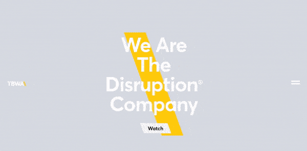
A good example of fully using interactive visuals is The Disruption Company.
[GIF source]
The Disruption Company use animations and videos to keep their customers engaged. Then they absolutely raise the bar for the rest of us commoners by switching up the content visitors see every time they visit their site.
This provides the website visitors with a unique and interesting experience and raises their conversion rate automatically.
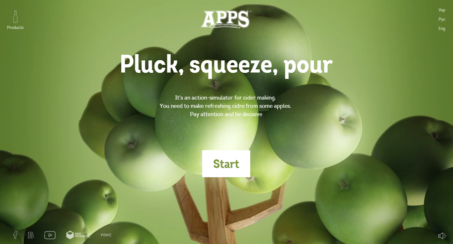
Another great example of interactive content that website visitors enjoy is APPS’ site. APPS is a company for apple cider production, and they show how much effort they put into their main product by having a cider-making action simulator on their front page.
[image source]
You can go through their entire cider-making process as though you were a part of it and even though most of us couldn’t make a cider to save our lives, APPS makes it fun and interesting from the very start.
2019 is going to be the year of consumer journey, so it’s important to integrate features that enrich the end consumer’s journey. If APPS gets anything, they get the need for a vivid experience.
Consumers today want interaction, not just plain text and images. They’ll lose their appeal in 2019, especially since many companies are already catching on to the interactive trend.
And speaking of interaction, another big trend to expect in 2019 is…
Gamification has been a big deal in design and marketing this past year, but only as a keyword. If you Google gamification, you’ll see a lot of articles but very little substance – especially on how you can use it to boost your marketing efforts.
The trick to gamification is helping customers fully immerse themselves into the process of consuming the product. Good marketers and designers know that this immersion starts with the website.
Gamification can be used in different ways, such as:
Obviously, everything about gamification is pretty fun and serves to engage visitors, but there’s nothing like real mini-games.
Now, you can integrate them into the site as a separate product, but you can also create entire websites with gamification in mind.
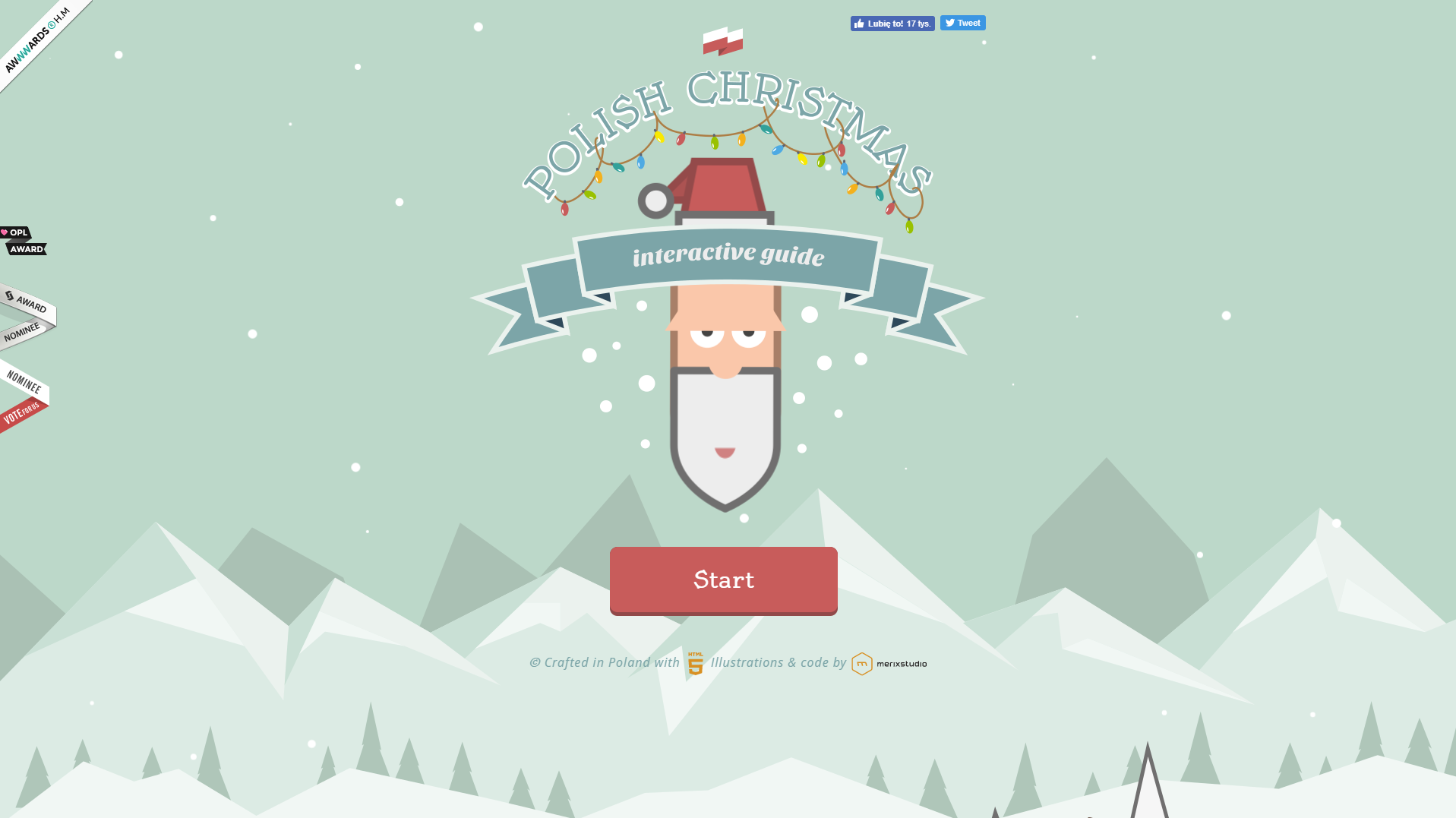
A great example of gamification is Polish Christmas Guide.
[image source]
Polish Christmas Guide is a website that helps visitors learn more about Christmas traditions in Poland, and even though it’s not a typical example of a for-profit website design, there’s a lot to learn from it.
Polish Christmas Guide uses animated SVG graphics and scroll-triggered CSS animations with custom SFX effects. The main mission behind the project is to motivate visitors to donate to Nobody’s Children Foundation, which helps abused children.
This design is driven by visuals, and visitors play a game where they ride around in Santa’s sleigh and collect presents while also learning about Polish traditions.
It’s great content, as far as content marketing goes, as it ultimately serves its main two purposes: consumer education, and emotional conversion.
Again, gamification really strives to create unique consumer experiences that can be considered separate products, but in coexistence with the actual product create an entire story.
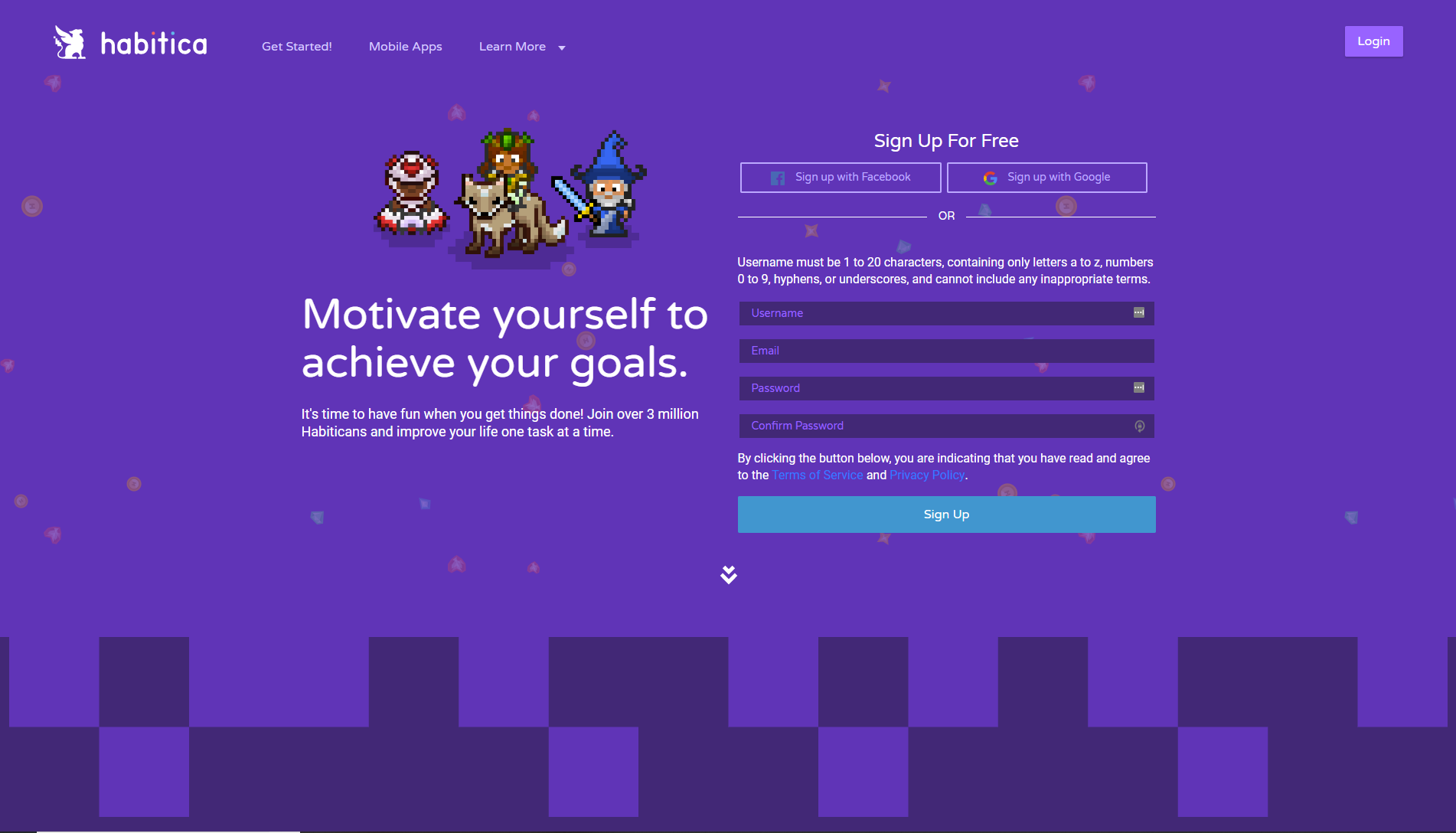
For example, Habitica allows you to gamify your life and motivate yourself to achieve your goals.
[IMAGE SOURCE]
It’s essentially a habit-tracker that uses the mechanics of role-playing games such as achieving points, earning rewards (snazzier armor, weapons, pets, etc.), and battling monsters with other friends.
While the web design itself isn’t as interactive, gamification starts from the get-go. The website is designed with the end experience in mind, allowing consumers to immerse themselves into the experience even before they’ve downloaded the apps.
Gamification is incredibly effective, especially because 70% of business transformation efforts fail due to lack of engagement. Gamification successfully combats that and increases both engagement and conversion.
Plus, it’s really darn fun. And we all need a bit more fun in 2019.
In 2015, we saw that mobile searches increased in comparison to web searches, and that trend kept rising in the last few years.
People use their phones more than they use desktop, and Google is the alpha and omega of resources, so it doesn’t surprise anyone to find that Google’s algorithms are also prioritizing mobile over web.
When it comes to web design and marketing, we’ve had to adjust our efforts to accommodate the rise of mobile. A lot of constraints come with that new direction of design, but we shouldn’t compromise on quality.
Consumers still want what consumers want, and an important trend in 2019 is going to be adjusting mobile to provide as much as web design does. This means that mobile shouldn’t only be an addition to standard design of your website, but a design in its own right.
A great example of mobile design that will gain even more significance in 2019 is the website of Adrian Zumbrunnen, a UX designer and writer.
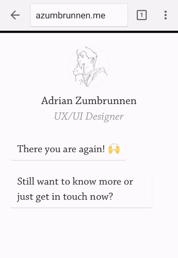
[GIF source: https://blog.hubspot.com/hs-fs/hubfs/adrian-zumbrunnen.gif?width=350&name=adrian-zumbrunnen.gif ]
Zumbrunnen’s mobile website experience is conversation-driven, and the customers can “have a conversation” with him, telling him more about their needs.
Again, interactivity is going to be huge in 2019 so if you don’t want to miss out, you can learn from Zumbrunnen.
Mobile isn’t the perfect platform for a lot of animations and videos, but great designers and marketers know that they don’t have to make compromises when it comes to unique user experience. It’s the main way of converting prospects to customers, so when thinking about mobile design, think interesting.
Then adapt to platform.
Lean Labs does the same, as they understand that mobile design is different from website design – but equally as important. They’re a marketing agency, and have a “10x formula.”
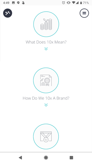
[IMAGE source: https://blog.hubspot.com/hs-fs/hubfs/lean-labs-mobile-website-2.png?width=350&name=lean-labs-mobile-website-2.png ]
Customers can understand their 10x formula by scrolling through the site, and everything is adapted to the sleekness and simplicity of the mobile experience.
Lean Labs also show their expertise in the field of design and marketing by using appropriate typefaces, color schemes and visuals.
When we take a look at Zumbrunnen and Lean Labs’ websites and compare them to other mobile sites which weren’t created with mobile-first in mind, a few things become immediately clear:
We’re going to see a lot more mobile-first websites in 2019 so forget about scaling your usual website CTA buttons, and focus on creating a different, unique, but on-brand experience.
Back in the day (by which we mean 2016, as that seems like it was twenty centuries ago), minimalism meant black & white color schemes, and not much to see.
Fortunately, we’ve grown up and realized that minimalism in the traditional sense won’t give the consumers what they need. So today, we’re seeing a paradigm shift towards content-first meaningful experiences that are focused on one goal (e.g. everything driving the consumer to sign up, as opposed to stuffing them with information and providing very little direction).
In order for the design to function properly, this design minimalism should be empowered by visual choices. With minimalism, colors are used to stimulate the purchasing decisions depending on the industries, and each design choice may be small, but it says a lot about the designers and marketers’ decisions.
Evoulve starts off mesmerizingly and cosmically. They’re a digital innovation company, and it becomes clear that they’re seamlessly passing through previously untouched frontiers from their website design.
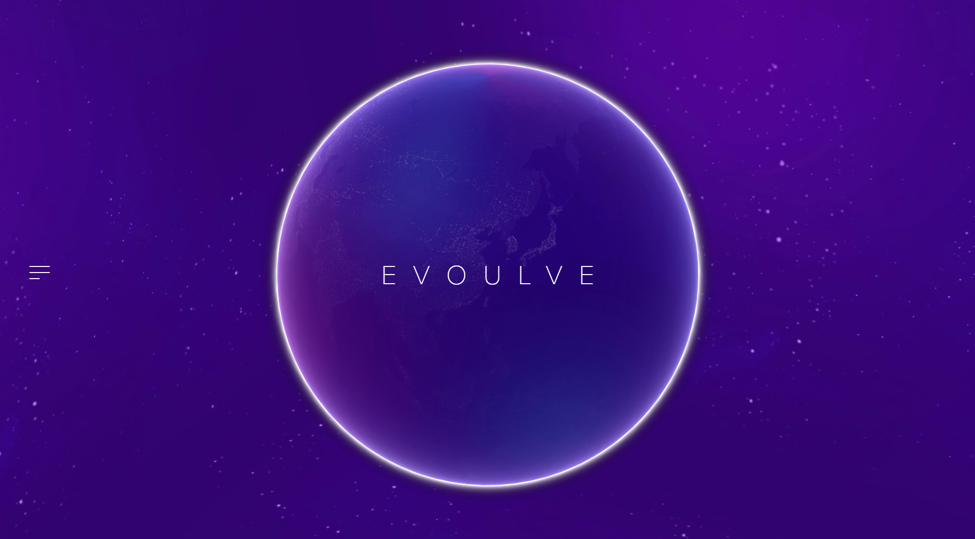
[IMAGE SOURCE: http://evoulve.com/]
Their brand message is conveyed with their website’s minimalist design. From the very start, visitors are motivated towards bigger and better things with the color scheme and the planet animation.
Evoulve only has a simple left side bar where visitors can navigate to find more information on the company. When pressed, there’s a translucent layover over the main animation, and a navigator with information on the company and technologies, and getting in touch with them.
This example is a great example to show how design and field of work can go hand in hand, especially when the principles of minimalism are utilized for that purpose.
With minimalism, each design choice goes on to say a lot about the purpose of the company. A great example of that is a product designer’s, Mikiya Kobayashi’s site.
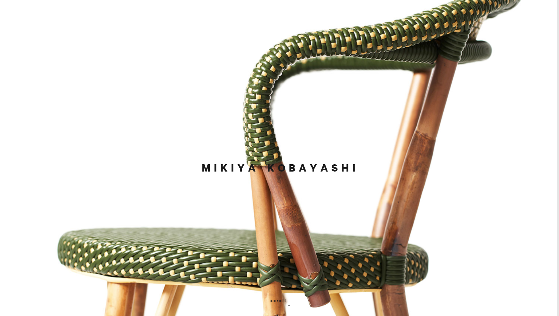
[IMAGE SOURCE: http://www.mikiyakobayashi.com/ ]
Kobayashi’s site’s main focus is on the products that he creates. He only briefly mentions his name and invites website visitors to scroll and focus on how he creates the products.
Some designers may even say that the placement of images in regard to his brand name is unfortunate. However, it’s a very bold and minimalist design choice that conveys the “product first” message from the very start.
In 2019, minimalism is going to take on a different meaning – one that will be more meaningful for the end consumers.
And designers who understand that minimalism is essentially a focus towards the central purchasing decision will be the ones making the most out of web design in 2019.
Bots and machine learning have changed the way we communicate, especially in sales.
Instead of manually fielding emails and customer questions, companies are increasingly using chatbots and machine learning to reduce the workload – and provide customers with much faster responses.
It’s only natural that changed design, as well. Currently, we’re seeing a lot of website integrations (usually in the form of ZenDesk pop-up on the right side) that are only a passing solutions.
Marketers and designers who want to fully utilize the possibilities of chatbots and machine learning will have to adapt their design to new technology in 2019, and make it a crucial part of website user experience.
Chatbots and machine learning are another feature of the push towards a more all-encompassing user experience. Hipmunk, a platform that helps people search for flights, hotels and rental cars, understand that, and they’ve created Slack, Facebook and Skype integrations to help users communicate with them when they need them.
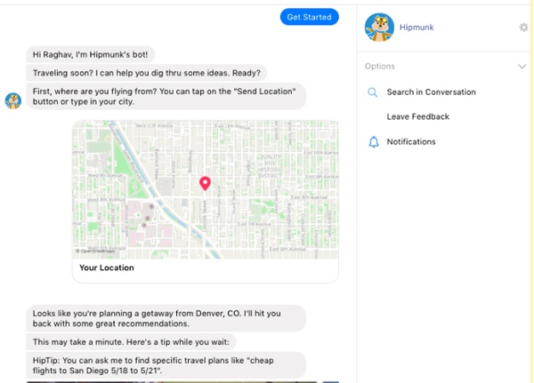
[IMAGE SOURCE: https://www.impactbnd.com/hs-fs/hubfs/Hipmunk-Messenger-Chatbot-example.jpg?width=600&name=Hipmunk-Messenger-Chatbot-example.jpg ]
Again, the convenience of web design is again exemplified by features that a company offers their customers. The goal is providing a complete service.
Landbot.io, even though they’re a chatbot provider, has a great website that shows exactly how their chatbots work.
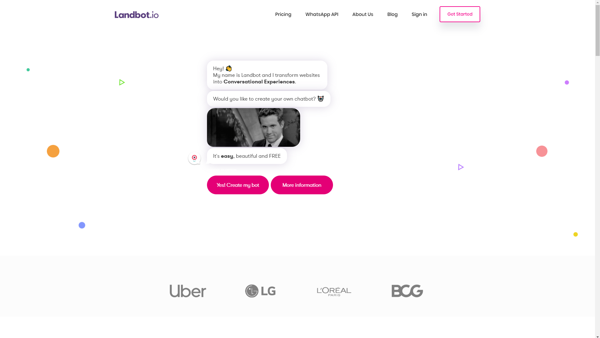
[IMAGE SOURCE: https://landbot.io/ ]
If you remember the conversational website that was a great example of interactivity, then you’ll see how much Landbot.io helps with that. Customers can have full-blown conversations (that range from product offers to customer service) with websites.
This not only helps provide excellent customer service but also cuts overhead costs for many companies, so chatbot integration is going to become a major design player in 2019.
Let’s just hope Skynet doesn’t take over the world.
Websites are no longer just resources – they’re becoming a major conversation and conversion drivers. Engagement matters, and it starts with them.
That’s why visually intriguing design choices will become a big trend in the way we design websites in 2019. It’s important to capture attention and provoke engagement, and what better way to do it than by making bold choices that stand out from the majority?
When we talk about visual design choices, we can talk about animations, cinemagraphs, and we can also talk about design lines and points of focus.
Traditionally, we’ve used straight and horizontal lines to separate different content. However, using diagonal line design has been proven as more effective.
An example of using diagonal line web design is Startup Giraffe. It’s immediately clear that this is a company that’s trying to present itself as fun and comfortable, but that brand image is further empowered by their design choices.
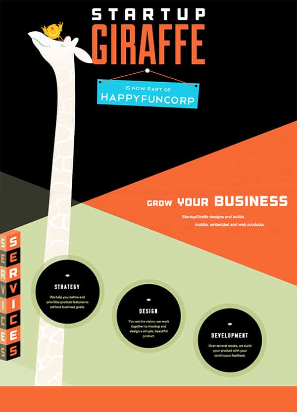
[IMAGE SOURCE: https://www.bluecompass.com/filesimages/News%20and%20Blog/Design/startup-giraffe-pin.jpg ]
These angled lines not only come off as interesting to website visitors, but also motivate visitors to keep scrolling and find out more.
Startup Giraffe’s website is a great example of a website that uses visually intriguing design to motivate conversions and education, but they can also be used to create a more dynamic user experience.
Dunlop Tires use angled lines for the purpose of creating a dynamic feeling, which is on par with their industry (automotive).
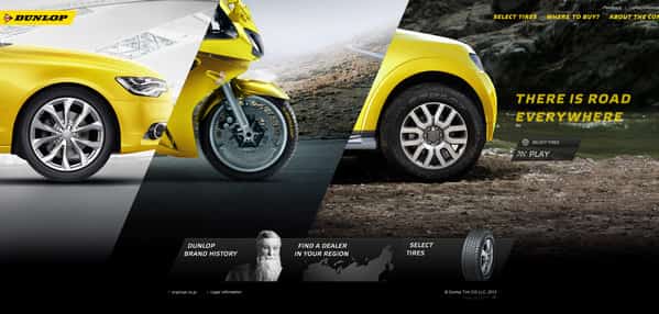
[IMAGE SOURCE: https://www.bluecompass.com/filesimages/News%20and%20Blog/Design/dunlop-tires.jpg ]
Generally, there are a lot of ways that diagonal lines can be used, but the main appeal of them (for companies and customers alike) is that they’re visually interesting and stand out from the crowd.
A lot of designers have already started using these principles in the way they shape user experience for their clients, and as a marketing tool, they’re incredibly powerful. That’s why we’ll be seeing a lot more of them in 2019.
Another way to choose something more interesting for your web design in 2019 is to use bright colors.
Gradients and grayscale have been very popular in the last few years, but we’re seeing a push towards bright colors, which will only become more prominent in 2019.
For example, MamboMambo’s website is very striking. From the collage elements to bright colors which immediately stand out, they’re presenting their brand identity from the very start.
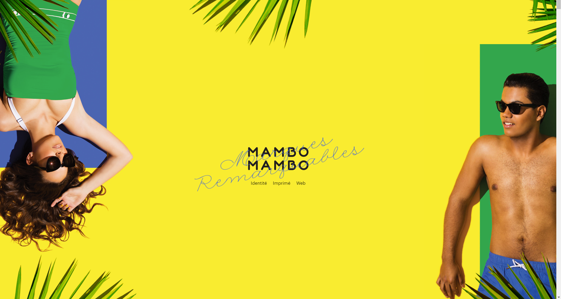
[IMAGE SOURCE: http://mambomambo.ca/ ]
Again, their website is very minimalist, but their color palette shows everything a visitor should know in order to become a customer as soon as possible.
Mambomambo also utilize scroll features and micro-animations to add to the visual appeal and show how dynamic their creative work is.
There are a lot of ways to design with curiosity in mind, and the best thing is that in 2019, that’s exactly what customers will need.
When we think about traditional scrolling, we think from top to bottom. However, that’s become the standard, and if we’ve learned anything that we want to take into 2019, it’s that the best way to approach web design is with diversity in mind.
An increasing number of web designers are now experimenting with different scrolling. This is great from the customer’s standpoint, as it automatically creates an experience (which increases engagement and conversion rates).
There’s always competition, and creating a unique experience for the customer comes off as a promise that the purchasing experience will be more unique, as well.
A great example of different scrolling in web design which will get more popular in 2019 is Aces, a baseball recruiting agency.
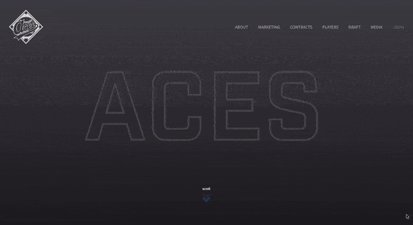
[ANIMATION SOURCE: https://www.bluecompass.com/filesimages/News%20and%20Blog/Design/aces-v2.gif ]
The first thing Aces do right is starting the page loading by showing how many baseball careers they’ve secured. And when customers reach the loaded page, they’re invited to scroll.
Scrolling is diagonal, and each movement opens up a new player whose career Aces managed. Additionally, Aces also provide statistical information about the work they do, successfully showing customers from the very start what their mission is.
They negotiate deals by showing results, not by talking, and it’s something that’s positioned them very highly in the world of baseball. However, it’s important that their web design follows suit, as well.
Long scrolling is also another type of different scrolling that can help brands tell their story more seamlessly, as opposed to stuffing website visitors with content that they can’t process.
Le Mugs is a restaurant that successfully uses long scrolling and different visual perspectives to create a unique user experience.
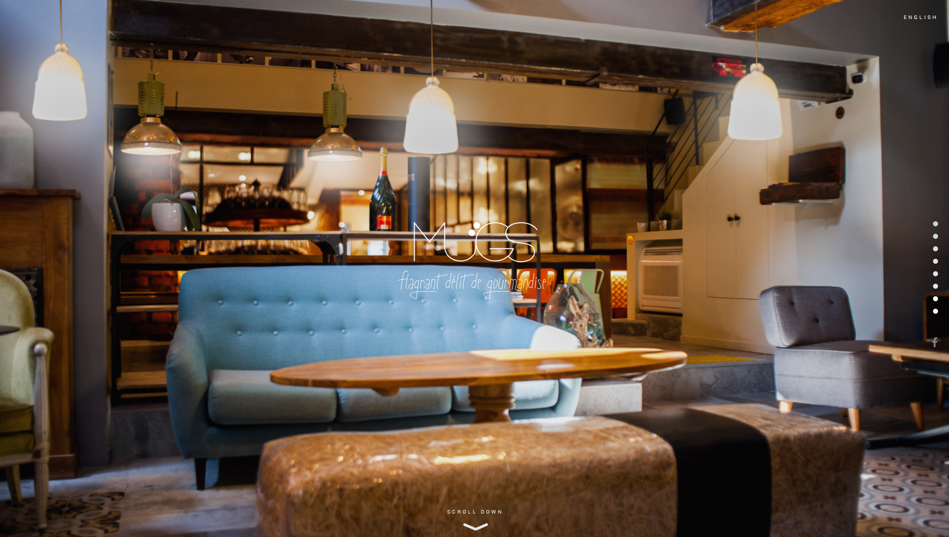
[IMAGE SOURCE: http://le-mugs.com/ ]
Website visitors are immediately invited (and pulled in) to explore their hedonistic offer, and immerse themselves into the gourmet experience.
They use bold and striking visuals and unique scrolling mechanisms to keep the attention on their site and their offer.
Long scrolling is also great for websites where it’s important for visitors to explore, and reach the purchasing decision through that.
Parallax scrolling is typical for the entertainment industry, but it can also be used to great success in different professional areas if done right. When we talk about parallax scrolling, we presume that there are two images which move at different paces.
This makes it a perfect option for storytelling and creating more dynamic in a website.
A great example of parallax scrolling is the website for The Walking Dead. A TV show about zombies, their website sticks to comic format.
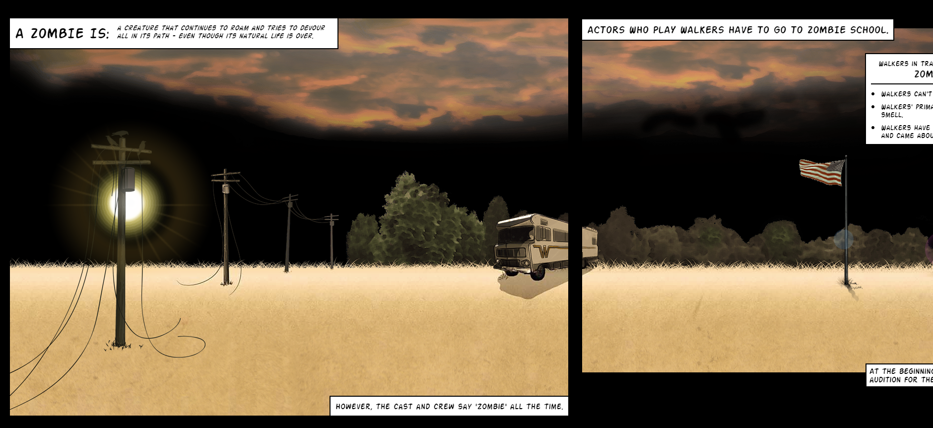
[IMAGE SOURCE: https://www.cabletv.com/the-walking-dead ]
When scrolling, we follow the character in the yellow shirt through different scenes. Some of them contain additional animations but even if they didn’t, it would still be an interesting way to scroll. Who’d say no to the show after that?
Additionally, keep scroll-triggered animations in mind. When visitors scroll, this triggers different engagement-provoking animations and interactions. Again, the focus in 2019 is definitely going to be on creating an all-encompassing user experience, and scroll-triggered animations are a very interesting way to keep the visitors on your site and convert them to customers.

[ANIMATION SOURCE: https://www.bluecompass.com/filesimages/News%20and%20Blog/Design/igor.gif ]
A great example of this is Igor, a website for an IoT company. Visitors are invited to scroll through to see the entire offer, and can see a variety of resources which they may find useful.
When it comes to different scrolling types which are a big trend for 2019, keep in mind that loading times are incredibly important.
If you don’t want to compromise on the experience just so your website is faster, try to create an interesting loading page that will stop the visitors from navigating away.
If you’ve got it, flaunt it. That’s going to be website design in a nutshell in the upcoming year, so make sure you’re not falling behind.
Many web designers use a combination of big statements (literally, the font size is going to be huge) and simplified details to create a dynamic user experience. Think of billboards, only on the screens of laptops or mobile phones.
This is another play on interesting visuals and bold statements which can create a very powerful effect for customers.
A great example of big and bold as a mission of web design in 2019 is Austin Eastciders. A cider-production company, they use their slogan “Cider Y’All” as an inspiration for their design.
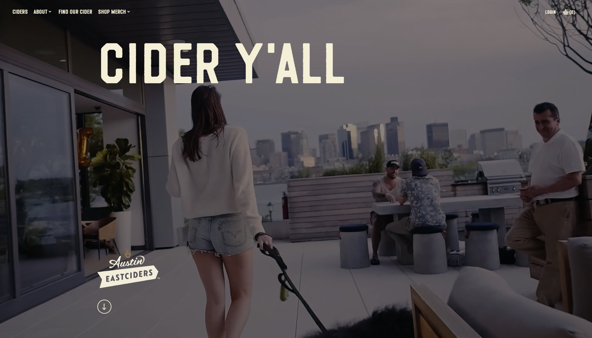
Austin Eastciders use big and bold titles with smaller copy, and let the animations and video direct the customers towards purchases.
The videos show different occasions where people can enjoy their ciders, and that’s another example of storytelling done right. People don’t buy because products are great – they buy because they want the lifestyle.
Austin Eastciders win in this category because they know that the appeal of the lifestyle in 2019 starts with web design.
The trend of interactivity and experience improvement in 2019 also means that each part of the website should be fully used to create a great experience for the end user and consumer.
This means that we can no longer be content with WordPress themes and a footer that contains basic information, and call it a day.
Instead, 2019 is going to make us go all kangaroo again and start jumping around in an effort to provide more to customers, instead of breaking the 4th wall with an uninspiring footer.
After all, details matter. And they’ll matter even more in 2019.
Consider 360gardalife’s website. A website for sports activities on Lake Garda in Italy, every design choice on the site caters towards the customer experience. They show details about diverse offers, offers instructions on how to book, and everything else athletic people visiting Lake Garda may enjoy.
However, the real magic starts when you reach their footer and realize that it’s not just basic information.
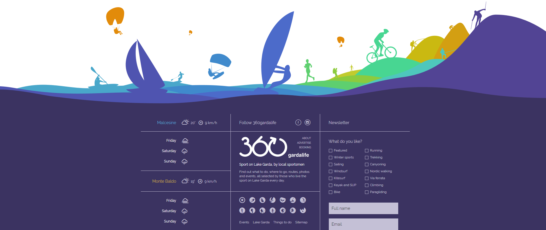
[IMAGE SOURCE: https://360gardalife.com/en ]
Instead of just providing visitors with basic contact information, Lake Garda designers also use the footer to display: weather reports, webcams, and icons reminding people of their diverse offer.
Additionally, visitors can also select sports they’re interested in, add their email address, and receive a personalized offer with activities that suit their preferences.
Naturally, this creates a more inclusive feeling to the entire web design (which will be an absolute necessity in 2019), and if visitors weren’t convinced, they will be upon seeing the footer.
People want to be entertained, and using the principles of three-dimensionality can be a great way to provide more flavor.
There are typically two ways of using 3D web design, and that’s either through 3D elements (creating depth in the visuals) or by using animations.
A great example of 3D web design which uses animations is Future Living. Designers behind the site were inspired by the topic and created a variety of animations and micro-interactions to improve user experience.
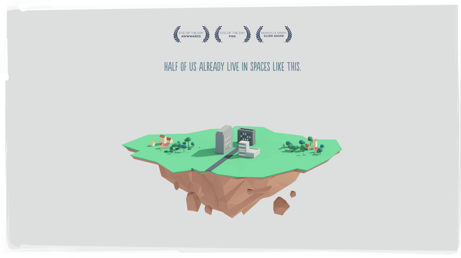
[IMAGE SOURCE: http://future-living.tv/en/home]
They reimagine the way we live, creating a future with shell cities that are capable of protecting themselves and to drive the point home, they’ve created incredible animations that’ll make the most of us go full-blown eco.
Again, web design in 2019 will be centered on storytelling and immersing the visitors into a unique experience. Future Living realize that, and they’ve created a beautiful website with illustrations (which evoke positive feelings) and simple explanations.
When it comes to using the principles of three-dimensionality, Future Living also create depth with shadows and different colors, not only animations.
However, the best example of using colors to create the 3D effect is Mortgage Hub. While not heavy on animations, the mortgage providers create depth by mixing different color tones and visuals.
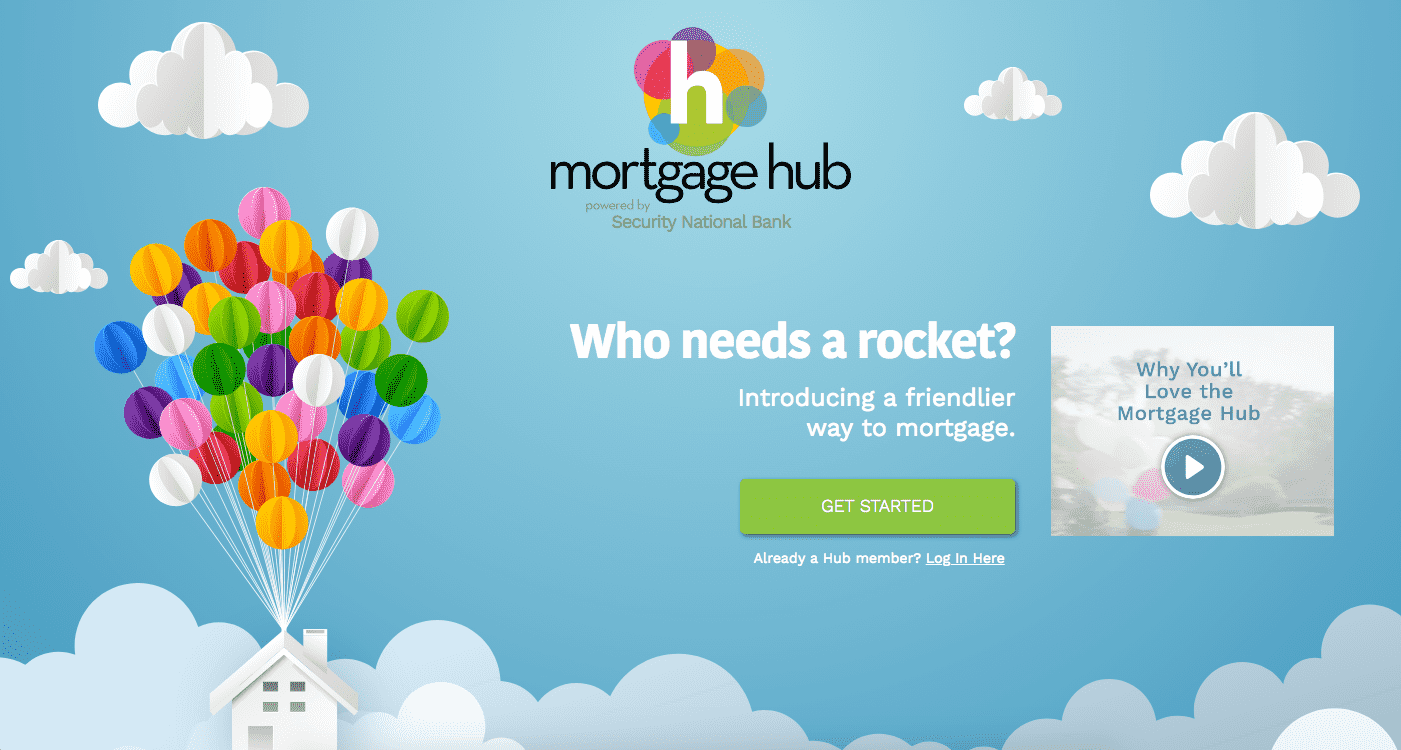
[IMAGE SOURCE: https://www.bluecompass.com/filesimages/News%20and%20Blog/Design/mortgage-hub.png ]
Since they also consider themselves to be a friendlier way to mortgage, they’ve selected designs that help the visitors feel as though they’re friends with them.
However, the principles of three-dimensionality also go a long way towards creating a dynamic (as opposed to flat) feeling of design, and add to the user experience.
2019 Is Going to Change the Way We Design for Web
But it won’t be bad.
In fact, the trends we’re currently seeing, and the ones we’ll see in 2019, will help all of us become more creative.
Of course, innovative design raises the bar, but companies which understand their consumers’ journeys (and are willing to step forward and approach them in the right way) will see an increase in revenue.
Why?
Because of creativity.
After all, we have a lot of technology at our disposal, and customers know it. It’s time our design started showing just how far we’ve come.
Read More at Design Trends That Have Been Taking Over This Year
Introducing Email Spreadsheets, a Google Sheets add-on that lets you automate the reporting of spreadsheet data and dashboards by email. If you are an office worker who has been emailing spreadsheets to colleagues manually, this add-on will save you a ton of time. And because it runs on the Google Cloud, your spreadsheet reports will be delivered even while you are offline or on vacation.
With Email Spreadsheets, you can schedule reports and it will automatically send them by email on a recurring schedule. You can email entire workbooks, specific sheets inside a workbook or even range of cells. Watch the video tutorial to get started.

Go to the Google add-on store and install Email Google Sheets. Next, open any Google Spreadsheet in your Google Drive, go to the Add-ons menu inside the sheet, choose Email Spreadsheets from the dropdown and then choose Rules to create your first scheduled email report.
You are presented with a 3-step wizard to help the email schedule of your spreadsheet report.

Tip: Use the Preview button to test how your exported files would be like with the various export options.

Next, we create an email template that will be sent with your reports. You can specify one or email recipients in the TO, CC, or BCC fields. Multiple email addresses should be separated by a comma.
You can also specify dynamic email recipients based on cell values in the spreadsheet. For instance, if the email address of the recipient is specified in cell B2 of a sheet titled “Employee Shifts”, you can put {{Employee Shifts!B2}} in the To field, and the add-on will pull the dynamic value from the cell at the time of sending the email report.
These dynamic cell values enclosed inside double curly braces can be used inside any of the email fields including subject, email body, and the sender’s name.
The email body can include dynamic cell values as well as ranges that make it easy of you to send portions of the spreadsheet without sharing the full workbook. For instance, you can write {{Employee Wages!B2:F9}} to include only the specific range (B2:F9) from the Wages sheet. Internally, the add-on converts the range to an HTML table, retaining all the display formatting with CSS, and embed it into the email.
You can also include standard HTML tags like H1, IMG, A, B, EM and more to include images and rich formatting in your emails.
Tip: Use the Test Email button to send an email with the exported files before setting up the schedule.

The Google Sheets add-on includes a scheduler to help you set up recurring schedules visually. You can send email hourly, daily, weekly, monthly or even on a yearly recurring basis.
It is also possible to setup advanced schedules like:
That’s it. After specifying the schedule, hit the Save button and your email report will be scheduled.
If you would like to edit your current email report or schedule a new report, go the add ons menu again, choose Email Spreadsheets and Rules.
The add-on is written in Google Apps Script. It uses the Google Sheets API to convert sheets to PDF files and uses the Gmail API for sending the converted files as attachments.
The post How to Email Spreadsheets Automatically on a Recurring Schedule appeared first on Digital Inspiration.