How To Align Things In CSS

How To Align Things In CSS

How To Align Things In CSS

Rachel Andrew

We have a whole selection of ways to align things in CSS today, and it isn’t always an obvious decision which to use. However, knowing what is available means that you can always try a few tactics if you come across a particular alignment problem.

In this article, I will take a look at the different alignment methods. Instead of providing a comprehensive guide to each, I’ll explain a few of the sticking points people have and point to more complete references for the properties and values. As with much of CSS, you can go a long way by understanding the fundamental things about how the methods behave, and then need a place to go look up the finer details in terms of how you achieve the precise layout that you want.

Aligning Text And Inline Elements

When we have some text and other inline elements on a page, each line of content is treated as a line box. The property text-align will align that content on the page, for example, if you want your text centered, or justified. Sometimes, however, you may want to align things inside that line box against other things, for example, if you have an icon displayed alongside text, or text of different sizes.

In the example below, I have some text with a larger inline image. I am using vertical-align: middle on the image to align the text to the middle of the image.

The line-height Property And Alignment

Remember that the line-height property will change the size of the line-box and therefore can change your alignment. The following example uses a large line-height value of 150px, and I have aligned the image to top. The image is aligned to the top of the line box and not the top of the text, remove that line-height or make it less than the size of the image and the image and text will line up at the top of the text.

It turns out that line-height and indeed the size of text is pretty complicated, and I’m not going to head down that rabbit hole in this article. If you are trying to precisely align inline elements and want to really understand what is going on, I recommend reading “Deep Dive CSS: Font Metrics, line-height And vertical-align.”

When Can I Use The vertical-align Property?

The vertical-align property is useful if you are aligning any inline element. This includes elements with display: inline-block. The content of table cells can also be aligned with the vertical-align property.

The vertical-align property has no effect on flex or grid items, and therefore if used as part of a fallback strategy, will cease to apply the minute the parent element is turned into a grid or flex Container. For example, in the next pen, I have a set of items laid out with display: inline-block and this means that I get the ability to align the items even if the browser does not have Flexbox:

See the Pen inline-block and vertical-align by Rachel Andrew.

In this next pen, I have treated the inline-block as a fallback for Flex layout. The alignment properties no longer apply, and I can add align-items to align the items in Flexbox. You can tell that the Flexbox method is in play because the gap between items that you will get when using display: inline-block is gone.

See the Pen inline-block flex fallback by Rachel Andrew.

The fact that vertical-align works on table cells is the reason that the trick to vertically center an item using display: table-cell works.

Now that we do have better ways to align boxes in CSS (as we will look at in the next section), we don’t need to employ the vertical-align and text-align properties in places other than the inline and text elements for which they were designed. However, they are still completely valid to use in those text and inline formats, and so remember if you are trying to align something inline, it is these properties and not the Box Alignment ones that you need to reach for.

Box Alignment

The Box Alignment Specification deals with how we align everything else. The specification details the following alignment properties:

  • justify-content
  • align-content
  • justify-self
  • align-self
  • justify-items
  • align-items

You might already think of these properties as being part of the Flexbox Specification, or perhaps Grid. The history of the properties is that they originated as part of Flexbox, and still exist in the Level 1 specification; however, they were moved into their own specification when it became apparent that they were more generally useful. We now also use them in Grid Layout, and they are specified for other layout methods too, although current browser support means that you won’t be able to use them just yet.

Therefore, next time someone on the Internet tells you that vertical alignment is the hardest part of CSS, you can tell them this (which even fits into a tweet):

.container {
  display: flex;
  align-items: center;
  justify-content: center;
}

In the future, we may even be able to dispense with display: flex, once the Box Alignment properties are implemented for Block Layout. At the moment, however, making the parent of the thing you want centering a flex container is the way to get alignment horizontally and vertically.

The Two Types Of Alignment

When aligning flex and grid items, you have two possible things to align:

  1. You have the spare space in the grid or flex container (once the items or tracks have been laid out).
  2. You also have the item itself inside the grid area you placed it in, or on the cross axis inside the flex container.

I showed you a set of properties above, and the alignment properties can be thought of as two groups. Those which deal with distribution of spare space, and those which align the item itself.

Dealing With Spare Space: align-content And justify-content

The properties which end in -content are about space distribution, so when you choose to use align-content or justify-content you are distributing available space between grid tracks or flex items. They don’t change the size of the flex or grid items themselves; they move them around because they change where the spare space goes.

Below, I have a flex example and a grid example. Both have a container which is larger than required to display the flex items or grid tracks, so I can use align-content and justify-content to distribute that space.

See the Pen justify-content and align-content by Rachel Andrew.

Moving Items Around: justify-self, align-self, justify-items And align-items

We then have align-self and justify-self as applied to individual flex or grid items; you can also use align-items and justify-items on the container to set all the properties at once. These properties deal with the actual flex or grid item, i.e. moving the content around inside the Grid Area or flex line.

  • Grid Layout You get both properties as you can shift the item on the block and inline axis as we have a defined Grid Area in which it sits.
  • Flex Layout You can only align on the cross axis as the main axis is controlled by space distribution alone. So if your items are a row, you can use align-self to shift them up and down inside the flex line, aligning them against each other.

In my example below, I have a flex and a grid container, and am using align-items and align-self in Flexbox to move the items up and down against each other on the cross axis. If you use Firefox, and inspect the element using the Firefox Flexbox Inspector, you can see the size of the flex container and how the items are being moved vertically inside of that.

Flex items aligned in their container
Aligned flex items with the flex container highlighted in Firefox (Large preview)

In grid, I can use all four properties to move the items around inside their grid area. Once again, the Firefox DevTools Grid Inspector will be useful when playing with alignment. With the grid lines overlaid, you can see the area inside which the content is being moved:

Aligned grid items
Aligned grid items with the Grid highlighted in Firefox (Large preview)

Play around with the values in the CodePen demo to see how you can shift content around in each layout method:

See the Pen justify-self, align-self, justify-items, align-items by Rachel Andrew.

Confused By align And justify

One of the cited issues with people remembering the alignment properties in Grid and Flexbox, is that no one can remember whether to align or to justify. Which direction is which?

For Grid Layout, you need to know if you are aligning in the Block or Inline Direction. The Block direction is the direction blocks lay out on your page (in your writing mode), i.e. for English that is vertically. The Inline direction is the direction in which sentences run (so for English that is left to right horizontally).

To align things in the Block Direction, you will use the properties which start with align-. You use align-content to distribute space between grid tracks, if there is free space in the grid container, and align-items or align-self to move an item around inside the grid area it has been placed in.

The below example has two grid layouts. One has writing-mode: horizontal-tb (which is the default for English) and the other writing-mode: vertical-rl. This is the only difference between them. You can see that the alignment properties which I have applied work in exactly the same way on the block axis in both modes.

See the Pen Grid Block Axis Alignment by Rachel Andrew.

To align things in the inline direction, use the properties which begin with justify-. Use justify-content to distribute space between grid tracks, and justify-items or justify-self to align items inside their grid area in the inline direction.

Once again, I have two grid layout examples so that you can see that inline is always inline — no matter which writing mode you are using.

See the Pen Grid Inline Alignment by Rachel Andrew.

Flexbox is a little trickier due to the fact that we have a main axis which can be changed to row or column. So, let’s first think about that main axis. It is set with the flex-direction property. The initial (or default) value of this property is row which will lay the flex items out as a row in the writing mode currently in use — this is why when working in English, we end up with items laid out horizontally when we create a flex container. You can then change the main axis to flex-direction: column and the items will be laid out as a column which means they are laid out in the block direction for that writing mode.

As we can do this axis switching, the most important factor in Flexbox is asking, “Which axis is my main axis?” Once you know that, then for alignment (when on your main axis) you simply use justify-content. It doesn’t matter if your main axis is row or column. You control space between the flex items with justify-content.

See the Pen justfy-content in Flexbox by Rachel Andrew.

On the cross axis, you can use align-items which will align the items inside the flex container or flex line in a multi-line flex container. If you have a multi-line container using flex-wrap: wrap and have space in that container, you can use align-content to distribute the space on the cross axis.

In the example below, we are doing both with a flex container displayed as a row and a column:

See the Pen Cross axis alignment in Flexbox by Rachel Andrew.

When justify-content Or align-content Do Not Work

The justify-content and align-content properties in Grid and Flexbox are about distributing extra space. So the thing to check is that you have extra space.

Here is a Flex example: I have set flex-direction: row and I have three items. They don’t take up all of the space in the flex container, so I have spare space on the main axis, the initial value for justify-content is flex-start and so my items all line up at the start and the extra space is at the end. I am using the Firefox Flex Inspector to highlight the space.

Flex items aligned left, highlighted spare space on the right
The spare space at the end of the container (Large preview)

If I change flex-direction to space-between, that extra space is now distributed between the items:

Flex items aligned so space is distributed between the items
The spare space is now between the items (Large preview)

If I now add more content to my items so they become larger and there is no longer any additional space, then justify-content does nothing — simply because there is no space to distribute.

Flex items are filling the container with no spare space
There is now no space to distribute (Large preview)

A common question I’m asked is why justify-content isn’t working when flex-direction is column. This is generally because there is no space to distribute. If you take the above example and make it flex-direction: column, the items will display as a column, but there will be no additional space below the items as there is when you do flex-direction: row. This is because when you make a Flex Container with display: flex you have a block level flex container; this will take up all possible space in the inline direction. In CSS, things do not stretch in the block direction, so no extra space.

Flex items arranged as a column
The column is only as tall as needed to display the items (Large preview)

Add a height to the container and — as long as that is more than is required to display the items — you have extra space and therefore justify-content will work on your column.

A column of flex items with space between them.
Adding a height to the container means we have spare space (Large preview)

Why Is There No justify-self In Flexbox?

Grid Layout implements all of the properties for both axes because we always have two axes to deal with in Grid Layout. We create tracks (which may leave additional space in the grid container in either dimension,) and so we can distribute that space with align-content or justify-content. We also have Grid Areas, and the element in that area may not take up the full space of the area, so we can use align-self or justify-self to move the content around the area (or align-items, justify-items to change the alignment of all items).

Flexbox does not have tracks in the way that Grid layout does. On the main axis, all we have to play with is the distribution of space between the items. There is no concept of a track into which a flex item is placed. So there is no area created in which to move the item around in. This is why there is no justify-self property on the main axes in Flexbox.

Sometimes, however, you do want to be able to align one item or part of the group of items in a different way. A common pattern would be a split navigation bar with one item being separated out from the group. In that situation, the specification advises the use of auto margins.

An auto margin will take up all of the space in the direction it is applied, which is why we can center a block (such as our main page layout) using a left and right margin of auto. With an auto margin on both sides, each margin tries to take up all the space and so pushes the block into the middle. With our row of flex items, we can add margin-left: auto to the item we want the split to happen on, and as long as there is available space in the flex container, you get a split. This plays nicely with Flexbox because as soon as there is no available space, the items behave as regular flex items do.

Flexbox And Micro-Components

One of the things I think is often overlooked is how useful Flexbox is for doing tiny layout jobs, where you might think that using vertical-align is the way to go. I often use Flexbox to get neat alignment of small patterns; for example, aligning an icon next to text, baseline aligning two things with different font sizes, or making form fields and buttons line up properly. If you are struggling to get something to line up nicely with vertical-align, then perhaps try doing the job with Flexbox. Remember that you can also create an inline flex container if you want with display: inline-flex.

There is no reason not to use Flexbox, or even Grid for tiny layout jobs. They aren’t just for big chunks of layout. Try the different things available to you, and see what works best.

People are often very keen to know what the right or wrong way to do things is. In reality, there often is no right or wrong; a small difference in your pattern might mean the difference between Flexbox working best, where otherwise you would use vertical-align.

Wrapping Up

To wrap up, I have a quick summary of the basics of alignment. If you remember these few rules, you should be able to align most things with CSS:

  1. Are you aligning text or an inline element? If so, you need to use text-align, vertical-align, and line-height.
  2. Do you have an item or items you want to align in the center of the page or container? If so, make the container a flex container then set align-items: center and justify-content: center.
  3. For Grid Layouts, the properties that start with align- work in the Block direction; those which start with justify- work in the inline direction.
  4. For Flex Layouts, the properties that start with align- work on the Cross Axis; those which start with justify- work on the main axis.
  5. The justify-content and align-content properties distribute extra space. If you have no extra space in your flex or grid container, they will do nothing.
  6. If you think you need justify-self in Flexbox, then using an auto margin will probably give you the pattern you are after.
  7. You can use Grid and Flexbox along with the alignment properties for tiny layout jobs as well as main components — experiment!

For more information about alignment, see these resources:

Smashing Editorial (il)

Font on background image

Screenshot_2019-03-28.png

Hello i want to show font on an image. Now, the image could be whatever a user uploads- that means white of black background. The font is not looking good. I want to try out something that will look clear on both on dark or light background. I put text shadow on it but the font is not clear. It doesnt looks good. I shared a photo of the problem

Plesk VPS Hosting For Better Website Outcomes

Plesk VPS Hosting For Better Website Outcomes

Plesk VPS Hosting For Better Website Outcomes

Suzanne Scacca

(This is a sponsored article.) In early discussions you have with clients about the website you’re tasked with designing, does the topic of web hosting ever come up? My guess is that it’s not something your clients give much thought to, waving it away with:

“Just give me the cheapest, no-frills hosting.”

I get why they’d think that way. For starters, they’re paying you a large sum of money to design the site. Of course, they’re going to look to other areas to offset those costs. Because server technology is rarely understood by the people who own websites, it’s easy for them to mistakenly think they can save money there.

Here’s the problem though:

As a website grows in authority and expands its reach, security and performance problems will arise if the hosting configuration isn’t prepared to handle it.

In the following article, I’m going to show you why clients need the power of VPS hosting behind the websites you design for them. And why you — the administrator — need a tool like the Plesk control panel to manage it.

The Web Designer’s Connection to Web Hosting

In many cases, people get stuck being the go-to person for one highly specialized task at the companies they work for. This person handles the marketing. This person manages inventory. This person coordinates client meetings.

One of the things I love about working with websites is that there are so many new things to learn about and other areas to branch out to. If you don’t want to be relegated to building website after website, day in and day out, there are ways to expand your offering and become the total end-to-end solution provider for clients.

In my opinion, web hosting is one of the areas you should look to for expansion. Now, I’m not saying you should become a reseller of hosting or anything like that. All I mean is that it would be beneficial to understand how the technology behind a website affects the outcomes of what you’ve built.

For example:

  • An underpowered hosting plan fails to handle influxes of traffic, which leads to slower page speeds and a drop in conversion rates.
  • Occasional downtime on the website leaves visitors wondering if it’s even worth going to the site if its availability is unreliable.
  • There’s a high demand for the inventory sold on the site, but potential customers are too nervous to pull the trigger since security seems to be non-existent.

Even if you’re not the one responsible for the server technology your client’s site sits on, you can see how this sort of thing could have a negative effect on your business. You build an amazing website that aims to do exactly what your client wanted, but the server technology is holding it back.

Who do you think the client is going to blame in that case?

Rather than let it get that far, I’d suggest you engage your clients early on in conversations about their web hosting. As we move on, I’m going to present you with specific arguments you should be prepared to make regarding the hosting as well as how it’s managed.

An Introduction To VPS Hosting

When it comes to choosing the right hosting for your clients’ websites, there’s a lot to think about:

Who Should You Entrust Your Website To?

There are thousands of web hosting companies to choose from. But in terms of reliability? That list could easily be narrowed down to less than a hundred.

HostGator has been a web hosting company I’ve recommended to clients for years, especially ones who need a powerful hosting solution like Plesk VPS hosting. If your client doesn’t have a strong preference of provider, start here.

What Type Of Web Hosting Will Serve Your Website And Audience Best?

This is what you need to know about the different kinds of web hosting:

Shared Hosting

This is the cheapest form of hosting available and probably the one your clients will be most inclined to purchase.

The hosting provider designates a section of a web server to a number of clients who will then share the resources. This means there are strict limitations set on how much bandwidth and storage a website can use, but very little you can do to control any of it — especially if another website in the shared server space hogs the resources.

It’s this last point that’s especially problematic on shared hosting. Although your hosting plan might indicate you get X amount of memory, it’s actually a cap on how much you might have access to if no one else is using resources from the server at the same time. In reality, it’s very likely you’ll run into lack of memory errors due to this limitation quite frequently.

Shared hosting is fine for small, personal blogs or private websites. Not for serious businesses.

Cloud Hosting

This is similar to shared hosting except that it’s more secure and stable.

Rather than relegate a website to one specific segment of a web server, the site is hosted across a number of servers. That way, if one server experiences an outage or another website compromises the performance of others around it, your website can safely be hosted elsewhere.

That said, there are still a number of limitations that come from cloud hosting. If your website is for a growing business, but you don’t expect a lot of traffic to it (say, if it were a simple portfolio), cloud hosting would be a good choice.

Dedicated Hosting

This is the most robust form of web hosting, which also makes it the most expensive.

As the name indicates, your hosting company will lease you an entire server to host your website. So, think of this like shared hosting, but on steroids. As you can imagine, when you have your own server environment, it greatly reduces the risk of anyone else compromising the performance of your website.

That said, there is a lot more work involved in managed a dedicated hosting account and the website on it. This is really only best for large enterprises, social networks, e-commerce sites and others that require this type of extreme web hosting.

VPS Hosting

This stands for “virtual private server”. The name alone should give you a good idea of how this differs from the other kinds of hosting already mentioned.

In sum, a virtual private server is like a scaled-back version of dedicated hosting. Instead of having an entire server to yourself, the web hosting company carves out a dedicated portion of the server and personalizes its settings for you. Although you share the server with other VPS clients, you don’t share the resources with anyone else. You get exactly what you pay for.

Here are some other highlights of VPS hosting:

  • It’s faster and more secure than shared or cloud hosting.
  • It’s cheaper than dedicated hosting.
  • It’s custom-tailored to your needs, but still allows you to take more control over your server configuration.

Bottom line: VPS is an overall better hosting solution for growing businesses.

How Will You Manage Your Web Hosting Account?

There’s one more question you have to ask yourself before you commit to a new hosting provider and plan.

Because VPS hosting is more complex and requires a greater degree of management than a set-it-and-forget-it type of hosting like shared or cloud, you need a control panel you can rely on.

So, let’s explore the Plesk panel and take a look at what you can do to maximize the management of your new website with it.

An Exploration Of Plesk VPS Hosting

This is the Plesk website:

A screenshot of the Plesk website frontpage
Large preview

It won’t take long to realize that Plesk is not like other control panel solutions. The website will help clarify some of this for you, but I’d like to give you an inside look at the control panel so you can see for yourself.

A Universally Friendly Control Panel

Plesk is one of those tools you step inside of and immediately realize you made the right choice. With a very short learning curve, Plesk is a highly intuitive control panel solution that’s great for anyone:

A screenshot of the Plesk website showing different options and that it is a universally user-friendly platform
Plesk is a universally user-friendly platform. (Image source: Large preview)

In all honesty, I don’t know how much time your clients will spend inside the control panel. When I’ve managed and built websites for clients in the past, just asking for login credentials to their hosting account tended to be a real chore.

“What’s hosting? Is that WordPress? I don’t think I need that.”

Regardless of whether they want or know what to do with a control panel, Plesk provides a user-friendly experience regardless of who the user is as well as their level of comfort with website management. I’ll show you why in this next example.

John Cusack is clearly frustrated
Words cannot describe how frustrating it is to ask clients to complete simple tasks. (Source)

Great Interface For Clients And Other End Users

If you’ve ever tried to use cPanel to manage hosting and domain services, you know how overwhelming it can be to use.

If you’re not familiar with it, this is typically what cPanel looks like upon first logging in:

Screenshot of the cPanel dashboard
This is how the cPanel interface (meant for end users) looks like. (Image source: cPanel) (Large preview)

If you plan on reselling or managing hosting for your cPanel clients, then you'll need to use a separate dashboard called WHM:

cPanel’s user interface
cPanel’s user interface (Image source: cPanel) (Large preview)

There’s a navigation and sub-navigation bar at the top, which makes management options seem simple enough.

Then, you’re presented with individual actions you can take to manage hosting, your website or email accounts within the control panel itself. This is just too much — even for technically-minded clients who know what the heck they’re looking for.

Now, check out the Plesk interface for power users:

Plesk power user UI
The Plesk power user home page. (Source: Plesk) (Large preview)

This is insanely well-organized and clearly labeled. If your clients or other novice users were to step inside of Plesk, they’d instantly know where to go as well as which actions they could possibly take from the sidebar alone.

It gets better within each of the individual modules. For instance:

Clean UI inside Plesk
An example of the clean layout of the Plesk UI. (Source: Plesk) (Large preview)

This is what the Tools & Settings page looks like. As you can see, it’s not bogged down by a barrage of icons for each setting. Instead, it presents options in a succinct and well-organized manner, which will greatly reduce friction that might otherwise exist in a tool of this nature.

Great Interface For Designers And Developers

Plesk offers an alternative “service provider” view for web developers and designers:

Plesk UI for developers
A look at the Plesk service provider interface for developers. (Source: Plesk) (Large preview)

It looks a lot like the power user view, except you can see that the sidebar is broken up into different modules. What I like about this is that it encourages developers to manage more of their business from one tool instead of a variety of business management tools.

From within Plesk, you can:

  • Add new customer accounts and manage them from one dashboard.
Plesk add users
Adding and managing customers in Plesk is easy. (Source: Plesk) (Large preview)
  • Customize what they do and see in their “power user” view of Plesk. This helps keep server and website management under control.
Plesk user management
Managing customers in Plesk is easy. (Source: Plesk) (Large preview)
  • Create hosting plans that you can, in turn, sell to customers as subscriptions.
Plesk hosting plan management
Managing hosting plans in Plesk is easy. (Source: Plesk) (Large preview)
  • Move non-Plesk customers over to Plesk with a simple-to-use migration tool.
Plesk migration
The Plesk Migrator extension. (Source: Plesk) (Large preview)
  • Customize nearly every aspect of your clients’ server configurations. Like disk space:
Plesk server configuration
It’s easy to configure your server with Plesk. (Source: Plesk) (Large preview)
  • Manage the essentials to ensure the server runs in tip-top shape. For instance, here are some of the PHP settings for security and performance:
Plesk security and performance
Security and performance controls are a priority in Plesk. (Source: Plesk) (Large preview)
  • Manage things like plugins, themes and more if you build websites with WordPress.
Plesk WordPress controls
Plesk users can control various WordPress settings and tools inside of the control panel. (Source: Plesk) (Large preview)

If you’ve ever been frustrated with the management piece of your business or felt that your ability to control things was lacking, Plesk is the solution. Plus, you can use Plesk extensions to really open this tool up. Add business management features like invoicing and site-builder tools to improve your offering, streamline your workflow and make more money.

Last but not least, you can white label it with your branding. That way, when clients step inside, they’re reminded that they have a trusted website pro like you to properly manage their server and website.

Flexible Workflows

Another developer-friendly feature of Plesk is its flexibility.

One of the issues with letting clients make decisions about their web hosting and server management is that they don’t understand the amount of work that goes into it behind the scenes. They might think:

“You’re the developer. Why can’t you work with whatever I give you?”

But you and I know it’s not that simple.

For starters, there’s your level of comfort in using the command line. For some developers, that level of comfort is low, so having a flexible solution like Plesk that removes the need for programming is great.

That said, you can still use the CLI if you prefer. Plesk provides you with full root access, so you won’t have to worry about being restricted to the control panel’s settings to manage your VPS server either. Like I said, it’s flexible. It allows you to work as you want to work.

Plus, it works on a number of configurations:

  • Linux vs. Windows
  • Apache vs. nginx
  • Ruby on Rails vs. Node.js.

Whatever you choose, settings are available to deeply customize and configure each so that the VPS hosting plan works exactly as you need it to.

Wrapping Up

It’s your hope that when you build a website for a client, it doesn’t go to waste. You design powerful website experiences so that clients can effectively leverage their web presences to drum up new business and increase conversions.

Sadly, something like a poor choice of web hosting can compromise all of that planning and hard work on your part. Unless you’re in the habit of designing websites for very small businesses or nonprofits, Plesk VPS Hosting is the logical choice. Not only is it a great solution in terms of easing your administration and management responsibilities, but it’s also an amazing tool for building your design business.

If you’re interested in using Plesk VPS hosting, I’d suggest you start by looking at HostGator. In addition to being one of the leading hosting companies around the world, there is a 45-day Money-Back Guarantee available which may help you encourage your clients to give it a try.

Smashing Editorial (ms, ra, yk, il)

How to Remove Author Name from WordPress Posts (2 Easy Ways)

Do you want to remove the author name from your WordPress blog posts? Normally, blog posts are supposed to show author name with other meta-data like date and category.

However, some blog owners may not want to display the author name next to their blog posts.

By default, WordPress does not have an option to remove author name, and you must select an author to publish a post.

In this article, we will show you two ways to easily remove author name from your WordPress posts. We will also discuss the pros and cons of each approach.

Remove author name from WordPress posts

Why Would You Want to Remove Author Name?

Author name is an important type of metadata added to your WordPress posts by default. It allows your readers to learn about authors who create content on your blog.

However, there are times when you may want to hide the author name.

For example: if multiple staff members in your team collaborate on each blog post, then it may seem unfair to credit a single staff member for the work.

In another scenario, you may have several contributors/freelance writers who occasionally write articles, but you want to keep a consistent style and voice for your blog.

With that said, let’s take a look at solutions for easily removing author name from WordPress posts while still allowing multiple authors to work in the background.

Method 1: Manually Remove Author Name from WordPress Posts

Your WordPress theme decides when and how to display the author name in your blog posts. Themes use multiple approaches to do that which makes it harder for a plugin to provide a generic solution for removing author names.

You will need to edit some code to prevent your theme from displaying the author name. If you are uncomfortable editing code, then try the second method instead.

The first method requires you to edit WordPress theme files. If you haven’t done this before, then please take a look at our guide on how to copy and paste the code in WordPress.

Note: Make sure that you create backup of your theme or child theme before making any changes. If something goes wrong, then this will help you easily revert changes.

WordPress themes use different variations of code to display the author name. You will need to locate the code responsible for showing the author’s name in your theme files and delete it.

Most common locations to find this code are single.php, content.php, archive.php, and index.php files.

In many cases, you will not be able to find the code that outputs author name. Instead, you will find a template tag defined in the functions.php file or template-tags.php file.

For example, the default Twenty Nineteen theme uses the function twentynineteen_posted_by to display author name. This function is defined in template-tags.php file and uses the following code:

function twentynineteen_posted_by() {
		printf(
			/* translators: 1: SVG icon. 2: post author, only visible to screen readers. 3: author link. */
			'<span class="byline">%1$s<span class="screen-reader-text">%2$s</span><span class="author vcard"><a class="url fn n" href="%3$s">%4$s</a></span></span>',
			twentynineteen_get_icon_svg( 'person', 16 ),
			__( 'Posted by', 'twentynineteen' ),
			esc_url( get_author_posts_url( get_the_author_meta( 'ID' ) ) ),
			esc_html( get_the_author() )
		);
	}
endif;

Once you have located the code that outputs the author name, you need to delete it.

For example, you have to delete the code from the second line to the ninth line in the above code. After that, the remaining code will look like below.

function twentynineteen_posted_by() {
}
endif;

Don’t forget to save your changes after deleting the author name code. Then, upload the files back to your website.

You can now visit your website to see your changes in action:

Author Name Removed in WordPress Post Demo

This method hides the author name on all your posts; however, the author archive pages will remain intact. An author archive page is where WordPress creates a list of all articles written by a specific user.

You can find author archive page on a URL like this:

https://example.com/author/samsmith/

This URL is discoverable by search engines, which means you may still get traffic to those pages.

You can disable the author archives easily using the Yoast SEO plugin. Once you install and activate the plugin, go to SEO » Search Appearance your dashboard and then click the ‘Archives’ tab.

Now you can see the author archive settings. You can toggle Author Archives switch and disable author archives on your site.

Yoast SEO Author Archive Settings

Doing so will disable author archives and hide author-sitemap.xml file created by the Yoast SEO plugin.

Method 2: Create a Generic Author Name for Publishing WordPress Posts

This method does not remove the author name, but it can be used as a workaround.

You will create a generic author name and use it for all your past and future articles. You will need to change the author name before publishing each post.

Note: This method is irreversible. If you do this and want to revert, then you will have to edit each post and assign it to the original author manually.

That being said, let’s get started.

First add a new author to your WordPress site and give it a generic username such as editorialteam.

Add new user

Next, you need to visit Users » All Users page and click on the ‘Edit’ link below the username you just added.

Edit user

On the user profile screen, scroll down to the ‘Nickname’ option and enter the name you want to be displayed (for example, Editorial Team).

After that, click on the drop down menu next to ‘Display name publicly as’ option and select the nickname you just entered.

Select display name

You can also add a generic bio and even create a gravatar for that user account.

Now go to Posts » All Posts page and click on the screen options menu at the top. Enter 999 for number of items to display.

Show all posts on screen

This will allow you to quickly edit and change author name for a large number of posts.

You need to select all posts using the checkbox and then select edit under the bulk actions drop down menu. After that click on the ‘Apply’ button to continue.

Select all posts for bulk editing

WordPress will now show you the bulk editing options. You need to change the author to the generic author name you added earlier and then click on the Update button.

Bulk change author name

WordPress will now update all selected posts and change author name. Remember, this process may take some time depending on how fast your WordPress hosting is.

If you have more than 999 posts, then you will need to go to page 2 and repeat the process.

That’s all. You can now visit your website to see it in action.

Editorial Team as Author Name

Our Recommendation

Removing author name using the coding method gets the job done, but it is not the best solution. For example, if you are not using a child theme, then a theme update will override your changes.

This is why we recommend the second method to create a generic author name.

Doing so allows you to use the built-in WordPress functionality and does not require you to edit any code. It will not remove author name or archives but will make them generic. It will also help to ensure consistency of authorship on your site.

If you are good with coding, then you can also use a combination of both approaches. You can create a generic author name to publish all your blog posts, and then hard-code author profile in a WordPress child-theme.

We use a similar approach at WPBeginner. You can see ‘Editorial Staff’ as the author for all blog posts including this one you are reading right now.

Generic Author Name on WPBeginner Article

You can also see that in the author info box at the bottom of the article.

Generic Author Info Box in WPBeginner Article

If you want to add an author info box like this, then take a look at the best free author bio box plugins.

We hope this article helped you learn how to remove author name from WordPress posts. You may also want to see our list of 30 effective ways to monetize your website.

If you liked this article, then please subscribe to our YouTube Channel for WordPress video tutorials. You can also find us on Twitter and Facebook.

The post How to Remove Author Name from WordPress Posts (2 Easy Ways) appeared first on WPBeginner.

WordPress 5.2 Beta 1 Released: Help Test New Blocks, Block Manager, and Improved Fatal Error Protection

WordPress 5.2 beta 1 was released this evening with an exciting lineup of new user-facing features that are ready for testing. The upcoming release introduces new blocks for RSS, Search, Calendar, Tag Cloud, and Amazon Kindle embed.

The proliferation of block collection plugins as a block distribution mechanism has caused some WordPress installations to become bloated with too many unused blocks. Version 5.2 includes new block management capabilities that will make it easy to turn blocks on or off and tidy up the block inserter tool for greater efficiency.

This release also introduces fatal error protection that catches errors before they produce a white screen, so that users can still log into the admin to attempt to resolve the issue. This feature was previously targeted for 5.1 but needed a few security issues ironed out before it was ready for core.

If you’re just getting started with testing WordPress, the 5.2 beta is a very approachable release with features that anyone can put through the paces. The easiest way is to install the WordPress Beta Testing plugin and select “bleeding edge nightlies.” Try out the new blocks, experiment with turning blocks and and off. Do the new features seem like they work as advertised? Are there any bumps in the road when trying to use them? You can report any issues to the Alpha/Beta area in the support forums or log a ticket on trac.

Developers have a few big items to test as well. Plugin authors can now specify a minimum PHP version that the plugin will support. WordPress is also adding the sodium_compat library, a libsodium-compatible cryptography API for PHP 7.2+.

According to the notes from today’s core developer chat, there are currently 116 open tickets that contributors plan to address in three betas. The goal is to slash that number down to 66 before beta 2. WordPress 5.2 is targeted for April 30, 2019.

rtCamp Releases GitHub Actions for Automated Code Review, Deploying WordPress, and Slack Notifications

rtCamp, a 60+ person agency and WordPress.com VIP service partner, has released three new GitHub Actions that handle automated code review, WordPress deployment, and Slack notifications.

The PHPCS Code Review action takes advantage of GitHub’s pull request review feature. It performs an automated code review on pull requests using PHPCS. This Action is based on WordPress.com VIP’s GPL-licensed review scripts.

“Our action is a wrapper around the original vip-go-ci project,” rtCamp CEO Rahul Bansal said. “VIP’s project uses Teamcity which is expensive and very hard to get up and running. We built a wrapper around it to get it working with Github. Still huge props to them for sharing what we consider to be the USP of the VIP platform to the public at large.”

The Deploy WordPress GitHub action uses the Deployer.org tool to deploy code changes. Using it requires your git repo to match rtCamp’s WordPress Skeleton which is very similar to the VIP Go Skeleton. The action includes optional support for Hashicorp Vault, which is useful for managing multiple servers.

“Our action supports secrets fetching via HashiCorp Vault project,” Bansal said. “For small teams or indies using Vault might be overkill. But at scale, such as our hosting dept, where they are responsible for more than 100+ servers, Vault streamlines WordPress Deploys. It’s partly because of Vault, devs can simply change the hostname on the fly and everything still works.”

rtCamp has also released a GitHub action called Slack Notify that sends a message to a Slack channel. It can be customized to notify a channel about deployment status. The Site and SSH Host details are available if the action is run following the Deploy WordPress GitHub action. All three of the new Actions are designed to work seamlessly together.

rtCamp plans to add more Actions to its GitHub Actions Library in the future. Bansal said they are currently working on build actions to cover Sass, Webpack, and Grunt, as well as Testing actions for phpunit and QUnit. Further down the road they are planning to build an action that will automatically update their theme and plugin products in their EDD store when there is a GitHub release.

These 3 Numbers in Google Analytics Will Help You Make Better Content

image02

Google Analytics (GA) is a digital marketer’s best friend. I use it all the time to check metrics, spot trends, and see what type of content my audience appreciates the most.

Of course, there are other tools you could use to analyze your metrics, but they’re not as valuable as GA for two reasons.

First, Google Analytics is free. The price can’t be beat.

Second, Google Analytics is a tool designed by the company that also gave us the most popular search engine in the world. That means it can (and does) provide you with information about the browsing and search history of the people who visit your site.

Beyond that, Google Analytics offers a wealth of information you can use to improve your reach. GA makes it easy to check conversion rates, view your visitors’ demographics, discover the way people follow the links within your site, and analyze your e-commerce funnel.

Basically, Google Analytics is awesome.

Obviously, I use several tools to track my data and analyze it. But I strongly recommend Google Analytics.

If you’re a digital marketer, you need to know a thing or two about Google Analytics.

That’s why I wrote this article.

I want to give you three simple, straightforward, and actionable tips that will allow you to create better content.

Here’s the thing about analytics: all those numbers and metrics serve a purpose. They tell a story. They give you instructions.

They tell you how to become a better marketer.

The purpose of analytics is to show you what’s going on with your marketing and what needs to change.

Marketing isn’t a guessing game. You shouldn’t have to wonder: Is this working? You should know. And you should know because of data.

So, do you want to know what’s working and what’s not working with your content marketing?

The three numbers I’m about to show you do just that. They give you an accurate read of user behavior and tell you what you should do next.

1. Average time on page

It’s this simple: if you’ve got great content, people will read it.

And reading takes time.

image05

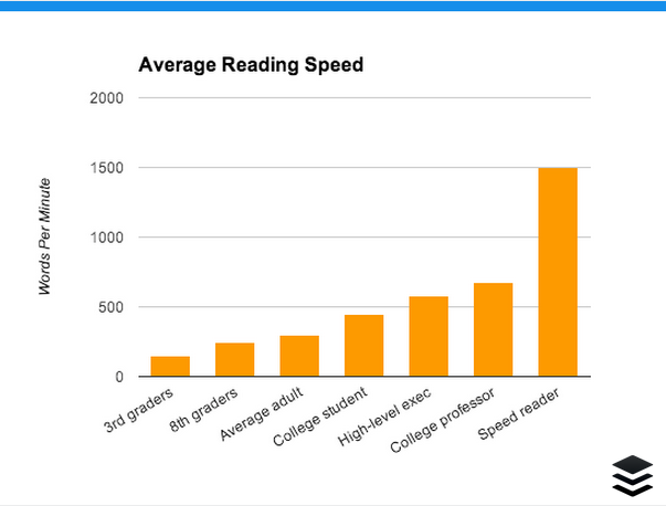
Speed readers can buzz through an article like this in about two minutes.

That’s insanely fast.

For most—mere mortals—this article will take 10-15 minutes to read.

If you want to find out how fast you read, take a test at myReadSpeed.com.

image01

Google Analytics gives you some insight into how your audience is reading. No, it’s not going to test their reading speed.

However, it is going to give you information regarding their time and behavior on the page.

This information comes from Average Time on Page in GA. It provides an insight into your audience’s interest level, reading speed, and overall engagement with a page.

As the name implies, it tells you how long the average user hangs around on a specific page.

If you’re producing content that’s 2,000 words in length and you find that people are leaving after just 30 seconds, then either you’ve got an audience consisting entirely of people who’ve participated in the Evelyn Woods Reading Dynamics course or they’re just not taking the time to read all your content.

Spoiler alert: it’s probably the latter.

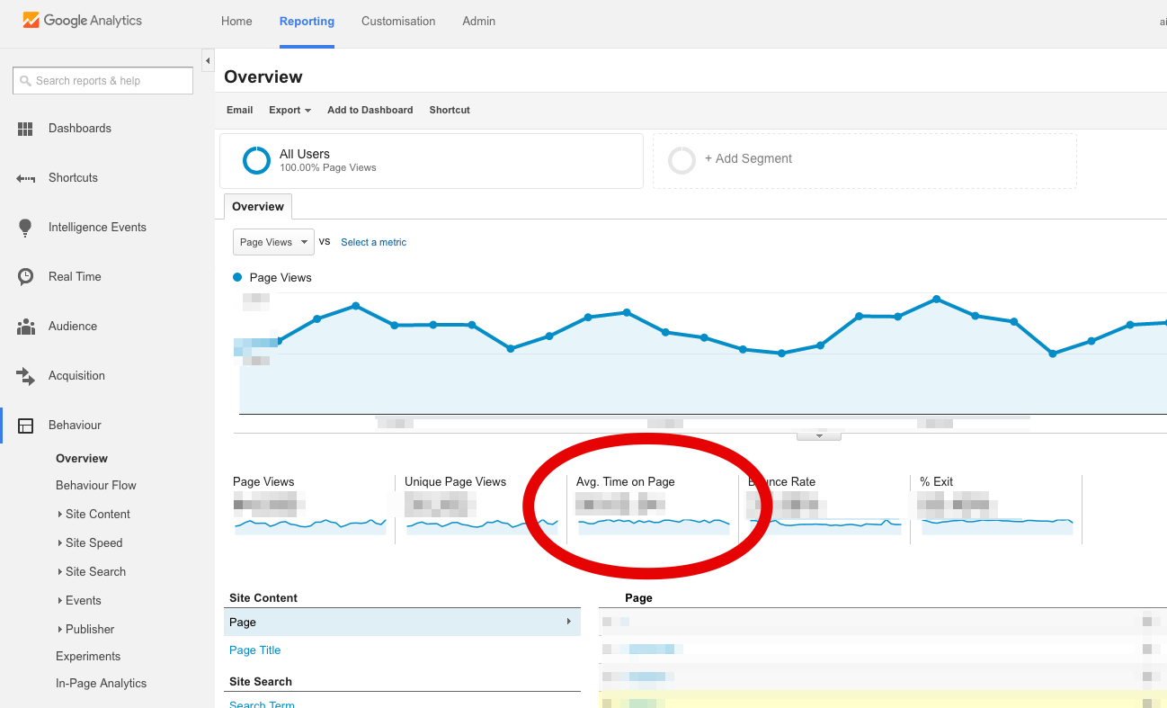
It’s time to look at the Average Time on Page metric.

You can find it on the Behavior Overview report of GA.

  • Click on Behavior in the left-hand sidebar.
  • Select Overview from the menu that appears below.

You’ll see the metric among the stats that appear below the graph:

image08

Unfortunately, though, that number gives you an across-the-board average of all your pages. You need a report that shows you how much time your visitors are spending on individual pages.

You can create a custom report to show you that information.

There’s an easier option, though. Just import Avinash Kaushik’s Content Efficiency Analysis Report.

It will show how much time your visitors are spending on each page.

You can use this report to determine which type of content is “sticky”—that is, which blog posts tend to keep people hanging around the longest.

Once you know that, you can produce more of that type of content.

Here is the big idea behind the Average Time on Page metric.

Knowing how long users spend on a given page tells you how interested they are in the page.

Remember, it’s just an average. A reader who spends 20 minutes on the page will be balanced out by the reader who spends only two seconds on the page.

Taken as an average, however, time on page shows you how interesting and engaging your content is.

If your average time on page is really low, it may suggest that your content isn’t all that great.

Find the pages or articles that have the longest average time on page, determine what’s different about those pages, and use these principles when you create more content.

2. Referrals

One of the best ways to tell whether your content is resonating with people is to see whether other webmasters are linking to it from their sites.

That’s why you need to pay attention to the Referrals metric.

To view referrals:

  • Click on Acquisition on the left-hand sidebar of Google Analytics.
  • Select All Traffic.
  • Click Channels.

In the table that appears on the main screen, you’ll see that the first column is labeled “Default Channel Grouping.” It lists the various channels that include Social, Direct, Organic Search, and Referral.

image03

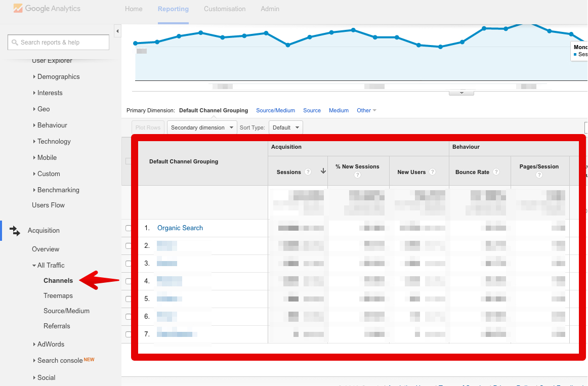
It’s that Referral metric that’s important here. Click on that link to view your referrals.

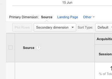
The table that appears shows you exactly where your inbound traffic is coming from. That’s great information to have, but it’s still not a complete story.

Why? Because it’s an aggregate number. In other words, it shows you how much all of your traffic comes from specific sites and doesn’t show which specific pages they’re linking to.

Fortunately, you can fix that by adding a new column to the table.

As I said, I love Google Analytics.

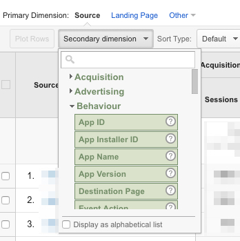
At the top of the table, you’ll see a dropdown menu labeled “Secondary Dimension.” Click on that:

image00

On the menu that appears, click on “Behavior.” Then, select “Destination Page” from the list of options that appear:

image04

Boom. Now you have a referral report that not only shows which sites are linking to your site but also which specific pages they’re linking to.

image06

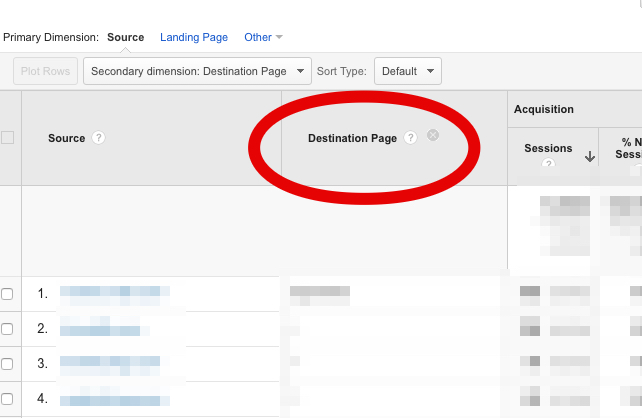
Even better: the default sorting is by the number of sessions in descending order. So you can immediately see which type of content gets the most backlinks.

What do you do with that information?

Easy: create more content like the articles that have the most referrals. If your content is good, people link to it. It’s that simple.

Ultra-linkable content is good content. The more links you’re earning, the better you’re doing.

3. Interests

Marketing is all about reaching people.

This is especially true with content marketing.

If you want to connect effectively with your visitors, you have to communicate with them on their level. That’s why it’s a great idea to find out what their interests are.

Fortunately, Google Analytics has a report for that.

  • Click on “Audience” on the left-hand sidebar of GA.
  • Select “Interests” from the dropdown menu that appears below.
  • Click on “Overview.”

Now, you’re looking at a few bar graphs that show you the interests of your audience. The graph below is from a tech website.

image09

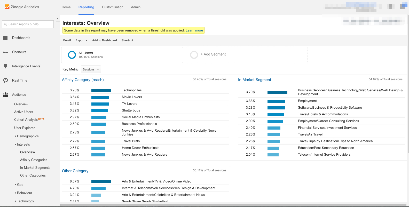
The first graph shows the “Affinity Category.” That tells you about the general hobbies and interests of people who’ve been visiting your site. Here’s how Google defines Affinity Categories:

Affinity Categories identifies users in terms of lifestyle; for example, Technophiles, Sports Fans, and Cooking Enthusiasts. These categories are defined to be similar to TV audiences.

The “In-Market Segment” graph shows you what your visitors are interested in purchasing. Here’s a definition of an in-market audience from Search Engine Watch:

An In-Market Audience is composed of folks who are actively searching and comparing your product/service. Individuals in this audience have indicated that they are actively in-market for a specific category such as “Autos & Vehicles” or “Real Estate” or “Travel” or any of the other audiences currently available from Google.

The “Other” graph gives you broad categories of your visitors’ interests. Google explains it this way:

Other Categories provides the most specific, focused view of your users. For example, while Affinity Categories includes the category Foodies, Other Categories includes the category Recipes/Cuisines/East Asian.

How does any of that help you produce better content? It gives you the ability to tailor-fit your blog posts to your readers’ interests while simultaneously boosting your brand.

For example, let’s say you run a men’s fashion e-commerce site. This week, you’re at a loss about what type of article you should write for your blog.

So, you fire up Google Analytics and view the interests of your visitors.

And then you have an “Aha!” moment.

You see on the “In-Market Segment” graph that 10% of your visitors are interested in “Employment.” They’re looking for a job.

You close GA, log in to your WordPress CMS, and type up an article titled “Here’s How to Dress for Success at Your Next Job Interview.”

Boom. The article gets shared more than most others on your site; it gets backlinks from various “life hacker” sites; and you even receive an honorable mention in GQ.

That wouldn’t have happened had you not checked the interests of your visitors.

You can dive deeper into each of these interest categories. For example, click “In-Market Segments” in the sidebar menu underneath “Interests.”

image07

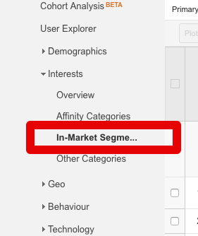
This will display a breakdown of the traffic trends associated with the in-market segment.

You can see how each category of visitor is interacting with the site—their sessions, bounce rate, session duration, and goal completion (if you have Goals activated).

What’s next?

The impact of your content marketing efforts shouldn’t be a mystery.

Check Google Analytics regularly to see which types of articles your visitors appreciate the most. Then, produce that type of content on a regular basis.

You can replicate this model for any and every number in Google Analytics.

Simply ask yourself these questions:

  • What does this number/metric say about my audience?
  • How should my content change as a result?

Bounce rate, session duration, percentage of new sessions, number of returning visitors, service providers, operating system, screen resolution, browser, language settings, mobile traffic, acquisition date, user retention, pages per session—all of this information has to do with your users, your readers, your audience.

All you have to do is understand what the numbers mean and then make relevant changes to your website.

Conclusion

Now, hold on a second.

I just told you to “make relevant changes to your website,” but I need to offer a final disclaimer. That’s what this conclusion is for.

It’s tempting to go crazy and start changing your website left and right. “Ooh! A number! Change the strategy! Revamp the content! Switch up the headline!”

Let me caution you against doing that. Why? Because if you start changing everything, you’ll defeat the entire purpose of analytics, which is to understand exactly what’s working and what’s not.

To truly understand what’s effective, what’s not so effective, and how to make the right kind of changes, you need to do one more thing.

Split testing.

This article isn’t the place to explain split testing—I’ve explained some of those principles elsewhere.

Instead, this is the place to encourage you not to change things willy-nilly but to make strategic changes in a split-testing environment.

The advantage of A/B-testing individual changes is this: Your analytics—all those numbers I talked about up there—will become far more reliable, effective, and actionable.

Google Analytics paired with accurate split testing is a surefire way to make better content.

The better you get at reading and acting upon your analytics, the better content you’ll create.

Next Genpm

So many web projects use npm to pull in their dependencies, for both the front end and back. npm install and away it goes, pulling thousands of files into a node_modules folder in our projects to import/require anything. It's an important cog in the great machine of web development.

While I don't believe the npm registry has ever been meaningfully challenged, the technology around it regularly faces competition. Yarn certainly took off for a while there. Yarn had lockfiles which helped us ensure our fellow developers and environments had the exact same versions of things, which was tremendously beneficial. It also did some behind-the-scenes magic that made it very fast. Since then, npm now also has lockfiles and word on the street is it's just as fast, if not faster.

I don't know enough to advise you one way or the other, but I do find it fascinating that there is another next generation of npm puller-downer-thingies that is coming to a simmer.

  • pnpm is focused on speed and efficiency when running multiple projects: "One version of a package is saved only ever once on a disk."
  • Turbo is designed for running directly in the browser.
  • Pika's aim is that, once you've downloaded all the dependencies, you shouldn't be forced to use a bundler, and should be able to use ES6 imports if you want. UNPKG is sometimes used in this way as well, in how it gives you URLs to packages directly pulled from npm, and has an experimental ?module feature for using ES6 imports directly.
  • Even npm is in on it! tink is their take on this, eliminating even Node.js from the equation and being able to both import and require dependencies without even having a node_modules directory.

The post Next Genpm appeared first on CSS-Tricks.

How to Build Twilio Appointment Reminders with Node.js and Express

Many of us have a love/hate relationship with appointment reminders. The last thing anyone wants is another email, or worse — a phone call from an agent, either live or automated. Perhaps the least annoying notification is a text message, and it's also the easiest, leading many companies to use this approach as part of their customer service strategy and more!

Copywriting

Copywriting may be the most important and foundational skill in all of marketing.

Every ad campaign requires it and it’s used across every single marketing channel.

As a marketer, I’m so thankful that I spend some of my early years improving my own copywriting skills. That time continues to pay massive dividends in my career and across my businesses.

When folks ask me what areas to focus on in order to become a great marketer, my answer is always copywriting.

On Quick Sprout, we’ve put together the best practices and resources to learn copywriting. There’s no need to dig through arhiac tombs of copywriting legend, we’ve found the best tips and tricks for you.

Start here to learn the basics of copywriting:

In copywriting, one item matters more than everything else put together.

Headlines.

That’s right, get the headline perfect and your job is basically done. A common rule is to spend 50% of your time on just the headline and the other 50% on all the other copy that you need for your campaign. I used to think that rule was hyperbolic in order to prove a point, now I believe it’s not aggressive enough. I’d rather spend 70 or 80% of my time getting the right headline.

Many of the biggest wins of my career have been from finding a better headline that instantly increased lead flow by 30%. I’ve run hundreds of A/B tests, no other element carries as much weight as a headline.

After you’ve got the basics of copywriting down, spend the bulk of your time learning how to write better headlines:

Once you have a got handle on how to write headlines, it’s time to learn the tricks and hacks of copywriting. There are quite a few out there. All these little tricks will add up and give you a huge edge in persuasion.

When learning how to be a better copywriter, it’s tough to know how much copy to write. Does short copy or long copy convert better? Some expert copywriter’s will answer this question with: “The copy should be as long as it needs to be and no longer.” They may be right but that answer is unsatisfying. We break down a better answer in Long vs. Short Copy – Which is Better?

People also love to argue over what matters more: design or copywriting. Designers love design. Copywriters love copy. I believe that it matters how design and copy blend together, we go into detail in How to Combine Copy and Design for Optimum Results.

While I love tricks and best practices, all of my major wins have come from deep research and nonstop testing of ideas. During my A/B testing programs, I’d only see 20% of my tests become winners even when I was completely convinced that each test was a brilliant idea. These days, I start by doing deep copywriting research to understand my market as much as possible, then I jump into back-to-back copywriting testing until I find the option that works the best. Then whenever I’m stuck, I go back to the research, brainstorm some more tests, and keep cycling through. Sooner or later, I find the next big winner.

Finally, it’s time to close the sale and convert your prospect into a customer. Lots of folks hesitate here, it can feel sleazy to ask for the sale. There are lots of ways on how to go for the sale in an authentic, genuine way that also works. Check out How to Close the Deal with Your Copy to see how.

Better Than Native

Andy Bell wrote up his thoughts about the whole web versus native app debate which I think is super interesting. It was hard to make it through the post because I was nodding so aggressively as I read:

The whole idea of competing with native apps seems pretty daft to me, too. The web gives us so much for free that app developers could only dream of, like URLs and the ability to publish to the entire world for free, immediately.

[...] I believe in the web and will continue to believe that building Progressive Web Apps that embrace the web platform will be far superior to the non-inclusive walled garden that is native apps and their app stores. I just wish that others thought like that, too.

Andy also quotes Jeremy Keith making a similar claim to bolster the point:

If the goal of the web is just to compete with native, then we’ve set the bar way too low.

I entirely agree with both Andy and Jeremy. The web should not compete with native apps that are locked within a store. The web should be better in every way — it can be faster and more beautiful, have better interactions, and smoother animations. We just need to get to work.

The post Better Than Native appeared first on CSS-Tricks.

Creating HTML Layouts That Meet Web Accessibility Standards

Web accessibility is often said to be a 'must' for the World Wide Web today. The term "web accessibility" defines a set of guidelines developers need to follow to make the interaction of people with disabilities and web apps more convenient. Any website should be accessible in terms of its content, UI/UX design, and layout. In this article, the Logicify team gives HTML/CSS developers a few practical tips to make web layouts more accessible — both for people and assistive devices.

Keep the Markup Clean

Whatever markup you are using, structure it correctly and neatly, avoid skipping levels. Always favor native elements (if there are ones) over faking them. For instance, use the <button> elements instead of <span> or <div> in HTML. Use <nav> for navigation, <button> for page actions.

#215: Podcasting 2

Show Description

Our podcast engineer, Chris Enns, chats with Marie about what's changed in podcasting over the last year, how CodePen evaluates the success of their podcast, and offer up some podcast suggestions for listeners.

Time Jumps

  • 00:19 Guest intro
  • 01:31 A transformative year for podcasting
  • 02:20 Podcasting sprouts up from talk radio
  • 04:24 CodePen Radio's podcast workflow
  • 09:24 Recast and podcast sharing
  • 12:21 Cold calls from wanna-be podcast guests
  • 14:56 Big money coming to podcasting
  • 19:54 Sponsor: Jetpack
  • 22:20 How does Codepen know the podcast is successful or working?
  • 27:11 What's happening with Chris' podcasting business
  • 30:33 Podcast suggestions

Sponsor: Jetpack

Jetpack brings a wealth of features to your self-hosted WordPress site as one of the best no-brainer plugins for WordPress there is. One feature I just recently used for the first time was the video hosting and video player. I had a video clip that I just wanted to drag and drop into a blog post like I would an image, but it was a little too big. Fortunately I just uploaded it through WordPress.com, it was magically available in the Media dialog on my self-hosted site, and it worked perfectly.

Show Links

CodePen Links

The post #215: Podcasting 2 appeared first on CodePen Blog.