

Edge computing has become an important trend for the Internet of Things (IoT). Gartner identifies edge computing as one of their top Tech Trends for 2019. Companies implementing IoT solutions are seeing real benefits of processing data on the edge, closer to the 'things', before it is sent to the cloud. Confirming this trend, a recent Micron/Forrester survey found in the next three years, 53 percent of respondents expect to be analyzing complex data sets at the edge. This is why some have made the bold prediction that 'the edge will eat the cloud. '
Edge computing is gaining attention since it addresses some of the key issues of implementing industrial IoT use cases.
Top 5 Course to Learn Apache Maven for Java Developers

Apache Maven, or more commonly known as just "Maven," is an important tool for Java programmers. It allows you to build your project, manage dependencies, generate documentation, and a lot more. I can vouch for Maven's usefulness because I have come from the pre-Maven world of Software development, where you need to manage all the JAR files required by your project. It may seem easy to you that just download the JAR file, but it's not so easy in practice. For example, you added a new library in your project — say the Spring Framework, which also needs log4j, but you thought log4j is already there, so you didn't do anything, only to realize that your application is not starting anymore and throwing long and convoluted errors. This can happen because of version mismatch, like Spring needed a higher version of log4j than available in your project.
This is just a tiny example that shows how manually managing dependencies can create nightmares. Maven took away all those pain by not only automatically downloading those JAR files for you but also created a central place, known as a Maven repository, to store those JAR files for better management.
Maven is not just a dependency management tool; it's, in fact, much more than that. The biggest advantage of using Maven is the following convention, which makes software development easy.
WordPress Explores Proposal for New Block Directory to Host Single Block Plugins
WordPress core contributor Alex Shiels has published a proposal for a WordPress.org block directory that would host JavaScript-based, single block plugins. The directory would make blocks searchable and installable from within the Gutenberg editor. Building a directory for discovering blocks and seamlessly installing them is one of the nine projects that Matt Mullenweg identified as a priority for 2019.
Block collections have become one of the most popular ways for distributing a group of related blocks but this method can cause bloat. Users currently cannot search for individual blocks by name and plugin names and descriptions are not always a good indication of what the blocks do.
Shiels proposed the new directory be limited to single block plugins, frontend JavaScript blocks with no UI outside of the editor. It would be a separate section inside the Plugins Directory, optimized for users to find blocks by name and description. Developers would be required to use a block.json file with metadata as outlined in the Block Registration RFC, which provides a technical specification for block type registration.
The most controversial part of the proposal is having blocks installable from within the Gutenberg editor. The long term goal is to make that process as seamless as possible. Block collections and blocks that do not meet the requirements of the single block directory would still be available via the normal plugin installation process. This could be confusing for users who do not know that blocks can be found in two separate directories.
“The Gutenberg editor should NOT be a plugin installation source,” Matt Cromwell commented on the proposal. “That just seems ripe for scope-creep. That’s not its purpose or function. Let it be an editor, layout builder, content manager, etc. Moving into searching an external library and installing plugins is the definition of losing site of the purpose of a ‘product.'”
Cromwell suggested a centralized block manager as an alternative that would offer a better experience for searching and installing blocks. He also echoed other participants’ opinions on the importance of including dynamic blocks in the directory, instead of limiting it to “JavaScript only” blocks.
“A centralized Block Manager like has already been suggested is a far better user-experience for searching and installing blocks than doing that in the Gutenberg editor. I like the idea of single-block plugins being the only option in the Directory. But make sure Dynamic Blocks that depend on other existing plugins or outside functionality are able to be added to that very important Directory as well. I really don’t see a benefit to limiting this Directory so much.”
WordPress developer Jamie Schmid also expressed hesitation about pursuing a solution that puts block installation inside the editor, as it may discourage users from thinking about their block usage across the entire site.
“I am not convinced that making blocks searchable and installable from within the editor is the best solution,” Schmid said. “This, along with page level block controls and style overrides, is encouraging a very short-sighted, page-level solution to an issue that is very likely a global site (or content or even business) issue. I’d love to instead see a central view for all installed blocks – similar to how plugins are, but more organized by type/function/etc and with a visual alongside. This will encourage making decisions at the site level, encouraging some bigger-picture reflection. And same to being able to apply access controls to the installation of new blocks.”
The proposal would place the single block plugin search interface inside the block inserter in the Gutenberg editor. This would enable users to quickly search for and install a block if they don’t see one they need among the existing blocks.

Riad Benguella, Gutenberg’s technical lead for phase 2, encouraged participants in the discussion to think about blocks as pieces of content that do not rely on the post editor but can be configured anywhere inside WordPress.
“It is important to think of blocks as its own unit that have a meaning on its own, and that can be used in different contexts,” Benguella said. “A block is a piece of content (static or dynamic) that can be configured and rendered anywhere.” This includes blocks found both inside and outside post_content, content in a full site editor, inside the WordPress admin, a headless application, or even another CMS.
“We should be ambitious and think about all these contexts (the final picture), but at the same time we should be pragmatic and iterate to achieve this goal,” Benguella said.
The discussion regarding the new block directory and block plugin architecture continues across WordPress contributor teams. Shiels said the proposal was meant as a starting place and contributors are still in the preliminary stage of exploring ideas.
Call of Duty API Update Temporarily Blocks Stat Tracking
Call of Duty: Black Ops 4 is one of the many games with an API. The API has traditionally allowed third party game tracking apps to access user stats and other helpful game data. However, a recent API change has prevented users from tracking their stats through such apps.
15 Ecommerce Conversion Rate Optimization Wins to Test
Ecommerce platforms rely on sales to survive. If you operate one of these websites, you know how important sales are for your business.
Whether you sell products exclusively online or have an ecommerce site in addition to your brick and mortar store, you need high conversion rates to be successful.
On average, ecommerce sites in the United States convert at about a 3% rate.
If you’re hovering somewhere around that number, you might think your website is already optimized for high conversions.
Even if you think you’re doing well, there’s always room for improvement.
In fact, some of the top performing websites, such as the Google Play Store, have a conversion rate close to 30%.
Companies such as the Dollar Shave Club have roughly a 20% conversion rate.
Do you still think 3% is sufficient?
I don’t.
Whether you sell products exclusively online or have an ecommerce site in addition to your brick and mortar store, you need high conversion rates to be successful.
If you want to improve your conversion rates and generate more sales, all you need to do is make some changes.
For the most part, these changes won’t cost you much money but will bring a massive return.
You could double, or even triple, your conversion rates in just a few months by implementing some of these conversion rate optimization (CRO) strategies.
Those of you who don’t know how to optimize your ecommerce site for conversions are in luck. I’m an expert in this space and have plenty of experience consulting businesses about their CRO.
I’ve come up with a list of the top 15 ways for ecommerce sites to increase their conversions.
First, let’s take it from the top.
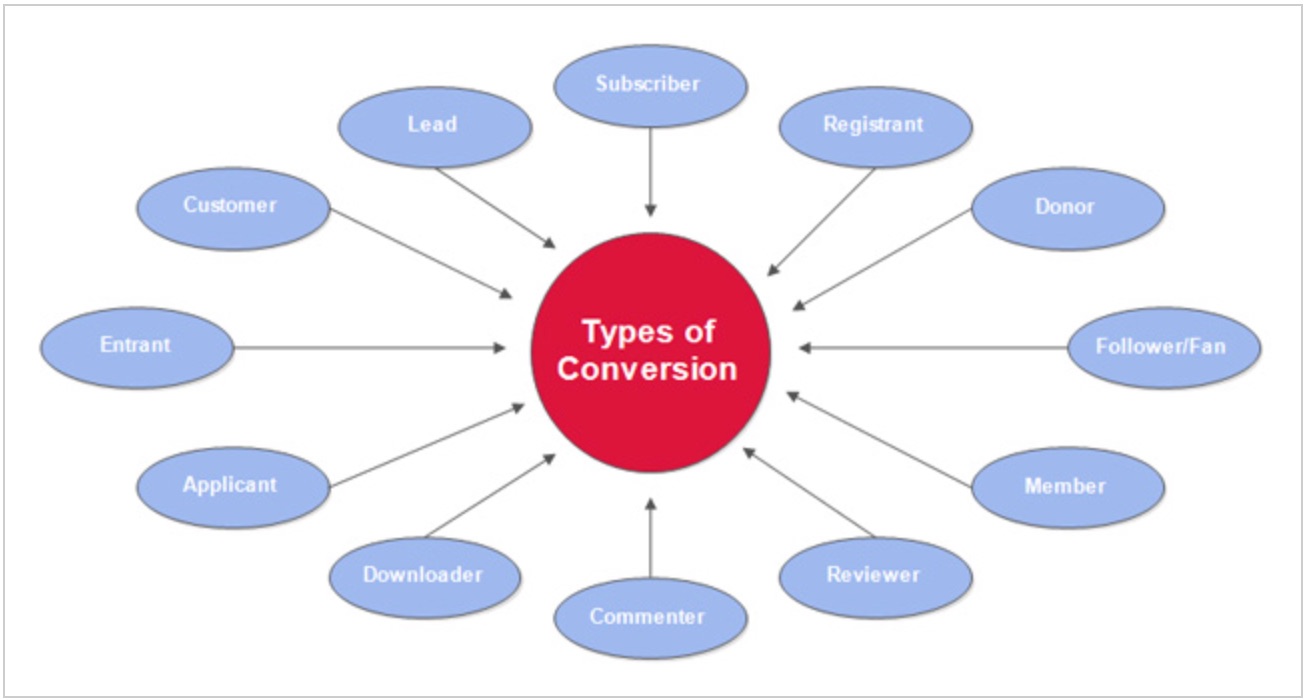
What is conversion rate optimization?
In layman’s terms, conversion optimization is the process of increasing the number of visitors who take a desired action on your site.
Any number of activities can count as a conversion. It depends on your goals.
Signing up to an email list, creating an account, making a purchase, and downloading software are all examples.
Here are some more examples:
The more often these conversions happen, the more revenue your business receives.
In theory, it’s pretty simple.
In practice, it’s a little more complex than just getting more people to take action.
Why so? You need to get the right people to take the right actions at the right time.
That means there are quite a few pieces that need to be moved to ensure your conversion funnel is working as it should.
What can conversion rate optimization do for your business?
1. You can have a fighting chance against Goliath competitors
Every time I think of competition, I think of this simple yet profound quote:
The strong eat the weak.
It’s true in life, and it’s true in business.
Ecommerce is extremely competitive. Just look at the increase in sales within the industry over the span of eight years:
![]()
New players are entering your space every single day with the sole goal of snatching up your customers.
The only way to combat this is to make your customers so loyal to you that the competition doesn’t matter.
That can’t happen without first moving them through your sales funnel.
There’s one mistake I see small ecommerce businesses make all the time.
They focus on traffic generation without first having the systems in place to:
- convert that traffic into leads;
- convert leads into loyal customers.
If you already have some traffic coming in, I recommend you spend some time optimizing your conversion funnel.
Because guess what? You may not be able to bring in as much traffic as larger sites. They have more resources, larger teams, and bigger advertising budgets.
You may not even be able to compete on price.
But you can still have a competitive advantage if you make use of conversion optimization.
2. You can learn more about your users behavior
The way users interact with your site is everything.
It’s the closest you’ll get to reading your prospects’ minds.
It tells you what they’re looking for, what they respond to best, and what turns them off.
This means you can give users exactly what they want when they get to your site. Conversions would happen much faster because web visitors would have what they need at hand.
But you shouldn’t just glance at your analytics and make changes to your site based on that one analysis.
You need to monitor user behavior over time.
It’s the only way to notice patterns you can capitalize on.
My advice?
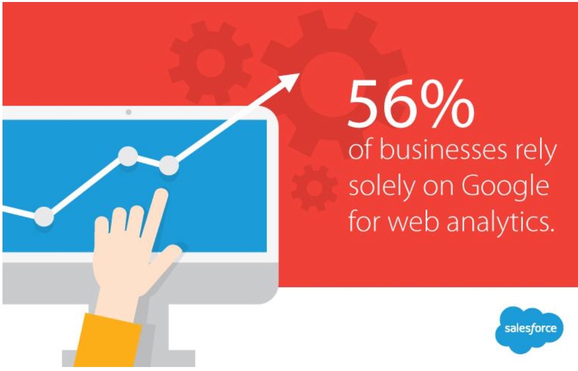
Get a solid grasp on how to navigate Google Analytics. It’s one of the most powerful free tools for analyzing user behavior on your site.
Salesforce found that 56% of businesses rely solely on Google Analytics for their web analytics. Only about 11% don’t use it at all.
Here are a few things you can track right now:
- Where are your web visitors coming from? You can target these sources to get more visitors.
- Which channels are driving the most traffic? This will tell you where to focus your time and resources.
- Where on your site are visitors spending the most time? This will tell you where users’ interests lie.
- How “sticky” are your site pages? Check your bounce rates for that info. You want them to be low.
These are just a few ideas. User behavior has many aspects.
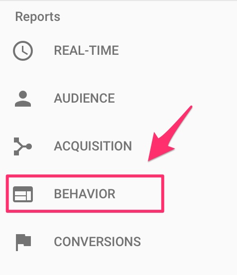
How do you get this info?
First, find the behavior reports within your Google Analytics account:
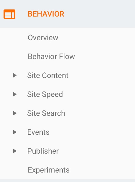
You’ll see several subsections, each with insights on how visitors interact with your site:
Hopefully, you already have Google Analytics fired up.
Go through the reports, and collect all historical data.
Identify what’s yielding the most results, and double down on it. Then, you can pinpoint underperforming areas and improve them.
These insights are crucial not only for conversions but for every aspect of your digital marketing.
Content, social media, and email marketing are all areas that can benefit from analyzing user behavior.
Here’s the other thing about using analytics for conversion optimization: It prevents you from making changes to your site based on a hunch.
You’ll have concrete data to base your decisions on, and that’s how you avoid making costly mistakes.
3. You can maximize your profits
Put simply, more conversions lead to bigger profits.
But know this: you need to tighten every aspect of your sales process.
There’s no point in optimizing for conversions at the top of your funnel if you can’t keep momentum as web visitors move through the funnel.
The best way to capitalize on all customer touch points is first to map your customer journey.
This is a map that illustrates the path your customers go through when they interact with your business.
Once you have that figured out, deciding what to optimize at each stage should be obvious.
Here’s an example of a customer journey map:
4. Your customer acquisition cost will be lowered
Conversion optimization is the silver bullet for reducing your customer acquisition costs (CAC).
Here’s the textbook definition of CAC:
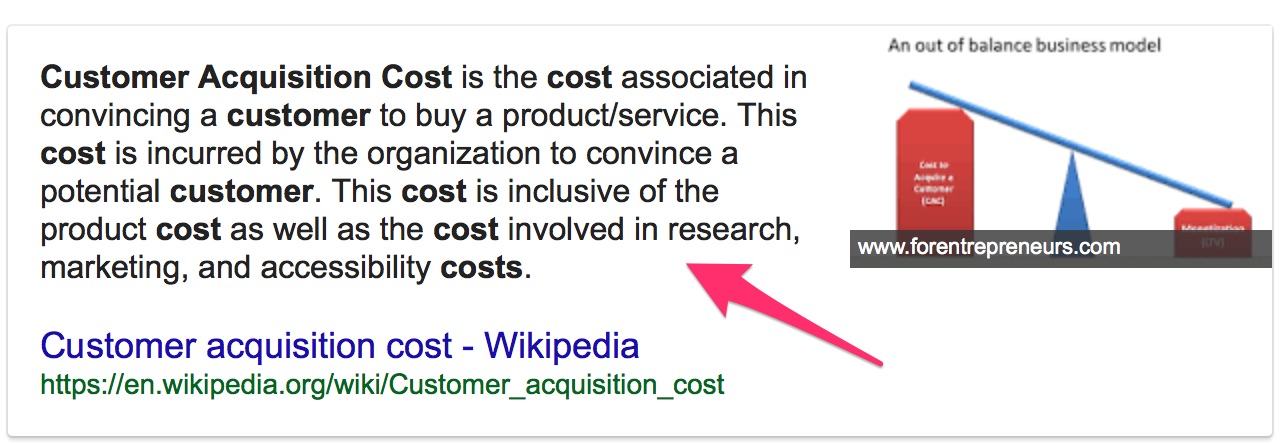
In short, it’s the price you pay for acquiring a customer.
This one metric can make or break your business.
If it costs too much to convert a customer, your profit margins will be restricted.
Larger profit margins, on the other hand, give you more flexibility in your market. You’ll be able to serve your customers with more value and secure a spot as a dominant player in your space.
What does conversion optimization have to do with all this?
Here’s a scenario.
Let’s say you’ve decided to optimize your site for more conversions.
With a few strategic changes, you see a 3% bump in conversions.
The amount of traffic to your site hasn’t changed. Your ad spend is still the same. The only variable is what you’ve done to optimize your site.
The 3% increase in conversions means you’ll be acquiring more customers, resulting in more revenue, without employing more resources.
Granted, it may cost you to make changes to your site. However, the result is still the same.
Your CAC will decrease while your ROI increases. Now, that’s a sweet deal.
Now that I have explained a few of the reasons that you should focus your efforts on your Ecommerce conversion rate optimization here are 15 conversion rate optimizations that you should test today.
Top 15 conversion rate optimization wins to tests
1. Simplify your website
Websites with simple designs have higher conversion rates.
Depending on your company, you might have hundreds or even thousands of products for sale on your website. But trying to cram all of those products onto one page is ineffective, and it’s crushing your conversions.
Clutter overwhelms the customers. Instead, focus on your top selling products or items with the highest profit margins.
Let’s look at a globally recognized brand as an example. Here’s Apple’s homepage:

When in doubt, it’s always a great idea to look at successful companies as examples. Apple is an industry leader, and their website is about as simple as it gets.
Think about the number of different products they offer. They have all kinds of different desktop computers, laptops, phones, and other electric accessories, not to mention the digital products like software and music.
If they tried to fit everything they sell on their homepage, it would be an absolute mess.
Instead, they promote one product and have a navigation bar at the top of the screen that lists different categories.
This makes it really easy for shoppers to find exactly what they’re looking for.
In the fourth quarter of 2017, Apple reported $52.6 billion in revenue— a 12% increase compared to the fourth quarter of 2016. It’s safe to say they don’t have a problem with conversion rates.
2. Include a search box
Users should be able to browse through your products quickly and conduct searches without fuss.
That’s where a prominently-placed search box comes in: 30% of site visitors use search on an ecommerce store.
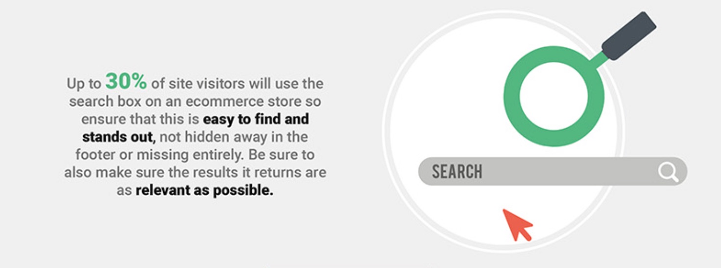
The quicker you can get customers what they want, the quicker you make the conversion.
That’s the point of navigation.
As such, it should be simple and distraction-free.
Add-to-cart buttons and checkout signs must be clearly visible.
3. Have clear CTA buttons
I’ll admit. The right-colored CTA button won’t make your sales funnel.
But it can certainly hurt you.
Don’t think this is a major problem?
These statistics show the many ways businesses neglect their CTAs:
![]()
If you don’t have a color that stands out and compels visitors to click through, it can take away from the user experience.
This is where color psychology can come into play. Make sure you choose the right colors for your ecommerce site, and your CTAs will perform as they should.
It’s not just about color though.
The words you use have far more impact. I recommend using words like “now” and “today” that convey urgency.

These are just a few elements.
Here’s a good rule of thumb for deciding how your web pages should be designed.
Step #1: Decide the primary goal of the page. Zone in on one thing.
Step #2: Decide on the secondary goals of the page. These should be related to your primary goal.
For instance, let’s look at product pages.
The goal is to get users to add products to their carts, right?
Your secondary goal can be a catalyst to get your primary goal moving along. For example, you may decide you want more persuasive product descriptions, more social proof, etc.
These will help advance your primary goal.
Makes sense?
Step #3: Make your primary call to action the most prominent element. This way you’re deciding for the user which action they should take.
Step #4: Include your secondary calls to action and nothing else. You don’t want to have anything on your page that doesn’t lead web visitors to your primary and secondary calls to action.
For creative elements, I always recommend split tests.
This is how you’ll know for sure which version of your site provides the smoothest user experience.
You should also always make sure your call-to-action buttons are clear.
They should be bold, standing out from other content on your website.
You can even put a box around the CTAs, clearly separating them from other text on each page.
Take a look at how The North Face does this on their website:

It’s clear which buttons on their homepage will direct customers to the right page.
Even though they have lots of different options, their website isn’t cluttered, and it’s organized in a professional way.
This makes navigation easy.
Now their customers can find what they’re looking for faster and start adding items to their carts.
Look at how the CTA button changes when a customer views an item:
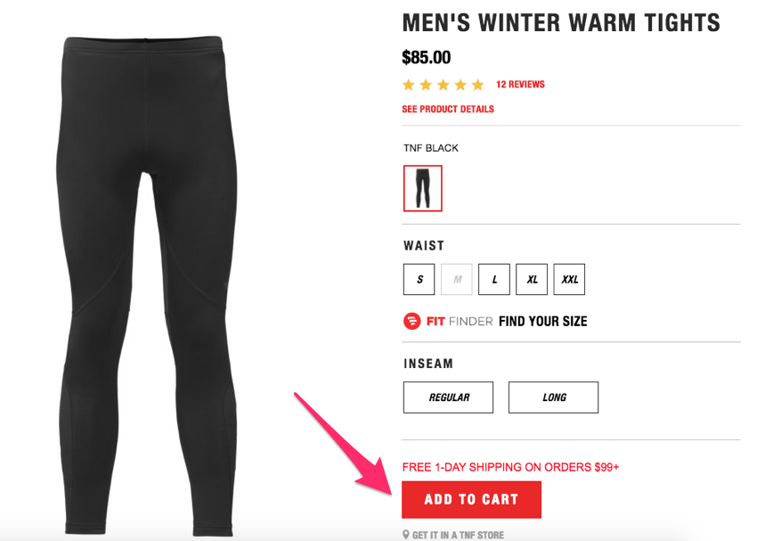
Now the button is even more apparent because it’s red.
It stands out, so it’s clear what the customer should do.
Don’t hide your CTA buttons.
It should be easy for customers to navigate and add items to their carts.
Big, bold, clear, and colorful call-to-action buttons can help improve your conversion rates.
4. Highlight items that are on sale
Most online shoppers—86% of them— say it’s important for them to compare prices from different sellers before making a purchase.
It’s no secret price is an important factor when it comes to a purchase decision.
That’s why you shouldn’t hide your discounted items.
Take a look at how Macy’s highlights markdowns on their homepage:
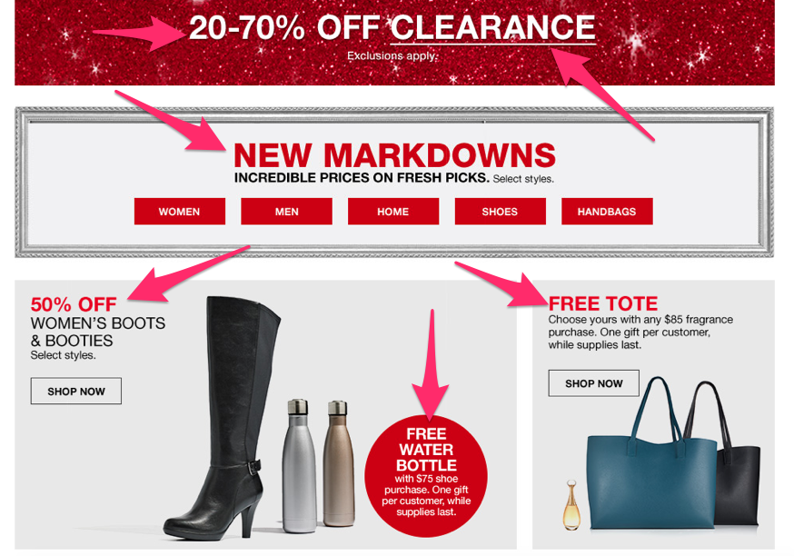
The website is absolutely plastered with buzz words like:
- free
- X% off
- markdowns
- sale
That’s why they are able to get higher conversions than their competitors.
Customers love to get a deal.
Buying something that’s on sale makes your customers feel better about spending money.
All too often I see companies try to hide their sale items.
They would rather sell items listed at a full price.
That’s a big mistake.
Instead, highlight discounted products and services.
You can always try to cross-sell or upsell to those customers later by enticing them to buy something else through other marketing efforts.
5. Display multiple pictures of the product
You shouldn’t be selling anything based on just a description.
Your customers want to see exactly what they’re purchasing.
Make sure your images are high quality and portray the item in question accurately.
Here’s a great example from Lululemon to show you what I’m talking about:
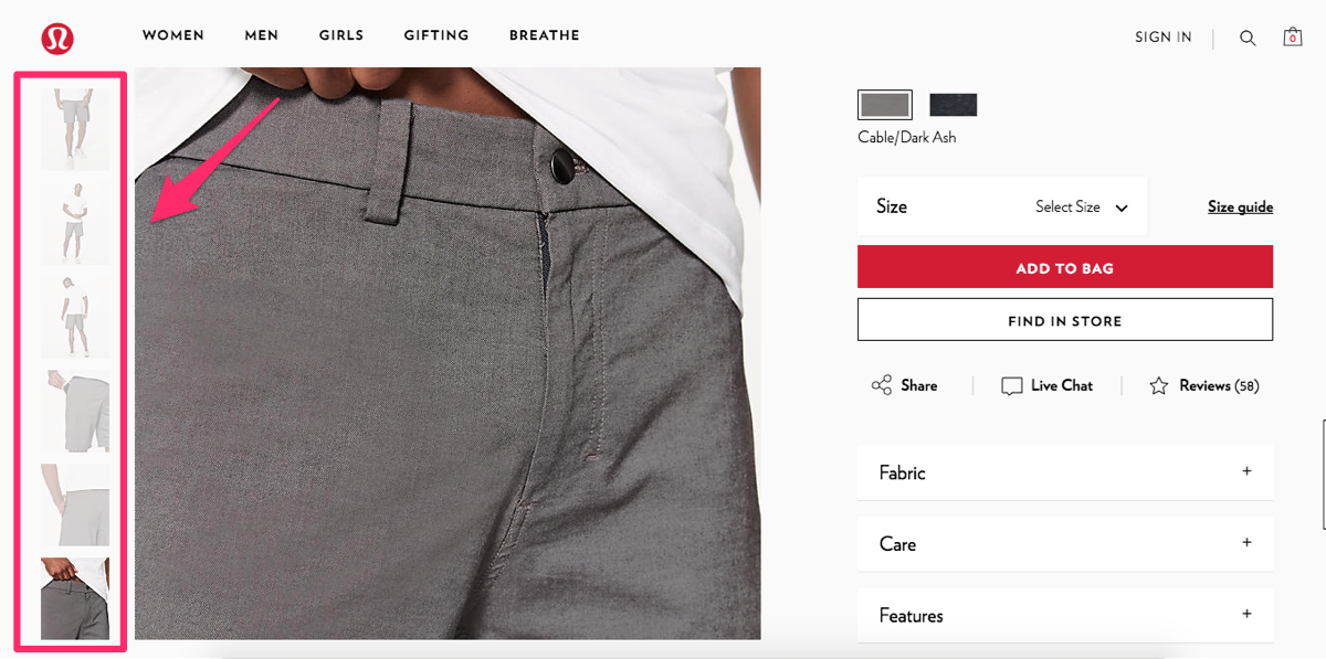
There are six different pictures of just one pair of shorts.
They show the product from different angles and even zoom in on some of the top features like a pocket that’s designed to keep a cell phone secure.
Pictures are much more reliable in relating information about a product than a written description of it.
You can apply the same concept to your ecommerce site.
Sure, it may take you a little bit more time to set up each product.
You’ll have to take more pictures and include additional images on your website.
But I’m sure you’ll notice a positive impact in terms of your conversions after you implement this strategy.
6. Include a detailed product description
In addition to photos, you’ll want to thoroughly describe what you’re selling. With items like clothing, it’s usually self-explanatory.
However, if you’re selling electronics or something that has a bit of a learning curve, an accurate and detailed product description could help you close the sale.
Think of it like this. If a customer were to walk into a physical store, there would be employees to answer questions and help explain how different products work.
Shoppers don’t have that luxury when they browse online. It’s your job to make sure they aren’t confused about a product.
Even if you’re selling something simple, such as a t-shirt, point out how it differs from others. Does it keep you cool when it’s hot? Does it keep you warm when it’s cold?
These are things that can’t be determined from a photo alone.
Check out how Amazon accomplishes this with one of their TV wall mounts:

Just like companies in our previous two examples, Amazon is another industry leader across the globe. They know how to sell products online.
While the photos are helpful, the description really helps the consumers.
It explains which kinds of TVs this mount is compatible with as far as size and weight are concerned. The description also covers the various mounting patterns based on what kind of TV you have.
Without the description, you wouldn’t know how far off the wall the mount comes or how close to the wall you can push it.
Not everyone is an expert in mounting televisions. The majority of people probably never have to do this. And unless you install home theater equipment for a living, it’s probably not something you’ll do more than a few times in your life.
For a unique and somewhat niche product like this, accurate descriptions can really help drive the sale.
7. Offer easily accessible customer service
Even if your website is very informative, some customers may still have questions while they’re shopping. But what if there’s nobody there to assist the consumer when they’re shopping online, unlike in a physical store?
Conversions rates drop.
Do your best to replicate that customer service experience. You may have photos, videos, and a great description, but customers will still have questions.
Make sure you give them several options to reach a customer service representative:
- phone
- live chat
Offer as many options as possible so each customer can contact your company based on their personal preference.
You also need to have support ready at all hours. As an ecommerce platform, I know you’re aware that customers all over the world have access to your website 24 hours a day.
Let’s play out a scenario. A customer is interested in one of your products but has a few simple questions. They try to contact customer support but don’t get an answer.
They won’t complete the purchase process. But if their questions get answered right away, your conversion rates will improve.
Try to offer an online shopping experience they would get inside a physical store, with a sales associate available to assist them.
Look at how Apple does it. They offer a live chat for shoppers on their website, and it looks like this:
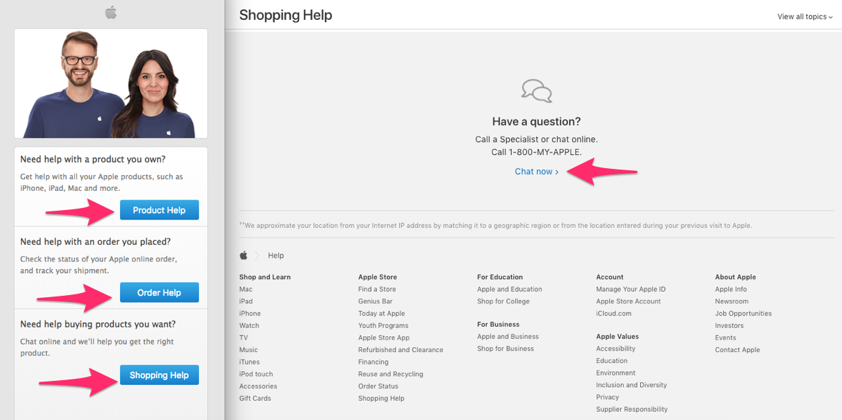
They make it super easy for customers to get all their questions answered online.
This is especially important if your company sells products that may need some extra explanation.
Realize not all of your prospective and current customers may be experts in your industry.
Although your product descriptions may be accurate, it’s possible there’s some terminology the customer doesn’t understand.
Rather than forcing them to pick up the phone or do outside research, offer them a live chat. Receiving this type of help can be the deciding factor that leads to a conversion for this customer.
8. Include all your contact information
On top of providing customer service, you should have as much information as possible about your company available on your website.
Clearly display your:
- address
- phone numbers
- fax
If this information isn’t on your site, it could appear sketchy. Customers may think you’re not a reputable company.
What if they have a problem with their order? If your contact information isn’t available, how will they get their issue resolved?
That uncertainty could prevent people from buying things on your website.
9. Simplify the checkout process
How long does it take for someone to complete a purchase once they’re done browsing on your website?
Studies show 27% of shoppers abandon their carts on an ecommerce website because the checkout process is too long and complicated:
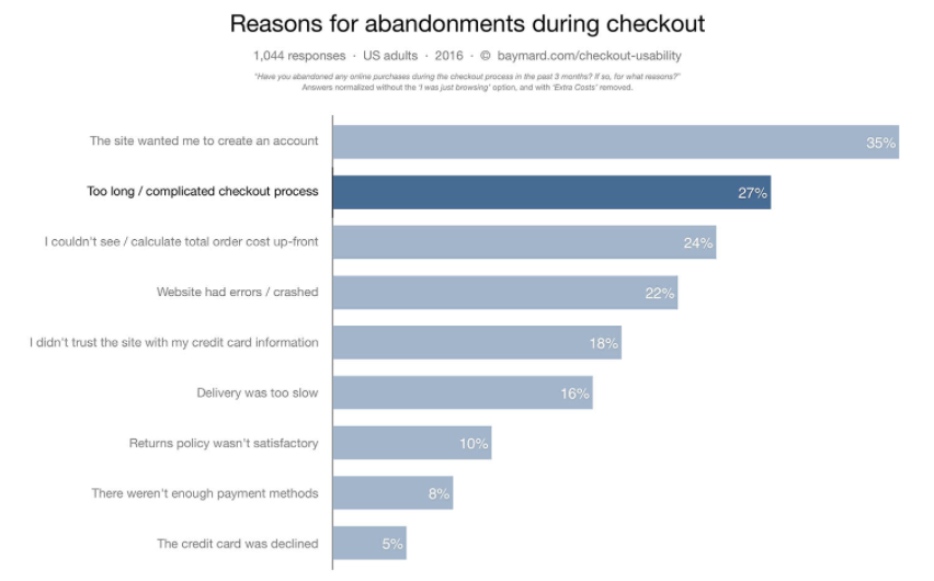
On average, the number of steps to check out on an ecommerce website is 5.42.
If you’re somewhere in that average range, nearly 30% of your prospective customers think your checkout process is too long.
Think about how much money you’re leaving on the table.
The more steps a customer has to take to complete the checkout, the more likely they’ll abandon the cart.
It gives them too many reasons to back out.
Don’t give them an excuse. Finalize your sale.
Get back to the basics, and narrow down the information you actually need from the customer:
- shipping information
- payment information
- email address to send a receipt.
That’s really it.
You don’t need to know their favorite color or who referred them to your website.
While additional insight may be beneficial to your marketing department, you still have plenty to work with from just those few pieces of information.
Based on the shipping location, you know where the customer lives. You have their name from their payment information. And you have a way to contact them via email.
Now you can send them a confirmation email as part of an actionable drip campaign to try to cross-sell and upsell products based on the customer’s current order or location.
You can even personalize that message since you know the customer’s name.
Don’t force your customers to fill out a form that’s longer than paperwork at the doctor’s office.
Simplify your checkout process and only ask for essential information needed to complete the sale.
10. Offer multiple payment options
Imagine this.
Someone wants to buy something on your website, but they can’t because you don’t accept their preferred payment method.
This should never be the reason for you to miss out on conversions.
While I realize some credit card companies may charge you higher rates than others, it doesn’t mean you should restrict payment options for your customers.
Try to accommodate as many people as possible.
While I’m not suggesting you need to accept cryptocurrency like Bitcoin, you should be accepting every major credit card, e.g.:
- Visa
- MasterCard
- American Express
- Discover
You should even offer alternative payment options such as:
- PayPal
- Apple Pay
- Venmo
Here’s an example from American Eagle:
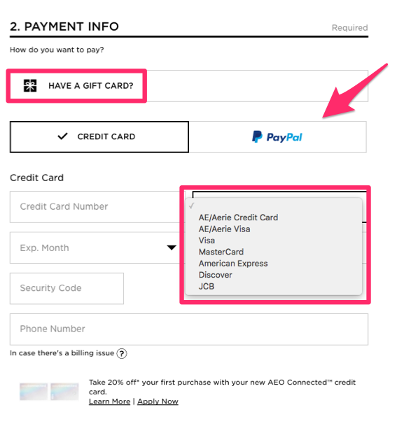
They accept nine different payment methods on their ecommerce site.
You need to offer as many options as possible for your customers.
It all comes down to convenience.
Some companies may just accept MasterCard and Visa.
They figure those are popular options, so everyone must have one, right?
But here’s the thing: you don’t know everyone’s financial situation.
While someone may have a Visa, it could already have a high balance on it, forcing them to use a different payment method.
Others may want to use their American Express card or Discover card because they get better rewards there.
And some people may not want to use a credit card at all if they have a sufficient PayPal balance.
The more options you offer, the greater the chance you’ll appeal to a wider audience.
Don’t assume everyone wants to pay with the cards you accept if that selection is limited.
Assume people will find a similar product elsewhere, where their preferred payment option is accepted, which will crush your conversion rates.
11. Include user reviews
Consider this: 88% of shoppers say they trust online reviews as much as they trust personal recommendations.
That means nearly 90% of people trust a stranger’s opinion online as if it were coming from their spouses, best friends, or family members.
Furthermore, 39% of people say they read product reviews on a regular basis, and only 12% of customers say they don’t check online reviews.
Basically, this means customers want to see what their peers have to say.
Encourage customers to review products they’ve purchased, and display those reviews on your website.
Take a look at how Johnston & Murphy does this on their ecommerce site:
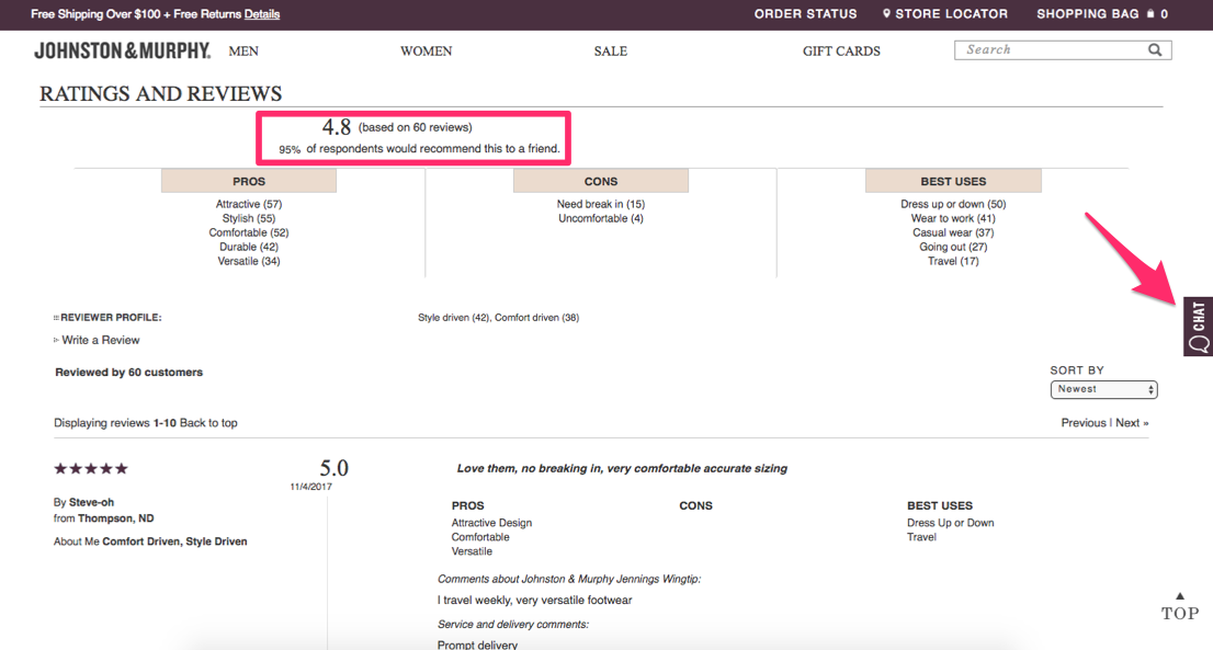
More reviews means more credibility.
Obviously, you’re going to say only great things about the products you’re selling.
But other customers will be truthful about their experiences.
That’s why consumers trust these ratings and reviews.
Customers share personal stories about the uses of the products they purchased and the reasons for recommending them (or not).
Notice I also highlighted the chat option on the Johnston & Murphy website—a topic I covered earlier.
Don’t be upset if not all your reviews are absolutely perfect.
You’ll get some negative comments.
It happens.
Those negative remarks can actually help you. It shows shoppers your reviews are legitimate.
Hopefully, the positive ratings will largely outweigh the negative ones.
This will help you get more shoppers to convert and complete the purchase process.
12. Add a video demonstration
If your products are unique, include video demonstrations showing how to use them.
Here’s an example from the Training Masks website:

They have workout videos to show people how to use their product to train harder and smarter.
Since this product isn’t something you see every day, the majority of the population may not know how it works.
But don’t think you can’t use videos even if you’re selling something simple.
For example, everyone knows how to use a piece of luggage, right?
Well, that doesn’t stop Thule from including a video demonstration on their website:
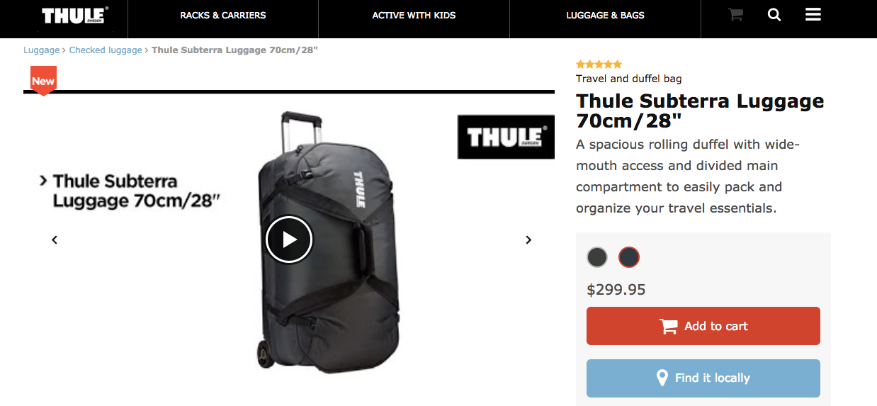
The video shows all the hidden compartments of the bag.
It also shows customers how they can adjust the handles and straps and utilize other features.
In addition, you can include a video demonstration highlighting the features that set your product apart from similar products.
Even if you’re selling something simple, like a shirt, a video can show customers the item’s versatility for different occasions, scenarios, or weather conditions.
You just have to get creative.
13. Don’t surprise your customers with extra fees
Consumers are sensitive to price. You have to be upfront and totally transparent with the prices on your website.
The customer expects to see the same price for the same product on all pages, including in their shopping cart.
Adding hidden charges, taxes, and shipping fees will crush your conversions.
Look at the top reasons for shopping cart abandonment:
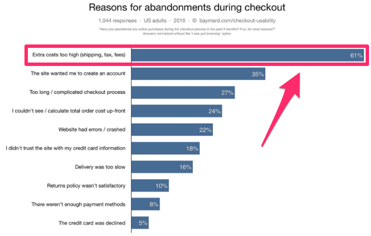
Extra costs are the number one reason why consumers abandon their shopping carts.
Look, I realize you’ve got to pay sales tax and shipping isn’t free. But rather than surprising the customer when they check out, include those costs in the original price.
You’ll still get paid enough to make a profit, and the customer won’t be surprised with extra fees. It’s a win-win scenario for everyone.
Plus, it will reduce cart abandonment and improve your conversion rates.
14. Send shopping cart abandonment emails
While you can certainly do things to improve your shopping cart abandonment rates, some customers still won’t always complete their purchases.
You can’t ignore this.
Someone was just a click or two away from buying something on your website. They identified what they wanted and added it to their cart.
It’s going to be much easier to try to get this customer to convert than to find a new customer.
This person is already familiar with your brand and obviously interested in at least one of your products. Sometimes they just need a bit of extra motivation to complete the sale.
Send out a shopping cart abandonment email to remind the consumer of your products. Here’s an example from Oakley:
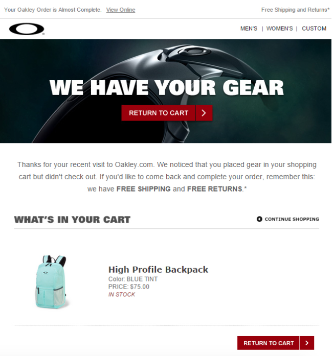
This product will still be fresh in the customer’s mind—they just left it in their shopping cart. They wanted it, but for one reason or another, it just didn’t happen.
Receiving this email could be enough to trigger an impulse buy.
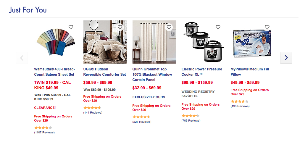
15. Recommend products to enhance the shopping experience
If your site is using cookies to track browsing behavior, you can recommend products to your customers based on what they like. Use their previous order history as well to personalize recommendations.
This shows the consumer you care. Their browsing experience is different from everyone else’s.
Here’s an example from Bed Bath & Beyond:
You can also try to upsell to your customers when they add something to their shopping carts. For example, if they buy a pair of headphones, you can recommend a carrying case for them.
Again, it reflects their personal experience. This strategy works.
Research shows that 49% of consumers said they bought something they weren’t initially planning on purchasing after seeing a personalized recommendation.
Conclusion
Your ecommerce site should be making more money.
If there’s one thing you choose to do for your ecommerce site today, let it be conversion optimization. Don’t settle for average.
Take steps to improve your conversion rates. It’s an especially powerful tactic for small businesses.
Why?
Because you can get better results by using the same resources you have. It means you can start to scale your business and make headway on your competitors without outspending them.
That’s golden.
Whether your business is brand new or has been around for a while, there is always room for improvement.
You can make simple modifications to your ecommerce website to get more conversion and the tips I provided are the best place for you to start.
You can start applying some of these elements to your website right away.
I’m not saying you need to implement all of these strategies overnight. In fact, you may even have a couple of these in place already.
But over time, you need to optimize your ecommerce website if you want to get as many sales as possible. Follow these tips, and I’m sure you’ll see an improvement.
Trust me, they work.
5 of the Best WooCommerce Alternatives
 When it comes to selling anything online, there’s no doubt that WooCommerce is the runaway favorite. With close to 60 million downloads,]close to 30% of business choose it to build an online store. It’s not hard to figure out why – WooCommerce is easy to install, use and customize. Moreover, hundreds of extensions allow users […]
The post 5 of the Best WooCommerce Alternatives appeared first on WPExplorer.
Downsides of Smooth Scrolling
Smooth scrolling has gotten a lot easier. If you want it all the time on your page, and you are happy letting the browser deal with the duration for you, it's a single line of CSS:
html {
  scroll-behavior: smooth;
}
I tried this on version 17 of this site, and it was the second most-hated thing, aside from the beefy scrollbar. I haven't changed the scrollbar. I like it. I'm a big user of scrollbars and making it beefy is extra usable for me and the custom styling is just fun. But I did revert to no smooth scrolling.
As Šime Vidas pointed to in Web Platform News, Wikipedia also tried smooth scrolling:
The recent design for moved paragraphs in mobile diffs called for an animated scroll when clicking from one instance of the paragraph in question to the other. The purpose of this animation is to help the user stay oriented in terms of where the paragraph got moved to.
We initially thought this behavior would benefit Minerva in general (e.g. when using the table of contents to navigate to a page section it would be awesome to animate the scroll), but after trying it out decided to scope this change just to the mobile diffs view for now
I can see not being able to adjust timing being a downside, but that wasn't what made me ditch smooth scrolling. The thing that seemed to frustrate a ton of people was on-page search. It's one thing to click a link and get zoomed to some header (that feels sorta good) but it's another when you're trying to quickly pop through matches when you do a Find on the page. People found the scrolling between matches slow and frustrating. I agreed.
Surprisingly, even the JavaScript variant of smooth scrolling...
document.querySelector('.hello').scrollIntoView({
  behavior: 'smooth'
});
...has no ability to adjust timing. Nor is there a reliable way to detect if the page is actively being searched in order to make UX changes, like turning off smooth scrolling.
Perhaps the largest downside of smooth scrolling is the potential to mismanage focus. Scrolling to an element in JavaScript is fine, so long as you almost move focus to where you are scrolling. Heather Migliorisi covers that in detail here.
The post Downsides of Smooth Scrolling appeared first on CSS-Tricks.
Accessibility is not a “React Problem”
Leslie Cohn-Wein's main point:
While [lots of divs, inline styles, focus management problems] are valid concerns, it should be noted that nothing in React prevents us from building accessible web apps.
True. I'm quite capable (and sadly, guilty) of building inaccessible interfaces with React or without.
I've long told people that one way to level up your front-end design and development skills, especially in your early days, is to understand how to change classes. I can write a few lines of JavaScript to add/remove an active class and build a tabbed interface quite quickly. But did I build the HTML in such a way that it's accessible by default? Did I deal with keyboard events? Did I deal with all the relevant aria-* attributes? I'll answer for myself here: no. I've gotten better about it over time, but sadly my muscle memory for the correct pattern isn't always there.
I also tend to listen when folks I trust who specialize in accessibility say that the proliferation of SPAs, of which React is a major player, conspicuously coincides with a proliferation of accessibility issues.
I'm optimistic though. For example, React has a blessed tabs solution that is accessible out of the box. I reach for those, and thus my muscle memory for building tabs now results in a more accessible product. And when I need to do routing/linking with React, I reach (get it?!) for Reach Router, and I get accessibility "baked in," as they say. That's a powerful thing to get "for free," again, as they say.
Direct Link to Article — Permalink
The post Accessibility is not a “React Problem” appeared first on CSS-Tricks.
Collective #498

iro.js
Iro is a lightweight, SVG-based color picker library. By James Daniel.

Divi: Build Anything Visually
Divi is powered by the Divi Builder, an insanely fast and incredibly intuitive front end editor like nothing you have seen before. It will change the way you build websites forever.

Handtrack.js: Hand Tracking Interactions in the Browser using Tensorflow.js and 3 lines of code
Handtrack.js library allows you to track a user’s hand from an image in any orientation, in just 3 lines of code. By Victor Dibia.

Cache-Control for Civilians
An in-depth article by Harry Roberts on Cache-Control.

Get Started With Viewing And Changing The DOM
Kayce Basques’ interactive tutorial where you’ll learn the basics of viewing and changing a page’s DOM using Chrome DevTools.

ArchiveBox
ArchiveBox takes a list of website URLs you want to archive and creates a local, static and browsable HTML clone.

Performance Budgets That Stick
Tim Kadlec explains how to make sure a performance budget is effective.

Physarum
Physarum is a slime mold simulation by Nicolas Barradeau. Check out the GitHub repo.

Building Robust Layouts With Container Units
Russell Bishop explains how to use the concept of container units powered by CSS variables.

CSSeffectsSnippets
A collection of CSS effects where you can click on an animation to copy it to your clipboard. Made with Vue.js by Emil Kowalski.

QuickChart.io
Create a chart using a single URL for embedding in email, SMS, reports, and more.

JavaScript Symbols: But Why?
Learn all about Symbols, the newest JavaScript primitive.

Beautiful Dingbats’ Unicode Calendar Generator
Enter a date, click to copy, then paste your monospace calendar.
60 Multimedia icons
A set of 60 multimedia themed icons with a lovely design.

The state of web analytics
An analysis of the current landscape of web analytic tools and what data they retrieve.

CSS Scroll Snap: How Do I Look In This?
A very creative way to use CSS Scroll Snap. By Olivia Ng.

Extracting Text from Content Using HTML Slot, HTML Template and Shadow DOM
Using HTML Slot, HTML Template and Shadow DOM, Preethi shows how to extract content directly from an article.

Real virtuality: connecting real things to virtual reality using web technologies
Fabien Benetou and Philippe Coval share the story of their lucky encounter at FOSDEM, the largest free and open source software event in Europe.

CurveBall
A hypnotizing demo by Chris Gannon.

Announcing the Open Sourcing of Windows Calculator
Microsoft has open sourced the Windows Calculator on GitHub under the MIT License.

Thank You – 1000 – Voronoi
Liam Egan tests the limitations of Voronoi distances in this fantastic demo.

Stairway
A free platform for learning Math in personalized lessons and an engaging interface.
Collective #498 was written by Pedro Botelho and published on Codrops.
How to Create Your Own Font
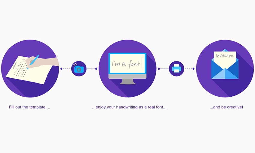
Have you ever wanted to make your own font? Maybe you need an extra personal touch for a design project, or perhaps you want to sell fonts commercially. Either way, there are solutions out there that can help you get started. All you need is an idea, good handwriting, and some font creation software!
Designing the Font
Firstly, if you would rather generate or build a font than create your own from scratch, try out an app like Prototypo or Fontstruct.
To begin creating a font, you have a few decisions to make. The first should be easy: Serif, sans serif, script (calligraphy), decorative or symbol type? There’s all sorts of sub-types, but this is a good beginning.
Start studying fonts you like. What makes them look so good? Why do you like them? You don’t want to copy, but you may want to start putting together references and sketching out early drafts.
What is this font for? A public or personal project? If it’s for yourself, you may only need to design the basic alphabet and some symbols. But if you’re releasing this font commercially, you’ll want to include many symbols and characters.
You might also want to consider including other typeface families like bold, italic, thin, light, condensed and so on. But if this is your first font, don’t worry about that and start simple.
Once you have an idea, start practicing by hand! Draw the letters over and over until you’re happy with the design.
What you do next depends on your preferences. You can scan your handwritten work and trace it in a program like Illustrator or Photoshop, or you can skip right to font creation software. Either way, you will need a program to help you compile the font. Here are a handful of the best.
Calligraphr
If you want a quick, easy and free solution to creating fonts, Calligraphr might be what you need. Just fill out the template and you’ll have a font that looks like your handwriting! There’s even a quick test version, no registration required, for when you need to make a font fast.
You can use what you create commercially without credit, but to access features like special characters, variants and ligatures, you’ll have to upgrade your account.
FontForge
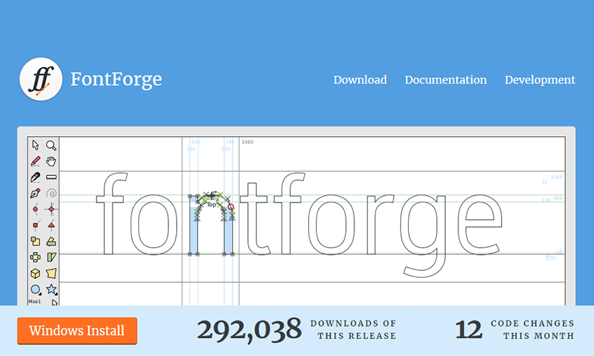
FontForge is free, open source font design software. You’ll be drawing your letters right in the program. If you’ve used vector graphics programs before, you’ll get the hang of it quickly. And since it’s open source, you can download or create scripts and utilities!
Fontself
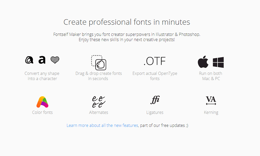
Fontself is the easy and cheap font maker. Available with a one-time payment as an addon for Photoshop and Illustrator, you won’t need to be hopping between programs. Just make the font in your software of choice, optimize your letters and export! You can even use Catapult for Illustrator to host your fonts and start using them online immediately.
Glyphs
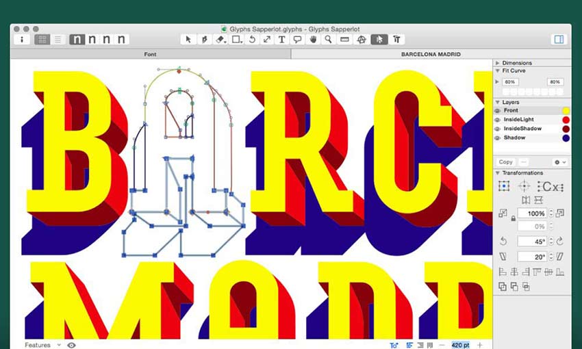
This app for MacOS has some serious power. If you’ve worked with fonts before and are ready for a solid upgrade, Glyphs is the solution. Every tool you’ll ever need, plus some super helpful tutorials and documentation so you’ll never feel lost.
If you like the look of Glyphs but need something a little less complicated, you can try Glyphs Mini instead. It’s got the same professional look and extensive functionality, but it’ll better ease you into the world of font creation.
FontLab

If you’re serious about font creation, FontLab is the way to go. It doesn’t come cheap, but you’ll never want for a more robust font tool. The revolutionary tools will turn previously impossible tasks into a breeze, even for beginners. It’s a big commitment, but one you won’t regret.
Design Beautiful Fonts
Creating a font isn’t too hard. The real difficulty comes during the design process. If you’re not sure where to begin, study your favorite fonts and ask yourself what makes them look so great. And make sure to practice a lot, both on paper and in your art program of choice, so you can nail those letters when it comes time to digitalize.
Compare The Best Ecommerce Website Builders
Our recommendation for most people is Shopify because it has everything you need to build an ecommerce website. Try Shopify free for three days, no credit card required.
Ecommerce website builders are the fastest and easiest way to start selling online. These tools support inventory, payments, shipping, and everything else you need to run an ecommerce site on a single platform.
Whether you’re starting a business from scratch or taking your established store online, this guide has a solution for you.
The Top 8 Best Ecommerce Website Builders
Best of 2023: BigCommerce, Shift4Shop, Shopify, Squarespace, Square Online, Weebly, Wix, and Hostinger.
All of my top picks are great options, but some are better than others for specific situations. While figuring out which is best for who, our researchers found four ecommerce platforms that stand out for balancing ease of use, simplicity, pricing, and features.
Our favorite ecommerce website builders for 2023 are:
- Shopify — Best all-around ecommerce website builder
- Wix — Best for launching an online store in minutes
- Hostinger — Best for simple online stores
- BigCommerce — Best site builder for multichannel selling
No matter your starting point or requirements, you’ll likely find everything you need in one of our top picks.

I’ll explain the top features, benefits, prices, and specific use cases for each platform below. I’ll point out any potential downsides or drawbacks, as well.
I’ve also included the key factors to consider when selecting the ecommerce website builder that’s best for your needs.
Shopify – Best All-Around Ecommerce Website Builder
- User-friendly interface
- Free marketing tools
- Built-in payment processor
- 24/7 customer support
Shopify is one of the most popular ecommerce platforms out there. It is a true plug-and-play option for people looking to start an online store with minimal hassle.
We like it for beginners because Shopify is the best way to start on the right foot. You can sell as many products on as many channels as you like. There are no annoying limits or tradeoffs that you typically find with solutions as easy as Shopify.

In terms of designing your online store, Shopify offers more than 100 free and paid themes to choose from. Each theme has settings that allow you to customize everything to your liking. Add features and functionality to your store by installing apps from the Shopify App Store.
I like that all payments are handled directly through the platform. With the Shopify Payments gateway built-in to your plan, you won’t need to connect to any third-party processors to accept payments. So you can start selling immediately.

Keep in mind you can always use another payment gateway by choosing from one of the over 100 payment processors that integrate with Shopify.
All plans come with web hosting, unlimited email forwarding, unlimited bandwidth, and a content delivery network for optimal performance. You’ll also benefit from marketing and SEO tools, mobile optimization, and analytics.
Shopify offers 24/7 customer support via phone, email, and live chat.
With Shopify, you have the potential to set up dropshipping, customer accounts, target abandoned carts, and manage your shipping rates.
Here’s an overview of Shopify’s plans and prices:

Basic Shopify – This plan costs $39 per month and has everything you need to set up an online business from scratch. You get critical features, including an online store, unlimited products, a sales channel, and abandoned cart recovery.
Shopify – This plan costs $105 per month and is ideal for expanding an existing store. You get three extra staff accounts and additional functionality like ecommerce automation and cheaper credit card and debit card rates. You also save more on third-party transaction fees if you choose a different payment processor.
Advanced – This plan costs $399 and provides all the enterprise features you need to scale your business. You get up to 15 staff accounts, up to eight inventory locations, and advanced reports. You also save more on credit and debit card fees and third-party payment processing fees.
For more information on Shopify’s plans, pricing, and features, check out our full Shopify review.
Consult with a Shopify sales expert if you’re building a high-volume ecommerce shop and need an enterprise-level solution. You can try Shopify free for three days.
Wix – Best for Launching an Online Store in Minutes
- Starts at $23/month
- Over 50 payment methods
- Build a site in mere minutes
- $300 in ad vouchers included
Wix is one of the most popular website builders out there. The company has made the process of creating a site as easy and enjoyable as possible.
So it’s no surprise that their web store solution, Wix eCommerce, makes it every bit as easy to start selling online in no time.
Wix has grown in recent years by adding serious muscle to the ecommerce capabilities they offer users. Wix eCommerce is not just a store add-on to their regular site builder; it’s a complete integrated online business solution packing a full suite of impressive tools and features.

It’s very intuitive. Use one of the hundreds of templates available to quickly whip up your storefront. Just tweak the colors and add your logo to match your branding, and then add your products.
Or, lean on the artificial intelligence of Wix’s ADI builder, which will create it all for you (in mere minutes) after you answer a few questions.
As long as you have an image in your mind of what you want, Wix gets you there.
Wix is the shortest distance between having no store and launching a professional ecommerce site.
If you’re creating a new ecommerce site for the first time, the simplicity of Wix will make your life much easier. Its incredibly versatile platform is practically tailor-made for someone with no web development experience.
But just because Wix eCommerce is easy to use, that doesn’t mean it skimps on important features.
Every plan offers unlimited bandwidth for your web store, plus a free domain for one year and unlimited products.
You also get a generous $300 in digital ad vouchers so you can drum up awareness of your new online store. That’s $100 each for Google Ads, Bing Ads, and local listings.
It’s also worth noting that all online payments from your Wix store are 100% commission free. This is a huge benefit, as a lot of other ecommerce platforms take a cut from your revenue.

Wix eCommerce is jam-packed with features to help grow and nurture your web store.
You can track and manage orders, payments, inventory, conversion rates, and revenue with ease from the Wix dashboard. You’ll get the hang of it really quick.
And every ecommerce package allows you to sell subscriptions and implement pricing plans in addition to selling your products. You can even save the payment methods and delivery addresses of loyal customers to give them an easier checkout experience.
And speaking of customer checkout, Wix is serious about payment protection. Every Wix eCommerce site is compliant by default with the Payment Card Industry Data Security Standards (PCI DSS). The checkout process is secure for both merchants and buyers, and merchants can choose from 50+ secure payment providers.
Wix is also super reliable, with an uptime rate of 99.98 percent. That means no matter when your customers want to shop, your site will be up and open for business. And your site data is secure, too. Wix saves your site backup data across 20 data centers and backup servers in diverse locations.
We’re really just scratching the surface here. Wix eCommerce plans also include:
- Abandoned cart recovery
- Mobile optimization
- Wix chat
- 50+ payment methods
- Global shipping
- Coupons and discounts
- Restaurant features (online orders, reservations, menu)
- Tickets and event management
- Online appointment booking
- 24/7 site security monitoring and optimization
Wix’s SEO tools are another big standout. With Wix, you can build a robust SEO infrastructure that automatically optimizes things like product page data and customizable URLs. You can also seamlessly manage SEO efforts with personalized checklists and easy-to-modify settings.

Wix also helps you optimize your website for mobile by creating an automatic mobile-friendly version of your website as you customize it. They also get your site listed on Google within 60 seconds.
Wix’s AppMarket provides more than 250 excellent apps from services like MailChimp, Quickbooks, and HubSpot to seamlessly integrate into your website. That way, you can take advantage of their offerings to grow your business.
Wix eCommerce pricing comes in three plans:
- Business Basic — $27/month
- Business Unlimited — $32/month
- Business VIP — $59 per month
Each tier adds more useful features to your web store’s arsenal, including support for multiple currencies, dropshipping tools, custom reporting, loyalty programs, and more. Our complete Wix review covers these plans in greater detail.
There’s also an all-encompassing, fully custom Wix Enterprise plan that starts at $500 per month.
Wix does have cheaper plans, but they’re for personal or portfolio sites. If you want to accept online payments, the Business Basic plan is the lowest plan available that’ll work for your needs.
To save some money, you could always sign up for a free Wix plan without the ability to accept online payments, build a personal website with Wix for no cost at all, then upgrade to a Wix eCommerce plan once you’re ready to start selling.
If you’re not happy with Wix, you can always cancel within 14 days to get a full refund. Try Wix eCommerce free for 14 days.
Hostinger – Best for Simple Online Stores
- Just $2.99 per month
- Drag-and-drop site builder
- AI tools to simplify web design
- Lock in price for up to 48 months
Hostinger offers a straightforward way to get your new online store up and running fast. It gives you an all-in-one solution that pairs website building with website hosting at a super affordable monthly cost. For anyone looking for a simple approach to building an ecommerce store, Hostinger can’t be beat.
You don’t need any coding skills to make it happen, either. A clean and minimalist interface with drag-and-drop functionality takes the guesswork out of creating and editing your site.

There’s also a gallery of designer-made templates to choose from to streamline the process even more. And Hostinger’s library of royalty-free images means you won’t waste time searching for the perfect pictures to complement your ecommerce shop.

There are also robust built-in SEO tools that will help you optimize your site to improve your site ranking in Google search results. A variety of marketing integrations for tools like Hotjar and Google Analytics give you the real-time data you need to optimize shop performance.
One of the really cool features that Hostinger offers is their integrated suite of AI functions. This really takes the guesswork out of creating key elements of a great website.
- AI logo maker: create a unique logo in just a few minutes
- AI writer tool: write compelling website copy that converts
- AI heatmap tool: identify where your shop visitors engage (or don’t) and tweak accordingly
Ecommerce is front-and-center of Hostinger’s website builder, too. Features include inventory and order management, the ability to sell up to 500 products, functionality for clients to book appointments, and the option to accept 20+ global payment options.
Security is critically important to anyone running an ecommerce shop, and Hostinger has you covered there, too. The web builder package includes free unlimited SSL security certificates, Cloudflare-protected nameservers, automatic file backups, and a 99.9% uptime guarantee.
Hostinger lets you get started with its website builder for just $2.99 per month and you also get two months free. This price includes:
- Free domain
- Up to 100 free email domain addresses
- Ecommerce features
- Marketing integrations
- 24/7 customer support
- Up to 100 websites
- Unmetered traffic (unlimited GB)
- Unlimited free SSL certificates
- Web hosting included

You can lock in the introductory $2.99/month price for 12, 24 or 48 months. At renewal, the monthly price will go up to $6.99 per month, but this is still a pretty good deal for everything you get. To see how Hostinger stacks up to other ecommerce website builders, check out our Hostinger review.
Straightforward and easy-to-use, plus all the extras to keep your ecommerce shop secure and online—it’s what landed Hostinger on our favorites list. Get up to 75% off Hostinger Web Builder today.
BigCommerce – Best Site Builder for Multichannel Selling
- Price starts at $29/mo
- B2B selling tools
- Move your products across any channel
- Loaded with built-in features
BigCommerce is a reputable and trustworthy ecommerce site builder.
It’s also very versatile. It has B2B-specific features like bulk pricing rates, quote management, customer groups, and custom price lists.
BigCommerce specializes in multichannel selling. Every plan comes with the ability to sell on Facebook, Instagram, Pinterest, Google Shopping, eBay, Amazon, and POS.
So for those of you who want to leverage omnichannel sales, BigCommerce should be at the top of your list.
The website builder itself is very intuitive and includes a drag-and-drop tool that makes creating the website easy.

BigCommerce is packed with lots of essential features right out of the box. Compared to other platforms on this list, it’s probably the most extensive feature list you’ll find.
But there’s a catch: It’s not the most beginner-friendly website builder. That’s because the extra features tend to make things more complex.
The platform is designed to help larger ecommerce sites scale quickly. So, if you’re just starting out, you’ll most likely be paying extra for features you won’t be using.
However, if you want the ability to have tons of ecommerce and website customization features at your disposal without paying extra for apps or extensions, BigCommerce is perfect for you.
All BigCommerce stores benefit from enterprise-level security and high uptime rates. You’ll also get 24/7 customer support via phone, live chat, and email.
Here’s a look at the price points for BigCommerce:
- Standard — $39 per month or $29 per month with an annual plan
- Plus — $105 per month or $79 per month with an annual plan
- Pro — $399 per month or $299 per month with an annual plan
Save up to 25% on your subscription when you pay annually for any BigCommerce plan. If you’re torn on which plan to get, our in-depth BigCommerce review can help guide you in the right direction.
These rates are almost identical to Shopify. While Shopify is a bit easier to use, BigCommerce comes loaded with more features. So if you’re deciding between those two options, you’ll need to determine which features are the most important to you.
You can try BigCommerce for free with a 15-day trial before you select a plan.
More Great Ecommerce Website Builders
Squarespace – Best for Social
- Price starts at $14/mo
- Beautiful designs
- Push content to social media
- Sell products, subscriptions, and digital goods
Squarespace offers ecommerce functionality built directly into its plans, which is not the case for most traditional website builders. Perhaps the reason most people love them, though, is their beautiful and award-winning template designs.
And Squarespace makes it easy to connect your site to social media accounts. Push new content to Facebook, Instagram, and more in real-time.
It doesn’t matter if you’re a seasoned pro who loves to jump in and craft a website to your exact design specs or a complete beginner who just wants a fantastic looking website straight from a template.
Anyone can build a modern and visually appealing ecommerce store using Squarespace.
Every element of every page is easily customized using the intuitive and highly-responsive, drag-and-drop builder.

Squarespace has award-winning templates that are specifically designed for online stores. Whether you’re selling products, services, subscriptions, or digital goods, Squarespace has a solution.
The Squarespace mobile app allows you to manage and edit your website on the go. You can also use it as a POS solution, too.
Squarespace has built-in SEO tools, analytics, blogging tools, and everything else you need to make your online store a huge success.
There are hundreds of apps built-in to Squarespace. However, there is not an app store or marketplace for one-click installations. If you want to install a third-party app that’s not already built-in to Squarespace, you’ll need to use code to accomplish that.
Squarespace has four different plans, three of which have fully-integrated ecommerce capabilities:
- Personal — $14 per month
- Business — $23 per month
- Basic Commerce — $27 per month
- Advanced Commerce — $49 per month
Save up to 30% with an annual subscription.
Online selling starts with the Business plan, but I recommend the Basic Commerce option as the bare minimum for most people.
This option has 0% transaction fees, POS, ecommerce analytics, customer accounts, and other features you’ll want at your disposal once you start selling online. It’s well worth the extra $8 per month.
As your business scales and you want more advanced features, you can always upgrade to the Advanced Commerce plan. But you may not need that on day one if you’re starting a new store from scratch.
All plans come with 24/7 customer support. You can try Squarespace for free with a 14-day trial.
Square Online – Best for Physical Retailers

- Price starts at $0
- SEO tools
- Great integrations
- Flexible customer connections
Square is best known for their point-of-sale software (which is great, by the way).
However, they also have a great ecommerce website builder that comes packed with features for free.
It’s especially great if you already use Square for your in-store POS system. The website will be able to seamlessly integrate with Square POS. You’ll also be able to accept all major credit cards, sync with your existing Square POS, and streamline your inventory management.
This is where Square really shines. By using both Square POS and their website builder, you’ll be able to easily sync your inventory so you can see your real time stock. This helps prevent overselling—and keeps customers happy.
You’ll also be creating a centralized database for your sales. No longer will you have to manually input your sales for the day, week, or month into a separate database since it’s all one system. With their analytics and reporting tools, you’ll be able to take a deeper look at the metrics behind your sales and improve them.
Square is very flexible in how you connect with customers too, allowing you to sell through Instagram, on your website, or local pickup and delivery.
Setting up the website is a snap too. You don’t need to know a bunch of code, or even hire a developer. All you need is a computer or mobile device and you can get started.

Square also gives you SEO tools to help your website reach even more potential customers.
Prices start free with 2.9% + 30 cents per transaction. Complete pricing is as follows:
- Free: $0 / month and 2.9% + 30 cents per transaction
- Professional: $12 / month and 2.9% + 30 cents per transaction
- Performance: $26 / month and 2.9% + 30 cents per transaction
- Premium: $72 / month and 2.6% + 30 cents per transaction
Weebly – Best for Small Sellers Who Don’t Want To Grow
- Price starts at $12/mo
- Drag and drop site builder
- Add product search to your store
- Integrates with PayPal, Square, and Stripe
Weebly is a well-known website builder. It’s affordable and very straightforward to use. For people running their own business looking for something that requires minimal maintenance, this is a good option.
It’s not going to let you sell thousands of items with hundreds of variations like BigCommerce, but if you don’t need that, you’ll appreciate the sleek platform.

The drag and drop site builder allows you to launch your store with minimal effort and no coding. Building a polished website with an online store takes very little time at all.
Weebly makes it easy for entrepreneurs to establish an online presence and expand with ecommerce. You can accept payments with popular gateways like PayPal, Stripe, and Square.
Since Weebly is powered by Square, it’s very easy to integrate the Square POS with your online sales system as well. You’ll be able to manage your products and inventory all in one place.
You’ll get tools for email, SEO, site stats, shipping, inventory, and more. Help your customers find what they’re looking for by adding Weebly’s product search to your online store. Add badges to products when items go on sale or when availability becomes limited.
These are Weebly’s prices for online stores:
- Free — $0
- Personal — $6 per month
- Professional — $12 per month
- Performance — $26 per month
The Personal plan is pretty basic, but it’s affordable if you don’t need any complex ecommerce features. It’s essentially just a shopping cart with the ability to accept payments.
If you want to get the most out of Weebly, you’ll need a Professional plan at a minimum.
Try out Weebly’s free forever plan and use it as an extended free trial before you officially launch your online store.
Shift4Shop – Best Value
- Free enterprise-level online store
- 200+ built-in features
- No long-term contracts
- Powerful yet easy to use
Shift4Shop is certainly not the most popular ecommerce website builder on the market. But that doesn’t mean you should sleep on it.
Formerly 3DCart, Shift4Shop offers enterprise-grade ecommerce functionality that’s 100% free. Unlike other free services out there, Shift4Shop doesn’t skimp on the features. You still get all of the features and tools that you’d expect from an enterprise-level website builder, including SEO tools, 100+ themes, unlimited products, and more.

Here’s the catch. You have to use the Shift4 payment platform and be based in the United States to take advantage of this free ecommerce plan.
Shift4’s processing fees start at 2.9% + $0.30 per transaction. This is considered to be the industry standard with ecommerce businesses, which makes it a fantastic deal for you.
This is especially great for seasonal businesses. That way, you don’t have to be on the hook for a monthly website fee during slow months since you only have to pay the payment processing fees when you make transactions.
Shift4Shop also comes with features and benefits like:
- API access
- Unlimited products
- Mobile-ready themes
- Web hosting
- Unlimited bandwidth
- No transaction fees
- Built-in blog
The completely free ecommerce platform is tempting. But you can still use Shift4Shop if you have your own payment processor. You’ll just need to sign up for one of the traditional subscriptions:
- Startup — $19 per month
- Basic — $29 per month
- Plus — $79 per month
- Power — $129 per month
- Pro — $229 per month
Either way, you’re getting a powerful ecommerce site builder and platform. You can get started with Shift4Shop for free today.
How to Find the Best Ecommerce Website Builder For You
My team tested all of the ecommerce platforms above using rigorous criteria, allowing us to discover the strengths and weaknesses of each one. We also identified what makes each tool stand out from one another.
You can use the same methodology we used in your own decision-making process. But ultimately, the best one for you will be unique to your needs. After all, the humble online store selling homemade goods is going to have different needs than the seven-figure dropship company.
Despite these differences, the following criteria are universally important when considering a platform:
Easy to Use (Without Sacrificing Quality)
If you’re creating your first ecommerce website, you may have little to no experience building websites. And without knowledge of code or web design, creating a site from scratch can be frustrating.
That’s why you want to find a platform that makes it easy to create a beautiful yet powerful site—even if you don’t know anything about coding.
Drag-and-drop, easily customizable website builders help you launch faster, it’s true, but they also save you time and money. Like, a lot of money. Web designers can charge over $10,000 to build an ecommerce site.
Even if you have more complex needs, such as multiple digital storefronts or significant product inventories, you still want a website builder that comes with a simple learning curve.
Good website builders simplify the process. For example, Wix uses powerful AI technology to help you create a website from the ground up. If you’re looking for the most straightforward option, go with Wix.
Many of the websites on this list, such as Squarespace and Hostinger, use drag-and-drop technology so you can easily customize your website. This allows you to customize your website’s appearance without typing a single line of code.
If you have more complex needs but still want to benefit from an easy-to-understand-no-computer-degree-needed builder, try a platform like BigCommerce. It’s packed with features, such as bulk pricing rates and customer groups, to help larger ecommerce businesses grow quickly.
3DCart is another option. It offers API access to let more seasoned ecommerce store builders exert more control over their sites.
Depth of Customization
While we looked for ecommerce website builders that were easy to use, we also wanted to make sure those who wanted more robust customization for their site could do so.
The builders on this list include a lot of tools and features to help make your website more customizable. For example, Shopify has a ton of different integrations and plugins—like Google and Facebook integrations, email marketing tools, and live chatbots—to build the right site for your business.
Social media integrations can be especially helpful if you plan on having an omnichannel ecommerce business.
If that’s something you’re interested in, you’ll want to definitely take a look at platforms like Shopify and BigCommerce. Each of BigCommerce’s plans, for example, comes with the ability to sell on Facebook, Instagram, Pinterest, Google Shopping, eBay, Amazon, and other channels.
If you have a warehouse with inventory, you’ll want easy integrations with your warehouse management system and logistics/shipping systems. Once again, BigCommerce is a great option for that.
Another area where these platforms offer customization is through SEO tools. Some offerings like Wix, Shopify, and Weebly help you build Google-friendly web pages and articles with suggestions as you customize your site.
Often these tools are optional and come in the form of plugins or dashboard features. Overall, they can be incredibly helpful if you plan on using SEO marketing as part of your growth strategy.
The templates offered by these websites offer varying levels of customization, too. You’ll want to make sure they give you options you need to fit your brand.
Quality and Variety of Templates
Each of the website builders on this list comes with a variety of templates for you to easily create a great website for your ecommerce business. When reviewing the templates for each of the builders on this list, we looked at two areas:
- Quality: We wanted to ensure the templates offered were eye-catching and visually appealing. We believe it’s better to offer a dozen really beautiful templates than 100 “meh” templates.
- Variety: While the templates needed to look good, we also wanted a healthy variety to choose from. This helps ensure the ecommerce website builder can be a good fit for your unique brand and won’t make you look identical to others.
The templates offered by each platform differ—sometimes drastically.
For example, Squarespace puts a lot of emphasis on visuals—splashy and vibrant photos, beautiful art, and gorgeous design. If your ecommerce website has a lot of products that create strong images (e.g. photography and art businesses), Squarespace is a no-brainer.
If you’re looking for an ecommerce site that also relies heavily on a blog for content marketing purposes, I highly suggest something like Wix. It offers 500+ templates, with most including a blog along with an ecommerce component. Wix easily offers the most options for templates on this list, too.
It’s worth mentioning that Weebly is another incredibly versatile platform, allowing you to do a lot of different things with your site.
If you want to run just a pure ecommerce site and really hone in on that, Shopify, BigCommerce, and Square are platforms I highly recommend. Their design templates let you optimize for sales and create the best site for your specific products.
Additional Considerations (But Not Deal Breakers)
There were other elements I took into consideration as well, but they weren’t deal breakers when it came to my ultimate decision with this list. They might be important to you, and they bear mention.
Responsive customer support: You want to make sure the ecommerce website builder you choose can quickly help you out with any questions. After all, if your site crashes in the middle of a product launch you’ll want that fixed ASAP.
Any downtime can cost you money. Not only are you missing out on potential sales while the site is down, but it’s also a poor reflection of your brand if customers can’t access your site. Responsive customer support can get you back up and running quickly if something goes wrong.
Analytics and reporting. This helps you track your website’s traffic and engagement. Understanding this data can help you improve your site’s performance.
Beyond performance, these tools can help you better understand how different pages and products are performing. Then you can make the necessary adjustments to ensure your site is converting at the highest possible rate.
Email integration. If you plan on scaling your business and want to get serious with branding, you’ll want a branded email address using your ecommerce store’s domain. Some platforms like Wix allow you to create a branded email address or purchase one from their website.
It’s pretty unprofessional if you’re sending emails and managing customer support through an email domain that doesn’t match your store. In some cases, this can even impact the message’s deliverability and open rates. So don’t overlook this when you’re comparing different options.
Pricing: Don’t get me wrong, pricing is important. However, it wasn’t necessarily a deal breaker for how this list was arranged. That’s because all of the offerings on this list have pricing in line with what I consider to be the industry standard.
An ecommerce website builder like Shopify might be on the more expensive end of the spectrum, but nothing too outrageous considering their quality and strong offerings.
The price tiers for each offering on this list are roughly equivalent to one another, and they tend to offer a free version with minimal features or (at the very least) a free trial. So don’t let a few dollars keep you from getting the plan you need, as the difference will be pretty marginal in the long run.
Best Ecommerce Website Builders: Your Top Questions Answered
The Top Ecommerce Website Builders in Summary
Ecommerce website builders take the guesswork out of selling online. You can focus on sales without worrying about the backend complexities of creating and running a website.
The best solutions support omnichannel sales, offer multiple payment methods, and provide a seamless experience for your customers. Some even integrate with POS solutions for your brick-and-mortar stores. Ultimately, the best ecommerce builder for you is driven by your unique needs, budget, and goals.
#CodePenChallenge: Art Icons
Week Two of our Tributes challenge starts now!
Last week, we paid tribute to our coding heroes. Check out the Pens from week one in our Coding Heroes collection.
March Challenge Sponsor: Buddy

Buddy turns DevOps to NoOps with blazing fast performance packed in exceptional UI/UX. Create delivery pipelines in 10 minutes from over 100 pre-configured actions: builds, tests, deployments & more.
Week Two Prompt: Art Icons
This week, we turn to the art world to pay tribute. Let's celebrate our favorite visual artists and musicians!
Your Challenge
Share a tribute to your favorite artist from the world of visual arts or music. Tell us about the life and work of your favorite artist, or borrow from their work to create a fitting tribute.
How to Participate
Create a Pen and tag it codepenchallenge and the weekly tag cpc-art-hero. We'll gather those Pens into a collection and share our favorites on Twitter and Instagram (Use the #CodePenChallenge tag on Twitter and Instagram as well).
Ideas
- Borrow an image, a signature color, or a recurring theme from your favorite painter or sculptor to create something in their honor.
- Do you have a favorite musician? Tell us about their life and work, or typeset the lyrics to one of their songs with a web font that fits their vibe.
- The world of film and photography is full of iconic creators. Whose camerawork gives you the chills?
Resources
- Browse the catalog of the Metropolitan Museum of Art in NYC or the British Museum to find examples of work by your favorite artist (and maybe discover someone new).
- Do you know what inspired the lyrics to your favorite song? Check out Genius for annotated lyrics and commentary from your fellow fans.
- Paying tribute to a film maker? If they worked in the 19th or 20th century you can find deep-dive details on their work in the AFI Catalog of the first 100 years of feature film, 1893-1993.
The post #CodePenChallenge: Art Icons appeared first on CodePen Blog.
Extending Google Analytics on CSS-Tricks with Custom Dimensions

The idea for this article sparked when Chris wrote this in Thank You (2018 Edition):
I almost wish our URLs had years in them because I still don't have a way to scope analytic data to only show me data from content published this year. I can see the most popular stuff from the year, but that's regardless of when it was published, and that's dominated by the big guides we've had for years and keep updated.
I have been a long-time reader of CSS-Tricks, but have not yet had something to contribute with. Until now. Being a Google Analytics specialist by day, this was at last something I could contribute to CSS-Tricks. Let’s extend Google Analytics on CSS-Tricks!
Enter Google Analytics custom dimensions
Google Analytics gives you a lot of interesting insights about what visitors are doing on a website, just by adding the basic Google Analytics snippet to every page.
But Google Analytics is a one-size-fits-all tool.
In order to make it truly meaningful for a specific website like CSS-Tricks we can add additional meta information to our Google Analytics data.
The year an article was posted is an example of such meta data that Google Analytics does not have out of the box, but it’s something that is easily added to make the data much more useful. That’s where custom dimensions come in.
Create the custom dimension in Google Analytics
The first thing to do is create the new custom dimension. In the Google Analytics UI, click the gear icon, click Custom Definitions and then click Custom Dimensions.
This shows a list of any existing custom dimensions. Click the red button to create a new custom dimension.
Let’s give the custom dimension a descriptive name. In this case, "year" seems quite appropriate since that’s what we want to measure.
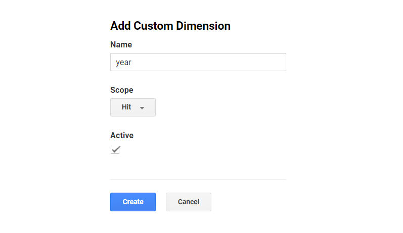
The scope is important because it defines how the meta data should be applied to the existing data. In this case, the article year is related to each article the user is viewing, so we need to set it to the "hit" scope.
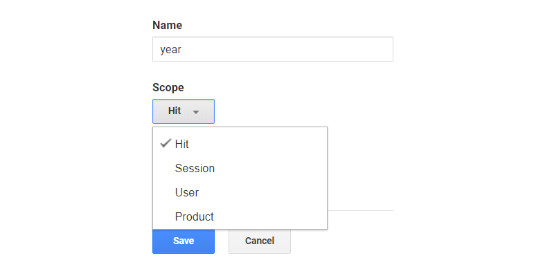
Another example would be meta data about the entire session, like if the user is logged in, that would be saved in a session-scoped custom dimension.
Alright, let’s save our dimension.
When the custom dimension is created, Google Analytics provides examples for how to implement it using JavaScript. We’re allowed up to 20 custom dimensions and each custom dimension is identified by an index. In this case, "year" is the first custom dimension, so it was created in Index 1 (see dimension1 in the JavaScript code below).
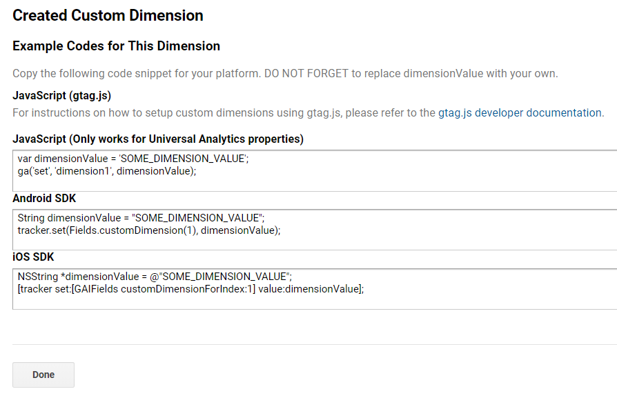
If we had other custom dimensions defined, then those would live in another index. There is no way to change the index of a custom dimension, so take note of the one being used. A list of all indices can always be found in the overview:
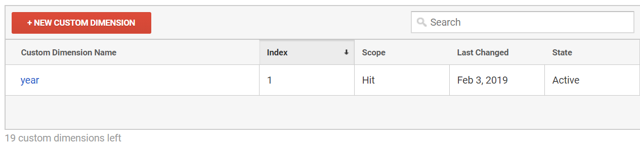
That’s it, now it’s time to code!
Now we have to extract the article year in the code and add it to the payload so that it is sent to Google Analytics with the page view hit.
This is the code we need to execute, per the snippet we were provided when creating the custom dimension:
var dimensionValue = 'SOME_DIMENSION_VALUE';
ga('set', 'dimension1', dimensionValue);
Here is the tricky part. The ga() function is created when the Google Analytics snippet is loaded. In order to minimize the performance hit, it is placed at the bottom of the page on CSS-Tricks. This is what the basic Google Analytics snippet looks like:
<script>
(function(i,s,o,g,r,a,m){i['GoogleAnalyticsObject']=r;i[r]=i[r]||function(){
(i[r].q=i[r].q||[]).push(arguments)},i[r].l=1*new Date();a=s.createElement(o),
m=s.getElementsByTagName(o)[0];a.async=1;a.src=g;m.parentNode.insertBefore(a,m)
})(window,document,'script','//www.google-analytics.com/analytics.js','ga');
ga('create', 'UA-12345-1', 'auto');
ga('send', 'pageview');
</script>
We need to set the custom dimension value after the snippet is parsed and before the page view hit is sent to Google Analytics. Hence, we need to set it here:
// ...
ga('create', 'UA-12345-1', 'auto');
ga('set', 'dimension1', dimensionValue); // Set the custom dimension value
ga('send', 'pageview');
This code is usually placed outside a WordPress Loop, but that’s where we would have access to meta information like the article year. Because of this, we need to store the article year in a JavaScript variable inside the loop, then reference that variable in the Google Analytics snippet when we get to the bottom of the page.
Save the article year within the loop
In WordPress, a standard loop starts here:
<?php if ( have_posts() ) : while ( have_posts() ) : the_post(); ?>...and ends here:
<?php endwhile; else : ?>
	<p><?php esc_html_e( 'Sorry, no posts matched your criteria.' ); ?></p>
<?php endif; ?>
Somewhere between those lines, we extract the year and save it in a JavaScript variable:
<script>
	var articleYear = "<?php the_time('Y') ?>";
</script>
Reference the article year in the Google Analytics snippet
The Google Analytics snippets is placed on all pages of the website, but the year does not make sense for all pages (e.g. the homepage). Being the good JavaScript developers that we are, we will check if the variable has been defined in order to avoid any errors.
ga('create', 'UA-68528-29', 'auto');
if (typeof articleYear !== "undefined") {
		ga('set', 'dimension1', articleYear);
}
ga('send', 'pageview');
That’s it! The Google Analytics page view hit will now include the article year for all pages where it is defined.
Custom dimensions do not apply to historical data
One thing to know about custom dimension — or any other modifications to your Google Analytics data — is that they only apply to new data being collected from the website. The custom dimensions described in this article was implemented in January 2019, and that means if we look at data from 2018 it will not have any data for the custom dimensions.
This is important to keep in mind for the rest of this article, when we begin to look into the data. The custom dimensions are added to all posts on CSS-Tricks, going all the way back to 2007, but we are only looking at page views that happened in 2019 — after the custom dimensions was implemented. For example, when we look at articles from 2011, we are not looking at page views in 2011 — we are looking at page views of posts from 2011 in 2019. This is important to keep in mind, when we start to look at posts from previous years.
All set? OK, let’s take a look at the new data!
Viewing the data in Google Analytics
The easiest way to see the new data is to go to Behavior → Site Content → All Pages, which will show the most viewed pages:
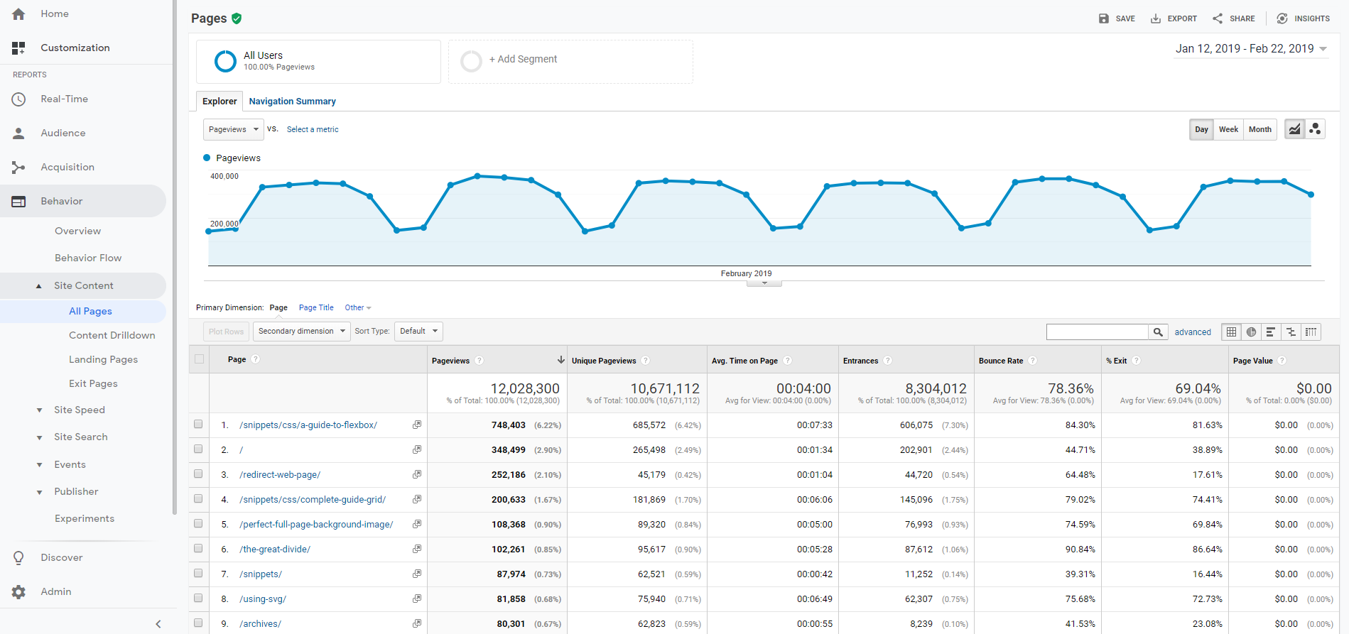
In the dropdown above the table, select "year" as a secondary dimension.
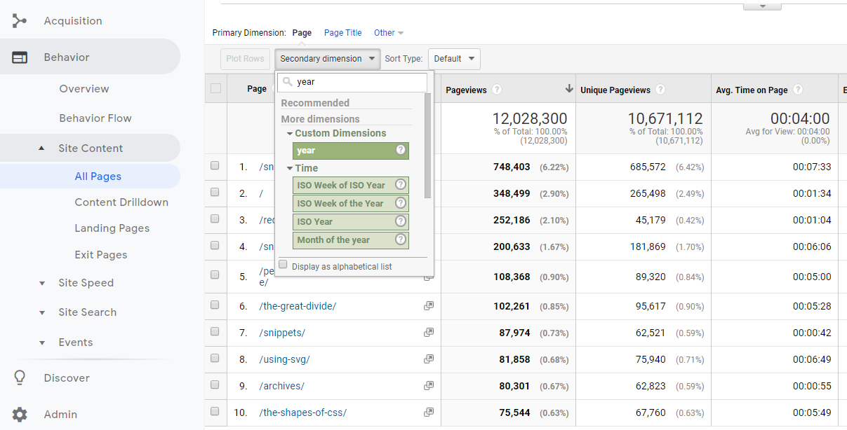
That gives us a table like the one below, showing the year for all articles. Notice how the homepage, which is the second most viewed page, is removed from the table because it does not have a year associated with it.
We start to get a better understanding of the website. The most viewed page (by far) is the complete guide to Flexbox which was published back in 2013. Talk about evergreen content!
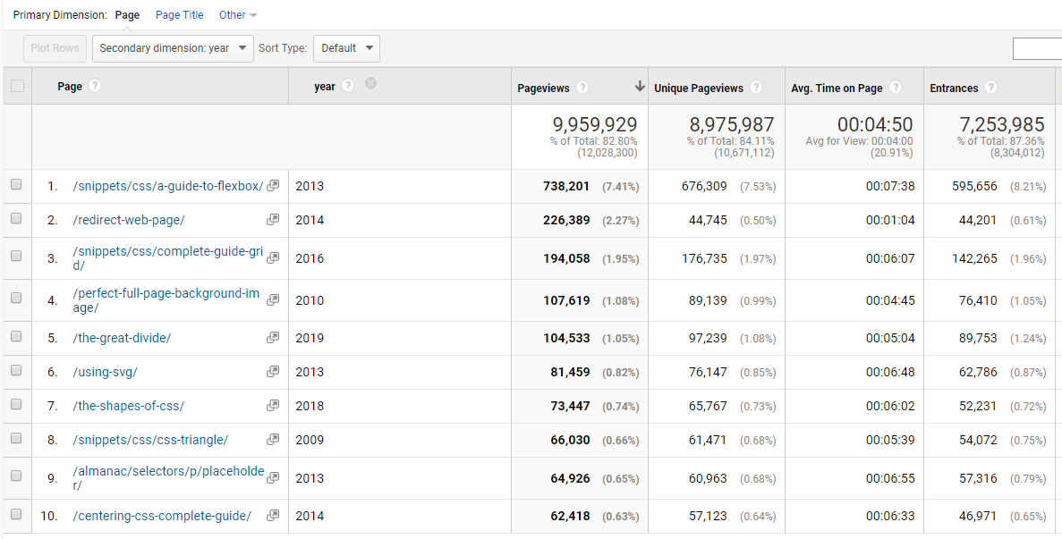
Secondary is good, primary is better
OK, so the above table adds some understanding of the most viewed pages, but let’s flip the dimensions so that year is the primary dimension. There is no standard report for viewing custom dimensions as the primary dimension, so we need to create a custom report.
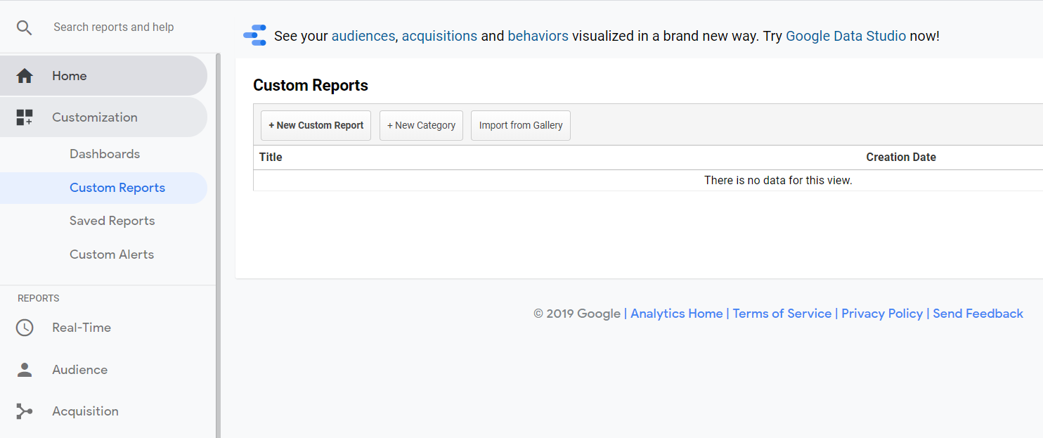
Give the Custom Report a good name. Finding the metrics (blue) and dimensions (green) is easiest by searching.
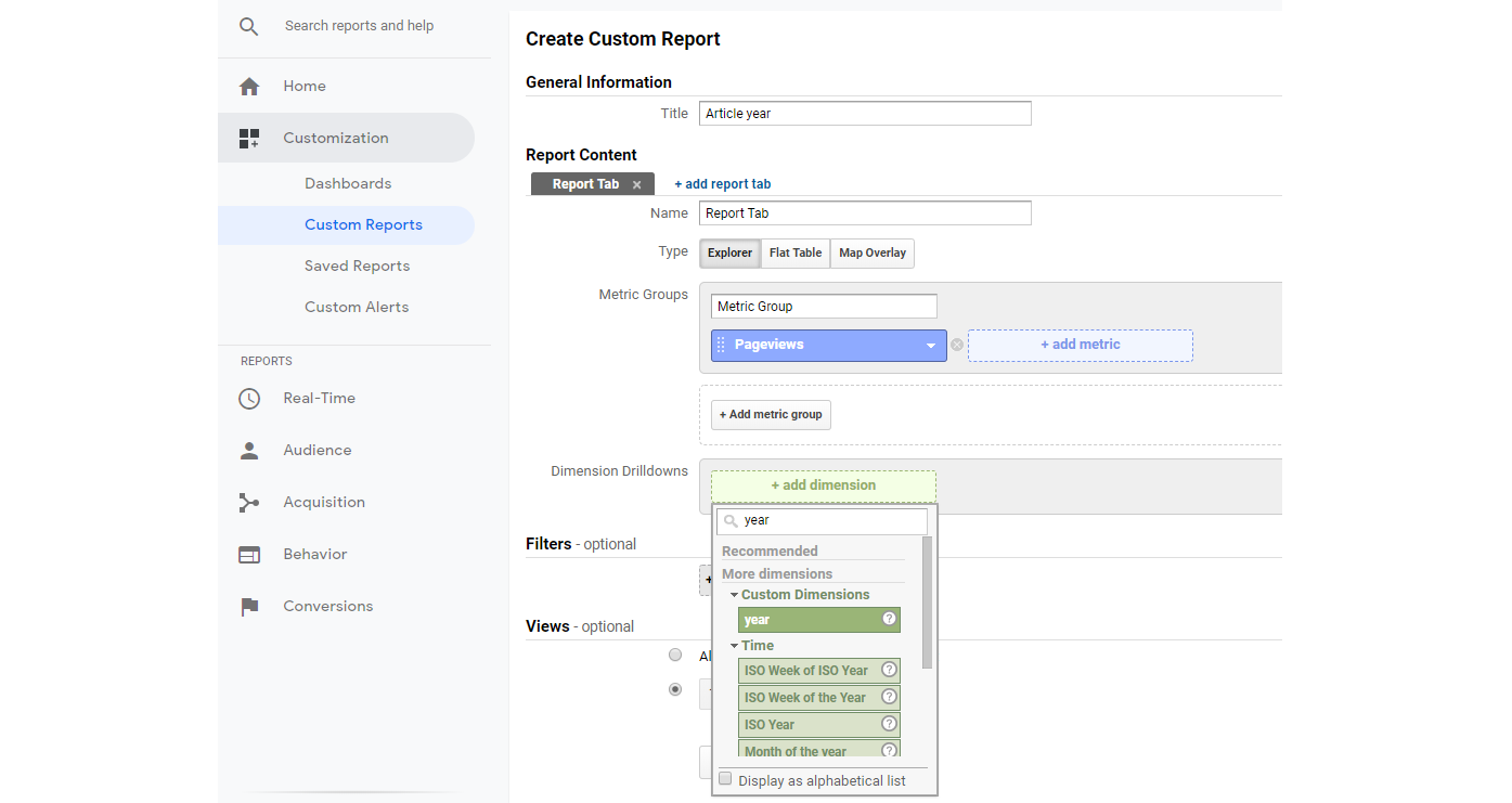
Here is what the final Custom Report should look like, with some useful metrics and dimensions. Notice how we have selected Page below Year. This will become useful in a second.
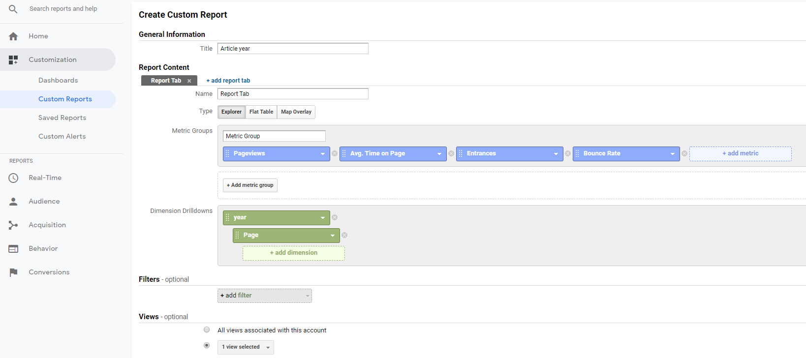
Once we hit Save, we see the aggregate numbers for all article years. 2013 is still on top, but we now see that 2011 also had some great content, which was not in the top 10 lists we previously looked at. This suggests that no single article from 2011 stood out, but in total, 2011 had some great articles that still receive a lot of views in 2019.
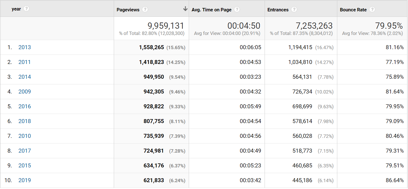
The percentage next to the number of page views is the percentage of the total page views. Notice how 2018 "only" accounts for 8.11% of all page views and 2019 accounts for 6.24%. This is not surprising, but shows that CSS-Tricks is partly a huge success because of the vast amount of strong reference material posted over the years, which users keep referring to.
Let’s look into 2011.
Remember how we set up the Custom Report with the Page below the Year in dimensions? This means we can now click 2011 and drill-down into that year.
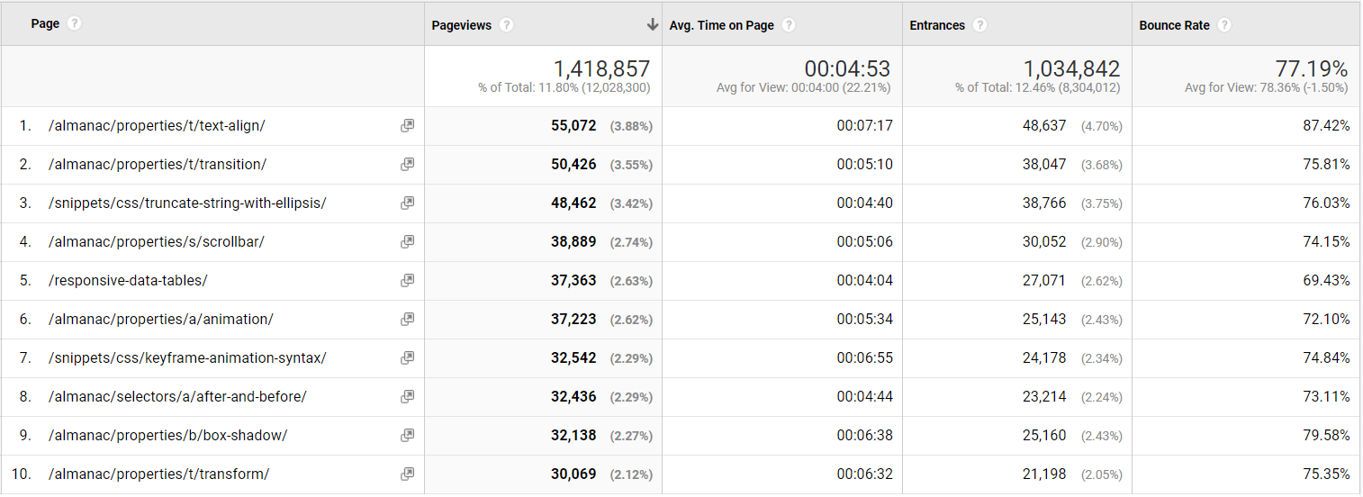
It looks like a lot of almanac pages were published in 2011, which in aggregate has a lot of page views. Notice the lower-right corner where it says "1-10 of 375." This means that 375 articles from 2011 have been viewed on the site in 2019. That is impressive!
Back to the question: Great content from 2018
Before I forget: Let's answer that initial question from Chris.
Let's scope the analytics data to content published this year (2018). Here are the top 10 posts:
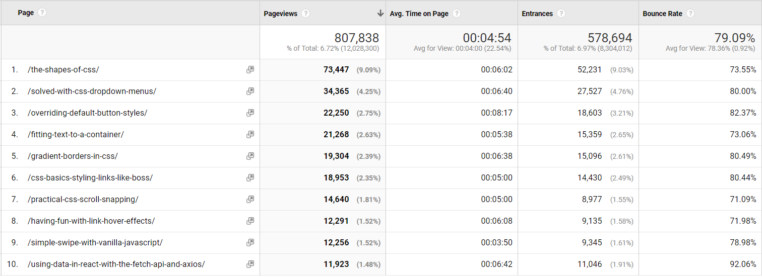
Understanding the two-headed beast
In Thank You (2018 Edition), Chris also wrote:
For the last few years, I've been trying to think of CSS-Tricks as this two-headed beast. One head is that we're trying to produce long-lasting referential content. We want to be a site that you come to or land on to find answers to front-end questions. The other head is that we want to be able to be read like a magazine. Subscribe, pop by once a week, snag the RSS feed... whatever you like, we hope CSS-Tricks is interesting to read as a hobbyist magazine or industry rag.
Let’s dig into that with another custom dimension: Post type. CSS-Tricks uses a number of custom post types like videos, almanac entries, and snippets in addition to the built-in post types, like posts or pages.
Let’s also extract that, like we did with the article year:
<script>
	var articleYear = "<?php the_time('Y') ?>";
	var articleType = "<?php get_post_type($post->ID) ?>";
</script>
We’ll save it into custom dimension Index 2, which is hit-scoped just like we did with year. Now we can build a new custom report like this:
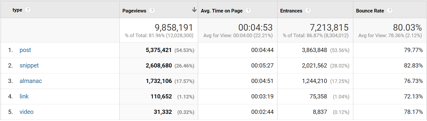
Now we know that blog posts account for 55% of page views, while snippets and almanac (the long-lasting referential content) account for 44%.
Now, blog posts can also be referential content, so it is safe to say that at least half of the traffic on CSS-Tricks is coming because of the referential content.
From a one-man band to a 333-author content team
When CSS-Tricks started in 2007 it was just Chris. At the time of writing, 333 authors have contributed.

Let’s see how those authors have contributed to the page views on CSS-Tricks using — you probably guessed it — another custom dimension!
<script>
	var articleYear = "<?php the_time('Y') ?>";
	var articleAuthor = "<?php the_author() ?>";
	var articleType = "<?php get_post_type($post->ID) ?>";
</script>
Here are the top 10 most viewed authors in 2019.
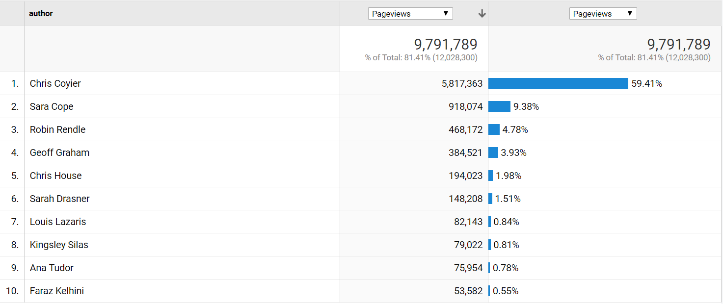
Let’s break this down even further by year with a secondary dimension and select 500 rows in the lower-right corner, so we get all 465 rows.
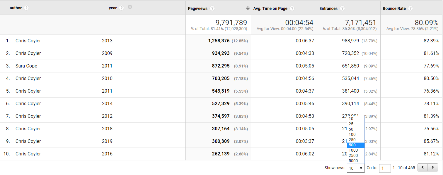
We can then export the data to Excel and make a pivot table of the data, counting authors per year.
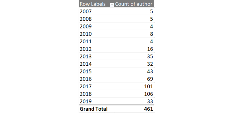
You like charts? We can make one with some beautiful v17 colors, showing the number of authors per year.
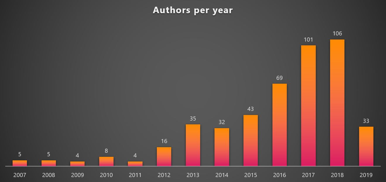
It is amazing to see the steady growth in authors contributing to CSS-Tricks per year. And given 2019 already has 33 different authors, it looks like 2019 could set a new record.
But are those new authors generating any page views?
Let’s make a new pivot chart where we compare Chris to all other authors.
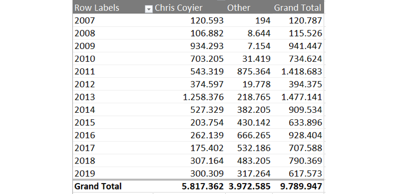
...and then chart that over time.
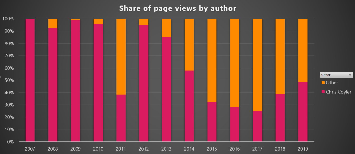
It definitely looks like CSS-Tricks is becoming a multi-author site. While Chris is still the #1 author, it is good to see that the constant flow of new high-quality content does not solely depend on him, which is a good trend for CSS-Tricks and makes it possible to cover a lot more topics going forward.
But what happened in 2011, you might ask? Let’s have a look. In a custom report, you can have five levels of dimensions. For now we will stick with four.

Now we can click on the year 2011 and get the list of authors.
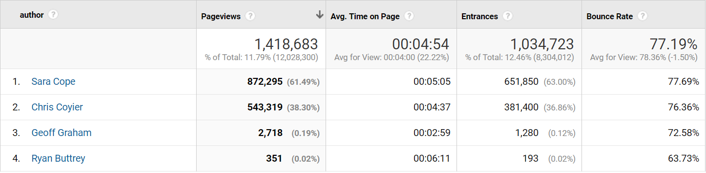
Hello Sara Cope! What awesome content did you write in 2011?
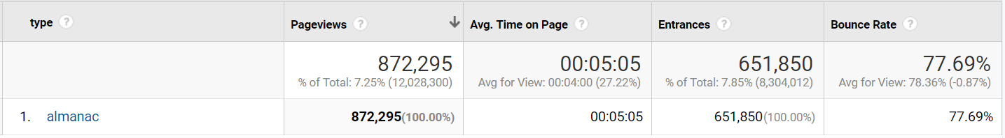
Looks like a lot of those almanac pages we saw earlier. Click that!
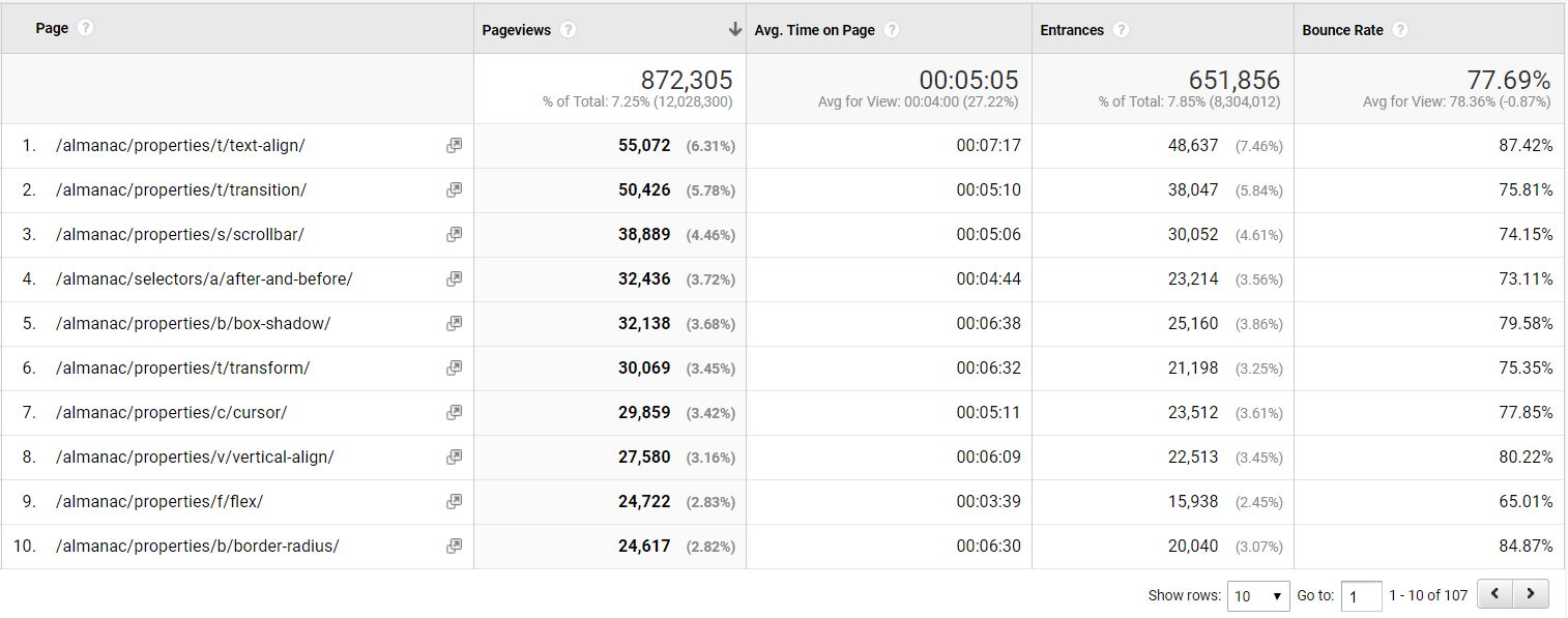
Indeed, a lot of almanac pages! 107 to be exact. A lot of great content that still receives lots of page views in 2019 to boot.
Summary
Google Analytics is a powerful tool to understand what users are doing on your website, and with a little work, meta data that is specific to your website can make it extra powerful. As seen in this article, adding a few simple meta data that's already accessible in WordPress can unlock a world of opportunities to analyze and add a whole new dimension of knowledge about the content and visitors of a site, like we did here on CSS-Tricks.
If you’re interested in another similar journey involving custom dimensions and making Google Analytics data way more useful, check out Chris Coyier and Philip Walton in Learning to Use Google Analytics More Effectively at CodePen.
The post Extending Google Analytics on CSS-Tricks with Custom Dimensions appeared first on CSS-Tricks.
Data Visualization in WordPress: How to Do It (With Examples, Plugins and Tools)
Designing An Aspect Ratio Unit For CSS
Designing An Aspect Ratio Unit For CSS
Rachel AndrewOne of the things that come up again and again in CSS is the fact that there is no way to size things based on their aspect ratio. In particular when working with responsive designs, you often want to be able to set the width to a percentage and have the height correspond to some aspect ratio. This is something that the folks who are responsible for designing CSS (i.e. the CSS Working Group) have recently been discussing and a proposed solution was agreed upon at a recent CSSWG meeting in San Francisco.
This is a new resolution, so we have no browser implementations yet, but I thought it would be worth writing up the proposal in case anyone in the wider web community could see a showstopping issue with it. It also gives something of an insight into the work of the CSSWG and how issues like this are discussed, and new features designed.
What Is The Problem We Are Trying To Solve?
The issue in in regard to non-replaced elements, which do not have an intrinsic aspect ratio. Replaced elements are things like images or a video placed with the <video> element. They are different to other boxes in CSS as they have set dimensions, and their own behavior. These replaced elements are said to have an intrinsic aspect ratio, due to them having dimensions.
A div or some other HTML element which may contain your content has no aspect ratio, you have to give it a width and a height. There is no way to say that you want to maintain a 16 / 9 aspect ratio, and that whatever the width is, the height should be worked out using the given aspect ratio.
A very common situation is when you want to embed an iframe in order to display a video from a video sharing site such as YouTube. If you use the <video> element then the video has an aspect ratio, just like an image. This isn’t the case if the video is elsewhere and you are using an embed. What you want is for your video to be responsive, yet remain at the correct aspect ratio for the video. What you get however, if you set width to 100%, is the need to then set a height. Your video ends up stretched or squished.
Let’s also look at a really simple case of creating a grid layout with square cells. If we were using fixed column track sizes, then it is easy to get our square cells as we can define rows to be the same size as the column tracks. We could also make our row tracks auto-sized, and have items and set the height on the items.
See the Pen Aspect Ratios Example 1 by Rachel Andrew.
The problem comes when we want to use auto-fill and fill a container with as many column tracks as will fit. We now can’t simply give the items a height, as we don’t know what the width is. Our items are no longer square.
See the Pen Aspect Ratios Example 2 by Rachel Andrew.
Being able to size things based on their aspect ratio would mean we could calculate the correct aspect ratio once the grid item is laid out. Thus making the grid items as tall as they are wide, so that they always maintain as a square no matter what their width.
Current Aspect Ratio Solutions
Web developers have been coping with the lack of any aspect ratio in CSS in various ways — the main one being the “padding hack”. This solution uses the fact that padding % in the block direction (so top and bottom padding in a horizontal top to bottom language) is calculated from the inline size (width).
The article “Aspect Ratio Boxes” on CSS-Tricks has a good rundown of the current methods of creating aspect ratio boxes. The padding hack works in many cases but does require a bunch of hoops to jump through in order to get it working well. It’s also not in the slightest bit intuitive — even if you know why and how it works. It’s those sort of things that we want to try and solve in the CSS Working Group. Personally, I feel that the more we get elegant solutions for layout in CSS, the more the messy hacks stand out as something we should fix.
For the video situation, you can use JavaScript. A very popular solution is to use FitVids — as also described in the CSS-Tricks article. Using JavaScript is a reasonable solution, but there’s more script to load, and also something else to remember to do. You can’t simply plonk a video into your content and it just works.
The Proposed Solution
What we are looking for is a generic solution that will work for regular block layouts (such as a video in an iframe or a div on the page). It should also work if the item is a grid or flex item. There is a different issue of wanting grid tracks to maintain an aspect ratio (having the row tracks match the columns), this solution would fix many cases, however, where you might want that (you would be working from the item out rather than the track in).
The soluion will be part of the CSS Sizing Specification, and is being written up in the CSS Sizing 4 specification. This is the first step for new features being designed by the CSS Working Group, the idea is discussed, and then written up in a specification. An initial proposal for this feature was brought to the group by Jen Simmons, and you can see her slide deck which goes through many of the use cases discussed in this article here.
The new property introduced to the Sizing specification is the aspect-ratio property. This property will accept a value which is an aspect ratio such as 16/9. For example, if you want a square box with the same width and height, you would use the following:
.box {
  width: 400px;
  height: auto;
  aspect-ratio: 1/1;
}
For a 16 / 9 box (such as for a video):
.box {
  width: 100%;
  height: auto;
  aspect-ratio: 16/9;
}
For the example with the square items in a grid layout, we leave our grid tracks auto-sized, which means they will take their size from the items; we then make our items sized with the aspect-ratio unit.
.grid {
    display: grid;
    grid-template-columns: repeat(autofill, minmax(200px, 1fr));
}

.item {
    aspect-ratio: 1/1;
}
Features often go through various iterations before browsers start to implement them. Having discussed the need for an aspect ratio unit previously, this time we were looking at one particular concern around the proposal.
What happens if you specify an aspect ratio box, but then add too much content to the box? This same issue is brought up in the CSS-Tricks article about the padding hack — with equally unintuitive solutions required to fix it.
Dealing With Overflow
What we are dealing with here is overflow, as is so often the case on the web. We want to have a nice neatly sized box: our design asks for a nice neatly sized box, our content is less well behaved and turns out to be bigger than we expected and breaks out of the box. In addition to specifying how we ask for an aspect ratio in one dimension, we also have to specify what happens if there is too much content, and how the web developer can tell the browser what to do about that overflowing content.
There is a general design principle in CSS that we use in order to avoid data loss. Data loss in a CSS context is where some of your content vanishes. That might either be because it gets poked off the side of the viewport, or is cropped when it overflows. It’s generally preferable to have a messy overflow (as you will notice it and do something about it). If we cause something to vanish, you may not even realize it, especially if it only happens at one breakpoint.
We have a similar issue in grid layout which is nicely fixed with the minmax() function for track sizes. You can define grid tracks with a fixed height using a length unit. This will give you a lovely neat grid of boxes, however, as soon as someone adds more content than you expected into one of those boxes, you will get overflow.
See the Pen Aspect Ratios Example 3 by Rachel Andrew.
The fix for this in grid layout is to use minmax() for your track size, and make the max value auto. In this case, auto can be thought of as “big enough to fit the content”. What you then get is a set of neat looking boxes that, if more content than expected gets in, grow to accept that content. (Infinitely better than a messy overflow or cropped content.)
In the example below, you can see that while the first row with the box with extra content has grown, the second row is sized at 100 pixels.
See the Pen Aspect Ratios Example 4 by Rachel Andrew.
We need something similar for our aspect ratio boxes, and the suggestion turns out to be relatively straightforward. If you do nothing about overflow, then the default behavior will be that the content is allowed to grow past the height that is inferred by the aspect ratio. This will give you the same behavior as the grid tracks size with minmax(). In the case of height, it will be at least the height defined by the aspect ratio, i.e. if the content is taller, the height can grow to fit it.
If you don’t want that, then you can change the value of overflow as you would normally do. For example hiding the overflow, or allowing it to scroll.
Commenting On Proposals In Progress
I think that this proposal covers the use cases detailed in the CSS-Tricks article and the common things that web developers want to do. It gives you a way to create aspect ratio-sized boxes in various layout contexts, and is robust. It will cope with the real situation of content on the web, where we don’t always know how much content we have or how big it is.
If you spot some real problem with this, or have some other use case that you think can’t be solved, you can directly comment on the proposal by raising an issue in the CSSWG GitHub repo. If you don’t want to do that, you can always comment here, or post to your own blog and link to it here so I can see it. I’d be very happy to share your thoughts with the working group as this feature is discussed.
Just help me with this one
Create a c++ program that accepts 5 integers in ascending order without using array or looping. Pure else and if statements.
How to Grow an Idea into a Fruitful Product or Service

Let’s take it back … Way back … Before the internet was a part of creating your business. What steps...
The post How to Grow an Idea into a Fruitful Product or Service appeared first on Copyblogger.
How to Create Conversational Forms in WordPress (Typeform Alternative)
Do you want to make your forms feel more human? Many of our readers have asked us to write a tutorial on how to create a Typeform-like form in WordPress.
Unlike a traditional contact form or survey form that lists all question at once, conversational forms take a one question at a time approach similar to a face-to-face conversation.
This makes conversational forms less overwhelming for users and result in higher form completion rate. In this article, we will show you how to create a conversational form in WordPress.

Conversational Form Plugin for WordPress (Typeform Alternative)
Previously it was hard to create conversational forms in WordPress because there wasn’t a good WordPress-focused solution.
Several SaaS applications offered this feature with Typeform being the most popular one, but it had several downsides:
- Typeform is a SAAS (software as a service) tool which stores your forms data on their servers. This means you’re trusting someone else for your data security.
- Typeform is expensive if you’re a small business. The premium plans start from $30 / user / month, and if you want more features, then it costs $59 / user / month.
While Typeform offered a free plan, it was too limited which made it less attractive for WordPress users.
This is why we asked our team at WPForms to create a Typeform alternative for WordPress.
Conversational Forms by WPForms lets you create interactive WordPress forms without the high costs of Typeform.

See the Conversational Form Demo
WPForms is the most user-friendly WordPress form plugin that’s used by over 1 million websites.
This new addon helps you transform any form into a conversational form in less than 90 seconds.
Unlike Typeform, WPForms is an open-source WordPress plugin which means all your form data is stored on your website, not some third-party app.
WPForms is more cost-effective than Typeform. You can buy the yearly plan for $199 which gives you unlimited forms, surveys, and tons of other powerful features including Conversational Forms.
Let’s take a look at how to easily create a conversational form on your WordPress website.
Disclosure: WPForms is created by the same team behind WPBeginner. It is one of our premium WordPress plugins.
Creating Conversational Forms in WordPress
First thing you need to do is install and activate the WPForms plugin. For detailed instructions, please see our step by step guide on how to install a WordPress plugin.
You will need at least the ‘Pro’ plan to access the ‘Conversational Forms Addon’. WPBeginner users can get 50% OFF on all WPForms licenses using our WPForms coupon.
Once the plugin is activated, you need to visit the WPForms » Settings page to verify your license key. You can find this information in your account area on WPForms website.

Next, you need to go to WPForms » Addons page and find the Conversational Forms addon.

Simply click the install button, and the plugin will install and activate the Conversational Form addon within a few seconds.
When you see the addon status as ‘Active’, it means that you can start using it.

You can enable conversational forms for any new or existing forms created with WPForms.
Conversational forms are useful in reducing form abandonment. The interactivity and face-to-face conversation approach leads to a higher form completion rate.
This is highly effective on the following types of forms:
These forms are typically longer and include more fields. If you display all those questions at once, then users feel overwhelmed and abandon the form.
Conversational forms fix this by asking users to answer one question at a time. Instead of a tedious long form, it feels more interactive and keeps users engaged.
In this example, we will show you how to create a conversational survey form.
First, you need to create a regular survey form. You can do this by clicking on WPForms » Add New in your WordPress admin area. For more details, see our step by step guide on how to create a survey in WordPress.
Creating a form with WPForms is easy using its simple drag and drop interface. You can drag form fields on the left to the form editor on the right side.
For instance, here’s how a sample WPForms survey form editor looks like:

Once you have added your survey questions, go to Settings » Conversational Forms tab on the left panel. You need to check the ‘Enable Conversational Form Mode’ box.

After that, you will see the conversational form settings and customization options. These options allow you to design an attractive conversational form landing page with your logo, color scheme, and message.

You can preview your form anytime by clicking on the ‘Preview Conversational Form’ button on the top right corner under Conversational Form settings.

At first, you will see the Conversational Form Title field. You can enter a short descriptive title for your form there. For example: Please, Take Our Survey!

Next, there is a Message field where you can add a short message to encourage your users to complete the form.

As you scroll down, you will see the Permalink option.
The permalink is a unique URL for your conversational form landing page. The plugin automatically creates it for each conversational form by using your form’s title. You can change that if needed.

While setting up a permalink, make sure that it is short and simple because you may want to use this URL in your email campaigns or social media posts.
Next thing you can do to customize your conversational form page is to add a header logo. Click on the ‘Upload Image’ button, then choose an image to upload.

Below that, you’ll see a checkbox option to hide WPForms branding. Check the box next to ‘Hide WPForms Branding’ if you don’t want to display ‘powered by WPForms’ message on your form landing page.
You can preview how the branding appears by clicking the Preview Conversational Form button on the top right corner.

After that, there is a Color Scheme option to customize your form Submit button and page background. You can use one of the pre-set colors or choose a new color by using the color picker.

Lastly, there is the Progress Bar option. You can choose one from the 2 styles: Percentage and Proportion.

If you want to see how each progress bar style looks, you can select the styles one by one and preview the form. Or you can see our screenshot:

Once you have configured all your conversational form settings, you can preview it to see how it looks on a live site. Next, click on the ‘Save’ button on the top to store your settings.

That’s it!
Now you can open your conversational form link in your browser to see it in action. Here’s how our conversational survey form page looked:

You can check the official WForms Conversational Forms demo to see how the interactive form elements works.
Now that your conversational form landing page is ready, you can add the link to your WordPress Navigation menu, use it in your email campaigns, social media updates, or blog posts.
We hope this article helped you learn how to easily create conversational forms in WordPress. You may also want to check out our guide on how to track user engagement on your site.
If you liked this article, then please subscribe to our YouTube Channel for WordPress video tutorials. You can also find us on Twitter and Facebook.
The post How to Create Conversational Forms in WordPress (Typeform Alternative) appeared first on WPBeginner.