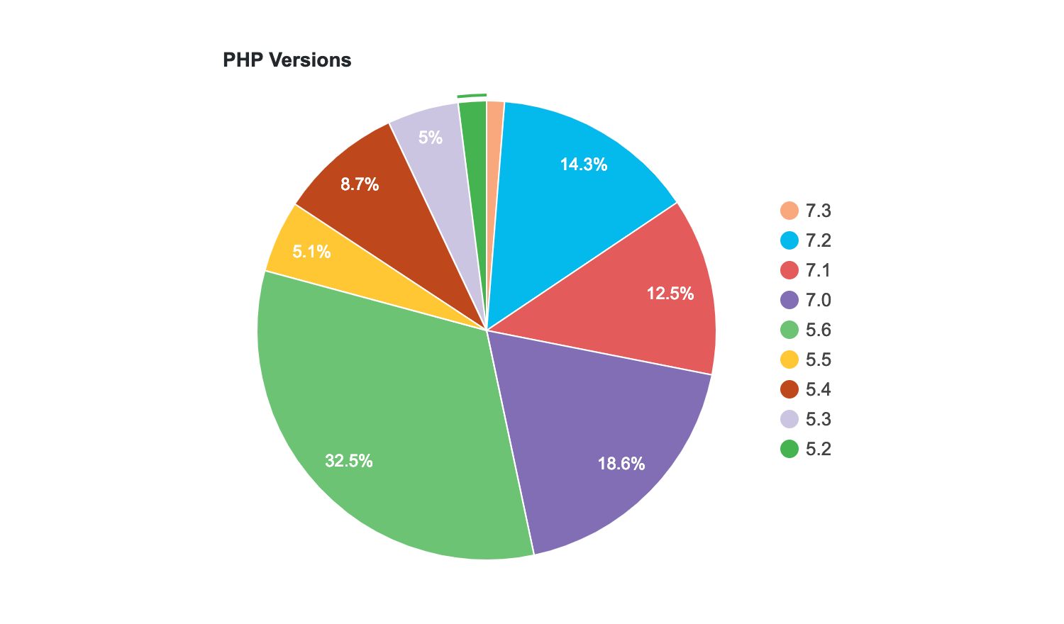
WordPress has officially ended support for PHP 5.2 – 5.5 and bumped its minimum required PHP version to 5.6. The plan announced last December was to bump the minimum required version in early 2019 and, depending on the results, bump it again to PHP 7 in December 2019. Sites on PHP 5.5 or earlier can still get security updates but will not be able to upgrade to the latest major WordPress version.
One might wonder why WordPress’ approach isn’t to just bump it all the way up to PHP 7. With its influence and dominant market share, this requirement would inevitably force users to get on board. However, WordPress contributors believe in supporting users who, for whatever reason, need more help upgrading PHP. Steamrolling this requirement has not been the WordPress way, despite years of immense pressure from the developer community.
“Leaving users behind for technical reasons creates a two-folded web with only few being able to leverage its power,” WordPress Core Committer Felix Arntz said. “Collaborating with and supporting these users gives that power to everyone in the long run.”
Gary Pendergast shared a few stats about how effective WordPress 5.1’s PHP update notice has been in prodding site owners to get on newer versions of PHP:
For WordPress 5.0, sites updated their PHP version from PHP <= 5.6 to PHP 7+ at the rate of 1 basis point per day. That is, the percentage of WordPress 5.0 sites using PHP <= 5.6 dropped by 0.01 every day, prior to the release of WordPress 5.1.
For WordPress 5.1 (after adding the update notice), that has increased to a steady 5 basis points per day. Doesn’t sounds like much? Every day, that’s hundreds of extra site owners choosing to go through the (frankly, terrifying) process of updating their PHP version. All they needed was a little extra nudge, and a little bit of information.
Scary EOL notices and attitudes of “well, we’re just bumping our supported PHP version, too bad if you don’t know what to do next” don’t help. Giving people the information they need to help themselves works.
WordPress folks are doing our part to help clean up the ancient PHP installs that are still running a large percentage of the internet, and we’re find that this isn’t an insurmountable problem. It just requires a bit of patience and empathy to solve.
WordPress developers around the web sent out celebration tweets after the news was announced. Although PHP 5.6 is the new minimum required version for running WordPress, the project’s technical requirements page recommends users ask their hosts for PHP version 7.3 or greater. PHP 7+ offers massive performance gains for users and developers will be able to update their plugins to use more modern syntax.
This is big news!!
WPGraphQL has a minimum requirement of PHP 5.6, so it couldn’t even be considered for core until now.
Still a ways to go before we’re ready for serious consideration, but pretty big news. https://t.co/gCbJM9VcRc
WordPress first came to prominence as the blogger’s platform. Anyone, no matter their circumstances or level of experience, could start sharing their ideas, thoughts and opinions with the world. And though it has since become...
Last year ProgrammableWeb reported that Twitter was working to protect their platform from spam and abuse by imposing additional restrictions on new developers hoping to gain access to the platform.
If you work in an open office (like me), you probably have your earbuds in constantly – because of course you do; open offices are the worst. But if those earbuds happen to be wireless, you may want to reconsider.
As this piece in Quartz explains, there was a bit of an uproar last week when reports began circulating the web that more than 200 scientists from around the globe were warning of serious health risks tied to this technology.
Material Design is a visual language developed by Google. It focuses on the look and feel of the User Interface. Google made it popular by using it on the Android versions of most of their products, including Gmail, YouTube, Google Maps, and Google+. In the last few years, most web designers and developers have joined […]
Gutenberg 5.3 was released today with basic block management, a feature that will be included in WordPress 5.2. It is a new modal that can be launched from the vertical ellipses menu, inspired by Rich Tabor’s CoBlocks implementation. Users can turn individual blocks on/off or even entire sections, such as Common Blocks, Formatting, and Embeds. Block management should help users avoid the bloat that happens when installing block collections with more blocks than they need.
This version’s updates to the Cover Block make it possible to nest other blocks inside of it. Users can now add buttons, paragraphs, and headers to easily create a call to action. It’s not immediately evident that nesting blocks is possible, despite the floating inserter. It takes a little bit of time to discover that it is available. There are still some quirks with this feature, but overall it makes the Cover Block much more useful than previous versions.
A few contributors commenting on the Cover Block’s nesting PR said that it seems like the work on this iteration is essentially a light version of a section block. They questioned if it might be better to finish the work on the Section block (#4900) and build from there. Many developers and designers are eagerly awaiting the addition of a Section block to core, which will provide a standard for the plugin and theme industries to build on.
“I think the cover block has very specific functionality that the section may not have like the focal point selector,” Automattic JavaScript engineer Jorge Costa said. “It is also important to note that the adjustments we make here to the way nesting works will also benefit a future section. This also allows us to test nesting a little bit more, before going to the section block. I expect the section block to be widely used in the community and will probably serve as a basis for many things being built in the future so it is important that we get it right. Exploring in cover will contribute to that.”
Gutenberg 5.3 adds an experimental Legacy Widget Block that allows existing WordPress widgets to be added as Gutenberg blocks. It offers a dropdown of available widgets. After selecting one, the block populates that area with the widget’s settings.
This version also improves block outlines for the hover and selected states for a more accessible UI with less distraction. Performance benchmarks show a slight decrease in performance with Gutenberg 5.3. Check out the release post for a full list of enhancements and bug fixes. This is the last plugin release that will be rolled into the upcoming WordPress 5.2 release.
Artificial technology may not actually be turning us into superheroes, at least not in the timeframe posited by this piece in VentureBeat, but it is giving us some pretty sweet new abilities.
“Wouldn’t it be great if everyone could be an artist?” asks NVIDIA’s VP of Applied Deep Learning Research, Dr. Bryan Catanzaro. His excitement is palpable as he reveals one of NVIDIA’s newest AI projects in the above video, a generative adversarial network known as GauGAN that gives everyone the power to create lifelike works of art in minutes.
We just did a whole bunch of work to our JavaScript processing stuff here on CodePen. Part of that work included updating the Babel preprocessor to version 7.
Here's what that means in the CodePen editor.
No need for a client-side polyfill
In the past, if you wanted to flip on Babel, but also use things like async and await, you would get an error that regeneratorRuntime was needed. You could make that work by linking up the Babel Polyfill script as an external resource, but clearly, that was a bit janky. Especially as async and await work without running through Babel in most browsers these days.
Now async and await work with Babel, or without Babel in browsers that support it.
That was off for a little while there while we were working on this. Sorry about that. It's back now and it's all the less likely you'll accidentally freeze your browser without us catching and stopping it.
Under the Hood
We run the Babel processing in a web worker (literally in your browser) if we can. Largely for speed reasons, as no network request for this is then needed. We'd love to do more of this, so we can get even faster and baby step toward editor features that work offline.
Navel-gazing
Like so many features, this release has many faces:
User-facing features like we've focused on in this post
Improvements to our own code base
Path-making for future releases
There are probably more implications for our own code base here. There is loads of testing we never had before. We've upgraded ourselves to Babel 7 and Webpack 4. We've upgraded versions of tons of software. And we've cleaned house on tons of aspects of our code base that haven't seen that love in a while. Feels great!
Just as importantly, this is a foundational step in another big feature that is just around the corner, and that is proper support of using resources from npm. Stay tuned!
Whitepages Pro has introduced its Transaction Risk API. The API helps users fight payment fraud and conduct more efficient authorizations. It uses predictive identity data that leverage models and internal company data for an additional security layer. The offering is a natural complement to the company's digital identity verification product portfolio.
Say we want to target an element and just visually blur the border of it. There is no simple, single built-in web platform feature we can reach for. But we can get it done with a little CSS trickery.
Here's what we're after:
The desired result.
Let's see how we can code this effect, how we can enhance it with rounded corners, extend support so it works cross-browser, what the future will bring in this department and what other interesting results we can get starting from the same idea!
Coding the basic blurred border
We start with an element on which we set some dummy dimensions, a partially transparent (just slightly visible) border and a background whose size is relative to the border-box, but whose visibility we restrict to the padding-box:
The box specified by background-origin is the box whose top left corner is the 0 0 point for background-position and also the box that background-size (set to cover in our case) is relative to. The box specified by background-clip is the box within whose limits the background is visible.
The initial values are padding-box for background-origin and border-box for background-clip, so we need to specify them both in this case.
If you need a more in-depth refresher on background-origin and background-clip, you can check out this detailed article on the topic.
Next, we add an absolutely positioned pseudo-element that covers its entire parent's border-box and is positioned behind (z-index: -1). We also make this pseudo-element inherit its parent's border and background, then we change the border-color to transparent and the background-clip to border-box:
$b: 1.5em; // border-width

div {
  position: relative;
  /* same styles as before */

  &:before {
    position: absolute;
    z-index: -1;
    /* go outside padding-box by
     * a border-width ($b) in every direction */
    top: -$b; right: -$b; bottom: -$b; left: -$b;
    border: inherit;
    border-color: transparent;
    background: inherit;
    background-clip: border-box;
    content: ''
  }
}
Now we can also see the background behind the barely visible border:
Alright, you may be seeing already where this is going! The next step is to blur() the pseudo-element. Since this pseudo-element is only visible only underneath the partially transparent border (the rest is covered by its parent's padding-box-restricted background), it results the border area is the only area of the image we see blurred.
We've also brought the alpha of the element's border-color down to .03 because we want the blurriness to be doing most of the job of highlighting where the border is.
This may look done, but there's something I still don't like: the edges of the pseudo-element are now blurred as well. So let's fix that!
One convenient thing when it comes to the order browsers apply properties in is that filters are applied before clipping. While this is not what we want and makes us resort to inconvenient workarounds in a lot of other cases... right here, it proves to be really useful!
It means that, after blurring the pseudo-element, we can clip it to its border-box!
My preferred way of doing this is by setting clip-path to inset(0) because... it's the simplest way of doing it, really! polygon(0 0, 100% 0, 100% 100%, 0 100%) would be overkill.
In case you're wondering why not set the clip-path on the actual element instead of setting it on the :before pseudo-element, this is because setting clip-path on the element would make it a stacking context. This would force all its child elements (and consequently, its blurred :before pseudo-element as well) to be contained within it and, therefore, in front of its background. And then no nuclear z-index or !important could change that.
We can prettify this by adding some text with a nicer font, a box-shadow and some layout properties.
What if we have rounded corners?
The best thing about using inset() instead of polygon() for the clip-path is that inset() can also accommodate for any border-radius we may want!
And when I say anyborder-radius, I mean it! Check this out!
div {
  --r: 15% 75px 35vh 13vw/ 3em 5rem 29vmin 12.5vmax;
  border-radius: var(--r);
  /* same styles as before */

  &:before {
    /* same styles as before */
    border-radius: inherit;
    clip-path: inset(0 round var(--r));
  }
}
Some mobile browsers still need the -webkit- prefix for both filter and clip-path, so be sure to include those versions too. Note that they are included in the CodePen demos embeded here, even though I chose to skip them in the code presented in the body of this article.
Alright, but what if we need to support Edge? clip-path doesn't work in Edge, but filter does, which means we do get the blurred border, but no sharp cut limits.
Well, if we don't need corner rounding, we can use the deprecated clip property as a fallback. This means adding the following line right before the clip-path ones:
clip: rect(0 100% 100% 0)
And our demo now works in Edge... sort of! The right, bottom and left edges are cut sharply, but the top one still remains blurred (only in the Debug mode of the Pen, all seems fine for the iframe in the Editor View). And opening DevTools or right clicking in the Edge window or clicking anywhere outside this window makes the effect of this property vanish. Bug of the month right there!
Alright, since this is so unreliable and it doesn't even help us if we want rounded corners, let's try another approach!
This is a bit like scratching behind the left ear with the right foot (or the other way around, depending on which side is your more flexible one), but it's the only way I can think of to make it work in Edge.
Some of you may have already been screaming at the screen something like "but Ana... overflow: hidden!" and yes, that's what we're going for now. I've avoided it initially because of the way it works: it cuts out all descendant content outside the padding-box. Not outside the border-box, as we've done by clipping!
This means we need to ditch the real border and emulate it with padding, which I'm not exactly delighted about because it can lead to more complications, but let's take it one step at a time!
As far as code changes are concerned, the first thing we do is remove all border-related properties and set the border-width value as the padding. We then set overflow: hidden and restrict the background of the actual element to the content-box. Finally, we reset the pseudo-element's background-clip to the padding-box value and zero its offsets.
$fake-b: 1.5em; // fake border-width

div {
  /* same styles as before */
  overflow: hidden;
  padding: $fake-b;
  background: url(oranges.jpg) 50%/ cover
                padding-box /* background-origin */
                content-box /* background-clip */;

  &:before {
    /* same styles as before */
    top: 0; right: 0; bottom: 0; left: 0;
    background: inherit;
    background-clip: padding-box;
  }
}
So why didn't we do this from the very beginning?!
Remember when I said a bit earlier that not using an actual border can complicate things later on?
Well, let's say we want to have some text. With the first method, using an actual border and clip-path, all it takes to prevent the text content from touching the blurred border is adding a padding (of let's say 1em) on our element.
But with the overflow: hidden method, we've already used the padding property to create the blurred "border". Increasing its value doesn't help because it only increases the fake border's width.
We could add the text into a child element. Or we could also use the :after pseudo-element!
The way this works is pretty similar to the first method, with the :after replacing the actual element. The difference is we clip the blurred edges with overflow: hidden instead of clip-path: inset(0) and the padding on the actual element is the pseudos' border-width ($b) plus whatever padding value we want:
What about having both text and some pretty extreme rounded corners? Well, that's something we'll discuss in another article - stay tuned!
What about backdrop-filter?
Some of you may be wondering (as I was when I started toying with various ideas in order to try to achieve this effect) whether backdrop-filter isn't an option.
Well, yes and no!
Technically, it is possible to get the same effect, but since Firefox doesn't yet implement it, we're cutting out Firefox support if we choose to take this route. Not to mention this approach also forces us to use both pseudo-elements if we want the best support possible for the case when our element has some text content (which means we need the pseudos and their padding-box area background to show underneath this text).
Update: due to a regression, the backdrop-filter technique doesn't work in Chrome anymore, so support is now limited to Safari and Edge at best.
For those who don't yet know what backdrop-filter does: it filters out what can be seen through the (partially) transparent parts of the element we apply it on.
The way we need to go about this is the following: both pseudo-elements have a transparent border and a background positioned and sized relative to the padding-box. We restrict the background of pseudo-element on top (the :after) to the padding-box.
Now the :after doesn't have a background in the border area anymore and we can see through to the :before pseudo-element behind it there. We set a backdrop-filter on the :after and maybe even change that border-color from transparent to slightly visible. The bottom (:before) pseudo-element's background that's still visible through the (partially) transparent, barely distinguishable border of the :after above gets blurred as a result of applying the backdrop-filter.
Remember that the live demo for this doesn't currently work in Firefox and needs the Experimental Web Platform features flag enabled in chrome://flags in order to work in Chrome.
Eliminating one pseudo-element
This is something I wouldn't recommend doing in the wild because it cuts out Edge support as well, but we do have a way of achieving the result we want with just one pseudo-element.
We start by setting the image background on the element (we don't really need to explicitly set a border as long as we include its width in the padding) and then a partially transparent, barely visible background on the absolutely positioned pseudo-element that's covering its entire parent. We also set the backdrop-filter on this pseudo-element.
Alright, but this blurs out the entire element behind the almost transparent pseudo-element, including its text. And it's no bug, this is what backdrop-filter is supposed to do.
The problem at hand.
In order to fix this, we need to get rid of (not make transparent, that's completely useless in this case) the inner rectangle (whose edges are a distance $b away from the border-box edges) of the pseudo-element.
$b: 1.5em; // border-width
$o: calc(100% - #{$b});

div {
  /* same styles as before */

  &:before {
    /* same styles as before */

    /* doesn't work in Edge */
    clip-path: polygon(0 0, 100% 0, 100% 100%, 0 100%,
                       0 0,
                       #{$b $b}, #{$b $o}, #{$o $o}, #{$o $b},
                       #{$b $b});
  }
}
The second way (live demo) is with two composited mask layers (note that, in this case, we need to explicitly set a border on our pseudo):
$b: 1.5em; // border-width

div {
  /* same styles as before */

  &:before {
    /* same styles as before */

    border: solid $b transparent;

    /* doesn't work in Edge */
    --fill: linear-gradient(red, red);
    -webkit-mask: var(--fill) padding-box,
                  var(--fill);
    -webkit-mask-composite: xor;
            mask: var(--fill) padding-box exclude,
                  var(--fill);
  }
}
Since neither of these two properties works in Edge, this means support is now limited to WebKit browsers (and we still need to enable the Experimental Web Platform features flag for backdrop-filter to work in Chrome).
Future (and better!) solution
The filter() function allows us to apply filters on individual background layers. This eliminates the need for a pseudo-element and reduces the code needed to achieve this effect to two CSS declarations!
As you may have guessed, the issue here is support. Safari is the only browser to implement it at this point, but if you think the filter() is something that could help you, you can add your use cases and track implementation progress for both Chrome and Firefox.
More border filter options
I've only talked about blurring the border up to now, but this technique works for pretty much any CSS filter (save for drop-shadow() which wouldn't make much sense in this context). You can play with switching between them and tweaking values in the interactive demo below:
And all we've done so far has used just one filter function, but we can also chain them and then the possibilities are endless - what cool effects can you come up with this way?
Instead of writing about what exactly ELK is, let me state the need and use cases for it.
Log Aggregation and Efficient Searching
In a very naive scenario, you have one server and lots of log messages generated by your application and system which are crucial to look at once something goes wrong. Now there are basically two problems with it:
Many sites send notifications to their users through the browser for various events occurring within the web app. We can easily do this using Cloud Messaging, which allows us to send messages to any device using HTTP requests with Firebase.
Here are the basic steps required for pushing the notifications to a web app using Firebase.
Creating a website is overwhelming. Don’t worry, that’s completely natural when building your first website.
When we built our first sites, it was so complicated. And so many articles and YouTube videos on how to create a website made it seem a lot easier than it ended up being.
We’ve outlined all the specific steps below on how to create your own website. We included everything that we learned over the years from building hundreds of sites.
We’re here to help.
This page is a collection of 70+ guides.You won’t need to read them all in order to build your website. Browse through and read what’s relevant to your situation. This will save you countless hours of frustration.
Our General Take on Building A Website
Don’t get confused by all of the different options for creating a website.
WordPress is King
In most cases, we highly recommend to build your website with WordPress. It’s an open source platform that allows you to run your website with very little technical expertise.
For Ecommerce, we like Shopify — which is an Ecommerce website builder that allows you to get an online store up and running quickly.
The reality is that creating and running an online store can be a huge pain. Shopify takes that pain away. That’s probably why they are growing so quickly, and so many great online stores are popping up on the platform.
If you’re reading this right now, then you most definitely fall into the category of someone that should be using WordPress or Shopify.
In rare cases, it might make sense to create a website using Wix or a similar website builder.
In other (very) rare cases, it might make sense to have a custom built website.
How to Create a Website
Start with our guide on how to create a website in 120 minutes. Along with that, there are a number of useful guides to consider as you start working on your website.
You need a web hosting provider in order to have a website.
We recommend SiteGround for most people. For advanced WordPress users, with high traffic websites, it could make sense to move to WP Engine at some point.
An analytics tool is important if you want to know what’s happening on your website. It tells you how much traffic you’re getting, where it’s coming from, and what people do on your site. Google Analytics is the standard. That’s what we use for Quick Sprout.
A WordPress website is basically made from what’s called a WordPress Theme and WordPress Plugins. All of the features of your website will come either from the theme or the plugins you install.
When you really break it down — most websites are blogs, and blogs are websites. They have become one and the same. The most popular blogging platform is WordPress, and that is also the same platform we use for any other website, blog or otherwise.
If you’re thinking about starting a blog specifically, and that is why you’re trying to figure out how to create a website…we have over 40 guides on blogging.
Here are the blogging guides specific to getting started, and building your blog:
Creating your website might seem overwhelming at first. It really comes down to starting with these simple steps:
Is your primary purpose to sell things on your website? If yes, then focus on Shopify, if no, then focus on WordPress.
Use the guides on Quick Sprout to help you through the process. It’s a learning curve for sure. Taking the time to set up everything correctly will help you grow your business and your traffic much faster later on.
Don’t hesitate to reach out to us directly via email with questions. We’ll help however we can.
Earlier this month Eric Bailey wrote about the current state of accessibility on the web and why it felt like fighting an uphill battle:
As someone with a good deal of interest in the digital accessibility space, I follow WebAIM’s work closely. Their survey results are priceless insights into how disabled people actually use the web, so when the organization speaks with authority on a subject, I listen.
WebAIM’s accessibility analysis of the top 1,000,000 homepages was released to the public on February 27, 2019. I’ve had a few days to process it, and frankly, it’s left me feeling pretty depressed. In a sea of already demoralizing findings, probably the most notable one is that pages containing ARIA—a specialized language intended to aid accessibility—are actually more likely to have accessibility issues.
Following up from that post, Ethan Marcotte jotted down his thoughts on the matter and about who has the responsibility to fix these issues in the long run:
Organizations like WebAIM have, alongside countless other non-profits and accessibility advocates, been showing us how we could make the web live up to its promise as a truly universal medium, one that could be accessed by anyone, anywhere, regardless of ability or need. And we failed.
I say we quite deliberately. This is on us: on you, and on me. And, look, I realize it may sting to read that. Hell, my work is constantly done under deadline, the way I work seems to change every year month, and it can feel hard to find the time to learn more about accessibility. And maybe you feel the same way. But the fact remains that we’ve created a web that’s actively excluding people, and at a vast, terrible scale. We need to meditate on that.
I suppose the lesson I’m taking from this is, well, we need to much, much more than meditating. I agree with Marcy Sutton: accessibility is a civil right, full stop. Improving the state of accessibility on the web is work we have to support. The alternative isn’t an option. Leaving the web in its current state isn’t fair. It isn’t just.
I entirely agree with Ethan here – we all have a responsibility to make the web a better place for everyone and especially when it comes to accessibility where the bar is so very low for us now. This isn’t to say that I know best, because there’s been plenty of times when I’ve dropped the ball when I’m designing something for the web.
What can we do to tackle the widespread issue surrounding web accessibility?
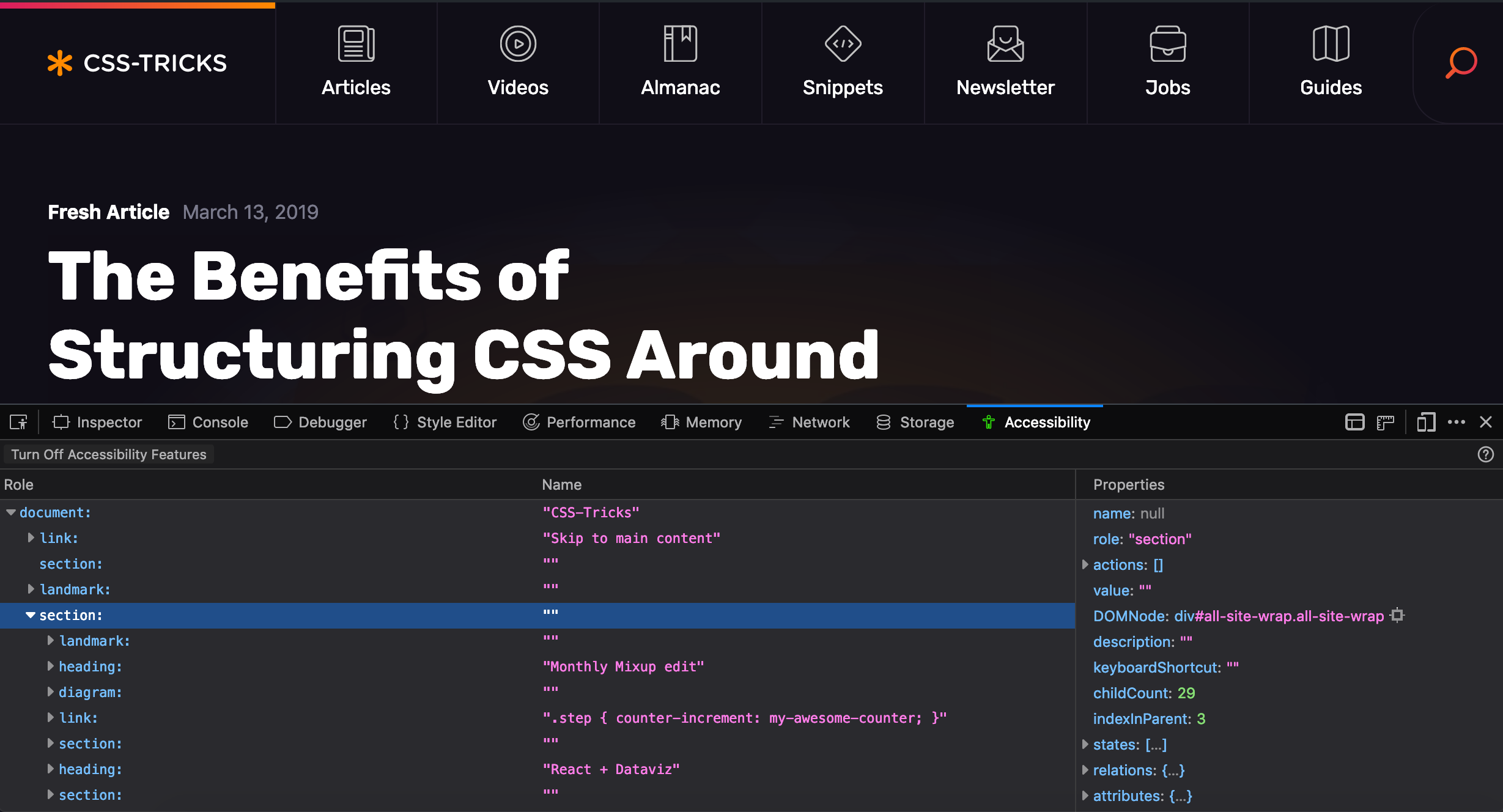
Well, as Eric mentions in his post, it’s first and foremost a problem of education and he points to Firefox and their great accessibility inspector as a tool to help us see and understand accessibility principles in action:
This inspector is not meant as an evaluation tool. It is an inspection tool. So it will not give you hints about low contrast ratios, or other things that would tell you whether your site is WCAG compliant. It helps you inspect your code, helps you understand how your web site is translated into objects for assistive technologies.
Chris also wrote up some of his thoughts a short while ago, including other accessibility testing tools and checklists that can help us get started making more accessible experiences. The important thing to note here is that these tools need to be embedded within our process for web design if they’re going to solve these issues.
We can’t simply blame our tools.
I know the current state of web accessbility is pretty bad and that there’s an enormous amount of work to do for us all, but to be honest, I can’t help but feel a little optimistic. For the first time in my career, I’ve had designers and engineers alike approach me excitedly about accessibility. Each year, there are tons of workshops, articles, meetups, and talks (and I particularly like this talk by Laura Carvajal) on the matter meaning there's a growing source of referential content that can teach us to be better.
And I can’t help but think that all of these conversations are a good sign – but now it’s up to us to do the work.
"My advice would always be to ignore the perceived wisdom and look for the most reliable evidence on the ground" - D.T. Puttnam
Hearing a senior executive announce, "We're committed to becoming Agile!" is not the bombshell moment it used to be. It no longer indicates a personal revelation or boardroom epiphany. In fact, if you were to read some of the interviews with managers in business magazines, or the guest articles and puff-pieces on agility in their companies, you'd think that their hearts and minds had been won decades ago. You'd have no reason to doubt that executives were anything other than firmly on-side with Scrum Masters, coaches, and change agents. Agile transformation, you would surmise, is a done deal with the higher-ups.
Redis can be widely used in microservices architecture. It is probably one of the few popular software solutions that may be leveraged by your application in so many different ways. Depending on the requirements, it can act as a primary database, cache, or message broker. While it is also a key/value store we can use it as a configuration server or discovery server in your microservices architecture. Although it is usually defined as an in-memory data structure, we can also run it in persistent mode.
Today, I'm going to show you some examples of using Redis with microservices built on top of Spring Boot and Spring Cloud frameworks. These applications will communicate between each other asynchronously using Redis Pub/Sub, using Redis as a cache or primary database, and finally using Redis as a configuration server. Here's the picture that illustrates the described architecture.


 Material Design is a visual language developed by Google. It focuses on the look and feel of the User Interface. Google made it popular by using it on the Android versions of most of their products, including Gmail, YouTube, Google Maps, and Google+. In the last few years, most web designers and developers have joined […]