GitLab has released version 11.9 of its popular devops platform. A noteworthy new feature of 11.9 is what GitLab calls secret detection. Secret detection is a new check that scans repository contents for API keys and other secret information. If the scan shows a leak of such content, the user will be warned.
Google hopes several fresh feature additions to Android App Bundles -- including a new API -- will convince more developers to adopt the modular platform. The goal behind Android App Bundles is to reduce app size and simplify the process of developing, testing, and releasing apps.
During the 2018 State of the Word address, Matt Mullenweg announced that Phase 4 of the Gutenberg project would be aimed at developing an official way for WordPress to support multilingual sites. There are no technical details available yet for what approach core will take, because it’s still in the experimental stage. The site building objectives in Phase 2 are currently the primary focus of the Gutenberg team.
Although Phase 4 is still a long way off (targeted for 2020 and beyond), WordPress multilingual product owners are starting to speculate about the impact of core offering its own standardized solution for multilingual sites. At WordCamp Nordic I had a quick chat with Robert Windisch, CIO of Inpsyde, a large WordPress agency in Germany and the creators of the MultilingualPress plugin.
Windisch predicts a culling of the multilingual solutions for WordPress after Phase 4, in the same way that Gutenberg has challenged page builders. Maintaining a plugin with thousands of users takes a toll on a company, because users require support and product owners need to have a way to continue offering something that isn’t already available by default in core.
“It’s the same with Gutenberg and all the page builders,” Windisch said. “You need to adapt. If core tackles 80-90% of the features the plugin does, then I’m sure some will decide to pursue other roads or extend core features with a new plugin.”
Windisch doesn’t see any issues for his company’s multilingual solution because of how it is architected to closely align with WordPress core in its use of multisite. The MultilingualPress website advertises the product as having “future-proof, WordPress core-based architecture.” Windisch said that big agencies and companies with local sites tend to opt for MultilingualPress’ solution because of the separation of access that multisite provides.
After some consideration, he said he found that Mullenweg’s timeline for getting multilingual support in core made sense, because existing solutions mean there is no pressing need to provide this functionality.
“Currently nobody waits for the multilingual in core, because there are already solutions out there,” Windisch said. “There’s not really the pressure to have it right now.”
Check out the quick interview below to hear more thoughts on how Gutenberg Phase 4 may impact other multilingual solutions:
I made sorting arrows for a table in illustrator and exported it out as an svg. I want to place them in a table head, and use css to style it. I will be using javascript (vannila) to swap classes to change the state of my icon.
What is the best tag to use for svg in my case?
below is sample of what I have now
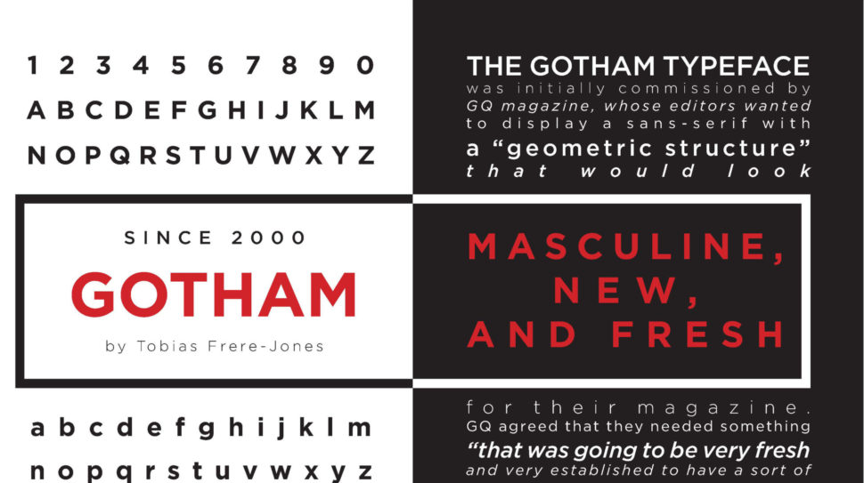
Gotham has become one of the most ubiquitous typographies of the 21st century. Its versatility and, undoubtedly, its good design makes it useable in many spaces. Even more, since it became the official typography of the campaign that led Obama to become president. However, in the typographic universe, there are hundreds and hundreds of typefaces to choose from. Since we live in a world that loves variety, here are 10 alternative typefaces to the Gotham.
1. Proxima Nova
Designed by Mark Simonson, Proxima Nova is perhaps one of the fonts that best presents itself as an alternative to the Gotham family. According to the author, this source “closes the gap between fonts such as Futura and Akzidenz Grotesk.” The result is a hybrid that combines modern proportions with a geometric appearance. It is a balanced and versatile source – the complete family includes 48 sources, eight pesos in three widths with their italics – the result of extensive work dating back to 1994. In recent years, Proxima Nova has become of the most popular web sources.
2. Montserrat
Montserrat was created by the designer Julieta Ulanovsky. He took inspiration from the architecture, the old posters, the luminous signs and the canopies of the neighborhood named after him in Buenos Aires. Ulanovsky’s intention was to rescue the beauty of urban typography from the first half of the 20th century. This inspiration taken from the local signs and architectural ques bring it closer to Gotham. Even so, the Montserrat forms are a little broader, giving a less solemn and more relaxed feeling that Gotham doesn’t provide. Montserrat was chosen to be among the 10 best fonts of Google Fonts in 2017.
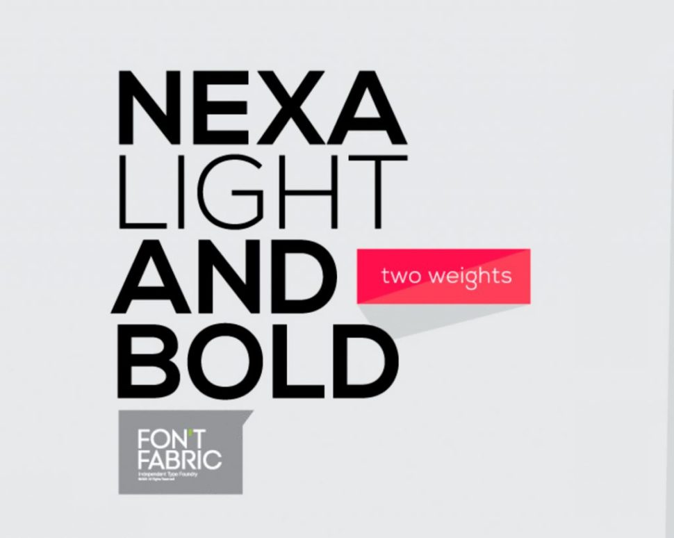
3. Nexa
Directly from FontFabric comes Nexa, a sans serif font available in Light & Bold. This alternative to Gotham is possibly more expressive typography than some of the fonts that appear in this list. For example, the lowercase letter ‘g’ and the capital letters ‘J’ and ‘Q’ are far more expressive. In terms of its uses and applications, Nexa is perfect for branding and packaging projects. Nexa Light & Bold is freely available for download.
4. Sans Museo
Sans Museo coems directly from Exljbris foundry. This type of sans serif is robust, geometric, low contrast and highly readable; very suitable for use on any screen or for any text. This family of OpenType fonts is in all the languages of the European Union and even in Esperanto. The Sans Museo package contains 10 fonts, 5 pesos, and their respective italics.
5. Pier Sans
According to Mathieu Desjardins, the designer of Pier Sans, it is a modern and geometric typeface, specially designed to be able to adapt to any size of text without losing legibility. This font, besides being a good alternative to Gotham typography, is quite useful for projects of all kinds, since it is able to cover the needs of any text.
6. Vision
Vision is a complete typographic package. It is elegant and offers very good readability, both on screen and in the text. It consists of 12 free sources available for commercial and non-commercial work. As an alternative to Gotham, it presents a more humanistic invoice, especially in its lowercase. It was born to be versatile, a clear and modern font with great readability in large and short texts. In addition, it has ligatures, alternative glyphs and OpenType features that provide flexibility and uniqueness wherever they are placed.
7. Avenir
Designed by Adrian Frutiger in 1988 and published by Linotype, Avenir is one of the best-known sans serif typefaces from the Swiss typographer. The word ‘Avenir’ comes from the French and means ‘future’. Frutiger wanted Avenir to convey a more organic interpretation of the geometric style. He wanted it to be more uniform for extensive texts, with details reminiscent of more traditional typefaces, such as ‘a’ and ‘t’ – two letters with a curl at the bottom, and letters like the ‘o’ that are not exact or perfect circles, but with optical correction. Avenir is not purely geometric. The vertical strokes are thicker than their horizontal ones, the ascending ones are shortened and the ‘o’ is not perfectly round, adjustments that help readability and give the typeface a more harmonious appearance.
8. Lato
Lato is the most popular font from Łukasz Dziedzic, a designer based in Warsaw. Designed in 2010, this free font contains more than 3,000 glyphs in 18 styles. It offers solutions to virtually everything a designer may need. Lato, which means ‘summer’ in Polish, is a semi-rounded sans serif that, like Gotham, achieves a convincing balance between what can be a serious and friendly conversation.
9. Foundry Sterling
Foundry Sterling is a functional and eloquent typographic family. It was born from the desire to create a modern sans serif with an essentially English flavor. It has been designed by paying special attention to the classical proportion and the purity of the forms, which has resulted in the creation of functional, beautiful and elegant typography. Like Gotham, Foundry Sterling has a wide range of weights that make it very versatile in its applications, whether for identity, editorial, signage or other uses.
10. Gothvetica
Its name says it all. Gothvetica is a hybrid between Gotham and Helvetica. This MarkStudio typographic exercise began as a question: How similar are Gotham and Helvetica? What would happen if they both merged? The result is this typographic mix, a kind of Frankenstein font, and we must admit that it works as alternative typography to Gotham and can give a solution to certain projects. Oh! and, by the way, it’s free.
Conclusion
Although Gotham is one of the most popular fonts on the market today, it doesn’t mean we all have to follow its trends. There are plenty of alternatives out there, and we shouldn’t limit ourselves. Try out one or all of the fonts above and let your creative spirit fly.
Over a year ago Google announced that page speed has become a ranking factor for mobile sites. Therefore, when ordering web development services, always make sure that you mention speed as a key factor to your project.
And if you are a developer yourself, read on to discover handy tips on how to create a fast website, or enhance the loading speed of an existing page.
Test with the right tools
In order to enhance your website speed, the first thing you need is a tool that will let you know how fast your website is and what you should do to make it even faster.
Many tools are available. Amongst them, here are the ones I work with:
Google PageSpeed Insights: Brought to you by Google, this tool is very handy and allows you to make your website run according to Google’s standards, which is very important in terms of SEO.
Pingdom: A very popular speed testing tool, Pingdom offers a free tool as well as paid options.
GT Metrix: This tool combines results from various sources, allowing you to check your site speed in depth.
Think mobile first
Nowadays, most website visits are made from smartphones and other handheld devices. Therefore, it is now wise to think mobile first.
For some more insights about mobile-first web design, check this interesting guide.
Optimize your images
Images often represent 75% of the total size of a webpage. Therefore, in order to have a fast loading website, it’s essential that your images are properly optimized.
Optimizing images isn’t complicated. If you’re using Adobe Photoshop, make sure that you use the Save for Web function and choose the appropriate file format for your images.
.jpg should be used for pictures and illustration images. Use .gif if you need to display an animation or an image with few different colors, such as a logo. If you need transparency, .png is the file format you should use.
For more info and tips about image optimization, feel free to refer to this article.
Handle assets properly
After images, assets (.js and .css files, PDFs, etc.) are a big part of the total size of a website. Therefore, it’s vital to handle them properly.
The first thing to do is to minimize HTTP requests. Do not split your CSS and JavaScript into multiple files – on the contrary, try to use a single .js and a single .css file.
Your loading speed can also be enhanced by deferring the loading of some of your assets. JavaScript, for example, is considered a “parser blocking resource”. This means that the parsing of the HTML document itself is blocked by JavaScript. When the parser reaches a <script> tag, whether that be internal or external, it stops to fetch (if it is external) and run it.
In order to specify that the script should be executed when the page has finished parsing, use the defer attribute, as shown below:
<script src="scripts.js" defer></script>
And finally, make sure to minify your .js and .css files. In case you didn’t know, minification is the process of removing extra spaces and comments from assets files, in order to reduce their size. You can use Minify to do so.
Make sure your site is running on a quality host
There’s no quality website without a quality server. If you want your website to be fast and available 24/7, you have to consider using the services of a quality hosting provider. Below is the list of my three personal favorites:
Tsohost: This company has been hosting CatsWhoCode since 2012. The speed and availability are amazing and the support service always responds fast, even on Sundays or in the middle of the night. The only down point is the somewhat expensive price, but just like cheap hosting isn’t good, good hosting isn’t cheap. Good news: By using the coupon CATSWHOCODE when checking out, you’ll get 10% off any hosting plan.
InMotion Hosting: I haven’t worked with them directly yet, but I’ve been fixing quite a lot of websites hosted on their servers and everything has been smooth. Definitely worth checking!
Dreamhost: A good quality hosting offering competitive prices and great support.
Use caching techniques to display your images faster
Although this isn’t really an image optimization technique itself, caching your images is, overall, good practice and will display your images faster to your returning visitors.
Here’s a ready-to-use code snippet that will cache various filetypes (images, and also other kind of documents like pdf or flv). This code has to be pasted in your website .htaccess file. Make sure you have a backup of it before applying this technique, just in case something goes wrong.
# 1 YEAR
<FilesMatch "\.(ico|pdf|flv)$">
Header set Cache-Control "max-age=29030400, public"
</FilesMatch>
# 1 WEEK
<FilesMatch "\.(jpg|jpeg|png|gif|swf)$">
Header set Cache-Control "max-age=604800, public"
</FilesMatch>
# 2 DAYS
<FilesMatch "\.(xml|txt|css|js)$">
Header set Cache-Control "max-age=172800, proxy-revalidate"
</FilesMatch>
# 1 MIN
<FilesMatch "\.(html|htm|php)$">
Header set Cache-Control "max-age=60, private, proxy-revalidate"
</FilesMatch>
Using WordPress? Beware of themes and plugins
If you’re using WordPress, you know how themes and plugins are useful. Be aware, though, that many commercial themes and plugins are packed with features, and therefore can be quite big in size, which is not a good thing for loading speed. Make sure you test themes with a speed testing tool before you decide to make a purchase.
Let’s finish this list with a very important thing: caching. A web cache (or HTTP cache) is information technology for the temporary storage (caching) of web documents, such as web pages, images, and other types of web multimedia, to reduce server lag.
If your site is running on WordPress, the easiest way to implement caching is to install a cache plugin, as such as W3 Total Cache or WP Fastest Cache.
Map, reduce, and filter are three very useful array methods in JavaScript that give developers a ton of power in a short amount of space. Let’s jump right into how you can leverage (and remember how to use!) these super handy methods.
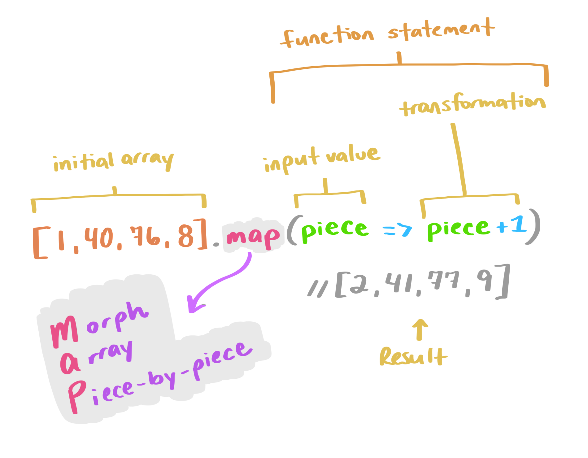
Array.map()
Array.map() updates each individual value in a given array based on a provided transformation and returns a new array of the same size. It accepts a callback function as an argument, which it uses to apply the transform.
let newArray = oldArray.map((value, index, array) => {
  ...
});
A mnemonic to remember this is MAP: Morph Array Piece-by-Piece.
Instead of a for-each loop to go through and apply this transformation to each value, you can use a map. This works when you want to preserve each value, but update it. We’re not potentially eliminating any values (like we would with a filter), or calculating a new output (like we would use reduce for). A map lets you morph an array piece-by-piece. Let’s take a look at an example:
[1, 4, 6, 14, 32, 78].map(val => val * 10)
// the result is: [10, 40, 60, 140, 320, 780]
In the above example, we take an initial array ([1, 4, 6, 14, 32, 78]) and map each value in it to be that value times ten (val * 10). The result is a new array with each value of the original array transformed by the equation: [10, 40, 60, 140, 320, 780].
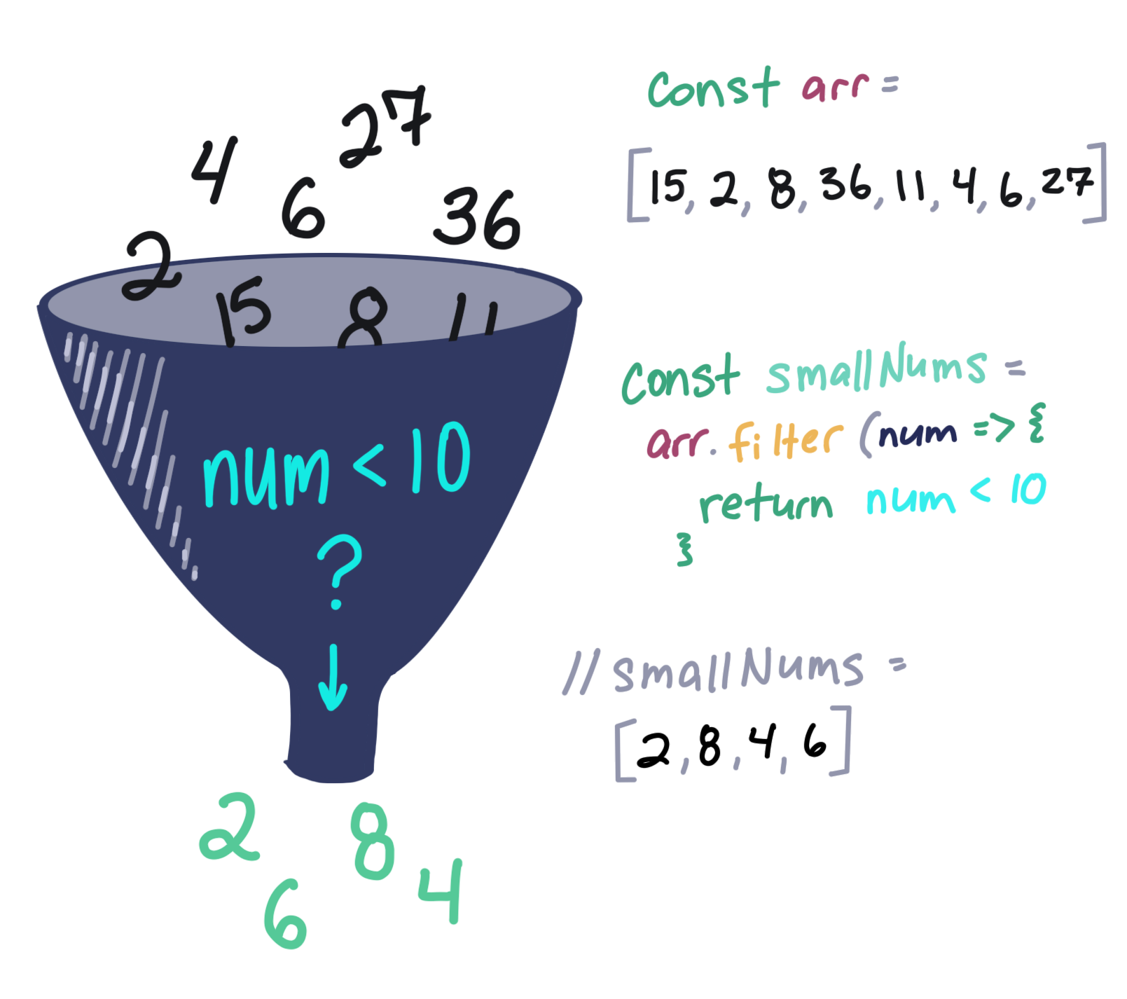
Array.filter()
Array.filter() is a very handy shortcut when we have an array of values and want to filter those values into another array, where each value in the new array is a value that passes a specific test.
This works like a search filter. We’re filtering out values that pass the parameters we provide.
For example, if we have an array of numeric values, and want to filter them to just the values that are larger than 10, we could write:
[1, 4, 6, 14, 32, 78].filter(val => val > 10)
// the result is: [14, 32, 78]
If we were to use a map method on this array, such as in the example above, we would return an array of the same length as the original with val > 10 being the “transform," or a test in this case. We transform each of the original values to their answer if they are greater than 10. It would look like this:
[1, 4, 6, 14, 32, 78].map(val => val > 10)
// the result is: [false, false, false, true, true, true]
A filter, however, returns only the true values. So the result is smaller than the original array or the same size if all values pass a specific test.
Think about filter like a strainer-type-of-filter. Some of the mix will pass through into the result, but some will be left behind and discarded.
Say we have a (very small) class of four dogs in obedience school. All of the dogs had challenges throughout obedience school and took a graded final exam. We’ll represent the doggies as an array of objects, i.e.:
If the dogs get a score higher than 70 on their final test, they get a fancy certificate; and if they don’t, they’ll need to take the course again. In order to know how many certificates to print, we need to write a method that will return the dogs with passing grades. Instead of writing out a loop to test each object in the array, we can shorten our code with filter!
As you can see, Boops and Taco are good dogs (actually, all dogs are good dogs), so Boops and Taco are getting certificates of achievement for passing the course! We can write this in a single line of code with our lovely implicit returns and then remove the parenthesis from our arrow function since we have single argument:
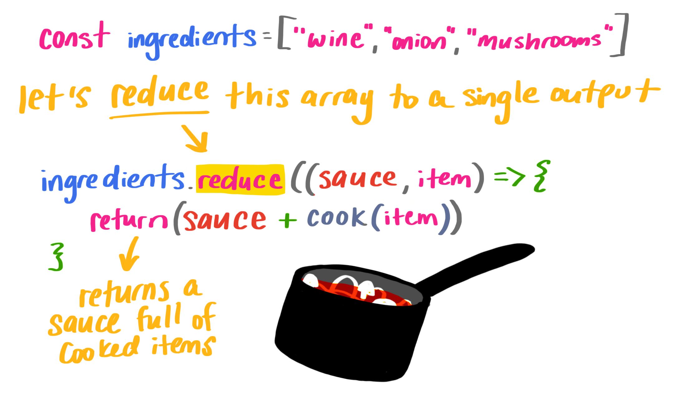
The reduce() method takes the input values of an array and returns a single value. This one is really interesting. Reduce accepts a callback function which consists of an accumulator (a value that accumulates each piece of the array, growing like a snowball), the value itself, and the index. It also takes a starting value as a second argument:
Let’s set up a cook function and a list of ingredients:
// our list of ingredients in an array
const ingredients = ['wine', 'tomato', 'onion', 'mushroom']

// a cooking function
const cook = (ingredient) => {
    return `cooked ${ingredient}`
}
If we want to reduce the items into a sauce (pun absolutely intended), we’ll reduce them with reduce()!
That initial value ('' in our case) is important because if we don’t have it, we don’t cook the first item. It makes our output a little wonky, so it’s definitely something to watch out for. Here’s what I mean:
Finally, to make sure we don’t have any excess spaces at the end of our new string, we can pass in the index and the array to apply our transformation:
Deploying a website to the server in 2019 requires much more effort than 10 years ago. For example, here's what needs to be done nowadays to deliver a typical JS app:
split the app into chunks
configure webpack bundle
minify .js files
set up staging environment
upload the files to the server
Running these steps manually takes time, so an automation tool seems like an obvious choice. Unfortunately, most of contemporary CI/CD software provide nothing more than infrastructure in which you have to manually configure the process anyway: spend hours reading the documentation, writing scripts, testing the outcome, and maintaining it later on. Ain't nobody got time for that!
This is why we created Buddy: to simplify deployment to the absolute minimum by creating a robust tool whose UI/UX allows you configure the whole process in 15 minutes.
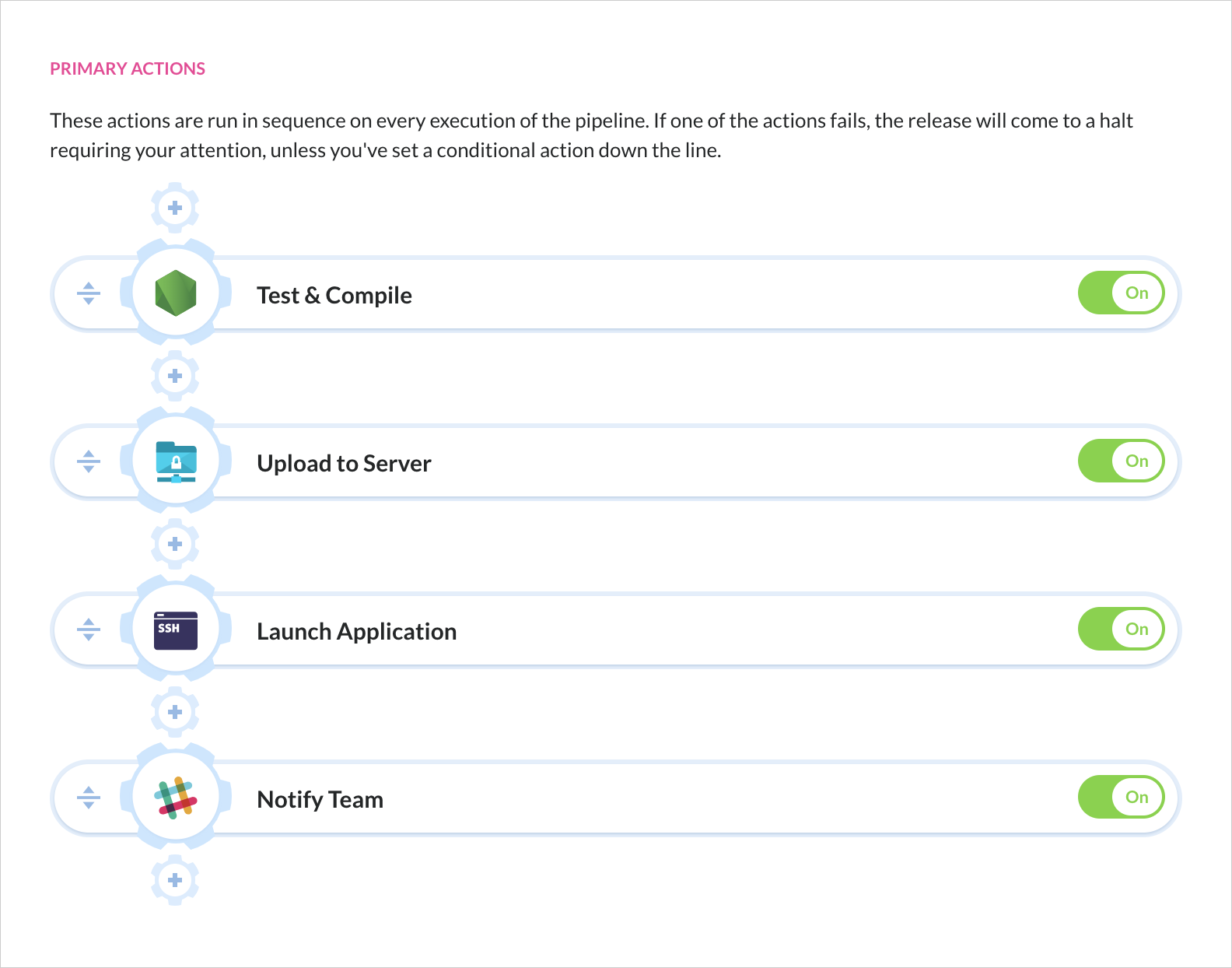
Here's how the delivery process looks in Buddy CI/CD:
This is a delivery pipeline in Buddy. You select the action that you need, configure the details, and put it down in place—just like you're building a house of bricks. No scripting, no documentation, no nothing. Currently, Buddy supportsover 100 actions: builds, tests, deployments, notifications, DevOps tools & many more.
Super-Smooth Deployments
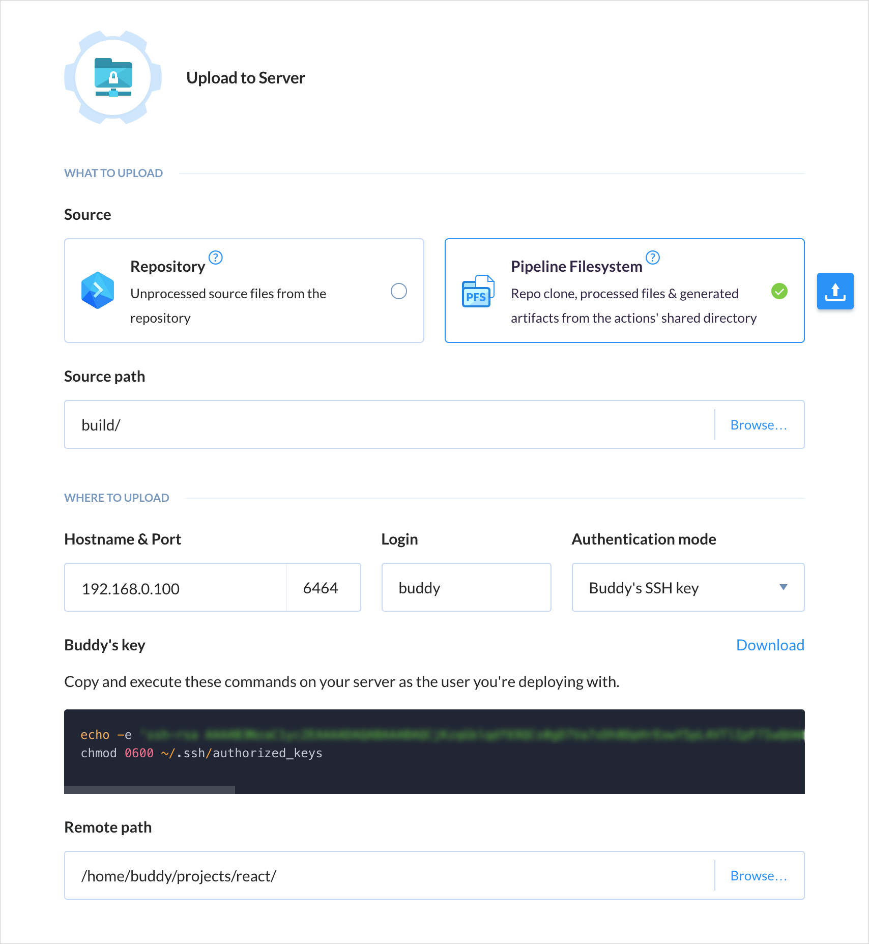
Buddy's deployments are based on changesets which means only changed files are deployed – there's no need to upload the whole repository every time.
Configuration is very simple. For example, in order to deploy to SFTP, you just need to enter authentication details and the target path on the server:
Buddy supports deployments to all popular stacks, PaaS, and IaaS services, including AWS, Google Cloud, Microsoft Azure, and DigitalOcean. Here's a small part of the supported integrations:
Faster Builds, Better Apps
Builds are run in isolated containers with a preconfigured dev environment. Dependencies and packages are downloaded on the first execution and cached in the container, which massively improves build performance.
Buddy supports all popular web developer languages and frameworks, including Node.js, PHP, Ruby, WordPress, Python, .NET Core and Go:
Docker for the People
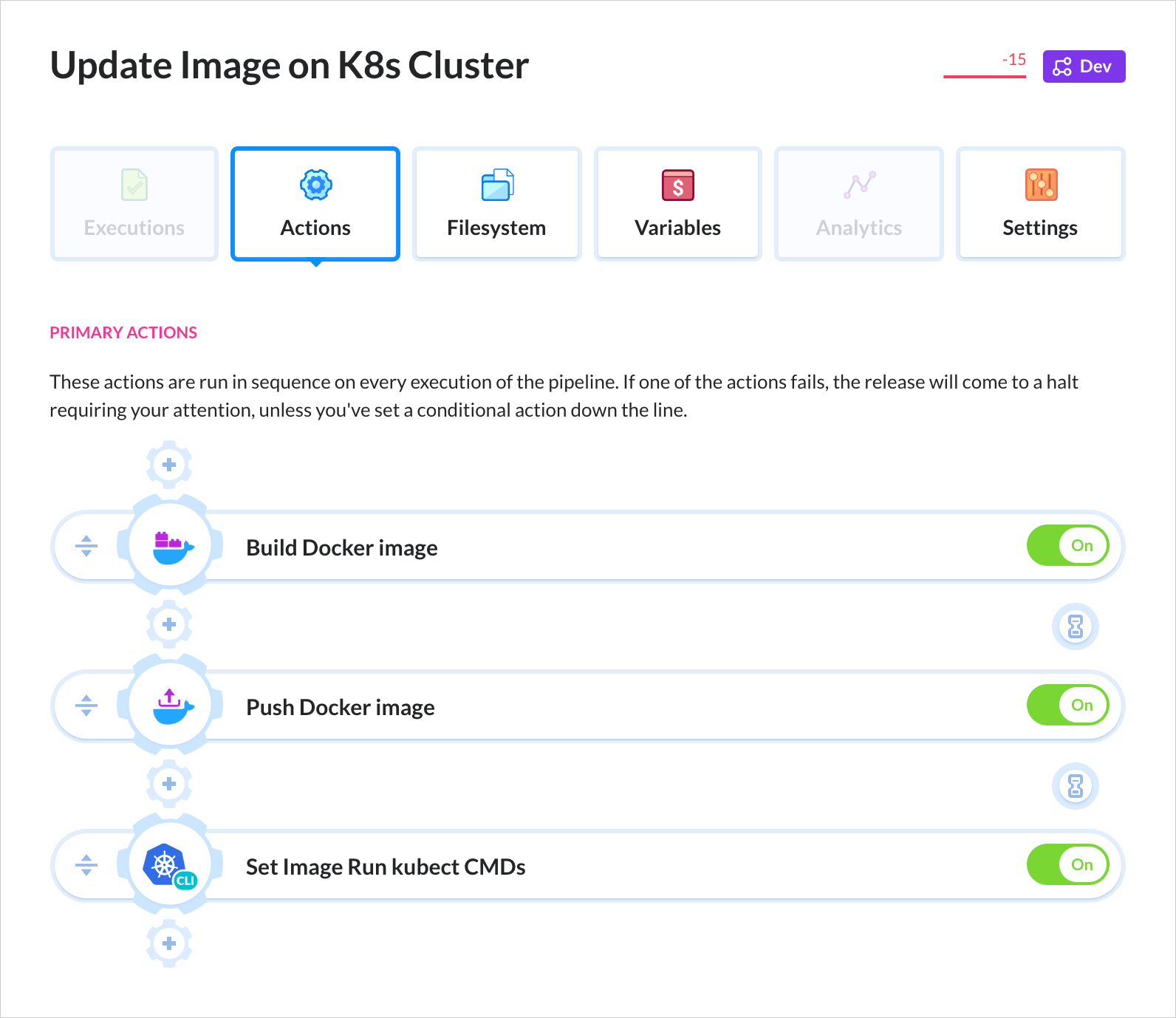
Being a Docker-based tool itself, Buddy helps developers embrace the power of containers with a dedicated roster of Docker actions. You can build custom images and use them in your builds, run dockerized apps on a remote, and easily orchestrate containers on a Kubernetes cluster.
Buddy has dedicated integrations with Google GKE, Amazon EKS, and Azure AKS. You can also push and images to and from private registries.
Automate now!
Sign up to Buddy now and get 5 projects forever free when your trial is over. The process is simple: click the button below, hook up your GitHub, Bitbucket or GitLab repository (or any other), and let Buddy carry you on from there. See you onboard!
Hummingbird has now crossed a staggering one million downloads quickly become everyone’s favorite speed and performance plugin for WordPress. And we’re not just improving your sites speed and performance (with all the built-in cache options you can handle, GZIP compression, asset optimization, and free site scans), we’ve integrated it with the Hub’s world-class WordPress site […]
Today we’d like to share an exploding object experiment with you. The effect is inspired by Kubrick Life Website: 3D Motion. No icosahedrons were hurt during these experiments!
The following short walk-through assumes that you are familiar with some WebGL and shaders.
We are lucky to have algorithms that can create those diagrams programmatically. Not only on surfaces, as giraffes do, but also as spatial ones that break down volumes. We can even partition four dimensional space. But let’s stop at three dimensions for today’s example. I will leave the four dimensional explosions as an exercise for the reader 😉
We prepared some models (you could use Blender/Cinema4D for that, or your own Voronoi algorithm):
You can see that this heart is no longer whole. This heart is broken. With Voronoi.
That looks already beautiful by itself, doesn’t it? ❤
On the other hand, that’s a lot of data to load, so I managed to compress it with the glTF file format using Draco 3D data compression.
Shader
I decided to use three.js for the rendering, as it has a lot of useful built-in stuff. It’s great if you want reflecting materials, and it has some utilities for working with fragments and lightning.
With too many fragments it is not very wise to put all calculations on the CPU, so it’s better to animate that in the shaders, i.e. on the GPU. There’s a really simple vertex shader to tear all those fragments apart:
	position = rotate(position);
	position += position + direction*progress;
…where direction is the explosion direction and progress is the animation progress.
We can then use some three.js materials and CubeTexture to color all the surfaces, and that’s basically it!
During development, I accidentally typed the wrong variable in one of my shaders, and got pretty interesting result:
So, don’t be afraid to make mistakes, you never know what you end up with when you try something new!
I hope you like the demos and the short insight into how it works, and that this story will inspire you to do more cool things, too! Let me know what you think, and what ideas you have!
Have you noticed that your blog posts with a lot of comments load slower than other posts? That’s because loading so many comments increase server load which increases your average page load time.
Having a lot of comments is a good thing because it means that your users are engaged with your content. Your most commented posts are usually the most popular posts on your blog.
However if a lot of comments are slowing down your website, then it can hurt your SEO rankings. That’s when pagination for WordPress comments comes handy.
In this article, we will show you how to paginate comments in WordPress to speed up your post load time. The best part is that it comes as a default feature in WordPress, and it is very easy.
Why You Should Paginate Comments in WordPress
Comment pagination helps you improve your website speed which is an important factor in your website SEO rankings.
Many of our users have reported that sometimes posts with a lot of comments can cause their readers to see white screen of death because it exhausts their server’s memory.
Even when it doesn’t cause ‘white screen of death’, posts with a lot of comments tend to be really really slow.
Comment pagination reduces server load for your most commented posts by splitting comments into multiple pages.
Another reason to paginate your WordPress comments is to maintain the keyword density of your articles. Comments add a lot of content to your post’s page, and they may not always include your target keywords in a sufficient amount.
When keyword ratio to content decreases, search engines fail to index your post for the right keywords.
Comment pagination can also have a negative SEO impact if it is not used correctly. Basically, WordPress generates URLs for each new page of comments. Search engines may consider this as ‘duplicate content’.
This issue can be easily fixed by using the Yoast SEO plugin, which points search engines to the canonical URL of your article.
Now that we have discussed the pros and cons of comment pagination, let’s take a look at how to easily paginate comments in WordPress.
Paginating WordPress Comments in Two Steps
The first thing you need to do is login to your WordPress admin area and go to Settings » Discussions page.
Next, look for the ‘Break comments into pages’ option. From here you need to enter the number of comments you want on each page, and how you want to display them.
Don’t forget to click on the ‘Save Changes’ button to store your settings.
You can now visit any popular post on your website that has a lot of comments. You will notice the pagination links below the comments.
Depending on your theme’s styling, you will either see numeric pagination or ‘Previous / Next’ comment links.
Meet “Art Direction For The Web,” A New Smashing Book By Andy Clarke
Meet “Art Direction For The Web,” A New Smashing Book By Andy Clarke
Bruce Lawson
A page on the Web isn’t like a printed page. Many of us learned that the hard way when we abandoned fixed-width layouts and embraced the web’s inherent flexibility and responsiveness. Read the excerpt chapter.
Modern web technologies like CSS Grid, Flexbox and Shapes have made it possible for us to implement print’s often distinctive designs, and the web’s now full of tutorials on how to use them. But the most important question is not “how” we can use art direction techniques to improve our designs for the web, but instead “when” and “why”.
This is the reason why Andy Clarke wrote his new book Art Direction for the Web. This is a book about why art direction matters and how you can art-direct compelling and effective experiences across devices and platforms.
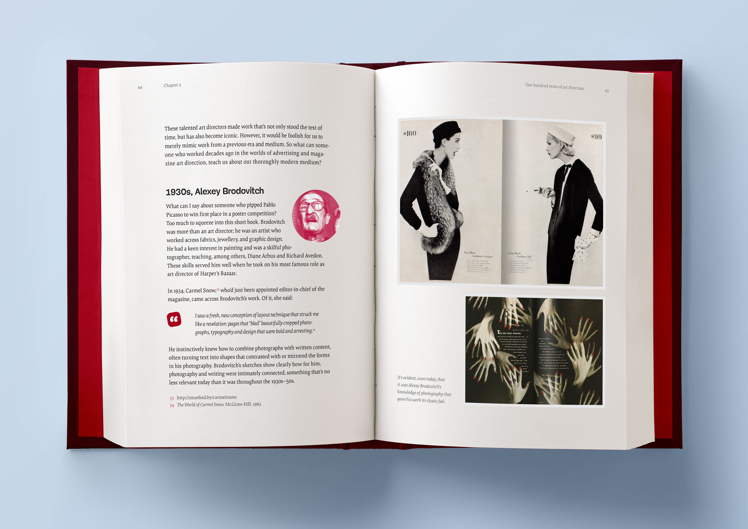
Andy explores the work of some of the most influential art directors, luminaries like Alexey Brodovitch, Bea Feitler, and Neville Brody. He doesn’t encourage us to merely mimic work from a previous era and medium, but to understand their thinking and learn how to apply that knowledge to art direction for the web.
Andy writes,
“You needn’t have been to art school to learn and apply the principles I teach you. Just like art direction itself, they’re something which everyone — no matter what your background and current area of expertise — can use every day to improve the effectiveness of a product or website’s design.”
Andy’s goal is to teach people about the importance of art direction for the web and explain how art direction can help people tell stories by using design. That way, products and websites will connect with audiences and also manage to keep them engaged. After a thorough investigation of the methodology of art direction, Andy teaches how to accomplish it by embracing the web using modern CSS.
Art Direction for the Web will help you make your sites more effective at communicating, persuading, and selling. If you develop products, this book will make them more compelling and more enjoyable to use. Read the excerpt chapter →
Table Of Contents
Part 1: Explaining Art Direction
What Art Direction Means
Ask what art direction means to developers, and they might answer: using the <picture> element or sizes attribute in HTML for responsive images; presenting alternative crops, orientations, or sizes at various screen sizes. But there’s more to it.
One Hundred Years Of Art Direction
Bradley, Brodovitch, Brody, and Feitler — together, their names sound like a Mad Men-era advertising agency. In this chapter, we’ll take a look at their iconic works, from the 1930’s to the 1980’s.
Art-Directing Experiences
Whether we write fact or fiction, sell or make products, the way to engage people, create desire, make them happy, and encourage them to stay that way, is by creating narratives. So what do we need to consider when doing so?
Art Direction And Creative Teams
Let’s take a look at how we can embrace collaboration and form teams who follow strategies built around common goals.
Part 2: Designing For Art Direction
Principles Of Design
Are the principles which have guided design in other media for generations relevant to the world of digital products and websites? Of course! In this chapter, we’ll explore the principles of symmetry, asymmetry, ratios, and scale.
Directing Grids
Grids have a long and varied history in design, from the earliest books, through movements like constructivism right up to the present-day popularity of grids in frameworks like Bootstrap and material design. This chapter explains grid anatomy and terminology and how to use modular and compound grids.
Directing Type
White space, typographic scale, and creative uses of type are the focus in this chapter.
Directing Pictures
Images and how we display them have an enormous impact on how people perceive our designs, whether that be on a commercial or editorial website, or inside a product. In this chapter, you’ll learn how to position and arrange images to direct the eye.
Part 3: Developing For Art Direction
Developing Layouts With CSS Grids
CSS Grid plus thoughtful, art-directed content offers us the best chance yet of making websites which are better at communicating with our audiences. In this chapter, Andy explains properties and techniques which are most appropriate for art direction.
Developing Components With Flexbox
While Grid is ideal for implementing art-directed layouts, Flexbox is often better suited to developing molecules and organisms such as navigation links, images, captions, search inputs, and buttons. This chapter explores how to make use of it.
Developing Typography
From multi-column layout and arranging type with writing modes to text orientation and decorative typography, this chapter dives deep into the code side of type.
Developing With Images
How do you fit your art-directed images to a user’s viewport? And what do CSS shapes and paths have in store for your design? Let’s find out in this final chapter.
Smashing TV Webinars
To accompany this book, Andy is also giving a series of webinars on Smashing TV. Webinars are free with Smashing Membership, which costs a couple of cups of coffee a month (cancel anytime).
About The Author
Andy Clarke is a well-known designer, design consultant, and mentor. He has been called plenty of things since he started working on the web. His ego likes terms such as “Ambassador for CSS,” “industry prophet,” and “inspiring,” but he’s most proud that Jeffrey Zeldman once called him a “triple-talented bastard.”
With his wife, Sue, Andy founded Stuff & Nonsense in 1998. They’ve helped companies around the world to improve their designs by providing consulting and design expertise.
Andy’s written several popular books on website design and development, including Hardboiled Web Design: Fifth Anniversary Edition, Hardboiled Web Design, and Transcending CSS: The Fine Art Of Web Design. He’s a popular speaker and gives talks about art direction and design-related topics all over the world.
Testimonials
It has been our goal to make the book as inspiring, practical, and useful as possible, and we feel honored to have already received such positive reviews.
“With ‘Art Direction for the Web,’ Andy provides a framework for harnessing the web’s potential. With historical context and real-life examples, Andy inspires each of us to be more purposeful about the choices we make. And true to form, he follows up all that inspiration with demos and the practical knowledge needed to see our ideas manifest online.”
— Trent Walton, co-founder of Paravel Inc.
Why This Book Is For You
The content of this book is based on Andy’s twenty years’ experience of working with clients, plus the expertise of the art directors and designers he interviewed. You’ll learn:
What art direction means, why it matters, and who can do it.
How to make art direction work for digital products and websites.
How to improve conversions and bring your customers’ journeys to life.
How to maintain brand values and design principles by connecting touch points across marketing, product design, and websites.
How to use art direction priciples such as layout, typography, proportions, ratio, and grids in a more imaginative way to communicate what you’re trying to do much better.
How to implement your designs on any platform with the latest HTML and CSS.
…Plus, we’ll explore outstanding designs from 100 years of media and print publishing for some extra art direction inspiration.
Andy’s new book explores 100 years of art direction and how we can use this knowledge and the newest web technologies to create better digital products.
Starting a blog can be a daunting task. If, however, you somehow manage to overcome your apprehensions and start creating content and publishing it online, if nobody reads it, the whole affair can feel very...


