In a bid to have web applications serve needs for different types of users, it’s likely that more code is required than it would be for one type of user so the app can handle and adapt to different scenarios and use cases, which lead to new features and functionalities. When this happens, it’s reasonable to expect the performance of an app to dwindle as the codebase grows.
Code splitting is a technique where an application only loads the code it needs at the moment, and nothing more. For example, when a user navigates to a homepage, there is probably no need to load the code that powers a backend dashboard. With code splitting, we can ensure that the code for the homepage is the only code that loads, and that the cruft stays out for more optimal loading.
Code splitting is possible in a React application using React Loadable. It provides a higher-order component that can be set up to dynamically import specific components at specific times.
Component splitting
There are situations when we might want to conditionally render a component based on a user event, say when a user logs in to an account. A common way of handling this is to make use of state — the component gets rendered depending on the logged in state of the app. We call this component splitting.
We can have an openHello state in the App component with an initial value of false. Then we can have a button used to toggle the state, either display the component or hide it. We’ll throw that into a handleHello method, which looks like this:
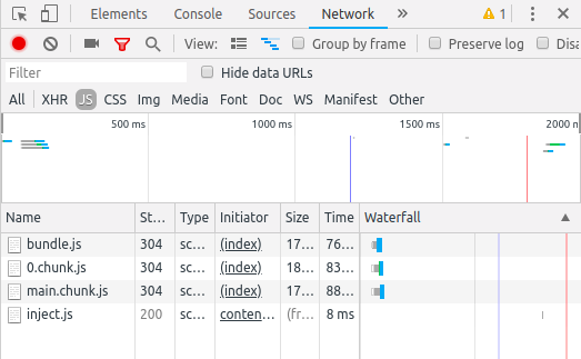
Take a quick peek in DevTools and take note the Network tab:
Now, let’s refactor to make use of LoadableHello. Instead of importing the component straight up, we will do the import using Loadable. We’ll start by installing the react-loadable package:
## yarn, npm or however you roll
yarn add react-loadable
Now that’s been added to our project, we need to import it into the app:
import Loadable from 'react-loadable';
We’ll use Loadable to create a “loading” component which will look like this:
We pass a function as a value to loader which returns the Hello component we created earlier, and we make use of import() to dynamically import it. The fallback UI we want to render before the component is imported is returned by loading(). In this example, we are returning a div element, though we can also put a component in there instead if we want.
Now, instead of inputting the Hello component directly in the App component, we’ll put LoadableHello to the task so that the conditional statement will look like this:
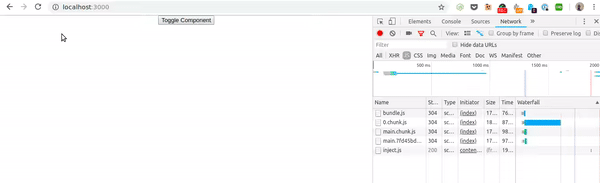
Check this out — now our Hello component loads into the DOM only when the state is toggled by the button:
And that’s component splitting: the ability to load one component to load another asynchronously!
Route-based splitting
Alright, so we saw how Loadable can be used to load components via other components. Another way to go about it is us ing route-based splitting. The difference here is that components are loaded according to the current route.
So, say a user is on the homepage of an app and clicks onto a Hello view with a route of /hello. The components that belong on that route would be the only ones that load. It’s a fairly common way of handling splitting in many apps and generally works well, especially in less complex applications.
Here’s a basic example of defined routes in an app. In this case, we have two routes: (1) Home (/) and (2) Hello (/hello).
As it stands, all components will render when a use switches paths, even though we want to render the one Hello component based on that path. Sure, it’s not a huge deal if we’re talking a few components, but it certainly could be as more components are added and the application grows in size.
Using Loadable, we can import only the component we want by creating a loadable component for each:
Now, we serve the right code at the right time. Thanks, Loadable!
What about errors and delays?
If the imported component will load fast, there is no need to flash a “loading” component. Thankfully, Loadable has the ability to delay the loading component from showing. This is helpful to prevent it from displaying too early where it feels silly and instead show it after a notable period of time has passed where we would expect to have seen it loaded.
To do that, our sample Loadable component will look like this;
Here, we are passing the Hello component as a value to loading, which is imported via loader. By default, delay is set to 200ms, but we’ve set ours a little later to 300ms.
Now let’s add a condition to the Loader component that tells it to display the loader only after the 300ms delay we set has passed:
So the Loader component will only show if the Hello component does not show after 300ms.
react-loader also gives us an error prop which we can use to return errors that are encountered. And, because it is a prop, we can let it spit out whatever we want.
const Loader = (props) => {
	if (props.error) {
		return <div>Oh no, something went wrong!</div>;
	} else if (props.delay) {
		return <h2>Loading...</h2>
	} else {
		return null;
	}
}
Note that we’re actually combining the delay and error handling together! If there’s an error off the bat, we’ll display some messaging. If there’s no error, but 300ms have passed, then we’ll show a loader. Otherwise, load up the Hello component, please!
That’s a wrap
Isn’t it great that we have more freedom and flexibility in how we load and display code these days? Code splitting — either by component or by route — is the sort of thing React was designed to do. React allows us to write modular components that contain isolated code and we can serve them whenever and wherever we want and allow them to interact with the DOM and other components. Very cool!
Hopefully this gives you a good feel for code splitting as a concept. As you get your hands dirty and start using it, it’s worth checking out more in-depth posts to get a deeper understanding of the concept.
HLS stands for HTTP Live Streaming. It’s an adaptive bitrate streaming protocol developed by Apple. One of those sentences to casually drop at any party. Äh. Back on track: HLS allows you to specify a playlist with multiple video sources in different resolutions. Based on available bandwidth these video sources can be switched and allow adaptive playback.
This is an interesting journey where the engineering team behind Kitchen Stories wanted to switch away from the Vimeo player (160 kB), but still use Vimeo as a video host because they provide direct video links with a Pro plan. Instead, they are using the native <video> element, a library for handling HLS, and a wrapper element to give them a little bonus UX.
This video stuff is hard to keep up with! There is another new format called AV1 that is apparently a big deal as YouTube and Netflix are both embracing it. Andrey Sitnik wrote about it here:
Even though AV1 codec is still considered experimental, you can already leverage its high-quality, low-bitrate features for a sizable chunk for your web audience (users with current versions of Chrome and Firefox). Of course, you would not want to leave users for other browsers hanging, but the attributes for <video> and <source> tags make implementing this logic easy, and in pure HTML, you don’t need to go at length to detect user agents with JavaScript.
That doesn't even mention HLS, but I suppose that's because HSL is a streaming protocol, which still needs to stream in some sort of format.
Are you an affiliate marketer looking to boost click-through rates and sales on your website? If so, you will definitely love this review of the Affiliate Coupons WordPress plugin. I think you will agree when I say: creating a successful affiliate website is challenging. Everything from finding the best deals to marketing and converting users […]
I wouldn't say the term "CSS algorithm" has widespread usage yet, but I think Lara Schenck might be onto something. She defines it as:
a well-defined declaration or set of declarations that produces a specific styling output
So a CSS algorithm isn't really a component where there is some parent element and whatever it needs inside, but a CSS algorithm could involve components. A CSS algorithm isn't just some tricky key/value pair or calculated output — but it could certainly involve those things.
The way I understand it is that they are little mini systems. In a recent post, she describes a situation involving essentially two fixed header bars and needing to deal with them in different situations. In this example, the page can be in different states (e.g. a logged-in state has a position: fixed; bar), and that affects not only the header but the content area as well. Dealing with all that together is a CSS algorithm. It's probably the way we all work in CSS already, but now have a term to describe it. This particular example involves some CSS custom properties, a state-based class, two selectors, and a media query. Classic front-end developer stuff.
As the world becomes more connected and digitized, individuals, businesses and countries produce data at an exponential rate. It has been estimated that the amount of data generated will grow from 33 Zettabytes in 2018 to 175 Zettabytes by 2025.
The W3C has announced that the Web Authentication (WebAuthn) specification is now an official Web standard. WebAuthn allows users to login into various accounts with more security than a standalone password. Security is increased through the use of mobile devices, biometrics, or FIDO security keys.
Do you know how slow your site loads? Just a one-second delay in loading time results in:
16% decrease in customer satisfaction which keeps your audience from coming back.
11% fewer page views which means less people will know about your brand.
7% loss in conversions which means less money for you.
Amazon says that one second of load lag time would cost them $1.6 billion in sales each year.
So, how fast should your website load? Both mobile and desktop users expect your site to load quickly (two seconds or less). However, the average loading times for various industries in the United States don’t meet those benchmarks. Take a look at this research from Google:
As you can see, the average website speed for all of these industries is significantly higher than the best practices line. But that doesn’t mean you should aim for 5-6 seconds. In fact, you have every reason to make your website as fast as possible.
13 Ways to Speed Up Your Website
If you can speed up your website, it will give you a huge advantage over your competitors with slower loading times. You’ll want to aim for your pages to load in three seconds or less. That’s because many visitors will abandon your site if it hasn’t loaded within three seconds. But obviously, the lower you can get that number, the better.
Understanding why website speed is so important, it’s time to do something about it. I created this guide of best practices that will help you speed up your website.
So read carefully and make any necessary changes to your site moving forward. Don’t be intimidated by any technical terms that you’re unfamiliar with — I’ve kept everything in plain English, so it’s easy for everyone to follow along.
Minimize Your HTTP Requests
HTTP requests are made for each element on your website. I’m referring to things like images, scripts, and stylesheets.
Much of a website’s loading time is related to downloading on-page elements. So for those of you who have lots of these components on your website, you have more HTTP requests.
Using your developer tools settings, you can figure out how many requests your website currently makes. Then, take steps lower that number. Reduce clutter on your website and simplify the design.
You should also eliminate unnecessary redirects. While these are often needed for fixing broken links, they create additional HTTP requests. This will slow down your website speed.
I’d recommend using a tool like Screaming Frog to help you identify all of your redirects. Once they’ve been identified, get rid of the ones that you can live without. Only keep the ones that are absolutely necessary.
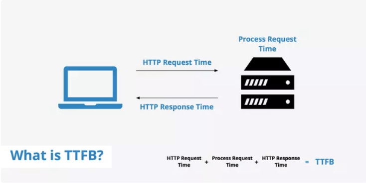
Reduce the Time to First Byte (TTFB)
TTFB refers to the time browsers need to wait before getting data from the server. Simply put, it’s basically how long it takes for a page to start loading.
Your TTFB is comprised of three elements:
HTTP request time
Process request time
Response time
The whole process refers to when the web browser’s HTTP request occurs to the server’s HTTP response being received. Here’s a visual representation showing how the time to first byte works.
If your website has a fast TTFB, then requests can be delivered to the browser faster. Ultimately, this gets your content loaded for visitors faster.
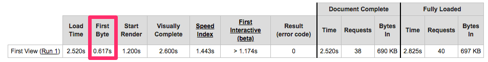
You should be aiming for a TTFB that’s less than 200ms. Use WebPageTest as a resource to identify your time to first byte.
Just look at the “first byte” column to see where you stand. In this example, .617s is equal to 617ms. That’s more than three times slower than the 200ms benchmark!
For those of you who have a TTFB that exceeds 200ms, you’ll need to take steps to improve that number. Beyond reducing HTTP requests, some common issues associated with slow TTFB are network and website traffic issues.
One of the best ways to reduce your TTFB is by enabling browser caching. Make note of that — we’ll discuss how to execute on that concept in greater detail later in this guide.
Make Sure Browser Caching is Enabled
As mentioned above, whenever someone visits a new website, all of the elements need to be loaded. These elements get stored in a cache, which is a temporary storage on their hard drive. The next time they go to that website, their browser can load that page without sending an additional HTTP request to the server.
If you have caching enabled, then your website speed will be faster for returning visitors. Check out my list of the best WordPress cache plugins to get this set up on your website.
Upgrade Your Web Hosting Plan
Cheaper isn’t always better. When your website was new, you might have gone with a budget hosting plan to keep costs low. However, as your traffic increases, you’ll need to make sure that your hosting plan is upgraded.
There are four types of web hosting:
Shared hosting
VPS hosting
Dedicated server
Cloud hosting
The plan you choose and the company you use will impact your website speed. Rather than spending all day discussing the pros and cons of these hosting options, it’s in your best interest to review my guide on the best web hosting.
This will give you the information needed to choose the best web host that will ensure fast site loading more reliably.
Run Compression Audits
Website compression refers to HTTP data being compressed so the size of it is smaller before it’s sent to the server. Doing this improves loading speed and bandwidth.
To compress your data, Gzip is the industry standard tool for this practice. This software locates lines of similar code and then replaces them to make all of your files smaller. It’s ideal for HTML and CSS since those files tend to have lots of whitespace and repetitive code.
Studies from Yahoo say that Gzip compression can reduce response sizes by 70%.
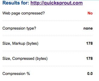
I’d recommend running a compression audit with a tool like GIDNetwork to give you a better idea of how compressed files can speed up your website. Here’s what the audit looks like for Quick Sprout.
To test your website, all you need to do is enter the URL and click “check.” As you can see from this audit, Quick Sprout isn’t compressed. The tool also offers a “what if analysis” to show you the benefits of compressing your website.
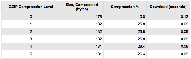
This chart shows what my website would look like at different compression levels. It tells me that at the fourth level of compression, the size can be compressed to 131 bytes compared to 178 with no compression. The download time would also improve from 0.12 seconds to .09 seconds.
These numbers are pretty marginal for my website, which is why I don’t currently have compression enabled. However, some of you might learn that your site can greatly benefit from compressed files after running this audit.
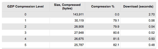
Let’s say your compression audit looked something like this.
There is a huge difference between no compression and the first level. Those figures continue to improve as we reach level five.
In this scenario, you’d absolutely want to enable compression.
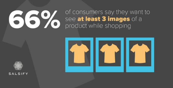
Reduce the Size of Images
As mentioned before, in order for your website to be as fast as possible, you need all of your files to be as small as they can possibly be. Just make sure that you’re not sacrificing quality, of course.
Smaller files load faster. It’s as simple as that. One area that you should reduce the size of are images. Visual elements are necessary on your website. Without images, your site will look boring, unprofessional, and probably untrustworthy.
But with that said, images can really slow down your loading times. That’s a big problem for some of you, especially for ecommerce businesses. Why? Well, consider this.
Some of you may have even more than three images per product. Now multiply that number by how many items are available on your website. The figures add up quickly.
Even websites that don’t sell anything need to reduce their image sizes. Go through your website then and assess every image. Is it doing the work it needs to do to justify it being there? Could you cut it and the content remains just as strong? Is it taking too much space on the web page? If the image doesn’t need to be there, cut it.
Compressing images is different from HTTP compression too. One has to do with the actual digital assets on your website’s front end, whereas the other has to do with compressing the commands sent to your web server.
Use a tool like Compressor.io to help you compress your images without sacrificing the quality of them. After the images are compressed, you’ll want to make sure that you’re saving them as the right file type.
For the most part, JPG will be your best option. You can use PNG files for graphics that need to have precise detail, like a logo.
Minify and Combine Files
We’ve already talked about some of the biggest ways you can leverage compression on your website. Now let’s talk about the last big way: minifying and combining files.
Minification removes unnecessary characters from your files, such as formatting and white space. Basically, it will get rid of anything that isn’t required for your code to function. This ultimately reduces your file sizes.
Combining files reduces the number of HTTP requests by concentrating them into smaller groups. For example, a browser can potentially download six smaller files faster than one giant file.
Think of this like sitting on a suitcase to get everything packed down nice and tight. You can do this for:
HTML files
CSS files
JavaScript files
Google Fonts
If you have a WordPress website, your best option is the WP Rocket plugin. If you have a different CMS, check to see if they offer plugins that minify and combine files for your website. This will definitely improve your website speed.
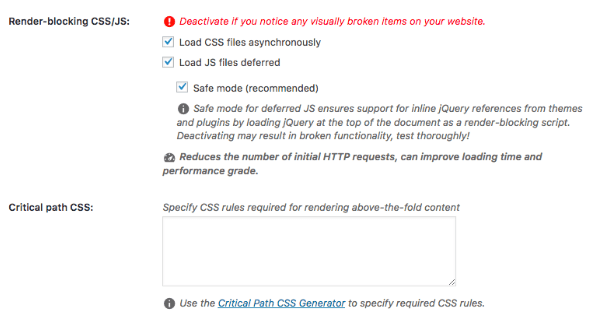
Use Asynchronous Loading
Now that your CSS and JavaScript files are minified and combined, it’s time for you to optimize the way they get loaded. There are two options:
Synchronous loading
Asynchronous loading
Files that load synchronously load one at a time, based on their location on the page. The problem with this is that if one file is taking longer to load, no other files will get loaded until that particular file is complete.
With asynchronous loading, files can load simultaneously. In the event of a file taking a while to load, other elements of your page can still load without any delay.
You can use the same WP Rocket plugin or the like to enable this as well.
Just navigate to the Static Files tab and check the option for asynchronous loading, as shown above.
You’ll also see from this screenshot that “Load JS files deferred” is also checked. This brings me to another best practice for website speed.
Defer Loading for JavaScript Files
When you defer a file, it means that you stop it from loading until other elements on the page have loaded. By deferring a large file, it helps ensure that the rest of your files load quickly without any problems.
JavaScript files are large and can be deferred.
As I just showed above, it’s easy to accomplish this with just one click if you’re using a plugin like WP Rocket. Otherwise, you’ll have to insert some code into the
tag for JS files. It will look something like this:
Personally, I like to avoid manual coding at all costs. So finding a plugin or tool that your CMS offers that can do the work for you is definitely easier.
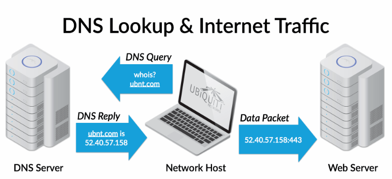
Improve DNS Lookups
DNS is short for “domain name system.” This is a server that has a database of IP addresses along with names of various hosts.
When a user types a URL into their browser, the DNS server translates the URL into an IP address, indicating its online location.
Typing the name of a website URL into your browser doesn’t mean much to your computer; it needs to be translated to find the site that you want to reach. Here’s a visual representation of what this looks like, using ubnt.com as the example.
With a DNS lookup, people don’t need to memorize long strings of number combinations. However, sometimes this takes too long.
If your DNS lookup time is too slow, you should look into switching to a new DNS provider that will give you faster service. Here is a great free tool you can use to test your DNS. Simply enter your URL in and click Go.
The numbers most relevant to you and your website are going to be under the A column. Check the average time. You’ll want this number to be as low as possible. Anywhere in the neighborhood of 10-20ms is decent. If you’re pushing 30ms, you might want to switch DNS providers to get faster service.
Make Sure Browser Caching is Enabled
As mentioned above, whenever someone visits a new website, all of the elements need to be loaded. These elements get stored in a cache, which is a temporary storage on their hard drive. The next time they go to that website, their browser can load that page without sending an additional HTTP request to the server.
If you have caching enabled, then your website speed will be faster for returning visitors. You can do this with a variety of different plugins out there for your CMS. If you have WordPress, check out my list of the best WordPress cache plugins to get this set up on your website.
Install a content delivery network (CDN)
As you know, your website is hosted on a server. Every time someone visits your site, a request gets sent to that server. So if you’re experiencing high levels of traffic, requests will take longer to process, which will slow down your website for these users.
But high traffic is a good thing for your website. The last thing you want is for this surge in visitors to deter those same people from coming back because your website speed is too slow.
The physical location of a user to your server can also impact how fast your website is for them. People who are farther away from the server will experience slower loading times, even if you aren’t having high volumes of traffic at that time.
CDNs cache your website on networks of global servers. So when someone requests a file from your website, it gets routed to the server closest to their physical location.
For example, let’s say your origin server is located in Texas, but you’re using a CDN to host your files across the world. If a user in China navigates to your website, their browser can download files from a server somewhere else that’s nearby.
Venture Harbour ran some tests on five pages on their website after they implemented a CDN. These were the results:
Page 1 — 20% more seconds gained
Page 2 — 37% more seconds gained
Page 3 — 41% more seconds gained
Page 4 — 4% more seconds gained
Page 5 — 51% more seconds gained
It’s worth noting that the page that was 4% faster went from 2.06 seconds to 1.97 seconds, so it was already fast to begin with. Overall, Venture Harbour experienced a 30.2% decrease in loading time across their entire website. That’s a huge improvement.
I’d recommend using Cloudflare or StackPath (formerly MaxCDN) to help you set up your content delivery network.
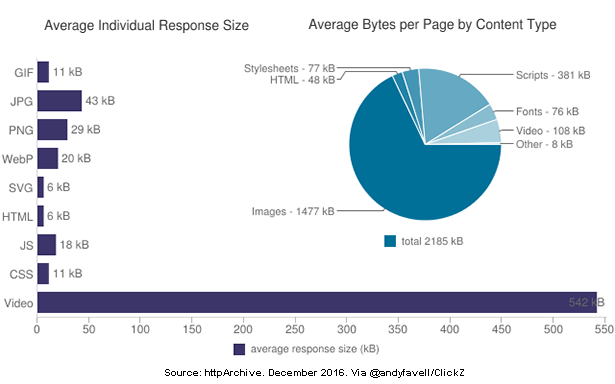
Host Videos on External Platforms
Videos can definitely add lots of value to your website. In fact, 73% of consumers are more likely to buy products online if they can watch a video about it.
But videos on your website can slow down your loading times if they’re not properly optimized.
Let’s say you filmed a product demonstration video that you want to add to your website. How do you approach this?
If you’re planning to upload the video directly to your website through a file transfer protocol (FTP) or your WordPress editor, it’s the wrong approach. Doing this means the video will get hosted on your server, which will take up tons of space. Look at how this compares to other file types.
For those of you who are using a shared hosting plan, you’ll be limited in the amount of space you can use. Adding videos to your website this way will push your limits. This can also hinder the user experience. Assuming multiple people want to watch a video simultaneously, servers with limited bandwidth will cause lagging and stoppages throughout the playback.
Instead, upload your videos to a third-party platform, like YouTube.
That platform will host your video; then you can simply embed the video on your website. This method will save you server space and speed up your website.
Uninstall Unused Plugins
Plugins are a great way to improve the performance of your website. There’s a plugin for nearly everything you can imagine.
I use them as well, and they tend to make my life much easier.
With that said, too many plugins can make your website heavy and slow down your loading times. So it’s in your best interest to only install plugins that you’re actually going to use (also, do some housekeeping from time to time!).
When searching for a plugin, look for all-in-one solutions so you don’t need to get one for every little feature. For example, say you’re looking for the best social media WordPress plugin. Rather than getting one plugin for Instagram, one plugin for Facebook, and one plugin for Twitter, look for one that supports all of these platforms.
Go through your plugins and get rid of ones that you aren’t using. These could potentially be slowing down your website.
Conclusion
The importance of website speed can’t be overstated. Page loading times can make or break the success of your site.
You can’t just launch a website and forget about it. Your loading speed needs to be monitored on a regular basis. Otherwise, you’ll have no way of knowing where you stand, and what needs to be improved.
So what does it take to have a fast website in 2021? There isn’t just one thing you can do. Start by following the list of best practices that I’ve identified above.
And remember: creating a fast website isn’t just a matter of installing a few plugins, dusting off your hands, and saying “Job well done!” It’s a continuous process that involves regular testing, tweaking, and housekeeping to keep your webpage speeds high.
Chapter names in books, quotes from a speech, keywords in an article, stats on a report — these are all types of content that could be helpful to isolate and turn into a high-level summary of what's important.
For example, have you seen the way Business Insider provides an article's key points before getting into the content?
That’s the sort of thing we're going to do, but try to extract the high points directly from the article using HTML Slot, HTML Template and Shadow DOM.
These three titular specifications are typically used as part of Web Components — fully functioning custom element modules meant to be reused in webpages.
Now, what we aim to do, i.e. text extraction, doesn’t need custom elements, but it can make use of those three technologies.
There is a more rudimentary approach to do this. For example, we could extract text and show the extracted text on a page with some basic script without utilizing slot and template. So why use them if we can go with something more familiar?
The reason is that using these technologies permits us a preset markup code (also optionally, style or script) for our extracted text in HTML. We’ll see that as we proceed with this article.
Now, as a very watered-down definition of the technologies we’ll be using, I’d say:
A template is a set of markup that can be reused in a page.
A slot is a placeholder spot for a designated element from the page.
A shadow DOM is a DOM tree that doesn’t really exist on the page till we add it using script.
We’ll see them in a little more depth once we get into coding. For now, what we’re going to make is an article that follows with a list of key points from the text. And, you probably guessed it, those key points are extracted from the article text and compiled into the key points section.
The key points are displayed as a list with a design in between the points. So, let’s first create a template for that list and designate a place for the list to go.
<article><!-- Article content --></article>
<!-- Section where the extracted keypoints will be displayed -->
<section id='keyPointsSection'>
<h2>Key Points:</h2>
<ul><!-- Extracted key points will go in here --></ul>
</section>
<!-- Template for the key points list -->
<template id='keyPointsTemplate'>
<li><slot name='keyPoints'></slot></li>
<li style="text-align: center;">⤙—⤚</li>
</template>
What we’ve got is a semantic <section> with a <ul> where the list of key points will go. Then we have a <template> for the list items that has two <li> elements: one with a <slot> placeholder for the key points from the article and another with a centered design.
The layout is arbitrary. What’s important is placing a <slot> where the extracted key points will go. Whatever’s inside the <template> will not be rendered on the page until we add it to the page using script.
Further, the markup inside <template> can be styled using inline styles, or CSS enclosed by <style>:
The fun part! Let’s pick the key points from the article. Notice the value of the name attribute for the <slot> inside the <template> (keyPoints) because we’ll need that.
<article>
  <h1>Bears</h1>
  <p>Bears are carnivoran mammals of the family Ursidae. <span><span slot='keyPoints'>They are classified as caniforms, or doglike carnivorans</span></span>. Although only eight species of bears <!-- more content --> and partially in the Southern Hemisphere. <span><span slot='keyPoints'>Bears are found on the continents of North America, South America, Europe, and Asia</span></span>.<!-- more content --></p>
  <p>While the polar bear is mostly carnivorous, <!-- more content -->. Bears use shelters, such as caves and logs, as their dens; <span><span slot='keyPoints'>Most species occupy their dens during the winter for a long period of hibernation</span></span>, up to 100 days.</p>
  <!-- More paragraphs -->
</article>
The key points are wrapped in a <span> carrying a slot attribute value ("keyPoints") matching the name of the <slot> placeholder inside the <template>.
Notice, too, that I’ve added another outer <span> wrapping the key points.
The reason is that slot names are usually unique and are not repeated, because one<slot> matches one element using one slot name. If there’re more than one element with the same slot name, the <slot> placeholder will be replaced by all those elements consecutively, ending in the last element being the final content at the placeholder.
So, if we matched that one single <slot> inside the <template> against all of the <span> elements with the same slot attribute value (our key points) in a paragraph or the whole article, we’d end up with only the last key point present in the paragraph or the article in place of the <slot>.
That’s not what we need. We need to show all the key points. So, we’re wrapping the key points with an outer <span> to match each of those individual key points separately with the <slot>. This is much more obvious by looking at the script, so let’s do that.
const keyPointsTemplate = document.querySelector('#keyPointsTemplate').content;
const keyPointsSection = document.querySelector('#keyPointsSection > ul');
/* Loop through elements with 'slot' attribute */
document.querySelectorAll('[slot]').forEach((slot)=>{
  let span = slot.parentNode.cloneNode(true);
  span.attachShadow({  mode: 'closed' }).appendChild(keyPointsTemplate.cloneNode(true));
  keyPointsSection.appendChild(span);
});
First, we loop through every <span> with a slot attribute and get a copy of its parent (the outer <span>). Note that we could also loop through the outer <span> directly if we’d like, by giving them a common class value.
This "attachment" causes the <slot> inside the template’s list item in the shadow tree to absorb the inner <span> carrying its matching slot name, i.e. our key point.
The slotted key point is then added to the key points section at the end of the page (keyPointsSection.appendChild(span)).
This happens with all the key points in the course of the loop.
That’s really about it. We’ve snagged all of the key points in the article, made copies of them, then dropped the copies into the list template so that all of the key points are grouped together providing a nice little CliffsNotes-like summary of the article.
What do you think of this technique? Is it something that would be useful in long-form content, like blog posts, news articles, or even Wikipedia entries? What other use cases can you think of?
I've definitely been guilty of thinking about rendering on the web as a two-horse race. There is Server-Side Rendering (SSR, like this WordPress site is doing) and Client-Side Rendering (CSR, like a typical React app). Both are full of advantages and disadvantages. But, of course, the conversation is more nuanced. Just because an app is SSR doesn't mean it doesn't do dynamic JavaScript-powered things. And just because an app is CSR doesn't mean it can't leverage any SSR at all.
It's a spectrum! Jason Miller and Addy Osmani paint that picture nicely in Rendering on the Web.
My favorite part of the article is the infographic table they post at the end of it. Unfortunately, it's a PNG. So I took a few minutes and <table>-ized it, in case that's useful to anyone.
We’ve been writing a lot about refactoring CSS lately, from how to take a slow and methodical approach to getting some quick wins. As a result, I’ve been reading a ton about this topic and somehow stumbled upon this post by Harry Roberts about refactoring and how to mitigate the potential risks that come with it:
Refactoring can be scary. On a sufficiently large or legacy application, there can be so much fundamentally wrong with the codebase that many refactoring tasks will run very deep throughout the whole project. This puts a lot of pressure on developers, especially considering that this is their chance to "get it right this time". This can feel debilitating: "Where do I start?" "How long is this going to take?" "How will I know if I’m doing the right thing?"
Harry then comes up with this metaphor of a refactoring tunnel where it’s really easy to find yourself stuck in the middle of a refactor and without any way out of it. He argues that we should focus on small, manageable pieces instead of trying to tackle everything at once:
Resist the temptation to refactor anything that runs right the way throughout the project. Instead, identify smaller and more manageable tasks: tasks that have a much smaller surface area, and therefore a much shorter Refactoring Tunnel.
These tasks can still aim toward a larger and more total goal but can be realised in much safer and shorter timeframes. Want to move all of your classes from BEM to BEM(IT)? Sure, but maybe just implement it on the nav first.
This way feels considerably slower, for sure, but there’s so much less risk involved.
Team CodePen's very own Stephen Shaw is also the creator of Splitting.js! Marie talks with Stephen about what Splitting.js is, what it's for, how he got the word out about his project, and his advice for anyone thinking of putting together an open-source library.
Need to know how to create an Email Newsletter? Every website owner has asked this question at least once. Whether you have a simple blog with occasional updates, an online magazine with stories published every hour or an e-store, chances …
How To Build An Endless Runner Game In Virtual Reality (Part 1)
How To Build An Endless Runner Game In Virtual Reality (Part 1)
Alvin Wan
Today, I’d like to invite you to build an endless runner VR game with webVR — a framework that gives a dual advantage: It can be played with or without a VR headset. I’ll explain the magic behind the gaze-based controls for our VR-headset players by removing the game control’s dependence on a keyboard.
In this tutorial, I’ll also show you how you can synchronize the game state between two devices which will move you one step closer to building a multiplayer game. I’ll specifically introduce more A-Frame VR concepts such as stylized low-poly entities, lights, and animation.
A virtual reality headset (optional, recommended). (I use Google Cardboard, which is offered at $15 a piece.)
Note: A demo of the final product can be viewed here.
Step 1: Setting Up A Basic Scene
In this step, we will set up the following scene for our game. It is composed of a few basic geometric shapes and includes custom lighting, which we will describe in more detail below. As you progress in the tutorial, you will add various animations and effects to transform these basic geometric entities into icebergs sitting in an ocean.
A preview of the game scene’s basic geometric objects (Large preview)
You will start by setting up a website with a single static HTML page. This allows you to code from your desktop and automatically deploy to the web. The deployed website can then be loaded on your mobile phone and placed inside a VR headset. Alternatively, the deployed website can be loaded by a standalone VR headset.
Get started by navigating to glitch.com. Then, do the following:
Start by deleting all existing code in the current index.html file. Then, type in the following for a basic webVR project, using A-Frame VR. This creates an empty scene by using A-Frame’s default lighting and camera.
<!DOCTYPE html>
<html>
  <head>
    <title>Ergo | Endless Runner Game in Virtual Reality</title>
    <script src="https://aframe.io/releases/0.7.0/aframe.min.js"></script>
  </head>
  <body>
    <a-scene>
    </a-scene>
  </body>
</html>
Note: You can learn more about A-Frame VR at aframe.io.
To start, add a fog, which will obscure objects far away for us. Modify the a-scene tag on line 8.
Moving forward, all objects in the scene will be added between the <a-scene>...</a-scene> tags. The first item is the sky. Between your a-scene tags, add the a-sky entity.
After your sky, add lighting to replace the default A-Frame lighting.
There are three types of lighting:
Ambient
This is an ever-present light that appears to emanate from all objects in the scene. If you wanted a blue tint on all objects, resulting in blue-ish shadows, you would add a blue ambient light. For example, the objects in this Low Poly Island scene are all white. However, a blue ambient light results in a blue hue.
Directional
This is analogous to a flashlight which, as the name suggests, points in a certain direction.
Point
Again, as the name suggests, this emanates light from a point.
Just below your a-sky entity, add the following lights: one directional and one ambient. Both are light blue.
Next, add a platform for our endless runner game to take place on. We will represent this platform using the side of a large cone. After the box above, add the following:
Finally, add the player, which we will represent using a small glowing sphere, on the platform we just created. Between the <a-entity id="tree-container" ...></a-entity> tags, add the following:
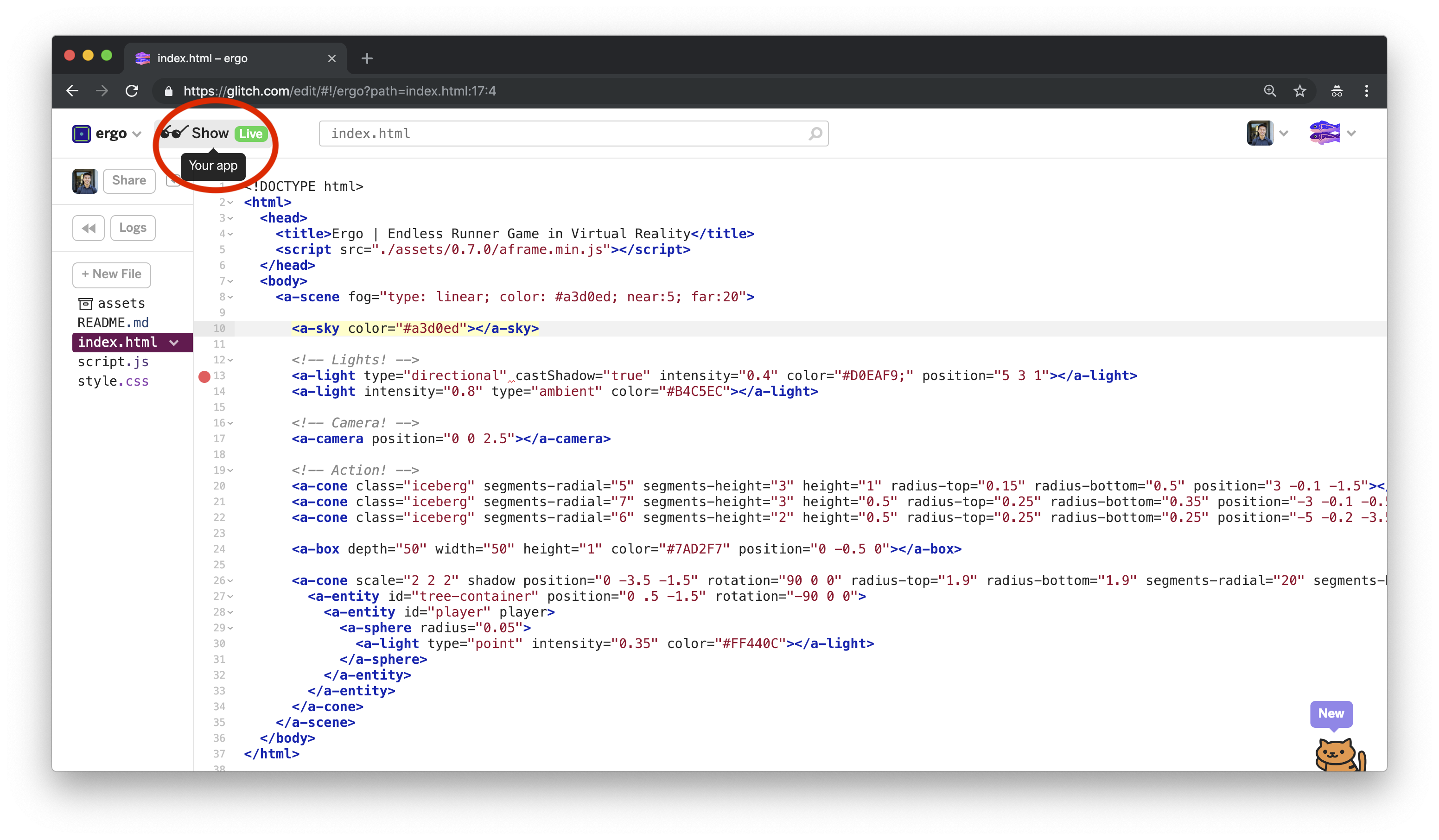
To preview the webpage, click on “Preview” in the top left. We will refer to this as your preview. Note that any changes in your editor will be automatically reflected in this preview, barring bugs or unsupported browsers.
“Show Live” button in glitch project (Large preview)
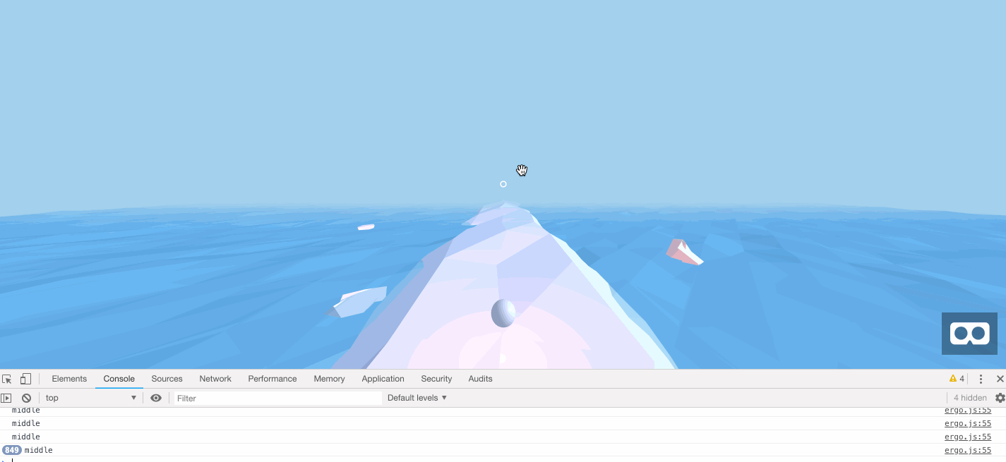
In your preview, you will see the following basic virtual reality scene. You can view this scene by using your favorite VR headset.
Animating Ocean and the fixed white cursor (Large preview)
This concludes the first step, setting up the game scene’s basic geometric objects. In the next step, you will add animations and use other A-Frame VR libraries for more visual effects.
Step 2: Improve Aesthetics for Virtual Reality Scene
In this step, you will add a number of aesthetic improvements to the scene:
Low-poly objects
You will substitute some of the basic geometric objects with their low-poly equivalents for more convincing, irregular geometric shapes.
Animations
You will have the player bob up and down, move the icebergs slightly, and make the ocean a moving body of water.
Your final product for this step will match the following:
The A-Frame low-poly library implements a number primitives, such as lp-cone and lp-sphere, each of which is a low-poly version of an A-Frame primitive. You can learn more about A-Frame primitives over here.
Next, navigate to the <!-- Icebergs --> section of your code. Replace all <a-cone>s with <lp-cone>.
We will now configure the low-poly primitives. All low-poly primitive supports two attributes, which control how exaggerated the low-poly stylization is:
amplitude
This is the degree of stylization. The greater this number, the more a low-poly shape can deviate from its original geometry.
amplitude-variance
This is how much stylization can vary, from vertex to vertex. The greater this number, the more variety there is in how much each vertex may deviate from its original geometry.
To get a better intuition for what these two variables mean, you can modify these two attributes in the A-Frame low-poly demo.
For the first iceberg, set amplitude-variance to 0.25. For the second iceberg, set amplitude to 0.12. For the last iceberg, set amplitude to 0.1.
Navigate to your preview, and you should see the low-poly icebergs bobbing around.
Bobbing player with fluctuating light (Large preview)
Next, update the platform and associated player. Here, upgrade the cone to a low-poly object, changing a-cone to lp-cone for <!-- Platform -->. Additionally, add configurations for amplitude.
Next, still within the platform section, navigate to the <!-- Player --> subsection of your code. Add the following animations for position, size, and intensity.
Navigate to your preview, and you will see your player bobbing up and down, with a fluctuating light on a low-poly platform.
Bobbing player with fluctuating light (Large preview)
Next, let’s animate the ocean. Here, you can use a lightly-modified version of Don McCurdy’s ocean. The modifications allow us to configure how large and fast the ocean’s waves move.
Create a new file via the Glitch interface, by clicking on “+ New File” on the left. Name this new file assets/ocean.js. Paste the following into your new ocean.js file:
/**
 * Flat-shaded ocean primitive.
 * https://github.com/donmccurdy/aframe-extras
 *
 * Based on a Codrops tutorial:
 * http://tympanus.net/codrops/2016/04/26/the-aviator-animating-basic-3d-scene-threejs/
 */
AFRAME.registerPrimitive('a-ocean', {
  defaultComponents: {
    ocean: {},
    rotation: {x: -90, y: 0, z: 0}
  },
  mappings: {
    width: 'ocean.width',
    depth: 'ocean.depth',
    density: 'ocean.density',
    amplitude: 'ocean.amplitude',
    'amplitude-variance': 'ocean.amplitudeVariance',
    speed: 'ocean.speed',
    'speed-variance': 'ocean.speedVariance',
    color: 'ocean.color',
    opacity: 'ocean.opacity'
  }
});

AFRAME.registerComponent('ocean', {
  schema: {
    // Dimensions of the ocean area.
    width: {default: 10, min: 0},
    depth: {default: 10, min: 0},

    // Density of waves.
    density: {default: 10},

    // Wave amplitude and variance.
    amplitude: {default: 0.1},
    amplitudeVariance: {default: 0.3},

    // Wave speed and variance.
    speed: {default: 1},
    speedVariance: {default: 2},

    // Material.
    color: {default: '#7AD2F7', type: 'color'},
    opacity: {default: 0.8}
  },

  /**
   * Use play() instead of init(), because component mappings – unavailable as dependencies – are
   * not guaranteed to have parsed when this component is initialized.
   * /
  play: function () {
    const el = this.el,
        data = this.data;
    let material = el.components.material;

    const geometry = new THREE.PlaneGeometry(data.width, data.depth, data.density, data.density);
    geometry.mergeVertices();
    this.waves = [];
    for (let v, i = 0, l = geometry.vertices.length; i < l; i++) {
      v = geometry.vertices[i];
      this.waves.push({
        z: v.z,
        ang: Math.random() * Math.PI * 2,
        amp: data.amplitude + Math.random() * data.amplitudeVariance,
        speed: (data.speed + Math.random() * data.speedVariance) / 1000 // radians / frame
      });
    }

    if (!material) {
      material = {};
      material.material = new THREE.MeshPhongMaterial({
        color: data.color,
        transparent: data.opacity < 1,
        opacity: data.opacity,
        shading: THREE.FlatShading,
      });
    }

    this.mesh = new THREE.Mesh(geometry, material.material);
    el.setObject3D('mesh', this.mesh);
  },

  remove: function () {
    this.el.removeObject3D('mesh');
  },

  tick: function (t, dt) {
    if (!dt) return;

    const verts = this.mesh.geometry.vertices;
    for (let v, vprops, i = 0; (v = verts[i]); i++){
      vprops = this.waves[i];
      v.z = vprops.z + Math.sin(vprops.ang) * vprops.amp;
      vprops.ang += vprops.speed * dt;
    }
    this.mesh.geometry.verticesNeedUpdate = true;
  }
});
Navigate back to your index.html file. In the <head> of your code, import the new JavaScript file:
Navigate to the <!-- Ocean --> section of your code. Replace the a-box to an a-ocean. Just as before, we set amplitude and amplitude-variance of our low-poly object.
Ensure that your index.html code matches the Step 2 source code. Navigate to your preview, and you’ll find the updated ocean along with a white circle fixed to the center of your view.
Bobbing player with fluctuating light (Large preview)
This concludes your aesthetic improvements to the scene. In this section, you learned how to use and configure low-poly versions of A-Frame primitives, e.g. lp-cone. In addition, you added a number of animations for different object attributes, such as position, rotation, and light intensity. In the next step, you will add the ability for the user to control the player — just by looking at different lanes.
Step 3: Add Virtual Reality Gaze Controls
Recall that our audience is a user wearing a virtual reality headset. As a result, your game cannot depend on keyboard input for controls. To make this game accessible, our VR controls will rely only on the user’s head rotation. Simply look to the right to move the player to the right, look to the center to move to the middle, and look to the left to move to the left. Our final product will look like the following.
Note: The demo GIF below was recorded on a desktop, with user drag as a substitute for head rotation.
Controlling game character with head rotation (Large preview)
Start from your index.html file. In the <head>...</head> tag, import your new JavaScript file, assets/ergo.js. This new JavaScript file will contain the game’s logic.
Then, add a new lane-controls attribute to your a-camera object:
<!-- Camera -->
<a-camera lane-controls position...>
</a-camera>
Next, create your new JavaScript file using “+ New File” to the left. Use assets/ergo.js for the filename. For the remainder of this step, you will be working in this new JavaScript file. In this new file, define a new function to setup controls, and invoke it immediately. Make sure to include the comments below, as we will refer to sections of code by those names.
/************
 * CONTROLS *
 ************/

function setupControls() {
}

/********
 * GAME *
 ********/

setupControls();
Note: The setupControls function is invoked in the global scope, because A-Frame components must be registered before the<a-scene>tag. I will explain what a component is below.
In your setupControls function, register a new A-Frame component. A component modifies an entity in A-Frame, allowing you to add custom animations, change how an entity initializes, or respond to user input. There are many other use cases, but you will focus on the last one: responding to user input. Specifically, you will read user rotation and move the player accordingly.
In the setupControls function, register the A-Frame component we added to the camera earlier, lane-controls. We will add an event listener for the tick event. This event triggers at every animation frame. In this event listener, hlog output at every tick.
Navigate to your preview. Open your browser developer console by right-clicking anywhere and selecting “Inspect”. This applies to Firefox, Chrome, and Safari. Then, select “Console” from the top navigation bar. Ensure that you see timestamps flowing into the console.
Navigate back to your editor. Still in assets/ergo.js, replace the body of setupControls with the following. Fetch the camera rotation using this.el.object3D.rotation, and log the lane to move the player to.
function setupControls() {
  AFRAME.registerComponent('lane-controls', {
    tick: function (time, timeDelta) {
      var rotation = this.el.object3D.rotation;

      if      (rotation.y > 0.1)  console.log("left");
      else if (rotation.y < -0.1) console.log("right");
      else                        console.log("middle");
    }
  })
}
Navigate back to your preview. Again, open your developer console. Try rotating the camera slightly, and observe console output update accordingly.
At the start of the controls section, define a new global variable representing the player position.
/************
 * CONTROLS *
 ************/

// Position is one of 0 (left), 1 (center), or 2 (right)
var player_position_index = 1;

function setupControls() {
...
After the new global variable, define a new function that will move the player to each lane.
var player_position_index = 1;

/**
 * Move player to provided index
 * @param {int} Lane to move player to
 */
function movePlayerTo(position_index) {
}

function setupControls() {
...
Inside this new function, start by updating the global variable. Then, define a dummy position.
function movePlayerTo(position_index) {
  player_position_index = position_index;

  var position = {x: 0, y: 0, z: 0}
}
After defining the position, update it according to the function input.
function movePlayerTo(position_index) {
  ...
  if      (position_index == 0) position.x = POSITION_X_LEFT;
  else if (position_index == 1) position.x = POSITION_X_CENTER;
  else                          position.x = POSITION_X_RIGHT;
}
Finally, update the player position.
function movePlayerTo(position_index) {
    ...
document.getElementById('player').setAttribute('position', position);
}
Double-check that your function matches the following.
/**
 * Move player to provided index
 * @param {int} Lane to move player to
 */
function movePlayerTo(position_index) {
  player_position_index = position_index;

  var position = {x: 0, y: 0, z: 0}
  if      (position_index == 0) position.x = POSITION_X_LEFT;
  else if (position_index == 1) position.x = POSITION_X_CENTER;
  else                          position.x = POSITION_X_RIGHT;
  document.getElementById('player').setAttribute('position', position);
}
Navigate back to your preview. Open the developer console. Invoke your new movePlayerTo function from the console to ensure that it functions.
> movePlayerTo(2) # should move to right
Navigate back to your editor. For the final step, update your setupControls to move the player depending on camera rotation. Here, we replace the console.log with movePlayerTo invocations.
function setupControls() {
  AFRAME.registerComponent('lane-controls', {
    tick: function (time, timeDelta) {
      var rotation = this.el.object3D.rotation;

      if      (rotation.y > 0.1)  movePlayerTo(0);
      else if (rotation.y < -0.1) movePlayerTo(2);
      else                        movePlayerTo(1);
    }
  })
}
Ensure that your assets/ergo.js matches the corresponding file in the Step 3 source code. Navigate back to your preview. Rotate the camera from side to side, and your player will now track the user’s rotation.
Controlling game character with head rotation (Large preview)
This concludes gaze controls for your virtual reality endless runner game.
In this section, we learned how to use A-Frame components and saw how to modify A-Frame entity properties. This also concludes part 1 of our endless runner game tutorial. You now have a virtual reality model equipped with aesthetic improvements like low-poly stylization and animations, in addition to a virtual-reality-headset-friendly gaze control for players to use.
Conclusion
We created a simple, interactive virtual reality model, as a start for our VR endless runner game. We covered a number of A-Frame concepts such as primitives, animations, and components — all of which are necessary for building a game on top of A-Frame VR.
Here are extra resources and next steps for working more with these technologies:
A-Frame VR
Official documentation for A-Frame VR, covering the topics used above in more detail.
A-Frame Homepage
Examples of A-Frame projects, exhibiting different A-Frame capabilities.
Low-Poly Island
VR model using the same lighting, textures, and animations as the ones used for this endless runner game.
In the next part of this article series, I’ll show you how you can implement the game’s core logic and use more advanced A-Frame VR scene manipulations in JavaScript.


 Are you an affiliate marketer looking to boost click-through rates and sales on your website? If so, you will definitely love this review of the Affiliate Coupons WordPress plugin. I think you will agree when I say: creating a successful affiliate website is challenging. Everything from finding the best deals to marketing and converting users […]
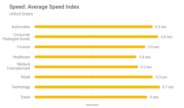


![How to Create and Verify an Email Newsletter Before Sending [Checklist]](https://designmodo.com/wp-content/uploads/2019/02/email-newsletter-plans-747x420.jpg)


