Newsletters are important. But managing an email list and making the time to create and send newsletters doesn’t always fit into your schedule (or your budget). Did you know that you could send a newsletter right from your WordPress dashboard? And better yet – that there are quite a few newsletter WordPress plugins that you […]
Irix design pays particular attention to detail to create lenses that combine classical design with maximum functionality. Irixlens have used the latest technology to ensure exceptional precision
Spotsy.me is a web service that allows any Instagram user to create a website in less than 5 minutes. Besides having immediately a fully customizable and cool website, users will be able to make money by adding links to their Instagram posts. On the most basic configuration this website will have only one page with a brief user description on the header, Instagram posts with custom info and links and a footer with some basic info an optional Mailchimp subscribe form.
One of the most empowering things you can learn as a new front-end developer who is starting to learn JavaScript is to change classes. If you can change classes, you can use your CSS skills to control a lot on a page. Toggle a class to one thing, style it this way, toggle to another class (or remove it) and style it another way.
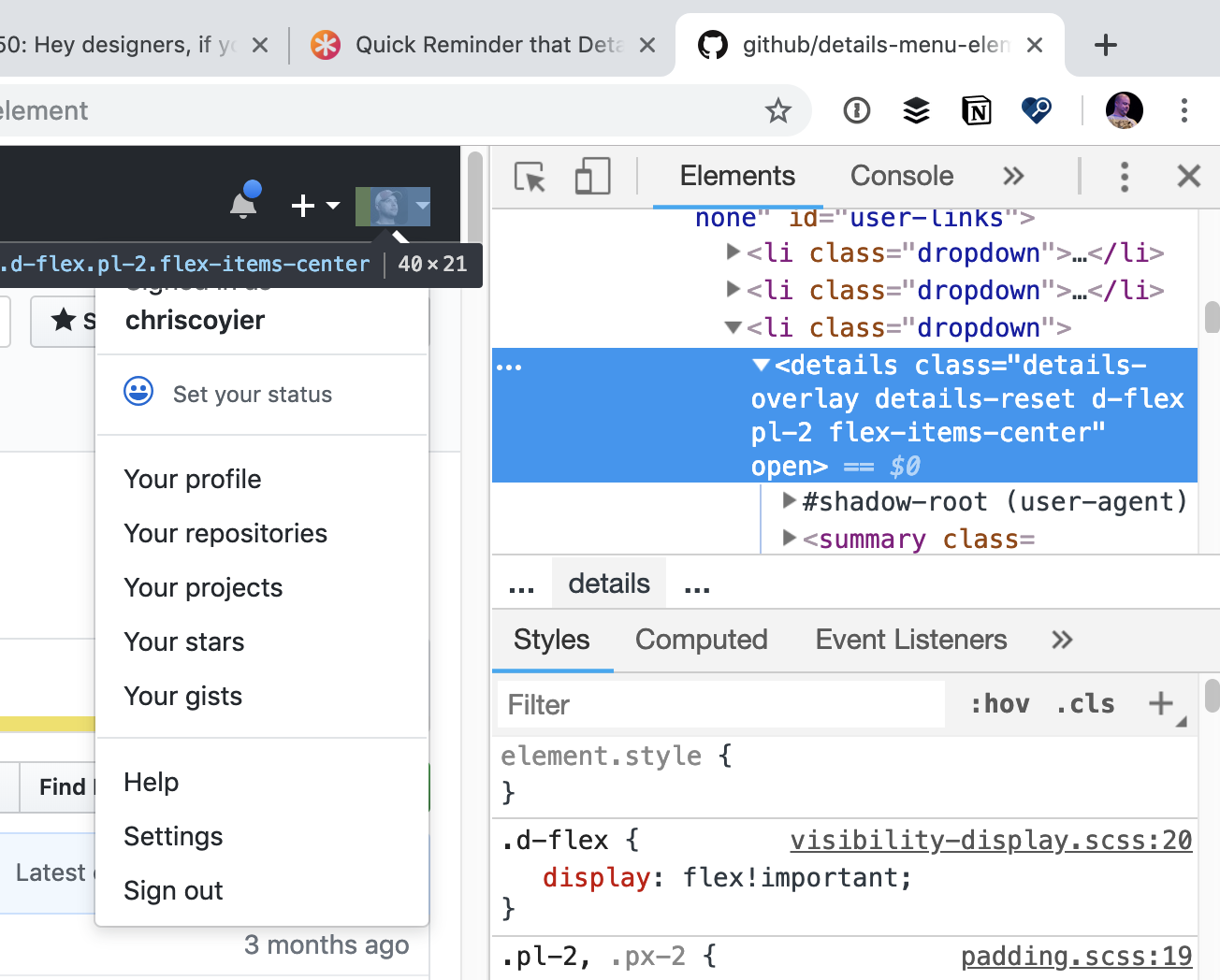
Extending that toggle-based thinking, what is a user menu if not for a single accordion? Same with modals. If we went that route, we could make JavaScript optional on those dynamic things. That's exactly what GitHub did with their menu.
Inside the <details> element, GitHub uses some Web Components (that do require JavaScript) to do some bonus stuff, but they aren't required for basic menu functionality. That means the menu is resilient and instantly interactive when the page is rendered.
We went all in on details to turn a lot of things interactive without JS. There is also https://t.co/SFXtkNzIbZ, and here is a talk I gave on leveraging the power of details, which mentions the CSS trick :) https://t.co/DmX8opvi4z
The worst strike on <details> is its browser support in Edge, but I guess we won't have to worry about that soon, as Edge will be using Chromium... soon? Does anyone know?
Here’s a wonderful post by Eric Higgins all about refactoring and technical debt. He compares giant refactoring projects to being similar to Tetris:
Similar to running a business, Tetris gets harder the longer you play. Pieces move faster and it becomes harder to keep up.
Similar to running a business, you can never win Tetris. There is no true finish line. You only control how quickly you lose.
Similar to running a business, allowing too many gaps to build up in Tetris will cause you to lose.
I love this comparison, despite my mediocre Tetris skills. It does feel like even "easy" development becomes harder as technical debt grows on a project, much the same way Tetris pieces gain speed and provide little time to react as the stack grows. However, I do think perhaps I have a more optimistic view of technical debt overall. If you work slowly and carefully then you can build up a culture of refactoring and gather momentum over time.
Connected services that depend on APIs can be difficult to test. You want to be certain whether or not a server will be available, if it will provide the expected result, or if changes made to your service will break other dependencies. Whether consuming your own APIs or third-party APIs, you can alleviate concerns with a structured and collaborative approach.
As web developers we do take seriously the security of our end users by applying a hash method on their passwords before storing it to the database so should our database be hacked we know that our end user passwords are secure.
But what about the browser remembered passwords on the front end? We all know that a password can be viewed on the front end by using a tool called element inspector and change the password type from password to text and we can see the actual password and we can login on our own device with that at our own space.
Let me introduce to you the Instant Web Password Encryption (IWPE). The IWPE encrypt and decrypt browser remembered passwords on the fly. The IWPE encrypt the password and return the 2 level hash as your password which on submit it then calculate the password and attach it to the POST/GET method on submit.
You can try the live demo and see how IWPE works. Check it out iwpe.000webhostapp.com/iwpe
I will provide with the documentation which will outline how you can also use the IWPE on your website, but it very easy to use this library.
As in, just a little DIY something you can add to each one of your Pens to brand it and let people know it's one of yours.
I'd bet you already know you could add external resources. Like linking up a JavaScript library, CSS file, or uploading your own asset. You can even link to other Pens as assets, so if you put the URL to another Pen in the CSS or JS asset area, it'll pull the respective code from that Pen.
But you can do that for HTML also!
If you put the URL of a Pen in [[[triple brackets]]] it will pull the HTML from that Pen and put it in place. That's useful for all sorts of stuff. Say you were making three mockups that all needed the same header bar, you could make one Pen for the header bar and import it in all three. Or use it make variations on a theme, like we showed in our introductory blog post.
Another thing people use it for though is CodePen Calling Cards, or little bits of UI you can add to a Pen that essentially brands it for yourself. Doing stuff like linking back to your profile or your own website.
Pete Barr has a whole slide out menu!
You might need to click over an look on a big screen.
Vonage recently announced Number Programmability capability for its Vonage Business Cloud (VBC) platform. Number Programmability leverages Nexmo APIs to intelligently program any VBC phone number.
Humane by Design is a resource that provides guidance for designing ethically humane digital products through patterns focused on user well-being. By Jon Yablonski.
Tifi is a library for functional programming in TypeScript that solves the problem of the existence of both undefined and null, inspired by the OCaml/Reason utilities for the option data type.
Little confession here: when I first saw Netlify CMS at a glance, I thought: cool, maybe I'll try that someday when I'm exploring CMSs for a new project. Then as I looked at it with fresh eyes: I can already use this! It's a true CMS in that it adds a content management UI on top of any static site generator that works from flat files! Think of how you might build a site from markdown files with Gatsby, Jekyll, Hugo, Middleman, etc. You can create and edit Markdown files and the site's build process runs and the site is created.
Netlify CMS gives you (or anyone you set it up for) a way to create/edit those Markdown files without having to use a code editor or know about Pull Requests on GitHub or anything. It's a little in-browser app that gives you a UI and does the file manipulation and Git stuff behind the scenes.
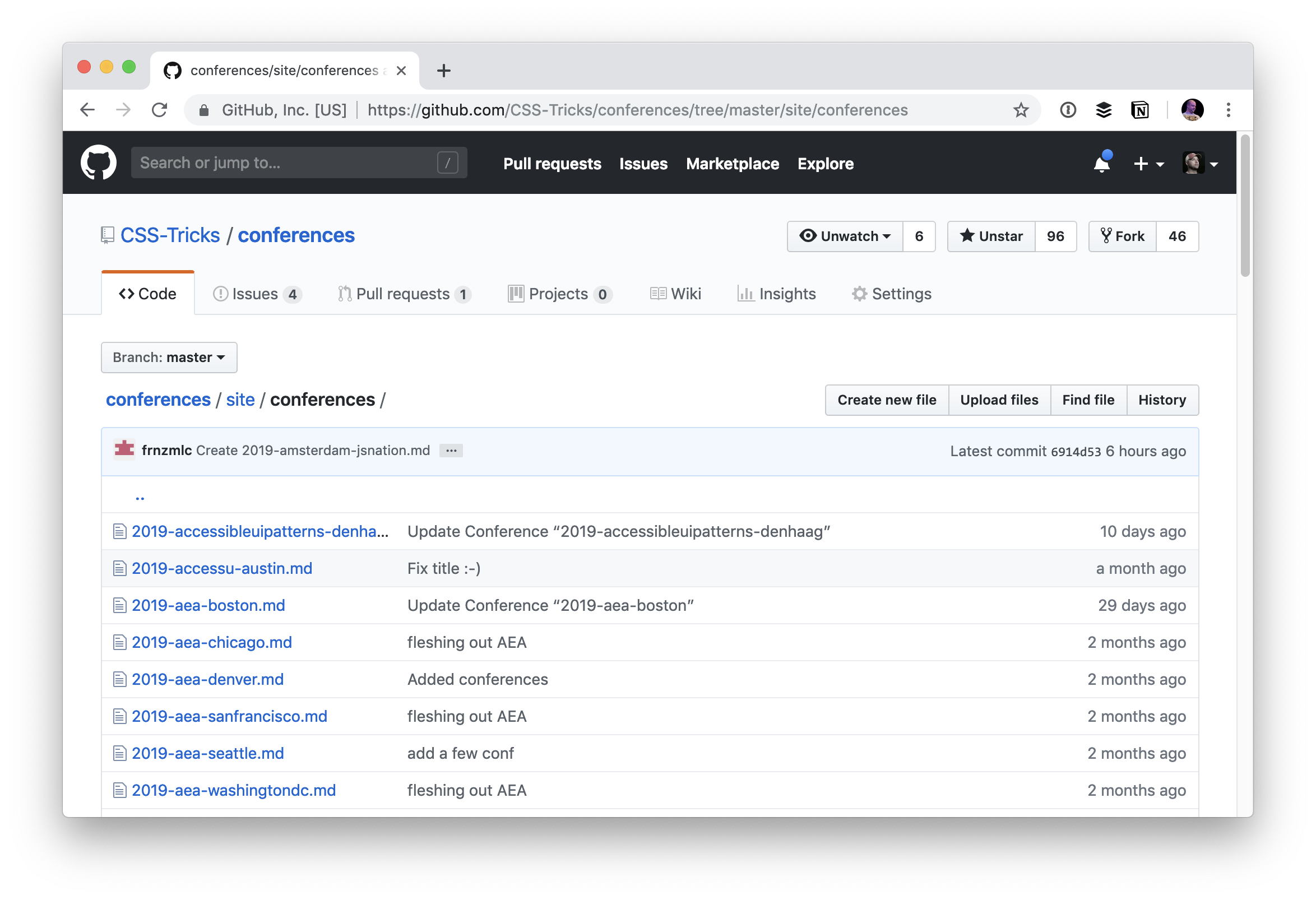
It's on GitHub, so it's open to Pull Requests, and each conference is a Markdown file.
That's pretty cool already. The community has contributed 77 Pull Requests already really fleshing out the content of the site, and the design, accessibility, and features as well!
I used 11ty to build the site, which works great with building out those Markdown files into a site, using Nunjucks templates. Very satisfying combo, I found, after a slight mostly configuration-related learning curve.
Enter Netlify CMS.
But as comfortable as you or I might be with a quick code edit and Pull Request, not everybody is. And even I have to agree that going to a URL quick, editing some copy in input fields, and clicking a save button is the easiest possible way to manage content.
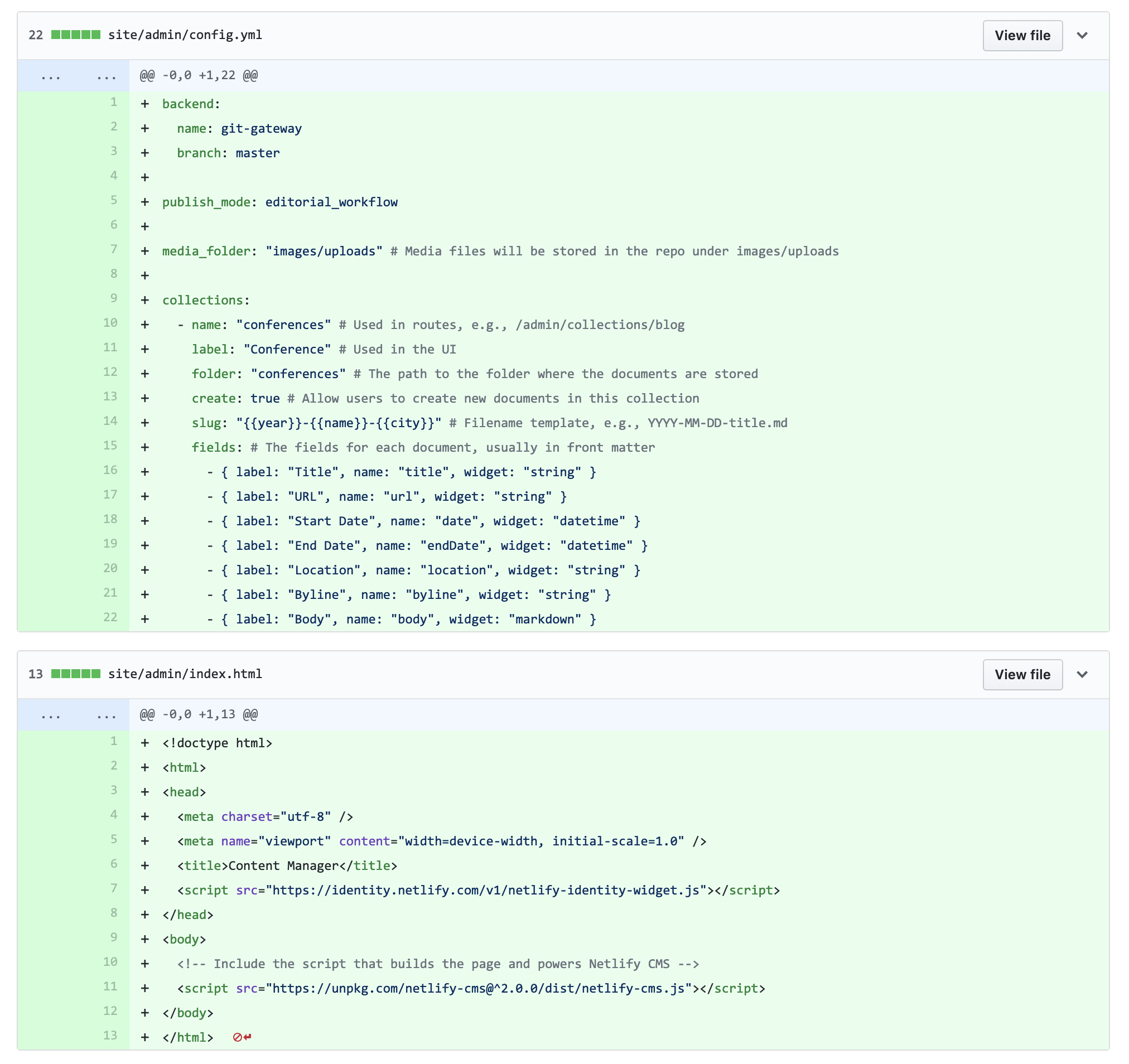
That CMS UI is exactly what Netlify CMS gives you. Wanna see the entire commit for adding Netlify CMS?
It's two files! That still kinda blows my mind. It's a little SPA React app that's entirely configurable with one file.
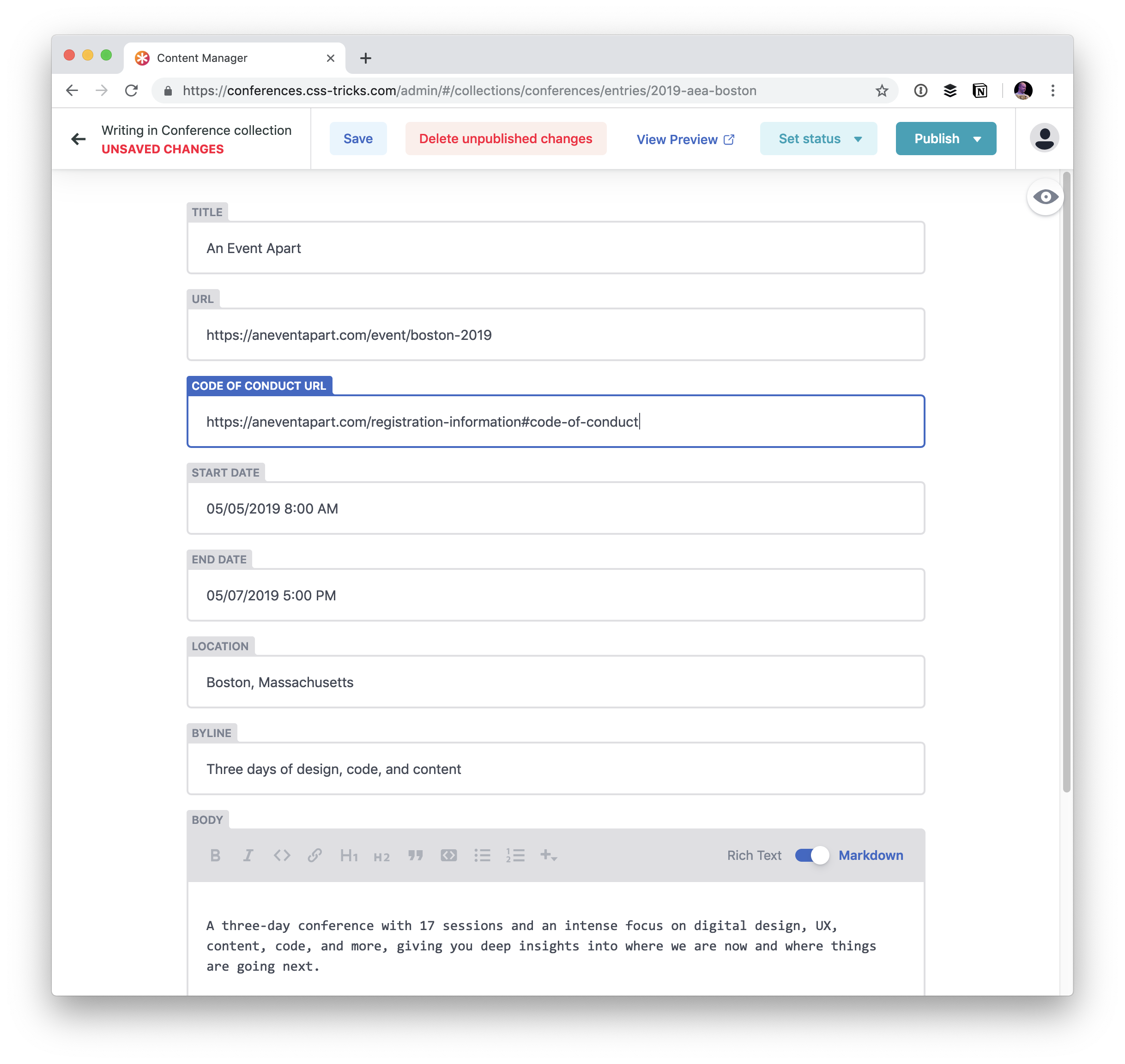
Cutting to the chase here, once it is installed, I now have a totally customized UI for editing the conferences on the site available right on the production site.
Netlify CMS doesn't do anything forceful or weird, like attempt to edit the HTML on the production site directly. It works right into the workflow in the same exact way that you would if you were editing files in a code editor and committing in Git.
Auth & Git
You use Netlify CMS on your production site, which means you need authentication so that just you (and the people you want) have access to it. Netlify Identity makes that a snap. You just flip it on from your Netlify settings and it works.
I activated GitHub Auth so I could make logging in one-click for me.
The Git magic happens through a technology called Git Gateway. You don't have to understand it (I don't really), you just enable it in Netlify as part of Netlify Identity, and it forms the connection between your site and the Git repository.
Now when you create/edit content, actual Markdown files are created and edited (and whatever else is involved, like images!) and the change happens right in the Git repository.
I made this the footer of the site cause heck yeah.
Companies
used to place the highest priority on delivering bug-free software. There’s
nothing wrong with that of course. Bug-free software is a worthy goal. The
problem is, these same companies neglected to address usability issues. They
did that until their software solutions had been placed into service. At this
time, resolving usability issues often involved significant expense.
Usability issues tend to be more common than
many people realize. The good news is, they can be addressed during the design
phase. Then, they can usually be dealt with at minimal time and expense.
The tools and resources presented here are
precisely what you want to have access to. This is if your intent is to address
usability issues or concerns during the design phase.
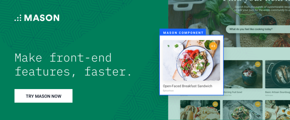
Mason provides teams with a visual front-end
feature-building environment in which they can collaborate to create app and
other digital product features and seamlessly integrate those features into the
codebases of existing products.
Normally, it can be fairly expensive to make a
change or add a feature to an existing product, even if either is relatively
minor. With Mason, neither software product teams or clients are forced to wait
for the next deployment cycle to make a change or add a feature. Mason makes
software maintenance far easier, faster, and less expensive than what people
have become accustomed to.
Since Mason takes care of the coding,
developers can focus on larger and more complex tasks and leave it up to the
designers to create and deploy robust and secure software features and fixes.
Mason is easy to work with, transparent, and
completely non-intrusive, it’s there only when you trigger it, so it won’t wear
your websites or apps down.
UXPin
is a powerful cloud-based prototyping tool you can use from the very beginning
of the design phase until it’s time to hand the design over to the developers.
Design, prototype, collaborate all in one place. It’s one of the few design
tools that allows you to design from coded components. Its use is based on the principle that one of
the best ways to create a top-tier UX is by using an iterative wireframing and
prototyping approach.
UXPin enables teams to share design information
as needed, including with their clients and other project stakeholders.
This design information can take the form of
concept-proving wireframes, low-fidelity prototypes to share with others for
feedback, and interactive high-fidelity prototypes that have the look and feel
of the real thing for user testing and design approval and buy off.
UXPin is designed to help you significantly
reduce design, development, and product time, while ensuring consistency of
design from one software solution to the next.
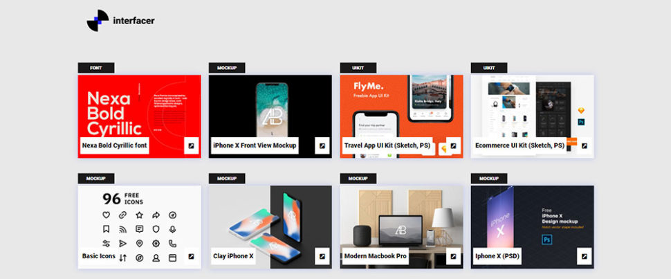
Interfacer
not only offers a practical solution to your need for a comprehensive library
of design aids, but it’s a fun resource to have at your fingertips as well.
This resource “library” is actually a collection of mini-libraries that feature
hundreds of Google fonts, icons, UI Design kits, images, and templates for
websites, landing pages, special pages and more.
Best of all, the quality throughout is
excellent and everything is free for commercial use.
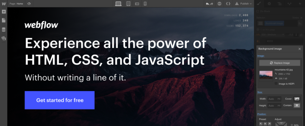
There’s no need to invest in separate tools or platforms to manage your website design, development, and hosting needs. Webflow gives you a code-free, all-in-one solution that includes building a client-friendly CMS for each website or app you create — not to mention completely custom layouts and interactions. Designed for creative web designers, Webflow is easy to work with whether you’re a long-time designer or a beginner.
Why should you concern yourself over UX design and these tools?
A
friendly UX encourages visitors to see their journey to its end
We’ve all been there. Looking for a particular
product or service on the web and finding several good websites.
They promote the same products or services, but
one stands out from the others. It was quick and easy to find what we were
looking for. The experience was in fact so enjoyable that we decided to
bookmark the website.
Wouldn’t it be wonderful if the website or app
in question belonged to you?
A
compelling UX design can increase loyalty to your brand
The ability to provide a good user experience
is key to the success of your business. It helps to build trust in your brand,
your product line, or your service. The UX you design can also help to
establish longstanding customer relationships. Seamless and enjoyable
interactions that encourage customer participation should be your goal.
Great
UX designs can encourage word of mouth referrals to new customers
Word of mouth has always been an effective way
to generate new business, and it’s no different in the digital world. People
like to share pleasant experiences. Provide a good online experience to your
users and they’ll want to tell the world about it.
Make the buying process a smooth and pleasant
one for your users. An opportunity will arise to recommend someone to friends
over social media. Whose business will that be? Yours?
Conclusion
The four UX and UI tools and resources
described above have several things in common. If you make a choice, it most
likely be one that best addresses your particular needs.
These UX/UI tools are fast, efficient, and
effective. The collection of design aid mini-libraries should help you. You can
steer clear having to reinvent the wheel.
You can also avoid extensive searches for special fonts, icons, or UI
kits.
The newest installment of our monthly web dev collection is here and it is packed with amazing new frameworks, useful tools and other awesome resources.
This is part four of a five-part series discussing the Web Components specifications. In part one, we took a 10,000-foot view of the specifications and what they do. In part two, we set out to build a custom modal dialog and created the HTML template for what would evolve into our very own custom HTML element in part three.
If you haven’t read those articles, you would be advised to do so now before proceeding in this article as this will continue to build upon the work we’ve done there.
When we last looked at our dialog component, it had a specific shape, structure and behaviors, however it relied heavily on the outside DOM and required that the consumers of our element would need to understand it’s general shape and structure, not to mention authoring all of their own styles (which would eventually modify the document’s global styles). And because our dialog relied on the contents of a template element with an id of "one-dialog", each document could only have one instance of our modal.
The current limitations of our dialog component aren’t necessarily bad. Consumers who have an intimate knowledge of the dialog’s inner workings can easily consume and use the dialog by creating their own <template> element and defining the content and styles they wish to use (even relying on global styles defined elsewhere). However, we might want to provide more specific design and structural constraints on our element to accommodate best practices, so in this article, we will be incorporating the shadow DOM to our element.
What is the shadow DOM?
In our introduction article, we said that the shadow DOM was "capable of isolating CSS and JavaScript, almost like an <iframe>." Like an <iframe>, selectors and styles inside of a shadow DOM node don’t leak outside of the shadow root and styles from outside the shadow root don’t leak in. There are a few exceptions that inherit from the parent document, like font family and document font sizes (e.g. rem) that can be overridden internally.
Unlike an <iframe>, however, all shadow roots still exist in the same document so that all code can be written inside a given context but not worry about conflicts with other styles or selectors.
Adding the shadow DOM to our dialog
To add a shadow root (the base node/document fragment of the shadow tree), we need to call our element’s attachShadow method:
By calling attachShadow with mode:'open', we are telling our element to save a reference to the shadow root on the element.shadowRoot property. attachShadow always returns a reference to the shadow root, but here we don’t need to do anything with that.
If we had called the method with mode: 'closed', no reference would have been stored on the element and we would have to create our own means of storage and retrieval using a WeakMap or Object, setting the node itself as the key and the shadow root as the value.
const shadowRoots = new WeakMap();

class ClosedRoot extends HTMLElement {
  constructor() {
    super();
    const shadowRoot = this.attachShadow({ mode: 'closed' });
    shadowRoots.set(this, shadowRoot);
  }

  connectedCallback() {
    const shadowRoot = shadowRoots.get(this);
    shadowRoot.innerHTML = `<h1>Hello from a closed shadow root!</h1>`;
  }
}
We could also save a reference to the shadow root on our element itself, using a Symbol or other key to try to make the shadow root private.
In general, the closed mode for shadow roots exists for native elements that use the shadow DOM in their implementation (like <audio> or <video>). Further, for unit testing our elements, we might not have access to the shadowRoots object, making it unable for us to target changes inside our element depending on how our library is architected.
There might be some legitimate use cases for user-land closed shadow roots, but they are few and far between, so we’ll stick with the open shadow root for our dialog.
After implementing the new open shadow root, you might notice now that our element is completely broken when we try to run it:
This is because all of the content we had before was added to and manipulated in the traditional DOM (what we’ll call the light DOM). Now that our element has a shadow DOM attached, there is no outlet for the light DOM to render. Let’s start fixing these issues by moving our content to the shadow DOM:
The major changes to our dialog so far are actually relatively minimal, but they carry a lot of impact. For starters, all our selectors (including our style definitions) are internally scoped. For example, our dialog template only has one button internally, so our CSS only targets button { ... }, and those styles don’t bleed out to the light DOM.
We are, however, still reliant on the template that is external to our element. Let’s change that by removing the markup from our template and dropping it into our shadow root’s innerHTML.
The shadow DOM specification includes a means for allowing content from outside the shadow root to be rendered inside of our custom element. For those of you who remember AngularJS, this is a similar concept to ng-transclude or using props.children in React. With Web Components, this is done using the <slot> element.
A simple example would look like this:
<div>
  <span>world <!-- this would be inserted into the slot element below --></span>
  <#shadow-root><!-- pseudo code -->
    <p>Hello <slot></slot></p>
  </#shadow-root>
</div>
A given shadow root can have any number of slot elements, which can be distinguished with a name attribute. The first slot inside of the shadow root without a name, will be the default slot and all content not otherwise assigned will flow inside that node. Our dialog really needs two slots: a heading and some content (which we’ll make default).
Go ahead and change the HTML portion of our dialog and see the result. Any content inside of the light DOM is inserted into the slot to which it is assigned. Slotted content remains inside the light DOM although it is rendered as if it were inside the shadow DOM. This means that these elements are still fully style-able by a consumer who might want to control the look and feel of their content.
A shadow root’s author can style content inside the light DOM to a limited extent using the CSS ::slotted() pseudo-selector; however, the DOM tree inside slotted is collapsed, so only simple selectors will work. In other words, we wouldn't be able to style a <strong> element inside a <p> element within the flattened DOM tree in our previous example.
The best of both worlds
Our dialog is in a good state now: it has encapsulated, semantic markup, styles and behavior; however, some consumers of our dialog might still want to define their own template. Fortunately, by combining two techniques we’ve already learned, we can allow authors to optionally define an external template.
To do this, we will allow each instance of our component to reference an optional template ID. To start, we need to define a getter and setter for our component’s template.
get template() {
  return this.getAttribute('template');
}

set template(template) {
  if (template) {
    this.setAttribute('template', template);
  } else {
    this.removeAttribute('template');
  }
  this.render();
}
Here we’re doing much the same thing that we did with our open property by tying it directly to its corresponding attribute. But at the bottom, we’re introducing a new method to our component: render. We are going to use our render method to insert our shadow DOM’s content and remove that behavior from the connectedCallback; instead, we will call render when our element is connected:
Our dialog now has some really basic default stylings, but also gives consumers the ability to define a new template for each instance. If we wanted, we could even use attributeChangedCallback to make this component update based on the template it’s currently pointing to:
static get observedAttributes() { return ['open', 'template']; }

attributeChangedCallback(attrName, oldValue, newValue) {
  if (newValue !== oldValue) {
    switch (attrName) {
      /** Boolean attributes */
      case 'open':
        this[attrName] = this.hasAttribute(attrName);
        break;
      /** Value attributes */
      case 'template':
        this[attrName] = newValue;
        break;
    }
  }
}
In the demo above, changing the template attribute on our <one-dialog> element will alter which design is being used when the element is rendered.
Strategies for styling the shadow DOM
Currently, the only reliable way to style a shadow DOM node is by adding a <style> element to the shadow root’s inner HTML. This works fine in almost every case as browsers will de-duplicate stylesheets across these components, where possible. This does tend to add a bit of memory overhead, but generally not enough to notice.
Inside of these style tags, we can use CSS custom properties to provide an API for styling our components. Custom properties can pierce the shadow boundary and effect content inside a shadow node.
“Can we use a <link> element inside of a shadow root?” you might ask. And, in fact, we can. The trouble comes when trying to reuse this component across multiple applications as the CSS file might not be saved in a consistent location throughout all apps. However, if we are certain as to the element’s stylesheet location, then using <link> is an option. The same holds true for including an @import rule in a style tag.
It is also worth mentioning that not all components need the kind of styling we're using here. Using the CSS :host and :host-context selectors, we can simply define more primitive components as block-level elements and allow consumers to provide classes to style things like background colors, font settings, and more.
Our dialog, on the other hand, is fairly complex. Something like a listbox (comprised of a label and an checkbox input) is not and can be just merely as a surface for native element composition. That is equally as valid a styling strategy as is being more explicit about styles (say for design systems purposes where all checkboxes might look a certain way). It largely depends on your use case.
CSS custom properties
One of the benefits of using CSS custom properties — also called CSS variables — is that they bleed through the shadow DOM. This is by design, giving component authors a surface for allowing theming and styling of their components from the outside. It is important to note, however, that since CSS cascades, changes to custom properties made inside a shadow root do not bleed back up.
Go ahead and comment out or remove the variables set in the CSS panel of the demo above and see how this impacts the rendered content. Afterward, you can take a look at the styles in the shadow DOM’s innerHTML, you’ll see how the shadow DOM can define its own property that won’t affect the light DOM.
Constructible stylesheets
At the time of this writing, there is a proposed web feature that will allow for more modular styling of shadow DOM and light DOM elements using constructible stylesheets that has already landed in Chrome 73 and received positive signaling from Mozilla.
This feature would allow authors to define stylesheets in their JavaScript files similar to how they would write normal CSS and share those styles across multiple nodes. So, a single stylesheet could be appended to multiple shadow roots and potentially the document as well.
In the above example, the everythingTomato stylesheet would be simultaneously applied to the shadow root and to the document’s body. This feature would be very useful for teams creating design systems and components that are intended to be shared across multiple applications and frameworks.
In the next demo, we can see a really basic example of how this can be utilized and the power that constructble stylesheets offer.
In this demo, we construct two stylesheets and append them to the document and to the custom element. After three seconds, we remove one stylesheet from our shadow root. For those three seconds, however, the document and the shadow DOM share the same stylesheet. Using the polyfill included in that demo, there are actually two style elements present, but Chrome runs this natively.
That demo also includes a form for showing how a sheet’s rules can easily and effectively changed asynchronously as needed. This addition to the web platform can be a powerful ally for those creating design systems that span multiple frameworks or site authors who want to provide themes for their websites.
There is also a proposal for CSS Modules that could eventually be used with the adoptedStyleSheets feature. If implemented in its current form, this proposal would allow importing CSS as a module much like ECMAScript modules:
Another feature that is in the works for styling Web Components are the ::part() and ::theme() pseudo-selectors. The ::part() specification will allow authors to define parts of their custom elements that have a surface for styling:
In the above example, the primary message of the <h1> tag would be in a different color than the description part, giving custom element authors the ability to expose styling APIs for their components and maintain control over the pieces they want to maintain control over.
The difference between ::part() and ::theme() is that ::part() must be specifically selected whereas ::theme() can be nested at any level. The following would have the same effect as the above CSS, but would also work for any other element that included a part="description" in the entire document tree.
:root::theme(description) {
  color: tomato;
}
Like constructible stylesheets, ::part() has landed in Chrome 73.
Wrapping up
Our dialog component is now complete, more-or-less. It includes its own markup, styles (without any outside dependencies) and behaviors. This component can now be included in projects that use any current or future frameworks because they are built against the browser specifications instead of third-party APIs.
Some of the core controls are a little verbose and do rely on at least a moderate knowledge of how the DOM works. In our final article, we will discuss higher-level tooling and how to incorporate with popular frameworks.
When Steve Jobs unveiled the Macintosh in 1984, it said “Hello” to us from the stage. Even at that point, speech synthesis wasn’t really a new technology: Bell Labs developed the vocoder as early as in the late 30s, and the concept of a voice assistant computer made it into people’s awareness when Stanley Kubrick made the vocoder the voice of HAL9000 in 2001: A Space Odyssey (1968).
It wasn’t before the introduction of Apple’s Siri, Amazon Echo, and Google Assistant in the mid 2015s that voice interfaces actually found their way into a broader public’s homes, wrists, and pockets. We’re still in an adoption phase, but it seems that these voice assistants are here to stay.
In other words, the web isn’t just passive text on a screen anymore. Web editors and UX designers have to get accustomed to making content and services that should be spoken out loud.
We’re already moving fast towards using content management systems that let us work with our content headlessly and through APIs. The final piece is to make editorial interfaces that make it easier to tailor content for voice. So let’s do just that!
What Is SSML
While web browsers use W3C’s specification for HyperText Markup Language (HTML) to visually render documents, most voice assistants use Speech Synthesis Markup Language (SSML) when generating speech.
A minimal example using the root element <speak>, and the paragraph (<p>) and sentence (<s>) tags:
<speak>
  <p>
    <s>This is the first sentence of the paragraph.</s>
    <s>Here’s another sentence.</s>
  </p>
</speak>
Press play to listen to the snippet:
Where SSML gets existing is when we introduce tags for <emphasis> and <prosody> (pitch):
<speak>
  <p>
    <s>Put some <emphasis strength="strong">extra weight on these words</emphasis></s>
    <s>And say <prosody pitch="high" rate="fast">this a bit higher and faster</prosody>!</s>
  </p>
</speak>
Press play to listen to the snippet:
SSML has more features, but this is enough to get a feel for the basics. Now, let’s take a closer look at the editor that we will use to make the speech synthesis editing interface.
The Editor For Portable Text
To make this editor, we’ll use the editor for Portable Text that features in Sanity.io. Portable Text is a JSON specification for rich text editing, that can be serialized into any markup language, such as SSML. This means you can easily use the same text snippet in multiple places using different markup languages.
Sanity.io’s default editor for Portable Text (Large preview)
Installing Sanity
Sanity.io is a platform for structured content that comes with an open-source editing environment built with React.js. It takes two minutes to get it all up and running.
Type npm i -g @sanity/cli && sanity init into your terminal, and follow the instructions. Choose “empty”, when you’re prompted for a project template.
If you don’t want to follow this tutorial and make this editor from scratch, you can also clone this tutorial’s code and follow the instructions in README.md.
When the editor is downloaded, you run sanity start in the project folder to start it up. It will start a development server that use Hot Module Reloading to update changes as you edit its files.
How To Configure Schemas In Sanity Studio
Creating The Editor Files
We’ll start by making a folder called ssml-editor in the /schemas folder. In that folder, we’ll put some empty files:
Now we can add content schemas in these files. Content schemas are what defines the data structure for the rich text, and what Sanity Studio uses to generate the editorial interface. They are simple JavaScript objects that mostly require just a name and a type.
We can also add a title and a description to make a bit nicer for editors. For example, this is a schema for a simple text field for a title:
export default {
  name: 'title',
  type: 'string',
  title: 'Title',
  description: 'Titles should be short and descriptive'
}
The studio with our title field and the default editor (Large preview)
Portable Text is built on the idea of rich text as data. This is powerful because it lets you query your rich text, and convert it into pretty much any markup you want.
It is an array of objects called “blocks” which you can think of as the “paragraphs”. In a block, there is an array of children spans. Each block can have a style and a set of mark definitions, which describe data structures distributed on the children spans.
Sanity.io comes with an editor that can read and write to Portable Text, and is activated by placing the block type inside an array field, like this:
An array can be of multiple types. For an SSML-editor, those could be blocks for audio files, but that falls outside of the scope of this tutorial.
The last thing we want to do is to add a content type where this editor can be used. Most assistants use a simple content model of “intents” and “fulfillments”:
Intents
Usually a list of strings used by the AI model to delineate what the user wants to get done.
Fulfillments
This happens when an “intent” is identified. A fulfillment often is — or at least — comes with some sort of response.
So let’s make a simple content type called fulfillment that use the speech synthesis editor. Make a new file called fulfillment.js and save it in the /schema folder:
// fulfillment.js
export default {
  name: 'fulfillment',
  type: 'document',
  title: 'Fulfillment',
  of: [
    {
      name: 'title',
      type: 'string',
      title: 'Title',
      description: 'Titles should be short and descriptive'
    },
    {
      name: 'response',
      type: 'speech'
    }
  ]
}
Save the file, and open schema.js. Add it to your studio like this:
// schema.js
import createSchema from 'part:@sanity/base/schema-creator'
import schemaTypes from 'all:part:@sanity/base/schema-type'
import fullfillment from './fullfillment'
import speech from './speech'

export default createSchema({
  name: 'default',
  types: schemaTypes.concat([
    fullfillment,
    speech,
  ])
})
If you now run sanity start in your command line interface within the project’s root folder, the studio will start up locally, and you’ll be able to add entries for fulfillments. You can keep the studio running while we go on, as it will auto-reload with new changes when you save the files.
Adding SSML To The Editor
By default, the block type will give you a standard editor for visually oriented rich text with heading styles, decorator styles for emphasis and strong, annotations for links, and lists. Now we want to override those with the audial concepts found in SSML.
We begin with defining the different content structures, with helpful descriptions for the editors, that we will add to the block in SSMLeditorSchema.js as configurations for annotations. Those are “emphasis”, “alias”, “prosody”, and “say as”.
Emphasis
We begin with “emphasis”, which controls how much weight is put on the marked text. We define it as a string with a list of predefined values that the user can choose from:
Sometimes the written and the spoken term differ. For instance, you want to use the abbreviation of a phrase in a written text, but have the whole phrase read aloud. For example:
<s>This is a <sub alias="Speech Synthesis Markup Language">SSML</sub> tutorial</s>
Press play to listen to the snippet:
The input field for the alias is a simple string:
// alias.js
export default {
  name: 'alias',
  type: 'object',
  title: 'Alias (sub)',
  description:
    'Replaces the contained text for pronunciation. This allows a document to contain both a spoken and written form.',
  fields: [
    {
      name: 'text',
      type: 'string',
      title: 'Replacement text',
    }
  ]
}
Prosody
With the prosody property we can control different aspects how text should be spoken, like pitch, rate, and volume. The markup for this can look like this:
<s>Say this with an <prosody pitch="x-low">extra low pitch</prosody>, and this <prosody rate="fast" volume="loud">loudly with a fast rate</prosody></s>
Press play to listen to the snippet:
This input will have three fields with predefined string options:
<s>Do I have to <say-as interpret-as="expletive">frakking</say-as> <say-as interpret-as="verbatim">spell</say-as> it out for you!?</s>
Press play to listen to the snippet:
// sayAs.js
export default {
  name: 'sayAs',
  type: 'object',
  title: 'Say as...',
  description: 'Lets you indicate information about the type of text construct that is contained within the element. It also helps specify the level of detail for rendering
  the contained text.',
  fields: [
    {
      name: 'interpretAs',
      type: 'string',
      title: 'Interpret as...',
      options: {
        list: [
          { value: 'cardinal', title: 'Cardinal numbers' },
          {
            value: 'ordinal',
            title: 'Ordinal numbers (1st, 2nd, 3th...)'
          },
          { value: 'characters', title: 'Spell out characters' },
          { value: 'fraction', title: 'Say numbers as fractions' },
          { value: 'expletive', title: 'Blip out this word' },
          {
            value: 'unit',
            title: 'Adapt unit to singular or plural'
          },
          {
            value: 'verbatim',
            title: 'Spell out letter by letter (verbatim)'
          },
          { value: 'date', title: 'Say as a date' },
          { value: 'telephone', title: 'Say as a telephone number' }
        ]
      }
    },
    {
      name: 'date',
      type: 'object',
      title: 'Date',
      fields: [
        {
          name: 'format',
          type: 'string',
          description: 'The format attribute is a sequence of date field character codes. Supported field character codes in format are {y, m, d} for year, month, and day (of the month) respectively. If the field code appears once for year, month, or day then the number of digits expected are 4, 2, and 2 respectively. If the field code is repeated then the number of expected digits is the number of times the code is repeated. Fields in the date text may be separated by punctuation and/or spaces.'
        },
        {
          name: 'detail',
          type: 'number',
          validation: Rule =>
            Rule.required()
              .min(0)
              .max(2),
          description: 'The detail attribute controls the spoken form of the date. For detail='1' only the day fields and one of month or year fields are required, although both may be supplied'
        }
      ]
    }
  ]
}
Now we can import these in an annotations.js file, which makes things a bit tidier.
// annotations.js
export {default as alias} from './alias'
export {default as emphasis} from './emphasis'
export {default as prosody} from './prosody'
export {default as sayAs} from './sayAs'
Now we can import these annotation types into our main schemas:
// schema.js
import createSchema from "part:@sanity/base/schema-creator"
import schemaTypes from "all:part:@sanity/base/schema-type"
import fulfillment from './fulfillment'
import speech from './ssml-editor/speech'
import {
  alias,
  emphasis,
  prosody,
  sayAs
} from './annotations'

export default createSchema({
  name: "default",
  types: schemaTypes.concat([
    fulfillment,
    speech,
    alias,
    emphasis,
    prosody,
    sayAs
  ])
})
Finally, we can now add these to the editor like this:
Notice that we also added empty arrays to styles, and decorators. This disables the default styles and decorators (like bold and emphasis) since they don’t make that much sense in this specific case.
Customizing The Look And Feel
Now we have the functionality in place, but since we haven’t specified any icons, each annotation will use the default icon, which makes the editor hard to actually use for authors. So let’s fix that!
With the editor for Portable Text it’s possible to inject React components both for the icons and for how the marked text should be rendered. Here, we’ll just let some emoji do the work for us, but you could obviously go far with this, making them dynamic and so on. For prosody we’ll even make the icon change depending on the volume selected. Note that I omitted the fields in these snippets for brevity, you shouldn’t remove them in your local files.
// alias.js
import React from 'react'

export default {
  name: 'alias',
  type: 'object',
  title: 'Alias (sub)',
  description: 'Replaces the contained text for pronunciation. This allows a document to contain both a spoken and written form.',
  fields: [
    /* all the fields */
  ],
  blockEditor: {
    icon: () => '🔤',
    render: ({ children }) => <span>{children} 🔤</span>,
  },
};
// emphasis.js
import React from 'react'

export default {
  name: 'emphasis',
  type: 'object',
  title: 'Emphasis',
  description: 'The strength of the emphasis put on the contained text',
  fields: [
    /* all the fields */
  ],
  blockEditor: {
    icon: () => '🗯',
    render: ({ children }) => <span>{children} 🗯</span>,
  },
};
// prosody.js
import React from 'react'

export default {
  name: 'prosody',
  type: 'object',
  title: 'Prosody',
  description: 'Control of the pitch, speaking rate, and volume',
  fields: [
    /* all the fields */
  ],
  blockEditor: {
    icon: () => '🔊',
    render: ({ children, volume }) => (
      <span>
        {children} {['x-loud', 'loud'].includes(volume) ? '🔊' : '🔈'}
      </span>
    ),
  },
};
// sayAs.js
import React from 'react'

export default {
  name: 'sayAs',
  type: 'object',
  title: 'Say as...',
  description: 'Lets you indicate information about the type of text construct that is contained within the element. It also helps specify the level of detail for rendering the contained text.',
  fields: [
    /* all the fields */
  ],
  blockEditor: {
    icon: () => '🗣',
    render: props => <span>{props.children} 🗣</span>,
  },
};
The editor with our custom SSML marks (Large preview)
Now you have an editor for editing text that can be used by voice assistants. But wouldn’t it be kinda useful if editors also could preview how the text actually will sound like?
Adding A Preview Button Using Google’s Text-to-Speech
Native speech synthesis support is actually on its way for browsers. But in this tutorial, we’ll use Google’s Text-to-Speech API which supports SSML. Building this preview functionality will also be a demonstration of how you serialize Portable Text into SSML in whatever service you want to use this for.
Wrapping The Editor In A React Component
We begin with opening the SSMLeditor.js file and add the following code:
// SSMLeditor.js
import React, { Fragment } from 'react';
import { BlockEditor } from 'part:@sanity/form-builder';

export default function SSMLeditor(props) {
  return (
    <Fragment>
      <BlockEditor {...props} />
    </Fragment>
  );
}
We have now wrapped the editor in our own React component. All the props it needs, including the data it contains, are passed down in real-time. To actually use this component, you have to import it into your speech.js file:
When you save this and the studio reloads, it should look pretty much exactly the same, but that’s because we haven’t started tweaking the editor yet.
Convert Portable Text To SSML
The editor will save the content as Portable Text, an array of objects in JSON that makes it easy to convert rich text into whatever format you need it to be. When you convert Portable Text into another syntax or format, we call that “serialization”. Hence, “serializers” are the recipes for how the rich text should be converted. In this section, we will add serializers for speech synthesis.
You have already made the blocksToSSML.js file. Now we’ll need to add our first dependency. Begin by running the terminal command npm init -y inside the ssml-editor folder. This will add a package.json where the editor’s dependencies will be listed.
Once that’s done, you can run npm install @sanity/block-content-to-html to get a library that makes it easier to serialize Portable Text. We’re using the HTML-library because SSML has the same XML syntax with tags and attributes.
This is a bunch of code, so do feel free to copy-paste it. I’ll explain the pattern right below the snippet:
This code will export a function that takes the array of blocks and loop through them. Whenever a block contains a mark, it will look for a serializer for the type. If you have marked some text to have emphasis, it this function from the serializers object:
Maybe you recognize the parameter from where we defined the schema? The h() function lets us defined an HTML element, that is, here we “cheat” and makes it return an SSML element called <emphasis>. We also give it the attribute level if that is defined, and place the children elements within it — which in most cases will be the text you have marked up with emphasis.
That is how the above structure in Portable Text gets serialized to this SSML:
<emphasis level="strong">Say this strongly</emphasis>
If you want support for more SSML tags, you can add more annotations in the schema, and add the annotation types to the marks section in the serializers.
Now we have a function that returns SSML markup from our marked up rich text. The last part is to make a button that lets us send this markup to a text-to-speech service.
As of early 2019, however, native browser support for speech synthesis is still in its early stages. It looks like support for SSML is on the way, and there is proof of concepts of client-side JavaScript implementations for it.
Chances are that you are going to use this content with a voice assistant anyways. Both Google Assistant and Amazon Echo (Alexa) support SSML as responses in a fulfillment. In this tutorial, we will use Google’s text-to-speech API, which also sounds good and support several languages.
Start by obtaining an API key by signing up for Google Cloud Platform (it will be free for the first 1 million characters you process). Once you’re signed up, you can make a new API key on this page.
Now you can open your PreviewButton.js file, and add this code to it:
// PreviewButton.js
import React from 'react'
import Button from 'part:@sanity/components/buttons/default'
import { blocksToSSML } from './blocksToSSML'

// You should be careful with sharing this key
// I put it here to keep the code simple
const API_KEY = '<yourAPIkey>'
const GOOGLE_TEXT_TO_SPEECH_URL = 'https://texttospeech.googleapis.com/v1beta1/text:synthesize?key=' + API_KEY

const speak = async blocks => {
  // Serialize blocks to SSML
  const ssml = blocksToSSML(blocks)
  // Prepare the Google Text-to-Speech configuration
  const body = JSON.stringify({
    input: { ssml },
    // Select the language code and voice name (A-F)
    voice: { languageCode: 'en-US', name: 'en-US-Wavenet-A' },
    // Use MP3 in order to play in browser
    audioConfig: { audioEncoding: 'MP3' }
  })
  // Send the SSML string to the API
  const res = await fetch(GOOGLE_TEXT_TO_SPEECH_URL, {
    method: 'POST',
    body
  }).then(res => res.json())
  // Play the returned audio with the Browser’s Audo API
  const audio = new Audio('data:audio/wav;base64,' + res.audioContent)
  audio.play()
}

export default function PreviewButton (props) {
  return <Button style={{ marginTop: '1em' }} onClick={() => speak(props.blocks)}>Speak text</Button>
}
I’ve kept this preview button code to a minimal to make it easier to follow this tutorial. Of course, you could build it out by adding state to show if the preview is processing or make it possible to preview with the different voices that Google’s API supports.
Add the button to SSMLeditor.js:
// SSMLeditor.js
import React, { Fragment } from 'react';
import { BlockEditor } from 'part:@sanity/form-builder';
import PreviewButton from './PreviewButton';

export default function SSMLeditor(props) {
  return (
    <Fragment>
      <BlockEditor {...props} />
      <PreviewButton blocks={props.value} />
    </Fragment>
  );
}
Now you should be able to mark up your text with the different annotations, and hear the result when pushing “Speak text”. Cool, isn’t it?
You’ve Created A Speech Synthesis Editor, And Now What?
If you have followed this tutorial, you have been through how you can use the editor for Portable Text in Sanity Studio to make custom annotations and customize the editor. You can use these skills for all sorts of things, not only to make a speech synthesis editor. You have also been through how to serialize Portable Text into the syntax you need. Obviously, this is also handy if you’re building frontends in React or Vue. You can even use these skills to generate Markdown from Portable Text.
We haven’t covered how you actually use this together with a voice assistant. If you want to try, you can use much of the same logic as with the preview button in a serverless function, and set it as the API endpoint for a fulfillment using webhooks, e.g. with Dialogflow.
If you’d like me to write a tutorial on how to use the speech synthesis editor with a voice assistant, feel free to give me a hint on Twitter or share in the comments section below.
Online reviews help others make a buying decision while allowing you to earn referral fees, known as affiliate commissions. You can build a reviews website dedicated to a specific niche, or you can add a reviews section to your existing blog.
In this article, we will show you how to easily create a niche review site in WordPress and make money from it.
What’s the first thing that you do when you’re looking to buy something online?
If you’re like most of us, then you check the online reviews of that product to see what others are saying about it.
This is why a popular online review site, TripAdvisor, is worth roughly $8.5 billion dollars.
While everyone cannot be as big as TripAdvisor, we know several folks that are earning anywhere from a few hundred to a few thousand dollars a month from running a niche review site.
There are two popular ways to create a review website. The first is to add a reviews section on your existing WordPress blog. The second is to create a completely independent online reviews site.
Regardless of the direction you choose, it’s important that you don’t pick a highly competitive niche.
For example, there are tons of sites talking about digital camera reviews, but not as many that are talking about camera accessory reviews.
The secret to building a successful review site is to find the right niche. A perfect niche has low competition, and it should be something that you’re passionate about.
Here are a few factors to think about:
What resources can you offer to build traffic?
Can you easily attract advertisers? (i.e are there people selling paid products)
Once you have picked your niche, let’s take a look at how you can create a reviews site.
Step 0. Before You Start
Before you start your website, you need to choose the right blogging platform. Ofcourse WordPress is #1, but there are actually two different types of WordPress.
First, there is WordPress.com which is a limited hosted platform. Second, you have the popular WordPress.org, also known as self-hosted WordPress. When you hear WordPress, people are typically talking about WordPress.org. To understand the difference, see our comparison of WordPress.com vs WordPress.org.
We recommend using WordPress.org because it gives you full freedom to create any kind of website. It also gives you full access to all WordPress features out of the box.
We highly recommend Bluehost because they are an officially recommended WordPress hosting provider, and one of the largest hosting companies in the world.
Not to mention, they are giving our users a free domain name, free SSL certificate, and 63% off their hosting plan (special for WPBeginner users).
If you want a Bluehost alternative, then take a look at Siteground who also offer an exclusive discount to WPBeginner readers.
Once you have signed up for hosting and set up your domain name, the next step is to install WordPress. With Bluehost, WordPress comes pre-installed. Most other hosting companies offer 1-click WordPress install option. We have created a step by step guide on how to install WordPress which covers every major hosting platform.
Once you have your WordPress site setup, you will reach the WordPress dashboard.
Step 1. Choosing the Perfect WordPress “Review” Theme
The first step after setting up your WordPress site is to select a perfect WordPress theme.
When you’re searching for best WordPress review themes, you will likely come across several themes that offer complete review-site functionality baked into the theme. You need to avoid those at all cost.
You don’t need a WordPress review site template. Most of those WordPress review themes are bloated and will lock you into using them forever.
That’s why it’s better to use a WordPress reviews plugin because plugins will work with any theme/design that you choose.
You will have the flexibility to change your themes in the future without having to hire a developer.
We have an article that will help you find the perfect theme. Basically, pick a theme that you like in terms of look and feel. We will show you how to add the reviews functionality in the next step.
Once you have found the theme you like, you can go ahead and install it. Need help installing theme? See our guide on how to install a WordPress theme for step by step instructions.
Step 2. Installing the best WordPress Reviews Plugin
Now that your website is ready, it is time to add reviews functionality to your website. We will be using a plugin to add SEO friendly reviews that make your website more easily discoverable by search engines and users.
This base plugin is available for free and comes with all essential features. However, you may need to upgrade to the premium version of the plugin to unlock advanced features like product comparison table, Amazon Affiliate integration, multiple templates, and more.
WP Product Review plugin is easy to use, and it helps you stand out in search engines by adding schema markup or rich snippets for your reviews.
In plain English, it adds those star ratings next to your reviews in Google to help you stand out.
Upon activation, you will notice a new menu item labeled ‘Product Review’ in your WordPress admin menu. Clicking on it will take you to the plugin’s settings page.
The settings page is divided into different sections. First, you need to set up the general settings.
Start by selecting where you want to display the review box. There are three options to choose from. You can show the review box after the content, before the content, or you can manually add it using the shortcode.
The next option is to choose whether you want to allow users to add their reviews as comments. If you allow this, then you also need to select how much influence user reviews will have on the actual review.
After that, you need to choose the numbers of options, pros, and cons that you want to be displayed. By default, the plugin will allow you to add 5 of each. You can adjust that as needed.
Another important option on this page is to enable the ‘Review’ post type. Basically, the plugin allows you to convert any WordPress blog post or page into a review.
However, some users may want to keep reviews separate from their blog posts and pages. The default option is ‘No’, and if you are unsure, then you can leave it as is.
Now move on to the rating colors tab in settings. This is where you can define the default colors used by the plugin for ratings. WP Product review uses different colors for excellent, good, not bad, and weak ratings.
You can change the rating colors to match with your theme design.
Next, click on the ‘Typography’ tab in the settings. This is where you can choose the default text for pros and cons columns. You can also change the text colors for different sections.
The final tab on the settings page is the buy button. On this tab, you can select the colors you want to use for the buy button.
Buy button will also have your affiliate link, so it is important that you choose a color that’s likely to stand out, so more users can click on it.
Don’t forget to click on the ‘Save All Changes’ button to store your settings.
Step 3: Adding a Review in WordPress
Adding a review using WP Product Review plugin is quite easy. There are basically two ways you can add product reviews in WordPress using WP Product Review plugin.
Add reviews to the reviews post type
Add review to any WordPress post or page
Regardless of how you choose to publish reviews, adding reviews in WordPress will be the same.
The plugin allows you to convert any WordPress post or page into a review. Simply edit or create a new post in WordPress.
If you have enabled the reviews post type, then you will need to visit Reviews » Add New page to add your review.
You will write your main review like you would write any other post in WordPress.
Under the ‘Document’ meta box in the right column, you will find the option labeled ‘Is this post a review’. Turning it on will display the options to add your product review.
First, you need to provide product details like images, buy now button text, product or affiliate link, and product price.
After that, you need to add specific product features and your grade score for that respective feature. Click on the Add option button to add more features if needed.
Next, you will add the pros and cons lists. You need to add the best features of the product in the pros list and the features it lacked in the cons list.
Once you are done, simply save or publish your post.
You can now visit the post to see the review box in action.
Note: If you are still using the old Classic Editor, then you will find the product review meta box below the post editor.
Step 4. Displaying Your Reviews in Sidebar
WP Product Review allows you to show your review posts in the sidebar and other widget-ready areas.
Visit Appearance » Widgets page, and you will find the top products and the latest products widgets.
Simply add the widget to a sidebar and configure its options. You can select the number of products you want to display, product title and image display settings. Once you are done, click on the save button.
Next, go ahead and visit your website to see the reviews widget in action. It will show the latest reviews with ratings and product image.
Step 5. Making Money From Your Reviews Site
Reviews site are a great way to generate passive income on the side. There are multiple ways to make money from your niche review site.
Following are some of the most common ways used by reviews websites to generate revenue.
1. Affiliate Marketing
Affiliate marketing allows you to make money from your reviews by recommending products on your website. You earn a commission when users click on your referral link and buy the product.
You will need to find products that have an affiliate program. The easiest way to find awesome products in every niche is by joining a large affiliate network like ShareAsale or Amazon Associates.
Most websites on the internet generate their revenue by displaying ads. You get paid either for impressions or when a user clicks on the ad from your website.
The easiest way to displays ads on your reviews site is by using Google AdSense. This gives you access to thousands of advertisers who are looking for targetted audiences.
Apart from Google AdSense, you can join other advertising networks like Media.net or sell ads directly to advertisers. This allows you to diversify and maximize advertising revenue on your reviews website.
3. Paid Reviews
This direct approach allows you to cut the middleman and directly reach out to businesses that want their products to be reviewed.
You get paid for testing and writing your honest opinion of the product. This approach requires a lot of outreach and can influence the quality of your reviews.
For more ways to make money from your reviews site, see our list of proven ways to make money online.
Step 6. Taking Your Reviews Site to The Next Level
WordPress is a powerful platform, and it gives you access to thousands of awesome plugins that you can use to grow your reviews site.
Following are just some of the essential plugins that you can install right away.
Pretty Links – It allows you to cloak affiliate links and easily add, manage, and edit affiliate links in WordPress.
WordPress is quite easy to use even for the beginners. However, occasionally you’ll need help in learning new things as your website grows. This is where WPBeginner can help.
WPBeginner is the largest free WordPress resource site for beginners. We have lots of helpful content which is created specifically for beginners, business owners, and bloggers.
Following are a few of the helpful resources you will find on WPBeginner (all of them are completely free).
WPBeginner Blog – The central place for all our WordPress tutorials and guides.
WPBeginner Dictionary – Our WordPress glossary is the best place to familiarize yourself with the WordPress lingo
WPBeginner Videos – New WordPress users can start with these 23 videos to master WordPress.
WPBeginner on YouTube – Need more video instructions? Subscribe to our YouTube channel with more than 130,000 subscribers and 12 Million+ views.
WPBeginner Blueprint – Check out plugins, tools, and services we use on WPBeginner.
WPBeginner Deals – Exclusive discounts on WordPress products and services for WPBeginner users.
We hope this article helped you learn how to create a niche review site in WordPress like a pro. You may also want to see these practical tips get more traffic to your reviews website.
If you liked this article, then please subscribe to our YouTube Channel for WordPress video tutorials. You can also find us on Twitter and Facebook.
Ever wanted to try the Designmodo products and services, but perhaps didn’t have the budget? Now’s the perfect time to do it! We’re offering a 30% discount code for 7 days only. All you need to do is add your …


 Newsletters are important. But managing an email list and making the time to create and send newsletters doesn’t always fit into your schedule (or your budget). Did you know that you could send a newsletter right from your WordPress dashboard? And better yet – that there are quite a few newsletter WordPress plugins that you […]


