Every day, the ProgrammableWeb team is busy, updating its three primary directories for APIs, clients (language-specific libraries or SDKs for consuming or providing APIs), and source code samples.
Google plans to deprecate versions 1 and 2 of the Google Play Developer API later this year and suggests developers adopt version 3 sooner rather than later. The Google Play Developer API lets developers automate in-app billing and app distribution via the Play Store. It's time to upgrade.
Refactoring is one of those words that evokes fear in the eyes of many folks, from developers to product owners and everyone in between. It may as well be a four-letter word in many ways. It's also something that we talk about quite a bit around here because, like books on the topic, where to start with one, and the impact of letting technical debt pile up.
Ben Rady has thoughts on refactoring as well, but in the context of pair programming:
We pair for about 6 hours a day, every day. Everything that's on the critical path is worked on in a pair. Always. Our goal is always to get the thing we're working on to production as fast as we responsibly can, and the best way I've found to that is with a pair.
Ben then dives into the process of working alongside others and how to ship software with that approach, a lot of which I think relates to front-end development best practices, too. But I also love how punk rock this team is, as they appear not to develop software with a backlog or a ton of meetings for managing their projects:
No formal backlog. We have three states for new features. Now, next, and probably never. Whatever we're working on now is the most valuable thing we can think of. Whatever's next is the next most valuable thing. When we pull new work, we ask "What's next?" and discuss. If someone comes to us with an idea, we ask "Is this more valuable that what we were planning to do next?" If not, it's usually forgotten, because by the time we finish that there's something else that's newer and better. But if it comes up again, maybe it'll make the cut.
I wonder how much time a year they save without having to argue about stories and points and whether this one tiny feature is more important than this other one. Anyway, I find all of this stuff thoroughly inspiring.
The Gutenberg team merged a pull request three days ago that adds a local “playground” development environment for testing outside of the WordPress admin. Riad Benguella, the technical lead for Gutenberg phase 2, said that the playground could grow over time to contain “more than just a standalone version of the editor” and could become a way for developers to test out components in isolation. He shared a screenshot of the playground in action:
During Tuesday’s JavaScript chat meeting, Benguella elaborated on the playground’s intended use.
“Now that we’re expanding the usage of Gutenberg outside of the edit-post and also talking about cross-CMS usage and external usage (in the broad sense), we need a way to run the block editor in a context independent from the WordPress Admin. This means no WordPress admin styles, no API.”
Testing Gutenberg in the playground’s “no-context” mode allows developers to ensure their components don’t rely on WP-Admin styles to be present. Benguella said it demonstrates how core blocks can be used without requiring a post object, which will be useful for architecting the widgets screen.
“This playground could evolve to contain examples of our reusable components (think Storybook),” Benguella said. “It could also serve as a contributor tool. For example, we could include a way to search for selectors.”
The playground was just merged this week, so contributors are working on better documentation. In the meantime, check out the PR for more details on how to test it.
Our very own Cassidy Williams in Spain at T3chFest! How cool. As so many people have done, Cassidy picked some gorgeous designs from Dribbble to rebuild. She had the audience choose, and then live coded that sucker in professor mode!
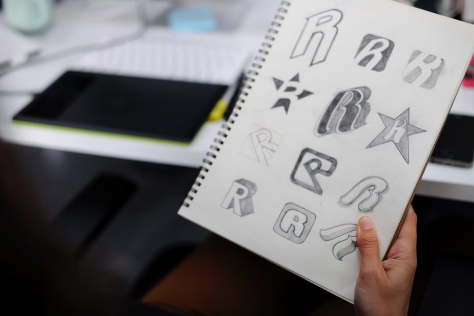
What is a logo? Basically, it is a symbol, a text, or a combination of the two that helps us identify a brand. The latter is not just a logo, it is the general way in which customers perceive you. This includes the way of communication, promotional materials, images, products or services, physical stores or online stores, and more.
Why is it important to have a logo? Representing the “face” of your business, it is necessary for the purpose of identifying, differentiating competition, constant communication and loyalty.
With that in mind, let’s talk about 10 of the biggest features that should go into a logo:
Represents the niche and the target audience
The features of a logo must depend on the niche and the target audience accordingly. That’s why a marketing brief is the basis for creating a good logo.
For a specific example, let’s use a heavy metal band’s logo. The band’s logo might look ugly and grotesque to some, but it’s exactly what it should be for their target audience.
It is adaptable
A good logo can be easily used in the online environment, embroidery, huge banners, small labels, business cards, bottles, you name it. Keep in mind that you need a logo in vector format, not just .png or .jpg, because this format offers scalability. Do not forget to always ask the graphic designer.
In this regard, you really should consider working with a graphic designer. Remember, your logo is the face of your company. It’s the thing that almost every customer sees before they even know what you do as a company. Spend the extra time and money to get it right the first time, and avoid having to spend more time and money in the future.
It differentiates you from the competition
First, to differentiate yourself, you have to know your competition. Considering the multitude of existing business and logos, it is extremely important to assume your own identity and not to copy it from others. Of course, in this case, differentiation must target the niche and the target audience. To continue with the previous example, heavy metal logos do not fit a law firm.
It is timeless
Trends come and go, but your logo does not have to be based on time preferences, but it has to pass the test of time. Of course, many businesses change their logos through rebranding campaigns, because they have changed their values or just because they originally made a trendy logo.
A good example of a timeless logo is the Coca-Cola logo. Since its creation in 1887, it’s kept roughly the same design. It’s easily recognized, and it stays up-to-date.
It’s memorable
The memorable character of a logo can be provided by simplicity, uniqueness, color, hidden elements or many other features. The customer will choose a brand they know and trust, and ultimately become faithful to your brand.
Leave a lasting impression, and gain a lasting customer.
It’s read easily
Handwriting fonts can be beautiful for a particular audience, but they are often hard to read and therefore hard to remember and perceive. If a font is not readable at a comfortable size, how does it look on a business card or a mobile site?
Again, keep it simple and clean, and you’ll avoid this mistake.
It doesn’t describe the business
Just because you deal with car production does not mean that your car needs a car illustration. Of all existing car brands, none of them include the main subject of their business (except those that make toy cars).
Many graphic designers (or business owners) tend to make the logo descriptive. This might not be considered a mistake, but, more often than not, it comes off as a generic looking logo. It usually limits you to certain services, which can prevent the expansion of your business.
It’s smart
A visible concept is not a must, but it’s a plus . A logo that contains a surprise item or something that needs to be discovered generates interest (have you ever noticed the arrow in the FedEx logo?). But one element is more than enough. Many times, designers take this idea too far, and overcomplicate the logo.
Contains the appropriate fonts and colors
Fonts and colors are excellent forms of communication. For example, a handwritten font is more feminine and personal, usually unmatched in a corporate logo. Every color has its psychology, which is dependent on culture. In this sense, have you ever wondered why most corporations have the blue logo? The answer is simple: because blue inspires confidence and is a favorite color of both genders.
It’s not complicated
Too many fonts, colors, elements, symbols, or slogans can complicate the design. This leads to a hard-to-remember and unidentifiable logo.
The summary
Now you know what a logo is, why it is important to have one, and what the characteristics that can fit it into the category of good ones are.
There are lots of examples of great logos out there. I’m sure you can think of a few right off the top of your head right now. But, for every good example of a logo, there’s at least one bad example. Avoid being one of those bad examples, and stick to these 10 features.
However, to be able to enjoy all of these perks, it means that you need to be generating some serious revenue from your online sales in order to ultimately support you without any additional income to prop you up along the way. If you want to move stock, you need to get noticed by your target audience and convince them you are the business selling something that they just can’t get anywhere else.
To get you started and help you boost your profit margins, this handy guide is going to take you through three essential things you need to think about and do to be successful in the business world of today.
Have striking visuals
With social media becoming an ever-present part of modern life, the focus on visual marketing has never been more intense. With platforms such as Instagram relying solely on the sharing of images to convey information, it is crucial that whatever visual material you are using to promote your brand and products is of the highest quality.
With this in mind, a great idea is to create your logo online for free and start building your brand identity. By choosing to use an online logo maker, you are already saving money and time on getting a commission done, and logo makers let you create a final design that looks polished and professional without having to waste your money on a graphic design software.
Think differently about your products
Online businesses can run in a variety of ways, but one of the most popular is selling handmade goods. When you are making the products you are selling yourself it is important that you consider what materials you are using.
For example, out of the many reasons you should use fair trade goods, one of them is that it has a widespread appeal to consumers. Knowing that the products you are selling are ethical and helping people will make your target audience want to spend their money on your goods because they know you are a responsible business person.
Spread things out
The internet is second to none when you want to reach out to your target audience, wherever they may be. One of the things you can do to make this work even more to your advantage is to spread out where you are selling your products (and this is easy to do considering how you can synchronize your inventory across platforms).
By selling your products across multiple online marketplaces, you will be reaching more people than ever and continuously increasing your likelihood of making more sales. If you couple this with expanding to include international postage, then you will be able to have your products distributed all over the world and have enough money to live a rather charmed life.
In this episode of “Why Build Progressive Web Apps”, Thomas Steiner shows how you can add offline analytics tracking with the Workbox libraries to your PWA to track events while the user is offline.
Sebastiano Guerriero shows how to create a dark theme for a web project, and how to switch from a default (light) theme to a dark one with the help of CSS Custom Properties.
A highly extensible, modern, TypeScript video player with support for the most popular stream formats, subtitles, out-of-the-box advertising, picture in picture, thumbnails and more.
In this tutorial we’ll learn how to install WordPress manually on any shared web host, using cPanel. Although there are quicker ways to install WordPress, such as using script installers such as Softaculous, this guide takes us back to the basics. It will give us a better understanding of how the different components of WordPress […]
CSS Houdini may be the most exciting development in CSS. Houdini is comprised of a number of separate APIs, each shipping to browsers separately, and some that have already shipped (here's the browser support). The Paint API is one of them. I’m very excited about it and recently started to think about how I can use it in my work.
One way I’ve been able to do that is to use it as a way to avoid reinventing the wheel. We’ll go over that in this post while comparing it with methods we currently use in JavaScript and CSS. (I won’t dig into how to write CSS Houdini because there are great articles like this, this and this.)
Houdini brings modularity and configurations to CSS
The way CSS Houdini works brings two advantages: modularity and configurability. Both are common ways to make our lives as developers easier. We see these concepts often in the JavaScript world, but less-so with CSS world… until now.
Here’s a table the workflows we have for some use cases, comparing traditional CSS with using Houdini. I also added JavaScript for further comparison. You can see CSS Houdini allows us to use CSS more productively, similar to how the JavaScript world had evolved into components.
Traditional CSS
CSS Houdini
JavaScript
When we need a commonly used snippets
Write it from scratch or copy-paste from somewhere.
Import a worklet for it.
Import a JS library.
Customize the snippet for the use case
Manually tweak the value in CSS.
Edit custom properties that the worklet exposes.
Edit configs that the library provides.
Sharing code
Share code for the raw styles, with comments on how to tweak each piece.
Share the worklet (in the future, to a package management service) and document custom properties.
Share the library to a package management service (like npm) and document how to use and configure it.
Modularity
With Houdini, you can import a worklet and start to use it with one line of code.
This means there’s no need to implement commonly used styles every time. You can have a collection of your own worklets which can be used on any of your projects, or even shared with each other.
If you're looking for modularity for HTML and JavaScript in additional to styles, then web components is the solution.
It’s very similar to what we already have in the JavaScript world. Most people won’t re-implement commonly used functions, like throttling or deep-copying objects. We simply import libraries, like Lodash.
I can imagine we could have CSS Houdini package management services if the popularity of CSS Houdini takes off, and anyone could import worklets for interesting waterfall layouts, background patterns, complex animation, etc.
Configurability
Houdini works well with CSS variables, which largely empowers itself. With CSS variables, a Houdini worklet can be configured by the user.
In the snippet, --direction and --size are CSS variables, and they’re used in the triangle worklet (defined by the author of the triangle worklet). The user can change the property to update how it displays, even dynamically updating CSS variables in JavaScript.
If we compare it to what we already have in JavaScript again, JavaScript libraries usually have options that can be passed along. For example, we can pass values for speed, direction, size and so on to a carousel library to make it perform the way we want. Offering these APIs at the element level in CSS is very useful.
A Houdini workflow makes my development process much more efficient
Let’s see a complete example of how this whole thing can work together to make development easier. We’ll use a tooltip design pattern as an example. I find myself using this pattern often in different websites, yet somehow re-implement for each new project.
Let’s briefly walk through my old experience:
OK, I need a tooltip.
It’s a box, with a triangle on one side. I’ll use a pseudo-element to draw the triangle.
I can use the transparent border trick to draw the triangle.
At this time, I most likely dig up my past projects to copy the code. Let me think… this one needs to point up, which side is transparent?
Oh, the design requires a border for the tooltip. I have to use another pseudo-element and fake a border for the pointing triangle.
What? They decide to change the direction of the triangle?! OK, OK. I will tweak all the values of both triangles...
It’s not rocket science. The whole process may only take five minutes. But let’s see how it can be better with Houdini.
I built a simple worklet to draw a tooltip, with many options to change its looks. You can download it on GitHub.
Here’s a demo! Go ahead and play around with variables!
CSS Houdini opens a door to modularized, configurable styles sharing. I look forward to seeing developers using and sharing CSS Houdini worklets. I’m trying to add more useful examples of Houdini usage. Ping me if you have ideas, or want to contribute to this repo.
Image optimization SEO isn’t what it used to be. Google is no longer like a toddler you can entertain with a picture book with basic words. Oh no, we’re dealing with a sophisticated teenager, who not only wants a deeper meaning but also to experience the thrill of speed. And your photos better be, like, […]
There are a ton of ways to learn web design and development. Some people prefer video courses, while others love reading books and webpages and applying the knowledge themselves.
Another way to learn is through online games! These will test your design skills, correct you when you’re wrong, and teach you basic concepts. If you love learning through doing, make sure to try these games!
This game walks you through various simple design choices, prompting you to pick the one that looks correct and explaining why one is wrong and one is right. You can click a button to directly compare the images, making it easy to understand the difference. This will test your eye for subtle designs. At the end, see how you rank against other players!
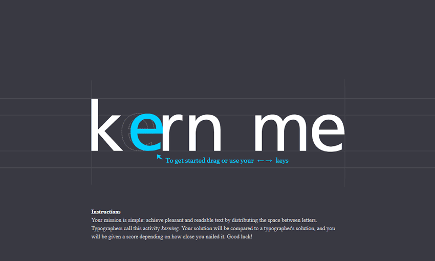
Kerning is the spacing between letters, and an important skill for typographers and designers to learn. This kerning minigame will let you drag around the letters, then compare them to the solutions of a pro designer.
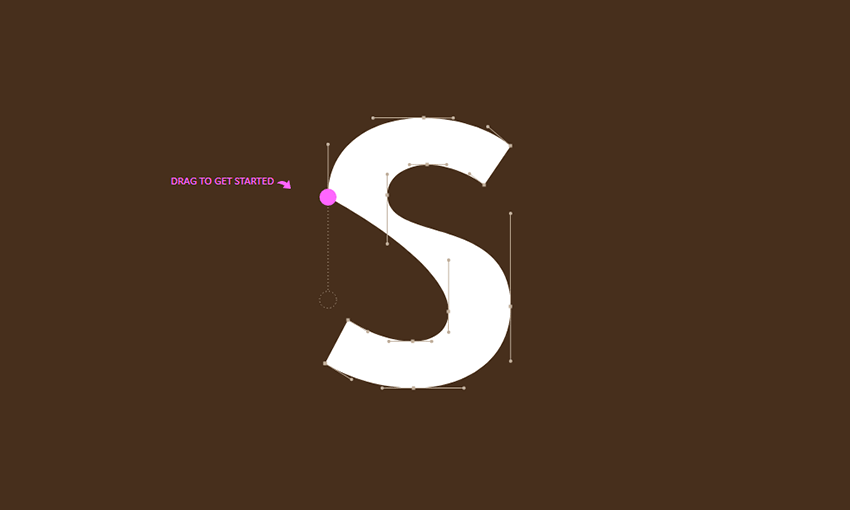
Another one for typographers, Shape Type tests your ability to accurately and beautifully shape letters in a design. You can easily compare your work to the designer’s with fluid transition animations that show you where you might have gone wrong.
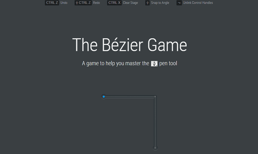
If you make vector graphics, fonts, or CSS animations, you might have encountered Bezier curves. The Bezier Game will help teach you to work with this tool by taking you through various shapes, lines, and circles to fill out with curves. By the end you should have a better understanding of how Bezier curves work.
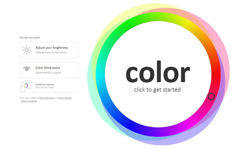
Ready to brush up on your color identification skills? This tests your ability to distinguish hues, saturation, complementary, analogous, triadic, and tetradic colors.
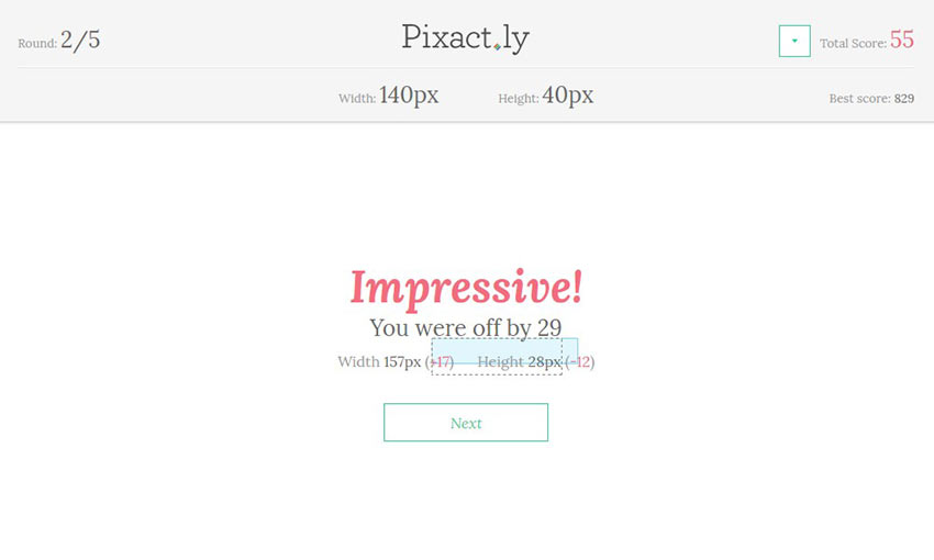
How good are you at measuring pixels by instinct? Pixactly helps you measure lengths and widths in pixels by prompting you to draw boxes of a specified height. Anyone who works with HTML and CSS will like this tool.
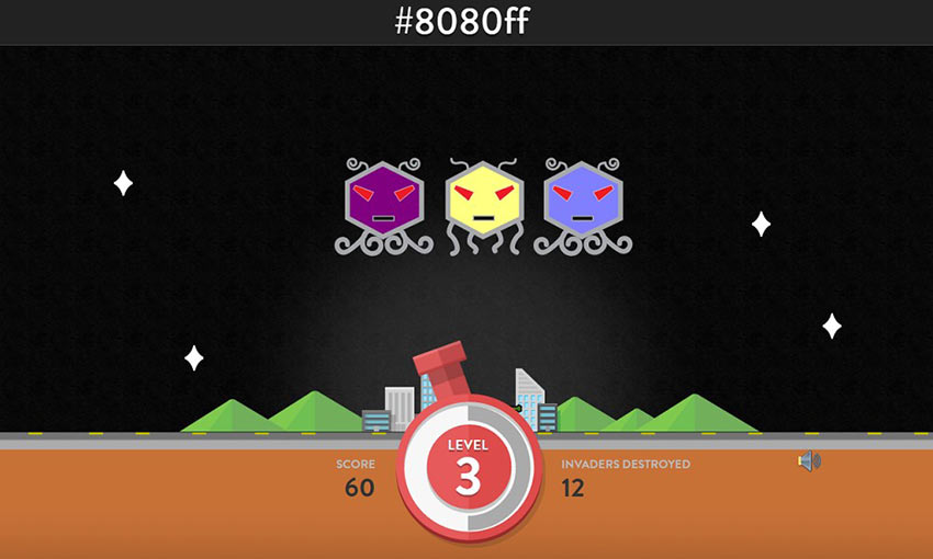
Do you know your hex codes? With all the online hex generator tools, many people neglect the learning their hex codes, but it’s still a good skill to have. Hex Invaders teaches you hex color codes by having you shoot the alien that corresponds to the color code shown on the screen.
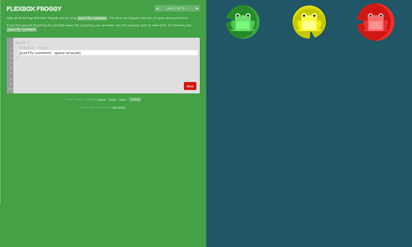
Time to brush up on some CSS. With the justify-content property, you need to guide the frogs to their lily pads, all while learning more about CSS in real time. With twenty-four levels, you’ll come out of this with a full understanding of this CSS code.
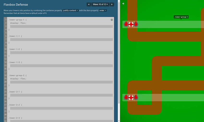
Still having trouble with flexboxes? Flexbox Defense is a tower defense game where you must position your towers using CSS. After playing Flexbox Froggy, reinforce your skills with this more difficult game.
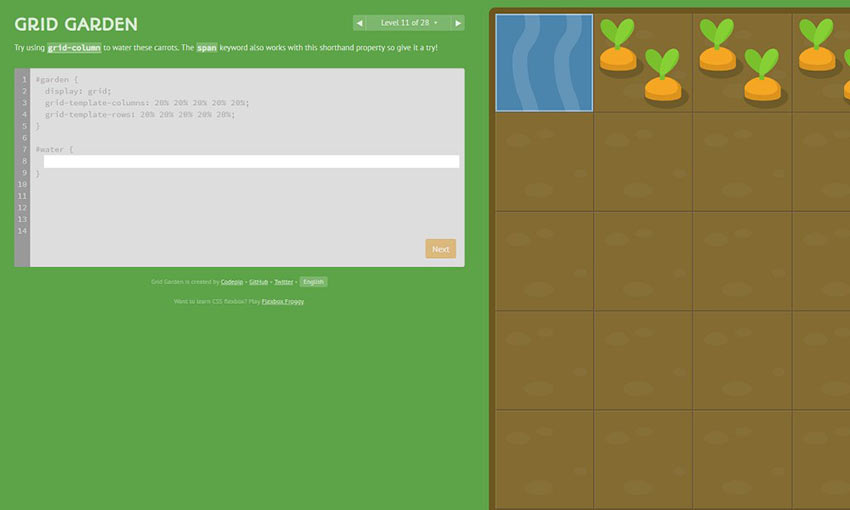
Here’s a relaxing game that will teach you how to use CSS Grid, specifically the grid-column-start property. Grow your own carrot garden, water plants, kill weeds, and learn new CSS tricks and tips in this unorthodox gardening game.
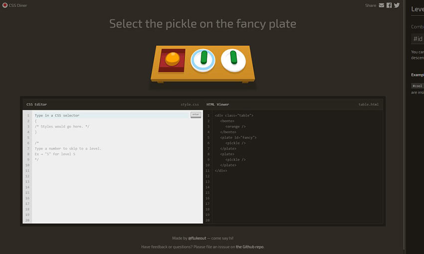
Ready to learn about CSS Selectors? Use the code window to select the correct objects and learn how to select them in all kinds of situations and unique placements. This one is great for people who are new to CSS.
Learning Design with Online Games
Whether you’re a brand-new designer/developer or just brushing up on what you’ve learned, online educational games are a great way to cement your skills. It’s always good to bring a little fun into your learning process. Let us know which game was your favorite!
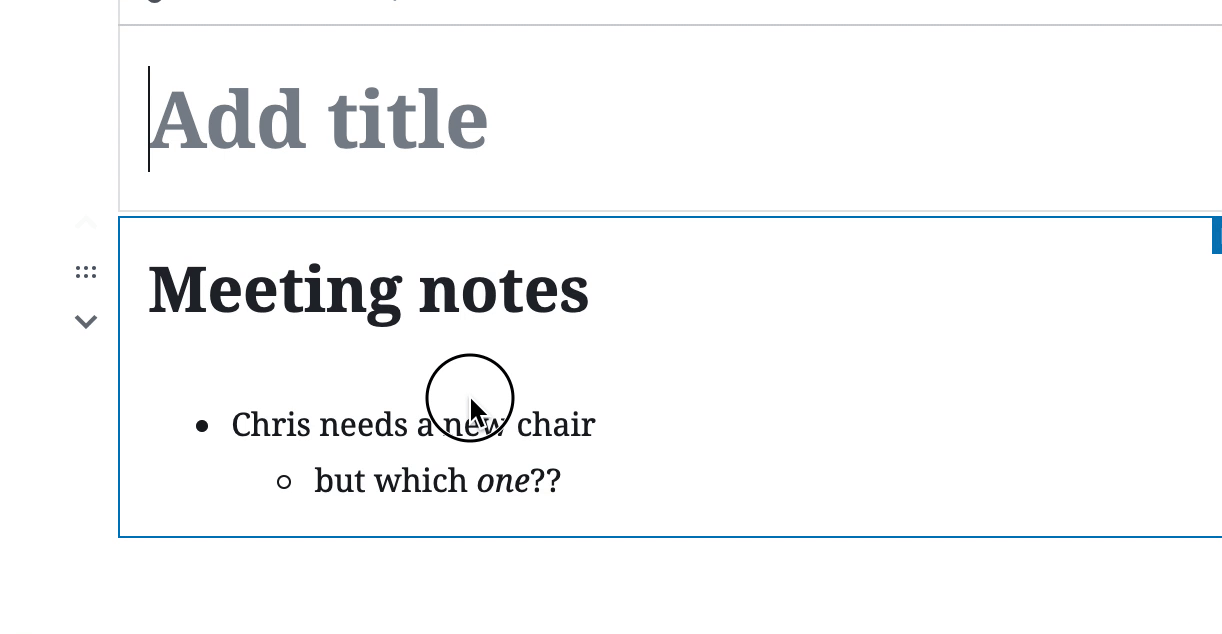
I remember when Gutenberg was released into core, because I was at WordCamp US that day. A number of months have gone by now, so I imagine more and more of us on WordPress sites have dipped our toes into it. I just wrote about our first foray here on CSS-Tricks and using Gutenberg to power our newsletter.
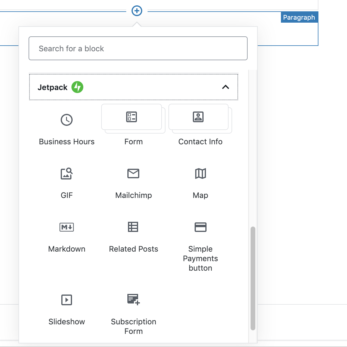
Jetpack, of course, was ahead of the game. Jetpack adds a bunch of special, powerful blocks to Gutenberg that it's easy to see how useful they can be.
Here they are, as of this writing:
Maps! Subscriptions! GIFs! There are so many good ones. Here's a look at a few more:
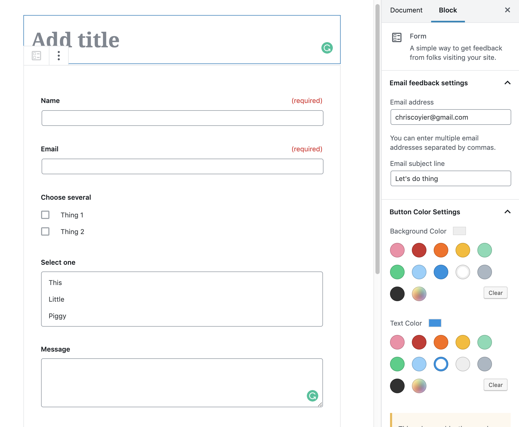
The form widget, I hear, is the most popular.
You get a pretty powerful form builder right within your editor:
Instant Markdown Processing
Jetpack has always enabled Markdown support for WordPress, so it's nice that there is a Markdown widget!
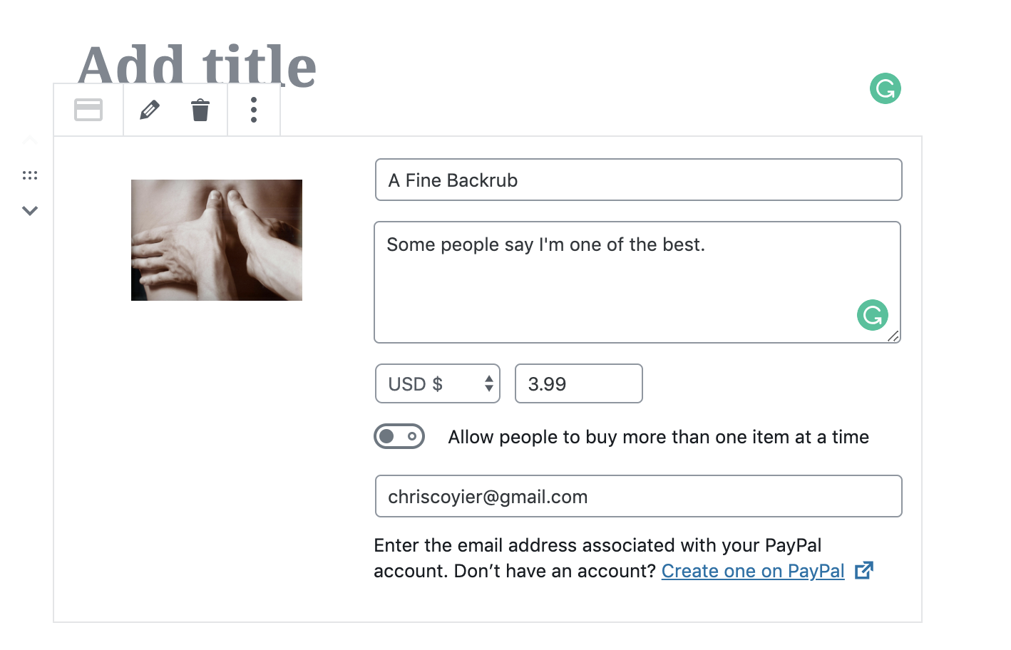
PayPal Selling Blocks
There is even basic eCommerce blocks, which I just love as you can imagine how empowering that could be for some folks.
You can read more about Jetpack-specific Gutenberg blocks in their releases that went out for 6.8 and 6.9. Here at CSS-Tricks, we use a bunch of Jetpack features.
I like Gutenberg, the new WordPress editor. I'm not oblivious to all the conversation around accessibility, UX, and readiness, but I know how hard it is to ship software and I'm glad WordPress got it out the door. Now it can evolve for the better.
I see a lot of benefit to block-based editors. Some of my favorite editors that I use every day, Notion and Dropbox Paper, are block-based in their own ways and I find it effective. In the CMS context, even moreso. Add the fact that these aren't just souped-up text blocks, but can be anything! Every block is it's own little configurable world, outputting anything it needs to.
I'm using Gutenberg on a number of sites, including my personal site and my rambling email site, where the content is pretty basic. On a decade+ old website like CSS-Tricks though, we need to baby step it. One of our first steps was moving our newsletter authoring into a Gutenberg setup. Here's how we're doing that.
Gutenberg Ramp
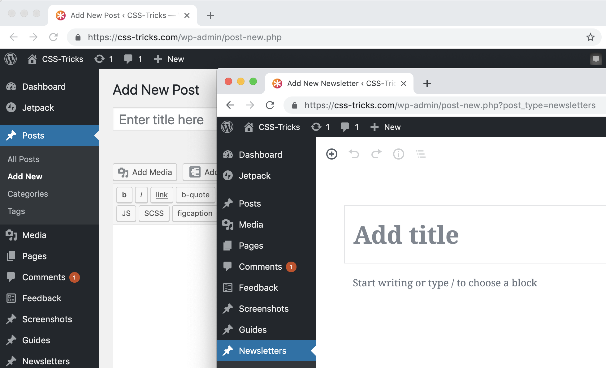
Gutenberg Ramp is a plugin with the purpose of turning Gutenberg on for some areas and not for others. In our case, I wanted to turn on Gutenberg just for newsletters, which is a Custom Post Type on our site. With the plugin installed and activated, I can do this now in our functions.php:
if (function_exists('gutenberg_ramp_load_gutenberg')) {
  gutenberg_ramp_load_gutenberg(['post_types' => [ 'newsletters' ]]);
}
Which works great:
Classic editor for posts, Gutenberg for the Newsletters Custom Post Type
We already have 100+ newsletters in there, so I was hoping to only flip on Gutenberg over a certain date or ID, but I haven't quite gotten there yet. I did open an issue.
What we were doing before: pasting in HTML email gibberish
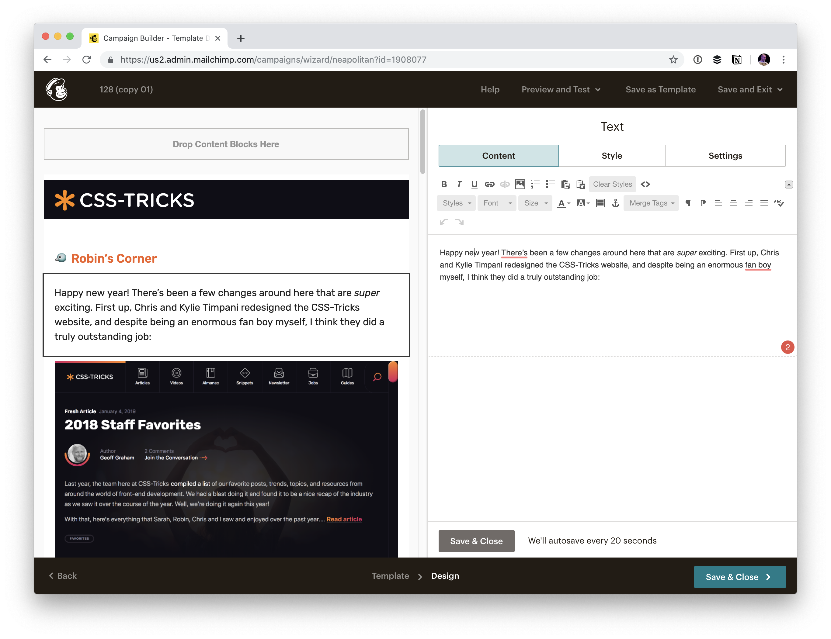
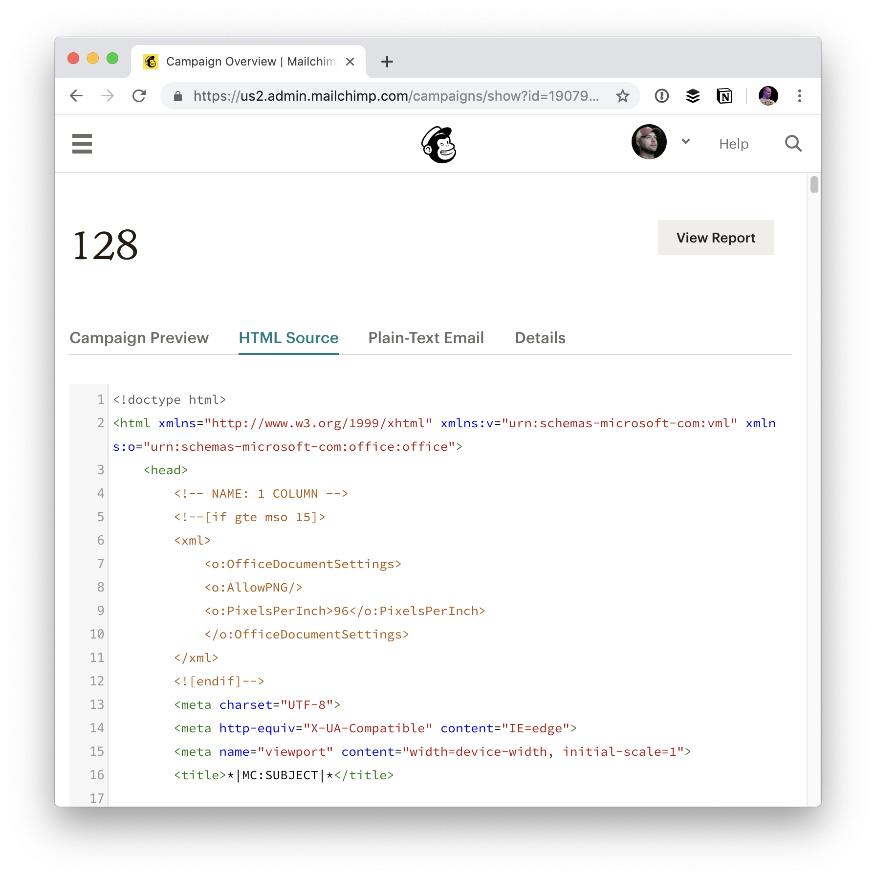
We ultimately send out the email from MailChimp. So when we first started hand-crafting our email newsletter, we made a template in MailChimp and did our authoring right in MailChimp:
The MailChimp Editor
Nothing terrible about that, I just much prefer when we keep the clean, authored content in our own database. Even the old way, we ultimately did get it into our database, but we did it in a rather janky way. After sending out the email, we'd take the HTML output from MailChimp and copy-paste dump it into our Newsletter Custom Post Type.
That's good in a way: we have the content! But the content is so junked up we can basically never do anything with it other than display it in an <iframe> as the content is 100% bundled up in HTML email gibberish.
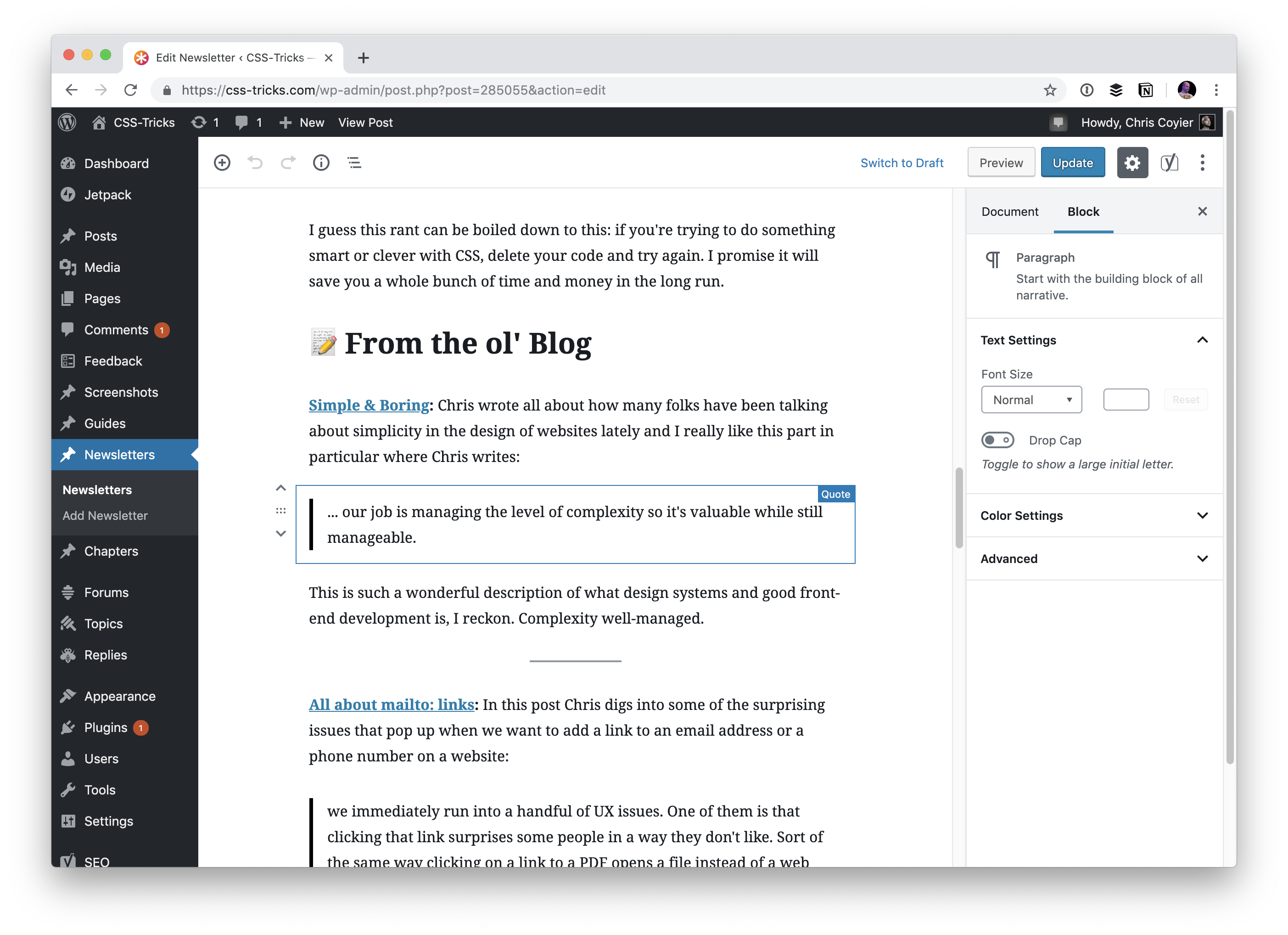
Now we can author cleanly in Gutenberg
I'd argue that the writing experience here is similar (MailChimp is kind of a block editor too), but nicer than doing it directly in MailChimp. It's so fast to make headers, lists, blockquotes, separators, drag and drop images... blocks that are the staple of our newsletter.
Displaying the newsletter
I like having a permanent URL for each edition of the newsletter. I like that the delivery mechanism is email primarily, but ultimately these are written words that I'd like to be a part of the site. That means if people don't like email, they can still read it. There is SEO value. I can link to them as needed. It just feels right for a site like ours that is a publication.
Now that we're authoring right on the site, I can output <?php the_content() ?> in a WordPress loop just like any other post or page and get clean output.
But... we have that "old" vs. "new" problem in that old newsletters are HTML dumps, and new newsletters are Gutenberg. Fortunately this wasn't too big of a problem, as I know exactly when the switch happened, so I can display them in different ways according to the ID. In my `single-newsletters.php`:
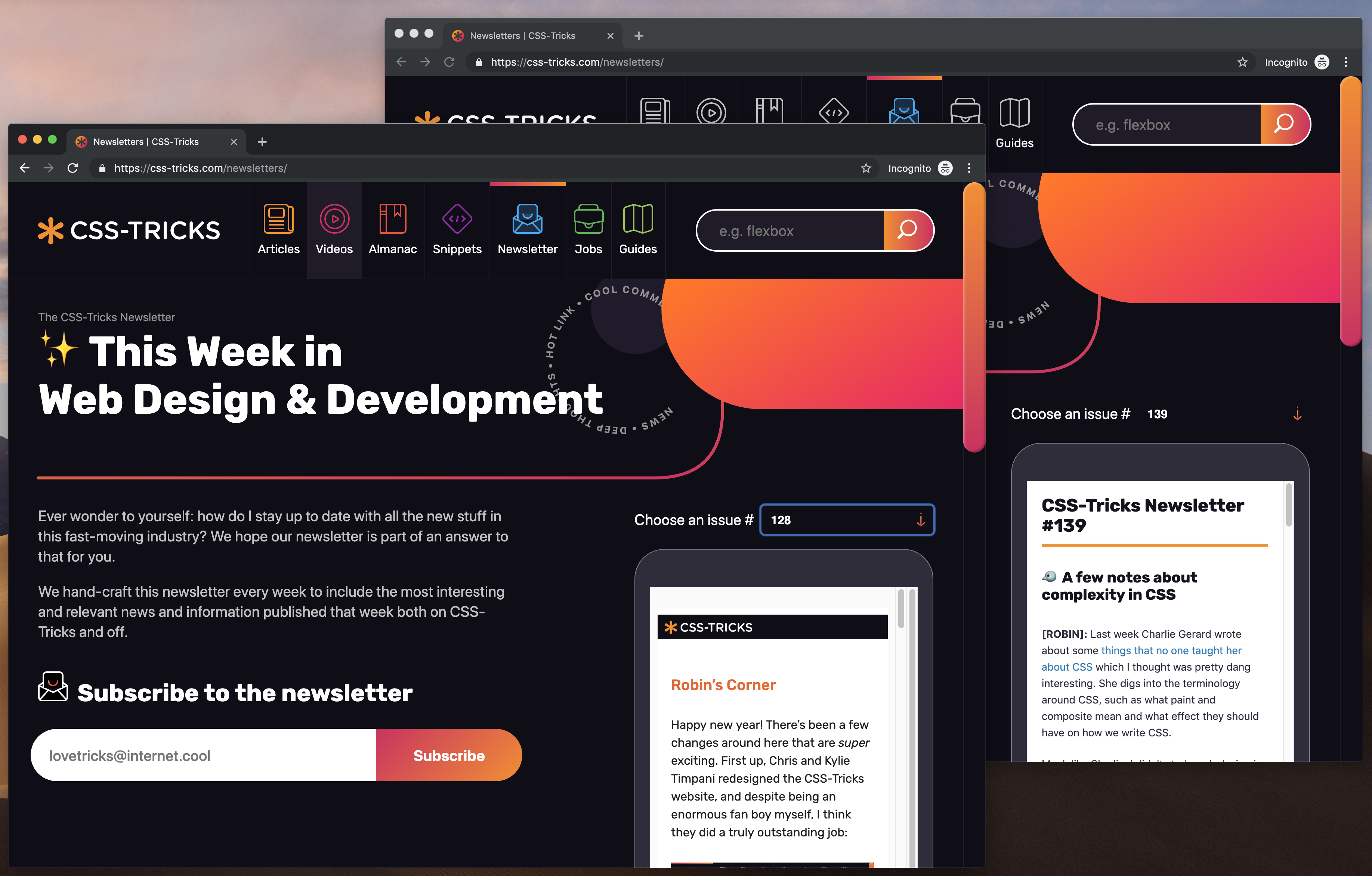
At the moment, the primary way we display the newsletters is in a little faux phone UI on the newsletters page, and it handles both just fine:
Old and new newsletters display equally well, it's just the old newsletters need to be iframed and I don't have as much design control.
So how do they actually get sent out?
Since we aren't creating the newsletters inside MailChimp anymore, did we have to find another way to send them out? Nope! MailChimp can send out a newsletter based on an RSS feed.
And WordPress is great at coughing up RSS feeds for Custom Post Yypes. You can do...
/feed/?post_type=your-custom-post-type
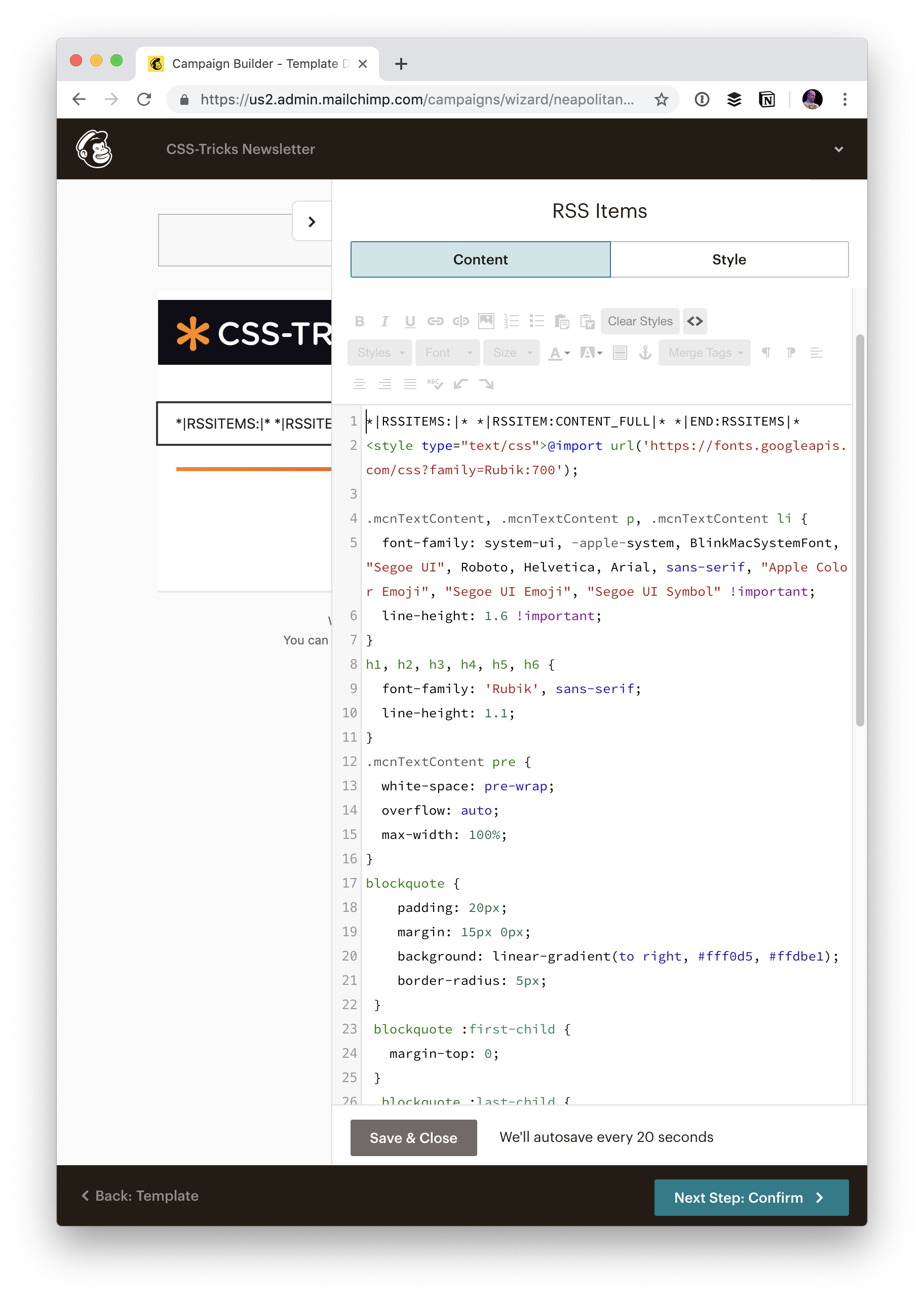
But... for us, I wanted to make sure that any of those old HTML dump emails never ended up in this RSS feed, so that the new MailChimp RSS feed would never see them an accidentally send them. So I ended up making a special Page Template that outputs a custom RSS feed. I figured that would give us ultimate control over it if we ever need it for even more things.
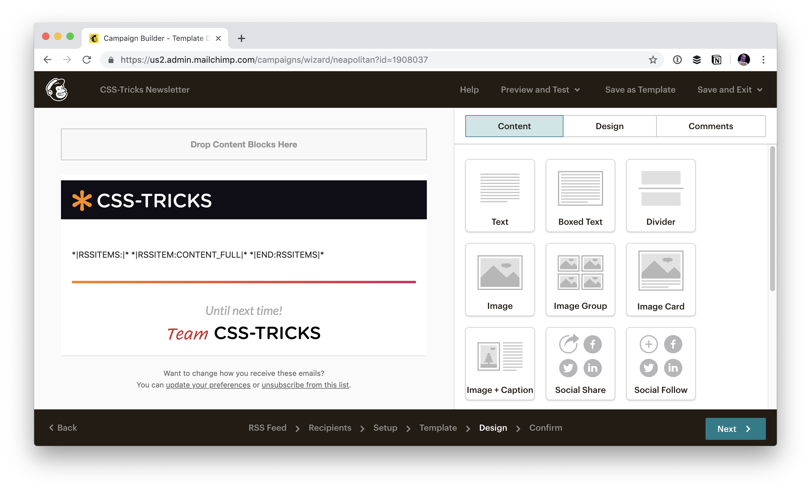
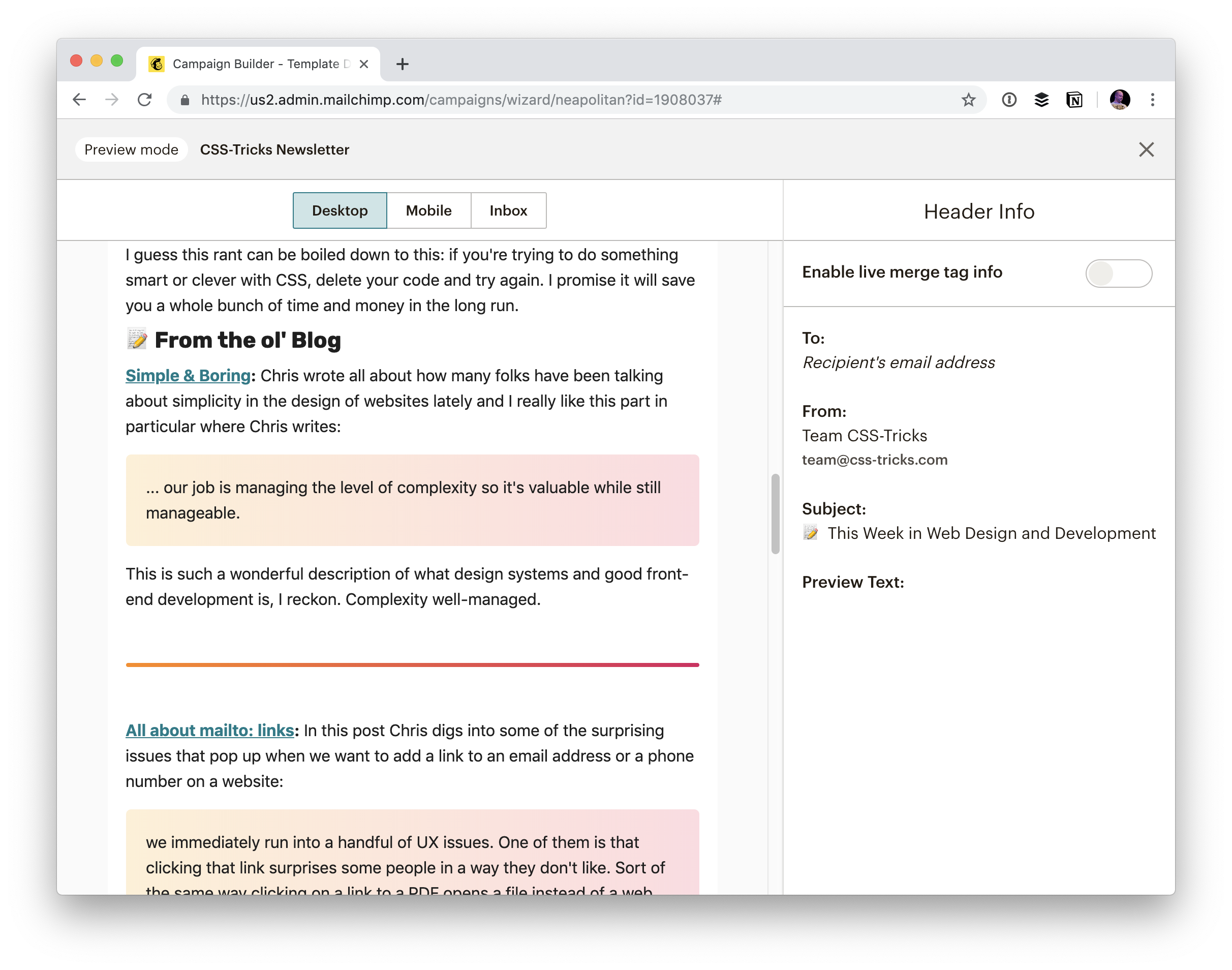
With a MailChimp RSS campaign, you still have control over the outside template like any other campaign:
But then content from the feed just kinda gets dumped in there. Fortunately, their preview tool does go grab content for you so you can actually see what it will look like:
And then you can style that by injecting a <style> block into the editor area yourself.
That gives us all the design control we need over the email, and it's nicely independent of how we might choose to style it on the site itself.
Howdy, WordPress friends. We’re checking in with the latest WordPress news and updates in our March 2019 edition of The WordPress Update. If you’re not already familiar with The WordPress Update, it’s our monthly WordPress news roundup where we share […]
Can you make money blogging? The short answer: Yes! It may not be the quickest way to earn money. There’s no magic red button that makes it rain cash (it’d be cool though, right?) But, with a smart approach, persistence […]
We have a whole selection of ways to align things in CSS today, and it isn’t always an obvious decision which to use. However, knowing what is available means that you can always try a few tactics if you come across a particular alignment problem.
In this article, I will take a look at the different alignment methods. Instead of providing a comprehensive guide to each, I’ll explain a few of the sticking points people have and point to more complete references for the properties and values. As with much of CSS, you can go a long way by understanding the fundamental things about how the methods behave, and then need a place to go look up the finer details in terms of how you achieve the precise layout that you want.
Aligning Text And Inline Elements
When we have some text and other inline elements on a page, each line of content is treated as a line box. The property text-align will align that content on the page, for example, if you want your text centered, or justified. Sometimes, however, you may want to align things inside that line box against other things, for example, if you have an icon displayed alongside text, or text of different sizes.
In the example below, I have some text with a larger inline image. I am using vertical-align: middle on the image to align the text to the middle of the image.
Remember that the line-height property will change the size of the line-box and therefore can change your alignment. The following example uses a large line-height value of 150px, and I have aligned the image to top. The image is aligned to the top of the line box and not the top of the text, remove that line-height or make it less than the size of the image and the image and text will line up at the top of the text.
It turns out that line-height and indeed the size of text is pretty complicated, and I’m not going to head down that rabbit hole in this article. If you are trying to precisely align inline elements and want to really understand what is going on, I recommend reading “Deep Dive CSS: Font Metrics, line-height And vertical-align.”
When Can I Use The vertical-align Property?
The vertical-align property is useful if you are aligning any inline element. This includes elements with display: inline-block. The content of table cells can also be aligned with the vertical-align property.
The vertical-align property has no effect on flex or grid items, and therefore if used as part of a fallback strategy, will cease to apply the minute the parent element is turned into a grid or flex Container. For example, in the next pen, I have a set of items laid out with display: inline-block and this means that I get the ability to align the items even if the browser does not have Flexbox:
In this next pen, I have treated the inline-block as a fallback for Flex layout. The alignment properties no longer apply, and I can add align-items to align the items in Flexbox. You can tell that the Flexbox method is in play because the gap between items that you will get when using display: inline-block is gone.
Now that we do have better ways to align boxes in CSS (as we will look at in the next section), we don’t need to employ the vertical-align and text-align properties in places other than the inline and text elements for which they were designed. However, they are still completely valid to use in those text and inline formats, and so remember if you are trying to align something inline, it is these properties and not the Box Alignment ones that you need to reach for.
Box Alignment
The Box Alignment Specification deals with how we align everything else. The specification details the following alignment properties:
justify-content
align-content
justify-self
align-self
justify-items
align-items
You might already think of these properties as being part of the Flexbox Specification, or perhaps Grid. The history of the properties is that they originated as part of Flexbox, and still exist in the Level 1 specification; however, they were moved into their own specification when it became apparent that they were more generally useful. We now also use them in Grid Layout, and they are specified for other layout methods too, although current browser support means that you won’t be able to use them just yet.
Therefore, next time someone on the Internet tells you that vertical alignment is the hardest part of CSS, you can tell them this (which even fits into a tweet):
In the future, we may even be able to dispense with display: flex, once the Box Alignment properties are implemented for Block Layout. At the moment, however, making the parent of the thing you want centering a flex container is the way to get alignment horizontally and vertically.
The Two Types Of Alignment
When aligning flex and grid items, you have two possible things to align:
You have the spare space in the grid or flex container (once the items or tracks have been laid out).
You also have the item itself inside the grid area you placed it in, or on the cross axis inside the flex container.
I showed you a set of properties above, and the alignment properties can be thought of as two groups. Those which deal with distribution of spare space, and those which align the item itself.
Dealing With Spare Space: align-content And justify-content
The properties which end in -content are about space distribution, so when you choose to use align-content or justify-content you are distributing available space between grid tracks or flex items. They don’t change the size of the flex or grid items themselves; they move them around because they change where the spare space goes.
Below, I have a flex example and a grid example. Both have a container which is larger than required to display the flex items or grid tracks, so I can use align-content and justify-content to distribute that space.
Moving Items Around: justify-self, align-self, justify-items And align-items
We then have align-self and justify-self as applied to individual flex or grid items; you can also use align-items and justify-items on the container to set all the properties at once. These properties deal with the actual flex or grid item, i.e. moving the content around inside the Grid Area or flex line.
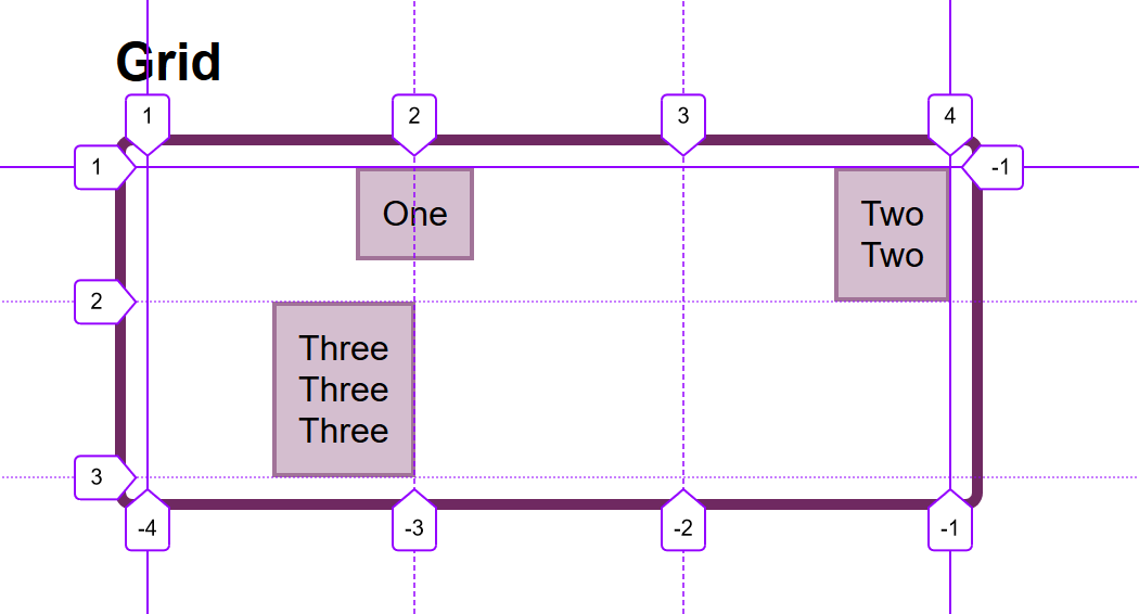
Grid Layout
You get both properties as you can shift the item on the block and inline axis as we have a defined Grid Area in which it sits.
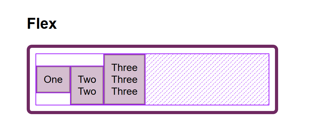
Flex Layout
You can only align on the cross axis as the main axis is controlled by space distribution alone. So if your items are a row, you can use align-self to shift them up and down inside the flex line, aligning them against each other.
In my example below, I have a flex and a grid container, and am using align-items and align-self in Flexbox to move the items up and down against each other on the cross axis. If you use Firefox, and inspect the element using the Firefox Flexbox Inspector, you can see the size of the flex container and how the items are being moved vertically inside of that.
Aligned flex items with the flex container highlighted in Firefox (Large preview)
In grid, I can use all four properties to move the items around inside their grid area. Once again, the Firefox DevTools Grid Inspector will be useful when playing with alignment. With the grid lines overlaid, you can see the area inside which the content is being moved:
Aligned grid items with the Grid highlighted in Firefox (Large preview)
Play around with the values in the CodePen demo to see how you can shift content around in each layout method:
One of the cited issues with people remembering the alignment properties in Grid and Flexbox, is that no one can remember whether to align or to justify. Which direction is which?
For Grid Layout, you need to know if you are aligning in the Block or Inline Direction. The Block direction is the direction blocks lay out on your page (in your writing mode), i.e. for English that is vertically. The Inline direction is the direction in which sentences run (so for English that is left to right horizontally).
To align things in the Block Direction, you will use the properties which start with align-. You use align-content to distribute space between grid tracks, if there is free space in the grid container, and align-items or align-self to move an item around inside the grid area it has been placed in.
The below example has two grid layouts. One has writing-mode: horizontal-tb (which is the default for English) and the other writing-mode: vertical-rl. This is the only difference between them. You can see that the alignment properties which I have applied work in exactly the same way on the block axis in both modes.
To align things in the inline direction, use the properties which begin with justify-. Use justify-content to distribute space between grid tracks, and justify-items or justify-self to align items inside their grid area in the inline direction.
Once again, I have two grid layout examples so that you can see that inline is always inline — no matter which writing mode you are using.
Flexbox is a little trickier due to the fact that we have a main axis which can be changed to row or column. So, let’s first think about that main axis. It is set with the flex-direction property. The initial (or default) value of this property is row which will lay the flex items out as a row in the writing mode currently in use — this is why when working in English, we end up with items laid out horizontally when we create a flex container. You can then change the main axis to flex-direction: column and the items will be laid out as a column which means they are laid out in the block direction for that writing mode.
As we can do this axis switching, the most important factor in Flexbox is asking, “Which axis is my main axis?” Once you know that, then for alignment (when on your main axis) you simply use justify-content. It doesn’t matter if your main axis is row or column. You control space between the flex items with justify-content.
On the cross axis, you can use align-items which will align the items inside the flex container or flex line in a multi-line flex container. If you have a multi-line container using flex-wrap: wrapand have space in that container, you can use align-content to distribute the space on the cross axis.
In the example below, we are doing both with a flex container displayed as a row and a column:
The justify-content and align-content properties in Grid and Flexbox are about distributing extra space. So the thing to check is that you have extra space.
Here is a Flex example: I have set flex-direction: row and I have three items. They don’t take up all of the space in the flex container, so I have spare space on the main axis, the initial value for justify-content is flex-start and so my items all line up at the start and the extra space is at the end. I am using the Firefox Flex Inspector to highlight the space.
The spare space at the end of the container (Large preview)
If I change flex-direction to space-between, that extra space is now distributed between the items:
The spare space is now between the items (Large preview)
If I now add more content to my items so they become larger and there is no longer any additional space, then justify-content does nothing — simply because there is no space to distribute.
A common question I’m asked is why justify-content isn’t working when flex-direction is column. This is generally because there is no space to distribute. If you take the above example and make it flex-direction: column, the items will display as a column, but there will be no additional space below the items as there is when you do flex-direction: row. This is because when you make a Flex Container with display: flex you have a block level flex container; this will take up all possible space in the inline direction. In CSS, things do not stretch in the block direction, so no extra space.
The column is only as tall as needed to display the items (Large preview)
Add a height to the container and — as long as that is more than is required to display the items — you have extra space and therefore justify-content will work on your column.
Adding a height to the container means we have spare space (Large preview)
Why Is There No justify-self In Flexbox?
Grid Layout implements all of the properties for both axes because we always have two axes to deal with in Grid Layout. We create tracks (which may leave additional space in the grid container in either dimension,) and so we can distribute that space with align-content or justify-content. We also have Grid Areas, and the element in that area may not take up the full space of the area, so we can use align-self or justify-self to move the content around the area (or align-items, justify-items to change the alignment of all items).
Flexbox does not have tracks in the way that Grid layout does. On the main axis, all we have to play with is the distribution of space between the items. There is no concept of a track into which a flex item is placed. So there is no area created in which to move the item around in. This is why there is no justify-self property on the main axes in Flexbox.
Sometimes, however, you do want to be able to align one item or part of the group of items in a different way. A common pattern would be a split navigation bar with one item being separated out from the group. In that situation, the specification advises the use of auto margins.
An auto margin will take up all of the space in the direction it is applied, which is why we can center a block (such as our main page layout) using a left and right margin of auto. With an auto margin on both sides, each margin tries to take up all the space and so pushes the block into the middle. With our row of flex items, we can add margin-left: auto to the item we want the split to happen on, and as long as there is available space in the flex container, you get a split. This plays nicely with Flexbox because as soon as there is no available space, the items behave as regular flex items do.
One of the things I think is often overlooked is how useful Flexbox is for doing tiny layout jobs, where you might think that using vertical-align is the way to go. I often use Flexbox to get neat alignment of small patterns; for example, aligning an icon next to text, baseline aligning two things with different font sizes, or making form fields and buttons line up properly. If you are struggling to get something to line up nicely with vertical-align, then perhaps try doing the job with Flexbox. Remember that you can also create an inline flex container if you want with display: inline-flex.
There is no reason not to use Flexbox, or even Grid for tiny layout jobs. They aren’t just for big chunks of layout. Try the different things available to you, and see what works best.
People are often very keen to know what the right or wrong way to do things is. In reality, there often is no right or wrong; a small difference in your pattern might mean the difference between Flexbox working best, where otherwise you would use vertical-align.
Wrapping Up
To wrap up, I have a quick summary of the basics of alignment. If you remember these few rules, you should be able to align most things with CSS:
Are you aligning text or an inline element? If so, you need to use text-align, vertical-align, and line-height.
Do you have an item or items you want to align in the center of the page or container? If so, make the container a flex container then set align-items: center and justify-content: center.
For Grid Layouts, the properties that start with align- work in the Block direction; those which start with justify- work in the inline direction.
For Flex Layouts, the properties that start with align- work on the Cross Axis; those which start with justify- work on the main axis.
The justify-content and align-content properties distribute extra space. If you have no extra space in your flex or grid container, they will do nothing.
If you think you need justify-self in Flexbox, then using an auto margin will probably give you the pattern you are after.
You can use Grid and Flexbox along with the alignment properties for tiny layout jobs as well as main components — experiment!
For more information about alignment, see these resources:


 In this tutorial we’ll learn how to install WordPress manually on any shared web host, using cPanel. Although there are quicker ways to install WordPress, such as using script installers such as Softaculous, this guide takes us back to the basics. It will give us a better understanding of how the different components of WordPress […]


