CSS Triangles, Multiple Ways

I like Adam Laki's Quick Tip: CSS Triangles because it covers that ubiquitous fact about front-end techniques: there are always many ways to do the same thing. In this case, drawing a triangle can be done:

  • with border and a collapsed element
  • with clip-path: polygon()
  • with transform: rotate() and overflow: hidden
  • with glyphs like ▼

I'd say that the way I've typically done triangles the most over the years is with the border trick, but I think my favorite way now is using clip-path. Code like this is fairly clear, understandable, and maintainable to me: clip-path: polygon(50% 0, 0 100%, 100% 100%); Brain: Middle top! Bottom right! Bottom left! Triangle!

My 2nd Place method goes to an option that didn't make Adam's list: inline <svg>! This kind of thing is nearly just as brain-friendly: <polygon points="0,0 100,0 50,100"/>.

Direct Link to ArticlePermalink

The post CSS Triangles, Multiple Ways appeared first on CSS-Tricks.

UNION SQL call original rows

Hello i want to UNION three tables from the same database.

SELECT DISTINCT * 
        FROM
    (SELECT uid as id, name as name, username as username,bio as aboutme, '' as text, 'user' as type, profile_pic as profile_pic, '' as media_pic, '' as group_pic, 'U' as mediatype, '' as image_path FROM users ORDER BY rand() LIMIT 5) AS T

            UNION ALL
            (SELECT group_id as id, group_name as name,'' as username, group_desc as aboutme, '' as text, 'group' as type, '' as profile_pic, '' as media_pic, group_pic as group_pic, 'G' as mediatype, '' as image_path FROM groups ORDER BY rand() LIMIT 5)
        UNION ALL
            (SELECT M.msg_id as id, M.title as name, '' as username,M.description as aboutme, M.message as text, 'media' as type, '' as profile_pic,  M.media_pic as media_pic, '' as group_pic, M.type as mediatype, P.image_path as image_path FROM messages M, user_uploads P ORDER BY rand() LIMIT 5) 

It works but i want to return the original names of the rows for example not id but uid or msg_id or group_id separately. But i still need to UNION Thanks in advance

JavaScript Promises: The Definitive Guide, Part 1

The single-threaded, event-loop based concurrency model of JavaScript deals with processing of events using so-called “asynchronous non-blocking I/O model.” Unlike computer languages such as Java, where events are handled using additional threads and processed in parallel with the main execution thread, JavaScript code is executed sequentially. In order to prevent blocking the main thread on I/O-bound operations, JavaScript uses a callback mechanism where asynchronous operations specify a callback – the function to be executed when the result of an asynchronous operation is ready; while the code control flow continues executing.

Whenever we want to use the result of a callback to make another asynchronous call, we need to nest callbacks. Since I/O operations can result in errors, we need to handle errors for each callback before processing the success result. This necessity to do error handling and having to embed callbacks makes the callback code difficult to read. Sometimes this is referred to as “JavaScript callback hell.”

Security’s Shift Right

Software development has gotten tricky. If you have been in the DevOps game in the past few years, then you have noticed a drumbeat of "shift left" echoing across your brainpan. You can't escape it — it's at conferences, in blogs, and on numerous podcasts. We know how to write tests before writing code — boom, we shifted left! We added acceptance testing in our CI system — notch one up for another shift-left win. 

Yet, with all this shifting left, there is a whisper in the wind (it may be hard to hear), but it is not a new sound. It is a more of a nagging reminder of a truth we knew long ago — it's the faint reverberation call to shift right. 

Open Source: It’s All Fun and Games Until Millions of People Have Their Data Stolen

Photo credit Flickr/Alan Levine

A new survey of 5,558 IT professionals reveals a staggering amount of enterprise-level practices that may very well lead to the next Equifax-type data breach. Published by Sonatype (in partnership with Cloudbees, Carnegie Mellon’s Software Engineering Institute, Signal Sciences, 9th Bit, and Twistlock), the 2019 DevSecOps Community Survey paints a rather unsettling picture of how a large number of enterprises are handling cybersecurity concerns, particularly when it comes to their use of open source components.

Collective #497


C497_web

Web

Install npm dependencies that run directly in the browser. No Browserify, Webpack or import maps required.

Check it out


C497_makerads

MakerAds

Unobtrusive adverts for makers. You can market your product to more than 50 thousand developers, designers, and freelancers.

Check it out


Collective #497 was written by Pedro Botelho and published on Codrops.

Guess What Software Eats Next? Wireless!

These days, the Marc Andreessen “Software is Eating the World” maxim seems universally accepted — or at least, it is popular enough that if a tech person mentions it at a cocktail party, those who know nothing about software nod their head in agreement and the tech people all groan.  

It’s basically understood that in our Internet-enabled world, technology equals software, even though the reality is more nuanced. And even the cloud, the grand enabler of the latest software wave, is itself being eaten alive by the software movement it has spawned, with cloud-native ecosystems such as Docker and Kubernetes devouring the value of verticalized cloud providers and offering a portable software experience across any infrastructure substrate, spanning architectures, providers, and form factors. Boy, it’s a good time to be in software!

Effective Use of Gradients in Design

Nothing looks nicer than a good gradient in a design. Gradients can completely transform a website color scheme from mundane to gorgeous, and you’ll often find them in the centerpiece of a site’s design. Looking for some inspiration for your own backgrounds and banners? Take a look at these beautiful blends.

Gradient Banner

Gradient Banner

Dazzling is barely enough to describe this stunning banner. A gradient made of opposite colors is bound to be striking, and the way the strong lighting in the background reflects off the model just makes this a fantastic example of great gradients in design.

The HR Manifesto

The HR Manifesto

This page makes abundant use of gradients, from the animations and the background as you scroll down, to the various banners and illustrations peppered throughout. The cool purples, blues and pinks blend together perfectly thanks to the colorful style.

Grabient Landing Page

Grabient Landing Page

Obviously, a site designed to generate gradients would know how to utilize them effectively. The banner on the right is an instant eye-catcher, and the same color scheme is used to draw attention to the logo/homepage link as well as the call to action button.

D25/Video Production

D25/Video Production

The effect here is super subtle, especially at the beginning of the page. But as you scroll, you’ll stumble upon a huge background image overlain with a pretty blue to red color palette. It then naturally flows into a big red text box, which is sure to grab attention.

Centexus Landing Page

Centexus Landing Page

Smooth gradients can give a page a clean and elegant look. Professional doesn’t have to mean blacks and whites – add a splash of color and see what happens! This is a landing page that would definitely make conversions.

Ninety Nine Seconds Game Prototype

Ninety Nine Seconds Game Prototype

This game has a strong concept, its artistic style just as much so. Various abstract levels can be explored and discovered, each sporting a beautiful blended background. There’s even a gradient generator for this purpose. It all comes together to make an app you won’t easily forget.

DIY Course Landing Page

DIY Course Landing Page

The beautifully designed landing page opens with vibrant blues and purples that cleanly fade to white as you scroll. Who needs a hero image when you can create a “hero gradient” that naturally transitions into your feature list?

Natoni Landing Page

Natoni Landing Page

Effective gradients can be simple and subtle, or flashy and gorgeous – all that matters is that it’s done well. This landing page sports the latter, with an image that serves both as a good background and yet is also the centerpiece of the design. It doesn’t distract from the text, but you can’t help but stare at the amazingly blended colors with the logo right in the middle.

Bitframemedia Logo

Bitframemedia Logo

This is just fantastic work from a graphic designer. A clean and simple, yet so very pretty logo. Made to look like ocean waves, every piece of the water blends together beautifully. The reverse gradient effect on the lighting makes the logo look interesting and dynamic as well.

TinyMind Landing Page

TinyMind Landing Page

Flat, simple design is a fairly popular trend online. It’s clean, easy to create, and looks nice. But it can also be boring! The slight gradient effect here adds a ton of beauty and dynamic, while still retaining that smooth, clean-cut appearance that’s super satisfying to look at.

Mindfulness App Onboarding Screens

Mindfulness App Onboarding Screens

Gradients work great with light colors and pastels, and here’s the perfect example. The effect is slight, but compelling, with the central character getting a more dramatic gradient while the background is pale enough to almost blend in with the white.

Inspiring Effective Gradients

Gradients are a great tool for designers. Used well, they can add a dynamic look and a spark of beauty to a design. Subtle or flashy, there’s a place for a good gradient in any creation.

And a skilled designer can utilize one to add contrast to important elements, highlight areas of interest, incorporate UI elements into the gradient, or any other number of clever tricks.

#CodePenChallenge: Tributes

New month, new #CodePenChallenge!

Last month, we wrapped up the shapes challenge with polygons. Check out the Pens from week four in our #CodePenChallenge: Polygons 🔷 collection.

This month, we're paying tribute to our heroes.

We all have heroes. People we look up to because, in some way or another, we wish we were more like them or could accomplish what they have. They give our lives shape, in a way, through their strong influence on what we choose to do. Let's take this month to reflect on who those people are to us. After we figure out who they are, let's pay tribute to them by creating something, big or small, in their honor.

March Challenge Sponsor: Buddy

Buddy turns DevOps to NoOps with blazing fast performance packed in exceptional UI/UX. Create delivery pipelines in 10 minutes from over 100 pre-configured actions: builds, tests, deployments & more.

Week One Prompt: Coding Heroes

Something tells us you have a passing interest in coding. Maybe it has something to do with the fact that you're on CodePen right now 😉

Who do you look up to in the history of coding? There is a rich and interesting history of people inventing computers and expanding what they are capable of. Or who do you admire today?

Your Challenge

Pick someone admirable from the world of computers and make a tribute to them.

How to Participate

Create a Pen and tag it codepenchallenge and the weekly tag cpc-coding-hero. We'll gather those Pens into a collection and share our favorites on Twitter and Instagram (Use the #CodePenChallenge tag on Twitter and Instagram as well).

Ideas

  1. Ada Lovelace lived in the mid-1800s and is regarded as the first computer programmer. She published an algorithm to be carried about by a proposed mechanical "computer" called the Analytical Engine. The first!
  2. Alan Turing lived 100 years after Ada and is now considered to the father of theoretical computer science. The 2014 movie The Imitation Game goes into his life, including some massively influential code cracking in World War II.
  3. What is the most important piece of software the last project you worked on relies upon? Can you figure out who one of the most important creators of that software was? How might you thank them?

Resources

  1. Arkhitech has some ideas of who the 12 Greatest Programmers of all Time were. And here's a longer list on Wikipedia.
  2. Exploring GitHub might spark some ideas!
  3. Conferences often feature notable coders. We're lucky in this industry to have so many. Check out this list of upcoming conferences focused on the front end. Maybe one of those has a coder you could pay tribute to.

The post #CodePenChallenge: Tributes appeared first on CodePen Blog.

7 Reasons Why You Do NOT Need to Hire a Website Designer

I’ve had a dream for a while to quit my job and build my own business.

Recently, I did just that. One of my businesses pays the bills while I build another one up.

I gotta say, it’s as amazing as I dreamt about it all those years. I wake up relaxed, calmly walk down the street and grab coffee, work on stuff that I want to work on all day, then hit the gym for a few hours. No rushing, no stress, no dead-end projects from my manager. Every day is a great and enjoyable day.

I didn’t make this happen on the first try. I have a closet full of failed sites and businesses that never went anywhere.

Looking back, a few things finally made it all come together. But hiring a web designer for my site wasn’t one of the critical pieces. Horrible site designs didn’t hold me back, nor did it finally give me the freedom to quit my job and build my business.

I’m going to be blunt.

By the end of this post, I’m hoping to convince you that a hiring a website designer is a waste of your time and money. Not only are there cheaper ways to get a great-looking site (I’ll show you them below), there are also much more important things to focus on before getting a fancy website design.

Reason #1: A Website Design Won’t Help

After countless business and site failures, I’ve learned a few things about what to prioritize.

Here’s what I obsess about when I’m starting a new business:

  • Do I have an extremely compelling offer that a specific market really wants?
  • Can I define that market precisely?
  • Have I proven a repeatable process for acquiring customers from that market?
  • Is it an attractive business model with healthy cash flow?
  • Do the challenges in this industry align naturally with my personal instincts?
  • How can I de-risk the opportunity as much as possible?

Guess what’s not on that list?

Website design.

Don’t get me wrong, website design can have a tangible impact on a business. But that opportunity happens at a much later stage.

If you don’t have enough revenue coming in to cover your rent or mortgage, hiring a website designer won’t change that fact. You’ll still be struggling to pay the bills. The only difference is that your savings with have gotten smaller by several thousand dollars.

I’ve used a personal blog to attract consulting clients for years. It also helped me get a few jobs that accelerated my career quite a bit. Have I ever paid a designer to give it a great design? Nope.

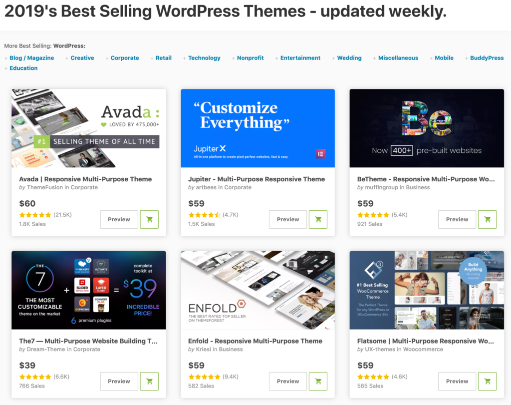
First I bought a $30 theme from Themeforest. Then I paid for Thesis (a WordPress framework) for about $100 and used the sample theme for years. Recently I bought Genesis (another WordPress framework) for $60 and currently use its sample theme.

After almost a decade, I put less than $200 into my website design. That didn’t stop me from landing speaking gigs, getting amazing jobs, closing clients, doing paid workshops, and having enough income to support myself while I quit my job to start another business.

Before getting a custom site design, I make absolutely sure I have a great offer that customers are paying for, a specific target market, and I know how to get in front of that market consistently. Any money spent on website design before hitting these milestones is a waste.

These days, there are plenty of low-cost ways to get great design assets anyway.

Reason #2: Buy a Theme for $60 Instead

What would you rather do at this stage of your business?

  • Hire a website designer for $10,000
  • Spend a few hours looking for a new theme for $60

To get a good website design that’s worth the extra hassle and time, $10,000 is a pretty conservative estimate.

For me, this decision depends entirely on the stage of the business. For a larger site that’s making real money, the $10,000 option makes perfect sense. The site has enough unique requirements that a theme really isn’t an option any more.

But when I’m just starting a new site, I’ll gladly use the $60 theme until the site is large enough to warrant a bigger design budget.

There is a catch to all this.

In order to buy a theme, you need to build your site with a tool that allows themes to be installed.

For blogs and basic sites, WordPress is perfect and has an enormous theme ecosystem. There’s an endless list of professional themes for $30–60. Our favorite web hosts all have one-click installs for WordPress which makes this option super easy. After you’ve installed WordPress, head over to Themeforest and pick the theme you want.

Theme Forest Website Themes

For an ecommerce site, Shopify gives you a ton of ecommerce features you’ll need while also having world-class themes. Many of them are free, some are $180. It’s our top recommended ecommerce tool.

You’ll get a great-looking site for a fraction of the cost it would take to hire a website designer.

Reason #3: Or Use Squarespace for $12/month

What if this whole WordPress or Shopify thing is too complicated? Is there an even easier way to get a website built?

You betcha!

Squarespace is your best option, it’s considered the market leader for website builders. These are tools that make building a website as easy as possible. It’s all drop-and-click and basic text editing. No programming or complicated settings to figure out.

It’s kind of like WordPress in that Squarespace is the tool that runs your site. Then you’ll pick a theme that changes how your site looks.

Squarespace Theme

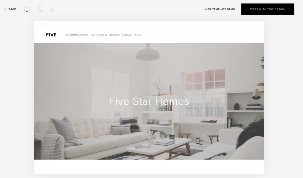
The main differences are that Squarespace is much easier to use and the theme is included in the monthly price. Pricing starts at $12/month which is very reasonable. Squarespace is your best option if you need a basic website that describes your business. A homepage, an About page, a Contact page, and that’s about it.

If you’re building an ecommerce business, use Shopify.

If you’re building a blog or want to focus on SEO, use WordPress.

Regardless of which option you choose, you don’t need a website designer for any of them.

Reason #4: Use These Logo Hacks Instead

Any designer that’s really good will charge a boatload for a logo. For a major corporation that depends on its brand identity, it’s well worth the cost.

But when I’ve started websites and businesses, the last thing I want to spend money on is a logo. I need to conserve every dollar I have to get the business off the ground.

Among online business owners, there’s a hack for getting a great logo at a reasonable price.

The hack is 99 Designs.

99 Designs Logo

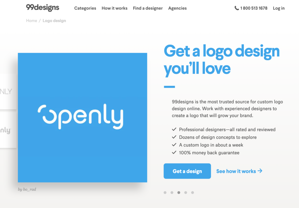
It’s a platform for connecting designers to clients. And it works like a contest. You put in your design spec, a bunch of designers submit designs, you give feedback on the top 3–5 that you like, then you pick the winner based on the one you like the most.

I’ve done a bunch of these over the years and have always ended up with a great logo.

It’s super easy to run and you’ll have a great logo for $299. Other than your website theme, this is the only money that you should spend on design in the early days.

What if $299 is too steep? Is there a cheaper way to get a logo?

Yes, a lot of folks have been using Fiverr recently. You can nab a logo for as low as $10. Keep in mind that these logos will be very derivative and basic. The designer has a bunch of basic logo templates and styles they’ve used in the past. They’ll take your company name and plop it right into one of these standard logos. It’s the only way to crank out logos for $10. As long as you’re okay with that, Fiverr has my full support.

Reason #5: The Best Website Designers Aren’t Available

When I was running website growth and optimization teams, I’d occasionally come across a good designer available for a reasonable rate. Can you guess what I did next?

I hired them full-time and took them off the market.

I had more than enough work to keep them busy and a good designer is indispensable to a larger site. I’d quickly employ them full-time and give them more than enough work that they’d stop freelancing.

This happens all the time.

Senior designers know their worth and are super expensive. Younger designers with talent that exceeds their cost are only available for brief periods. Either a client brings them in-house or they figure out what they’re really worth and up their rates. Regardless, it’s super hard to find talent at reasonable rates for a new business.

The last thing I’d do is pay through the nose when I’m just getting a business off the ground.

Reason #6: Cheap Designers Won’t Do Much Design Anyway

I can’t believe I’m about to tell this story.

Years ago, when I was just getting my career going, I did a bunch of freelance online marketing. I ran AdWords accounts, did conversion optimization, wrote copy, and built a lot of websites. Building websites was the bulk of the work that I brought in. A bunch of small businesses needed them and asked if I could help. Of course I said yes because I was living out of a barn and needed the cash.

So I teamed up with a good friend of mine who was a front-end developer.

Here’s the problem: we had no design skills whatsoever.

I wrote solid copy, my friend could build whatever you wanted, but we couldn’t design our way out of a paper bag.

Clients would ask me if I could design a website, I’d say yes, then I’d go buy a WordPress theme that was 90% of what they needed. We’d tweak it just enough to make it look unique.

Here’s the part that will make you cringe.

I’d pay like $30 for the WordPress theme. Then I’d charge the client thousands of dollars for the website. I never felt too bad about since we spun the site up, wrote all the copy, and got everything in place. But still, that’s a lot of extra money you don’t really need to spend.

And this was back when WordPress themes weren’t that good. You could tell the difference between a theme and a real site in those days. Themes are so good these days that if I was a junior designer, I’d play this theme arbitrage game all day long.

Moral of the story: if you find a cheap designer, they’re charging you to find a theme and make a few basic edits.

Reason #7: Website Designs Age Fast

If you find a great designer who charges you thousands or tens of thousands of dollars for your website, you’ll be thrilled with the design.

For about a year.

Then it will start to age.

By years two and three, you’ll desperately want a new design.

Design trends online charge so fast, I can barely keep up myself. They change so quickly that I’ve accepted the fact that my sites need major overhauls every 2–3 years. Instead of a website design being an investment in the future, it behaves more like a fixed cost.

A great design only looks great if it’s better than everyone else’s site. A great design from 5 years ago does not look great anymore – it looks pretty shabby.

Let’s say you buy a WordPress theme for $60. In 3 years, you can easily buy another WordPress theme for $60 that looks more up-to-date. Now you’re spending $20/year to keep your website fresh.

What if you get a spiffy site custom built? If you spend $9,000 on the design (a very conservative estimate), that works out to a budget of $3,000 per year. For a lot of small businesses, that’s a hefty price tag.

I Only Hire a Website Designer When I Can Afford One Full Time

Here’s my rule: I only start doing custom website designs once I have the budget to hire a full-time designer. I might choose a website design agency or a freelancer instead if I don’t have enough ongoing work for a full-time role, but my business should be large enough that I could hire a designer full-time if I really needed. Otherwise I stick to templates and small design projects.

How to Use Spring Data JPA and Spring Boot With MariaDB

As you may already be aware, Spring Data JPA is part of the larger Spring Data family. In this article, we are going to use Spring Data JPA along with Spring Boot to communicate with the MariaDB database.

Dependencies

With Spring Boot:

<dependency>
<groupId>org.springframework.boot</groupId>
<artifactId>spring-boot-starter-data-jpa</artifactId>
</dependency>


Learning to Learn

There’s been a lot of talk recently about whether or not you need a degree to be in tech (spoiler: you don’t). But please don’t take this to mean you don’t need any kind of education to be in tech, because by not getting a degree, you’re opting to replace the imposed learning structure of an academy with learning on your own.

Academic background or not, technical education doesn’t stop once you get a job. On the contrary: nothing in tech stays in one place, and the single most valuable skill you can possess to remain employable over time is learning how to learn.

Identifying holes

You’re all ready to go, ready to challenge yourself, learn what you can, and grow. But where do you start? Sometimes people rely on a more formal education simply because someone is there, guiding your path.

When you’re learning on your own, this part can sometimes be tough — you don’t know what you don’t know. If you’re starting from scratch, learning web development or computer science, here are some resources that might help:

There are also times when you know what you need to learn, but you have to level up. In this case, I have some strategies on how to organize yourself in the next section.

Possible strategies

You absolutely do not to be as formal in your approach to learning as I am. I used to be a college professor, and so I still organize my own learning as though I’m teaching. I even still use a paper planner designed for teachers. I’ll show you how I do it in case it’s helpful. A few years back I taught myself ES2015/ES6, so I'll use that as an example. Structure like this is good for some and not good for others, so do what works for you.

If there’s an API I’m trying to learn, I’ll go to the main documentation page (if there is one), and list each of the things I’m trying to learn. Then I’ll divide the sections into what I think are manageable chunks, and spread the sections over my schedule, usually shooting for about a half hour a day. I do this with the understanding that some days I won’t find the time, and others, I’ll dig in for longer. Typically I aim for at least 2.5 hours of learning a week, because that pace seems reasonable to me.

ES2015 main
The list of ES2015 features I used when I was learning

Then I take all of those features, write them out, and estimate how much time I'll need for each one. Here’s an example where I wrote out all the things I needed to learn. The yellow numbers on the side are my time estimates in half hour units.

checklist of ES6 features

You can also do this with course materials from an online workshop, writing down the sections and breaking them into chunks to go over every day. I really enjoy Frontend Masters for long form learning like this, as well as Egghead and courses by Wes Bos.

At this point, I'll break those pieces down and schedule them. The teacher planner allows me to divide my days into the different themes I'm focusing on and put a little in each day. You can see in the first screenshot that I was learning a bit, mentoring a bit, and writing and building what I was learning each day. This kind of input/output really helped me solidify the concepts as I was digging into ES2015/ES6.

example of scheduling by theme, subjects broken down by day

I try not to schedule too far out because I'm bound to drop something here and there, or I might dive further one day than I was planning to. I keep the schedules flexible enough to adjust for these inevitable inconsistencies. This also allows me to not get too demotivated. If I feel I'm off-track, the next week is another opportunity to get back on.

Again, you don't have to be as formal as I am, and there are so many ways to be effective. Find what works for you. I would make a small suggestion that you're taking a look at the table of contents for those API docs now and again, mostly because then you're aware of any gaps in your knowledge that you're not filling.

Setting aside time

Setting aside time can be challenging with all of our busy schedules, but it's critical. If you look at your week, how much time do you have? Learning won’t happen unless you purposefully devote time for it. It needn’t be a ton of time. If you’re a more habit-driven kind of person, you can set up a daily schedule. If you’re the kind of person who learns better head down and you have an existing job, then you might have to give up some Sunday afternoons, or possibly some time after work now and again. Most of us need a bit of both. ☺️

If you’re socially motivated, you might want to find a study buddy. Is there someone at work who has similar goals? Maybe going to coding meetups can help keep you on track. Emma Wedekind also builds Coding Coach, where you can have guided mentorship sessions.

Practice

At the end of the day, it's going to come down to practice. If you read about Cognitive Load Theory (I highly recommend the book Cognitive Load Theory if you want to learn about this), you'll see that the old "practice makes perfect" adage has some bite to it.

diagram showing that practice helps us store long term ideas
Information Processing Model (how we learn) - Richard Atkinson and Richard Shiffrin's cognitive load theory, 1968.

I also really like this quote from Zed Shaw’s Learn Python the Hard Way.

Do Not Copy-Paste
You must type each of these exercises in, manually. If you copy and paste, you might as well just not even do them. The point of these exercises is to train your hands, your brain, and your mind in how to read, write, and see code. If you copy-paste, you are cheating yourself out of the effectiveness of the lessons.

I also love this quote from Art and Fear, and bring it up frequently as it's been a guiding light for me:

The ceramics teacher announced on opening day that he was dividing the class into two groups. All those on the left side of the studio, he said, would be graded solely on the quantity of work they produced, all those on the right solely on its quality. His procedure was simple: on the final day of class he would bring in his bathroom scales and weigh the work of the "quantity" group: fifty pounds of pots rated an "A", forty pounds a "B", and so on. Those being graded on "quality", however, needed to produce only one pot —albeit a perfect one —to get an "A". Well, came grading time and a curious fact emerged: the works of highest quality were all produced by the group being graded for quantity. It seems that while the "quantity" group was busily churning out piles of work—and learning from their mistakes —the "quality" group had sat theorizing about perfection, and in the end had little more to show for their efforts than grandiose theories and a pile of dead clay.

Learning modalities

Truly there are many different learning modalities, and combining them can even be helpful. Sometimes I will sit and practice refactoring code from other languages into JavaScript (this is a pretty old project now), or reverse engineer things to learn. I like reverse engineering because people tend to problem-solve in different ways. This allows me to peek inside other people’s heads and see how they approach things. I even have a private collection on CodePen where I collect other people's work that I think can benefit me and my learning.

Personally, I think there’s nothing more motivating than building. You can actually learn a metric ton just by building things.

Storytime: Many years ago, I was at a conference with a few people who worked on the SVG spec, including the inventor of SVG himself. I was completely unknown at the time, but had been churning out tons of SVG animations that were wildly unpopular for a few years. We got on the subject of a certain behavior that was in the spec. I mentioned, that yes, it should work that way but unfortunately Firefox had x behavior and Chrome had y.

No one in the group knew this, and it was the first time I realized that all those silly playful things I was building were actually educating me; that I knew practical, real-life edge cases even though I hadn’t sought them out in a formal manner. I was so excited! I didn’t plan to become an SVG expert — it snuck up on me as I enjoyed myself, building things to relieve stress and play.

This is good news! You can learn so much by creating things you think are fun. I like to learn for a bit, and then practice what I learned by making something, just to make sure I solidify the concepts.

You may find you learn the most by teaching. If you do have a person you can mentor, it can actually benefit you, too. Writing technical posts or helping with documentation can help you learn something concretely as well.

Cognitive Load Theory

The book I cited earlier, Cognitive Load Theory, has this great section breaking down learning modalities and what they require. A central theme to the book is discussing moving information from a source into our own minds, and that there are certain capabilities and limitations affected by design characteristics of the learning structure and our own cognition.

  • Intrinsic load is created by the difficulty of the materials.
  • Extraneous load is created by the design characteristics of the type of education and materials.
  • Germane load is the amount of invested mental effort.

The chart below explores effects of different ways that we learn, and what the primary cognitive load would be of the three listed above.

table of human cognition and learning modalities
From Cognitive Load Theory

This kind of meta-understanding of what it takes to learn might be helpful to you in that you might find you have less cognitive load in one learning modality versus another. You may also find that you can cut yourself some slack when one topic with more germane load takes you longer to understand than another that's mostly memorization.

Know that learning styles do affect our ability to comprehend things, and reducing barriers for yourself is key. Do you keep studying at a cafe where there's a lot of noise and distraction? Consider that your lack of focus might have more to do with the setting than your ability to process the materials.

One more note on this: learning is hard, and it's humbling. It's exciting too, but please don't feel alone if you struggle, or if you need to repeat something multiple times to really get it. Even after taking care of cognitive leaks, expanding knowledge is not necessarily easy, but does pay off in dividends.

Lifelong learners

By choosing to be a developer, you are choosing to learn. This is amazing. Our field not only values our knowledge, but we can stave off boredom because it doesn’t stagnate. My suggestion is to consider these tips a buffet table. There’s so much you can do, so many tools you can use. You don't need to learn everything and no one knows absolutely everything. It can feel overwhelming, but try to view it less like a race to the finish and more like a continuous journey.

Remember: no one was born knowing any of this. Even the experts you know started at zero. There's nothing stopping you from becoming their peer if that's your goal. Or simply learning enough to get the job done if that's what you need.

The post Learning to Learn appeared first on CSS-Tricks.

CSS Remedy

There is a 15-year history of CSS resets. In fact, a "reset" isn't really the right word. Tantek Çelik's take in 2004 was called "undohtml.css" and it wasn't until a few years later when Eric Meyer called his version a reset, that the word became the default term. When Normalize came around, it called itself a reset alternative, which felt right, because it wasn't trying to obliterate all styles, but instead bring the base styles that browsers provide in their User Agent Stylesheet in line with each other.

We've taken a romp through this history before in Reboot, Resets, and Reasoning. Every single take on this — let's call them "base" stylesheets — has a bit of a different angle. How much does it try to preserve the UA defaults? How opinionated does it get? How far back does it consider for browser support?

Along comes CSS Remedy (they say it's not ready for usage), with yet another different spin:

Sets CSS properties or values to what they would be if the CSSWG were creating the CSS today, from scratch, and didn't have to worry about backwards compatibility.

Fascinating to think about.

CSS Remedy re-draws the line for what is opinionated and what isn't. I'd say that something like * { box-sizing: border-box; } is a fairly strong opinion for a base stylesheet to have. No UA stylesheet does this, so it's applying a blanket rule everywhere just because it's desirable. It's definitely desirable! It's just opinionated.

But not having border-box be the default is considered a CSS mistake. So if CSS Remedy is what a UA stylesheet would be if we were starting from scratch, border-box isn't opinionated; it's the new default.

Sadly, we probably can never have a fresh UA stylesheet in browsers, because the danger of breaking sites is so high. If Firefox shipped some new modernized UA stylesheet that was tastefully done and appears to be nice, but only until you browse around the billion websites that weren't built to handle the new CSS being applied to them, them people would blame Firefox — and not incorrectly. Gracefully handling legacy code is a massive strength of the web and something that holds us back. It's more the former than the latter, though.

It's been fun watching Jen think through and gather thoughts on stuff like this though:

I agree! That little space below images has confounded an absolute ton of people. It's easy enough to fix, but it being the fault of vertical-align is a bit silly and a great candidate for fixing in what would be a new UA stylesheet.

I tossed the in-progress version into the comparison tool:

See the Pen
HTML Kitchen-sink
by Chris Coyier (@chriscoyier)
on CodePen.

Direct Link to ArticlePermalink

The post CSS Remedy appeared first on CSS-Tricks.

Free Absurd Illustrations for Landing Pages

This post is originally published on Designmodo: Free Absurd Illustrations for Landing Pages

Free Absurd Illustrations for Landing Pages

Absurd Illustrations that make sense are something completely new when it comes to modern web design. The digital era has its aesthetic standards inspired by perfection and artificial intelligence. On the other hand, Absurd Illustrations provide us with perfect imperfection. …

For more information please contact Designmodo