If you are on social media of any kind, you will know how many bloggers there are out there, as well as social media influencers, that are all out there working with brands and making some serious cash from doing so. But in a world that is saturated with influencers and bloggers, is there space Read More →
Every day, the ProgrammableWeb team is busy, updating its three primary directories for APIs, clients (language-specific libraries or SDKs for consuming or providing APIs), and source code samples.
At the start of 2018, as I was starting to go a bit deeper into CSS gradient masking in order to create interesting visuals one would think are impossible otherwise with just a single element and a tiny bit of CSS, I learned about a property that had previously been completely unknown to me: mask-composite.
As this is not a widely used property, I couldn't find any comprehensive resources on this topic. So, as I began to use it more and learn more about it (some may remember I've mentioned it before in a couple of otherarticles), I decided to create such a resource myself and thus this article was born! Here, I'm covering how mask-composite works, why it's useful, what values it can take, what each of them does, where we are in terms of support and what alternatives we have in non-supporting browsers.
What mask compositing does
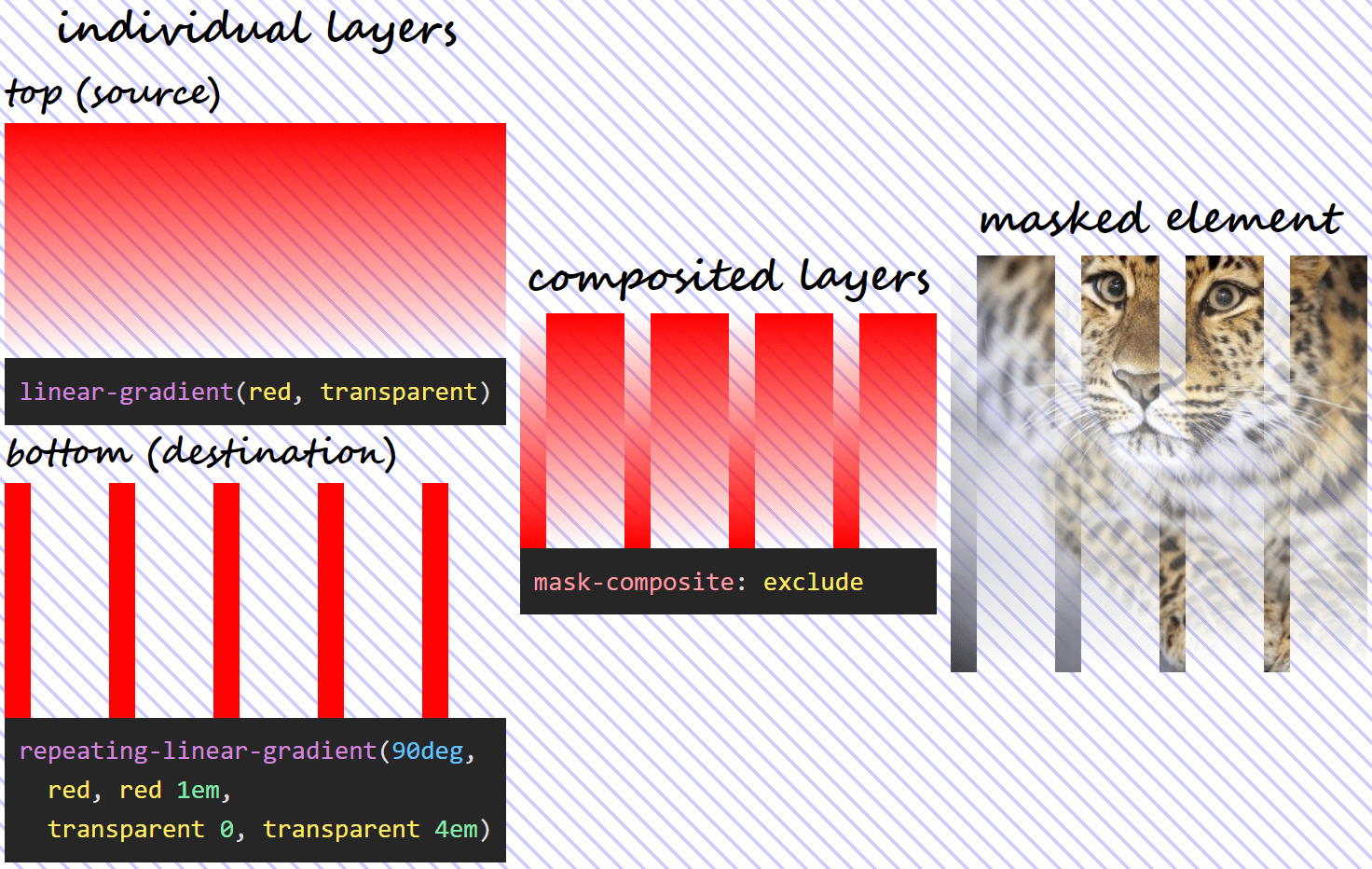
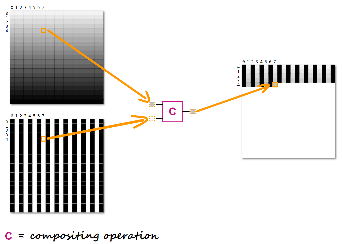
Mask compositing allows us to combine different mask layers into a single one using various operations. Combine them how? Well, pixel by pixel! Let's consider two mask layers. We take each pair of corresponding pixels, apply a certain compositing operation (we'll discuss each possible operation in detail a bit later) on their channels and get a third pixel for the resulting layer.
How compositing two layers works at a pixel level.
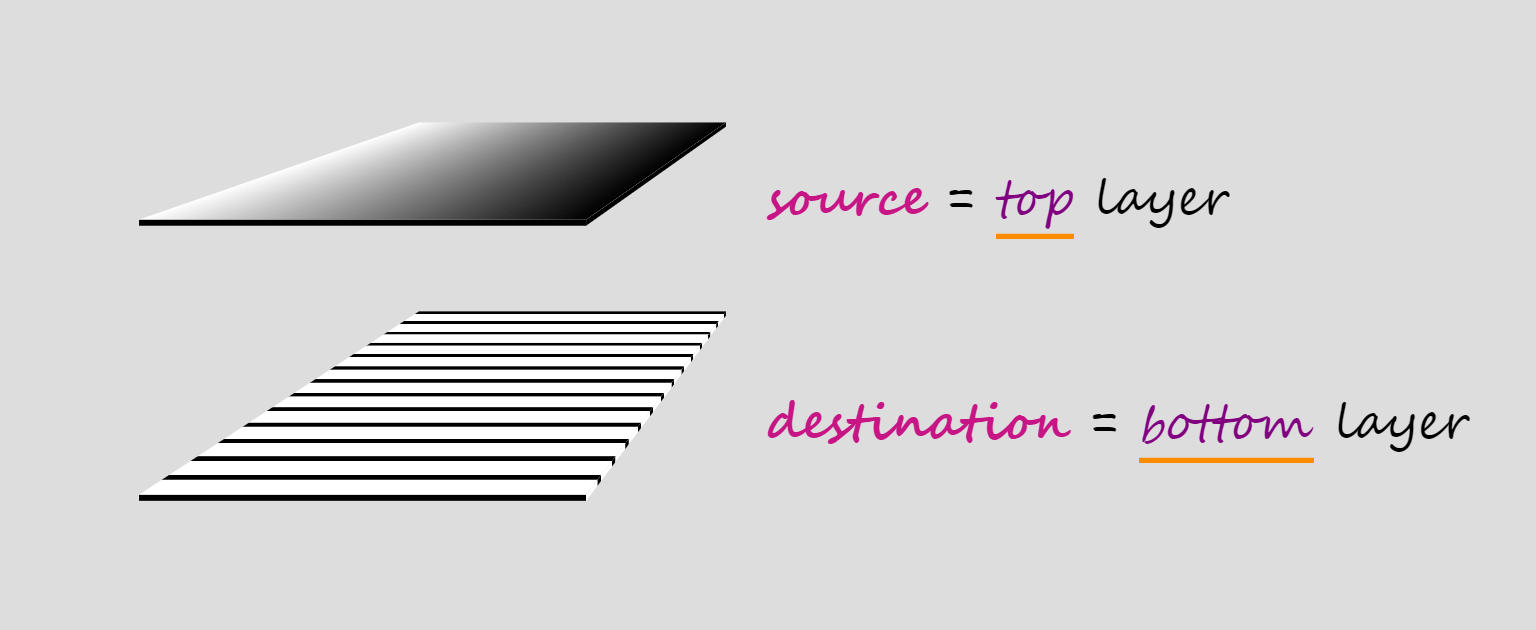
When compositing two layers, the layer on top is called the source, while the layer underneath is called the destination, which doesn't really make much sense to me because source sounds like an input and destination sounds like an output, but, in this case, they're both inputs and the output is the layer we get as a result of the compositing operation.
Compositing terminology.
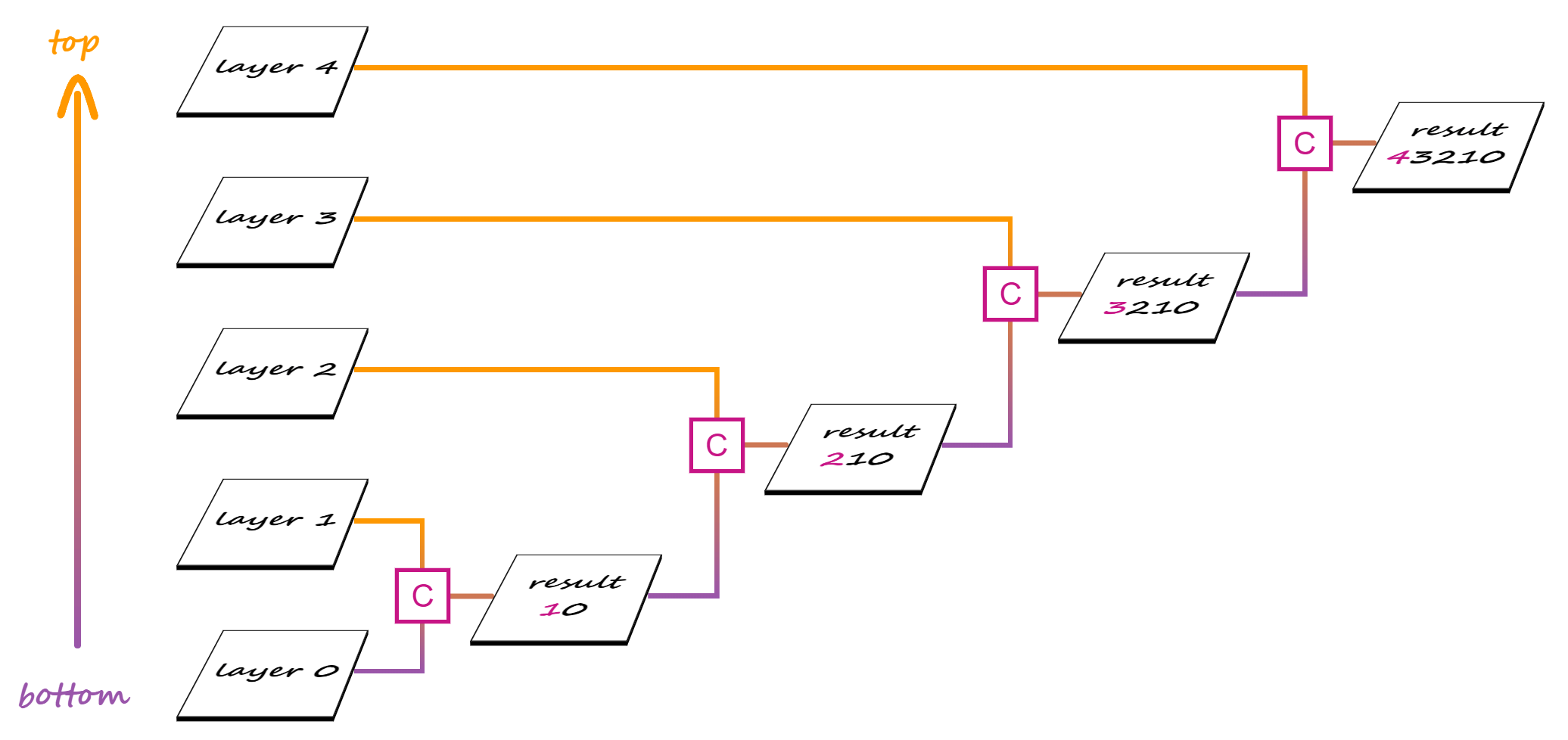
When we have more than two layers, compositing is done in stages, starting from the bottom.
In a first stage, the second layer from the bottom is our source and the first layer from the bottom is our destination. These two layers get composited and the result becomes the destination for the second stage, where the third layer from the bottom is the source. Compositing the third layer with the result of compositing the first two gives us the destination for the third stage, where the fourth layer from the bottom is the source.
Compositing multiple layers.
And so on, until we get to the final stage, where the topmost layer is composited with the result of compositing all the layers beneath.
Why mask compositing is useful
Both CSS and SVG masks have their limitations, their advantages and disadvantages. We can go around the limitations of SVG masks by using CSS masks, but, due to CSS masks working differently from SVG masks, taking the CSS route leaves us unable to achieve certain results without compositing.
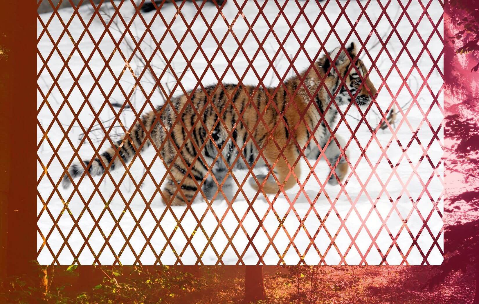
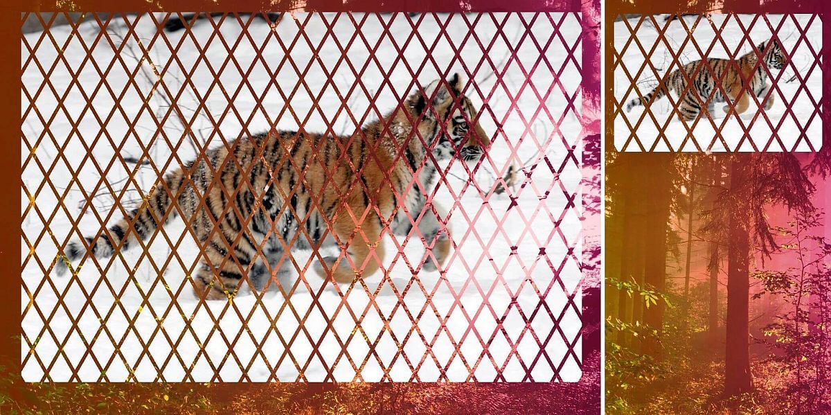
In order to better understand all of this, let's consider the following image of a pawesome Siberian tiger cub:
The image we want to have masked on our page.
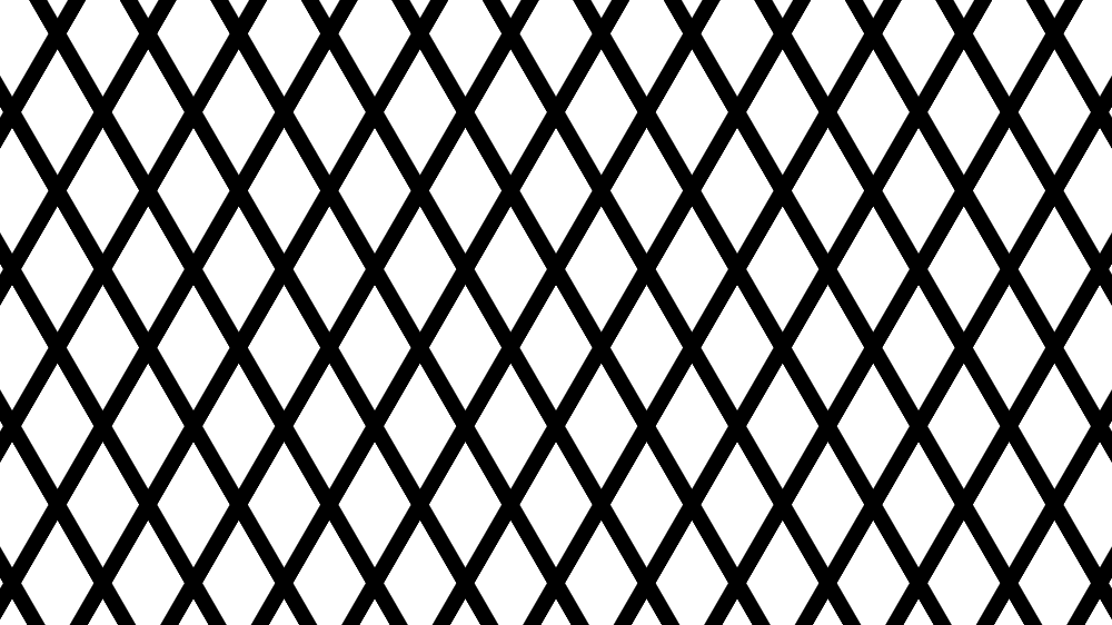
And let's say we want to get the following masking effect on it:
Desired result.
This particular mask keeps the rhombic shapes visible, while the lines separating them get masked and we can see through the image to the element behind.
We also want this masking effect to be flexible. We don't want to be tied to the image's dimensions or aspect ratio and we want to be able to easily switch (just by changing a % value to a px one) in between a mask that scales with the image and one that doesn't.
In order to do this, we first need to understand how SVG and CSS masks each work and what we can and cannot do with them.
SVG masking
SVG masks are luminance masks by default. This means that the pixels of the masked element corresponding to the whitemask pixels are fully opaque, the pixels of the masked element corresponding to blackmask pixels are fully transparent and the pixels of the masked element corresponding to mask pixels somewhere in between black and white in terms of luminance (grey, pink, lime) are semitransparent.
The formula used to get the luminance out of a given RGB value is: .2126·R + .7152·G + .0722·B
For our particular example, this means we need to make the rhombic areas white and the lines separating them black, creating the pattern that can be seen below:
Black and white rhombic pattern used as an SVG mask.
In order to get the pattern above, we start with a white SVG rectangle element rect. Then, one might think we need to draw lots of black lines... but we don't! Instead, we only add a path made up of the two diagonals of this rectangle and ensure its stroke is black.
To create the first diagonal (top left to bottom right), we use a "move to" (M) command to the top left corner, followed by a "line to" (L) command to the bottom right corner.
To create the second diagonal (top right to bottom left), we use a "move to" (M) command to the top right corner, followed by a "line to" (L) command to the bottom left corner.
... but that's about to change! We increase the thickness (stroke-width) of the black diagonal lines and make them dashed with the gaps between the dashes (7%) bigger than the dashes themselves (1%).
If we keep increasing the thickness (stroke-width) of our black diagonal lines to a value like 150%, then they end up covering the entire rectangle and giving us the pattern we've been after!
The above should work. But sadly, things are not perfect in practice. At this point, we only get the expected result in Firefox (live demo). Even worse, not getting the desired masked pattern in Chrome doesn't mean our element stays as it is unmasked - applying this mask makes it disappear altogether! Of course, since Chrome needs the -webkit- prefix for the mask property (when used on HTML elements), not adding the prefix means that it doesn't even try to apply the mask on our element.
The most straightforward workaround for img elements is to turn them into SVG image elements.
This gives us the result we've been after, but if we want to mask another HTML element, not an img one, things get a bit more complicated as we'd need to include it inside the SVG with foreignObject.
Even worse, with this solution, we're hardcoding dimensions and this always feels yucky.
Of course, we can make the mask ridiculously large so that it's unlikely there may be an image it couldn't cover. But that feels just as bad as hardcoding dimensions.
We can also try tackling the hardcoding issue by switching the maskContentUnits to objectBoundingBox:
But we're still hardcoding the dimensions in the viewBox and, while their actual values don't really matter, their aspect ratio does. Furthermore, our masking pattern is now created within a 1x1 square and then stretched to cover the masked element.
Shape stretching means shape distortion, which is why is why our rhombic shapes don't look as they did before anymore.
However, in order to get one particular rhombic pattern, with certain angles for our rhombic shapes, we need to know the image's aspect ratio.
Sigh. Let's just drop it and see what we can do with CSS.
CSS masking
CSS masks are alpha masks by default. This means that the pixels of the masked element corresponding to the fully opaque mask pixels are fully opaque, the pixels of the masked element corresponding to the fully transparentmask pixels are fully transparent and the pixels of the masked element corresponding to semitransparent mask pixels are semitransparent. Basically, each and every pixel of the masked element gets the alpha channel of the corresponding mask pixel.
For our particular case, this means making the rhombic areas opaque and the lines separating them transparent, so let's how can we do that with CSS gradients!
In order to get the pattern with white rhombic areas and black separating lines, we can layer two repeating linear gradients:
This is the pattern that does the job if we have a luminancemask.
But in the case of an alphamask, it's not the black pixels that give us full transparency, but the transparent ones. And it's not the white pixels that give us full opacity, but the fully opaque ones - red, black, white... they all do the job! I personally tend to use red or tan as this means only three letters to type and the fewer letters to type, the fewer opportunities for awful typos that can take half an hour to debug.
So the first idea is to apply the same technique to get opaque rhombic areas and transparent separating lines. But in doing so, we run into a problem: the opaque parts of the second gradient layer cover parts of the first layer we'd like to still keep transparent and the other way around.
So what we're getting is pretty far from opaque rhombic areas and transparent separating lines.
My initial idea was to use the pattern with white rhombic areas and black separating lines, combined with setting mask-mode to luminance to solve the problem by making the CSS mask work like an SVG one.
This property is only supported by Firefox, though there is the non-standard mask-source-type for WebKit browsers. And sadly, support is not even the biggest issue as neither the standard Firefox way, nor the non-standard WebKit way give us the result we're after (live demo).
Fortunately, mask-composite is here to help! So let's see what values this property can take and what effect they each have.
mask-composite values and what they do
First, we decide upon two gradient layers for our mask and the image we want masked.
The two gradient mask layers we use to illustrate how each value of this property works are as follows:
These two layers can be seen as background gradients in the Pen below (note that the body has a hashed background so that the transparent and semitransparent gradient areas are more obvious):
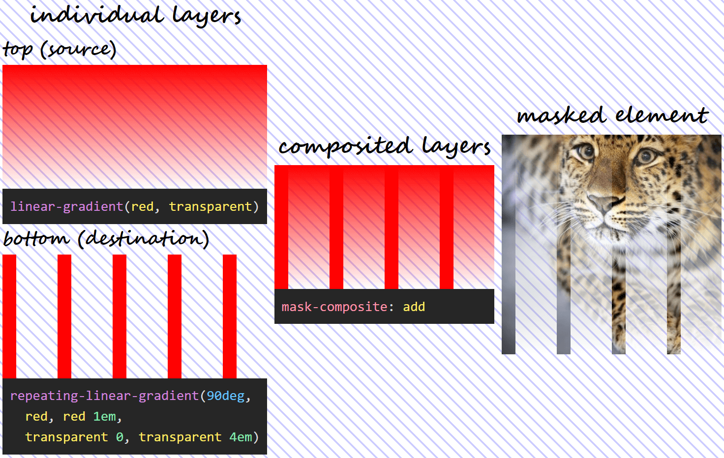
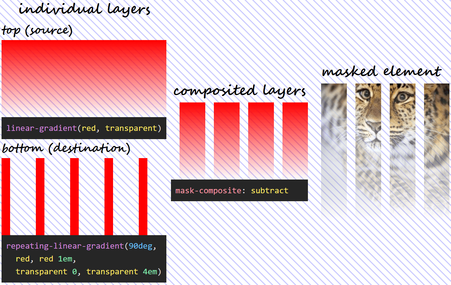
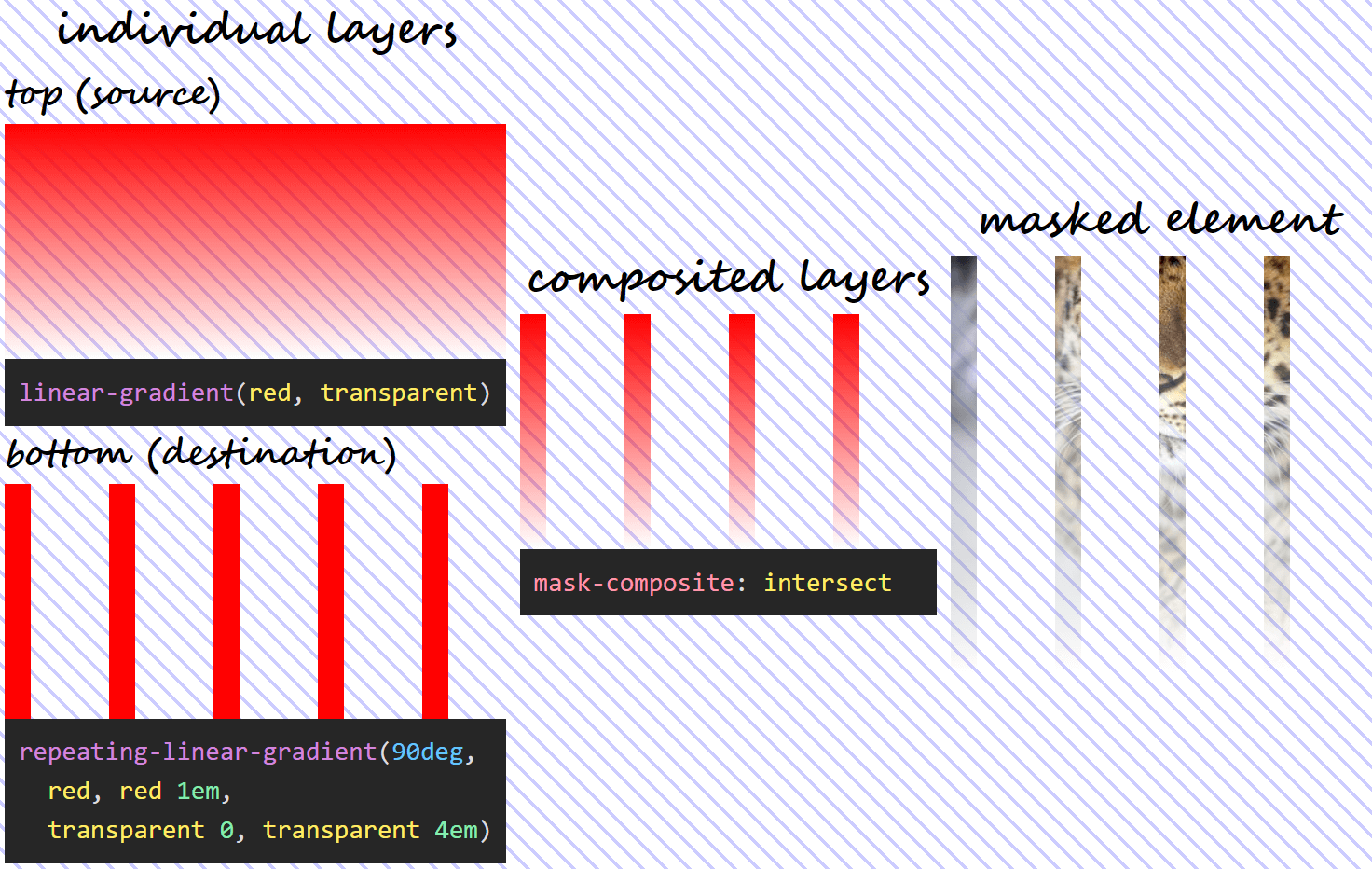
The layer on top (--l1) is the source, while the bottom layer (--l0) is the destination.
We apply the mask on this image of a gorgeous Amur leopard.
The image we apply the mask on.
Alright, now that we got that out of the way, let's see what effect each mask-composite value has!
add
This is the initial value, which gives us the same effect as not specifying mask-composite at all. What happens in this case is that the gradients are added one on top of the other and the resulting mask is applied.
Note that, in the case of semitransparent mask layers, the alphas are not simply added, in spite of the value name. Instead, the following formula is used, where α₁ is the alpha of the pixel in the source (top) layer and α₀ is the alpha of the corresponding pixel in the destination (bottom) layer:
α₁ + α₀ – α₁·α₀
Wherever at least onemask layer is fully opaque (its alpha is 1), the resulting mask is fully opaque and the corresponding pixels of the masked element are shown fully opaque (with an alpha of 1).
If the source (top) layer is fully opaque, then α₁ is 1, and replacing in the formula above, we have:
1 + α₀ - 1·α₀ = 1 + α₀ - α₀ = 1
If the destination (bottom) layer is fully opaque, then α₀ is 1, and we have:
α₁ + 1 – α₁·1 = α₁ + 1 – α₁ = 1
Wherever bothmask layers are fully transparent (their alphas are 0), the resulting mask is fully transparent and the corresponding pixels of the masked element are therefore fully transparent (with an alpha of 0) as well.
0 + 0 – 0·0 = 0 + 0 + 0 = 0
Below, we can see what this means for the mask layers we're using - what the layer we get as a result of compositing looks like and the final result that applying it on our Amur leopard image produces.
What using mask-composite: add for two given layers does.
subtract
The name refers to "subtracting" the destination (layer below) out of the source (layer above). Again, this does not refer to simply capped subtraction, but uses the following formula:
α₁·(1 – α₀)
The above formula means that, since anything multiplied with 0 gives us 0, wherever the source (top) layer is fully transparent or wherever the destination (bottom) layer is fully opaque, the resulting mask is also fully transparent and the corresponding pixels of the masked element are also fully transparent.
If the source (top) layer is fully transparent, replacing its alpha with 0 in our formula gives us:
0·(1 – α₀) = 0
If the destination (bottom) layer is fully opaque, replacing its alpha with 1 in our formula gives us:
α₁·(1 – 1) = α₁·0 = 0
This means using the previously defined mask and setting mask-composite: subtract, we get the following:
What using mask-composite: subtract for two given layers does.
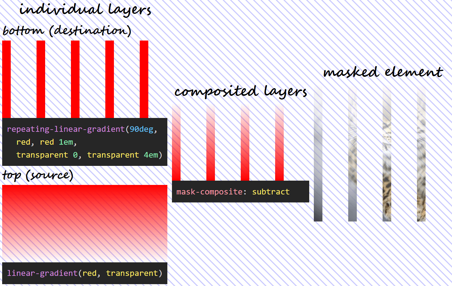
Note that, in this case, the formula isn't symmetrical, so, unless α₁ and α₀ are equal, we don't get the same thing if we swap the two mask layers (α₁·(1 – α₀) isn't the same as α₀·(1 – α₁)). This means we have a different visual result if we swap the order of the two layers!
Using mask-composite: subtract when the two given layers have been swapped.
intersect
In this case, we only see the pixels of the masked element from where the two mask layers intersect. The formula used is the product between the alphas of the two layers:
α₁·α₀
What results from the formula above is that, wherever eithermask layer is fully transparent (its alpha is 0), the resulting mask is also fully transparent and so are the corresponding pixels of the masked element.
If the source (top) layer is fully transparent, replacing its alpha with 0 in our formula gives us:
0·α₀ = 0
If the destination (bottom) layer is fully transparent, replacing its alpha with 0 in our formula gives us:
α₁·0 = 0
Also, wherever bothmask layers are fully opaque (their alphas are 1), the resulting mask is fully opaque and so are the corresponding pixels of the masked element. This because, if the alphas of the two layers are both 1, we have:
1·1 = 1
In the particular case of our mask, setting mask-composite: intersect means we have:
What using mask-composite: intersect for two given layers does.
exclude
In this case, each layer is basically excluded from the other, with the formula being:
α₁·(1 – α₀) + α₀·(1 – α₁)
In practice, this formula means that, wherever bothmask layers are fully transparent (their alphas are 0) or fully opaque (their alphas are 1), the resulting mask is fully transparent and the corresponding pixels of the masked element are fully transparent as well.
If both mask layers are fully transparent, our replacing their alphas with 0 in our formula results in:
0·(1 – 0) + 0·(1 – 0) = 0·1 + 0·1 = 0 + 0 = 0
If both mask layers are fully opaque, our replacing their alphas with 1 in our formula results in:
1·(1 – 1) + 1·(1 – 1) = 1·0 + 1·0 = 0 + 0 = 0
It also means that, wherever one layer is fully transparent (its alpha is 0), while the other one is fully opaque (its alpha is 1), then the resulting mask is fully opaque and so are the corresponding pixels of the masked element.
If the source (top) layer is fully transparent, while the destination (bottom) layer is fully opaque, replacing α₁ with 0 and α₀ with 1 gives us:
0·(1 – 1) + 1·(1 – 0) = 0·0 + 1·1 = 0 + 1 = 1
If the source (top) layer is fully opaque, while the destination (bottom) layer is fully transparent, replacing α₁ with 1 and α₀ with 0 gives us:
1·(1 – 0) + 0·(1 – 1) = 1·1 + 0·0 = 1 + 0 = 1
With our mask, setting mask-composite: exclude means we have:
What using mask-composite: exclude for two given layers does.
Applying this to our use case
We go back to the two gradients we attempted to get the rhombic pattern with:
--l1: repeating-linear-gradient(-60deg,
          transparent 0, transparent 5px,
          tan 0, tan 35px);
--l0: repeating-linear-gradient(60deg,
          transparent 0, transparent 5px,
          tan 0, tan 35px)
If we make the completely opaque (tan in this case) parts semitransparent (let's say rgba(tan, .5)), the visual result gives us an indication of how compositing could help here:
The rhombic areas we're after are formed at the intersection between the semitransparent strips. This means using mask-composite: intersect should do the trick!
$sw: 5px;

--l1: repeating-linear-gradient(-60deg,
          transparent 0, transparent #{$sw},
          tan 0, tan #{7*$sw});
--l0: repeating-linear-gradient(60deg,
          transparent 0, transparent #{$sw},
          tan 0, tan #{7*$sw});
mask: var(--l1) intersect, var(--l0)
Note that we can even include the compositing operation in the shorthand! Which is something I really love, because the fewer chances of wasting at least ten minutes not understanding why masj-composite, msdk-composite, nask-composite, mask-comoisite and the likes don't work, the better!
Not only does this give us the desired result, but, if now that we've stored the transparent strip width into a variable, changing this value to a % value (let's say $sw: .05%) makes the mask scale with the image!
If the transparent strip width is a px value, then both the rhombic shapes and the separating lines stay the same size as the image scales up and down with the viewport.
Masked image at two different viewport widths when the transparent separating lines in between the rhombic shapes have a px-valued width.
If the transparent strip width is a % value, then both the rhombic shapes and the separating lines are relative in size to the image and therefore scale up and down with it.
Masked image at two different viewport widths when the transparent separating lines in between the rhombic shapes have a %-valued width.
Too good to be true? What's the support for this?
The bad news is that mask-composite is only supported by Firefox at the moment. The good news is we have an alternative for WebKit browsers, so we can extend the support.
Extending support
WebKit browsers support (and have supported for a long, long time) a non-standard version of this property, -webkit-mask-composite which needs different values to work. These equivalent values are:
source-over for add
source-out for subtract
source-in for intersect
xor for exclude
So, in order to have a cross-browser version, all we need to is add the WebKit version as well, right?
Well, sadly, things are not that simple.
First off, we cannot use this value in the -webkit-mask shorthand, the following does not work:
-webkit-mask: var(--l1) source-in, var(--l0)
And if we take the compositing operation out of the shorthand and write the longhand after it, as seen below:
And if you think that's weird, check this: using any of the other three operations add/ source-over, subtract/ source-out, exclude/ xor, we get the expected result in WebKit browsers as well as in Firefox. It's only the source-in value that breaks things in WebKit browsers!
Why is this particular value breaking things in WebKit?
When I first came across this, I spent a few good minutes trying to find a typo in source-in, then copy pasted it from a reference, then from a second one in case the first reference got it wrong, then from a third... and then I finally had another idea!
It appears as if, in the case of the non-standard WebKit alternative, we also have compositing applied between the layer at the bottom and a layer of nothing (considered completely transparent) below it.
For the other three operations, this makes absolutely no difference. Indeed, adding, subtracting or excluding nothing doesn't change anything. If we are to take the formulas for these three operations and replace α₀ with 0, we always get α₁:
However, intersection with nothing is a different story. Intersection with nothing is nothing! This is something that's also illustrated by replacing α₀ with 0 in the formula for the intersect/ source-in operation:
α₁·0 = 0
The alpha of the resulting layer is 0 in this case, so no wonder our image gets completely masked out!
So the first fix that came to mind was to use another operation (doesn't really matter which of the other three, I picked xor because it has fewer letters and it can be fully selected by double clicking) for compositing the layer at the bottom with this layer of nothing below it:
Note that we need to add the non-standard WebKit version before the standard one so that when WebKit browsers finally implement the standard version as well, this overrides the non-standard one.
Well, that's about it! I hope you've enjoyed this article and learned something new from it.
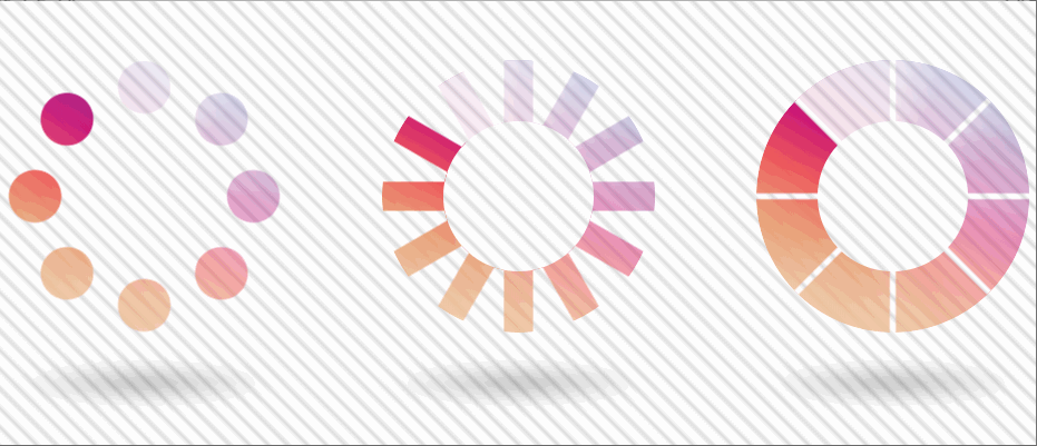
A couple more demos
Before closing, here are two more demos showcasing why mask-composite is cool.
The first demo shows a bunch of 1 element umbrellas. Each "bite" is created with a radial-gradient() that we exclude from the full circular shape. Chrome has a little rendering issue, but the result looks perfect in Firefox.
1 element umbrellas using mask-composite (live demo).
The second demo shows three 1 element loaders (though only the second two use mask-composite). Note that the animation only works in Chrome here as it needs Houdini.
1 element loaders using mask-composite (live demo).
How about you - what other use cases can you think of?
A logo is an anchor of a branding strategy and web design in general. If you don’t believe us, just try to imagine Apple, Coca Cola, or one of other top 100 companies of the...

