Normal and Laplace Distributions in Differential Privacy

I heard the phrase “normal approximation to the Laplace distribution” recently and did a double take. The normal distribution does not approximate the Laplace!

Normal and Laplace Distributions

A normal distribution has the familiar bell curve shape. A Laplace distribution, also known as a double exponential distribution, it pointed in the middle, like a pole holding up a circus tent.

How Many Architects Does it Take to Change a Light Bulb?

Looking at the Problem of Responsibility and Alignment

This is how changing the light bulb situation would pan out at a large corporation.

The business, or the Product Owner, would come and say that it was made clear that a light bulb in the living room had burned out. They engage a Solution Architect, who will suggest that the light bulb should be replaced, the BA would validate the voltage and size of the bulb, and the Infrastructure Architect would say that we need to turn off the power before attempting this operation.

13 Website Design Best Practices For 2020

Nowadays, you can get a website up and running in a few minutes. But there’s a difference between a website being live and it being optimized.

Why does design matter? It only takes 0.05 seconds for people to form an opinion about your website. Yes, you read that correctly—50 milliseconds for someone to be blown away or repulsed by your website. Most of that opinion is formed from the design.

Website design also impacts your conversions, credibility, and, ultimately, makes or breaks the success of your site. No website is perfect, but you should optimize it as much as possible.

Here’s something to take into consideration as well: After a bad experience, 88% of consumers are unlikely to return to a website. On top of that, a recent study found that 77% of agencies say that a poor website design is the most significant weakness of their clients.

Bottom line: If your web design isn’t optimized for user experience (UX), it’s going to be detrimental to your success. That’s why I wrote this guide.

Do You Need Help With Website Design?

Get help with designing your website or blog today.

Get Started

Many factors go into designing a website. These are the thirteen most important elements to prioritize in 2020. If you follow these best practices, the performance of your site will drastically improve.

Use this checklist to ensure you have a winning design

  1. Minimize text
  2. Show, don’t tell
  3. Use short sentences
  4. Try shorter paragraphs
  5. Choose a color scheme that fits
  6. Make your CTA clear
  7. Reinforce actions with familiarity
  8. Simplify the navigation
  9. Optimize your design for mobile
  10. Prioritize SEO
  11. Monitor your page loading speed
  12. Continuously run A/B tests

1. Minimize text

Don’t fill your pages with massive blocks of text.

I’m not talking about blog posts, which sometimes need to go in-depth (like this one!). I’m talking about your web pages (e.g. homepage, landing page). Keep the text to a minimum here.

You want to tell your website visitors all about you, your company, your brand, and your products. But you need to learn how to tell that story in just a few sentences or—even better— a few words.

2. Show, don’t tell

Visuals not only help you break up the written content, but they can also provide deeper explanation. Show your visitors what you’re about. They’ll understand more in a shorter amount of time.

Harry’s product page embodies both of these first two design principles:

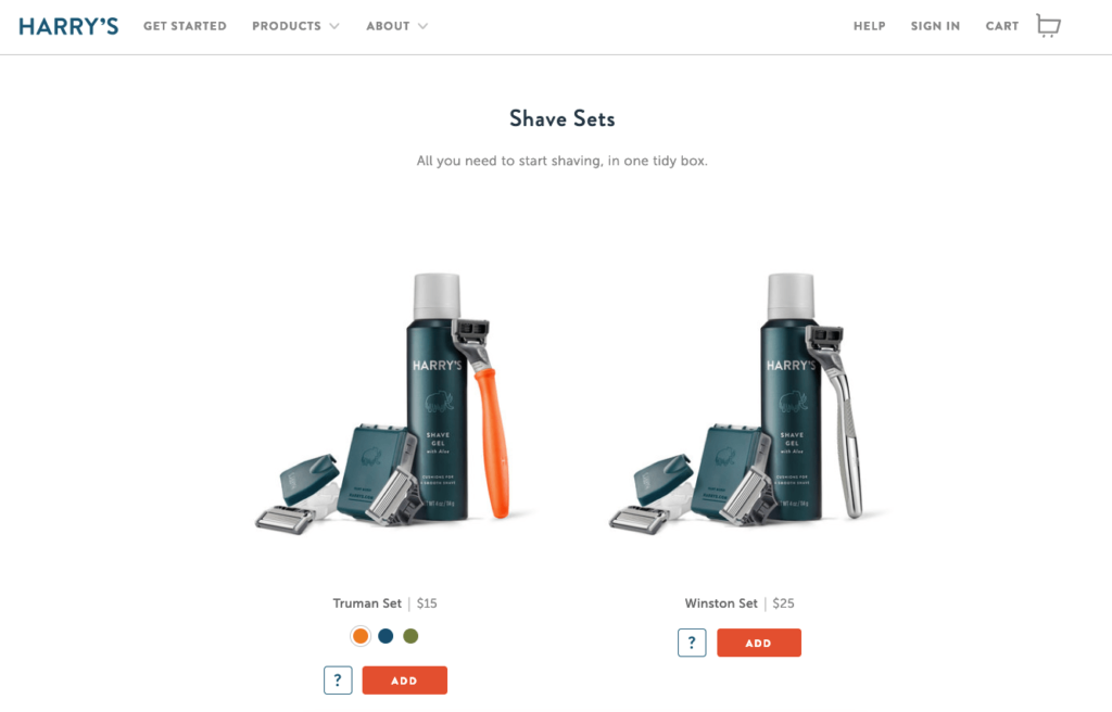
For example, let’s say your website sells razors, blades, shaving cream, and other shaving products for men.

You operate on a subscription business model and deliver these products to your customers on a monthly basis. The design of your razors is very handsome — they’re made of carved hardwood and are nice enough to give as a gift.

Rather than going into all of this detail on your homepage, you can simply have a photo of these products with text saying something like, “delivered to your door.” You get your message across in just four words.

Sure, you can go into greater detail the deeper the visitor gets into your pages, but a lengthy text description isn’t required.

3. Use short sentences

Short sentences are easier to read.

Don’t bombard visitors with big chunks of text. They won’t know where to start reading and won’t be able to digest your content.

Mix it up. If you need a long sentence, follow it with a short one. Variety helps.

4. Try shorter paragraphs

Use paragraph breaks to your advantage. It’s okay to write longer paragraphs, but I like to keep my homepage paragraphs to a few sentences.

It’s also important not to overdo it. Too much of a good thing, is actually a bad thing.

Start each paragraph with new information, so if someone is scrolling they can quickly tell if they need to read that paragraph.

Eliminating unnecessary text on your pages reduces clutter AND puts more emphasis on your call-to-action.

Having the CTA stand out alone in its own paragraph is more impactful than burying it in a bunch of text.

A very useful tool in this situation are bullets. Instead of adding paragraphs and long-form writing, consider using lists. In those lists, use bullet points.

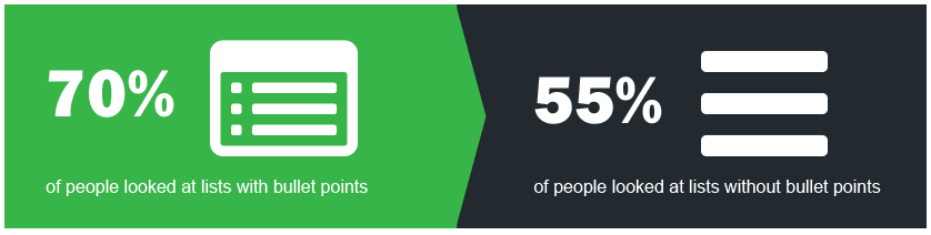
Studies show that more people will look at lists with bullet points than other formats. That’s because they help improve a page’s scannability and allow you to highlight the most important points you want to make.

5. Choose a color scheme that fits your branding strategy

The color choices you make on your website are more important than you think.

Visitors judge your website in less than 90 seconds. Most of that is a result of the colors you choose.

The best way to choose your website color scheme is with branding. Refer to your logo. Do the colors on your website fit with your brand image?

Here’s an example. Think of Starbucks.

When you hear this brand name, I’m sure you have an image in your head. Maybe it’s the logo, a sign, or a store location.

Do you associate any colors with that name? Now let’s look at their website.

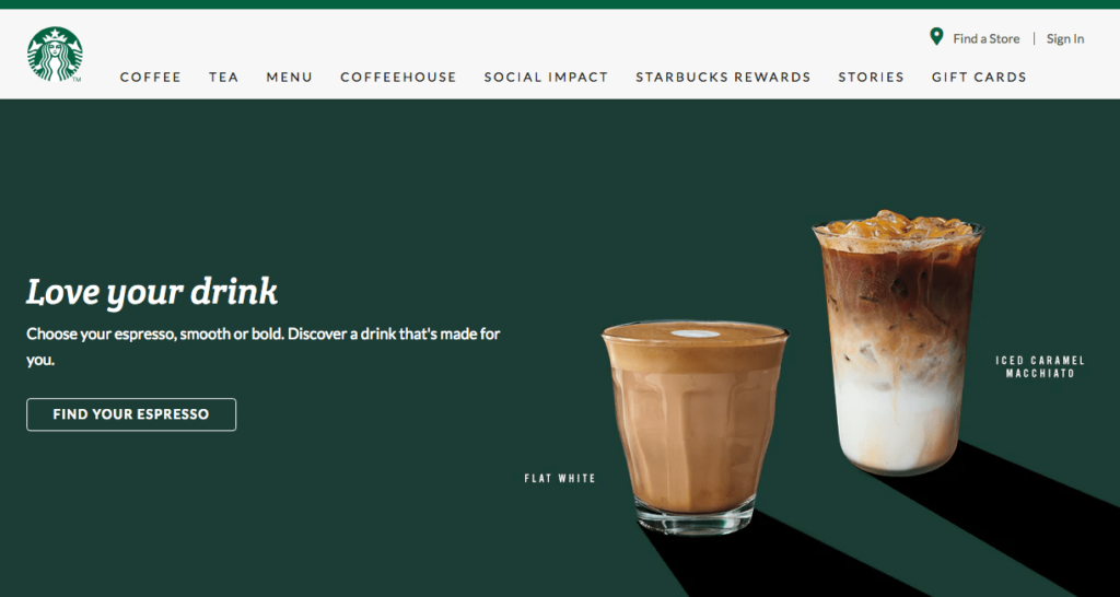
It’s no surprise that they went with a green color scheme.

This design choice matches their logo and brand image, which reinforces what consumers already associate with the brand. By keeping things consistent, there is no confusion. It would be odd if you visited this website and the colors were yellow and red. That has nothing to do with their brand.

We’ll talk more about reinforcement in greater depth as we continue.

6. Make your CTA clear and obvious

CTAs should not be buried. They need to be big, bold and powerful and they must clearly stand out as the action your visitors should take next.

Yet, most websites don’t have a CTA button that can be spotted in less than three seconds. There’s a good chance that you fall into the group that takes longer. That’s not the category you want to be in.

You can’t drive conversions without an effective CTA button.

I almost never see a CTA on a business’ interior pages (the pages that explain what your brand does and what you offer). This is a major design flaw. You can’t expect visitors to navigate back to your homepage to convert.

Take a look at this CTA from Litmus.

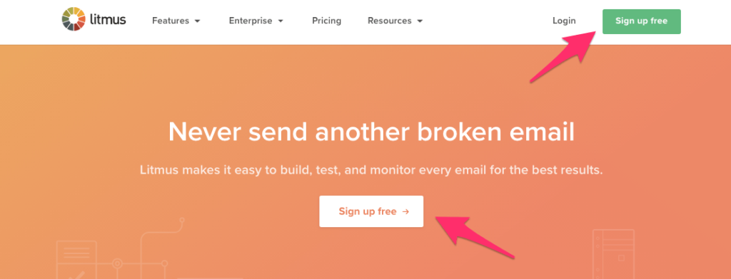
Look how simple this design is. There is minimal text on the screen, so the message is clear.

As a result, the CTA “sign up free” stands out. In fact, Litmus even put it in more than one location on the screen.

Where you should put your CTA differs from page to page. For example, blog posts should have the CTA up top so readers see it quickly and also at the bottom after they have read the post.

Go deeper: Want to optimize your CTAs? Here are 11 ways to improve your calls to action.

7. Reinforce actions with familiarity

If your message is the same, your CTA should be the same on every single page.

Think about how people navigate your website. Even if you set up a certain flow, not everyone will land on a page and convert in seconds. They may browse around for a bit first.

For example, let’s say you have an ecommerce website. You shouldn’t change the CTA button from page to page, which would look like this:

  • Homepage: Checkout now
  • Category page: Buy it today
  • Product page: Click to purchase

If a visitor sees one of those buttons on your homepage, the other on a category page, and the third on a product page, there’s no reinforcement.

Instead, keep the messaging and the style consistent. Here’s a good example from the jewelry and accessories brand MVMT.

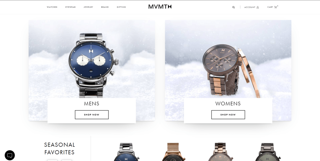
It doesn’t matter if you’re on their eyewear, watches, or jewelry page. You’re going to see the same “SHOP NOW” CTA for their products.

Each page also stays consistent with their website’s overall minimalist, black-and-white design.

Apply this design principle to your website as well.

It goes beyond the CTA button. The idea is to have this type of reinforcement with as many elements as possible.

Consistency in language, messaging, and design reinforces your brand identity and leaves a lasting impression on your visitors’ minds.

8. Simplify the navigation

It shouldn’t be difficult for a website visitor to find what they’re looking for on your site.

Put yourself in their shoes. Why are you visiting the website? How do you accomplish that task? Maybe you want to buy something, get more information, or see what there is to offer. Whatever that reason may be, if visitors can’t figure it out quickly, they’re going to leave.

There is just too much competition out there. Users have no reason to put up with unwieldy website navigation. All they need to do is leave your site and find what they need somewhere else.

Don’t try to reinvent the wheel with a complex design. Stick with the standard format.

For example, most websites put the navigation menu horizontally at the top of each page. If your menu is somewhere else, it might confuse your visitors.

The fewer options in the menu, the better. Otherwise, it will be too hard for people to find what they need. This concept is known as Hick’s Law.

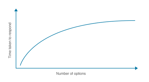
The more options you give someone, the longer it will take them to make a decision. That’s why complex designs and navigations will crush your conversion rates.

There’s a famous experiment about this, referred to as the jam study, which discusses the paradox of choice.

The experiment was conducted at a local grocery store. Consumers were presented with 24 jams to sample on one day, and six jams on the following day:

  • The larger display on day one attracted 60% of shoppers, but only 3% of those people made a purchase.
  • The smaller display of six jams on the second day attracted 40% of shoppers, but 30% of them made a purchase.

By limiting choices, conversions were ten times higher. This same concept can be applied to your website navigation.

Eliminate unnecessary menu options. For example, instead of having a “home” button, just use the website logo to link back to the home screen.

Take a look at Square’s homepage.

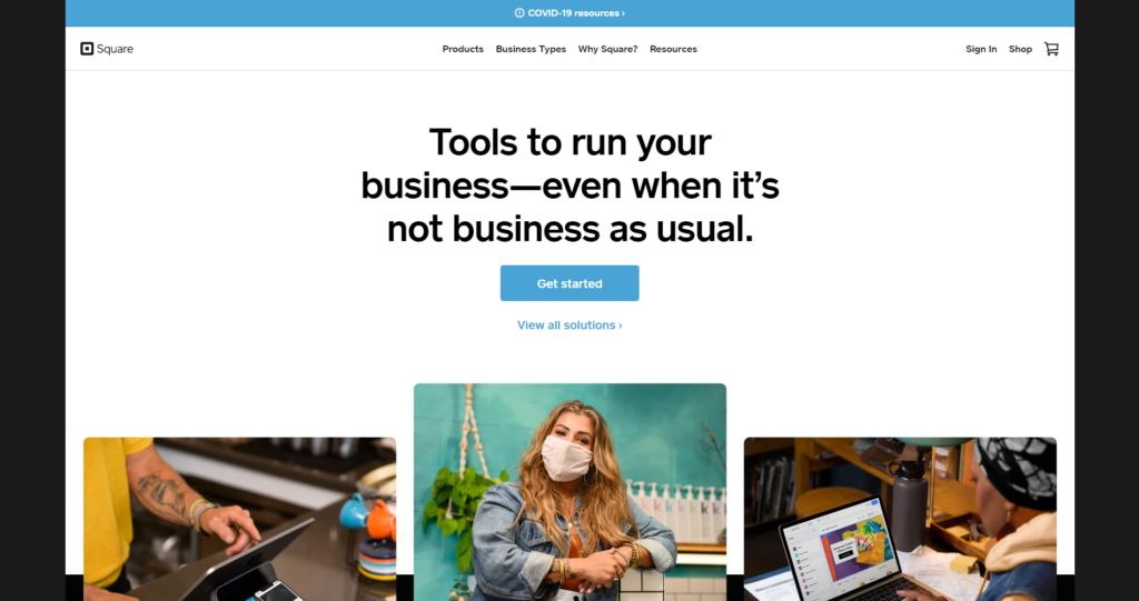
The design is super clean. The menu options are extremely limited. This makes it easy for visitors to choose a selection that fits their needs.

You’ll notice that there’s minimal text on the screen, and the CTA is clear and obvious.

This type of design makes it nearly impossible for website visitors to get lost or confused when they’re navigating.

For those of you who have lots of options on your website, such as an ecommerce shop, you can add a search bar to simplify the navigation process without using a complicated menu. A lot of software companies put their features in a features tab rather than have an individual tab for each feature.

9. Optimize your design for mobile devices

Mobile is how the majority of the world accesses the Internet. That means if you’re not optimized for mobile, your website is not going to perform well.

Take a look at this data from Hootsuite:

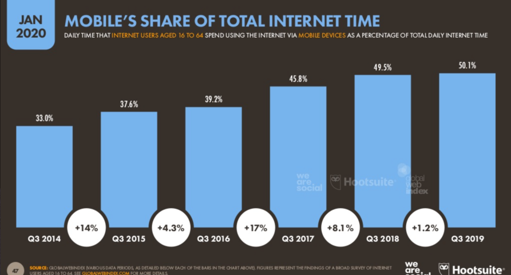
Search engines recognize this and reward sites that are mobile-friendly. Here are a few more stats to hit the point home:

Mobile SEO is the most important thing you can do in order to rank well on Google. Seriously.

If your website doesn’t look good on a smartphone, people won’t want to stick around. So, make sure your website designs are mobile-friendly.

Go deeper: Want to learn how to optimize your website for mobile? Check out our complete guide to a mobile friendly website.

10. Prioritize SEO

Everything you do on your site needs to circle back to SEO.

And it’s not enough to just add keywords here and there. It’s a website-wide system of improving content and relentlessly targeting specific subject matters to build your site authority in that area.

For example, a landing page for an ecommerce site will want to focus on certain on-page elements such as:

  • Usability. How easy it is for your visitors to use and navigate.
  • Mobile. How your website looks and performs on a mobile device.
  • Keyword optimization. The words and phrases that you want to rank for.
  • Internal links. How often you link to other pages on your website.
  • Headline. This is often the biggest text on a web page. As such, it does most of the heavy lifting on your landing page.

Create an XML sitemap. This will make it easier for search engine crawlers to analyze content on your website. A sitemap will show the bots the location of pages on your site, when the page was last updated, the updating frequency, and the relationship to other pages on your site.

A proper sitemap shows Google that you don’t have duplicate content, which can damage your SEO rankings.

When you’re designing your site, there are a TON of less obvious elements that factor into ranking on Google, too.

We’ve already gone over a few aspects you can improve on the page itself. But other elements include:

  • Domain. Your URL is pretty consequential to your google rank. Key factors include having your keyword in the domain, how old the domain is, and what your domain extension is (e.g. high-quality such as .com, .net, .gov, .org versus nontraditional extensions).
  • Site quality. Your website must be helpful to visitors. Key factors include an ‘About Us’ page, a ‘Contact Us’ page, how frequently you update your website, how easy it is to navigate your website, uptime (how often your website crashes), and SSL certificates.
  • Backlinks. This refers to the frequency your website is linked to by other websites. It is a crucial factor for ranking well on Google. Key factors include the number of linking pages, the quality and authority of the websites linking to you, the anchor text they’re using to link to you, and whether or not those links come from .edu or .gov domains.

11. Monitor your page loading speed

I know what some of you are thinking. What does page loading speed have to do with web design? Everything.

Sure, loading times are related to your website hosting plan, server, traffic, and things of that nature. However, design choices can impact your loading times as well.

Each time you add an element to your site, especially images, videos, and other complex media files, your loading times can be affected. As such, it can slow down HTTP requests.

Slow loading times lead to high abandonment rates. You can’t ignore this. If your pages take too long to load, it’s going to be a huge problem.

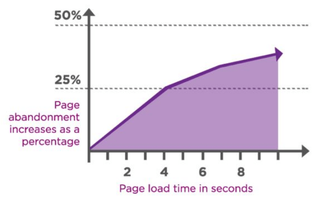
Furthermore, 25% of people abandon websites that take more than four seconds to load. Yes, four seconds. That’s all you have, or you’ll lose 25 out of every 100 visitors. Most visitors expect for a page to load in two seconds or less.

So how can you apply this to your web design?

  • Reduce the file sizes of your images
  • Take advantage of browser caching tools
  • Reduce HTTP requests
  • Improve your TTFB (time to first byte)
  • Minify and combine your files

There are lots of tools available online to help you accomplish these things. For example, check out the WordPress Rocket plugin as a resource for minifying and combining your files. And use the Page Speed Insights tool from Google to help you monitor your loading times whenever you make design changes on your website.

12. Continuously run A/B tests

When it comes to your website design, you can’t just set it and forget it.

As I said earlier, no website is perfect. There are always ways for you to improve your design.

That’s why you need to run A/B tests. These allow you to make regular improvements to your website and test out elements to see what works the best and, more importantly, what isn’t working at all.

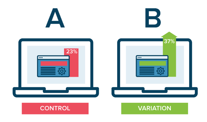
Nearly every element of your site design can be tested. For example, you could create two different landing pages that have different CTAs but are otherwise the same. If one landing page performs better than the other, you’ll know that its CTA is likely getting the job done.

Here are some quick suggestions to get you started in the right direction:

  • Test the location of your CTA button
  • Test the color of your CTA button
  • Test the CTA copy
  • Test the images that you’re using on landing pages
  • Test wording variations of text on the screen
  • Test the size of your navigation bar

There are so many options, I could spend all day talking about this. For those of you who aren’t familiar with A/B tests or need some help, check out my guide on everything you need to know before you start A/B testing.

Conclusion

Saying that the design of a website is important would be an understatement. Your web design choices will ultimately impact whether or not your site is successful.

  • Everyone’s website can be improved. Use this list as a guide as a resource to help you make those improvements.
  • Don’t get overwhelmed. I’m not saying you need to implement all of these design suggestions overnight, but you need to start somewhere.
  • I didn’t pull these ideas out of thin air. Everything on this list is backed by research and statistics related to design principles.

Remember: Every website is a work in progress. If you put the work in and always fine-tune your website, you’re going to improve your edge with your competitors.

It doesn’t matter if your website is brand new or if it’s been around for a decade. These are the web design best practices that you need to follow in 2020.

Do You Need Help With Website Design?

Get help with designing your website or blog today.

Get Started

Why CSS Needs its Own Survey

2016 was only three years ago, but that’s almost a whole other era in web development terms. The JavaScript landscape was in turmoil, with up-and-comer React — as well as a little-known framework called Vue — fighting to dethrone Angular.

Like many other developers, I felt lost. I needed some clarity, and I figured the best way to get it was simply to ask fellow coders what they used, and more importantly, what they enjoyed using. The result was the first ever edition of the now annual State of JavaScript survey.

The State of JavaScript 2018

Things have stabilized in the JavaScript world since then. Turns out you can’t really go wrong with any one of the big three frameworks, and even less mainstream options, like Ember, have managed to build up passionate communities and show no sign of going anywhere.

But while all our attention was fixated on JavaScript, trouble was brewing in CSS land. For years, my impression of CSS’s evolution was slow, incremental progress. Back then, I was pretty sure border-radius support represented the crowning, final achievement of web browser technology.

But all of a sudden, things started picking up. Flexbox came out, representing the first new and widely adopted layout method in over a decade. And Grid came shortly after that, sweeping away years of hacky grid frameworks into the gutter of bad CSS practices.

Something even crazier happened: now that the JavaScript people had stopped creating a new framework every two weeks, they decided to use all their extra free time trying to make CSS even better! And thus CSS-in-JS was born.

And now it’s 2019, and the Flexbox Cheatsheet tab I’ve kept open for the past two years has now been joined by a Grid Cheatsheet, because no matter how many times I use them, I still need to double-check the syntax. And despite writing a popular introduction to CSS-in-JS, I still lazily default to familiar Sass for new projects, promising myself that I’ll "do things properly" the next time.

All this to say that I feel just as lost and confused about CSS in 2019 as I did about JavaScript in 2016. It’s high time CSS got a survey of its own.

Starting from scratch

Coming up with the idea for a CSS survey was easy, but deciding on the questions themselves was far from straightforward. Like I said, I didn’t feel confident in my own CSS knowledge, and simply asking about Sass vs. Less for the 37th time felt like a missed opportunity…

Thankfully, the CSS Gods decided to smile down upon me: while attending the DotJS conference in France I discovered that, not only did fellow speaker Florian Rivoal live in Kyoto, Japan, just like me; but that he was a member of the CSS Working Group! In other words, one of the people who knows the most about CSS on the planet was living a few train stops away from me!

Florian was a huge help in coming up with the overall structure and content of the survey. And he also helped me realize how little I really knew about CSS.

Kyoto, Japan: a hotbed of CSS activity (Photo by Jisu Han)

You don’t know CSS

I’m not only talking about obscure CSS properties here, or even new up-and-coming ones, but about how CSS itself is developed. For example, did you know that the development of the CSS Grid spec was sponsored by Bloomberg, because they needed a way to port the layout of their famous terminal to the web?

Did you ever stop to wonder what top: 30px is supposed to mean on a circular screen, such as the one on a smartwatch? Or did you know that some people are laying out entire printed books in CSS, effectively replacing software like InDesign?

Talking with Florian really expanded my mind to how broad and interesting CSS truly is, and convinced me doing the survey was worth it.

"What do you mean, ‘Make the <table> circular’?" Photo by Artur Łuczka

About that divide...

The idea of a CSS survey became all the more important as my new-found admiration for CSS seemed to coincide with a general sentiment that HTML and CSS mastery were becoming under-appreciated skills in the face of JavaScript hegemony.

Myself, personally, I’ve always enjoyed being a generalist in the sense that I happily hop from one side of the great divide to another whenever I feel like it. At the same time, I’m also wholly convinced that the world needs specialists like Florian; people who dedicate their lives to championing and improving a single aspect of the web.

Devaluing the work the work of generalists is not only unfair, but it’s also counter-productive — after all, HTML and CSS are the foundation on which all modern JavaScript frameworks are built; and on the other hand, new patterns and approaches pioneered by CSS-in-JS libraries will hopefully find their way back into vanilla CSS sooner or later.

Thankfully, I feel like a minority of developers hold those views, and those who do generally hold them do so out of ignorance for what the "other side" really stands for more than any well-informed opinion.

So that’s where the survey comes in: I’m not saying I can fill up the divide, but maybe I can throw a couple walkways across, or distribute some jetpacks — you know, whatever works. 🚀

If that sounds good, then the first step is — you guessed it — taking the survey!

Take Survey

The post Why CSS Needs its Own Survey appeared first on CSS-Tricks.

API Security Weekly: Issue #20

This week we look into vulnerabilities at Uber and Drupal, ICANN DNS security checklist, upcoming European IoT security standards, and more vulnerability stats from 2018.

Vulnerabilities

This is the worst API vulnerability of the year so far. Drupal's RESTful Web Services (rest), JSON:API and other web services modules allow arbitrary remote code execution. The vulnerability caused by lack of input data sanitization. Attackers are already exploiting the vulnerability. If your site is on Drupal, upgrade and patch it ASAP.

Recreating the Facebook Messenger Gradient Effect with CSS

One Sunday morning, I woke up a little earlier than I would’ve liked to, thanks to the persistent buzzing of my phone. I reached out, tapped into Facebook Messenger, and joined the conversation. Pretty soon my attention went from the actual conversations to the funky gradient effect of the message bubbles containing them. Let me show you what I mean:

This is a new feature of Messenger, which allows you to choose a gradient instead of a plain color for the background of the chat messages. It’s currently available on the mobile application as well as Facebook’s site, but not yet on Messenger’s site. The gradient appears “fixed" so that chat bubbles appear to change background color as they scroll vertically.

I thought this looked like something that could be done in CSS, so… challenge accepted!

Let’s walk through my thought process as I attempted to recreate it and explain the CSS features that were used to make it work. Also, we’ll see how Facebook actually implemented it (spoiler alert: not the way I did) and how the two approaches compare.

Getting our hands dirty

First, let’s look at the example again to see what exactly it is that we’re trying to achieve here.

In general, we have a pretty standard messaging layout: messages are divided into bubbles going from top to bottom, ours on the right and the other people in the chat on the left. The ones on the left all have a gray background color, but the ones on the right look like they’re sharing the same fixed background gradient. That’s pretty much it!

Step 1: Set up the layout

This part is pretty simple: let’s arrange the messages in an ordered list and apply some basic CSS to make it look more like an actual messaging application:

<ol class="messages">
  <li class="ours">Hi, babe!</li>
  <li class="ours">I have something for you.</li>
  <li>What is it?</li>
  <li class="ours">Just a little something.</li>
  <li>Johnny, it’s beautiful. Thank you. Can I try it on now?</li>
  <li class="ours">Sure, it’s yours.</li>
  <li>Wait right here.</li>
  <li>I’ll try it on right now.</li>
</ol>

When it comes to dividing the messages to the left and the right, my knee-jerk reaction was to use floats. We could use float: left for messages on the left and float: right for messages on the right to have them stick to different edges. Then, we’d apply clear: both to on each message so they stack. But there’s a much more modern approach — flexbox!

We can use flexbox to stack the list items vertically with flex-direction: column and tell all the children to stick to the left edge (or “align the cross-start margin edges of the flex children with cross-start margin edges of the lines," if you prefer the technical terms) with align-items: flex-start. Then, we can overwrite the align-items value for individual flex items by setting align-self: flex-end on them.

What, you mean you couldn’t visualize the code based on that? Fine, here’s how that looks:

.messages {
  /* Flexbox-specific styles */
  display: flex;
  flex-direction: column;
  align-items: flex-start;

  /* General styling */
  font: 16px/1.3 sans-serif;
  height: 300px;
  list-style-type: none;
  margin: 0 auto;
  padding: 8px;
  overflow: auto;
  width: 200px;
}

/* Default styles for chat bubbles */
.messages li {
  background: #eee;
  border-radius: 8px;
  padding: 8px;
  margin: 2px 8px 2px 0;
}

/* Styles specific to our chat bubbles */
.messages li.ours {
  align-self: flex-end; /* Stick to the right side, please! */
  margin: 2px 0 2px 8px;
}

Some padding and colors here and there and this already looks similar enough to move on to the fun part.

Step 2: Let’s color things in!

The initial idea for the gradient actually came to me from this tweet by Matthias Ott (that Chris recreated in another post):

The key clue here is mix-blend-mode, which is a CSS property that allows us to control how the content of an element blends in with what’s behind it. It’s a feature that has been present in Photoshop and other similar tools for a while, but is fairly new to the web. There’s an almanac entry for the property that explains all of its many possible values.

One of the values is screen: it takes the values of the pixels of the background and foreground, inverts them, multiplies them, and inverts them once more. This results in a color that is brighter than the original background color.

The description can seem a little confusing, but what it essentially means is that if the background is monochrome, wherever the background is black, the foreground pixels are shown fully and wherever it is white, white remains.

With mix-blend-mode: screen; on the foreground, we'll see more of the foreground as the background is darker.

So, for our purposes, the background will be the chat window itself and the foreground will contain an element with the desired gradient set as the background that’s positioned over the background. Then, we apply the appropriate blend mode to the foreground element and restyle the background. We want the background to be black in places where we want the gradient to be shown and white in other places, so we’ll style the bubbles by giving them a plain black background and white text. Oh, and let’s remember to add pointer-events: none to the foreground element so the user can interact with the underlying text.

At this point, I also changed the original HTML a little. The entire chat is a wrapper in an additional container that allows the gradient to stay “fixed" over the scrollable part of the chat:

.messages-container:after {
  content: '';
  background: linear-gradient(rgb(255, 143, 178) 0%, rgb(167, 151, 255) 50%, rgb(0, 229, 255) 100%);
  position: absolute;
  left: 0;
  top: 0;
  height: 100%;
  width: 100%;
  mix-blend-mode: screen;
  pointer-events: none;
}

.messages li {
  background: black;
  color: white;
  /* rest of styles */
}

The result looks something like this:

The gradient applied to the chat bubbles

Step 3: Exclude some messages from the gradient

Now the gradient is being shown where the text bubbles are under it! However, we only want it to be shown over our bubbles — the ones along the right edge. A hint to how that can be achieved is hidden in MDN’s description of the mix-blend-mode property:

The mix-blend-mode CSS property sets how an element's content should blend with the content of the element's parent and the element's background.

That’s right! The background. Of course, the effect only takes into account the HTML elements that are behind the current element and have a lower stack order. Fortunately, the stacking order of elements can easily be changed with the z-index property. So all we have to do is to give the chat bubbles on the left a higher z-index than that of the foreground element and they will be raised above it, outside of the influence of mix-blend-mode! Then we can style them however we want.

The gradient applied to the chat bubbles.

Let’s talk browser support

At the time of writing, mix-blend-mode is not supported at all in Internet Explorer and Edge. In those browsers, the gradient is laid over the whole chat and others’ bubbles appear on top of it, which is not an ideal solution.

This browser support data is from Caniuse, which has more detail. A number indicates that browser supports the feature at that version and up.

Desktop

ChromeOperaFirefoxIEEdgeSafari
412932NoNoTP

Mobile / Tablet

iOS SafariOpera MobileOpera MiniAndroidAndroid ChromeAndroid Firefox
12.246No677164

So, this is what we get in unsupported browsers:

How browsers that don’t support mix-blend-mode render the chat.

Fortunately, all the browsers that support mix-blend-mode also support CSS Feature Queries. Using them allows us to write fallback styles for unsupported browsers first and include the fancy effects for the browsers that support them. This way, even if a user can’t see the full effect, they can still see the whole chat and interact with it:

A simplified UI for older browsers, falling back to a plain cyan background color.

Here’s the final Pen with the full effect and fallback styles:

See the Pen
Facebook Messenger-like gradient coloring in CSS
by Stepan Bolotnikov (@Stopa)
on CodePen.

Now let’s see how Facebook did it

Turns out that Facebook’s solution is almost the opposite of what we’ve covered here. Instead of laying the gradient over the chat and cutting holes in it, they apply the gradient as a fixed background image to the whole chat. The chat itself is filled with a whole bunch of empty elements with white backgrounds and borders, except where the gradient should be visible.

The final HTML rendered by the Facebook Messenger React app is pretty verbose and hard to navigate, so I recreated a minimal example to demonstrate it. A lot of the empty HTML elements can be switched for pseudo-elements instead:

See the Pen
Facebook Messenger-like gradient coloring in CSS: The Facebook Way
by Stepan Bolotnikov (@Stopa)
on CodePen.

As you can see, the end result looks similar to the mix-blend-mode solution, but with a little bit of extra markup. Additionally, their approach provides more flexibility for rich content, like images and emojis . The mix-blend-mode approach doesn’t really work if the background is anything but monochrome and I haven’t been able to come up with a way to “raise" inner content above the gradient or get around this limitation in another way.

Because of this limitation, it’s wiser to use Facebook’s approach in an actual chat application. Still, our solution using mix-blend-mode showcases an interesting way to use one of the most under-appreciated CSS properties in modern web design and hopefully it has given you some ideas on what you could do with it!

The post Recreating the Facebook Messenger Gradient Effect with CSS appeared first on CSS-Tricks.

Free HTML Email Template Builder, No-Code Editor – Postcards

This post is originally published on Designmodo: Free HTML Email Template Builder, No-Code Editor – Postcards

Postcards

Postcards is here and we want to show them to you! Using Postcards, you can create beautiful responsive emails/newsletters templates in minutes with drag and drop features and ready-made modules. Generated and exported emails are optimized for most popular email …

For more information please contact Designmodo

Cool Textures: Top 15 Best Ideas To Inspire Your Next Project

When you’re thinking about textures, what is it that you’re looking for? Why do you want to add texture? People seek out textures to use on web design to create because it has the power to give a web site depth. There is an important distinction between texture and patterns, so we’re going to start...

The post Cool Textures: Top 15 Best Ideas To Inspire Your Next Project appeared first on DesignrFix.

5 Courses to Learn RESTful Web Services With Java and Spring in 2019

In the last article, I shared some courses to learn Microservices development with Spring, and today, I'll talk about RESTful web service development. REST APIs and RESTful web services need no introduction; they're everywhere now and driving a new internet revolution. Most software development in the web space now also involves REST APIs.

Gone are the days where the only interface for a web application is the browser. Now, most of them support REST APIs, which allows them to be accessible on any device like mobile devices, tablets, Apple watches, or any other digital gadget.

90% Off: Get a 10-Year Radix .tech Domain for Your Website for Only $49.99

You’re a business startup with a brilliant idea or product. After careful consideration, you came up with a name that resonates with your branding and core competency, only to find out that it is already taken. Your business deserves a unique web address with a domain name that truly sets is apart. Just because www.YourStartup.com has […]

The post 90% Off: Get a 10-Year Radix .tech Domain for Your Website for Only $49.99 appeared first on designrfix.com.

5 MVP Development Mistakes Resulting in an Epic Business Failure

"Minimum Viable Product is that version of a new product which allows a team to collect the maximum amount of validated learning about customers with the least effort." — Eric Ries

After speaking to budding entrepreneurs about launching a business, most of them have massive dreams of starting a big, successful company that will be the next Facebook, Instagram, or Amazon.

One and Done?

In the last decade, we have realized that we cannot plan everything up front in a linear process to develop software. We are solving complex problems, which requires us to use an empirical process, lean UX practices, and a supporting technology platform that allows us to build, measure, learn and apply the learning in a repeatable fashion. This allows us to move from trying to predict everything about the future towards shared learning from the present.

Although we are getting gains from people using Agile practices to get increments of work done, most enterprise organizations are not taking advantage of developing iteratively. They still put effort to fully polish a feature before releasing to see how customers respond to that feature, primarily because they are funded and managed as a project, instead of a product lifecycle. “If we do not fully build this feature, we may never get the budget again” is the tired excuse I always hear.

How to Install an SSL Certificate on IBM Domino

IBM Domino, formally known as Lotus Domino, is a web-server and an advanced product of the IBM server. This web-server is widely used for hosting several social business applications and enterprise-level e-mail collaboration. It is considered to be a low-cost solution to enhance productivity and speed up the operations.

Installing an SSL Certificate on the IBM Domino (Lotus Domino) Web Server

After completing the check-out process for the SSL certificate, you will receive an e-mail attached with a *.zip file from your certification authority. This file comprises of primary, intermediate, and root certificates. You need to download and extract this *.zip file on your IBM Dominoserver directory where you intend to store all your certificates.

Data Science for Decision Makers

Introduction

In this article, I'm interviewing a veteran data scientist, Dr. Stylianos (Stelios) Kampakis, about his career to date and how he helps decision makers across a range of businesses understand how data science can benefit them.

While data science is a field showing immense growth at present, it's somewhat nebulous in its description. I think there's a lot of uncertainty as to exactly what it is and how to apply it. Fortunately, Stelios is an expert data scientist with a mission to educate the public about the power of data science and AI. He is a member of the Royal Statistical Society, an honorary research fellow at the UCL Centre for Blockchain Technologies, and CEO of The Tesseract Academy. A natural polymath, with a Ph.D. in Machine Learning and degrees in Artificial Intelligence, Statistics, Psychology, and Economics, he loves using his broad skillset to solve difficult problems and help companies improve their efficiency.

Organizing Brainstorming Workshops: A Designer’s Guide

Organizing Brainstorming Workshops: A Designer’s Guide

Organizing Brainstorming Workshops: A Designer’s Guide

Slava Shestopalov

When you think about the word “brainstorming”, what do you imagine? Maybe a crowd of people who you used to call colleagues, outshouting each other, assaulting the whiteboard, and nearly throwing punches to win control over the projector? Fortunately, brainstorming has a bright side: It’s a civilized process of generating ideas together. At least this is how it appears in the books on creativity. So, can we make it real?

I have already tried the three methodologies presented in this article with friends of mine, so there is no theorizing. After reaching the end of this article, I hope that you’ll be able to organize brainstorming sessions with your colleagues and clients, and co-create something valuable. For instance, ideas about a new mobile application or a design conference agenda.

Building Diverse Design Teams

What is diversity and what does it have to do with design? It’s important to understand that design is not only critical to solving problems on the product and experience level, but also relevant on a bigger scale to close social divides and to create inclusive communities. Learn more →

Universal Principles

Don’t be surprised to notice all brainstorming techniques have much in common. Although “rituals” vary, the essence is the same. Participants look at the subject from different sides and come up with ideas. They write their thoughts down and then make sorting or prioritizing. I know, sounds easy as pie, doesn’t it? But here’s the thing. Without the rules of the game, brainstorming won’t work. It all boils down to just three crucial principles:

  1. The more, the better.
    Brainstorming aims at the quantity, which later turns into quality. The more ideas a team generates the wider choice it gains. It’s normal when two or more participants say the same thing. It’s normal if some ideas are funny. A facilitator’s task is encouraging people to share what is hidden in their mind.
  2. No criticism.
    The goal of brainstorming is to generate a pool of ideas. All ideas are welcome. A boss has no right to silence a subordinate. An analyst shouldn’t make fun of a colleague’s “fantastic” vision. A designer shouldn’t challenge the usability of a teammates’ suggestion.
  3. Follow the steps.
    Only a goal-oriented and time-bound activity is productive, whereas uncontrolled bursts of creativity, as a rule, fail. To make a miracle happen, organize the best conditions for it.

Here are the universal slides you can use as an introduction to any brainstorming technique.

Examples of slides that describe the three core brainstorming rules
(Large preview)

Now when the principles are clear, you are to decide who’s going to participate. The quick answer is diversity. Invite as many different experts as possible including business owners, analysts, marketers, developers, salespeople, potential or real users. All participants should be related to the subject or be interested in it. Otherwise, they’ll fantasize about the topic they’ve never dealt with and don’t want to.

One more thing before we proceed with the three techniques (Six Thinking Hats, Walt Disney’s Creative Strategy, and SCAMPER). When can a designer or other specialist use brainstorming? Here are two typical cases:

  1. There is a niche for a new product, service or feature but the team doesn’t have a concept of what it might be.
  2. An existing product or service is not as successful as expected. The team generally understands the reasons but has no ideas on how to fix it.

1. Six Thinking Hats

The first technique I’d like to present is known as “Six Thinking Hats”. It was invented in 1985 by Edward de Bono, a Maltese physician, psychologist, and consultant. Here’s a quick overview:

Complexity Normal
Subject A process, a service, a product, a feature, anything. For example, one of the topics at our session was the improvement of the designers' office infrastructure. Another team brainstormed about how to improve the functionality of the Sketch app.
Duration 1–1.5 hours
Facilitation One facilitator for a group of 5–8 members. If there are more people, better divide them into smaller groups and involve assistants. We split our design crew of over 20 people into three workgroups, which were working simultaneously on their topics.
A photo of the brainstorming session using the Six Thinking Hats technique
Brainstorming workshop for the ELEKS design team (Large preview)

Materials

  • Slides with step-by-step instructions.
  • A standalone timer or laptop with an online timer in the fullscreen mode.
  • 6 colored paper hats or any recognizable hat symbols for each participant. The colors are blue, yellow, green, white, red, and black. For example, we used crowns instead of hats, and it was fun.
  • Sticky notes of 6 colors: blue, yellow, green, white, red, and brown or any other dark tint for representing black. 1–2 packs of each color per team of 5–8 people would be enough.
  • A whiteboard or a flip-chart or a large sheet of paper on a table or wall.
  • Black marker pens for each participant (markers should be whiteboard-safe if you choose this kind of surface).

Process

Start a brainstorming session with a five-minute intro. What will participants do? Why is it important? What will the outcome be? What’s next? It’s time to explain the steps. In my case, we described the whole process beforehand to ensure people get the concept of “thinking hats.” De Bono’s “hat” represents a certain way of perceiving reality. Different people are used to “wearing” one favorite “hat” most of the time, which limits creativity and breeds stereotypes.

For example, risk analysts are used to finding weaknesses and threats. That’s why such a phenomenon as gut feeling usually doesn’t ring them a bell.

A set of slide samples for conducting a brainstorming session due to the method of Six Thinking Hats
(Large preview)

Trying on “hats” is a metaphor that helps people to start thinking differently with ease. Below is an example of the slides that explain what each “hat” means. Our goal was to make people feel prepared, relaxed, and not afraid of the procedure complexity.

A set of slide samples for conducting a brainstorming session due to the method of Six Thinking Hats
(Large preview)

The blue “hat” is an odd one out. It has an auxiliary role and embodies the process of brainstorming itself. It starts the session and finishes it. White, yellow, black, red, and green “hats” represent different ways to interpret reality.

For example, the red one symbolizes intuitive and emotional perception. When the black “hat” is on, participants wake up their inner “project manager” and look at the subject through the concepts of budgets, schedule, cost, and revenue.

There are various schemas of “hats” depending on the goal. We wanted to try all the “hats” and chose a universal, all-purpose order:

Blue Preparation
White Collecting available and missing data
Red Listening to emotions and unproven thoughts
Yellow Noticing what is good right now
Green Thinking about improvements and innovations
Black Analyzing risks and resources
Blue Summarizing
A set of slide samples for conducting a brainstorming session due to the method of Six Thinking Hats
(Large preview)

Now the exercise itself. Each slide is a cheat sheet with a task and prompts. When a new step starts and a proper slide appears on the screen, a facilitator starts the timer. Some steps have an extended duration; other steps require less time. For instance, it’s easy to agree on a topic formulation and draw a canvas but writing down ideas is a more time-consuming activity.

When participants see a “hat” slide (except the blue one), they are to generate ideas, write them on sticky notes and put the notes on the whiteboard, flip-chart or paper sheet. For example, the yellow “hat” is displayed on the screen. People put on yellow paper hats and think about the benefits and nice features the subject has now and why it may be useful or attractive. They concisely write these thoughts on the sticky notes of a corresponding color (for the black “hat” — any dark color can be used so that you don’t need to buy special white markers). All the sticky notes of the same color should be put in the corresponding column of the canvas.

A set of slide samples for conducting a brainstorming session due to the method of Six Thinking Hats
(Large preview)

The last step doesn’t follow the original technique. We thought it would be pointless to stick dozens of colored notes and call it a day. We added the Affinity sorting part aimed at summarizing ideas and making the moment of their implementation a bit closer. The teams had to find notes about similar things, group them into clusters and give a name to each cluster.

For example, in the topic “Improvement of the designers’ office infrastructure,” my colleagues created such clusters as “Chair ergonomics,” “Floor and walls,” “Hardware upgrade.”

A set of slide samples for conducting a brainstorming session due to the method of Six Thinking Hats
(Large preview)

We finished the session with the mini-presentations of findings. A representative from each team listed the clusters they came up with and shared the most exciting observation or impression.

Walt Disney’s Creative Strategy

Walt Disney’s creative method was discovered and modeled by Robert Dilts, a neuro-linguistic programming expert, in 1994. Here’s an overview:

Complexity Easy
Subject Anything, especially projects you’ve been postponing for a long time or dreams you cannot start fulfilling for unknown reasons. For example, one of the topics I dealt with was “Improvement of the designer-client communication process.”
Duration 1 hour
Facilitation One facilitator for a group of 5–8 members. When we conducted an educational workshop on brainstorming, my co-trainers and I had four teams of six members working simultaneously in the room.
A photo of the brainstorming session using Walt Disney's Creative Strategy
Educational session on brainstorming for the Projector Design School (Large preview)

Materials

  • Slides with step-by-step instructions.
  • A standalone timer or laptop with an online timer in the fullscreen mode.
  • Standard or large yellow sticky notes (1–2 packs per team of 5–8 people).
  • Small red sticky notes (1–2 packs per team).
  • The tiniest sticky stripes or sticky dots for voting (1 pack per team).
  • A whiteboard or a flip-chart or a large sheet of paper on a table or wall.
  • Black marker pens for each participant (markers should be whiteboard-safe if you choose this kind of surface).

Process

This technique is called after the original thinking manner of Walt Disney, a famous animator and film producer. Disney didn’t use any “technique”; his creative process was intuitive yet productive. Robert Dilts, a neuro-linguistic programming expert, discovered this creative knowhow much later based on the memories of Disney’s colleagues. Although original Dilts’s concept is designed for personal use, we managed to turn it into a group format.

Slide examples for conducting a rainstorming workshop according to Walt Disney's Strategy
(Large preview)

Disney’s strategy works owing to the strict separation of three roles — the dreamer, the realist, and the critic. People are used to mixing these roles while thinking about the future, and that’s why they often fail. “Let’s do X. But it’s so expensive. And risky… Maybe later,” this is how an average person dreams. As a result, innovative ideas get buried in doubts and fears.

In this kind of brainstorming, the facilitator’s goal is to prevent participants from mixing the roles and nipping creative ideas in the bud. We helped the team to get into the mood and extract pure roles through open questions on the slides and introductory explanations.

Slide examples for conducting a rainstorming workshop according to Walt Disney's Strategy
(Large preview)

For example, here is my intro to the first role:

“The dreamer is not restrained by limitations or rules of the real world. The dreamer generates as many ideas as possible and doesn’t think about the obstacles on the way of their implementation. S/he imagines the most fun, easy, simple, and pleasant ways of solving a problem. The dreamer is unaware of criticism, planning, and rationalism altogether.”

As a result, participants should have a bunch of encircled ideas.

When participants come up with the cloud of ideas, they proceed to the next step. It’s important to explain to them what the second role means. I started with the following words:

“The realist is the dreamer’s best friend. The realist is the manager who can convert a vague idea into a step-by-step plan and find necessary resources. The realist has no idea about criticism. He or she tries to find some real-world implementation for dreamer’s ideas, namely who, when, and how can make an idea true.”

Brainstormers write down possible solutions on sticky notes and put them on the corresponding idea circles. Of course, some of the ideas can have no solution, whereas others may be achieved in many ways.

Slide examples for conducting a rainstorming workshop according to Walt Disney's Strategy
(Large preview)

The third role is the trickiest one because people tend to think this is the guy who drags dreamer’s and realist’s work through the mud. Fortunately, this is not true.

I started my explanation:

“The critic is the dreamer’s and realist’s best friend. This person analyses risks and cares about the safety of proposed solutions. The critic doesn’t touch bare ideas but works with solutions only. The critic’s goal is to help and foresee potential issues in advance.”

The team defines risks and writes them down on smaller red notes. A solution can have no risks or several risks.

After that’s done, team members start voting for the ideas they consider worth further working on. They make a decision based on the value of an idea, the availability of solutions, and the severity of connected risks. Ideas without solutions couldn’t be voted for since they had no connection with reality.

During my workshops, each participant had three voting dots. They could distribute them in different ways, e.g. by sticking the dots to three different ideas or supporting one favorite idea with all of the dots they had.

Slide examples for conducting a rainstorming workshop according to Walt Disney's Strategy
(Large preview)

The final activity is roadmapping. The team takes the ideas that gained the most support (typically, 6–10) and arrange them on a timeline depending on the implementation effort. If an idea is easy to put into practice, it goes to the column “Now.” If an idea is complex and requires a lot of preparation or favorable conditions, it’s farther on the timeline.

Of course, there should be time for sharing the main findings. Teams present their timelines with shortlisted ideas and tell about the tendencies they have observed during the exercise.

SCAMPER

This technique was proposed in 1953 by Alex Osborn, best known for co-founding and leading BBDO, a worldwide advertising agency network. A quick overview:

Complexity Normal to difficult
Subject Ideally, technical or tangible things, although the author and evangelists of this method say it’s applicable for anything. From my experience, SCAMPER works less effective with abstract objects. For example, the team barely coped with the topic “Improve communication between a designer and client,” but it worked great for “Invent the best application for digital prototyping.”
Duration Up to 2 hours
Facilitation One facilitator for a group of 5–8 members
A photo of the brainstorming session using the SCAMPER technique
Brainstorming workshop for the ELEKS design team (Large preview)

Materials

  • Slides with step-by-step instructions.
  • A standalone timer or laptop with an online timer in the fullscreen mode.
  • Standard yellow sticky notes (7 packs per team of 5–8 people).
  • A whiteboard or a flip-chart or a large sheet of paper on a table or wall.
  • Black marker pens for each participant (markers should be whiteboard-safe if you choose this kind of surface).
  • Optionally: Thinkpak cards by Michael Michalko (1 pack per team).

Process

This brainstorming method employs various ways to modify an object. It’s aimed at activating the inventory thinking and helps to optimize an existing product or create a brand new thing.

Samples of slides for conducting a brainstorming workshop employing SCAMPER method
(Large preview)

Each letter in the acronym represents a certain transformation you can apply to the subject of brainstorming.

S  Substitute
C Combine
A Adapt
M Modify
P Put to other uses
E Eliminate
R Rearrange/Reverse

It’s necessary to illustrate each step with an example and ask participants to generate a couple of ideas themselves for the sake of training. As a result, you’ll be sure they won’t get stuck.

We explained the mechanism by giving sample ideas for improving such an ordinary object as a ballpoint pen.

  • Substitute the ink with something edible.
  • Combine the body and the grip so that they are one piece.
  • Adapt a knife for “writing” on wood like a pen.
  • Modify the body so that it becomes flexible — for wearing as a bracelet.
  • Use a pen as a hairpin or arrow for darts.
  • Eliminate the clip and use a magnet instead.
  • Reverse the clip. As a result, the nib will be oriented up, and the pen won’t spill in a pocket.
Samples of slides for conducting a brainstorming workshop employing SCAMPER method
(Large preview)

After the audience doesn’t have questions left, you can start. First of all, team members agree on the subject formulation. Then they draw a canvas on a whiteboard or large paper sheet.

Once a team sees one of the SCAMPER letters on the screen, they start generating ideas using the corresponding method: substitute, combine, adapt, modify, and so on. They write the ideas down and stick the notes into corresponding canvas columns.

The questions on the slides remind what each step means and help to get in a creative mood. Time limitation helps to concentrate and not to dive into discussions.

Samples of slides for conducting a brainstorming workshop employing SCAMPER method
(Large preview)

Affinity sorting — the last step — is our designers’ contribution to the original technique. It pushes the team to start implementation. Otherwise, people quickly forget all valuable findings and return to the usual state of things. Just imagine how discouraging it will be if the results of a two-hour ideation session are put on the back burner.

Samples of slides for conducting a brainstorming workshop employing SCAMPER method
(Large preview)

Thinkpak Cards

It’s a set of brainstorming cards created by Michael Michalko. Thinkpak makes a session more exciting through gamification. Each card represents a certain letter from SCAMPER. Participants shuffle the pack, take cards in turn and come up with corresponding ideas about an object. It’s fun to compete in the number of ideas each participant generates for a given card within a limited time, for instance, three or five minutes.

My friends and I have tried brainstorming both with and without a Thinkpak; it works both ways. Cards are great for training inventory thinking. If your team has never participated in brainstorming sessions, it’ll be great to play the cards first and then switch to a business subject.

Lessons Learned

  1. Dry run.
    People often become disappointed in brainstorming if the first session they participate in fails. Some people I worked with have a prejudice towards creativity and consider it the waste of time or something not proven scientifically. Fortunately, we tried all the techniques internally — in the design team. As a result, all the actual brainstorming sessions went well. Moreover, our confidence helped others to believe in the power of brainstorming exercises.
  2. Relevant topic and audience.
    Brainstorming can fail if you invite people who don’t have a relevant background or the power and willing to change anything. Once I asked a team of design juniors to ideate about improving the process of selling design services to clients. They lacked the experience and couldn’t generate plenty of ideas. Fortunately, it was a training session, and we easily changed the topic.
  3. Documenting outcomes.
    So, the session is over. Participants go home or return to their workplaces. Almost surely the next morning they will recall not a single thing. I recommend creating a wrap-up document with photos and digitized canvases. The quicker you write and share it, the higher the chances will be that the ideas are actually implemented.

Further Resources

Smashing Editorial (dm, ra, il)