How often have you heard that expression? Better yet, how often have you heard that excuse? If you’re reading this article, the chances are that you’re involved in either the development or testing of software. Perhaps you’re a product owner, maybe a dev lead, or a QA testing director overseeing a portfolio of customer-facing software applications. Any way you cut it, time always seems to run out when we need it the most.
I've been working on a web client for my side project Grapevine, and part of that includes parsing a telnet stream. Before you ask, "A telnet stream!?", the web client connects to text-based games called MUDs that primarily used telnet as that's how they started in the late 1980s.
Telnet is mostly a TCP stream that contains only text that should be output to the screen. Hidden inside the otherwise plain TCP stream is a series of bytes called IAC (Interpret as Command). This is the byte 255 followed by at least one other byte that describes what the command is.
Keeping in mind the growing multi-cloud trend, developers should start working with more than one provider. However, this can mean leaving your comfort zone, and not everyone likes the idea of doing that. Recently, I’ve done this and would like to share my experiences with you. I believe they are useful, regardless of whatever cloud platform you are using/are going to use.
We have a legacy serverless application hosted on Azure Functions. There were some issues with it:
As more teams embrace the challenges of continuous delivery, we hear lots of people talking about "shift left" and "shift right" in a testing context. What does that mean, exactly, and why does everyone want to do it?
When Software Development Was Linear
I joined my first "waterfall" process project back in the mid-1980s, as a developer. It was a linear progression, and in my head, I saw it unfurl from left to right. It seemed reasonable (to my naive eyes) to start with a thorough analysis of the system to be built, finding out what the customers wanted. This "phase" produced an analysis document which triggered the "requirements phase," during which analysts and product managers created a document detailing every bit of functionality to be built. And on it went, handoffs from one phase, and often one team, to the next, with thick Word documents changing hands, until the developers finally "froze" the code so that no more changes could be done. Finally, QA could start the testing phase, usually with very little time left until the release deadline!
Mule developers build integration solutions that must cater to high volumes of real-time and batch data. In some cases, the size of payloads can be larger than memory. In others, API solutions may have to handle high rates of API calls per second.
Horizontal scalability, whereby Mule instances are deployed across multiple virtual and physical machines, is costly. Thus, a single Mule instance must utilize to the maximum underlying processing and storage resources as it handles traffic. Its ability to handle more traffic with more underlying resources is what we refer to as vertical scalability.
My colleague, Lju, started off a series of posts showing how to import the BBC Good Food dataset into Neo4j. Lju also shows how to query the dataset to find recipes written by the same author.
In this post, we're going to continue from where Lju left off and explore the dataset a bit more. Imagine that we have some chilis and want to find some recipes that will make use of them.
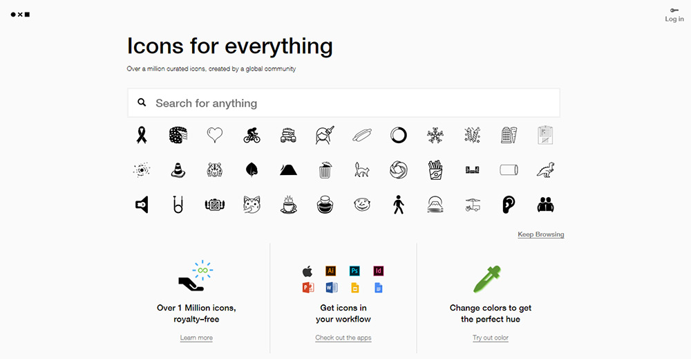
It doesn’t take much work to find free icon sets online. While they’re useful, they aren’t always the best option for finding specific icons. That’s where free icon resource sites can help.
These websites curate icons based on license (Creative Commons or premium/commercial). Below I’ve curated a nice list for anyone who wants to quickly find specific CC icons on the web.
Your Designer Toolbox Unlimited Downloads: 500,000+ Web Templates, Icon Sets, Themes & Design Assets
Iconfinder
If you spend any time searching for icons, then you’re bound to stumble upon Iconfinder. This is the premier destination for any icon you could ever need.
It operates like a search engine, where you type in an icon style or glyph (like “magnifying glass” for a search icon). You’ll then see results with a mix of commercial and free options.
But if you look deeper into the search settings, you can filter the results to view just free or just paid options. You can also set the icon sizes and a few other search criteria.
No doubt that Iconfinder is the best place to start if you’re looking for free icons. If the icon is out there online, Iconfinder has it indexed.
All the Icons, Fonts, Web Templates & Design Assets You Could Ask For
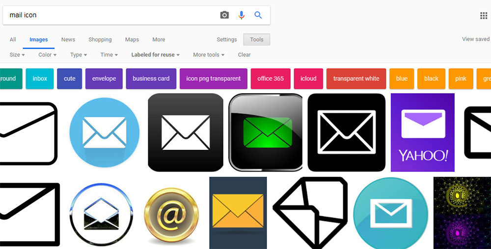
Noun Project
On the Noun Project website you’ll find a curated list of over one million icons and counting.
This site also works like a search engine, where you can filter icons based on keywords, styles and glyph shapes. For example, you can search for a mail icon and find some pretty clean results.
But The Noun Project isn’t completely free. They do have an optional pro plan which gives you access to far more icons.
Thankfully, their free icon library is still large enough to be worth a bookmark.
FindIcons
FindIcons is an icon-only search engine and it features one sweet interface.
As you start typing you’ll notice auto-populated search results based on existing tags. This can help you find exactly what you’re looking for very quickly.
There’s also a filter menu on the side that lets you select how many icons to display per page, icon colors, styles and license.
This one is definitely worth saving if you need a high-quality search engine exclusively for finding icons.
Flaticon
There’s a lot to say about the flat design trend sweeping the industry. One sure thing is that if you’re creating flat websites, you’ll have no problem finding resources.
This is a free icon search engine dedicated to flat icon styles. You’ll only find flat icons here and they’re all pulled from open source icon packs submitted by the community.
One cool feature is that they offer icons in many different formats – including base64. You can use base64 code within CSS to embed icons into your page without ever saving an image file.
Flaticon is certainly the best place to look for icons if you work with flat design on a regular basis.
Google Images (CC search)
A lot of people skip Google Images on their quest for design assets. Typically, that’s because the results in Google Images come from other websites and you never really know what kind of license they’re using.
But there’s a nifty feature in Google Images that few people know about.
If you click “Tools” and then click “Usage Rights” you can select from one of many Creative Commons licenses to search through.
This automatically limits your image searches to return only images with the correct usage rights. Pretty cool!
Alternatively, there is a CC search page which can return similar results. But there’s no way CC’s internal search can ever match the power of Google.
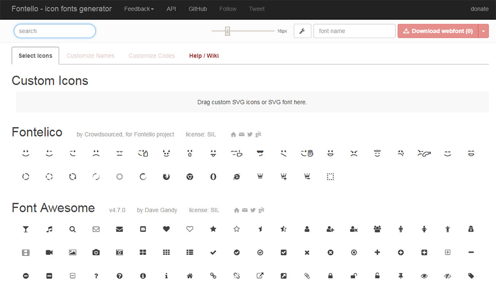
Fontello
I can’t say that Fontello is really a search engine just for icons. But it is one amazing website to help you find free Creative Commons assets – with plenty of icons to go around.
It’s described as an “icon fonts generator” and can be used to create custom icon font files to embed via CSS.
Note that you can also download these icons as vectors and rework them to suit your needs.
While it’s not the largest icon library in existence, it certainly features a variety of quality icons for designers.
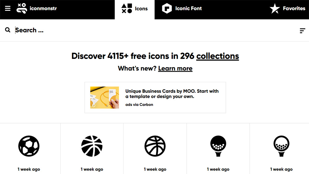
Iconmonstr
Iconmonstr is relatively new compared to the other sites I’ve mentioned. However, this is a fantastic icon repository full of 100% free open source icons.
As of this writing it features over 4,000 icons – all organized into different collections. They’ll help you search for icons based on topics like sports, business or healthcare.
There’s also a standard search field if you know exactly what you’re looking for.
Just note that Iconmonstr primarily organizes single line icons with a similar minimalist style. So it’s great for finding icons with that particular style, but won’t help for much else.
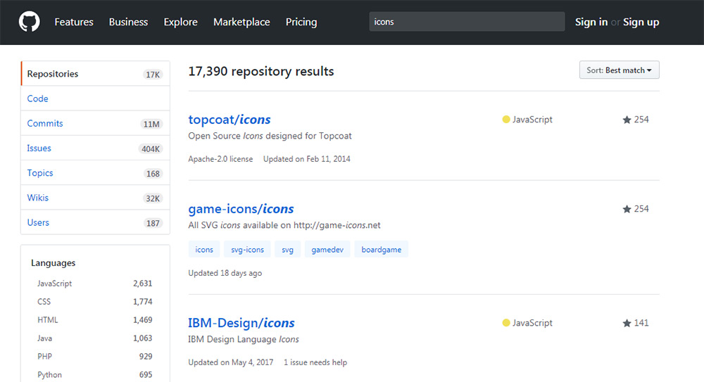
GitHub
It may seem weird to recommend a code repository as a resource for graphics. But GitHub really does have a lot of repos with free icons available as SVGs and PNGs – among other formats.
Just do a search for icons and you’ll see what I mean.
Granted, there will be plenty of scripts and templates built around icons that show up in the search results. But you’ll also find repos for open source icon libraries that designers chose to host and release through GitHub’s free platform.
Consider this a last resort for finding obscure and niche icons. Don’t expect miracles, but the few gems you find can really have an impact on your design projects.
1. What Is Dynamic Instrumentation Code Coverage and Why Do We Want It?
Java code coverage tools, like these embedded in IDEs or provided as CI environments plugins, are great, but they have one limitation — the tests you run have to also be written in Java or other JVM language. What if you have suites of tests in other, non-JVM languages and would like to know what is covered and what is not?
I've faced such an issue — we had a really big suite of e2e REST API tests written in Python and executed them against big Java application running on Tomcat. We wanted to track where these tests go in the code. But how to check it?
There has been no shortage of hype attached to artificial intelligence in recent years, with many a breathless tome predicting that it would transform life as we know it. One could be forgiven for thinking the latest report into AI from consultancy firm Cognizant fits neatly into that box.
After all, it reveals that some 84 percent of business leaders believe that AI will be vital to their business in the next few years. Despite this, however, few executives had much in the way of planning in place to convert this optimism into tangible change.
For some freelancers, churning out work and keeping focused comes easy. For others, it’s a living nightmare. If you find yourself struggling and wasting hours on social media, all hope isn’t lost. Before you give up on freelancing and go back to that office job, try these tips to get back on track.
Establish Structure
Many people choose freelancing for its freedom. What’s better than waking up at noon and working in pajamas? But just because you don’t have someone looking over your shoulder or a tight schedule doesn’t mean you don’t have deadlines to meet.
Don’t let your laziness get the best of you. You’re allowed to make your own structure, so design a schedule that works for you!
If you want to have a 30-minute coffee break in the morning, then feel free – just make sure that you do start working on those terms. Don’t let 30 minutes turn into an hour. A lack of discipline is the downfall of many freelancers.
Work with Your Energy Cycle
Every day has high and low points, and this cycle is different for everyone. Some find it easier to start right away, and struggle to focus as the day goes on. Night owls may need to spend the afternoon relaxing and ride on their nightly burst of energy.
Figure out when you feel most active and put those times to use. Save your recreational time for when you’re feeling lazy. If you work best in the morning, don’t get up and waste that potential energy on video games. Change up your routine if you must.
Rest and Reward
The best way to get motivated is to use positive reinforcement. If you force yourself to work without a break, you’ll only begin to dread your job. Our brains aren’t wired to sit still and stay focused for hours on end.
Break your work into smaller tasks. When you hit those milestones, take a break to do something enjoyable. Wrote 1,000 words? Play your favorite game for a while. Finished up a webpage template? Treat yourself to some ice cream. Even if it’s just to get up and stretch your legs every 30 minutes, make sure to give your brain a break.
You may find it easier to take frequent mini-breaks throughout the day, or work for hours and take longer rests. Just don’t reward yourself unless you’ve earned it.
But it’s also important to know your limits. When these small breaks stop working, take a long shower or do something that requires little mental energy. Get relaxed, then get back to work.
Take Care of Yourself
Nothing does more wonders for your productivity than a good night’s sleep, lots of exercise and a few healthy meals. If your job is getting in the way of this, it may be time to step back. Know when you’re overloaded, and when to say “no” to a client. Don’t work yourself into the ground.
Create a Comfortable Workspace
It may not seem that important, but comfort can do wonders for your productivity. Work in a quiet room with no noise or distractions. Invest in a comfy office chair or a nice, spacious desk. Make it yours with posters, plants and your own personal touch. Decorate to create a casual or professional environment, depending on where you work better.
Use Tools
There are many apps, websites, and programs out there that can help you stay focused. Desktop calendars, virtual sticky notes, and time management tools are great at keeping everything straight. If you’re desperate, Parental Controls can keep you off Facebook.
Apps like Habitica, Mindbloom or Fighter’s Block! “gamify” your life and reward you for staying motivated – helping you build better habits.
Do What Works for You
More important than any advice a stranger can give you is this: Figure out what’s best for you. Articles like this can point you in the right direction, but they’re no replacement for experimenting. Keep trying and find what keeps you motivated, what’s best for your situation and what methods keep you focused and on track.
Timelines are a fantastic way to narrate the story of your business or brand. Fortunately, we have listed the best WordPress timeline plugins here. Adding the best timelines plugins for WordPress to your site has...
This week Microsoft announced the latest updates to its Cognitive Services Speech SDK, now in version 1.3. Included in the update is the selection of the input microphone by using the AudioConfig class, beta support for Unity and new sample code.
New to the SDK is the ability for it to use the AudioConfig class in order to support a selection of the input microphone. For developers this means they can now stream audio data to the service without being locked into the default microphone.
Parents please be aware and very cautious of what your child watches on YouTube and KIDS YOUTUBE. There is a thing called ‘Momo’ that’s instructing kids to kill themselves, turn stoves on while everyone is sleep and even threatening to kill the children if they tell their parents!!!
If your business has multiple locations, WordPress store locator plugins can prove to be useful additions to your website. Motel chains, gas stations, chain stores, beauty parlors can all benefit from adding store locator plugins. They help users find your business locations easily. These plugins rely on Google Maps for displaying locations. Consequently, you’ll be […]
If you are on social media of any kind, you will know how many bloggers there are out there, as well as social media influencers, that are all out there working with brands and making some serious cash from doing so. But in a world that is saturated with influencers and bloggers, is there space Read More →
Every day, the ProgrammableWeb team is busy, updating its three primary directories for APIs, clients (language-specific libraries or SDKs for consuming or providing APIs), and source code samples.
At the start of 2018, as I was starting to go a bit deeper into CSS gradient masking in order to create interesting visuals one would think are impossible otherwise with just a single element and a tiny bit of CSS, I learned about a property that had previously been completely unknown to me: mask-composite.
As this is not a widely used property, I couldn't find any comprehensive resources on this topic. So, as I began to use it more and learn more about it (some may remember I've mentioned it before in a couple of otherarticles), I decided to create such a resource myself and thus this article was born! Here, I'm covering how mask-composite works, why it's useful, what values it can take, what each of them does, where we are in terms of support and what alternatives we have in non-supporting browsers.
What mask compositing does
Mask compositing allows us to combine different mask layers into a single one using various operations. Combine them how? Well, pixel by pixel! Let's consider two mask layers. We take each pair of corresponding pixels, apply a certain compositing operation (we'll discuss each possible operation in detail a bit later) on their channels and get a third pixel for the resulting layer.
How compositing two layers works at a pixel level.
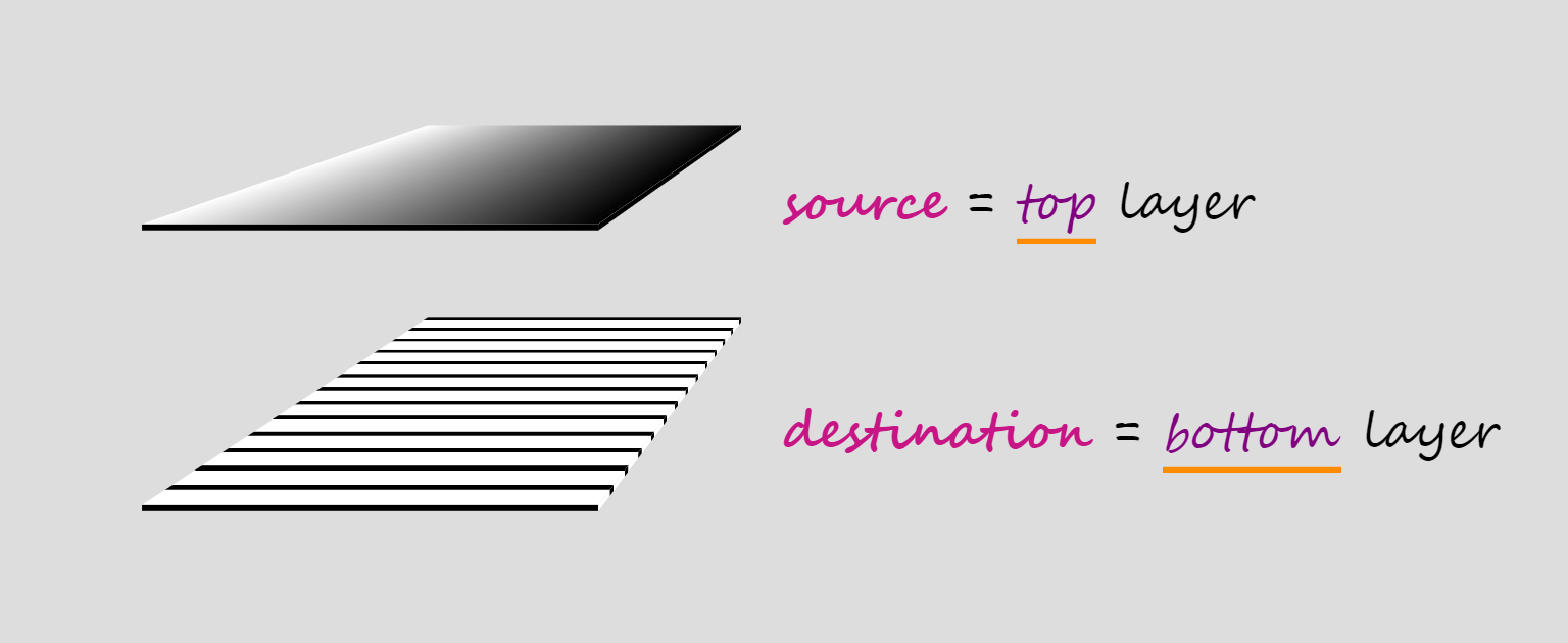
When compositing two layers, the layer on top is called the source, while the layer underneath is called the destination, which doesn't really make much sense to me because source sounds like an input and destination sounds like an output, but, in this case, they're both inputs and the output is the layer we get as a result of the compositing operation.
Compositing terminology.
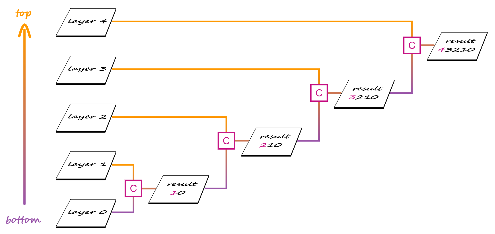
When we have more than two layers, compositing is done in stages, starting from the bottom.
In a first stage, the second layer from the bottom is our source and the first layer from the bottom is our destination. These two layers get composited and the result becomes the destination for the second stage, where the third layer from the bottom is the source. Compositing the third layer with the result of compositing the first two gives us the destination for the third stage, where the fourth layer from the bottom is the source.
Compositing multiple layers.
And so on, until we get to the final stage, where the topmost layer is composited with the result of compositing all the layers beneath.
Why mask compositing is useful
Both CSS and SVG masks have their limitations, their advantages and disadvantages. We can go around the limitations of SVG masks by using CSS masks, but, due to CSS masks working differently from SVG masks, taking the CSS route leaves us unable to achieve certain results without compositing.
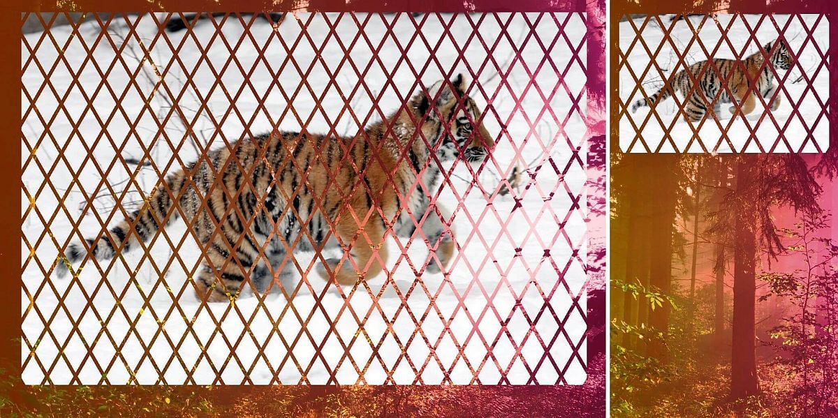
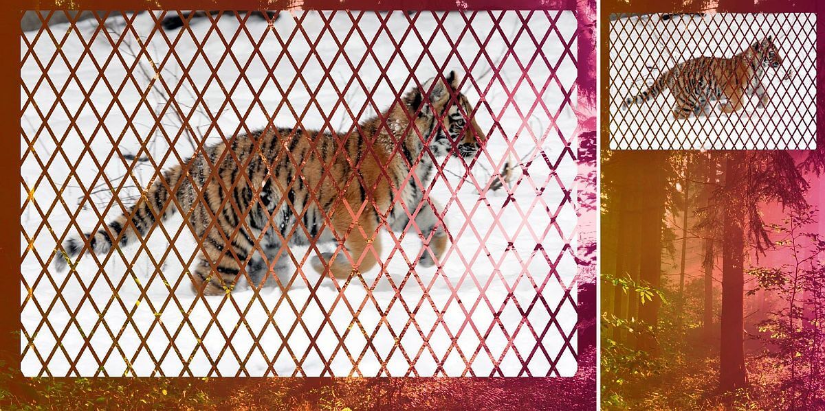
In order to better understand all of this, let's consider the following image of a pawesome Siberian tiger cub:
The image we want to have masked on our page.
And let's say we want to get the following masking effect on it:
Desired result.
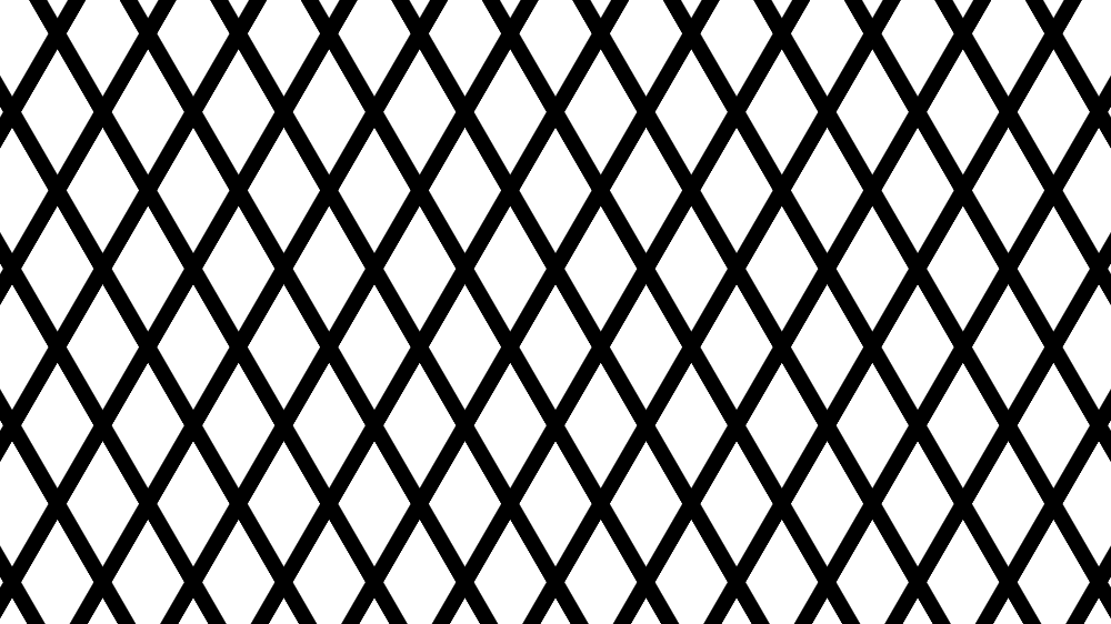
This particular mask keeps the rhombic shapes visible, while the lines separating them get masked and we can see through the image to the element behind.
We also want this masking effect to be flexible. We don't want to be tied to the image's dimensions or aspect ratio and we want to be able to easily switch (just by changing a % value to a px one) in between a mask that scales with the image and one that doesn't.
In order to do this, we first need to understand how SVG and CSS masks each work and what we can and cannot do with them.
SVG masking
SVG masks are luminance masks by default. This means that the pixels of the masked element corresponding to the whitemask pixels are fully opaque, the pixels of the masked element corresponding to blackmask pixels are fully transparent and the pixels of the masked element corresponding to mask pixels somewhere in between black and white in terms of luminance (grey, pink, lime) are semitransparent.
The formula used to get the luminance out of a given RGB value is: .2126·R + .7152·G + .0722·B
For our particular example, this means we need to make the rhombic areas white and the lines separating them black, creating the pattern that can be seen below:
Black and white rhombic pattern used as an SVG mask.
In order to get the pattern above, we start with a white SVG rectangle element rect. Then, one might think we need to draw lots of black lines... but we don't! Instead, we only add a path made up of the two diagonals of this rectangle and ensure its stroke is black.
To create the first diagonal (top left to bottom right), we use a "move to" (M) command to the top left corner, followed by a "line to" (L) command to the bottom right corner.
To create the second diagonal (top right to bottom left), we use a "move to" (M) command to the top right corner, followed by a "line to" (L) command to the bottom left corner.
... but that's about to change! We increase the thickness (stroke-width) of the black diagonal lines and make them dashed with the gaps between the dashes (7%) bigger than the dashes themselves (1%).
If we keep increasing the thickness (stroke-width) of our black diagonal lines to a value like 150%, then they end up covering the entire rectangle and giving us the pattern we've been after!
The above should work. But sadly, things are not perfect in practice. At this point, we only get the expected result in Firefox (live demo). Even worse, not getting the desired masked pattern in Chrome doesn't mean our element stays as it is unmasked - applying this mask makes it disappear altogether! Of course, since Chrome needs the -webkit- prefix for the mask property (when used on HTML elements), not adding the prefix means that it doesn't even try to apply the mask on our element.
The most straightforward workaround for img elements is to turn them into SVG image elements.
This gives us the result we've been after, but if we want to mask another HTML element, not an img one, things get a bit more complicated as we'd need to include it inside the SVG with foreignObject.
Even worse, with this solution, we're hardcoding dimensions and this always feels yucky.
Of course, we can make the mask ridiculously large so that it's unlikely there may be an image it couldn't cover. But that feels just as bad as hardcoding dimensions.
We can also try tackling the hardcoding issue by switching the maskContentUnits to objectBoundingBox:
But we're still hardcoding the dimensions in the viewBox and, while their actual values don't really matter, their aspect ratio does. Furthermore, our masking pattern is now created within a 1x1 square and then stretched to cover the masked element.
Shape stretching means shape distortion, which is why is why our rhombic shapes don't look as they did before anymore.
However, in order to get one particular rhombic pattern, with certain angles for our rhombic shapes, we need to know the image's aspect ratio.
Sigh. Let's just drop it and see what we can do with CSS.
CSS masking
CSS masks are alpha masks by default. This means that the pixels of the masked element corresponding to the fully opaque mask pixels are fully opaque, the pixels of the masked element corresponding to the fully transparentmask pixels are fully transparent and the pixels of the masked element corresponding to semitransparent mask pixels are semitransparent. Basically, each and every pixel of the masked element gets the alpha channel of the corresponding mask pixel.
For our particular case, this means making the rhombic areas opaque and the lines separating them transparent, so let's how can we do that with CSS gradients!
In order to get the pattern with white rhombic areas and black separating lines, we can layer two repeating linear gradients:
This is the pattern that does the job if we have a luminancemask.
But in the case of an alphamask, it's not the black pixels that give us full transparency, but the transparent ones. And it's not the white pixels that give us full opacity, but the fully opaque ones - red, black, white... they all do the job! I personally tend to use red or tan as this means only three letters to type and the fewer letters to type, the fewer opportunities for awful typos that can take half an hour to debug.
So the first idea is to apply the same technique to get opaque rhombic areas and transparent separating lines. But in doing so, we run into a problem: the opaque parts of the second gradient layer cover parts of the first layer we'd like to still keep transparent and the other way around.
So what we're getting is pretty far from opaque rhombic areas and transparent separating lines.
My initial idea was to use the pattern with white rhombic areas and black separating lines, combined with setting mask-mode to luminance to solve the problem by making the CSS mask work like an SVG one.
This property is only supported by Firefox, though there is the non-standard mask-source-type for WebKit browsers. And sadly, support is not even the biggest issue as neither the standard Firefox way, nor the non-standard WebKit way give us the result we're after (live demo).
Fortunately, mask-composite is here to help! So let's see what values this property can take and what effect they each have.
mask-composite values and what they do
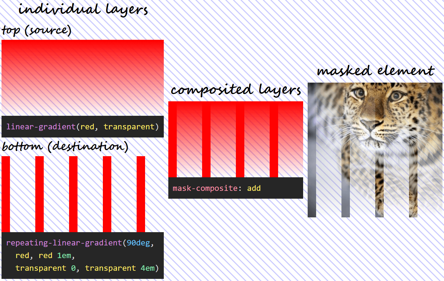
First, we decide upon two gradient layers for our mask and the image we want masked.
The two gradient mask layers we use to illustrate how each value of this property works are as follows:
These two layers can be seen as background gradients in the Pen below (note that the body has a hashed background so that the transparent and semitransparent gradient areas are more obvious):
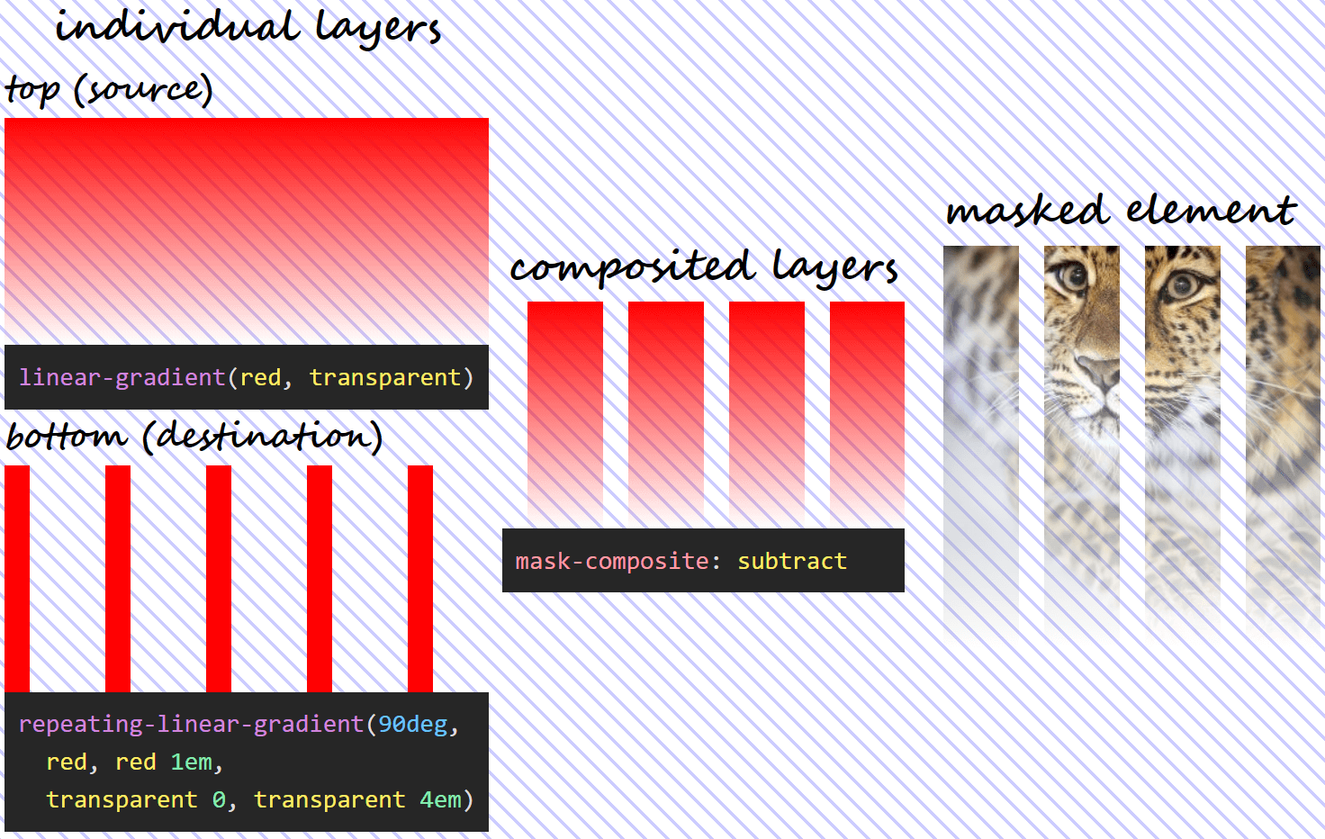
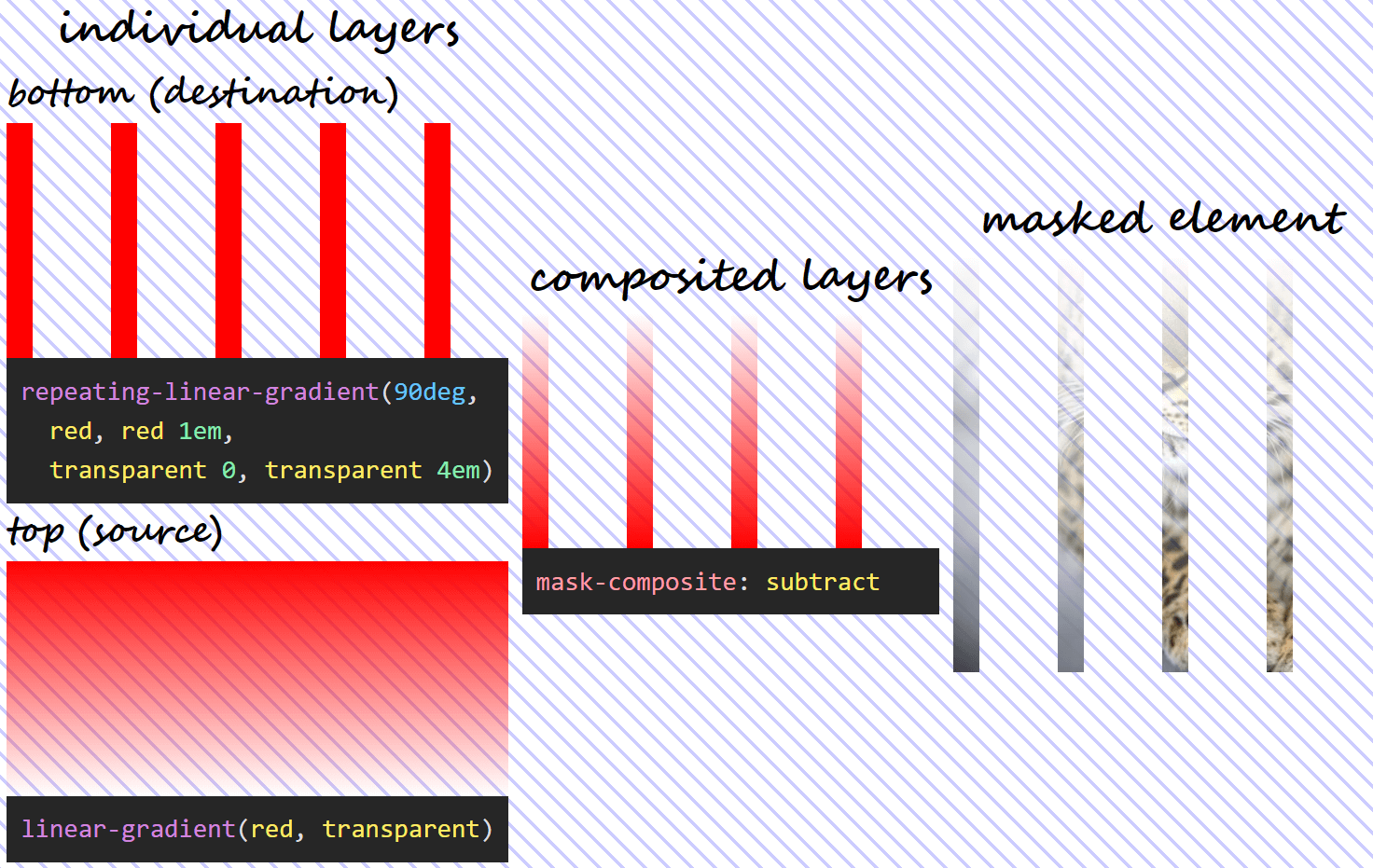
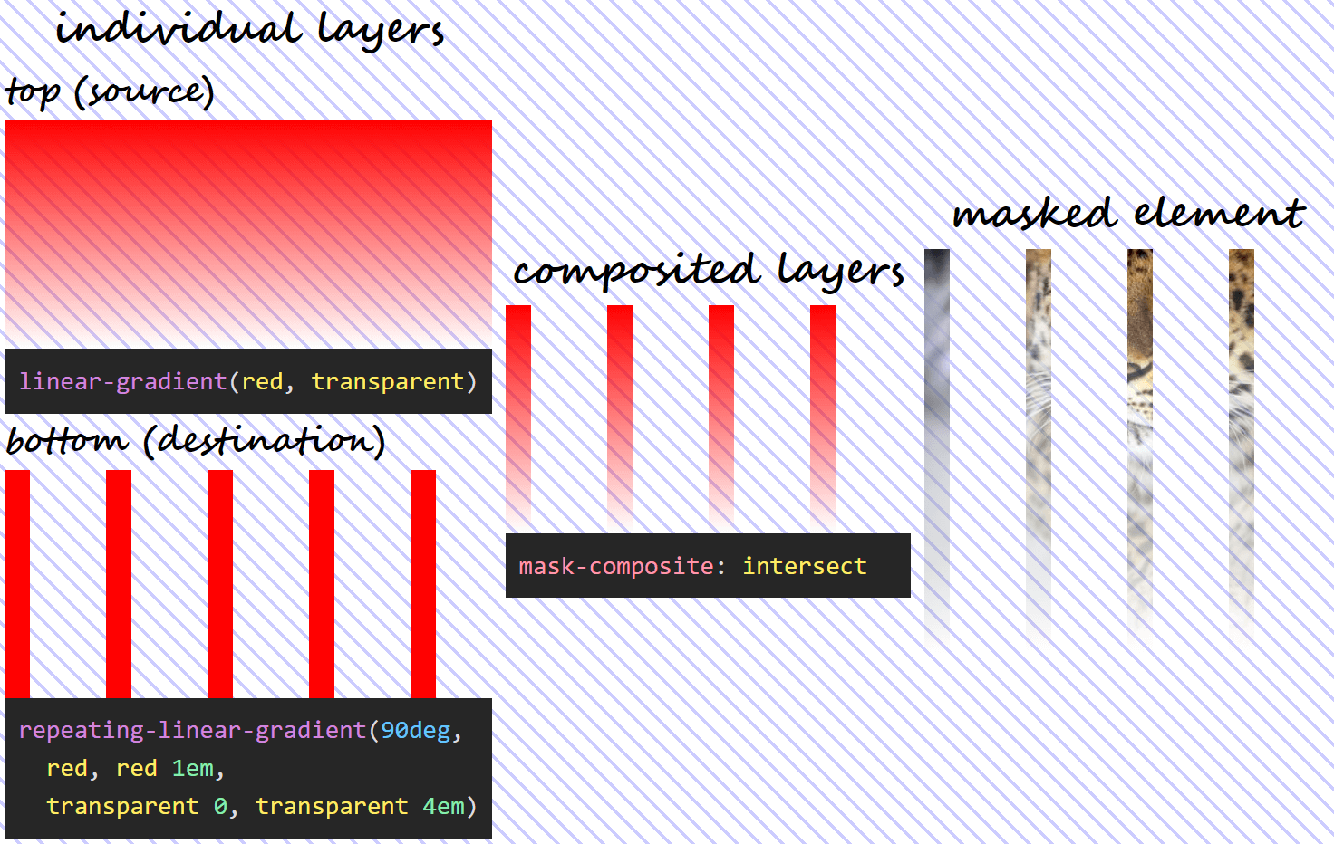
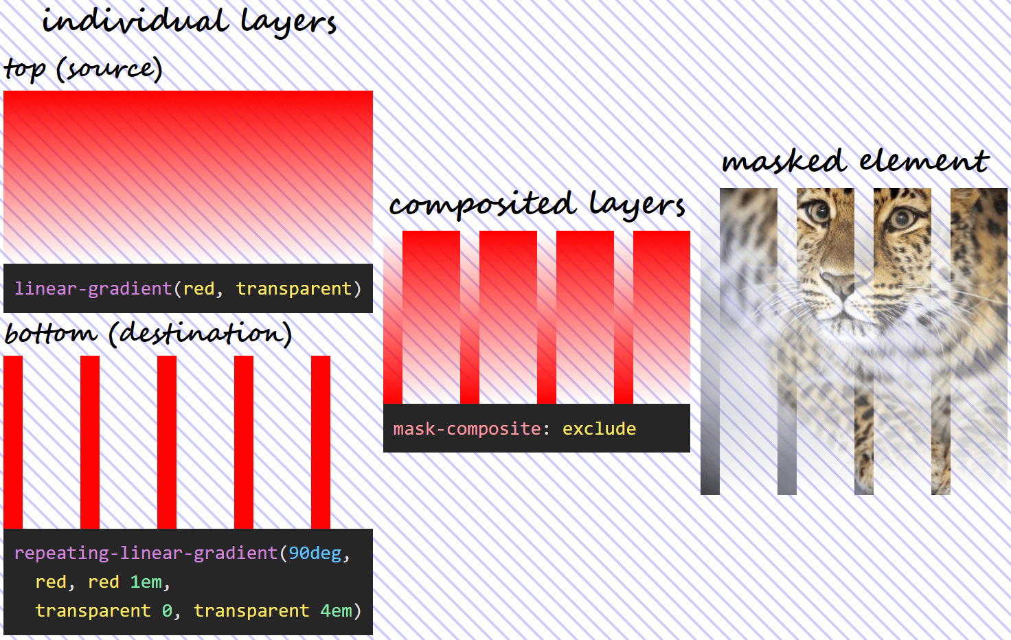
The layer on top (--l1) is the source, while the bottom layer (--l0) is the destination.
We apply the mask on this image of a gorgeous Amur leopard.
The image we apply the mask on.
Alright, now that we got that out of the way, let's see what effect each mask-composite value has!
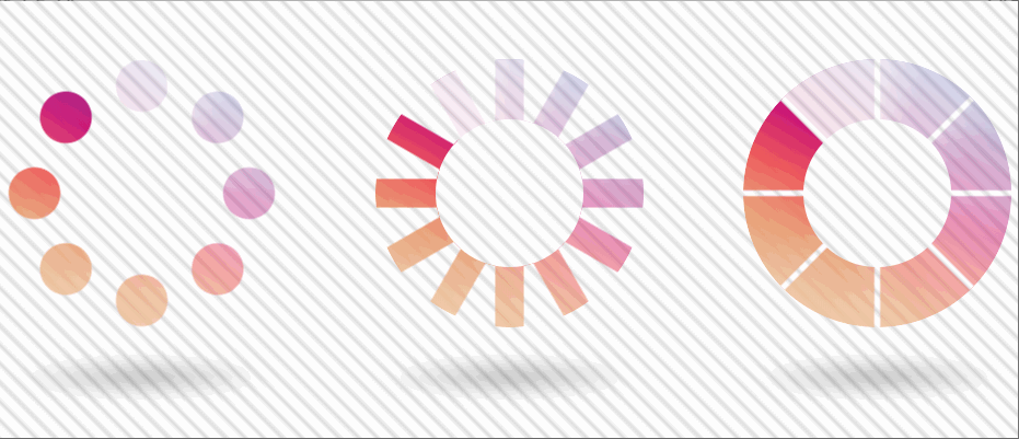
add
This is the initial value, which gives us the same effect as not specifying mask-composite at all. What happens in this case is that the gradients are added one on top of the other and the resulting mask is applied.
Note that, in the case of semitransparent mask layers, the alphas are not simply added, in spite of the value name. Instead, the following formula is used, where α₁ is the alpha of the pixel in the source (top) layer and α₀ is the alpha of the corresponding pixel in the destination (bottom) layer:
α₁ + α₀ – α₁·α₀
Wherever at least onemask layer is fully opaque (its alpha is 1), the resulting mask is fully opaque and the corresponding pixels of the masked element are shown fully opaque (with an alpha of 1).
If the source (top) layer is fully opaque, then α₁ is 1, and replacing in the formula above, we have:
1 + α₀ - 1·α₀ = 1 + α₀ - α₀ = 1
If the destination (bottom) layer is fully opaque, then α₀ is 1, and we have:
α₁ + 1 – α₁·1 = α₁ + 1 – α₁ = 1
Wherever bothmask layers are fully transparent (their alphas are 0), the resulting mask is fully transparent and the corresponding pixels of the masked element are therefore fully transparent (with an alpha of 0) as well.
0 + 0 – 0·0 = 0 + 0 + 0 = 0
Below, we can see what this means for the mask layers we're using - what the layer we get as a result of compositing looks like and the final result that applying it on our Amur leopard image produces.
What using mask-composite: add for two given layers does.
subtract
The name refers to "subtracting" the destination (layer below) out of the source (layer above). Again, this does not refer to simply capped subtraction, but uses the following formula:
α₁·(1 – α₀)
The above formula means that, since anything multiplied with 0 gives us 0, wherever the source (top) layer is fully transparent or wherever the destination (bottom) layer is fully opaque, the resulting mask is also fully transparent and the corresponding pixels of the masked element are also fully transparent.
If the source (top) layer is fully transparent, replacing its alpha with 0 in our formula gives us:
0·(1 – α₀) = 0
If the destination (bottom) layer is fully opaque, replacing its alpha with 1 in our formula gives us:
α₁·(1 – 1) = α₁·0 = 0
This means using the previously defined mask and setting mask-composite: subtract, we get the following:
What using mask-composite: subtract for two given layers does.
Note that, in this case, the formula isn't symmetrical, so, unless α₁ and α₀ are equal, we don't get the same thing if we swap the two mask layers (α₁·(1 – α₀) isn't the same as α₀·(1 – α₁)). This means we have a different visual result if we swap the order of the two layers!
Using mask-composite: subtract when the two given layers have been swapped.
intersect
In this case, we only see the pixels of the masked element from where the two mask layers intersect. The formula used is the product between the alphas of the two layers:
α₁·α₀
What results from the formula above is that, wherever eithermask layer is fully transparent (its alpha is 0), the resulting mask is also fully transparent and so are the corresponding pixels of the masked element.
If the source (top) layer is fully transparent, replacing its alpha with 0 in our formula gives us:
0·α₀ = 0
If the destination (bottom) layer is fully transparent, replacing its alpha with 0 in our formula gives us:
α₁·0 = 0
Also, wherever bothmask layers are fully opaque (their alphas are 1), the resulting mask is fully opaque and so are the corresponding pixels of the masked element. This because, if the alphas of the two layers are both 1, we have:
1·1 = 1
In the particular case of our mask, setting mask-composite: intersect means we have:
What using mask-composite: intersect for two given layers does.
exclude
In this case, each layer is basically excluded from the other, with the formula being:
α₁·(1 – α₀) + α₀·(1 – α₁)
In practice, this formula means that, wherever bothmask layers are fully transparent (their alphas are 0) or fully opaque (their alphas are 1), the resulting mask is fully transparent and the corresponding pixels of the masked element are fully transparent as well.
If both mask layers are fully transparent, our replacing their alphas with 0 in our formula results in:
0·(1 – 0) + 0·(1 – 0) = 0·1 + 0·1 = 0 + 0 = 0
If both mask layers are fully opaque, our replacing their alphas with 1 in our formula results in:
1·(1 – 1) + 1·(1 – 1) = 1·0 + 1·0 = 0 + 0 = 0
It also means that, wherever one layer is fully transparent (its alpha is 0), while the other one is fully opaque (its alpha is 1), then the resulting mask is fully opaque and so are the corresponding pixels of the masked element.
If the source (top) layer is fully transparent, while the destination (bottom) layer is fully opaque, replacing α₁ with 0 and α₀ with 1 gives us:
0·(1 – 1) + 1·(1 – 0) = 0·0 + 1·1 = 0 + 1 = 1
If the source (top) layer is fully opaque, while the destination (bottom) layer is fully transparent, replacing α₁ with 1 and α₀ with 0 gives us:
1·(1 – 0) + 0·(1 – 1) = 1·1 + 0·0 = 1 + 0 = 1
With our mask, setting mask-composite: exclude means we have:
What using mask-composite: exclude for two given layers does.
Applying this to our use case
We go back to the two gradients we attempted to get the rhombic pattern with:
--l1: repeating-linear-gradient(-60deg,
          transparent 0, transparent 5px,
          tan 0, tan 35px);
--l0: repeating-linear-gradient(60deg,
          transparent 0, transparent 5px,
          tan 0, tan 35px)
If we make the completely opaque (tan in this case) parts semitransparent (let's say rgba(tan, .5)), the visual result gives us an indication of how compositing could help here:
The rhombic areas we're after are formed at the intersection between the semitransparent strips. This means using mask-composite: intersect should do the trick!
$sw: 5px;

--l1: repeating-linear-gradient(-60deg,
          transparent 0, transparent #{$sw},
          tan 0, tan #{7*$sw});
--l0: repeating-linear-gradient(60deg,
          transparent 0, transparent #{$sw},
          tan 0, tan #{7*$sw});
mask: var(--l1) intersect, var(--l0)
Note that we can even include the compositing operation in the shorthand! Which is something I really love, because the fewer chances of wasting at least ten minutes not understanding why masj-composite, msdk-composite, nask-composite, mask-comoisite and the likes don't work, the better!
Not only does this give us the desired result, but, if now that we've stored the transparent strip width into a variable, changing this value to a % value (let's say $sw: .05%) makes the mask scale with the image!
If the transparent strip width is a px value, then both the rhombic shapes and the separating lines stay the same size as the image scales up and down with the viewport.
Masked image at two different viewport widths when the transparent separating lines in between the rhombic shapes have a px-valued width.
If the transparent strip width is a % value, then both the rhombic shapes and the separating lines are relative in size to the image and therefore scale up and down with it.
Masked image at two different viewport widths when the transparent separating lines in between the rhombic shapes have a %-valued width.
Too good to be true? What's the support for this?
The bad news is that mask-composite is only supported by Firefox at the moment. The good news is we have an alternative for WebKit browsers, so we can extend the support.
Extending support
WebKit browsers support (and have supported for a long, long time) a non-standard version of this property, -webkit-mask-composite which needs different values to work. These equivalent values are:
source-over for add
source-out for subtract
source-in for intersect
xor for exclude
So, in order to have a cross-browser version, all we need to is add the WebKit version as well, right?
Well, sadly, things are not that simple.
First off, we cannot use this value in the -webkit-mask shorthand, the following does not work:
-webkit-mask: var(--l1) source-in, var(--l0)
And if we take the compositing operation out of the shorthand and write the longhand after it, as seen below:
And if you think that's weird, check this: using any of the other three operations add/ source-over, subtract/ source-out, exclude/ xor, we get the expected result in WebKit browsers as well as in Firefox. It's only the source-in value that breaks things in WebKit browsers!
Why is this particular value breaking things in WebKit?
When I first came across this, I spent a few good minutes trying to find a typo in source-in, then copy pasted it from a reference, then from a second one in case the first reference got it wrong, then from a third... and then I finally had another idea!
It appears as if, in the case of the non-standard WebKit alternative, we also have compositing applied between the layer at the bottom and a layer of nothing (considered completely transparent) below it.
For the other three operations, this makes absolutely no difference. Indeed, adding, subtracting or excluding nothing doesn't change anything. If we are to take the formulas for these three operations and replace α₀ with 0, we always get α₁:
However, intersection with nothing is a different story. Intersection with nothing is nothing! This is something that's also illustrated by replacing α₀ with 0 in the formula for the intersect/ source-in operation:
α₁·0 = 0
The alpha of the resulting layer is 0 in this case, so no wonder our image gets completely masked out!
So the first fix that came to mind was to use another operation (doesn't really matter which of the other three, I picked xor because it has fewer letters and it can be fully selected by double clicking) for compositing the layer at the bottom with this layer of nothing below it:
Note that we need to add the non-standard WebKit version before the standard one so that when WebKit browsers finally implement the standard version as well, this overrides the non-standard one.
Well, that's about it! I hope you've enjoyed this article and learned something new from it.
A couple more demos
Before closing, here are two more demos showcasing why mask-composite is cool.
The first demo shows a bunch of 1 element umbrellas. Each "bite" is created with a radial-gradient() that we exclude from the full circular shape. Chrome has a little rendering issue, but the result looks perfect in Firefox.
1 element umbrellas using mask-composite (live demo).
The second demo shows three 1 element loaders (though only the second two use mask-composite). Note that the animation only works in Chrome here as it needs Houdini.
1 element loaders using mask-composite (live demo).
How about you - what other use cases can you think of?


 If your business has multiple locations, WordPress store locator plugins can prove to be useful additions to your website. Motel chains, gas stations, chain stores, beauty parlors can all benefit from adding store locator plugins. They help users find your business locations easily. These plugins rely on Google Maps for displaying locations. Consequently, you’ll be […]
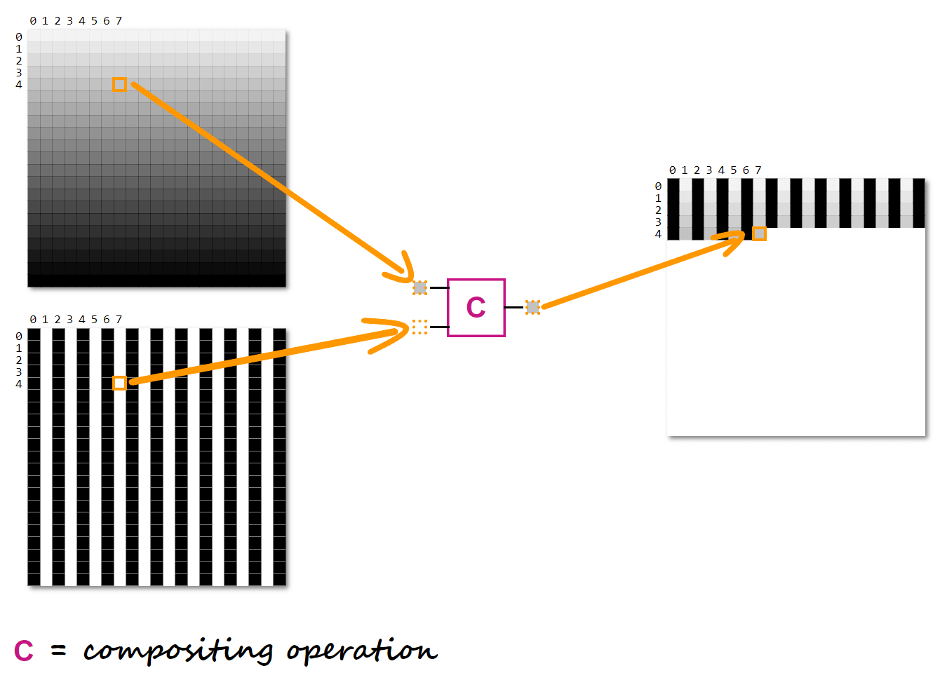