The 11th edition of WordCamp Miami was held this past weekend, a three-day event that featured multiple learning workshops and six different tracks. The speaker ratio was 50% male and 50% female, and nearly half of the speakers were new to WordCamp Miami.
One of the highlights of this year’s event were the WordPress stories coming out of the Kid’s Panel. WordCamp Miami has been hosting learning experiences for kids since 2014 and for the past four years has included a two-day Kid’s Camp along with a Kid’s Panel. More than 100 children (not including parents and guardians) attended this year’s event. Some of the kids who are more experienced with WordPress shared their experiences during the Kid’s Panel.
Kids reported that they using WordPress for blogs, science projects, and robotic competitions. One fifth grade student, who has been using WordPress for three years, said she plans to continue using it to document her life and share her future educational experiences:
“I plan to be using it later in my life when I go to college, so I can be talking about what my life journey was and what I’m going to be studying, which is software engineering.”
Miami to Host New One-Day WordPress Event for Kids and Teachers
The growing popularity of WordCamp Miami’s kids events has inspired organizers to host a new one-day event for kids and teachers. The date has not yet been set but the plan is to have it scheduled for summer 2019.
The event will be divided into two tracks, one for kids aged 6 to 18 and another for teachers and educators. The kid’s track will include talks on WordPress, MineCraft, STEAM/STEM activities, and ways they can improve their coding skills. Teachers and educators will have a dedicated track with talks that will help them incorporate coding, WordPress, and broader STEAM/STEM activities into their curricula.
In their announcement, WordCamp Miami’s organizers said they believe the next generation of WordPress users are “vital to the growth of the open web.” They are looking for sponsors to cover the costs of snacks and lunch for approximately 100 students, volunteers and speakers to give presentations on various subjects for kids and teachers, and people to spread the word to schools in the Dade/Broward area.
Kids engaging with WordPress is one of the most inspiring things happening in the community right now. It’s the spark of a new generation of users who are embracing the concept of sharing their ideas on the open web. WordPress’ Community team also has a new Kids Event Working Group that kicked off last month to support the growth of these kinds of events around the world. They are currently working on documentation, training guides, legal documents, supply lists, and other resources. This is another way to get involved if you don’t live near a local kid’s event.
Every day, the ProgrammableWeb team is busy, updating its three primary directories for APIs, clients (language-specific libraries or SDKs for consuming or providing APIs), and source code samples.
Chrome on Android’s Data Saver feature helps by automatically optimizing web pages to make them load faster. When users are facing network or data constraints, Data Saver may reduce data use by up to 90% and load pages two times faster, and by making pages load faster, a larger fraction of pages actually finish loading on slow networks. Now, we are securely extending performance improvements beyond HTTP pages to HTTPS pages and providing direct feedback to the developers who want it.
To show users when a page has been optimized, Chrome now shows in the URL bar that a Lite version of the page is being displayed.
All of this is pretty neat but I think the name Lite Pages is a little confusing as it’s in no way related to AMP and Tim Kadlec makes that clear in his notes about the new feature:
Lite pages are also in no way related to AMP. AMP is a framework you have to build your site in to reap any benefit from. Lite pages are optimizations and interventions that get applied to your current site. Google’s servers are still involved, by as a proxy service forwarding the initial request along. Your URL’s aren’t tampered with in any way.
A quick glance at this seems great! We don’t have to give up ownership of our URLs, like with AMP, and we don’t have to develop with a proprietary technology — we can let Chrome be Chrome and do any performance things that it wants to do without turning anything on or off or adding JavaScript.
But wait! What kind of optimizations does a Lite Page make and how do they affect our sites? So far, it can disable scripts, replace images with placeholders and stop the loading of certain resources, although this is all subject to change in the future, I guess.
The optimizations only take effect when the loading experience for users is particularly bad, as the announcement blog post states:
...they are applied when the network’s effective connection type is “2G” or “slow-2G,” or when Chrome estimates the page load will take more than 5 seconds to reach first contentful paint given current network conditions and device capabilities.
It’s probably important to remember that the reason why Google is doing this isn’t to break our designs or mess with our websites — they’re doing this because there are serious performance concerns with the web, and those concerns aren't limited to developing nations.
BigBelly, a smart waste management company, has announced its CLEAN API. Through the API, third parties gain access to BigBelly's smart waste data. Third parties can integrate the data into their management systems, workforce management tools, dashboards, and other systems that help make users more efficient in waste management and disposal.
Have you seen Local by Flywheel? It's a native app for helping set up local WordPress developer environments. I absolutely love it and use it to do all my local WordPress development work. It brings a lovingly designed GUI to highly technical tasks in a way that I think works very well. Plus it just works, which wins all the awards with me. Need to spin up a new site locally? Click a few buttons. Working on your site? All your sites are right there and you can flip them on with the flick of a toggle.
Local by Flywheel is useful no matter where your WordPress production site is hosted. But it really shines when paired with Flywheel itself, which is fabulous WordPress hosting that has all the same graceful combination of power and ease as Local does.
Just recently, we moved ShopTalkShow.com over to Local and it couldn't have been easier.
Running locally.
Setting up a new local site (which you would do even if it's a long-standing site and you're just getting it set up on Flywheel) is just a few clicks. That's one of the most satisfying parts. You know all kinds of complex things are happening behind the scenes, like containers being spun up, proper software being installed, etc, but you don't have to worry about any of it.
(Local is free, by the way.)
The Cross-platform-ness is nice.
I work on ShopTalk with Dave Rupert, who's on Windows. Not a problem. Local works on Windows also, so Dave can spin up site in the exact same way I can.
Setting up Flywheel hosting is just as clean and easy as Local is.
If you've used Local, you'll recognize the clean font, colors, and design when using the Flywheel website to get your hosting set up. Just a few clicks and I had that going:
Things that are known to be a pain the butt are painless on Local, like making sure SSL (HTTPS) is active and a CDN is helping with assets.
You get a subdomain to start, so you can make sure your site is working perfectly before pointing a production domain at it.
I didn't just have to put files into place on the new hosting, move the database, and cross my fingers I did it all right when re-pointing the DNS. I could get the site up and running at the subdomain first, make sure it is, then do the DNS part.
But the moving of files and all that... it's trivial because of Local!
The best part is that shooting a site up to Flywheel from Local is also just a click away.
All the files and the database head right up after you've connected Local to Flywheel.
All I did was make sure I had my local site to be a 100% perfect copy of production. All the theme and plugins and stuff were already that way because I was already doing local development, and I pulled the entire database down easily with WP DB Migrate Pro.
I think I went from "I should get around to setting up this site on Flywheel." do "Well that's done." in less than an hour. Now Dave and I both have a local development environment and a path to production.
Your website must be optimized for mobile devices. Why?
Well, for starters, 80% of the top websites according to the Alexa rankings were optimized for mobile users. Plus, 80% of all Internet users have smartphones.
It’s easy for people to browse the Internet from their mobile devices. Doesn’t it seem like everyone is glued to their smartphones all the time?
Even those who aren’t holding their phones right now, I’m sure, have them within arm’s reach, either in their pockets, purses, or on nearby tables.
This is great news for your company and your website. Our love for mobile devices makes it easier for your current and prospective customers to access your site.
According to Statista, more than half of the global web traffic comes from mobile devices:
As you can see from this graph, this number continues to grow each year. I expect this trend to continue in the years to come.
This percentage is even higher in some areas of the world. For example, more than 65% of web traffic in Asia comes from mobile devices.
If you’re not optimizing your content and your website as a whole, you’re likely not making the most of your traffic.
Additionally, it may be preventing you from getting more traffic.
Google has made it clear that it wants to serve mobile users mobile-friendly web pages.
Optimizing your website and content for mobile is a must, even though it might seem like another chore to do.
Not only will it help you get more SEO traffic in both the short and long term, but it will also help you with your conversion rates because a smaller percentage of your traffic will bounce.
No matter what industry you’re in or where you’re located, your site needs to accommodate mobile users. How can you do this?
I’m here to explain the top principles of an effective mobile web design. If you can apply these concepts to your mobile site, you’ll benefit from an increase in traffic and more engaged users.
In this post, I’m going to show you the several ways you can optimize content for mobile. I encourage you to put as many of them into effect as possible.
A quick definition of mobile-friendly
I don’t want to jump ahead too far.
If you’re already familiar with what mobile-friendly means, feel free to skip ahead to the next section.
Otherwise, it’s really not that complicated.
As the name implies, mobile-friendly content just means that content appears well not just on desktop computers but also on smaller mobile devices.
That means that the text is easily readable, links and navigation are easily clickable, and it’s easy to consume the content in general.
Let’s begin with a test: It’s important to know where you stand. If your content is already mobile-friendly, you won’t need to do all the things in this post.
There are two main ways that you can test your site for mobile-friendliness.
The first is with Google’s own mobile-friendly test tool, which is something that everyone should use.
Another option is to use a site like this mobile phone emulator, which lets you see what your site looks like on a variety of different phones. It won’t give you a grade like Google’s tool will, but you’ll be able to see if anything shows up weird.
A quick note on responsive design
You’ve probably heard about “responsive” design.
It’s typically used as a synonym for mobile-friendly design although that’s technically not true.
There are a few different strategies to create mobile-friendly websites, and using responsive design is just one of them.
It means that as the screen’s size changes, the content adjusts to match that size:
That being said, responsive design is a clear winner in most situations.
Because of that, some of the tactics I’m about to show you are based on the assumption that you will implement responsive design as opposed to one of the other methods for creating mobile-friendly pages.
Here are 14 tips for making your website mobile-friendly.
1. Install a responsive theme
If you want a quick fix then you can consider changing your theme entirely.
For an established site this probably not best option but if it is a low traffic site, or you are just getting started, then installing a brand new responsive theme is a easy solution.
If you are using WordPress then changing your theme is simple.
Head over to your WordPress dashboard and under ‘appearance’ click on ‘themes’ and then click on ‘install themes’.
Put in ‘responsive’ and hit search.
What this will do is bring up all of the themes in the WordPress database that are responsive, including the responsive theme, which is actually quite nice, and obviously responsive, and they also have hundreds of other themes for you to choose from.
Choose the one that’s best for your site, and that’s responsive, and install it.
Double check that your new theme looks great on all devices, and make sure you still follow the rest of the tips below to ensure everything else is up to par.
2. Simplify your menus
Obviously, mobile screens are significantly smaller than laptop or desktop screens. Keep this in mind when designing your menu options.
The menu of your desktop site can be more extensive and have lots of options. But this complicates things on a smaller screen.
You don’t want visitors to have to scroll or zoom in and out to see all the navigation choices. Everything needs to be concise and fit on one screen.
It gets pushed down to the very bottom of the page and barely ever gets used.
So, unless you can create a fancy sidebar like Google did, it’s probably better to remove it altogether for mobile users.
3. Keep forms as short as possible
Think about all the different forms you have on your website. If you’re asking the visitor for a lot of information, it’s not an effective approach.
Instead, you should change the design to keep your forms short.
Again, if someone is filling out a form on their computer, it’s not as big of an issue because it’s easier to type and navigate on a larger screen. But this isn’t the case with smartphones and tablets.
Evaluate your forms, and ask yourself whether you need each line.
For example, if you’re trying to get users to subscribe to your email list, you don’t need their home addresses and phone numbers.
Forms designed for buying conversions shouldn’t ask the user what their favorite color is. Get their billing and shipping info, and end it.
In fact, a long and complicated checkout process is one of the top reasons for shopping cart abandonment:
If you want to reduce shopping cart abandonment rates from mobile devices, you’ll need to change the design of your mobile website forms.
4. Clearly display your CTAs
Let’s continue talking about conversions. To have an effective mobile web design, your call-to-action buttons need to be obvious.
Since we’re dealing with a smaller screen here, you don’t want to overwhelm the user by trying to squeeze more than one CTA on the screen.
Think about your goal for each landing page. Are you trying to get downloads? New subscribers? Increase social media presence? Get visitors to buy something?
Your CTA needs to focus on that primary goal.
Focusing your attention on your CTA buttons will give you an edge over your competitors. That’s because 53% of websites have call-to-action buttons that take users more than three seconds to identify.
That’s far too long. Your CTA should be easy to spot in just one or maximum two seconds.
5. Include a search function
This design principle relates back to what I previously said about your menu options. Right now, some of you may have a menu with 20 or 30 different options.
It may seem impossible to try to simplify those options to fit on just one page. Well, it can be done, especially if you add a search bar to your mobile site.
Encouraging users to search for what they want reduces the need for you to rely on a large and complex menu. Too many options will confuse the visitor and kill your conversions.
This feature for sure needs to be incorporated into the web design of ecommerce sites. Let’s take a look at the home screen of an industry giant Amazon:
Amazon sells over 12 million products. Take a minute to let that number sink in. I’m willing to bet your website doesn’t sell nearly as many products.
I’m not saying this to make you feel bad. But I want you to realize that if Amazon can use a search bar to help mobile users browse through millions of items, your company shouldn’t have any issues applying the same concept for hundreds or thousands of products.
Implement a search bar to simplify your design and make it easy for mobile users to find exactly what they’re looking for.
6. Make customer service easily accessible
No matter how much time and effort you put into simplifying your mobile web design, people will still have issues.
Don’t worry, it’s all part of running a successful business and website. But the key here is being able to quickly and effectively help your mobile site visitors work through their problems.
Make sure you’ve got obvious customer support information on your mobile site.
Provide your phone number, email address, and social media profiles. Display anything that gives the user an option to contact a representative from your company as fast as possible.
Put yourself in the shoes of a frustrated mobile user who has a question or problem. If they can’t get help from your customer service team, it’ll leave them with a bad impression of your company.
Adding obvious customer support information to your mobile web design is something that can’t go overlooked.
7. Size matters
Navigating a website from a desktop or laptop computer is simple. It’s easy to control a cursor from a mouse or keypad.
But browsing with your thumbs on a 4-inch screen isn’t as easy. Keep this in mind when laying out different elements of your mobile site.
Buttons need to be large enough to be tapped with a finger. Make sure you keep enough space between buttons so someone doesn’t accidentally click the wrong one.
Having to tap the same button several times to make it work will frustrate mobile users visiting your website.
You also need to keep in mind the placement of clickable items on the screen:
Keep in mind 75% of smartphone users use their thumbs to tap on the screen.
This image shows you the best location on the screen to place buttons. Avoid the corners: it’s hard for a person to reach those places with their thumb while holding a mobile device.
The reach decreases further as the screen size becomes larger. It’s in your best interest to place the most important elements and clickable buttons toward the middle of the screen.
8. Eliminate pop-ups
Get rid of pop-ups on your mobile site. For the most part, people don’t like pop-ups as it is. They are annoying and hinder the user experience.
The problem with pop-ups on mobile devices is they become even more of a nuisance because they are so difficult to close.
Recall that people use their thumbs to tap on small screens. The small “X” button to close a pop-up will be so small on a mobile device that users won’t be able to close the window.
They might even accidentally click on the ad while trying to close it. They’ll get brought to a new landing page, which will ruin their experience.
Sometimes users will try to zoom in on the close button to make it easier to tap, but then the dimensions of the screen get messed up as well.
It’s best to remove these pop-ups altogether. Come up with other ways to promote whatever your pop-up is advertising.
If you do decide to keep a popup on your mobile site then be sure to do a lot of testing.
I’ve certainly experimented with using pop-ups to collect email addresses on my sites, and you should try them on yours as well.
However, you have to be very careful.
Many cheap pop-up tools and plugins look fine on desktop screens but completely ruin the user experience on mobile devices.
Not surprisingly, they cause visitors to instantly close the window.
Other than simply removing the popup on mobile (which is what I still recommend) there are two other solutions to a pop-up problem on mobile devices:
Solution #1 – Simplify them: One solution is to make your forms as simple as possible to fill out (minimize the number of fields) and make them easy to close.
This is probably the worst solution, but it’s still better than sticking with whatever default pop-up you’re currently serving.
Solution #2 – Only use pop-ups when a visitor clicks: This is another great option.
If you’ve heard about content upgrades, you may have already seen it in action.
The idea here is that you don’t use pop-ups that come up after a visitor spends a certain amount of time on your pages.
Instead, you offer them some sort of lead magnet and tell them to click a link to get it. Then, the pop-up will come up and ask for their information.
People are much more receptive to pop-ups in this situation because they’re the ones who asked for it.
9. Avoid large blocks of text
Reduce the amount of text on the screen of your mobile website. Obviously, you’ll need to use some words to communicate with your visitors, but keep sentences and paragraphs as short as possible.
Large blocks of text are overwhelming and difficult to read. Remember, if a paragraph is two lines long on your desktop site, it might be six lines long on a smartphone.
Take a look at how typography affects conversions:
Keep these three elements in mind whenever you’re adding text to your mobile site.
Can the visitor comprehend your message? Where is their point of focus? What is the visual hierarchy?
Eliminating large blocks of text makes this possible.
10. Choose the right font
Let’s continue talking about the text on your mobile site. Picking the right font is a crucial design principle as well.
Fonts need to be clear and easy to read. But you can also use fonts to set two lines of text apart.
You don’t want the text of one line to run into the text of another.
For example, you could use all capital letters and bold font for the headline of a section. Then use regular capitalization rules and non-bold font for the line underneath to show a clear separation.
You’ve got a small space to work with, so you can’t rely on a page break or image every time you want to separate text.
11. Prioritize speed
No matter what changes you implement on your mobile website, you need to keep its speed in mind.
Research shows that 53% of people will abandon a mobile website that takes more than three seconds to load. Take a look at how these bounce rates increase with increasing page loading times:
The best way to keep your page loading time as low as possible is by simplifying your design.
Fortunately, if you follow all the other principles I’ve outlined so far, this shouldn’t be an issue.
Eliminate unnecessary heavy images and flashing lights. Simple websites load faster and have higher conversion rates.
12. Widths should be in terms of percentages
Lets get a bit technical. All HTML elements (e.g., “divs”) have some sort of width assigned to them.
If you right-click any element on a web page and then choose “inspect element” (in Chrome), you’ll see a panel come up.
If you click on an element in the left window of the panel, the corresponding CSS (style properties) values will be displayed in the right window.
You will typically see a value for “width” specified, like this example shows:
This value can be set in terms of pixels (essentially tiny blocks on the screen) or a percentage.
When you assign 50% as a value, that tells the browser to make that element 50% of the width of the screen (or of the section that it’s contained in).
This is a good thing because if the screen is smaller, that section still shrinks to fit half the screen, which keeps things looking how they should.
If you instead specify widths by pixels, the widths of those elements do not change as the screen size changes.
If the width of a section in pixels is bigger than the screen size (common for phones), the user will have to scroll horizontally, which is a pain on mobile devices.
What you should do about widths: If you bought a good theme or hired competent developers, you don’t have to worry about this too much.
However, if you ever design your own landing pages or modify your theme, keep in mind to specify widths as percentages.
If you’ve used pixels in the past, track those down and fix them now.
This is a simple change that will make a big difference.
There is one exception, though. You can specify pixel widths if you know how to use media queries effectively.
What are media queries? Read on…
13. Use media queries to make your site responsive
The real key to using responsive design is to use media queries.
Again, if your site is already responsive, you don’t have to worry about this unless you start creating your own custom pages.
But if the situation comes up, you’d better know how to handle it.
Have you ever wondered how some pages not only resize as the screen size changes but also reshape?
Certain sections might get wider or thinner than before, and other elements may move altogether (navbars and sidebars).
The answer is that the site uses media queries to truly make the site responsive.
Here’s what a basic media query looks like (you can find them in the CSS of some pages):
@media screen and (max-width: 1020px) {
#container, #header, #content, #footer {
float: none;
width: auto;
}
p{ font-size: 2em; }
}
There’s a lot to see here, so let’s break it down into simple chunks.
Right at the start of the line, the media query is labeled with the “@media” tag.
The “screen” part is standard to include and means that the media query will be applied based on screen size.
The most important part is the stuff in the brackets.
You can specify both “min-width” and “max-width.”
In this case, the max-width is 1020px.
This means that when the screen is up to 1020 pixels wide, all the CSS code inside this media query should apply.
The code inside will be given priority over other codes for the specified elements.
Going back to the code, you can see a bunch of normal CSS code inside the outside curly brackets for the overall media query.
You can see that when the screen is under 1020px wide, any elements with an id of “container,” “header,” “content,” or “footer,” will now have “auto” width and a float value of “none.”
Similarly, all text in paragraph tags (p), will have a font size of 2.0 em.
Applying this is simple.
Load your webpage, and then drag a corner to make the screen smaller.
If you notice that certain parts become hard to read at a certain point, create a media query. Change it so that your content elements become larger or smaller, whatever is needed to make the content more mobile-friendly.
Note that you can apply multiple media queries to a page. Just specify a maximum and minimum width, and make sure they don’t overlap.
14. Get ahead of the curve with Accelerated Mobile Pages (AMP)
Accelerated Mobile Pages (AMP) are still HTML pages, but they follow a specific format.
Google has teamed up with a bunch of huge brands to create and support them.
Should you create AMP? I can’t give you a definitive answer. On the one hand, they may help get you some extra traffic, but I haven’t experimented with them enough to conclude anything.
The one downside is that you need to maintain two versions of your content. The good news is that it’s easy with WordPress because there’s actually a plugin for that—all you need to do is enable it.
Finally, if you’re interested in creating AMP on your own non-WordPress site, here’s the official tutorial. I’d create my own, but Google’s will always be better.
If you have the extra time and resources, I’d encourage you to test out AMP, but most businesses will be better off to wait a bit and see if they get adopted more widely first.
Conclusion
If you’re not optimizing your content for mobile users, you’re behind the curve and missing out on traffic (and wasting some of your current traffic).
Your website needs to be optimized for mobile users. To do this effectively, you need to understand some important design principles.
Simplify your menu choices, and keep forms short. Make sure your CTAs are clearly displayed, and stick to one CTA per page.
Add a search bar to help improve navigation while clearing up space on the screen. You should make it easy for mobile users to contact your customer service team.
Realize that people are using their thumbs to tap on the screen, so buttons need to be sized accordingly. Get rid of pop-ups as well.
Carefully select an appropriate font that’s easy to read. Eliminate large blocks of text on the screen and follow the rest of the tips in this guide.
No matter what, make sure your mobile site loads as fast as possible.
Follow these top mobile design principles to maximize traffic and conversions on your mobile website.
A little while back, I was in the process of adding focus styles to An Event Apart’s web site. Part of that was applying different focus effects in different areas of the design, like white rings in the header and footer and orange rings in the main text. But in one place, I wanted rings that were more obvious—something like stacking two borders on top of each other, in order to create unusual shapes that would catch the eye.
I toyed with the idea of nesting elements with borders and some negative margins to pull one border on top of another, or nesting a border inside an outline and then using negative margins to keep from throwing off the layout. But none of that felt satisfying.
It turns out there are a number of tricks to create the effect of stacking one border atop another by combining a border with some other CSS effects, or even without actually requiring the use of any borders at all. Let’s explore, shall we?
Outline and box-shadow
If the thing to be multi-bordered is a rectangle—you know, like pretty much all block elements—then mixing an outline and a spread-out hard box shadow may be just the thing.
Let’s start with the box shadow. You’re probably used to box shadows like this:
That gets you a blurred shadow below and to the right of the element. Drop shadows, so last millennium! But there’s room, and support, for a fourth length value in box-shadow that defines a spread distance. This increases the size of the shadow’s shape in all directions by the given length, and then it’s blurred. Assuming there’s a blur, that is.
So if we give a box shadow no offset, no blur, and a bit of spread, it will draw itself all around the element, looking like a solid border without actually being a border.
This box-shadow "border" is being drawn just outside the outer border edge of the element. That’s the same place outlines get drawn around block boxes, so all we have to do now is draw an outline over the shadow. Something like this:
Bingo. A multicolor "border" that, in this case, doesn’t even throw off layout size, because shadows and outlines are drawn after element size is computed. The outline, which sits on top, can use pretty much any outline style, which is the same as the list of border styles. Thus, dotted and double outlines are possibilities. (So are all the other styles, but they don’t have any transparent parts, so the solid shadow could only be seen through translucent colors.)
If you want a three-tone effect in the border, multiple box shadows can be created using a comma-separated list, and then an outline put over top that. For example:
Taking it back to simpler effects, combining a dashed outline over a spread box shadow with a solid border of the same color as the box shadow creates yet another effect:
The extra bonus here is that even though a box shadow is being used, it doesn’t fill in the element’s background, so you can see the backdrop through it. This is how box shadows always behave: they are only drawn outside the outer border edge. The "rest of the shadow," the part you may assume is always behind the element, doesn’t exist. It’s never drawn. So you get results like this:
An outer box-shadow casts a shadow as if the border-box of the element were opaque. Assuming a spread distance of zero, its perimeter has the exact same size and shape as the border box. The shadow is drawn outside the border edge only: it is clipped inside the border-box of the element.
(Emphasis added.)
Border and box-shadow
Speaking of borders, maybe there’s a way to combine borders and box shadows. After all, box shadows can be more than just drop shadows. They can also be inset. So what if we turned the previous shadow inward, and dropped a border over top of it?
That’s... not what we were after. But this is how inset shadows work: they are drawn inside the outer padding edge (also known as the inner border edge), and clipped beyond that:
An inner box-shadow casts a shadow as if everything outside the padding edge were opaque. Assuming a spread distance of zero, its perimeter has the exact same size and shape as the padding box. The shadow is drawn inside the padding edge only: it is clipped outside the padding box of the element.
(Ibid; emphasis added.)
So we can’t stack a border on top of an inset box-shadow. Maybe we could stack a border on top of something else...?
Border and multiple backgrounds
Inset shadows may be restricted to the outer padding edge, but backgrounds are not. An element’s background will, by default, fill the area out to the outer border edge. Fill an element background with solid color, give it a thick dashed border, and you’ll see the background color between the visible pieces of the border.
So what if we stack some backgrounds on top of each other, and thus draw the solid color we want behind the border? Here’s step one:
We can see, there on the left side, the blue background visible through the transparent parts of the dashed red border. Add three more like that, one for each edge of the element box, and:
In each case, the background gradient runs for five pixels as a solid dark turquoise background, and then has a color stop which transitions instantly to transparent. This lets the "backdrop" show through the element while still giving us a "stacked border."
One major advantage here is that we aren’t limited to solid linear gradients—we can use any gradient of any complexity, just to spice things up a bit. Take this example, where the dashed border has been made mostly transparent so we can see the four different gradients in their entirety:
.multibg-me {
  border: 15px dashed rgba(128,0,0,0.1);
  background:
    linear-gradient(to top,    darkturquoise, red 15px, transparent 15px),
    linear-gradient(to right,  darkturquoise, red 15px, transparent 15px),
    linear-gradient(to bottom, darkturquoise, red 15px, transparent 15px),
    linear-gradient(to left,   darkturquoise, red 15px, transparent 15px);
  background-origin: border-box;
}
If you look at the corners, you’ll see that the background gradients are rectangular, and overlap each other. They don’t meet up neatly, the way border corners do. This can be a problem if your border has transparent parts in the corners, as would be the case with border-style: double.
Also, if you just want a solid color behind the border, this is a fairly clumsy way to stitch together that effect. Surely there must be a better approach?
Border and background clipping
Yes, there is! It involves changing the clipping boxes for two different layers of the element’s background. The first thing that might spring to mind is something like this:
But that does not work, because CSS requires that only the last (and thus lowest) background be set to a <color> value. Any other background layer must be an image.
So we replace that very-light-gray background color with a gradient from that color to that color: this works because gradients are images. In other words:
The light gray "gradient" fills the entire background area, but is clipped to the padding box using background-clip. The dark turquoise fills the entire area and is clipped to the border box, as backgrounds always have been by default. We can alter the gradient colors and direction to anything we like, creating an actual visible gradient or shifting it to all-white or whatever other linear effect we would like.
The downside here is that there’s no way to make that padding-area background transparent such that the element’s backdrop can be seen through the element. If the linear gradient is made transparent, then the whole element background will be filled with dark turquoise. Or, more precisely, we’ll be able to see the dark turquoise that was always there.
In a lot of cases, it won’t matter that the element background isn‘t see-through, but it’s still a frustrating limitation. Isn’t there any way to get the effect of stacked borders without wacky hacks and lost capabilities?
Border images
In fact, what if we could take an image of the stacked border we want to see in the world, slice it up, and use that as the border? Like, say, this image becomes this border?
First, we set a solid border with some width. We could also set a color for fallback purposes, but it’s not really necessary. Then we point to an image URL, define the slice inset(s) at 15 and width of the border to be 15px, and finally the repeat pattern of round.
There are more options for border images, which are a little too complex to get into here, but the upshot is that you can take an image, define nine slices of it using offset values, and have those images used to synthesize a complete border around an image. That’s done by defining offsets from the edges of the image itself, which in this case is 15. Since the image is a GIF and thus pixel-based, the offsets are in pixels, so the "slice lines" are set 15 pixels inward from the edges of the image. (In the case of an SVG, the offsets are measured in terms of the SVG’s coordinate system.) It looks like this:
Each slice is assigned to the corner or side of the element box that corresponds to itself; i.e., the bottom right corner slice is placed in the bottom right corner of the element, the top (center) slice is used along the top edge of the element, and so on.
If one of the edge slices is smaller than the edge of the element is long—which almost always happens, and is certainly true here—then the slice is repeated in one of a number of ways. I chose round, which fills in as many repeats as it can and then scales them all up just enough to fill out the edge. So with a 70-pixel-long slice, if the edge is 1,337 pixels long, there will be 19 repetitions of the slice, each of which is scaled to be 70.3 pixels wide. Or, more likely, the browser generates a single image containing 19 repetitions that’s 1,330 pixels wide, and then stretches that image the extra 7 pixels.
You might think the drawback here is browser support, but that turns out not to be the case.
This browser support data is from Caniuse, which has more detail. A number indicates that browser supports the feature at that version and up.
Desktop
Chrome
Opera
Firefox
IE
Edge
Safari
56
43
50
11
12
9.1
Mobile / Tablet
iOS Safari
Opera Mobile
Opera Mini
Android
Android Chrome
Android Firefox
9.3
46
all*
67
71
64
Just watch out for the few bugs (really, implementation limits) that linger around a couple of implementations, and you’ll be fine.
Conclusion
While it might be a rare circumstance where you want to combine multiple "border" effects, or stack them atop each other, it’s good to know that CSS provides a number of ways to get the job done, and that most of them are already widely supported. And who knows? Maybe one day there will be a simple way to achieve these kinds of effects through a single property, instead of by mixing several together. Until then, happy border stacking!
WP Smush, Queen of image optimization, just added image lazy loading to her bag of tricks… And it’s free! If you thought Smush couldn’t get any better after 3.0, think again. Our CDN upgrade unlocked the future of site speed and WordPress performance – instantaneously delivering next-gen images at the right size for every container […]
The images on my site looked decent and loaded quickly. I thought that was enough. Then I invested some time in making them Retina-ready and WOWZA, the upgraded photos looked phe-nom-e-nal! Now there’s no way I can go back. Retina devices have more pixels per inch, so they require high-resolution images to fill in those […]
In our last article, we discussed the Web Components specifications (custom elements, shadow DOM, and HTML templates) at a high-level. In this article, and the three to follow, we will put these technologies to the test and examine them in greater detail and see how we can use them in production today. To do this, we will be building a custom modal dialog from the ground up to see how the various technologies fit together.
Creating a Custom Element from Scratch (Coming soon!)
Encapsulating Style and Structure with Shadow DOM (Coming soon!)
Advanced Tooling for Web Components (Coming soon!)
HTML templates
One of the least recognized, but most powerful features of the Web Components specification is the <template> element. In the first article of this series, we defined the template element as, “user-defined templates in HTML that aren’t rendered until called upon.” In other words, a template is HTML that the browser ignores until told to do otherwise.
These templates then can be passed around and reused in a lot of interesting ways. For the purposes of this article, we will look at creating a template for a dialog that will eventually be used in a custom element.
Defining our template
As simple as it might sound, a <template> is an HTML element, so the most basic form of a template with content would be:
<template>
  <h1>Hello world</h1>
</template>
Running this in a browser would result in an empty screen as the browser doesn’t render the template element’s contents. This becomes incredibly powerful because it allows us to define content (or a content structure) and save it for later — instead of writing HTML in JavaScript.
In order to use the template, we will need JavaScript
The real magic happens in the document.importNode method. This function will create a copy of the template’s content and prepare it to be inserted into another document (or document fragment). The first argument to the function grabs the template’s content and the second argument tells the browser to do a deep copy of the element’s DOM subtree (i.e. all of its children).
We could have used the template.content directly, but in so doing we would have removed the content from the element and appended to the document's body later. Any DOM node can only be connected in one location, so subsequent uses of the template's content would result in an empty document fragment (essentially a null value) because the content had previously been moved. Using document.importNode allows us to reuse instances of the same template content in multiple locations.
That node is then appended into the document.body and rendered for the user. This ultimately allows us to do interesting things, like providing our users (or consumers of our programs) templates for creating content, similar to the following demo, which we covered in the first article:
In this example, we have provided two templates to render the same content — authors and books they’ve written. As the form changes, we choose to render the template associated with that value. Using that same technique will allow us eventually create a custom element that will consume a template to be defined at a later time.
The versatility of template
One of the interesting things about templates is that they can contain any HTML. That includes script and style elements. A very simple example would be a template that appends a button that alerts us when it is clicked.
Once this element is appended to the DOM, we will have a new button with ID #click-me, a global CSS selector targeted to the button’s ID, and a simple event listener that will alert the element’s click event.
For our script, we simply append the content using document.importNode and we have a mostly-contained template of HTML that can be moved around from page to page.
This code will serve as the foundation for our dialog. Breaking it down briefly, we have a global close button, a heading and some content. We have also added in a bit of behavior to visually toggle our dialog (although it isn't yet accessible). In our next article, we will put custom elements to use and create one of our own that consumes this template in real-time.
Are you looking for the top ways to make money online that are NOT scams? WordPress is the largest publishing platform on the planet, and it powers over 30% of all websites.
You can use WordPress and blogging to earn money online by doing what you love. You can work from home, at your own time, and there is no limit on how much money you can make.
In this article, we will share top “proven” ways to make money online blogging with WordPress.
First, a word of warning: these aren’t ‘Get rich quick’ schemes. If you are looking for a way to get rich quick by making money online, then you’re in the wrong place.
Don’t be fooled by the pictures of expensive cars, mansions, or working from the beach. Every single one of them is a scam, and you will waste your time and money paying for any courses or training that you buy from those guys.
Unlike other “make money online” articles, this is a comprehensive guide on how to make money at home legitimately, using blogging and WordPress.
Many of these methods require some investment of time and/or money to get started. As long as you’re willing to put in the effort, you’ll reap the reward.
Before you can start using any of these methods, you’ll need to have your own self-hosted WordPress blog. We have a step by step guide on how to start a WordPress blog for beginners.
The process is really easy to follow whether you are 20 years or 60 years old. However, if you need help, our expert team can help you set up your blog for free. → Click Here to Get Your Free WordPress Blog Setup! ←
Once you have set up your blog, then you are ready to follow this guide.
Since this is a lengthy article, we created a table of contents below for easy navigation.
When you think of how to make money blogging, advertising is often the first thing that comes to mind.
Yes, it is possible to make money with ads on WordPress, but there are also other ways you can monetize your blog content. Here are a few methods that work:
1. Make Money With Affiliate Marketing
Affiliate marketing is when you recommend a product or service to your audience using special tracking links, and then get a referral commission for every time someone buys after clicking your link.
A real-life example of affiliate marketing would be when you help a friend open a bank account at your bank branch. Usually, they give you a gift card or a bonus of some sort.
Similar to that many products and services online have affiliate programs that you can join. There are affiliate programs available for every industry (niche).
If you’re interested in getting started with affiliate marketing, you can start by thinking about the products you already use that your readers may be interested in as well. Then you can see if they have an affiliate program that you can sign up for.
You can find a huge list of products to promote from:
Once you have selected the products to promote, then you can use a WordPress plugin like PrettyLinks to manage your affiliate links.
It allows you to quickly insert links into posts, create branded links, auto-replace keywords into links, and even see how each link is performing on your site.
Affiliate marketing is the easiest way to make money because you can promote a wide-variety of products. Just about every popular store like Walmart, BestBuy, Amazon, and others have an affiliate program.
Google Adsense is an easy way to make money from your blog. All you need to do is add a script from Google to your website and start displaying ads.
You will get paid for every time a user clicks on the ad. These are called CPC ads.
What is CPC? CPC stands for “cost per click.” By displaying CPC ads with Google Adsense, you receive a set fee every time a visitor clicks on an ad.
The cost per click is set by the advertiser. (This is in contrast to CPM ads, where you’re paid for ad views instead of clicks. CPM means “cost per thousand impressions,” where M is the roman numeral for 1,000.)
Google Adsense is a good way to start earning money online when you are first starting out.
Looking for a Google AdSense alternative? Try Media.net. They also have a large pool of advertisers, and their payouts are good.
3. Use a WordPress Advertising Plugin to Sell Ads Directly
Google AdSense is easy to set up, but the amount of money you can earn is limited. Each ad click earning will vary.
Directly selling banner ad space on your website can be more lucrative. Instead of having to rely on an intermediary who takes a cut of the money, you negotiate the price and terms on your own.
Above we mentioned the difference between CPC and CPM ads, where you are paid per click or per thousand views. While you could use one of those models for selling banner ads, most bloggers charge a flat rate instead. Charging a flat rate is easier than keeping track of views or clicks.
Still, directly selling ads takes more work to manage than using Google AdSense. Instead of just adding a bit of code to your website, you’ll have to negotiate the pricing, come up with an agreement and terms, and take care of administrative work like invoicing.
However, using a WordPress ad management plugin can make the process easier. We recommend using AdSanity, it allows you to manage Google AdSense as well as your own ads.
Some bloggers aren’t interested in displaying ads to their audience and wonder how to monetize a blog without ads.
With ad networks, you lose some control over the content displayed on your site. Some readers will get annoyed or offended by ads, and more and more people are using ad blockers which affects your earning potential.
An alternative way to monetize a blog is through sponsorships.
A sponsorship works just like it does in sports, TV shows, or other industries. Basically, a company pays you to represent their product, talk about it, and promote it to your readers.
To get started, it’s a good idea to put together a one-page media kit that details your traffic stats, social media following, audience demographics, and any other data that will make your site more appealing to advertisers. Then, you can approach companies to negotiate a sponsorship deal.
When publishing sponsored posts, it’s crucial to know about the laws in your area about disclosure.
For example, in the United States, a blogger who publishes a sponsored post must comply with the FTC’s Endorsement Guides. This includes disclosing whenever a post is sponsored. You can do that by adding a sponsored post prefix to your post title in WordPress.
5. Get Paid to Write Reviews
Similar to sponsored posts, you can also make money by writing paid reviews on your site.
Instead, you get to try out products related to your niche for free, and even get paid for writing a review.
The process for doing this can be similar to getting sponsored posts. You’ll want to review products that are relevant to your niche, that your audience would be interested in.
You can approach companies on your own to ask about doing paid reviews. There are also websites like PayPerPost that can help to connect you with businesses who may be interested.
6. Earn Money Online by Flipping Websites
If you know how to build a WordPress website, then you’re way ahead of most people. Sometimes entrepreneurs like to buy already established websites that they can use for their own businesses.
If you can build a WordPress blog and start getting traffic to it, then you can sell it and make money for your efforts.
This requires knowing the type of websites in demand, and how to price and sell them. There are websites like Flippa that serve as auction sites and brokers for selling websites.
7. Get Public Speaking Gigs as an Influencer
If you are promoting your own brand along with your blog, then over time you will get a decent following establishing you as an influencer in your space.
You can utilize this recognition to get some public speaking jobs. Many bloggers make a lot of money by speaking at conferences.
Speaking at events whether you are paid or not helps you promote your blog and your personal brand. If you are good at networking and public speaking, then you would be able to find lots of new opportunities on the way.
Here are some general tips you need to keep in mind if you want to make money as a paid public speaker.
Be an expert in your field. If you don’t have enough knowledge/skills at the moment, then start learning right away.
Be consistent – You need to continuously promote your expertise on the topic through your blogging and social media activities.
Let people know that you are available. You can announce on social media or privately reach out to event organizers.
You may not find paid public speaking gigs right away. Many successful speakers start their public speaking career from smaller, more casual, and free community events and meetups.
Create a Paid Membership Website
If you’re not interested in selling ads or sponsored posts, there are plenty of other ways you can earn money online from your blog. A popular method is by having your audience pay to access certain content or areas of your site. Here are a couple of ways to do that.
8. Create Restricted Members Only Content
Your most loyal readers are huge fans and may be willing to pay to read more of your work. You can create a members-only area for them to share more in-depth blog posts, downloads, videos, audio content, and more.
Membership sites can be a big time investment since you must continually create premium content for your paying members. But they can be very lucrative because they are recurring revenue (subscriptions).
You can easily create a membership site using a WordPress membership plugin. We recommend using MemberPress, it is the most beginner friendly and robust membership plugin for WordPress.
Another option for creating a paid membership site is to create private forums that users must pay to get access to. Forums are a great way for your audience to get one-on-one advice from you. Other members of the community can also interact and help each other out.
While moderating a forum can be a lot of work, a paid forum is a great way to earn recurring revenue from your WordPress site.
Question and answers communities like Stack Exchange and Quora are huge. They help you build an online community that is driven, motivated, and highly engaged.
Just like forums, you will have to spend some time building a sizable community. After that, you will be able to monetize user-generated content on your website using advertisements, affiliate ads, and other methods.
Popular question and answer websites are able to get direct advertisement and sponsorship deals from advertisers in their industry. This helps them negotiate a much higher rate and extra perks.
Another option for making money online with WordPress is to create a directory or listing website. You can then charge visitors to advertise their listings on your site.
Here are a few different directory ideas to get you started.
11. Create a Paid Business Directory
Web directories may make you think of the early days of the web before bots started indexing everything automatically, but they’re not completely obsolete.
Generic web directories are no longer necessary, but local or niche directories can be extremely useful.
Directories might gather reviews of local businesses, share the best podcasts on a given topic, or list the best products in a certain niche.
12. Create a WordPress Job Board With Paid Submissions
Another option is to create a paid job board. Companies who want to advertise an open position to your audience can pay you to submit a listing.
It’s easier to create a successful job board if you narrow down to a specific niche. That way you can become the go-to site for anyone looking for a job in that industry, with minimal competition.
This works great for established blogs in a narrow niche. For example, ProBlogger is now famous for their job board for professional bloggers.
13. Create a WordPress Event Calendar With Paid Submissions
Instead of a job board, you could create an event calendar where you charge people to advertise their events. This also works well if you already have an established audience, because businesses will be willing to pay to reach your audience.
A paid event calendar is a good monetization method for local or industry-specific websites. You might choose to advertise events in your local city, conferences in a certain industry, or even webinars or live streaming events.
If you’re looking for a more low-maintenance way to make money online blogging with WordPress, then selling your own digital products may be a good choice. While you do have to invest the time to create the product up front, after it’s created your work is very minimal.
Here are a few digital products you can create and sell on your website.
14. Sell Ebooks on WordPress
Ebooks are an obvious choice for creating digital products. They are relatively simple to write and produce. If you’ve been blogging for a while, then you can collect some of your old blog posts and turn them into chapters of a book.
Once your book is written, you can design a cover using a tool like Canva and create a PDF of your ebook.
For digital downloads, we recommend Easy Digital Downloads. It’s relatively easy to use and includes all the features you need to create your online store.
15. Sell Online Courses
Selling an online course is another great way to make money online.
Courses usually sell for a much higher price point than ebooks. You can charge a premium for your expertise.
You’ll need to create the lessons for your course, plus any supporting materials that you want to include such as downloads, slides, checklists, templates, etc.
You will also need to decide whether you want to offer personalized support for your course. Some sites offer two tiers of each course: a basic version without support, and a premium version with email support.
Webinars are a great way to build your audience, share your experience, and grow your business. But did you know they’re also a smart way to make money online?
Webinars are similar to online courses, but a webinar is live and often includes a question and answer section.
WordPress makes it easy to host a paid webinar. Whether you’re using your site to actually host the webinar, or just to advertise your webinar and register participants, it’s crucial for your webinar success.
If you’re looking for easy ways to make money online, selling services is the fastest way to get started. There’s no up front investment of creating a product or investing in inventory.
Instead, you can just create a “hire me” page on your website and start looking for your first client.
Here are a few ideas to get you started.
17. Offer Freelance Services
As a blogger, you’re already an expert on your niche. You can start earning an income by offering your skills and expertise as a freelancer.
Freelancing is a popular way to make money online because it doesn’t necessarily require any upfront investment of time or money. You can just start offering your services to your current audience.
Once you start freelancing, you’ll need a way to invoice and collect payments from your clients. We recommend using FreshBooks, but there are also other invoicing plugins for WordPress.
Consulting is another way to make money online from your blog and share your expertise.
Instead of offering your services, a consultant offers advice and strategy so that their clients can become more effective.
As with freelancing, there is no startup investment. You can start offering consulting services on your existing blog. All you need is to create a page with a form so users can request more information.
If “consultant” doesn’t feel like the right title for you, you can consider becoming a coach instead.
A life coach offers advice, guidance, and accountability for setting goals and improving one’s life. There are also other kinds of coaches, such as blog coaches, writing coaches, and more.
Whatever your area of expertise is, you can provide one-on-one help to your audience with coaching sessions.
To save time and make things convenient for your clients, you can set up a booking form so readers can schedule coaching sessions right from your WordPress blog.
While selling digital products or services can be an easy way to start making money online, there’s nothing quite like selling real, physical products. Here are a few ways you can get started selling products with WordPress.
20. Start an Ecommerce Business With WooCommerce
Have an idea for your own product? Why not start your own online store?
WordPress makes it easy to create a shop or even add a shop to your existing blog using the free WooCommerce plugin.
Starting an online store can be a lot of work, since you need to create or buy the products and then ship them out yourself.
But selling physical products can be a rewarding experience, and sometimes a physical product is exactly what your audience wants.
Creating your own t-shirt shop is easy with WordPress. Almost everyone wears t-shirts, so opening up a t-shirt shop is a great way to monetize any kind of blog. Designing t-shirts allows you to be creative and offer something unique to your audience.
It’s easy because there are services out there that allow you to upload your own designs, and they print / ship it for you. You get a profit share.
You can easily create your own t-shirt shop on your WordPress site using WP-Spreadplugin by Spreadshirt.
If you want a faster solution, then you can use a Shopify store which connects with dozens of t-shirt printing companies.
22. Create a WooCommerce Dropshipping Store
Dropshipping is another way you can create an ecommerce store on your WordPress website without having to handle inventory or ship items yourself.
With dropshipping, you create the store, manage the website, and customer service. But a dropshipping service will take your orders and ship them out to your customers. They’re an invisible third party that your customers don’t even know about.
You can use the WooCommerce plugin to create a dropshipping store. There’s also a WooCommerce Dropshipping addon plugin that allows you to automate the process.
23. Create an Amazon Affiliate WordPress Shop
One downside of dropshipping is that you have to find a good supplier, which can be a challenge, and sometimes you have to place a large order up front. This can make it difficult to get started without investing a lot of money.
If you want an easier way to set up an ecommerce site without having to ship products yourself, then you may want to try an Amazon Affiliate shop.
As with many of the items on this list, this works best if you specialize in a niche. If you offer everything, it’s impossible to compete with a big shop like Amazon. But in a small niche, you can differentiate yourself and really stand out.
WordPress comes with some incredibly powerful plugins that are actually full-fledged platforms in their own right.
You can add such a platform to your blog or e-commerce store and offer it as a paid service. You get a cut from each sell, which allows you to earn passive income from user activity on your website.
24.Create an Online Marketplace Website
An online marketplace is like an eCommerce store where users cannot just buy but also sell their own products. Normally, WooCommerce assumes that you run a single vendor website.
You will need a plugin like WC Vendors to turn WooCommerce into a multi-vendor capable platform. After that, vendors will be able to register on your site and start selling.
You can make money by charging commission on each sell, or you can allow vendors to buy membership packages for their listings.
An auctions website allows users to bid on products to purchase them. This allows the sellers to maximize their profits and customers to find unique deals.
Ebay is probably the best example of an online auctions marketplace.
You can run auctions on your WordPress website and even allow third-party vendors to list their products as well. You can make money by charging for the listing or by getting a cut on each sell.
To build an auctions marketplace with WordPress, you will need the following add-ons.
WooCommerce (for shopping cart and payment features).
Unlike a regular job listings website, a job marketplace allows you to make money on each job listing. Fiverr and UpWork are probably the best examples of online job marketplace websites.
You can promote your job marketplace as a micro-job platform for people working in the same niche as your blog. To make your platform more competitive you can select a very specific niche.
This will help you easily find customers and professionals who are unable to use large platforms because of too much irrelevant competition.
You can charge a small fee for job listings or when a job is completed. More successful completion of jobs will bring you more customers and freelancers in the future.
If you’re more technically inclined, then you can become a WordPress developer or designer in order to make money online. This will take more technical skills, but it’s not too hard to get started.
27. Develop WordPress Plugins
Plugins are what make WordPress so flexible and powerful. Plugins work like apps, allowing you to extend and modify any feature of your WordPress website.
Plugins come in all varieties, from very simple code modifications to complex software applications. If you have a basic grasp of how WordPress works and some simple PHP knowledge, you can create your own WordPress plugin.
As a plugin developer, there are many ways you can distribute your plugins. Anyone can submit a free plugin to the WordPress.org plugin directory, as long as they follow the WordPress plugin guidelines. This is a great way to gain experience and build a reputation for yourself as a WordPress plugin developer.
Once you’re ready to start selling premium plugins, you could choose to sell them on a site like MOJO Marketplace, or on your own WordPress site.
If you’re using your existing WordPress blog to sell plugins, you’ll want to make sure that the plugin you create directly fulfills a need of your audience. You can survey them to see what problems they need to solve on their WordPress site, and then create a plugin that solves that problem.
If you like design more than coding, another option is to design and sell graphics on your WordPress site.
You can create graphics such as stock images or logos and sell them on your site using an ecommerce plugin. You can also join online marketplaces to sell your graphics as well.
30. Accept Donations
Last but not least, one way you can make money from your WordPress blog is simply to ask for it.
Donations are last on the list because of their limited effectiveness, since you have to rely on the generosity of your readers. It’s usually more lucrative to offer them something in return.
FAQs about making money blogging with WordPress?
At WPBeginner, we have helped thousands of beginners start their blogging journey. We have heard almost every question you can think of. Here are the top questions beginners ask us about making money online by blogging.
1. Which one of these proven ways is right for me?
Depends on what you are passionate about and which method would work best with your blog’s topics.
For example, if you run a blog about photography, then affiliate marketing, advertisements, and paid memberships may all work well for your blog.
Focus on offering useful, quality content, that users will find helpful and money will follow. Or as the saying goes, do what you love and the money will follow.
2. How much money can I make from blogging?
It really depends on how much effort you put in and the time you are willing to invest. To be honest, many beginner bloggers lose interest and give up quickly.
You will be making money based on how much traffic you get, the monetization methods you use, and the work you put in. Many successful bloggers make six and even seven figure incomes.
3. How long would it take before I start making some serious money from blogging?
Making money online is not a ‘get-rich-quick’ scam. Anyone telling you otherwise is probably trying to scam you. If you want to make money by starting a blog, then you will have to work hard and invest a lot of your time into it.
There is no easy way to tell you how soon you would start making money. Some bloggers start making small amounts soon after starting their blogs. Others struggle to get their blogs to take off.
However, those who continuously work and stick to a planned strategy are the ones most likely to see encouraging results very early on.
4. How do I get started?
Getting started with your own WordPress blog is easy. However, make sure that you are using the right platform.
Basically, there are two types of WordPress available. WordPress.com which is a hosted solution, and WordPress.org, also known as self-hosted WordPress.
We recommend using WordPress.org because it will allow you to start making money without any limitations. For more details, see our comparison of WordPress.com vs WordPress.org.
You will need a domain name and a web hosting account to start blogging with WordPress.org. Normally, a domain costs $14.99 per year and web hosting $7.99 per month usually paid for a full year.
This is a lot of money if you are just starting a new blog.
Luckily, we were able to get an exclusive discount from Bluehost. They are offering 60% off and a free domain name to WPBeginner users.
Basically, you will be able to get started for just $2.75 per month. Bluehost is an officially recommended WordPress hosting provider and one of the largest hosting companies in the world.
After purchasing hosting, you will be ready to install WordPress. Follow the instructions in our step by step guide on how to start a blog which will help you get started in less than 30 minutes.
We hope this article helped to give you plenty of ideas on how to make money online using WordPress! With hard work and perseverance, anyone can earn money from their WordPress site.
If you liked this article, then please subscribe to our YouTube Channel for WordPress video tutorials. You can also find us on Twitter and Facebook.
This article is part of a series in which I attempt to use the web under various constraints, representing a given demographic of user. I hope to raise the profile of difficulties faced by real people, which are avoidable if we design and develop in a way that is sympathetic to their needs.
But as much as we developers hope for it to go away, it just. Won’t. Die. IE8 continues to show up in browser stats, especially outside of the bubble of the Western world.
Browser stats have to be taken with a pinch of salt, but current estimates for IE8 usage worldwide are around 0.3% to 0.4% of the desktop market share. The lower end of the estimate comes from w3counter:
From a peak of almost 30% at the end of 2010, W3Counter now believes IE8 accounts for 0.3% of global usage. (Large preview)
The higher estimate comes from StatCounter (the same data feed used by the “Can I use” usage table). It estimates global IE8 desktop browser proportion to be around 0.37%.
Worldwide usage of IE8 is at 0.37% according to StatCounter. (Large preview)
I suspected we might see higher IE8 usage in certain geographical regions, so drilled into the data by continent.
IE8 Usage By Region
Here is the per-continent IE8 desktop proportion (data from February 2018 — January 2019):
1.
Oceania
0.09%
2.
Europe
0.25%
3.
South America
0.30%
4.
North America
0.35%
5.
Africa
0.48%
6.
Asia
0.50%
Someone in Asia is five times more likely to be using IE8 than someone in Oceania.
I looked more closely into the Asian stats, noting the proportion of IE8 usage for each country. There’s a very clear top six countries for IE8 usage, after which the figures drop down to be comparable with the world average:
1.
Iran
3.99%
2.
China
1.99%
3.
North Korea
1.38%
4.
Turkmenistan
1.31%
5.
Afghanistan
1.27%
6.
Cambodia
1.05%
7.
Yemen
0.63%
8.
Taiwan
0.62%
9.
Pakistan
0.57%
10.
Bangladesh
0.54%
This data is summarized in the map below:
Iran, Turkmenistan and Afghanistan in the Middle East, and China, North Korea & Cambodia in the Far East stand out for their IE8 usage. (Large preview)
Incredibly, IE8 makes up around 4% of desktop users in Iran — forty times the proportion of IE8 users in Oceania.
Next, I looked at the country stats for Africa, as it had around the same overall IE8 usage as Asia. There was a clear winner (Eritrea), followed by a number of countries above or around the 1% usage mark:
1.
Eritrea
3.24%
2.
Botswana
1.37%
3.
Sudan & South Sudan
1.33%
4.
Niger
1.29%
5.
Mozambique
1.19%
6.
Mauritania
1.18%
7.
Guinea
1.12%
8.
Democratic Republic of the Congo
1.07%
9.
Zambia
0.94%
This is summarized in the map below:
Eritrea stands out for its IE8 usage (3.24%). A number of other countries also have >1% usage. (Large preview)
Whereas the countries in Asia that have higher-than-normal IE8 usage are roughly batched together geographically, there doesn’t appear to be a pattern in Africa. The only pattern I can see — unless it’s a coincidence — is that a number of the world’s largest IE8 using countries famously censor internet access, and therefore probably don’t encourage or allow updating to more secure browsers.
If your site is aimed at a purely Western audience, you’re unlikely to care much about IE8. If, however, you have a burgeoning Asian or African market — and particularly if you care about users in China, Iran or Eritrea — you might very well care about your website’s IE8 experience. Yes — even in 2019!
Who’s Still Using IE?
So, who are these people? Do they really walk among us?!
Whoever they are, you can bet they’re not using an old browser just to annoy you. Nobody deliberately chooses a worse browsing experience.
Someone might be using an old browser due to the following reasons:
Lack of awareness
They simply aren’t aware that they’re using outdated technology.
Lack of education
They don’t know the upgrade options and alternative browsers open to them.
Lack of planning
Dismissing upgrade prompts because they’re busy, but not having the foresight to upgrade during quieter periods.
Aversion to change
The last time they upgraded their software, they had to learn a new UI. “If it ain’t broke, don’t fix it.”
Aversion to risk
The last time they upgraded, their machine slowed to a crawl, or they lost their favorite feature.
Software limitation
Their OS is too old to let them upgrade, or their admin privileges may be locked down.
Hardware limitation
Newer browsers are generally more demanding of your hard disk space, memory and CPU.
I booted up my IE8 VM, clicked on the Internet Explorer program in anticipation, and this is what I saw:
The first thing I saw was a 404. Great. (Large preview)
Hmm, okay. Looks like the default web page pulled up by IE8 no longer exists. Well, that figures. Microsoft has officially stopped supporting IE8 so why should it make sure the IE8 landing page still works?
I decided to switch to the most widely used site in the world.
Google
The Google homepage renders fine in IE8. (Large preview)
It’s a simple site, therefore difficult to get wrong — but to be fair, it’s looking great! I tried searching for something:
Those who have read my previous articles may notice a recurring theme here. (Large preview)
For reference, here is how the search results look in a modern browser with JavaScript enabled:
Cleaner layout, extra images and meta information, Netflix/Twitter integration. (Large preview)
So, it looks like IE8 gets the no-JS version of Google search. I don’t think this was necessarily a deliberate design decision — it could just be that the JavaScript errored out:
The page tried and failed to run JavaScript. (Large preview)
Still, the end result is fine by me — I got my search results, which is all I wanted.
I clicked through to watch a YouTube video.
YouTube
Funky logo, no images for related videos, and unsurprisingly, no video. (Large preview)
There’s quite a lot broken about this page. All to do with little quirks in IE.
The logo, for instance, is zoomed in and cropped. This is down to IE8 not supporting SVG, and what we’re actually seeing is the fallback option provided by YouTube. They’ve applied a background-image CSS property so that in the event of no SVG support, you’ll get an attempt at displaying the logo. Only they seem to have not set the background-size properly, so it’s a little too far zoomed in.
YouTube set a background-img on the logo span, which pulls in a sprite. (Large preview)
For reference, here is the same page in Chrome (see how Chrome renders an SVG instead):
And what about that Autoplay toggle? It’s rendered like a weird looking checkbox:
Looks like IE8 defaults to a checkbox under the hood. (Large preview)
This appears to be down to use of a custom element (a paper-toggle-button, which is a Material Design element), which IE doesn’t understand:
paper-toggle-button is a custom element. (The screenshot is from Chrome DevTools, alongside how the Autoplay toggle SHOULD render.) (Large preview)
I’m not surprised this hasn’t rendered properly; IE8 doesn’t even cope with the basic semantic markup we use these days. Try using an <aside> or <main> and it will basically render them as divs, but ignoring any styling you apply to them.
To enable HTML5 markup, you have to explicitly tell the browser these elements exist. They can then be styled as normal:
That is wrapped in an IE conditional, by the way. <!--[if lt IE 9]> is a HTML comment to most browsers — and therefore gets skipped — but in IE it is a conditional which only passes “if less than IE 9”, where it executes/renders the DOM nodes within it.
So, the video page was a fail. Visiting YouTube.com directly didn’t fare much better:
At least I had a visible error message this time! (Large preview)
Undeterred, I ignored the warning and tried searching for a video within YouTube’s search bar.
IE8 traffic is clearly suspicious enough that YouTube didn’t trust that I’m a real user, and decided not to process my search request!
Signing Up To Gmail
If I’m going to spend the day on IE8, I’m going to need an email address. So I go about trying to set up a new one.
First of all, I tried Gmail.
The text isn’t going to pass color contrast standards! (Large preview)
There’s something a bit off about the image and text here. I think it’s down to the fact that IE8 doesn’t support media queries — so it’s trying to show me a mobile image on desktop.
One way you can get around this is to use Sass to generate two stylesheets; one for modern browsers, and one for legacy IE. You can get IE-friendly, mobile-first CSS (see tutorial by Jake Archibald) by using a mixin for your media queries. The mixin “flattens” your legacy IE CSS to treat IE as though it’s always a specific predefined width (e.g. 65em), giving only the relevant CSS for that width. In this case, I’d have seen the correct background-image for my assumed screen size and had a better experience.
Anyway, it didn’t stop me clicking ‘Create an Account’. There were a few differences between how it looked in IE8 and a modern browser:
IE8 is missing the tight layout, and there’s an overlap of text, but otherwise still works. (Large preview)
Whilst promising at first sight, the form was quite buggy to fill in. The ‘label’ doesn’t get out of the way when you start filling in the fields, so your input text is obfuscated:
The labels overlapped the text I was writing. (Large preview)
The markup for this label is actually a <div>, and some clever JS moves the text out of the way when the input is focussed. The JS doesn’t succeed on IE8, so the text stays stubbornly in place.
The ‘label’ is a div which is overlaid on form input using CSS. (Large preview)
After filling in all my details, I hit “Next”, and waited. Nothing happened.
Then I noticed the little yellow warning symbol at the bottom left of my IE window. I clicked it and saw that it was complaining about a JS error:
I got reasonably far, but then the Next button didn’t work. (Large preview)
I gave up on Gmail and turned to MSN.
Signing Up To Hotmail
I was beginning to worry that email might be off-limits for a ten-year-old browser. But when I went to Hotmail, the signup form looked OK — so far so good:
The signup page looked fine. Guessed we’d have more luck with a Microsoft product! (Large preview)
Then I noticed a CAPTCHA. I thought, “There’s no way I’ll get through this…”
I could see and complete the CAPTCHA. (Large preview)
To my surprise, the CAPTCHA worked!
The only quirky thing on the form was some slightly buggy label positioning, but the signup was otherwise seamless:
The label positions were a bit off, but I guessed my last name followed by my surname would be fine. (Large preview)
Does that screenshot look OK to you? Can you spot the deliberate mistake?
The leftmost input should have been my first name, not my surname. When I came back and checked this page later, I clicked on the “First name” label and it applied focus to the leftmost input, which is how I could have checked I was filling in the correct box in the first place. This shows the importance of accessible markup — even without CSS and visual association, I could determine exactly which input box applied to which label (albeit the second time around!).
Anyhow, I was able to complete the sign-up process and was redirected to the MSN homepage, which rendered great.
If any site is going to work in IE8, it will be the Microsoft homepage. (Large preview)
I could even read articles and forget that I was using IE8:
The article works fine. No dodgy sidebars or borked images. (Large preview)
With my email registered, I was ready to go and check out the rest of the Internet!
Facebook
I visited the Facebook site and was immediately redirected to the mobile site:
“You are using a browser that is not supported by Facebook, so we have redirected you to a simpler version to give you the best experience.” (Large preview)
This is a clever fallback tactic, as Facebook need to support a large global audience on low-end mobile devices, so need to provide a basic version of Facebook anyway. Why not offer that same baseline of experience to older desktop browsers?
I tried signing up and was able to make an account. Great! But when I logged into that account, I was treated with suspicion — just like when I searched for things on YouTube — and was faced with a CAPTCHA.
Only this time, it wasn’t so easy.
“Please enter the code below”. Yeah, right. (Large preview)
I tried requesting new codes and refreshing the page several times, but the CAPTCHA image never loaded, so I was effectively locked out of my account.
Oh well. Let’s try some more social media.
Twitter
I visited the Twitter site and had exactly the same mobile redirect experience.
Twitter treats IE8 as a mobile browser, like Facebook does. (Large preview)
But I couldn’t even get as far as registering an account this time:
Your browser is no longer supported. To sign up, please update it. You can still log in to your existing user accounts. (Large preview)
Oddly, Twitter is happy for you to log in, but not for you to register in the first place. I’m not sure why — perhaps it has a similar CAPTCHA scenario on its sign-up pages which won’t work on older browsers. Either way, I’m not going to be able to make a new account.
I felt awkward about logging in with my existing Twitter account. Call me paranoid, but vulnerabilities like the CFR Watering Hole Attack of 2013 — where the mere act of visiting a specific URL in IE8 would install malware to your machine — had me nervous that I might compromise my account.
But, in the interests of education, I persevered (with a temporary new password):
Successfully logged in. I can see tweets! (Large preview)
I could also tweet, albeit using the very basic <textarea>:
You only miss them when they’re gone. (Large preview)
In conclusion, Twitter is basically fine in IE8 — as long as you have an account already!
I’m done with social media for the day. Let’s go check out some news.
BBC News
The BBC appears to be loading a mixture of HTTPS and HTTP assets. (Large preview)
The news homepage looks very basic and clunky but basically works — albeit with mixed content security warnings.
Take a look at the logo. As we’ve already seen on YouTube, IE8 doesn’t support SVG, so we require a PNG fallback.
The BBC uses the <image> fallback technique to render a PNG on IE:
IE8 finds the base64 image inside the SVG and renders it. (Large preview)
…and to ignore the PNG when SVG is available:
The image part is ignored and the svg is rendered nicely. (Large preview)
This technique exploits the fact that older browsers used to obey both <image> and <img> tags, and so will ignore the unknown <svg> tag and render the fallback, whereas modern browsers ignore rendering <image> when inside an SVG. Chris Coyier explains the technique in more detail.
I tried viewing an article:
This site is optimised for modern browsers, and does not fully support your browser. (Large preview)
It’s readable. I can see the headline, the navigation, the featured image. But the rest of the article images are missing:
This is to be expected, and is due to the BBC lazy-loading images. IE8 not being a ‘supported browser’ means it does not get the JavaScript that enables lazy-loading, thus the images never load at all.
Out of interest, I thought I’d see what happens if I try to access the BBC iPlayer:
And that got me wondering about another streaming service.
Netflix
I was half expecting an empty white page when I loaded up Netflix in IE8. I was pleasantly surprised when I actually saw a decent landing page:
“Join free for a month” call to action, over a composite image of popular titles. (Large preview)
I compared this with the modern Chrome version:
“Watch free for 30 days” call to action, over a composite image of popular titles. (Large preview)
There’s a slightly different call to action (button text) — probably down to multivariate testing rather than what browser I’m on.
What’s different about the render is the centralized text and the semi-transparent black overlay.
The lack of centralized text is because of Netflix’s use of Flexbox for aligning items:
Netflix uses the Flexbox property justify-content: center to align its text. (Large preview)
A text-align: center on this class would probably fix the centering for IE8 (and indeed all old browsers). For maximum browser support, you can follow a CSS fallbacks approach with old ‘safe’ CSS, and then tighten up layouts with more modern CSS for browsers that support it.
The lack of background is due to use of rgba(), which is not supported in IE8 and below.
A background of rgba(0,0,0,.5) is meaningless to older browsers. (Large preview)
Traditionally it’s good to provide CSS fallbacks like so, which show a black background for old browsers but show semi-transparent background for modern browsers:
This is a very IE specific fix, however, basically every other browser supports rgba. Moreover, in this case, you’d lose the fancy Netflix tiles altogether, so it would be better to have no background filter at all! The surefire way of ensuring cross-browser support would be to bake the filter into the background image itself. Simple but effective.
Anyway, so far, so good — IE8 actually rendered the homepage pretty well! Am I actually going to be watching Breaking Bad on IE8 today?
My already tentative optimism was immediately shot down when I viewed the sign-in page:
Can you guess which side is IE8 and which is Chrome? (Large preview)
Still, I was able to sign in, and saw a pared-back dashboard (no fancy auto-expanding trailers):
Each programme had a simple hover state with play icon and title. (Large preview)
I clicked on a programme with vague anticipation, but of course, only saw a black screen.
Amazon
Ok, social media and video are out. All that’s left is to go shopping.
I checked out Amazon, and was blown away — it’s almost indistinguishable from the experience you’d get inside a modern browser:
The Amazon homepage looks almost as good on IE8 as it does on any other browser. (Large preview)
I’ve been drawn in by a good homepage before. So let’s click on a product page and see if this is just a fluke.
The product page also looks fantastic (and makes me hungry). (Large preview)
No! The product page looked good too!
Amazon wasn’t the only site that surprised me in its backwards compatibility. Wikipedia looked great, as did the Gov.UK government website. It’s not easy to have a site that doesn’t look like an utter car crash in IE8. Most of my experiences were decidedly less polished…!
It is difficult to read or navigate sky.com on IE8. (Large preview)
But a deprecated warning notice or funky layout wasn’t the worst thing I saw today.
Utterly Broken Sites
Some sites were so broken that I couldn’t even connect to them!
I wondered if it might be a temporary VM network issue, but it happened every time I refreshed the page, even when coming back to the same site later in the day.
This happened on a few different sites throughout the day, and I eventually concluded that this never affected sites on HTTP — only on HTTPS (but not all HTTPS sites). So, what was the problem?
Using Wireshark to analyze the network traffic, I tried connecting to GitHub again. We can see that the connection failed to establish because of a fatal error, “Description: Protocol Version.”
Default advanced settings for IE8: TLS 1.0 is checked, TLS 1.1 and 1.2 are unchecked. (Large preview)
I checked the boxes for TLS 1.1 and TLS 1.2, reloaded the page and — voilà! — I was able to view GitHub!
It doesn’t look pretty, but at least I can now see it! (Large preview)
Many thanks to my extremely talented friend Aidan Fewster for helping me debug that issue.
I’m all for backwards compatibility, but this presents an interesting dilemma. According to the PCI Security Standards Council, TLS 1.0 is insecure and should no longer be used. But by forcing TLS 1.1 or higher, some users will invariably be locked out (and not all are likely to be tech-savvy enough to enable TLS 1.2 in their advanced settings).
By allowing older, insecure standards and enabling users to continue to connect to our sites, we’re not helping them — we’re hurting them, by not giving them a reason to move to safer technologies. So how far should you go in supporting older browsers?
But “supporting older browsers” is very different to “hacking it for IE”. I don’t advocate the latter, but we should pragmatically try to do the former. The mantra I try to live by as a web developer is this:
“Optimize for the majority, make an effort for the minority, and never sacrifice security.”
I’m going to move away from the world of IE8 now and talk about general, sustainable solutions for legacy browser support.
There are two broad strategies for supporting older browsers, both beginning with P:
Polyfilling
Strive for feature parity for all by filling in the missing browser functionality.
Progressive Enhancement
Start from a core experience, then use feature detection to layer on functionality.
These strategies are not mutually exclusive from one another; they can be used in tandem. There are a number of implementation decisions to make in either approach, each with their own nuances, which I’ll cover in more detail below.
Polyfilling
For some websites or web pages, JavaScript is very important for functionality and you simply want to deliver working JavaScript to as many browsers as possible.
There are a number of ways to do this, but first, a history lesson.
A Brief History Of ECMAScript
ECMAScript is a standard, and JavaScript is an implementation of that standard. That means that ES5 is “ECMAScript version 5”, and ES6 is “ECMAScript version 6”. Confusingly, ES2015 is the same as ES6.
ES6 was the popularized name of that version prior to its release, but ES2015 is the official name, and subsequent ECMAScript versions are all associated with their release year.
At time of writing, the latest standard is ES2018 (ES9). Most modern browsers support at least ES2015. Almost every browser supports ES5.
Technically IE8 isn’t ES5. It isn’t even ES4 (which doesn’t exist — the project was abandoned). IE8 uses the Microsoft implementation of ECMAScript 3, called JScript. IE8 does have some ES5 support but was released a few months before ES5 standards were published, and so has a mismatch of support.
Transpiling vs Polyfilling
You can write ES5 JavaScript and it will run in almost every ancient browser:
var foo = function () {
  return 'this is ES5!';
};
You can also continue to write all of your JavaScript like that — to enable backwards compatibility forever. But you’d be missing out on new features and syntactic sugar that has become available in the evolving versions of JavaScript, allowing you to write things like:
const foo = () => {
  return 'this is ES6!';
};
Try running that JavaScript in an older browser and it will error. We need to transpile the code into an earlier version of JavaScript that the browser will understand (i.e. convert our ES6 code into ES5, using automated tooling).
Now let’s say our code uses a standard ES5 method, such as Array.indexOf. Most browsers have a native implementation of this and will work fine, but IE8 will break. Remember IE8 was released a few months before ES5 standards were published, and so has a mismatch of support? One example of that is the indexOf function, which has been implemented for String but not for Array.
If we try to run the Array.indexOf method in IE8, it will fail. But if we’re already writing in ES5, what else can we do?
We can polyfill the behavior of the missing method. Developers traditionally polyfill each feature that they need by copying and pasting code, or by pulling in external third-party polyfill libraries. Many JavaScript features have good polyfill implementations on their respective Mozilla MDN page, but it’s worth pointing out that there are multiple ways you can polyfill the same feature.
For example, to ensure you can use the Array.indexOf method in IE8, you would copy and paste a polyfill like this:
if (!Array.prototype.indexOf) {
  Array.prototype.indexOf = (function (Object, max, min) {
    // big chunk of code that replicates the behaviour in JavaScript goes here!
    // for full implementation, visit:
    // https://developer.mozilla.org/en-US/docs/Web/JavaScript/Reference/Global_Objects/Array/indexof#Polyfill
  })(Object, Math.max, Math.min);
}
So long as you call the polyfill before you pull in any of your own JS, and provided you don’t use any ES5 JavaScript feature other than Array.indexOf, your page would work in IE8.
Polyfills vary in size and effectiveness and sometimes have dependencies on external libraries such as jQuery.
You may also hear of “shims” rather than “polyfills”. Don’t get too hung up on the naming — people use the two terms interchangeably. But technically speaking, a shim is code that intercepts an API call and provides a layer of abstraction. A polyfill is a type of shim, in the browser. It specifically uses JavaScript to retrofit new HTML/CSS/JS features in older browsers.
Summary of the “manually importing polyfills” strategy:
✅ Complete control over choice of polyfills;
✅ Suitable for basic websites;
⚠️ Without additional tooling, you’re forced to write in native ES5 JavaScript;
⚠️ Difficult to micromanage all of your polyfills;
⚠️ Out of the box, all your users will get the polyfills, whether they need them or not.
Babel Polyfill
I’ve talked about transpiling ES6 code down to ES5. You do this using a transpiler, the most popular of which is Babel.
Babel is configurable via a .babelrc file in the root of your project. In it, you point to various Babel plugins and presets. There’s typically one for each syntax transform and browser polyfill you’ll need.
Micromanaging these and keeping them in sync with your browser support list can be a pain, so the standard setup nowadays is to delegate that micromanagement to the @babel/preset-env module. With this setup, you simply give Babel a list of browser versions you want to support, and it does the hard work for you:
The useBuiltIns configuration option of @babel/preset-env is where the magic happens, in combination with an import "@babel/polyfill" (another module) in the entry point of your application.
When omitted, useBuiltIns does nothing. The entirety of @babel/polyfill is included with your app, which is pretty heavy.
When set to "entry", it converts the @babel/polyfill import into multiple, smaller imports, importing the minimum polyfills required to polyfill the targeted browsers you’ve listed in your .babelrc (in this example, Chrome 58 and IE 11).
Using Babel, you can transpile and polyfill your JavaScript prior to deploying to production, and target support in a specific minimum baseline of browsers. NB, another popular tool is TypeScript, which has its own transpiler that transpiles to ES3, in theory supporting IE8 out of the box.
Summary of using @babel/preset-env for polyfilling:
✅ Delegate micromanagement of polyfills to a tool;
✅ Automated tool helps prevent inclusion of polyfills you don’t need;
✅ Scales to larger, complex sites;
⚠️ Out of the box, all your users will get the polyfills, whether they need them or not;
⚠️ Difficult to keep sight of exactly what’s being pulled into your application bundle.
Lazy Loading Polyfills With Webpack And Dynamic Imports
It is possible to leverage the new import() proposal to feature-detect and dynamically download polyfills prior to initializing your application. It looks something like this in practice:
✅ Doesn’t bloat modern browsers with unnecessary polyfills;
⚠️ Requires manually managing each polyfill.
polyfill.io
polyfill.io is polyfilling as a service, built by the Financial Times. It works by your page making a single script request to polyfill.io, optionally listing the specific features you need to polyfill. Their server then analyzes the user agent string and populates the script accordingly. This saves you from having to manually provide your own polyfill solutions.
Here is the JavaScript that polyfill.io returns for a request made from IE8:
Lots of JS code to polyfill standard ES5 methods in IE8. (Large preview)
Here’s the same polyfill.io request, but where the request came from modern Chrome:
All that’s required from your site is a single script call.
Summary:
✅ Ease of inclusion into your web app;
✅ Delegates responsibility of polyfill knowledge to a third party;
⚠️ On the flipside, you’re now reliant on a third-party service;
⚠️ Makes a blocking <script> call, even for modern browsers that don’t need any polyfills.
Progressive Enhancement
Polyfilling is an incredibly useful technique for supporting older browsers, but can be a bloat to web pages and is limited in scope.
The progressive enhancement technique, on the other hand, is a great way of guaranteeing a basic experience for all browsers, whilst retaining full functionality for your users on modern browsers. It should be achievable on most sites.
The principle is this: start from a baseline of HTML (and styling, optional), and “progressively enhance” the page with JavaScript functionality. The benefit is that if the browser is a legacy one, or if the JavaScript is broken at any point in its delivery, your site should still be functional.
The term “progressive enhancement” is often used interchangeably with “unobtrusive JavaScript“. They do mean essentially the same thing, but the latter takes it a little further in that you shouldn’t litter your HTML with lots of attributes, IDs and classes that are only used by your JavaScript.
Cut-The-Mustard
The BBC technique of “cutting the mustard” (CTM) is a tried and tested implementation of progressive enhancement. The principle is that you write a solid baseline experience of HTML, and before downloading any enhancing JavaScript, you check for a minimum level of support. The original implementation checked for the presence of standard HTML5 features:
if ('querySelector' in document
  && 'localStorage' in window
  && 'addEventListener' in window) {
    // Enhance for HTML5 browsers
}
As new features come out and older browsers become increasingly antiquated, our cuts the mustard baseline will change. For instance, new JavaScript syntax such as ES6 arrow functions would mean this inline CTM check fails to even parse in legacy browsers — not even safely executing and failing the CTM check — so may have unexpected side-effects such as breaking other third-party JavaScript (e.g. Google Analytics).
To avoid even attempting to parse untranspiled, modern JS, we can apply this “modern take” on the CTM technique, taken from @snugug’s blog, in which we take advantage of the fact that older browsers don’t understand the type="module" declaration and will safely skip over it. In contrast, modern browsers will ignore <script nomodule> declarations.
<script type="module" src="./mustard.js"></script>
<script nomodule src="./no-mustard.js"></script>

<!-- Can be done inline too -->

<script type="module">
  import mustard from './mustard.js';
</script>

<script nomodule type="text/javascript">
  console.log('No Mustard!');
</script>
However, just as the world of JavaScript is evolving, so is the world of CSS. Now that we have Grid, Flexbox, CSS variables and the like (each with a varying efficacy of fallback), there’s no telling what combination of CSS support an old browser might have that might lead to a mishmash of “modern” and “legacy” styling, the result of which looks broken. Therefore, sites are increasingly choosing to CTM their styling, so now HTML is the core baseline, and both CSS and JS are treated as enhancements.
The JavaScript-based CTM techniques we’ve seen so far have a couple of downsides if you use the presence of JavaScript to apply CSS in any way:
Inline JavaScript is blocking. Browsers must download, parse and execute your JavaScript before you get any styling. Therefore, users may see a flash of unstyled text.
<head>
  <!-- CSS-based cuts-the-mustard -->
  <!-- IMPORTANT: the JS depends on having this rule somewhere in the CSS: `body { clear: both }` -->
  <link rel="stylesheet" href="mq-test.css"
      media="only screen and (min-resolution: 0.1dpcm),
      only screen and (-webkit-min-device-pixel-ratio:0)
      and (min-color-index:0)">
</head>
<body>
  <!-- content here... -->
  <script>
    (function () { // wrap in an IIFE to prevent global scope pollution
      function isSupported () {
        var val = '';
        if (window.getComputedStyle) {
          val = window.getComputedStyle(document.body, null).getPropertyValue('clear');
        } else if (document.body.currentStyle) {
          val = document.body.currentStyle.clear;
        }
        if (val === 'both') { // references the `body { clear: both; }` in the CSS
          return true;
        }
        return false;
      }
      if (isSupported()) {
        // Load or run JavaScript for supported browsers here.
      }
    })();
  </script>
</body>
This approach is quite brittle — accidentally overriding the clear property on your body selector would ‘break’ your site — but it does offer the best performance. This particular implementation uses media queries that are only supported in at least IE 9, iOS 7 and Android 4.4, which is quite a sensible modern baseline.
“Cuts the mustard”, in all its various guises, accomplishes two main principles:
Widespread user support;
Efficiently applied dev effort.
It’s simply not possible for sites to accommodate every single browser / operating system / network connection / user configuration combination. Techniques such as cuts-the-mustard help to rationalize browsers into C-grade and A-grade browsers, according to the Graded Browser Support model by Yahoo!.
Cuts-The-Mustard: An Anti-Pattern?
There is an argument that applying a global, binary decision of “core” vs “advanced” is not the best possible experience for our users. It provides sanity to an otherwise daunting technical problem, but what if a browser supports 90% of the features in your global CTM test, and this specific page doesn’t even make use of the 10% of the features it fails on? In this case, the user would get the core experience, since the CTM check would have failed. But we could have given them the full experience.
And what about cases where the given page does make use of a feature the browser doesn’t support? Well, in the move towards componentization, we could have a feature-specific fallback (or error boundary), rather than a page-level fallback.
We do this every day in our web development. Think of pulling in a web font; different browsers have different levels of font support. What do we do? We provide a few font file variations and let the browser decide which to download:
We have a similar fallback with HTML5 video. Modern browsers will choose which video format they want to use, whereas legacy browsers that don’t understand what a <video> element is will simply render the fallback text:
<video width="400" controls>
  <source src="mov_bbb.mp4" type="video/mp4">
  <source src="mov_bbb.ogg" type="video/ogg">
  Your browser does not support HTML5 video.
</video>
The nesting approach we saw earlier used by the BBC for PNG fallbacks for SVG is the basis for the <picture> responsive image element. Modern browsers will render the best fitting image based on the media attribute supplied, whereas legacy browsers that don’t understand what a <picture> element is will render the <img> fallback.
The HTML spec has carefully evolved over the years to provide a basic fallback mechanism for all browsers, whilst allowing features and optimisations for the modern browsers that understand them.
We could apply a similar principle to our JavaScript code. Imagine a Feature like so, where the foo method contains some complex JS:
class Feature {
  browserSupported() {
    return ('querySelector' in document); // internal cuts-the-mustard goes here
  }

  foo() {
    // etc
  }
}

export default new Feature();
Before calling foo, we check if the Feature is supported in this browser by calling its browserSupported method. If it’s not supported, we don’t even attempt to call the code that would otherwise have errored our page.
import Feature from './feature';

if (Feature.browserSupported()) {
  Feature.foo();
}
This technique means we can avoid pulling in polyfills and just go with what’s natively supported by each individual browser, gracefully degrading individual features if unsupported.
Note that in the example above, I’m assuming the code gets transpiled to ES5 so that the syntax is understood by all browsers, but I’m not assuming that any of the code is polyfilled. If we wanted to avoid transpiling the code, we could apply the same principle but using the type="module" take on cuts-the-mustard, but it comes with the caveat that it already has a minimum ES6 browser requirement, so is only likely to start being a good solution in a couple of years:
<script type="module">
  import Feature from './feature.js';
  if (Feature.browserSupported()) {
    Feature.foo();
  }
</script>
We’ve covered HTML, and we’ve covered JavaScript. We can apply localized fallbacks in CSS too; there’s a @supports keyword in CSS, which allows you to conditionally apply CSS based on the presence or absence of support for a CSS feature. However, it is ironically caveated with the fact that it is not universally supported. It just needs careful application; there’s a great Mozilla blog post on how to use feature queries in CSS.
In an ideal world, we shouldn’t need a global cuts-the-mustard check. Instead, each individual HTML, JS or CSS feature should be self-contained and have its own error boundaries. In a world of web components, shadow DOM and custom elements, I expect we’ll see more of a shift to this sort of approach. But it does make it much more difficult to predict and to test your site as a whole, and there may be unintended side-effects if, say, the styling of one component affects the layout of another.
Two Main Backwards Compatibility Strategies
A summary of polyfilling as a strategy:
✅ Can deliver client-side JS functionality to most users.
✅ Can be easier to code when delegating the problem of backwards-compatibility to a polyfill.
⚠️ Depending on implementation, could be detrimental to performance for users who don’t need polyfills.
⚠️ Depending on complexity of application and age of browser, may require lots of polyfills, and therefore run very poorly. We risk shipping megabytes of polyfills to the very browsers least prepared to accept it.
A summary of progressive enhancement as a strategy:
✅ Traditional CTM makes it easy to segment your code, and to manually test.
✅ Guaranteed baseline of experience for all users.
⚠️ Might unnecessarily deliver the core experience to users who could handle the advanced experience.
⚠️ Not well suited to sites that require client-side JS for functionality.
⚠️ Sometimes difficult to balance a robust progressive enhancement strategy with a performant first render. There’s a risk of over-prioritizing the ‘core’ experience to the detriment of the 90% of your users who get the ‘full’ experience (e.g. providing small images for noJS and then replacing with high-res images on lazy-load means we’ve wasted a lot of download capacity on assets that are never even viewed).
Conclusion
IE8 was once a cutting edge browser. (No, seriously.) The same could be said for Chrome and Firefox today.
If today’s websites are totally unusable in IE8, the websites in ten years time’ are likely to be about as unusable in today’s modern browsers — despite being built upon the open technologies of HTML, CSS, and JavaScript.
Stop and think about that for a moment. Isn’t it a bit scary? (That said, if you can’t abandon browsers after ten years and after the company who built it has deprecated it, when can you?)
IE8 is today’s scapegoat. Tomorrow it’ll be IE9, next year it’ll be Safari, a year later it might be Chrome. You can swap IE8 out for ‘old browser of choice’. The point is, there will always be some divide between what browsers developers build for, and what browsers people are using. We should stop scoffing at that and start investing in robust, inclusive engineering solutions. The side effects of these strategies tend to pay dividends in terms of accessibility, performance and network resilience, so there’s a bigger picture at play here.
We tend not to think about screen reader numbers. We simply take it for granted that it’s morally right to do our best to support users who have no other way of consuming our content, through no fault of our own. The same principle applies to people using older browsers.
We’ve covered some high-level strategies for building robust sites that should continue to work, to some degree, across a broad spectrum of legacy and modern browsers.
Once again, a disclaimer: don’t hack things for IE. That would be missing the point. But be mindful that all sorts of people use all sorts of browsers for all sorts of reasons, and that there are some solid engineering approaches we can take to make the web accessible for everyone.
Optimize for the majority, make an effort for the minority, and never sacrifice security.


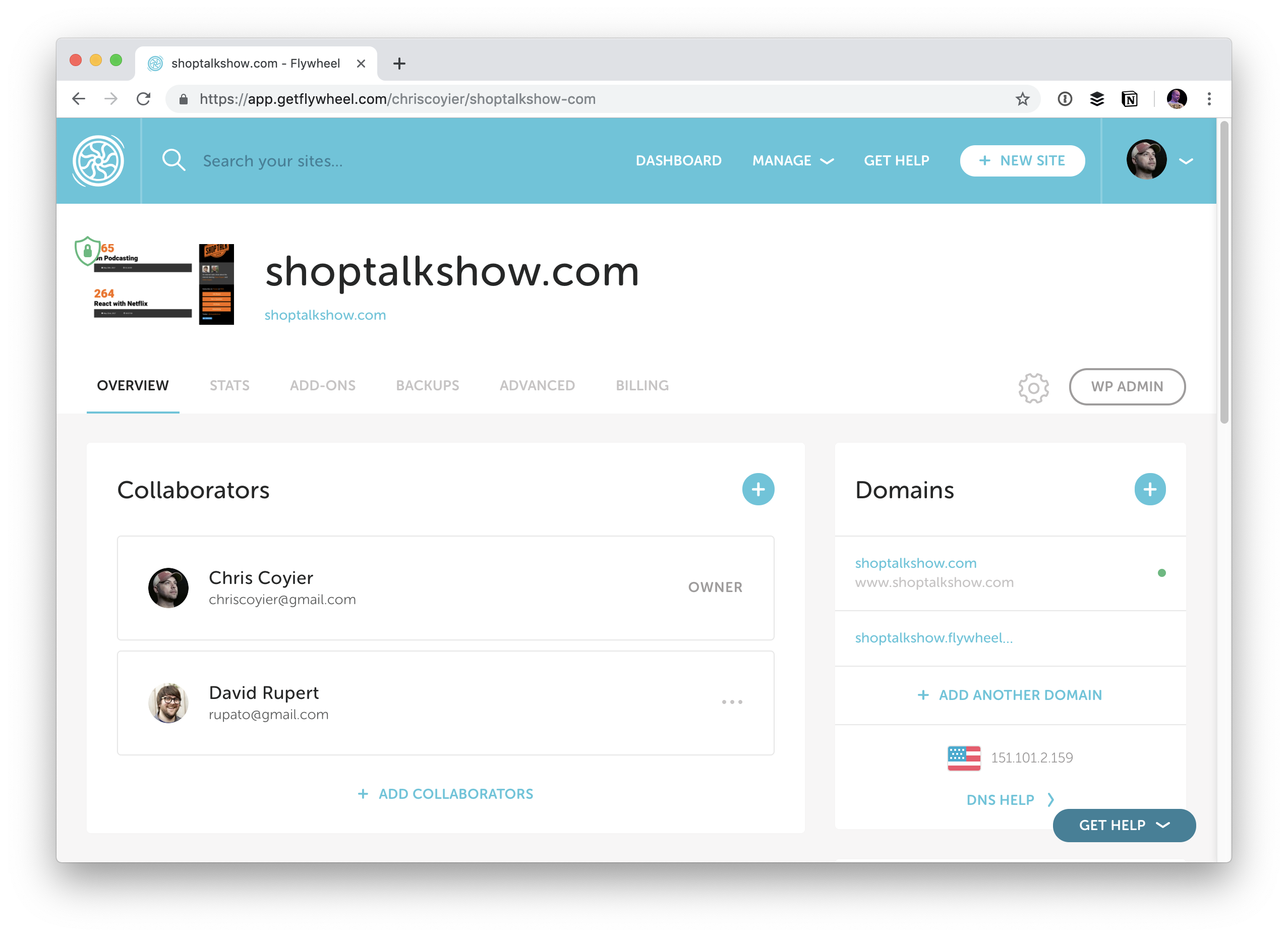


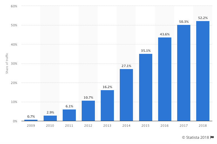
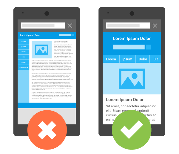
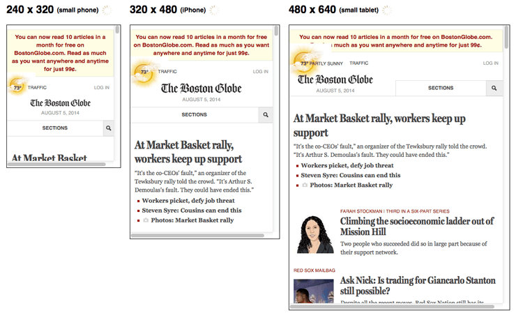
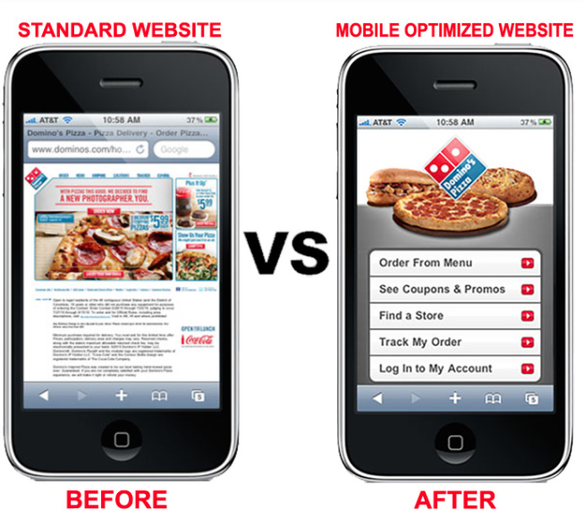
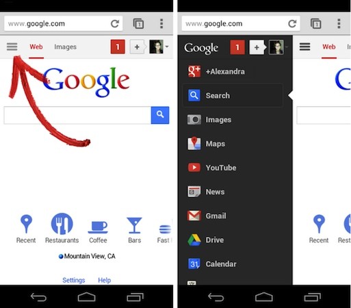
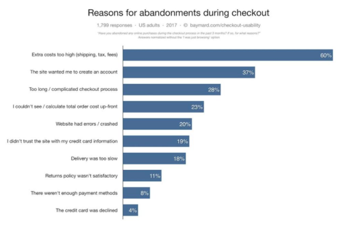
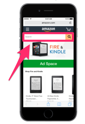

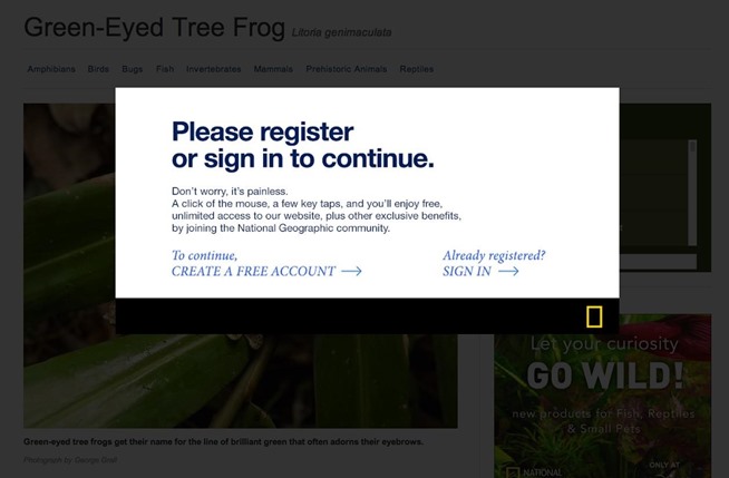
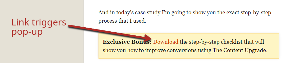
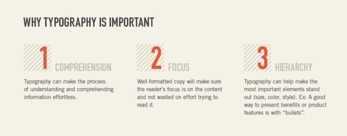
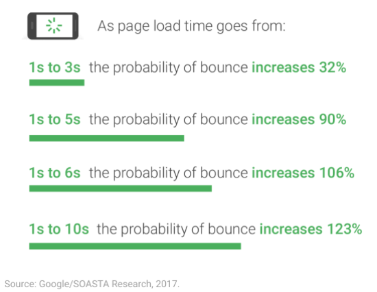
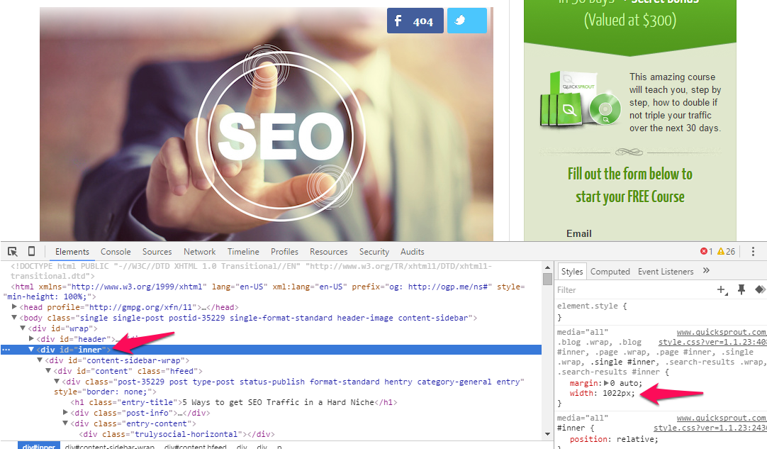
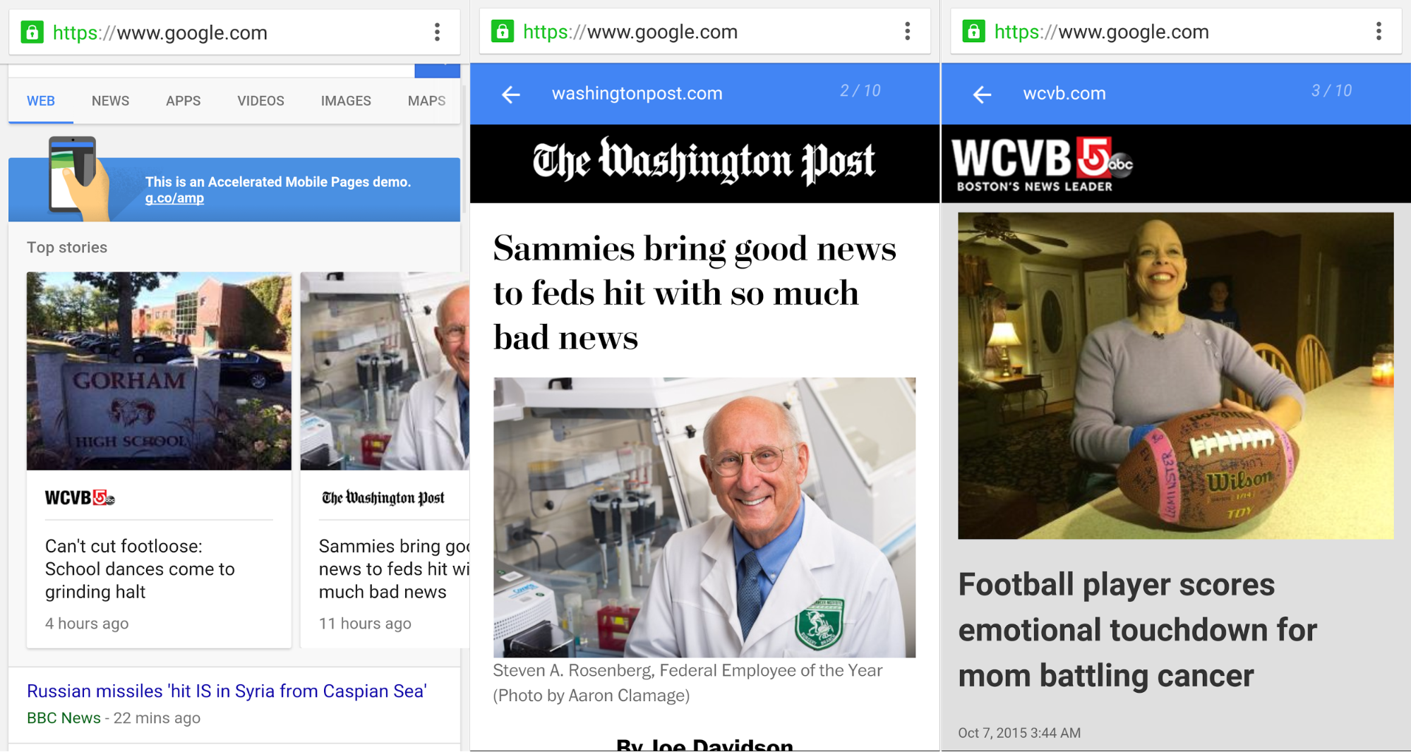


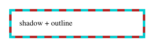

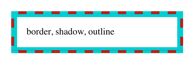
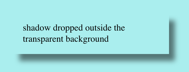

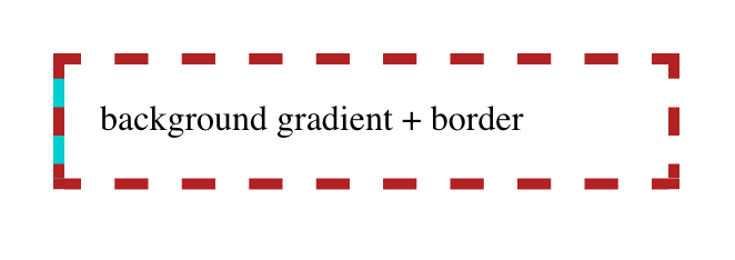
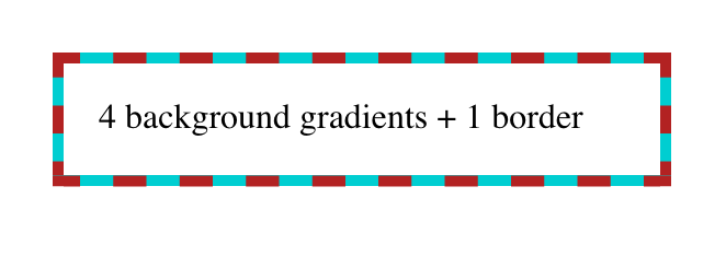
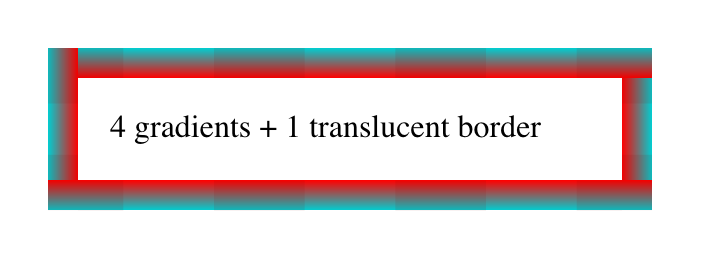
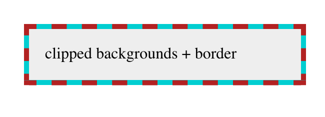
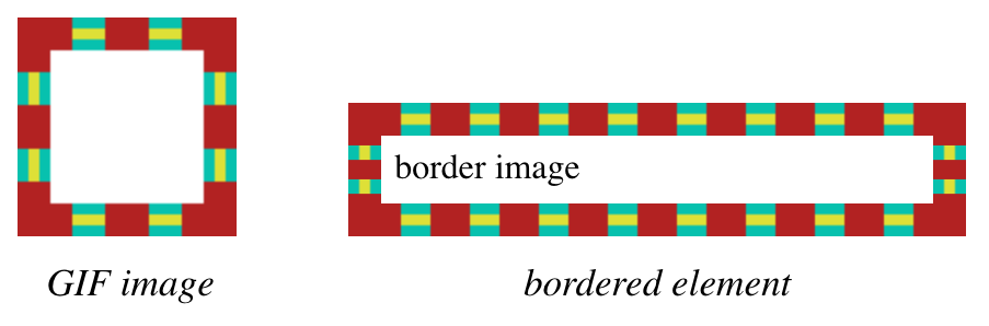
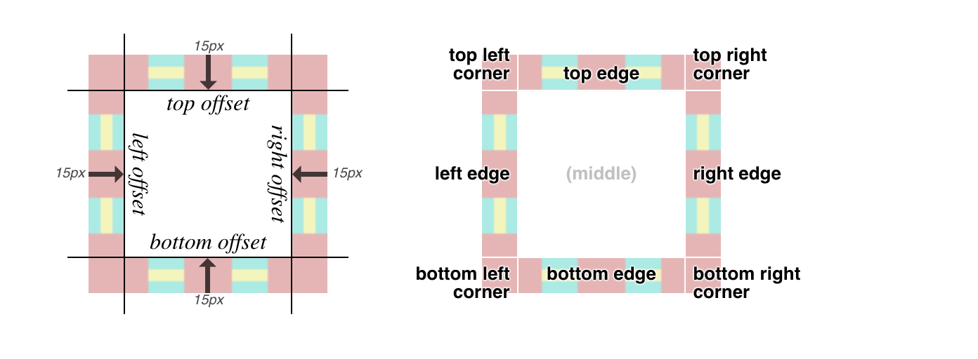


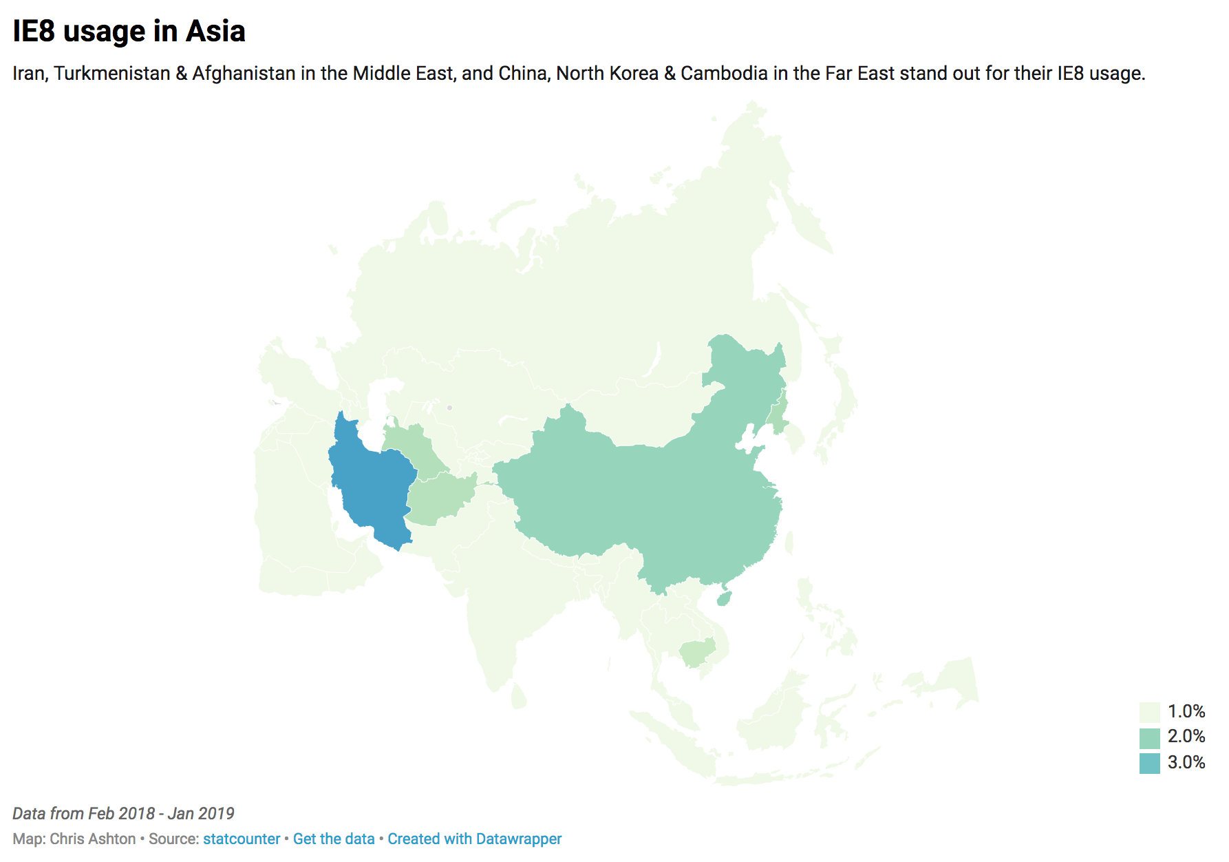
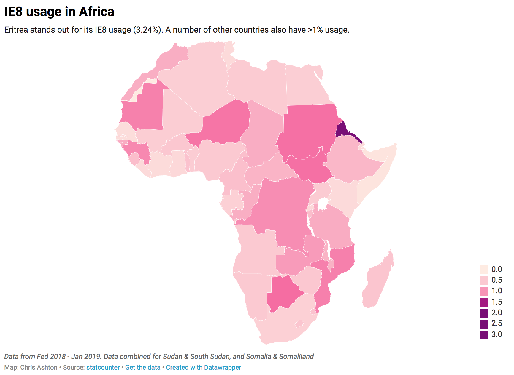
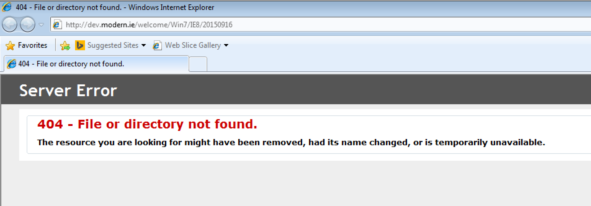


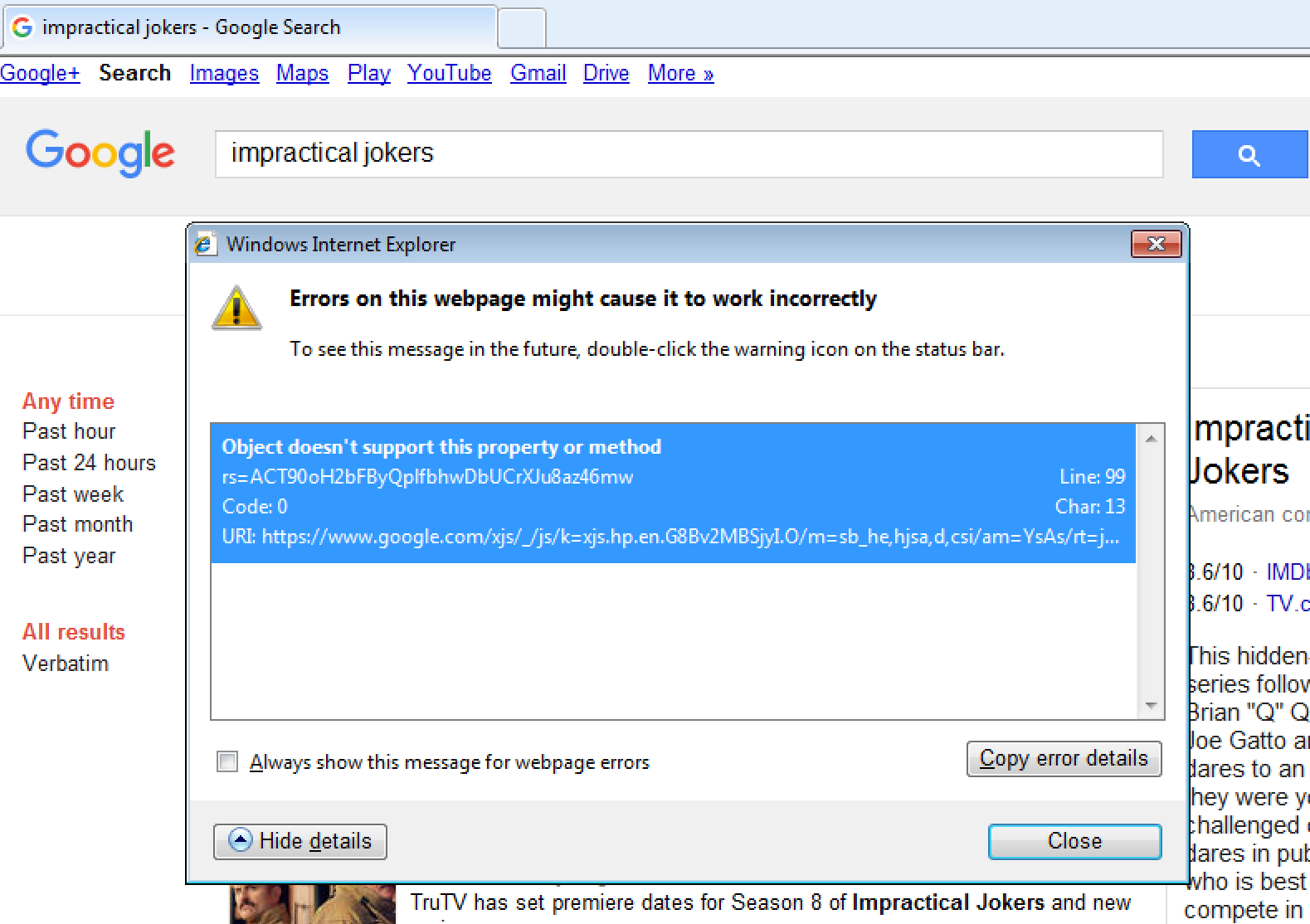


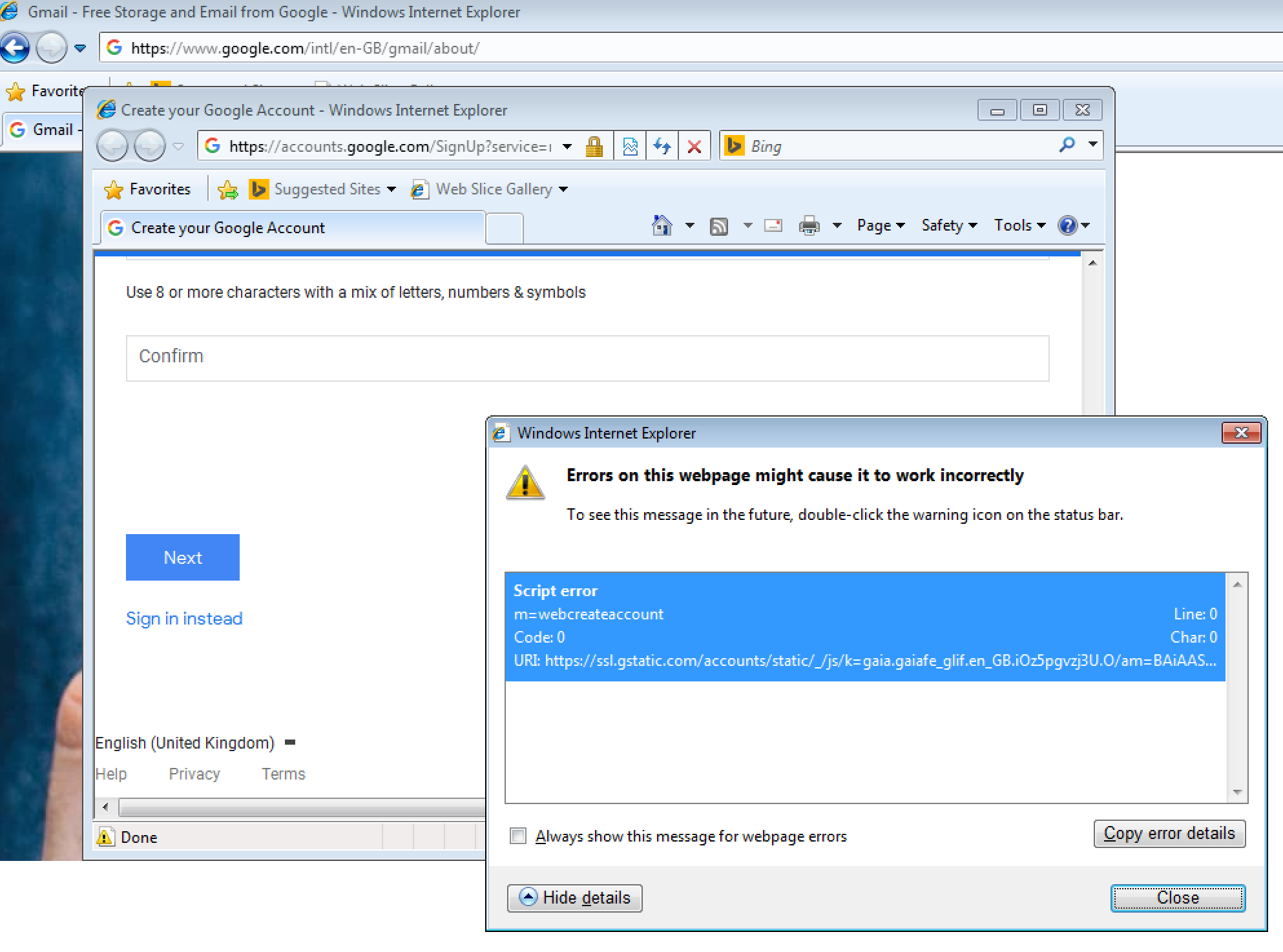
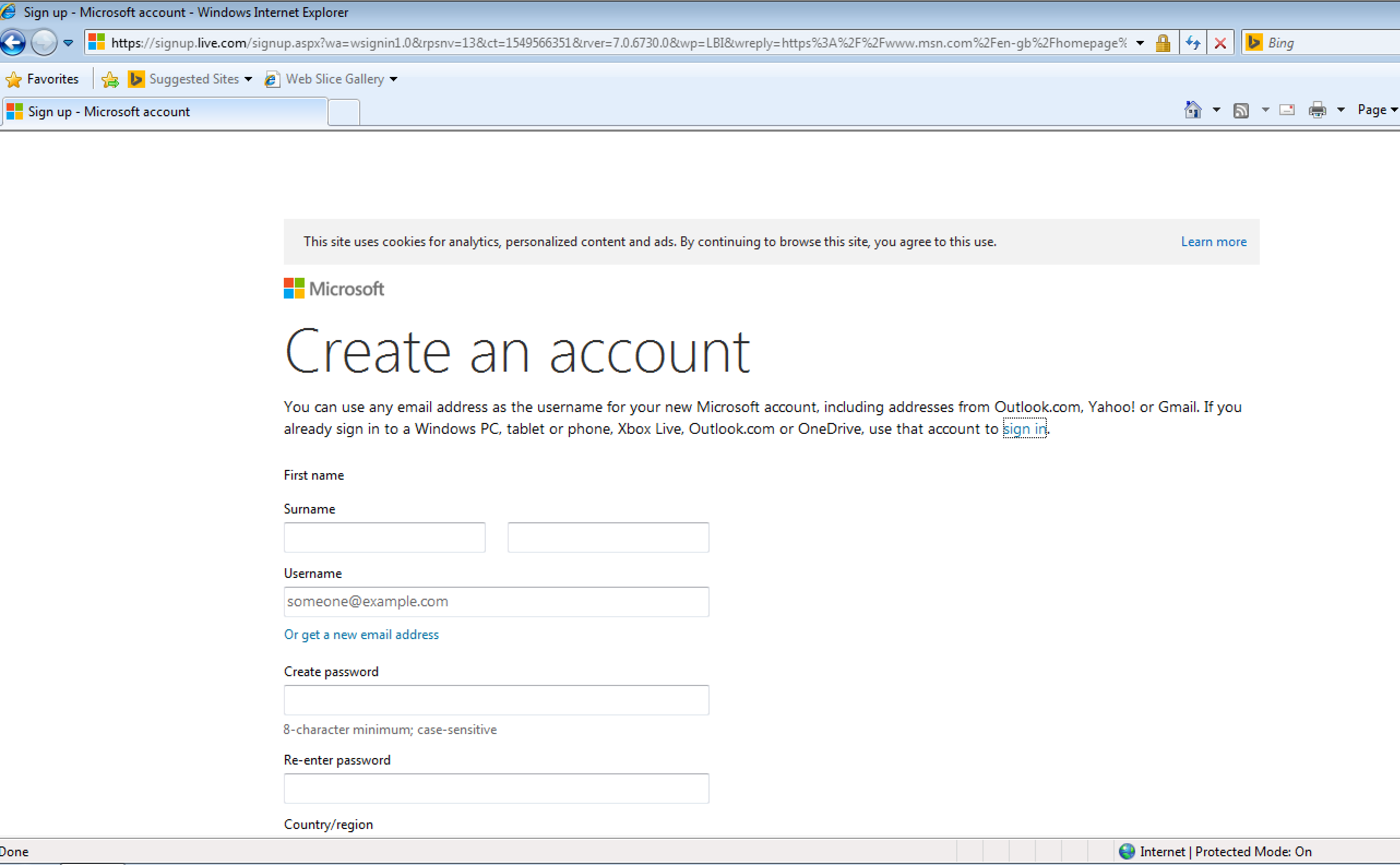


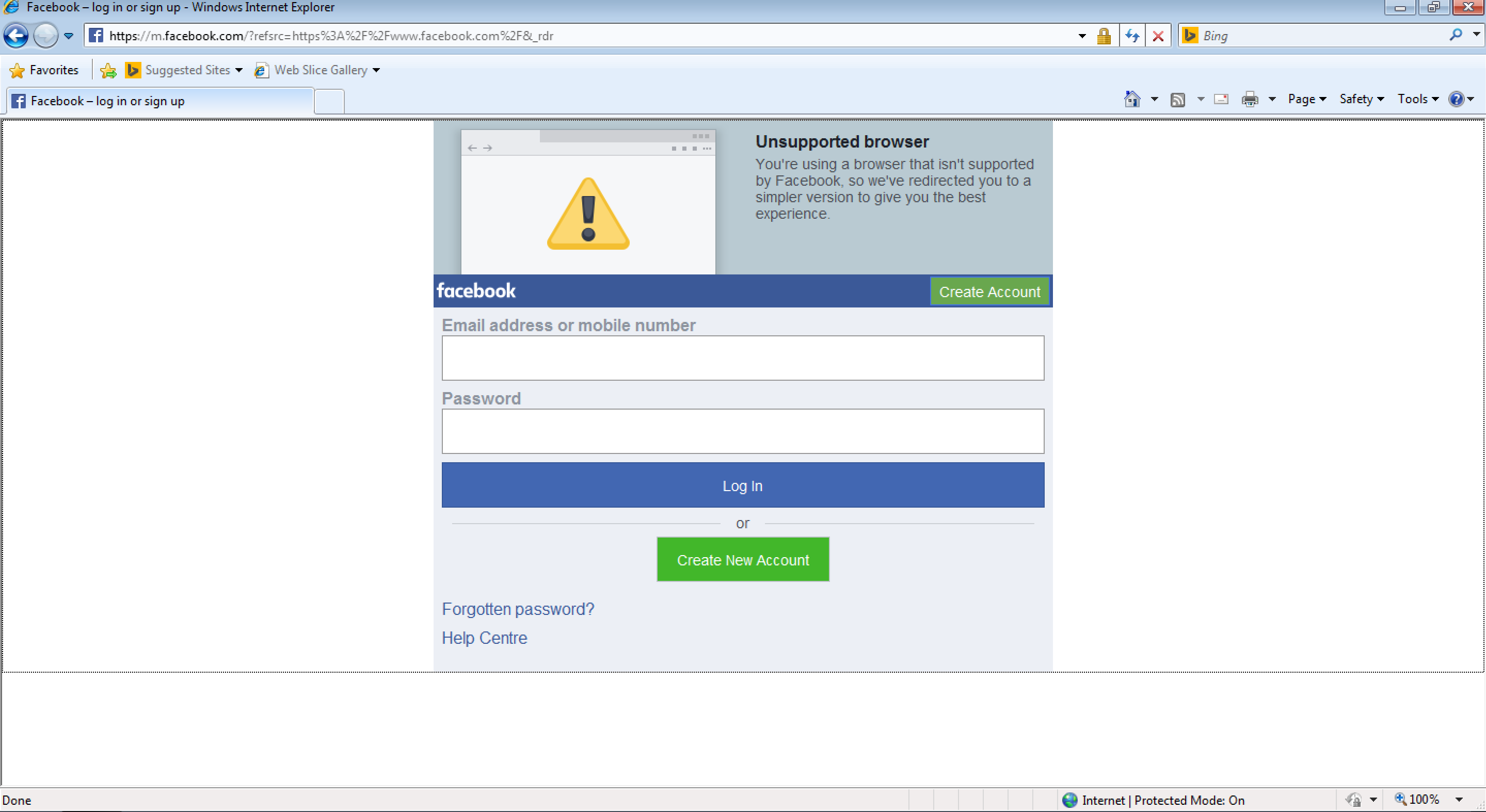


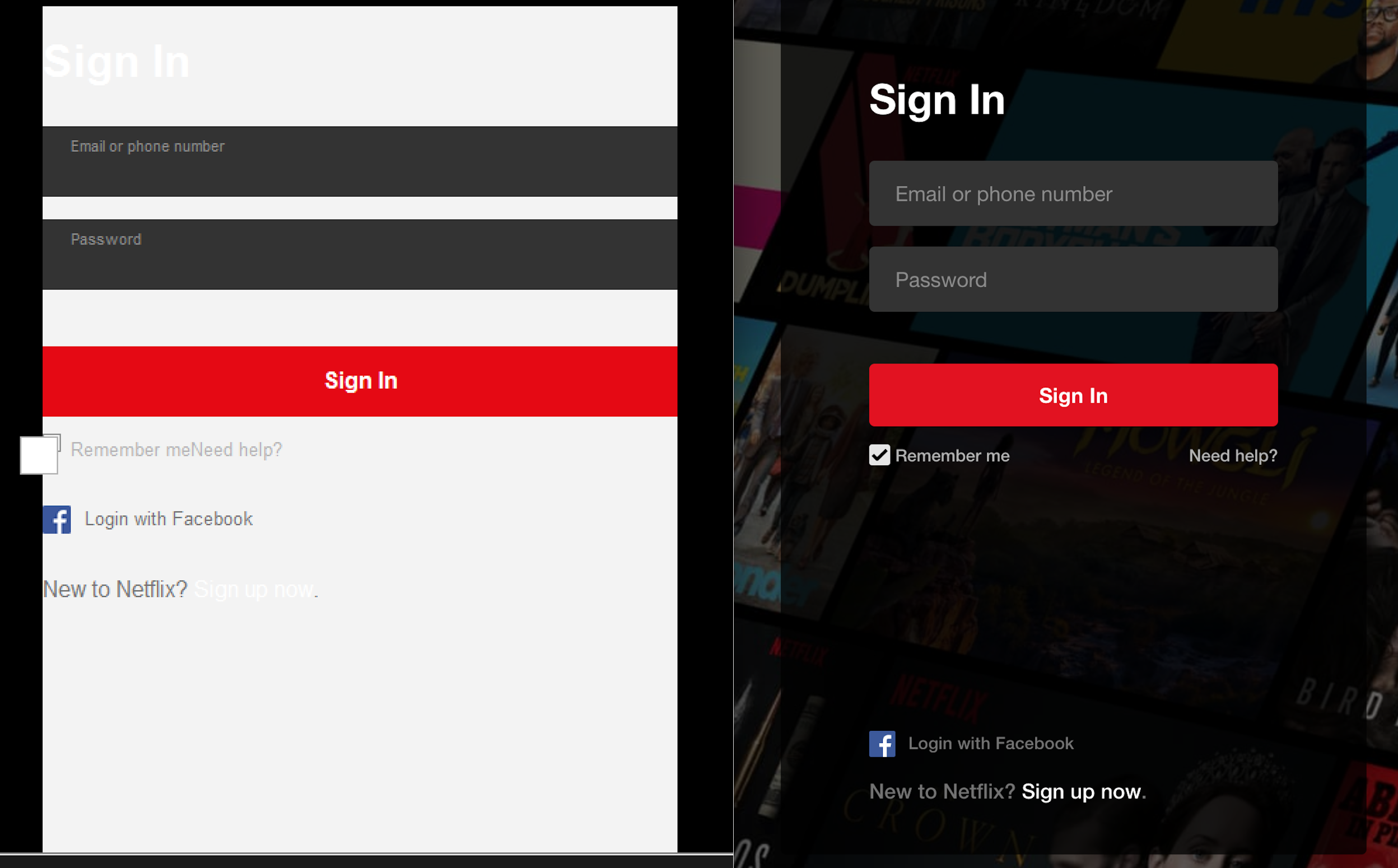


