WordPress and music go hand in hand. Or, aren’t you aware that each major version of WordPress is named after a jazz legend? At the time of writing, the latest major version of our favorite CMS is named “Jaco,” but I know you’re not here for a WordPress history lesson. You are out here looking […]
As time goes on, web design is getting more innovative. Rather than just displaying information, websites are works of art, featuring complex animations, unique layouts, and micro-interactions. So many of these things are possible through CSS.
CSS gives style to normal, boring webpages, and enables everything that makes websites enjoyable to interact with. 2019 brings with it plenty of new horizons for web design, and these are the 7 CSS trends that will define the year.
The prevailing standard for grid-based layouts has been Flexbox. In fact, at its height at the end of 2018, nearly 83% of page loads on Chrome used Flexbox. But a new contender has entered the ring.
That new contender is Grid. Still young and only seeing use on about 2.25% of page loads, it has still skyrocketed in popularity, only representing 0.25% of page loads at the start of 2018.
Grid is being hailed as better than Flexbox. Flexbox gives you control of vertical or horizontal alignment, but not both at once. Grid, on the other hand, does.
CSS experts attribute the lack of popularity to the fact that most major websites are not using it. After all, that data above is based on page views, not the raw number of pages that use Grid. It was only fairly recently that major sites adopted Flexbox, so it makes sense that they don’t want to make the switch just yet.
2019 will definitely see the growth of Grid, however, because it unlocks a degree of creative freedom that other options do not offer.
CSS Writing Mode
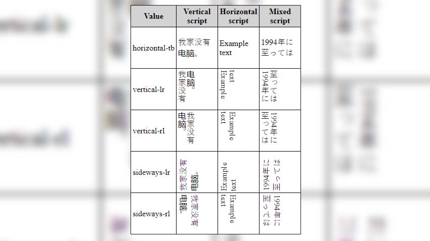
Not all languages are written and read from left to right. For languages that go in other directions, you can use the writing-mode CSS property.
Flow text from top to bottom or from right to left and adjust the horizontal and vertical values. You can even display text sideways vertically, rotate the text for certain designs, and mix scripts.
Animations as a tool for engagement are increasingly popular. Websites will start to use more and more animated loading icons, page loads with limited design, etc. to keep the user’s attention.
An example of this from a popular website is YouTube. Open the YouTube mobile app and scroll through the videos. If you stop for a second, the video will autoplay with the sound off and show captions.
Animations are also used as indicators for an action or a task. Animated buttons and lists are becoming common too. Read all about using CSS animations here.
Popular Frameworks (Bulma, Tailwind, Bootstrap 4, etc.)
CSS frameworks have been around for a while, but they’ve only been growing in popularity in recent years. If you need a primer on what a framework is, read this.
“A framework is a standardized set of concepts, practices and criteria for dealing with a common type of problem, which can be used as a reference to help us approach and resolve new problems of a similar nature.”
As we move to a more mobile web, frameworks are adjusting to compensate. Styling and design are changing, animations and action are becoming more common, and a focus on simplicity and end user experience are more important than ever!
In 2019, many well designed frameworks are taking the lead and helping developers and designers to ship faster than ever. A few of the most notable frameworks being used around the web in 2019 are:
Foundation – Responsive, mobile-first framework and used as enterprise solution;
Bootstrap 4 – Bootstrap is one of the biggest CSS frameworks used worldwide, version 4 comes with new features for color schemes and utility classes;
Materialize – Popular framework focused on material design styles;
With websites becoming almost as synonymous as having your own profile on social networks, more users are turning to simpler solutions and single page options to send traffic out to other locations.
Common examples include:
Linktree – Simple page with links to your socials, products, etc.;
Carrd – Simple, free, fully responsive one-page sites for pretty much anything;
About.me – More professional focused portfolio site, similar to LinkedIn but with room for creativity;
Instapage – Top landing page builder for businesses and startups;
These single page websites are being taken further with the creative use of CSS and styling to enhance the experience. The Next Web highlighted ‘large and experimental navigations’ as one of their ‘10 exciting web design trends you can’t hide from in 2019’. So why are people moving to these interesting layouts?
Because of action. With the focused large buttons and navigation, users immediately click to the desired location. Whether that be a shop, informational page with hours/details, or just a new video/song.
More and more websites are simply set up as directing points for companies, individuals, or groups to send traffic to and then distribute out. Musicians use Linktree and other services to share their new songs on all streaming platforms, and get a cut of the affiliate revenue in the meantime.
Variable Fonts
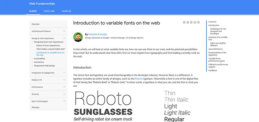
Highlighted by Carrie Cousins for Designmodo’s ‘Top 17 Web Design and UI Trends for 2019’, variable fonts are defined as “a collection of master styles, with one central ‘default’ master (usually the Regular font style) and multiple registered “axes” which tie the central master to the other masters. For example, the Weight axis might connect a Light style master to the default style and through to the Bold style master. The individual styles that can be located along this axis are called “instances”.
What this means is that fonts are more responsive and seamless across devices and platforms. You can scale the width, sizing, and other aspects of the font more easily without jumping from font weight to font weight or switching fonts entirely.
Check out an example of the variable typeface ‘Amstelvar’ on GitHub. Also read the full analysis on variable fonts and how they will change the web from Google.
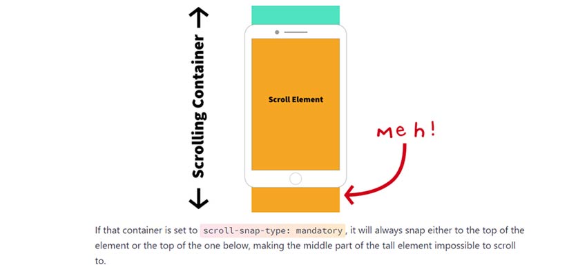
Scroll Snapping
Last, but not least, scroll snapping is a relatively new technique used for snapping users to certain scroll points. Rather than a fluid motion down the page or left to right, you can have the page scroll in increments. Popular uses of this are for swiping through products or details on a page, scrolling through a book/reading experience, and sliding down a page with incremental blocks of information.
December 6th, 2018 was a special date for WordPress: it marked the release of version 5.0 of the software that, to this day, powers more than one-third of the web. In the past, people working on the platform pointed out that there has never been any special meaning to version numbers used in WordPress releases; as such, WordPress 5.0 was simply the follower to WordPress 4.9. Yet, 5.0 brought possibly the biggest innovation since Custom Post Types were introduced in version 3.0 – that's almost a decade, folks.
The Block Editor — codename "Gutenberg" — is now the new default writing tool in WordPress. Before its adoption in Core, our beloved CMS has relied on what we now call the Classic Editor. And, by the way, the Classic Editor isn't really gone: you can bring it back by installing a plugin that restores the default editing experience you've known all these years.
So, why was the Classic Editor replaced? Essentially because it embodied an old concept of writing, a concept that was conceived when the only need of a text editor was to visually compose HTML code.
Not to create layouts. Not to embed dynamic content form heterogeneous sources. Not to offer a representation of what your post or page would look like when you pressed that "Publish" button, and go live with your piece of content.
In short, the Classic Editor delivered a very basic writing experience and, frankly, it always fell short at creating anything more than flowing text.
The Block Editor is based on the idea of content "blocks" in the sense that everything we can add to a page — a text paragraph, an image, an embed — is technically a block, that is, an atomic entity that's defined by a certain series of properties. The combination of these properties determines the state of that particular block. Combine several blocks one after the other, and you'll get the content of your page.
In this transition from unorganized text to rigorous content structure lies the biggest change introduced by the Block Editor.
Layouts pre-Block Editor
Before all of this bursted into existence, people who wanted to create a layout within WordPress had to choose between either of these options:
Create a custom template from scratch, getting their hands dirty with code – a noble intent, yet not so appealing to the masses.
Use a tool, better if a visual one, that helped them composing a page structure without having much code knowledge.
That's how page builders were born: page builders are plugins that provide a visual way to compose a layout, ideally without touching a single line of code, and they were created out of necessity to fill a gap between visual mockups and the actual, finished website.
Page builders have always suffered from a bad reputation, for a variety of reasons:
They tend to be slow and bulky.
Some offer poor editing experiences.
They end up locking users into a framework or ecosystem that's tough to replace.
The first point is as obvious as it is unavoidable: if you're a page builder author (and, hopefully, aspire to sell copies of your product), you have to make it as appealing as possible; physiologically, builders started to slowly become big code soups with everything in them, at the detriment of performance.
The second point may be subjective, at least to to some extent. The third point, however, is a fact. Sure, one could be perfectly fine using the same tool for every project, perfecting knowledge of the instrument as time goes by, but the more you stick to it, the harder it gets to potentially stop using it one day.
The Block Editor aims to surpass this deadlock: from the user's point of view, it aims at offering a better, richer writing experience, while, from the developer's perspective, providing a unified, shared API from which to build upon.
A brief history of CSS layouts
If you're old enough, you'll probably know the story already. If not, it might be fun for you to hear what life was like for a front-end developer back in the day.
The first version of the CSS specification dates back to 1996, and it allowed an embedded stylesheet to add font styling, pick colors for elements, change the alignments and spacing of objects in the page. The problem was that, in those days, the concept of semantic HTML wasn't exactly widespread. In other words, there was no clear separation between content and form. The markup we'd write and the appearance we want were completely intertwined in the same document.
This led to HTML elements to be used more for presentation purposes, than conveying meaning to their presence in the page. For example, on the layout side of things, this also led to to table elements being used to create layouts instead of actual tabular data. To achieve even more complex layouts, tables began being nested into other tables, making the page become a nightmare from the semantic point of view, its size grow and grow, and resulting very hard to maintain over time. If you've ever coded an HTML email, then you have a good idea of what life was like. And, really, this still sort of happens in websites today, even if it's for smaller elements rather than complete page layouts.
Then the Web Standards movement came along with the goal to raise awareness among developers that we could be doing things differently and better; that style and content should be separated, that we need to use HTML elements for their meaning, and reinforcing the concept that a lighter page (in terms of code weight) is a fundamentally better option than an unmanageable ocean of nested tables.
We then began (over)using div elements, and juxtaposed them using the float property. The presentation focus was shifted from the markup to the stylesheet. Floats became the most reliable layout tool available for years, yet they can be a bit problematic to handle, since they have to be cleared in order for the page to return to its standard flow. Also, in this age, page markups were still too redundant, even though using divs instead of tables helped make our content more accessible.
The turnaround moment came in 2012, with the publication of the Flexbox specification. Flexbox allowed developers to solve a whole series of long standing little layout problems, complete with an elegant syntax that requires a lot less markup to be implemented. Suddenly (well, not that suddenly, we still have to care about browser support, right?), reliably centering things on both axises wasn't an issue anymore. It was refreshing. Finally, tweaking a layout could be reduced to altering just one property in our stylesheet.
As important as Flexbox is to this day, it is not the end of the story.
It's 2019! Let's use CSS Grid.
If you've come this far reading this piece, we think it's safe to assume that two things are for sure:
That we clearly aren't in this industry to live peaceful, quiet professional lives.
The things we use are going to change.
In 2017, the CSS Grid Layout Module specification was officially published, but, as it always happens with CSS specs, its draft and interim implementations had already been around for some time.
CSS Grid is a bold leap into what CSS can and should do. What if we stopped micromanaging our pages styles, and started thinking more holistically? What if we had a system to reliably position elements on the screen that doesn't depend at all on the markup being used, nor the order of elements, and that is, at the same time, programmatically applicable on smaller screens?
No, this isn't just a thought. This is more of a dream; one of those good ones you don't want to wake up from. Except that, in 2019, this has become a reality.
The main difference between Grid and Flexbox is more nuanced, of course, but basically comes down to Grid operating in two dimensions, while Flexbox is limited to one. Knowing what elements are going to be placed within the limits of a container, we can choose exactly where those elements are going to end up, entirely from directives written in the stylesheet.
Do we want to tweak the layout down the road? Fine, that modification won't affect the markup.
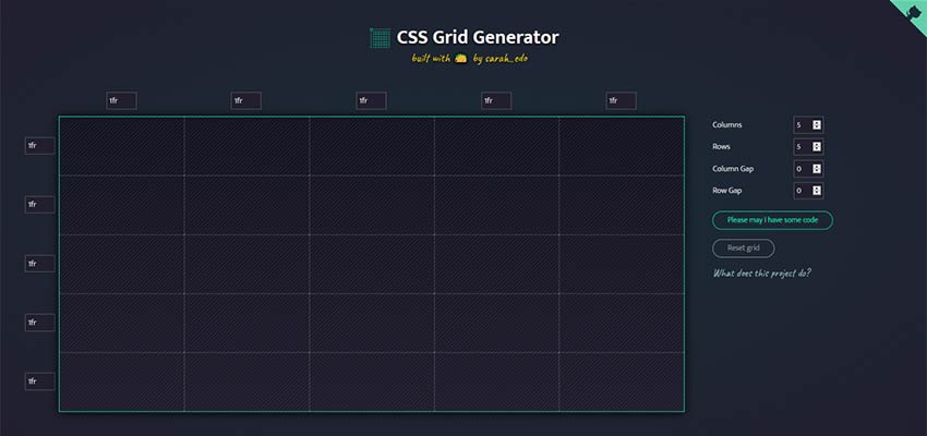
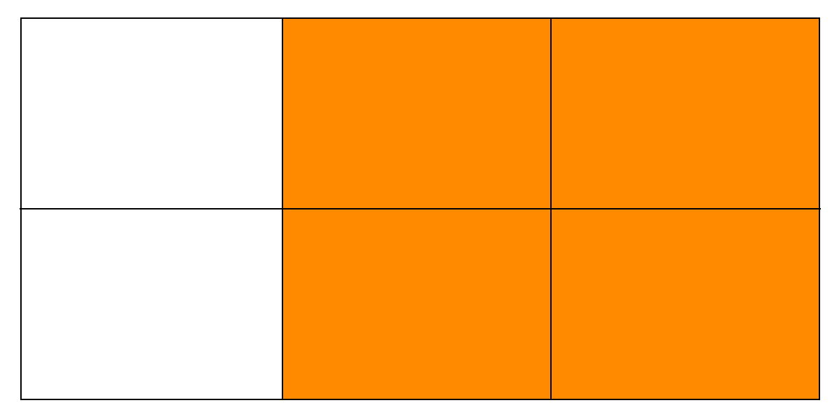
The basic idea behind Grid is that elements are laid out in, well, a grid. By definition, a grid is composed by a certain amount of columns and rows, and the boundaries between columns and rows form a series of cells that can be filled with content.
The savings of this approach in terms of quantity of code being used to achieve the desired result are extraordinary: we just need to identify a container element, apply the display: grid rule to it, and then pick elements within that container and tell CSS what column/row they begin/end in.
The above example creates a 3x2 grid associated to the .my-container element; .element-1 is a 2x2 block that is inscribed in the grid, with its upper left vortex being positioned in the second column of the first row of the grid.
Sounds pretty neat, right?
The even neater thing about CSS Grid is the fact that you can create template areas, give those areas meaningful names (e.g. "header" or "main"), and then use those identifiers to programmatically position elements in those areas.
For those who have begun working in this business in the tables era, the code above is nothing short of science fiction.
More good news, anyway: support for CSS Grid is pretty great, today.
Using CSS Grid in WordPress
So, this is great, and knowing that we can do so many more things today than we could compared to a few years ago probably makes you want to give Grid a try, at last.
If you are working on a WordPress project, you're back facing the two options mentioned above: do we start from scratch and manually coding a template, or is there something that can give us a little help? Luckily, there is a plugin that might interest you, one that we have created with a dual goal in mind:
Create a bridge between the Block Editor and CSS Grid.
Create a plugin that could perhaps make people move past the initial skepticism of adopting the Block Editor.
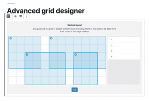
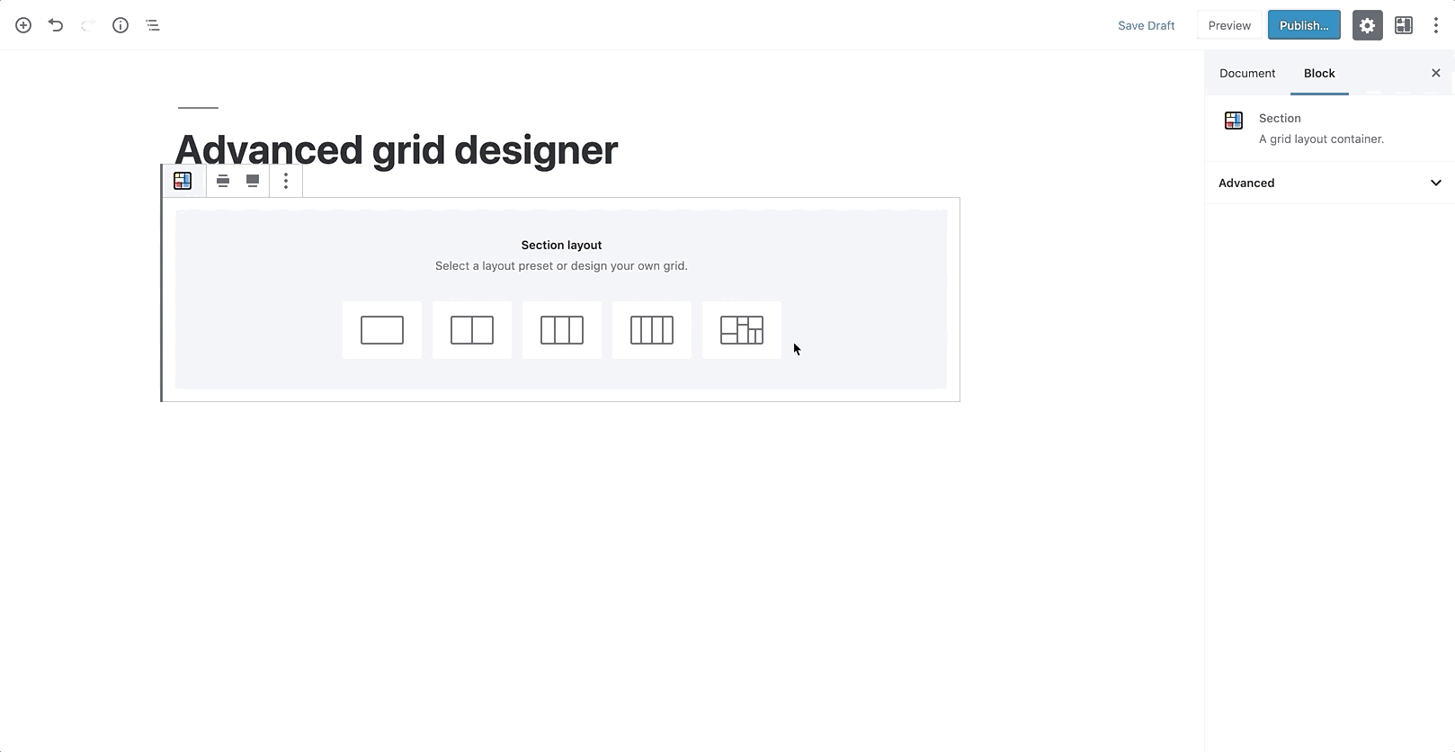
It's called Grids, and it's a free download on the WordPress plugins repository.
Grids only takes care of the layout structure. It puts a 12x6 grid at your disposal (called Section), over which you can drag and draw the elements (Areas) that are going to be contained in that Section.
The system allows you to manually specify dimensions, backgrounds, responsive behavior, all using visual controls in the Block Editor, but by design, it doesn't provide any content block. Sure, one could see this approach as a weak point, but we think it's actually Grids' biggest strength because it enables the plugin to integrate with the myriad content blocks that other developers all around the world are creating. More so, in a way Grids helps bringing those blocks, and WordPress as a platform, in touch with CSS Grid itself.
Yet, even if the plugin doesn't strictly produce content, it's inevitable to put it in the same phrase with successful page builders, in fact comparing its functionality to that offered by those. If you care about concepts like separation of form and content, page weight, ease of maintenance, Grids offers a cleaner solution to the problem of creating visually appealing layouts in WordPress.
The generated markup is minimal. In its most basic form, a Section (that is, the element with the display: grid property) is only composed by its own element — of course, an internal wrapper (that couldn't be avoided and that's used for spacing purposes), and then one element per Area belonging to the Section. This is a huge step forward in terms of avoiding using unnecessary markup.
This choice also directly determines what happens in the eventuality that you disable Grids in your install.
If you don’t re-save your page again, what’s left of Grids on the front end is actually exclusively the content you put inside the content Areas. Not any extra markup elements, not any weird-looking shortcode.
On the back-end side of things, the Block Editor has a system in place that warns you if you're editing a page that is supposed to use a particular block type, but that block type isn’t currently available: in that case, you could easily turn Grids back on temporarily, move your content in another place, and then get rid of the Section altogether.
CSS generated to create the grid is also dynamically added to the page, as an inline style in the <head> portion of the document. We haven't been exactly fans of styles written in the page directly, because ideally we'd like to delegate all of the styling to files that we could put under version control, yet this is a case where we found that approach to be very convenient.
Another viable option would have been to identify all the possible combinations of column/row starting/ending points, and programmatically map those with classes that could then be used to actually position elements within the grid. On a 12x6 grid, that would have lead to having a grand total of 36 class selectors, looking like this:
What if we decide to offer more control over how a grid is composed and, say, give users access to options that determine how many columns or rows form the grid structure?
We'd have to manually map the classes that we don't yet have in the stylesheet (and release an update to the plugin just for that), or, again, generate them inline, and then add those classes to the grid elements.
While perfectly fine, this approach kind of goes against the idea of having a leaner, more scannable markup, so we've decided not to follow this route, and pay the price of having style dynamically put in the head of the document, knowing that it could be easily cached.
Because of the experimental nature of the plugin, the backend UI that's being used to actually compose the grid is created with CSS Grid, and a set of CSS variables through which we control the properties of content Areas. Using variables has immensely sped up our work behind the grid creator prototype — had we chosen a different path there, things wouldn't just be much longer in terms of development times, but also more complex and less clear to maintain down the road.
Feedback wanted!
To further foster the adoption of CSS Grid, we need tools that automate the process of creating layouts with it.
While we have been seeing great examples of this technology out in the wild, it would be short-sighted to assume that every website that is published today has a team of front-end devs behind it, that can take care of the issue.
We need tools that produce good markup, that don't hinder the maintenance of the website stylesheets, and, most importantly in the WordPress world, that can be easily integrated with the existing themes that people love to use.
We think Grids is a step forward in that direction, as it's a tool that is built upon two standards — the Block Editor API, and CSS Grid — and, as such, suffers less risk of reinventing the proverbial wheel.
While we've been recording general interest in the plugin at the recent WordCamp Europe in Berlin – with Matt Mullenweg himself displaying a brief demo of the plugin during his keynote — we know that it still needs a lot of feedback that can only be obtained with real-life scenarios. So, if you want to take Grids for a spin, please use it, test it and, why not, suggest new features.
Some say that the key to success lies in meticulous attention to detail. Whether we deal with simple tasks or tricky ones, whether we are building something brand-new and grandiose or just creating a regular blog update. We need to …
The point of the <portal> element (behind a flag in Chrome Canary) is that you can preload another whole page (like <iframe>), but then have APIs to animate it to the current page. So "Single Page App"-like functionality (SPA), but natively. I think that's pretty cool. I'm a fan of JavaScript frameworks in general, when they are providing value by helping do things that are otherwise difficult, like fancy state management, efficient re-rendering, and component composition. But if the framework is being reached for just for SPA qualities, that's unfortunate. The web platform is at its best when it seems what people are doing are in step with native, standardized solutions.
But it's not the web platform at its best when things are done inaccessibly. Steve Faulkner wrote "Short note on the portal element" where he points out seven issues with the portal element as it exists now. Here's a demo of it with some of those issues addressed. I guess it's somewhat of an implementation issue if a lot can be fixed from the outside, but I imagine much of it cannot (e.g. back button behavior, whether the loaded pages becomes part of the accessibility tree, etc.).
Simplify The Handoff From Sketch To Visual Studio Code With Indigo.Design
Simplify The Handoff From Sketch To Visual Studio Code With Indigo.Design
Suzanne Scacca
(This is a sponsored article.) If you think about it, software teams are a lot like sports teams. While each team member works towards the same exact goal, the role they play and the actions they take are vastly different from one another.
Which is why it’s crucial to have a seamless way of moving the ball from one team member to another.
Unfortunately, the handoff that takes place within software teams isn’t naturally as smooth as what you see on the sports field. And one of the primary reasons for this is the different systems and approaches used to build products.
Designers create pixel-perfect UIs in Sketch, only to have to translate them into a language that developers can use when they build apps in the Visual Studio Code IDE. Without a seamless way to move product designs through the pipeline, these inefficiencies lead to expensive reworks and debugging after an app has been shuttled from designer to developer.
Needless to say, a solution to the Sketch-to-IDE handoff problem has been a long time coming. It’s not that software teams don’t know how to collaborate or communicate well with one another. It’s just that their disparate systems and strategies make the transition from one team to another clunky, time-consuming and error-ridden.
Today, we’re going to look at why this happens and how your agency can fix the problem with two plugins and a prototyping cloud platform from Indigo.Design.
Where Does the Designer-Developer Handoff Go Wrong?
First, what we should really ask is:
Why is the designer-developer handoff such a problem?
Nick Babich recently wrote about how designers go to great lengths to create digital solutions that are perfectly measured and consistently crafted. But design systems don’t fluently translate to development systems.
The more the designer does to an interface, the more they have to actually communicate to a developer. So, it’s not enough to hand over a Sketch design file and leave the developer to run with it. Designers have to provide design specs that explain how all the moving pieces need to be laid out, spaced, styled, colored, engaged with and so on.
It’s been the only way to ensure that an app ends up pixel-perfect in the end. Even then, it still requires a lot of implementation on the part of the developer once they’re inside their IDE.
As you can imagine, this whole process takes a designer a lot of time to do. But without design specs, developers end up having to play a risky guessing game.
Not only that, developers aren’t typically in the habit of coding with HTML and CSS, which is tedious work and only represents the UI. There’s a lot more code behind the scenes that makes a web app work and not all developers are adept at or interested in learning to write the UI markup. When they’re forced into this position, the steep learning curve adds more time to projects and the resulting reworks and debugging sends costs spiraling out of control.
Is it the designer who has to redline everything so the developer knows how to turn the design into reality?
Or:
Is it the developer who has to look at a design, manually measure everything on the screen and hope they get all the specifications right just by eyeballing it?
No one wins in either scenario. And you’re going to eat away at your profit margins in the process.
There may be some agencies who believe that forcing designers and developers to work in the same platform is the best solution. That way, there’s no need to do all of this translation or interpretation during the handoff from Sketch to Visual Studio Code. But that often results in stifled creativity on the part of the designer or a hampered ability to build effective software solutions on the part of the developer.
So, what’s the answer?
Improve The Designer-Developer Handoff With Indigo.Design
It’s not like Indigo.Design is the first platform to try to solve handoff issues for software teams. InVision and Zeplin have both offered up their own solutions.
Each of these platforms have made visual specifications more accessible for developers while consequently improving the efficiency of designer-developer teams. Specifically:
Designers don't need to mark up the UI anymore as the platforms handle the redlines.
Developers can manually extract the design specs without the designers’ help.
That said, with platforms like InVision and Zeplin, developers still have to inspect each element and manually code it based on the extracted specs. These platforms also have yet to create a seamless bridge between Sketch and Visual Studio Code.
So, if designers and developers want to work as efficiently as possible with one another, Indigo.Design has developed an answer to their problem:
Step 1: Design in Sketch
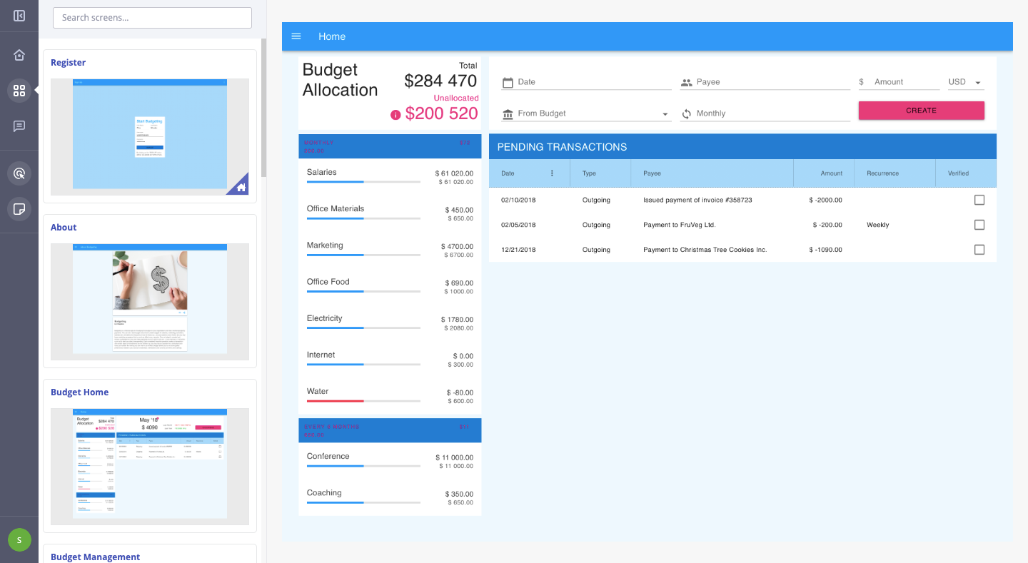
There’s really only one thing about this phase that has to change for the designer. The app, pages and flow will still be designed as usual within Sketch, using components from the Indigo.Design UI Kit.
An example of what your app might look like in Sketch. (Source: Sketch) (Large preview)
However, there’s no longer any need to compile redlines or specs for the app anymore. Indigo.Design takes care of it for you.
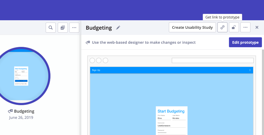
In order to leverage this, your designer has to ditch whatever prototyping system they were using before. With this new streamlined and error-free system, your designer can easily push their designs into the cloud using the Indigo.Design plugin.
This can be accessed under the Plugins menu > Indigo.Design > Publish Prototype:
The Indigo.Design plugin simplifies the publication of prototypes. (Source: Sketch) (Large preview)
There’s no need for the designer to export files and upload into another system for clients to review or developers to work with. They get to stay right where they are to publish the prototype.
All it takes is one link to move clients, developers and others into the Indigo.Design cloud. (Source: Indigo.Design) (Large preview)
It takes only about a minute to complete the process, too. The designer is then given a link to the cloud which they can share with clients and others to review and comment on the prototype.
Step 2: Work in the Indigo.Design Cloud
To get others into the cloud is easy. The link provided will take them into the experience cloud where the design can be reviewed:
The developer can also edit or copy the cleanly written and outputted CSS from this panel, too. (Though they shouldn’t have to, as I’ll explain in the next step.)
See what I mean about saving designers time in generating specs? By simply pushing this design into the Indigo.Design cloud, the specs are automatically generated.
Step 3: Build in Visual Studio Code
Now, let’s say your design is good enough to go into development. The moving of an Indigo.Design prototype to Visual Studio Code is just as easy as the move from Sketch was.
Retrieve the original cloud link provided by the Indigo.Design plugin in Sketch. If you don’t have it anymore, that’s fine. You can retrieve it from the libraries screen in Indigo.Design:
All the developer has to do now is install the Indigo.Design Code Generator extension. This is what enables Visual Studio Code to talk directly to Indigo.Design to retrieve the prototype.
Once the extension is set up, the developer will do the following:
The developer has the option to generate code for all components of the app or to go component-by-component, checking only the ones they need. This is especially helpful if an app is in progress and the developer only needs to import new components into VSC.
By clicking “Generate Code Assets”, the selected components will be added into Angular as readable and semantic HTML and CSS.
The developer now has less to worry about in terms of rebuilding styles or configuring other specs. Instead, they can spend their time building business functionality and really refining the product.
A Note About This Process
It’s important to point out that this Sketch – cloud – Visual Studio Code workflow doesn’t just work with the first iteration of a design. Developers can build while designers work through feedback with clients or usability studies with users — something Indigo.Design has accounted for.
So, let’s say the designer moved a login form UI through Indigo.Design and the developer generated the code to get things moving.
While working on the form, the developer implemented some authentication code in the TypeScript file.
In the meantime, though, the designer received a message from the client, letting them know that a new Universal Login with Google needed to be implemented. Which means the UX has to change.
When the update is ready and the prototype sync’ed to Indigo.Design, the designer messages the developer to let them know about the changes. So, the developer launches the Visual Studio Code Generator once more. However, when regenerating the login screen, they select "Do Not Override" on the TypeScript file. This way, they can preserve the code they wrote while simultaneously importing the new HTML and CSS.
The developer can then make any necessary adjustments based on the updated design.
Wrap-Up
Indigo.Design has effectively created an efficient and bug-free handoff for designers working in Sketch and developers working in Visual Studio Code.
Designers don’t waste time designing in one platform and prototyping in another, drawing up design specs or dealing with file exports. Developers don’t waste time trying to re-create the design intent from a static file.
As Jason Beres, the Senior VP of Product Development for Indigo.Design, said:
With Indigo.Design code generation, all of these bugs are 100% avoided. Not only is the spirit of the design maintained, but pixel-perfect HTML and CSS is created so the developer isn’t in the unfortunate position of having to manually match the design.
And by working out the technical kinks in the designer-developer workflows and handoff, your agency will greatly reduce the cost of reworks and debugging. You’ll also boost profits by providing your software team with a more efficient and quicker way to get apps through the process and in pixel-perfect condition.
How can I get internal HDD_DETLAIS = SerialNumber, Model, Manufacturer,TotalHeads ...... etc.
Please help me.. Now my problem is my code run ok, but when I insert external HDD or pen drive then showing the last counting device Details please help ....
i want to show only internal HHD device means OS loaded disk "C" drive
Thanks
Dim HDD_DETLAIS As String
      Dim HDD As New ManagementObjectSearcher("select * from Win32_DiskDrive")

      For Each HDDDET In HDD.Get
          HDD_DETLAIS = HDDDET("SerialNumber") + "   Model-" + HDDDET("Model") + "   Manufacturer-- " + HDDDET("Manufacturer") ' + "  TotalHeads  -  " + hd("TotalHeads") '+ "   Signature - " + hd("Signature")
          TextBox1.Text = HDD_DETLAIS

      Next
The newest additions to both the HTML and CSS specifications allow web developers to craft beautiful and user-friendly components. Amongst those components, progress/loading bars can contribute to making your website more enjoyable to use for your visitors. This complete front-end web development tutorial will show you how you can learn to create a fancy CSS/HTML5 […]
Do you want to create AMP-friendly forms on your WordPress site?
Accelerated Mobile Pages (AMP) help speed up websites. However, AMP removes WordPress forms to improve the performance of your site.
In this article, we will show you how to create AMP forms in WordPress using WPForms (the easy way).
Why Create an AMP Form in WordPress?
Accelerated Mobile Pages or AMP is a Google project that makes websites load faster on mobile devices.
While AMP offers a great mobile browsing experience by making your web pages load faster, it disables many useful features on your WordPress website.
One of them is contact forms. Since AMP uses a limited set of HTML and JavaScript, it can’t load your WordPress forms properly on AMP pages.
Alternatively, you could use one of the many responsive WordPress themes that offer excellent performance on desktop and mobile. This way, you don’t have to compromise on your website styling to deliver a superior experience on mobile.
However, if you are using AMP on your WordPress site, then you can use a plugin to show forms. Let’s see how to add an AMP form to your site.
Adding AMP Forms in WordPress (Step by Step)
The best way to create an AMP form is by using WPForms. It is the most beginner-friendly WordPress form plugin that helps you create AMP-ready WordPress forms.
Their team recently worked with Google to make AMP forms easy for WordPress.
Step 1: Install and Activate the WPForms Plugin
For this tutorial, we will use the WPForms Pro version because it offers more features, form templates, addons, and customization options. There is also a WPForms Lite version that you can use to get started for free.
Both the lite and pro version of WPForms allows you to create a basic AMP-ready contact form.
First, you will need to install and activate the WPForms plugin. If you need help, then please see our guide on how to install a WordPress plugin.
Step 2: Add AMP to Your WordPress Site
Before we create a form, it’s important that you have AMP set up on your WordPress site.
Once you have configured AMP, the next step is to create an AMP-compatible contact form on your WordPress site.
Step 3: Create a New AMP Form in WPForms
Simply head over to WPForms » Add New page to create a new WordPress form. WPForms is compatible with AMP by default, so you won’t need to turn on any special settings.
On the form setup screen, you can choose a form template and enter a name at the top. You can select the Blank Form if you want to start from scratch or use a prebuilt template to quickly edit it according to your needs.
For this tutorial, we will pick the ‘Simple Contact Form’ template.
Next, you will see the form builder page, where there are different options to customize your template.
From here, you can add or remove form fields. To add a new field to your form, you can simply click on a form field from the left panel and drag it onto the form template.
Note: The Modern Style Dropdown and Number Slider fields are not compatible with Google AMP. Instead, you will need to use the Number and Classic Style Dropdown fields.
After that, you can configure the field options. Simply click on a field, and then Field Options will appear on the left.
For instance, you can edit the label and format of a field, make it a required field, set up conditional logic, and more. Similarly, you can customize all the other fields.
After that, you can click on the ‘Settings’ tab to configure your form settings.
The ‘General’ settings allow you to change your form name, submit button text, submit button processing text, and more.
Next, you can click on the ‘Notifications’ tab to set up email notifications to notify you when a user completes the form.
Next, you can click on the ‘Confirmation’ tab to set up a confirmation message to be shown when a user submits the form.
WPForms lets you show a message, show a page, or redirect users to a URL on form submission.
After the configuration is complete, you can save your form.
Step 4: Add Your AMP Form to a Page
Now that your WordPress form is ready, you can add it to a page.
In the WPForms form builder, you will see an ‘Embed’ button at the top. Simply click on it to add your form to a new page or an existing one.
Next, a popup window will open, asking you to create a new page or choose an existing page.
We will select the ‘Create New Page’ option for this tutorial.
Next, you will need to enter a name for your new form page.
Once that’s done, simply click the ‘Let’s Go’ button.
From here, you will see a preview of your AMP form in the content editor.
Alternatively, you can also use the WPForms block to add the form in the content editor. Simply select your AMP form from the dropdown menu.
Next, you can publish or update your page.
That’s all! You don’t need to configure anything else. The WPForms plugin will add full AMP support to your form now.
If you want to see how it looks, then you can open the page on your mobile phone. Or you can open the page on your desktop browser by adding /amp/ or /?amp at the end of your page URL, like this:
https://www.example.com/contact/?amp
Adding Google reCAPTCHA to Your AMP Form
By default, WPForms includes anti-spam settings to catch and block spam. Additionally, you can use Google reCAPTCHA to reduce spam submissions.
To use Google reCAPTCHA with your AMP forms, you need to register your site for Google reCAPTCHA v3 and get the Google API keys.
First, you will need to go to the Google reCAPTCHA website and click on the ‘v3 Admin Console’ button at the top right corner of the page.
After that, you need to sign in with your Google account. Once done, you will see the ‘Register a new site’ page.
Next, you need to enter your website name in the Label field. Google AMP only supports reCAPTCHA v3, so you must choose the ‘Score based (v3)’ reCAPTCHA type option.
After that, enter your domain name (without https://www.) into the Domains field.
Next, click the ‘Submit’ button.
Next, you will see a success message along with the site key and the secret key to add reCAPTCHA to your site.
Simply copy these keys.
Now, you have the Google API keys to add reCAPTCHA to your forms. However, there is one more setting required to ensure AMP compatibility with the reCATCHA.
First, you will need to click on the ‘Go to Settings’ link.
Next, you will see the reCAPTCHA settings again with the ‘Allow this key to work with AMP pages’ checkbox. Simply check the box and click on the ‘Save’ button below.
Now that you have Google API keys to add reCAPTCHA on AMP forms, you need to enter them in WPForms.
You can open the WPForms » Settings » CAPTCHA page in your WordPress dashboard.
Next, you can scroll down and choose the ‘reCAPTCHA v3’ option.
After that, simply paste the site key and secret key. When you are done, just click on the ‘Save Settings’ button.
Now that Google reCAPTCHA is added to WPForms, you can enable it in your forms where needed.
Go to WPForms » All Forms and select the form where you want to enable the reCAPTCHA. Simply click the ‘Edit’ button under the form name.
Once the form setup screen appears, click on the ‘Settings’ tab and select the ‘Spam Protection and Security’ tab.
From here, simply enable the Google v3 reCAPTCHA option.
Once that’s done, save your form by clicking on the ‘Save’ button in the top right corner.
After that, you can revisit your contact page and see the AMP form with reCAPTCHA in action.
With Microsoft Powerpoint, you can easily convert your presentation decks into high-resolution video files for uploading to YouTube and other video sites. The exported video files can also include all the voice narrations and background audio that you may have included in the presentation.
Google Slides doesn’t offer an option to save presentations as videos but there’s a new add-on in town – Creator Studio – that brings new export capabilities to your Google Slides. With Creator Studio, you’ll be able to save your decks as animated GIFs, image sequences and HD video (with audio).
To get started, go to creatorstudio.dev and install the Google Slides add-on. It requests certain permissions as it has to read the presentation images for converting them into movies. It also requires access to creating files in your Google Drive since the exported files are automatically uploaded to your Google Drive.
Once the add-on is installed, open any deck inside Google Slides that has at least 2 or more slides. Go to the add-ons menu, choose Creator Studio and it will open up a sidebar.
Specify the width of the output file in pixels. Creator Studio will auto-calculate the height to maintain the original aspect ratio of the presentation. Next, specify the time interval (in seconds) and this is the duration for which each slide would be visible in the video before advancing to the next slide.
Finally, you have a variety of export options to choose from that are not available natively inside Google Slides.
GIF Image
An infinite looping animated GIF image is created that is perfect for sharing inside email messages and blog posts. You can even make stop motion animations by keeping the time interval very low (say 0.2 seconds).
Image Sequence
Creator Studio will capture screenshots of each slide in your presentation and save it as a numbered PNG file in your Google Drive folder. Internally, it uses the Google Slides API to generate these thumbnail images.
MP4 Video
Like the GIF image, Creator Studio will produce an MP4 video file from your deck and you can also vary the time interval between slides.
Video with Audio
You can upload any audio file in MP3 or WAV format and it will play alongside the presentation. You can upload background music or even voice narration that will play in the background while the video is playing.
You lose 100% of the sales you don’t ask for, and the same holds true for having a clunky checkout experience. Order forms help you to collect order information and process payments efficiently, thereby increasing your conversion rates significantly.
Forminator makes it easier than ever to build an order form and accept payments on WordPress. Oh ya…and the best part is, it’s completely free! And that includes PayPal and Stripe payment gateways!
Whether you’re planning to sell merchandise, collect donations or get rooms booked, Forminator does them all without skipping a beat. His simple drag-and-drop interface means that you don’t need to know any coding whatsoever. It’s truly the one form maker plugin to rule them all!
**Long live Forminator!**
In this post, I’ll show you step-by-step how to use Forminator to build an order form from scratch and have set it up to collect payments effortlessly with Stripe and/or PayPal.
Introducing the Fantastic Forminator
Forminator is a powerhouse of a form plugin. He supports conditional logic, stores all the form entries in an easily accessible database, sends emails to both the user and the admin, and does it all without reloading the page.
He’s also GDPR compliant and works seamlessly with WordPress’ new Gutenberg block editor. If you can think of a form, Forminator can almost certainly get it done.
Let’s Build an Order Form
For this demo, we’ll build a simple order form, like the one below, to sell a custom notebook. We’ll make it so that the users can enter their personal information (such as name, address, email and phone number), and then at the very end, place an order by completing the payment.
Follow the steps below and/or enjoy the video we’ve put together to accompany this post:
Step 1: Install Forminator
To install Forminator, just go to your WordPress Dashboard, and under Plugins, choose Add New and search for Forminator. Click the Install Now button and Activate the plugin after installation.
If you’re a WPMU DEV Member, you can also install and activate Forminator Prodirectly from the WPMU DEV Dashboard. If you’re not a member yet, what are you waiting for? Try it free for 30 days!
Using the free WordPress.org version of Forminator is totally cool too. This tutorial works perfectly fine with either version.
Step 2: Access the Forminator Dashboard
Go to Forminator’s Dashboard. This will give you a quick overview of all your forms, quizzes, and polls.
You won’t see any data here now, but as you start creating forms and collecting user entries, the dashboard will start populating with views, submissions, conversion rates, and other interesting data.
Step 3: Let’s Create a Form
Go to Forminator > Forms and click either of the blue Create buttons to begin making your new form. You can also do the same directly from Forminator’s dashboard.
A popup will appear where you need to enter your new form’s name. Keep the form name unique and memorable so that you can recall it easily. Click the blue Create button after entering your form name.
By default, every form in Forminator comes with the following predefined fields: First Name, Email Address, Phone Number, and Message.
The default form fields can be edited or deleted, and with the option of adding many other fields, you have unlimited customization possibilities.
Note: The fields marked with a red asterisk (*) at the end are Required fields. The form won’t submit until the user fills them up.
Step 4: Adding the Order Form Fields
We’ll keep the First Name, Email Address and Phone Number fields, and delete the Message field which we don’t need for this form.
In the First Name field, click on the gear icon and select Duplicate. This is a faster way to insert multiple fields of the same type without accessing the Insert Fields menu repeatedly.
Rename the duplicated field as Last Name.
Drag the Last Name field to the same row as the First Name, to its right, so that they appear side by side in the form.
And just like that, you have a two-column row in your form.
All Forminator fields can be dragged and dropped into rows and columns, so you have maximum flexibility in designing your forms just the way you want them.
Next, click on the purple Insert Fields button. It should open a popup with all the field options you can add to the form. There’s also another Insert Fields link at the bottom of the form.
Select the Address option from the popup window, and click the Insert Fields button.
Once inserted, click on the Address row to open its field settings. In the Labels tab, you can activate or deactivate the different address subfields (they’re all enabled by default).
Underneath the Settings tab, mark all the address subfields as required since they’re essential to ship the product.
Finally, click on the gear icon of Message field and hit Delete.
You can retain the Message field if you want to give users an option to add a comment or preference.
Step 5: Adding the Stripe Payment Button and Integration
Click on the purple Insert Fields button and select the Stripe option.
Stripe enables you to supercharge your online sales with its hassle-free and secure payment gateway.
Note: You need an activated Stripe account to configure the Stripe field. Otherwise, it won’t let you edit it. If you need help to set it up, use Forminator’s documentation as a cheatsheet.
You can configure Stripe by going to Settings > Payments > Stripe under Forminator.
Once Stripe is configured, under the Stripe field settings, we need to set the payment amount. Since this is a single product with an all-inclusive price and no variations, we’ll select the Fixed payment option.
When user inputs affect the price (ex. different sized t-shirts or customization options), or if there is a calculation such as tax or shipping that will be added to the original price, the Variable option should be used instead.
Select Fixed in the Stripe field settings and enter the amount.
Also, note the Test and Live mode options mentioned on the top here. We’ll be using the Test mode for now.
Don’t forget to set your brand logo, company name and product description under the Checkout tab. It’s great to have a self-branded payment gateway popup.
The below image shows how the self-branded popup will look like. Cool, isn’t it?
Next, change the Submit button label from Send Message to Order Now.
Preview the form and ensure it’s working as you intend. You can edit the default placeholders in the form if they’re not to your liking.
The order form is good to go!
Step 6: Let’s Jazz It Up
Forminator lets you make basic style changes to the form easily. The Appearance section helps you set your form’s Design Style, Colors, Fonts, Padding, Borders, Spacing, etc.
Click on the Appearance button to move on to its settings.
You can choose your preferred style here. I like the look of the Flat style more than the Default one, however this choice is up to you. It also offers you a way to add Custom CSS for your form.
As for the Colors and Fonts, I prefer the theme defaults and will leave them as is. Save your form draft after making your changes.
Step 7: Form Submitted. Next What?
Forminator is like a cool and casual professor. He’s fun and intelligent, but he also makes sure that the forms behave properly.
In the Behavior settings, you can define how the form will behave after the user successfully submits the form, or in this case, places an order.
By default, the form will show an inline message that will close automatically within 5 seconds. Change the message here to better reflect an order form.
You also have the option of redirecting the user to a new page or hiding the form altogether.
If you’re collecting payments, it’s highly recommended that you have the “Require SSL certificate to submit this form” option checked. It’ll enable your form to collect payments securely.
The rest of the Behavior settings can be left as is.
Step 8: Email Me Please, and to the User Too
After finishing up with setting the Behavior, move to the Email Notifications settings.
By default, every form will send you (the admin) an email with details of all the form fields entered.
You can change it and/or add multiple recipients too. You also have the option of adding Cc and Bcc fields to the email.
It’s good practice to send an automatic order confirmation email to the user. This option can be enabled in the Email Notifications settings.
Make sure that the recipient here is set to Email Address, which is the label for the email address entered by a user in the form. For example, if a user enters username@gmail.com as their email address in the form, the order confirmation email will be sent to that address automatically.
Forminator also lets you set Integrations with various third-party apps, and change the overall form settings. For this order form, we won’t be adding any Integrations, and will stick to the default settings.
Step 9: Hit the Publish Button
Preview the form one last time before pressing the Publish button.
Hey, give yourself a pat on the back. You just created your first order form!
After hitting the Publish button, a popup will present you with the form’s shortcode. Copy and place this shortcode anywhere in your site to display it to users.
You can also copy the shortcode later from Forminator’s Dashboard.
Step 10: Add the Order Form to Your Sales Page
Create a sales page if you don’t have one yet. It should contain all the important product details such as name, image, description, price, etc.
If you’re using the Classic Editor plugin, you can copy and paste the shortcode to add the form to your post/page. For sites that are using the default Block Editor, adding a form is much simpler.
To place the order form at the bottom of your sales page, in your WordPress post/page editor, click the Plus icon and add a Form block.
Next, select your order form from here to add it to the page.
Publish or Update your sales page after you’ve added the order form to it.
Visitors to your website can now use this form to place an order. It’s that simple!
Important Note: The Stripe field in your order form is still set to Test mode. This is to help you make test payments and make sure that everything is working fine. Before accepting actual orders, you need to change it from Test to Live.
Once an order has been placed, you’ll be notified of it via mail. Forminator also stores all the form submissions in a database so that it’s easier for you to sort through them later.
To view all of a form’s submissions, visit Forminator > Forms in your dashboard. Click on the gear icon and select View Submissions.
You can click on any individual submission row to get its complete details. You can also push the Export button to download all the submissions as a .csv file.
Reach > Engage > Convert
Running an online business comes with a lot of challenges. Anything that helps you engage with your potential customers and get paid easier is a welcome addition, and that’s exactly what Forminator does.
What we’ve built here is the simplest of order forms that you can make with Forminator. With its support for conditional logic, it can do much more! You can set taxes, shipping rates, product variations, and then have the form calculate the final order amount automatically.


 WordPress and music go hand in hand. Or, aren’t you aware that each major version of WordPress is named after a jazz legend? At the time of writing, the latest major version of our favorite CMS is named “Jaco,” but I know you’re not here for a WordPress history lesson. You are out here looking […]


