The role of a Solution Architect would be in migrating existing systems to a cloud architecture, defining and designing AWS architecture for them, and establishing technical road maps for future AWS cloud implementation.
Why AWS?
According to the job trends from Indeed.com, since 2006 there has been an explosive growth in the area of AWS job postings with salaries ranging from $110,000 to $220,000, depending on the location. One of the trending career choices when it comes to AWS is that of a Certified Solutions Architect. The high demand in this area is only expected to grow as more and more companies migrate to the cloud.
OpenShift, arguably the most popular Kubernetes distribution for hybrid cloud, recently has got its fourth major release! The latest release is the result of RedHat’s (now IBM) acquisition of CoreOS and is a merge of two leading Kubernetes distributions, Tectonic and OpenShift. Both platforms had their advantages, large open source communities, and solid arguments in cloud-native space.
CoreOS Tectonic: operator framework, quay.io container build, and registry service, stable tiny Linux distribution with ignition bootstrap and transaction-based update engine.
OpenShift: wide enterprise adoption, security, and multi-tenancy features.
What Do We Get as An Outcome of Such a Merge?
The short answer is, OpenShift 4 is built on top of Kubernetes 1.13 and comes with three main features:
Logging is a natural part of coding. Believe it or not, we’ve all programmed logging into our code. After all, who hasn’t written a “Hello World” program?
It’s not just your code that writes out log messages, every other piece of software does, from the operating system all the way up the stack. Tools to ship, aggregate and index logs have been around for a long time; it’s a mature market. That does not mean that there is no room for a new startup to disrupt the market. Humio received $9M in Series A funding from Accel at the beginning of 2019 and is aiming to do just that. The Humio log management platform is lightning fast, flexible, and built to scale — all at an affordable price. Integrating data sources between Humio and Instana is useful because DevOps, IT Ops and Security professionals need many types of data and information to optimise their applications and speed up software development. Correlating APM performance data with log data helps teams build better software faster.
Istio’s service mesh is able to manage traffic distribution with complete independence from deployment scaling, which enables a simpler, yet significantly more functional way to realize canary release and rollout. It allows users to introduce a new version of service by first testing it using a small percentage of user traffic, and then if all goes well, increase, possibly gradually in increments, the percentage while simultaneously phasing out the old version.
KubeSphere provides three kinds of grayscale strategies based on Istio, including blue-green deployment, canary release, and traffic mirroring. Without modifying the source code, KubeSphere can realize grayscale, traffic governance, tracing, traffic monitoring, and other service mesh features.
Python is becoming the most widely used programming language.
Different Types of Testing
Unit Test — you can picture this being at the bottom of the pyramid. It is mostly used to pinpoint bugs in your code. It cannot be used for integration testing, unit tests should essentially just give the function that’s tested some inputs, and then check what the function outputs are correct.
UI Testing — the user interface testing, on the other hand, it can be pictured at the top of the pyramid. The purpose is to test UI elements and features, to replicate a user experience. Usually, this is the most time consuming and expensive type of testing on your web application.
Service/API Layer Testing — the aim is to split UI testing from Unit testing and test functionality in terms of services.
Efficient UI testing
I'm going to go ahead and assume that you know what Selenium is and that you are familiar with "Unit Test" or "Pytest" in python. If you are not, I would suggest that you read an article about either, or try them out yourself!
It is said that the best teams thrive on collaboration. But is it still possible to collaborate with your team members when they are miles apart from each other?
Absolutely! Thanks to technology and online collaboration tools, remote teams can now stay connected, productive, and engaged. Some of the popular online collaboration tools for remote teams are outlined below.
Agile transformation today is considered as a necessity as the traditional waterfall model has failed conclusively. Agile has led to phenomenal efficiency and has become de facto standard in the IT landscape today. Agile transformation is part of every organization’s technology roadmap with dedicated teams. Though numerous case studies are proving its effectiveness and great turnaround saving big businesses, it is still clouded in doubtfulness due to the demands that are less understood and wrongly enforced. This white paper addresses common pitfalls that were encountered during project execution particularly in an onsite-offshore / onsite/best-shore model and the learnings. If properly done, this could be a key game-changer that will not only push organizations towards a consistent growth path but also serve the society by reducing wastage and getting more things done in less than half the time.
The rising trends of time-management and self-improvement created a high demand for productivity apps. They help to set and track personal goals, create a to-do list, keep in mind all current tasks, etc. These systems are useful for everyone. They are popular among students and professors, business owners and home keepers. Although the modern market offers a wide variety of productivity tools, it isn't still late to invest in them. With reach functionality and appealing design, a time-management tool startup can beat all competitors.
So, where should you start? My article describes must-have features and potential improvements of a modern productivity tool. You will find out actionable tips, brief market analysis, time and budget estimation.
You do excellent work, but you’re always looking for ways to take your game a higher level, and we’re here to help you do just that.
Since there are roughly 55,000 WordPress tools services on the market, you would think finding solutions to some of your everyday problems, concerns, or issues that make improvement easier would be a piece of cake. The problem is, plowing through that vast array of potential solutions to find what will work best for you could take weeks.
That’s fine if you have plenty of spare time on your hands, but we can offer a better way. We’ve done most of the heavy lifting for you, and we’d like to share with you 5 tools and services that are the best of the bunch when it comes to improving website quality, maintenance management, and speeding up day-to-day project workflow.
Elementor is a powerful page builder with endless advanced design elements and options that lets you create the ideal website for your clients.
You can start your pages from scratch and put Elementor’s library of useful widgets to work, or if you prefer you could choose from a large array of templates to get your projects underway.
Either way, Elementor can improve your workflow and increase your productivity, and the quality of your websites – big time.
To say Elementor is popular and widely used is a huge understatement when you consider there are already more than 2 million active installs, already explains why it might be the world’s best website builder.
You can use any theme and any WordPress plugin with Elementor. You won’t be bothered by design constrains some themes impose on you, and plugins won’t slow you down. Those two features alone could be reason enough to choose this powerful WordPress tool. Investigate Elementor’s capabilities further and you’ll discover even more reasons.
Website builders aren’t a lazy bunch, but as a rule they don’t object to working with a tool that’s almost ridiculously intuitive and easy to use, doesn’t require coding, or doesn’t require any special technical skills. Brizy WordPress page builder fits that description perfectly, and it has everything needed to enable you to create the most perfect websites you can imagine.
The Brizy package includes 150 layouts, 240 design blocks, and 16 popups, every one of which is ready-made and professionally crafted. 4,000 icons are also included, and you’ll find color-schemes and fonts easy to work with.
The blocks make great starting points, especially if you find starting from scratch is somewhat intimidating. With the layouts and blocks at your fingertips you could easily build a complete page in minutes.
Brizy is free to download, and you can build your first website on Brizy free of charge with no strings attached.
Maintaining an up-and-running website can be a pain at times, and if you’re responsible for multiple sites, maintenance and troubleshooting it’s no fun at all. Newt Labs will be happy to take over those tasks so you can focus on designing and building websites, pleasing your clients, and growing your business.
The Newt Labs team will do any needed troubleshooting, offer advice or help you make small fixes, and take care of WordPress core, theme, and plugin updates, site security monitoring, backups, and other day-to-day management tasks. Since Newt Labs’ cloud hosting is WordPress optimized, you can upgrade to a proper hosting service if you need to speed up your website.
Newt Labs also gives you easy access to the latest WooCommerce and WordPress video tutorials, so you and your clients will be able to get the most from your use of WordPress and your website designs.
WordLift is a semantic platform that applies AI to SEO analysis and design. It partners with WooRank to measure the performance of your site content in terms of key factors influencing search rankings and organic traffic in general.
This SEO tool takes your site content and translates it into knowledge graphs and machine readable content that helps the search engines better understand what your content is all about and allows you to find out how to improve user engagement. A useful tool indeed!
Launch your website design the Goodie way by working directly with an experienced developer. You’ll save time and money and avoid communications bottlenecks by avoiding middlemen. Whether your design is richly detailed or barely beyond the conceptual stage all you need to do is hand it over and Goodie will carefully code it for you at a special price of $999.
Goodie specializes in helping web designers and small business owners and coding WordPress websites and websites in the 1-10 page range.
Tips to Make Your WordPress Site Secure
Choose a Good Hosting Company
When you choose a hosting company you can expect to get what you pay for in terms of site performance and site security. If you go cheap, you’re putting your site and perhaps even your business at risk.
It’s far better to choose a hosting service that will treat your site as if it’s their own even if it costs a little more.
Install a WordPress Security Plugin
Do you rarely check your site security for malware, check it on occasion, or have you automated the process by letting a plugin do the work? The third option makes the most sense. The right plugin can monitor your site 24/7 which means less work for you and greater site security.
Update WordPress regularly
WordPress continually improves its performance and security through its upgrades. Malicious bugs are promptly taken care of when an update is released. If you don’t update, any latent malicious bug can be a source of mischief.
Periodically visit WordPress’s dashboard to check for new updates and hit the “Update Now” button when you see one.
Back up your site regularly
It’s simply a matter of creating a copy of your site and storing it in a safe place. Do it periodically. Some hosting sites perform daily backups.
Conclusion
This article covers 5 must-have WordPress tools and services you can use to build high-quality websites and built them quickly. plus 5 tips you should follow to keep those sites up and running. One of the services listed can do that for you.
If you’re looking for a faster, more efficient, and easy to use website builder either Elementor or Brizy will be an ideal choice. If SEO design is giving you headaches, give WordLift a try or go to Goodie for your development needs. And, if you’ve been thinking about handing your site maintenance responsibilities to someone else so you can better focus on website design, Newt Labs is there to help.
Open-plan offices are renowned as being terrible for our productivity and efficiency at work, but they're also pretty awful in terms of energy efficiency. Lighting is often on for the entire office, regardless of whether it's actually in use, and even lighting equipped with motion detectors can be far from optimum as it results in lights frequently flickering on and off.
Research from the Eindhoven University of Technology proposes a better approach that could potentially reduce energy consumption by over 25 percent whilst maintaining the usability of the space.
Designing And Building A Progressive Web Application Without A Framework (Part 2)
Designing And Building A Progressive Web Application Without A Framework (Part 2)
Ben Frain
The raison d’être of this adventure was to push your humble author a little in the disciplines of visual design and JavaScript coding. The functionality of the application I’d decided to build was not dissimilar to a ‘to do’ application. It is important to stress that this wasn’t an exercise in original thinking. The destination was far less important than the journey.
Want to find out how the application ended up? Point your phone browser at https://io.benfrain.com.
Here is a summary of what we will cover in this article:
The project set-up and why I opted for Gulp as a build tool;
Application design patterns and what they mean in practice;
How to store and visualize application state;
how CSS was scoped to components;
what UI/UX niceties were employed to make the things more ‘app-like’;
How the remit changed through iteration.
Let’s start with the build tools.
Build Tools
In order to get my basic tooling of TypeScipt and PostCSS up and running and create a decent development experience, I would need a build system.
In my day job, for the last five years or so, I have been building interface prototypes in HTML/CSS and to a lesser extent, JavaScript. Until recently, I have used Gulp with any number of plugins almost exclusively to achieve my fairly humble build needs.
Typically I need to process CSS, convert JavaScript or TypeScript to more widely supported JavaScript, and occasionally, carry out related tasks like minifying code output and optimizing assets. Using Gulp has always allowed me to solve those issues with aplomb.
For those unfamiliar, Gulp lets you write JavaScript to do ‘something’ to files on your local file system.
To use Gulp, you typically have a single file (called gulpfile.js) in the root of your project. This JavaScript file allows you to define tasks as functions. You can add third-party ‘Plugins’, which are essentially further JavaScript functions, that deal with specific tasks.
An Example Gulp Task
An example Gulp task might be using a plugin to harness PostCSS to process to CSS when you change an authoring style sheet (gulp-postcss). Or compiling TypeScript files to vanilla JavaScript (gulp-typescript) as you save them. Here is a simple example of how you write a task in Gulp. This task uses the ‘del’ gulp plugin to delete all the files in a folder called ‘build’:
var del = require("del");

gulp.task("clean", function() {
  return del(["build/**/*"]);
});
The require assigns the del plugin to a variable. Then the gulp.task method is called. We name the task with a string as the first argument (“clean”) and then run a function, which in this case uses the ‘del’ method to delete the folder passed to it as an argument. The asterisk symbols there are ‘glob’ patterns which essentially say ‘any file in any folder’ of the build folder.
Gulp tasks can get heaps more complicated but in essence, that is the mechanics of how things are handled. The truth is, with Gulp, you don’t need to be a JavaScript wizard to get by; grade 3 copy and paste skills are all you need.
I’d stuck with Gulp as my default build tool/task runner for all these years with a policy of ‘if it ain’t broke; don’t try and fix it’.
However, I was worried I was getting stuck in my ways. It’s an easy trap to fall into. First, you start holidaying the same place every year, then refusing to adopt any new fashion trends before eventually and steadfastly refusing to try out any new build tools.
I’d heard plenty of chatter on the Internets about ‘Webpack’ and thought it was my duty to try a project using the new-fangled toast of the front-end developer cool-kids.
Webpack
I distinctly remember skipping over to the webpack.js.org site with keen interest. The first explanation of what Webpack is and does started like this:
import bar from './bar';
Say what? In the words of Dr. Evil, “Throw me a frickin’ bone here, Scott”.
I know it’s my own hang-up to deal with but I’ve developed a revulsion to any coding explanations that mention ‘foo’, ‘bar’ or ‘baz’. That plus the complete lack of succinctly describing what Webpack was actually for had me suspecting it perhaps wasn’t for me.
Digging a little further into the Webpack documentation, a slightly less opaque explanation was offered, “At its core, webpack is a static module bundler for modern JavaScript applications”.
Hmmm. Static module bundler. Was that what I wanted? I wasn’t convinced. I read on but the more I read, the less clear I was. Back then, concepts like dependency graphs, hot module reloading, and entry points were essentially lost on me.
A couple of evenings of researching Webpack later, I abandoned any notion of using it.
I’m sure in the right situation and more experienced hands, Webpack is immensely powerful and appropriate but it seemed like complete overkill for my humble needs. Module bundling, tree-shaking, and hot-module reloading sounded great; I just wasn’t convinced I needed them for my little ‘app’.
So, back to Gulp then.
On the theme of not changing things for change sake, another piece of technology I wanted to evaluate was Yarn over NPM for managing project dependencies. Until that point, I had always used NPM and Yarn was getting touted as a better, faster alternative. I don’t have much to say about Yarn other than if you are currently using NPM and everything is OK, you don’t need to bother trying Yarn.
One tool that arrived too late for me to appraise for this application is Parceljs. With zero configuration and a BrowserSync like browser reloading backed in, I’ve since found great utility in it! In addition, in Webpack’s defense, I'm told that v4 onwards of Webpack doesn’t require a configuration file. Anecdotally, in a more recent poll I ran on Twitter, of the 87 respondents, over half chose Webpack over Gulp, Parcel or Grunt.
I started my Gulp file with basic functionality to get up and running.
A ‘default’ task would watch the ‘source’ folders of style sheets and TypeScript files and compile them out to a build folder along with the basic HTML and associated source maps.
I got BrowserSync working with Gulp too. I might not know what to do with a Webpack configuration file but that didn’t mean I was some kind of animal. Having to manually refresh the browser while iterating with HTML/CSS is soooo 2010 and BrowserSync gives you that short feedback and iteration loop that is so useful for front-end coding.
By consequence of my technology choices, some elements of code organization for the application were defining themselves. A gulpfile.js in the root of the project, a node_modules folder (where Gulp stores plugin code) a preCSS folder for the authoring style sheets, a ts folder for the TypeScript files, and a build folder for the compiled code to live.
The idea was to have an index.html that contained the ‘shell’ of the application, including any non-dynamic HTML structure and then links to the styles and the JavaScript file that would make the application work. On disk, it would look something like this:
Configuring BrowserSync to look at that build folder meant I could point my browser at localhost:3000 and all was good.
With a basic build system in place, files organization settled and some basic designs to make a start with, I had run-out of procrastination fodder I could legitimately use to prevent me from actually building the thing!
Writing An Application
The principle of how the application would work was this. There would be a store of data. When the JavaScript loaded it would load that data, loop through each player in the data, creating the HTML needed to represent each player as a row in the layout and placing them in the appropriate in/out section. Then interactions from the user would move a player from one state to another. Simple.
When it came to actually writing the application, the two big conceptual challenges that needed to be understood were:
How to represent the data for an application in a manner that could be easily extended and manipulated;
How to make the UI react when data was changed from user input.
One of the simplest ways to represent a data structure in JavaScript is with object notation. That sentence reads a little computer science-y. More simply, an ‘object’ in JavaScript lingo is a handy way of storing data.
Consider this JavaScript object assigned to a variable called ioState (for In/Out State):
var ioState = {
    Count: 0, // Running total of how many players
    RosterCount: 0; // Total number of possible players
    ToolsExposed: false, // Whether the UI for the tools is showing
    Players: [], // A holder for the players
}
If you don’t really know JavaScript that well, you can probably at least grasp what’s going on: each line inside the curly braces is a property (or ‘key’ in JavaScript parlance) and value pair. You can set all sorts of things to a JavaScript key. For example, functions, arrays of other data or nested objects. Here’s an example:
The net result is that using that kind of data structure you can get, and set, any of the keys of the object. For example, if we want to set the count of the ioState object to 7:
ioState.Count = 7;
If we want to set a piece of text to that value, the notation works like this:
aTextNode.textContent = ioState.Count;
You can see that getting values and setting values to that state object is simple in the JavaScript side of things. However, reflecting those changes in the User Interface is less so. This is the main area where frameworks and libraries seek to abstract away the pain.
In general terms, when it comes to dealing with updating the user interface based upon state, it’s preferable to avoid querying the DOM, as this is generally considered a sub-optimal approach.
Consider the In/Out interface. It’s typically showing a list of potential players for a game. They are vertically listed, one under the other, down the page.
Perhaps each player is represented in the DOM with a label wrapping a checkbox input. This way, clicking a player would toggle the player to ‘In’ by virtue of the label making the input ‘checked’.
To update our interface, we might have a ‘listener’ on each input element in the JavaScript. On a click or change, the function queries the DOM and counts how many of our player inputs are checked. On the basis of that count, we would then update something else in the DOM to show the user how many players are checked.
Let’s consider the cost of that basic operation. We are listening on multiple DOM nodes for the click/check of an input, then querying the DOM to see how many of a particular DOM type are checked, then writing something into the DOM to show the user, UI wise, the number of players we just counted.
The alternative would be to hold the application state as a JavaScript object in memory. A button/input click in the DOM could merely update the JavaScript object and then, based on that change in the JavaScript object, do a single-pass update of the all interface changes that are needed. We could skip querying the DOM to count the players as the JavaScript object would already hold that information.
So. Using a JavaScript object structure for the state seemed simple but flexible enough to encapsulate the application state at any given time. The theory of how this could be managed seemed sound enough too – this must be what phrases like ‘one-way data flow’ were all about? However, the first real trick would be in creating some code that would automatically update the UI based on any changes to that data.
The good news is that smarter people than I have already figured this stuff out (thank goodness!). People have been perfecting approaches to this kind of challenge since the dawn of applications. This category of problems is the bread and butter of ‘design patterns’. The moniker ‘design pattern’ sounded esoteric to me at first but after digging just a little it all started to sound less computer science and more common sense.
Design Patterns
A design pattern, in computer science lexicon, is a pre-defined and proven way of solving a common technical challenge. Think of design patterns as the coding equivalent of a cooking recipe.
Perhaps the most famous literature on design patterns is "Design Patterns: Elements of Reusable Object-Oriented Software" from back in 1994. Although that deals with C++ and smalltalk the concepts are transferable. For JavaScript, Addy Osmani’s "Learning JavaScript Design Patterns" covers similar ground. You can also read it online for free here.
Observer Pattern
Typically design patterns are split into three groups: Creational, Structural and Behavioural. I was looking for something Behavioural that helped to deal with communicating changes around the different parts of the application.
More recently, I have seen and read a really great deep-dive on implementing reactivity inside an app by Gregg Pollack. There is both a blog post and video for your enjoyment here.
When reading the opening description of the ‘Observer’ pattern in Learning JavaScript Design Patterns I was pretty sure it was the pattern for me. It is described thus:
The Observer is a design pattern where an object (known as a subject) maintains a list of objects depending on it (observers), automatically notifying them of any changes to state.
When a subject needs to notify observers about something interesting happening, it broadcasts a notification to the observers (which can include specific data related to the topic of the notification).
The key to my excitement was that this seemed to offer some way of things updating themselves when needed.
Suppose the user clicked a player named “Betty” to select that she was ‘In’ for the game. A few things might need to happen in the UI:
Add 1 to the playing count
Remove Betty from the ‘Out’ pool of players
Add Betty to the ‘In’ pool of players
The app would also need to update the data that represented the UI. What I was very keen to avoid was this:
playerName.addEventListener("click", playerToggle);

function playerToggle() {
  if (inPlayers.includes(e.target.textContent)) {
    setPlayerOut(e.target.textContent);
    decrementPlayerCount();
  } else {
    setPlayerIn(e.target.textContent);
    incrementPlayerCount();
  }
}
The aim was to have an elegant data flow that updated what was needed in the DOM when and if the central data was changed.
With an Observer pattern, it was possible to send out updates to the state and therefore the user interface quite succinctly. Here is an example, the actual function used to add a new player to the list:
function itemAdd(itemString: string) {
  let currentDataSet = getCurrentDataSet();
  var newPerson = new makePerson(itemString);
  io.items[currentDataSet].EventData.splice(0, 0, newPerson);
  io.notify({
    items: io.items
  });
}
The part relevant to the Observer pattern there being the io.notify method. As that shows us modifying the items part of the application state, let me show you the observer that listened for changes to ‘items’:
io.addObserver({
  props: ["items"],
  callback: function renderItems() {
    // Code that updates anything to do with items...
  }
});
We have a notify method that makes changes to the data and then Observers to that data that respond when properties they are interested in are updated.
With this approach, the app could have observables watching for changes in any property of the data and run a function whenever a change occurred.
If you are interested in the Observer pattern I opted for, I describe it more fully here.
There was now an approach for updating the UI effectively based on state. Peachy. However, this still left me with two glaring issues.
One was how to store the state across page reloads/sessions and the fact that despite the UI working, visually, it just wasn’t very ‘app like’. For example, if a button was pressed the UI instantly changed on screen. It just wasn’t particularly compelling.
Let’s deal with the storage side of things first.
Saving State
My primary interest from a development side entering into this centered on understanding how app interfaces could be built and made interactive with JavaScript. How to store and retrieve data from a server or tackle user-authentication and logins was ‘out of scope’.
Therefore, instead of hooking up to a web service for the data storage needs, I opted to keep all data on the client. There are a number of web platform methods of storing data on a client. I opted for localStorage.
The API for localStorage is incredibly simple. You set and get data like this:
// Set something
localStorage.setItem("yourKey", "yourValue");
// Get something
localStorage.getItem("yourKey");
LocalStorage has a setItem method that you pass two strings to. The first is the name of the key you want to store the data with and the second string is the actual string you want to store. The getItem method takes a string as an argument that returns to you whatever is stored under that key in localStorage. Nice and simple.
However, amongst the reasons to not use localStorage is the fact that everything has to be saved as a ‘string’. This means you can’t directly store something like an array or object. For example, try running these commands in your browser console:
// Set something
localStorage.setItem("myArray", [1, 2, 3, 4]);
// Get something
localStorage.getItem("myArray"); // Logs "1,2,3,4"
Even though we tried to set the value of ‘myArray’ as an array; when we retrieved it, it had been stored as a string (note the quote marks around ‘1,2,3,4’).
You can certainly store objects and arrays with localStorage but you need to be mindful that they need converting back and forth from strings.
So, in order to write state data into localStorage it was written to a string with the JSON.stringify() method like this:
Using localStorage meant everything was on the client and that meant no 3rd party services or data storage concerns.
Data was now persisting refreshes and sessions — Yay! The bad news was that localStorage does not survive a user emptying their browser data. When someone did that, all their In/Out data would be lost. That’s a serious shortcoming.
It’s not hard to appreciate that `localStorage` probably isn’t the best solution for 'proper' applications. Besides the aforementioned string issue, it is also slow for serious work as it blocks the 'main thread'. Alternatives are coming, like KV Storage but for now, make a mental note to caveat its use based on suitability.
Despite the fragility of saving data locally on a users device, hooking up to a service or database was resisted. Instead, the issue was side-stepped by offering a ‘load/save’ option. This would allow any user of In/Out to save their data as a JSON file which could be loaded back into the app if needed.
This worked well on Android but far less elegantly for iOS. On an iPhone, it resulted in a splurge of text on screen like this:
As you can imagine, I was far from alone in berating Apple via WebKit about this shortcoming. The relevant bug was here.
At the time of writing this bug has a solution and patch but has yet to make its way into iOS Safari. Allegedly, iOS13 fixes it but it’s that’s in Beta as I write.
So, for my minimum viable product, that was storage addressed. Now it was time to attempt to make things more ‘app-like’!
App-I-Ness
Turns out after many discussions with many people, defining exactly what ‘app like’ means is quite difficult.
Ultimately, I settled on ‘app-like’ being synonymous with a visual slickness usually missing from the web. When I think of the apps that feel good to use they all feature motion. Not gratuitous, but motion that adds to the story of your actions. It might be the page transitions between screens, the manner in which menus pop into existence. It’s hard to describe in words but most of us know it when we see it.
The first piece of visual flair needed was shifting player names up or down from ‘In’ to ‘Out’ and vice-versa when selected. Making a player instantly move from one section to the other was straightforward but certainly not ‘app-like’. An animation as a player name was clicked would hopefully emphasize the result of that interaction – the player moving from one category to another.
Like many of these kinds of visual interactions, their apparent simplicity belies the complexity involved in actually getting it working well.
It took a few iterations to get the movement right but the basic logic was this:
Once a ‘player’ is clicked, capture where that player is, geometrically, on the page;
Measure how far away the top of the area is the player needs to move to if going up (‘In’) and how far away the bottom is, if going down (‘Out’);
If going up, a space equal to the height of the player row needs to be left as the player moves up and the players above should collapse downwards at the same rate as the time it takes for the player to travel up to land in the space vacated by the existing ‘In’ players (if any exist) coming down;
If a player is going ‘Out’ and moving down, everything else needs to move up to the space left and the player needs to end up below any current ‘Out’ players.
Phew! It was trickier than I thought in English — never mind JavaScript!
There were additional complexities to consider and trial such as transition speeds. At the outset, it wasn’t obvious whether a constant speed of movement (e.g. 20px per 20ms), or a constant duration for the movement (e.g. 0.2s) would look better. The former was slightly more complicated as the speed needed to be computed ‘on the fly’ based upon how far the player needed to travel — greater distance requiring a longer transition duration.
However, it turned out that a constant transition duration was not just simpler in code; it actually produced a more favorable effect. The difference was subtle but these are the kind of choices you can only determine once you have seen both options.
Every so often whilst trying to nail this effect, a visual glitch would catch the eye but it was impossible to deconstruct in real time. I found the best debugging process was creating a QuickTime recording of the animation and then going through it a frame at a time. Invariably this revealed the problem quicker than any code based debugging.
Looking at the code now, I can appreciate that on something beyond my humble app, this functionality could almost certainly be written more effectively. Given that the app would know the number of players and know the fixed height of the slats, it should be entirely possible to make all distance calculations in the JavaScript alone, without any DOM reading.
It’s not that what was shipped doesn’t work, it’s just that it isn’t the kind of code solution you would showcase on the Internet. Oh, wait.
Other ‘app like’ interactions were much easier to pull off. Instead of menus simply snapping in and out with something as simple as toggling a display property, a lot of mileage was gained by simply exposing them with a little more finesse. It was still triggered simply but CSS was doing all the heavy lifting:
There when the data-evswitcher-showing="true" attribute was toggled on a parent element, the menu would fade in, transform back into its default position and pointer events would be re-enabled so the menu could receive clicks.
ECSS Style Sheet Methodology
You’ll notice in that prior code that from an authoring point of view, CSS overrides are being nested within a parent selector. That’s the way I always favor writing UI style sheets; a single source of truth for each selector and any overrides for that selector encapsulated within a single set of braces. It’s a pattern that requires the use of a CSS processor (Sass, PostCSS, LESS, Stylus, et al) but I feel is the only positive way to make use of nesting functionality.
I’d cemented this approach in my book, Enduring CSS and despite there being a plethora of more involved methods available to write CSS for interface elements, ECSS has served me and the large development teams I work with well since the approach was first documented way back in 2014! It proved just as effective in this instance.
Partialling The TypeScript
Even without a CSS processor or superset language like Sass, CSS has had the ability to import one or more CSS files into another with the import directive:
@import "other-file.css";
When beginning with JavaScript I was surprised there was no equivalent. Whenever code files get longer than a screen or so high, it always feels like splitting it into smaller pieces would be beneficial.
Another bonus to using TypeScript was that it has a beautifully simple way of splitting code into files and importing them when needed.
This capability pre-dated native JavaScript modules and was a great convenience feature. When TypeScript was compiled it stitched it all back to a single JavaScript file. It meant it was possible to easily break up the application code into manageable partial files for authoring and import then into the main file easily. The top of the main inout.ts looked like this:
This simple house-keeping and organization task helped enormously.
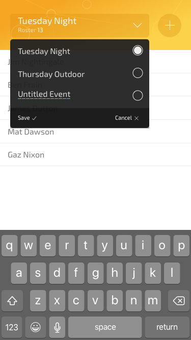
Multiple Events
At the outset, I felt that from a functionality point of view, a single event, like “Tuesday Night Football” would suffice. In that scenario, if you loaded In/Out up you just added/removed or moved players in or out and that was that. There was no notion of multiple events.
I quickly decided that (even going for a minimum viable product) this would make for a pretty limited experience. What if somebody organized two games on different days, with a different roster of players? Surely In/Out could/should accommodate that need?
It didn’t take too long to re-shape the data to make this possible and amend the methods needed to load in a different set.
At the outset, the default data set looked something like this:
The new data was an array with an object for each event. Then in each event was an EventData property that was an array with player objects in as before.
It took much longer to re-consider how the interface could best deal with this new capability.
From the outset, the design had always been very sterile. Considering this was also supposed to be an exercise in design, I didn’t feel I was being brave enough. So a little more visual flair was added, starting with the header. This is what I mocked up in Sketch:
It wasn’t going to win awards but it was certainly more arresting than where it started.
Aesthetics aside, it wasn’t until somebody else pointed it out, that I appreciated the big plus icon in the header was very confusing. Most people thought it was a way to add another event. In reality, it switched to an ‘Add Player’ mode with a fancy transition that let you type in the name of the player in the same place the event name was currently.
This was another instance where fresh eyes were invaluable. It was also an important lesson in letting go. The honest truth was I had held on to the input mode transition in the header because I felt it was cool and clever. However, the fact was it was not serving the design and therefore the application as a whole.
This was changed in the live version. Instead, the header just deals with events — a more common scenario. Meanwhile, adding players is done from a sub-menu. This gives the app a much more understandable hierarchy.
The other lesson learned here was that whenever possible, it’s hugely beneficial to get candid feedback from peers. If they are good and honest people, they won’t let you give yourself a pass!
Summary: My Code Stinks
Right. So far, so normal tech-adventure retrospective piece; these things are ten a penny on Medium! The formula goes something like this: the dev details how they smashed down all obstacles to release a finely tuned piece of software into the Internets and then pick up an interview at Google or got acqui-hired somewhere. However, the truth of the matter is that I was a first-timer at this app-building malarkey so the code ultimately shipped as the ‘finished’ application stunk to high heaven!
For example, the Observer pattern implementation used worked very well. I was organized and methodical at the outset but that approach ‘went south’ as I became more desperate to finish things off. Like a serial dieter, old familiar habits crept back in and the code quality subsequently dropped.
Looking now at the code shipped, it is a less than ideal hodge-bodge of clean observer pattern and bog-standard event listeners calling functions. In the main inout.ts file there are over 20 querySelector method calls; hardly a poster child for modern application development!
I was pretty sore about this at the time, especially as at the outset I was aware this was a trap I didn’t want to fall into. However, in the months that have since passed, I’ve become more philosophical about it.
The final post in this series reflects on finding the balance between silvery-towered code idealism and getting things shipped. It also covers the most important lessons learned during this process and my future aspirations for application development.
Do you want to add a custom scrollbar in WordPress? Changing the appearance of scrollbar can help you stand out specially when making a custom theme for your website.
In this article, we will show you how to easily add a custom scrollbar in WordPress. We will show you two solutions and you can choose one that works best for you.
Issues with Custom Scrollbar Colors
By default, CSS does not come with a ruleset that would let you change scrollbar properties. There are some proposals to add this, but they are not supported by most browsers at the moment.
To overcome this, designers and developers use browser-specific pseduo elements or JavaScript to override default scrollbar appearance.
Upon activation, you need to head over to Settings » Custom Color Scrollbar Settings page to configure plugin.
From here, you can change the scrollbar color and the scrollbar rail background colors. You can then select the mouse scroll step, which is the scrolling speed of the mouse wheel.
You can also select whether you want to auto-hide the scrollbar or always display it.
You have the option choose ‘Cursor only’ option which would display the scrollbar rail but not the button.
Below that, you will find options to set the scroll speed, change rail alignment (left or right), and enable touch behavior.
Don’t forget to click on the save changes button to store your settings.
You can now visit your website to see your custom scrollbar colors in action.
Method 2. Add Custom Scrollbar Colors in WordPress using CSS
This method uses CSS to style your scrollbar, which is faster than using jQuery.
However, it only works on desktop browsers using WebKit rendering engine like Google Chrome, Safari, Opera, and more.
It will not have any effect on mobile browsers or Firefox and Edge on desktop computers.
Feel free to change colors and other CSS properties.
Once you are satisfied, don’t forget to save your changes. After that, you can preview it in a supported browser.
This is how it looked on our demo website while viewing on Google Chrome on a Mac computer.
We hope this article helped you learn how to add a custom scrollbar in WordPress. You may also want to see our guide on how to easily create a custom WordPress theme without writing any code.
If you liked this article, then please subscribe to our YouTube Channel for WordPress video tutorials. You can also find us on Twitter and Facebook.
If you are looking to create and sell online courses then you need an effective WordPress LMS (learning management system) to assist you. A powerful LMS plugin will help you to design varied and stimulating courses, that inform your learners and provide value for money.
One huge concept that many designers overlook on their landing pages is social proof. This can come in the form of user reviews, testimonials, or bigger companies vouching for your website. You can accomplish this in many ways but one design …
Online marketing is convenient and does away with the burden of having to meet a limited number of the audience on a daily basis. That isn’t to say that it’s easily done and easier to...


 The rising trends of time-management and self-improvement created a high demand for productivity apps. They help to set and track personal goals, create a to-do list, keep in mind all current tasks, etc. These systems are useful for everyone. They are popular among students and professors, business owners and home keepers. Although the modern market offers a wide variety of productivity tools, it isn't still late to invest in them. With reach functionality and appealing design, a time-management tool startup can beat all competitors.


