At Cambridge Intelligence, we recently launched an Early Access Program (EAP) for ReGraph, our brand new graph data visualization toolkit for React developers. The response from evaluators has been fantastic, and now we’re inviting more organizations to join the ReGraph EAP.
To help you get started with ReGraph, this step-by-step tutorial covers everything you need to know. Once we’ve created our visualization in a React app, we’ll load an example network of suspected terrorists and show how easy it is to apply the key analysis techniques your users need to uncover threats.
In the field of integration, there is a lot of talk about the Hybrid Integration Platform. It consists of having a suite of software, which, put together, allows managing the integration of on-premise software with cloud software. However, there is a subject that is rarely mentioned: The hybridization of the components themselves!
A world without hybrid components
In a world without hybrid components, to integrate your on-premise legacy with your SaaS and PaaS applications, you will typically have the following architecture:
This article is in continuation to Part 1, Tensorflow for deep learning. Make sure you go through it for a better understanding of this case study.
Keras is a high-level neural network API written in Python and capable of running on top of Tensorflow, CNTK, or Theano. It was developed with a focus on enabling fast experimentation. In this article, we are going to cover one small case study for fashion mnist.
"The power of the Web is in its universality. Access by everyone regardless of disability is an essential aspect."
- Tim Berners-Lee
Accessibility is an important element of web development, and with the ever-growing prevalence of video content, the necessity for captioned content is growing as well. WebVTT is a technology that solves helps with captioned content as a subtitle format that integrates easily with already-existing web APIs.
That’s what we’re going to look at here in this article. Sure, WebVTT is captioning at its most basic, but there are ways to implement it to make videos (and the captioned content itself) more accessible for users.
First and foremost: WebVTT is a type of file that contains the text "WebVTT" and lines of captions with timestamps. Here’s an example:
WEBVTT

00:00:00.000 --> 00:00:03.000
- [Birds chirping]
- It's a beautiful day!

00:00:04.000 --> 00:00:07.000
- [Creek trickling]
- It is indeed!

00:00:08.000 --> 00:00:10.000
- Hello there!
A little weird, but makes pretty good sense, right? As you can see, the first line is "WEBVTT" and it is followed by a time range (in this case, 0 to 3 seconds) on Line 3. The time range is required. Otherwise, the WEBVTT file will not work at all and it won’t even display or log errors to let you know. Finally, each line below a time range represents captions contained in the range.
Note that you can have multiple captions in a single time range. Hyphens may be used to indicate the start of a line, though it’s not required and more stylistic than anything else.
The time range can be one of two formats: hh:mm:ss.tt or mm:ss.tt. Each part follows certain rules:
Hours (hh): Minimum of two digits
Minutes (mm): Between 00 and 59, inclusive
Seconds (ss): Between 00 and 59, inclusive
Milliseconds (tt): Between 000 and 999, inclusive
This may seem rather daunting at first. You’re probably wondering how anyone can be expected to type and tweak this all by hand. Luckily, there are tools to make this easier. For example, YouTube can automatically caption videos for you with speech recognition in addition to allowing you to download the caption as a VTT file as well! But that’s not it. WebVTT can also be used with YouTube as well by uploading your VTT file to your YouTube video.
Once we have this file created, we can then embed it into an HTML5 video element.
The <track> tag is sort of like a script that "plays" along with the video. We can use multiple tracks in the same video element. The default attribute indicates that a the track will be enabled automatically.
Let’s run down all the <track> attributes while we’re at it:
srclang indicates what language the track is in.
kind represents the type of track it is and there are five kinds:
subtitles are usually translations and descriptions of different parts of a video.
descriptions help unsighted users understand what is happening in a video.
captions provide un-hearing users an alternative to audio.
metadata is a track that is used by scripts and cannot be seen by users.
chapters assist in navigating video content.
label is a title for the text track that appears in the caption track
src is the source file for the track. It cannot come from a cross-origin source unless crossorigin is specified.
While WebVTT is designed specifically for video, you can still use it with audio by placing an audio file within a <video> element.
Digging into the structure of a WebVTT file
MDN has great documentation and outlines the body structure of a WebVTT file, which consists of up to six components. Here’s how MDN breaks it down:
An optional byte order mark (BOM)
The string "WEBVTT"
An optional text header to the right of WEBVTT.
There must be at least one space after WEBVTT.
You could use this to add a description to the file.
You may use anything in the text header except newlines or the string "-->".
A blank line, which is equivalent to two consecutive newlines.
Zero or more cues or comments.
Zero or more blank lines.
Note: a BOM is a unicode character that indicates the unicode encoding of the text file.
Bold, italic, and underline — oh my!
We can absolutely use some inline HTML formatting in WebVTT files! These are the ones that everyone is familiar with: <b>, <i>, and <u>. You use them exactly as you would in HTML.
WEBVTT

00:00:00.000 --> 00:00:03.000 align:start
This is bold text

00:00:03.000 --> 00:00:06.000 align:middle
This is italic text

00:00:06.000 --> 00:00:09.000 vertical:rl align:middle
This is <u>underlined  text</u>
Cue settings
Cue settings are optional strings of text used to control the position of a caption. It’s sort of like positioning elements in CSS, like being able to place captions on the video.
For example, we could place captions to the right of a cue timing, control whether a caption is displayed horizontally or vertically, and define both the alignment and vertical position of the caption.
Here are the settings that are available to us.
Setting 1: Line
line controls the positioning of the caption on the y-axis. If vertical is specified (which we’ll look at next), then line will instead indicate where the caption will be displayed on the x-axis.
When specifying the line value, integers and percentages are perfectly acceptable units. In the case of using an integer, the distance per line will be equal to the height (from a horizontal perspective) of the first line. So, for example, let’s say the height of the first line of the caption is equal to 50px, the line value specified is 2, and the caption’s direction is horizontal. That means the caption will be positioned 100px (50px times 2) down from the top, up to a maximum equal to coordinates of the boundaries of the video. If we use a negative integer, it will move upward from the bottom as the value decreases (or, in the case of vertical:lr being specified, we will move from right-to-left and vice-versa). Be careful here, as it’s possible to position the captions off-screen in addition to the positioning being inconsistent across browsers. With great power comes great responsibility!
In the case of a percentage, the value must be between 0-100%, inclusive (sorry, no 200% mega values here). Higher values will move the caption from top-to-bottom, unless vertical:lr or vertical:rl is specified, in which case the caption will move along the x-axis accordingly.
As the value increases, the caption will appear further down the video boundaries. As the value decreases (including into the negatives), the caption will appear further up.
Tough picture this without examples, right? Here’s how this translates into code:
00:00:00.000 --> 00:00:03.000 line:50%
This caption should be positioned horizontally in the approximate center of the screen.
00:00:03.000 --> 00:00:06.000 vertical:lr line:50%
This caption should be positioned vertically in the approximate center of the screen.
00:00:06.000 --> 00:00:09.000 vertical:rl line:-1
This caption should be positioned vertically along the left side of the video.
00:00:09.000 --> 00:00:12.000 line:0
The caption should be positioned horizontally at the top of the screen.
Setting 2: Vertical
vertical indicates the caption will be displayed vertically and move in the direction specified by the line setting. Some languages are not displayed left-to-right and instead need a top-to-bottom display.
  00:00:00.000 --> 00:00:03.000 vertical:rl
This caption should be vertical.
00:00:00.000 --> 00:00:03.000 vertical:lr
This caption should be vertical.
Setting 3: Position
position specifies where the caption will be displayed along the x-axis. If vertical is specified, the position will instead specify where the caption will be displayed on the y-axis. It must be an integer value between 0% and 100%, inclusive.
00:00:00.000 --> 00:00:03.000 vertical:rl position:100%
This caption will be vertical and toward the bottom.

00:00:03.000 --> 00:00:06.000 vertical:rl position:0%
This caption will be vertical and toward the top.
At this point, you may notice that line and position are similar to the CSS flexbox properties for align-items and justify-content, and that vertical behaves a lot like flex-direction. A trick for remembering WebVTT directions is that line specifies a position perpendicular to the flow of the text, whereas position specifies the position parallel to the flow of the text. That’s why line suddenly moves along the horizontal axis, and position moves along the vertical axis if we specify vertical.
Setting 4: Size
size specifies the width of the caption. If vertical is specified, then it will set the height of the caption instead. Like other settings, it must be an integer between 0% and 100%, inclusive.
00:00:00.000 --> 00:00:03.000 vertical:rl size:50%
This caption will fill half the screen vertically.
00:00:03.000 --> 00:00:06.000 position:0%
This caption will fill the entire screen horizontally.
Setting 5: Align
align specifies where the text will appear horizontally. If vertical is specified, then it will control the vertical alignment instead.
The values we’ve got are: start, middle, end, left and right. Without vertical specified, the alignments are exactly what they sound like. If vertical is specified, they effectively become top, middle (vertically), and bottom. Using start and end as opposed to left and right, respectively, is a more flexible way of allowing the alignment to be based on the unicode-bidi CSS property’s plaintext value.
Note that align is not unaffected by vertical:lr or vertical:rl.
WEBVTT

00:00:00.000 --> 00:00:03.000 align:start
This caption will be on the left side of the screen.

00:00:03.000 --> 00:00:06.000 align:middle
This caption will be horizontally in the middle of the screen.

00:00:06.000 --> 00:00:09.000 vertical:rl align:middle
This caption will be vertically in the middle of the screen.

00:00:09.000 --> 00:00:12.000 vertical:rl align:end
This caption will be vertically at the bottom right of the screen regardless of vertical:lr or vertical:rl orientation.

00:00:12.000 --> 00:00:15.000 vertical:lr align:end
This caption will be vertically at the bottom of the screen, regardless of the vertical:lr or vertical:rl orientation.

00:00:12.000 --> 00:00:15.000 align:left
This caption will appear on the left side of the screen.

00:00:12.000 --> 00:00:15.000 align:right
This caption will appear on the right side of the screen.
WebVTT Comments
WebVTT comments are strings of text that are only visible when reading the source text of the file, the same way we think of comments in HTML, CSS, JavaScript and any other language. Comments may contain a new line, but not a blank line (which is essentially two new lines).
WEBVTT

00:00:00.000 --> 00:00:03.000
- [Birds chirping]
- It's a beautiful day!

NOTE This is a comment. It will not be visible to anyone viewing the caption.

00:00:04.000 --> 00:00:07.000
- [Creek trickling]
- It is indeed!

00:00:08.000 --> 00:00:10.000
- Hello there!
When the caption file is parsed and rendered, the highlighted line above will be completely hidden from users. Comments can be multi-line as well.
There are three very important characters/strings to take note of that may not be used in comments: <, &, and -->. As an alternative, you can use escaped characters instead.
Not Allowed
Alternative
NOTE PB&J
NOTE PB&J
NOTE 5 < 7
NOTE 5 < 7
NOTE puppy --> dog
NOTE puppy --> do
A few other interesting WebVTT features
We’re going to take a quick look at some really neat ways we can customize and control captions, but that are lacking consistent browser support, at least at the time of this writing.
Yes, we can style captions!
WebVTT captions can, in fact, be styled. For example, to style the background of a caption to be red, set the background property on the ::cue pseudo-element:
video::cue {
  background: red;
}
Remember how we can use some inline HTML formatting in the WebVTT file? Well, we can select those as well. For example, to select and italic (<i>) element:
video::cue(i) {
  color: yellow;
}
Turns out WebVTT files support a style block, a lot like the way HTML files do:
Elements can also be accessed via their cue identifiers. Note that cue identifiers use the same escaping mechanism as HTML.
WEBVTT

STYLE
::cue(#middle\ cue\ identifier) {
  text-decoration: underline;
}
::cue(#cue\ identifier\ \33) {
  font-weight: bold;
  color: red;
}

first cue identifier
00:00:00.000 --> 00:00:02.000
Hello, world!

middle cue identifier
00:00:02.000 --> 00:00:04.000
This cue identifier will have an underline!

cue identifier 3
00:00:04.000 --> 00:00:06.000
This one won't be affected, just like the first one!
Different types of tags
Many tags can be used to format captions. There is a caveat. These tags cannot be used in a <track> element where kind attribute is chapters. Here are some formatting tags you can use.
The class tag
We can define classes in the WebVTT markup using a class tag that can be selected with CSS. Let’s say we have a class, .yellowish that makes text yellow. We can use the tag <c.yellowish> in a caption. We can control lots of styling this way, like the font, the font color, and background color.
WEBVTT

00:00:00.000 --> 00:00:03.000
<c.yellowish>This text should be yellow.</c> This text will be the default color.

00:00:03.000 --> 00:00:06.000
<c.redcolor>This text should be red.</c> This text will be the default color.
The timestamp tag
If you want to make captions appear at specific times, then you will want to use timestamp tags. They’re like fine-tuning captions to exact moments in time. The tag’s time must be within the given time range of the caption, and each timestamp tag must be later than the previous.
Voice tags are neat in that they help identify who is speaking.
WEBVTT

00:00:00.000 --> 00:00:03.000
<v Alice>How was your day, Bob?

00:00:03.000 --> 00:00:06.000
<v Bob>Great, yours?
The ruby tag
The ruby tag is a way to display small, annotative characters above the caption.
WEBVTT

00:00:00.000 --> 00:00:05.000
<ruby>This caption will have text above it<rt>This text will appear above the caption.
Conclusion
And that about wraps it up for WebVTT! It’s an extremely useful technology and presents an opportunity to improve your site’s accessibility a great deal, particularly if you are working with video. Try some of your own captions out yourself to get a better feel for it!
One random day not long ago, I started hearing joke after joke about "micro frontends" — sort of how I first learned about Toast. I didn't understand the source until asking around, which uncovered this article from Cam Jackson.
In this article we'll describe a recent trend of breaking up frontend monoliths into many smaller, more manageable pieces, and how this architecture can increase the effectiveness and efficiency of teams working on frontend code.
I'd argue it should read "front-end monoliths" and "front-end code," but I digress already.
The idea is similar to microservices, but for the front end. So, instead of one big front-end architecture (e.g. a React app), different parts of the front end are developed entirely independent of one another, have no dependencies on each other, and can be worked on and deployed independently.
It's one of those things where you can't quite tell if it's really an interesting foretelling of the future, just a niche architectural choice that happened to work for a handful of large organizations, or even just a theoretical option.
The first place my mind goes is consistency and DRY-ness. Anywhere I've worked, these things are a big deal and it seems like the industry at large has had endless front-end problems with shipping designs that start and stay consistent and cohesive without repeating itself with shovelfuls of technical debt. Independent front-ends sound like they might be a problem if Team B is being blocked by Team A for something not directly related, but then it introduces the problem of Team B's output drifting towards inconsistency with Team A's output.
The article itself talks about a browse/search landing page, a details/ordering page, and a profile page, with all three of those tackled by different independent products/teams. It sounds kinda cool and interesting to me, and it also sounds like those teams better sit right next to each other at work; otherwise this app is going the way of Frankenstein's monster in two weeks. Styling is only lightly addressed with a, "I dunno, do a good job" sort of vibe. Teams struggle with this when they are all on the same product, so I'd have huge concerns here. The first thing I'd try to solve if this is being discussed seriously would be a design system that transcends all of it and that everyone uses without fail.
And what if those micro front ends co-exist on the same page? Use <iframe>, the article says. I can't see a world where that leads to a good user experience. (iFrames are slow, especially many of them all booting up their own worlds — and what about elements that might overflow bounds like tooltips and menus?)
The other integration options... isolating them to their own bundles or even native web components sounds a bit better. But still, the idea of siloed development where a React component might be slapped on the same page as a Vuew component seems like a huge user penalty for a pretty specific organizational problem. Not to mention you're losing the benefits of a shared understanding of a codebase and the benefits of a deeper technical understanding of a smaller set of tools.
I'm probably not characterizing all of this fairly, especially because the idea is rather new to me and I've never worked like this before.
Nader Dabit has a follow up article: Building Micro Frontends with React, Vue, and Single-spa. Just so I'm not mischaracterizing that: The idea really is that you might build a React app and I build a Vue app and we'll slap 'em together on the same page. I definitely come from an era where we laughed-then-winced when we found sites that used multiple versions of jQuery on the same page, plus one thing that loaded all of MooTools and Prototype thrown on there seemingly by accident. We winced because that was a bucket full of JavaScript, mostly duplicated for no reason, causing bugs and slowing down the page. This doesn't seem all that much different.
I’m pointing out that we’re in the “hate without closely examining” stage of the idea. It’s entirely possible that after legitimate, close examination that the idea still fails. But too early to tell.
To gather insights on the current and future state of API management, we asked IT professionals from 18 companies to share their thoughts. We asked them, "What are the most important elements of managing APIs?" Here's what they told us:
Protection
Since you are exposing APIs to line-of-business applications, they need to guard against abuse. With two-factor authentication. people try to do fishing attacks. Rate limiting, circuit braking, and timeouts become quite important. Our SLAs tie-in with the other systems they are interacting with. When there is too much load on the system, you need to think about how to shed load. Interesting rules come into play even with APIs exposed out to everyone.
API lifecycle management consists of defining, publishing, securing, routing and mediating traffic, monitoring, and analyzing APIs. The two most important elements of managing APIs are: 1) API Security — according to OWASP Top 10 - 2017, “sensitive data exposure” by APIs is the third most critical web application security risk. 2) Providing a seamless consumption experience via a robust dev portal. According to the 2018 State of API Integration report from Cloud Elements, this is the second most common request from API consumers.
A lot of customers are interested in a different environment and may have moved to microservices which makes APIs a big piece. Security, rate-limiting be in control of how many requests you have. Canary deployment, green/blue deployment, A/B testing is very popular. Have one microservice with the old version of the API and one with the new API. Push the new one and route traffic from 10 requests — one in 10 go to new and then watch the metrics and gradually move everything to the new version. Have security on the gateway side to monitor traffic from the internet. API management is taking the operation logic away from the engineer or developer, it’s done in the proxy itself. The API gateway takes care of security.
Security, then stability. If permission-driven rules are co-resident with the API code, then having an excellent process that keeps security in-sync with your changing data is critical. Secondly, stability, we want to ensure our API users remain backward-compatible.
Ease of Use
There are many important elements to deploying APIs including authentication, protection/availability, and monetization. However, many of those don’t matter if the API is not adopted and used. Ease of use and successfully fulfilling a use case are key to gaining adoption. Our integration platform makes APIs easy to use. Through our application connectors, we can simplify the use of the APIs of many popular software applications. On the API provider side, we give users a second chance to get an API right. A complex API that provides somewhat generalized access to a system can be simplified to satisfy a single important use case (i.e., get my order status).
The last letter in API is “interface” for good reason, and I’ve long felt that the most important thing is to clearly define how you expect that interface to work. How do customers consume your APIs, and how do developers bring those APIs to market? There are a few major architectural decisions you need to make upfront. First, are you planning to go all-in on microservices where your customers are consuming from hundreds or dozens of public-facing APIs, or are you going to wall them up behind a gateway or façade that reduces your surface area? We’ve chosen the former. In our case, you need to put a lot of effort into ensuring standard practices (on everything from authentication to capitalization in responses). If all of your APIs feel like they were developed by different teams, you’re making it harder for customers to adopt more than one. What makes interface definition particularly critical is that a misstep takes years to unwind. Once customers are consuming your API, you have limited scope to make changes without requiring your customers to recode their integrations. And every time you require customers to make a change, they’ll ask themselves why they are working with you and not a vendor that can get things right the first time.
Maintaining consistency in naming and data formats as the number of endpoints grow. It’s not a big deal when you’re providing 5-10 endpoints, but when number gets over a hundred you probably have multiple people (or multiple teams) creating them, over different periods of time, introduced as a part of different products, etc. Having an easy way for all teams to access existing specs is critical. If those specs would be long and difficult to read — it leads to problems. Some questions about formats and conventions we expected to be already solved actually don’t really exist. It’s surprising how many ways are out there to describe sorting/multipage/searches/filtering with multiple parameters. Some standards exist, but after a deep look, we found them incomplete for our use case and had to come up with our own conventions.
Analytics
Communication with visibility. Make it clear what the apps are and how to use them with design, documentation, messaging, and how you sell and market them. Well-designed APIs can fall apart if you do not communicate their value and capabilities. If you manage and own APIs, you need visibility into what’s happening with them, how they are being used, if anything bad is happening. Reports can indicate new and interesting directions in which to take your API program. Do this based on your own metrics and visibility. You have a better chance of succeeding versus copying someone else.
Performance, reliability, and analytics are all important topics in API management. The operational quality of Facebook or Google progressively became the baseline for the delight of end-users and the doom of site reliability engineers. Beyond these, when creating an API-centric business, two rarely mentioned elements are of the utmost importance. The first is maintaining compatibility over time. The purpose of APIs is to have customers build products leveraging them. An API whose form changes — breaks — regularly, alienates customers who have to update their own products in consequence. There are many ways to maintain compatibility while moving forward — versioning and backward-compatible changes being the most common. Yet to be done correctly, the topic must be considered right from the start. Besides, maintaining compatibility generates an extra cost, whether in the form of explicit infrastructure cost when old versions of an API must be kept running, or of implicit maintenance cost when old versions must be regularly patched if not just for security reasons. Another major element of managing API is enforcing security while providing transparency. It is not just about ensuring that the correct people have the appropriate set of permissions to manipulate data anymore. That would be “conventional” security, and while it’s still very relevant and definitely not a solved problem, the topic is relatively well understood. Today, customers expect understanding if not guarantees on the actual use of their data by the company delivering their services. Are their data indirectly leveraged — e.g. by “blind” machine learning algorithms? Can they request their old data to be removed entirely from servers? Can they access all — absolutely all the data their provider is storing about them?
API Lifecycle Management
API Management has the following four major elements: 1. API Lifecycle Management — We believe providing companies the ability to manage the entire lifecycle of API - from designing, developing, publishing, and management of API (that includes retirement/versioning) - thus allowing companies to accelerate innovation by composing innovative solutions, facilitate better security of their enterprise data and allow users to discover and consume your APIs easily. 2. API Gateway — An API gateway acts as a point of entry for a set of APIs. Benefits of using an API gateway is providing the optimal API for each client, reducing the number of requests a client needs to make and enforcing appropriate security and controls. 3. Documentation — The Developer Portal is key to increasing adoption and stickiness of your APIs. It is your initial method of communication with developers. This is the first point where a developer learns and uses your API and is where the developer will learn about the authentication/authorization mechanism. In addition, they will learn which APIs are available for consumption and leverage descriptions and examples for each API request. 4. API Analytics/Monitoring — API Analytics and Monitoring helps companies learn and understand the utilization of their APIs, which can provide insights on the use of various APIs. Alternatively, companies can enforce API quotas, limits, and API traffic throttling to discourage/limit usage that doesn't align with your business goals.
Other
APIs have transitioned from XML-based contracts like SOAP and WSDL to a RESTful format with a little loser definition, using JSON to communicate. Document how it works in a machine-readable format. Define contracts and make them easily consumable by humans and other APIs. Leverage Open API 3, describe APIs in JSON, communicate and understand what the API can do for you and how to communicate with it.
In more than half of the projects, APIs are delivered by clients or third-party services. Make an alignment of deliverables when APIs are being developed at the same time as the application. People are still learning to design, secure, and deliver APIs. APIs are built to be used. When you design, fit the needs of the consumers. Be efficient for a specific use case. Backend APIs can be very different than for a mobile application. A lot of coaching is needed to help developers understand the best practices for APIs in mobile. New standards like graph QL helps with that problem. APIs provide more flexibility for the types and amounts of data.
It is important to anticipate and integrate fallback when an API stops responding or starts to behave differently (like when the API is having a bug). Often, the issue could be easily mitigated by pushing the action to a queue that will be tried again later (like, for instance, sending an email or saving an action), but it's not always possible. Having the application handle such case and indicate with a custom message any issues to the end-user - along with some notification to the development team - is crucial to ensure a well-working service.
There are the usual suspects at runtime, such as security policy management, telemetry and monitoring, and consistent performance. This functionality is more accessible than ever via a number of mature API Gateway products. The most important, and often overlooked, element of managing APIs at scale is a solid API design foundation. It's in developing an API-first culture within your organization that elevates their importance and provides a clear development workflow that results in higher quality, more consistent APIs.
When you start a web design business, there are so many unknowns and things you may not have even considered. Maybe you’re a talented designer or developer – but that’s only part of the equation.
After all, even the most talented among us aren’t going to be successful without the ability to recruit and retain paying customers. Otherwise, you career becomes one endless side project. It may sound fun, but it also leaves you wondering how you’ll pay the bills.
The future of your business depends on creating solid working relationships with your clients. In other words: You need to keep them happy. But how?
In my 20+ years as a freelance designer, I’ve had a number of experiences – both good and not-so-good. Here are a few things I’ve learned about retaining clients over the long haul.
Communication is Key
Having good communication skills is essential in this business – especially if you’re working directly with clients. But there are some misconceptions about what this entails.
First and foremost, communication during a project’s development phase is of the utmost importance. Keep in mind that no one wants to be left in the dark. Clients need to be kept abreast of progress and aware of any challenges you see in achieving project goals.
Once the project is launched, you still need to keep up with your clients. However, some designers take this to mean inundating them with upsells and other marketing. While it’s OK to send an occasional newsletter or social media post, don’t overdo it. Someone who just paid a good bit of money for your services doesn’t want be bothered with constant “offers”.
More important is to be proactive about things like software updates, security and third-party subscriptions. For example, if they’re using a commercial plugin on their website, you’ll want to let your client know when a license renewal is coming. Or perhaps a change to a search engine algorithm means that some adjustments to their content may be in order.
These may seem like little things, but they mean a lot. They show clients that you are looking out for them and aren’t simply out to take their money. In turn, this establishes a level of trust between you that bodes well for the future of your relationship.
Be Honest
Communication is only as good as its actual content. Just as it’s not wise to send a constant stream of sales pitches, dishonesty is also a huge turnoff (and, sooner or later, a deal-breaker).
It’s not that we necessarily start out with the intention of being dishonest. Often it can come from the fear of letting someone down. And it may not even be about anything very important with regards to the bigger picture. That’s all the more reason to just be honest.
Be truthful in your billing, your skills and your assessment of a situation. If you don’t know the answer to something – it’s OK. Let your client know that you need to do some further research and get back to them.
Perhaps most importantly, own up to a mistake. None of us are perfect and we’re all going to do something wrong from time-to-time. Refusal to admit mistakes can only serve to put you into a deeper hole, while harming your relationship.
Honesty has its consequences, as well. But they are often better than the alternative.
Make Them a Priority
Everyone wants to feel like their needs are being attended to. As such, you’ll want to be as responsive as you can when it comes to handling client requests. Whether their site needs maintenance or they just have a question, it’s important to take care of things in a timely manner.
Once again, it always seems to come back to communication. Even if you aren’t able to get to something just that minute (not every request is that important), it’s helpful to let your client know when they can expect it done. Just as important is to make sure that it’s done within whatever time frame you’ve provided.
The idea here is to provide a first-class experience. It’s not about getting to each and every item on your to-do list immediately. Rather, it’s making sure that your clients feel good about you and your service.
Think of it this way: In a world that is often chaotic, clients will appreciate the fact that they can count on you to get the job done. Prove your reliability and you’ll be far ahead of most of your competitors.
Build Better Client Relationships
The great thing about all of this is that it’s not inherently difficult. The main challenge comes in finding consistency in your efforts. This can take a little time, but it’s very much worth doing.
Now, some of you may be thinking that being an outstanding communicator also means that you need to have a warm and fuzzy personality. That you need to be a social butterfly. However, that’s not the case.
The tips above don’t require the gift of gab or even a witty writing style. It’s more a matter of avoiding procrastination and letting clients know that you are there for them. You don’t need to win a personality contest to do it.
And now that you know what it takes to keep clients happy, you can put it into practice. The result will be better relations with your clients, year after year.
7 Gorgeous Free And Open-Source Typefaces And When To Use Them
7 Gorgeous Free And Open-Source Typefaces And When To Use Them
Noemi Stauffer
To facilitate your font picking and pairing process, I’ve included examples of how these typefaces have been put to use recently, as well as a few pairing ideas. Enjoy and don’t forget to ping me on Twitter to show me how you’ve used them — I’d love to see it!
Gangster Grotesk
Designed by Adrien Midzic, Gangster Grotesk is a contemporary grotesque with angled terminal strokes that slightly curve inward. Because of these quirky individual touches, the typeface brings a unique flavor to headlines and posters when used at large sizes. Its low contrast and slightly condensed width make it a good choice for body copy and other texts of small type sizes as well.
The font family comes in three weights, from Light to Bold, with stylistic alternates, including a loopy expressive ampersand. Gangster Grotesk is offered for free when signing up for the Fresh Fonts newsletter.
When applying Gangster Grotesk to titles, the quirky grotesque pairs well with low x-height serifs for text settings, such as FF Atma. Used at small point sizes instead, pairing Gangster Grotesk with Le Murmure (see below) offers the right mix of character and neutrality.
Use Case
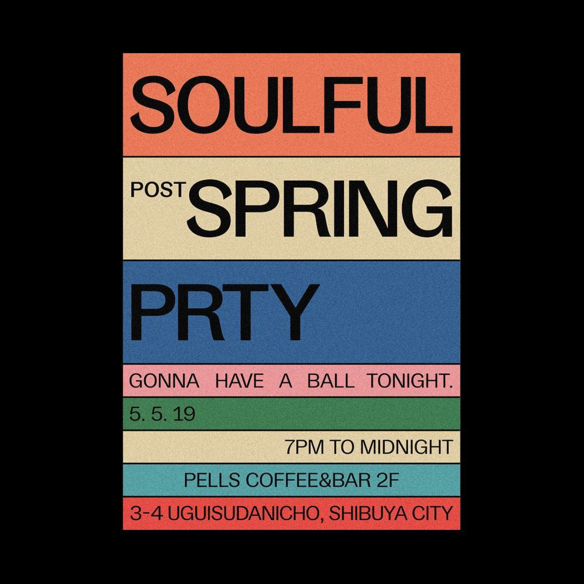
Gangster Grotesk excels in punchy designs with strong colors when it’s asked to render strings of text, for example on this flyer designed by Tokyo-based Juri Okita for Pells Coffee.
Recently awarded a Certificate of Typographic Excellence by the Type Directors Club, Le Murmure was commissioned by French design agency Murmure to renew their brand image. Drawing inspiration from magazine titling fonts, Le Murmure is a condensed sans serif with an interesting mismatch between its characters, making it especially distinctive for use at large sizes. Its height and the singularity of its shapes provide elegance while conveying notions of experimentation and creativity. Le Murmure comes with many — even more — original alternate letters, and there is even a stylistic set that ‘randomizes’ all alternates for you (SS08).
Used as a titling font, Le Murmure can pair well with a sans serif with warm curves, like Standard CT, or with a sans that has more pronounced irregularities, like Dinamo’s Prophet.
Use Case
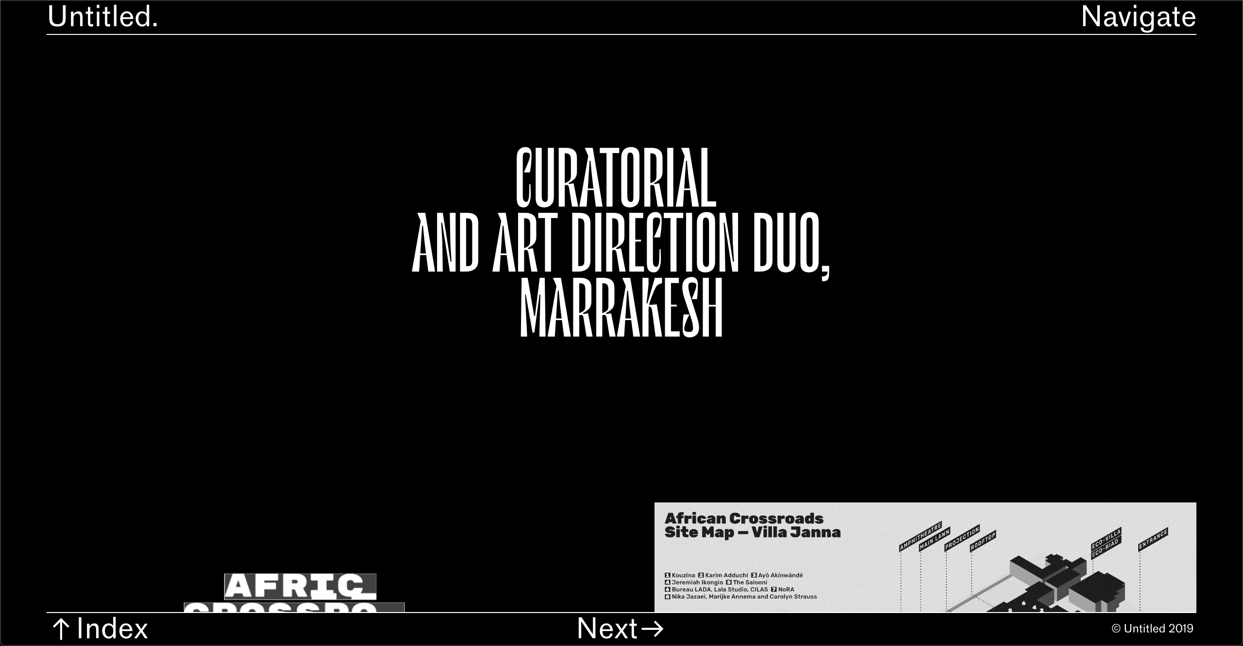
Marrakesh’s Untitled Duo picked Le Murmure for the headlines of their studio’s website, complemented with Classic Sans for the navigation, which they also used at smaller size for the body text.
Reforma is a bespoke typeface designed by PampaType for the Universidad Nacional de Córdoba in Argentina, an educational institution more than 400 years old. The typeface is composed of three subfamilies: Reforma 1918, a classic Serif, Reforma 2018, a modern Sans, and Reforma 1969, an intermediate hybrid that combines the qualities of the other two (subtle modulation and flare serifs). I find all three subfamilies to adapt well to a wide range of bodies, from display to immersive text, and each one of them comes in three weights, with matching italics.
This typeface allows for interesting combinations among its different styles. The most obvious would be to use Reforma Sans for display use and to pair it with its serif counterpart for body text. However, I would encourage you to do something more original and try it the other way around, using the serif for titling.
Use Case
Graphic designer Étienne Pouvreau chose Reforma for the creation of the annual programs of the two Caf family centers of the Loir-et-Cher department in France. The booklets feature Reforma 1918 (the serif) for the headings, in italic, and Reforma 2018 (the sans) for the titles, subtitles and body text.
The new foundry of Florian Karsten is behind this versatile, geometric sans serif. Derived from Space Mono, a monospaced typeface designed by Colophon Foundry for Google Fonts in 2016, Space Grotesk kept the nerdy charm of its predecessor and its particular retro-future voice. Available in five weights, Space Grotesk is well-suited for a wide range of uses, from body text to bold headlines. In addition, it comes with five sets of alternate letters, the third one (SS03) removing the connections between the diagonal strokes of uppercase A, M, N, V, W, and lowercase v, w, y — which can be particularly effective to create distinctive headlines.
As one would guess, Space Grotesk pairs well with Colophon Foundry’s Space Mono, the typeface it was derived from, which is also open source and free to use. Alternatively, if you’d like to pair it with a serif typeface, I would recommend one with pointy serifs and sharp details, such as Fortescue, or Wremena, which is also free to use (see below).
Use Case
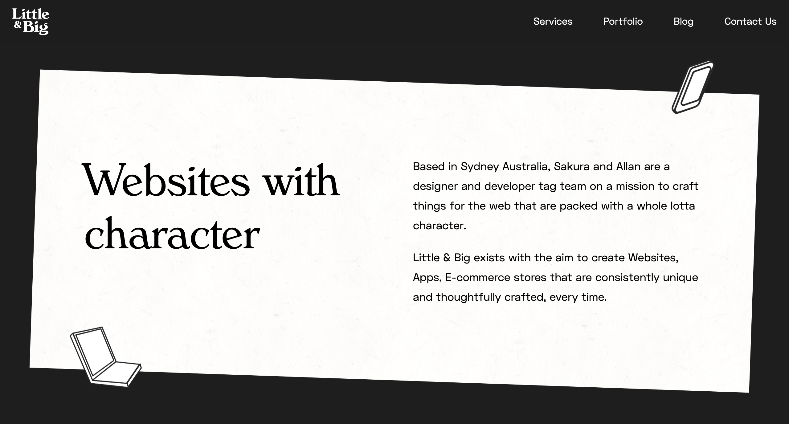
Little & Big, a web design and development studio based in Sydney, Australia, chose Space Grotesk as the body text font for their website, including on blog entries, header and footer. They decided to pair it with Verona Serial, giving the website a professional, yet playful look and feel.
Syne is a type family designed by Bonjour Monde for the visual identity of Synesthésie, an art center close to Paris. It consists of five distinct styles, amplifying the notion of structural differentiation within a font family: Syne Extra is a wide, heavy weight intended for use at large sizes, Syne Regular is a geometric sans with short ascenders and descenders (visible in the lowercase ‘g’ among others), complemented with a wider bold style, an italic in a handwritten style and a monospaced with a distorted look. Updated just days ago, Syne now comes with more alternates, a set of brand new accents, and a variable font version.
The particularity of this typeface is that you can play with its different styles, and create fresh and atypical associations among them. For instance, Syne Extra does wonder for titles and headlines, and works well with Syne Regular for body copy.
Use Case
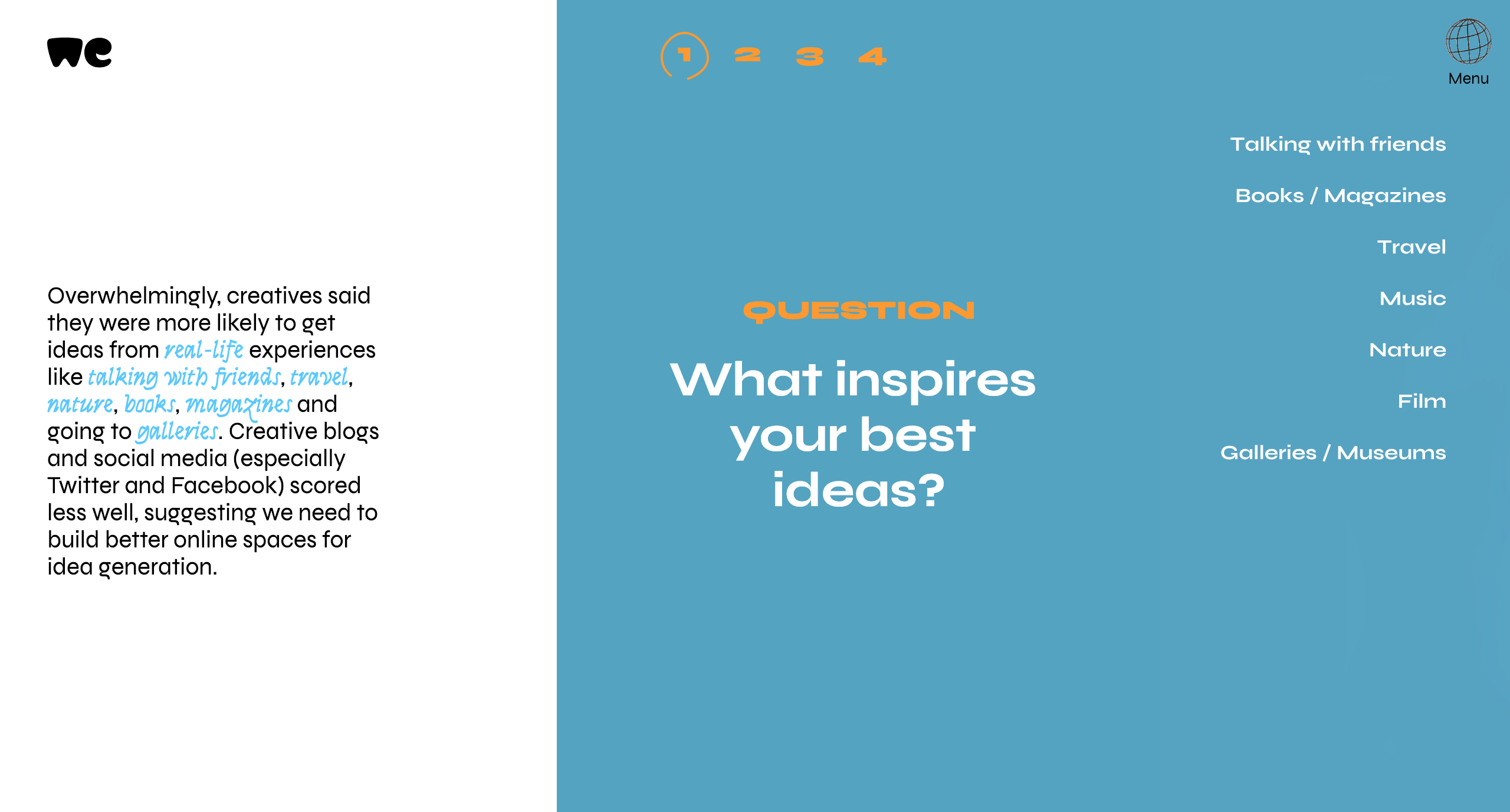
Syne was recently used by WeTransfer to present the results of their Ideas Report 2018, making extensive use of the typeface’s five different cuts on the website of the report and on its beautiful PDF companion.
Named after the VG 5000, a computer created by Phillips in 1984, this typeface playfully combines pixelated and curved strokes, blurring the lines between old and new digital shapes. It also includes many early emojis and pictograms from the VG 5000’s original set, allowing you to create unexpected combinations. Moreover, the typeface comes with contemporary gender inclusive characters for the French language, replacing pronouns “il” and “elle” (“he” and “she”) with the neutral “iel”, and providing an alternative to gendered words by combining their masculine and feminine versions.
Because of its pixelated details, and to remain truthful to its origins, I would suggest pairing VG5000 with a monospaced font, for example League Mono, which is also open source. Alternatively, you could decide to pair it with the sans or serif version of Input, or with a semi-proportional typeface like ETC Trispace, which is also free.
Use Case
French design studio Brand Brothers put VG5000 to use for the visual identity of Les Halles de la Cartoucherie, a new, versatile space dedicated to cultural, artistic and gastronomic activities in Toulouse. Paired with a custom, grid-based logo that represents the structure of the space, VG5000 was used both at large and small sizes on print materials, on the website of the space and even on its walls, using VG5000's pixelated arrows for its wayfinding system.
Wremena is a serif typeface designed by Roman Gornitsky and published by Moscow-based foundry Typefaces of The Temporary State. Its design was based on Vremena, a free typeface by the same designer, but it features more pronounced triangular serifs and sharper angles, which become even more visible in heavier weights. Wremena is available in three styles (Light, Regular and Bold) without italics but with support for the Latin and Cyrillic scripts. Because of its similarities with Times New Roman, Wremena can be used as a free, more contemporary alternative to the ever-popular typeface.
A good tip to find pairings for a specific font is to browse the library of typefaces created by the same designer, as they often pair well together. This is especially true in this case, as Roman Gornitsky designed two sans serifs that are great matches for Wremena: Nowie Vremena, with its distinctive lowercase ‘g’, and more recently, Steinbeck, a lively font with intentional irregularities.
Use Case
The Jewish Museum of Moscow is behind Russian Spleen, a picturesque interactive web project that explores how Russian landscape painter Isaac Levitan impacted the 20th-century cinematography. Designer Pavel Kedich decided to typeset the website in Steinbeck (used at large sizes) and Wremena (here used for captions). Both fonts being multi-script, they allow the website to be available in English and Russian languages.
While I’ve included great examples of how these free fonts can be used, there are many more on Typewolf and Fonts in Use. And if you’d like to discover new, high-quality free and open source fonts, make sure to subscribe to my newsletter Fresh Fonts.
All works and screenshots are property of their respective owners.
Are you seeing ‘The link you followed has expired’ error in WordPress?
This error does not give much clues about what’s actually wrong, which is why beginners find it a bit difficult to resolve.
In this article, we will show you how to easily fix ‘the link you have followed has expired’ error in WordPress. We will also talk about what causes this error and how to avoid it in the future.
What Causes The Link You Have Followed Has Expired Error?
This error usually occurs when you are trying to upload a WordPress theme or a plugin to your website from the WordPress admin area.
WordPress hosting companies have a setting which controls the size of files you can upload from inside the WordPress admin area. They also have a setting which stops scripts from running too long.
You can see the file size upload limit by visiting Media » Add New page.
However, if you are trying to upload a WordPress theme or plugin, then you would see ‘The link you followed has expired’ error.
That being said, let’s take a look at how to easily fix this problem.
Fixing ‘The Link You Have Followed Has Expired’ Error
The quickest way to fix ‘The link you followed has expired’ error is by increasing the file upload size, PHP memory, and execution time limits for your website.
There are multiple ways to do that. We will show you all of them, and you can choose the one that looks easier or the one that works on your hosting environment.
Method 1. Increasing limits in functions.php file
This method is easier, but it has a downside. Your site will return back to the old limits if you change WordPress theme. If you are planning on changing your theme, then try one of the other two methods described below.
Simply add the following code to your WordPress theme’s functions.php file.
You can increase the values in upload_max_size and post_max_size to be more than the file you are trying to upload.
You will also need to increase the max_execution_time to the time you think it would take for the file to upload. If you are unsure, then you can try doubling this value.
Method 2. Fix by increasing limits in .htaccess file
If you don’t want to add code to your theme’s functions file, then you can try the .htaccess method.
Don’t forget to save your changes and upload the file back to your website.
Method 3. Fix by increasing limits in php.ini file
The php.ini file is a configuration file used by PHP and WordPress. You’ need to connect to your WordPress site using an FTP client and look for php.ini file in your site’s root folder.
Most users are on a shared hosting account, so they may not find it in their site’s root folder. In that case, you need to create a blank php.ini file using a plain text editor like Notepad and upload it to your website.
Now edit the php.ini file and add the following code inside it.
Don’t forget to save your changes and upload the file back to your website.
You can now visit your website and try to upload the theme or plugin file. The error would disappear, and you should be able to upload the file.
If it doesn’t, then try to increase file limits to match the file size you are trying to upload.
We hope this article helped you easily fix ‘The link you followed has expired’ error in WordPress. You may also want to bookmark our guide on how to fix the most common WordPress errors. It will help you save a lot of time by quickly finding a fix for WordPress issues.
If you liked this article, then please subscribe to our YouTube Channel for WordPress video tutorials. You can also find us on Twitter and Facebook.
This was a query raised by one of a forum members at another site, where he had a worksheet filled with random numbers, and I have already answered that query at my post here. You may go through that post and read the logic behind the code.