Turns out, empathy and creativity are two peas in a pod.
It seems intuitive that if you can step into the shoes of your customers and experience what they do, then you have a good chance of delivering exceptional customer experiences. It's perhaps for this reason that so many successful startups emerge from the personal pain of the founders.
Nonetheless, the importance of empathy to creativity was underlined by recent research from the University of Connecticut and the University of Illinois, which asked participants to imagine consumers eating a snack before then designing that snack on their behalf.
There has been much said about the importance of security, availability, integration, analysis, and access when it comes to the role of data in today's enterprise world. But you talk about data performance and the need to embrace performance as a philosophy.
Is this in the context of a piece of software code or of wider digital transformation in an organisation?
I recently joined OmniSci as a Community Developer Advocate. My role is to help build the global OmniSci community and raise awareness through presentations and technical writing. My background is in database technology, but I don't have any previous experience with OmniSci or Graphics Processing Unit (GPU) technology. In this series of articles, I will share what I learned about OmniSci as a beginner and I hope that this will also be useful to other beginners. I will focus mainly on Open Source Software (OSS) and industry standards.
What Is OmniSci?
At its heart, OmniSci is an analytics platform that can process very large quantities of data at scale. As shown in Figure 1, OmniSci consists of a number of components in three major groupings: Data Integration, OmniSci Platform and Develop and Accelerate.
One of the first things most of us learned when we learned CSS, was details of the various parts of a box in CSS, described as The CSS Box Model. One of the elements in the Box Model is the margin, a transparent area around a box, which will push other elements away from the box contents. The margin-top, margin-right, margin-bottom and margin-left properties were described right back in CSS1, along with the shorthand margin for setting all four properties at once.
A margin seems to be a fairly uncomplicated thing, however, in this article, we will take a look at some of the things which trip people up with regard to using margins. In particular, we will be looking at how margins interact with each other, and how margin collapsing actually works.
The CSS Box Model
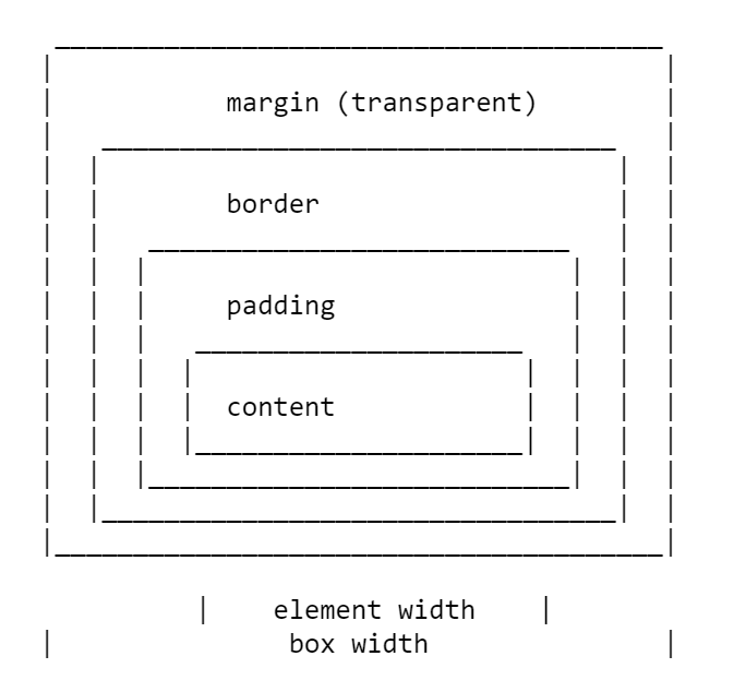
As with all articles about parts of the CSS Box Model, we should define what we mean by that, and how the model has been clarified through versions of CSS. The Box Model refers to how the various parts of a box — the content, padding, border, and margin — are laid out and interact with each other. In CSS1, the Box Model was detailed with the ASCII art diagram shown in the image below.
Depiction of the CSS Box Model in CSS1
The four margin properties for each side of the box and the margin shorthand were all defined in CSS1.
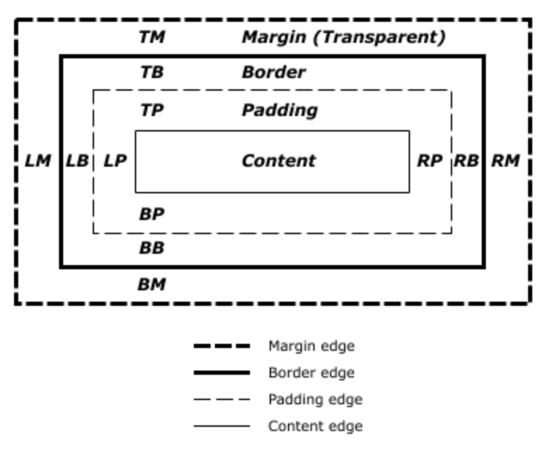
The CSS2.1 specification has an illustration to demonstrate the Box Model and also defines terms we still use to describe the various boxes. The specification describes the content box, padding box, border box, and margin box, each being defined by the edges of the content, padding, border, and margin respectively.
Depection of the CSS Box Model in CSS2
There is now a Level 3 Box Model specification as a Working Draft. This specification refers back to CSS2 for the definitions of the Box Model and margins, therefore it is the CSS2 definition we will be using for the majority of this article.
Margin Collapsing
The CSS1 specification, as it defined margins, also defined that vertical margins collapse. This collapsing behavior has been the source of margin-related frustration ever since. Margin collapsing makes sense if you consider that in those early days, CSS was being used as a documenting formatting language. Margin collapsing means that when a heading with a bottom margin, is followed by a paragraph with a top margin, you do not get a huge gap between those items.
When margins collapse, they will combine so that the space between the two elements becomes the larger of the two margins. The smaller margin essentially ending up inside the larger one.
Let’s take a look at each of these scenarios in turn, before looking at the things which prevent margins from collapsing in these scenarios.
Adjacent Siblings
My initial description of margin collapsing is a demonstration of how the margins between adjacent siblings collapse. Other than in the situations mentioned below, if you have two elements displaying one after the other in normal flow, the bottom margin of the first element will collapse with the top margin of the following element.
In the CodePen example below, there are three div elements. The first has a top and bottom margin of 50 pixels. The second has a top and bottom margin of 20px. The third has a top and bottom margin of 3em. The margin between the first two elements is 50 pixels, as the smaller top margin is combined with the larger bottom margin. The margin between the second two elements in 3em, as 3em is larger than the 20 pixels on the bottom of the second element.
See the Pen [Margins: adjacent siblings](https://codepen.io/rachelandrew/pen/OevMPo) by Rachel Andrew.
If a box is empty, then it’s top and bottom margin may collapse with each other. In the following CodePen example, the element with a class of empty has a top and bottom margin of 50 pixels, however, the space between the first and third items is not 100 pixels, but 50. This is due to the two margins collapsing. Adding anything to that box (even padding) will cause the top and bottom margins to be used and not collapse.
See the Pen [Margins: empty boxes](https://codepen.io/rachelandrew/pen/JQLGMr) by Rachel Andrew.
This is the margin collapsing scenario which catches people out most often, as it does not seem particularly intuitive. In the following CodePen, I have a div with a class of wrapper, and I have given that div an outline in red so that you can see where it is. The three child elements all have a margin of 50 pixels. However, the first and last items are flush with the edges of the wrapper; there is not a 50-pixel margin between the element and the wrapper.
See the Pen [Margins: margin on first and last child](https://codepen.io/rachelandrew/pen/BgrKGp) by Rachel Andrew.
This is because the margin on the child collapses with any margin on the parent thus ending up on the outside of the parent. You can see this if you inspect the first child using DevTools. The highlighted yellow area is the margin.
DepvTools can help you see where your margin ends up
Only Block Margins Collapse
The last example also highlights something about margin collapsing. In CSS2, only vertical margins are specified to collapse — that is the top and bottom margins on an element if you are in a horizontal writing mode. So the left and right margins above are not collapsing and ending up outside the wrapper.
Note: It is worth remembering that margins only collapse in the block direction, such as between paragraphs.
Things Which Prevent Margin Collapsing
Margins never collapse if an item has absolute positioning, or is floated. However, assuming you have run into one of the places where margins collapse outlined above, how can you stop those margins collapsing?
The first thing that stops collapsing is situations where there is something between the elements in question.
For example, a box completely empty of content will not collapse it’s top and bottom margin if it has a border, or padding applied. In the example below I have added 1px of padding to the box. There is now a 50-pixel margin above and below the box.
See the Pen [Margins: empty boxes with padding do not collapse](https://codepen.io/rachelandrew/pen/gNeMpg) by Rachel Andrew.
This has logic behind it, if the box is completely empty with no border or padding, it is essentially invisible. It might be an empty paragraph element thrown into the markup by your CMS. If your CMS was adding redundant paragraph elements, you probably wouldn’t want them to cause large gaps between the other paragraphs due to their margins being honored. Add anything to the box, and you will get those gaps.
Similar behavior can be seen with margins on first or last children which collapse through the parent. If we add a border to the parent, the margins on the children stay inside.
See the Pen [Margins: margin on first and last child doesn’t collapse if the parent has a border](https://codepen.io/rachelandrew/pen/vqRKKX) by Rachel Andrew.
Once again, there is some logic to the behavior. If you have wrapping elements for semantic purposes that do not display visually, you probably don’t want them to introduce big gaps in the display. This made a lot of sense when the web was mostly text. It is less useful as behavior when we are using elements to lay out a design.
Creating a Block Formatting Context
A new Block Formatting Context (BFC) will also prevent margin collapsing through the containing element. If we look again at the example of the first and last child, ending up with their margins outside of the wrapper, and give the wrapper display: flow-root, thus creating a new BFC, the margins stay inside.
See the Pen [Margins: a new Block Formatting Context contains margins](https://codepen.io/rachelandrew/pen/VJXjEp) by Rachel Andrew.
To find out more about display: flow-root, read my article “Understanding CSS Layout And The Block Formatting Context”. Changing the value of the overflow property to auto will have the same effect, as this also creates a new BFC, although it may also create scrollbars that you didn’t want in some scenarios.
Flex And Grid Containers
Flex and Grid containers establish Flex and Grid formatting contexts for their children, so they have different behavior to block layout. One of those differences is that margins do not collapse:
“A flex container establishes a new flex formatting context for its contents. This is the same as establishing a block formatting context, except that flex layout is used instead of block layout. For example, floats do not intrude into the flex container, and the flex container’s margins do not collapse with the margins of its contents.”
If we take the example above and make the wrapper into a flex container, displaying the items with flex=direction: column, you can see that the margins are now contained by the wrapper. Additionally, margins between adjacent flex items do not collapse with each other, so we end up with 100 pixels between flex items, the total of the 50 pixels on the top and bottom of the items.
See the Pen [Margins: margins on flex items do not collapse](https://codepen.io/rachelandrew/pen/mZxreL) by Rachel Andrew.
Due to margin collapsing, it is a good idea to come up with a consistent way of dealing with margins in your site. The simplest thing to do is to only define margins on the top or bottom of elements. In that way, you should not run into margin collapsing issues too often as the side with a margin will always be adjacent to a side without a margin.
Note: Harry Roberts has an excellent post detailing the reasons why setting margins only in one direction is a good idea, and not just due to solving collapsing margin issues.
This solution doesn’t solve the issues you might run into with margins on children collapsing through their parent. That particular issue tends to be less common, and knowing why it is happening can help you come up with a solution. An ideal solution to that is to give components which require it display: flow-root, as a fallback for older browsers you could use overflow to create a BFC, turn the parent into a flex container, or even introduce a single pixel of padding. Don’t forget that you can use feature queries to detect support for display: flow-root so only old browsers get a less optimal fix.
Most of the time, I find that knowing why margins collapse (or didn’t) is the key thing. You can then figure out on a case-by-case basis how to deal with it. Whatever you choose, make sure to share that information with your team. Quite often margin collapsing is a bit mysterious, so the reason for doing things to counter it may be non-obvious! A comment in your code goes a long way to help — you could even link to this article and help to share the margin collapsing knowledge.
I thought that I would round up this article with a few other margin-related pieces of information.
Percentage Margins
When you use a percentage in CSS, it has to be a percentage of something. Margins (and padding) set using percentages will always be a percentage of the inline size (width in a horizontal writing mode) of the parent. This means that you will have equal-sized padding all the way around the element when using percentages.
In the CodePen example below, I have a wrapper which is 200 pixels wide, inside is a box which has a 10% margin, the margin is 20 pixels on all sides, that being 10% of 200.
See the Pen [Margins: percentage margins](https://codepen.io/rachelandrew/pen/orqzrP) by Rachel Andrew.
We have been talking about vertical margins throughout this article, however, modern CSS tends to think about things in a flow relative rather than a physical way. Therefore, when we talk about vertical margins, we really are talking about margins in the block dimension. Those margins will be top and bottom if we are in a horizontal writing mode, but would be right and left in a vertical writing mode written left to right.
Once working with logical, flow relative directions it becomes easier to talk about block start and block end, rather than top and bottom. To make this easier, CSS has introduced the Logical Properties and Values specification. This maps flow relative properties onto the physical ones.
For margins, this gives us the following mappings (if we are working in English or any other horizontal writing mode with a left-to-right text direction).
margin-top = margin-block-start
margin-right = margin-inline-end
margin-bottom = margin-block-end
margin-left = margin-inline-start
We also have two new shorthands which allow for the setting of both blocks at once or both inline.
margin-block
margin-inline
In the next CodePen example, I have used these flow relative keywords and then changed the writing mode of the box, you can see how the margins follow the text direction rather than being tied to physical top, right, bottom, and left.
See the Pen [Margins: flow relative margins](https://codepen.io/rachelandrew/pen/BgrQRj) by Rachel Andrew.
You now know most of what there is to know about margins! In short:
Margin collapsing is a thing. Understanding why it happens and when it doesn’t will help you solve any problems it may cause.
Setting margins in one direction only solves many margin related headaches.
As with anything in CSS, share with your team the decisions you make, and comment your code.
Thinking about block and inline dimensions rather than the physical top, right, bottom and left will help you as the web moves towards being writing mode agnostic.
There are a lot of organizations and corporate companies which tend to organize a thing called hackathon which is uniquely designed for their employees. So, what exactly is a hackathon? These hackathons are mainly a sprint like a marathon which can allow the developers, graphic designers, project managers and other employees of an organization to [...]
Every website in existence will need a proper redesign sooner or later. Some will need it to update their layout, colors and other visual elements. Others, on the other hand, may not need a redesign for aesthetic purposes but they do need a functionality upgrade. Needless to say, every website owner needs to keep up [...]
In a crowded marketplace, web designers need to take advantage of every opportunity to stand out. And the right domain name can play a significant role. However, the traditional .com, .net or .biz extensions aren’t necessarily the best options for those of us in the industry. They lack the context that really hits home for potential clients.
But that’s all changing, thanks to the growing popularity of .design domain names. They offer a novel and unique way to promote your business. Why, just imagine the brand synergy of using one in your printed materials and email address. It sends a clear message to potential clients about you and your business.
And to make this a truly amazing opportunity, you can now register your own .design domain name for free! That’s right, a free .design domain that you can use in any way you like. Point it to your existing website or use the available site builder to start something new.
Stand Out in Style
.design is unique from other domain extensions in that it so easily identifies with the core of your business. They provide a perfect complement to your new or existing brand.
Plus, you’ll find a number of additional benefits to owning one:
Find the Right Name (While They Last)
Since it’s fairly new to the market, there are still a number of great .design domain names available. But they are going fast! Therefore, you’ll want to reserve your name in short order.
Need more proof? Companies such as Adobe, Facebook and Uber are using .design domain names right now.
Make Your Brand Memorable
In general, shorter domains are easier to remember. And an industry-specific option such as .design creates an opportunity to shorten your name in some unique ways.
For example, johnsmithdesigncompany.com could be shortened to just johnsmith.design. In this case, the domain is both shorter and more memorable.
Redirect Anywhere
You may consider using your .design domain name for your main business website. It’s a great strategy and can be very effective. But you also have the flexibility to redirect it to other valuable resources. For example, you might consider pointing it towards your Dribbble portfolio or LinkedIn profile. It makes sharing that much easier, while looking highly-professional.
Register your FREE .design Domain Today
We at 1stWebDesigner have teamed up with Porkbun to offer our readers a FREE .design domain name. The first year is free, and yearly renewals are just $35 – a bargain compared to the $70 offered at some registrars.
You’ll also get:
Free Email Hosting Trial
Your domain comes with three months of free email hosting. Using your .design domain for email is a great way to add that professional feel to your business. For example, john@johnsmith.design or info@johnsmith.design. Use any name you want!
Free SSL Certificates
Get a free Let’s Encrypt SSL certificate to provide your visitors with peace of mind. Porkbun will even renew your certificate free of charge.
Free WHOIS Privacy
Most registrars charge for WHOIS privacy protection, but not Porkbun. They’ll protect your private contact information from scammers and marketers.
Free Website Builder
Build your new .design website without code. Your domain registration earns you a free three-month trial of Porkbun’s site builder, powered by Weebly. You even get free hosting!
Connect Your Domain to Any Outside Service
A .design domain name from Porkbun can be pointed to any outside service. So, whether you’re building a website with Wix, SquareSpace or WordPress, simply point the domain to your website via an easy-to-use domain management panel.
?Graphics are a visual way of communicating with someone. Billboard along highways try to sell us things or get us to stop at some location while images online work in much the same way. Somewhere at some point in time, a person designed everything we see that's not part of nature. Quick Navigation A Deeper […]
So, here’s the thing – starting a website is one thing, but making it successful is entirely different. Sure, there aren’t magic pills to make visitors stay on your site for more than five seconds....


