To understand the current and future state of the cybersecurity landscape we spoke to, and received written responses from, 50 security professionals. We asked them, "What are the most common security fails you see today?"
The three most common covered in part one were the lack of fundamentals, training, and vision. The following are the next most frequently mentioned failures:
The security of RSA encryption depends on the fact that the product of two large primes is difficult to factor. So if p and q are large primes, say 2048 bits each, then you can publish n = pq with little fear that someone can factor n to recover p and q.
But if you can change n by a tiny amount, you may make it much easier to factor. The Rowhammer attack does this by causing DRAM memory to flip bits. Note that we're not talking about breaking someone's encryption in the usual sense. We're talking about secretly changing their encryption to a system we can break.
This article presents a general survey of the current IoT software platform landscape based on a detailed analysis we conducted on IoT vendors. We first create a list of key features which are important for any IoT software platform. Next, we compare the extent to which those key features have been implemented in the current IoT software platforms. Finally, we list down the desired features of an IoT software platform based on our observations.
2. Introduction
The Internet of Things (IoT) has undergone rapid transformation since the term was first coined in 1999 by Kevin Ashton. Since the variety — and the number — of devices connected to the Internet has increased exponentially in recent years, IoT has become a mainstream technology with a significant potential for advancing the lifestyle of modern societies.
I have been wrestling with this for two days now and getting nowhere. Something is broken, either the GridSizer control or me. I'm hoping it's me and someone can show me the problem. I've stripped my app of non-essentials. What I am building is a Sudoku app which consists of several nested controls, as can be seen in the atached image. The outer frame contains the puzzle which contains a 3x3 grid of panes. Each pane contains a 3x3 grid of tiles and each tile contains a 3x3 grid of digits.
So far so good. Except for the layout. I use RPAD and CPAD to determine on which edge of a control to apply a border. As you can see in the image, for some unknown reason the layout logic insists on adding the PANEBORDER between the 2nd and 3rd columns, and the 2nd and 3rd rows. Similarly, it screws up the TILEBORDER in the tile placements.
I've included wx.lib.inspection.InspectionTool().Show() so that you can see (if you try this locally) that the border values wx.TOP, etc. are assigned correctly, just not laid out correctly.
Is there anyone out there proficient enough in wxPython to offer a suggestion?
import wx
import wx.lib.mixins.inspection

RPAD = (wx.TOP , 0, wx.BOTTOM)
CPAD = (wx.LEFT, 0, wx.RIGHT)

PANEBORDER = 20
TILEBORDER =  5

class App(wx.App):

    def OnInit(self):
        self.frame = Frame()
        self.frame.Position = (10,10)
        self.frame.Show()
        return True

class Frame(wx.Frame):

    def __init__(self):

        wx.Frame.__init__(self, None, title="Sudoku", style=wx.CLOSE_BOX | wx.CAPTION)

        self.SetBackgroundColour('white')
        self.puzzle = Puzzle(self)

        bsizer = wx.BoxSizer(wx.HORIZONTAL)
        bsizer.Add(self.puzzle,0,wx.ALL,10)

        self.SetSizerAndFit(bsizer)

class Puzzle(wx.Panel):

    def __init__(self, parent):

        wx.Panel.__init__(self, parent, -1, style=wx.BORDER_DOUBLE)

        self.SetBackgroundColour('white')

        gsizer = wx.GridSizer(cols=3, vgap=5, hgap=5)

        for row in (0,1,2):
            for col in (0,1,2):
                pane = Pane(self,'(%d,%d)' % (row,col))
                gsizer.Add(pane,0,RPAD[row] | CPAD[col], border=PANEBORDER)

        self.SetSizerAndFit(gsizer)

class Pane(wx.Panel):

    def __init__(self, parent, name):

        wx.Panel.__init__(self, parent, -1, name=name, style=wx.BORDER_DOUBLE)

        self.SetBackgroundColour('yellow')

        gsizer = wx.GridSizer(cols=3, vgap=5, hgap=5)

        for row in (0,1,2):
            for col in (0,1,2):
                tile = Tile(self,'(%d,%d)' % (row,col))
                gsizer.Add(tile,0,RPAD[row] | CPAD[col], border=TILEBORDER)

        self.SetSizerAndFit(gsizer)

class Tile(wx.Panel):

    def __init__(self, parent, name):

        wx.Panel.__init__(self, parent, -1, name=name, style=wx.BORDER_DOUBLE)

        gsizer = wx.GridSizer(cols=3, vgap=0, hgap=0)

        for i in range(1,10):
            button = wx.Button(self,label = str(i), size=(24,24))
            button.name = str(i)
            gsizer.Add(button,0,0,0)
        self.SetSizerAndFit(gsizer)

if __name__ == '__main__':
    app = App(False)
    wx.lib.inspection.InspectionTool().Show()
    app.MainLoop()
According to Michael Feathers, “Any code that has no tests is a legacy code.” So as a developer it is your duty to avoid creating legacy code by using test-driven development (TDD).
There are many tools available for unit testing in ReactJS but we will be going through Enzyme and Jest.
For some enterprises, a “cloud-first” policy can seem like a no-brainer, especially when compared to the quagmire of traditional data center infrastructure. Yet new software-defined infrastructure solutions like hyperconverged infrastructure (HCI) also offer IT agility, as well as greater security and control than what’s available in a public cloud. Perhaps surprisingly, many actually cite cost as the key incentive for using public cloud, despite the fact that, in most cases, it is significantly more expensive than on-premises HCI solutions like Enterprise Cloud.
IDC published a study that found predictable workloads, which account for the majority of all enterprise workloads, on average were about twice as expensive to run in the public cloud as compared to running on-premises on Nutanix. And a 2018 IDC survey entitled Cloud Repatriation Accelerates in a Multicloud World reported that 80 percent of organizations had repatriated applications out of the public cloud back to on-premises, and that 50 percent of all public cloud applications installed today will move back on-premises over the next two years.
Data is a valuable asset for any organization. That’s the reason VMs (virtual machines) came to be. Users could perform tasks on a virtualized system that protects and secures data. But, VMs are expensive and that led to the rise of containers. However, VMs can’t be completely eradicated. Various enterprises depend on VMs in one way or another. Huge volumes of critical data are hosted on VMs, so it’s important to back them up because there’s an imminent threat of data loss. Traditionally, enterprises back up their VMs and store these backups in offsite data centers. This is done to have a copy of the data in case the primary data center is affected by a natural calamity or technical failure.
Enterprises across all industries, sizes and geographies have been tapping into the power of the cloud. Gaining widespread use over the last few years, cloud computing has made it easier for businesses to get an edge in the digital age. Gartner survey predicts cloud computing as a $300 billion business by 2021. More and more companies are recognizing the business advantages of cloud computing and leveraging it to run their organizations efficiently, better serve their customers and increase profit margins.
Cloud computing boosts cost efficiency, promotes collaboration, aids disaster recovery, increases mobility and provides flexibility for businesses. If you are planning to migrate your virtualized workload to the cloud, then it is crucial to choose a Cloud Service Provider (CSP) that can best match your business, operational, security and compliance needs.
Editor's Note: Part 2 of a 5 Part series on securing DevOps environments based on insights from Global 1,000 Chief Information Security Officers in the CISO View report.
Prioritize securing DevOps tools and infrastructure
Establish enterprise requirements for securing secrets and credentials
Adapt processes for application testing
Evaluate the results
The power of the DevOps toolchain and their associated privileged accounts and secrets make them a top priority for security teams, along with protecting the development and production environments themselves. In The CISO View — Protecting Privileged Access in DevOps and Cloud Environments, published earlier this year, our panel of expert CISOs weighed in on their experiences securing key tools and infrastructure to help their organizations achieve successful DevOps outcomes and progress on their digital transformation journeys.
Enterprises today are dedicating a lot of time and resources to ensure that the apps they build are the best version of themselves in all ways. Meanwhile, developers and IT Ops together are trying to establish a continuous app delivery pipeline that enables effortless app deployment on demand. Yet, not all teams are able to achieve continuous delivery.
Presently, there is more pressure than ever for apps to move faster and be more Agile without compromising on the security or reliability which makes enterprises look for alternative approaches to software development. Apart from adopting modern app architectures, it is essential to change the workflow as well because the old methods of app development cannot be relied upon to speed up app delivery. That is why enterprises all around the world are trying to adopt the DevOps approach. DevOps is defined as the blending of the development and IT operations teams in order to enhance the app delivery process and have a continuous delivery pipeline in place.
If your team is creating apps for the cloud, chances are the Twelve-Factor App methodology has influenced the frameworks and platforms you’re using. Popular frameworks such as Spring Boot, Magento, and more credit the twelve factors as part of their design. Leading companies such as Heroku, Amazon, and Microsoft use and recommend the methodology. While new frameworks and methodologies are released every month, few have the far-reaching impact of this one.
Let's take a look at what these factors are all about, the story behind the creation of this methodology seven years ago, and why they are just as important today.
In this article, we'll be taking a look at the structure inside <input type='color'> elements, browser inconsistencies, why they look a certain way in a certain browser, and how to dig into it. Having a good understanding of this input allows us to evaluate whether a certain cross-browser look can be achieved and how to do so with a minimum amount of effort and code.
Here's exactly what we're talking about:
But before we dive into this, we need to get into...
Accessibility issues!
We've got a huge problem here: for those who completely rely on a keyboard, this input doesn't work as it should in Safari and in Firefox on Windows, but it does work in Firefox on Mac and Linux (which I only tested on Fedora, so feel free to yell at me in the comments if it doesn't work for you using another distribution).
In Firefox on Windows, we can Tab to the input to focus it, press Enter to bring up a dialog... which we then cannot navigate with the keyboard!
I've tried tabbing, arrow keys, and every other key available on the keyboard... nothing! I could at least close the dialog with good old Alt + F4. Later, in the bug ticket I found for this on Bugzilla, I also discovered a workaround: Alt + Tab to another window, then Alt + Tab back and the picker dialog can be navigated with the keyboard.
Things are even worse in Safari. The input isn't even focusable (bug ticket) if VoiceOver isn't on. And even when using VoiceOver, tabbing through the dialog the inputs opens is impossible.
If you'd like to use <input type='color'> on an actual website, please let browsers know this is something that needs to be solved!
How to look inside
In Chrome, we need to bring up DevTools, go to Settings and, in the Preferences section under Elements, check the Show user agent shadow DOM option.
How to view the structure inside an input in Chrome.
Then, when we return to inspect our element, we can see inside its shadow DOM.
In Firefox, we need to go to about:config and ensure the devtools.inspector.showAllAnonymousContent flag is set to true.
How to view the structure inside an input in Firefox.
Then, we close the DevTools and, when we inspect our input again, we can see inside our input.
Sadly, we don't seem to have an option for this in pre-Chromium Edge.
The structure inside
The structure revealed in DevTools differs from browser to browser, just like it does for range inputs.
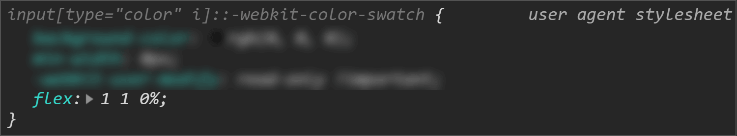
In Chrome, at the top of the shadow DOM, we have a <div> wrapper that we can access using ::-webkit-color-swatch-wrapper.
Inside it, we have another <div> we can access with ::-webkit-color-swatch.
Inner structure in Chrome.
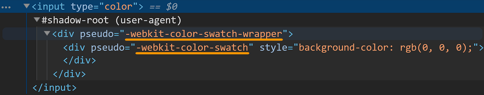
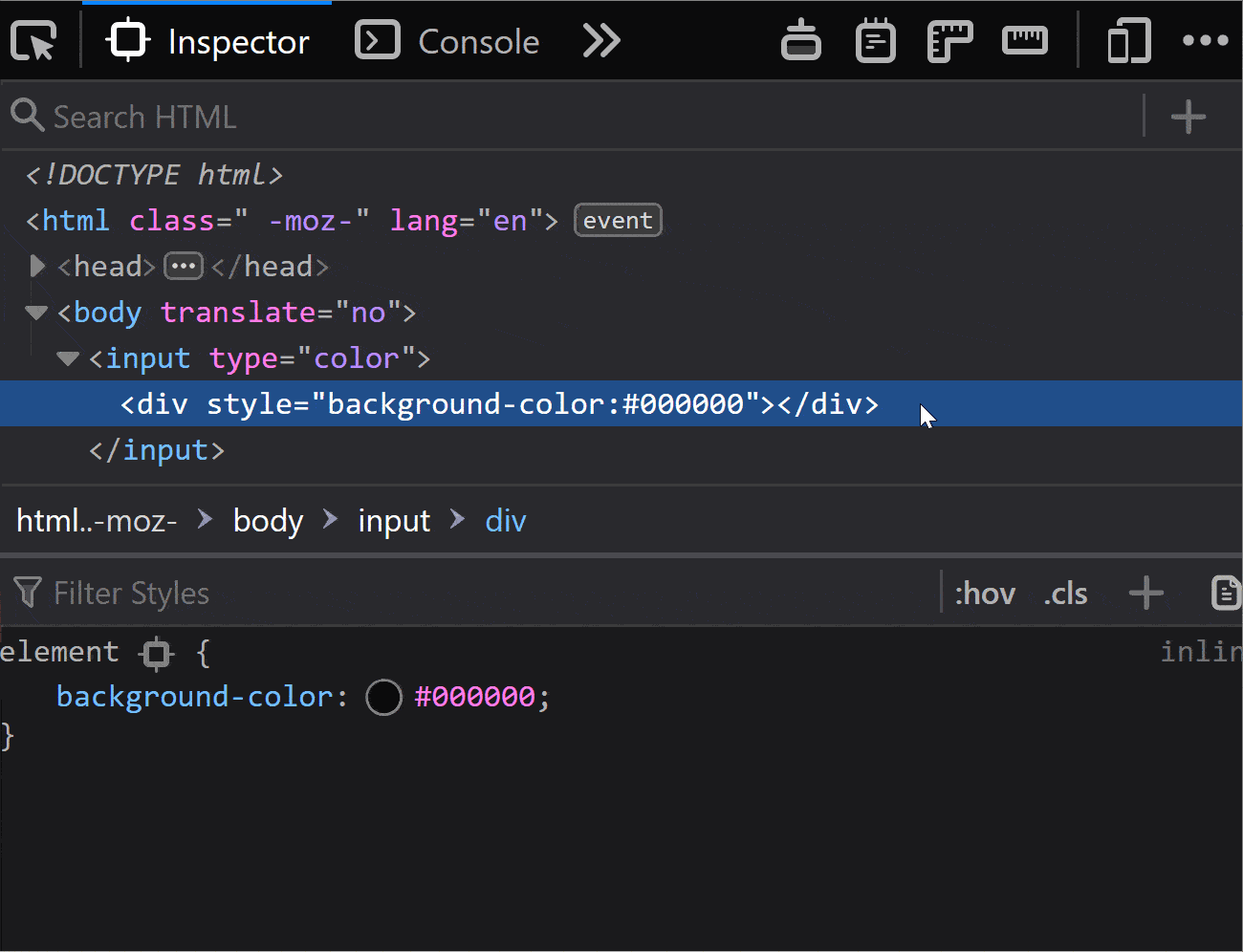
In Firefox, we only see one <div>, but it's not labeled in any way, so how do we access it?
On a hunch, given this <div> has the background-color set to the input's value attribute, just like the ::-webkit-color-swatch component, I tried ::-moz-color-swatch. And it turns out it works!
Inner structure in Firefox.
However, I later learned we have a better way of figuring this out for Firefox!
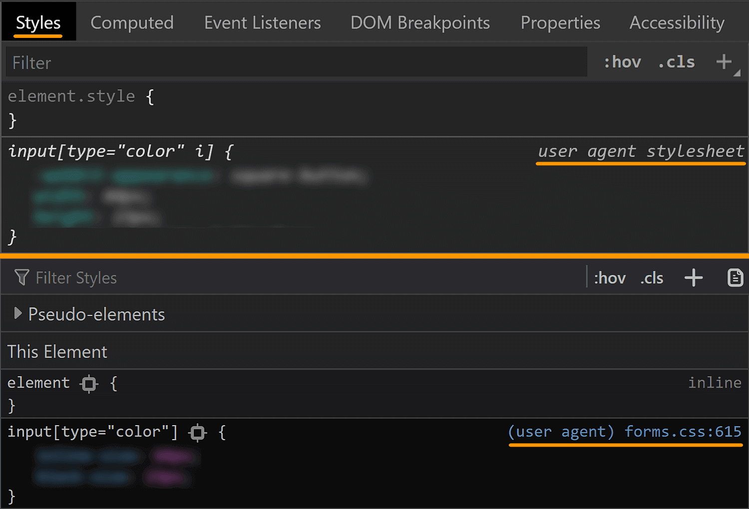
We can go into the Firefox DevTools Settings and, in the Inspector section, make sure the "Show Browser Styles" option is checked. Then, we go back to the Inspector and select this <div> inside our <input type='color'>. Among the user agent styles, we see a rule set for input[type='color']::-moz-color-swatch!
Enable viewing browser styles in Firefox DevTools.
In pre-Chromium Edge, we cannot even see what kind of structure we have inside. I gave ::-ms-color-swatch a try, but it didn't work and neither did ::-ms-swatch (which I considered because, for an input type='range', we have ::-webkit-slider-thumb and ::-moz-range thumb, but just ::-ms-thumb).
After a lot of searching, all I found was this issue from 2016. Pre-Chromium Edge apparently doesn't allow us to style whatever is inside this input. Well, that's a bummer.
How to look at the browser styles
In all browsers, we have the option of not applying any styles of our own and then looking at the computed styles.
In Chrome and Firefox, we can also see the user agent stylesheet rule sets that are affecting the currently selected element (though we need to explicitly enable this in Firefox, as seen in the previous section).
Checking browser styles in Chrome and Firefox.
This is oftentimes more helpful than the computed styles, but there are exceptions and we should still always check the computed values as well.
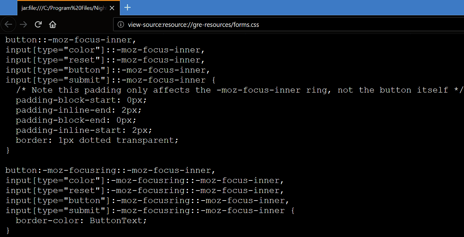
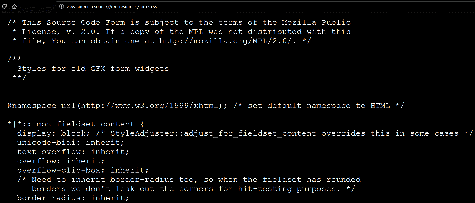
In Firefox, we can also see the CSS file for the form elements at view-source:resource://gre-resources/forms.css.
Checking browser styles in Firefox.
The input element itself
We'll now be taking a look at the default values of a few properties in various browsers in order to get a clear picture of what we'd really need to set explicitly in order to get a custom cross-browser result.
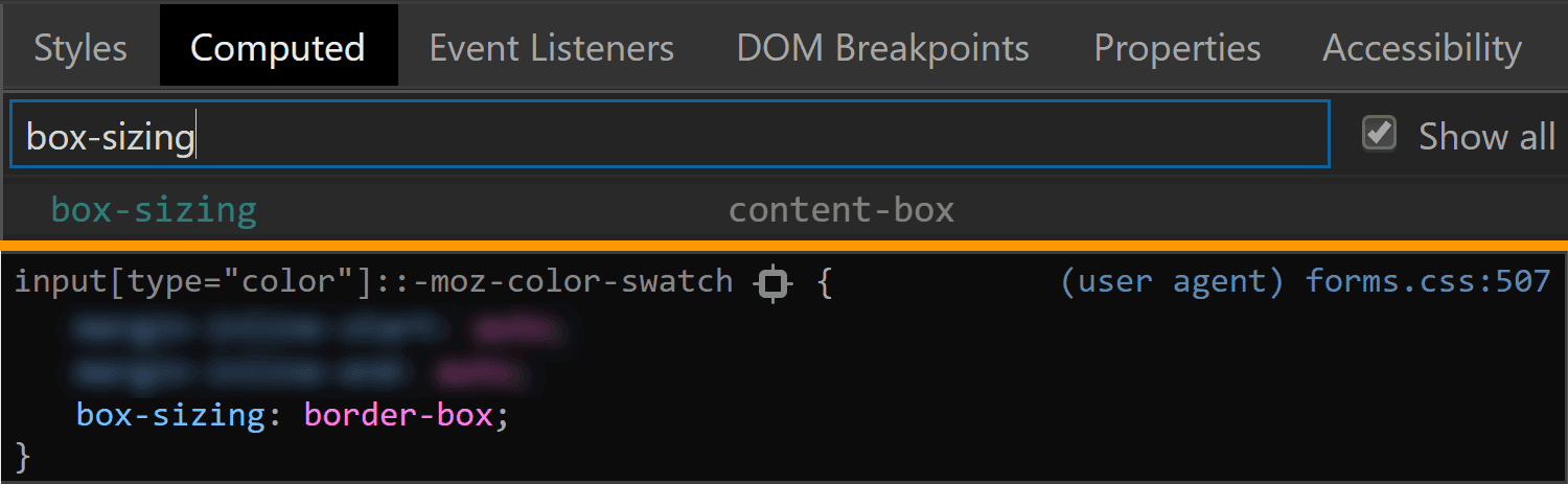
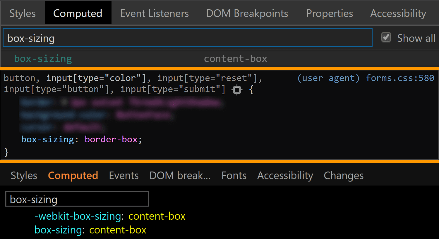
The first property I always think about checking when it comes to <input> elements is box-sizing. The initial value of this property is border-box in Firefox, but content-box in Chrome and Edge.
The box-sizing values for <input type='color'> compared in Chrome, Firefox and Edge (from top-to-bottom).
We can see that Firefox is setting it to border-box on <input type='color'>, but it looks like Chrome isn't setting it at all, so it's left with the initial value of content-box (and I suspect the same is true for Edge).
In any event, what it all means is that, if we are to have a border or a padding on this element, we also need to explicitly set box-sizing so that we get a consistent result across all these browsers.
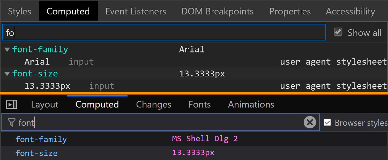
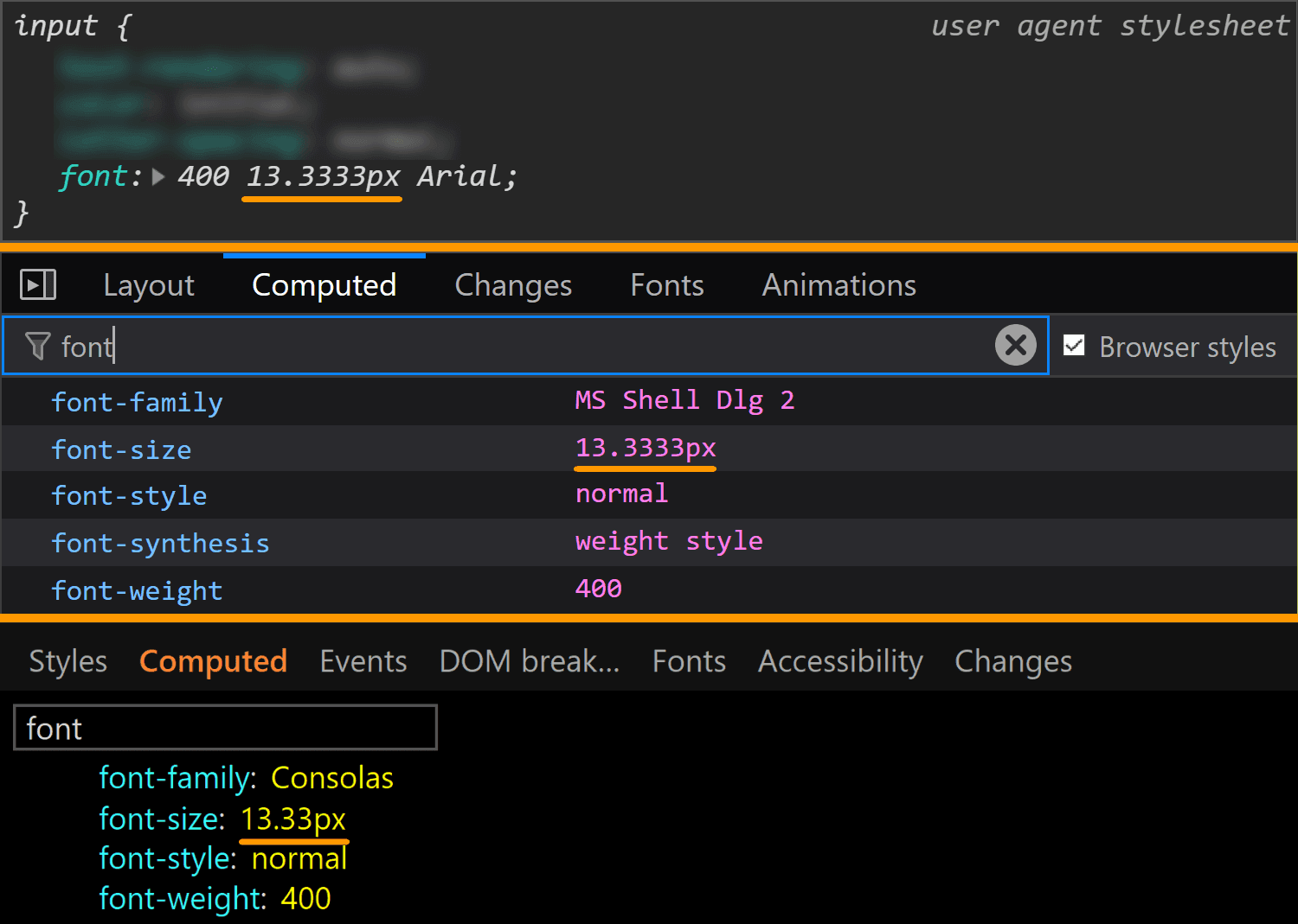
The font property value is different for every browser, but since we don't have text inside this input, all we really care about is the font-size, which is consistent across all browsers I've checked: 13.33(33)px. This is a value that really looks like it came from dividing 40px by 3, at least in Chrome.
The font values for <input type='color'> compared in Chrome, Firefox and Edge (from top-to-bottom).
This is a situation where the computed styles are more useful for Firefox, because if we look at the browser styles, we don't get much in terms of useful information:
Sometimes the browser styles are pretty much useless (Firefox screenshot).
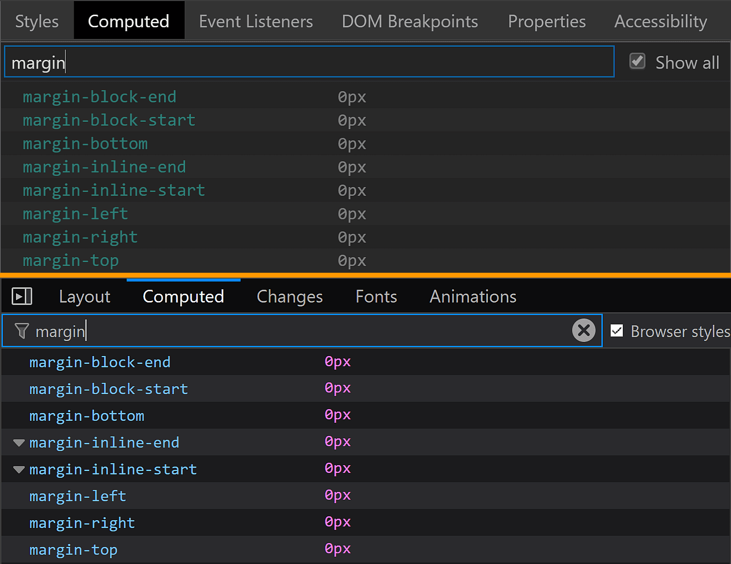
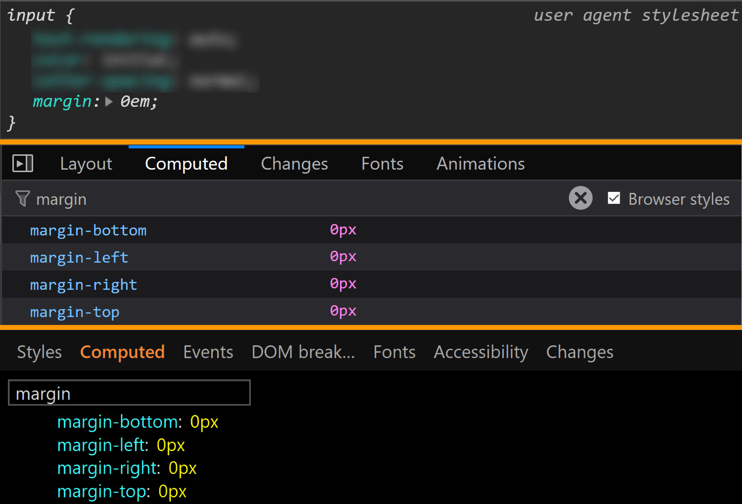
The margin is also consistent across all these browsers, computing to 0.
The margin values for <input type='color'> compared in Chrome, Firefox and Edge (from top-to-bottom).
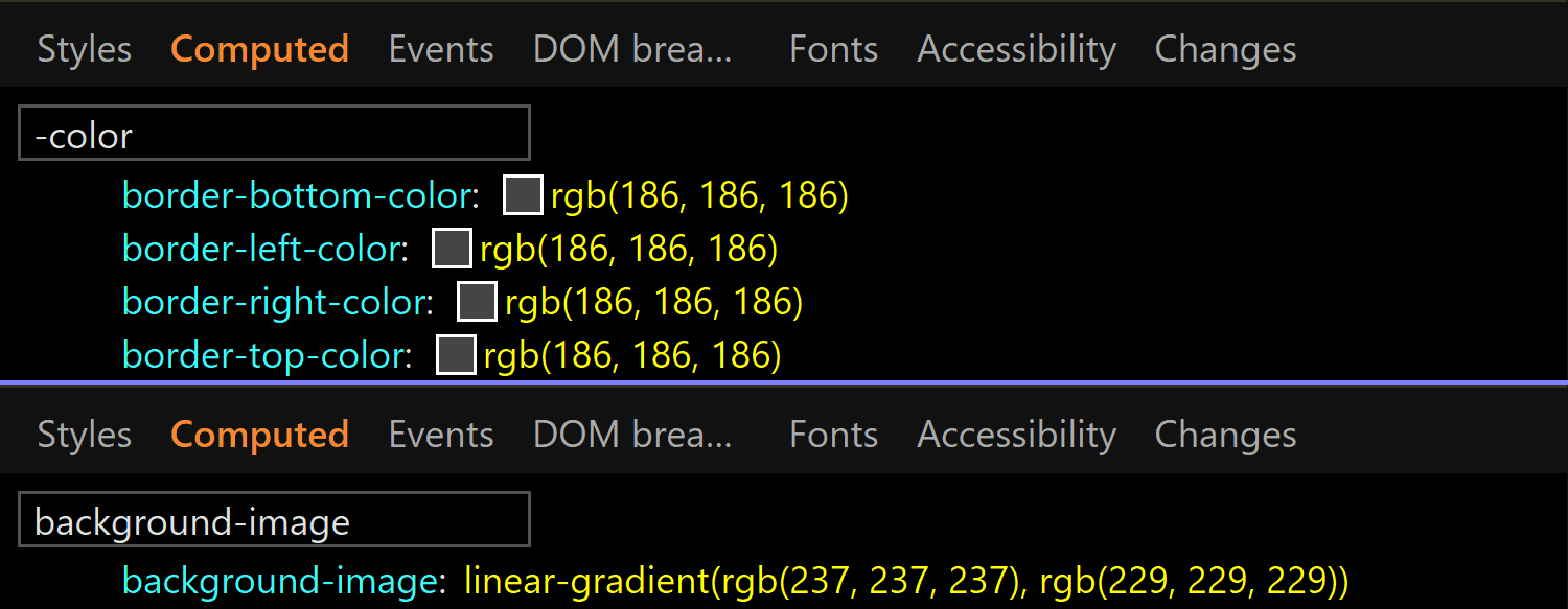
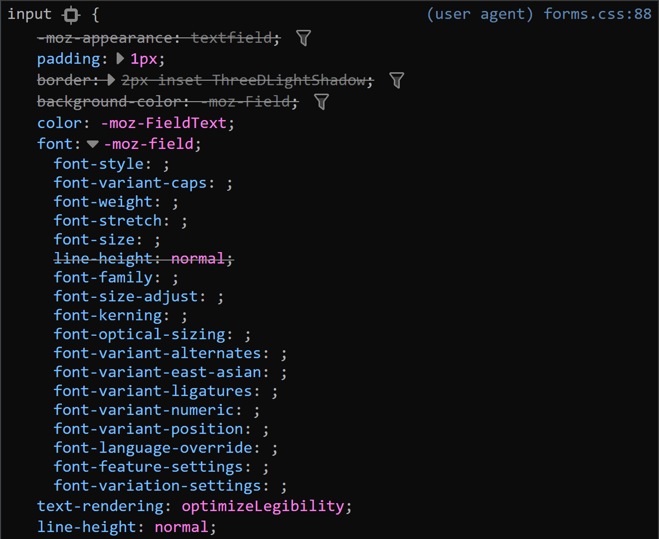
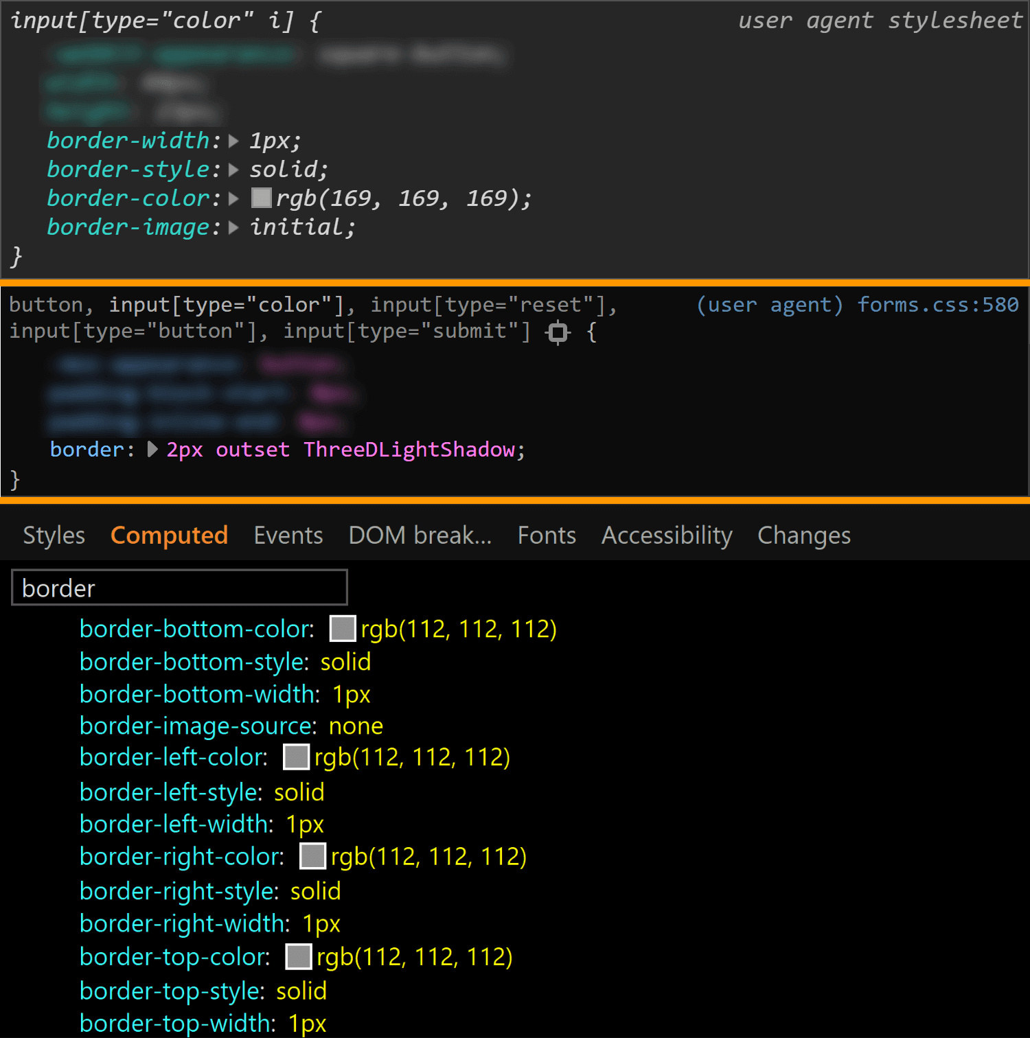
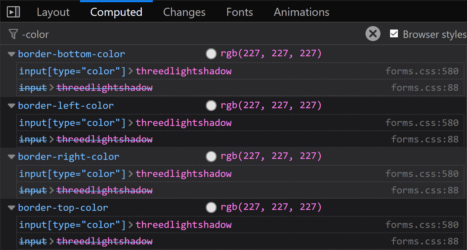
The border is different for every single browser. In both Chrome and Edge, we have a solid 1px one, but the border-color is different (rgb(169, 169, 169) for Chrome and rgb(112, 112, 112) for Edge). In Firefox, the border is an outset 2px one, with a border-color of... ThreeDLightShadow?!
The border values for <input type='color'> compared in Chrome, Firefox and Edge (from top-to-bottom).
What's the deal with ThreeDLightShadow? If it doesn't sound familiar, don't worry! It's a (now deprecated) CSS2 system value, which Firefox on Windows shows me to be rgb(227, 227, 227) in the Computed styles tab.
Computed border-color for <input type='color'> in Firefox on Windows.
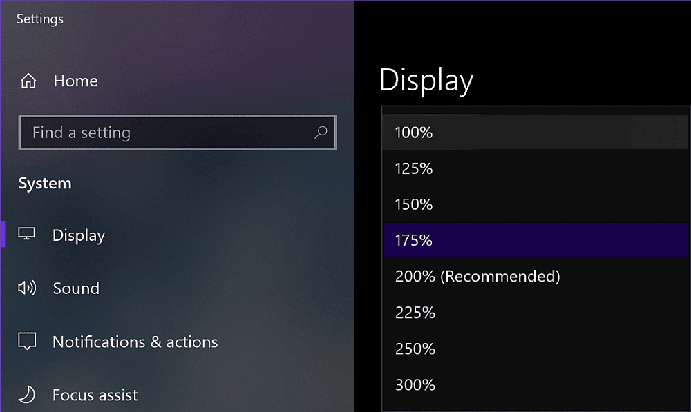
Note that in Firefox (at least on Windows), the operating system zoom level (Settings → System → Display → Scale and Layout → Change the size of text, apps and other items) is going to influence the computed value of the border-width, even though this doesn't seem to happen for any other property I've checked and it seems to be partially related to the border-style.
Zoom level options on Windows.
The strangest thing is the computed border-width values for various zoom levels don't seem to make any sense. If we keep the initial border-style: outset, we have:
1.6px for 125%
2px for 150%
1.7px for 175%
1.5px for 200%
1.8px for 225%
1.6px for 250%
1.66667px for 300%
If we set border-style: solid, we have a computed border-width of 2px, exactly as it was set, for zoom values that are multiples of 50% and the exact same computed values as for border-style: outset for all the other zoom levels.
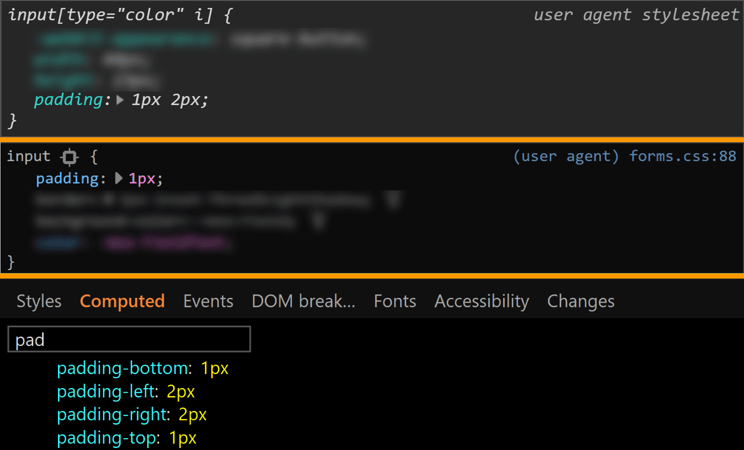
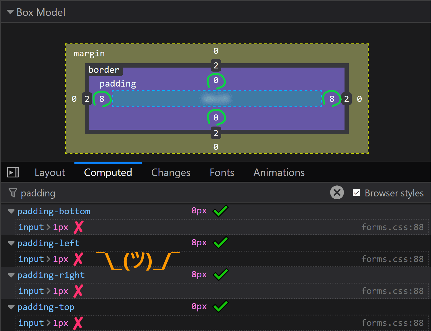
The padding is the same for Chrome and Edge (1px 2px), while Firefox is the odd one out again.
The padding values for <input type='color'> compared in Chrome, Firefox and Edge (from top-to-bottom).
It may look like the Firefox padding is 1px. That's what it is set to and there's no indication of anything overriding it — if a property is overridden, then it's shown as grey and with a strike-through.
Spotting overrides in Firefox.
But the computed value is actually 0 8px! Moreover, this is a value that doesn't depend on the operating system zoom level. So, what the hairy heck is going on?!
Computed value for padding in Firefox doesn't match the value that was set on input.
Now, if you've actually tried inspecting a color input, took a close look at the styles set on it, and your brain works differently than mine (meaning you do read what's in front of you and don't just scan for the one thing that interests you, completely ignoring everything else...) then you've probably noticed there is something overriding the 1px padding (and should be marked as such) — the flow-relative padding!
Flow-relative padding overrides in Firefox.
Dang, who knew those properties with lots of letters were actually relevant? Thanks to Zoltan for noticing and letting me know. Otherwise, it probably would have taken me two more days to figure this one out.
This raises the question of whether the same kind of override couldn't happen in other browsers and/or for other properties.
Edge doesn't support CSS logical properties, so the answer is a "no" in that corner.
In Chrome, none of the logical properties for margin, border or padding are set explicitly for <input type='color'>, so we have no override.
Concerning other properties in Firefox, we could have found ourselves in the same situation for margin or for border, but with these two, it just so happens the flow-relative properties haven't been explicitly set for our input, so again, there's no override.
Even so, it's definitely something to watch out for in the future!
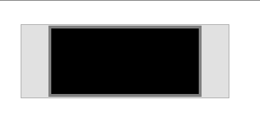
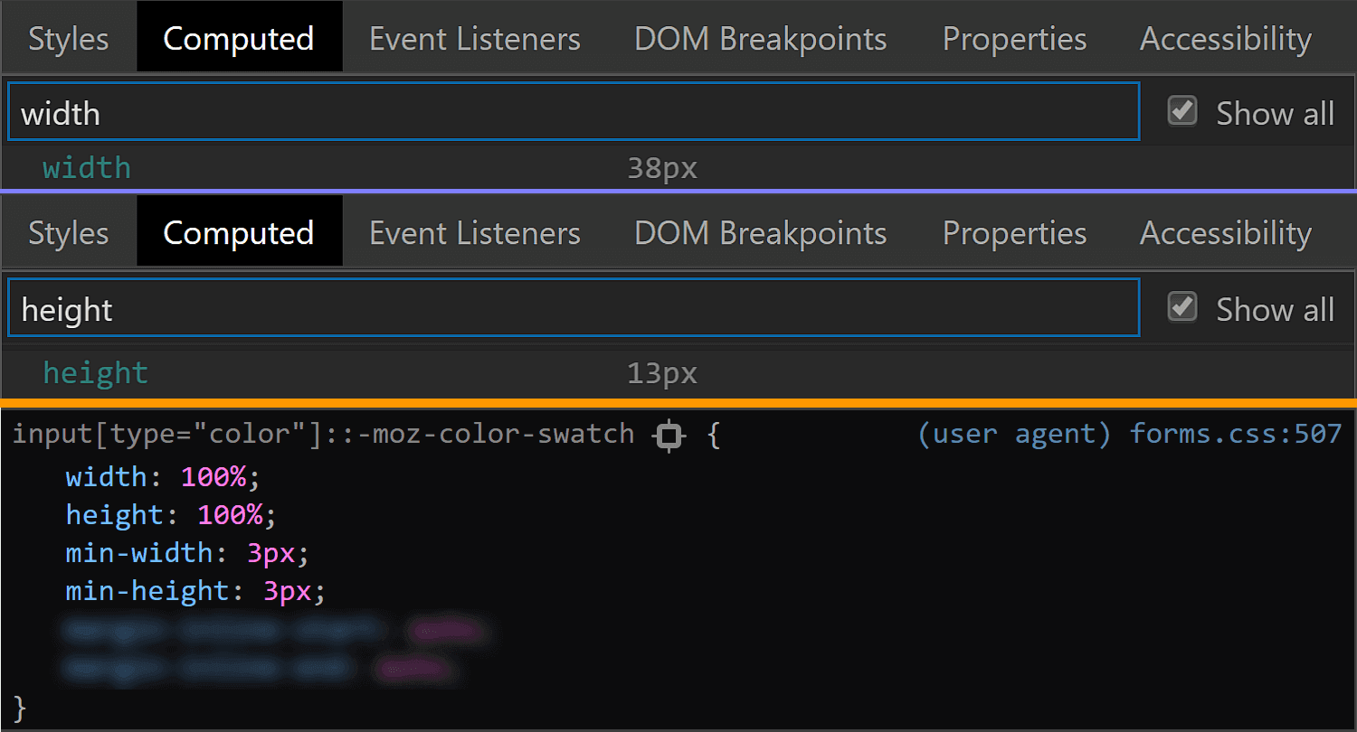
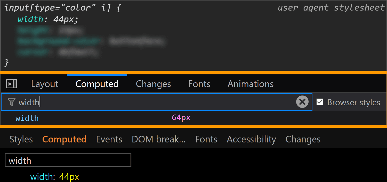
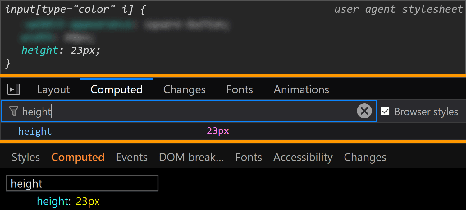
Moving on to dimensions, our input's width is 44px in Chrome and Edge and 64px in Firefox.
The width values for <input type='color'> compared in Chrome, Firefox and Edge (from top-to-bottom).
Its height is 23px in all three browsers.
The height values for <input type='color'> compared in Chrome, Firefox and Edge (from top-to-bottom).
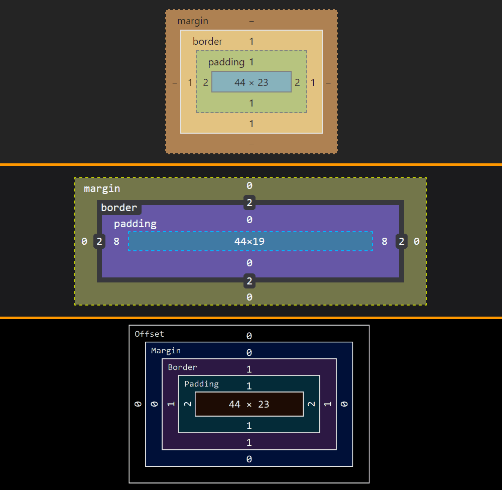
Note that, since Chrome and Edge have a box-sizing of content-box, their width and height values do not include the padding or border. However, since Firefox has box-sizing set to border-box, its dimensions include the padding and border.
The layout boxes for <input type='color'> compared in Chrome, Firefox and Edge (from top-to-bottom).
This means the content-box is 44pxx23px in Chrome and Edge and 44xpxx19px in Firefox, the padding-box is 48pxx25 in Chrome and Edge and 60pxx19px in Firefox and the border-box is 50pxx27px in Chrome and Edge and 64pxx23 in Firefox.
We can clearly see how the dimensions were set in Chrome and I'd assume they were set in the same direct way in Edge as well, even if Edge doesn't allow us to trace this stuff. Firefox doesn't show these dimensions as having been explicitly set and doesn't even allow us to trace where they came from in the Computed tab (as it does for other properties like border, for example). But if we look at all the styles that have been set on input[type='color'], we discover the dimensions have been set as flow-relative ones (inline-size and block-size).
How <input type='color'> dimensions have been set in Firefox.
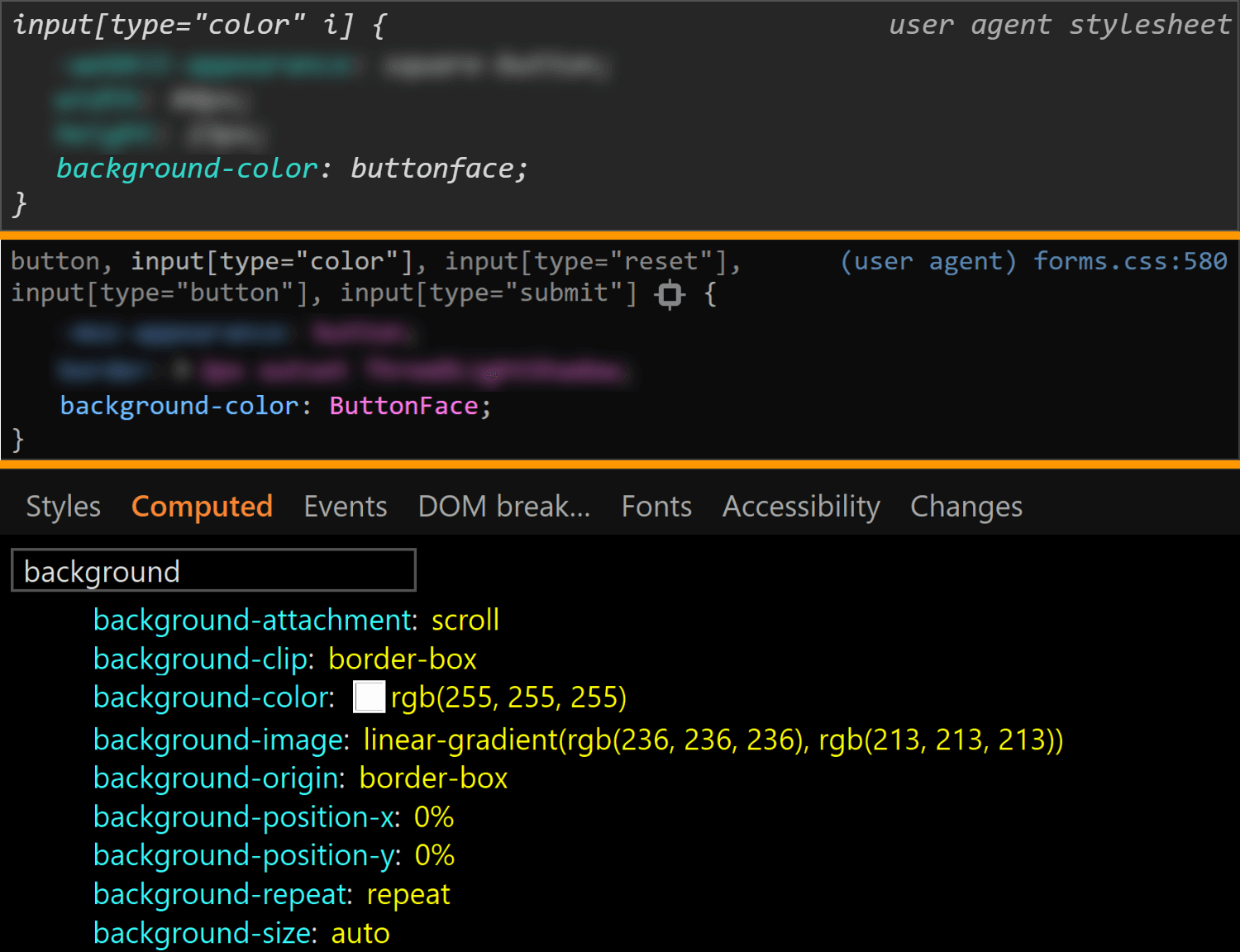
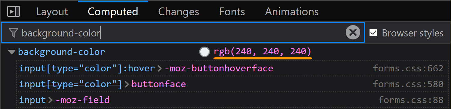
The final property we check for the normal state of the actual input is background. Here, Edge is the only browser to have a background-image (set to a top to bottom gradient), while Chrome and Firefox both have a background-color set to ButtonFace (another deprecated CSS2 system value). The strange thing is this should be rgb(240, 240, 240) (according to this resource), but its computed value in Chrome is rgb(221, 221, 221).
The background values for <input type='color'> compared in Chrome, Firefox and Edge (from top-to-bottom).
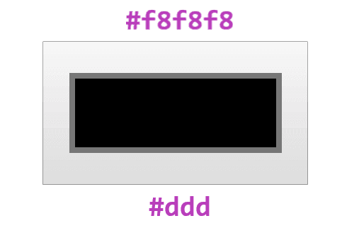
What's even stranger is that, if we actually look at our input in Chrome, it sure does look like it has a gradient background! If we screenshot it and then use a picker, we get that it has a top to bottom gradient from #f8f8f8 to #ddd.
What the actual input looks like in Chrome. It appears to have a gradient, in spite of the info we get from DevTools telling us it doesn't.
Also, note that changing just the background-color (or another property not related to dimensions like border-radius) in Edge also changes the background-image, background-origin, border-color or border-style.
Edge: side-effects of changing background-color.
Other states
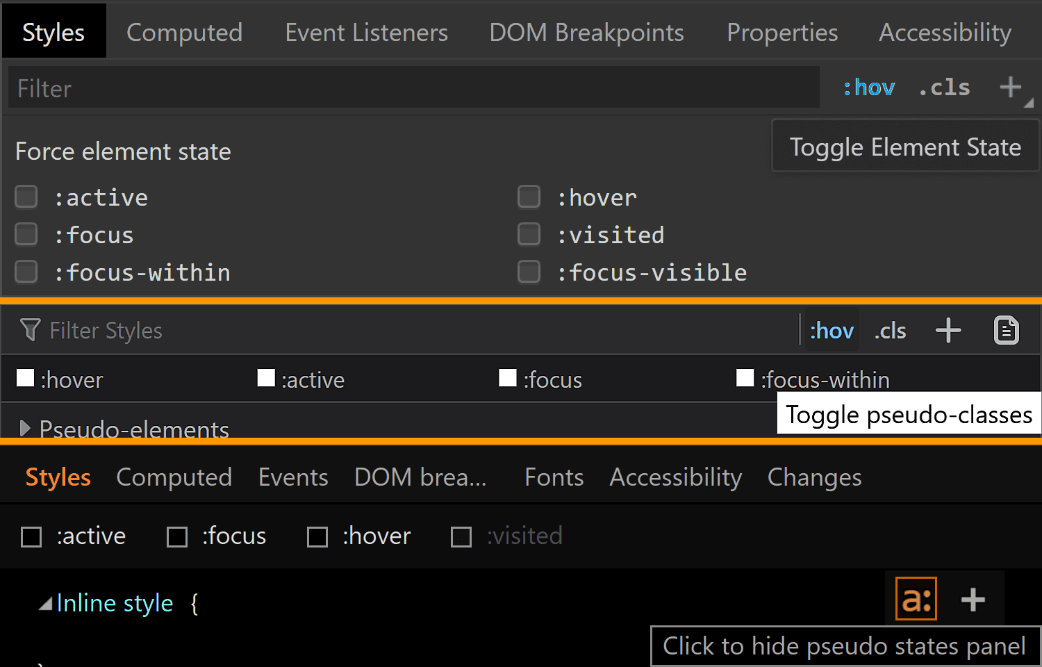
We can take a look at the styles applied for a bunch of other states of an element by clicking the :hov button in the Styles panel for Chrome and Firefox and the a: button in the same Styles panel for Edge. This reveals a section where we can check the desired state(s).
Taking a look at other states in Chrome, Firefox, Edge (from top to bottom).
Note that, in Firefox, checking a class only visually applies the user styles on the selected element, not the browser styles. So, if we check :hover for example, we won't see the :hover styles applied on our element. We can however see the user agent styles matching the selected state for our selected element shown in DevTools.
Also, we cannot test for all states like this and let's start with such a state.
:disabled
In order to see how styles change in this state, we need to manually add the disabled attribute to our <input type='color'> element.
Hmm... not much changes in any browser!
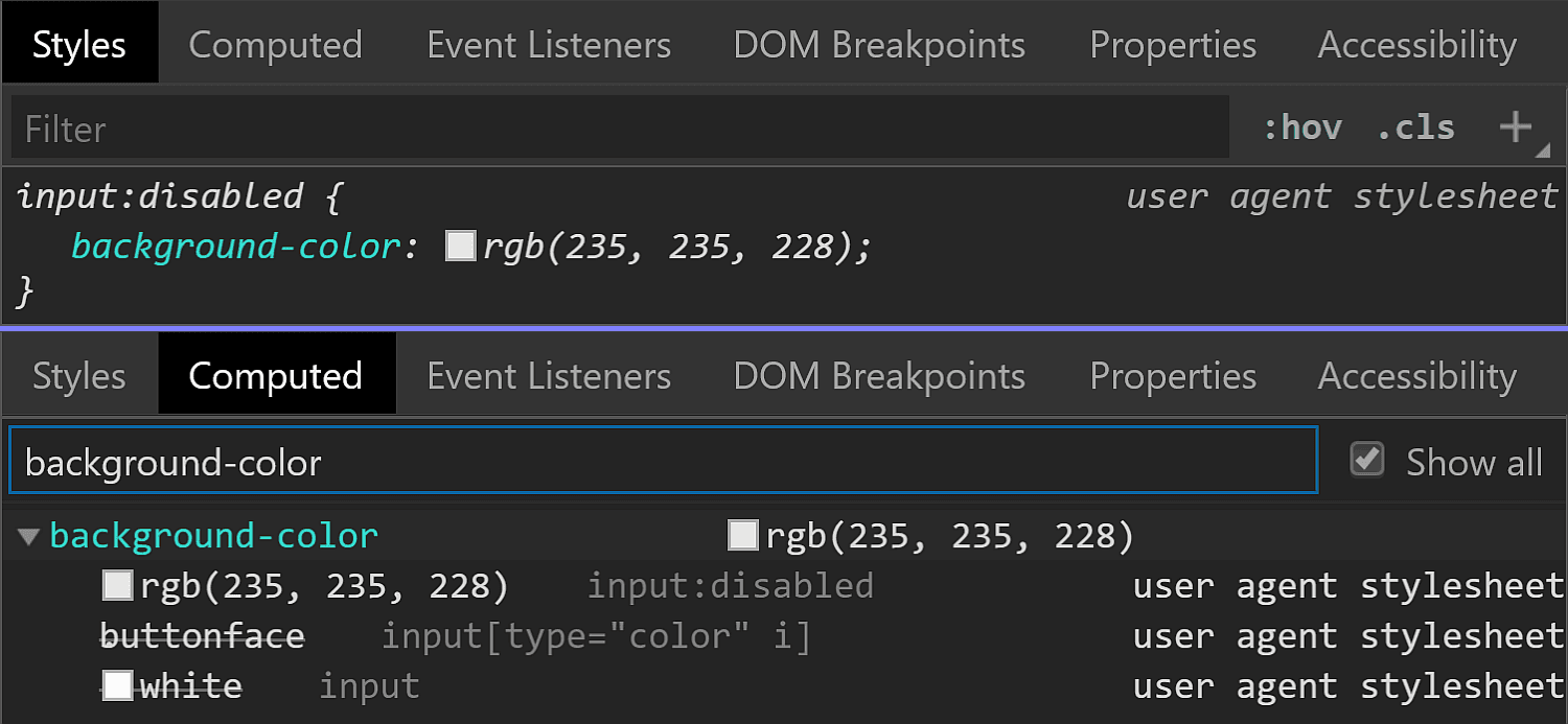
In Chrome, we see the background-color is slightly different (rgb(235, 235, 228) in the :disabled state versus rgb(221, 221, 221) in the normal state).
Chrome :disabled styling.
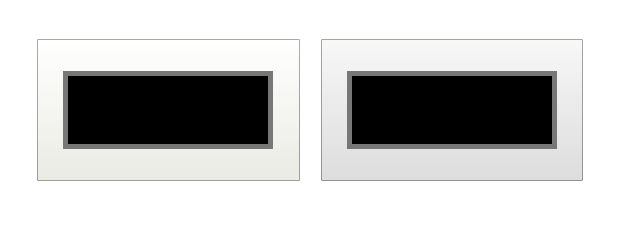
But the difference is only clear looking at the info in DevTools. Visually, I can tell tell there's a slight difference between an input that's :disabled and one that's not if they're side-by-side, but if I didn't know beforehand, I couldn't tell which is which just by looking at them, and if I just saw one, I couldn't tell whether it's enabled or not without clicking it.
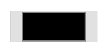
Disabled (left) versus enabled (right) <input type='color'> in Chrome.
In Firefox, we have the exact same values set for the :disabled state as for the normal state (well, except for the cursor, which realistically, isn't going to produce different results save for exceptional cases anyway). What gives, Firefox?!
Firefox :disabled (top) versus normal (bottom) styling.
In Edge, both the border-color and the background gradient are different.
Clearly different if we look at the code and visually better than Chrome, though it still may not be quite enough:
Disabled (left) versus enabled (right) <input type='color'> in Edge.
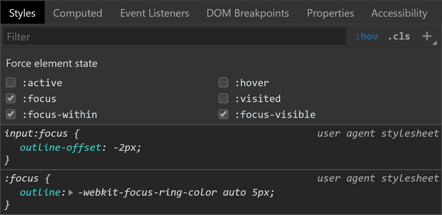
:focus
This is one state we can test by toggling the DevTools pseudo-classes. Well, in theory. In practice, it doesn't really help us in all browsers.
Starting with Chrome, we can see that we have an outline in this state and the outline-color computes to rgb(77, 144, 254), which is some kind of blue.
Chrome :focus styling.
Pretty straightforward and easy to spot.
Moving on to Firefox, things start to get hairy! Unlike Chrome, toggling the :focus pseudo-class from DevTools does nothing on the input element, though by focusing it (by tab click), the border becomes blue and we get a dotted rectangle within — but there's no indication in DevTools regarding what is happening.
What happens in Firefox when tabbing to our input to :focus it.
If we check Firefox's forms.css, it provides an explanation for the dotted rectangle. This is the dotted border of a pseudo-element, ::-moz-focus-inner (a pseudo-element which, for some reason, isn't shown in DevTools inside our input as ::-moz-color-swatch is). This border is initially transparent and then becomes visible when the input is focused — the pseudo-class used here (:-moz-focusring) is pretty much an old Firefox version of the new standard (:focus-visible), which is currently only supported by Chrome behind the Experimental Web Platform features flag.
Firefox: where the inner dotted rectangle on :focus comes from.
What about the blue border? Well, it appears this one isn't set by a stylesheet, but at an OS level instead. The good news is we can override all these styles should we choose to do so.
In Edge, we're faced with a similar situation. Nothing happens when toggling the :focus pseudo-class from DevTools, but if we actually tab to our input to focus it, we can see an inner dotted rectangle.
What happens in Edge when tabbing to our input to :focus it.
Even though I have no way of knowing for sure, I suspect that, just like in Firefox, this inner rectangle is due to a pseudo-element that becomes visible on :focus.
:hover
In Chrome, toggling this pseudo-class doesn't reveal any :hover-specific styles in DevTools. Furthermore, actually hovering the input doesn't appear to change anything visually. So it looks like Chrome really doesn't have any :hover-specific styles?
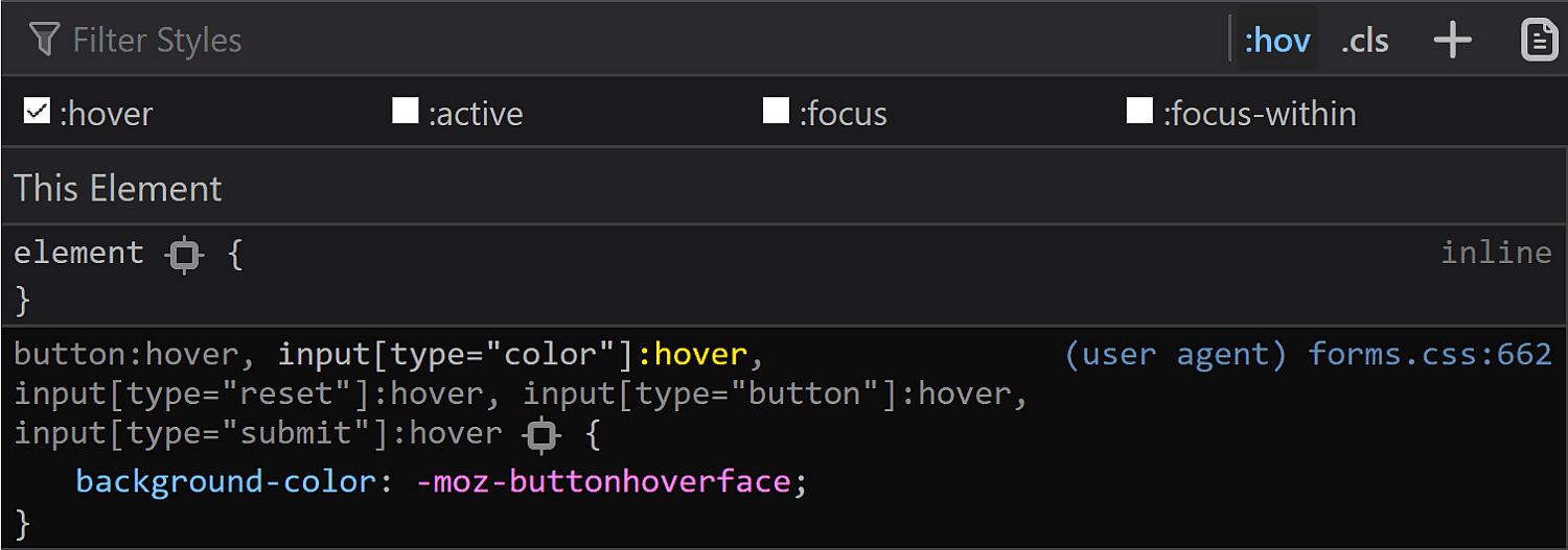
In Firefox, toggling the :hover pseudo-class from DevTools reveals a new rule in the styles panel:
Firefox :hover styling as seen in DevTools.
When actually hovering the input, we see the background turns light blue and the border blue, so the first thought would be that light blue is the -moz-buttonhoverface value and that the blue border is again set at an OS level, just like in the :focus case.
What actually happens in Firefox on :hover.
However, if we look at the computed styles, we see the same background we have in the normal state, so that blue background is probably really set at an OS level as well, in spite of having that rule in the forms.css stylesheet.
Firefox: computed background-color of an <input type='color'> on :hover.
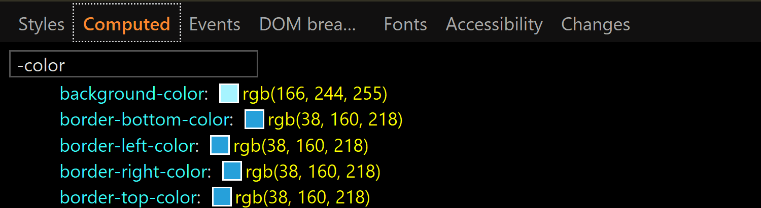
In Edge, toggling the :hover pseudo-class from DevTools gives our input a light blue (rgb(166, 244, 255)) background and a blue (rgb(38, 160, 218)) border, whose exact values we can find in the Computed tab:
Edge: computed background-color and border-color of an <input type='color'> on :hover.
:active
Checking the :active state in the Chrome DevTools does nothing visually and shows no specific rules in the Styles panel. However, if we actually click our input, we see that the background gradient that doesn't even show up in DevTools in the normal state gets reversed.
What the actual input looks like in Chrome in the :active state. It appears to have a gradient (reversed from the normal state), in spite of the info we get from DevTools telling us it doesn't.
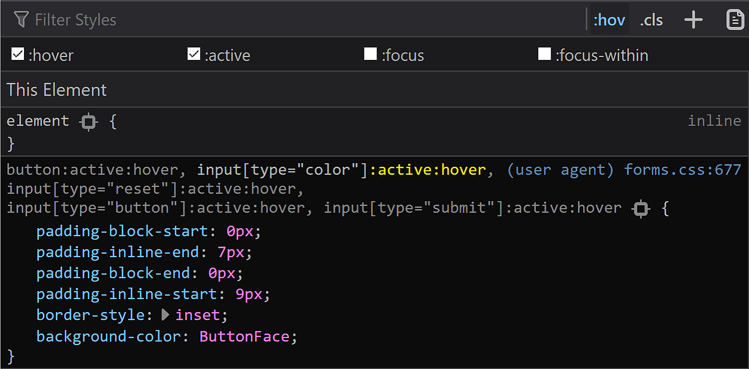
In Firefox DevTools, toggling the :active state on does nothing, but if we also toggle the :hover state on, then we get a rule set that changes the inline padding (the block padding is set to the same value of 0 it has in all other states), the border-style and sets the background-color back to our old friend ButtonFace.
Firefox :active styling as seen in DevTools.
In practice, however, the only thing that matches the info we get from DevTools is the inline shift given by the change in logical padding. The background becomes a lighter blue than the :hover state and the border is blue. Both of these changes are probably happening at an OS level as well.
What actually happens in Firefox in an :active state.
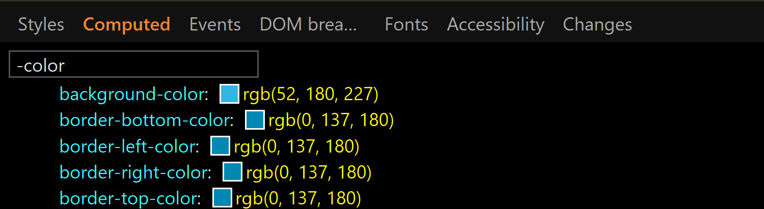
In Edge, activating the :active class from DevTools gives us the exact same styles we have for the :hover state. However, if we have both the :hover and the :active states on, things change a bit. We still have a light blue background and a blue border, but both are darker now (rgb(52, 180, 227) for the background-color and rgb(0, 137, 180) for the border-color):
The computed background-color and border-color of an <input type='color'> on :active viewed in Edge.
This is the takeaway: if we want a consistent cross-browser results for <input type='color'>, we should define our own clearly distinguishable styles for all these states ourselves because, fortunately, almost all the browser defaults — except for the inner rectangle we get in Edge on :focus — can be overridden.
The swatch wrapper
This is a component we only see in Chrome, so if we want a cross-browser result, we should probably ensure it doesn't affect the swatch inside — this means ensuring it has no margin, border, padding or background and that its dimensions equal those of the actual input's content-box.
In order to know whether we need to mess with these properties (and maybe others as a result) or not, let's see what the browser defaults are for them.
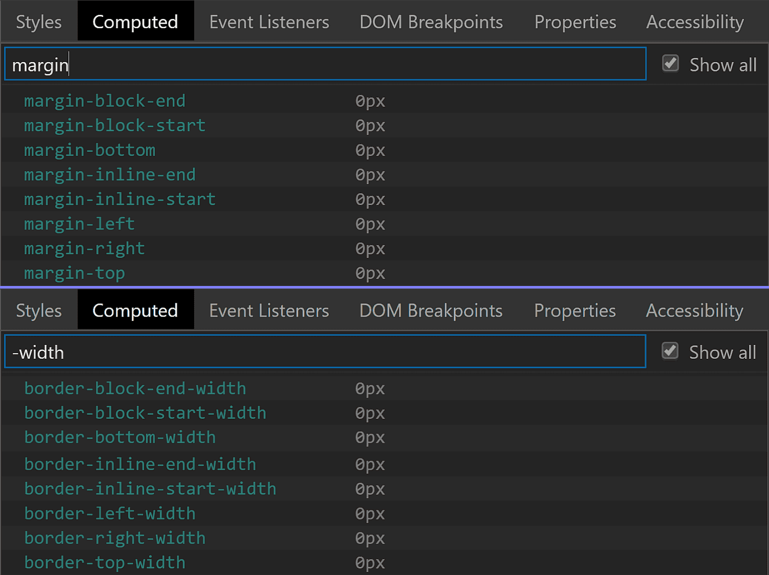
Fortunately, we have no margin or border, so we don't need to worry about these.
The margin and border values for the swatch wrapper in Chrome.
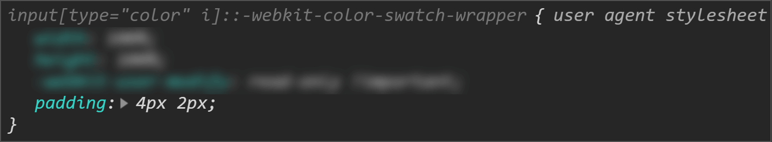
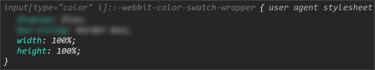
We do however have a non-zero padding (of 4px 2px), so this is something we'll need to zero out if we want to achieve a consistent cross-browser result.
The padding values for the swatch wrapper in Chrome.
The dimensions are both conveniently set to 100%, which means we won't need to mess with them.
The size values for the swatch wrapper in Chrome.
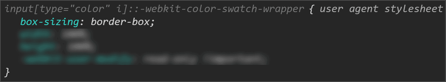
Something we need to note here is that we have box-sizing set to border-box, so the padding gets subtracted from the dimensions set on this wrapper.
The box-sizing value for the swatch wrapper in Chrome.
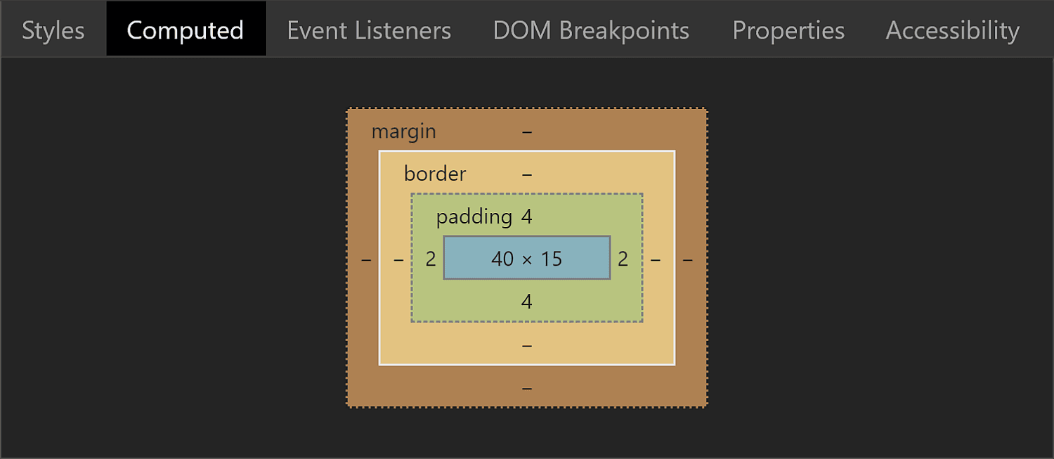
This means that while the padding-box, border-box and margin-box of our wrapper (all equal because we have no margin or border) are identical to the content-box of the actual <input type='color'> (which is 44pxx23px in Chrome), getting the wrapper's content-box involves subtracting the padding from these dimensions. It results that this box is 40pxx15px.
The box model for the swatch wrapper in Chrome.
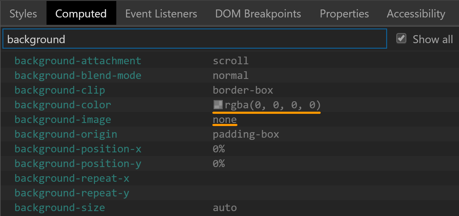
The background is set to transparent, so that's another property we don't need to worry about resetting.
The background values for the swatch wrapper in Chrome.
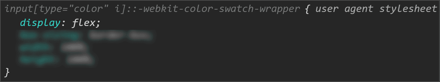
There's one more property set on this element that caught my attention: display. It has a value of flex, which means its children are flex items.
The display value for the swatch wrapper in Chrome.
The swatch
This is a component we can style in Chrome and Firefox. Sadly, Edge doesn't expose it to allow us to style it, so we cannot change properties we might want to, such as border, border-radius or box-shadow.
The box-sizing property is one we need to set explicitly if we plan on giving the swatch a border or a padding because its value is content-box in Chrome, but border-box in Firefox.
The box-sizing values for the swatch viewed in Chrome (top) and Firefox (bottom).
Fortunately, the font-size is inherited from the input itself so it's the same.
The font-size values for the swatch viewed in Chrome (top) and Firefox (bottom).
The margin computes to 0 in both Chrome and Firefox.
The margin values for the swatch viewed in Chrome (top) and Firefox (bottom).
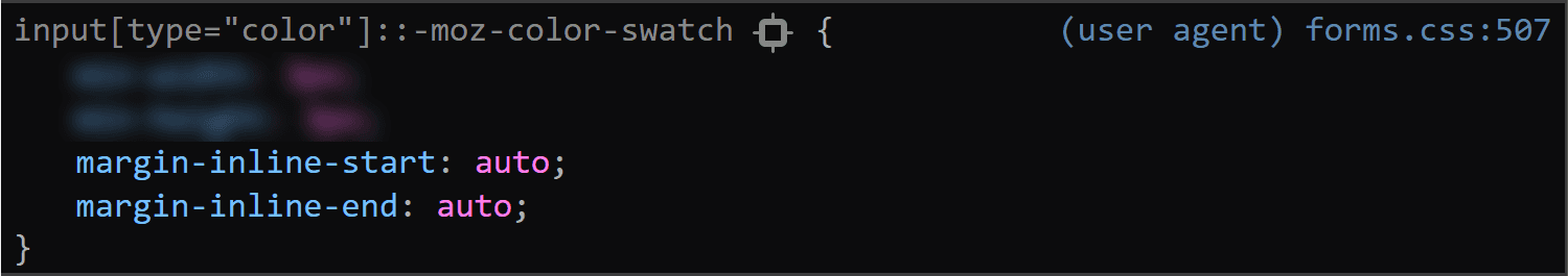
This is because most margins haven't been set, so they end up being 0 which is the default for <div> elements. However, Firefox is setting the inline margins to auto and we'll be getting to why that computes to 0 in just a little moment.
The inline margin for the swatch being set to auto in Firefox.
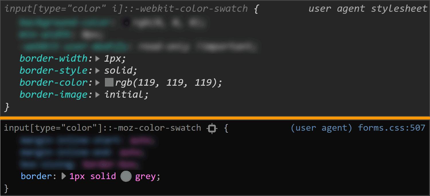
The border is solid 1px in both browsers. The only thing that differs is the border-color, which is rgb(119, 119, 119) in Chrome and grey (or rgb(128, 128, 128), so slightly lighter) in Firefox.
The border values for the swatch viewed in Chrome (top) and Firefox (bottom).
Note that the computed border-width in Firefox (at least on Windows) depends on the OS zoom level, just as it is in the case of the actual input.
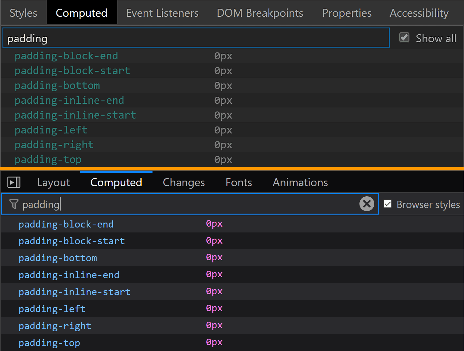
The padding is luckily 0 in both Chrome and Firefox.
The padding values for the swatch viewed in Chrome (top) and Firefox (bottom).
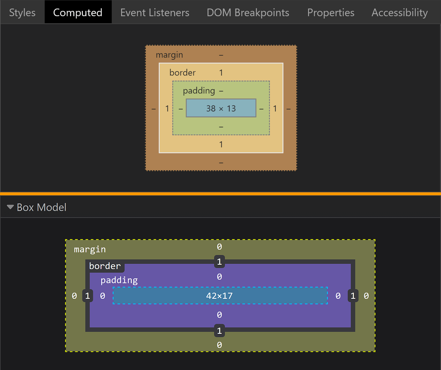
The dimensions end up being exactly what we'd expect to find, assuming the swatch covers its parent's entire content-box.
The box model for the swatch viewed in Chrome (top) and Firefox (bottom).
In Chrome, the swatch parent is the <div> wrapper we saw earlier, whose content-box is 4pxx15px. This is equal to the margin-box and the border-box of the swatch (which coincide as we have no margin). Since the padding is 0, the content-box and the padding-box for the swatch are identical and, subtracting the 1px border, we get dimensions that are 38pxx13px.
In Firefox, the swatch parent is the actual input, whose content-box is 44pxx19px one. This is equal to the margin-box and the border-box of the swatch (which coincide as we have no margin). Since the padding is 0, the content-box and the padding-box for the swatch are identical and, subtracting the 1px border, we get that their dimensions are 42pxx17px.
In Firefox, we see that the swatch is made to cover its parent's content-box by having both its dimensions set to 100%.
The size values for the swatch viewed in Chrome (top) and Firefox (bottom).
This is the reason why the auto value for the inline margin computes to 0.
But what about Chrome? We cannot see any actual dimensions being set. Well, this result is due to the flex layout and the fact that the swatch is a flex item that's made to stretch such that it covers its parent's content-box.
The flex value for the swatch wrapper in Chrome.
Final thoughts
Phew, we covered a lot of ground here! While it may seem exhaustive to dig this deep into one specific element, this is the sort of exercise that illustrates how difficult cross-browser support can be. We have our own styles, user agent styles and operating system styles to traverse and some of those are always going to be what they are. But, as we discussed at the very top, this winds up being an accessibility issue at the end of the day, and something to really consider when it comes to implementing a practical, functional application of a color input.
Remember, a lot of this is ripe territory to reach out to browser vendors and let them know how they can update their implementations based on your reported use cases. Here are the three tickets I mentioned earlier where you can either chime in or reference to create a new ticket:
Performance testing and engineering is always a niche area with many challenging objectives across the globe. The challenge of performance testing with performance engineering is far more complex and requires one to be multi-skilled to find problems/issues/defects. In the last few years, I have come across several interviews, discussions with client-facing groups and customers, and what they have in common is a high demand for performance engineers, not just performance testers.
Having knowledge and experience on any performance testing tools like Microfocus LoadRunner, Apache JMeter, Neotys Neoload or IBM RPT is good, but they are not really sufficient to find the hard and hidden bottlenecks. The ability to find degradations and root cause analysis in performance testing projects is really a challenge for any performance guru. So, what makes a performance tester a performance engineer? We all know that anything is possible in the IT industry and that skills can be acquired if one has a positive attitude and the only prerequisite to learning is spending time. So, based on my experience and understanding of this area, I have tried to lay down the general guidelines which I believe will help make any performance tester become a Perfect Performance Engineer. This article can help many performance engineers understand how to start a career from performance testing to performance engineering and the essential skills that every performance engineer should have.
We’ve been working with the Gutenberg block editor for a long time across multiple websites, so we know that it can feel restrictive by default.
WordPress offers a set of essential content blocks like Paragraph, Image, Button, List, and more. However, you can extend these options using plugins that add more blocks to the editor.
In this article, we’ll share some of WordPress’s best Gutenberg block plugins that you can try.
What Is the WordPress Block Editor?
The WordPress block editor is the default content editor that comes with WordPress. It lets you build your posts and pages using a system of blocks.
For a typical blog post, you will have many paragraph blocks, some heading blocks for subheadings, and some image blocks.
There are also several default blocks to add other commonly used web elements such as lists, columns, groups, galleries, and more.
If you’ve been creating WordPress sites for many years, you will likely find the block editor a significant change from the classic editor.
Some users have chosen to disable the block editor and keep the classic editor. However, we recommend using the block editor. It offers many valuable features and is more user-friendly.
The block editor lets you add elements to your posts and pages that aren’t possible in the classic editor.
For instance, you can add tables to your post or add a call-to-action button without writing HTML code.
7 Most Useful Time-Saving Default WordPress Blocks
The block editor already includes built-in blocks for all types of content elements.
These blocks make it accessible to add common elements, such as tables, galleries, buttons, and more. In the older versions of WordPress, you had to install plugins to add these common web elements.
Here are some super helpful default WordPress Gutenberg blocks you can use immediately.
Button Block: This lets you add call-to-action buttons to your WordPress pages and articles.
Media & Text Block: This lets you add images and text side-by-side. Doing this with the old Classic Editor was a confusing task for beginners.
Cover Block: You can add stunning cover images to your posts and pages. See our guide on the difference between cover images vs. featured images.
Table Block: This lets you easily create basic tables in WordPress posts and pages. For advanced tables with search, sorting, and ordering features, we still recommend the free TablePress plugin.
Embed Blocks: The block editor includes many embed blocks for popular websites. You can use them to easily embed tweets, YouTube videos, and more.
Shortcode Block: This lets you easily add shortcodes to your WordPress posts and pages. This means the block editor is fully compatible with plugins that provide a shortcode.
Besides these, there are many other blocks that you can explore and try without using a plugin.
With block editor, you also get access to block patterns. These are pre-configured sets of blocks that allow you to add entire sections to your content, making content creation faster and more efficient.
With that said, let’s take a look at some of the best WordPress blocks offered by WordPress plugins. These plugins will simply add new blocks and allow you to extend the functionality of the default WordPress editor.
Best Gutenberg Blocks Plugins for Your WordPress Site
There are two types of WordPress block plugins available on the market. We will cover both of them:
Single-Purpose Block Plugins
Gutenberg Block Libraries
Single-purpose plugins are mostly popular WordPress plugins. Many of them have been in the market for a long time. They specialize in one specific feature and usually provide a powerful block to add content in WordPress.
For example, WPForms is a popular WordPress form plugin for making powerful forms in WordPress. It offers a WordPress block to add contact forms, surveys, order forms, payment forms, and more in your posts and pages.
On the other hand, there are block collection plugins that combine many different content elements in a single plugin.
For example, Genesis Pro gives you 16 additional premium blocks. These include a pricing table block, testimonial block, profile box block, and more.
Single Purpose Block Plugins vs. Block Library Plugins
Now that you know the options, you might wonder if one is better. Here are some essential points to consider.
Single-purpose block plugins add only one feature, but they offer the most comprehensive set of options and integrations. They’re often the best solution for what you’re trying to do.
Block library plugins include a collection of different blocks for different purposes. However, these blocks are not as fine-tuned as the single feature blocks. While they offer a lot of blocks, they may not be as robust.
Another disadvantage of using block suites is that they can add unnecessary clutter to your block list.
With that said, let’s look at the best WordPress Gutenberg block plugins.
WPForms is the most user-friendly WordPress form plugin on the market. It allows you to easily create simple contact forms and more powerful forms like interactive polls, surveys, order forms, and more on your WordPress site.
WPForms offers a block for adding WordPress forms to your posts and pages.
With WPForms, you can create many forms, including survey, contact, email sign-up, and login forms.
You can accept online payments through your forms via Stripe and PayPal, with no additional transaction fees. Even the free version of WPForms allows you to collect Stripe payments, and it only charges a 3% transaction fee.
Why we recommend WPForms: Forms make any website more engaging, and WPForms makes it very easy to add them anywhere on your posts and pages using a block instead of using shortcodes or writing code. In addition, it is a powerful form builder that allows you to create all sorts of forms for your website, including credit card payment forms.
Pros
Easy-to-use form builder with drag-and-drop interface
Dozens of templates to quickly create forms in WordPress
Allows you to accept payments online easily.
Cons
You need a premium version for more features.
Advanced users may want to use custom CSS to style forms.
Author Profile Block – Easily add an author profile box to posts or pages.
Pricing Block – Build beautiful pricing tables in WordPress.
Share Icons Block – Add social share buttons to your posts and pages.
Testimonial Block – Include customer testimonials to help drive sales.
Genesis Blocks also has a pro version, Genesis Pro. This gives you new blocks, 26 pre-built full-page layouts, 56 pre-built sections, and much more. If you want to create a beautiful and effective website quickly, it’s a great solution.
Genesis Blocks is owned by WP Engine, one of the leading managed WordPress hosting companies. They offer premium StudioPress themes that integrate seamlessly with the Genesis Blocks plugin.
Genesis Pro subscription will also give you access to all premium StudioPress themes.
Pros
13 additional blocks for the default WordPress editor
Pre-built layouts to create different types of content
56+ pre-built sections to use anywhere in your posts and pages
Cons
Shows Genesis Blocks above default blocks in the add block panel
Some users may find it difficult to distinguish between default patterns and the plugin’s advanced layouts.
It also comes with a collection of custom blocks that you can add to your website. These blocks are purpose-built to give your posts and pages an SEO boost.
You will get access to the following custom blocks:
AIOSEO Table of Contents – Lets you easily add an SEO-friendly table of contents to your articles.
AIOSEO Breadcrumbs – Add breadcrumb navigation with the right schema markup manually without writing code or editing the theme.
Establish E-E-A-T – Helps you comply with Google’s E-E-A-T ranking signals with Author Bio, Author Name, and Reviewer Name blocks.
Local SEO blocks: Add local SEO blocks to show business info, opening hours, and location map.
AIOSEO – FAQ – Add an FAQ section in your articles with the right schema markup to boost search rankings.
All in One SEO further extends your writing experience by adding a powerful headline analyzer, SEO analysis, and AI-powered SEO title and description generator.
Why we recommend All in One SEO: It provides essential blocks for local SEO, Author Bio, Table of Contents, and FAQs, which helps you improve your articles for search rankings. Additionally, it has in-editor writing tools, powerful schema markup support, and comprehensive SEO features. All these features make it highly useful for any WordPress website.
Pros
The most comprehensive SEO toolkit for WordPress
Custom blocks that give you an SEO boost
Additional tools in block editor to improve your content creation process from an SEO perspective
Cons
You will need the paid plan to unlock its true potential
Smash Balloon is the best social feeds plugin for WordPress. It makes adding social media posts to your site incredibly easy. For instance, you can use it to create a custom Instagram photo feed.
Smash Balloon gives you a block for adding each social media feed. For example, you can simply drag and drop the Facebook block into a post or page to add your Facebook feed. You don’t need to enter any shortcodes.
Each plugin is 100% mobile responsive and looks great out of the box. It automatically matches your WordPress theme’s fonts and styles.
Why we recommend Smash Balloon: The default social media blocks in WordPress are not very helpful. You cannot even embed Instagram and Facebook posts in WordPress properly. However, for many websites, social media can be an important source of traffic or revenue. Smash Balloon helps you bring your social media to your WordPress website.
Pros
Offers easy-to-add blocks for your social media feeds
Combine multiple social feeds
Choose from different layouts and styles
Cons
The all-access plan is a bit expensive but gives you access to all pro plugins for unlimited websites.
OptinMonster is the best lead generation tool for WordPress. You can use it to create many campaigns, including popups, slide-ins, spin-to-win coupon wheels, light boxes, and inline campaigns.
The inline campaigns can be added to your posts and pages in just a few clicks using the OptinMonster block.
You can use inline campaigns to quickly and easily embed an eye-catching email signup form on your page.
Additionally, you could use OptinMonster’s content locking feature to lock the content below the inline campaign.
Why we recommend OptinMonster: The default WordPress blocks are quite limited when it comes to the marketing needs of a website. OptinMonster helps users change that by easily embedding lead generation, special offers, and other personalized campaigns in their posts and pages. See our full OptinMonster review to learn more.
Pros
Helps you convert website visitors into customers
Comes with several campaign types and dozens of templates
Powerful display rules allow you to show personalized messages to your users
Cons
You’ll need a paid plan to unlock its full potential
WP Call Button is a single-purpose block plugin that helps you easily add a click-to-call button on your WordPress site.
Aside from adding clickable phone numbers on your contact page, WP Call Button also has a smart floating call button. This lets you add a highly visible click-to-call button on all pages of your website for mobile users.
This helps you get more phone calls and close more sales for your business. It also works with any professional business phone service that you may be using.
The WP Call Button smartphone buttons have built-in click tracking with Google Analytics, so you can easily see which pages on your site are performing the best.
The phone button block has many customization options, so you can easily customize the call button to match your website design.
Why we recommend WP Call Button: There is no default block to easily add a phone number with a call to action button. Users can manually create one, but what if they need to change the phone number later? WP Call Button block helps fix that issue by providing an easy way to generate phone leads from a website.
Pros
Allows you to easily add a phone number to your website
Create effective call to action buttons and generate phone leads
Spectra, formerly known as the Ultimate Addon for Gutenberg, is the most widely used Gutenberg blocks library plugin.
Created by the people behind the popular Astra theme, this plugin is actively installed on over 600,000 websites.
It includes over 30 Gutenberg blocks, including the following:
Info Box Block – Add an info box with an image, heading, and description.
Multi Buttons Block – It lets you add multiple buttons within a single block.
Team Block – This allows you to create a team section with photos.
Price List Block – This lets you easily create a price list like a restaurant menu.
Testimonial Block – Useful to add testimonials on your website.
An advantage of using this plugin is that it comes with built-in support for the Astra theme and all its starter sites and Template Kits. This means you can import a starter site and use the block editor to create beautiful layouts.
Why we recommend Spectra: It offers a comprehensive set of blocks, patterns, and templates to make the website creation process easier and quicker for beginners. Each block has extensive customization options that let users control design aspects without dealing with code.
Pros
Comes with 30+ blocks for the block editor
Template kits allow you to easily insert entire sections and quickly build websites
Offers handy customization options for each custom block
Cons
Adds an action bar to the editor (which you can hide from settings)
Pricing: Starting at $49 per year or $199 for a lifetime license. A free version is also available.
The default Gallery block in WordPress is quite basic and does not allow you to share the same image galleries outside the editor.
Envira Gallery will enable you to keep your Galleries separate and add them to any post or page.
The plugin is fully compatible with the block editor and has a native block to instantly embed galleries.
Envira Gallery includes advanced features like watermark protection and image proofing. It also has seamless integration with WooCommerce to let you sell your photos.
Why we recommend Envira Gallery: Out of the box, the WordPress Gallery block is quite limited. Envira Gallery allows users to make the visual elements of their website pop out with multiple styles and visual effects. Additionally, the plugin makes it easier to showcase photos without impacting performance. To learn more, see our detailed Envira Gallery review.
Pros
Creates beautiful image galleries for your website
Kadence Blocks is another great WordPress block collection plugin. It comes with some of the most commonly used blocks and helps you add more functionality to your content editor.
The plugin is available in both free and premium versions. The free version has 23 custom blocks, including the following:
Row Layout Block – Insert content blocks in one or multiple columns in a row.
Tabs Block – Lets you create horizontal or vertical tabs and customize them.
Accordion Block – Create beautiful accordions within your content.
Icon List Block – Lets you create attractive lists with custom icons instead of default bullets.
The plugin allows you to deactivate the blocks that you will not use. Doing so keeps your editor clean and lightweight.
It also includes a Design Library, which comes with a collection of block patterns and full-page layouts that you can add to any post or page.
If you like these blocks and want more from Kadence Themes, you can buy their pro plugin or membership plan.
Why we recommend Kadence Blocks: It offers an impressive selection of custom blocks that allow users to extend the functionality of the block editor. The collection includes all the common design elements used in WordPress layouts, making it quite helpful during site creation.
Pros
Extensive set of blocks for commonly used design elements
Ready to use patterns and page layouts for building websites quickly
Works with most popular WordPress themes
Cons
Paid plans are a little expensive.
Pricing: Free, with paid upgrade starting at $149.
Created by the team behind ThemeIsle, a popular WordPress theme company, Otter includes blocks you’ll need to go beyond your theme’s layout options.
There are more than 23 WordPress blocks included in this plugin. Here are some of the useful blocks:
Section Block – Allows you to build layouts using columns like in page builder plugins.
Google Maps Block – This lets you embed Google Maps on your website.
About Author Block – Allows you to show an author bio box on your website.
Sharing Icons Block – This lets you add social sharing icons to your WordPress articles easily.
In addition to the Gutenberg blocks, the plugin also includes block patterns and layouts to help you create stunning pages quickly.
There is also an AI block that connects to OpenAI and can be used to generate content and layouts.
Why we recommend Otter Blocks: It includes a decent set of custom blocks missing from the default WordPress editors. These blocks make it easier to create custom content layouts and highly engaging websites with no design skills.
Pros
An excellent collection of blocks with commonly used design elements
Easy to use and less intrusive than some other plugins on this list
Beautiful patterns library with useful sections to quickly insert into your posts and pages
Cons
Patterns library and block options are not as extensive as some other options on this list
Pricing: Free with a paid version starting at $49.
Notification Box Block – This allows you to add a simple notification box in your articles.
Why we recommend Ultimate Blocks: It offers a decent collection of custom blocks that are helpful in writing engaging content or making custom layouts. See our complete Ultimate Blocks review for more details.
Pros
A decent collection of custom blocks
Easy to use and offers a clutter-free experience
Offers a review block with schema markup support
Cons
Some blocks are locked and available with pro version
Pricing: Free paid version starting at $49 per year.
The plugin helps you to create professional web pages easily and quickly.
Here are some of the advanced Gutenberg blocks.
Columns Manager Block – Predefined responsive columns to let you add multi-column content in WordPress.
Map Block – This lets you embed Google Maps in your posts and pages.
Counter Block – Allows you to showcase numbers like total sales in an attractive manner.
Tabs Block – This lets you add content in tabs easily.
Advanced List Block – Create visually attractive lists with custom list icons and styles.
Several common forms blocks – Including contact forms, newsletter forms, and login / registration forms.
The plugin also gives you advanced block control options to activate blocks as per user roles.
The Advanced Gutenberg plugin is maintained by PublishPress, the folks behind several popular WordPress plugins for editors and publishers.
Why we recommend Gutenberg Blocks by PublishPress: The custom blocks included in the plugin include some unique blocks unavailable in other collections. The plugin’s developers specialize in creating WordPress tools for publishers.
Pros
Excellent set of additional blocks
Clutter-free user interface that doesn’t hijack the default editor
Fast with a minimal performance impact
Cons
Login forms showed up even when a user was already logged in.
Stackable is a free WordPress block library plugin with beautiful custom blocks and a design library for WordPress sites.
It includes more than 43 easy-to-use blocks for Gutenberg.
Here are some of the excellent WordPress blocks offered by this plugin.
Container Block – Allows you to combine different blocks in a single row.
Feature Grid Block – This lets you showcase your product features or portfolio in stylish grid layouts.
Team Members Block – This lets you showcase your team members with their positions, duties, and specialties.
Video Popup Block – This lets you add full-screen video popups for YouTube and Vimeo videos.
Stackable also offers impressive effects and background options. You can use image and video backgrounds, fixed images, gradient background effects, and more.
Why we recommend Stackable: The plugin offers beautifully designed blocks with styling options to easily customize them. It also has a larger collection of blocks than some other plugins on this list.
Pros
Large collection of custom blocks for your WordPress website
Extensive customization options for individual blocks
Dozens of block designs, UI kits, and wireframes to instantly add to your website
The plugin lets you customize your blocks with ease. You can change fonts, set the margin and padding, pick colors, and more.
In addition, some of the blocks offer advanced features like image filters and animation effects.
Why we recommend CoBlocks: If you are looking for a decent collection of custom blocks without compromising how the default editor looks, then this might be the plugin for you. It is easy to use and blends in with the default blocks.
Pros
A decent collection of useful custom blocks
Animation and image filter effects may come in handy for some elements
Blends in the block editor without altering the default UI
Cons
A smaller set of blocks than some other plugins on the list
Advanced Editor Tools used to be called TinyMCE Advanced. It’s a popular plugin that enhanced the old classic editor with more formatting options.
Now, it also supports the newer Gutenberg block editor.
Advanced Editor Tools offers additional formatting and styling options in default blocks. For example, you will see new formatting buttons in the toolbars with the ability to choose fonts. You can also adjust which buttons you want to see in the toolbar.
Why we recommend Advanced Editor Tools: Many folks migrating from the older editor still had content that they could edit in the classic editor block. For those people, this plugin offers an option to switch to the block editor while still using the classic editor inside it.
Pros
A better alternative to the classic editor
Extends classic editor block editor with more formatting options
Easy to use inside the block editor
Cons
Lacks styling options that you would get with custom blocks
Pricing: Free
Some Honorable Mentions
Besides the ones we mentioned above, there are many Gutenberg blocks plugins on the market. Here are some honorable mentions you can use as alternatives to the above-listed plugins:
Among the block library plugins, Genesis Blocks is the best option, with Spectra being the close second.
We hope this article helped you find the best Gutenberg blocks for your WordPress site. You may also want to see our handpicked list of the best Gutenberg-friendly WordPress themes and our comparison of the best WordPress membership plugins to create & sell online courses.
If you liked this article, then please subscribe to our YouTube Channel for WordPress video tutorials. You can also find us on Twitter and Facebook.
Hello, all — hope you all are having a great time and are working towards your goals for this year. I have been sharing a lot of courses and tutorials recently about what to learn this year, starting from tools and frameworks to libraries and programming languages, but one of the most important technologies you can learn this year is blockchain development.
It's one of most talked about technologies at the moment and is considered to be the Next Big Thing after the invention of the Internet, as blockchain technology can provide a way to attain digital trust on via the Internet.
I summarized some recent Project ValhallaLW2 "inline types" progress that was made public recently in my blog post "Valhalla LW2 Progress - Inline Types." In this post, I illustrate some of the concepts summarized in that post with code examples executed against recently released Valhalla Early Access Buildjdk-14-valhalla+1-8 (2019/7/4). All code examples featured in this post are available on GitHub.
The OpenJDK Wiki page "LW2" provides an illustrative example of inline types via source code for a class called "InlineType." My example makes some minor adaptions and additions to this class and is available on GitHub as a class called InlineTypeExample. Some items that stand out immediately when reviewing this source code are the presence of the keyword inline and the presence of the ? in the Comparable's generic parameter.


![Screenshot of Firefox DevTools highlighting how the border set on input[type='color'] overrides the one set on input and the look (grey + strike-through) of overridden properties.](https://css-tricks.com/wp-content/uploads/2019/05/override_firefox.png)
![Screenshot of Firefox DevTools showing the flow-relative padding overriding the old padding due to higher specificity of selector (input[type='color'] vs. input).](https://css-tricks.com/wp-content/uploads/2019/05/default_l0_padding_firefox.png)
![Screenshot of the Firefox user agent styles showing flow relative dimensions being set on input[type='color'].](https://css-tricks.com/wp-content/uploads/2019/05/default_l0_dim_firefox_logical.png)