Smart Glass and the Future of Artificial Vision

Smart glass is being for facial recognition on cell phones.

Facial recognition technology is advancing at a tremendous pace, with the glass that is literally the face of modern systems at the heart of this progression. A recently published paper from the University of Wisconsin-Madison highlights the progress being made in the field, with their ‘smart’ glass able to recognize images without requiring either sensors or a power source.

“We’re using optics to condense the normal setup of cameras, sensors and deep neural networks into a single piece of thin glass,” the researchers explain.

The Best (GraphQL) API is One You Write

Listen, I am no GraphQL expert but I do enjoy working with it. The way it exposes data to me as a front-end developer is pretty cool. It's like a menu of available data and I can ask for whatever I want. That's a massive improvement over REST and highly empowering for me as a front-end developer who desires to craft components with whatever data I think is best for a UI without having to make slew of calls for data or ask a back-end developer to help make me a new bespoke API for my new needs.

But... who builds that menu of data? Somebody does.

If that somebody is a person or team at your own company because you've built out your own GraphQL API for your own needs, that's great. Now you've got control over what goes in there (and when and how).

But sometimes GraphQL APIs are just handed to you. Perhaps that is how your CMS delivers its data. Still cool and useful, but that control is at the mercy of the CMS. You still have a menu of options, but the menu just is what it is. No substitutes, to continue the metaphor. If the menu doesn't have what you need, you can't go back into the kitchen and add extra sauerkraut to that reuben or have the steak fries come with fried mushrooms.

This came up in a discussion with Simen Skogsrud and Knut Melvær on an episode of ShopTalk. Their product, Sanity, is like cloud storage for JSON data, and a CMS if you need it. A modern product like this, you'd think a GraphQL API would be a no-brainer, and indeed, they have a beta for it.

But instead of GraphQL being the main first-class citizen way of querying for and mutating data, they have their own special language: GROQ. At first glance, I'm like: eeeeeesh, there's a way to shoot yourself in the foot. Invent some special language that people have to learn that's unique to your product instead of the emerging industry standard.

But Simen and Knut made a good point about some of the limitations of GraphQL in the context of a third-party handing you an API: you get what you get. Say a GraphQL API offers a way to retrieve authors. A generic API for that is probably designed something like this:

{
  allAuthors {
    author {
      name
      username
      avatar
    }
  }
}

But what I actually want is just how many authors we have on the site. Perhaps I wish I could do this:

{
  allAuthors {
    count
  }
}

But that's not in the API I was given. Well, too bad. I guess I'll have to request all the authors and count them myself. I might not control the API.

This means that something like a CMS that offers a GraphQL endpoint needs to make a choice. They are either very strict and you just get-what-you-get. Or, they offer not only a GraphQL API but a way to control and augment what goes into that API.

In Santiy's case, rather than offer the later, they offer GROQ, which is a query language that is powerful enough you can get whatever you want out of the (JSON) data. And rather than making it this proprietary Sanity-only thing, they've open sourced it.

With GROQ, I don't need any permission or alterations to the API to ask how many authors there are. I'd do something like...

{ "totalAuthors": count(*[* in authors]) }

(I actually have no idea if the above code is accurate, and of course, it depends on the JSON it is querying, but it's just conceptual anyway.)

By giving someone a query language that is capable of selecting any possible data in the data store, it has a big benefit:

  • You can query for literally anything
  • You don't need a middle layer of configuration

But it comes at a cost:

  • Complexity of syntax
  • No middle layer means less opportunity for connecting multiple APIs, exposing only certain data based on permissions, etc.

The post The Best (GraphQL) API is One You Write appeared first on CSS-Tricks.

Imperva Breach is Another Reminder That API Keys Alone Cannot Secure APIs

Imperva, a company that provides application security solutions, recently announced that they had experienced a data breach that exposed user’s email addresses, scrambled passwords, API keys, and SSL certificates. A quick glance at the company’s API documentation reveals other concerning revelations that may highlight a pattern of surprisingly lax security for a company whose sole mission is to protect customer data.

Drupal 8

In this Refcard, a Drupal expert demonstrates how developers new to the Drupal 8 platform can get started creating web pages, applications, and more using this open source CMS.

Gutenberg 6.4 Adds New Typewriter Experience, Cover Block Resizing, and Block Inserter Help Panel

Gutenberg 6.4 arrived this week with two more improvements to the Cover block. The background can now be set to a solid color (in addition to images and videos). Users can also easily resize the block, making it far more useful for those who are designing their own pages.

One notable change to Image block in this release is the addition of a circle mask variation. Gutenberg designer Joen Asmussen described how it works with various image aspect ratios:

This PR adds a variation to the Image block, “Circle Crop”. What that means is you can choose a style variation for the image, which rounds all 4 corners. When this is applied to a square image, that means a perfect circle. When it is applied to a rectangle, it means a pill-shape.

A new “Typewriter experience” landed in this release, providing a smoother writing flow that is especially beneficial when writing on mobile. It keeps the users’s place while typing, maintaining a margin at the bottom of the screen. This prevents typing from overflowing outside the viewport and allows the user’s eyes to stay in the same place.

This video demo from the release post explains how the Typewriter experience improves writing in the editor:

New Help Panel in the Block Inserter Offers More Real Estate for Contextual Help and Tips

After another round of usability testing in July 2019, Gutenberg designers found that most participants were not interacting with the new user help tips, preferring to jump right into editing. The floating tips also obscured essential UI and the placement of the tips was even worse on mobile.

As part of an ongoing effort to bring all tips inline, Gutenberg 6.4 adds a new help panel to the block inserter, designed to provide contextual help and education for users. As the user mouses over different blocks, the panel displays the icon, title, a brief explanation of what the block does, along with space for an image preview.

Contributors entertained quite a bit of discussion regarding how the block hovering interactions should behave, and this is likely to go through more iterations as users start testing it in the plugin. Some users may not like that it makes the block inserter take up more space on the screen, so there is a checkbox setting to turn it off under the vertical ellipses menu > Options:

The new help panel might be a good solution for helping users identify the source of a block, since branding in the block icon doesn’t always provide enough information. It could also be useful in providing a space where plugins authors could indicate if the block is only available with a paid upgrade. This would go a long way towards solving controversial issues related to monetizing plugins. Jetpack is currently beta testing a preview and upgrade nudge for blocks only available on paid plans. Using the help panel to indicate that the block is a non-functional preview might prevent users from getting frustrated by inserting the block only to discover the upsell in the editor.

In a related ticket, Matias Ventura has also floated the idea of implementing block collections, which would initially function in the same way block categories do now. This would allow developers to register a collection as another way to help users identify blocks coming from a single source.

Gutenberg 6.4 includes several new APIs and more than two dozen enhancements and bug fixes. Check out the release post for a full list of all the changes.

A Micro-Manifesto on API Testing to Inspire and Recharge Your Organization

In this post, Software Development Technologies CEO Ed Kit decrees it's time for everyone, everywhere, to accept the need for API testing and provides us with 13 tips of inspiration to build the energy to get it done.

How can API Testing breathe life back into your organization?

After 25 years of leading many software engineering projects at small and large Fortune 200 companies, I have come to a major realization. Application Program Interface (API) testing is more important than User Interface (UI) testing. In manifesto terms, API testing over UI testing. This is not to diminish the value of UI testing — I simply wish to inspire you to value the item on the left (API testing) more!

5 Resources to Help Identify a Font

Every designer has had this problem: You visit a website or see a graphic with an awesome font you’d love to save for use in your next project. But unless the font is credited somewhere, which it often isn’t, there’s no way to easily tell what its name is.

Luckily, you no longer need to spend hours combing through font sites trying to find similar typefaces. Several resources exist online that can help you quickly identify any font – or at the very least, find a similar one.

Let’s go over a few of the best font identifiers now.

UNLIMITED DOWNLOADS: 400,000+ Fonts & Design Assets


WhatFont

Example of WhatFont

Want to hover some text and instantly see what font it is? WhatFont does just that, naming almost any font on a website at the click of a button. It can also identify fonts that are served from Typekit or Google Fonts. Get it for Chrome, Firefox, or even as a bookmarklet.

The one problem with this is that it only works on webpages; if you need to identify fonts in an image or photograph, you’ll need to use one of the services below.

WhatTheFont!

Example of WhatTheFont!

With one of the largest collections of fonts at 130k, WhatTheFont allows you to compare the typeface in any image against the huge selection at MyFonts. Just drop in an image and adjust the crop box to the text you want to identify. You can even use images with multiple fonts and lines of text.

The search results show the text within the crop box so you can compare it directly, and just keep clicking “See more” to get more results.

You’ll only find commercial fonts however, so if you know that a font you’re looking for is free or want to find free similar fonts, this might not be the best tool.

Font Finder

Example of Font Finder

Font Finder is an advanced tool that compares fonts against a library of 550k. It takes a bit more work to set up and has some limitations, as more than one line of text or more than one font in the same image can confuse it.

To make up for this, it comes with an image editor that allows you to increase contrast for dark images, crop out irrelevant portions, and reduce noise, among other tools. These allow you to get more accurate results than other font finders. You can also sort results by free or commercial.

Fontspring Matcherator

Example of Fontspring Matcherator

Upload or link to any image, crop the text you want to identify or rotate flipped images, and you’re on your way with this identifier. It automatically matches shapes and glyphs, but you can manually input glyphs as well. You’ll find free and premium fonts in the results, and just click to see the download page.

Identifont

Identifont

If all else fails, or if you’re trying to identify a popular font, try Identifont. It asks you a series of questions about the typeface’s style, then gives you a few results and several similar fonts. It also lists info like the designer and where to buy it.

Find Any Font

Before these font identifiers were popularized, it was a time-consuming process to locate a font you were looking for.

Your best bet was asking the person who made the graphic or website. And if you found it in the real world, all you could do was search through font repositories or even books of fonts. And there was no guarantee that you would ever find it.

Thanks to these programs, that’s a thing of the past. Now, just take a screenshot or scan a font and get results in seconds. Even if you can’t locate the exact typeface, you can still try the similar fonts in the search results instead.

Try them out next time you stumble on a font you want to try. You’ll be surprised at how accurate these tools are.

Why Every Organization Needs a Data Analyst

Data-driven decisions make the world go round

There is so much hype around the data scientist role these days that when a company needs a specialist to get some insights from data, their first inclination is to look for a data scientist. But is that really the best option? Let’s see how the roles of data scientists and data analysts differ and why you may want to hire an analyst before any other role.

You may also like: Five Must Read Books to Become a Successful Data Analyst.

Data Scientist or Data Analyst

So, what’s the difference between data scientists and data analysts? The definitions of these roles can vary, but it’s usually believed that a data scientist combines three key disciplines — data analysis, statistics, and Machine Learning. Machine learning involves the process of data analysis to learn and generate analytical models that can perform intelligent action on unseen data, with minimal human intervention. With such expectations, it’s clear that three-in-one is better than one-in-one, and data scientists become more desired by companies.

Collective #544


C544_svgartista

SVG Artista

SVG Artista is a useful tool that helps you animate strokes and fills in your SVG image with CSS transitions.

Check it out


C537_divi

Our Sponsor

The Ultimate WordPress Page Builder

You’ve never built a WordPress website like this before. Divi is more than just a WordPress theme, it’s a completely new website building platform that replaces the standard WordPress post editor with a vastly superior visual editor.

Try it


C544_splitting

How to Accessibly Split Text

Michelle Barker takes a look at why splitting a string of text can be problematic from an accessibility point of view, and what we can do to make sure that split text is accessible to everyone.

Read it


C544_labelstudio

Label Studio

Label Studio is a multi-type data labeling and annotation tool with standardized output format.

Check it out


C544_pattern

Delaunay

Johan Karlsson implemented the Bowyer-Watson algorithm to perform the Delaynay triangulation. Click to generate a new pattern.

Check it out


C544_js13k

Js13kGames

A friendly reminder that the epic JavaScript coding competition for HTML5 Game Developers is still running for 2 weeks.

Check it out

Collective #544 was written by Pedro Botelho and published on Codrops.

Maskable Icons: Android Adaptive Icons for Your PWA

You’ve created a Progressive Web App (PWA), designed an icon to represent it, and now you’re installing it to your Android home screen.

Folder containing icons with transparent backgrounds or solid backgrounds

But, if you have a recent Android phone, your icons will show up like this:

Homescreen with icons inside white circles

What happened? Well, Android Oreo introduced adaptive icons, a new icon format that enforces the same shape for all icons on the home screen. Icons that don’t follow the new format are given a white background.

However, there is a new web feature called maskable icons that is coming soon to Firefox Preview and other web browsers. This new icon format will let your PWAs have their own adaptive icons on Android.

I work at Mozilla and have implemented support for maskable icons in Firefox Preview. I’ll show you how to add them to your own PWAs for Android.

What are maskable and adaptive icons?

Until a few years ago, Android app icons were freeform and could be any shape. This meant that web apps could also reuse the same transparent icon when pinned to the home screen.

Icons of various shapes and sizes

However, manufacturers, like Samsung, wanted to make all icons on a device the same shape to keep things consistent. Some manufacturers even wanted different shapes. To deal with the variety of requirements from manufacturers and devices, Android introduced “adaptive icons.” You supply an image with extra space around the edges, and Android will crop it to the correct shape.

Icons restricted to different shapes

But web apps are designed to work on any platform, so they don’t have APIs to create these special Android icons. Instead, icons would get squished into white boxes like this:

Icons stuck in shapes with white backgrounds

Lo and behold, last September a brand new API descended upon us and was added to the W3C spec. Maskable icons allow web developers to specify a full-bleed icon that will be cropped. It’s platform agnostic, so Windows could use them for tiles or iOS could use them for icons.

Icons with detailed backgrounds restricted to different shapes

How to create maskable icons

Since the maskable icon format is designed work with any platform, the size and ratios are different from the size and ratios of Android’s adaptive icons. This means you can’t reuse the same asset.

Maskable icons can be any size, and you can continue to use the same sizes that you’d use for normal transparent icons. But when designing the icon, ensure that important information is within a “safe zone” circle with a radius equal to 40% of the image’s size.

The safe zone

All pixels within this zone are guaranteed to be visible. Pixels outside the zone may be cropped off depending on the icon shape and the platform.

Warning: If you already have an Android app, avoid copying and pasting the icon from your Android app to your web app. The ratios are different, so your icons would look too small.

Adding the icon to your Web App Manifest

Once the icons are created, you can add an entry to your Web App Manifest similar to other icon assets. The Web App Manifest provides information about your web app in a JSON file, and includes an "icons" array.

{
  ...
  "icons": [
    ...
    {
      "src": "path/to/maskable_icon.png",
      "sizes": "196x196",
      "type": "image/png",
      "purpose": "maskable"
  ]
  ...
}

Maskable icons use a special new key, "purpose", to indicate that they are meant to be used with icon masks. Icons with transparent backgrounds have a default "purpose" of "any", and icons can be used for multiple purposes by separating each option with a space.

"purpose": "maskable any"

Preview your icons

Do you want to see what your own maskable icons will look like? I’ve created a tool, Maskable.app, to help you evaluate how the icon appears in different shapes.

The app lets you preview your icon in various shapes that can be found on Android devices. I hope this tool helps you create unique icons for your Progressive Web Apps.

Once you’re satisfied with the results, you can start testing your app with Mozilla’s Reference Browser. This special browser is a testing ground for features before they reach Firefox Preview, and you can use it to check out how your PWA looks. Chrome is working on maskable icon support too.

Tools like PWACompat also have support for maskable icons. You can automatically generate icons for iOS and other devices based on your new maskable icons!

Time to build your own icons

If you want to more control over how your PWA icons are displayed on Android, maskable icons is the way to go. With maskable icons you can customize how your icon is displayed from edge-to-edge. Hopefully this article can get you started on creating your first maskable icon.


Icon Credits:

The post Maskable Icons: Android Adaptive Icons for Your PWA appeared first on CSS-Tricks.

A Glassy (and Classy) Text Effect

The landing page for Apple Arcade has a cool effect where some "white" text has a sort of translucent effect. You can see some of the color of the background behind it through the text. It's not like knockout text where you see the exact background. In this case, live video is playing underneath. It's like if you were to blur the video and then show that blurry video through the letters.

Well, that's exactly what's happening.

Here's a video so you can see it in action (even after they change that page or you are in a browser that doesn't support the effect):

And hey, if you don't like the effect, that's cool. The rest of this is a technological exploration of how it was done — not a declaration of when and how you should use it.

There are two main properties here that have to work together perfectly to pull this off:

  1. backdrop-filter
  2. clip-path

The backdrop-filter property is easy as heck to use. Set it, and it can filter whatever background is seen through that element.

See the Pen
Basic example of backdrop-filter
by Chris Coyier (@chriscoyier)
on CodePen.

Next we'll place text in that container, but we'll actually hide it. It just needs to be there for accessibility. But we'll end up sort of replacing the text by making a clip path out of the text. Yes indeed! We'll use the SVG <text> inside a <clipPath> element and then use that to clip the entire element that has backdrop-filter on it.

See the Pen
Text with Blurred Background
by Chris Coyier (@chriscoyier)
on CodePen.

For some reason (that I think is a bug), Chrome renders that like this:

It's failing to clip the element properly, even though it supposedly supports both of those properties. I tried using an @supports block, but that's not helpful here. It looks like Apple's site has a .no-backdrop-blur class on the <html> element (Modernizr-style) that is set on Chrome to avoid using the effect at all. I just let my demo break. Maybe someday it'll get that fixed.

It looks right in Safari:

And Firefox doesn't support backdrop-filter at the moment, so the @supports block does its thing and gives you white text instead.

The post A Glassy (and Classy) Text Effect appeared first on CSS-Tricks.

WordPress vs. Blogger – Which one is Better? (Pros and Cons)

Are you planning to start a new blog? Not sure whether you should use WordPress or Blogger as your blog platform? Well, we can help.

WordPress and Blogger are the two most popular blogging platforms on the internet. They both let you create a blog easily; however, there are some big differences between them. Each one has its own pros and cons.

In this article, we will compare Blogger vs WordPress side by side and show you the differences that matter. Our goal is to help you decide which one is better for your needs.

WordPress vs Blogger - Blog Platform Comparison

What to Look for in Your Blog Platform?

Before we begin our WordPress vs. Blogger comparison, let’s cover some important things to look for when choosing a blog platform.

  • Ease of Use: You need a simple and easy to use platform to quickly set up your blog, add content, and grow your audience.
  • Flexibility: You need a platform which lets you add more features or use more resources as your blog grows.
  • Monetization options: Do you want to make money online with your blog? If yes, then you need to choose a platform which has plenty of monetization options.
  • Support: You may need support while creating your blog, designing, or managing it. Check whether you will get support when you need it or not.

Plus, you need to consider cost comparison, design options, search engine optimization (SEO) opportunities, etc.

With that said, let’s compare how WordPress and Blogger stack up against these requirements.

Table of Contents – WordPress vs Blogger

Note: This comparison is between self-hosted WordPress.org and Blogger (not WordPress.com vs Blogger). See our guide on the differences between self-hosted WordPress.org vs WordPress.com.

Overview – WordPress vs Blogger

As we mentioned above, WordPress and Blogger are the two most widely used blog management platforms in the world.

According to blog technology usage stats from BuiltWith, WordPress is the #1 most popular blog software used by about 35% of blogs in the top 1 million sites.

The same report shows Blogger as the second most popular platform used by about 1% of the blogs in the top 1 million sites.

We also compared the search terms ‘WordPress’ and ‘Blogger’ in Google Trends to see users’ ‘interest over time.’

WordPress vs Blogger Google Trends Compare

As shown in the screenshot above, WordPress steadily rose to popularity beating Blogger by 2005.

What is WordPress?

WordPress.org Best Blogging and Website Platform

WordPress is a free open source software which allows you to easily create a website, blog, or an online store. Started In 2003, WordPress now powers more than 30% of all websites on the internet.

You can download the WordPress software for free and use it unlimited on as many sites as you want.

To create a blog in WordPress, you will need to buy a hosting plan and a domain name, so you can install WordPress. It sounds a bit complex at first; however, it is pretty simple with tons of user-friendly tutorials on WPBeginner and other sites.

Our team can even setup your WordPress blog for free. Learn more about our free blog setup service.

What is Blogger?

Blogger Best Blogging Platform

Blogger is a free blogging service by Google. Started in 1999 by Pyra Labs, it was acquired by Google in 2003, and they redesigned it as the product it is today.

Blogger is a free blog hosting service which lets you create a blog completely free of cost. You also get a free Blogspot subdomain for your new blog.

For example, your blog’s address will look like this: www.yourname.blogspot.com.

However, you can also connect your blog with a custom domain name. For that, you need to register a domain name through third-party domain registrars.

Ease of Use – Blogger vs WordPress

Most users who want to create a blog are not web developers. They are passionate writers and storytellers, or they are non-techy business owners. An easy to use blogging platform can empower them to present their stories to the world.

WordPress – Ease of Use

Setting up a blog in WordPress is a simple and quick process. It requires no coding skills, but it does require you to know how to point-and-click on a computer screen to setup WordPress and install WordPress apps.

You can follow our step by step beginner’s guide on how to start a WordPress blog and you’ll be up and running in less than 30 minutes.

Once the setup is done, you can choose a WordPress blog theme as per your requirement. A theme mostly determines the appearance of your blog in WordPress.

After that, you can install the best WordPress plugins to enhance your WordPress blog’s features.

Adding content to WordPress is simple with default posts and pages.

Default WordPress editor

You can easily create text content, add images, videos, and other media to your WordPress posts and pages using the simple block editor.

Blogger – Ease of Use

Blogger is a simple blogging platform where you can create a blog in just a few minutes. You simply need a Google account to get started.

Go to Blogger website and then sign up with your Google account. After that, you can find a ‘Create New Blog’ option, where you need to click to start the process. Next, choose your blog title, blog address, and a theme.

That’s all, and the setup will be done. Next, you can configure blog settings, edit your blog layout, and add posts.

Creating an Article in Blogger

The setup process is pretty simple; however, Blogger has some learning curve during theme customization. You cannot change much of the design unless you have some HTML skills.

Whereas in WordPress, you have drag and drop page builders that lets you customize everything.

Winner: Tie.

Ownership – Blogger vs WordPress

Ownership of your blog is another crucial aspect to consider while choosing a blog site.

Having full ownership of your blog gives you the freedom to do anything, including how to handle it, how to monetize it, and when to shut it down.

Who Owns Your Blog on Blogger?

Blogger is a blogging service provided by the tech giant Google. It is free, reliable most of the time, and has enough features to publish your content on the web.

However, it is not owned by you.

Google runs this service and has the right to shut it down or shut down your access to it at any time.

It is a point to be noted that Google has a history of abandoning projects without warning, such as Feedburner.

Who Owns Your Blog on WordPress?

With WordPress, you use a WordPress hosting provider to host your site. You are free to decide how long you want to run it and when you want to shut it down.

You own all your data, and you control what information you share with any third party.

Winner: WordPress.

Control and Flexibility – Blogger vs WordPress

Another important thing you need to consider is flexibility options. Does your blog site let you fully control the design and functionalities of your blog? Are you able to add new features to your blog?

Let’s see how Blogger and WordPress compare on this aspect.

Control and Flexibility with Blogger

Blogger is a fine-tuned service with minimal tools allowing you to perform only specific tasks on your website. The things you can do on your Blogspot blog are limited, and there is no way you can extend them.

Blogger has a set of built-in gadgets (similar to WordPress widgets) to add features like ads, subscription links, contact form, etc. But these gadgets have limited functionality, and there are no alternatives available for them.

Adding Blogger Gadgets

More frustrating is that advanced options like popups, eCommerce features, etc. aren’t available on the Blogger platform.

Control and Flexibility Options with WordPress

WordPress is an open source software, so you can easily extend it to add new features. You can add almost any functionality imaginable to your WordPress blog with plugins and third-party integrations.

There are thousands of free and premium WordPress plugins which allow you to modify and extend the default features.

For example, adding a store to your website, creating a portfolio, making popups, adding social share buttons, etc.

If you visit the plugins page on WordPress.org, then you can find over 55,000+ free plugins there.

Official WordPress Plugins Page

If you have coding skills, then you can also create your own custom plugins and use on your blog.

When comparing WordPress vs Blogger for flexibility and customization options, then WordPress is hands down the best long-term solution for any serious blogger/business owner.

Winner: WordPress.

Appearance and Design Options

The appearance or the design of your blog plays a vital role in attracting users and engaging them on your site. You need an elegant blog design to engage users, reduce bounce rate, and improve the time spent on your blog.

Blog Design Options in Blogger

Blogger, by default, only provides a limited set of templates to use. These templates look basic as they have been used on thousands of blogs.

Blogger Themes

You can modify the colors and layout of these templates using the built-in tools, but you cannot create your own layouts or make modifications.

There are some non-official Blogger templates available, but those templates are usually very low quality.

Fewer templates, basic customization options, and lack of layout choices make Blogger seriously fall behind in terms of design choices.

Blog Design Options in WordPress

In WordPress, there are thousands of free and premium WordPress themes which allow you to create professional-looking websites.

There is a WordPress theme for just about every kind of website. No matter what your site is about, you will find plenty of high-quality themes which are easy to modify and customize.

You can find a collection of 7000+ free WordPress themes on the official WordPress.org themes page. You can search ‘blog’ to view the themes designed for blogs. When we searched, we found more than 2000 free blog themes.

Free WordPress Blog Themes

And, you can get more themes from third-party theme providers like Elegant Themes, Themify and Astra Themes.

Not only that, you can use the simple drag and drop WordPress page builders to design stunning landing pages easily in WordPress.

You can even create your own custom WordPress themes without writing any code.

Winner: WordPress.

Security – WordPress vs Blogger

Security of Your Blog

Security is another essential aspect you need to consider while selecting your blog platform. Unless you pick a secure platform, your investment and time can go to waste if your site is blacklisted or hacked.

Managing Security in Blogger

Using Blogger, you have the added advantage of Google’s robust, secure platform. You don’t need to worry about managing your server’s resources, securing your blog, or creating backups.

But it also means that an entire service downtime will turn down your blog as well. You cannot do anything to resume your blog when the Blogger site is down.

Managing Security in WordPress

WordPress is quite secure, but since it is a self-hosted solution you are responsible for security and backups. There are plenty of WordPress plugins that make it easier for you.

For example, you can use UpdraftPlus or VaultPress for creating a backup, and Sucuri for web-application firewall to improve site security.

For complete guide on managing security in WordPress, see our ultimate WordPress security guide.

Winner: Tie.

Support – WordPress vs Blogger

Support is another critical factor to consider while choosing your blog platform. Check whether there is a reliable support system to help you out when you need it.

Support Options in Blogger

There is limited support available for Blogger. They have very basic documentation and a user’s forum. In terms of support, your choices are very limited.

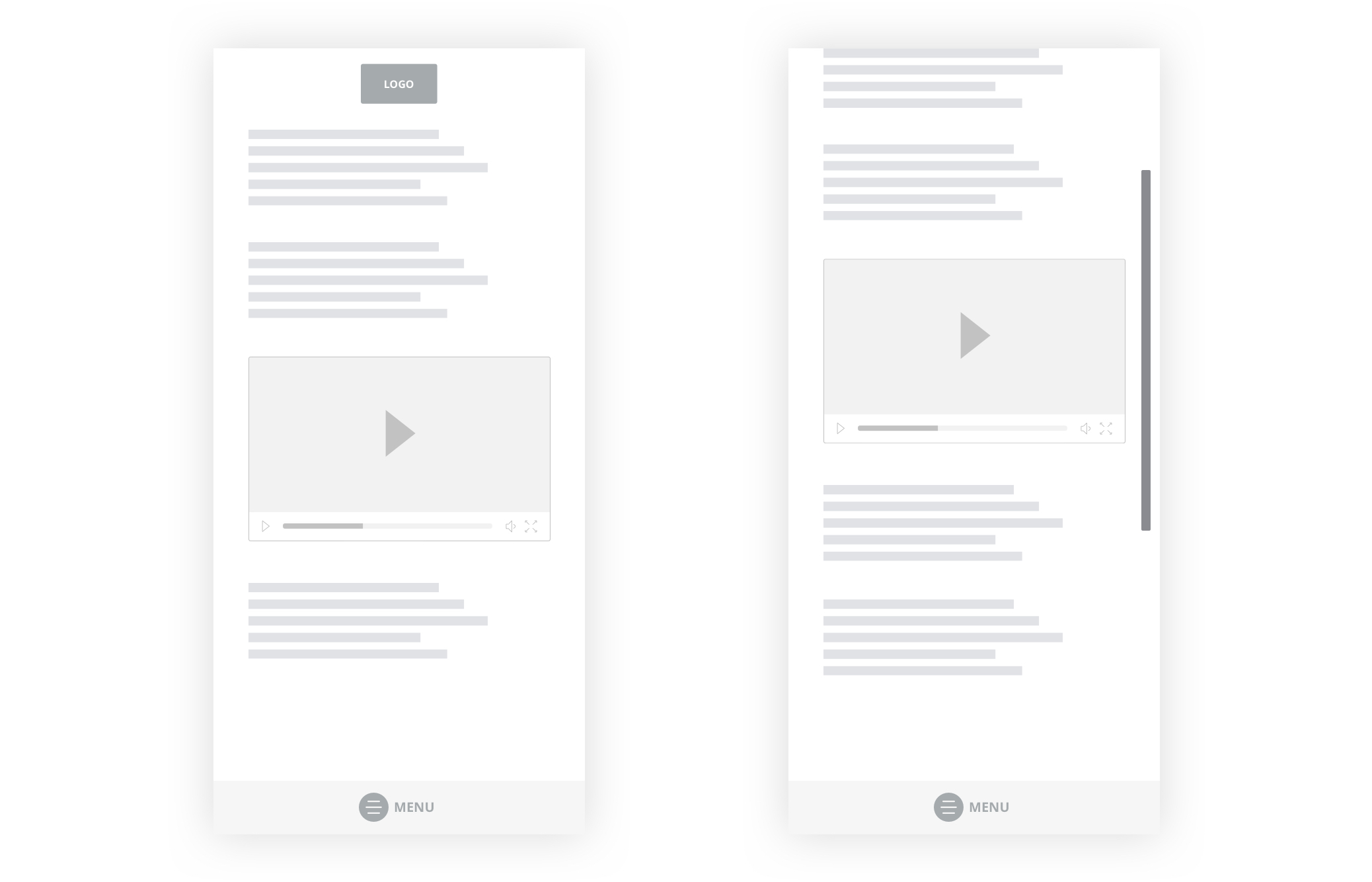
You can click on the Help option in your Blogger admin panel to see support tutorials as shown in the image below.

Blogger Support Options

Since it is a free service, it is not possible for Google to provide adequate support to individual blog owners.

Support Options in WordPress

WordPress has a very active community support system. There are question-answer forums for each theme and plugin on WordPress.org. For example, this is the official support forum of the popular coming soon plugin SeedProd.

SeedProd Coming Soon Plugin Support Page

If you are using paid WordPress products, then you can get even more dedicated support from the respective product companies.

Plus, you can find online documentation, community forums, and IRC chatrooms, where you can get help from experienced WordPress users and developers. Our team of WordPress experts is also helping thousands of users via our Facebook group.

Apart from community support, there are many companies offering premium support for WordPress. Check out our guide on how to properly ask for WordPress support and get it.

Winner: WordPress.

Future – Blogger vs WordPress

The future of your blogging platform determines how far you can go with your blog.

Future of Your Blog on Blogger

Blogger has not seen any major update since a very long time. We have seen Google kill their popular services such as Google Reader, Google Adsense for feeds, and FeedBurner.

Future of Blogger depends on Google, and they have the right to shut it down whenever they want. So, the future of your blog also depends on Google’s decisions.

Future of Your Blog on WordPress

WordPress is an Open Source software which means its future is not dependent on one company or individual (Check out the history of WordPress). It is managed by a community of developers and users.

Being the world’s most popular content management system, thousands of businesses around the globe depend on it. The future of WordPress is bright and reassuring.

Winner: WordPress.

Portability – WordPress vs Blogger

Portability - Moving Your Blog From One Platform to Another

The purpose of this article is to help you choose the best platform, so you don’t need to move your site. But mistakes can happen. So, it is essential to check whether your blog platform has secure options to move to another platform or not.

Portability of Your Blogger Blog

Moving your site from Blogger to a different platform is a complicated task. There is a significant risk that you will lose your SEO (search engine rankings), subscribers, and followers during the move.

Even though Blogger allows you to export your content, your data will stay on Google’s servers for a very long time.

Portability of Your WordPress Blog

Using WordPress, you can move your site anywhere you want. You can move your WordPress site to a new host, change domain name, or even move your site to other content management systems.

Also, if you compare WordPress vs Blogger SEO, then WordPress offers way more SEO advantages.

Winner: WordPress.

Pricing – Blogger vs WordPress

Last but not least, comparing the cost of creating a blog and managing it is crucial.

Cost of Making a Blog in Blogger

Blogger is an entirely free blogging service. It provides free blog hosting and free Blogspot subdomain to get started. And, all the themes, gadgets, and other options are free as well.

If you want to use a custom domain name, then you will have to buy it from a domain registration company like Domain.com. A domain name typically costs $14.99 per year, but you can get a discount with our Domain.com coupon code.

Blogger platform is very cost-effective however it lacks many features you will need to make your blog successful.

Cost of Making a Blog in WordPress

WordPress software is free, but you need to buy a hosting plan and domain name to start a blog.

With Bluehost, you can get a WordPress hosting plan for just $2.75 per month and a free domain along with it.

Get started with Bluehost

Once the setup is done, the cost entirely depends on the services you want to use. If you’re going to use paid themes and plugins, then the cost of making a blog will go higher.

For more details, see our complete guide on how much does it really cost to build a WordPress website.

Winner: Tie.

Conclusion: Blogger vs WordPress – Which One Is Better?

WordPress and Blogger both are widely used blog platforms. But since you need to choose one, it comes down to the purpose of your blog entirely.

If your goal is to make a personal blog and share your stories, then you can choose a simple platform like Blogger.

But if you aim to make a professional blog which can earn a living, then you need a robust and scalable platform like WordPress.

With WordPress, you can add a shop to your blog, create membership website, and add tons of marketing tools to your blog, and earn money.

We hope this WordPress vs Blogger comparison helped you understand the pros and cons of each and helped you make the right decision for your blog.

To learn more about WordPress, we recommend you to read our guide on Why is WordPress Free? and 9 most common misconceptions about WordPress.

If you liked this article, then please subscribe to our YouTube Channel for WordPress video tutorials. You can also find us on Twitter and Facebook.

The post WordPress vs. Blogger – Which one is Better? (Pros and Cons) appeared first on WPBeginner.

Bottom Navigation Pattern On Mobile Web Pages: A Better Alternative?

Bottom Navigation Pattern On Mobile Web Pages: A Better Alternative?

Bottom Navigation Pattern On Mobile Web Pages: A Better Alternative?

Arthur Leonov

Whenever you hear of “mobile navigation”, what’s the first thing that comes to mind? My guess would be the hamburger slide-out menu. This design pattern had been in use since the first responsive design days, and even though a lot has changed since then, this particular pattern has not. Why is that?

How did we start using the top navigation with the hamburger menu in the first place? Is there a better alternative? In this article, I will try to explore these questions.

The History Of The Top Navigation And The Hamburger

The first hamburger menu icons started appearing in the ‘80s. It was designed by Norm Cox for the Xerox Star — the world’s first graphical user interface. He also designed the document icon for the same interface. This piece of history was uncovered by Geof Allday (who actually emailed Norm Cox). You can read the whole email response by clicking here. Later, it was seen on Windows 1 & and DOS.

The current mobile navigation — as we know it — was popularized by Ethan Marcotte’s “Responsive Web Design” book back in 2011. Since then, the top navigation and the hamburger became the industry’s standard.

The Mobile Phone Screen Size Doubled In 10 Years

Since the original iPhone, mobile sales have been increasing year after year. 2019 is the first year that the market reached saturation point and the sales have started to decrease. But that doesn’t mean people are not using phones. By 2020, we will spend 80% of our time on the Internet on mobile phones, reports Quartz and Ciodive. Compare that to 2010, when only a fourth of Internet users were phone-based.

As phone sales increased, screen sizes have more than doubled, too. The average screen size of smartphones has increased from 3.2 inches all the way to 5.5 inches. In 2017, device makers started to adopt the taller 18:9 aspect ratio with 5.7-inch and 6-inch 18:9 displays. Now, we are starting to see 6-inch 18:9 displays become the new standard in flagships as well as in the mid-range price segments, as they have more screen area than 5.5-inch 16:9 displays, XDA-Developers reports.

An overview of how the mobile scren sizes have changed
An overview of how the mobile screen sizes have changed (Image source: Scientamobile) (Large preview)

Basically, the mobile phone screen size is getting bigger and bigger. That’s fine, but how do we adapt our design patterns to reflect these changes?

Thumb-Driven Design

I first heard of the term “thumb-driven design” from Vitaly Friedman. It’s based on the Steven Hoober’s and Josh Clark’s research on how people hold their devices.

The gist of it is that in nearly every case, three basic grips were most common. 49% held their phones with a one-handed grip, 36% cradled the phone in one hand and jabbed with the finger or thumb of the other, and the remaining 15% adopted the two-handed BlackBerry-prayer posture, tapping away with both thumbs, states Josh Clark. Steven Hoober had found that 75% of users touch the screen with only one thumb. Hence, the term thumb-driven design.

There are three main ways in which we hold our phones
There are three main ways in which we hold our phones. (Large preview)

In 2016, Samantha Ingram wrote an article named “The Thumb Zone: Designing For Mobile Users” which further explores these ideas. She defined easy-to-reach, hard-to-reach and in-between areas.

Thumb-zone mapping explained by Samantha Ingram
Thumb-zone mapping explained by Samantha Ingram (Large preview)

However, I would argue, that with increasing phone sizes, the mapping has shifted a bit:

New thumb-zone mapping adjusted to larger screen sizes
New thumb-zone mapping adjusted to larger screen sizes (Large preview)

When the phones were small, most areas were easy to reach. As our screens got bigger, the top part became virtually impossible to touch without adjusting your phone. From the example above, we can see where the most expensive screen real estate is. Yet, it’s often neglected on web pages. How can we fix this?

Bottom Navigation Pattern

Every now and then, bottom navigation pattern pops up on the web. The idea itself is quite simple: move the navigation bar further down.

Slack web page navigation reimagined with new thumb-zone mapping
Slack web page navigation reimagined with new thumb-zone mapping (Large preview)

Positioning the navigation bar at the bottom makes it easier for users to click on the menu icon, while secondary items can be moved to the top. Basically, you simply switch the order. Mobile apps have been using this logic with the tap bar pattern. It’s not a new idea in itself, but it’s still not as popular in web design as it is in app design.

This is not a foolproof solution since it raises a few critical questions, but it’s a worthy alternative. Let’s explore some of the questions that may come up.

Primary And Secondary Items

As the top of the screen is becoming hard to reach, placing the primary menu items closer to the bottom is a better alternative. But what about the other things that are just as important?

I propose two ideas to tackle this problem:

  1. Placing the search bar or any non-primary items to the top;
  2. CTA buttons should remain at the bottom next to the menu items as it is a vital part of the navigation.
A wireframe of reimagined primary and secondary navigation items.
A wireframe of reimagined primary and secondary navigation items (Large preview)

How Will This Affect Scrolling With Large Menus?

Some websites have extensive menus, submenus and everything in between. Naturally, there will be scrolling involved. How does flipping the primary/secondary items work in this scenario?

A wireframe of a reimagined large menu
A wireframe of a reimagined large menu (Large preview)

Make the primary and secondary items (menu link, logo, search input) fixed while leaving the menu list scrollable. That way, your users will be able to reach the critical things they need.

You might have concerns about the logo placement. There are two ways to go about it:

  • Placing the logo at the bottom might be a bit awkward, however, the thumb will most likely not obstruct it. It can be missed, though, as we tend to scan top to bottom.
  • A more reasonable option is to keep the logo at the top of the page, but not to have it fixed. Make it a part of the content so it goes away as you scroll. That way, people will still be able to see it perfectly.

As you can see, I used the menu label in the wireframe. Kevin Robinson had found that putting a label next to the icon increased engagement by 75%:

A wireframe of the logo placed at the top while the menu can be found at the bottom
A wireframe of the logo placed at the top while the menu can be found at the bottom. (Large preview)

How Does This Work With Handlebars?

Some operating systems and browsers tend to use the bottom area of the screen for their own purposes. iOS handlebars can get in the way of bottom navigation. Make sure the navigation is spacious enough to accommodate the iOS safe area.

iOS Handlebars and safe areas
iOS Handlebars and safe areas (Large preview)

If you place the logo dead in the center, the link might clash with the handlebar functionality. A bit of padding will do the trick.

Will The Users Adjust To This Pattern Or Find It Disorentating?

As I was writing this article, I kept thinking of whether this would turn out into a big redesign or a simple usability improvement for users navigating through your website. After all, according to Jakob’s Law, users spend most of their time on other sites. This means that users prefer your site to work the same way as all the other sites they’re already familiar with.

As a counter-argument to Jakob’s Law, I would like to propose Fitts Law. It argues that the time to acquire a target is a function of the distance and size of the target. Basically, the smaller and further away the target is, the higher the interaction cost. NN/g has a wonderful video explaining this in more detail:

“A bottom hamburger menu icon will have a much lower interaction cost compared to the top menu icon because it’s closer. By placing the menu CTA near the thumb, we are allowing the user to reach it’s end goal faster. Would the users find the feature disorientating if it lowers their interaction cost? Probably not.”

How Will This Integrate With The Tap Bar Pattern?

A tap bar patterns lists three to five most common first-level actions to click on a single row. You may have seen it in popular apps and some websites:

iOS Tap bar design by Mengyuan Sun
Tap bar design by Mengyuan Sun (Large preview)

Hamburger menus have sparked a lot of controversy over the years. Just take a few moments to read this article, and this one, and this one, and most importantly, this one. You’ll then understand why the tap bar became the preferred navigation pattern in mobile app design.

Nielsen argues that hidden navigation (hamburger menu) significantly decreases user experience both on mobile and desktop. On mobile, people used the hidden navigation in 57% of the cases, and the combo navigation in 86% of the cases, i.e. 1.5 times more! The combo navigation that Nielsen refers to is a tab bar pattern combined with a hamburger menu — here’s an example:

Samsung app example from Rizki Rahmat Ridha for Muzli
The Samsung app example from Rizki Rahmat Ridha for Muzli (Large preview)

It might seem like the tap bar is the perfect solution, but it has its problems too. Fabian Sebastian raised a good point that it only works on top-level views. It does not work with secondary navigation items. To solve this problem, a hamburger/tap bar hybrid was born. If you pay attention to the Samsung app, you’ll see that the last item on the menu is the “*More*” button which calls up the hamburger menu.

In essence, the bottom navigation pattern integrates quite well into the tap bar pattern if you want to combine both of them. The best place to look for good examples is in the mobile app world.

I opened up Photoshop and did a quick mockup of a few popular websites in order to explain that changing the navbar to go bottom-up is not that difficult.

Let’s first take a look at Bloomberg:

Bloomberg website with a reimagined bottom navigation
The Bloomberg website with a reimagined bottom navigation (Large preview)

Next, let’s take a look at Invision:

Invision website with a reimagined bottom navigation
The Invision website with a reimagined bottom navigation (Large preview)

Last but not least, the good ol’ Reddit:

The <a href='https://www.reddit.com/'>Reddit website</a> with a reimagined bottom navigation
The Reddit website with a reimagined bottom navigation (Large preview)

Yes, this idea does raise questions, but it’s simple enough to be adapted to the web. It does make a usability difference as the interaction cost is much lower.

That Sounds Great, But How Do I Convince My Clients?

You, as the designer, might see the potential of this pattern, but what if your client or your boss doesn’t? I would answer this problem with a couple of arguments:

  • Mobile apps have been placing valuable menu items to the bottom for years already. Just send them these two articles for starters:
  • I had noticed cases in which popular mobile apps started to shift important bits to the bottom. A good example is Uber. For them, the search bar is one of the most important items on the screen. In the old design, its position was at the top. Now, they’ve shifted it to the bottom. Could we be on to something here?
Old and new Uber search bar designs
The old and new Uber search bar design (Large preview)

Shifting important navigation items to the bottom is not a new thing in mobile app design. It’s just that — for some reason — the web industry has not caught up on this just yet.

Summary

The facts are quite clear: Phones are getting bigger, and some parts of the screen are easier to interact with than others. Having the hamburger menu at the top provides too big of an interaction cost, and we have a large number of amazing mobile app designs that utilize the bottom part of the screen. Maybe it’s time for the web design world to start using these ideas on websites as well?

I understand that all of this is not a foolproof solution for all use cases, but it’s worth a shot. It helps make the experience just a tad bit better. I’m interested in hearing your thoughts below!

Useful Reading Resources

Smashing Editorial (cc, il)