Last month the WordPress Theme Review Team took action to curb obtrusive admin notices, requiring all themes to use the admin_notices API and follow the core design pattern. Prior to this rule going into effect, many themes would commonly display a large, branded notice upon activation. Sometimes these came with a prompt to install more plugins or instructions for getting started.
The Theme Review Team began prompting the authors of themes already known to be in violation of this guideline, to change their notices as soon as possible or risk suspension. Popular themes are rolling out updates that include cleaned-up notices.
Storefront, WooCommerce’s flagship theme, was one of the themes the team cited during the meeting as an example of the notices that the team was looking to discourage with this new requirement. Its large post-activation notice took up half the screen and was previously displayed on every page. Storefront 2.5.2 replaces the notice with one that conforms to the new rule.
The Noto theme from Pixelgrade, which previously had nearly a full-page branded onboarding screen with a call-to-action, has updated to a smaller notice that appears in the designated area for admin notices. Futurio has also scaled back its post-installation footprint and now displays a simple, compliant message with a “Get Started” button.
Theme authors are still finding creative ways to brand their notices, but they are now much less obtrusive and confined to the expected area. They are still able to communicate the necessary information for getting started, without cluttering the admin by taking over half the screen.
Creating an email newsletter can be a great way to provide valuable content for your customers and build a loyal following. The challenge is convincing someone to open their inbox to you in an overcrowded digital world…
Start an email newsletter they said…
Create a simple sign up form and watch as new subscribers come FLOODING in they said…
It will be EASY they said…
If only it were that simple!
Then we’d all be swimming in more email subscribers than we can handle.
But sadly, as far as I’m aware, this is not the case.
Therefore, if you…
Think your amazing email newsletter deserves more subscribers than it currently boasts.
Are looking to create an optimized newsletter signup form or page that converts better than your current effort.
Want to outdo your annoying competitor (let’s call him Steve) who constantly brags about the tens of thousands of subscribers he has (typical Steve).
Are tired of potential customers constantly bailing out of your current opt-in form or sign up page like the flash.
Then stick around…
Because in this article we’re going to look at the simple conversion tactics high level companies use to boost their newsletter and list sign-ups.
We’ll also talk about what NOT to do, and what might be causing potential customers to hastily exit your opt-in… never to be seen again!
On that sombre note, let’s kick things off with:
Why Your Newsletter Sign Up Pages Aren’t Converting
Signing up to a new email list or newsletter is a big commitment for most people.
As you know, some lists are a no brainer to sign up for, while others definitely require some vetting before you hit that subscribe button.
Aside from trust issues, the reality is that most people are already overwhelmed by the emails already flowing into their inbox on a daily basis.
“There is an ever-rising tidal wave of information and it will continue to rise forever.”
“Everyone you want to reach has 1440 minutes in their day; not a minute more.”
“The world is becoming ever more complicated, but people will give you their time and attention if you give them more of what they want.”
The lesson here?
People Will Let You Into Their Inboxes Providing You Give Them What They Want
However, you also need to be aware of the things that may scare potential subscribers off.
And on that note, here are some common reasons people might be running for the door instead of signing up…
They’re Afraid You’re Going To Spam Them
No one wants their inbox flooded with spam or unwanted emails.
It’s also the number one reason users will unsubscribe from your list, or hesitate to sign up in the first place.
To overcome this fear, try to be clear on what they should expect from you content wise, as well as frequency wise.
You’re Giving Them Too Many Form Fields To Fill Out
If you had a choice would you fill in this form?
Yes, in general the more information you can capture from a customer the better. But not if getting those insights means you’re losing just as many customers!
Giving the user tonnes of fields to fill out is asking for trouble and likely to turn them off.
Remember you can always find out more information once they have subscribed.
Just remember user experience and satisfaction should always come first.
For example, if a reader has been directed to an article page, it’s probably not a good idea to hit them with an entry pop up right away.
Why?
Because they’re there to read! Not sign up to your newsletter.
So it’s important to wait until the time is right.
In this case, you might want to employ a “scroll pop-up” which activates when a user has scrolled a certain distance down the page:
An example of how a scroll pop-up works
Another alternative is a “timed pop-up” which initiates once the user has been on the page for a certain amount of time.
This way you’re not interrupting the users intended experience, and they can still get the value they were originally seeking from the page.
They’re also far more likely to engage with your pop-up when they see it at a more appropriate time.
Okay Enough With The Bad Stuff…
Let’s look at some tactics and examples to help you get those subscribers flowing in…
5 Proven Conversion Hacks To Help Increase Your Newsletter Sign Ups:
1.Get Creative With Your Newsletter Forms And Landing Pages
When someone lands on your opt-in page they’re probably expecting the same thing they see everywhere else.
And although there’s nothing wrong with this (if it works), why not try spicing things up a little?!
Like this creative and self-aware example from Shinesty:
What’s great about this example is that the headlines instantly grab your attention.
They also do a great job of “going against the grain” so to speak, by pointing out “emails normally suck” and theirs don’t.
Although these statements could be backed up by a little more proof, overall, this sign up page is a great example of adding personality and being creative with your copy.
It also emphasises the importance of grabbing the reader’s attention and setting the tone of what’s to come.
2. KISS! (Keep It Simple Stupid)
As mentioned earlier, it’s best to keep your sign up forms as simple and brief as possible.
The idea here being to reduce as much friction as possible and to not overwhelm your potential customers.
You’ll also be far more likely to convert “on the fence types” who might not be totally convinced of the value you’re offering them.
But don’t take my word for it…
In one study participants replaced an 11 field form with a 4 field form. This simple change resulted in a 160% increase in the number of forms submitted, as well as a 120% increase in conversion rate.
Of course, you also have to take into account the quality of the forms.
But in general, the shorter you can make your signup form (while still capturing the necessary info) the better.
Here’s a great (and incredibly cute) example by Hipmunk:
3.“Sweeten The Deal” Of Signing Up To Your Email List
There’s nothing wrong with a good old fashioned ethical bribe to help tip on-the-fence prospects over the edge.
In fact, according to a study by the Social Habit, 70% of people open emails from brands or businesses just to get their hands on a deal, discount, or coupon.
Typically you’ll see SAAS companies offering clever incentives to get users to sign up for their services.
However, discounts and offers can also work for newsletter subscriptions.
As shown by this sign up form by TOMS:
In this particular example TOMS does a clever job of leveraging the products they sell and using a 10% discount as an incentive for people to sign up for their newsletter.
Land’s End also do a similar job:
If you’re using this tactic just make sure to provide relevant and helpful newsletter content.
Otherwise subscribers will simply opt out once they’ve taken advantage of the deal or incentive you’ve offered them.
4.Use Social Proof To Entice Newsletter Subscribers
Utilizing social proof in your signup forms or landing pages is another great way to increase conversions.
Social proof is effective in two ways:
1. It proves to the reader that they can trust that your newsletter is legitimate.
2. It also taps into people’s “FOMO” (fear of missing out).
After all, it’s one of our most basic instincts as humans to get the inside scoop, or to not miss out on anything we deem important.
In other words, if you can show that a number of people have signed up to your newsletter, it’s going to help alleviate the fears a potential subscriber might have.
It’s also gonna have them wanting to know what all the fuss is about.
Here are a few examples of newsletter opt-ins that use social proof:
Using social proof can be a great way to attract subscribers
5.Be Clear About Your Intentions And The Type Of Content You’re Offering
Providing your readers with irrelevant content is the quickest way to have them hitting that unsubscribe button.
That’s why it’s important to clearly communicate what kind of content they can expect.
The New York Times does a great job of this by giving readers a look at past newsletters:
This tactic is highly effective as it reassures readers will be receiving the kind of content they’ll be interested.
Another great thing about this sign up page is that it displays the different types of newsletters on offer.
This helps raise awareness and ensures users are signing up for the appropriate newsletter.
If possible, also try to mention how often readers can expect you to email them.
Especially if you plan to email them quite frequently, as this can be annoying for some people if they’re not ready for it.
Now Not To Brag Or Anything But…
If you want a near-perfect example of a newsletter sign up page that ticks pretty much all of the boxes…
Check out the sign up page of our very own quirky newsletter: the Whip!
We’re pretty proud of this one, and as you’ll see below it employs many of the tactics mentioned in this article:
A Simple Sign Up Form:
Value Prop / Social Proof:
Clear Expectations:
Overcomes Spam Objection:
Let users know your emails are spam free!
Psst… Looking For A Free And Easy Way To Create Your Own Sign Up Forms?
Hustle makes creating pop-ups, slide-ins, and widgets for your website a breeze.
Learn more about this handy WordPress Plugin below:
Before We Wrap Up Let’s Recap…
If You Want To Increase Your Newsletter Sign Ups Remember To:
Ensure your form suits your readers preferences, helps them through the sign up process, and delivers on your promise.
Make sure your opt-in form is simple, to the point, and contains the fewest number of fields possible (where practical).
Be clear about your intentions and what readers can expect from your emails.
Ensure the copy of your form is clear, concise, and easy to read and understand.
Use incentives and offers to sweeten the deal for your potential subscribers.
Use social proof and FOMO as a way to build trust with your audience.
Make sure you have fun with it! Create a form that reflects your brand, personality, and what you’re all about.
And Finally… Don’t Forget To Test!
Try a combination (or all) of the tactics mentioned in this article.
Certain tactics may work better for some niches, businesses, and newsletters than others.
In this week's roundup, how to determine a slow connection, what we should put into alt text for images, and a new polyfill for the HTML loading attribute, plus more.
Detecting users on slow connections
Algolia is using the Network Information API (see the API’s Chrome status page) to detect users on slow connections — about 9% of their users — and make the following adjustments to ensure a good user experience:
increase the request timeout when the user performs a search query (a static timeout can cause a false positive for users on slow connections)
show a notification to the user while they’re waiting for search results (e.g., "You are on a slow connection. This might take a while.")
request fewer search results to decrease the total response size
debounce queries (e.g., don’t send queries at every keystroke)
navigator.connection.addEventListener("change", () => {
  // effective round-trip time estimate in ms
  let rtt = navigator.connection.rtt;

  // effective connection type
  let effectiveType = navigator.connection.effectiveType;

  if (rtt > 500 || effectiveType.includes("2g")) {
    // slow connection
  }
});
The key is to describe what you want your audience to get out of the image rather than a simple description of what the image is.
<!-- BEFORE -->
<img alt="Graph showing the use of the phrase "Who you
          gonna call?" in popular media over time.">

<!-- AFTER -->
<img alt="Graph illustrating an 800% increase in the use
          of the phrase "Who you gonna call?" in popular
          media after the release of Ghostbusters on
          June 7th, 1984.">
There is a new polyfill for the HTML loading attribute that is used by wrapping the images and iframes that you want to lazy-load in <noscript> elements (via Maximilian Franzke).
WeChat, the Chinese multi-purpose app with over one billion monthly active users, hosts over one million "mini programs" that are built in a very similar fashion to web apps (essentially CSS and JavaScript) (via Thomas Steiner).
Microsoft has made 24 new (online) voices from 21 different languages available to the Speech Synthesis API in the preview version of Edge ("these voices are the most natural-sounding voices available today") (via Scott Low)
Read more news in my new, weekly Sunday issue. Visit webplatform.news for more information.
Every day, the ProgrammableWeb team is busy, updating its three primary directories for APIs, clients (language-specific libraries or SDKs for consuming or providing APIs), and source code samples.
Atlassian has announced a new Asset Management API that will allow IT teams to more easily store and view asset information in Jira Service Desk. This new API, which will also be available to Jira Core users, should help to cut down on the back and forth between IT agents and end-users when working to resolve device issues.
In the announcement of the new API, Atlassian highlighted the value of the Asset Management API by illustrating the problem:
WordPress 5.3 release dates were confirmed this week. The timeline has the official release arriving November 12, 2019, with a decent margin of time to avoid WordCamp US (early November) and the U.S. Thanksgiving holiday week at the end of November. Beta 1 is expected September 23 and a Release Candidate is scheduled to follow on October 15.
The scope for this release is squarely in line with Matt Mullenweg’s 2019 goal of tightening up the software to improve existing features.
“The focus will be polishing current interactions and making the UIs more user friendly,” WordPress 5.3 release coordinator Francesca Marano said in the schedule announcement.
Another major part of this release is the editor improvements that have already been pushed to the Gutenberg plugin over the past few months. Riad Benguella, WP 5.3 Editor Tech lead, said these improvements “go beyond ‘polishing things,'” and will include more than 10 previous releases of the plugin.
After speaking with component maintainers, WordPress Executive Director Josepha Haden posted a summary of updates that could be included in the release during the proposed timeframe:
Grouping: support for dividing your page into sections
Motion: support for visual motion when moving/arranging blocks
Column patterns and widths: support for fixed column widths, and predefined layouts
Big images: support for saving progress after a big image fails to upload
Media accessibility: some fixes and a lot of polish as a result of the a11y audit
PHP 7.4: support for the new version coming late in November
And also: Build/Test updates, better administration of emails, and a lot of under the hood improvements
WordPress 5.3 to Introduce Twenty Twenty Default Theme
Earlier this month, Haden confirmed that WordPress 5.3 will include a new bundled default theme. Twenty Twenty development is taking a different route from previous default themes in that it will not be designed from scratch.
“I think something that would be cool is taking a theme from the community that is already doing cool stuff with the features we’ve been introducing, and modifying it to fit with the 5.3 release,” Haden said.
The lead for the default theme project has yet be announced, although Mark Uraine, a designer working on Gutenberg, will be facilitating the effort behind the scenes.
“I know people are looking at themes that make good use of Gutenberg and have theme developers that can dedicate some time to this,” Uraine said.
WordPress 5.3 will be the last major release of 2019. Contributors plan to land a minor release in the meantime. WordPress 5.2.3 RC 1 was released today. Jeffrey Paul, who is helping to coordinate this release, said the focuses for 5.2.3 include the PHP version bump coming in 5.3, backporting some block editor features, and improving accessibility and RTL issues. The official 5.2.3 release is scheduled for Wednesday, September 4, 2019, 10:00 AM PDT.
GitHub now supports Web Authentication (WebAuthn). WebAuthn, a WC3 API for accessing public key credentials, is seen by many as the new standard for secure authentication across the web. GitHub has adopted the standard and sees it as an opportunity to include two-factor authentication on GitHub from more browsers and devices than ever before.
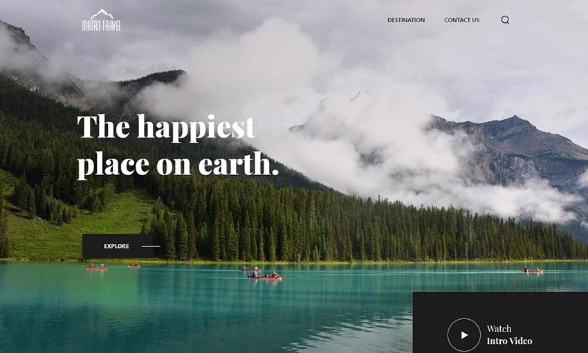
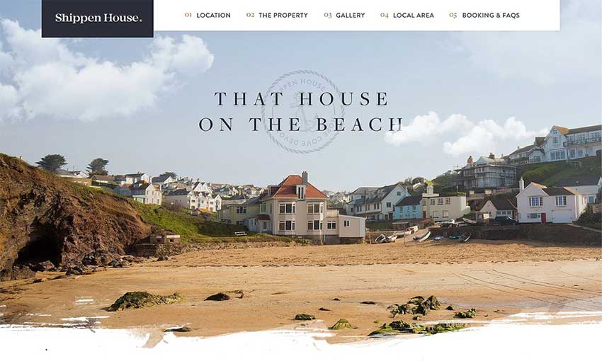
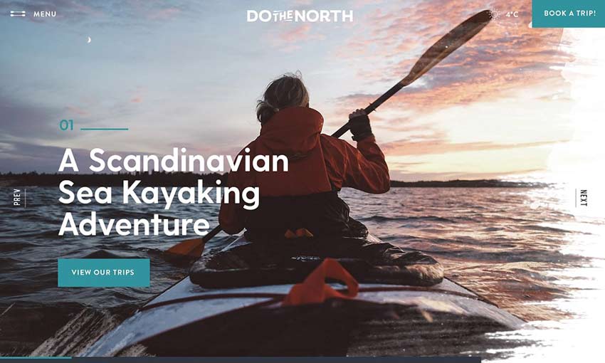
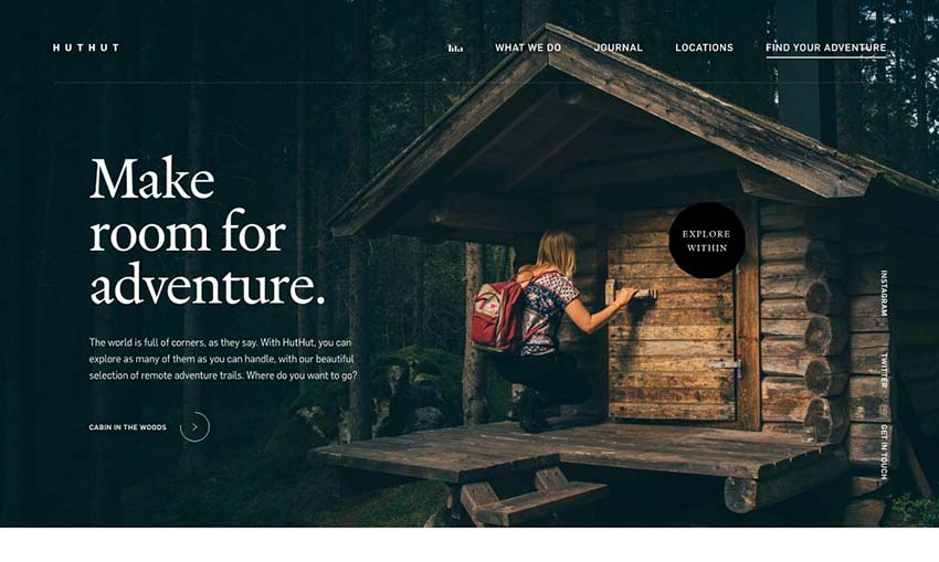
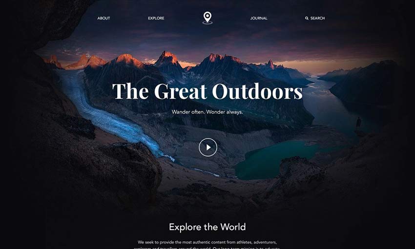
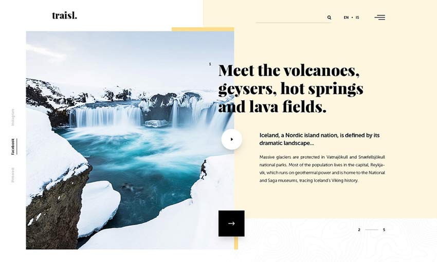
Are you making a travel website that needs to capture the beauty of the world? World explorer, outdoorsy business, or travel agency, we know you need some big inspiration to get started with your design.
We’ve collected the work of some amazing web designers here for you. Let the mockups and websites they’ve created help you create your own awe-inspiring travel site.
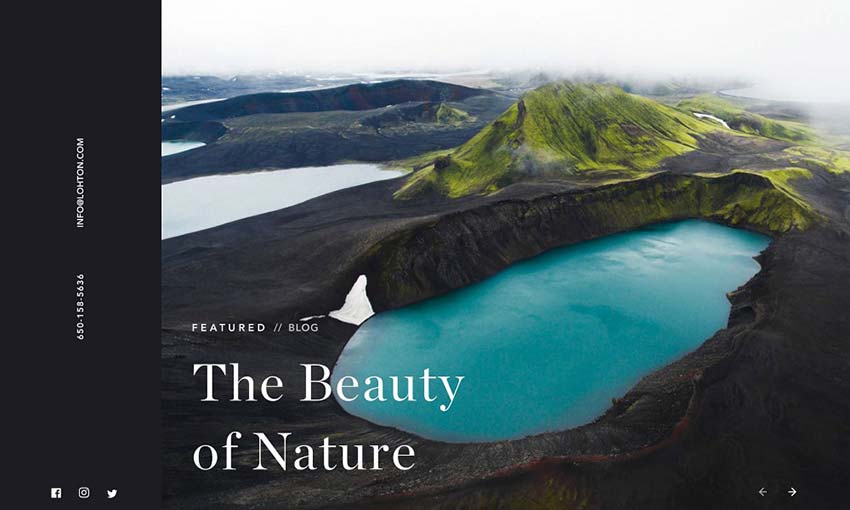
Dark and light contrasts the elements of this beautiful design, with light used to highlight the gorgeous imagery. Fullscreen photography, galleries, and sliders of the most scenic places in Iceland are scattered throughout and keep people engaged.
Bright and clean design dominates this well-made mockup. There’s a nice full screen hero image followed by plenty of smaller images next to calls to action and other information.
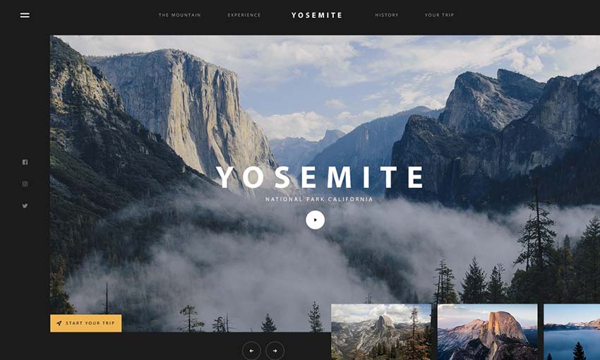
Huge photography, a large and user-friendly UI, and sections of interest that take up the whole screen or more are scattered about this landing page. It’s fitting for one of the largest national parks in America.
If you want to create a blog that stuns people just as much as the homepage, look here. Create a travel blog that looks like this and people are sure to quickly subscribe for more.
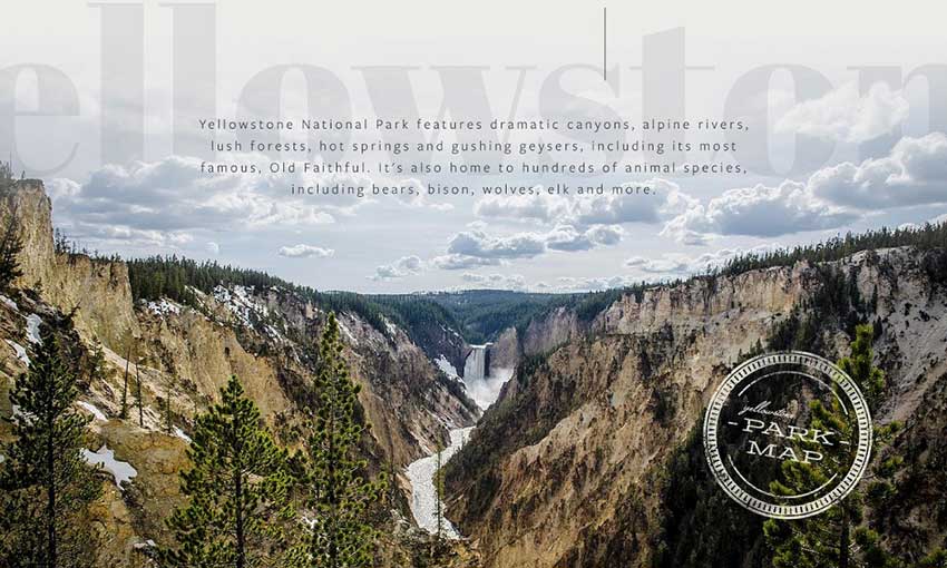
Yellowstone’s gorgeous homepage is simply a masterpiece. It combines the amazing imagery of an untouched national park with a pleasing user interface and helpful info at every scroll.
The tile-based design here is used well, with 3D overlays and lots of interactive media in every block. A similar design would look great for a website that relies on visuals rather than text content.
This mockup has more of a focus on real estate. Photos of vast landscapes are replaced with pretty interior and exterior shots, and it all has a bright, fresh look to it.
It may only be inspired by National Geographic, but this project looks completely authentic. Exciting photography is what the brand is all about, and it’s woven perfectly into its landing page.
This hero image transitions from white to black, which seamlessly spills down into the rest of the page. The design is then broken up with beautiful, bright photography that stands out against the darkness. It’s a great concept for a landing page, and very inspiring.
Pretty and functional, this is a great project to study if you’re making a business website. Calls to action are everywhere, but it never gets in the way of the landscape and portrait shots.
Here’s an example of nice composition. The hero image and footer utilize photography, while the content area is the middle is light and spacious. Large images offer breathing room between text.
Short, sweet, and simple, this landing page gets its point across quickly and stylishly. The photo header smoothly fades out to give way to image links and blog posts, before fading back in to the footer.
A good homepage is crucial for success, and here’s a great example. Notice the focus on orange hues; they appear everywhere from UI to the photography. Strong usage of color can create a beautiful effect.
Many travel sites tend to go for contrast between the photos and background, but this contrasts dark UI against snowy photography. It gives a greater focus to the text content.
Gorgeous Travel Sites
Travel websites are especially beautiful. They utilize jaw-dropping photography and videos to draw you in and get you excited to explore. Knowing how to incorporate these into a great user interface is key to creating an amazing travel design.
There’s something about seeing gorgeous natural imagery that draws people in. Use this to your advantage as you design a website that captures people with its beauty.
With Slim 4, we have continued the tradition of allowing you to use the framework in the way that best fits you and your project. You can create a Slim application entirely in a single file, suitable for prototyping through to a few files for a simple web hook or serverless action, all the way to a fully-decoupled application suitable for an enterprise.
From my point of view, the big changes with Slim 4 are:
In advance of a recent podcast with the incredible technical writer and Smashing Magazine editor-in-chief Rachel Andrew, I gathered up a bunch of thoughts and references on the subject of technical writing. So many smart people have said a lot of smart things over the years that I thought I'd round up some of my favorite advice and sprinkle in my own experiences, as someone who has also done his fair share of technical writing and editing.
There is a much larger world of technical writing out there. My experience and interest is largely about web technology and blogging, so I'm coming at it from that angle and many of the people I quote throughout are in that same boat.
Picking something to write about
If you want to write for CSS-Tricks and you ask me what you should write about, I'm probably going to turn that question around on you. It's likely I don't know you well enough to pick the perfect topic for you. More importantly, what I really want you to write about is something that is personal and important to you. Articles rooted in recent excitement about a particular idea or technology always come out better than dictated assignments.
My best advice:
Write the article you wish you found when you googled something.
That said, I do maintain a list of ideas specifically for this site. Any writing can be done on assignment and sometimes that elicits the spark needed for something great and on-target for the audience of a site.
Write at the moment of learning
The moment you learn something is the best time to write. It's fresh in your mind and you can remember what it was like before you understood it. You also understand what it takes to go from not knowing to knowing it. That's the journey you need to take people on.
If you don't have time, at least try to capture the vibe wherever you save your ideas. Don't just write down "dataset." Write down some quick notes like, "I didn't realize DOM elements had a .dataset property for getting and setting data attributes. I wonder if it's better to use that than getAttribute." That way, you'll be able to reload that realization in your brain when you revisit the idea.
Here's some advice Rachel shared that I don't see taken advantage of nearly enough:
There is a sweet spot for writing technical posts and tutorials. Write for the professional who hasn't had time to learn that thing yet, and link it back to things they already know. For example explaining a modern JS technique to someone who knows jQuery.
Tell me about how this new framework relates to Backbone. Tell me how this CMS relates to WordPress. Tell me how some technology connects to another technology that is safe to assume is more widely understood.
Technology changes a lot, but what technology does doesn't change all that much.
Careful with that intro
The main comment I add on tutorials I review is to ask for an intro that describes what the tutorial is about. I'm 600 words in and still don't know what the tutorial is about and who it is for. #writing
Not getting to the point right at the top of technical articles is a dang epidemic. The start of a technical article is not the time to wax poetic or drop some cliché light philosophy like, "Web design sure has changed a lot." You don't have to be boring, but you do need to tell me what this article is going to get into and who it is for.
“Does the title make the article sound interesting?” If the title interests a reader, they’ll typically read the intro and decide, “Is it worth my time reading the whole thing?” A common mistake I see in a lot of technical posts is either too much introduction or, alternatively, far too little.
A single well-written paragraph can set the stage for a technical blog post.
Careful with the title, too
I remember a conversation from years ago with content strategist Erin Kissane where she strongly advised me to choose boring titles for everything. Not just the title of blog posts, but for everything, including the names of sections, tags, and even subheadings within posts.
Here's the thing with boring: it works. Boring isn't the right word either; it's clarity. The world is full of clickbait, and maybe that's effective in some genres, but technical blogging isn't one of them.
A terrible version of the same: Build a web app with modern technologies in 30 minutes!
What's a web app? What technologies? What's modern about them? What's with the weird time limit?
SEO matters and Margaret's article is going to do a lot better in both the short and long term with that clear title.
The outro
Ben Halpern says that the next most important thing after the intro is:
[...] the last paragraph.
People don't read top-to-bottom the moment when they arrive, so there is a good chance it's the second paragraph people read. Personally, I find the beginning a lot more important than the ending, but there is a certain art to the ending as well.
A lot of people just <h2>Conclusion</h2> and write a few words about what was just went over. Honestly, I don't hate that. It falls into this time tested pattern:
Tell 'em what you're gonna tell 'em
Tell 'em
Tell 'em what you told 'em
That helps your message sink in and brings things full circle. Technical blogging isn't terribly different from marketing in that sense. You're trying to get people to understand something and you're using whatever tricks you need to to get the job done. A little repetition is a classic trick.
[...] the wall of text can be easily be made less intimidating and appear much more visually appealing through the use of visual elements that break it up. The easiest is to simply place section subheadings throughout your post.
I agree: subheadings are probably the easiest and most powerful trick for scannability.
Other methods:
Lists: Like what I'm doing right now! I didn't have to use a list. Paragraphs might have worked as well, but a list makes contextual sense here and is probably tricking some of you into reading this. Or at least scanning it and getting some key points in the process.
Images: Please make them relevant and contextual. Skip the funny GIF. Screenshots are often great in a technical context because they provide a visual to what might otherwise be a difficult concept to explain. I like Unsplash for thematic imagery, too, but you can do better than a random picture of trees, a woman drinking coffee, or a random rack of servers.
Illustrations: The abstract nature of an illustration is your friend. It tricks people into having a quick thought about what you are describing. They generally take a little work to pull off, but the pay-off for you and the reader can be huge.
Videos: You can't simply drop a 42-minute video in the middle of a blog post, but if you can make it clear that you are demonstrating something visual and the video is less than a minute, it can be a powerful choice. You've always got <video autoplay muted loop controls> as well to make it GIF-like.
Blocks of code: Technical blog posts are often about code. Don't avoid code, embrace it. I love how Dan Abramov sprinkles in code blocks in blog posts not so much to demonstrate syntax and setup, but to make points. I'm going to recommend Embedded Pens as well, because they're fully interactive demoes in addition to serving as code blocks.
Tables: Don't forget about tabular data! Presenting information (particularly data or definitions) in a table makes it more understandable than it would have been any other way.
Collapsing sections: The <details>/<summary> elements make quick work of collapsible content. If you've got a large section of content that is good to be there but doesn't need to be read by everyone, collapse it! Our reference guide of media queries for devices is a decent example of this in action.
Whatever you pick here, you should pick things that help enhance the points you're making even if in some ways it feels like trickery. It's trickery to help readability, and that's a good thing.
My favorite technique? A little bit of design. Use design principals like spacing, color, and alignment to help the readability of posts. We even go so far as to art direct some posts where design can enhance the central point being made.
The point here isn't to do away with walls of text altogether. Sometimes that's exactly what's needed because you're asking a reader to deeply read a passage that they otherwise wouldn't get what's needed from the content. However, more often than not, a post can strongly benefit from some healthy use of white space.
Use an active voice
I find this one a little tricky to wrap my head around, but Katy Decorah has a great presentation about technical writing that explains this point in great detail. It's kinda like using present tense and stating a point directly rather than passively.
Passive: "After the file is downloaded..." Active: "After you download the file..."
Passive: "The request is processed by the server." Active: "The server processes the request."
“Just” makes me feel like an idiot. “Just” presumes I come from a specific background, studied certain courses in university, am fluent in certain technologies, and have read all the right books, articles, and resources. “Just” is a dangerous word.
There are plenty of others to avoid, which which I've written about before. Read the comments in that last link. Long story short: there are lots of words that do more harm than good in technical writing, not only because they can come across as preachy, but because they usually don't help the sentences where they're used. Try taking "just" out of any sentence. The sentence will still make sense without it.
SimplyClearlyJustOf courseEveryone knowsEasyHoweverSoBasicallyTurns outIn order toVery
Be mindful of your tone
Tone is concerned with how you say something in consideration of the context. For example, you wouldn't deliver bad news to someone with a happy tone. The way you express yourself ought to be aligned with the situation.
This is our tone goal on this site:
Friendly. Authoritative. Welcoming. We're all in this together. Flexible (nondogmatic about ideas). Thankful.
It's worth pointing out that tone and voice are separate concepts. I like to think of voice as never changing (it's your personality which is a part of who you are) while tone changes to suit the context. In other words, you can have a professional voice while communicating in a friendly tone.
I don't think there is one true tone that is perfect for technical writing, but since the high-level goal of any technical writing is to help someone understand something complicated, you can use tone to help. A joke in the middle of a set of intricate steps is confusing. A bunch! of! excitement! about something might feel out of place or disingenuous, but being drab and lifeless is worse. I'd say if you're writing under your own name, let's feel a little bit of your personality as long as it's not at the cost of clarity. If you're writing under a brand, match what they have established whether it has been codified or not.
Careful about length
The general tendency in technical writing is to write too much rather than too little. Wade Christensen:
Whether trained by school assignments with word minimums or just uncritical, most of us write too much. Beyond approaching each draft with a ruthless cutting mentality, there are several ways to write short from draft one.
Word limits can help, even if they're self-imposed.
I heard from a fledgling editor recently who struggled with his writers submitting posts with high word counts, so he suggested they keep it to 1000-1500 as a guideline and that seemed effective. This post is roughly double the high end there, for comparison.
The real solution, if the resources are there, is ruthless editing.
I personally don't find that writing too long is the only issue. I've had just as many occurrences of writers going too short and not digging into the topic deep enough. I don't like focusing on the length; I like focusing on the clarity of the delivery and usefulness of the content itself.
Side note: Breaking up a post into multiple parts (as separate posts in a series) is not a solution for posts that are too long. In fact, it can exacerbate the problem. Do that only if the different parts are thematically different and can stand alone without the other parts.
Don't stop yourself from writing
There is an invisible force, built from fear, that keeps a lot of people away from technical blogging. "Meh, everybody already knows this," you might think. (They don't). "What if I'm wrong and someone calls me out?" (You aren't wrong if what you're doing is working for you.)
There can still be blockers even if you overcome those fears and start putting words to screen. Here's Max Böck:
There is a thing that happens to me while writing. I start with a fresh idea, excited to shape it into words. But as time passes, I lose confidence.
The trick for Max is not to wait too long and to ignore feelings holding you back:
I’ll publish something as soon as I feel confident that all the important points I want to get across are there. I try to ignore the voice screaming “it’s not ready” just for long enough to push it online.
I think keeping drafts can be counterproductive. The problem is that, once something is a draft rather than a blog post, it’s likely to stay a draft and never become a blog post. And the longer something stays in draft, the less likely it is to ever see the light of day.
The chances that your writing helps someone is pretty high! Matthias Ott:
Even the smallest post can help someone else out there.
Think you're too inexperienced? You're probably not, but even if you were, a perspective from someone with less experience is still useful. Ali Spittel:
If you have a blog post that contains mostly correct information, or at least your interpretation of the topic, then you're experienced enough. There are lots of excellent posts out there from the perspective of newbies, and they're really important!
Fear is a real thing in writing and dealing with it can be debilitating. While it's primarily geared toward creative writing, The War of Art by Stephen Pressfield is a good read to help break through the fear.
There is no one perfect style
We each have our own unique perspectives and writing styles. One writing style might be more approachable to some, and can therefore help and benefit a large (or even small) number of people in ways you might not expect.
Even if only one person learns something from your article, you’ll feel great, and that you’ve contributed — even if just a little bit — to this amazing community that we’re all constantly learning from.
Technical blog posts don't have to be devoid of creativity. You could create a wonderful technical blog post that is an annotated chat room conversation between two developers learning from each other. Or a blog post that is a series of videos that build on each other.
The more introductory, the higher the bar
The web is saturated with beginner-rated and surface-level blog posts. There's a sea of crash courses, 101s, and intros out there. You've gotta knock it out of the park if you want to stand out from the pack and be useful.
There is no particular change in tone necessarily for a beginner-focused post. You don't need to do the equivalent of talking slowly or talking down. You only need to be clear, and clarity is valuable to readers at any skill level, not to mention appreciated by them as well. A very advanced programmer can and will appreciate the clarity in a technical blog post even if it's something they already understand.
But the bar isn't that high in general
You don't need a decade of experience to write a blog post. I'd say it's closer to a day of experience, a desire to write, and having something to say. I think you'd be surprised at how little you need to do to make a blog post stand out and be read. Put in some effort, make clear points, focus on readability, and you will do well.
I hope the advice in this post helps!
Abstraction is helpful, but real-world examples are sometimes better
It’s one thing to describe a high-level concept, and another to explain or illustrate how that concept applies to the real world. In technical writing, you’ll often be covering complex or hard-to-understand subjects, so it’s even more important to use a well-placed example or two to showcase why your topic matters, or how it relates to the real world.
I find myself pushing back on code that is too abstract more than I push back on code that is too focused on a real-world use case. I'd rather see ["Charles Adok", "Samantha Frederick"] than ["foo", "bar"] or [a, b] any day, but more importantly, what is then done with that data to make it feel like a relatable programming scenario.
But avoid real-world examples that come at the cost of clarity. If abstraction is useful to drive a complex point home without getting lost in the details, so be it.
Blogging opens doors
Everyone I've ever met who had ever actively blogged has said that blogging has had a positive impact on their career. Besides being a public demonstration of your ability to think and present ideas, it helps you understand things better. To teach is to learn.
I'd attribute my own blogging as the biggest contributor to any success I've had. Here's Khoi Vinh, a designer ten times more successful than I'll ever be:
It’s hard to overstate how important my blog has been, but if I were to try to distill it down into one word, it would be: “amplifier.”
You get better at what you do.
There is no way around it: practice makes you better. The expectations around practice are sometimes very clear and culturally ingrained. In order to get better at playing the piano, you take piano lessons and practice. We all know this. But people also say "Oh, I'm a terrible cook," as if cooking as a skill is somehow fundamentally different than playing the piano and doesn't require the same amount of learning and practice.
You get better at writing by writing more. That is, writing with stakes. Writing and then publicly publishing what you write such that people read it.
You can go to school for writing. You could get a writing coach. My thinking is nothing teaches better than writing often. Whatever it is you sink time into is what you end up getting good at. Is 10,000 hours a good framework for you? Go with it. Heck, I find even people that sit around watching a lot of TV end up being pretty damn good at watching TV.
Your voice alone < A story with context < Stories including others < Research and data along with stories including others
An article where you just say some stuff is OK. You're allowed to say stuff.
But you can do better.
An article where you tell a true story about how something worked for you is better. Context! Now we can better understand where you are coming from when you say your stuff. Plus everybody likes a story.
An article where you combine that with quoting other people's writing and stories is even better. Now you're painting a larger picture and helping validate what you're saying. Context and flavor!
An article where you combine all that with research and data is the best. Now you're being personal, acknowledging a world outside yourself, layering in context, and avoiding being too anecdotal. Kapow! Now you're writing!
Are you pitching?
Read what the site says about guest writing. Here's ours.
Not to scare you off, but 90% of submissions are garbage. Maybe 75% is outright spam and another 15% are people that clearly didn't read anything we had to say about guest posting and are way off base. I can usually tell from the quality of writing in the email itself if they'll be a good guest blogger.
There probably is, but I don't wanna link you off to tools I can't vouch for. All I use is Dropbox Paper for collaborative writing because the sharing model is easy and allows for co-editing and commenting. Plus Grammarly because it catches a ton of mistakes as you go.
Phillip Walton shows how to deploy native JavaScript modules in production today and improve the load and runtime performance of your site by doing so.
NuxtPress is a microframework that will automatically register routes, templates and configuration options in your Nuxt application. It also takes care of loading Markdown files and making pre-rendered static files automatically available.
I got to be the featured guest over on The Keyframers the other day. We looked at a Dribbble shot by Björgvin Pétur Sigurjónsson and then slowly built it, taking some purposeful detours along the way to discuss various tech.
We start by considering doing it entirely in CSS, then go for some light JavaScript to alter some data attributes as state, then ultimately end up using flipping.
Cosmos DB is the new NoSQL database released in Azure Cloud by Microsoft. Unlike relational databases, Cosmos DB is scalable as it is a hosted database service, so it enjoys a lot of popularity among high transaction .NET and .NET Core applications.
However, using Cosmos DB, you need to be wary of performance bottlenecks and cost overhead for accessing the database as Microsoft charges you for each transaction to Cosmos DB. While Cosmos DB is scalable in terms of transaction capacity, it is not as fast because the database service is living in a separate VNet or subscription than the applications. So even if your applications are running in Azure cloud, accessing the database across the VNet is a huge blow to the performance.
Annotations have been a very important part of Java, and it’s been there from the time of J2SE 5.0. All of us have seen annotations like @Override and @Deprecated in our application code at some place or another. In this article, I will discuss what exactly annotations are, why they were introduced, how they work, how to write custom annotations (with example code), what could be valid scenarios for annotations, and lastly annotations and ADF. It’s going to be a long post, so grab some coffee and get ready to dive into the world of annotations.
What Are Annotations?
One word to explain annotation is metadata. Metadata is data about data. So annotations are metadata for code. For example, look at the following piece of code.
Like many other marketing buzzwords, the concept of "serverless" has taken on a life of its own, which can make it difficult to understand what serverless actually means. What it really means is that the cloud provider fully manages server infrastructure all the way up to the application layer. For example, GCE isn't serverless because, while Google manages the physical server infrastructure, we still have to deal with patching operating systems, managing load balancers, configuring firewall rules, and so on. Serverless means we merely worry about our application code and business logic and nothing else. This concept extends beyond pure compute though, including things like databases, message queues, stream processing, machine learning, and other types of systems.
There are several benefits to the serverless model. First, it allows us to focus on building products, not managing infrastructure. These operations-related tasks, while important, are not generally things that differentiate a business. It's just work that has to be done to support the rest of the business. With cloud —and serverless in particular — many of these tasks are becoming commoditized, freeing us up to focus on things that matter to the business.
Alluxio is an open-source data orchestration system for analytics and AI workloads. Distributed applications like Apache Spark or Apache Hive can access Alluxio through its HDFS-compatible interface without code change. We refer to external storage such as HDFS or S3 as under storage. Alluxio is a new layer on top of under storage systems that can not only improve raw I/O performance but also enables applications flexible options to read, write and manage files. This article focuses on describing different ways to write files to Alluxio, realizing the tradeoffs in performance, consistency, and also the level of fault tolerance compared to HDFS.
Given an application such as a Spark job that saves its output to an external storage service; Writing the job output to the memory layer in a colocated Alluxio worker will achieve the best write performance. Due to the volatility of memory, when a node in Alluxio goes down or restarts, any data in that node’s memory is lost. To prevent data loss, Alluxio provides the ability to write the data to the persistent under storage either synchronously or asynchronously by configuring client-side Write Types. Each Write Type has benefits and drawbacks associated with it. Applications that write to Alluxio storage should consider the different write types and perform a cost-benefit analysis to determine the write type that is best suited for the application requirements.