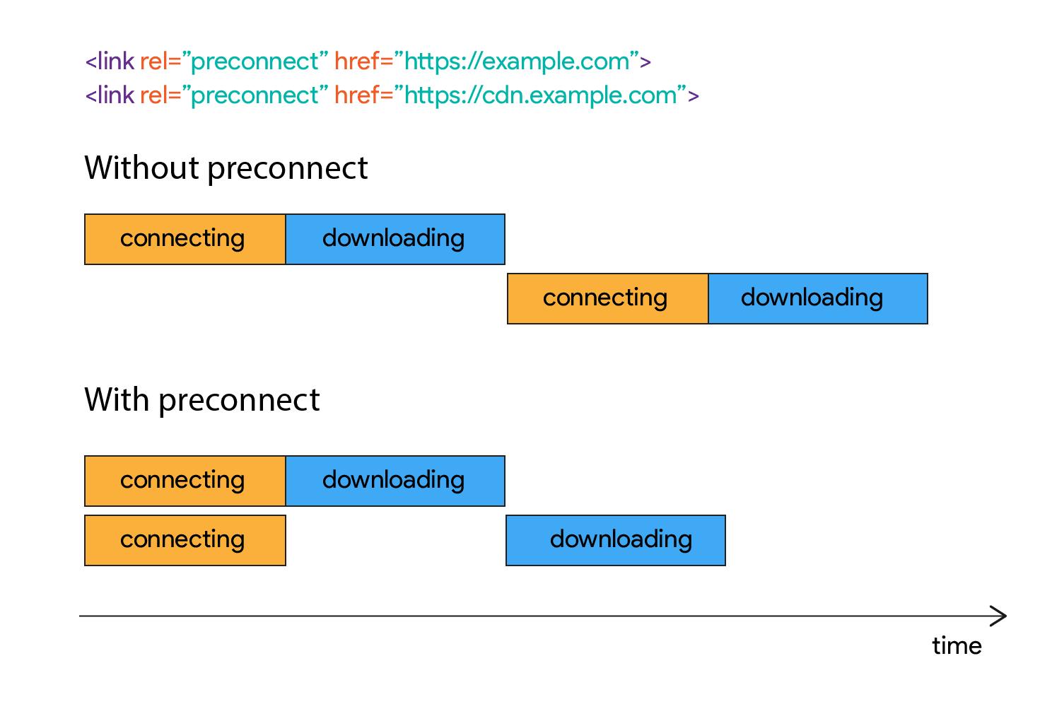
Adding rel=preconnect to a <link> informs the browser that your page intends to establish a connection to another domain, and that you'd like the process to start as soon as possible. Resources will load more quickly because the setup process has already been completed by the time the browser requests them.
The graphic in the post does a good job of making this an obviously good choice for performance:
Robin did a good job of rounding up information on all this type of stuff a few years back. Looks like the best practice right now is using these two:
That'd be 14 extra <link> tags in the first few packets of data on every request on this site. It sounds like a perf win, but I'd want to test that before no-brainer chucking it in there.
I used the HTTP Archive to find a couple of sites that use Cloudinary for their images, and tested them unchanged, and then with the preconnect script injected. Each test consisted of nine runs, using Chrome emulating a mobile device, and the Cable network profile.
There’s a noticeable visual improvement in the first site, with the main background image loading over half a second sooner (top) than on the unchanged site (bottom).
This stuff makes me think of instant.page (which just went v2), which is a fancy little script that preloads things based on interactions. It's now a browser extension (FasterChrome) that I've been trying out. I can't say I notice a huge difference, but I'm almost always on fast internet connections.
The Joomla World Conference in London, planned for November 2019, has been cancelled. Joomla’s Board of Directors announced the cancellation at the end of July, citing the updated October 31, 2019, Brexit deadline as the primary reason:
Last week the new UK Prime Minister, Boris Johnson has been elected with a mandate to ensure Brexit happens on 31st October, even if that means without any form of deal with the EU.
Sadly, for an international conference planned for the weeks after Brexit, there is considerable doubt and uncertainty around travel requirements to the UK and what (if any) visas may be required. This coupled with the huge workload already on the limited resources of the community with Joomla 4 at an advanced development stage, the Board has very reluctantly taken the decision to postpone JWC2019 to some date yet to be announced.
The directors did not want to risk international attendees purchasing travel not being able to attend. They are issuing refunds for tickets already purchased.
WordCamp London, which has traditionally been held in early April or late March, is also not exempt from Brexit-related planning challenges. The lingering uncertainty bleeds into other aspects of planning, such as recruiting sponsors and speakers.
“The uncertainty that Brexit brings when trying to organize an international conference adds huge pressures to the organizing team, creates many additional logistical problems for sponsors, and creates uncertainty for volunteers and attendees,” WordCamp London organizer Dan Maby said. He and co-lead Barbara Saul are currently in the early stages of planning the 2020 event. They faced similar issues this year with the original Brexit date set for March 29, 2019.
“The WordCamp was planned just one week after this date,” Maby said. “As an organizing team we faced unanswerable questions from the outset. We planned to develop a dedicated team within the organizers to support questions, but we soon realized this wasn’t possible because even at governmental level the answers to questions we had were not answered.”
Since WordCamps are designed to be focused on the local communities where they are produced, Maby and his team adopted a mindset that they would send a message by keeping the 2019 camp running as planned: “Let’s do our small part in demonstrating that the UK is open for international business.” The event ended up selling out of both tickets and sponsor packages. Although WordCamp London historically attracts an international audience, the marketing team for the 2019 event focused heavily on the local community.
Maby said it saddened him to read that Joomla World Conference 2019 has been postponed due to Brexit and that he empathizes with their team.
“We’re in early discussions regarding WordCamp London 2020 and considering delivering the event later in the year,” he said. “Part of the reason is to allow the unknown of Brexit to start to settle.”
With a lack of definitive information about who will need visas and how Brexit will affect international travelers, Maybe said his team is still mostly in dark. The biggest complication is not knowing if sponsors or attendees will be able to legally enter the country. This makes planning a budget and selling sponsorship packages and tickets more tricky. WordCamp London co-leads have yet to put the application in but are eying September 2020 for the next event.
“We are investigating September as a potential alternative,” Maby said. “We’ll be 11 months post-Brexit (if it happens in October) so we will hopefully have a better idea of what to communicate to attendees, volunteers, and sponsors traveling into the UK. It also sits well between the European and US regional WordCamps.”
Amazon has introduced SendDiagnosticInterrupt for AWS EC2. The feature is an API-driven diagnostic interrupt that triggers a kernel panic for Linux instances or a blue screen/stop error for Windows instances. The interrupt is received as a non-maskable interrupt by Intel and AMD processors.
The availability of flexible and free CMS systems like WordPress means it’s never been easier to set your stall out as a creative entrepreneur and drive both product sales and new business via your website. As a creative entrepreneur, you need more than just an e-commerce theme optimized for mobile. You need one of the […]
As a WordPress enthusiast, you always want to stay abreast of the latest happenings in the world of WordPress and, to some extent, web development. You want to know what the whos of WordPress have to say at any given time. You want to stay ahead of the curve; keep tabs on WordPress news, latest techniques, hacks, […]
The FREE Visual Composer Website Builder is perfect for building simple elements FAST with 0 coding. Based on ReactJS for performance & loading speed, it shaves hours off your work!
A course that will introduce you to modern JavaScript-based web development. The main focus is on building single page applications with ReactJS that use REST APIs built with Node.js.
Mandy Michael shares a demo that shows how to change the page content based on the light level in the room using the Ambient Light API. Works behind the #enable-generic-sensor-extra-classes flag in chrome://flags.
An article by Berrak Nil where she explains what procedural audio is and how it can be used on the web, while walking through a WebVR experience created using A-Frame.
Let's say you were gonna bounce an element all around a screen, sorta like an old school screensaver or Pong or something.
You'd probably be tracking the X location of the element, increasing or decreasing it in a time loop and — when the element reached the maximum or minimum value — it would reverse direction. Then do that same thing with the Y location and you've got the effect we're after. Simple enough with some JavaScript and math.
Here's The Coding Train explaining it clearly:
Here's a canvas implementation. It's Pong so it factors in paddles and is slightly more complicated, but the basic math is still there:
But what if we wanted to do this purely in CSS? We could write @keyframes that move the transform or left/top properties... but what values would we use? If we're trying to bounce around the entire screen (viewport), we'd need to know the dimensions of the screen and then use those values. But we never know that exact size in CSS.
Or do we?
CSS has viewport units, which are based on the size of the entire viewport. Plus, we've got calc() and we presumably know the size of our own element.
The extra tricky part is breaking the X animation and the Y animation apart into two separate animations (one on a parent and one on a child) so that, when the direction reverses, it can happen independently and it looks more screensaver-like.
Let's take a look at how to do it in different browsers. Although note the date of this blog post. This stuff tends to change over time, so if anything here is wrong, let us know and we can update it.
In Firefox...
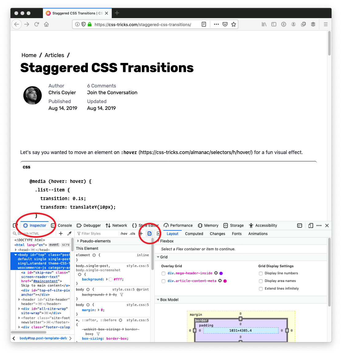
It's a little button in DevTools. So easy!
Open DevTools (Command+Option+i)
Go to the “Inspector” tab
Click the little page icon
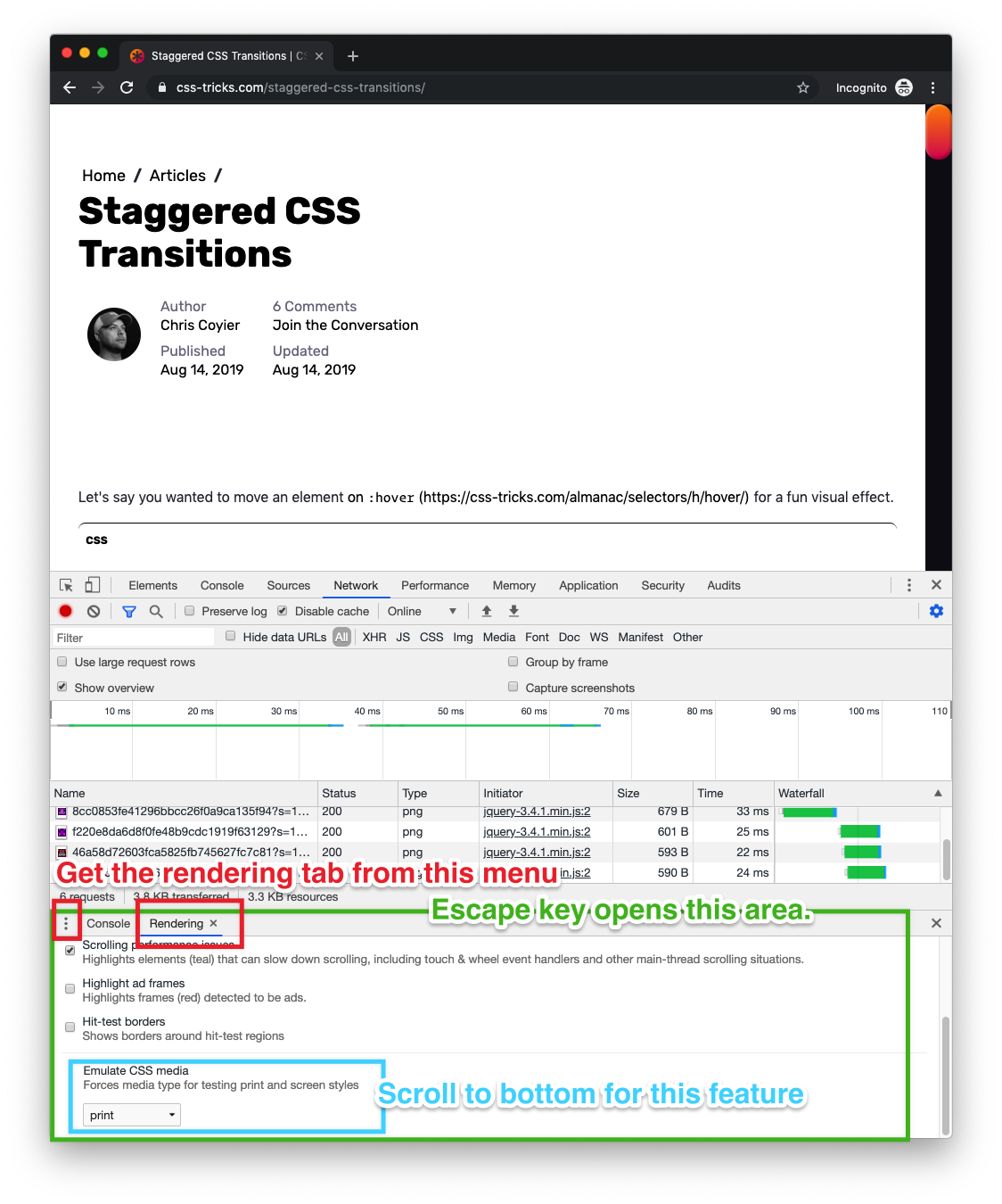
In Chrome and Edge...
It's a little weirder, I think, but it's still a fairly easy thing to do in DevTools.
Open DevTools (Command+Option+i)
If you don't have the weird-special-bottom-area-thing, press the Escape key
Click the menu icon to choose tabs to open
Select the “Rendering” tab
Scroll to bottom of the “Rendering” tab options
Choose print from the options for Emulate CSS media
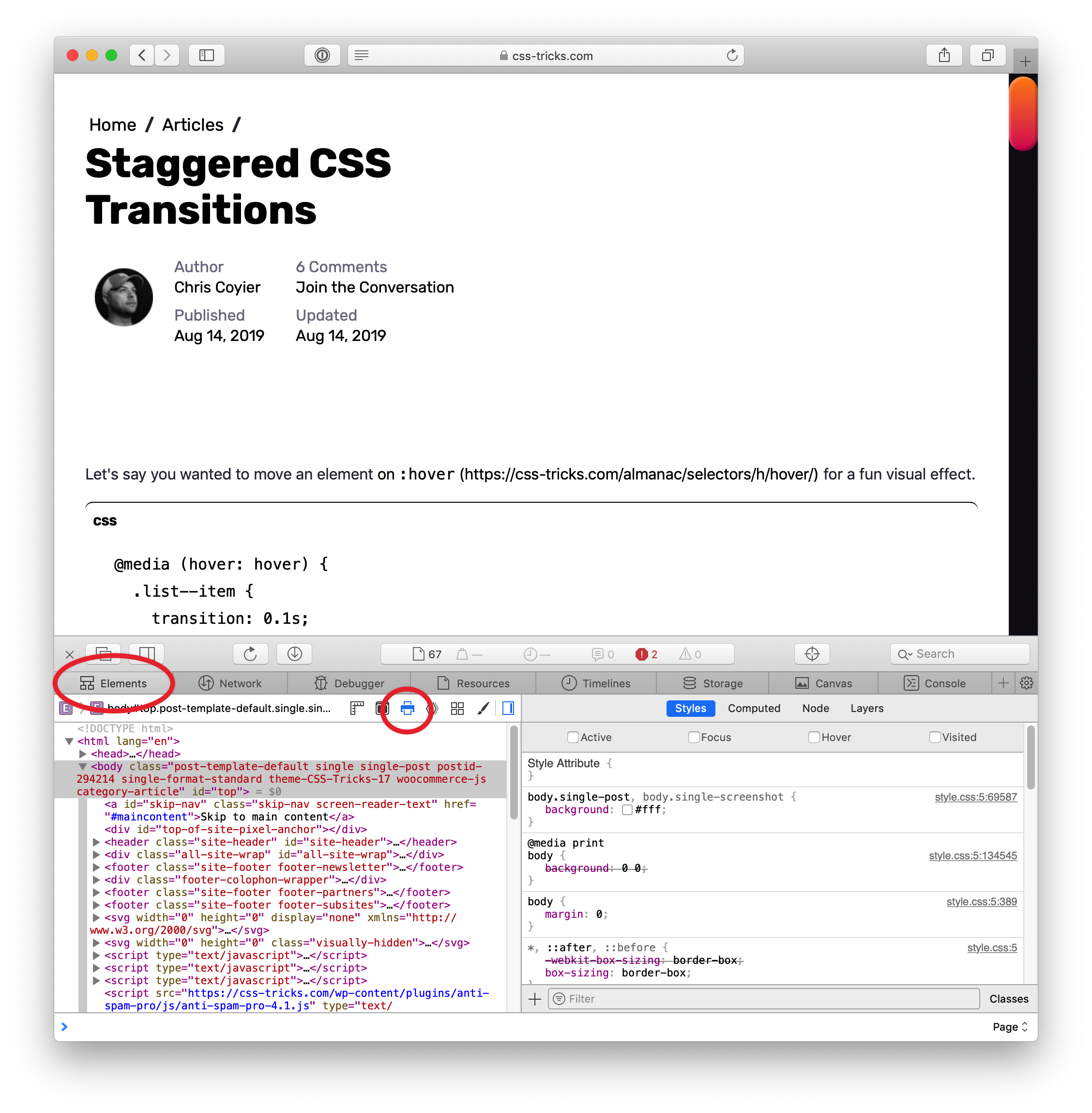
In Safari...
Safari has a little button a lot like Firefox, but it looks different.
In the world of design, there are a few unwritten rules. For a logo, a few of those rules are don’t make it over the top, don’t make it overly and unnecessarily colorful, and make it match the brand.
One thing that we haven’t considered (at least some of us) is taking that list of rules and sending them to the opposite side of the spectrum. Is there such a thing as a logo that is so boring that it goes against those unwritten laws?
Let’s look at what Visa has done with their newest logo and talk about it.
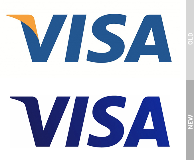
The old Visa logo
This of course, is the old Visa logo. There’s nothing special about it. In fact, if it didn’t say Visa, you could easily mistake it for -insert any generic massive corporation here-. But what it does represent is the brand. It’s a calming dark blue, and it boasts a small golden-yellow accent atop the V that really draws your focus to the start of the logo.
Pretty simple, right? It’s not the Mona Lisa, but it certainly has some aspect of design. Not even that much can be said about the new logo.
The new logo
Yep. That’s it. Believe it or not, there are some changes at play here. But, as we were discussing before, they are so far from being unique that they might put you to sleep.
For starters, they completely dropped the golden-yellow highlight. In a sense, it does unify the logo a little bit better, so maybe that wasn’t the worst choice.
The next thing you’ll notice is the color change. Visa went from a kind of playful blue to a dark, more serious blue, and added in a slight color gradient.
The reason, according to Visa, that they dropped the original color scheme actually dates back to the creation of credit cards. Way back in 1958, Bank of America sent out what they referred to as Bank of Americards.
Back then, Bank of America was based in California. The colors of those cards back then (again, the first ever credit card) was gold and blue. The blue represented the clear california sky, and the gold was taken from the color of the rolling golden hills. These colors represented the luxury of having a credit card simply because they represented the first credit cards created.
Now, what does that have to do with anything? Visa decided to cut these colors out because they wanted the logo to represent everyone and everywhere. In fact, there tagline is “Everywhere you want to be.”
So, it makes sense that they’d want to cut colors that represent a single state. But, they certainly did not have to be so boring about it.
And that’s pretty much all they changed. All we’re left with is a bland and easily ignorable sans serif. It’s quite boring and unnecessary. Most of the time, brands change their logo to signify change. This logo is far from changed. It is un-unique in every sense of the word, and lacks everything that makes a company stand out.
What to take away from this
Listen, I get that nobody should really expect much design-wise from a company that provides financial services. What I am saying is that they could have tried much harder.
When most people open up their wallet or purse, this logo is one of the first things that greet them. Every single time you pay for something, you and everyone around you will see this logo. Granted, it is quite small in this case, and in reality nobody will see it, but still.
You would expect a massive corporation to at least put a little more thought into the words that define their existence.
As of right now, Visa seems pretty happy about their new change. On the other hand, it’s left many designers world-wide questioning their use of blue completely. Only time will tell if Visa keeps the change, or continues to charge full-steam ahead confidently.
A lot can happen over coffee. If you’re a cafe owner, you’ll be wishing it does happen in your cafe. And what better way to drive people through your cafe’s door than to have an awesome website? The best cafe WordPress themes can give you a leg up here!
Recently, I had a chat with Chris Coyier and Dave Rupert over on the Shoptalk Podcast about writing for publications such as Smashing Magazine and CSS-Tricks. One of the things we talked about was submitting ideas to publications — something that can feel quite daunting even as an experienced writer.
In this article, I’m going to go through the process for pitching, heavily based on my own experience as a writer and as Editor in Chief of Smashing. However, I’ve also taken a look at the guidelines for other publications in order to help you find the right places to pitch your article ideas.
Do Your Research
Read existing articles on the site that you would like to write for. Who do they seem to be aimed at? What tone of voice do the writers take? Does the publication tend to publish news pieces, opinion, or how-to tutorials? Check to see if there are already other pieces which are on the same subject as your idea, i.e. will your piece add to the conversation already started by those articles? If you can show that you are aware of existing content on a particular subject, and explain how you will reference it or add to that information, the editor will know you have done some research.
Research more widely; are there already good pieces on the subject that an editor will consider your piece to be a repeat of? There is always space for a new take on an issue, but in general, publications want fresh material. You should be ready to explain how your piece will reference this earlier work and build upon it, or introduce the subject to a new audience.
A good example from our own archives is the piece, “Replacing jQuery With Vue.js”. There are a lot of introductions to Vue.js, however, this piece was squarely aimed at the web developer who knows jQuery. It introduced the subject in a familiar way specifically for the target audience.
Find The Submission Guide
The next thing to do is to find the submission information on the site you want to write for. Most publications will have information about who to contact and what information to include. From my point of view, simply following that information and demonstrating you have done some research puts you pretty high up the queue to be taken seriously. At Smashing Magazine, we have a link to the guide to writing for us right there on the contact form. I’d estimate that only 20% of people read and follow those instructions.
The link to our submission guide on our Contact Us page.
When you submit your idea, it is up to you to sell it to the publication. Why should I run with your idea over the many others that will show up today? Spending time over your submissions will make a huge difference in how many pieces you have accepted.
Different publications have different requirements. At Smashing Magazine, we ask you to send an outline first, along with some information about you so that we can understand your expertise in the subject matter. We’re very keen to feature new voices, and so we’ll accept pieces from writers who haven’t got a huge string of writing credentials.
The information we request helps us to decide if you are likely to be able to deliver a coherent piece. As our articles are technical in nature (often tutorials), I find that an outline is the best way to quickly see the shape of the proposal and the scope it will cover. A good outline will include the main headings or sections of the article, along with an explanation of what will be taught in that section.
For many other publications, a common request is for you to send a pitch for the article. This would typically be a couple of paragraphs explaining the direction your piece will take. Once again, check the submission guide for any specific details that publication is interested to see.
The Verge has an excellent submission guide which explains exactly what they want to see in a pitch:
“A good pitch contains a story, a narrative backbone. Pitches should clearly and concisely convey the story you plan to write and why it matters. The best pitches display promising pre-reporting and deep knowledge of the topic as well as a sense of the angle or insight you plan to pursue. If your story depends on access to a person or company, you should say whether you have obtained it already (and if not, what your prospects are). Pitches should also be written in the style you expect to write the story.”
A List Apart explains what they will accept in their contribution page:
“... a rough draft, a partial draft, or a short pitch (a paragraph or two summarizing your argument and why it matters to our readers) paired with an outline. The more complete your submission is, the better feedback we can give you.”
The Slate has a list of Do’s and Don’ts for pitching:
“Do distill your idea into a pitch, even if you have a full draft already written. If you happen to have a draft ready, feel free to attach it, but please make sure you still include a full pitch describing the piece in the body of the email.”
Including your pitch or outline in the body of the email is a common theme of pitch guidelines. Remember that your aim is to make it as easy as possible for the editor to think, “that looks interesting”.
Include A Short Biography
The editor doesn’t need your life story, however, a couple of sentences about you is helpful. This is especially useful if you are a newer writer who has subject matter expertise but fewer writing credentials. If you are proposing an article to me about moving a site from WordPress to Gatsby, and tell me that the article is based on your experience of doing this on a large site, that is more interesting to me than a more experienced writer who has just thought it would be a good topic to write about.
If you do have writing credits, a few relevant links are more helpful than a link to your entire portfolio.
When You Can’t Find A Submission Guide
Some publications will publish an email address or contact form for submissions, but have no obvious guide. In that case, assume that a short pitch as described above is appropriate. Include the pitch in the body of the email rather than an attachment, and make sure you include contact details in addition to your email address.
If you can’t find any information about submitting, then check to see if the publication is actually accepting external posts. Are all the articles written by staff? If unsure, then get in touch via a published contact method and ask if they accept pitches.
I’ve Already Written My Article, Why Should I Send An Outline Or Pitch?
We ask for an outline for a few reasons. Firstly, we’re a very small team. Each proposal is assessed by me, and I don’t have time in the day to read numerous 3000-word first draft proposals. In addition, we often have around 100 articles in the writing process at any one time. It’s quite likely that two authors will want to write on the same subject.
On receiving an outline, if it is going in a similar direction to something we already have in the pipeline, I can often spot something that would add to — rather than repeat — the other piece. We can then guide you towards that direction, and be able to accept the proposal where a completed piece may have been rejected as too similar.
If you are a new writer, the ability to structure an outline tells me a lot about your ability to deliver us something useful. We are going to spend time and energy working with you on your article, and I want to know it will be worthwhile for all of us.
If you are an experienced writer, the fact that you have read and worked with our guidelines tells me a lot about you as a professional. Are you going to be difficult for our editorial team to work with and refuse to make requested changes? Or are you keen to work with us to shape a piece that will be most useful and practical for the audience?
In The Verge submission guide included above, they ask you to “clearly and concisely” convey the story you plan to write. Your pitch shouldn’t be an article with bits removed or about the first two paragraphs. It’s literally a sales pitch for your proposed article; your job is to make the editor excited to read your full proposal! Some publications — in particular those that publish timely pieces on news topics — will ask you to attach your draft along with the pitch, however, you still need to get the editor to think it is worth opening that document.
Promoting Yourself Or Your Business
In many guides to self-promotion or bootstrapping the promotion of a startup, writing guest posts is something that will often be suggested. Be aware that the majority of publications are not going to publish an advert and pay you for the privilege.
Writing an article that refers to your product may be appropriate, as most of our expertise comes from doing the job that we do. It is worth being upfront when proposing a piece that would need to mention your product or the product of the company you work for. Explain how your idea will not be an advert for the company and that the product will only be mentioned in the context of the experience gained in your work.
Some publications will accept a trade of an article for some promotion. CSS-Tricks is one such publication, and describes what they are looking for as follows:
“The article is intended to promote something. In that case, no money changes hands. In this scenario, your pitch must be different from a sponsored post in that you aren’t just straight up pitching your product or service and that you’re writing a useful article about the web; it just so happens to be something that the promotion you’ll get from this article is valuable to you.”
Writing for a popular publication will give you a byline, i.e. your credit as an author. That will generally give you at least one link to your own site. Writing well-received articles can be a way to build up your reputation and even introduce people to your products and services, but if you try and slide an advert in as an article, you can be sure that editors are very well used to spotting that!
Pitching The Same Idea To Multiple Publications
For time-sensitive pieces, you might be keen to spread the net. In that case, you should make publications aware of submitting that you have submitted it elsewhere. Otherwise, it is generally good practice to wait for a response before offering the piece to another publication. The Slate writes,
“Do be mindful if you pitch your idea to multiple publications. We try to reply to everyone in a timely manner, typically within one to two days. As a general rule, and if the story isn’t too timely, it’s best to wait that amount of time before sharing the pitch with another publication. If you do decide to cast a wide net, it’s always helpful to let us know ahead of time so we can respond accordingly.”
You will have ideas rejected. Sometimes, the editor will let you know why, but most often you’ll get a quick no, thanks. Try not to take these to heart; there are many reasons why the piece might be rejected that have nothing to do with the article idea or the quality of your proposal.
The main reasons I reject pitches are as follows:
Obvious Spam
This is the easy one. People wanting to publish a “guest post” on vague subjects, and people wanting “do-follow links”. We don’t tend to reply to these as they are essentially spam.
No Attempt At A Serious Outline
I can’t tell anything about an idea from two sentences or three bullet points, and if the author can’t spend the time to write an outline, I don’t think I want to have a team member working with them.
Not A Good Topic For Us
There are some outlines that I can’t ever see being a great fit for our readers.
An Attempt To Hide An Advert
In this case, I’ll suggest that you talk to our advertising team!
Difficult To Work With
Last but not least, authors who have behaved so badly during the pitch process that I can’t bring myself to inflict them on anyone else. Don’t be that person!
If I have a decent outline on a relevant subject in front of me, then one of two things are going to happen: I’ll accept the outline and get the author into the writing process or I’ll reply to the author because there is some reason why we can’t accept the outline as it is. That will usually be because the target audience or tone is wrong, or we already have a very similar piece in development.
Quite often in these scenarios, I will suggest changes or a different approach. Many of those initial soft rejections become an accepted idea, or the author comes back with a different idea that does indeed work.
Ultimately, those of us who need to fill a publication with content really want you to bring us good ideas. To open my inbox and find interesting pitches for Smashing is a genuine highlight of my day. So please do write for us.
Things To Do
Research the publication, and the type of articles they publish;
Read their submissions guide, and follow it;
Be upfront if you have sent the pitch to other publications;
Include a couple of sentences about you, and why you are the person to write the article. Link to some other relevant writing if you have it;
Be polite and friendly, but concise.
Things To Avoid
Sending a complete draft along with the words, “How do I publish this on your site?”;
Sending things in a format other than suggested in the submissions guide;
Pitching a piece that is already published somewhere else;
Pitching a hidden advert for your product or services;
Following up aggressively, or sending the pitch to multiple editors, Facebook messenger, and Twitter, in an attempt to get noticed. We publish a pitch contact, because we want pitches. It might take a day or two to follow up though!
As a user of WordPress and blogger writing about the platform, there are some rules about the WordPress logo and trademark that you need to keep in mind.
WordPress is an open-source software, but it is still protected by copyright and trademark laws. Many beginners don’t know them, and they may accidentally violate the guidelines.
In this article, we will explain the rules you need to follow when using the WordPress logo and trademark. We will also discuss why it is important and what rights you are given under the WordPress license.
Understanding GPL – The WordPress License
Let’s start with the basics first.
There are two types of WordPress websites. First, there is WordPress.com which is a hosted solution, and then there is the popular WordPress.org also called self-hosted WordPress.
WordPress is released under the open source GPL license. This makes WordPress a free software. However, free here is used as in freedom not as in free coffee.
This license gives anyone the freedom to download, copy, use, study, and modify the WordPress code.
While the software itself is free to use, you will need to purchase a domain name and web hosting account to install WordPress and make a website.
There is a misconception among beginners about free software and copyright. While you are free to to use the software code in any way you want, the software itself is protected by copyright and trademark laws.
What does that mean?
Basically, you can copy the WordPress code to make new software, but you cannot call your software WordPress.
The name WordPress is a registered trademark owned by the WordPress foundation. It is a non-profit organization which ensures that WordPress runs successfully as a free open source project.
Why You Need to Understand WordPress Logo and Trademark Rules?
WordPress powers nearly 33% of all websites on the internet. That’s a really huge number.
Millions of businesses rely on WordPress to effectively run their website, online communities, and blogs.
To make sure that everything works smoothly, WordPress brand and trademark needed to be protected. For this purpose, the WordPress trademark was transferred to The WordPress Foundation in 2010.
Now the problem is that WordPress foundation is not the only one that works on WordPress. It is an open source project where thousands of people contribute to its success.
Apart from those contributors, there are many companies, individuals, and freelancers who sell WordPress related products and services around the world.
If you are running a WordPress website, a web design agency, or providing WordPress related services, then you need to understand these rules to comply with the trademark policies.
That being said, let’s take a look at the rules and guidelines that you must follow to properly use the WordPress trademark and logo in your projects.
Rule 1. Always Write WordPress with a Capital P
The correct way to spell WordPress is with a capital P. This capitalization is taken very seriously by the WordPress community.
If you are going to mention WordPress anywhere, then make sure that you use the correct spelling. Using an incorrect spelling is frowned upon and considered unprofessional.
WordPress team takes it so seriously that in 2010 they added a built-in filter called capital_P_dangit() in WordPress 3.0 release.
This function automatically corrects the misspelled instances of WordPress in title, content, and excerpts.
As we mentioned earlier that the name WordPress is a registered trademark owned by the WordPress foundation. This protects the WordPress brand and ensures its continued success.
Just like any other registered trademark, the WordPress Foundation reserves exclusive usage rights for the term WordPress. This means you cannot use WordPress as part of your brand name or website.
This restriction also includes domain names. For example:
WordPressBeginner.com Wrong!
WPBeginner.com OK!
You can use WordPress in a subdomain such as (wordpress.example.com), the WordPress Foundation is mainly concerned about top-level domains.
If you see someone using WordPress in their domain name or brand name, then you should contact the WordPress Foundation and notify them about the violation.
The WordPress logo consists of the letter W in a grey or sometimes white circle with a grey ring around it.
The height of the letter W is tall and graceful. Many bloggers and website owners sometimes mistakenly use the faux logo which usually has a shorter W in it.
Make sure that you are using the correct WordPress logo in your projects. The WordPress logo is also available as a text mark, text mark with W logo, and W logo.
Feel free to use these images in your projects. However, make sure that you use them in accordance with WordPress trademark policy.
Rule 4. No Affiliation or Endorsement
The WordPress foundation wants you to use the WordPress logo and brand to promote the WordPress project itself.
However, you are not allowed to use it in a way that suggests endorsement or affiliation with the project. Here are some examples:
You cannot use WordPress logo in your product’s advertisements.
You cannot use WordPress or its logo as part of your own logo.
You can place ‘Powered by WordPress.org’ on your website, but you cannot say ‘Recommended by WordPress’.
In easier words, any attempts to take unfair advantage of WordPress brand name are a violation of the trademark policy.
What Happens When Someone Doesn’t Follow These Rules?
The WordPress foundation takes these violations very seriously. You may receive an email from them to comply with their trademark guidelines.
Failure to comply may lead to further actions. These actions may include several legal procedures.
For example, if you are using WordPress in your domain name, then foundation can claim that domain name. Their lawyers can also send you a legal notice.
The legal proceedings would cost you a lot of money, and you would lose support from the WordPress community itself.
The WordPress community relies on the WordPress foundation to take these actions. It benefits everyone in the ecosystem and helps countless WordPress related companies grow and succeed.
We hope this article helped you understand the rules you must follow to comply with the WordPress logo and trademark policies. You may also want to see our guide on the best WordPress plugins and best email marketing services for small businesses.
If you liked this article, then please subscribe to our YouTube Channel for WordPress video tutorials. You can also find us on Twitter and Facebook.
A clunky website is a liability for your conversion rate. Implement these web design tips into your site and watch your conversion rate skyrocket! 38% of people will stop engaging with a badly designed website. With numbers like that, you want to ensure your design is pulling its weight. Web design tips are a great [...]
Throw out your downloadable e-books and checklists… interactive quizzes are the new way to engage with your audience, collect qualified leads and drive more sales for your business.
Who doesn’t love a good online quiz?
Whether it’s the challenge of testing your general knowledge… or maybe it’s you desperately needing to know which Marvel superhero you are, or which Harry Potter house you’d be sorted into.
(I got Iron Man and Gryffindor FYI)
Point is, people just can’t get enough of them!
And in the spirit of this apparent obsession, let’s kick things off with a little quiz of our own.
Start by taking a look at the following article headlines:
“Only People With Perfect Color Vision Can Read These Words”
“Community Post: Pick Out An Outfit At Hot Topic And We’ll Tell You How Old You Are”
“Only People With Perfect Color Vision Can See These D**ks”
“Pretend To Buy Things From Amazon And We’ll Reveal Your Age”
Now see if you can figure out what all of these articles have in common?
Let’s start with the obvious…
First off, two of the articles seem to suggest having perfect color vision is apparently a big deal?
Next, all of these articles are, yep, you guessed it…
QUIZZES!
And finally… (this is the one you probably won’t have known)
These Four Quizzes Were Buzzfeed’s Best Performing Articles In March 2017 – With A Combined Engagement Of 2,042,505!
Check it out:
Quizzes dominated BuzzFeed’s article content in March 2017
And it doesn’t stop there…
According to NewsWhip during this same month, 50 of BuzzFeed’s most engaging quizzes drove just under 3 million engagements – averaging a massive 60,000 engagements per quiz.
Speaking of engagement…
In a survey conducted by CMI in 2016, 81% of respondents agreed that interactive content grabbed attention more effectively than static content (sorry downloadable e-books and checklists!).
Heck, even Neil Patel agrees:
“When you make the content interactive, whether it’s text format or image format or anything like that, people will start learning more. Because they’re engaging. And that’s the key to helping people: it’s to make sure that they’re engaged.” – Neil Patel
Why am I telling you all of this?
Because although interactive quizzes are usually viewed as nothing more than a bit of fun between friends on social media…
They’ve recently grown into a legitimate marketing tool.
A powerful one that businesses can use to capture leads, drive more traffic and increase sales.
And in this article we’ll be looking at real examples of businesses who’ve had great success with interactive quizzes (and explain how you can too!).
I’ll also give you a quick rundown of how you can easily create your own interactive quiz using the Forminator plugin in WordPress.
But before we get to that…
Let’s uncover the psychology behind why people love quizzes so much:
The Psychology Behind Our Obsession With Online Quizzes
People Are More Comfortable Being a “Type”
Although most of us like to think we’re individuals, we all have a habit of categorising ourselves and those around us.
We also need to feel a sense of belonging and being a part of something bigger than ourselves.
That’s why “which … do you belong to?” quizzes are so popular and addictive.
Because placing ourselves into boxes or categories is sometimes our way of making sense of this big bad world.
Quizzes Appeal To Our Most Primal Desires
Two of our most primal desires are knowing more about ourselves and showing other people how good we are.
Graded (or knowledge) quizzes for example, provide the perfect opportunity to prove just how smart we are.
And savvy marketers know this.
As a result, publications often use these kinds of tests to challenge readers intelligence.
By extension this also makes the person feel more intelligent for reading their publication.
We’re All Searching For Deeper Insights About Ourselves
Although outcome quizzes like: “what your choice of … says about you” seem innocent enough, they’re secretly appealing to our needs as humans to seek deeper insights about ourselves.
For example, if you’re feeling underpaid in your job and you come across a quiz titled: “How To Tell If Your Boss Is Paying You Fairly” it’s likely you’ll look to this quiz for validation that your assumptions were true.
Okay Enough With The Deep Insights And Psychology…
I think we’re ready to get to the quiz making!
But first we need to decide:
What TYPE Of Quiz Should You Create For Your Business?
Generally there are two main types of interactive quizzes businesses will create.
These are:
“Graded” (or knowledge) quizzes.
And…
“Outcome” (or personality) quizzes.
The quiz type you choose will largely depend on your business (you may even choose both!).
However, to help you identify which is right for you, let’s take a look at some real examples of both in action.
Starting With “Graded” Quizzes…
Examples of graded quizzes include such classics as:
“Only True Movie Buffs Can Name More Than 7 Of These 10 Films.”
And…
“Can You Name These Justin Bieber Songs Judging By One Line Of The Lyrics”
Okay, I may have made those up…
But you get the idea!
As mentioned above, this type of quiz aims to bring out the competitive nature in us so we click through.
BuzzFeed are pros at using this kind of interactive quiz:
BuzzFeed articles do a great job of getting people to click
Could you resist clicking if you were interested in these topics?
Or Maybe An “Outcome Quiz” Would Work Better?
Outcome or personality quizzes are the most popular type of quiz you’ll see shared on social media.
However, when done right, they can also be a powerful marketing tool for businesses.
The idea of these quizzes is to have participants answer questions with the intention of driving them to a set of predetermined outcomes.
BuzzFeed are also infamous for these types of quizzes… (but enough about them!)
“Oh My Disney” does a pretty good job too:
Oh My Disney love their personality quizzes
The World Wildlife Fund Also Achieved 1,043 Opt Ins Converting At 38.5% With This Simple Outcome Quiz:
The World Wildlife Fund had great success with this outcome quiz
This Quiz By Warby Parker is Also A Perfect Example Of Using An Outcome Quiz To Drive Sales:
Warby Parker nailed this outcome quiz
Although outcome quizzes are often more for entertainment, as you can see from the Warby Parker example, this type of quiz can also be great for driving sales and helping customers with their buying decisions.
It also makes your customers’ lives easier, so it’s a win-win!
Alrighty, now that you’ve had a chance to see both types in action…
It’s Time To Create Your Own Online Quiz In WordPress!
We’ll be creating your quiz using our popular contact form plugin “Forminator” which comes with a handy (and easy-to-use!) quiz functionality.
This plugin is also completely FREE to install and add to your WordPress website right now.
Also, for this particular walkthrough we’ll be creating an “outcome quiz.”
But don’t worry, if you’re looking to create a “knowledge quiz” you’ll also find instructions for this on the Forminator documentation page.
In any case, if you’re ready to learn how to make your own outcome quiz in less than 10 minutes…
Let’s get to it!
Step 1: Install Forminator
First of all, you’ll want to install the free Forminator plugin for WordPress if you haven’t already:
Step 2: Select The Quiz Option
Once you’ve installed and activated the plugin, head to the Forminator dashboard and scroll down until you find “quizzes.” After you’ve found quizzes, click on create to open a new pop-up.
Forminator also allows you to create polls and forms!
Step 3: Select Quiz Type
You have the option of choosing between a knowledge and a personality quiz. For the purpose of this walkthrough we’ll select a personality quiz.
Forminator lets you create two types of online quizzes
Step 4: Name Your Quiz
Now’s when the real fun starts, it’s time to name your quiz. Select an appropriate name (e.g “which superhero are you?”) and then click create.
Time to creative! Name your epic quiz
Step 5: Fill Out The Intro Fields
Next you’ll be greeted with some more introduction options including:
The Title: Which will appear above your quiz.
The Feature Image: The main image visitors will see when they click through to your quiz.
The Description: A short summary of your quiz to help visitors understand what it’s all about.
Step 6: Choose Your Personalities
Now it’s time to choose your personalities, or the “outcomes” of your quiz. So if your quiz is titled: “which superhero are you?” Your options might include Superman, Batman and Iron Man.
Which superhero would you be?
Step 7: Fill Out Your Questions And Answers
Next fill out the questions and answers of your quiz. Each answer will match up with one (or more) of the appropriate personalities you’ve selected prior.
As an example, if the question is: “what is your superpower?” possible answers could be “super strength” which equals the superman personality, or “super speed” which might equal The Flash etc.
Step 8: Adjust The Appearance Of Your Quiz
You can also change the appearance and look of your quiz. Play around with adjusting elements like the style and colors. As well as changing the font and the layout:
Give your quiz a makeover
Step 9: Social Media Share
Next you can choose to give users a chance to share their results on social media. This a great option if you want to increase awareness and traffic to your quiz.
Share your quiz on social!
Step 10: Publish!
Once you’ve completed these steps your quiz is pretty much complete! Simply select publish and it will go live:
Step 11: Copy Quiz Short Code
But no one’s going to see it if it’s not on a web page right?
To select a web page to host your quiz on, simply navigate back to the Forminator dashboard. Here you’ll be able to copy your quiz’s short code:
Step 12: Insert Short Code Into Web Page
You should then be able to paste the short code on the appropriate part of the page, or by selecting “add form.”
And That’s It!
In less than 10 minutes you’ve just created a simple personality quiz for your business.
Of course, a more in depth quiz with a lot of questions will probably take longer… but hey… 10 mins can still be done!
*BONUS TIPS For Getting Maximum Results From Your Quizzes
Get Topical With Your Quiz!
Creating quizzes based on topical events can be a great way to drive traffic and ride the wave of new trends.
Music website Hotnewhiphop did exactly this, taking advantage of rapper Kendrick Lamar’s newly released album:
Kendrick Lamar’s popularity drove the success of this quiz
This particular quiz gained a huge amount of traction on social media and resulted in 48,759 impressions on the web page containing the quiz.
The website had an average click-through rate to their on-page ads of 1.5% and every click was worth $0.75.
This all meant that the quiz brought in $548 on its first day alone!
Keep Your Quiz Running “Evergreen” If Possible
If it’s working like crazy, why not keep it running?
This is exactly what Forbes did back in 2014 with their quiz about which University prospective students should attend:
This Forbes university quiz just wouldn’t quit!
Since that time the quiz has been taken over 181,000 times and shared thousands more.
What makes this quiz different is the fact that only 60,000 of participants took the quiz during the first week, and the remaining 120,000 people took the quiz over several months following its release.
This proves your quiz can still be extremely effective without being timely.
Of course, you’ll need to ensure that the theme of your quiz can be evergreen like Forbes’ example.
You’re Now Left With Two Choices…
1. Go Back To Taking Quizzes For Fun On Social Media
Like everyone else, you have a chuckle discovering you’re more “Joker” than “Batman.”
Or…
2.Create a Kickass Quiz Of Your Own!
One that gives your customers more than a dull “e-book” or “checklist” to download…
A quiz that can easily be created in WordPress in less than 10 minutes.
A quiz that drives genuinely interested customers to your website, where they’ll at least be entertained, or who knows… they might even become lifelong customers.


 The availability of flexible and free CMS systems like WordPress means it’s never been easier to set your stall out as a creative entrepreneur and drive both product sales and new business via your website. As a creative entrepreneur, you need more than just an e-commerce theme optimized for mobile. You need one of the […]
 As a WordPress enthusiast, you always want to stay abreast of the latest happenings in the world of WordPress and, to some extent, web development. You want to know what the whos of WordPress have to say at any given time. You want to stay ahead of the curve; keep tabs on WordPress news, latest techniques, hacks, […]