In this week's roundup, variable fonts get oblique, a new browser extension for linting, and the very first version of CSS Modules.
Use font-style: oblique on variable fonts
Some popular variable fonts have a 'wght' (weight) axis for displaying text at different font weights and a 'slnt' (slant) axis for displaying slanted text. This enables creating many font styles using a single variable font file (e.g., see the "Variable Web Typography" demo page).
You can use font-style: oblique instead of the lower-level font-variation-settings property to display slanted text in variable fonts that have a 'slnt' axis. This approach works in Chrome, Safari, and Firefox.
The webhint linting tool is now available as a browser devtools extension for Chrome, Edge, and Firefox (read Microsoft’s announcement). Compared to Lighthouse, one distinguishing feature of webhint are its cross-browser compatibility hints.
In other news...
CSS Modules V1 is a new proposal from Microsoft that would extend the JavaScript modules infrastructure to allow importing a CSSStyleSheet object from a CSS file (e.g., import styles from "styles.css";) (via Thomas Steiner)
Web apps installed in the desktop version of Chrome can be uninstalled on the about:apps page (right-click on an app’s icon to reveal the Remove... option) (via Techdows)
Because of AMP’s unique requirements, larger news sites such as The Guardian should optimally have two separate codebases (one for the AMP pages and one for the regular website) (via The Guardian)
Read more news in my new, weekly Sunday issue. Visit webplatform.news for more information.
If you have a sneaking suspicion that APIs are something you should know about in 2019, you’re onto something! In 2019, APIs are more important than ever, and their prominence in the programming world is only growing. But what exactly...
Poor privacy practices have Facebook in hot water, again. This time, Facebook can thank its Instagram team for what's sure to be a PR nightmare. Business Insider just released a scathing investigative report:
Google has recently announced the addition of new API security reporting features to the company’s API management platform. These new features are currently in beta, with the company intending to roll out functionality to all Apigee Edge enterprise cloud customers over the next several weeks.
?Gainsight PX reveals how users engage and feel about your product features. Leverage your customers’ voice to create a best-in-class product experience.
A well made and eye-opening presentation on how the formulaic approach to UX case studies is numbing the critical thinking of designers, and how to bring a unique point of view to one’s work.
Read all about the new Contact Picker API, an on-demand picker that allows users to select entries from their contact list and share limited details of the selected entries with a website.
A free Brain food ebook series where Joël van Bodegraven and other guest authors delve deep into how Artificial Intelligence will impact UX design, and how to design meaningful experiences in an era with AI-driven products and services.
Monica Dinculescu shares her latest creation called MidiMe: a small magenta.js model that you can train in your browser with your music to output variations. Read more about it in this article.
Read the details about the eighth annual js13kGames competition, a game jam for web developers, game developers, and anyone who wants to challenge themselves to create something fun using JavaScript.
Last year, GitHub introduced its Actions API. Actions allow developers to orchestrate workflows based on events. After consistent developer feedback, GitHub Actions now supports CI/CD. CI/CD support is in beta and scheduled to be generally available on November 13.
Exporting Pens is a great way to make an offline backup or to port your code to another project, but what if you wanted to keep working on that preprocessor code locally?
Open any Pen and click Export in the footer to try the new Build Process option. You'll receive a .zip file with your original code, a backup of the in-browser preview, and a build script customized for the preprocessors used!
No internet? No problem! You can work offline after you run npm install. There's even an auto-refreshing preview server for a local CodePen-like experience.
Stephen, Chris, and Marie are here to talk about the new export with build process! We get into how it was built, its limitations, and some improvements we made to our admin systems along the way.
WooCommerce is a WordPress plugin that brings eCommerce to your WordPress sites. It's unique in its customizability and flexibility. You can use it to sell physical products, digital downloads, memberships, services, and tickets, plus offer customers lots of different ways to pay, including things like Apple Pay and Bitcoin powered by Stripe.
It is technically true that anyone can cook. But there’s a difference between actually knowing how to prepare a delicious meal and hoping for the best as you throw a few ingredients in a pot. Just like web development, you might know the ingredients—<span>, background-color, .heading-1—but not everyone knows how to turn those ingredients into a beautiful, easy-to-use website.
Whenever you use HTML and CSS, you are designing—giving form and structure to content so it can be understood by someone else. People have been designing for centuries and have developed principles along the way that are applicable to digital interfaces today. These principles manifest in three key areas: how words are displayed (typography), how content is arranged (spacing), and how personalty is added (color). Let’s discover how to use each of these web design ingredients through the mindset of a developer with CSS properties and guidelines to take the guesswork out of web design.
Websites that are easy to read don’t happen by mistake. In fact, Taimur Abdaal wrote an entire article on the topic that’s chock-full of advice for developers working with type. We’re going to focus specifically on two fundamental principles of design that can help you display words in a more visually pleasing and easy-to-read way: repetition and hierarchy.
Use repetition for consistency and maintainability
Repetition comes fairly naturally on the web thanks to the importance of reusability in software. For example, CSS classes allow you to define a particular style for text and then reuse that style across the site. This results in repeating, consistent text styles for similar content which helps users navigate the site.
If, for example, you are working on styles for a new paragraph, first consider if there is existing content that has a similar style and try to use the same CSS class. If not, you can create a new class with a generic name that can be repeated elsewhere in your site. Think .paragraph--emphasize as opposed to .footer__paragraph--emphasize or .heading-1 as opposed to .hero__site-title. The first examples can be used across your site as opposed to the second which are scoped to specific components. You can even add a prefix like text- to indicate that the class is used specifically for text styles. This method will reduce the CSS file size and complexity while making it much easier to update global styles in the future.
Left: The black text is similar but uses a slightly different font size and line height. Right: The black text uses the same styles and therefore can use the same CSS class. Reducing the amount of CSS needed and adding repetition and consistency.
In design, there are endless ways to experiment with styles. Designers can sometimes go a little crazy with their font styles by creating numerous slight variations of similar styles. However, in code, it’s valuable to restrict text styles to a minimum. Developers should urge designers to combine similar styles in order to reduce code weight and increase reusability and consistency.
These headings look very similar but are slightly different and would require three separate CSS classes to style them. They could probably be combined into one and styled with a single class.
Hierarchy provides a clear visual order to content
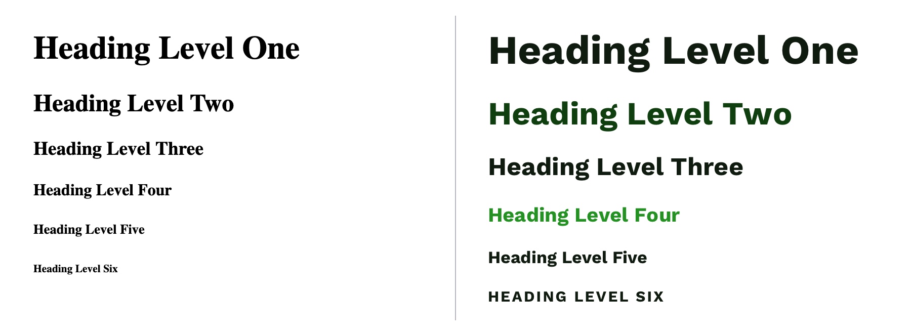
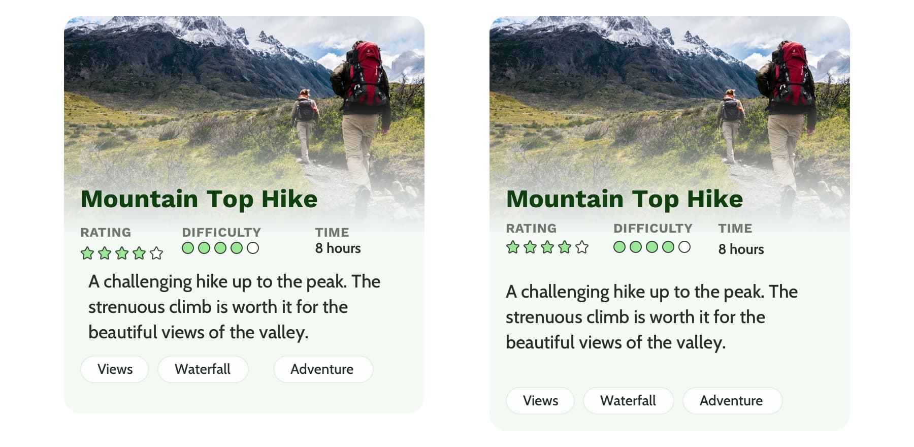
Hierarchy is something you really only notice when it’s not there. In typography, hierarchy refers to the visual difference between various pieces of text. It’s the distinction between headings, paragraphs, links, and other text styles. This distinction is made by choosing different fonts, colors, size, capitalization, and other properties for each type of text content. Good hierarchy makes complex information easier to digest and guides users through your content.
Left: Poor hierarchy. There’s not much differentiation in the size or color of the text to help users digest the content. Right: Better hierarchy that uses more variety in font size, color, and spacing to help users quickly navigate the content.
Out of the box, HTML provides some hierarchy (like how the font size of headings gets smaller as you go from <h1> to <h6>), but CSS opens the door for even more creativity. By giving <h1> tags an even larger font size, you can quickly establish greater difference in size between heading levels—and therefore more hierarchy. To create more variety, you can also change the color, text-align, and text-transform properties.
A comparison of the way HTML headings look without styles versus adding more contrast with CSS.
A note on choosing fonts
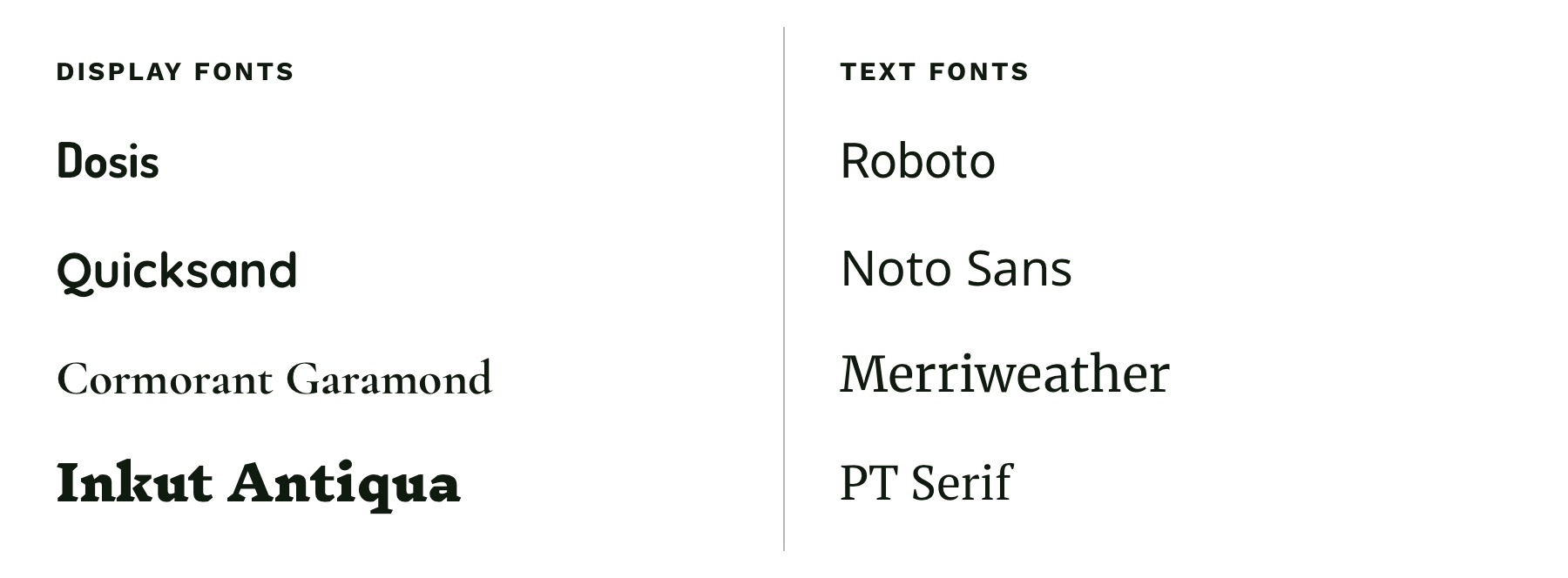
With typography, we need to make sure it is as easy to read as possible. The greatest overall factor in readability is the font you choose—which is a huge topic. There are many factors that determine how "readable" a font is. Some fonts are made specifically to be used as headings or short lines of text; these are called "display" fonts, and they often have more personality than fonts designed to be used for text. Unique flourishes and quirks make display fonts harder to read at small sizes and when part of a large paragraph. As a rule of thumb, use a more straightforward font for text and only use display fonts for headings.
Left: Examples of display fonts that work better as headings. Right: Examples of text fonts that are more readable and can be used for headings, paragraphs, and any other text that needs to be easy to read.
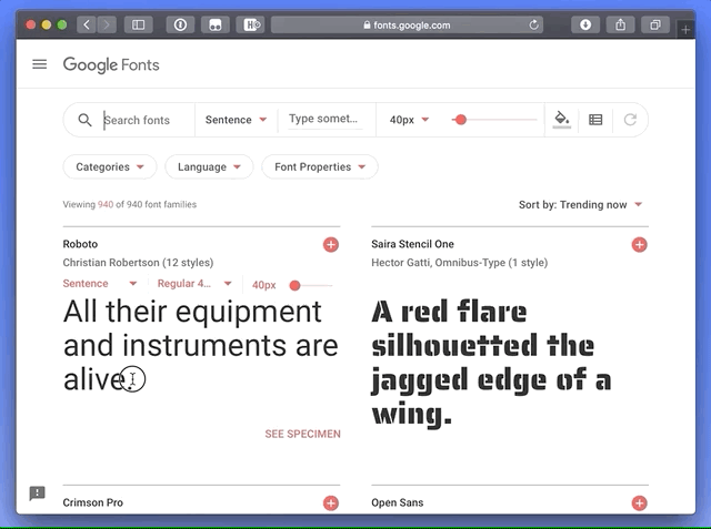
If you’re in a pinch and need a readable font, try Google Fonts. Add a paragraph of text to the preview field and size it roughly how it will display on your website. You can then narrow down your results to serif or sans-serif and scan the list of fonts for one that is easy to read. Roboto, Noto Sans, Merriweather, and PT Serif are all very readable options.
CSS properties for better readability
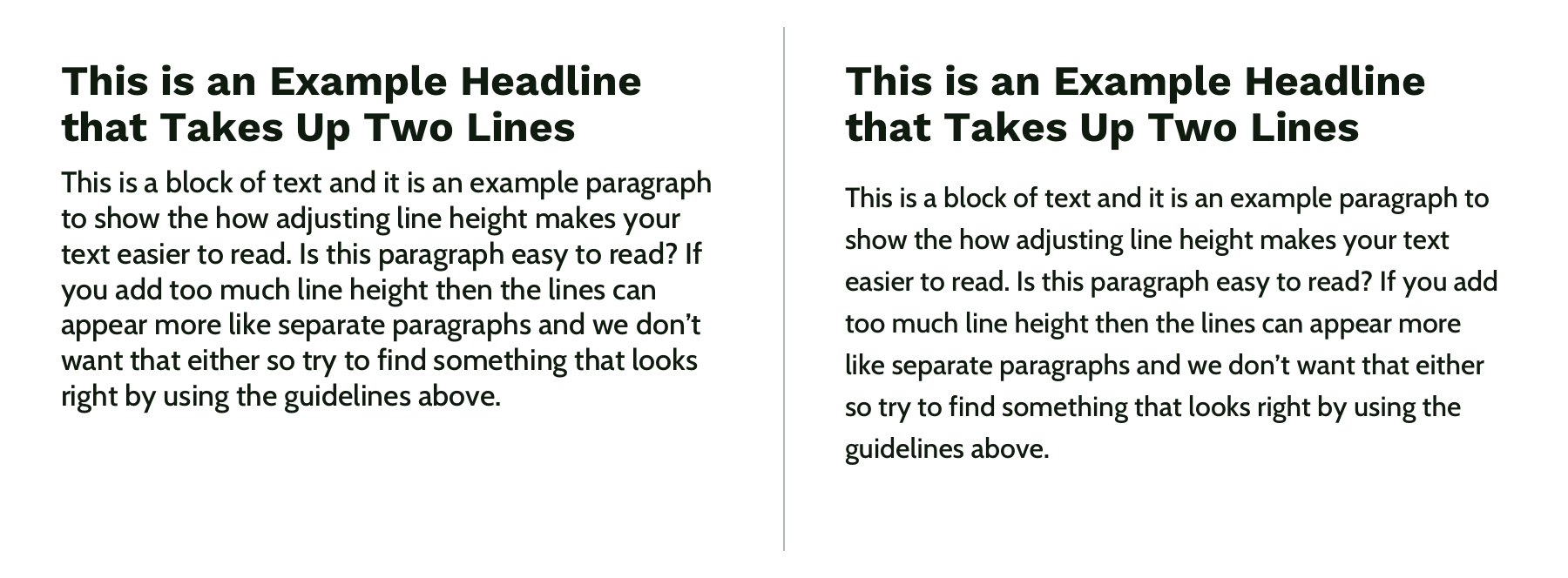
The main paragraph font-size should be between 16pxand 18px (1em and 1.25em) depending on the font you choose.
Manually set line-height (the vertical space between two lines of text) to make your text less cramped and easier to read. Start with line-height: 1.25 (that is 1.25 times the font-size) for headings and at least 1.5 for paragraphs (but no more than 1.9) and adjust from there. The longer the line of text, the larger the line-height should be. To keep your text flexible, avoid adding a unit to your line-height. Without a unit the line-height you set will be proportional to your font-size. For example, line-height: 1.5 and font-size: 18px would give you a line height of 27 pixels. If you changed your font size to font-size: 16px on smaller screens, the computed line height would then change to 24 pixels automatically.
Left: line-height is 1.1 for the heading and 1.2 for the paragraph, which is roughly the default setting. Right: line-height is 1.25 for the headings and 1.5 for the paragraph.
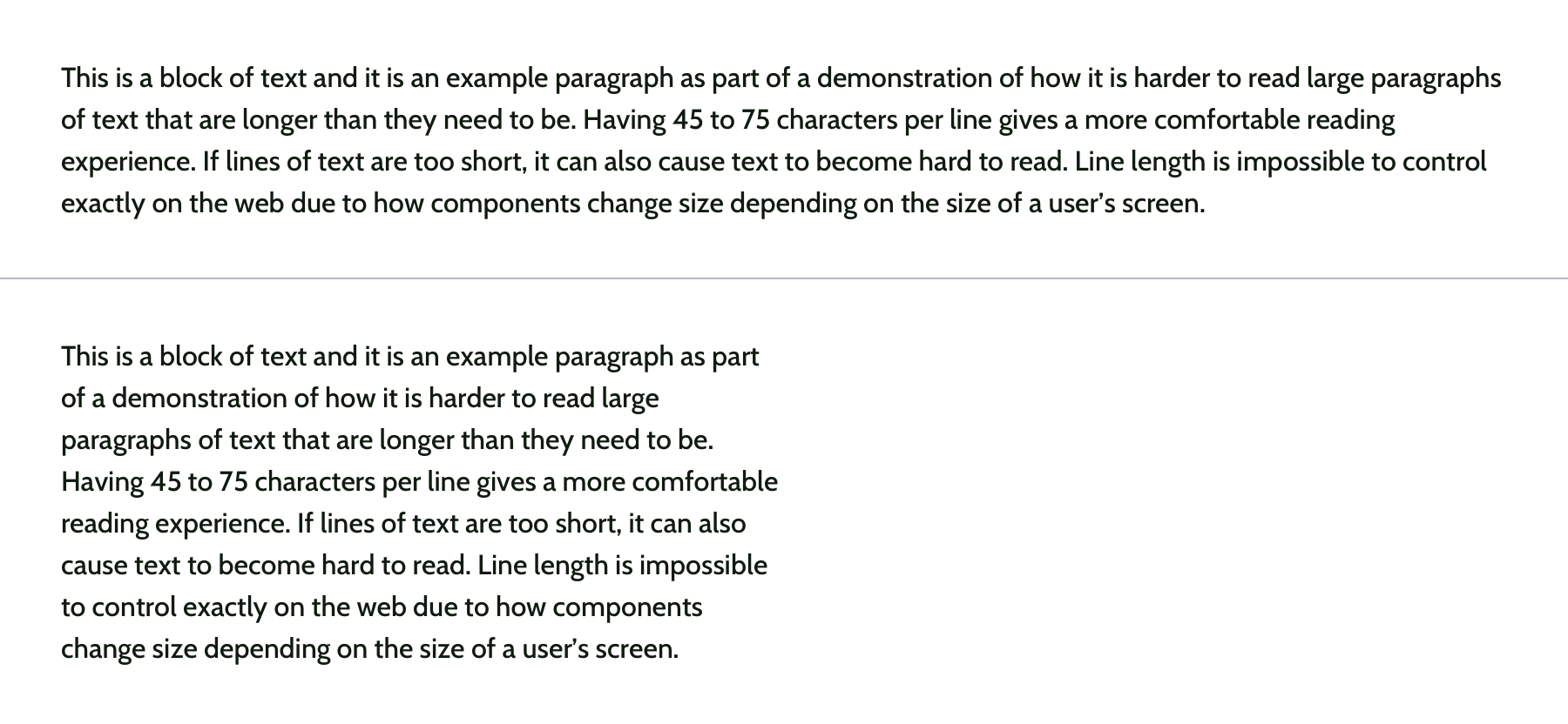
Pay attention to how many characters are in a line of text and aim for 45 and 75 characters long (including punctuation and spaces). Doing so reduces reading fatigue for your users by limiting the eye and head movement needed to follow a line of text. With the variable nature of the web, it’s impossible to completely control line length, but you can use max-width values and breakpoints to prevent lines of text from getting too long. Generally speaking, the shorter the line of text, the faster it will be to scan for quick reading. And don’t worry too much about counting the characters in every line. Once you do it a few times, you’ll develop a sense for what looks right.
Top: line length of around 125 characters. Bottom: line length of around 60 characters.
Spacing
After looking at typography, you can take a step back and examine the layout, or spacing, of your content. Movement and proximity are two design principles that relate to spacing.
Movement is about content flow
Movement refers to how your eye moves through the page or the flow of the page. You can use movement to direct a user’s eye in order to tell a story, point to a main action item, or encourage them to scroll. This is done by structuring the content within individual components and then arranging those components to form the layout of the page. By paying attention to how your eye moves through content, you can help users know where to look as they scan the page.
Unlike books, which tend to have very linear structure, websites can be more creative with their layout—in literally endless ways. It is important to make sure you are intentional with how you layout content and do so in a way which guides users through your content as easily as possible.
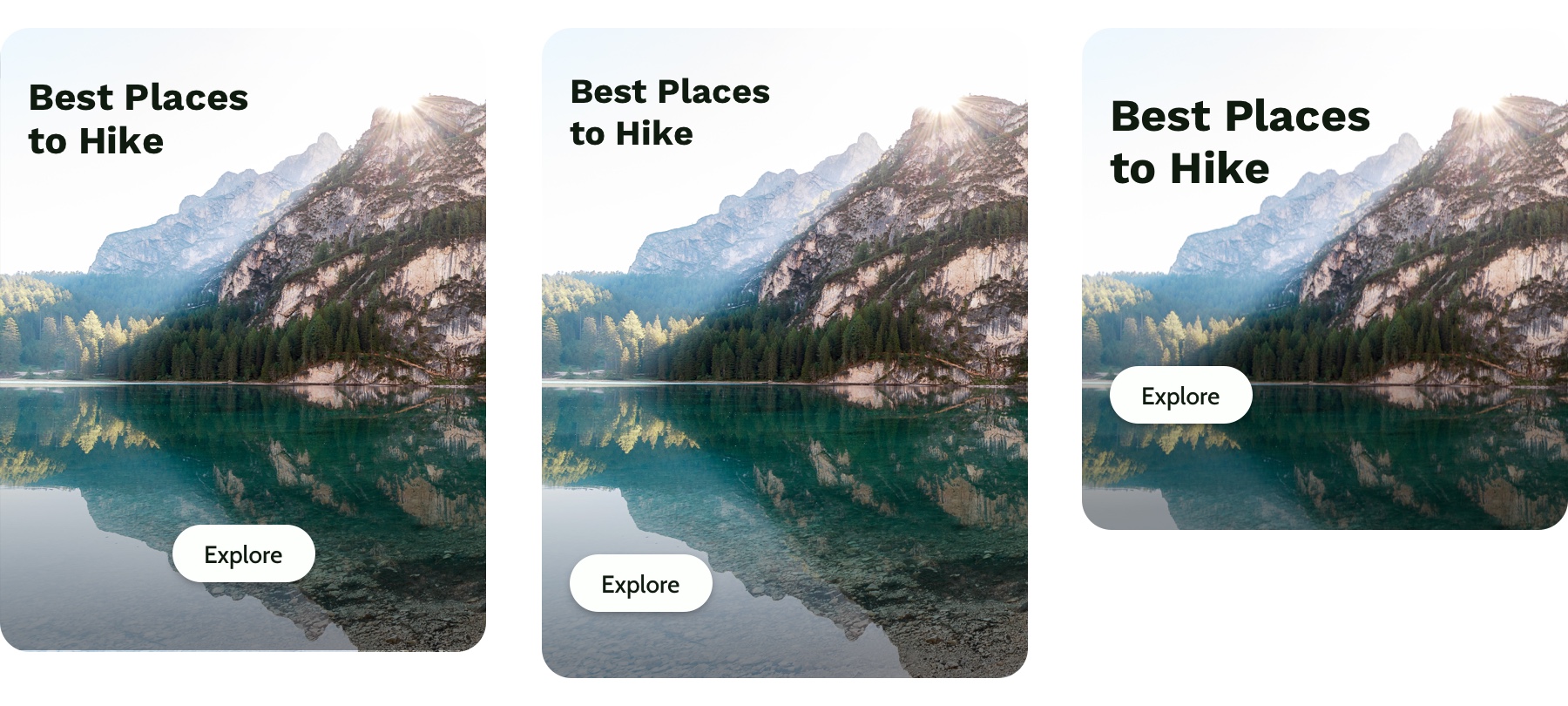
Three potential ways to arrange a heading, image, and button.
Consider these three examples above. Which is the easiest to follow? The arrangement on the left draws your eye off the screen to the left due to how the image is positioned which makes it hard to find the button. In the center option, it’s easy to skip over the headline because the image is too large in comparison. On the right, the heading draws your attention first and the image is composed so that it points to the main action item—the button.
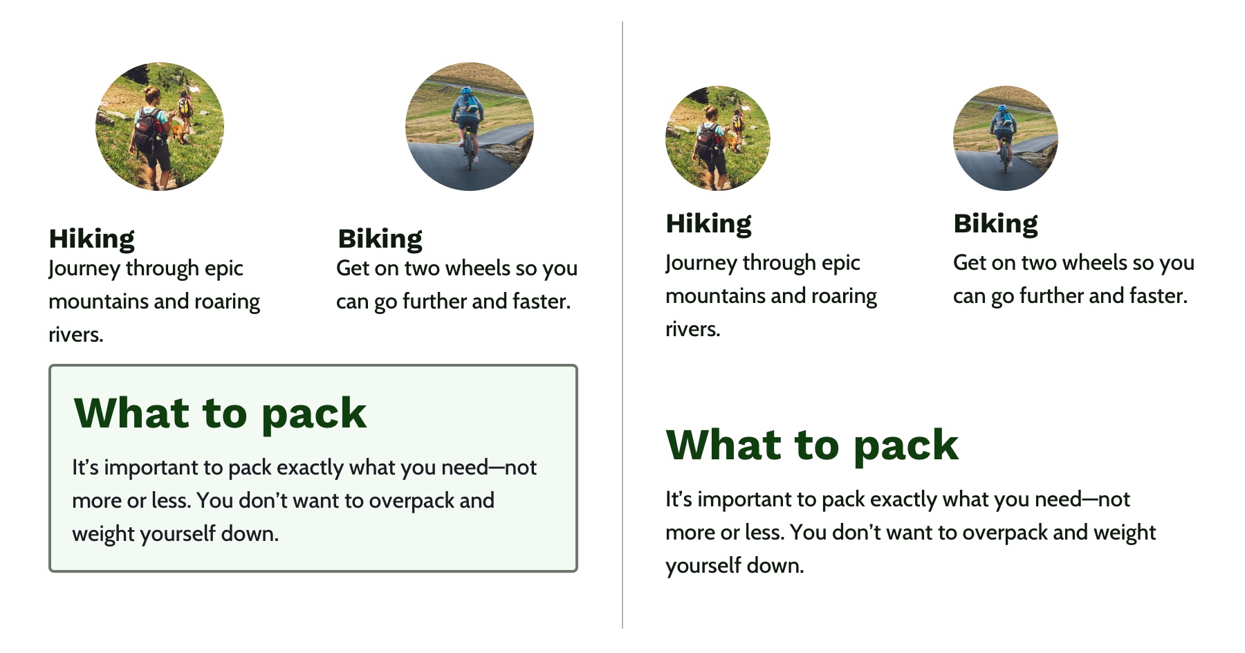
White space is a helpful tool for creating strong movement, but it’s easy to use too much or too little. Think about how you are using it to direct the user’s eye and divide your content. When used well, users won’t notice the whitespace itself but will be able to better focus on the content you are presenting. For example, you can use whitespace to separate content (instead of a colored box) which results in a less cluttered layout.
Left: Using a graphic element to separate content and aligning images in the center. Right: Using whitespace to separate content and aligning images on the left to let the whitespace flow better around groups of related content and create a cleaner layout.
Proximity establishes relationships
When objects are closer together, they are perceived as being related. By controlling spacing around elements, you can imply relationships between them. It can be helpful to create a system for spacing to help build consistency through repetition and avoid the use of random numbers. This system is based off the default browser font size (1rem or 16px) and uses distinct values that cover most scenarios:
0.25rem (4px)
0.5rem (8px)
1rem (16px)
2rem (32px)
4rem (64px)
You can use Sass or CSS variables so that the values are kept consistent across the project. A system might look like this—but use whatever you’re comfortable with because naming things is hard:
$space-sm
$space-med
$space-lg
$space-xl
$space-xxl
Left: A component with uneven spacing between elements. Right: A component that uses consistent spacing.
Color conveys personality and calls attention
Color greatly affects a website’s personality. When used well, it gives pages life and emotion; used poorly, it can distract from the content, or worse, make it inaccessible. Color goes hand in hand with most design principles. It can be used to create movement by directing users’ eyes and can be used to create emphasis by calling attention to the most important action items.
A note on choosing colors
With color, it can be hard to know where to start. To help, you can use a four-step process to guide your color choices and build a color palette for the site.
Step 1: Know your mood
You have to know the mood or attitude of your site and brand before choosing colors. Look at your content and decide what you are trying to communicate. Is it funny, informative, retro, loud, somber? Typically, you can boil down the mood of your site to a few adjectives. For example, you might summarize The North Face as adventurous and rugged while Apple would be minimalistic and beautiful.
Step 2: Find your main color
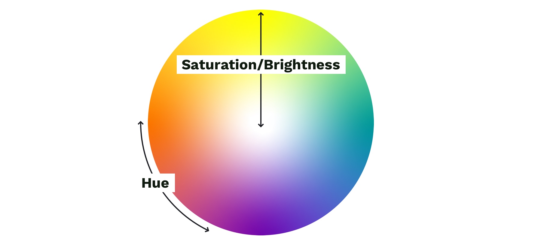
With your mood in mind, try to visualize a color that represents it. Start with the color’s saturation (how intense the color is) and brightness (how close the color is to white or black). If your mood is upbeat or flashy, a lighter (more saturated) color is probably best. If your mood is serious or reserved, a darker (less saturated) color is better.
Next, choose a hue. Hue refers to what most people think of as colors—where does is fall on the rotation of the color wheel? The hue of a color is what gives it the most meaning. People tend to associate hues with certain ideas. For instance, red is often associated with power or danger and green relates to money or nature. It can be helpful to look at similar websites or brands to see what colors they use—although you don’t need to follow their lead. Don’t be afraid to experiment!
Color wheel showing saturation and brightness versus hue.
Step 3: Add supporting colors
Sometimes, two or three main colors are needed, but this is not necessary. Think about the colors of different brands. Some use a single color, and others have a main color and one or two that support it. Coca-Cola uses its distinct red. IKEA is mostly blue with some yellow. Tide is orange with some blue and yellow. Depending on your site’s mood, you might need a few colors. Try using a tool like Adobe Color or Coolors), both of which allow you to add a main color and then try different color relationships, like complementary or monochromatic, to quickly see if any work well.
Step 4: Expand your palette
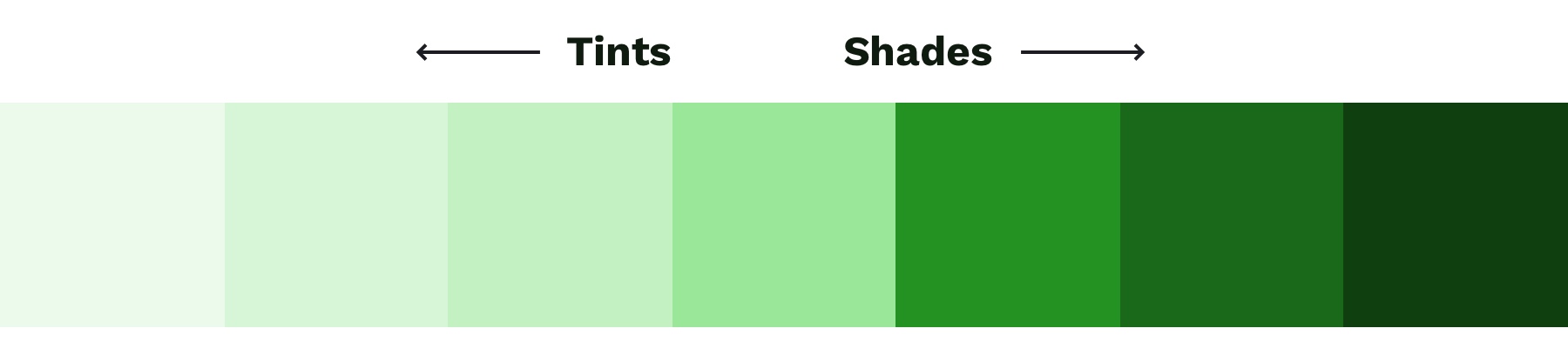
Now that you’ve narrowed things down and found your main color(s), it’s time to expand your scope with a palette that gives your project versatility and constraint—here’s a methodology I’ve found helpful. Tints and shades are the trick here. Tints are made by mixing your main color(s) with white, and shades are made by mixing with black. You can quickly create an organized system with Sass color functions:
A palette of color options created with Sass color functions. Make sure to use percent values for the functions that create distinct colors—not too similar to the main color.
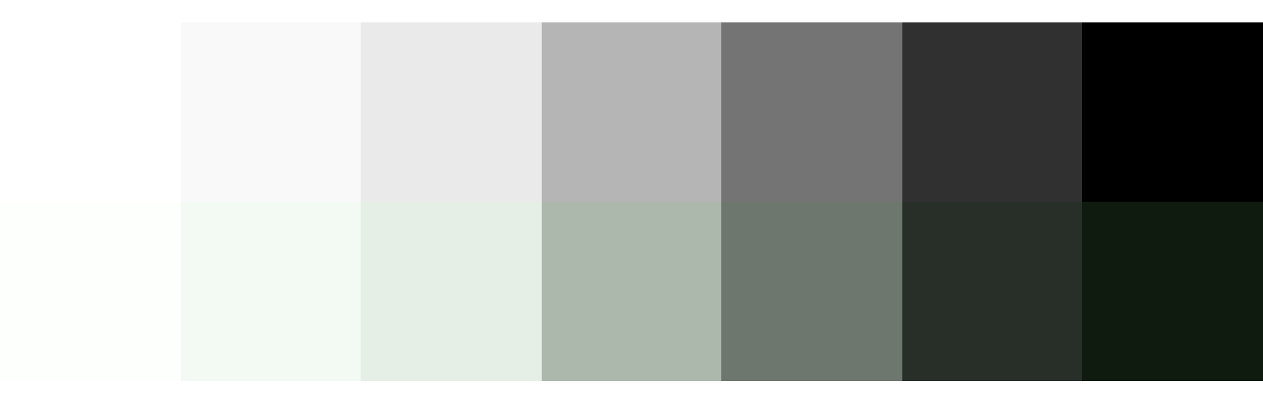
To round out your palette, you’ll need a few more colors, like a white and black. Try creating a "rich black" using a dark, almost black shade of your main color and, on the other end of the spectrum, pick a few light grays that are tinted with your main color. Tinting the white and black adds a little more personality to your page and helps create a cohesive look and feel.
Top: Basic white, gray, and black. Bottom: Tinted white, grays, and black to match the main color.
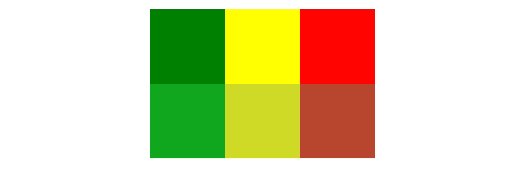
Last but not least, if you are working on an interactive product, you should add colors for success, warning, and error states. Typically a green, yellow, and red work for these but consider how you can adjust the hue to make them fit better with your palette. For example, if your mood is friendly and your base color is green, you might want to desaturate the error state colors to make the red feel less negative.
You can do this with the mix Sass color function by giving it your base color, the default error color, and the percentage of base color that you want to mix in with the error color. Adding desaturate functions helps tone down the colors:
Top: Default colors for success, warning, and error states. Bottom: Tinted and desaturated colors for the success, warning and error states.
When it comes to the web, there’s one color principle that you have to pay extra attention to: contrast. That’s what we’ll cover next.
Contrast
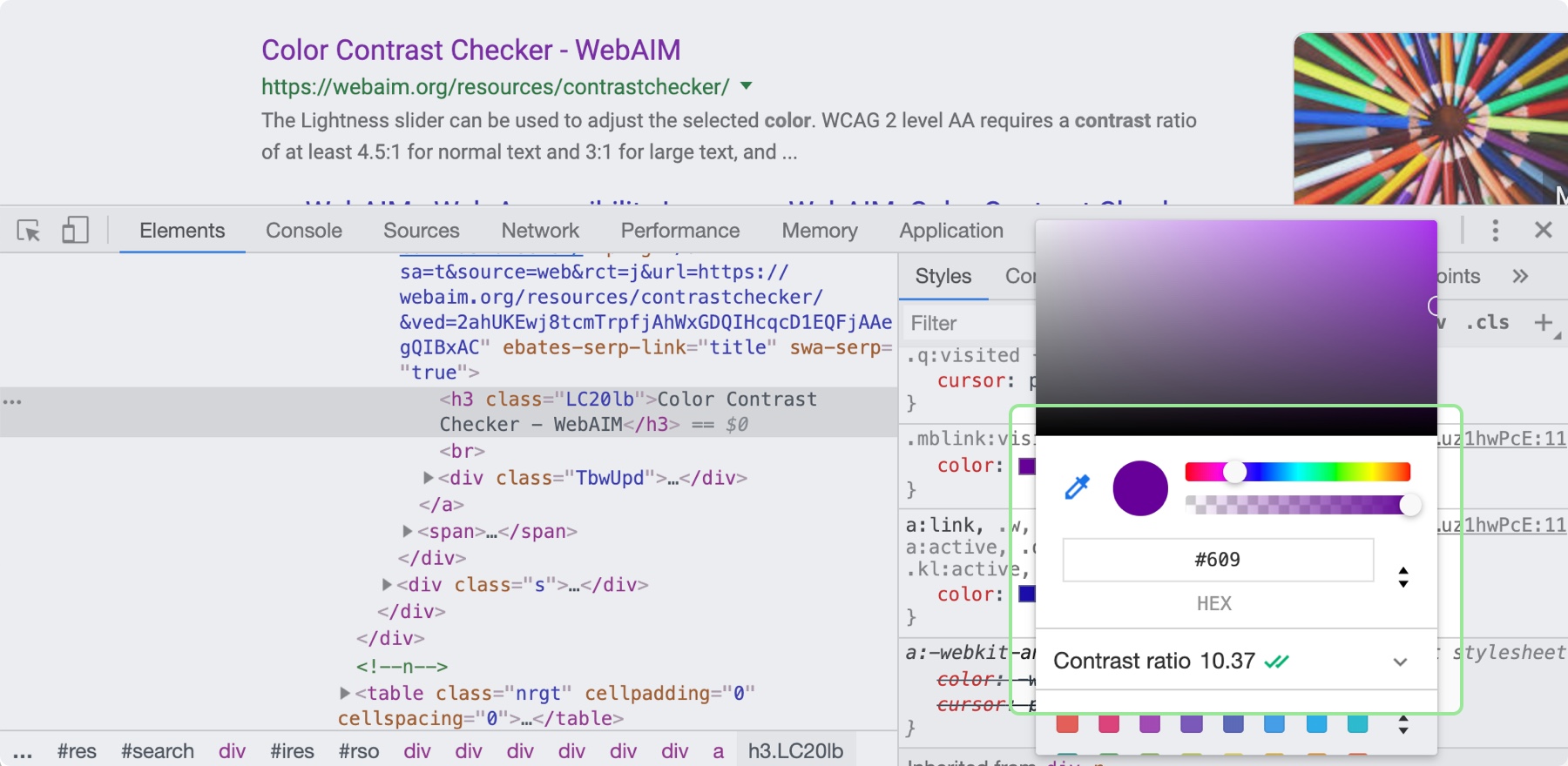
Color contrast—the difference in saturation, brightness, and hue between two colors—is an important design principle for ensuring the web is accessible to those with low vision or color blindness. By ensuring there is enough contrast between your text and whatever is behind it on your site will be more accessible for all sighted users. When looking at accessibility, be sure to follow the color contrast guidelines provided by W3C’s Web Content Accessibility Guidelines (WCAG). There are many tools that can help you follow these guidelines, including the inspect panel in Chrome’s dev tools.
By clicking on the color property in the Chrome Inspect tool, you can see the contrast ratio and whether it is passing.
Now, it’s time to put these principles to practice! You can use these processes and CSS tips to help take the guesswork out of design and create better solutions. Start with what you are familiar with, and eventually, the design principles mentioned here will become second nature.
If you're on CSS-Tricks, we can probably bet that you're in the process of building a really cool website. You've spent your time creating content, applying appropriate UX design techniques, coding it to perfection, and now you're about ready to launch it to the world.
A great website deserves a domain name that represents all that you've built. With Hover, you have the flexibility to choose a domain name that truly reflects that. We offer not only the go-to domain name extensions, like .com and .org, or the familiar country code domain extensions, like .uk or .us, or .ca, but also the more niche extensions. We have .dev for developers, .design for designers, and .dog for your dog (yes, really!).
We have hundreds of domain names to choose from and all eligible domains come with free Whois privacy protection. We're proud of the modern UX/UI and fabulous customer service we offer our customers. Find your next domain name with Hover!
We have edited and prepared the video from SmashingConf Toronto, and it is all now live for you to watch and learn from. To get a feel for the event, watch our compilation. We think that it really captures the atmosphere of a SmashingConf!
Day One
The Day One Collaborative Doc created by attendees is full of takeaways from the first day of the conference. You might find some of those notes helpful as you watch the video linked below.
If you would like to be part of the SmashingConf fun next year, we already have tickets on sale for SmashingConf San Francisco 2020. The rest of this year’s events (New York and Freiburg) are already sold out! There are a few workshop-only tickets available for New York 2019, but be quick!
In one of my projects, I received a requirement that stated that while parsing a text file, Strings denoting a date or a timestamp are expected to be in many different formats that are not known in advance, yet all of them represent a valid date or timestamp needed to be parsed properly. So, the solution I came up with is this: To have a set of formats stored in the property file, and when a String needs to be parsed, the formats are read from a file and attempts to parse the String are made sequentially with each format until it is parsed successfully, or until we run out of formats. The advantages of this solution are that if you discover a valid String that was not parsed successfully, all you will need to do is to add a new format to your properties file and no re-compilation and re-deployment is needed. Also, this way, you can set your priorities: Say if the US date format is preferable to the European one, just place US formats first and only after the European ones. Also, in Java 8, the format Strings allow for the optional format sections denoted by '[]'. So, several formats actually may be combined into a single one with optional sections. For example, instead of:
Spring MVC helps in building flexible and loosely coupled web applications. The Model-view-controller design pattern helps in seperating the business logic, presentation logic, and navigation logic. Models are responsible for encapsulating the application data. The Views render a response to the user with the help of the model object. Controllers are responsible for receiving the request from the user and calling the back-end services.
The figure below shows the flow of requests in the Spring MVC Framework.
Hi, Spring fans! Welcome to another amazing week in Spring! The biggest headline this week: Spring Boot 2.2.0 M5 is available now as well as Spring Boot 2.1.7. The time has come — goodbye, Spring Boot 1.x!
I just published This Month in Spring, if you want a larger roundup of everything from June to pretty much this week.
In my last article, I gave a quick introduction to Swagger in the Spring realm. Also, we saw how the additional Maven artifact "spring-swagger-simplified" automatically leverages the validation constraint annotations used by Spring and enriches the Swagger models and Swagger UI.
Below, for a quick recap, we look at the automatic model enhancements amongst other things we had discussed in the previous article.
Let's implement a command Shell by using a command dispatcher. The objective is to have an event loop, which is to dispatch input commands and implement some handlers who are going to handle those commands. And, we don't want to change in the event loop whenever some new command comes in future. So, our design should be scalable enough to support adding new commands without affecting the event loop.
When you work in design for any length of time, forming habits is natural. It’s not unusual to follow a predictable process or use familiar patterns. This repetition can be fabulous for your productivity, but when each design looks much like your last, you can quickly begin to feel jaded. Staying curious is the best remedy for that feeling.
After running a small studio for eighteen years, my fatigue had become overwhelming. I dreaded each and every new email notification and phone call. While client projects offered opportunities to be creative, they also depleted my energy reserves and any capacity I had to come up with ideas.
For someone whose business — and self-esteem — relies on what I dream up, this was devastating. I admitted to my wife that I was exhausted, had no more to give, and couldn’t carry on because the business we’d started together had become a burden. I needed to recharge, reconnect with my creativity, and rekindle my enthusiasm for working in design.
When a company in Sydney offered me an interim role, I didn’t hesitate. They seemed welcoming, work was interesting, and living in Australia was something I wanted to experience. More importantly, time away allowed me to explore aspects of design which were new to me, away from the crushing pressures I’d felt building up while running my business.
Working in Australia meant finding creative ways to sell the company’s products and services, as well as exploring new approaches to the design of the products themselves. I was curious about whether graphic design and visual storytelling could make a digital product more compelling.
As I’d studied Fine Art and not art direction or graphic design, I knew very little about its principles, famous names, or history. I was eager to learn, and with the pressure of running my business lifted, I had the energy and the time for studying. I started a magazine collection, studied books on art direction and graphic design, and discovered art directors, including Alexey Brodovitch, Neville Brody, Bea Feitler, and Tom Wolsey. Their work fascinated me, and I was curious why we see so little like it online.
This curiosity took me in unexpected directions, and my head was soon bursting with ideas. I learned how to combine images and text in more exciting ways from Alexey Brodovitch and Bea Feitler. I picked up tips on how to give my typographic designs more impact from Neville Brody, and Tom Wolsey taught me how to make even the smallest design element more interesting. I studied editorial and magazine layout principles, and instead of merely copying them, I found ways to adapt them for the web to make product and website layouts more compelling.
Time away helped me rediscover my enthusiasm for design. While falling into predictable patterns — in behaviour and design — is still tempting, since coming home, I’ve realised how important it is to stay curious, study other media, and keep my mind open to the lessons we can learn from them.
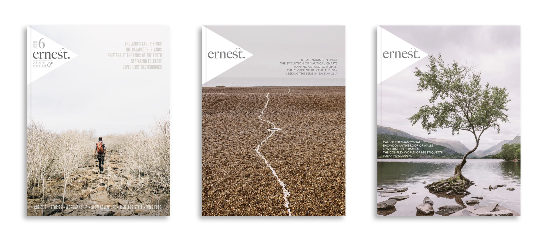
The design of Ernest Journal is simple, but not minimal. (Large preview)
Ernest Journal: Curiosity And Adventure
Despite its smaller format, on my latest visit to my favourite magazine shop, I was drawn to Ernest Journal. Ernest is “a journal for enquiring minds. It’s made for those who value surprising and meandering journeys, fuelled by curiosity rather than adrenaline, and guided by chance encounters.”
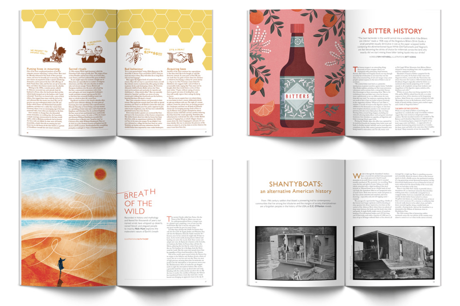
When you open Ernest Journal for the first time, you’re immediately drawn to its content, rather than its design. There are beautiful photographs and striking graphic designs which are often presented large enough to spread from one page to the next.
The design of Ernest Journal is simple, but not minimal. It gets maximum value from only a small number of assets, in particular, its dominant two typefaces, Freight Big Pro and Gill Sans Nova.
Freight Big Pro is a high contrast serif typeface by Joshua Darden — the founder of type foundry Darden Studio — who also designed Jubilat and Omnes, two fonts I use regularly. Freight Big Pro is a family of twelve styles and comes with a host of OpenType features including beautiful ligatures, a feature used by Ernest Journal for headlines and even its logotype. While Gill Sans has never been a particular favourite of mine, the designers of Ernest Journal put it to good use in contemporary looking headlines and other typographic details.
Ernest Journal’s layout consists mainly of two and three columns, but it’s their thoughtful use, which helps the overall design feel connected, despite the variety of content and styles in the magazine. I’ll teach you how to create varied yet connected designs later in this issue.
Ernest Journal is an excellent example of how to use colour and typography to create consistency across an entire publication. At the same time, by picking colours from graphics and photographs to use for headlines, pull-quotes, and other details, their designers connect this overall design to individual stories. This adds variety and makes the stories Ernest Journal tells even more engaging.
Magazine Anatomy
The not-so-snappily named Web Hypertext Application Technology Working Group (WHATWG) surveyed thousands of websites before settling on names for new elements including header and footer. Magazines have their own terminology for parts of a page which you can use to name product or website components:
Next time you’re passing a magazine store, drop in and look for a copy of Ernest Journal. It might be small, but you’ll find it packed with ideas to use on your next project.
Inspired By Ernest Journal
Many people blame frameworks including Bootstrap for the homogenous layouts we see all too often on the web, but the problem comes from our thinking, not the framework. The cold, hard truth is that Bootstrap doesn’t create unimaginative designs. Lazy designers do.
The majority of Ernest Journal’s content is placed using a symmetrical grid which can easily be reproduced for the web using a framework’s twelve columns. Content is simply laid out using a mix of two and three columns. Yet unlike many websites built using a framework, Ernest Journal’s pages are exciting and varied. There’s no reason why frameworks can’t be used to create layouts as engaging as Ernest Journal. All it takes is an understanding of layout design and imagination.
Variety is a crucial part of the success of Ernest Journal’s design, and it’s a lesson we can apply to products and websites. Single columns have been used by book designers for generations and designs based on them look classical. Grids with two symmetrical columns feel orderly. They can hold a tremendous amount of content without becoming overwhelming. Combine white space with three or more columns and your designs immediately take on an editorial feel, reminiscent of a quality print publication, like Ernest Journal.
Designing With Frameworks
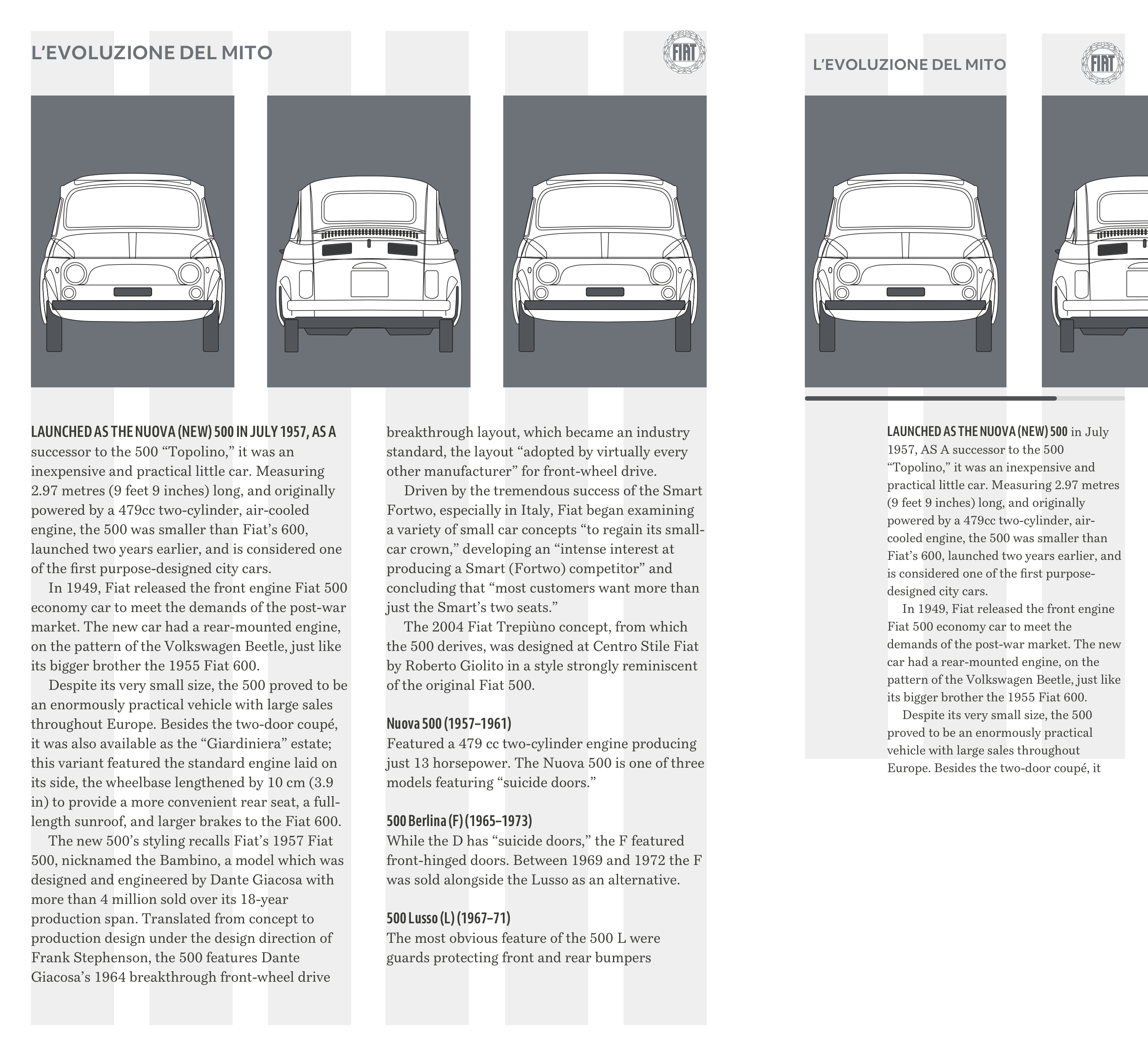
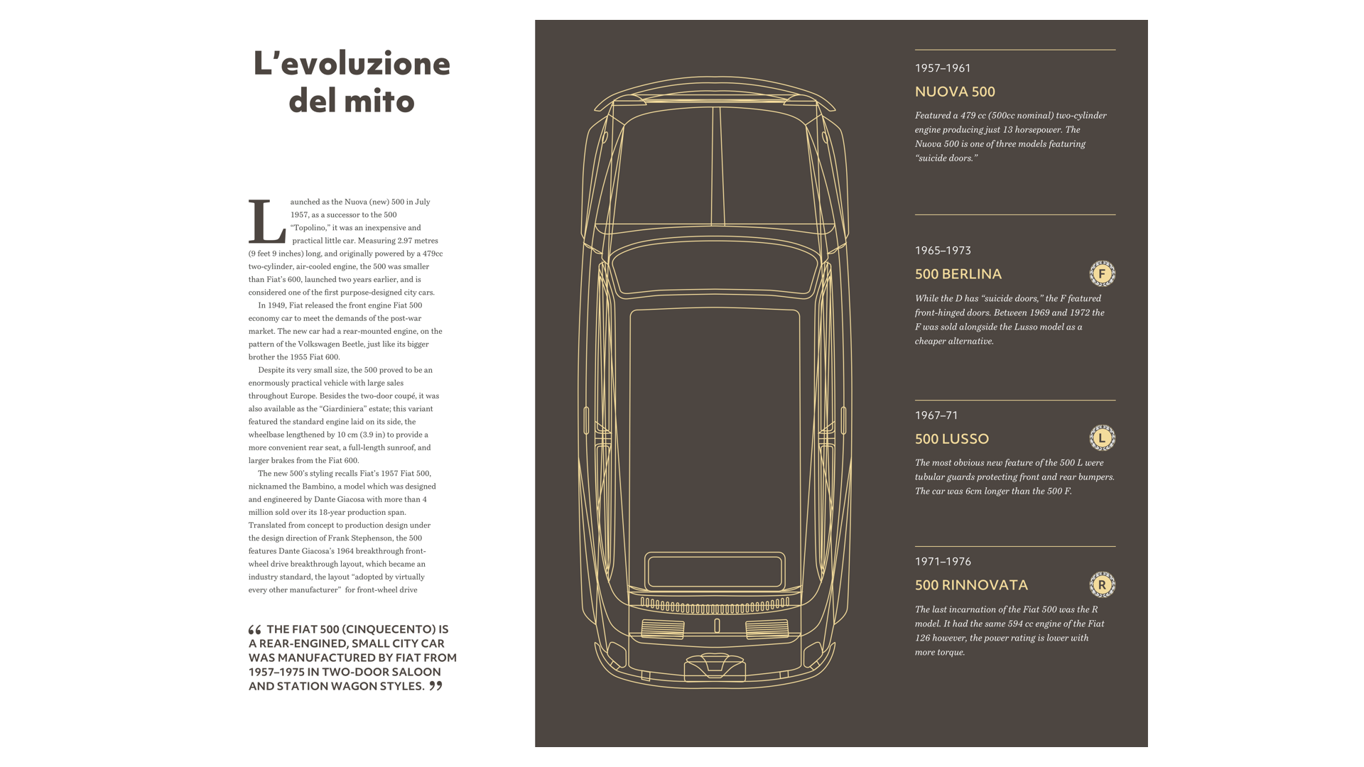
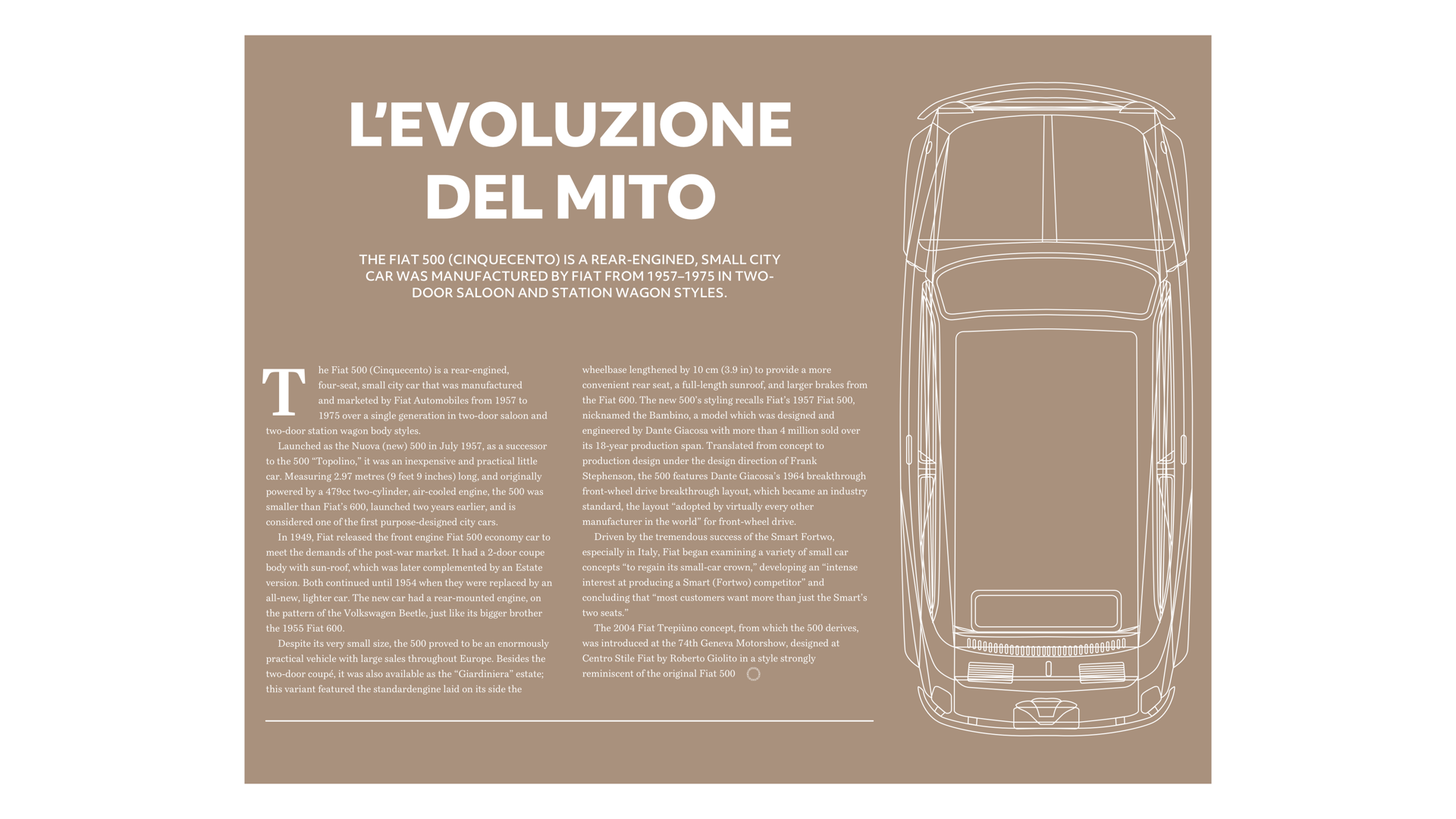
The original Fiat 500 was a tiny car which made a big impression on the motor industry. It was enormously popular and became the template for a generation of small cars. For this design about the rise of this iconic little car, I want to make a similarly big impression by filling a large panel with a headline and image. This panel occupies two-thirds the width of my page — eight of my twelve columns. The running text on the right occupies four columns, and its width is matched by the standfirst paragraph opposite, bringing this asymmetric composition into balance.
Panels like this one will have more impact when you allow them to bleed off the edges of the page. (Large preview)
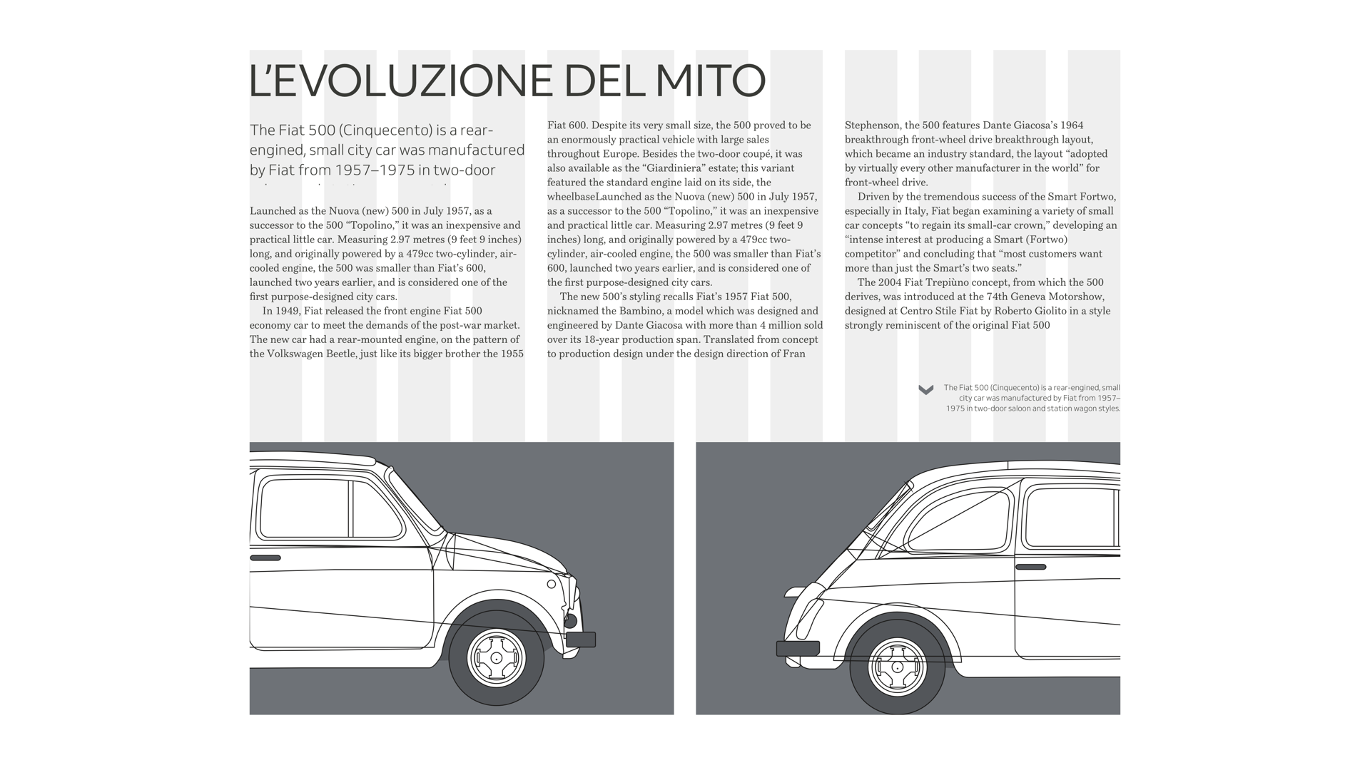
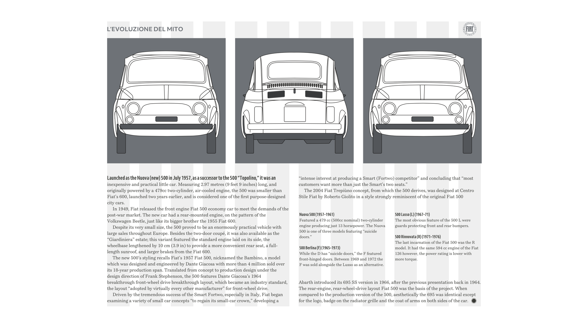
By using a variety of connected but diverse layouts, you can make stories more engaging and keep readers interested. My next design is based on that same twelve column grid but looks completely different. Here, the large image occupies six columns, half the width, and the full height of my page. Text runs down two columns in the centre, and supporting information — including a timeline of Fiat 500 models — matches its width, even though I place it within a much wider panel.
I reinforce the distinction between content types by using a sans-serif typeface for supporting information. The box also has a different background colour to emphasise this difference. (Large preview)
Now, I know some of you will be wondering how to adapt designs like this to smaller screens. Proportionately narrow columns of text don’t make sense when space is limited, so I use the entire screen width. Instead of asking people to flick past a tall image, I place the Fiat 500 on its side within a horizontal scrolling panel.
It’s just as important to create a connected experience across screen sizes as it is across media. (Large preview)
Even when using just two or three symmetrical columns, you can create a surprising variety of layouts. So that your design feels connected and familiar across all its pages, develop a system for how to use those columns. You might use three columns for running text, giving your design an editorial feel, and twin-columns for images.
The placement of these images suggests movement in this otherwise highly structured composition. (Large preview)
Alternatively, use twin-columns of text for an orderly feeling and three columns for images. This increased repetition of shapes helps a composition to feel more dynamic.
If you have plenty of running text, twin-columns solidify it into blocks, giving your page visible structure. (Large preview)
Changing how you place images in three columns is a simple way to vary the look and feel of a design. My next design sets one large image across two-thirds of the page, and a small picture in the remaining third. But image proportions are not nearly as interesting as the position of the gutter between images, and how it offsets the gutter between running text columns below.
Negative and positive space are equally important. The margins around, and gutters between, this content help to lead someone’s eye to where they should start reading. (Large preview)
There’s still space on medium-size screens for an exciting juxtaposition of two and three columns. But what about small screens?
Twin-columns of running text would make no sense in such a narrow width, but you needn’t sacrifice the benefits of white space, even when it’s limited. For this small-screen design, I place images into a horizontally scrolling panel. Then, I use a narrow column to indent the running text.
There’s no need to fall back on predictable, single-column designs for small screens. Use your imagination and be experiment with ways to use positive and negative space. (Large preview)
Designing Connected Layouts
In the last issue, I introduced you to Swiss artist and typographer Karl Gerstner and the “mobile grid” he designed to lay out content in Capital magazine consistently and without restrictions. Those same principles apply when placing content inspired by Ernest Journal.
A single module — filling the entire width of the page — slows people down and encourages them to linger on its content. It isn’t necessary to use every pixel, and I devote a quarter of this composition to white space to give this design a feeling of luxury.
Something is reassuring about the structure of a twin-column layout, so for this design, I give equal space to these classic cars. To prevent this design from becoming predictable, I utilise extra columns for larger cars and use gutters to stagger the start of my headlines and paragraphs.
It’s possible to pump energy into the structure of a symmetrical three-column design. For this next design, I use those three columns in two different ways, first with a top-down view of the Fiat 500, then a smaller module for each of the remaining cars.
Designs which use odd numbers of columns and rows can be compelling, especially when arranged in a modular grid. This design demands attention not only because it‘s interesting visually, but also because it’s so different from other pages. It’s an excellent choice for interrupting the rhythm of reading to make someone focus on a particular piece of content.
Controlling Reading Rhythm
The pace in which someone moves through a product or website is an essential factor in their experience. This principle is as useful on a mobile’s smaller screen as it is on a larger one.
Slowest
Larger modules which fill a small screen make an immediate impact and give someone time to pause. (Large preview)
Slower
Two evenly sized modules feel balanced as the pace starts to pick up. (Large preview)
Slow
Three smaller modules speed up the pace, even though they contain more content than before. (Large preview)
Fast
Small modules encourage people to glance briefly at your content before making a choice about which direction to take. (Large preview)
Faster
With five modules visible, people can race through your content. (Large preview)
Fastest
A large number of tiny modules is the fastest yet and is ideal for mobile navigation. (Large preview)
Creating Connections
One of the most attractive features of Ernest Journal, and a technique you can quickly adapt to the websites you design is using an accent colour picked from images. You can use accents for headlines, pull quotes, and other typographic and details to connect them with graphics and photographs.
Choose which elements to apply this accent colour and then style them throughout your website to create continuity. Use just one accent — or tints of that colour — per article to give each its own distinctive style.
Pick an accent colour from a graphic and use it on typographic and other details to connect them to your image. (Large preview)
On this first article, I pick a dark pink from the lights on the Fiat 500 and use it for my headline, standfirst, and dates in my timeline. For the second article, I sample a warm light brown from the suitcase in a photograph of another Fiat 500. There are plenty of tools available online to help you sample colours from images, but my favourite is still Adobe Color.
Sample accent colours from dominant areas in photographs using a tool like Adobe Color to help you. (Large preview)
Using large blocks of colour can help you distinguish between content types, and choosing the same colour for panel backgrounds and typographic elements such as drop caps will maintain a subtle connection between them.
I use a warm dark brown for my drop cap, headline, and pull quote, and in the background of the panel which dominates these pages. The yellow outlines in the illustration, borders, and titles in the timeline is a colour I use to connect multiple pages.
For the second page, I also use the same light brown as before to create a palette of colours and consistency across all my designs.
Remember accessibility when you reduce the contrast between background and foreground colours. Lea Verou’s Contrast Ratio is the tool I use most often. (Large preview)
Foundation Styles
Colours help create a signature style that can make a design memorable. Colour connects content to a brand, creates connections between images and text. They define the personality of a product or website, and ultimately an entire company, so it’s crucial to develop a suite of colours to use throughout your designs.
But colour isn’t the only aspect of a design which can help maintain that all-important consistency. You can create signature typographic elements, including block quotes, dates, and drop caps, as well as border styles, and image treatments which repeat across pages.
With these styles forming the foundation to your design, you’ll then be free to use colour and type variations to give each article its own unique look.
Colour isn’t the only aspect of a design which helps maintain that consistency, so create signature typographic elements, border styles, and image treatments too. (Large preview)
In this design, a background colour covers the entire page. Simply changing that colour between articles, while maintaining layout and typography styles, adds variety and creates a series of pages which, while different, feel like they belong together.
Combine changes in colour and pace to make different content types clear to your readers. (Large preview)
Using a tool like Adobe Color, experiment with analogous and complementary colours. Creating a colour family sampled from graphics and photographs, and using them in several combinations, is a simple way to create a variety of designs for sections across your website.
Combine colours in different and interesting ways to add variety while maintaining a unified look and feel. (Large preview)
Ernest Journal’s design is successful because although each article has its own distinctive elements which connect the visual style with the content, those articles use a consistent grid system and foundation styles. This consistency helps Ernest Journal feel like a unified whole and not a collection of separate pieces.
NB: Smashing members have access to a beautifully designed PDF of Andy’s Inspired Design Decisions magazine and full code examples from this article.


