Let Mavo Shine in Building Interactive Web Applications

As you could guess from the title, this tutorial is dedicated to Mavo: a new, approachable way to create complex, reactive, persistent web applications just by writing HTML and CSS, without a single line of JavaScript and no server backend.

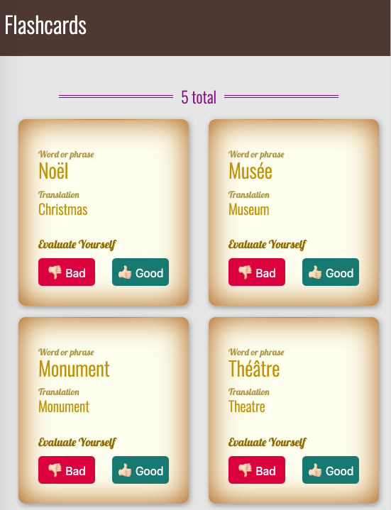
The app we will build together is a flashcard study app for foreign language learners. It is a fully-fledged CRUD application that lets you:

  • Create, delete, update flashcards and re-arrange them via drag and drop.
  • Import and export flashcards.
  • Evaluate how well you've learned the word on a flashcard.

Here is what our finished application looks like:

In the tutorial, I will guide you through the entire process of building the app.

At the end of some steps, I provide suggestions for you to experiment with Mavo—to learn a bit more—and to make some enhancements to the application we are building.

Are you ready? Let's get started! 😀

Static template

See the Pen
01. Static template
by Dmitry Sharabin (@dsharabin)
on CodePen.

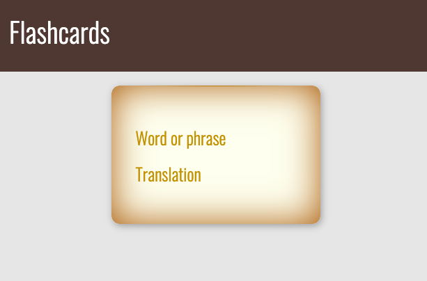
In order to illustrate how Mavo enhances standard HTML, we will first create a purely static HTML page and then use Mavo to turn this static HTML into a fully-functional web application.

Assume we have the following HTML code inside <body>:

<header>
  <h1>Flashcards</h1>
</header>

<main>
<article>
  <p>Word or phrase</div>
  <p>Translation</div>
</article>
</main>

In that code, the <article> element represents a single flashcard.

Let's add some styling in order to make our HTML look more like an actual flashcards app. You can take a look at the source code and play with it here.

Getting started with Mavo

Right now, all we have is a static template. It's time to add functionality, so it can actually work like a flashcard application. Here comes Mavo!

In order to use Mavo, we first need to include its JavaScript and CSS files in our page’s <head> section:

<head>
  ...
  <script src="https://get.mavo.io/mavo.min.js"></script>
  <link rel="stylesheet" href="https://get.mavo.io/mavo.css">
  ...
</head>

Defining a Mavo app

To enable Mavo functionality on an HTML structure, we must use the mv-app attribute on the element that contains our Mavo app (which may even be the <body> or <html> element, that's fine!). Its value is an ID for our app that should be unique in the page.

Considering that the <main> element is representing our Mavo app, let's add the mv-app attribute to it and give our app the ID "flashcards":

<main mv-app="flashcards">
  ...
</main>

The property attribute

See the Pen
02. The property attribute
by Dmitry Sharabin (@dsharabin)
on CodePen.

It's time to tell Mavo what elements of our app are important, i.e., which elements we want to be editable and be saved.

Now we have two such elements, and they are the <p> elements. Let's add the property attribute to those elements to tell Mavo they contain data. Elements with the property attribute are called properties.

Keep in mind that the value of the property attribute should describe the element, similarly to an id or class attribute:

...

  <p property="source">Word or phrase</div>
  <p property="translation">Translation</div>

...

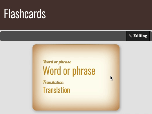
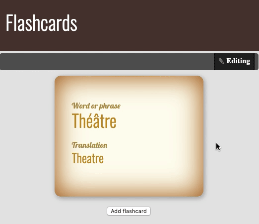
Notice any changes in our app? The Mavo toolbar with an Edit button appeared at the top of the page. The Edit button lets the user switch between read and edit modes. Now our app is in read mode. That means we can't edit the data on the page.

Now lets us switch to edit mode by clicking the Edit button. What has changed? The text of the Edit button becomes Editing to indicate that we are in edit mode. If you hover over the paragraphs, Mavo communicates that you can click to edit them by highlighting them in yellow. Go ahead! Click the text and edit it. Wow! We can change the content of the page right in place!

💻 Let's get our hands dirty!

Assume that in addition to the word and its translation, the flashcard should have an example of the word's usage in a sentence. Enhance the app by adding the appropriate elements to the flashcard.

The mv-multiple attribute

See the Pen
03. The mv-multiple attribute
by Dmitry Sharabin (@dsharabin)
on CodePen.

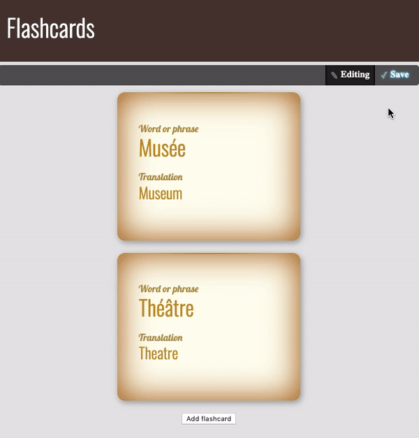
At this point, we have only one flashcard in our app. That's not very useful! For a working flashcard application, we need the ability to add, delete, and rearrange flashcards. How can we do that? We could create more flashcards by adding more <article> elements to our code, but then how does an end user create and delete flashcards?

Fortunately, Mavo has something to offer that makes this a breeze: the mv-multiple attribute, which tells Mavo that certain elements can be multiplied. It converts the element it’s used on to an editable collection of items and generates (customizable) UI for adding, deleting, and rearranging items.

Let's use the mv-multiple attribute in our app to convert our lonely flashcard into a collection of flashcards:

<article property="flashcard" mv-multiple>
  ...    
</article>

Now switch the app to edit mode. Note that below the flashcard, there is now an Add flashcard button. Let's give it a try: create a few flashcards with the help of that button. Now we can dynamically add new elements right in the app, even though there are no corresponding elements in the HTML. But that is not all!

Try hovering over a flashcard and notice the three buttons that appear near its top right corner for adding, deleting and rearranging elements via a drag and drop handle. And by hovering over any item bar button, we can understand which flashcard they correspond: Mavo highlights it. Isn't that amazing?

The mv-storage attribute

See the Pen
04. The mv-storage attribute
by Dmitry Sharabin (@dsharabin)
on CodePen.

Now that we have the basic UI in place, let's try the following:

  • Switch to edit mode (if you haven't already done so).
  • Edit the first flashcard's source word and translation. Add a couple more flashcards too.
  • Switch the app back to read mode.
  • And finally... refresh the page.

What?! Where did our data go? Wasn't Mavo supposed to save it? What happened?

Actually, we never told Mavo if or where to store our data!

To do so, we need to use the mv-storage attribute. What options do we have? Well, Mavo opens great possibilities for us, and Mavo plugins open up even more!

In our application, we are going to store the data in the browser’s localStorage, which is one of the simplest options available, so it's good for our first Mavo app. We just need to add the attribute mv-storage with the value local to the element with the mv-app attribute (also called the Mavo root).

<main mv-app="flashcards" mv-storage="local">
  ...
</main>

Have a look at the Mavo toolbar. Notice something? Another button appeared—the Save button.

Try to edit the app data one more time. Note that the Save button is now highlighted. Hover over the Save button, and Mavo will highlight the properties with the unsaved data. Isn't that cool?

Click the Save button and refresh the page (there is no need to switch to read mode before refreshing the page). Is your data still there? Great! We are one step closer to our goal—a fully-fledged flashcard application.

The mv-autosave attribute

Now we have to click the Save button every time we need our data to be saved? That may be safer, to prevent destroying valuable data, but it can often be inconvenient. Can we just save the data automatically? Sure! To save the data automatically every time it is changed, we can use the mv-autosave attribute on our Mavo root. Its value is the number of seconds to throttle saving by. Let's add mv-autosave="3" to the root element of our app:

<main mv-app="flashcard" mv-storage="local" mv-autosave="3">
  ...
</main>

Change the data one more time and have a look at the Save button. See? In the beginning, it was highlighted but after 3 seconds–it is not. All our data is now saved automatically!

So, now the main part of our app would look like that:

<main mv-app="flashcards" mv-storage="local" mv-autosave="3">
  <article property="flashcard" mv-multiple>
    <p property="source">Word or phrase</div>
    <p property="translation">Translation</div>
  </article>
</main>
💻 Let's get our hands dirty!

We are almost done with the alpha version of our app. Now it’s your turn to make the app even better. No worries, you have all the knowledge you need.

Enhance the app so as flashcards could be organized by end users in different groups related to various topics, e.g., the users could gather all the flashcards corresponding to clothing in one group, all the flashcards associated with kitchen utensils in the other one, etc.

💡 Hints!

There are many ways to achieve that goal, and it's up to you to decide what to follow. However, I'd like you to think about some questions before proceeding:

  1. What HTML element would you use as a grouping element? It would be convenient for the users if they could see the name of the group of flashcards (topic name) and could collapse the group up to the title.
  2. What Mavo attribute(s) are you going to add to that element, if any? Will the element be a property or a collection?
  3. Will end users be able to add new topics, delete and rearrange them, change the title of a topic and move flashcards between different topics?

What if you decide not to organize flashcards in groups, but instead just label them with tags that correspond to various topics? Well, that is perfectly fine. The solution with tags is also appropriate. For the sake of practice, try to accomplish that approach too.

The mv-bar attribute

See the Pen
05. The mv-bar attribute
by Dmitry Sharabin (@dsharabin)
on CodePen.

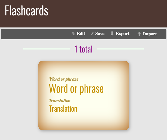
As our app stores the data locally, by default, the users of the app won't be able to share their cards with other users. Wouldn't it be great if we would let them export their flashcards and import somebody else's flashcards? Thankfully, these features are already implemented in Mavo, and we can very easily add them to our app!

The mv-bar attribute controls which buttons are going to appear in the toolbar, if any. It’s typically specified on the Mavo root (an element with the mv-app attribute). Buttons are represented by their ids (which are very logical): edit, import, export, etc.

As we only want to add a few buttons to the default set, we can use the so-called relative syntax, which allows us to add and remove buttons from the default set without having to explicitly list everything out. All we need is to start the mv-bar attribute's value with the with keyword.

By doing that, we would get the following:

<main mv-app="flashcards"
      mv-storage="local"
      mv-autosave="3"
      mv-bar="with import export">
      ...
</main>
💻 Let's get our hands dirty!

Give those features a try: add some flashcards, try to export them in a file. Then delete existing flashcards and import the flashcards from the previously exported file.

Expressions and MavoScript

See the Pen
06. Expressions and MavoScript
by Dmitry Sharabin (@dsharabin)
on CodePen.

Let's now add some statistics to our app, such as the number of flashcards! Sounds interesting? I hoped so. 😀

To do that, we need to learn something new about Mavo.

We can dynamically refer to the value of any property we have defined, anywhere in our Mavo app (including in HTML attributes), by putting its name inside brackets, like this: [propertyName]. This is an example of a simple expression, which allows us to dynamically calculate things, reactively as they change.

Now let’s experiment and add a [source] expression inside the flashcard property, e.g., between two properties: the source and the translation.

...
  <p property="source">Word or phrase</div>
  [source]
  <p property="translation">Translation</div>
...

What has changed in our app? The value of the flashcard source property is now shown on the page twice.

Switch to edit mode and try to change the value of the source property. Can you see that? The page content updates while you are changing the property value! That’s why I said earlier that Mavo lets us develop reactive web applications.

That's indeed cool, but unfortunately, in our case, it's not really helpful: we can't use this expression to count the number of flashcards—we would always have only one value.

What if we put the [source] expression outside the flashcard property? We will have something like that:

...
  [source]
  <article property="flashcard" mv-multiple>
    ...
  </article>
...

How does this differ from the previous case? To see the difference add some flashcards if you haven't done so yet. Now instead of one value we have a list of comma separated values: the source property of all flashcards. That's exactly we were looking for: the number of items in the list corresponds the number of flashcards in the app.

Makes sense? Well, yes, but it wouldn't it be more logical if we would count the number of flashcards, not the number of values of its source property? After all, a flashcard added exists even before we fill in its source or translation. I suggest you do the following: let's substitute the [source] expression with [flashcard]:

...
  [flashcard]
  <article property="flashcard" mv-multiple>
    ...
  </article>
...

Noticed the difference? We still have a list, but its values are not simple values but objects, i.e., complex values containing all data that pertains to each flashcard. The good news is that the number of these objects is equal to the number of flashcards, since there is one for each flashcard, even when it's completely empty. So, right now we have an object for each flashcard, but how do we count them and display the total count?

Now let's get familiar with the MavoScript functions and find the one that would let us count the number of flashcards. Remember, we have a list of flashcards, so we need to find a function that would let us count the number of items in a list. And here it is—the count() function does exactly that!

But how can we use functions in expressions? Are there any rules we need to be aware of? Well, yes, there is a couple:

  1. Expressions are denoted by brackets.
  2. Do not nest brackets.

Let's try using the count() function to count the number of flashcards:

...
[count(flashcard)]
<article property="flashcard" mv-multiple>
  ...
</article>
...

And that's exactly what we were aiming for—now we have some statistics in our app! Isn't that cool?

💻 Let's get our hands dirty!

I hope you've already warmed up and ready to continue experimenting with Mavo.

Improve the application so that the statistics are displayed not only for the total number of flashcards in the app but also for the number of flashcards in each topic separately if there are any topics.

💡Hint!
Want to filter a list based on some criteria? The where operator will help.

The self-evaluation feature

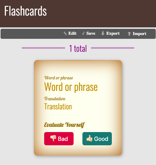
We already have an application that lets us create, edit and store multiple flashcards. But how do we keep track of which ones we have already learned and which ones we need to practice more? Any respectable flashcards application needs a self-evaluation feature. Let's investigate how we can add that!

Suppose in our app we have two buttons for the self-evaluation: the Bad and the Good. What exactly do we want to happen every time an end user clicks the buttons? Well, the idea is rather simple:

  • Clicking the Bad button would indicate the user hasn't learned the word yet and we want our app to move the corresponding flashcard to the beginning of the list so they could see it as soon as possible after launching the app.
  • Clicking the Good button would indicate the user has learned the word and the corresponding flashcard needs to move to the end of the list to let them work with other flashcards which they haven't learned yet.

“Are you sure we can do that without JavaScript?” you may ask. Yep! Mavo is extremely powerful and is able to equip us with all the tools we need!

Now when we know what we are going to implement, let's set the UI in place first and then move on to the next step. Our markup would look something like this:

...
<article property="flashcard" mv-multiple>
  ...
  <section>
    <h2>Evaluate Yourself</h2>
    <button>Bad</button>
    <button>Good</button>
  </section>
</article>
...

The mv-action attribute

See the Pen
07. The mv-action attribute
by Dmitry Sharabin (@dsharabin)
on CodePen.

Mavo actions allow us to create our very own controls that modify data in custom ways when the user interacts with them. Sounds promising right?

To define a custom action we need to use the mv-action attribute on an appropriate element inside our Mavo app. The action is performed every time the element is clicked. That’s exactly what we were looking for.

The value of the mv-action attribute is an expression. We can use any of the expression functions and syntax that MavoScript provides to us, as well as a few more to facilitate data manipulation, such as add(), set(), move(), or delete(). It is important to note that unlike normal expressions which are evaluated reactively, these expressions are only evaluated each time the action is triggered.

So, we need to move flashcards inside the collection, and Mavo has an appropriate function that lets us do that—the move() function. Its first argument refers to the item we are moving, and the second is its position in the collection. Bear in mind that elements of the collection are numbered starting from 0.

Let's implement the first point of the outline we discussed earlier: while self-evaluating, an end user clicks the Bad button and the corresponding flashcard moves to the beginning of the collection, i.e., it becomes the first one. So in the code, we have:

...
<article property="flashcard" mv-multiple>
  ...
  <button mv-action="move(flashcard, 0)">Bad</button>
  ...
</article>
...

Pay attention that in the mv-action attribute we refer to the flashcard property inside the property itself, since we want to deal with the current flashcard.

If we try to implement the second point of the outline, we will face a problem. Can you suggest what problem exactly will it be?

Let's remember that if an end user clicks the Good button the corresponding flashcard moves to the end of the collection, i.e., it becomes the last one. To make a flashcard last in the collection we need to know the number of items in it.

Thankfully, a bit earlier we've already solved that task and implemented the corresponding feature. But could we use that solution to solve our current problem? Unfortunately, we can't: as we already know, we can refer to the collection of flashcards by its name (and evaluate its size) only outside the flashcard property. But in our case, we need to do that inside it: the Good button for which we need to write an expression is inside the flashcard property.

What should we do then? I'm glad you ask. Mavo has the solution.

Using the meta element to hold intermediate values

See the Pen
08. The <meta> element
by Dmitry Sharabin (@dsharabin)
on CodePen.

So, on the one hand, we know that the [count(flashcards)] expression gives us the number of flashcards if it is evaluated outside the flashcard property. On the other hand, we need to use that value inside the flashcard property.

To solve that dilemma, we need to evaluate the number of flashcards outside the flashcard property and somehow hold the result to be able to use it elsewhere in the app, precisely inside the flashcard property. For cases like that, in Mavo, there are so-called computed properties.

To hold an intermediate result so we can refer to it, we need an HTML element in our code. It is recommended to use the <meta> element for that purpose, like so: <meta property="propertyName" content="[expression]">. The advantage of using this element is that it is hidden outside edit mode, both semantically and visually.

Now let's add the flashcardCount computed property in our app. Remember, we must place it outside the flashcard property, but then we can refer to it from anywhere:

...
<meta property="flashcardCount" content="[count(flashcard)]">
<article property="flashcard" mv-multiple>
    ...
</article>
...

Only one step left to finish the implementation of the self-evaluation feature: if an end user clicks the Good button the corresponding flashcard moves to the end of the collection, i.e., it becomes the last one. Let's add the relevant action in the code of our app:

...
<meta property="flashcardCount" content="[count(flashcard)]">
<article property="flashcard" mv-multiple>
  ...
  <button mv-action="move(flashcard, flashcardCount)">Good</button>
</article>
...

We are done! Congratulations! 😀

💻 Let's get our hands dirty!

There is another way to solve that task: with the help of the $all special property. The $all property represents a collection itself if it is placed inside the collection. So there is no need to use any computed property in this case. Try to implement that solution on your own.

There is only one more tiny thing left that we need to fix. Remember the part where we added some stats to our app? Remember the expression we built to evaluate the number of flashcards in the app: [count(flashcard)]? Instead, we can (and should) now use the computed property we defined. Make the appropriate changes in the app.

Takeaways

So what have we learned so far? Let's recap. In order to turn any static HTML page into a Mavo app we need to:

  1. Include the Mavo JavaScript and CSS files in the page’s <head> section.
  2. Add the mv-app attribute to the Mavo root element.
  3. Tell Mavo what elements of our app are important by adding the property attribute to them.
  4. Place the mv-multiple attribute on the element that will be multiplied and converted into a collection.
  5. Tell Mavo where to store our data by adding mv-storage attribute to the Mavo root.
  6. Decide whether Mavo should save our data automatically or not. If yes, add the mv-autosave attribute to the Mavo root.

    We also know that:

  7. The Mavo toolbar is fully-customizable. The mv-bar attribute controls which buttons are going to appear there.
  8. Expressions let us present the current value of properties in other elements and perform computations. An expression value (and type) vary depending on the place the expression takes in the code. Mavo’s expression syntax is called MavoScript.
  9. Custom actions allow creating controls that modify data in custom ways. To define a custom action set the mv-action attribute on an appropriate element inside a Mavo app
  10. Properties whose values are expressions are called computed properties. To hold an intermediate result to be able to refer to it elsewhere in the app, it is recommended to use the <meta> element.

Instead of an epilogue

So we built our app. Is it already perfect? Of course not, nothing is! There are so many things that can be improved, and so many features that can be added (with the help of Mavo, we can even make our app multilingual!). Go ahead, enhance it more, don't hesitate to try something new!

What we've learned so far about Mavo is just the tip of the iceberg, and there is so much more. I encourage you to give it a closer look, by reading the documentation, by examining examples (on the Mavo site, or on CodePen: made by Lea Verou and a few made by myself), and by creating new stuff! Good luck! 😉

Acknowledgments

I want to thank two great people. First of all, my huge thanks go to Lea Verou, who not only inspired me to write this tutorial (and helped me make it happen) but also inspires me all the time by the way she makes the world of web development a better place. I've never met such a gifted human being, and I am happy having an opportunity to make some stuff with her!

I also thank James Moore. The examples he uses in his course "Functional Programming for Beginners with JavaScript” on Udemy pushed me to make my very own version of a flashcard study app. He is a wonderful teacher!

The post Let Mavo Shine in Building Interactive Web Applications appeared first on CSS-Tricks.

WordPress Explores Forming a Nomination-Based Advisory Board

WordPress contributors are weighing in on a proposal for the formation of a nomination-based advisory board with set term limits for its members. Josepha Haden, the project’s Executive Director, published a first draft two weeks ago with ideas for how the board might operate and feedback is rolling in.

WordPress experimented with a growth council three years ago that Haden said was disbanded in December 2018 due to logistics and too much analysis causing paralyzed decision-making. The proposed advisory board would exist to provide “information on industry trends and risks as well as non-binding strategic advice to the Project Lead and Executive Director.”

“I am not proposing that this group would function as a final-say, decision-making body for the WordPress project,” Haden said. “It should serve as a collection of bright, insightful people who have contact with clients and end-users of WordPress. This removes the ‘analysis paralysis’ challenge that the growth councils faced.”

Haden proposed that WordPress use a traditional board process of nomination and self-nomination to form the group, where existing members would select candidates from nominees. Previous members of the growth council would be invited to be part of the first iteration of the Advisory Board with a 12-month term. New members would be incorporated in 2020 with an emphasis on creating a diverse group of advisors. Haden plans to publish a list of previous members of the growth council.

“At the moment, I find that I’m hovering around 12-15 to allow for as many clear subsets of our community/users as possible,” Haden said when asked how many people would be on the advisory board.

Advisory Board Proposal Discussion Surfaces Concerns Regarding its Impact, Diversity, and Corporate Influence

The proposal has so far garnered support and positive feedback, but some participants in the discussion have questioned the impact of an advisory board that lacks any decision-making capability. The structure is not like a Board of Directors where members have authority to vote on matters and bear legal responsibilities. Board members may become frustrated if their advice has no real impact on important project decisions.

“My eyebrows raised at the specific inclusion of the phrase ‘non-binding strategic advice to the Project Lead’ as a way of essentially giving (before the board starts) a feel that this might be just more of the same, where we in the community are asked for our opinion, but then fairly routinely feel ignored or condescended to by the project lead,’ WordPress developer Ben Meredith commented the proposal.

“So my main concern would be how this is going to be different? At the end of the day, it’s still Matt’s party, and he can do what he wishes. I’d love to see true governance here, where Matt submits a bit more officially to the board.”

Others are concerned about balancing the diversity of the board using a nomination process, although Haden said she reserves the right to invite nominees for diversity and representation purposes. WordPress developer Pat Lockley suggested board members be paid in order to prevent them from trying to gain economically from their position. One byproduct of having unpaid board members is that participation might then exclude those who cannot afford to offer their time without compensation.

Several participants in the discussion advocated for the inclusion of people representing users who are not enterprise or industry professionals. If the first iteration of the Advisory Board is comprised of former members of the Growth Council, it’s possible that the board’s advice would be skewed towards corporate interests, since it was originally formed for the purpose of marketing WordPress against direct competitors.

“I think we could do a lot to figure out a roadmap for countering this huge marketing spending being directed against us, because we are the big guy here,” Mullenweg said when first floating the idea of the Growth Council during his WordSesh talk in 2016. “We are the 26% and they are like a 1%. But even though they’re smaller, they might be cannibalizing some of the most valuable aspects of the WordPress customer base.”

Sé Reed, one of the members of the Growth Council, said that she and at least one other member were not representing a corporate interest. Overall, the council’s focus was “truly was on the WP Project as a whole, and not focused on the needs of any individual company.” She reported that conversations were open and everyone seemed to be personally passionate about the project and willing to share information. The breakdown was in the execution of their plans and decisions.

“Unfortunately, and possibly because of the obscured profile, the conversations and actions we attempted to take didn’t really go anywhere within the project,” Reed said. “The entire council was frustrated by this. It’s possible that some of those conversations were integrated into the strategies of some of the companies represented, and I personally feel in some cases it was, but I could not say for sure.”

Reed said the general consensus was that there was “no clear path to integrate the council’s conversations into the WordPress project, and indeed not a clear role for the council within the project.” Members were able to speak candidly, knowing the conversations were confidential.

“These are important discussions to have, but when held publicly, in the Make channel for example, people can’t be, or won’t be, as frank or as honest as they would be in a confidential conversation, especially if they are representing companies,” Reed said. “That was, to my understanding, the impetus for the Advisory Board – to create a space where the difficult confidential discussions can be held, but there is also a clear and public role for the results of those discussions.”

Reed said she thinks it makes sense for the Growth Council members to be the starting Advisory Board, since the group already has a shared history and a year of conversations under their belts.

“We all feel strongly about creating a space for this type of bigger picture conversation, so we can hit the ground running,” she said. “The first members will likely set the stage for the Advisory Board’s bylaws and elections and such, and then move out of that role once that structure is in place. I think the experience of the council members will facilitate a streamlined process for this, and I think it’s a logical group to start with. It has to start somewhere if it’s going to start at all, and if it is not the Growth Council then it would have to be just Matt and Josepha deciding where the start is. And honestly, that’s just as controversial within the community as having the Growth Council do it.”

Haden proposed that the advisory board meet using video calls with high level notes published afterwards. One participant in the discussion said he would prefer full transcripts. Simon Dickson, Director of Platform Services of WordPress.com VIP at Automattic, said he would like to see some clear examples of the tasks the board might take on.

“For example, would the Project Lead or Executive Director be required to present an annual strategy to the Board, and take their questions? Could release leads be required to present a retrospective after each release? Would the Board sign off on ‘State Of The Word’ each year? Would the Board have a role in endorsing key appointments, such as the Executive Director?”

Dickson also suggested that board members be encouraged to act as representatives of the community.

“I hope Board members will be tasked with acting as representatives, bringing not only their own personal thoughts, but those of the diverse communities they come from,” he said. “They should be encouraged, perhaps even required to blog, tweet, speak and engage; and to reflect back what they hear.”

With strong user representation and more transparent communication, an advisory board has the potential to be an organization that the WordPress community can feel invested in, if their experiences and opinions are included in important conversations. If ex-Growth Council members are going to be its charter members, the group may have some challenges in assuring the community that they are representing community interests to WordPress’ Project Lead and Executive Director.

“I absolutely think users need to be represented, and I attempt to represent that viewpoint in all of my community participation, but I also think sometimes we forget that even the larger companies have invested heavily in WordPress and they have an interest in the WP Project’s success,” Reed said. “They are the face of WordPress to hundreds of thousands of users who don’t even know the community exists. For better or worse, our fates are intertwined.”

JavaFX TextField Append delay

So, I made a simple server-client chat program, but I have a problem:
if the server tries to message the client, the server lags or freezes a bit, same with the client.
is there something that I do wrong?

import java.io.DataInputStream;
import java.io.DataOutputStream;
import java.io.IOException;
import java.net.ServerSocket;
import java.net.Socket;

import javafx.application.Application;
import javafx.scene.Group;
import javafx.scene.Scene;
import javafx.scene.control.TextArea;
import javafx.scene.control.TextField;
import javafx.scene.paint.Color;
import javafx.stage.Stage;

public class Server extends Application {

    private Group serverGR;
    private Scene serverSC;
    private Stage window;
    private TextField tf;
    private TextArea ta;

    private ServerSocket ss;
    private Socket s;
    private DataInputStream dis;
    private DataOutputStream dos;

    ConnectionThread cT = new ConnectionThread();

    public void init() {
        cT.start();
    }

    @Override
    public void start(Stage primaryStage) {
        try {
        serverGR = new Group();
        serverSC = new Scene(serverGR, 800, 500, Color.LIGHTCYAN);
        window = primaryStage;
        window.setTitle("Bleidorb Simplistic ChatProgram \\\\\\\\\"ServerMode\"\\\\\\\\");
        window.setScene(serverSC);
        window.show();

        tf = new TextField();
        tf.setTranslateX(10);
        tf.setTranslateY(10);
        tf.setPrefWidth(400);
        tf.setPrefHeight(20);
        tf.appendText("Type your message here.");
        tf.setOnAction(event -> {

            String server = "Server: ";
            server += tf.getText();

                try {
                    dos.writeUTF(server);
                    dos.flush();
                    ta.appendText(dis.readUTF() + "\n");
                } catch (IOException e) {
                    e.printStackTrace();
                }

            tf.clear();

        });

        ta = new TextArea();
        ta.setTranslateX(10);
        ta.setTranslateY(40);
        ta.setPrefWidth(400);
        ta.setPrefHeight(400);

        serverGR.getChildren().addAll(tf, ta);
        } catch (Exception e) {
            System.out.println(e.toString() + "\n something wrong in startmethod, lol?");
        }
    }   

    @SuppressWarnings("deprecation")
    public void stop() {
        try {
            cT.stop();
            dis.close();
            ss.close();
            s.close();
        } catch (IOException e) {
            e.printStackTrace();
        }
    }

    public static void main(String[] args) {
        launch(args);
    }

    private class ConnectionThread extends Thread {

        @Override
        public void run(){
            try {
                ss = new ServerSocket(5279, 100);
                s = ss.accept();
                s.setTcpNoDelay(true);
                dis = new DataInputStream(s.getInputStream());
                dos = new DataOutputStream(s.getOutputStream());
            } catch (Exception e) {
                e.printStackTrace();
            }
        }
    }
}

import java.io.DataInputStream;
import java.io.DataOutputStream;
import java.io.IOException;
import java.net.Socket;

import javafx.application.Application;
import javafx.scene.Group;
import javafx.scene.Scene;
import javafx.scene.control.TextArea;
import javafx.scene.control.TextField;
import javafx.scene.paint.Color;
import javafx.stage.Stage;

public class Client extends Application {

    private Group serverGR;
    private Scene serverSC;
    private Stage window;
    private TextField tf;
    private TextArea ta;

    private Socket s;
    private DataInputStream dis;
    private DataOutputStream dos;

    ConnectionThread cT = new ConnectionThread();

    public void init() {
        cT.start();
    }

    @Override
    public void start(Stage primaryStage) {
        try {
        serverGR = new Group();
        serverSC = new Scene(serverGR, 800, 500, Color.LIGHTCYAN);
        window = primaryStage;
        window.setTitle("Bleidorb Simplistic ChatProgram \\\\\\\\\"ClientMode\"\\\\\\\\");
        window.setScene(serverSC);
        window.show();

        tf = new TextField();
        tf.setTranslateX(10);
        tf.setTranslateY(10);
        tf.setPrefWidth(400);
        tf.setPrefHeight(20);
        tf.appendText("Type your message here.");
        tf.setOnAction(event -> {

            String client = "Client: ";
            client += tf.getText();

                try {
                    dos.writeUTF(client);
                    dos.flush();
                    ta.appendText(dis.readUTF() + "\n");
                } catch (IOException e) {
                    e.printStackTrace();
                }

            tf.clear(); 

        });

        ta = new TextArea();
        ta.setTranslateX(10);
        ta.setTranslateY(40);
        ta.setPrefWidth(400);
        ta.setPrefHeight(400);

        serverGR.getChildren().addAll(tf, ta);
        } catch (Exception e) {
            System.out.println(e.toString() + "\n something wrong in startmethod, lol?");
        }
    }   

    @SuppressWarnings("deprecation")
    public void stop() {
        try {
            cT.stop();
            dos.close();
            s.close();
        } catch (IOException e) {
            e.printStackTrace();
        }
    }

    public static void main(String[] args) {
        launch(args);
    }

    private class ConnectionThread extends Thread {

        @Override
        public void run(){
            try {
                s = new Socket("localhost", 5279);
                s.setTcpNoDelay(true);
                dis = new DataInputStream(s.getInputStream());
                dos = new DataOutputStream(s.getOutputStream());
            } catch (Exception e) {
                e.printStackTrace();
            }
        }
    }
}

How to Set Up Google Site Kit in WordPress

How to Set Up Google Site Kit in WordPressGoogle Site Kit is a brand new SEO/analytics plugin for WordPress, developed by Google. Google Site Kit enables you to connect and monitor your site across Google’s online marketing services including: Search Console, Google Analytics, PageSpeed Insights, Google AdSense, Google Optimize and Google Tag Manager. The best part? You can do all of this directly […]

The post How to Set Up Google Site Kit in WordPress appeared first on WPExplorer.

Collective #538


C538_adblockers

Adblocking: How About Nah?

An important read: “…with more and more power in fewer and fewer hands, it’s become increasingly difficult for Web publishers to resist advertisers’ insistence on obnoxious tracking ads”.

Read it


C538_patterns

paaatterns

A nice collection of handcrafted patterns free for a subscription. By Lstore Graphics.

Get it


Collective #538 was written by Pedro Botelho and published on Codrops.

Can you nest @media and @support queries?

Yes, you can, and it doesn't really matter in what order. A CSS preprocessor is not required. It works in regular CSS.

This works:

@supports(--a: b) {
  @media (min-width: 1px) {
    body {
      background: red;
    }
  }
}

And so does this, the reverse nesting of the above:

@media (min-width: 1px) {
  @supports(--a: b) {
    body {
      background: green;
    }
  }
}

You can keep going with the nesting, if it ever makes sense:

@media (min-width: 2px) {
  @media (min-width: 1px) {
    @supports (--a: b) {
      @supports (display: flex) {
        body {
          background: pink;
        }
      }
    }
  }
}

There is probably a point where the logic of that gets out of hand, so careful. But hey, it works. Presumably, you can "infinitely" nest at-rules.

To look at nested code like that looks a little like a CSS preprocessor is in use, but that's not the case here. Regular ol' CSS handles this just fine, and in fact, CSS preprocessors don't meaningfully manipulate it at all (tested Sass, Less, and Stylus).

The post Can you nest @media and @support queries? appeared first on CSS-Tricks.

The Real Dark Web

Here’s a wonderful reminder from Charlie Owen that everyone in the web design industry isn’t using the latest and greatest technology. And that’s okay! Charlie writes:

Most web developers are working on very "boring" teams. They're producing workhorse products that serve the organisation needs. They aren't trying to innovate. They aren't trying to impress the next recruiter with their CV. They simply want to get paid, produce a solution that works, and go home.

Yet they are told, mostly implicitly, sometimes directly, that if they're not innovating and using the latest tools that they are somehow a failure. This feeling of failure for not implementing the latest tech permeates our industry.

This feeling needs to end.

I feel that this is a big problem for our community because there are a small number of folks on the bleeding edge that happen to be quite loud about their work (even here at CSS-Tricks) – and that’s great! We all need to learn from folks that are doing this work. However, we need to remind ourselves that this is a very small number of folks and not every project has to be a technical marvel to be a success.

Take Michelle Barker's personal site, for example. It's slick but is also dependency-free so she could focus on writing the languages she loves: HTML and CSS. Not a bad goal, nor a bad outcome.

This also harkens back to something Chris mentioned when discussing complexity in web development:

There are more developers these days working on in-house teams or agencies with big-ticket clients. That is, more and more developers on large-scope, long-scale, highly-complex jobs. So that's where their minds are at. Big complicated problems with big complicated solutions. That's what gets talked about. That's what gets blogged about. That's what gets argued about. That's the topic at a lot of conferences I've been to.

While you certainly can make a soup-of-the-day website with an index.html file and FTP, blog posts about that are fewer and farther between and don't get as many claps.

It's not so much that we need cheers to validate our work; it's merely recognizing that not everything has to be on the bleeding edge of technology. There's something to be said about "simple and boring" projects.

Perhaps the real thing to fear is less about what we're sharing and more about what we're not sharing.

Direct Link to ArticlePermalink

The post The Real Dark Web appeared first on CSS-Tricks.

Why Should Businesses not Treat Branding as an Afterthought?

What is branding? The term branding, by definition, means ‘any and every market practice through which a company establishes a name, story, and symbol that creates an individual identity for easy recognition.’ Branding is the foundation that helps a company develop its name as a distinguishable entity that reflects the products and services being offered. [...]

The post Why Should Businesses not Treat Branding as an Afterthought? appeared first on WPArena.

10 Content Marketing Terms Every College Graduate Should Know

Digital content marketing is fast becoming one of the most effective means of marketing, promotion, and advertisement in the contemporary business industry. Companies are relying more and more on their digital marketing than ever before. The careers in the industry are also significantly on the rise, growing at an increase above the national average with [...]

The post 10 Content Marketing Terms Every College Graduate Should Know appeared first on WPArena.

A Look at Why Web Projects Stall

There’s nothing quite like the feeling of booking a new project. You immediately start thinking of it’s potential to boost your portfolio and your bank account (you may have even received a nice down payment).

And there’s often a great level of excitement from your client as well. They just can’t wait to get started and want to have things up and running as soon as possible. This is just fine with you, as you love crossing items off of your to-do list.

So, everybody’s just raring to go, right? Perhaps they are, for a little while. But over time, all of that initial elation fades away – along with any signs of progress. All of the sudden, you find yourself in the middle of a stalled project.

Why did this happen? And what can you do about it? We have some ideas! Let’s explore the common ways a project can slow to a crawl (or worse) and some ways to jumpstart it back to life.

A Wakeup Call

There is always a high level of optimism at the very beginning of a project. And clients usually have a lot of big ideas, too.

But when it’s time to actually do the work, reality sets in. What sounded like a piece of cake in meetings turns out to be more difficult than initially thought. This is a common theme when working with clients.

However, it’s not just the degree of difficulty that gets in the way. Time, or lack of it, can also play a major role. Clients who are already swamped with work may just not have an opportunity to get together content and other promised assets.

The result is that the website you were supposed to build in six weeks is past due, and it’s because you don’t have what you need to finish the job.

A wall clock.

The Domino Effect

For web designers, this situation is frustrating on several levels. First, it can have a negative impact on your schedule. If you blocked off a certain amount of time to finish a project, you might be left waiting around with nothing to do. And once it finally does start to move forward again, it could clash with other work you have to get done.

Along with a reshuffled schedule, a stalled project can also hurt you financially. When you’re counting being paid for your work at a specific time and it doesn’t happen – that can really hinder your ability to pay the bills.

Plus, this can also put a heavy strain on the relationship you have with your client. There’s a certain level of mutual trust and cooperation that is needed to ensure a positive end result. In some instances, you may feel like your client isn’t holding up their end of the bargain, thus throwing your life into disarray. This, as much as anything, can make it difficult to move forward (even after you finally receive those product photos).

In short, a whole lot of trouble can come out of a stalled project. And the worst part is that, from a designer’s perspective, it can sometimes seem completely unnecessary.

Toy blocks scattered on a floor.

How to Keep the Ball Rolling

While you can’t necessarily avoid every instance of a stalled project, there are some things you can do to help try and keep things moving forward. Among them:

Establish Benchmarks

Having a mutually agreed-upon schedule of project benchmarks can be just the incentive a client needs to get things done. This is something you can discuss before things start and include in your contract. If the project is rather large, you might even consider adding some level of financial penalties for missed deadlines.

However, this may be easier said than done. It’s advisable to speak with a legal professional when adding this type of language to a contract as it could backfire on you. Not only that, but some clients may balk at the terms.

Offer to Help

Not all delays are due to negligence or being too busy. Sometimes, a client may be a bit overwhelmed by the process of putting together materials for their website. They may not know where to begin or are just unsure about asking for help.

So, if things don’t appear to be moving along as you expected, reach out and offer your assistance. Check in and see if they have any questions or need some advice. You might find that, by being proactive, you can restart progress.

Break Down the Process

Another reason a client might feel overwhelmed is that they think everything needs to be taken care of at once. But for most projects this just isn’t the case.

One solution may be found in more clearly communicating the design process. Inform your clients about the steps involved and what you need to complete each one. A more iterative process might just lead to fewer fits and starts.

Person walking up a flight of stairs.

Keeping a Watchful Eye

One of the less talked-about parts of a web designer’s job is that of project management. It is so often up to us to keep things running smoothly. Although, instead of making sure employees stay on task, we’re usually focusing on clients.

This is difficult, as we can’t really control what our clients do (or don’t do). Therefore, our best weapon is communication. If we don’t lead by spelling out our processes and their requirements, the project will most likely stall at some point.

Using some or all of the tips above can help you keep clients in the loop. While they don’t guarantee success, they do put all of the expectations out in the open. This way, if your client still doesn’t deliver, it’s on them. At the very least, you can say that you made the effort to keep the project moving forward.

Which Is Best: A Loyalty Program PWA or Mobile App?

Which Is Best: A Loyalty Program PWA or Mobile App?

Which Is Best: A Loyalty Program PWA or Mobile App?

Suzanne Scacca

Customer loyalty is a critical component in the success of any business. In some cases, loyalty can be earned by providing a high-quality service and dedicated support. In other cases, customers expect more from a business than just the products or services they put before them.

So, don’t be surprised when clients ask you to design a loyalty app for them.

Loyalty programs are a great way to dish out rewards to the most loyal base of customers while also giving them a reason to stay engaged with a brand. This isn’t superficial engagement like views or clicks either. If the rewards are valuable enough, customers will stay committed to a business for longer (even when faced with a negative experience) and also spend more money than one-time customers.

There’s a lot of value in creating a loyalty program. Now, it’s up to you to determine the best way to design it for your clients:

Should it be a PWA or mobile app?

Why Is Mobile The Key To Loyalty?

Using the 2018 Loyalty Program Consumer Survey from CodeBroker, let’s shed some light on why mobile is where you need to design your clients’ loyalty apps.

To start, there are a number of businesses that would benefit from loyalty programs. For example:

  • Retailers
  • e-Commerce
  • Restaurants
  • Hotels
  • Airlines and other travel providers
  • Credit card companies

With many of these options, there’s an in-person component at play, which is why it’s important to give users access to their loyalty program and rewards on mobile.

But be careful. Of the top concerns expressed by CodeBroker’s survey respondents, 54% said it was too difficult to access rewards information from their mobile devices.

CodeBroker survey stat
CodeBroker’s 2018 Loyal Consumer Survey and report. (Source: CodeBroker) (Large preview)

What’s more, many consumers were frustrated with having to install a mobile app in order to get rewards updates. And, yet, 75% indicated they’d be more likely to sign up for a rewards program if it were convenient to use from their mobile device.

Now, the main gripe from this report is that consumers want communications about rewards points and other program details sent via text and email. They don’t want to have to log into a mobile app to get them.

It’s a valid argument to make. If a brand were proactive in emailing Jane Doe to say, “Hey! You have 2,500 points to use by the end of the month!”, that would be a much better experience than Jane Doe having to take the initiative to check on her points standing.

However, this ignores the fact that customer loyalty is more than just the act of counting how many points one has to spend.

True customer loyalty comes about when brands can anticipate their customers’ needs and provide a more personalized, fast and convenient experience.

Which is why we have to look beyond mobile communications and look at how to actually design the program’s experience for mobile.

Designing Loyalty Programs For Mobile

While mobile apps and PWAs can both provide a good experience, consumers have already expressed a disinterest in installing mobile apps to manage their loyalty programs. That said, I don’t think it’s fair to throw native mobile apps out of the race solely based on that feedback. If you make a mobile app worthwhile, consumers will use it.

Plus, PWAs can work offline… but will only display cached content. Which means that customers who want to use their loyalty app to place orders on the go, pay in store from their app or do something else when they’re out of service range won’t be able to do so with a PWA.

That’s why I’m going to argue that you should design your loyalty program as a PWA only if there’s no in-person counterpart. So, basically, e-commerce companies can skip the mobile app. Those in the credit card space might be able to get away with it, too, though security will need to be extra tight.

Everyone else, will need to build a mobile app. And, based on what I’m seeing, you should create a matching PWA, too.

For example, this is the Starbucks rewards app as a PWA:

Starbucks rewards PWA
The home page of the Starbucks rewards PWA. (Source: Starbucks) (Large preview)

And this is the Starbucks loyalty program as a mobile app:

Starbucks loyalty mobile app
The home screen of the Starbucks loyalty mobile app. (Source: Starbucks) (Large preview)

There are a number of discrepancies between the two, but, for the most part, it’s an identical experience. I’d even argue that the PWA looks a lot cleaner and more welcoming to users. However, the mobile app is necessary for customers that want to order while they’re on the road or to pay from their phone at the counter or drive-through.

With that out of the way, I’d like to quickly review some strategies for designing loyalty program apps for your mobile users. I’ll use both PWAs and native apps in these examples, just so you can see that there isn’t a whole lot of difference in how you design them:

1. Ask Your Users for More Than a Username and Password

Unlike something like an email subscription form or a free SaaS signup, you should be collecting more than just a username and password from your users. And they should be happy to give it to you.

It’s up to you to decide where and when it’s best to ask for this information though:

Do you want to ask for it on the login screen? Or do you want them to provide personal details and preferences later on?

Let’s look at how The North Face’s VIPeak program handles it:

VIPeak rewards signup
The North Face’s VIPeak rewards signup form. (Source: The North Face) (Large preview)

This signup screen asks for four things:

  • First Name
  • Last Name
  • Email
  • Password

It’s a couple extra fields to fill in, but I don’t think many customers will take issue with it. Plus, signing up doesn’t just let them start collecting rewards immediately. They automatically get 10% off their first purchase from the website.

Now, what I like about how this one is handled is that users aren’t pestered with extra questions at signup. Instead, they have the ability to customize what sort of promotions they receive at a time when it’s more convenient for them.

The North Face email preferences
The North Face asks loyalty members what kinds of interests they want offers for. (Source: The North Face) (Large preview)

This is just one way to make the signup process go more smoothly on mobile. You can use this post-signup customization for more than just email preferences, too. You can plant a number of additional fields or questions in their account settings.

For instance, you could ask for their mailing address if the loyalty app also does order-and-delivery services. Or if you want to go old school with your marketing and send them a mailer.

You could also ask for their birthday. This would work in your favor two-fold. First, a birthday discount or free gift offer is a great way to re-engage a user who’s potentially lost interest or forgotten about the brand. Plus, everyone loves a birthday gift, so that “free” bonus would be useful in holding onto their loyalty.

2. Always Lead with Points

There’s a reason why the CodeBroker report focuses heavily on the points aspect of loyalty programs.

Even if the brand offers other rewards with memberships, customers first and foremost want to know how much “free” money they have to play with.

So, when you design your loyalty PWA or mobile app, don’t be coy with that data. Put it front and center.

This is the Chick-fil-A One app:

Chick-fil-A One points counter
The Chick-fil-A One app displays the total points available to redeem. (Source: Chick-fil-A One) (Large preview)

As you can see, the main focus in the “Rewards” tab is on how many points are available to redeem.

This is a good idea for two reasons:

  1. If someone comes to the app wanting to spend their points, there’s no need to hunt them down. This makes the experience better for them and speeds up the time to conversion.
  2. If someone comes to the app to do something else, that big red number might be enough to get them thinking, “Hmmm… maybe I should deal with those points while I’m here.”

Either way, the prioritization of points available gives them a reason to re-engage and spend.

Plus, it’s really easy to redeem available points.

If users click the “Redeem my points” button under their points counter or they click on the “Redeem” tab at the top, they’ll be taken to this page:

Chick-fil-A Redeem
Chick-fil-A One makes it easy to see what you can buy with points earned. (Source: Chick-fil-A One) (Large preview)

Items that are unavailable (based on the user’s point total) will be greyed out. The ones they do have enough points to spend on will appear in full color.

It’s a smart design strategy as it simplifies the redemption process while also motivating users to open their wallets and spent a little more to get the items they can’t afford with points just yet.

3. Motivate Them to Spend More By Using FOMO

Feature comparison tables aren’t just a great way to upsell product tiers to customers. You can use them to communicate the value of spending more money through a loyalty program.

Sephora’s Beauty Insider program uses this technique:

Sephora points explainer
Sephora briefly explains how much points can be earned in its loyalty program. (Source: Sephora) (Large preview)

First, it simply explains that users earn 1 point for every $1.00 spent. But the comparison table below reveals that there’s more to the program than that:

Sephora points comparison table
Sephora’s points comparison table helps convince loyalty members to spend more. (Source: Sephora) (Large preview)

As Beauty Insider members reach certain spending tiers, even more benefits become available. For instance, after they’ve spent their first $350, they’ll start getting 1.25 points for every $1.00 spent. New rewards become available, too, like full-size beauty product samples and celebration gifts.

If you want to motivate users to install your loyalty app and keep spending money through it, clearly show them what they’re missing.

4. Simplify Future Purchases

The whole point in creating a loyalty program is to retain a customer’s business for the long run. To do that, you have to find ways to make them buy again and again.

Now, a lot of that rests on your client’s shoulders as they’re the ones who will shape the offers that entice them back to the app. However, you have a part to play as well.

Let’s use World of Hyatt to demonstrate how you might do this.

World of Hyatt points counter
The Account tab in World of Hyatt shows points accumulation. (Source: World of Hyatt) (Large preview)

This is Hyatt Hotels’ loyalty program app. Users can view points accumulation, manage account preferences and book new hotel stays.

Users can also quickly rebook previous reservations:

World of Hyatt Rebook feature
World of Hyatt includes a quick Rebook feature for repeat stays. (Source: World of Hyatt) (Large preview)

And if that isn’t helpful enough, users can set custom room preferences from their account settings:

World of Hyatt room settings
World of Hyatt lets users define room settings for more personalized search results. (Source: World of Hyatt) (Large preview)

This way, the World of Hyatt app won’t waste their time showing rooms that don’t fit their ideal specifications as they try to book something new.

While the simplification of preferences and setting up repeat or recurring purchases will look differently from app to app, it’s an important feature to build in whenever you can. If you can show your users that you understand how tedious it is to enter the same details every time or to repeat a process even though nothing has changed, they’ll be more likely to return.

Wrap-Up

There’s one other thing I want to add here and it’s this:

When your client asks you to build a loyalty app, make sure it’s the right thing to do. Because if their business is new and they have absolutely no brand name recognition or long-term trust to leverage, it might be difficult to get people to subscribe to the program. No matter how beautifully you design the app experience.

And because loyalty members want access to their rewards on mobile, that’s going to leave you with two costlier choices than a website.

It might be best to explain the risks of creating a loyalty program without a huge demand for one. And, instead, recommend creating on-site promotions and offers they can share through email to start.

Then, when they’re ready, you can sit down with them and explain how a PWA or mobile app loyalty program will help them attract a better quality of customer and hold onto them for longer.

Smashing Editorial (yk, ra)

The Complete Social Media Cheat Sheet for WordPress (Updated)

Are you looking for a social media cheat sheet that you can follow to quickly set up social media profiles the right way?

If you are serious about your website or blog, then you simply can’t ignore social media. The problem is that each of these platforms has different requirements for cover photos, profile images, article covers, etc. This makes it quite overwhelming for new users to get started.

In this article, we will share our ultimate social media cheat sheet for WordPress.

The Complete Social Media Cheat Sheet for WordPress

Why Do You Need a Social Media Cheat Sheet for WordPress?

If you have been running social media profiles for your WordPress blog or website, then you would notice that each platform has different requirements.

For example, Facebook has specific requirements for image sizes while Pinterest needs totally different proportions.

It can be difficult to remember all that information when creating social media images for your articles or profile.

A cheat sheet helps you quickly look up all these options. It will also ensure that you don’t miss anything important when creating a social media profile or publishing a new article on your WordPress website.

That being said, let’s get started with our ultimate social media cheat sheet for WordPress users.

Here is a quick overview of the things we will cover in this article:

Choose Your Social Media Platforms

There are so many social media websites, but not all of them are helpful in growing your business or bringing traffic to your website.

Apart from bigger sites like Facebook and Twitter, you can choose platforms that work best with your website’s target audience and niche.

For example, if you run a fashion blog, then you may want to use Instagram to promote your content.

A food and recipe blog may want to focus on YouTube and Yummly.

Home decor or DIY websites may find Pinterest helpful in finding the right audience.

Choosing the right platforms for your target audience will help you create an effective social media marketing strategy to grow your business.

Social Media Image Sizes Checklist

To promote your blog or business on social media, you will need to setup profiles, upload your website logo and a cover photo, and create images to accompany your articles and links.

You can see our article on how to easily create images for your WordPress blog to learn how to make beautiful images without hiring a graphic designer.

Now the problem is that each social media platform has specific requirements for these images. Not using the right size would make your images look skewed or stretched.

Here is our quick cheat sheet for social media image sizes that you can use when creating images for your social accounts.

Facebook Image Sizes

Facebook page preview

Facebook has specific recommendations for images to be used in different areas.

Cover image: 820 x 312 pixels on computers and 640 x 360 pixels for smartphones. Cover images should be less than 100 KB in filesize. It could be in JPEG or PNG file format. You can create a larger image while maintaining the same aspect ratio, and Facebook will automatically create smaller sizes to display on mobile devices.

Profile image: An square image of at least 170 x 170 pixels on computers and 128 x 128 pixels on smartphones. For business pages, this is where you would ideally display your custom logo. This image will be cropped to display as a circle.

Shared Image: 1200 x 630 pixels. This image will be displayed on your page with a maximum width of 470 pixels and in the feed maximum width of 600 pixels.

Group cover image: 1640 x 856 pixels.

Twitter Image Sizes

Twitter preview

Twitter is the internet’s conversation hub. Following are the recommended image sizes for Twitter to make your profile more engaging and professional.

Header image: 1500 x 500 pixels. This full-width image appears as the cover image of your Twitter profile page.

Profile image: 400 x 400 pixels. This square image is cropped to be displayed in a circular format. Twitter allows you to upload JPG, PNG, and GIF formats with a maximum file size of 2MB.

In-stream image: 1200 x 675 pixels. This image is displayed when you share an article, retweet, embed a tweet, upload images, and more. If you are already using Twitter Cards then Twitter will be able to pick the correct image to display with your article description and title.

Instagram Image Sizes

Instagram preview

Instagram’s main content is already in a visual format. If you are uploading photos directly from your phone using the Instagram app, then it will automatically take care of appropriate image sizes for you.

For other uploads, you can follow these Instagram image size recommendations for the best results.

Profile image: 320 x 320 pixels. You can use larger image dimensions as long as it is a square image.

Image thumbnail: 161 x 161 pixels. This image is displayed as your thumbnails for your photos.

Shared photos: 1080 x 1080 pixels. You can use a higher resolution image as long as it is a square image.

Shared videos: 1080 pixels wide.

Instagram Stories: 1080 x 1920 pixels or minimum 600 x 1067 pixels. File size cannot exceed more than 4 GB which is quite a lot for a high-quality video.

YouTube Image Sizes

YouTube channel preview

YouTube is not only the second most popular social media platform but also the second most popular search engine. Your YouTube channel image, cover image, and video thumbnails are crucial in getting more views for your videos.

YouTube Channel cover image: 2048 x 1152 pixels. You need to make sure that the image is horizontally centered so that it looks good on mobile devices where YouTube may crop the image to fit the user’s screen size.

Channel icon: 800 x 800 pixels. This image is displayed as your channel icon and may sometimes be cropped as a circular image.

Video thumbnail: 1280 x 720 pixels. Ask any YouTube creator and they will tell you that the video thumbnail is the most important part of video optimization on YouTube. This is what YouTube users will see on their homepage, in search, and in other areas. A highly optimized video thumbnail helps you get more views and grow your channel.

Pinterest Image Sizes

Pinterest preview

Pinterest is a visual social sharing platform, which means images play the most significant role in growing your Pinterest following.

Profile image: 165 x 165 pixels. You can upload a higher resolution image with a maximum file size of 10 MB.

Profile cover: 800 x 450 pixels. Select a board to feature as your profile’s cover. Pinterest will automatically fetch pins from that board to create your profile cover.

Board cover image: 222 x 150 pixels. Pinterest allows you to choose the cover image from the pins you have saved for that board.

Pinned image preview: 236 pixels wide. Pinterest automatically scales your pins to fit their grid. For best results, you need to upload the images with an aspect ratio of 2:3 to 1:3.5.

LinkedIn Image Sizes

LinkedIn preview

LinkedIn can be a great source of traffic, connections, and building a brand image. It is a social networking platform for professionals and businesses, which makes it a powerful tool to help you grow your business.

Personal profile image: 400 x 400 pixels with a maximum image file size of 10 MB.

Banner image for personal profile: 1584 x 396 pixels with a maximum file size of 4 MB.

Company cover image: 1128 x 191 pixels.

Shared image: 1200 x 627 pixels.

Company profile / logo image: 300 x 300 pixels or higher resolution image with 1:1 aspect ratio.

Setting up Social Media Optimization in WordPress

Now that you have learned about proper social media image sizes, the next step is to make sure that your WordPress site is optimized for social media.

The most important aspect of this optimization is to set up automatic inclusion of Open Graph metadata. Open Graph metadata is a technology that allows you to include additional information to your web pages that social media and search engines need.

First, you need to install and activate the All in One SEO plugin. For more details, see our step-by-step guide on how to install a WordPress plugin.

AIOSEO is the best WordPress SEO plugin that helps you get more traffic from search engines. It is also a complete website optimization tool including support for social media platforms as well.

Upon activation, you need to visit All in One SEO » Social Networks page. From here, you need to first add your social media profile URLs under the ‘Social Profiles’ tab.

The AIOSEO SEO plugin for WordPress

You don’t need to add all URLs, you can simply skip the social media websites where you don’t have a profile.

Next, you need to switch to the Facebook tab. From here you can see that AIOSEO enables Open Graph metadata by default.

Upload default Facebook image

Below that you need to provide a default post Facebook image for your website’s front page. The image you provide here will be displayed when someone shares your website’s front page or root URL on Facebook.

Next, switch to the Twitter tab. Here you can choose the default card display for your website.

Add Twitter card details

A ‘summary with large image’ option will display your Twitter share image with a summary of your article.

You can now switch to the Pinterest tab. From here you can add the Pinterest confirmation tag to your website.

You can click on the link on the screen to claim your website and get the confirmation code. For more details, you can see our guide on how to verify your WordPress site on Pinterest.

Claim your Pinterest account

Don’t forget to click on the ‘Save Changes’ button to store your settings.

Social Media Settings for WordPress Posts and Pages

Just like the SEO settings for posts and pages, you can also optimize them for social media websites.

AIOSEO plugin allows you to easily set social options for your individual posts and pages.

Simply edit the blog post or page you want to optimize, and then scroll down to ‘AIOSEO Settings’ section below the editor.

Add social image in content editor

Switch to the ‘Social’ tab and you can upload a custom title and description as well as an image for Facebook and Twitter shares. You can also see a preview of what your post will look like when shared on social media.

After that, you can click on ‘Publish’ or ‘Update’ to save your post or page.

Adding Social Sharing Buttons to Your Website

The easiest way to promote your website on social media is by encouraging your users to share your content. This can be achieved by adding social sharing buttons to your blog posts and pages.

First, you need to install and activate the Shared Counts plugin. For more details, see our step-by-step guide on how to install a WordPress plugin.

Shared Counts is the best social media plugin for WordPress. It allows you to easily add social sharing buttons to your WordPress blog posts.

Upon activation, simply head over to Settings » Shared Counts page to configure plugin options.

Share counts settings

From here you need to scroll down to the ‘Display’ section and select the social media websites you want to display in the ‘Share Buttons to Display’ field.

After that, you can choose a button style and location where you want to display the buttons.

Don’t forget to click on the ‘Save Changes’ button to store your settings.

You can now visit any post on your website to see social sharing buttons in action.

For more detailed instructions, see our guide on how to add social share buttons in WordPress.

Setting up Automated Social Sharing in WordPress

Social media platforms are great for building a following and bringing more traffic to your website. However, it can become quite time-consuming to share content across different platforms and engage with your audience.

Luckily, there are several online tools that you can use to automate the process.

We hope this social media cheat sheet for WordPress helped you improve your social media marketing strategy. You may also want to see our list of best email marketing services and how to start your own podcast.

If you liked this article, then please subscribe to our YouTube Channel for WordPress video tutorials. You can also find us on Twitter and Facebook.

The post The Complete Social Media Cheat Sheet for WordPress (Updated) first appeared on WPBeginner.

Is Multilingual WordPress Plugin Enough For The International E-Store?

If you are an online retail shop owner, then you have probably considered reaching a much greater audience outside of your country. Of course, not every region you target will have people speaking English. In fact, a huge number of your potential customers don’t know English. There is an easy solution to this problem which [...]

The post Is Multilingual WordPress Plugin Enough For The International E-Store? appeared first on WPArena.