Private Note-Taking and Journaling With the Hypernotes WordPress Plugin

Ella van Durpe, a core WordPress contributor and software engineer at Automattic, released a note-taking plugin earlier today. Hypernotes is a simple custom post type that allows end-users to take private notes or serve as a journaling tool.

I have seen similar plugins in the past. I even began building one years ago before ultimately abandoning it for a simple Markdown solution in a private repository.

What makes Hypernotes unique is its handling of “folders,” which essentially work like categories. However, each folder gets its own sub-menu link under the Notes section in the WordPress admin.

Folder system for the Hypernotes plugin shown in the left WordPress admin sidebar.
Hypernotes’ folder system.

This more closely mimics other note-taking apps where users can switch between various folders to quickly find notes.

The code to make this happen is simple; the idea is ingenious. It is the sort of outside-the-box thinking I love to see from plugin developers.

There are a few trivial issues with it, such as the folder names not being highlighted when viewing their screens. However, that is a WordPress-specific bug. A simple dash before each folder name could spruce up the UI a bit too. They sit below the “All Notes” menu item, so it would create more of a folder effect.

On the whole, the plugin works well as a note-taking application.

WordPress post editor showcasing the Hypernotes plugin.
Writing a note in the WordPress editor.

The plugin description does have a security note for users who are wondering just how private their content is:

Only you will be able to see your notes within the WordPress admin, but the notes are NOT encrypted at the moment, so anyone with database access will be able to read them.

Hypernotes also ensures that no post is ever accidentally published for all the world to see. Under the hood, it automatically sets all notes to the “private” status. The plugin’s post type cannot be publicly queried on the front end either.

It is worth mentioning that the plugin does not create custom capabilities (permissions) for its post type and taxonomy. Any registered user on the site with the right post-editing capabilities can access others’ notes in the backend, such as people with the Editor role.

This is unlikely an issue given the nature of the plugin. I imagine the primary audience will be made up of solo bloggers who want a simple note-taking solution.

I ran into one not-so-trivial issue when I began trying out Hypernotes, believing my website was broken. This is usually because of a patch I am testing for the Gutenberg plugin or just one of its run-of-the-mill updates. However, the typical culprit was not to blame. After a half-hour or so trying to figure out why my theme styles were not appearing for Note posts, I finally cracked the issue.

Hypernotes disables all theme editor styles. The beautiful typography of my currently active theme was gone, which would work well with a note or journaling plugin.

This was easy enough to overrule with a few lines of custom code. If I was going to save a few quotes that I liked as personal notes, I at least wanted to do it in style:

Re-adding custom theme editor styles to the Hypernotes plugin and showcasing a quote in the editor.
Bringing back my theme’s custom quotes style.

The plugin also attempts to disable wide/full alignment and theme editor font sizes. The code it uses works for traditional WordPress themes but not for block themes, which have a different mechanism for registering such support. This was also one of the reasons it was tough to track down the issue. Everything else from my theme was working but custom editor styles.

I understand the idea behind removing support for those features. Themes design the front end of the site, and Hypernotes is purely a backend tool. However, I would rather see an option for letting the user control what gets disabled. Some theme editor styles would pair well with the plugin.

Disabling these features has other implications too. For example, all of my theme’s custom block style variations were registered and usable from the editor. However, because my styles were not loaded, they did not work correctly.

Another option would be for the plugin to provide its own editor styles. There would still be some complications going that route, such as the block style variations issue, but the plugin could become a beautifully designed note-taking app in its own right.

For a version 1.0 outing, I am a fan of the simplicity. More so, I am impressed with the clever method of handling note “folders.” I am eager to see how this plugin evolves over future iterations.

Want to achieve web page timing become focus execution

This button page implements "window.open()" to open a new window.
I would like to ask how I can automatically bring the button page to focus if I am browsing another page and the button page is not closed. I don't want to use "window.open" again to bring the button page to focus.
Before, I tried to execute a certain page in the background, and then I wanted to use the "window.location.href" to a page that open a new window of the button page after a period of time, so that the button page becomes the focus of execution, but I failed.
Later I tried a page in the background using "window.location.href" to jump to the button page then the button page automatically become the focus, but failed!
Because I am new for js, trouble a little more detailed, please help me! Thank you very much!

#323: Trends

Chris & Marie talk about some of the types of Pens that have been particularly popular this year so far, now that’s we’re halfway through it. There is still plenty of time to make the best-of-the-year list (you could make a Pen the third week of December and still make it!). Heads up though, giving out hearts in general on CodePen is a great idea as it helps improve search results, helps improve your own personal feeds, and helps people feel good about what they make.

Some trends are eternal, some trends are ephemeral, and we talk about them both.

Time Jumps

  • 01:06 Practical UI
  • 03:55 Sharing on dark social vs public
  • 07:23 Sponsor: Netlify
  • 09:37 Educational content
  • 12:27 Complete layout pens
  • 15:12 Commenting and hearting
  • 17:54 Generative tools used in a practical design
  • 21:21 Ana Tudor
  • 24:25 Real world visuals
  • 26:43 Glassmorphism
  • 28:36 Stretching the limits of new tech
  • 32:20 Greensock

Sponsor: Netlify

The original coiners of Jamstack! Netlify helps you with everything Jamstack. They are a static file host, which is incredibly useful already, in that it means your site is fast and secure and scales forever. That also opens the door for deploy previews, which have gotten even more amazing lately with feedback tools built right in. But they also help with dynamic aspects of the Jamstack like processing your forms and running cloud functions.

The post #323: Trends appeared first on CodePen Blog.

A Look at Building with Astro

Astro is a brand new framework for building websites. To me, the big thing is that it allows you to build a site like you’re using a JavaScript framework (and you are), but the output is a zero-JavaScript static site. You can opt-in to client-side JavaScript as needed, and there are clever options for doing so. Notably, the learning curve is somewhat flattened by the fact that it supports componentry you may already know: React/Preact (JSX), Svelte, Vue, or web components.

Table stakes

Starting a new project is as easy as it should be:

npm init astro
npm install
npm start

There is a helpful little process and output:

As expected (like you would get with Next or Nuxt or any other site builder kind of project) you get a dev server at a local port you can pop right up:

From here, I consider the table stakes to be CSS injection / Hot Module Reloading. No worries there:

A static site generator with honest-to-god real actual components

This is such a wonderful thing to me. I really like the idea of static site generators—I think they make a lot of sense in a lot of situations. Sending HTML over-the-wire is just a good move for resiliency, CDN-efficiency, SEO, accessibility, you name it. But in the past a lot of the options were either:

  • A JavaScript powered static site generator, that does generate a “static” site, but also ships a JavaScript bundle (e.g. Next or Gatsby)
  • A static site generator that is more focused on HTML and has its own templating/formats that aren’t JavaScript components (e.g. Eleventy or Jekyll)

I know there are exceptions, but this covers the vast majority of the site generator market.

But I want both!

  • I want to craft sites from JavaScript-components, because the syntax and tooling around them is just better than any other component system we have right now.
  • I want static output that is actually zero-JavaScript (unless I manually opt-in to things).

That’s what happens with Astro.

Those components?

  • They can be .jsx files
  • They can be .svelte files
  • They can be .vue files
  • These are “renderers” and you can BYO.

Astro also has it’s own format (.astro) and it’s also very compelling because:

  • It’s obviously a first-class citizen of how Astro works
  • It’s comfortably JSX-like…
  • …except better because it does stuff like makes the <head> work automatically
  • Styled scoping works out of the box, through a normal <style> tag
  • “Fenced” JavaScript runs during build. Let’s look at that next.

Astro files

I mentioned some of the cool parts about the .astro syntax right above. At a higher level, I just like how they look. So little boilerplate! Just gets right to it.

---
import SomeComponent from "../components/SomeComponent";

// This runs in Node, so you look at your command line to see it.
console.log("Hi.");

// Example: <SomeComponent greeting="(Optional) Hello" name="Required Name" />
const { greeting = 'Hello', name } = Astro.props;
const items = ["Dog", "Cat", "Platipus"];
---
<!-- JSX-like, but also more pleasantly HTML like, like this comment  -->
<div class="module">
  <h1>{greeting}, {name}!</h1>
  <ul>
    {items.map((item) => (
      <li>{item}</li>
    ))}
</ul>
</div>

<SomeComponent regular="props" />

<style>
   /* Scoped! */
  .module {
    padding: 1rem;
  }
</style>

The “fences” (---) at the top is where the initial JavaScriptin’ goes. That’s where I yank in the props for this component if it needs any (they can be typed if you like that), do imports/exports, and set up data for the template below.

What feels a little funky, but is in-line with the Astro vibe, is that this is essentially Node JavaScript. It runs in the build process. So that console.log() statement I don’t see in my browser console, I see it in my command line.

pages-style routing

It’s tempting to say Next.js popularized this, but really the concept is as old as file systems. Think of how a classic Apache server works. If you have a file system like:

index.html
/about/
  index.html

In a browser, you can visit http://website.com/about and that will render that index.html page under the /about folder. That’s what the routing is like here. By virtue of me having:

/pages/
  index.astro
  about.astro

I’ll have a homepage as well as an /about/ page on my site. That’s just a refreshingly nice way to deal with routing—as opposed to needing to build your own routing with component-ry all to itself.

If you want to do that thing where all the content of your site lives in Markdown files right in the repo, that’s a first-class citizen.

I think this is super common for stuff like blogs and documentation, especially as those are already popular targets for static site generators. And in these early days, I think we’re going to see a lot of Astro sites along those lines while people wait to see if it’s ready for bigger undertakings.

One way to use Markdown is to make Pages in Markdown straight away. The Markdown will also have “fences” (Frontmatter) where you chuck what layout you want to use (best to use an .astro file) and pass in data if you need to. Then the entire content of the Markdown file will flow into the <slot />. Pretty darn slick:

Another incredibly satisfying way to use Markdown in Astro is using the built-in <Markdown /> component. Import it and use it:

---
import { Markdown } from 'astro/components';
---

<main>
  <Markdown>
    # Hello world!
    
    - Do thing
    - Another thing in my *cool list*
  </Markdown>

  <div>Outside Markdown</div>
</main>

You can also go snag some Markdown from elsewhere in your project and barf that into a component. That leads into fetching data, so let’s look at that next.

Fetching data rules

We were just talking about Markdown so let’s close the loop there. You can “fetch” data internally in Astro by using fetchContent. Look how straightforward it is:

I fetch it the raw Markdown, then I could use the HTML it returns if I want, or slap it into a <Markdown /> component if that makes sense for whatever reason:

---
import { Markdown } from 'astro/components';
const localData = Astro.fetchContent('../content/data.md');
---

<div class="module">
  <Markdown content={localData[0].astro.source} />
</div>

But I don’t have to fetch internal data only. I’m a fan of Eleventy. During an Eleventy build, you can certainly go fetch data from an outside source, but I’d argue it’s a little finnicky. You fetch the data with code in a separate JavaScript file, pulling in your own network library, then processing and returning the data to use elsewhere in a template. Like this. In Astro, that fetching can happen right alongside the component where you need it.

Check out this real-world-ish example where I yank in data from right here from CSS-Tricks and display it as cards.

---
import Card from '../components/Card.astro';
import Header from '../components/Header';

const remoteData = await fetch('https://css-tricks.com/wp-json/wp/v2/posts?per_page=12&_embed').then(response => response.json());
---

<!doctype html>
<html lang="en">

<head>
    <meta charset="UTF-8">
    <meta name="viewport" content="width=device-width, initial-scale=1">
    <title>CSS-Trickzz</title>
    <link rel="icon" href="data:image/svg+xml,<svg xmlns=%22http://www.w3.org/2000/svg%22 viewBox=%220 0 100 100%22><text y=%22.9em%22 font-size=%2290%22>⭐️</text></svg>">
    <link rel="stylesheet" href="/style/global.css">

    <style lang="scss">
      .grid {
        margin: 4rem;
        display: grid;
        grid-template-columns: repeat(2, 1fr);
        @media (max-width: 650px) {
          grid-template-columns: repeat(1, 1fr);
          margin: 2rem;
        }
        gap: 3rem;
      }
    </style>
</head>

<body>
  <main>
    <Header />

    <div class="grid">
      {remoteData.map((post) => {
        return(
          <Card 
            title={post.title.rendered}
            link={post.link}
            excerpt={post.excerpt.rendered}
            featured_img={post.featured_media_src_url}
          />
        )
      })}
    </div>

  </main>
</body>

</html>

Check it out, I can build a page from CSS-Tricks data just that easily:

What’s fascinating about that is that the data happens:

  1. in Node, not client-side, and
  2. during the build process.

So, in order to keep a website like this updated, I’d have to run the build/deploy process regularly.

I suppose it’s kind of weird how Astro supports all these different frameworks out of the box.

I’ve overheard some pushback that Astro is inefficient at the npm install level since you have to bring down a bunch of stuff you likely won’t need or use. I’ve overheard some pushback on the idea that mixing-matching JavaScript frameworks is a terrible idea.

I agree it’s weird-feeling, but I’m not particularly worried about non-user-facing things. When things are happening only during the build process and all the user ever gets is HTML, use whatever feels good! If you ultimately do load the components-based frameworks to do on-page interactive things, surely it makes sense to limit it to one. And since you’re getting so much at build time, maybe it makes sense to use something designed for super light on-rendered-page interactivity.

Styling

Let’s say you want to use Sass to style your site. With many site generators, they punt on this, as a philosophy. Like saying “nah, we don’t want to be opinionated here, you style however you want to”. And I get that, it might be a strength as sometimes frameworks that are too opinionated lose people. But to me, it often feels unfortunate as now I’m on my own to wire up some style-processing build processes (e.g. Gulp) that I really just don’t want to deal with.

With Astro, the philosophy seems to be to support a wide swath of popular styling techniques out of the box right away.

  • Just import "./style.css"; vanilla stylesheets
  • Use a <style> block anywhere in .astro files and the CSS will be scoped to that component…
  • … which is like CSS modules, but that’s only needed if you go for a .jsx file, and if you do, it’s supported.
  • The styling capabilities of .svelte and .vue files work as expected.
  • Sass is built in, just put <style lang="scss"> on the styling blocks wherever.

The styling doc has more detail.

The fancy opt-in JavaScript tricks

Allow me to blockquote this from the README:

  • <MyComponent /> will render an HTML-only version of MyComponent (default)
  • <MyComponent:load /> will render MyComponent on page load
  • <MyComponent:idle /> will use requestIdleCallback() to render MyComponent as soon as main thread is free
  • <MyComponent:visible /> will use an IntersectionObserver to render MyComponent when the element enters the viewport

That’s some fancy dancing. HTML by default, and you opt-in to running your components client-side (JavaScript) only when you specifically want to, and even then, under efficient conditions.

I put a little Vue-based counter (from their examples) onto my demo site and used the :visible modifier to see it work. Check it out:

The Vue stuff only loads when it needs to. Like the blog post says:

Of course, sometimes client-side JavaScript is inevitable. Image carousels, shopping carts, and auto-complete search bars are just a few examples of things that require some JavaScript to run in the browser. This is where Astro really shines: When a component needs some JavaScript, Astro only loads that one component (and any dependencies). The rest of your site continues to exist as static, lightweight HTML.

The Discord is poppin’

I should point out that Astro is super duper new. As I write, they don’t even have real documentation up. It might feel a bit early to be using a framework with docs that only exist as a README. They are working on it though! I’ve seen previews of it because I happen to be in the Discord.

I think they are very smart to have a public Discord as it means there is a hot-n-fast feedback loop for them to improve the framework. I’ve found that being in it is super useful.

I believe they are hoping that Astro grows up into much more than a framework, but a complete platform, where Astro is just the open-source core. You can hear Fred talk with Jason about that on a Learn with Jason episode.


The post A Look at Building with Astro appeared first on CSS-Tricks. You can support CSS-Tricks by being an MVP Supporter.

Google Core Web Vitals Optimization for WordPress

How to Prepare Your WordPress Site for Core Web VitalsGoogle makes dozens of algorithm changes throughout the year, intending to weed out poor search results and give searchers only the most beneficial, relevant content. Last fall, the search engine giant announced some pretty big changes that could impact your website’s ranking. The good news is that if you’ve already prioritized optimizing your website and […]

The post Google Core Web Vitals Optimization for WordPress appeared first on WPExplorer.

Welcome SearchWP to WPBeginner Family of Products

Today, I’m extremely excited to share that SearchWP has joined Awesome Motive, and it is now part of the WPBeginner family of products.

SearchWP is a powerful WordPress search plugin that helps you improve your site search to deliver more relevant results. Over 30,000 websites use SearchWP to improve their content discoverability, reduce website abandonment, and increase sales.

Welcome SearchWP to WPBeginner Family of Products

Introduction to SearchWP – Quick Overview

SearchWP makes it easy for your website visitors to search everything by relevance, so they can quickly find what they’re looking for.

Unlike default WordPress search, SearchWP goes beyond just the post content and indexes everything on your site including custom fields, ACF fields, text files, PDF document content, custom tables, custom taxonomies, WooCommerce product attributes, and more.

It gives you the flexibility to create your own relevance scale and adjust the algorithm without writing any code.

SearchWP Custom Engines

The Metrics feature helps you see what your visitors are searching for, what they’re finding or not finding, so you can leverage these actionable insights to improve your content and grow your business.

SearchWP Metrics

SearchWP automatically integrates with every popular WordPress theme and page builder. This means you can instantly activate SearchWP and improve your website search (no coding needed).

Aside from that, SearchWP also integrates with all major WordPress plugins including but not limited to WooCommerce, Advanced Custom Fields (ACF), Meta Box, Toolset, BigCommerce, Easy Digital Downloads, bbPress, and more.

SearchWP Integrations

If you want to create a AJAX live search for WordPress or WooCommerce, then you can easily do that with SearchWP.

SearchWP Ajax Live

It also comes with dozens of other powerful features like ability to redirect users to a specific page when certain searches are performed, ability to include & exclude specific content from search, keyword stemming, multiple search engines for different areas of your website, ability to index content from PDF, office, and other text documents, and a whole lot more.

And if you’re a developer, SearchWP comes with custom integrations, hooks, and REST API that you can use to build next generation search solutions for your clients.

Background Story – Why SearchWP?

As you already know, I’m a huge fan of WordPress. I believe it’s the most powerful website builder in the world that makes it easy for anyone to build any type of website.

But there’s always been one big drawback … the search functionality is a bit limited.

That’s because search is a really hard problem to solve.

While there are SaaS on-site search solutions in the market, most are either crazy expensive, or they don’t integrate well with WordPress.

When SearchWP was first released in 2013, I wrote a detailed tutorial about it on WPBeginner blog.

Since then, I’ve secretly admired Jon Christopher, founder of SearchWP, and all the amazing work he has done to create the most powerful WordPress search solution. Over the last 8 years, we have recommended SearchWP in dozens of our tutorials.

Just about everyone whom I referred to SearchWP loved how powerful this plugin really is and the impact it had on their business.

So naturally when WPBeginner readers survey showed that y’all wanted me to build a search plugin to help improve WordPress and WooCommerce search, I reached out to Jon with a partnership proposal.

Jon and I have met several times in the past at various WordCamp events, so the conversation progressed quickly.

We are both located in Florida, so he drove down to my house, and shortly after we agreed to an acquisition deal, so SearchWP can join the WPBeginner family of products.

What’s Coming Next?

Our work is just starting.

We will be leveraging the scale and knowledge of the Awesome Motive team to build more innovative solutions to help you maximize the full power of your website search.

We have built a lot of internal tools to improve our website search that I’m really looking forward to sharing with the WordPress community.

We will be combining Jon’s vision with our own experience, so we can make the BEST WordPress search plugin even better.

This is truly going to be a game changer!

Whether you’re a publisher (blogger) or an eCommerce site owner, you should enable SearchWP to improve your website search and grow your business.

If you have suggestions on features you’d like to see in the SearchWP plugin, then please let us know by sending us a message via WPBeginner contact form.

As always, I want to thank you for your continued support of WPBeginner. We look forward to bringing you more amazing solutions to help you grow your business.

Yours Truly,

Syed Balkhi
Founder of WPBeginner

P.S. Want to join our team and work alongside me in helping small businesses grow and compete with the big guys? We’re hiring.

We’re a fully remote team of over 170+ amazingly talented team members across 31 countries.

P.P.S Are you a WordPress product owner looking for an investment or an exit (on fair, founder friendly terms)? Learn more about my WPBeginner Growth Fund.

The post Welcome SearchWP to WPBeginner Family of Products appeared first on WPBeginner.

The Web’s Worst Default

There are a lot of great defaults when it comes to browsers and the web. Think about all the accessibility features that are baked into HTML so that you don’t have to do weird stuff, like this example from Manuel:

<h2 role="heading" aria-level="1" class="sr-only">
  Title
</h2>

You can just write your <h2> and the browser deals with the accessibility parts. This is why we should start with semantic HTML first before adding ARIA roles to everything.

There are other great defaults of the modern web, like responsive design: a lot of folks have mentioned that the web is responsive by default and it’s actually us web developers that break it.

Then there are defaults when it comes to CSS. I’m thinking of stuff like flex. It feels pretty darn good to slap display: flex onto a parent element and all the children just snap next to each other since that’s mostly what I want to accomplish.

So: defaults on the web are good!

But there’s also a lot of bad defaults. You might be familiar with my favorite website, an Incomplete List of Mistakes in the Design of CSS, where the CSS Working Group lists out a ton of problems in the CSS spec such as:

size should have been a shorthand for width and height instead of an @page property with a different definition

These defaults are annoying, some minor, some major. And some of them can be fixed, like the box-sizing CSS property. Yes, there was a time on the web when even adding padding, borders, or width to an element would be confusing as all heck. Now we don’t have to worry about that quite so much.

But I think the absolute worst default on the web was the backspace key—in most browsers, it would force users to go back to the previous page. There have been countless times where I’ve tried to remove text in an input field and suddenly I would be dragged back to the last page I was on and all my data would be lost. That sort of thing makes typing into forms feel so fragile, as if at any moment you might exhale and your entire house implodes.

Side note: I think this is why a lot of folks prefer native over the web. They feel how fragile the web is when it comes to these default settings. When you load an app it feels like you’re on solid ground but a web app? It’s a rickety house that’s ready to fall apart at any moment.

Anyway, I didn’t even realize that Chrome removed the backspace key shortcut way back in 2016! Firefox also removed it earlier this year and yet, to this very day, five years later, I’m still scared of clicking that darn backspace key. I’ll always hesitate if I click the wrong key and then, very slowly, I’ll make sure that I’m focused on the correct input, unless I nuke all my data in the form.

I think this is kind of a good lesson when designing software: first, default settings are the most important thing in the world and are very difficult to get right; second, even if you do the right thing and fix all those bad defaults, habits are extremely hard to break.


The post The Web’s Worst Default appeared first on CSS-Tricks. You can support CSS-Tricks by being an MVP Supporter.

An Introduction To Figma Interactive Components

Recently, Figma rolled out the beta for the newest interactive components feature that allows defining interactions and animations directly into the variants and propagates them to every component instance. This means that it is now possible to create a component with states (hover, active, clicked, focus) and make it interactive so that every copy of the component will inherit those same interactions by default, helping a lot in the prototyping phase.

Here’s a comparison example of how the workflow will change:

As you can see in the example above, it requires four screens and eight interactions to make the prototype work as a real product. And if I wanted to use three switches, I would have to add even more screens and interactions.

In the next example, it only requires one screen and one component with two variants for the interactions, and the switch is the same so it can be duplicated as many times as needed:

Using Interactive Components simplifies not only the final prototype but also the logic behind it, making it easier to learn how to build, maintain and update the prototypes.

Now, before we start:

Interactive Components (Beta Access)

You need to sign up for the Interactive Components Beta program to start experimenting with this new feature as it is not yet available in the current stable release. Joining the Beta is free and once you submit the form, it should not take more than two or three days before you see Interactive Components appear in your Figma design tool.

Freebie

I have created a Figma design file with the examples from this article. Once you join the Beta, you can duplicate my design and follow along more easily.

Before Starting

It’s necessary to understand some key Figma elements that we are going to use, if you’re already familiar with them you can skip this part and start directly with the first tutorial (section: “Create your first Interactive Component”).

Components

Think of these as items that, when duplicated, create a connection with its copy (called instance) and when the component is changed, the instance receives the same changes. You can also apply overrides to instances (which are basically style changes to the component properties which allow for some customization).

Variants

These are the different styles a component can have and are usually used to apply different properties such as size or states.

Interaction Details Panel

It’s important to understand the Interaction Details panel because it allows us to define the different interactions and animations for our interactive components. Figma has a lot of information on their site so I will include links for those of you that want to dig deeper.

Hotspot

Even though this is not inside the panel, the hotspot is the element where the interaction will happen, in our case, each variant will be an interactive hotspot for which you can define triggers and actions.

Triggers

These are known in development as Events and are the different ways we the user can activate an interaction.

  • On Click,
  • On Drag,
  • While Hovering,
  • While Pressing,
  • Key/gamepad,
  • Mouse Enter,
  • Mouse Leave,
  • Mouse Down,
  • Mouse Up,
  • After Delay.

  • More information about Triggers →.

Actions

In this setting, you can define what will happen when the interaction is activated; for interactive components, we will use Change To which allows swapping the variants inside a component.

  • Change To,
  • Navigate To,
  • Open Overlay,
  • Scroll To,
  • Swap With (overlay),
  • Back,
  • Close Overlay,
  • Open URL.
Destination

This is the final target of the action. In my examples, I will use a variant as the destination to swap it from Switch OFF to Switch ON.

Animations

Figma comes with a set of pre-defined transitions that can be useful for some cases (move in, push, slide-in) but I always prefer to go with Smart Animate and define my own transitions as it’s really easy to use — it basically checks the layer names and if there are changes between the selected frame and the destination frame, it will animate those layers.

Easing

Easing refers to the way the animation moves, it’s basically how the element accelerates and decelerates. I’m going to use two settings for this tutorial: Ease In and Out for the switch, and Linear for the loops, but have in mind that it’s also possible to define a custom easing so you might want to learn more about Easing.

Creating Your First Interactive Component

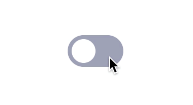
Now that you have all the information you can start making your first interactive component. I’ll show you a very common case by creating a simple switch that has two states (Off and On) and use the variants to replicate those states.

We’ll start by creating a simple switch.

Create A Component

The first step is to create a component.

  • Using the Rectangle tool (R), create a grey rectangle (#A7A9BC) 56x32 pixels in size and apply a corner radius of 16 px.
  • Using the Ellipse tool (O) create a white circle (#FFF) 24x24 pixels in size and place it over the rectangle in the left part, leaving 4 px of spacing. This is how it should look:

  • Combine these two elements into a single component using Ctrl/Cmd + Alt + K (or using the Component icon from the top bar in Figma):

Note: Here and in other places, I will use the Windows/Mac universal key notation, where the Ctrl key in Windows corresponds to the Cmd key on the Mac; Alt in Windows is the equivalent of Alt/Option on the Mac, so I’ll use Alt for short, and Shift is the same on both platforms.

Add A Variant

  • Select the component you’ve just created and, in the right panel (inside the Design tab), click on the plus button near Variants:

It will generate a purple frame with a dashed border that represents the group of variants you have.

You should have two variants by now, use the first one for the Off state and the second one for the On state.

  • Apply a different style to the On state to make it the active option, I recommend using a blue background (#0B5FFF) and move the circle to the right.

These are the states of the switch that are going to change from Off to On (and vice-versa) when the user clicks on the switch.

Useful tip: For this case it is not necessary but if you need to add more variants you can select a component inside the box and click the purple plus button, it will add a copy of the selected component and resize the box automatically. (It’s also possible to resize the box manually as if it was a frame and freely duplicate and arrange the variants inside it.)

Alternative approach

As you’ve seen, we’ve created these components by duplicating them inside the variant group but it's also possible to create them individually and combine them as variants, the final result will be exactly the same. If you want to try this method just create and select two components, the right panel will then have another action called “Combine as variants,” click it and done — you will now have the same two variants.

This alternative is really useful when you already have different components and only need to define the variants, if you're working on a library it will help you update it without having to recreate everything from scratch.

Name Your Variants

Naming the variants won’t have a direct effect over the final result (unless you use the same name more than once), but defining the names and hierarchies will help you have everything better organized and understandable for other colleagues that might need to use the prototype for other projects.

By default the main group of variants is named “Property 1”, you can change this from the sidebar when selecting the entire group. I suggest renaming this to “State” since we’re going to use Off and On states.

Renaming a single variant is done by using the same process but you need to select the single variant inside the group and in the same panel you’ll find the names “Default” and “Variant 2” that you can overwrite, for the switch name these should be “Off” and “On”.

As a result, the layer names of the variants will be automatically changed to “State=Off” and “State=On”.

Fun fact: If your component only has two variants and you use the names “Off” and “On”, it will show a switch instead of a dropdown in the destination!

Let’s Make It Interactive!

Now that you have the component and the variants it’s time to apply the interactions.

  • Click on the Prototype tab (at the top-right side of the screen) to open the Prototype panel and activate its features.
  • Select the Off variant (it should have a blue dot) and drag it over the On variant to connect it.

  • Double-check that you have selected the whole variant and not just the background layer, this will make the interaction work even when the user clicks on the circle element.
  • In the Interaction Details panel set the trigger to On Click.
  • Make sure the action is set to Change To.
  • Change the animation to Smart Animate and use Ease In And Out for a natural feeling.

I'll translate these settings into a single sentence to explain what will happen: when the user Clicks on Off State then Change to On State using Smart Animate with Ease In And Out at 300 milliseconds.

  • Apply the same settings to the On State variant so that when clicked again it, will turn off the switch. (Note: Figma will remember the interaction settings applied to the elements inside the group and will apply the same settings when dragging a new interaction so in this case, you would only need to double-check.)

Done! If you want to check if it works you need to include one of the variants into a frame, select the frame and then click on the presentation button (represented by the play icon) that is placed over the tabs.

It should allow you to turn On/Off every switch individually.

However, if you want to see the real power of this feature, duplicate the component in the frame multiple times (at least three or more) and activate them individually in the presentation.

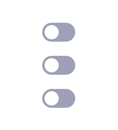
The switch interactive components in action.

Using More Than Two Variants

This feature becomes very powerful when you add multiple variants and connect them individually to make a realistic component. Here is an example where I’ve connected a total of six variants with small changes to the background color to recreate the multiple states of a button, a classic in the web design industry nowadays.
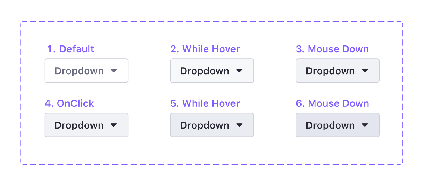
Component States

This is the list of the different states for this component, including also the triggers we’re going to use to change from one variant to another.

  1. Default — Default,
  2. Hover — WhileHover,
  3. Pressed — MouseDown,
  4. Active — MouseUp (It could be possible to use On Click for the same result),
  5. Hover while Active — WhileHover,
  6. Pressed while Active — MouseDown.

Useful tip: It’s possible to use MouseDown to simulate the button being pressed but not released and then use MouseUp to activate a transition, it’s a nice interaction detail that makes the button feel more real.

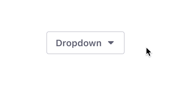
Use the MouseDown trigger before the Click trigger.

Nested Interactive Components

As for the regular components, you can also create nested interactive components.

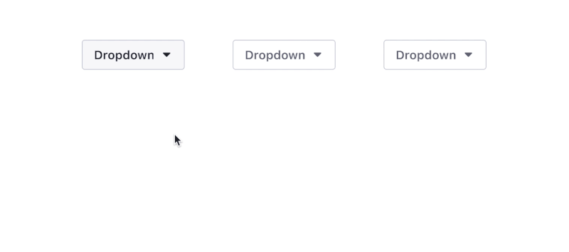
Using the same example of the dropdown it would be possible to create a single interactive component called Dropdown with two interactive components inside it: the Dropdown Button and the Dropdown Menu. This will help you control how the button and the menu interact with each other, allowing you to define which variant of the button will trigger the opening of the menu.

Note: It would be possible to create another nested component for the dropdown menu options and use the override to change the different texts.

The main benefit of using nested interactive components is the new level of modularity that it provides for prototypes, you could define the interactions individually and mix them into infinite interactive components. The Dropdown Menu could be included in other components (a card, for example) without having to prototype how it works every single time.

It’s possible to simulate real Hover and Click effects. (Large preview)

Navigation

We can go even further, it’s also possible to navigate from a variant to an external frame, you can connect the single variant to the frame by using the On Click trigger and Navigate To action. In this example I’ve connected each one of the actions from the Dropdown Menu component to an external frame with a grey rectangle in the same position as the menu (Right, Top, Left, Bottom).

When one of these actions is clicked, it will navigate to the connected frame as it happens with regular prototypes, the real magic happens when you need to reuse the Dropdown Menu for another component, it will have all the interactions inside already done, so you don’t have to connect it over and over again.

This dropdown menu is a great example of how real an interactive component can get. (Large preview)

This workflow and the features of the nested components are amazing for product design cases where you have tons of frames to connect as they will reduce the amount of work required to create a high-fidelity prototype for testing, or even if you want to create a components library for prototypes.

Special Effects

That was all for the introduction to Figma interactive components. As you can see, it’s pretty easy to use this feature to create and connect interactions inside a prototype. But it’s also possible to create various kinds of special effects using variants.

In the following section, I will take a close look at these!

Loops

It’s finally possible to make infinity loops inside Figma without too much effort and also you can create various spinners and loading indicators.

Elements can be resized to create infinite loops. (Large preview)

To create a loop, use the After Delay trigger set to 1 ms to swap the variants automatically and connect at least two of them.

Note: 1 ms is the minimum amount of time we can set in Figma to change from a variant to another and make it an almost instantaneous change; and, thanks to the AfterDelay trigger, it will happen automatically. It’s possible to use a higher delay time if you need the loop to look like it has a pause between the variants.

Rotation

Let me start the next part of the article with a note about how strangely Figma handles rotation.

Figma has a weird way to rotate elements, it seems to be limited from -179º to a maximum of 180º and does not allow to go further than these values. In addition, there is no way to define a rotation direction so if you try to rotate from 0º to 180º and vice-versa, instead of doing a 360º turn, it will first rotate to 180º and then come back to 0º (like a swing).

So, to let the system identify correctly the rotation you will need to use at least three variants.

Here’s how you can do it:

  • Create a component with three variants: VariantA, VariantB, VariantC (for this example I modified an ellipse to make the triangle shape).
  • Apply the following rotation to the elements inside the variants (not the variants themselves).
    • VariantA: set the element to 0º and connect the variant to VariantB.
    • VariantB: set the element to -120º and connect the variant to VariantC.
    • VariantC: set the element to 120º and connect the variant to VariantA to complete the loop.
  • All the interactions should have After Delay (1ms) as a trigger and a Linear easing.

The result will be a neutral spinner that will have three small pauses of 1 ms each because of the variant swap, not perfect but fast and for a prototype, it’s good enough — and you will be probably the only one that will notice the pauses anyway.

Useful tip: You can either use the same animation time for each variant to make a linear loop, or you can play with the animation using a faster time for some variants and a slower time for others, this will simulate a curved easing.

The rotation is the same but the animation times are different. (Large preview)
Complex Spinners

I wouldn’t suggest using Figma interactive components for complex spinners, for such cases it might be better to create the spinner with a dedicated animation app (such as After Effects) and import it into the prototype as a GIF.
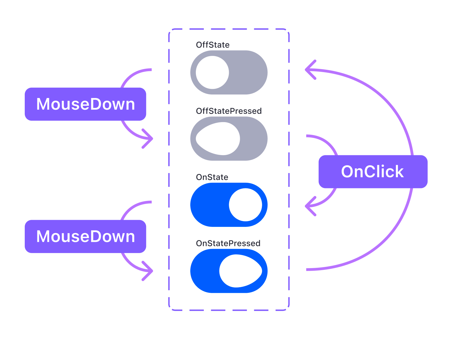
Micro Interactions

Interactive components allow you to include more delightful details into prototypes. I’ll go back to the switch example to show you how to add micro-interactions to this component using MouseDown and On Click.

Do you want to turn a simple switch into an amazing switch?
Component

To recreate this example you need to apply some changes to the structure of the switch:
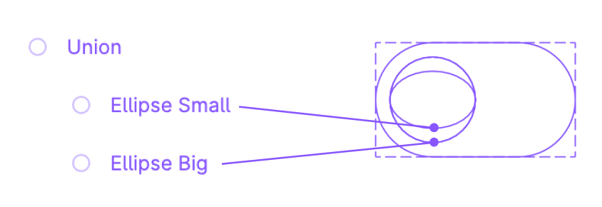
  • Make a copy of the Off state switch that you already created.
  • Create another ellipse shape of 16*24 px, place it over the previous ellipse (the circle).
  • Unify the two ellipses as a boolean group using Union.

  • Learn more about Boolean groups →.

  • Apply 32 px of border-radius to the Union layer, this will create the distortion effect you can see in the example.
  • Create the component (Ctrl/Cmd + Alt + K).
Variants and Prototype

You’ll need a total of four variants to make this work: OffState, OffStatePressed, OnState, and OnStatePressed.

  • Use the Mouse Down trigger to simulate the mouse being pressed and activate the distortion by moving the bigger ellipse 8 px to the other side.
  • Use the On Click trigger to change states from Off to On.

3D Animation With A Sequence Of Images

Before we continue, I want to thank Andrea Cau, the author of this cool 3D sequence that I’m going to use as an example.

This is more of a hack to integrate 3D animations into a Figma prototype, you could also use GIFs but this way you gain full control over the images, not just play/stop, allowing you to create a prototype that simulates an interface to rotate objects, commonly seen in car websites where you can rotate the car.

Imagine an e-commerce website with a 3D model that you can turn around. (Large preview)

In this case, I’ve used nine images (you could use more, or less, depending on the rotation you need), the important steps to reproduce this interaction are:

  • Create one variant per image (in this case 9 variants will be needed) and include one image in each one, following the sequence order.
  • Create the arrow button, it will be the Hotspot.
  • Connect the right arrow to the next variant (repeat for every variant).
  • Connect the left arrow to the previous variant (repeat for every variant).
  • Use the Instant animation instead of Smart Animate to avoid the fade in/out effect and create the illusion of movement.

Conclusion

The more I use this feature the more I think it will be a game-changer for companies working in the areas of web and product design. Mastering interactive components and variants will allow designers to produce better, more advanced, and realistic prototypes with less effort, giving you the freedom to work on the actual designs and focus less on the design tool itself.

As mentioned earlier, I’ve created a Figma community file with the examples from this article (and a few more experiments that I’ve been doing during the testing of the new feature). Once you join the Beta, feel free to duplicate my design, follow along or start experimenting, and share your results! Play with the animation times, change the easing, try to rotate, scale elements, try to nest different interactive components.

If you have questions or something is not entirely clear, leave a question in the Comments section below, or ping me on Twitter (@emi_cicero) — I’d be glad to help! :)

Further Reading

7 Best Free Author Bio Box Plugins for WordPress Compared (2021)

Are you looking for the best free author bio box plugins for WordPress?

Adding an author bio box can help you connect with your readers, boost authority, and even attract new writers to your site.

In this article, we’ll highlight the best free author bio box plugins for WordPress.

7 best free author bio box plugins for WordPress compared (2021)

Why Use an Author Bio Box Plugin for WordPress?

An author bio box plugin lets you customize and display an author bio section at the end of your WordPress posts.

Many WordPress themes have this feature built-in. However, a plugin lets you change how the author bio is displayed, add social media links, and much more.

Author bio example

Adding a custom author bio box section can benefit your WordPress blog in many ways.

  • Improve author credibility and authority with your readers
  • Build a connection between readers and authors
  • Help persuade guest authors to write for your website

With that said, let’s take a look at some of the most popular author bio box plugins for WordPress that you can use on your WordPress website.

1. Simple Author Box

Simple Author Box

Simple Author Box is the best author bio box plugin. What started as a simple way to add a clean author box to your WordPress posts has grown into a very feature rich plugin.

This plugin lets you customize nearly every aspect of your author bio box. You can add an author bio, social media links, and a custom Gravatar.

You also have complete control over the colors, typography, background, and more. There’s an option to show the author’s email address, so your readers can get in touch directly.

The real-time preview box lets you see the changes to your author bio box as you customize it.

If you want even more features, then there’s a pro version that lets you display an author box before or after content, add website links, get more social icon styles, include guest and co-authors, and more.

2. Author Bio Box

Author Bio Box

Author Bio Box is an incredibly simple author bio box plugin that will display an author bio beneath your blog posts.

The author profiles can include an image, social media links, and a short description.

The design of the author profile box is very minimalist, so it won’t distract from the blog content. However, you do have control over the text and title color, background color, and border size.

For more details, see our guide on how to add an author info box in WordPress posts.

3. WP Post Author

WP Post Author

WP Post Author is a simple and easy to use author bio plugin. It seamlessly integrates with your site’s design and will blend into your content.

This plugin will display the author’s avatar, name, company role, a short bio, and social media icons.

You have control over which elements of the author bio will display, along with the alignment of the text and author image.

There are 3 different widgets and a shortcode you can use to display your author bio in your sidebar and other areas of your website.

4. Meks Smart Author Widget

Meks Smart Author Widget

Meks Smart Author Widget lets you add an author bio to any widget area of your site.

You can display an author avatar, a short bio, links to social media, and a link to the author profile page that lists all their articles.

This can be a great way to add a good looking author bio widget to your WordPress sidebar. The plugin set up is fairly straightforward, and it uses an auto-detect feature to find the correct post author and display their bio instantly.

Since the plugin will fetch author information from their WordPress profile, you need to make sure that all authors fill out their author information by editing their profiles.

5. Starbox

Starbox

Starbox is a feature rich and easy to use author bio box plugin. The goal is to make it as easy as possible to create a custom author bio box.

You’ll find a few different themes you can use to customize your author bios.

With this plugin, you can create unique author bio boxes for every author on your website. You have control over social media profiles, name, job or role, image, and more.

There’s even the option to add a tabbed author bio that includes the latest posts from that author.

If you’re running an online store, then this plugin can integrate with WooCommerce to display unique author bios as well.

6. Molongui Authorship

Molongui Authorship

Molongui Authorship is a great WordPress author bio box plugin that lets you display an author box, co-authors, and guest contributors.

This plugin makes it easy to create author bios and guest author bios without creating a WordPress account.

If you want to add additional authors and co-authors to WordPress, then see our guide on how to add new users and authors to your WordPress blog.

There are many customization options, including multiple layouts, colors, typography, author avatars, social media icons, and more. You can also control whether the author bio displays above or below the content.

Plus, you can fully customize the author bio using the WordPress Customizer, which makes things easy.

7. All in One SEO

AIOSEO

All in One SEO is the best WordPress SEO plugin in the market used by over 2 million websites.

It’s the most comprehensive SEO toolkit and will help you improve your search engine rankings without having to learn the ins and outs of SEO.

The setup wizard will help you pick the perfect SEO settings for your WordPress website, and you can start optimizing with the built-in SEO checklist.

You’ll also find a feature that will help you improve your author profile pages. By default, your author profile pages display a list of posts from respective author’s on your site.

These can help your readers find more content from their favorite author, and it can also help you get more search engine traffic.

AIOSEO add Twitter and Facebook

AIOSEO expands the default WordPress author profile and lets you add social media links in the meta data.

You can connect your Facebook and Twitter profiles to make your author profiles and author bio more engaging.

Author profile links

For more details, see our guide on how to display author’s Twitter and Facebook on the profile page.

Note: there is also a premium version of the AIOSEO available that offers even more advanced SEO features to help your website get more traffic from the search engines.

We hope this article helped you find the best free author bio box plugin for WordPress. You may also want to see our guide on how to change the author of a post in WordPress and our expert picks of the must have WordPress plugins for business websites.

If you liked this article, then please subscribe to our YouTube Channel for WordPress video tutorials. You can also find us on Twitter and Facebook.

The post 7 Best Free Author Bio Box Plugins for WordPress Compared (2021) appeared first on WPBeginner.

WordPress 5.8 Adds Support for New Emoji Introduced in Twemoji 13.1.0

In the upcoming 5.8 release, WordPress is updating its version of Twemoji, Twitter’s open source emoji library that supports the latest Unicode emoji specification. Version 13.1.0 introduces five new smileys and emotions, including heart on fire, mending heart, face with spiral eyes, face in clouds, and face exhaling.

Version 13.1 adds mixed skin tone support for all variations of the “Kiss” emoji and the “Couple with Heart” emoji. It also makes it possible to add a bearded man or a bearded woman in all skin tone variations.

WordPress 5.8 will also include significant changes to the syringe emoji that were committed to a previous version of Twemoji (13.0.2) earlier this year. Instead of a blood-filled barrel accented with drops of blood leaking out of the tip, the new syringe emoji contains a non-specific liquid. This makes it more flexible for use cases that don’t involve removing blood. Emojipedia has a fascinating look at the syringe emoji’s history, dating back to 1999 when it was primarily used in Japan for blood donation. A 2021 refresh on the syringe makes it possible for it to be used in reference to vaccines, a topic of public conversation across the globe.

In addition to changes to the syringe, Jonathan Desrosiers, who opened the trac ticket to initiate the update, summarized a few other changes from previous Twemoji versions that modify existing emoji:

  • Cricket: the colors have been adjusted to improve readability on small screens and to prevent confusion with other Emoji that had a similar color.
  • T-Rex: The color and posture of the T-Rex has been adjusted.
  • Portuguese flag: A line within the flag’s circle has been corrected.
  • Thai flag: The proportions of the stripes for this flag have been corrected.
  • Fox face: The symmetry has been improved.
  • Transgender flag: The lines have been updated to prevent small gaps between stripes from showing when rendered with antialiasing.
  • Rolling on the floor laughing: Adjusted to be less exaggerated and appear more natural.

The official emoji lexicon is constantly being tweaked and updated for accuracy, and to better serve conversations, as current events increase demand for visual representations of specific objects and emotions. Although many of these updates and new additions may seem pandemic-inspired, there’s a lengthy, official process for proposing changes to the Unicode Consortium. The Unicode Emoji Subcommittee reviews proposals, which require compelling data on compatibility, expected usage level, distinctiveness, and other factors. Candidates approved for inclusion do not arrive to major platforms for approximately a year.

WordPress 5.8 will bump Twemoji from 13.0.1 to 13.1.0. Unicode 14.0, the next major update, is expected for release in late 2021. Emojipedia has a draft list of what is on deck for the next version and those that are approved would likely make it to major platforms by the end of 2022.