Basic React Navigation for React Native Apps
Introduction
Creating an intuitive navigation UI is essential for any mobile app. Because we build custom software at SmartLogic, most of our mobile apps require different navigation setups, but they often have a lot in common. We use React Navigation which makes it easy for users to move across different screens. Built-in options allow us to quickly add UI features while also being fully customizable. In this post, I'll walk through a basic React Navigation pattern we've used and the steps to get it up and running.
Below is an example of the architecture of common patterns we use. We have the main navigation for our app, different navigation stacks (more on this later), screens and a tab navigation setup as well.
Agora.io Releases Agora Video Chat SDK for Unity Game Developers
Agora.io, a provider of voice, video, and live interactive streaming solutions, has announced the release of the Agora Video Chat SDK for Unity. This new SDK will allow game developers to embed video chat directly into their games. With this release, Agora.io is now a Unity Verified Solutions partner.
Bluehost Web Hosting Review (2019)
If you’re on the hunt for a new web hosting service, Bluehost is definitely a top option to consider. This platform powers more than 2 million sites across the globe.
All web hosting services are not created equally.
I see so many new webmasters make the mistake of just going with the cheapest web host or the web hosting site that appears first in their Google search results.
For something as important as web hosting, you can’t rush this decision. It’s crucial that you take the time to weigh your options in order to find the best web hosting plan for your needs.
That’s what inspired me to write this guide. Since so many of you will likely come across Bluehost during your search, I wanted to give you as much information about this web hosting service as possible.
I’ll explain all of their hosting plans, pricing, and discuss the best parts about using Bluehost. I’ll even tell you about a couple of cons associated with Bluehost, just to make sure you have all the facts before you sign up.
Bluehost Web Hosting Plans
Not every website has the same web hosting needs. Bluehost knows this and has three different types of web hosting options for you to choose from.
- Shared
- VPS (virtual private server)
- Dedicated server
Choosing which kind of web hosting plan to go with will vary based on how much you want to pay, your expected site traffic, and the type of website you have. If these terms are foreign to you, I recommend reading my guide on everything you need to know about web hosting. This will give you a more detailed description of the differences between these hosting options.
Shared hosting

If you have a new website and you’re on a tight budget, shared hosting might be your best option. Bluehost offers four different pricing plans for its shared hosting services.
- Basic — $3.95 per month
- Plus — $5.95 per month
- Choice Plus — $5.95 per month
- Pro — $13.95 per month
I know what some of you are thinking. If Plus and Choice Plus are priced the same, wouldn’t you automatically go with Choice Plus?
All Bluehost plans go up in price once you renew. The advertised prices above are just the introductory rates. It’s worth noting that Plus renews at $10.99 per month, while Choice Plus renews at $14.99 per month.
Bluehost has managed shared hosting platforms, meaning you won’t have to worry about managing servers or anything like that.
VPS hosting

VPS hosting from Bluehost is the middle-tier option of the three plans. There are three pricing options for a Bluehost virtual private server.
- Standard — $19.99 per month
- Enhanced — $29.99 per month
- Ultimate — $59.99 per month
The biggest differences in these plans are the cores, SSD storage, RAM, bandwidth, and IP addresses.
With the Standard plan, you’ll get 1 core, 30 GB of SSD storage, 2 GB of RAM, 1 TB of bandwidth, and 1 IP address. Cores, SSD storage, and RAM double at each tier for the Enhanced and Ultimate packages.
Using Bluehost for a VPS gives you dedicated server resources. You’ll be able to use your RAM, CPU, and disk space, no matter what other users on the same server are doing. VPS hosting also has increased security, since you won’t be sharing an operating system with any other Bluehost users.
Dedicated hosting

Picking a dedicated server plan from Bluehost means you’ll be taking advantage of their top of the line services. These plans are made for those of you who are tech-savvy and want complete control over your server.
- Standard — $79.99 per month
- Enhanced — $99.99 per month
- Premium — $119.99 per month
As you can see, top-tier plans come at higher price points. With VPS hosting, you’re maxed out at 120 GB of SSD storage, 8 GB of RAM, 3 TB of bandwidth, and 2 IP addresses. But dedicated servers from Bluehost go all the way up to 1 TB of storage, 16 GB of RAM, 15 TB of bandwidth, and 5 IP addresses.
These plans will probably exceed the needs and uses for what most of you are looking for. But with that said, as your website grows and your traffic scales, you might want to consider a dedicated server in the future.
Benefits of Bluehost for web hosting
Now that you have a better understanding of the plans offered by Bluehost, it’s time for us to discuss what makes Bluehost a great choice for web hosting.
Low pricing options
If you have a brand new website, you don’t need to be spending thousands of dollars per year on web hosting. With Bluehost, you won’t have too.
As you’ve already seen, the introductory rates for Bluehost shared web hosting starts at just $3.95 per month. Being able to host your site for less than $50 is a great deal.
All Bluehost shared hosting plans come with a free SSL certificate and free marketing credits. When you factor in the storage and bandwidth you’re getting, that’s a fairly decent value for the price.
Overall, this is one of the lowest prices you’ll see for a legitimate web host.
Great security
Even though Bluehost has some inexpensive pricing options compared to other web hosts on the market today, it doesn’t mean that they’re inferior when it comes to crucial security features.
I’ve already mentioned that an SSL certificate comes standard, regardless of which plan you choose.
Furthermore, their plans have a feature to hide the personal information that you used when signing up for a private domain. Lots of times hackers will target this information from website owners.
Bluehost has features to prevent malware attacks, as well as tools used for automatic daily backups. You’ll also get a security tool that offers spam protection for the email address associated with your website.
Again, this is all a great value considering how much these plans go for.
Top loading speeds
Page loading speed is something that always needs to be taken into consideration when you’re shopping around for the best website host.
If your site takes too long to load, it’s going to kill your engagement metrics. People will abandon your site, and you won’t be able to drive conversions. It’s as simple as that.
So let’s take a look the response time for a Bluehost test website.
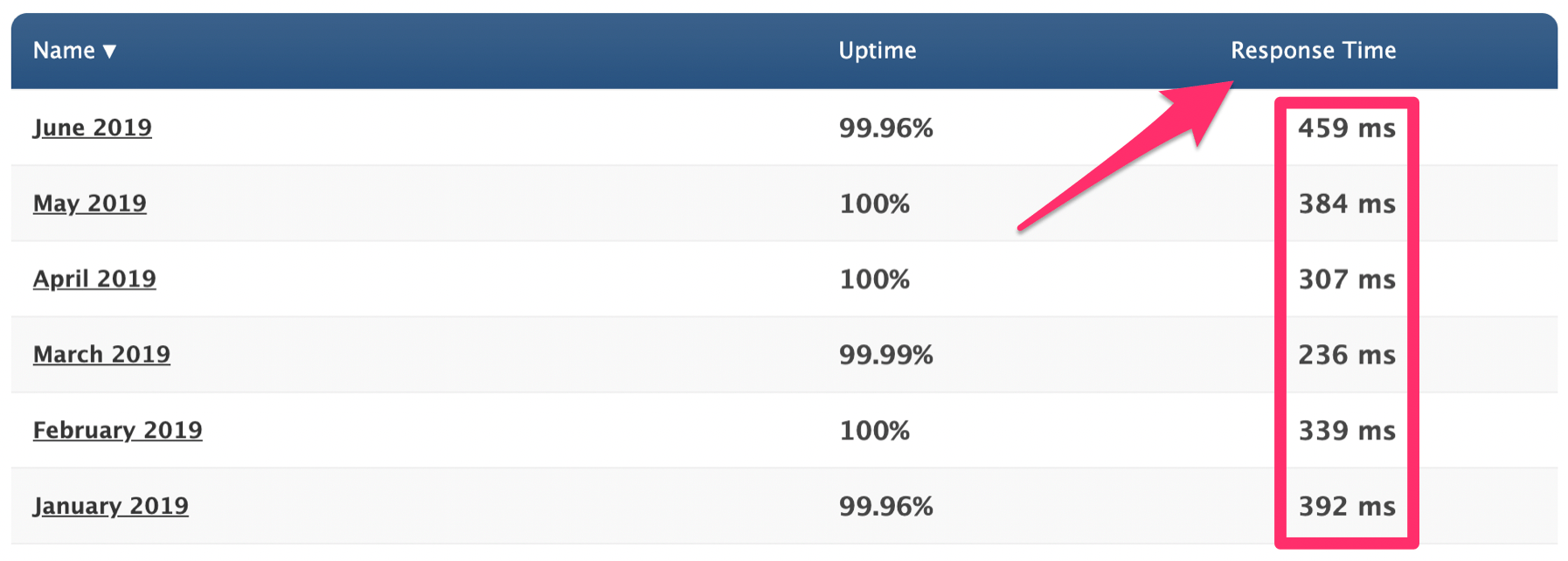
The average response time for Bluehost so far in 2019 is 352 ms. To put that into perspective, refer to my SiteGround web hosting review. SiteGround’s average response time over the same period of time was 662 ms, which is still fast.
Bluehost nearly cuts that time in half.
Easy to use
You don’t need to be a tech expert to host your website with Bluehost. Nearly anyone, regardless of their experience level, can find a beginner hosting plan from this platform.
That’s definitely not the case with all web hosting providers on the market today. There are plenty of web hosts out there that are specifically designed for advanced webmasters.
Whether you’re using WordPress or taking advantage of the Bluehost website builder, everything will be pretty straightforward and easy to follow.
Excellent support
Even though Bluehost is easy to figure out, you may still find yourself in a situation where you need some help or guidance.
In most cases, you should able to find an answer through their knowledge base page. This is essentially a support center that has how-to guides, tutorials, and articles with instructions for troubleshooting and FAQ. Simply search what you’re looking for, and there will likely be a resource to help you out.
Furthermore, Bluehost has 24/7 phone support, which is great for those of you who like to be talked through problems.
If you’re like me, you’ll probably just take advantage of their live chat agents. It’s a fast and easy way to get an answer without having to leave their website.
High uptimes
You can’t give a web hosting review without referring to uptime rates. Take a look at where Bluehost stacks up compared to other web hosting providers in this recent study.
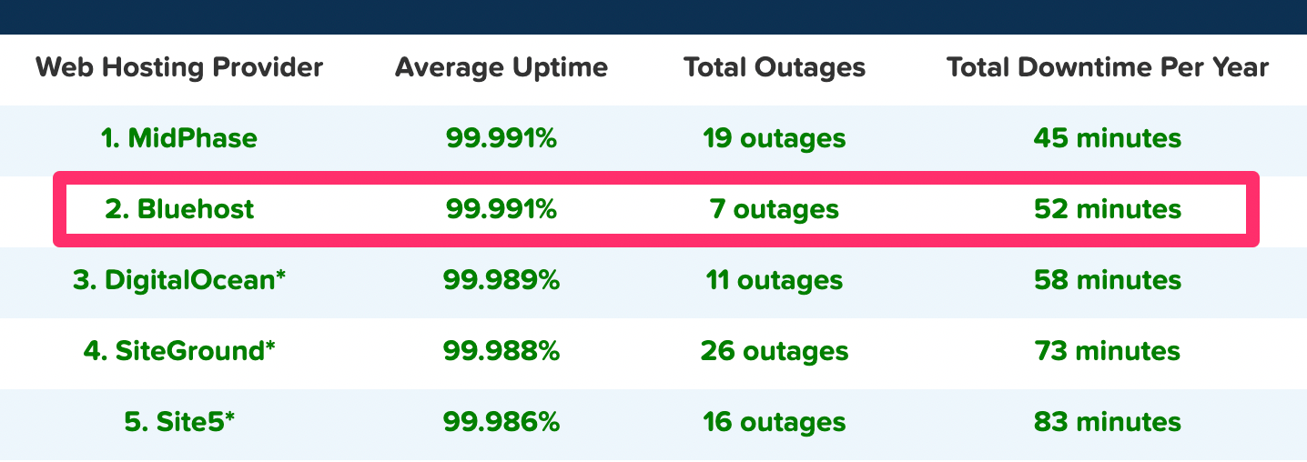
Bluehost ranked second on the list with a 99.991% average uptime for the year. That percentage is identical to MidPhase, which ranked first on the list.
Furthermore, you can see that Bluehost only had seven total outages on the year, which was the lowest for all hosts in the top five, including the top-ranking provider on the list.
It really doesn’t get much better than that. So if you host your website with Bluehost, you can rest assured knowing that your site isn’t going to have much downtime throughout the year.
Money-back guarantee
Like most web hosting services, you won’t get a free trial to try them out. But with that said, Bluehost does offer a 30-day money-back promise.
So if you’re on the fence about using Bluehost, it’s comforting to know that you’ll get refunded if you’re not ultimately satisfied in the first month.
But with that said, it’s worth noting that the refund only applies to web hosting costs. So if you use Bluehost for a domain name or other add-ons, those purchases are final.
WordPress hosting
If you’re using WordPress, Bluehost is definitely a top option for you to consider. That’s because this web host is just one of the three “official” recommended choices from the WordPress website.
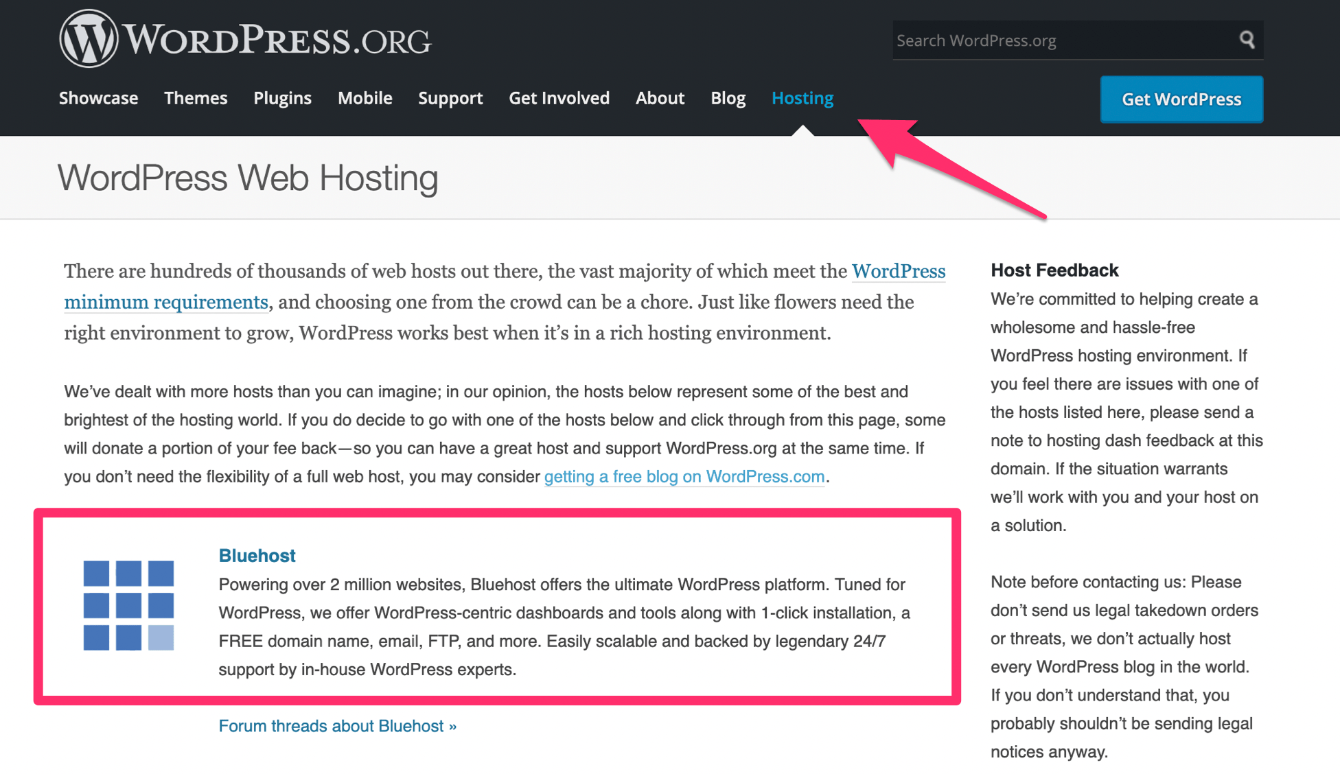
DreamHost and SiteGround are the other two recommended web hosting services on this WordPress resource.
With that said, you can still use nearly any other web hosting service on the market to create your WordPress website. But it’s definitely a positive sign that Bluehost is recognized as a WordPress partner.
Other considerations
While Bluehost has its fair share of positive characteristics, it’s still not perfect. I wouldn’t be doing my job if I didn’t mention some of the shortcomings of this web host.
High renewal rates
I briefly mentioned this before when we were discussing the different plans and pricing options. Like many other web hosting services, Bluehost jacks up the prices once you renew your subscription.
Depending on your plan, the monthly rate will change as follows:
- $3.95 to $7.99
- $5.95 to $10.99
- $5.95 to $14.99
- $13.95 to $23.99
- $19.99 to $29.99
- $29.99 to $59.99
- $59.99 to $119.99
- $79.99 to $119.99
- $99.99 to $159.99
- $119.99 to $209.99
As you can see from this list, in some instances the price more than doubles. So it’s in your best interest to commit to a longer term plan if you want to get the best rate for the longest amount of time.
Bluehost offers plans for 12, 24, or 36 months. So if you know that you’re ready to commit to this web host, I’d recommend going with a three-year contract when you first sign up. It will save you money down the road.
Costly site migrations
It seems like the majority of web hosting services out there will migrate your current website to their service at no cost. This is a major selling point for new customers.
However, Bluehost does not offer free website migrations.
For $149.99 they’ll migrate up to five websites and 20 email accounts. This gets handled by experts at Bluehost, so you won’t have to do any heavy lifting.
But with that said, you do have to pay for it, which can be a turn-off for those of you with an existing site.
Conclusion
Simply put, I definitely recommend Bluehost as a web hosting provider. There’s a reason why it’s one of the most popular services on the market today.
Bluehost has exceptionally fast loading times as well as one of the highest uptime rates we’ve seen in the last year.
They offer different hosting types, plans, and options to meet the needs of any website. I’m sure you’ll be able to find a plan from Bluehost that is suitable for your web hosting needs.
Are We More Likely to Trust Machines With Private Information Than Humans?
Recently, concern has been aired around just what kind of information devices such as Amazon’s Alexa is consuming as it sits quietly in our homes. While various people have voiced concern about such a possibility, recent research from Penn State suggests that consumers are pretty relaxed by it all.
The research finds that people are generally more willing to trust machines with private information than we are human beings. The authors believe that the ‘machine heuristic’ imbues people with greater trust in technology than humans, as people are capable of dishonesty and fraud.
Design Considerations for Real-Time Operational Data Architectures for Industry 4.0
The fourth Industrial Revolution brought cyber-physical systems to the manufacturing floor, leading to to the production of data at an unforeseen volume. Most of the current statistical process control systems (SPCs) were designed in the Industry 3.0 era, and they use only a fraction of the data produced on production lines to monitor the production quality.
However, to ensure waste reduction and yield increases, new age manufacturing systems need real-time operational data replication and analysis to improve. This article lists the key design considerations for real-time operational data architecture.
Cronjob is running once, but reports are generating twice
Team,
Hope you all are doing fine
I have one admin server which is being used dedicately to run cron jobs on hourly basis, fetching the details from Database which is in a different server.These cronjob are run on every hourly/5 minutes basis depending as per end user requirement.
The cron jobs are basically reports which end users need for their records
OS version is Red Hat Enterprise Linux Server release 6.6 where the cronjob is set
Now the tricky point:
1)Since last week, everything was getting run once, but when we query the database we are seeing duplicate entries for each cronjobs and the reports are published twice
2) Also, even when I have disabled/removed/changed the timestamp from crontab, we still see the duplicate entries on the database.
Need to find out why this is happening and its remedy,Can anyone guide please.
Regards
Whizkid
A Production-Ready Checklist for Kubernetes
How do you know when you're ready to run your Kubernetes cluster in production? In this blog series, we're going to look at what's typically included in a Production Readiness checklist for your cluster and your app.
These checklists were put together by Brice Fernandes (@fractallamda), a Weaveworks customer success engineer. If you're lucky enough to attend an upcoming hands-on workshop led by Brice, production readiness will be a topic that he'll be deep diving on.
Main Factors to Consider When Evaluating API Management Platforms
The last decade has seen a slew of key technology developments, namely REST/Hypermedia(HATEOAS) and microservices architecture styles, Security (OAuth, SAML, OpenID), Cloud Computing, which have helped facilitate the API driven Digital Transformation initiatives within organizations.
As organizations need to adapt business applications to changing business strategy to be competitive, the need to provide business capabilities via applications on multiple devices(mobile, tablet, web) is urgent and means for easy integration with vendor and partner applications both internal and external is critical.
Achieving Application Consistent Recovery Points of SQL Server 2008 R2 With Azure Site Recovery in Azure
If you want to use ASR to replicate SQL Server 2008 R2 standalone or clustered instances, you will need to update the SQL Writer to 2012 or later.
You can use SQL express version as it is a free download.
Design Your Mobile Emails To Increase On-Site Conversion
Design Your Mobile Emails To Increase On-Site Conversion
Suzanne ScaccaI find it interesting that Google has pushed so hard for web designers to shift from designing primarily for desktop to now designing primarily for mobile. Google’s right… but why only focus on designing websites to appeal to mobile users? After all, Gmail is a leader within the email client ranks, too.
Email can be an incredibly powerful driver of conversions for websites, according to a 2019 report from Barilliance.
On average, emails convert at a rate of 1.48%. That includes all sent emails though — which includes the ones that go unopened as well as the ones that bounce. If you look at emails that are opened by recipients, however, the average conversion rate jumps to 17.75%.
Let’s go even further with this:
Recent data from Litmus reveals that more emails are opened on mobile than on any other device:

Many sources even put the average mobile open rate at well over 50%. But whether it’s 43% or 50%+, it’s clear that mobile is most commonly the first device people reach for to check their emails.
Which brings us to the following conclusion:
If users are more likely to open email on mobile and we know that opened emails convert at a higher rate than those that go unopened, wouldn’t it make sense for designers to prioritize the mobile experience when designing emails?
Mobile Email Design Tips to Increase Conversions
Let’s explore what the latest research says about designing emails for mobile users and how that can be used to increase opens, clicks and, later, your website’s conversion rates (on mobile and desktop).
Design the Same Email for Mobile and Desktop
Although email is often ranked as the most effective marketing channel for acquiring and retaining customers, that’s not really an accurate picture of what’s going on.
According to Campaign Monitor, here’s what’s actually happening with mobile email subscribers:
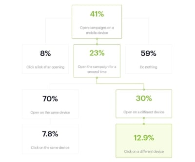
The open rates on mobile are somewhat on par with the Litmus data earlier.
However, it can take multiple opens before the email recipient actually clicks on a link or offer within an email. And guess what? About a third of them make their way over to desktop — where they convert at a higher rate than those that stay on mobile.
As the report states:
Data from nearly 6 million email marketing campaigns suggests the shift to mobile has made it more difficult to get readers to engage with your content, unless you can drive subsequent opens in a different environment.
I’ve reconstructed the graphic above and filled it with the number of people who would take action from an email list of 1,000 recipients:
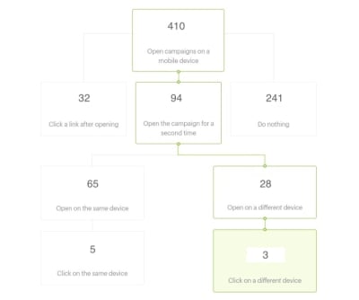
At first glance, it looks as though mobile is the clear winner — at least in terms of driving traffic to the website. After the initial mobile open, 32 subscribers go straight to the website. After a few more opens on mobile, 5 more head over there.
Without a breakdown of what the user journey looks like when opened on desktop, though, the calculation of additional clicks you’d get from that portion of the list isn’t so cut-and-dried.
However, let’s assume that Litmus’s estimate of 18% desktop opens is accurate and that Campaign Monitor’s 12.9% click-through rate holds true whether they open the email first on mobile or desktop. I think it’s safe to say that 23 desktop-only email opens can be added to the total.
So, that brings it to:
37 clicks on mobile vs 26 on desktop.
Bottom line: while mobile certainly gets more email subscribers over to a website, the conversion-friendliness of desktop cannot be ignored.
Which is why you don’t want to segment your lists based on device. If you want to maximize the number of conversions you get from a campaign, enable subscribers to seamlessly move from one device to the other as they decide what action to take with your emails.
In other words, design the same exact email for desktop and mobile. But assume that the majority of subscribers will open the email on their mobile device (unless historical data of your campaigns says otherwise). Then, use mobile-first design and marketing tips to create an email that’s suitable for all subscribers, regardless of device.
Factor in Dark Mode When Choosing Your Colors
You don’t want there to be anything that stands in your users’ way when it comes to moving from email to website. That’s why you have to consider how their choice of color and brightness for their mobile screen affects the readability or general appearance of your email design.
There are a number of ways in which this can become an issue.
As we hear more and more about how harmful blue light from our devices can be, it’s no surprise that Dark Mode options are beginning to roll out. While it’s prevalent on desktops right now, it’s mostly in beta for mobile. The same goes for email apps.
That said, smartphone users can hack their own “Dark Mode” of sorts. This type of color inversion can be enabled through the iPhone’s “Accessibility” settings.
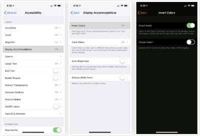
Essentially, what this does is invert all of the colors on the screen from light to dark and vice versa.
Unfortunately, the screenshotting tool on my iPhone won’t allow me to capture the colors exactly as they appear. However, what I can show you is how the inversion tool alters the color of your email design.
This is an email I received from Amtrak last week. It’s pretty standard with its branded color palette and brightly colored notices and CTA buttons:

Now, here is what that same email looks like when viewed through my iPhone’s “Smart Invert” setting:

The clean design of the original with the white font on the deep blue brand colors is gone. Now, there’s a harsh mix of colors and a hard-to-read Amtrak logo in its place.
You can imagine how this kind of inconsistent and disjointed color display would create an off-putting experience for mobile users.
But what do you expect them to do? If they’re struggling with the glare from their mobile device, Dark Mode (or some other brightness adjustment) will make it easier for them to open and read emails in the first place. Even if it means compromising the appearance of the email you so carefully designed.
One bright spot in all this is that the official “Dark Mode” being rolled out to iPhone (and, hopefully, other smartphones) soon won’t alter the look of HTML emails. Only plain-text messages will be affected.
However, it’s important to still be mindful of how the design choices you make may clash with a surrounding black background. Brightly colored backgrounds, in particular, are likely to clash with the surrounding black of your email app.
How do you solve this issue? Unfortunately, you can’t serve different versions of your email to users based on whether they’re viewing it in Dark Mode or otherwise. You’ll just have to rely on your own tests to confirm that potential views in Dark Mode don’t interfere with your design or message.
In addition to the standard testing you do, set your own smartphone up with Dark Mode (or its hack counterpart). Then, run your test email through the filter and see what happens to the colors. It won’t take long to determine what sort of colors you can and cannot design with for email.
Design the Subject Line
The subject line is the very first thing your email subscribers are going to see, whether it shows up as a push notification or they first encounter it in their inbox. What do you think affects their initial decision to click open an email rather than throw it in the Trash or Spam box immediately? Recognizing the Sender will help, but so will the attractiveness of the subject line.
As for how exactly you go about “designing” a subject line, there are a few things to think about. The first is the length.
Marketo conducted a study across 200+ email campaigns and 2 million emails sent to subscribers. Here is what the test revealed about subject line length:

Although the 4-word subject line resulted in the highest open rate, it had a poor showing in terms of clicks. It was actually the 7-word subject line that seemed to have struck the perfect balance with subscribers, leading 15.2% of them to open the email and then 10.8% of them to click on it.
While you should still test this with your own email list, it appears that seven words is the ideal length for a subject line.
Next, you have to think about the buzzwords used in the subject line.
To start, keep this list of Yesware’s Spam Trigger Words out of it:
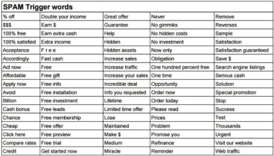
If you want to increase the chance the email will be opened, read, clicked on and eventually convert on-site, you have to be savvy about which words will appear within the subject line.
What I’d suggest you do is bookmark CoSchedule's Email Subject Line Tester tool.
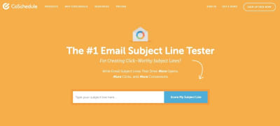
Here’s an example of how CoSchedule analyzes your subject lines and clues you in to what increases and decreases your open rates:
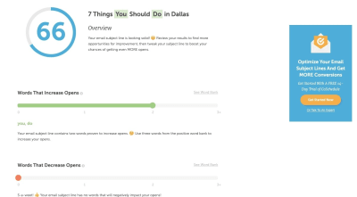
As you can see, CoSchedule tells you which kinds of words increase open rates as well as those that don’t. Do enough of these subject line tests and you should be able to compile a good set of wording guidelines for your writers and marketers.
Further down, you’ll get more insight into what makes for a strongly worded and designed subject line:
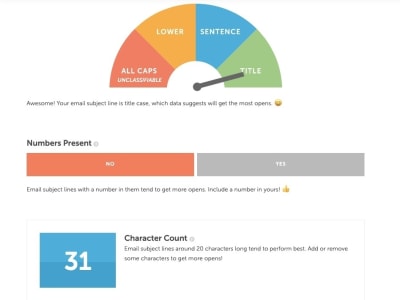
CoSchedule will provide recommendations on how to shorten or lengthen the character and word counts based on best practices and results.
Finally, at the very bottom of your subject line test you’ll see this:
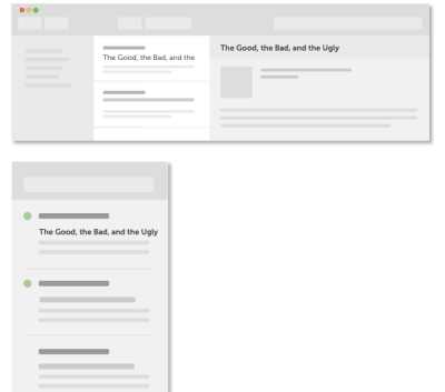
This gives you (or, rather, your writer) a chance to see how the subject line will appear within the “design” of an email client. It’s not a problem if the words get cut off on mobile. It’s bound to happen. However, you still want everything that does appear to be appealing enough to click on.
Also, don’t forget about dressing up your subject lines with emoji.
When you think about it, emoji in mobile email subject lines make a lot of sense. Text messaging and social media are ripe with them. It’s only natural to use this fun and truncated form of language in email, too.
Campaign Monitor makes a good point about this:
If you replace words with recognizable emoji, you’ll create shorter subject lines for mobile users. Even if it doesn’t shorten your subject line enough to fit on a mobile screen, it’s still an awesome way to make it stand out from the rest of your subscribers’ cluttered inboxes.
The CoSchedule test will actually score you based on how (or if) you used emoji, too:

As you can see, CoSchedule considers this a competitive advantage in marketing.
Even just looking at my own email client, my eye is instantly drawn to the subject line from Sephora which contains a “NEW” emoji:

Just be careful with which emoji you use. For starters, emoji are displayed differently from device to device, so it may not have the same effect on some of your subscribers if it’s a more obscure choice.
There’s also the localization aspect to think about. Not every emoji is perceived the same way around the globe. As Day Translations points out, the fire symbol is one that could cause confusion as some countries interpret it as a literal fire whereas some may view it as a symbol for attraction.
That said, emoji have proven to increase both open rates and read rates of emails. Find the right mobile-friendly emoji to include in your subject line and you could effectively increase the number of subscribers who visit your website as a result.
Wrap-Up
There are so many different kinds of emails that go out from websites:
- Welcome message
- Post-purchase transaction email
- Abandoned cart reminder
- Promotional news
- Product featurette
- New content available
- Account /rewards points
- And more.
In other words, there are plenty of ways to get in front of email subscribers.
Just remember that the majority of them will first open your email on mobile. And some will reopen it on mobile over and over again until they’re compelled to click on it or trash it. It’s up to you to design the email in a way that motivates them to visit your website and, consequently, convert.
Further Reading on SmashingMag:
- Everything You Need To Know About Transactional Email But Didn’t Know To Ask
- The Current State Of Email Marketing Programming: What Can And Can’t Be Used
- Level-Up Email Campaigns With Customer Journey Mapping
- How Mail.Ru Reduced Email Storage From 50 To 32 PB
 (ra, yk, il)
Migrating to MRTK2: Missing Singleton and 3DTextPrefab
If you are migrating from the HoloToolkit to Mixed Reality Toolkit 2 'cold turkey,' as I am doing for my AMS HoloATC app, a lot of things break, as I already said in the first post of this series. For things that you can tap, you can simply change the implementing interface from IInputClickHandler or IManipulationHandler to a couple of other interface and change the signature a bit — that's not complex, only tedious, depending on how much you have used it.
What I found really hard was the removal of the Singleton class and the 3DTextFab. I used both quite extensively. The first one I needed for like data access classes as the concept of services that was introduced in the Mixed Reality Toolkit 2 was not yet available, and the other... well basically all my texts were 3DTextPrefabs so any kind of user feedback in text format was gone. Because so much breaks at the same time, it's very hard to step by step rebuilding your app to a working condition. Basically you have to change everything before something starts to work again. Since I was still learning by doing, there was no way to test if I was doing things more or less right. I got stuck and took a radical approach.
Five-Minute Friday #003: Top Java (Web) Frameworks and Skills Companies Look for in 2019 [Video]
Questions answered in this episode:
"What are the top used frameworks, tools, and libraries in Java — at least in the web industry?", "Is JSF still a thing?", "Is GWT still alive?", and "what happens to those frameworks?"
26 Best Beaver Builder Themes and Templates
Are you looking for the best Beaver Builder themes and templates?
There are many WordPress themes and templates built specifically for Beaver Builder to help you quickly create professional websites. Using such a theme or template makes the process a lot faster without compromising on design.
In this article, we will share some of the best Beaver Builder themes and templates that you can use.

What Is Beaver Builder?
Beaver Builder is one of the best drag and drop WordPress page builder plugins on the market. It allows you to easily create beautiful websites and landing pages without writing any code.

Using the point-and-click tools, you can create highly engaging designs with a live preview. You can customize every aspect of your layouts, including custom headers, footers, sidebars, and widgets.
By default, Beaver Builder comes with dozens of ready-made templates that you can use as a starter point. It works with any WordPress theme, but using Beaver Builder-ready themes gives you even more flexibility. For more details, see our Beaver Builder review.
Expert Tip: If you are looking for a Beaver Builder alternative, then we recommend SeedProd. It’s a powerful WordPress page builder that lets you easily create custom landing pages, layouts, and themes.
Here’s how to create a completely custom WordPress theme with SeedProd (no code required).
What’s the Difference Between WordPress Theme vs. Template?
A WordPress theme is a complete package including the design, layout, features, and web pages for your site. You can use a theme to create your website without the help of any other resource. It comes with all the coding files and CSS that you need to style your website.
On the other hand, a page template is a single page layout that you can use to create landing pages or other custom pages such as a coming soon page, about us page, etc.
You can also make single page websites with WordPress templates. However, you’d still need to use third-party WordPress plugins to add features and functionality to your site.
Now that you know the difference between WordPress theme vs. template, let’s take a look at the best Beaver Builder themes and templates for your website.
Note: You also need a domain name and web hosting for your website before you can install a theme. A domain name is your site’s address on the web, like wpbeginner.com or google.com. Web hosting is the storage for all your website files.
If you don’t yet have web hosting, Bluehost is offering a great deal for WPBeginner readers. This gives you cheap web hosting plus a FREE domain name and SSL certification.

Once you have your web hosting account set up, you need to install WordPress. Then, you can choose from our best Beaver Builder themes and templates.
Best Beaver Builder Themes
There are hundreds of WordPress themes that are compatible with Beaver Builder.
However, the themes below have gone through additional review to make sure they are compatible with Beaver Builder. We specifically tested each of these themes with the Beaver Builder plugin to make sure that they work as they should.
1. Astra

Astra is a popular WordPress multi-purpose theme built for all types of websites. It’s fully compatible with drag-and-drop page builders, including Beaver Builder, as well as other options like Elementor. It also comes with dozens of starter sites and demos that you can import with 1-click and edit with Beaver Builder.
Astra is one of the best WordPress themes. It’s feature-rich with paid extensions and add-ons to add more options to your WordPress website. Every aspect of theme design can be fully customized, and you can even create your own custom layouts.
Even the free version of Astra is designed for good SEO (search engine optimization). This helps your website rank well in Google and other search engines.
2. Hestia Pro

Hestia Pro is a powerful WordPress theme that works great with Beaver Builder as well as with other popular page builder plugins.
With Hestia Pro, you get a 1-click demo content installer to help you get started right away. You can use Beaver Builder to change the content and images on the web pages.
This theme works with all popular WordPress plugins to extend functionality and add more features. Hestia Pro also fully supports WPML to create a multilingual WordPress site.
3. OceanWP

OceanWP is an excellent WordPress theme that fully integrates with Beaver Builder to customize your website. It’s packed with dozens of layouts and templates. You can install a web template to set up the structure of your website and make changes to the layout using Beaver Builder.
It comes with multiple color schemes, fonts, parallax scrolling, background images, and custom widgets. It’s also highly optimized for SEO to help you get more traffic from search engines.
4. Sydney Pro

Sydney Pro is a stylish WordPress Beaver Builder theme designed to create beautiful websites. It ships with homepage content blocks to add images, elements, widgets, and content in an organized way. It also allows you to include a featured content slider in the header section of your website.
The theme offers space for a custom logo, navigation menu, call-to-action button, and social media icons. It’s easy to set up with Beaver Builder and the WordPress customizer.
5. Potenza

Potenza is a one-page WordPress theme crafted beautifully for all kinds of websites. It’s fully customizable using the Beaver Builder page builder. This theme has a flexible layout with proper sections to add a navigation menu, image slider, content elements, widgets, testimonials, and footer on the homepage.
The theme can be customized for color choices, font styles, background images, and more. It supports WooCommerce and can be used to start an online store.
6. GeneratePress

GeneratePress is a great Beaver Builder theme for WordPress websites. It has a modern and stylish layout with all the features you need. It also comes with paid modules and extensions to add more options to your website.
You will find extensive theme options to control colors, fonts, the background, and other layout settings. GeneratePress is optimized for performance and speed, improving your site’s user experience and search rankings.
7. Customify

Customify is a simple WordPress theme designed for page builder plugins, including Beaver Builder. All design elements are easy to customize using the drag-and-drop page builder. It gives you the option for real-time editing.
It comes with multiple pre-built website demos that you can use to quickly start a blog or website. Customify also allows you to create your custom layouts using Beaver Builder.
8. Page Builder Framework

Page Builder Framework is a WordPress theme built specifically for page builders like Beaver Builder. It comes with flexible layout settings and an impressive set of features. It also offers premium extensions for transparent headers, sticky navigation, and Adobe Fonts.
It can be used to create a website for any business niche. Page Builder Framework is optimized for SEO and supports WooCommerce out of the box.
9. Lense

Lense is a WordPress photography theme designed to create beautiful websites and blogs for photographers, portfolios, and digital agencies. It’s compatible with the Beaver Builder drag-and-drop page builder and includes multiple image gallery layouts, fullscreen templates, a sidebar navigation menu, and a custom logo.
Other important features include color selection, a separate blog page, sidebar widgets, image archives, page templates, and featured content sections.
10. Neve

Neve is a lightweight and feature-rich WordPress theme. It fully integrates with Beaver Builder to customize each section of your website quickly. This theme has beautiful typography, a navigation menu, a custom logo, a header background image, and parallax scrolling.
It comes with a 1-minute installer to import the demo content and replace it with your content to launch the website. Neve has eCommerce settings and cart options to run an online store easily.
Best Beaver Builder Templates
Beaver Builder offers beautiful, ready-made templates that can be used as landing pages for any website niche. These templates can be edited with the drag-and-drop page builder.
To install and use the Beaver Builder templates, you need to download and activate the Beaver Builder plugin.
Now, let’s take a look at some of the best Beaver Builder templates.
1. Photography

Photography is a Beaver Builder template for photographers, artists, and bloggers. It has an attractive layout to create your photography landing page.
The dark color in the background makes your photos look stunning. You can also use this template to get more leads online.
2. Creative Agency

Creative Agency is a beautiful Beaver Builder template for marketing and web agencies, small businesses, and online stores. It supports WooCommerce to showcase your products beautifully.
It has a simple layout with a minimalist design, which creates a nice user experience.
3. Small Business

Small Business is a perfect Beaver Builder business template. It has a minimal and sleek design to promote business landing pages.
The template comes with a fullscreen background image and a call-to-action button. It uses beautiful typography with bold fonts, which makes your text more noticeable.
4. Construction

Construction is a stylish Beaver Builder template for real estate, contractors, and construction businesses. Its modern layout creates a great first impression.
With Beaver Builder’s Construction template, you can create beautiful landing pages to promote your business and services.
5. Fullscreen

Fullscreen is a minimalist Beaver Builder template suitable for any website. It can be used to create fullscreen landing pages with text and a call-to-action button.
You can use the Beaver Builder drag-and-drop builder to customize the colors, background, and fonts to match your brand colors.
6. Editorial

Editorial is an excellent Beaver Builder template for bloggers, editors, online magazines, and authors. It offers a fullscreen background image for your landing page.
You can also add content in the sections below the header area. It’s designed to make your content stand out and increase your page views.
7. Restaurant

Restaurant is a beautiful Beaver Builder template for food and recipe blogs, restaurants, and cafes. It has crisp typography and a dark background, giving your landing page a very modern look.
The template also has custom icons, elegant typography, and CSS animations to create an interactive user experience.
8. Musician

Musician is a Beaver Builder music template for DJs, bands, artists, singers, and performers. It features large-sized buttons for call-to-action and redirection to your landing pages. It also uses bold fonts to create a casual and entertaining experience for visitors.
9. Crossfit

Crossfit is a modern Beaver Builder template for the gym, CrossFit, yoga, and fitness websites. It features a stunning layout with an impressive header image. It can also be used with any WordPress theme for CrossFit and gyms to attract more customers.
10. Family Church

Family Church is a Beaver Builder template for church services, non-profits, and religious websites. It has a beautiful combination of fonts and colors, a custom background image, and an attractive layout. You can add your own content and images with the Beaver Builder page builder.
11. Coming Soon

Coming Soon is a simple and neat Beaver Builder template for your coming soon page. It features a custom tagline, a countdown timer, and an email newsletter subscription box.
You can use the WordPress customizer with its live preview for easy customization.
12. Law Firm

Law Firm is the perfect Beaver builder template to create a beautiful landing page for your legal firm’s website. It’s highly customizable using the Beaver Builder page builder, and you can easily change the background color, text, font style, and more.
13. eBook

eBook is a professional Beaver Builder template for writers, bloggers, authors, online libraries, and literary websites. The template features a large image on the top with your call to action text.
It’s compatible with WooCommerce, so you can showcase and organize all your eBooks. You can also use it to create a landing page for a single eBook.
14. General Business

General Business is a Beaver Builder business template for online agencies, brands, and small businesses. It features a header section on the top, followed by your most important content.
This template has space for your custom logo, full-width featured background, tagline, and call-to-action button. It can be edited with the Beaver Builder and WordPress Live Customizer.
15. Mobile App

Mobile App is a clean and sleek Beaver Builder app template designed to showcase your mobile apps, gadgets, and accessories. It offers a simple layout with a white background.
It’s easy to set up using Beaver Builder page builder. The Mobile App template can also be used to promote your apps and boost the number of downloads.
16. Educational

Educational is an elegant Beaver Builder template for schools, universities, libraries, and private institutions. It can be used to create landing page designs to promote an online course, announce new classes, or attract new students. It’s fully customizable, so you can replace the default content with your own.
We hope this article helped you find the best Beaver Builder themes and templates for WordPress. You may also want to check out our other WordPress guides for your website.
Best WordPress Guides for Growing Your Site
- Best Email Marketing Services for Small Businesses
- Best Business Phone Services for Small Businesses
- WooCommerce Made Simple: A Step-by-Step Tutorial [+ Resources]
- The Ultimate WordPress Security Guide – Step by Step
- WordPress Block Editor vs Page Builders: What’s the Difference?
- Best WordPress Theme Builders (Compared)
If you liked this article, then please subscribe to our YouTube Channel for WordPress video tutorials. You can also find us on Twitter and Facebook.
The post 26 Best Beaver Builder Themes and Templates first appeared on WPBeginner.
Creating a React Custom Element Wrapper Generator
A few days ago I published a post called “Wrapping React Components Inside Custom Element.” The post explained how to wrap a React component inside a custom element. At the end of the post, I wrote that I might think of a few ways to do the same functionality but automatic and more generic. In this post, I’ll explain one of those ideas.
Note: If you didn’t read the previous post, I suggest to read it to get some context for this post.
Observing Props
At first, I’ll take an assumption which is that the majority of React developers use the prop-types library to declare React prop types on their React component. Using this assumption, we can use the prop types to understand the names and the types of all the props that a component is receiving and to generate the observed attributes array for the custom element. We will create a getObserved helper function, which will be responsible to extract the names of the observed attributes from the prop types:
What Is a Container, Anyway?
Recently there was a thread on Twitter which established that a lot of IT people didn't know the difference between virtual machines and containers.
I felt like this was a question I'd already answered, so I searched my computer for the word "container." It turns out that I have explained this in the past, but I just hadn't written a blog post about it.
Infrastructure-as-Code: Testing and Monitoring
In my last post, I talked about the evolution of Infrastructure-as-Code and its role in modern software development. To recap, let's take a quick look back at what an IaC process establishes: in a nutshell, IaC is a methodology that enables you to manage your servers and deploy your applications purely through code. Through some configuration language saved to a file, you define the resources and packages that servers need. These files can be checked into source control, and establish consistent behavior for your application across all of its environments, whether that's production, staging, or a local dev machine. A basic IaC workflow might look something like this:
Essentially, you come up with a top-level design of your infrastructure: what are you trying to achieve, and what services do you need to provide? You declare the dependencies that your applications need, everything from disk partitions, system packages, dependent services, and so on (e.g., if I have a web application, it depends on Apache, Memcache, and MySQL, to name a few). In parallel to that, you'd typically be writing code to provision your infrastructure as well, whether that's cloud resources or virtual machines on bare metal. That code is then reviewed and deployed into the world. Over time, as your application grows and its requirements change, these steps are iterated on over and over again.
[Video] How to Consume RabbitMQ Messages From Queues With Java
What Are You Going to Learn?
Now it is time to consume the messages you have sent to RabbitMQ with a Java application. That means opening up connections to a RabbitMQ broker and then consuming messages with the Java API. Find out how to do that in this episode.

