Experimenting With Reusable Blocks to Create Post Templates

For the past several years, I’ve used the Post Template plugin developed by Vincent Prat to create and manage post templates. For example, some of the information in the WordPress Weekly and In Case You Missed It posts never changes and instead of manually entering it each time, it’s nice to use a template where only a few changes are necessary.

The other day, I was wondering if I could use the reusable block feature in Gutenberg to replace the plugin. Justin Tadlock reached out and provided me a reusable block template JSON file that I imported into Gutenberg. By the way, if you successfully import a block into WordPress, the block won’t appear until you manually refresh the page.

The reusable block template approach works fairly well. However, I noticed that I was unable to add a block inside the reusable block. When I tried, a red line was displayed and any blocks that were inserted were removed.

Red Means No

I understand that reusable blocks are meant to be restricted templates where changes are distributed across a site to wherever the block is displayed. But it’s still a bummer that I can’t add a block inside the template for a singular purpose if a need arises.

One other thing I noticed is that reusable blocks are custom post types. While there is a link to manage them within the reusable block selector, there isn’t a dedicated item within the admin menu. Unless you know the location of the management link, adding and managing them can be a bit more time-consuming.

If you want a quick shortcut to the reusable block management screen, add this to the URL after your domain name. wp-admin/edit.php?post_type=wp_block

I think I’ll experiment with reusable blocks a bit more but as long as they’re not changing often, I believe they’ll make a nice replacement for the Post Templates plugin. What use cases have you encountered where reusable blocks were the solution?

What if we got aspect-ratio sized images by doing almost nothing?

Say you have an image you're using in an <img> that is 800x600 pixels. Will it actually display as 800px wide on your site? It's very likely that it will not. We tend to put images into flexible container elements, and the image inside is set to width: 100%;. So perhaps that image ends up as 721px wide, or 381px wide, or whatever. What doesn't change is that image's aspect ratio, lest you squish it awkwardly (ignoring the special use-case object-fit scenario).

The main point is that we don't know how much vertical space an image is going to occupy until that image loads. This is the cause of jank! Terrible jank! It's everywhere and it's awful.

There are ways to create aspect-ratio sized boxes in HTML/CSS today. None of the options are particularly elegant because they rely on the "hack" of setting a zero height and pushing the boxes height with padding. Wouldn't it be nicer to have a platform feature to help us here? The first crack at fixing this problem that I know about is an intrinsicsize attribute. Eric Portis wrote about how this works wonderfully in Jank-Free Image Loads.

We'd get this:

<img src="image.jpg" intrinsicsize="800x600" />

This is currently behind a flag in Chrome 71+, and it really does help solve this problem.

But...

The intrinsicsize property is brand new. It will only help on sites where the developers know about it and take the care to implement it. And it's tricky! Images tend to be sized arbitrarily, and the intrinsicsize attribute will need to be custom on every image to be accurate and do its job. That is, if it makes it out of standards at all.

There is another possibility! Eric also talked about the aspect-ratio property in CSS as a potential solution. It's also still just a draft spec. You might say, but how is this helpful? It needs to be just as bespoke as intrinsicsize does, meaning you'd have to do it as inline styles to be helpful. Maybe that's not so bad if it solves a big problem, but inline styles are such a pain to override and it seems like the HTML attribute approach is more inline with the spirit of images. Think of how srcset is a hint to browsers for what images are available to download, allowing the browser to pick the best one for the scenario. Telling the browser about the aspect-ratio upfront is similarly useful.

I heard from Jen Simmons about an absolutely fantastic way to handle this: put a default aspect ratio into the UA stylesheet based on the elements existing width and height attributes. Like this:

img, iframe {
  aspect-ratio: attr(width) / attr(height);
}

Let that soak in.

Now if you already have:

<img src="image.jpg" width="800" height="600" />

It automatically has the correct aspect ratio as the page loads. That's awesome.

  1. It's easy to understand.
  2. A ton of the internet already has these attributes sitting on their images.
  3. New developers will have no trouble understanding this, and old developers will be grateful there is little (if any) work to do here.

I like the idea of the CSS feature. But I like 100 times more the idea of putting it into the UAUA stylesheet is no small thing to consider — and I'm not qualified to understand all the implications of that — but it feels like a very awesome thing at first consideration.

Jen has a ticket open for people to voice their thoughts and links to the bug ticket where Firefox is going to test this out to see how it goes.

The post What if we got aspect-ratio sized images by doing almost nothing? appeared first on CSS-Tricks.

Branch Continuous Integration Service Selected for TinySeed Startup Accelerator

Branch, a Docker-based continuous integration service for WordPress, has been selected for TinySeed’s startup accelerator. The company was founded by Peter Suhm who is also the creator of WP Pusher, a plugin that lets developers install and update WordPress themes and plugins directly from GitHub, Bitbucket, and GitLab.

TinySeed, founded by Rob Walling and Einar Vollset, is a remote accelerator that focuses on providing enough funding for early-stage SaaS founders to live for a year and focus full-time on their startups. It advertises itself as “the first startup accelerator designed for bootstrappers.” TinySeed is unique in that it does not have a bias against single founders. The website states that the majority of successful $1m-$30m SaaS companies that TinySeed is connected with were started by founders working alone.

Branch fits the bill as a SaaS company with a single founder and no employees. As part of the investment terms, TinySeed invests $120k for the first founder (plus $20k per additional founder) in exchange for 8-15% equity. If founders do not need the money for living expenses they are free to spend it on growing the business. Both Branch and WP Pusher are included in Suhm’s participation in TinySeed.

“WP Pusher was doing just enough to pay my bills living in a fairly cheap city (Glasgow), but not enough to pay a full time developer salary,” Suhm said. “However, I didn’t spend much time on WP Pusher in the past few years and was working part time for other companies – mainly Timekit as a backend developer.”

Suhm said the TinySeed investment will allow him to work full time on Branch and WP Pusher for at least a year or two without having to worry about making a salary.

“I may also decide to make a hire during the program, but I want the product to be a little bit more mature,” he said. “In terms of the roadmap, I’ll be able to focus more on building the best tool and less about making a lot of money in the beginning.”

Branch and WP Pusher are fairly unique products in the WordPress space. Suhm said he sees most of his competition coming from continuous integration services that are not tailored to WordPress.

“However, my biggest competitor at the moment is probably manual labor – WordPress developers testing and deploying everything manually,” Suhm said.

TinySeed received approximately 900 applications from which they will select 10-15 companies for participation in 2019. Co-founder Rob Walling has knowledge of the WordPress ecosystem, as he previously invested in WP Engine’s 2011 round of funding.

“Peter has a distinct advantage with Branch in that he’s building on the audience, customer base, and domain knowledge he’s developed with WP Pusher,” TinySeed co-founder Rob Walling said. “His methodical approach to shipping code and content every week has been a good signal for us that he’s pushing the product forward, as well as a key factor in building Branch’s traction in the space.”

Branch is joining a handful of other SaaS companies that have already been selected for 2019, including ClientSherpa, Gather, SimSaaS, Reimbi, and Castos.

RepairCarJobs

The website design and implementation of RepairCarJobs.com aims to connect Car Drivers & Local Automotive Service Providers in Singapore, in a simple and transparent way.

The post RepairCarJobs appeared first on WeLoveWP.

Studio 313

We have finally had the chance to finish off our new website after having to put it aside for what seems to have been forever.

This is our new WordPress studio portfolio website and we love it. Bright, informal with a little bit of animation

The post Studio 313 appeared first on WeLoveWP.

How APIs Can Standardize Information Storage in the Cloud

Cloud-based storage has opened open a whole new world of possibilities for managing and analyzing data. The volume of data that business can have access to and can process has grown—as well as the number of applications that would like to access or provide a service that uses that data as well. People, as well as companies, want to use the cloud to store their files—and be able to access them and share them with others instantly.

Collective #522


C522_slidertype

Embla

An extensible low level carousel for the web, written in TypeScript.

Check it out


C522_px

Px

Px is a tiny 2D canvas framework for turn-based puzzle games.

Check it out


Collective #522 was written by Pedro Botelho and published on Codrops.

Automattic Adopts Alex Mills’ Plugins

Automattic announced today that a team inside the company will be adopting Alex Mills‘ plugins and continuing their development and support. Mills, also known around the web as @Viper007Bond, was a WordPress core contributor and prolific plugin developer who passed away in February 2019 after a battle with Leukemia.

At one time last year, Mills was the primary author for and contributor to more than 40 plugins hosted on WordPress.org. The current collection seems to have been pared back to 17 of his most popular plugins. According to stats from WP Tally, these 17 plugins have a cumulative download count of 138,665,603 and a cumulative rating of 4.55 out of 5 stars.

“Since all of my plugins are open-source, they are free to be forked by reputable authors in the WordPress community. It would mean a lot to have my legacy go on,” Mills said in his farewell post earlier this year. The plugins are all free without any pro versions or monetization efforts attached to them.

“I’d never monetize any of my plugins,” Mills told the Tavern after his popular Regenerate Thumbnails plugin passed 5 million downloads in 2017. “I write them for fun not profit. It would be a conflict of interest anyway due to my employment at Automattic.”

Regenerate Thumbnails is active on more than a million WordPress sites and passed the 10 million downloads milestone in January 2019. It has already been downloaded more than 7,000 times today and has regularly received 3K-12k downloads per day throughout 2019.

The enduring popularity of Regenerate Thumbnails is a testament to Mills’ commitment to writing future-proof plugins. What started as a small plugin to fix a client’s problem in 2008 quickly became an indispensable utility for millions of WordPress users transitioning between themes with different image sizes. For those users who could never write their own script to generate new thumbnail sizes, Mills’ plugin was a little piece of time-saving magic that exemplifies the significant contributions plugin developers can make when they write and share code that solves a common problem.

Automattic plans to fork each of Mills’ GitHub repositories and will add them to the Automattic Github account. The team behind this effort is also adding the following paragraph to each plugin’s readme file:

In February 2019 Alex Mills, the author of this plugin, passed away. He leaves behind a number of plugins which will be maintained by Automattic and members of the WordPress community. If this plugin is useful to you please consider donating to the Oregon Health and Science University.

Automattic will also be answering support queries on the forums and the team is open to receiving help from other members of the WordPress community in maintaining and supporting Mills’ plugins.

“In times gone by authors left works of music, novels, poetry, and letters on their passing,” Donncha Ó Caoimh said on the Automattic Engineering blog. “They were static works of art frozen in time. Alex leaves behind his code that will continue to evolve and operate in a living world used by thousands (millions?) of people every day as they go about their online lives.”

Fugue Merges Fugue Platform and Fugue Risk Manager into Single SaaS Product

Fugue, a cloud infrastructure security and compliance provider, has announced that it has combined its Fugue Platform and Fugue Risk Manager into a single SaaS solution. The single solution, which combines cloud security, compliance, and software development life cycle under a single umbrella includes the new Fugue API. Through the API, developers can integrate security and policy checks within their infrastructure.

How to Create a Website With Squarespace

Squarespace is one of the most popular website builders available on the market today.

It’s a quick, easy, and legitimate way to get a new website up and running from scratch. Anyone can build a website with Squarespace. You don’t need to be too tech-savvy, know how to code, or have any prior design skills to have success using this resource.

Squarespace is known as an all-in-one solution for creating a website on a singular platform.

The company was originally founded in a University of Maryland dorm room back in 2003. Over the past 15+ years, millions of websites have been created with Squarespace. So it’s safe to say that they have grown exponentially over time.

In terms of their reputation and reliability, there aren’t too many negative things you can say about Squarespace.

So for those of you who are ready to build your first website, using an industry-leading platform is definitely going to be a top option for you to consider.

Even if you’ve created websites in the past on other platforms, it’s worth reviewing this guide since not all website builders are the same. Regardless of your experience level, I’ll walk you through this simple step-by-step process of creating a website with Squarespace.

Step #1: Sign up

Obviously, you can’t use the platform and build a website without creating a profile.

So head on over to the Squarespace homepage and click on one of the many CTAs located on the page. These buttons will redirect you to sign up.

create account

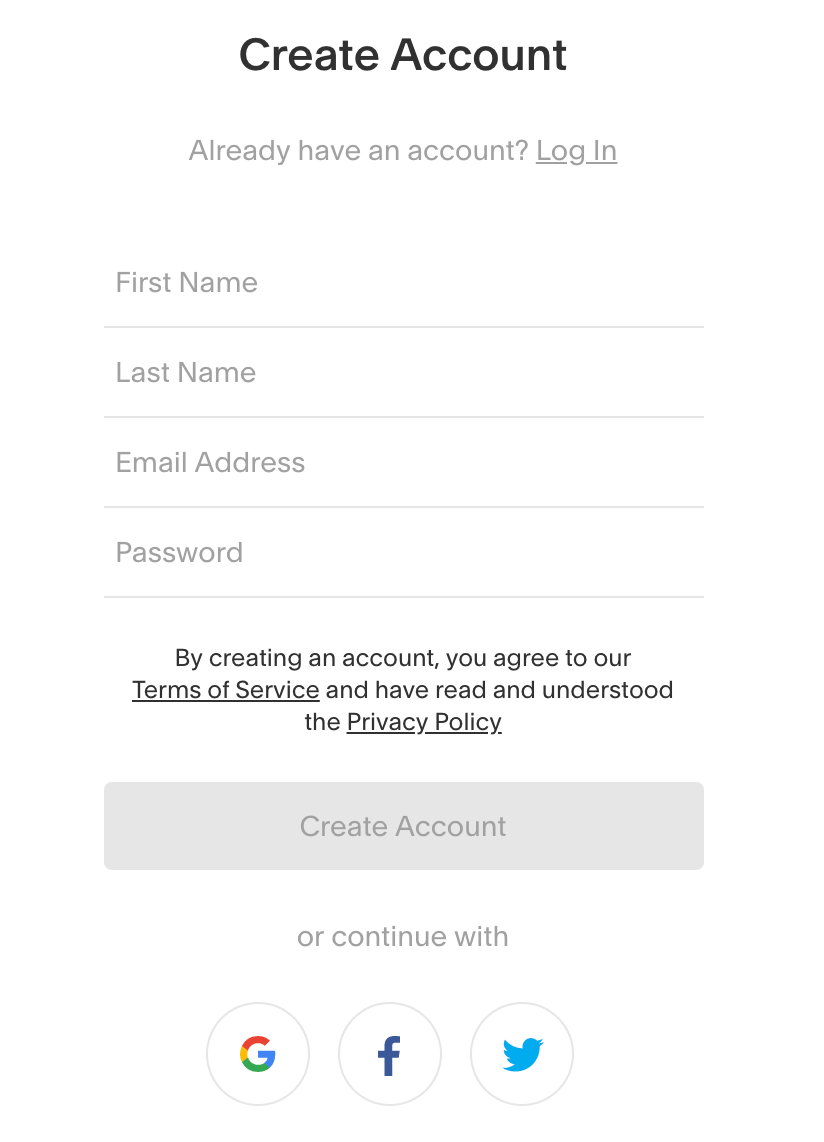
Creating an account doesn’t get much easier. You don’t even need a credit card to join and start building.

All Squarespace requires is your first name, last name, email address, and password. It took me about ten seconds to enter my information into these form fields.

You can also log in with your Google account, Facebook profile, or Twitter account to expedite the process even more.

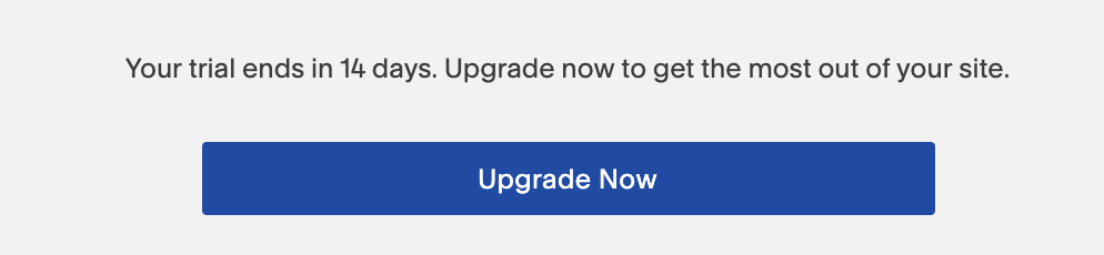
Once you have an account, you’ll be able to start creating a website immediately. Squarespace gives you a 14-day free trial so you can test out their software without having to commit to anything just yet.

So even if you’re on the fence about using Squarespace and you’re considering one of the other best website builders on the market, it’s worth trying out for free.

Step #2: Choose your plan

Technically, you don’t need to do this just yet.

As I just mentioned, you have two weeks to use Squarespace before they even ask you for billing information. So for those of you who aren’t sold on the platform just yet, you can skip over this. But with that said, you should at least be familiar with the pricing plans.

Look for the “upgrade now” CTA at the bottom of your dashboard if you’re still using the free trial.

choose plan

Squarespace has four plans, segmented into two categories.

  • Websites
  • Online stores

Let’s review the website plans first.

website plan

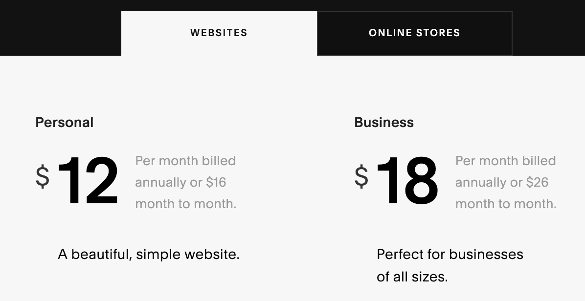
Pricing starts at $12 per month for a personal website if you sign up for an annual contract. This same plan will cost you $16 per month if you elect to go with a month-to-month plan.

The personal plan comes with features like:

  • Unlimited storage and bandwidth
  • Mobile optimization
  • Metrics and analytics
  • Custom domain
  • SSL
  • 24/7 support

Only two different accounts can contribute to the website if you have a personal plan, which isn’t a problem if you’re running the website on your own.

But if you’re creating a business website and want to grant access to multiple partners, employees, or an agency, the business plan will be more suitable for your needs. This plan comes with unlimited contributors, all of the features in the personal plan, as well as:

  • Free year of G Suite and Professional Gmail account
  • $100 credit for Google Ads
  • Pop-ups
  • Custom options with CSS and JavaScript
  • Premium blocks
  • Announcement bar

The business plan costs $18 per month if you sign up for an annual contract, or $26 per month if you’d rather get billed on a monthly basis.

Now let’s take a look at the plans designated for online stores.

online stores

The ecommerce options are a bit more expensive, but they’re more advanced as well.

Even the basic online store package comes with all of the features from the business plan. It also includes benefits like:

  • Unlimited products
  • No transaction fees
  • Mobile website and mobile checkout process
  • Metrics specifically for ecommerce shops
  • Customer accounts
  • Ability to sell with Instagram shoppable posts
  • Integrated accounting system
  • Manage inventory, orders, coupons, and taxes

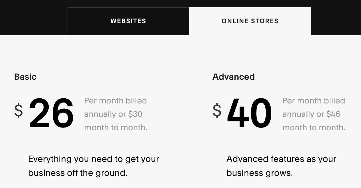
This plan sells for $26 or $30 per month, depending on if you go with the annual renewal or month-to-month contract.

The advanced online stores plan is the top-tier package offered by Squarespace. For $40 per month (annual) or $46 per month (month-to-month) you get additional benefits like:

  • Subscriptions
  • Shipping
  • Shopping cart abandonment recovery
  • Discounts
  • Gift cards
  • Ability to integrate your ecommerce shop with third-party services for production and fulfillment

As you can see, all four of these plans are very different. It should be fairly easy for you to decide which one is best for your new Squarespace website.

Step #3: Add a domain

By default, your Squarespace site will have a built-in domain name. This is usually a random combination of words, letters, and numbers.

You can change this domain and keep it for free, but it’s going to have a Squarespace.com URL.

domains

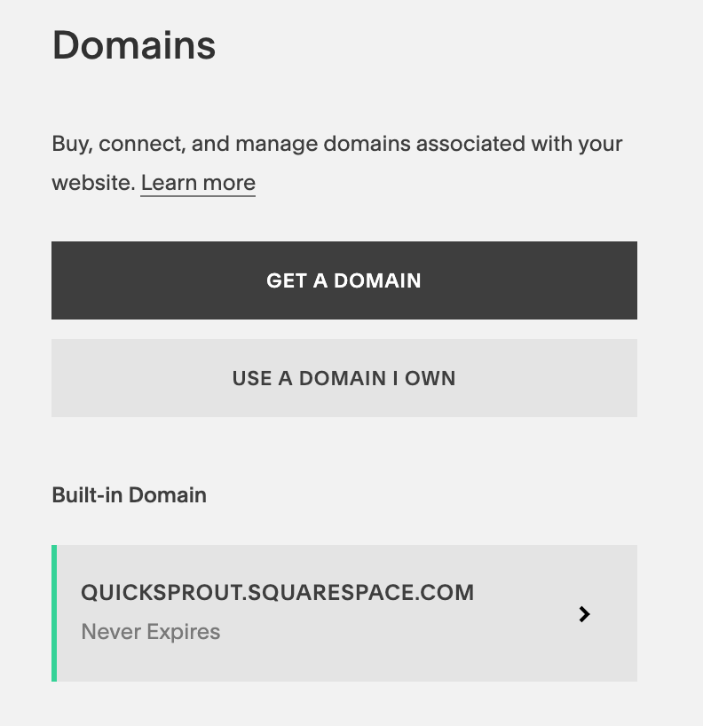
As you can see from the screenshot above, I customized my built-in domain to Quicksprout.squarespace.com. But that’s not very professional.

So you’ll want to use a domain that you already own, or get a new domain through Squarespace.

If you already own a domain, you just need to transfer it to Squarespace. After it’s transferred, you can manage all of your domain settings and website settings in one place.

It’s worth noting that you need to meet certain requirements in order for the transfer to be completed. If you don’t meet those requirements, you’ll have to connect the domain instead of transferring it. Here’s a resource with more information about how to transfer your domain to Squarespace. You can also review this page about connecting a domain if you don’t meet those requirements.

For those of you who still need a domain, I highly recommend you review my guide on how to buy the right domain. This will make the process much easier for you to understand.

Step #4: Customize your style

When you first get started, you’ll be asked some preliminary questions about the goal of your website. This is optional, but it gives Squarespace more information about what you’re trying to accomplish so they can steer you in the right direction.

Examples of goals include:

  • Display my photographs
  • Publish my videos
  • Publicize my brand
  • Promote my business
  • Write a blog
  • Create a portfolio
  • Sell my products
  • Advertise my restaurant

Next, Squarespace will show you some different themes for the design of your website.

themes

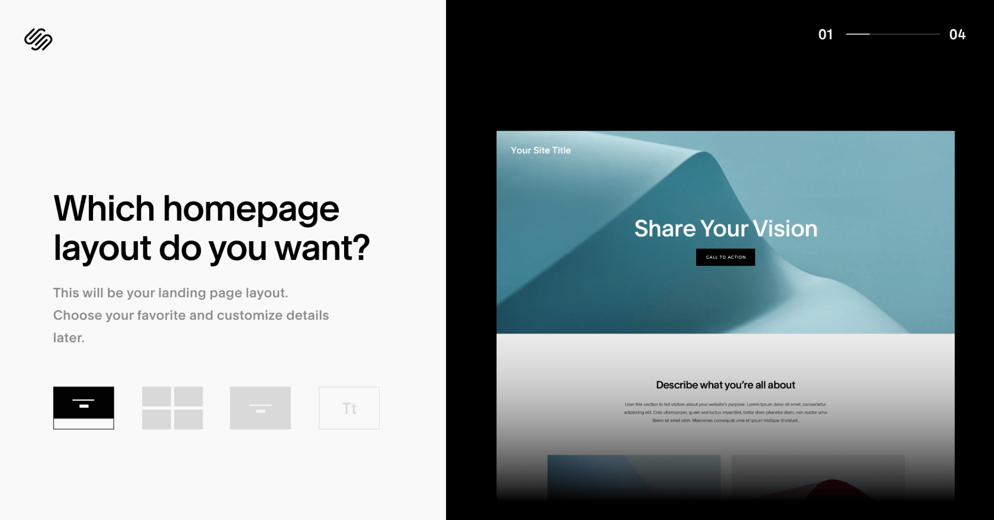
You’ll have four different homepage layouts to choose from.

If you’re not crazy about any of them, don’t worry. You’ll be able to completely customize everything later on. So just choose the one that you like the best for now.

This will give you something to work with, as opposed to starting with a blank canvas and building from scratch.

You’ll also be asked to choose your font. Again, this can always be changed down the road.

Step #5: Add pages

So far, you’ve only chosen a layout for your homepage. But now you need to add other pages on your site.

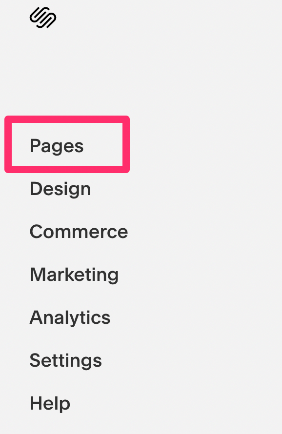
In order to do this, navigate to the “pages” menu on the left side of your Squarespace dashboard.

pages

These are some of the options for pages you can add to your site:

  • About
  • Appointments
  • Blog
  • Contact
  • FAQ
  • Gallery
  • Events
  • Location
  • Menu
  • Newsletter
  • Press
  • Registry
  • Reservations
  • RSVP
  • Store
  • Team
  • Terms of service
  • Testimonials

Depending on what you choose, an appropriate template will be provided based on the type of page you’re creating. For example, a gallery page and FAQ page will have different default layouts.

As you add new pages to the builder, they’ll appear on your website preview page.

page builder

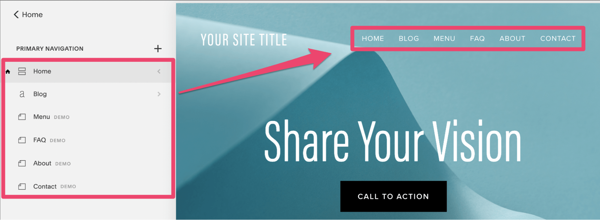
I just added some basic ones as an example.

They are all primary navigation pages, meaning they’ll show up on the homepage, as you can see from the screenshot above.

Squarespace lets you add secondary navigation pages, as well as footer navigation pages to your website as well.

Step #6: Choose a template

From your main dashboard, navigate to the “design” menu.

templates

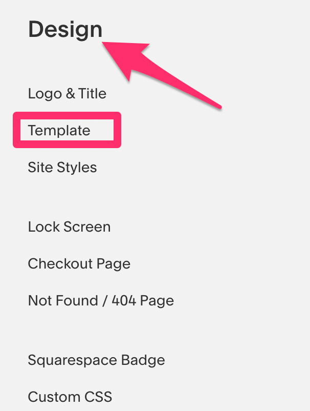
From here you can install a template that flows with the theme that you’re trying to accomplish on your website.

I recommend searching for templates by category:

  • Online store
  • Portfolio
  • Business
  • Professional service
  • Nonprofit
  • Blog
  • Restaurant
  • Event
  • Wedding
  • Photography
  • Music and entertainment
  • Health and fitness
  • Travel and tourism

Obviously, a fitness website and restaurant website should look very different from each other. That’s why it’s much easier to pick a theme based on a category that your website falls under.

You can always customize the templates to make them more personal to your site. So you won’t have to worry about using the same theme as another Squarespace website.

It’s worth noting that certain parameters and special features that have already been built into templates cannot be altered.

No matter what Squarespace plan you choose, you’ll have access to every template on the platform.

Sometimes Squarespace discontinues templates. So it’s important that you don’t uninstall a template after you’ve used it on your site. If you decide down the road that you want to change it, you can always try a new one. But you won’t be able to switch back to a discontinued template after it’s been uninstalled and discontinued.

Step #7: Edit images

By default, your site will have some images on the pages after you pick a style, theme, and template. But since these are just random stock images, you’ll definitely want to get rid of them and use your own.

This is very easy to do. Just hover the cursor over your site preview page and click on the “edit” button.

image editor

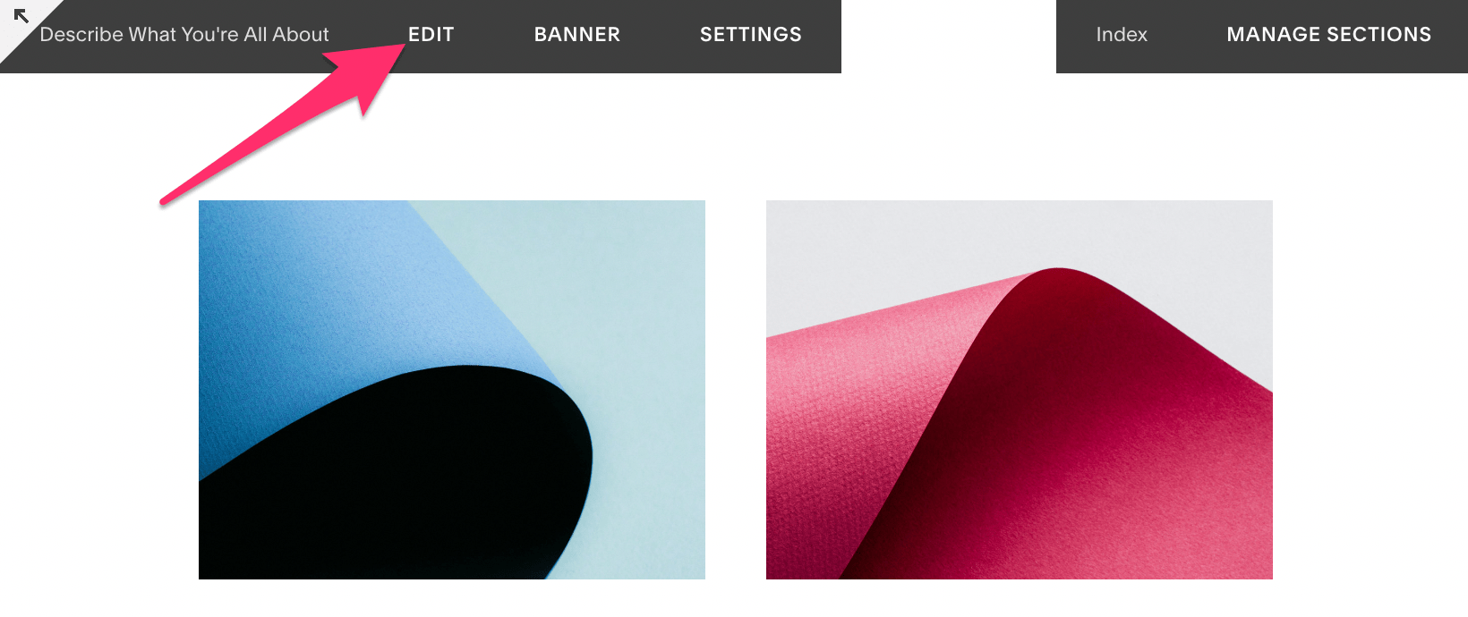
That’s how you change everything on your Squarespace site.

You’ll take the same approach for editing text, adding or removing blocks, changing the size, and moving the location of a feature. But for now, we’ll just stick with the images.

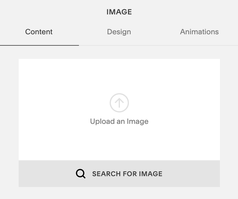
Hover your cursor over an image that you want to change. Another box will appear above it. You’re going to select “edit” again.

Then delete the image by clicking on the trash can icon. From here, you can upload a new image or search for another stock image.

edit image

Continue doing this on all of your pages until you’re satisfied with the layout and have replaced all of the default photos with your own original images.

Step #8: Set up ecommerce features (optional)

You can’t access the ecommerce features if you’re still using the free trial. So if you’re ready to launch your ecommerce shop with Squarespace, then you’ll need to upgrade to a paid plan.

Here are some of the settings that you can control from the Squarespace commerce menu:

  • Orders
  • Inventory
  • Customers
  • Discounts
  • Payments
  • Checkout
  • Customer accounts
  • Notifications
  • Shipping
  • Taxes
  • Accounting
  • Apps

If you just have a blog or personal site, then don’t worry about any of this. But if you’re planning to sell online with Squarespace, you definitely need to get familiar with all of these settings so you can manage and customize them to fit your needs.

Step #9: Promote your site

Take full advantage of the marketing tools offered by Squarespace. Head over to the marketing navigation menu and you’ll see options for:

  • Email marketing campaigns
  • SEO tools
  • Announcements
  • Pop-ups
  • Selling on Instagram
  • Share buttons
  • Ads

One of my favorite features here is the URL builder.

url builder

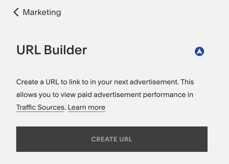
Use this tool to create custom URLs for keeping track of specific marketing campaigns. That way you can measure the success to repeat what’s been working, and abandon what’s not.

Step #10: Publish your website

When you’re building a website with Squarespace initially, it’s not live.

It’s actually impossible to publish your site on the web while you’re still in the free trial phase. But once you’re ready for it to go live, go to the “settings” menu from your dashboard.

From here, select “site visibility” to continue.

site visibility

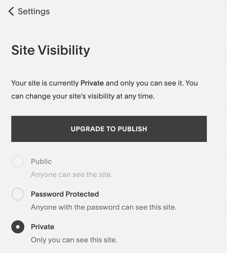
Since I’m still using the trial, the public option is unavailable. But for those of you who have started to pay for Squarespace, you just need to pick “public” from the bullet list.

Get familiar with the other options on the settings menu. From here you’ll also be able to manage things like your business information, social media accounts, permissions, billing, G Suite, and domains.

Conclusion

Building a website in 2019 has never been easier. With website builders like Squarespace, you can literally get a website off of the ground in less than an hour.

While I wouldn’t recommend publishing a new site that quickly, the option is available at your disposal.

If you’re a beginner and want to create a website with lots of design options and custom features, Squarespace will definitely be one of your top options.

For those of you who aren’t completely sold on Squarespace just yet, no problem. At the very least, take advantage of the 14-day free trial. Use this guide as a reference and go through the step-by-step process that I’ve outlined above.

How to Use the Web Share API

The Web Share API is one that has seemingly gone under the radar since it was first introduced in Chrome 61 for Android. In essence, it provides a way to trigger the native share dialog of a device (or desktop, if using Safari) when sharing content — say a link or a contact card — directly from a website or web application.

While it’s already possible for a user to share content from a webpage via native means, they have to locate the option in the browser menu, and even then, there’s no control over what gets shared. The introduction of this API allows developers to add sharing functionality into apps or websites by taking advantage of the native content sharing capabilities on a user’s device.

iOS offers a number of native sharing options.

This approach provides a number of advantages over conventional methods:

  • The user is presented with a wide range of options for sharing content compared to the limited number you might have in your DIY implementation.
  • You can improve your page load times by doing away with third-party scripts from individual social platforms.
  • You don’t need to add a series of buttons for different social media sites and email. A single button is sufficient to trigger the device’s native sharing options.
  • Users can customize their preferred share targets on their own device instead of being limited to just the predefined options.

A note on browser support

Before we get into the details of how the API works, let’s get the issue of browser support out of the way. To be honest, browser support isn’t great at this time. It’s only available for Chrome for Android, and Safari (desktop and iOS).

This browser support data is from Caniuse, which has more detail. A number indicates that browser supports the feature at that version and up.

Desktop

ChromeOperaFirefoxIEEdgeSafari
NoNoNoNoNo12.1

Mobile / Tablet

iOS SafariOpera MobileOpera MiniAndroidAndroid ChromeAndroid Firefox
12.2NoNoNo74No

But don’t let that discourage you from adopting this API on your website. It’s pretty easy to implement a fallback for supporting browsers that don’t offer support for it, as you’ll see.

A few requirements for using it

Before you can adopt this API on your own web project, there are two major things to note:

  • Your website has to be served over HTTPS. To facilitate local development, the API also works when your site is running over localhost.
  • To prevent abuse, the API can only be triggered in response to some user action (such as a click event).

Here's an example

To demonstrate how to use this API, I’ve prepared a demo that works essentially the same as it does on my site. Here’s how it looks like:

See the Pen
WebShare API Demo - Start
by Ayooluwa (@ayoisaiah)
on CodePen.

At this moment, once you click the share button, a dialog pops out and shows a few options for sharing the content. Here’s the part of the code that helps us achieve that:

shareButton.addEventListener('click', event => {
  shareDialog.classList.add('is-open');
});

Let’s go ahead and convert this example to use the Web Share API instead. The first thing to do is check if the API is indeed supported on the user’s browser as shown below:

if (navigator.share) {
  // Web Share API is supported
} else {
  // Fallback
}

Using the Web Share API is as simple as calling the navigator.share() method and passing an object that contains at least one of the following fields:

  • url: A string representing the URL to be shared. This will usually be the document URL, but it doesn’t have to be. You share any URL via the Web Share API.
  • title: A string representing the title to be shared, usually document.title.
  • text: Any text you want to include.

Here’s how that looks in practice:

shareButton.addEventListener('click', event => {
  if (navigator.share) {
    navigator.share({
      title: 'WebShare API Demo',
      url: 'https://codepen.io/ayoisaiah/pen/YbNazJ'
    }).then(() => {
      console.log('Thanks for sharing!');
    })
    .catch(console.error);
  } else {
    // fallback
  }
});

At this point, once the share button is clicked in a supported browser, the native picker will pop out with all the possible targets that the user can share the data with. Targets can be social media apps, email, instant messaging, SMS or other registered share targets.

The API is promised-based, so you can attach a .then() method to perhaps display a success message if the share was successful, and handle errors with .catch(). In a real-world scenario, you might want to grab the page’s title and URL using this snippet:

const title = document.title;
const url = document.querySelector('link[rel=canonical]') ? document.querySelector('link[rel=canonical]').href : document.location.href;

For the URL, we first check if the page has a canonical URL and, if so, use that. Otherwise, we grab the href off document.location.

Providing a fallback is a good idea

In browsers where the Web Share API isn’t supported, we need to provide a fallback mechanism so that users on those browsers still get some sharing options.

In our case, we have a dialog that pops out with a few options for sharing the content and the buttons in our demo do not actually link to anywhere since, well, it’s a demo. But if you want to learn about how you can create your own links to share web pages without third-party scripts, Adam Coti's article is a good place to start.

What we want to do is display the fallback dialog for users on browsers without support for the Web Share API. This is as simple as moving the code that opens the share dialog into the else block:

shareButton.addEventListener('click', event => {
  if (navigator.share) {
    navigator.share({
      title: 'WebShare API Demo',
      url: 'https://codepen.io/ayoisaiah/pen/YbNazJ'
    }).then(() => {
      console.log('Thanks for sharing!');
    })
    .catch(console.error);
  } else {
    shareDialog.classList.add('is-open');
  }
});

Now, all users are covered regardless of what browser they’re on. Here's a comparison of how the share button behaves on two mobile browsers, one with Web Share API support, and the other without:

Testing the share button on an Android device that supports the functionality. Android's native sharing options are triggered when the share button is pressed. The second test shows the hare button being clicked on an Android device that does not support the functionality. That produces the fallback sharing options that have been added manually.

Try it out! Use a browser that supports Web Share, and one that doesn't. It should work similarly to the above demonstration.

See the Pen
WebShare API Demo - End
by Ayooluwa (@ayoisaiah)
on CodePen.

Wrapping up

This covers pretty much the baseline for what you need to know about the Web Share API. By implementing it on your website, visitors can share your content more easily across a wider variety of social networks, with contacts and other native apps.

It’s also worth noting that you’re able to add your web application as a share target if it meets the Progressive Web App installation criteria and is added to a user’s home screen. This a feature of the Web Share Target API which you can read about at Google Developers.

Although browser support is spotty, a fallback is easily implemented, so I see no reason why more websites shouldn’t adopt this. If you want to learn more about this API, you can read the specification here.

Have you used the Web Share API? Please share it in the comments.

The post How to Use the Web Share API appeared first on CSS-Tricks.

Cloud-Native Everything

What’s in a (Buzz)word?

I often have a love-hate relationship with buzzwords. On the one hand, they are usually so grossly abused and promiscuously thrown around as to almost lose all practical meaning. And yet, paradoxically, they often seem to be the only way to succinctly convey some concept.

Cloud-native is exactly such a buzzword. Lately, everything and anything seems to be labeled cloud-native. Don’t believe me? Google the phrases “cloud-native hardware,” “cloud-native sales specialist,” and "cloud-native accounting firm.” It’s an epidemic.

Snag Resources from An Event Apart Boston 2019 and Save on Washington D.C. Registration

(This is a sponsored post.)

Hey, so we talked a little bit about An Event Apart Boston 2019 leading up to the event and now there are a ton of resources available from it. I stopped counting the number of links after 50 because there's way more than that. Seriously, there's stuff in there on subgrid, working with CSS Regions, design systems, using prefers-reduced-motion... and much, much more, so check it out.

And, while you're at it, you should consider attending the next installment of An Event Apart. It takes place - in Washington D.C. and seating — as you might expect — is limited. Like Boston, you can expect to get a treasure trove of useful information, educational content, and valuable training on topics that will help you sharpen your front-end chops and grow your career. Plus, the best part is getting to meet the rest of the great folks at the event — that's where your network grows and real conversations take place.

Register Today

Can't make it to Washington D.C.? No worries, because An Event Apart is also slated to take place in Chicago (-), Denver (-) and San Francisco (-). Now's the time to start planning your trip and begging your boss for a well-deserved self-investment in leveling up.

And if you're wondering whether we have a discount code for you... of course we do! Enter the AEACP at checkout to knock $100 off the price. 🤑

Direct Link to ArticlePermalink

The post Snag Resources from An Event Apart Boston 2019 and Save on Washington D.C. Registration appeared first on CSS-Tricks.

Graylog With Kubernetes in GKE

We all know that when collecting data from different data sources — whether it is an application, server, or service —  it is a necessity to have a tracking system that tells what went wrong with your system at a specific time, and to know exactly how your system behaves. 

This article aims to demonstrate how to deploy The Graylog Stack — Graylog v3 and Elasticsearch v6, along with MongoDB v3 — use Kubernetes, and how to collect data from different data sources using inputs, and streams.