Hello. As a personal project, I am trying to create a "Java Argot" translator. However I am having some issues.
The purpose of the program is to translate a sentece into the following "Secret Languages": "Pig Latin", "Leet" and "Morse Code". I have only done the "Pig Latin" translator however, everytime I try to activate case one in the "switch case" I get the error message "Exception in thread "main" java.lang.StringIndexOutOfBoundsException: String index out of range: 0".
The program shows that the line of code that is sending this message is these two lines: "PigLatin_Translator.main(word);" in the "Translator Menu" and "if(word[count].charAt(0) == 'a' || word[count].charAt(0) == 'e' || word[count].charAt(0) == 'i' || word[count].charAt(0) == 'o' || word[count].charAt(0) == 'u')" in the "PigLatin_Translator". I don't know why the system has an "Index Out of Bounds" error when the program does not give the user a chance to type in a string of code (if it allowed the user to type in a string of code then it would have an index). Please Help. Thank You.
Main Menu for Translator Code (some parts of code are removed since no translator is available yet for the other switch cases
        Scanner scan = new Scanner (System.in);

        System.out.println("****Welcome to the \"Argot \" translator. A translator that translates some common and un-common forms of \"Secret Language\"**** ");
        System.out.println("|Look below at the menu to naviage to which translator you would like to use...");
        System.out.println("|Translator Name                  |        Transator Number|");
        System.out.println("|The \"PigLatin\" Translator        |        Press \"1\" on your keyboard to activate|");
        System.out.println("|\"The \"Morse Code\" Translator     |        Press \"2\" on your keyboard to activate [Comming Soon]|");
        System.out.println("|\"The \"Leet\" Translator           |        Press \"3\" on your keyboard to activate [Comming Soon]|");
        int option = scan.nextInt();

        //Switch case that navigates though translator options
        switch(option){

        case 1:
            //Asks user to type in a sentence for the translator
            System.out.print("Type in a word so it can be translated into \"Pig Latin \": ");
            String wordTyped = scan.nextLine();

            //Sends the letter to all Lowercase
            String wordLowercae = wordTyped.toLowerCase();

            //Separates string of words into different words
            String[] word = wordLowercae.split(" ");

            PigLatin_Translator.main(word);

            System.out.println();

            //Tells the user the "PigLatin Translation
            System.out.print("Here is the \"Pig Latin \" translation: ");
Pig_Latin Translator Code
    public static void main(String[] word) {

    Scanner scan = new Scanner (System.in);

    //Loop that controls the separated words
    for (int count = 0; count < word.length; count++ ) {

        //Pig Latin Rule for "Vowels" (excluding "Y")
        if(word[count].charAt(0) == 'a' || word[count].charAt(0) == 'e' || word[count].charAt(0) == 'i'
                || word[count].charAt(0) == 'o' || word[count].charAt(0) == 'u') {

            String newWord = word[count] + "-yay";
            System.out.print(" " + newWord);

        }
Google's plan to limit developers' access to the Chrome API browser extensions which is commonly used to perform ad blocking and push them to use a new API sparked a developer firestorm. In response, Google engineers altered their plans slightly.
For those very new to this area, please google SIM SWAP and discover a very nasty security issue with all phones we use today. At first glance the new security researcher might think I'm exaggerating. Do your own research and tell me you don't find this to be one of the most foul, nasty exploits I've seen in years.
The current state of affairs appears to be DENIAL by the carriers that this is a problem. You can do your research and if you are like most I've talked to about this, it will shake your faith in all things smart phone and cloud based. So many are using their phone as their wallet and for now, until there are lawsuits that cost the makers of this disaster lose a few billion they won't see a reason to fix it.
Considering Mailchimp's evolution into an all-in-one marketing platform, we compare it to Mailpoet - a simple yet powerful email marketing plugin for WordPress.
Zendesk, customer service and engagement solutions provider, recently introduced the expansion of its Answer Bot product. Answer Bot is a machine learning tool that helps customers find answers for themselves. It pulls data from the Zendesk Guide knowledge base and suggests articles to help customers solve problems on their own.
WordPress provides a widget that can be used to display recent posts in any sidebar or widgetized location. Likewise many WordPress themes provide some sort of "recent post" functionality, so users can display their latest posts in specific locations around the theme. Such functionality is great and useful for displaying recent posts just about anywhere in your theme. Problem is, those methods don't work for displaying recent posts inside of posts, pages, and custom post types. Like inside of post content itself. For that, we can use a shortcode.
Shortcode to the rescue
In order to display a list of related posts from within the WordPress post editor (e.g., RTE/Visal/TinyMCE or Plain-Text Editor), you can use the built-in WordPress widget or a plugin, but that may be overkill depending on your site strategy, goals, and so forth. By adding the following pretty simple slice of code your theme's functions.php file:
As is, this code creates a shortcode that gets a customizable set of posts from the WordPress database, and displays them on your post or page. As simple as "one, two three", as they say. No modifications are required, this universal "recent posts" shortcode can be added to any WordPress theme, or alternately the code can be added to your site via simple plugin.
Usage
To use the recent-posts shortcode, add the following to any WP post or page:
[recent_posts num="5" cat="7"]
That will display a list of five posts from category with ID = 7. You can customize the attributes however is desired. The shortcode also accepts a couple of other attributes, order and orderby:
So now the list will include 10 posts from any category, ordered randomly and displayed in ascending order.
Code explanation
This recent-posts technique combines the WP add_shortcode() function with the get_posts() template tag. Essentially define all the arguments, tap the database via get_posts(), and then output the results in HTML list format. And of course hook everything into WordPress via the Shortcode API. So it's actually very standard stuff, and because get_posts() uses the same parameters as WP_Query, you can do much more in terms of customizing and querying highly specific sets of posts. Check out the WP_Query docs for more ideas.
Are you a freelancing professional web designer or a member of a web design team? Either way, you’re always looking for great tools that will make your work easier.
Cam Jackson describes a recent trend of breaking up frontend monoliths into many smaller, more manageable pieces, and how this architecture can increase the effectiveness and efficiency of teams working on frontend code.
Neil Shankar shares how he took the challenge of producing high-quality animations without contributing to latency for a redesign of the Google Chrome homepage.
Content marketing has arguably become the biggest buzzword in the marketing industry today.
It seems like you can’t have a conversation with a business owner who has an online presence without the term being brought up. Every online “expert” claims to hold the secret to content marketing.
But the reality is this. Like most marketing strategies, what works for one business won’t necessarily work for another. Content marketing campaigns will vary by industry as well.
So what exactly is content marketing?
By definition, it’s the process of creating and distributing digital materials online to directly or indirectly promote a brand, product, or service.
But that definition is so broad. To have a successful content marketing strategy as an ecommerce website, you need to take an ecommerce-specific approach.
Your content strategy won’t be the same as a B2B SaaS company or a B2C local retailer without an online presence.
I’ve seen countless ecommerce sites get so caught up in their marketing plan, that they actually lose sight of what drives their business. Rather than trying to copy the content strategy of a competitor (who may or may not have a good approach) you should be focusing on ecommerce conversions.
Everything you do needs to drive conversions. That’s the ultimate way to survive as an ecommerce shop.
So if you can’t directly or indirectly connect conversions to your content strategy, then it’s a wasted effort. That’s what inspired me to create this guide.
I want to clear up any misconceptions that you might have about content marketing and how it works. I’ve outlined a straightforward content marketing approach that’s specifically designed for ecommerce shops.
Ecommerce content marketing process
Before you start blogging or uploading videos to YouTube, you need to establish a clear plan for your content strategy. Remember, everything you do ultimately needs to drive conversions.
This is something that I encounter all of the time when I’m consulting with ecommerce companies.
They start to tell me about their plan, which sounds great in theory, but they don’t know the “why” behind the strategy.
For example, let’s say you’re putting all of your efforts into advertising on LinkedIn. You saw some information online about how many users are on the platform and how much it’s been growing over the years. Must be a good place to deploy a content marketing campaign, right?
For some businesses, sure. But that’s not the case for ecommerce.
You would know this if you took the time to create a plan before putting a strategy in motion. I’ve simplified the planning process into three easy steps. It’s crucial that you follow them in order.
Step #1: Identify your target audience
I know this may sound simple, but you’d be surprised at how many people don’t know the answer to this question. Take a moment to see if you really know your target audience.
Here’s the thing. Your target audience needs to be crystal clear before every content marketing campaign. Otherwise, it won’t have a high success rate and lead to conversions.
Without knowing your target audience, you won’t know how to reach them.
Age
Gender
Location
Likes
Dislikes
Habits
These are just the basics that you need to know, at a minimum. Identifying the target market of your startup is something that you should have done a long time ago. But your overall audience isn’t always the same for individual campaigns and strategies.
For example, let’s say your company sells sports equipment online. Your audience isn’t just “people who play sports.”
You can’t tailor your content around that because it’s way too broad. High school softball players aren’t the same as middle-aged male golfers.
Step #2: Learn their online habits
Remember, content marketing is all about distributing digital touchpoints online. That’s why it’s so important to figure out who your audience is.
You need to know where these people live online. Otherwise, you won’t know how or where to distribute the right content.
Social media is a great way to distribute your content. Here’s a basic breakdown of social media usage based on age.
This will tell you more about your target audience, but it’s still not enough information.
Sure, based on this graph, you could eliminate the possibility of targeting users over the age of 55 on Instagram and Snapchat since they only make up 9% and 6% of the population on those platforms, respectively.
However, other times broad information like this can be misleading. Take a look at the Snapchat usage. 76% of Snapchat users fall between the ages of 12 and 34.
So if you’re targeting younger consumers, like Millennials or Generation Z, this might seem like the place to do it. But you need to learn their habits as well.
For simplicity sake, let’s continue using the example from before. You have an ecommerce sports shop, and you’re trying to sell equipment to high school softball players.
If you assume that Snapchat is the best place to distribute your content, you’re making a mistake. You haven’t done all of the research yet.
In fact, 49% of Generation Z females say that they prefer to use Snapchat for sending videos of themselves. 43% of that same group says they prefer using Snapchat for posting selfies. They don’t use this platform to interact with brands.
However, 48% of Generation Z females say that Instagram is their preferred social media network for following brands.
Even though Snapchat has a greater marketing penetration of your target audience, it doesn’t matter if they’re not using that platform to interact with businesses online.
You can’t make assumptions about habits. I alluded to this earlier about LinkedIn. While your customers may be using the platform, that network is designed for B2B marketing, not B2C ecommerce shops.
Step #3: Create and distribute content
Once you figure out what platforms are the best places to distribute content for your previously identified target audience, now you can start to create content.
If you start building the content before you go through the first two steps, it’s a big mistake. You might be wasting your time creating content that people won’t end up seeing or using.
Let’s say you’re spending 90% of your content marketing resources on blogging. But your audience is consuming content on YouTube and Instagram. That’s not an efficient use of your resources.
The type of content you create will also depend on who you’re targeting people based on their stage in the marketing funnel.
This graphic is a great resource to give you inspiration for content ideas.
A consumer who has never heard of your brand or ecommerce site will be targeted differently than repeat customer who knows what they’re looking for and is ready to make a purchase.
Breaking this entire process down into these three steps simplifies content marketing for ecommerce brands. But if you mix up the order of these steps, it won’t be as effective.
Types of ecommerce content marketing
Now that you understand the approach behind content marketing for ecommerce sites, it’s time to look at some more specific types of content that you can use for your campaigns.
Keep in mind, not all of these will be applicable for every campaign you run. The content will always vary and be based on who you’re targeting and the platforms you’re planning to distribute on.
Blogging
I always recommend starting your content marketing strategy with blogging. While this may not be the most popular approach for ecommerce companies, it’s very beneficial in terms of SEO.
Let me show you an example from Vinebox, an ecommerce store that sells wine.
Here’s a blog post I pulled from their site about the benefits of drinking organic wine.
So if someone is browsing online and searching for more information about organic wine, how it works, and the effect it has on their body, this post can pop up. People can navigate to this website even if they never heard of Vinebox.
As an ecommerce shop, you’re competing with dozens, hundreds, or even thousands of other brands across the web. You can’t rely on all of your customers going directly to your site to buy.
While this page serves as an informational guide on organic wine, it’s also designed for conversions.
This is the final section of the blog post.
The blog closes with two CTAs about buying organic wine directly through their website. It’s a simple, yet effective approach.
You can definitely mimic this strategy for blog posts related to the products you’re selling online.
Original photos
The biggest challenge of selling online is that customers can’t touch and feel what you’re offering before they buy it.
They rely heavily on visuals for this. So it’s up to you to ensure that you have tons of pictures of your products from nearly every imaginable angle. This is necessary for your product pages, but you can also repurpose those images on other channels as well.
For example, you can take an original photo of a model wearing the clothes that you’re selling and turn it into an Instagram shoppable post.
Again, this is only under the assumption that you’ve done the right research and recognized this platform as a place to reach your target audience.
Include photos in your blogs. Add them to your email campaigns. Share them on other social media channels. Keep taking original photos because you’ll always be able to find a use for them.
Video content
This piggybacks off of my last point about how consumers need to see your products before they buy anything.
Images are somewhat limited, but videos can tell the full story. Just look at how big of an impact video content has on purchases.
The more videos people watch about a product online, the higher their average order value is.
Videos can also be repurposed across multiple channels. Your blog, product pages, email campaigns, and social media profiles are all great places to distribute.
Furthermore, 90% of consumers say that videos assist their buying decisions. 54% of consumers want to see more video content from brands they support. Videos on landing pages can increase conversions by up to 80%.
Just adding the word “video” to an email subject line can increase your open rates by 19%.
“How to” videos
Product demonstrations
Brand advertisements
Interviews
Animations
Live video broadcasts
The list of possibilities goes on and on. Video content must be incorporated into marketing strategies for all ecommerce sites.
Product buying guides
Product buying guides are essential for the same reason as blogs. They can be used to drive organic traffic to your ecommerce site when people are looking for more information about specific products.
The biggest difference between product buying guides and blogging is that they will each target different types of people.
Blog posts are typically ToFu (top of funnel) content since the consumer is still in the product and brand awareness stage. On the other hand, product buying guides are MoFu (middle of funnel) content as the consumer reaches the evaluation stage of the purchase process.
Make sure that all of your buying guides have CTAs to drive conversions.
Email marketing
Truthfully, email marketing isn’t just an ecommerce-specific content marketing strategy.
But with that said, there are definitely ways that your ecommerce shop can leverage emails that other businesses cannot. Here’s a look at how B2C marketers are using email marketing.
Your ecommerce site can take this to the next level.
Any time someone makes a purchase on your website, you have the opportunity to send them a drip campaign that’s relevant to that order.
Order confirmation
Shipping notification
Package delivered
Follow up
That’s four emails that you have an excuse to send. All of them are relevant to the customer and provide information that they want to see.
You can use these messages to drive more conversions. Provide discount codes off of an upcoming purchase. Show product recommendations based on what they bought.
If a customer buys a surfboard, send them an email about a wetsuit. If they buy workout shorts, send them an email about more new workout gear.
Customer stories
There are lots of different formats you can use to tell a customer story.
Reviews
Testimonials
Case studies
These can be in text format, image format, videos, or blog posts. Display them on your homepage. Create separate landing pages for customer stories. Share them on social media.
If you look back to the content marketing funnel that we talked about earlier, customer stories fall into the BoFu (bottom of funnel) category.
At this point, the consumer is close to converting. The customer stories can be the factor that drives them to complete the purchase process.
Interactive content
Adding interactivity to your content strategy is a great way to bring a personalized touch to the customer.
When you land on their homepage, you aren’t shown any specific products, and they don’t have any CTAs saying something like “buy now.”
Instead, there is an original photo of three men, each with three very different beards. There is a link to a quiz that will “help you find the perfect product.”
This interactive quiz makes the customer feel confident about the product that they’re purchasing. By answering a series of questions designed to meet their needs, it gives them an incentive to buy.
Conclusion
There are lots of misconceptions about content marketing and how it works. As an ecommerce business, you need to look for strategies that are specific to your industry.
Before you do anything, you need to know the process for ecommerce content marketing.
Identify your audience
Find out how to reach them online
Create content and distribute them on those platforms
When you take this approach, everything else gets easier. Just remember that every content strategy you apply needs to ultimately drive conversions.
Keep this guide as a reference, and use the examples I listed above as inspiration for some high-converting content strategies.
For as long as CSS has existed, web developers have struggled to design layouts with it. Positioning elements on a page has never been easy and usually involved a workaround like using floats or tables, instead of having a CSS system designed just for that purpose.
All that changes with the advent of CSS grids, which have only recently been adopted by all major browsers. Finally, there exists an easy way to create two-dimensional layouts on a webpage, and position elements within them. No more convoluted workarounds for such a simple issue.
There’s just one problem with CSS grids: many developers, especially newer ones, are having trouble learning how to use them! If you struggle with flexboxes, then learning grids might seem like an impossible task.
Luckily, other developers are here to save the internet with their grid layout generators. Just point and click or fill out some boxes and you have a frame to work with.
Here’s a collection of a few great grid generators, from very simple layout makers to ones that touch on much more complex features of the CSS system.
First up is the simple but effective CSS Grid Generator. No frills or confusing addons, just create a grid, tweak some numbers, and stick the code in your website, simple as that. If you’re new to CSS grids, this is a great tool to get started with.
Griddy is a helpful CSS grid generator which allows you to add as many elements as you want and size them based on row or column size. You can size them on fractionals (fr), pixels, percent, or auto – and you’re not locked to using one unit for the whole grid. Have two columns using fr and carefully size the others with pixels!
With LayoutIt you can easily create grids of any size, and even place grids inside other grids. Add more columns and rows as you need them, inside and outside individual boxes, and get full control over the layouts you create.
This is a tool for advanced users ready to learn more about CSS grids. Grid Wiz isn’t just a simple generator. You can edit code right in the sidebar and see it update in real time. Then download it, or add Grid Wiz as a dependency and compile it.
One of the most flexible CSS layout generators out there, cssgr.id presents you with plenty of options to get started. There are five starter layouts to begin with, and you can add as many items, columns, and rows as you want. There’s even a placeholder text option so you can see how this layout will look in action.
Easily Make Grids in CSS
Web developers are always making strides towards a better, more efficient internet backend. CSS grids are just among the latest developments, and it’s finally solved a long-standing issue that’s plagued CSS designers.
CSS grids have actually been around since they were proposed in 2011, but it wasn’t until 2017 that all the major browsers finally adopted support for them.
Now that developers no longer have to be wary of using them, there’s been a ton of CSS grid guides, tutorials, and resources made, just like these layout generators. So, if you’re still using a workaround like flexboxes or even floats to design webpages, consider trying out grids instead. There’s plenty of support online to help you learn them.
And if you’re still learning to use grid layouts, check out this comprehensive guide to get you started!
Agile DevOps practices are changing the ways apps are being developed and delivered. This collaboration of software developers and IT operations staff allows for faster development cycles, more frequent updates, and faster delivery.
Companies not using DevOps might do software updates annually. That’s because the pathway to deployment could take a long time. Developers focused on code. When the code was completed, the operations team would go to work to make sure everything runs smoothly. Then a security team might analyze it. When an issue arose, it was back to the developers to start the cycle over again.
Technology is advancing in leaps and bounds and is rapidly transforming almost every aspect of our life. Cloud technology is a major shift from conventional computing technologies and is impacting businesses of all sizes immensely. For big enterprises, however, its impact is highly positive. Before discussing the cloud technology’s benefits for big enterprises, it is important to know, what is actually meant by the term.
What Is Cloud Computing?
Cloud technology, or cloud computing, in its simplest terms, denotes the delivery of computer system resources (hardware, software, analytics, databases, intelligence, and networking, etc.) through the internet. The word "cloud" is used as a metaphor for the internet because, traditionally, the internet has always been described as a cloud in all flow charts.
I’ve been working on the creation and maintenance of the main library of our design system, Lexicon. We used the Sketch app for the first year and then we moved to Figma where the library management was different in certain aspects, making the change quite challenging for us.
To be honest, as with any library construction, it requires time, effort, and planning, but it is worth the effort because it will help with providing detailed components for your team. It will also help increase the overall design consistency and will make the maintenance easier in the long run. I hope the tips that I’ll provide in this article will make the process smoother for you as well.
This article will outline the steps needed for building a component library with Figma, by using styles and a master component. (A master component will allow you to apply multiple changes all at once.) I’ll also cover in detail the components’ organization and will give you a possible solution if you have a large number of icons in the library.
Note:To make it easier to use, update and maintain, we found that it is best to use a separate Figma file for the library and then publish it as a team ‘library’ instead of publishing the components individually.
Getting Started
This guide was created from a designer’s perspective, and if you have at least some basic knowledge of Figma (or Sketch), it should help you get started with creating, organizing and maintaining a component library for your design team.
If you are new to Figma, check the following tutorials before proceeding with the article:
Before starting, there are some requirements that we have to cover to define the styles for the library.
Typography Scale
The first step to do is to define the typography scale; it helps to focus on how the text size and line height grow in your system, allowing you to define the visual hierarchy of your texts.
Typography scales are useful to improve the hierarchy of the elements, as managing the sizes and weights of the fonts can really guide the user through the content. (Large preview)
The type of scale depends on what you’re designing. It’s common to use a bigger ratio for website designs and a smaller ratio when designing digital products.
The reason for this is behind the design’s goal — a website is usually designed to communicate and convert so it gives you one or two direct actions. It’s easier in that context to have 36px for a main title, 24px for a secondary title, and 16px for a description text.
On the other hand, digital products or services are designed to provide a solution to a specific problem, usually with multiple actions and possible flows. It means more information, more content and more components, all in the same space.
For this case, I personally find it rare to use more than 24px for texts. It’s more common to use small sizes for components — usually from 12 to 18 pixels depending on the text’s importance.
If you’re designing a digital product, it is useful to talk to the developers first. It’s easier to maintain a typography scale based on EM/REM more than actual pixels. The creation of a rule to convert pixels into EM/REM multiples is always recommended.
Second, we need to define the color scheme. I think it’s best if you to divide this task into two parts.
First, you need to define the main colors of the system. I recommend keeping it simple and using a maximum of four or five colors (including validation colors) because the more colors you include here, the more stuff you’ll have to maintain in the future.
Next, generate more color values using the Sass functions such as “Lighten” and “Darken” — this works really well for user interfaces. The main benefit of this technique is to use the same hue for the different variants and obtain a mathematical rule that can be automated in the code. You can’t do it directly with Figma, but any Sass color generator will work just fine — for example, SassMe by Jim Nielsen. I like to increase the functions by 1% to have more color selection.
Once you have your main colors (in our case, blue and grey), you can generate gradients using lighten and darken functions. (Large preview)
Tip: In order to be able to apply future changes without having to rename the variables, avoid using the color as part of the color name. E.g., instead of$blue, use$primary.
Once we have the typography scale and the color scheme set, we can use them to define the Library styles.
This is the first actual step into the library creation. This feature lets you use a single set of properties in multiple elements.
Styles are the way to control all the basic details in your library. (Large preview)
Concrete Example
Let’s say you define your brand color as a style, it’s a soft-blue and you originally apply it to 500 different elements. If it is later decided that you need to change it to a darker blue with more contrast, thanks to the styles you can update all the 500 styled elements at once, so you won’t have to do it manually, element by element.
If you have variations of the same style, to make it easier to find them later, you can name the single styles and arrange them inside the panel as groups. To do so, just use this formula:
Group Name/Style Name
I’ve included a suggestion of how to name texts and colors styles below.
Text Styles
Properties that you can define within a text style:
Font size
Font weight
Line-height
Letter spacing
Tip: Figma drastically reduces the number of styles that we need to define in the library, as alignments and colors are independent of the style. You can combine a text style with a color style in the same text element.
You can apply all the typography scale we’ve seen before as text styles. (Large preview)
Text Styles Naming
I recommend using a naming rule such as “Size/Weight” (eg: 16/Regular, 16/SemiBold, 16/Bold).
Figma only allows one level of indentation, if you need to include the font you can always add a prefix before the size: FontFamily Size/Weight or FF Size/Weight *(eg: SourceSansPro 16/Regular or SSP 16/Regular).*
Color Styles
The color style uses its hex value (#FFF) and the opacity as properties.
Tip: Figma allows you to set a color style for the fill and a different one for the border within the same element, making them independent of each other.
You can apply color styles to fills, borders, backgrounds, and texts. (Large preview)
Color Styles Naming
For a better organization I recommend using this rule “Color/Variant”. We named our color styles using “Primary/Default” for the starter color, “Primary/L1”, “Primary/L2” for lighten variants, and “Primary/D1”, “Primary/D2” for darken variants.
Effects
When designing an interface you might also need to create elements that use some effects such as drop shadows (the drag&drop could be an example of a pattern that uses drop shadows effects). To have control over these graphic details, you can include effect styles such as shadows or layer blurs to the library, and also divide them by groups if necessary.
Define shadows and blurs to manage special interaction effects such as drag-n-drop. (Large preview)
Grids
To provide something very useful for your team, include the grid styles. You can define the 8px grid, 12 columns grid, flexible grids so your team won’t need to recreate them.
There’s no need to memorize the grid sizes anymore. (Large preview)
Tip: Taking advantage of this feature, you can provide all the different breakpoints as ‘grid styles’.
Master Component
Figma lets you generate multiple instances of the same component and update them through a single master component. It’s easier than you might think, you can start with some small elements and then use them to evolve your library.
One master component to rule them all! (Large preview)
To explain this workflow better, I will use one of the basic components all the libraries have: the buttons.
Buttons!
Every system has different types of buttons to represent the importance of the actions. You can start having both primary and secondary buttons with only texts and one size, but the reality is that you’ll probably end up having to maintain something like this:
2 color types (Primary | Secondary)
2 sizes of buttons (Regular | Small)
4 content types (Text Only | Icon Only | Text + Icon right | Icon Left + Text)
5 states (Default | Hover | Active | Disabled | Focus)
This would give us up to 88 different components to maintain only with the set of buttons mentioned above!
Thanks to how Figma is built, you can easily manage a lot of button instances all at once. (Large preview)
Let’s Start Step By Step
The first step is to include all the variations together in the same place. For the buttons we’re going to use:
A single shape for the background of the button so that we can then place the color styles for the fill and the border;
The single text that will have both text and color styles;
Three icon components (positioned to the right, center and left) filled in with the color style (you will be able to easily swap the icons).
A shape, a text, and an icon walk into a Figma bar... (Large preview)
The second step is to create the master component (use the shortcut Cmd + Alt + K on Mac, or Ctrl + Alt + K on Windows) with all of the variations as instances. I suggest using a different and neutral style for the elements inside the master component and use the real styles on the sub-components, this trick will help the team use only sub-components.
You can see the visual difference between a master component and a sub-component in the next step:
The more elements, the more instances you can control. (Large preview)
In the third step you need to duplicate the master component to generate an instance, now you can use that instance to create a sub-component, and from now on every change you make to the master component will also change the sub-component you’ve created.
You can now start applying the different styles we’ve seen before to the elements inside the sub-component and, of course, you can hide the elements you don’t need in that sub-component.
Thanks to the color styles you can generate different components using the same shape. In this example, primary and secondary styles are generated from the same master component. (Large preview)
Text Alignment
As I’ve shown you in the styles, the alignments are independent of the style. So if you want to change the text alignment, just select it by hitting Cmd/Ctrl and changing it. Left, center or right: it will all work and you can define different sub-components as I did with the buttons.
Tip: To help you work faster without having to find the exact element layer, if you delete an element inside the instance, it will hide the element instead of actually deleting it.
Component Organization
If you’re coming from Sketch, you could be having trouble with the organization of the components in Figma as there are a few key differences between these two tools. This is a brief guide to help you organize the components well so that the instance menu doesn’t negatively affect your team’s effectiveness.
As you can see here, our library had so many sub-menus that as a result the navigation was going off the screen on MacBooks, that was a big problem for our library. We were able to find a workaround for this issue. (Large preview)
This was the result after improving the library order following the rules for pages and frames, now it’s way more usable and organized for our teams. (Large preview)
We’ve all been there, the solution is easier than you think!
Here’s what I have learned about how to organize the components.
Figma Naming
While in Sketch all the organization depends only on the single component name, in Figma it depends on the Page name, the Frame name, and the single Component name — exactly in that order.
In order to provide a well-organized library, you need to think of it as a visual organization. As long as you respect the order, you can customize the naming to fit your needs.
Here’s how I’ve divided it:
File Name = Library Name (e.g. Lexicon);
Page Name = Component Group (e.g. Cards);
Frame Name = Component Type (e.g. Image Card, User Card, Folder Card, etc);
Component Name = Component State (e.g. Default, Hover, Active, Selected, etc).
This structure is the equivalent to the Sketch naming of ‘Cards/Image Card/Card Hover’. (Large preview)
Adding Indentation Levels
When creating the Lexicon library, I found that I actually needed more than three levels of indentation for some of the components, such as the buttons that we saw before.
For these cases, you can extend the naming using the same method as Sketch for nested symbols (using the slashes in the component name, e.g. “Component/Sub-Component”), under the condition that you do it only after the third level of indentation, respecting the structural order of the first three levels as explained in the previous point.
This is how I organized our buttons:
Page name = Component Group (e.g. Buttons);
Frame name = Component Size (e.g. Regular or Small);
Component name = Style/Type/State (e.g. Primary/Text/Hover).
This structure is the equivalent to the Sketch naming of '*Buttons/Buttons Regular/Primary/Text/Button Hover*'. (Large preview)
Tip: You can include the component name (or a prefix of the name) in the last level, this will help your team to better identify the layers when they import the components from the library.
Icons Organization
Organizing the icons in Figma can be challenging when including a large number of icons.
As opposed to Sketch which uses a scroll functionality, Figma uses the sub-menus to divide the components. The problem is that if you have a large number of icons grouped in sub-menus, at some point they might go off screen (my experience with Figma on a MacBook Pro).
An example of how the components are organized inside a single scrollable sub-menu. (Large preview)
As you can see, using a Macbook Pro the result was the menus going outside the screen. (Large preview)
Here are two possible solutions:
Solution 1
Create a page named “Icons” and then a frame for each letter of the alphabet, then place each icon in the frame based on the icon’s name. For example, if you have an icon named “Plus”, then it will go in the “P” frame.
Solution 2
Create a page named “Icons” and then divide by frames based on the icon categories. For example, if you have icons that represent a boat, a car, and a motorcycle, you can place them inside a frame named “vehicles”.
I, personally, applied solution 1. As you can see in this example, we had a huge number of icons so this was the better fit. (Large preview)
Conclusion
Now that you know what’s exactly behind a team’s library construction in Figma, you can start building one yourself! Figma has a free subscription plan that will help you to get started and experiment with this methodology in a single file (however, if you want to share a team library, you will need to subscribe to the “Professional” option).
Try it, create and organize some advanced components, and then present the library to your team members so you could amaze them — or possibly convince them to add Figma to their toolset.
Finally, let me mention that here in Liferay, we love open-source projects and so we’re sharing a copy of our Lexicon library along with some other resources. You can use the Lexicon library components and the other resources for free, and your feedback is always welcome (including as Figma comments, if you prefer).
I hope you’re just as stoked as we are to attend this year’s WordCamp Europe 2019! Just to refresh your memory, it’s all happening in Berlin, Germany and it’s THE place to meet like-minded WordPress people of all paths and professions. Here’s everything you need to know about #WCEU 2019, the sub-events you can can attend, and other information that may come in handy.
There are all kinds of WordPress Image optimizer plugins available in the WordPress plugin repository. They can help you compress images for the web or handle things like resizing images or lazy loading.
In this post, we’re going to look at the features of the most popular image optimization plugins. Some are all-in-one image optimizers while others have some unique strengths that make them helpful additions, but all of them will help you serve up images on your site much faster.
Smush
I don’t want to brag, but Smush is the most popular free image optimization plugin for a reason. It’s the best WordPress image optimizer because it is an all-in-one solution that has lossless image compression, lazy loading, bulk smushing (so you can optimize up to 50 images at once) and more. With over 1+ million active installations, Smush has optimized literally billions of images.
Smush will process PNGs, JPEGS and GIFs on OUR superfast servers, freeing up resources on your server so your site performance will not be affected. And the best part? The free version has no daily, monthly or annual caps so you can optimize to your heart’s content. As long as your images are under 5MB we’ll Smush it.
If you want even more cool features, then Smush Pro, with her lightning fast CDN, convert images to WebP, automatically resize your images, convert PNGs to JPEGs, compress images in other directories or in your Amazon S3 cloud and more.
Plus, Smush and Smush Pro integrate well with other popular image plugins such as NextGEN Gallery, WP Offload S3 and WP Retina 2x. Try Smush Pro free for 30 days to see how she can take your site performance to new levels.
EWWW Image Optimizer
EWWW Image Optimizer automatically and losslessly optimizes your images as you upload them to your site. It can also optimize images that you have previously uploaded.
Another nice feature of this plugin is the ability to convert your images to the file format that produces the smallest image size. It can also optionally apply lossy reductions for PNG images.
The plugin is free if you use your own servers to optimize your images. Something to be aware of is if you can’t use the exec() function on your server, you’ll have to pay to use the EWWW I.O. API. If you opt to use the EWWW service, you’ll have to pay an additional fee.
Imsanity
Don’t be scared off by Imsanity’s freaky feature image in the WordPress Plugin Repository. This free image optimizer plugin automatically resizes images to a more “sane” size by using WordPress’ built-in image scaling functions.
A nice feature of Imsanity is the ability to set a maximum width, height and quality. You can also convert BMP files to JPG so images can be scaled.
With Imsanity, you’ll be able to bulk resize images. When Imsanity scales an image, it replaces the original image.
Imagify Image Optimizer
Another image optimizer plugin is WP Media’s Imagify Image Optimizer that automatically optimizes an image when it is uploaded into WordPress. It also has the ability to bulk optimize images.
Imagify Image Optimizer will optimize your images in WordPress by resizing images. It also has three levels of image compression and the ability to convert your images to WebP.
Imagify Image Optimizer is compatible wtih WooCommerce and NextGEN gallery.
You’ll be able to optimize up to 25MB of images which is about 250 images every month. Keep in mind that WordPress generates multiple additional images for every single image you upload, so this will count toward your limit. Once you pass your limit you’ll need to upgrade to a paid plan.
Compress JPEG & PNG images
Compress JPEG & PNG images integrates with the popular WordPress image compression services TinyJPEG and TinyPNG.
With Compress JPEG & PNG images, your images will automatically be optimized when uploaded. You can also optimize images that are already in your media library, one at a time or in bulk.
Compress JPEG & PNG images has encoding for progressive JPEGs, and is the best compressor plugin for animated PNGs. It is compatible with WP Retina 2x, WP Offload S3, WooCommerce (although there are a few known issues) and is WPML as well as multisite compatible.
There are no file size limits but if you want to optimize more than 100 images a month, you’ll have to upgrade to a paid account. Again, keep in mind that when you upload one image, WordPress generates additional sizes to make your site responsive, so those additional images will count toward your limit.
ShortPixel Image Optimizer
ShortPixel Image Optimizer is not only for images, but it’s a PDF optimizer that’s free. As with the other WordPress image optimization plugins, new images are automatically resized and optimized when you upload.
ShortPixel Image Optimizer is great at compressing images for your website because it has both lossy and lossless image compression for for JPEGs, PNGs, WebPs, GIFs and PDF files. It also has a free image compressor called glossy image compression that was designed as a photo optimizer setting for photographers that preserves the quality of an image.
ShortPixel is GDPR compliant and integrates well with NextGEN gallery, Foo Gallery and any other galleries and sliders.
ShortPixel comes with 100 free credits/month and additional credits can be bought for as little as $4.99 for 5,000 image credits.
WP Retina 2x
WP Retina 2x is not an image optimizer for WordPress like the other plugins on this list. It is in a class of its own.
WP Retina 2x is used for serving Retina images on your WordPress site. Retina images are tremendously resource intensive because they’re twice as large as normal images, so you need a plugin that will help you serve them properly.
We’ve mentioned how some of the other plugin on this list pair well with WP Retina 2x in order to optimize your images in WordPress while still making sure that your images are high quality so they look good on Retina screens.
reSmush.it Image Optimizer
reSmush.it allows you to use the the free image optimization reSmush.it API. The API accepts JPEGs, PNGs and GIF files that are up to 5MB. The plugin is free to use with the only restriction being that your images need to be under 5MB.
reSmush.it is not only an image optimizer for WordPress, but its API is also flexible enough to use with other CMS systems, such as Drupal, Joomla and Magento. So even though it has fewer installs compared to some of the others on this list, reSmush.it has smushed billions of images.
reSmush.it sets the default optimization level to 92, but you can adjust this if necessary. You’ll also be able to specify if images should be optimized on upload.
Lazy Load
Let’s not leave lazy load plugins off this list. Lazy load doesn’t need configuring because it is a simple and light plugin that works out-of-the-box.
It uses jQuery.sonar to only load an image when it’s visible above fold. This plugin is an amalgamation of code written by the WordPress.com VIP team at Automattic, the TechCrunch 2011 Redesign team, and Jake Goldman from WordPress consultancy 10up.
Lazy loading is an easy way to load your images more efficiently so your initial site loads more quickly.
Last but not least on our WordPress optimization plugin list is Optimus. It automatically reduces the file size of uploaded images by compressing the images for your website.
There is a free level that allows a maximum file size of 100kb. The free version does not include WebP conversion, but it does allow an unlimited number of images. Rather than using your server for WordPress, Optimus sends your images to the Optimus server in Germany for optimization, then sends it back once the image has been optimized.
You will be able to specify if you would like Optimus to keep or remove the image metadata such as the author, EXIF and copyright information, for additional file size reduction.
Optimus has a bulk image compressor, is compatible with WooCommerce, WP Retina 2x and WordPress multisite, and does not store your images on their server once it is optimized.
Image Optimization Summary
While there are a lot of image optimization plugins available in the WordPress plugin repository, in our opinion Smush is the best image optimizer for WordPress because you do not have to upgrade to a paid account. With Smush you get a free image compressor and an auto-optimization plugin that streamlines your images on upload.
For even more features and faster smushing, Smush Pro can’t be beat. Try Smush Pro free for 30 days to see for yourself how it stacks up against these other WordPress Image Optimization plugins.
Recently, one of our readers asked us how to properly change a WordPress theme on their website without breaking anything.
WordPress makes it super easy to change and manage themes. However, you need to remember that changing the appearance of your live website is a major event. You need to keep certain things in mind before and after you change a theme so you don’t lose any data and website traffic.
In this article, we will show you how to change a WordPress theme with a step-by-step checklist.
Why Change a WordPress Theme?
You may want to change the theme on your WordPress website to make it better match your niche.
For example, if you run a fashion blog, then you might want to switch to a theme with the style of a professional fashion website.
Switching to a different theme can also give your website a fresh look, enhance the user experience, and even improve your site’s SEO by making it easier for search engines to crawl and index your content.
Plus, some WordPress themes come with built-in features that you may need on your site. For instance, some themes include features for eCommerce, membership sites, and portfolios.
Having said that, let’s see how to properly change a WordPress theme on your website. Here’s a quick overview of what you’ll learn in this article:
While you can easily change a theme with just a few clicks, you must take some precautionary steps before starting this process.
We recommend that you go through the following checklist to ensure that the process of changing your WordPress theme goes smoothly and that you don’t end up losing important data.
1. Copy Snippets from Your Current Theme
Some intermediate WordPress users like to customize their website by adding code snippets directly to the theme’s functions.php file.
Since these changes were made once, people usually forget about them.
If you or your web developer made these changes, then make sure to go through the files of your current theme and note all the additional code you’ve added previously. This will allow you to add these snippets later into your new theme’s functions.php file or a site-specific WordPress plugin.
Expert Tip: We recommend always adding code to your website using WPCode, which is the best WordPress code snippets plugin on the market. This way, when you switch to a different theme, you won’t have to worry about copying and adding code snippets.
Before changing your theme, you should check the load time of your website. This can help you easily compare the differences in the page load time after you make changes to your website.
Remember, WordPress speed is an important factor in user experience and SEO, so you need to make sure that the new theme is faster than your previous one.
Make sure that you test the load time of the homepage and also some of your inner pages.
3. Don’t Lose Any Tracking Code
Some users add their analytics tracking code directly to their theme files. Also, some WordPress themes allow you to add AdSense or Analytics code in their settings panels.
One of the most common mistakes beginners make is to overlook these code snippets.
You need to make sure that you copy all the tracking code so you can add it to your new site after changing the theme.
To future-proof this, we always recommend users install Google Analytics using a plugin like MonsterInsights. This plugin lets you view the analytics and reports directly from your WordPress dashboard without having to add any tracking code to the theme files.
It’s always recommended to back up your posts, images, plugins, and the database before changing your theme.
You can use a WordPress backup plugin like Duplicator to create a backup of your entire site. Make sure that you download this backup to your computer before moving forward.
This step will ensure that you can recover your website easily if anything goes wrong.
Sidebars are used for adding different widgets including social links, advertisements, subscription forms, or a contact form.
Make a note of these changes. If there is any custom code added to a widget, then make sure you copy and paste this code on your computer so that you can reuse it in your new theme.
6. Keep Your Site in Maintenance Mode
It’s a good practice to put your website in maintenance mode when you are making changes to it. This can prevent users from seeing an incomplete website and ensure a smooth transition to a different theme.
Note: You can use SeedProd’s free plan to enable maintenance mode. However, upgrading to the premium version will unlock more features like pre-built templates, advanced customization features, and email marketing tool integrations.
Next, head over to the SeedProd » Landing Pages screen from your WordPress dashboard and click the ‘Set up a Maintenance Mode Page’ button.
After that, you must select a template for your maintenance mode page. You can also use a blank template and create a page from scratch.
To choose a template, simply hover your mouse over a thumbnail and then click the check icon.
You can now use SeedProd drag-and-drop page builder to customize your page. Simply add new blocks by dragging them from the menu on your left.
SeedProd lets you add standard blocks for text, images, buttons, and headlines. It also offers advanced blocks, including contact forms, giveaways, social sharing options, and much more.
Don’t forget to save your changes by clicking the ‘Save’ button in the top right corner.
After that, head over to the ‘Page Settings’ tab and change the Page Status by toggling it to ‘Publish.’
Once you do that, click the ‘X’ icon at the top left corner of the screen to exit the drag-and-drop builder. This will open a prompt on the screen asking you to activate the maintenance mode.
From here, simply click the ‘Yes, Activate’ button to display the maintenance mode to the users visiting your website.
There are thousands of free and paid WordPress themes available for you to pick from. The fact that you are reading this article means you’ve likely found a good theme for your needs.
However, if you haven’t already selected a theme, then we can highly recommend the following WordPress themes:
Astra is a lightweight and speed-optimized WordPress theme that is compatible with popular page builder plugins like SeedProd, Beaver Builder, Divi, and Visual Composer.
It’s a translation and RTL-ready theme. It allows you to start your website in any language and even create a multilingual website.
Astra can also be integrated with the WooCommerce plugin, so you can easily create an online store without much hassle. You can even customize the header, footer, layout, and more using the WordPress Theme Customizer.
Our favorite thing about Astra is all the starter website templates it comes with. It has more than 250 options for all kinds of niches, including business websites, online stores, and personal blogs.
Divi is one of the most popular WordPress themes on the market. It’s powered by the drag-and-drop Divi Builder, which allows you to easily build any kind of website.
It comes with over 2000 pre-built layouts and 200 different content elements. You can easily customize each element of your site and see the changes in real time.
Plus, Divi is also super SEO-friendly and can help your site rank higher in Google and other search engines.
We already mentioned you can use it to create a maintenance mode page. But you can also use it to create a custom WordPress theme without writing any code.
SeedProd comes with a drag-and-drop builder and 300+ professionally designed templates to get you started. You can easily customize your theme with ready-made blocks, smart sections, and WordPress template tags.
It also shows a real-time preview of all the changes on the right side of the screen, so you can see how your website will appear to users before it’s even published.
Genesis is the most popular WordPress theme framework built by the StudioPress team. You can create amazing websites using the Genesis framework and other StudioPress themes.
OceanWP is a responsive and multi-purpose WordPress theme. It offers multiple demo templates that have been built with different professions and businesses in mind.
It is compatible with the major page builder plugins. You can also use different extensions to take your site to the next level.
How to Change WordPress Theme Without Going Live
Once you’ve installed your new theme, you are ready to switch themes.
However, it’s always recommended to test a theme before switching to it on your live website.
This way, you’ll be able to check the compatibility of the new theme with your existing plugins and make sure that everything is working properly.
There are three ways that you can change your WordPress theme without going live.
1. Live Preview Option
By default, WordPress allows you to preview a theme on your website without changing it.
To do that, head over to the Appearance » Themes page from the WordPress admin sidebar.
On this page, you’ll see all the installed themes on your site. Go ahead and hover your mouse over the theme you want to preview and click on the ‘Live Preview’ button.
This will open your new theme in the WordPress Theme Customizer.
You can now test your new theme and make sure that everything is working properly.
2. Theme Switcha Plugin
Another option is to use the Theme Switcha plugin. It allows you to preview your new theme without activating it.
First, you need to install and activate this free plugin. For detailed instructions, see our step-by-step guide on how to install a WordPress plugin.
Upon activation, visit the Settings » Theme Switcha page from the WordPress dashboard and check the box next to the ‘Enable theme switching’ option.
Once you do that, scroll to the bottom of the page to click the ‘Save Changes’ button.
This plugin will now display all your installed themes at the bottom of this page.
From here, simply click on your new theme to preview it in a new web browser tab.
3. Test Your Theme on a Staging Site
You can also test your WordPress theme without making it live by creating a staging site. This website is a clone of your live website and is used for testing any kind of changes.
You can easily do this by using your hosting provider’s built-in staging site feature. For this tutorial, we will be using Bluehost.
First, you must visit your Bluehost cPanel and click the ‘My Sites’ button. Once you do that, switch to the ‘Plugins’ tab and activate the The Bluehost Plugin.
Next, visit your WordPress dashboard and head to the Bluehost » Staging page.
From here, click on the ‘Create Staging Site’ button to continue.
Bluehost will now prepare the staging environment for you.
After that, it will display the ‘Staging Site’ section where you must check the ‘Not currently editing’ box.
This will open a prompt on the screen asking you to switch to your staging site.
From here, click the ‘Switch’ button.
Once you do that, you can head to the Appearance » Themes page from the dashboard and activate any theme that you want to test without worrying about it affecting your live site.
Then, once you’re happy with the theme, you can just push the changes live.
However, if you don’t have a backup, then you can change the theme manually with the help of phpMyAdmin.
This method allows you to tell WordPress which theme to use by changing the information in the database.
First, you need to connect to your website using an FTP client and go to the /wp-content/themes/ folder.
Here, you’ll be able to see all the themes that are currently installed on your website. You can also install a WordPress theme via FTP if you don’t see it.
Next, you want to write down the folder name of the theme you want to use because you will need it later.
After that, head over to the cPanel of your WordPress hosting account. For this tutorial, we will be using Bluehost. However, your cPanel may look different depending on the hosting service that you use.
On this page, scroll down to the phpMyAdmin section and click the ‘Manage’ button next to it.
Once you are in phpMyAdmin, you’ll see a list of databases on the left side of the screen. From here, click on the database that you are using for your WordPress site.
This will open all the database tables in the right column of the screen. Now, go ahead and click on the wp_options table to open it up.
Note: By default, WordPress uses wp_ as the prefix for the table names. However, it’s possible to have a different database prefix, as shown in the image.
This will open a list of other files that were stored in the wp_options table.
From here, you must locate the template and stylesheet rows in the right panel.
Once you do that, click on the ‘Edit’ link in the template row to open the editor.
Here, you need to change the value in the option_value field to the theme name that you want to use.
It’s usually the same as the folder name in the /wp-content/themes/ folder that you copied earlier.
Once you are done, click on the ‘Go’ button to save the changes. Next, go ahead and repeat the same process for the stylesheet row.
After making changes to both rows, you can go to your website to see the new theme in action.
Things to Do After Changing Your Theme
Once you’ve changed the theme on your website, you need to take care of certain things before turning off maintenance mode.
You can check out the following checklist of things to do after changing your WordPress theme.
1. Test Your Website
First, you need to make sure that all the functionalities, plugins, and widgets are working properly on your site.
You should invest some time to test your website and check out different things including the posts, comment section, images, and contact form.
Once you are satisfied with how your website looks and works, you can move to the next step.
2. Cross Browser Compatibility
Browsers have a tendency to show certain things differently.
To make sure that your website looks good in every major browser, you should test your site in different web browsers, including Google Chrome, Firefox, Safari, and Internet Explorer.
3. Add Tracking Code
After you’ve tested the features and the cross-browser compatibility, you should add your analytics and AdSense tracking code to your site.
You can use the MonsterInsights plugin to add the Google Analytics tracking code. This will allow you to properly set up analytics and view detailed website stats right inside your WordPress dashboard.
You can now disable maintenance mode on your site to make it go live.
If you are using the SeedProd plugin, simply visit the SeedProd » Landing Pages screen from your WordPress dashboard and click the toggle to ‘Inactive’ to turn off the maintenance mode.
5. Test Loading Time
Upon changing your theme, we recommend using the IsItWP Website SpeedTest Tool again to test the loading time of your homepage.
Next, compare it to the load time when your old theme was installed. If you see any major differences, then you can follow our guide to improve WordPress speed.
6. Monitor Bounce Rate
After switching themes, you should monitor the bounce rate of your site.
If your new theme is not user-friendly and difficult to navigate, then it may increase the bounce rate and drive visitors away from your website.
You can also ask your users for feedback and suggestions on how to improve your site design. You can use survey forms or online polls to gather user input.
For example, you might use user feedback to add a two-question survey prompt on your website. For detailed instructions, see our tutorial on how to create a survey in WordPress.
You can share the new design with your subscribers using an email marketing service and ask them for their suggestions. This will help you to get ideas for what they would like to see improved.
Bonus: Update a WordPress Theme Without Losing Customization
Once you have switched to a different theme and customized it according to your liking, you will want to keep that theme regularly updated to the newer versions.
However, when you update a theme, you can lose some of the customization settings. For example, you will lose all the code that you have added to the theme’s functions.php file, stylesheet, or templates.
However, you can easily update a WordPress theme without losing all your customization by creating a child theme.
This theme will inherit the parent theme’s functionality, features, and style. You can then customize the child theme without making any changes to the original one.
Next, you must identify all of the changes you made to your theme and copy them over to the child theme. The easiest way to do this is by comparing your old and new theme files using software like WinMerge or Kaleidoscope.
Once you make the changes, simply export the customizer settings from the parent theme and import them to the child theme.
Upon doing that, you can preview your changes in the customizer and click the ‘Save & Publish’ button to make those changes live.
Another way to update your theme without losing any customization is to always add your custom code with WPCode. It is the best WordPress code snippet plugin on the market that makes it super easy and safe to add custom code to your website.
When using this plugin, you won’t have to worry about losing the custom code in your functions.php file, stylesheets, or templates when you update your theme.
This is because the code will be saved in WPCode and will automatically be executed on your site. For details, see our complete WPCode review.
There are all kinds of WordPress Image optimizer plugins available in the WordPress plugin repository. They can help you compress images for the web or handle things like resizing images or lazy loading.
In this post, we’re going to look at the features of the most popular image optimization plugins. Some are all-in-one image optimizers while others have some unique strengths that make them helpful additions, but all of them will help you serve up images on your site much faster.
I don’t want to brag, but Smush is the most popular free image optimization plugin for a reason. It’s the best WordPress image optimizer because it is an all-in-one solution that has lossless image compression, lazy loading, bulk smushing (so you can optimize up to 50 images at once), and more. With over 1+ million active installations, Smush has optimized literally billions of images.
Smush will process PNGs, JPEGS, and GIFs on OUR superfast servers, freeing up resources on your server so your site performance will not be affected. And the best part? The free version has no daily, monthly or annual caps so you can optimize to your heart’s content. As long as your images are under 5MB we’ll Smush it.
If you want even more cool features, then Smush Pro, with her lightning-fast CDN, convert images to WebP, automatically resize your images, convert PNGs to JPEGs, compress images in other directories or in your Amazon S3 cloud, and more.
Plus, Smush and Smush Pro integrate well with other popular image plugins such as NextGEN Gallery,Infinite Uploads, WP Offload S3, and WP Retina 2x. Try Smush Pro free to see how she can take your site performance to new levels.
Infinite Uploads
If you are running out of storage or bandwidth on a media-heavy website, Infinite Uploads boosts performance by moving your uploads directory to cloud storage and serving them from a super-fast CDN.
Set up your Infinite Uploads account and the Infinite Uploads plugin allows you to connect an unlimited number of websites and will automatically move all your files to the cloud. This does not replace your image compression plugins, so you can pair it with Smush or any other image optimization plugin to optimize the images before they are moved to the cloud.
EWWW Image Optimizer
EWWW Image Optimizer automatically and losslessly optimizes your images as you upload them to your site. It can also optimize images that you have previously uploaded.
Another nice feature of this plugin is the ability to convert your images to the file format that produces the smallest image size. It can also optionally apply lossy reductions for PNG images.
The plugin is free if you use your own servers to optimize your images. Something to be aware of is if you can’t use the exec() function on your server, you’ll have to pay to use the EWWW I.O. API. If you opt to use the EWWW service, you’ll have to pay an additional fee.
Imsanity
Don’t be scared off by Imsanity’s freaky feature image in the WordPress Plugin Repository. This free image optimizer plugin automatically resizes images to a more “sane” size by using WordPress’ built-in image scaling functions.
A nice feature of Imsanity is the ability to set a maximum width, height and quality. You can also convert BMP files to JPG so images can be scaled.
With Imsanity, you’ll be able to bulk resize images. When Imsanity scales an image, it replaces the original image.
Imagify Image Optimizer
Another image optimizer plugin is WP Media’s Imagify Image Optimizer that automatically optimizes an image when it is uploaded into WordPress. It also has the ability to bulk optimize images.
Imagify Image Optimizer will optimize your images in WordPress by resizing images. It also has three levels of image compression and the ability to convert your images to WebP.
Imagify Image Optimizer is compatible wtih WooCommerce and NextGEN gallery.
You’ll be able to optimize up to 25MB of images which is about 250 images every month. Keep in mind that WordPress generates multiple additional images for every single image you upload, so this will count toward your limit. Once you pass your limit you’ll need to upgrade to a paid plan.
Compress JPEG & PNG images
Compress JPEG & PNG images integrates with the popular WordPress image compression services TinyJPEG and TinyPNG.
With Compress JPEG & PNG images, your images will automatically be optimized when uploaded. You can also optimize images that are already in your media library, one at a time or in bulk.
Compress JPEG & PNG images has encoding for progressive JPEGs, and is the best compressor plugin for animated PNGs. It is compatible with WP Retina 2x, WP Offload S3, WooCommerce (although there are a few known issues) and is WPML as well as multisite compatible.
There are no file size limits but if you want to optimize more than 100 images a month, you’ll have to upgrade to a paid account. Again, keep in mind that when you upload one image, WordPress generates additional sizes to make your site responsive, so those additional images will count toward your limit.
ShortPixel Image Optimizer
ShortPixel Image Optimizer is not only for images, but it’s a PDF optimizer that’s free. As with the other WordPress image optimization plugins, new images are automatically resized and optimized when you upload.
ShortPixel Image Optimizer is great at compressing images for your website because it has both lossy and lossless image compression for for JPEGs, PNGs, WebPs, GIFs and PDF files. It also has a free image compressor called glossy image compression that was designed as a photo optimizer setting for photographers that preserves the quality of an image.
ShortPixel is GDPR compliant and integrates well with NextGEN gallery, Foo Gallery and any other galleries and sliders.
ShortPixel comes with 100 free credits/month and additional credits can be bought for as little as $4.99 for 5,000 image credits.
WP Retina 2x
WP Retina 2x is not an image optimizer for WordPress like the other plugins on this list. It is in a class of its own.
WP Retina 2x is used for serving Retina images on your WordPress site. Retina images are tremendously resource intensive because they’re twice as large as normal images, so you need a plugin that will help you serve them properly.
We’ve mentioned how some of the other plugin on this list pair well with WP Retina 2x in order to optimize your images in WordPress while still making sure that your images are high quality so they look good on Retina screens.
reSmush.it Image Optimizer
reSmush.it allows you to use the the free image optimization reSmush.it API. The API accepts JPEGs, PNGs and GIF files that are up to 5MB. The plugin is free to use with the only restriction being that your images need to be under 5MB.
reSmush.it is not only an image optimizer for WordPress, but its API is also flexible enough to use with other CMS systems, such as Drupal, Joomla and Magento. So even though it has fewer installs compared to some of the others on this list, reSmush.it has smushed billions of images.
reSmush.it sets the default optimization level to 92, but you can adjust this if necessary. You’ll also be able to specify if images should be optimized on upload.
Optimus Image Optimizer
Last but not least on our WordPress optimization plugin list is Optimus. It automatically reduces the file size of uploaded images by compressing the images for your website.
There is a free level that allows a maximum file size of 100kb. The free version does not include WebP conversion, but it does allow an unlimited number of images. Rather than using your server for WordPress, Optimus sends your images to the Optimus server in Germany for optimization, then sends it back once the image has been optimized.
You will be able to specify if you would like Optimus to keep or remove the image metadata such as the author, EXIF and copyright information, for additional file size reduction.
Optimus has a bulk image compressor, is compatible with WooCommerce, WP Retina 2x and WordPress multisite, and does not store your images on their server once it is optimized.
Image Optimization Summary
While there are a lot of image optimization plugins available in the WordPress plugin repository, in our opinion Smush is the best image optimizer for WordPress because you do not have to upgrade to a paid account. With Smush, you get a free image compressor and an auto-optimization plugin that streamlines your images on upload.
For even more features and faster smushing, Smush Pro can’t be beat. Try Smush Pro free to see for yourself how it stacks up against these other WordPress Image Optimization plugins.
Artificial intelligence (AI) and the Internet of Things (IoT) have recieved a great deal of attention over the last few years, and with good reason — they both are transforming the way enterprises do business. And now, a new Gartner report says that the synergy between them will be so powerful that enterprises should consider rolling them out in tandem. The report, “AI on the Edge: Fusing Artificial Intelligence and IoT Will Catalyze New Digital Value Creation,” puts it this way:
“Artificial Intelligence and the Internet of Things are symbiotic technologies that will be the foundation of a new platform for digital business value creation. CIOs engaged in IoT initiatives should leverage these capabilities for strategic advantage.”
Companies that don't look carefully at artificial intelligence and IoT risk losing competitive advantage.


 Considering Mailchimp's evolution into an all-in-one marketing platform, we compare it to Mailpoet - a simple yet powerful email marketing plugin for WordPress.


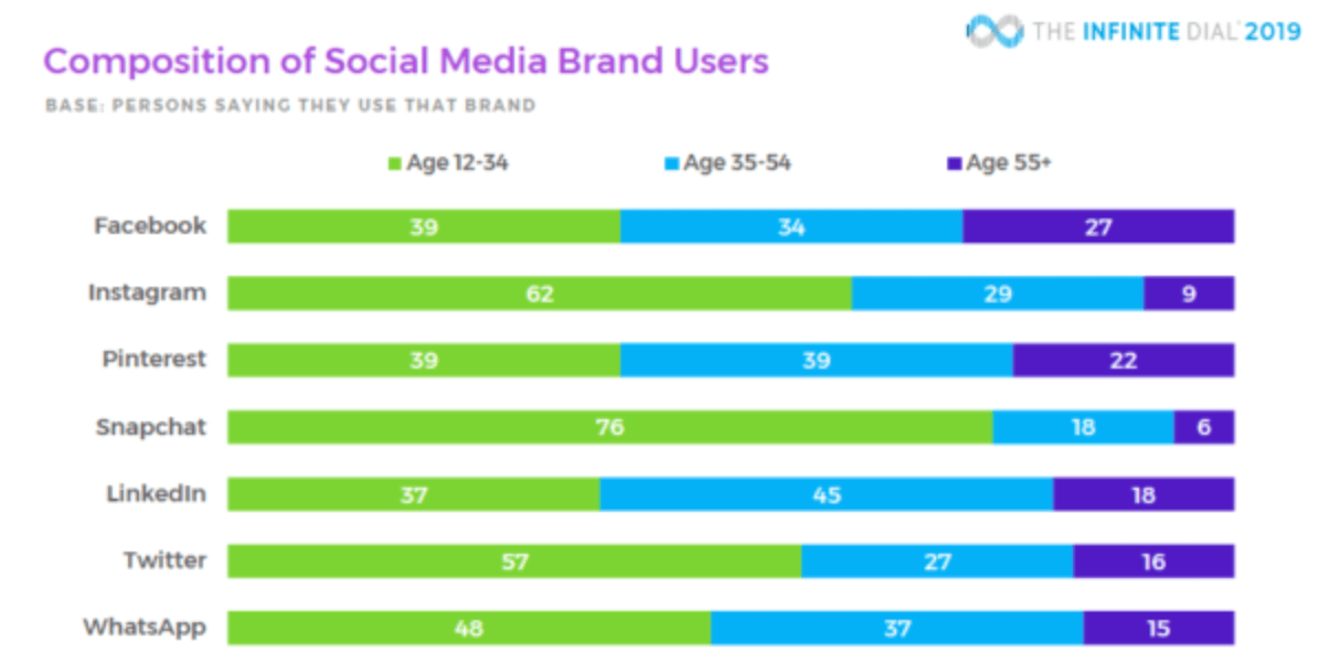
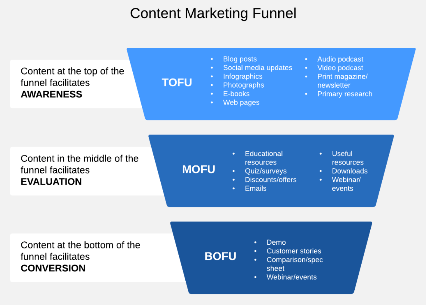

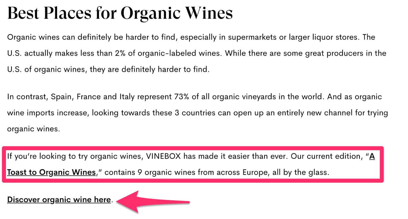
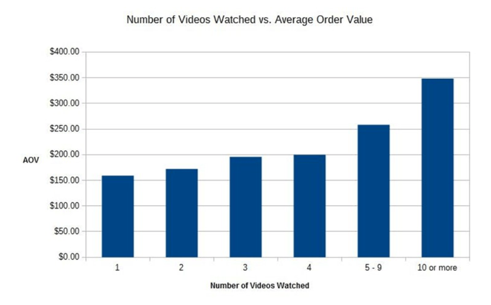
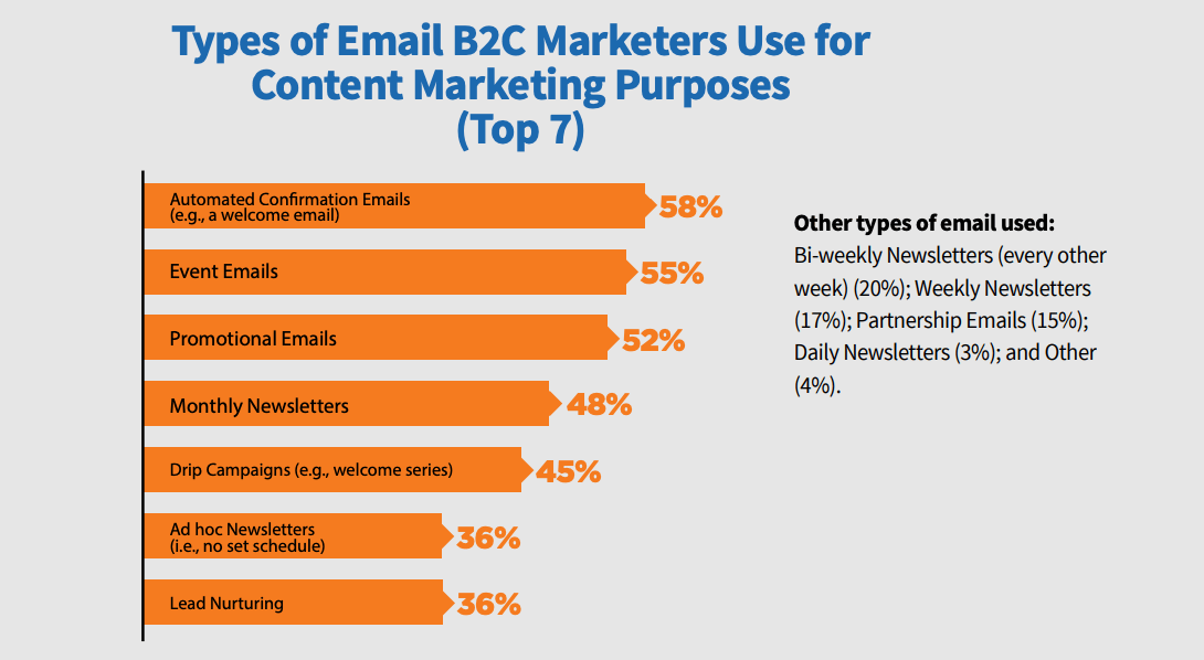

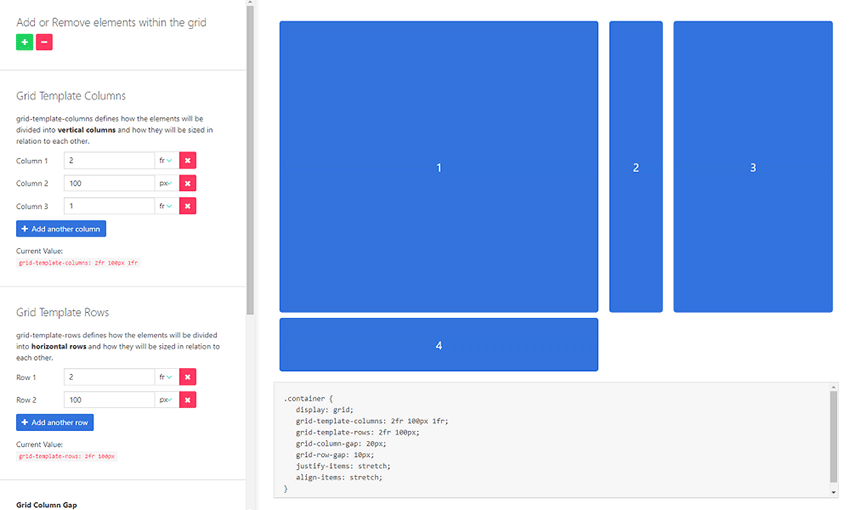
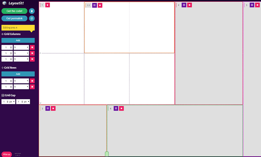
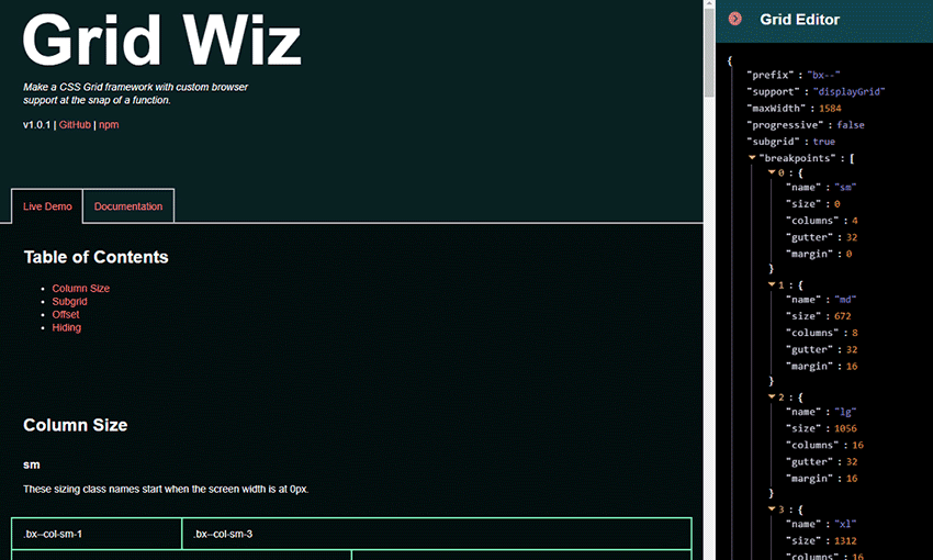
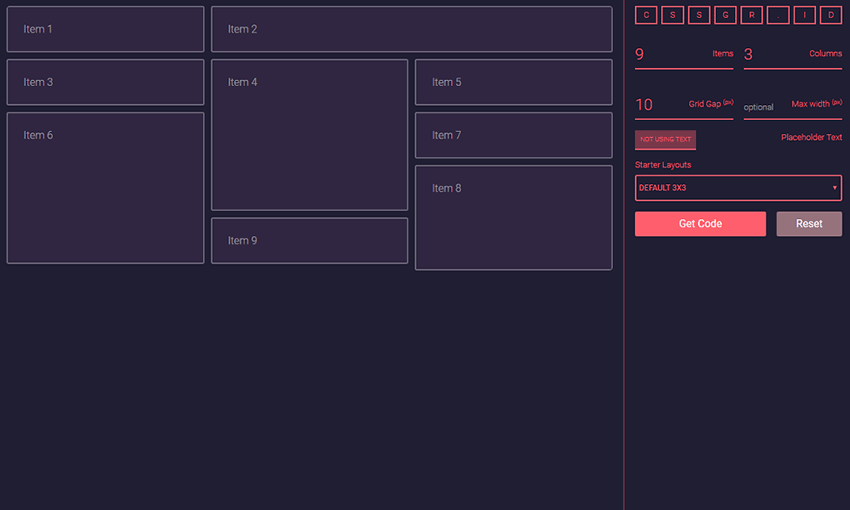


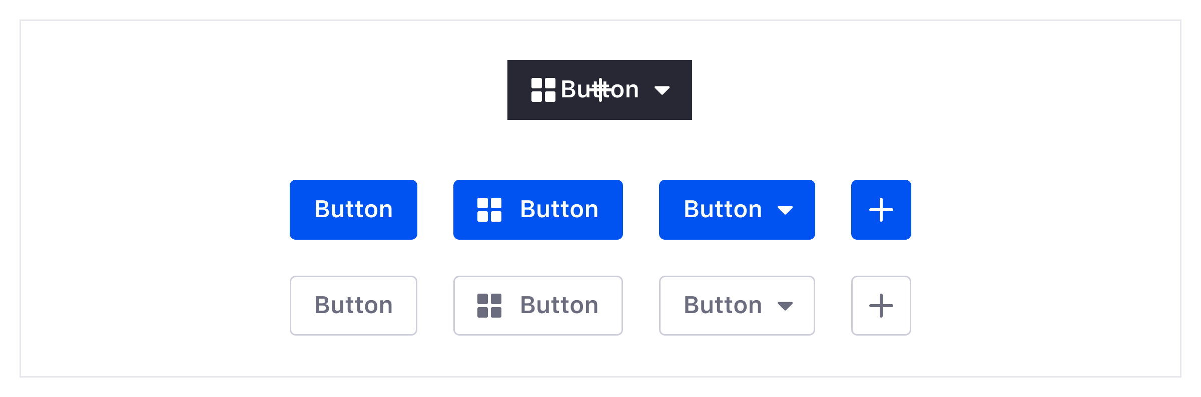


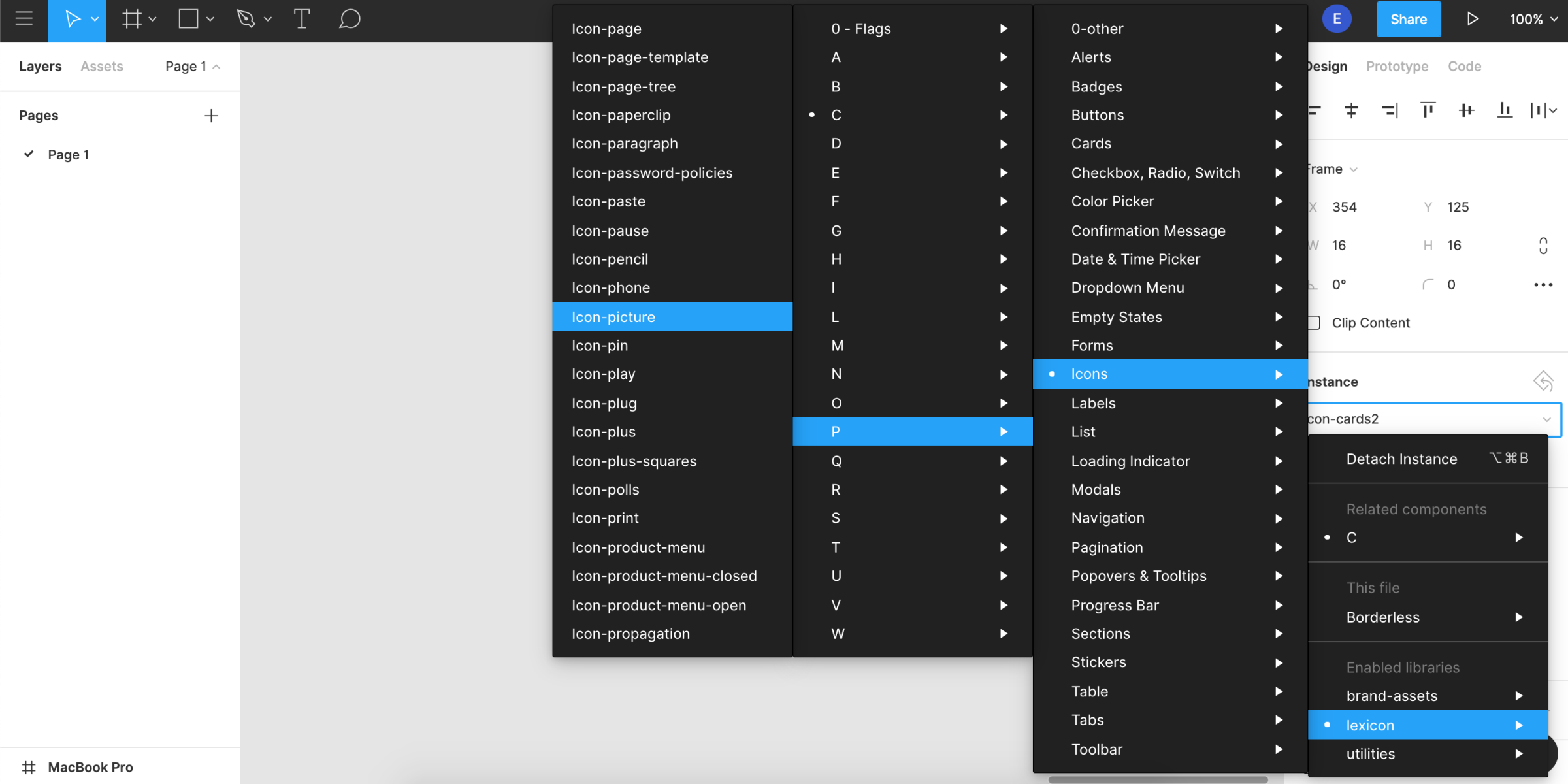


