As I continue my conversion from vbScript to Python I am finding the gotchas. For example...
A lot of my utility scripts take a file name or a file pattern as a parameter. My script, bitrate.vbs, for example allows me to invoke it as
bitrate file
bitrate pattern
Technically file and pattern are identical since specifying a file is really just specifying a pattern that matches up to one file. To get file listings in vbScript I would just spawn a dos dir command and grab the output from stdout. In Python, however, they provide what I thought was a great module named glob. So a lot of my code looked like
for file in glob.glob(pattern):
I had rewritten five scripts before I got bitten. Let's take a folder that has videos named like
Piano Recital [1994].mp4
Awards Day [1994].mp4
Betula Lake [1983].mp4
glob.glob("*.mp4") gives the expected result
['Awards Day [1994].mp4', 'Betula Lake [1983].mp4', 'Piano Recital [1994].mp4']
so if I were to run bitrate *.mp4 I would process the expected set of files. But if I want the bitrate of only one file and type bitrate "Awards Day [1994].mp4" I get nothing because the result of `glob.glob("Awards Day [1994].mp4") is
[]
And there is a (semi) valid reason for this. glob allows you to use character classes (a subset of regular expressions) in file patterns and [ and ] are used to delimit character classes. Fortunately, glob also provides an escape method in case your file name contains these delimiters. Lets see how this works.
 >>> glob.escape("Awards Day [1994].mp4")
'Awards Day [[]1994].mp4'
so using glob.glob(glob.escape(filename)) instead of glob.glob(filename) handles the case where filename contains [ or ]. But look what happens with actual dos wildcard patterns.
Regular (as in Windows) wildcards are also escaped. There are other Python filename listers like fnmatch, but these follow the same convention. So I've gone back to
While I am on the subject of gotchas, here's one that pisses me off. When you create a string you can include special characters like newline (\n). I love being able to do this. vbScript was butt ugly, relying on constructs like "line 1" & vbCrLf & "line 2". But this can be awkward when coding up file names like 'D:\temp\log.txt' because \t is a tab character. In Python you have to do 'D:\\temp\\log.txt'. But the language provides an alternative. You can specify a string as a raw string in which the backslash is to be taken literally. The above filename can then be coded as r'D:\temp\log.txt.
But here's the gotcha. In a raw string, a backslash is to be treated just like any other character - nothing special here - UNLESS it is the last character. So don't use r'D:\temp\'. Instead you have to use r'D:\temp\\'. I can't imagine a scenario in which this makes sense.
Request, a blockchain-based payment solution provider, has launched a beta version of its Request API. Through the API, users can create and read electronic invoices stored on the Request network. Because the Request core is exposed through an API, developers can integrate with Request technology without needing to learn development skills specifically tied to Request.
The Theme Review Team has been discussing ideas in Slack on how to solve the problem of themes in the review queue suffering from common theme issues. Just Tadlock has proposed a idea he calls Theme Feature Repositories.
The idea is to create standardized packages on the Theme Review Team GitHub repo that authors could use in their themes. If enough people bought into the idea and worked together, it would lessen the pain points between reviewers and theme authors. It would also decrease the amount of code written by hundreds of different authors to solve a common problem.
Tadlock used Admin notices and Links to ‘Pro’ versions as two examples that could benefit from this approach. Packages would handle specific use cases and be installed using Composer. For those who don’t use composer, an autoloader would be provided as well as a .zip file that could be dropped into a theme.
Tadlock is asking the theme community what packages do they need or what common problems could be solved together.
“This can literally be any common feature in WordPress themes, not just admin or customizer-related things,” Tadlock said. “Nothing is ‘out of bounds’. Every idea is on the table right now.
“This is an ambitious project. It’d require cooperation between authors and reviewers for the betterment of the theme directory as a whole. It’ll only work if we have buy-in from everyone.”
Tadlock also mentioned that due to his schedule, he will be unable to lead or co-lead the project and is seeking people interested in taking on these roles. Those interested should have knowledge of Git, Composer, and Object-oriented programming.
If you’re interested in this project or want to provide feedback, you can leave a comment on the proposal.
The Spanish WordPress community hit a remarkable milestone with translations this week. Polyglots volunteers have now translated the meta sites, WordPress apps, and the top 200 plugins at 100% completion, with no pending translations to review.
No solo no hay traducciones pendientes de revisar, sino que tiene siempre traducido al 100% WordPress, sitios meta, aplicaciones y, ahora, también al 100% el Top 200 Plugins.
The size of the team is a major factor in reaching this milestone. According to stats Naoko Takano shared at WordPress Translation Day 4 last month, Spanish is the locale with the most translation contributors (2,863), followed by German (2,399), Italian (2,190), Dutch (1,584), and Russian (1,515). It is also one of the top non-English locales installed, with 5.0% of all WordPress sites using the translation. WordPress.com reports similar numbers, where Spanish is the second most popular language for blogs at 4.7%.
Rocío Valdivia, a Community Wrangler at WordCamp Central who lives in Spain, gave us a look at what is behind the team’s extraordinary growth and momentum. She identified several key factors that have contributed to their success in working efficiently and sharing useful information among team members during the past 2-3 years.
“We created a Slack instance some years ago, but at the beginning it was common for people to join and ask for support questions,” Valdivia said. “Now we have some protocols: the general channel is an only-read channel. If someone ask for support, we send them with a kind predef to the es.wordpress.org forums, where they get answers in a few hours. There are no questions in the forums waiting for longer than six hours ever, as we have a very active support team that coordinates in the #support channel of our Slack.”
Valdivia said that removing the noise of support requests has given the team very productive channels for translations, plugin and theme translations, meetups (where Meetup organizers share tips and resources using a shared Google drive folder), and WordCamps (where WC organizers share info, tips, answer questions in Spanish, and share resources like email templates.)
“Besides all of this, we’ve worked very well passing the philosophy of the project to the new members from the most experienced ones,” Valdivia said. “For example, people do very soft transitions from one lead organizer to the next one.”
Although some WordCamp attendees have complained in the past that not much is accomplished at Contributor Days, the Spanish community has had success using these opportunities to transfer knowledge to new leaders and contributors. The community hosted 10 WordCamps in 2018 and Valdivia estimates they will have 9-10 in 2019. WordCamp Barcelona 2018 and 2019 had 400 attendees and 180 people at their Contributor Days. WC Irun 2019 had 220 attendees and 100 participants at Contributor Day. WordCamp Madrid 2019 sold out with 600 attendees and approximately 200 participated in Contributor Day.
Although the Spanish community has experienced contributors across several WordPress.org teams, such as WPTV, Community, Support, and Polyglots, Valdivia said they are a bit thin on Core contributors.
“We’re lacking people with experience contributing frequently to Core,” Valdivia said. “We have some of them who have contributed several times, but still need more people with more involvement to be able to pass all this info to newcomers.”
Strong local meetups are another factor in the Spanish community’s success at keeping translations up-to-date. In addition to the largest team of translators in the world of WordPress, Spain has the second highest number of meetup groups and events per month. Spain is running 64 local meetups, with a population of 46 million people, compared to 201 groups in the U.S., which has 7x the population size (327 million).
“The language barrier has been an issue for years, as not everyone speaks English and not everyone feels confident following conversations in English,” Valdivia said. “So, being able to train our own teams of contributors in our own language and having our own shared resources and channels, has been very useful.”
In this episode, John James Jacoby and I are joined by Jonny Harris. Jonny describes how he discovered WordPress and some of the core projects he’s been working on including, Site Health Checks, fatal error protection, and Multisite. We discuss WordPress’ focus on users vs developers in recent years, Jonny’s experience contributing to core, and his thoughts on a WordPress governance model.
Games media service RAWG opened the RAWG Video Games Database API for developers. RAWG is the largest games database with over 300,000 of games, 2M of screenshots, 400K of reviews and ratings, and now you can access all of it and much more via the API.
This B2B platform fits designers, freelancers, agencies and anyone who wants to make beautiful websites for their clients or let them do it on their own.
Rachel Andrew introduces subgrid at the CSSconf EU 2019, with use cases, example code and some thoughts on where we might see Grid going in the future.
Chen Hui Jing explains a variety of modern CSS layout techniques through live demonstrations via DevTools, and provides real-world use cases of how such techniques allow designs to better adapt across a broad range of viewports.
A new CDN that was built to serve the 60,000+ npm packages written in ES Module (ESM) syntax meaning you can import packages directly without worrying about their module format or file location.
Golden Gate SEO is the premier SEO company. Our proven search engine marketing techniques have helped hundreds of clients transform their businesses to the next level. We offer unparalleled search engine optimization, paid and social media marketing services.
Fred Schott, a software developer and former Google employee on the Polymer team, has launched a new CDN for his Pika project. Schott’s mission with Pika is “to make modern JavaScript more accessible by making it easier to find, publish, install, and use modern packages on npm.” Pika provides a searchable catalog of “module” packages available on npm – packages that use the more compact ES module syntax (ESM), which result in smaller Javascript bundles.
npm currently lists 59,851 ES modules. This makes up approximately 7% of total packages on npm are exporting an ES module, but the number is steadily increasing:
Pika makes it easy to search for these packages and the results will only include those that have a defined “module” entry point in their package.json manifest. Each listing consolidates the relevant information on one page, highlighting the important details.
One of the chief advantages of using ES modules is that they run natively on the web, without the need for a bundler. In a post titled “A Future Without Webpack,” Schott contends that JavaScript developers are “so steeped in the world of bundlers” that they overlook the possibilities of using ESM dependencies that run directly on the web:
Over the last several years, JavaScript bundling has morphed from a production-only optimization into a required build step for most web applications. Whether you love this or hate it, it’s hard to deny that bundlers have added a ton of new complexity to web development – a field of development that has always taken pride in its view-source, easy-to-get-started ethos.
@pika/web is an attempt to free web development from the bundler requirement. In 2019, you should use a bundler because you want to, not because you need to.
Schott created @pika/web to make it easy for developers to use ES modules, even when they don’t have compatible dependencies. It provides an install-time tool that is not exactly a build tool or a bundler but works to output web-native npm dependencies into a single ESM .js file:
@pika/web checks your package.json manifest for any “dependencies” that export a valid ESM “module” entry point, and then installs them to a local web_modules/ directory. @pika/web works on any ESM package, even ones with ESM & Common.js internal dependencies.
Installed packages run in the browser because @pika/web bundles each package into a single, web-ready ESM .js file. For example: The entire “preact” package is installed to web_modules/preact.js. This takes care of anything bad that the package may be doing internally, while preserving the original package interface.
Here’s a demo of how that works:
¡OJO con @pika/web!
Instala tus dependencias npm y úsalas directamente en el navegador. Sin bundlers, ni configuraciones de ningún tipo. Nativo, ESM, optimizado para http2… ¡y MUY rápido!
This week Schott announced the availability of a new Pika CDN for delivering modern ES module packages. It uses the pikapkg/web package builder to work with any ESM package and the CDN will automagically handle any non-ESM dependencies of that package. Pika CDN automatically detects the visitor’s browser and serves JS that is optimized to the environment, eliminating polyfills and transpiler bloat wherever possible.
“Pika CDN leverages your browser’s natural caching abilities to give your pages faster dependency load times, especially on first visit,” Schott said. “0ms first-loads are even possible (for your dependencies at least) if all packages have been seen before.
“With our CDN, package authors can distribute more modern, unminified packages without worrying about how to serve them directly. Instead, our nifty package-builder automatically resolves each package — and any legacy sub-dependencies — into a single, minified, ready-to-import JavaScript file.”
Schott recently left his position at Ripple to work full-time on Pika, a project that he believes will move the JavaScript ecosystem forward.
“Leaving my team was one of the hardest decisions I’ve ever made, but I know that I’m needed here,” he said. “I’m so excited to be a part of the future of the web, whatever it ends up looking like.”
Clean minimal modern website inspired by moving windows of an award-winning digital agency that builds brands, websites, and apps for leading businesses internationally from its offices in Shanghai, London, and Tanzania.
Mauritz is a burger cafe and restaurant with locations in 3 Danish cities – Odense, Svendborg & Middelfart. All our cafes are decorated with a focus on giving our guests a much-needed break in everyday life. At Café Mauritz there is room for everyone – we can be the meeting place for a quick cup of coffee, “the long-awaited reunion”, your important business meeting or next party.
Mauritz has a mission to deliver good food at reasonable prices, whether our customers enjoy the food in one of our cozy burger cafes, or our take away in their usual home setting. That’s why we at Mauritz go high in quality. The quality already starts with the staff employed in the cafes. The staff represents Mauritz, and so our staff is responsible, smiling, friendly and quality conscious.
Our website gives the customers an idea of our burger cafes, lets them book an event, or order take away from our e-commerce store.
Greek mythology tells the story of Zeus creating the cloud nymph, Nephele. Like other Greek myths, this tale gets pretty bizarre and X-rated. Here’s a very abridged, polite version.
Nephele, we are told, was created by Zeus in the image of his own beautiful wife. A mortal meets Nephele, falls in love with her and, together, they take an adult nap™. Finally, in a strange twist, the cloud gives birth to half-human half-horse Centaur babies.
Weird, right? Personally, I can’t make heads or tails of it. Thankfully, the process for creating clouds in the browser is much more straightforward and far less risqué.
Recently, I discovered that developer Yuan Chuan has realized code-generated, photorealistic clouds. For me, this notion in the browser had long been the stuff of myth.
With one glance at the code in this pen we can imagine that convincing individual clouds are achievable through the use of CSS box-shadow with a <filter> element containing two SVG filters as its complement.
The photorealism we want is achieved with a delicate mix of feTurbulence and feDisplacementMap. These SVG filters are powerful, complex and offer very exciting features (including an Oscar winning algorithm)! However, under the hood, their complexity can be a bit intimidating.
For this article, we will focus on learning to use these SVG filters to get spectacular results. We don’t need to delve too deeply into what is happening behind the scenes algorithmically, much in the way an artist isn’t required know the molecular structure of paint to render a stunning landscape.
Instead, let's pay close attention to small handful of SVG attributes that are essential for drawing convincing clouds in the browser. Their use will enable us to bend these powerful filters to our will and learn how to customize them with precision in our own projects.
Let’s start with some basics
The CSS box-shadow property has five values that deserve close attention:
In the same way that a hand changes shape to alter the shadow, a "source shape" in the our HTML can move and morph to move and alter the shape of a shadow rendered in the browser. box-shadow duplicates the "morphing" features on the original size and border-radius. SVG filters get applied to both the element and its shadow.
This is the markup for our SVG so far. It won’t render because we haven’t defined anything visual (not to mention the zero width and height). It’s sole purpose is to hold a filter that we feed our SourceGraphic (aka our <div>). Our source <div>and its shadow are both being distorted independently by the filter.
We’ll add the essential CSS rule linking the HTML element (`#cloud-circle`) to the SVG filter using its ID:
No worries! We have only just scratched the surface and have a lot more good stuff to look at.
Experimenting with the feDisplacementMap scale attribute
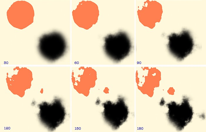
A few un-scientific experiments with this one attribute can yield dramatic results. For the moment, let’s keep the all values in feTurbulence constant and simply adjust the scale attribute of DisplacementMap.
As scale increases (by increments of 30) our source <div> becomes distorted and casts a shadow to mirror the stochastic form in which clouds appear in the sky.
Great, now the source element is getting in the way. 😫
Wait! We’ve widened the source element and now it’s in the way of our of the white shadow we’re calling a cloud. Let’s "re-cast" the shadow at a greater distance so that our cloud is no longer obscured by the source image. (Think of this as moving your hand away further from the wall so it doesn’t block the view of your shadow puppet.)
This is nicely achieved with a bit of CSS positioning. The <body> is the parent element for our cloud, which is statically positioned by default. Let’s "tuck" our source <div> up and out of the way with some absolute positioning. Initially, that will reposition our shadow as well, so we’ll also need to increase the distance of the shadow from the element and nudge the element a bit more.
#cloud-circle {
  width: 500px;
  height: 275px;
  background: #000;
  border-radius: 50%;
  filter: url(#filter);
  box-shadow: 400px 400px 60px 0px #fff; /* Increase shadow offset */
  position: absolute; /* Take the parent out of the document flow */
  top: -320px; /* Move a little down */
  left: -320px; /* Move a little right */
}
What is painted to the browser is a pretty decent depiction of a cloud–But, I’m not sure…does this cloud really do justice the cloud nymph, Nephele? I'm sure we can do better!
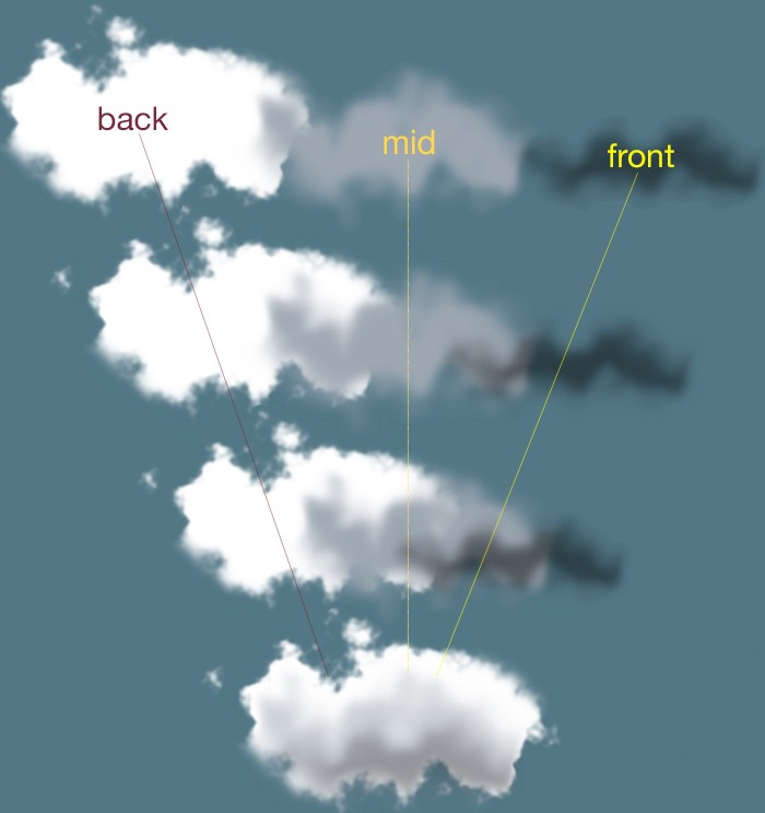
From the look of the depth, texture and richness of the clouds in this photograph, one thing is clear: Zeus went to art school. At the very least, he must have read the The Universal Principles of Design which illustrates a powerful–yet, deceptively ordinary–concept:
[...] lighting bias plays a significant role in the interpretation of depth and naturalness, and can be manipulated in a variety of ways by designers...Use the level of contrast between light and dark areas to vary the appearance of depth.
This passage provides for us a hint as to how to we can vastly improve our own code-generated cloud. We can render our cloud with a good deal of fidelity to the clouds in our reference image by stacking layers of differing form, size and color on top of each other. All that takes is calling our filter as many times as we want layers.
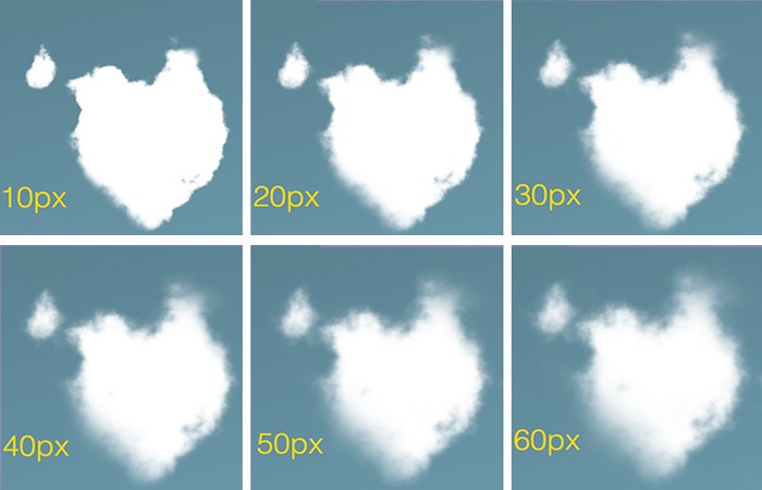
Applying our layers will afford us an opportunity to explore feTurbulence and realize its versatility. We’ll choose the smoother type available to us: fractalNoise with numOctaves cranked up to 6.
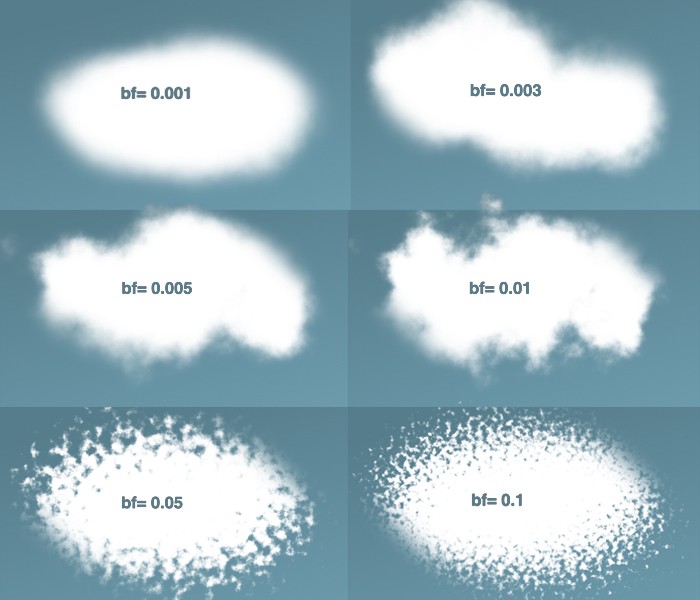
What does all that mean? For now, let’s focus specifically on the baseFrequency attribute. Here’s what we get as we increase the value of n:
The lower the value, the rounder and fuzzier we get. The higher the value, the rounder and more rigid we get.
Words like turbulence, noise, frequency, and octave may seem odd and even confusing. But fear not! It’s actually perfectly accurate to analogize this filter’s effects to sound waves. We may equate a low frequency (baseFrequency=0.001) with a low, muffled noise and a rising frequency (baseFrequency=0.1) with a higher, crisper pitch.
We can see that our sweet spot for a cumulus-like effect may lie comfortably around the ~0.005 and ~0.01 range for the baseFrequency.
Adding detail with numOctaves
Incrementing numOctaves allows us to render our image in extremely granular detail. This requires a great deal of calculation, so be warned: high values are a significant performance hit. Try to resist the temptation to pump up this value unless your browser is wearing a helmet and knee-pads.
The higher the value we put into numOctaves the more granular detail give to our cloud.
The good news is that we don’t have to crank this value too high in order to produce detail and delicacy. As the array of images above shows, we can satisfy ourselves with a numOctavesvalue of 4 or 5.
There is much to say about the seed attribute as it offers a hint into the magic happening behind the scenes. But, for our purposes, the utility of seed can be reduced to four words: "different value, different shape."
The Perlin Noise function (mentioned earlier) uses this value as the starting point for its random number generator. Choosing not to include this attribute will default seed to zero. When included, however, whatever value we give seed, we don’t need to worry about a performance hit.
Different seed values produce different shapes.
The GIF above represents some of what seed has to offer. Keep in mind that each of those clouds is a layered, composite cloud. (While I have tweaked attributes for each layer, I have kept their respective seed values uniform.)
Here, with a close look at the reference image, I've layered 3 cloud-<div>s (of differing in opacity) onto a single base div. Through trial and error and punching in arbitrary seed values, I eventually arrived at a shape resembling the shape of the cloud in the photograph.
Of course, it would be hubris to think that the <div>s that we paint to the browser could be superior to Zeus’s, Nephele.
However, the more mystery we are able to tease out of CSS and SVG filters, the more we are empowered create something visually stunning with a high degree of fidelity to the Thunder God’s original creation. We can, then, can go on experiment further!
I hope this gets you excited about creating a bit of photorealism on the web. I developed a little tool to help put them all to use and experiment a bit. Any questions, suggestions or advice? Ping me in the twitterverse drop a comment here.
Lindsey Kopacz has a wonderful blog about accessibility. I've seen a number of her articles making the rounds lately and I was like, dang I better make sure I'm subscribed. For example:
Regarding that last one, I remember learning from Sara Soueidan that a good tip for this to position them over the new custom checkboxes and hide them via opacity instead of hiding the native checkboxes by clipping them away. That covers the scenario of people exploring a touch screen for native interactive elements.
There is a seemingly endless supply of crazy fonts to choose from. But few of those fonts are actually good for a blog or website. Minimal and simple fonts make great headers and body text for a website that wants to be clean and readable. With 58% of people visiting webpages on mobile devices, it’s important that web fonts be very legible even at small sizes. These fonts are all geometrically sound, have well-thought-out spacing and kerning, and were often specifically designed for screens.
What fonts look good where is often fairly subjective, but most people can appreciate a good minimal font. We live in a cluttered world with a lot of distractions, so simple fonts are seeing a revival in web design.
Here are 12 of the best free fonts for minimal blogs and websites!
Montserrat is a sans serif font that tends to be on the thinner side. It has a bit of personality, with the inspiration coming from signage in the Montserrat neighborhood of Buenos Aires. Certain characters such as the capital ‘J’, and the capital ‘R’ have special aspects that make this font really stand out, despite being minimalist. You’ll always recognize the use of Montserrat in a webpage, with iconic curves and lines.
Source Sans Pro is another sans serif mainstay that was specifically designed to work well in user interfaces. This makes it the perfect font for blogs and websites. Most of the characters are very simple, straightforward, and balanced. It was inspired by gothic fonts, but spread out the character’s elements vertically and horizontally, to increase readability.
The Simplifica typeface is a somewhat condensed sans serif font. It has very consistent character heights, to increase readability. This font flows easily and legibly across any webpage. It really shows off why the word “simple” is in the name. The tall character heights make for a smashed-together look, but the wide variety of ascenders and descenders provide enough interest to prevent Simplifica from being hard to read.
Blogger Sans was designed for website headers, and focuses on legibility. Some characters are shorter or more compact, which means this font is great for headings with small line spacings. While many minimalist fonts involve just straight lines, Blogger Sans employs more rounded corners. It’s a slippery slope to Comic Sans from here, so use something like this only when very appropriate.
Caviar dreams is a thinner sans serif font that features a lot of straight lines and a few surprises. The lowercase ‘e’ in particular has a 45-degree angle line that adds a lot of personality to any header text you use this on. The “caviar” in the name makes this font seem ideal for elegant looks, and its clean lines would certainly imply that as well.
Quicksand is designed for display purposes but is still legible at small sizes. It has rounded terminals, which makes it easy to read whether using light or bold styles. Overall, it is based on geometric shapes, so all of the characters just make sense when seen together. It is clear that the entire font is based around a few curves, and lines jutting out of those curves in a deliberate fashion.
The Roboto font has a geometric core that also features a lot of open spaces to increase readability. This typeface lets characters take up their natural amount of space, rather than forcing a grid. That makes Roboto easy to read on a webpage, and look pleasing to the eyes at the same time.
Lato was originally conceived for corporate logos, which is probably why it works so well as a professional-looking blog or website font. It is a sans serif font that has a fairly timeless, simple design. Its simplicity makes it great for body text, but stands out enough with some unique characters and rounded elements, to be a great header font as well.
Oswald is a play on Alternate Gothic sans serif fonts, and was optimized for digital displays. All of the characters are well-balanced with a combination of straight lines and rounded details. The letters have a very tight spacing between them, but everything is still legible at a small size. The entire font has an “upwards” feeling to it, making it seem tall and strong.
Raleway was designed for headings and other large usages. It is a sans serif font that comes with a unique look – some of the numbers have additional ascenders and descenders that can give some special character to a heading, although that doesn’t work for every situation.
Merriweather is a serif font, but one that works nicely for web display. It was specifically created for being easily read on screens. The serifs make the font appear sturdy and strong, while a taller overall design gives plenty of room to legibly read this typeface. This makes a great, subtle replacement for a classic font like Times New Roman, which is similar in many ways.
Playfair is a stylistic serif font that works great on any website trying to convey a sense of elegance. This font is elegant while not sacrificing simplicity. There are just enough details and unique serifs to make it exciting. It feels like an old, classical font, while still maintaining modern sensibilities. Most sans serif fonts will pair nicely as body text, with Playfair used for headings.
Fonts That Add Simple Personality
Quite often, simple, no-frills fonts are more effective than their over-the-top counterparts. The selections above enable you to make a statement in a clean, simplistic manner. That, in turn, will allow your content to speak for itself.
User Interaction is one of the critical aspects you need to concentrate on if you want to deliver a welcoming user experience. Unfortunately, you can’t sit down in their place and see your site from your visitors’ point-of-view, so you need a way to figure out how your site responds to input.
Enter Google PageSpeed Insights. There are 3 metrics in Google PageSpeed Insights that will help you understand the user interaction experience so you can improve, Time to Interactive, Max First Input Delay, and First CPU idle.
In this post, we’re going to cover the metrics Google PageSpeed Insights uses to measure user interaction. I’m going to show you how to improve Time to Interactive, Max First Input Delay, and First CPU idle so you can deliver the best user experience for your visitors.
What is Interactive Design?
Tell me if this has ever happened to you. You go to a site and as the content is loading, you click on something, but nothing happens. So you click on it again and again and then when the page finally responds, you end up on some random advertisement landing page or somewhere else you didn’t want to be.
That my friends is a negative user interaction.
Interactive design focuses on allowing the user to achieve their goals, whether that’s purchasing a product or signing up for your newsletter, as easily as possible.
There are many dimensions to interactive design. What we’re most concerned with in this article is feedback and how long it takes to deliver, since it helps your visitors assess if their actions are effective.
If the response time between an action (like a click) and the response takes too long, your visitors will lose faith in your site and probably turn to your competitors.
To deliver a positive user interaction as your site loads, we need to focus on several metrics to give us a well-rounded idea of what the user is experiencing. Let’s look at what those are now.
For this site the user interaction metrics are great, but the site still needs some work to improve the other metrics
Lighthouse takes a user-centric approach and measures the following:
First Contentful Paint
First Meaningful Paint
Speed Index
First CPU Idle
Time to Interactive
Estimated Input Latency
Lighthouse collects lab data within a controlled environment with a predefined device and network settings and then assigns each metric a score. Scores in the ideal range are shown in green, while low scores are shown in red. Yellow scores fall in the average range.
These six metrics each tell you something different about what your user experiences as they’re waiting for your site to load and together they form a more complete picture.
The Time to Interactive metric, or TTI, measures how long it takes before the user can reliably interact with the content on the page by doing things like clicking links or entering text into input fields.
A TTI score of less than 100ms is ideal because when your visitor takes an action, the response feels almost instantaneous. Any longer than that and the user will perceive the lag as something wrong with your site.
While the ideal Time to Interactive in WordPress should be under 100ms, you do have some flexibility. On a landing page with a web form, the Time to Interactive benchmark would be very important. On a blog page, with only a couple of links, TTI would be less important than content visibility. Each site has different priorities, so you should only sacrifice content visibility for interactivity if it makes sense.
How is Time to Interactive Measured?
Time to Interactive is tricky to measure because there isn’t an exact and clearly defined point when the page is ready for interaction.
Think of it like measuring how long it takes to make stovetop popcorn. It’s impossible to say exactly how long it will take because you can’t see inside the pot and don’t know how many kernels still need to pop. So to make popcorn without burning it, you need to listen. When there’s a long enough delay of a few seconds between pops, you can safely assume that the popcorn is about ready.
Measuring Time to Interactive is a similar process. Lighthouse observes the main thread and network activity to figure out what is taking place. It is looking for a big enough time window on the browsing context event loop and a 5-second sub-window of network quiet where the probability of long tasks or heavy processing taking place are low.
It knows when to pay attention by looking for the First Contentful Paint and detecting when event handlers are registered for most visible page elements.
How to Improve Time to Interactive
To improve your TTI score, focus on improving your site’s JavaScript code. Downloading, parsing and executing JavaScript consumes more CPU than all other browser activities combined.
While mobile devices and computers now have more CPU, the amount of JavaScript on webpages has ballooned, increasing 3 fold in the last 6 years.
JavaScript operates in a single-threaded environment which forms a bottleneck when one process takes too long to perform. When one process blocks the single thread, everything else has to wait including other processes and user feedback.
This is even worse on mobile. Tasks can take 3-5x longer and the high CPU load drains batteries. Not to mention that the site will appear janky so it doesn’t make for the best user experience.
Tasks that take longer than 50ms are considered long tasks. To improve your TTI score, remove unnecessary JavaScript or defer it until the page is finished loading. You should also break up large files to prevent a bottleneck.
What is First Input Delay?
The Google First Input Delay metric measures how long it takes for the browser to respond to the user’s input, such as clicking a button. An ideal First Input Delay of 10ms is ideal.
While Time to Interactive, can be measured in a lab setting, First Input Delay or FID, requires users to be calculated accurately. A Google PageSpeed Insights test does include a metric for Max Potential First Input Delay, but an analytics tool, such as Google Analytics will give you more accurate results.
If you are collecting First Input Delay data from your analytics tool, then you’re capturing real user pain. If the wait time is long, then you know your visitors are probably frustrated because they have to wait every time they interact with the page. If that wait time is especially long and your bounce rate is high, then guess what? You’re losing visitors because of a poor site experience. Ouch.
What counts as a first input?
Let’s define the first input delay meaning because it doesn’t include all user interactions.
FID measures actions like clicks, key presses and entering text in fields. It does not include scrolling or zooming since they can be run on a separate thread by the browser.
This is why if your site doesn’t have any actions the user can take, other than scrolling or zooming, you won’t have a First Input Delay metric to deliver.
How to Fix First Input Delay
TTI and FID are closely related, so if you work on delivering your JavaScript more efficiently to improve your Time to Interactive, it will also improve First Input Delay.
If the browser’s main thread is busy then it won’t be able to respond to user input so you should work to split up long tasks or not run them on the main thread. This will keep the main thread open.
Third party ads and social widgets have a reputation for being greedy when it comes to consuming resources on their host pages so you should aim to include the fewest third-party iframes possible.
One approach to improve First Input Delay is by deferring non-critical tasks until they’re called for. This method is called “Idle Until Urgent” if you’d like to learn more about how to use it.
What is First CPU Idle in Lighthouse?
The First CPU Idle in Lighthouse measures when a page is minimally interactive and most but not all of the elements are ready for interaction. If you do interact with elements on the page, there may be a delay, but the page will respond.
First CPU Idle in PageSpeed Insights was originally called Time to First Interactive. It indicates when there is the first span of 5 seconds in the main thread when tasks so not take longer than 50ms after the First Contentful Paint.
The First CPU Idle is similar to Time to Interactive because both listen for JavaScript event handlers in order to return an accurate measurement, but First CPU Idle does not require the browser to respond to user input in less than 50 milliseconds.
A value of 2-4 seconds for the First CPU Idle in WordPress is about average.
How to Improve First CPU Idle?
An easy First CPU Idle fix is to minimize the number of resources that need to be executed before a page can load and reduce the size of the remaining resources.
These are the same strategies to improve TTI and FID, optimize the critical rendering path and optimize content efficiency.
User Experience Interaction Guidelines
Lighthouse does not assess your whole site. It audits one page at a time, so to understand how your site performs, you need to test a variety of page types on your site. Test a blog page, a product page, checkout, etc. Pay special attention to important conversion pages, like your landing pages and shopping cart.
Lighthouse evaluates six test metrics, but it doesn’t weigh them all the same when coming up with an overall score. Each is weighted differently.
The metric with the most weight is Time to Interactive because it has a greater impact on the page’s overall performance. This is followed by Speed Index, First Contentful Paint, First CPU Idle and First Meaningful Paint, in that order.
How to Improve Your Score
You may have noticed a pattern in the suggestions to improve Time to Interactive, First CPU Idle, and First Input Delay. Since these three metrics are closely related, you take a holistic approach to improving them. By improving your interactions for your users, you’ll improve all three.
Here are actions you can take to improve your scores:
Optimize the Critical Rendering Path
Minimize or eliminate critical resources in the main thread.
Defer their download or load them asynchronously if you can.
Optimize the size of assets by compressing or minifying to reduce the download time.
Download all critical assets as soon as possible to shorten the critical path length.
Lazy Load Your Images – If an image is below the fold, wait to load it until you need to. Prioritize loading the page first, then when you have idle time in the main thread, you can load the image once the visitor scrolls down the page.
Enable browser caching – Caching files dramatically cuts down the loading time for additional pages by storing assets in a cache for faster retrieval. With HTTP caching, the browser stores a copy of assets downloaded via HTTP by the user in its cache so it will be able to retrieve them without making an additional trip to the server. We recently compared Hummingbird to other popular caching plugins and Hummingbird out optimized all of them.
Use a CDN – Intermediary caches such as content delivery networks can help you serve assets faster from a closer data center to the user.
Use JavaScript Wisely
Remove unnecessary JavaScript files and unused portions within files.
Split up large JavaScript files.
Defer loading of low-priority JavaScript files.
Minify and compress JavaScript files
Smush Pro has a CDN that can help you lazy load your images. Hummingbird can assist with enabling browser caching. You can get a free 30 trial for both right here to improve your Google PageSpeed Insights score.
Splash pages are a great way for you to communicate in a deeper, more personal way with your user base. In today’s business landscape, it can be difficult to attract visitors to your page over your competitor’s page. Competition is fierce, and businesses everywhere use design and marketing to create an effective message that resonates with their audience.
As you start to design your website, you might find that adding an extra layer—a splash page—can help you bridge a gap, filling the spaces for anything you feel is missing from a traditional landing page.
In some cases, a splash page can more clearly deliver a message than your homepage can. But in a world where the average attention span is lowering, you need to execute your splash page right to make it a success. Here’s what you should know:
What Is a Splash Page?
It’s important to understand that the splash page isn’t the same as yourlanding page or homepage. A landing page’s sole purpose is to act a conversion hotspot: with a landing page, you’re seeking to fulfill a goal, whether that goal is to encourage visitors to subscribe or to make a purchase.
A splash page’s purchase is to serve as a creative introduction and is much more personalized. Think of your splash page a welcome screen and teaser for users visiting your page for the first time.
This is what they see before they officially reach your landing page, and it’s a great way for you to set the mood and tone for your site.
As you start to think about how you cancreate a splash page of your own, you can take a look at how others are executing splash pages to communicate their vision and mission. Use this as inspiration for your personal creative efforts. Take a look at theseexample splash pages for some ideas.
Two Key Components
There are two key components that need to be integrated into your splash page. The first should be a clear message and purpose for the splash page. The second should be a clear exit that takes them to the actual landing page. These two simple elements are the crux of a splash page, and without both, you’ll most likely have a crappy user experience.
The text should be clear and to the point. Any visitor should be able to read the splash page and take action within just a few seconds. As such, the copy should veer on the short and snappy side. A heading and subheading should easily cover your most basic splash page needs. Graphics and images, a CTA, and bullet points are all helpful to add.
Pay Close Attention to Design
Design is one of the most important aspects of a splash page. Today’s users will spend less than four seconds deciding whether they want to engage further with a page, and your business should capture attention quickly.
Your imagery should be captivating, and your content should be equally as attention-grabbing. There are plenty of splash page templates that make creating a great design easier than ever.
When to Use a Splash Page
While splash pages can be a great feature on your site, not everyone needs them. Determining whether splash pages are for you is a great first step towards making the best decision for you and your site.
One of the best reasons for offering a splash page is if you have multiple types of experiences for the user. For example, Football.com asks visitors if they want to know more about American football or World football.
Their user experience will differ depending on the choices they make. There are other preferences that can be communicated via splash page too, such as languages or currency—ideal for businesses who service multiple worldwide locations.
You can also use a splash page for age verification purposes, which is ideal if your business is centered around delivering age-appropriate content. For example, alcohol-based businesses are required to verify age before users can learn more about the product on the homepage. And lastly, you can use a splash page as a “coming soon” banner if your website is still in its production phase.


 Instala tus dependencias npm y úsalas directamente en el navegador.
 Sin bundlers, ni configuraciones de ningún tipo.
 !
!