Once you have finished your batch of logos, website design, or whatever creative work you made, you need a marketplace to sell it on. There are a vast number of websites out there for you to choose from.
Selling your designs is a very easy way to make some extra money and to expand your brand. Whether you are an illustrator, 3D artist or logo maker, there is a demand for your creative work.
There is no longer a need to build your own website to sell designs. Now, it is easier than ever to list your work on ecommerce websites to help you reach thousands (if not millions) of people. This article will help you find the one that best suits your needs.
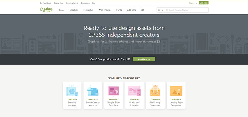
“Empowering creators to make a living doing what they love” is a phrase that Creative Market uses to describe what they offer and this holds very true. Creative Market has a network of about 5.9 million potential customers that could be interested in purchasing your work.
This marketplace is used to sell graphics, WordPress themes, stock photos, and many other digital goods. There are many success stories from sellers using Creative Market to sell their goods and making a lot of money doing so. Stories such as Nicky Laatz, a South African shop owner, who has earned more than $1,000,000 selling her work on Creative Market.
Envato Elements is a digital marketplace that allows creators to sell multiple digital goods such as graphics, fonts, WordPress themes, web templates and photos – along with many more digital items.
The company believes in supporting independent designers and that when the community succeeds, the company succeeds. With this belief they share an even 50% of the net revenue with their designers and sellers. This marketplace is driven exclusively by the community of designers who sell their work with them. Envato Elements is a great way to get paid for your creative work.
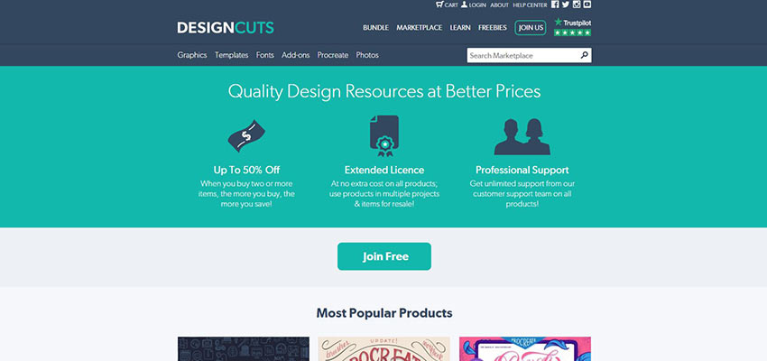
DesignCuts is a digital marketplace that is driven by the community. They are very selective in who they allow to sell on their marketplace. Taking a visit to their website, you will see the quote “We’re very exclusive and work with only the best designers in the world, curating the highest quality marketplace around.”
This means it is tough to become a seller on their marketplace. But once you do, you will be part of a small group who has access to a large share of potential customers.
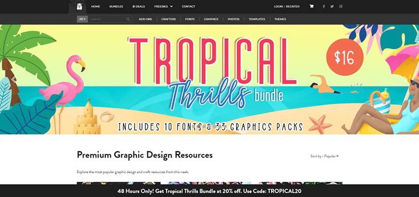
The Hungry JPEG began in late 2014 as a website to help designers and crafters navigate the design world. By mid-2015, they launched a shop to give designers a way to make money from their craft.
They offer a wide range of products, from handmade goods to website templates. If you choose to sell on The Hungry JPEG, you will earn 70% of every sale you make – one of the highest numbers of all the websites on this list.
Also, they do not ask for an exclusivity deal – meaning you can list your products on their website and any other websites of your choosing. They also offer an automated product delivery system so your items are always selling, even when you are away.
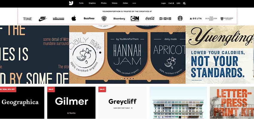
YouWorkForThem has been around since 2001 and is one of the oldest online marketplaces. They are privately owned and run by a group of designers who know what is best for the designer.
They are used by many major brands such as Nike, Coca-Cola, Whole Foods Market, Starbucks, Amazon, Samsung and many others. YouWorkForThem splits the profits 50/50 with all the designers who sell fonts and stock art. On top of that, they will market your designs on their social media outlets, like Facebook and Twitter, that have a combined audience of nearly 80,000 people.
Etsy is one of the largest global marketplaces around. With a concentration on handmade goods, jewelry, and clothing, you can also find digital goods such as website designs.
They are also one of the easiest places to sell your work, but this ease and large user base also creates more competition. Etsy does offer affordable ways to list your work with prices as low as $0.20. With the many tools that Etsy provides, it is very possible to become a successful seller on their website.
Society6 is very similar to Etsy in that it focuses on selling handmade crafts and goods. Their market mostly consists of artwork that goes on products like mugs, phone cases, and t-shirts. This is the place to get your work in front of thousands of people and a network that grows every day.
Template Monster has been in business since 2002 and from the get-go they changed the way websites are built. They specialize in offering web templates and other related digital goods.
You’ll find WordPress themes and plugins, CMS templates, fonts, and illustrations along with many more digital products to sell and buy. Every month they add nearly 400 new products in all the categories mentioned above.
They also offer 24/7 customer support for sellers and buyers, making it easy to handle any problems you may come across when using their marketplace.
Big Cartel has been around for 14 years and in that time, they have helped artists sell over $2.5 billion in creative work. They enable sellers to create their own store with many customizable features to make the experience as personal as possible.
The freedom they allow you to have with selling your work is everything a designer could want from a marketplace.
The Power of Community
One of the common threads of each of the marketplaces above is their reliance on a community. The strength of these virtual places, and the work they produce, is what keeps them going. The stronger the community, the bigger potential audience you’ll find.
In that way, deciding where to sell your own work is just as much about deciding which community is the best fit as it is about profits. Fortunately, there are a lot of high-quality options for just about every designer!
Transactional emails and promotional emails lay a sound foundation for every email marketing campaign. While the first one is responsible for luring people in, promoting products, and keeping the readers up-to-date, the second one is used for numerous notifications. Even …
Are you seeing ‘Fatal error: Maximum execution time of 30 seconds exceeded’ on your screen when trying to update a WordPress plugin or theme?
Typically this problem occurs when a PHP code in WordPress takes a long time to run and reaches the maximum time limit set by your WordPress hosting server. The time limit is important because it helps prevent the abuse of server resources.
In this article, we will show you how to fix the fatal error: maximum execution time exceeded in WordPress.
Why Maximum Execution Time Exceeded Error Occurs?
WordPress is coded mainly in the PHP programming language. To protect web servers from abuse, there is a time limit set for how long a PHP script can run.
The actual time limit varies across hosting companies, however most of the times the maximum execution time is set between 30 – 60 seconds because that’s usually enough for a good PHP script to run.
When a script reaches the maximum execution time limit, it results in maximum execution time exceeded error.
Fixing Maximum Execution Time Exceeded Error
Although Maximum Execution Time Exceeded error is named a ‘fatal error,’ it is one of the most common WordPress errors, and you can easily resolve this.
Depending on when and where the error is triggered, WordPress may show the following error message to your website visitors.
This is part of the fatal error protection feature added in WordPress 5.2. You may also receive an email that will tell you which plugin (if a plugin triggered the error) caused the issue.
The email will also include a special link, which will allow you to log in to WordPress with ‘Recovery mode’.
Once there, you can simply deactivate or delete the plugin causing the error.
However, if you don’t want to deactivate a plugin, then you can fix the underlying cause that triggered the error.
To fix the error, you will need to manually edit your .htaccess file and add a simple line of code.
Simply connect to your website using an FTP client.
Another method to fix the maximum execution time exceeded error in WordPress is by modifying your php.ini file.
The php.ini file is a configuration file that defines settings for PHP on your server. On many WordPress hosting platforms, you may not see it inside your WordPress folder.
In that case, you can create a new php.ini file inside your WordPress root folder. After that, edit the php.ini file and add the following line.
max_execution_time = 60
Don’t forget to save and upload your changes back to the server. You can now visit your website and to see if the error has gone.
In most cases, increasing maximum execution time using either of these two methods will resolve the error. However if it doesn’t, then you need to contact your WordPress hosting provider for assistance.
When it comes to showing the transition, interaction and animation of elements in the user interface, a prototyping tool like Framer X can make a difference in the way you communicate your vision to the team and stakeholders and as a result, boost your efficiency as a designer.
With the following example, I will illustrate how you can add interaction to static designs. To profit the most from this tutorial, some basic experience with Framer X are welcome.
To get started, you will need the following tools and assets:
A sample Sketch file: This Sketch file contains the design screens that we will use in the tutorial. The designs are part of the Velocity UI Kit created by InVision.
Note:This tutorial is for designers using MacOS, as Framer X is for Mac (although this may change in the near future), and Sketch app is also only for Mac.
Bringing Your Designs From Sketch
We will bring our designs from Sketch into Framer X. You might also create your designs in Framer X as there is a full bunch of layout tools to do so, but there are some reasons whereby you can be interested in continuing designing your interfaces in Sketch:
You are used to Sketch and not willing to learn a new design tool.
You have already some designs in Sketch and you want to build the interaction for them.
Sketch works much better with large files. Framer X seems to have some problems when moving elements around.
Framer X is still in his early stages as a design tool and there are not many tutorials about how to create some elements of design. On the other hand, there are plenty of tutorials about Sketch and also many plugins such as the Craft plugin for Sketch which allows you to speed up your design process.
You will find many more web design resources for Sketch than for Framer X.
There is still a lack of tutorials about some of the options available in Framer X, especially about how to use the Code components.
So first of all, let’s create a new file in Framer X. The first thing we will do is to bring the design screen we have in Sketch into Framer X. To do so, just copy the Static artboard from Sketch and paste it in Framer X.
Copy your designs from Sketch and paste them into Framer X. (Large preview)
As you can see in the Layers panel, we’ve got the same layers we had in Sketch.
Note:Sometimes, when bringing your designs into Framer X, some properties may be lost — in this case, it’s the border radius of the thumbnails. This is because we used a Mask in Sketch and Framer X doesn’t recognize it. To solve this, you can either select the Group in Sketch and Flatten it to Bitmap before pasting it into Framer X, or once you have brought the design into Framer X, double-click to reach the Frame element and manually change the Radius in the Properties panel.
Organize The Layout In Framer
To work on the interaction of the elements in Framer X, we need to create a new Frame.
Note:A frame is similar to an Artboard in Sketch (or to the HTML <div> element), but is more powerful. Frames act more like containers as a frame can contain other frames.
To create a new Frame, go to the Layout tool panel, select Frame and drag and drop in any part of the canvas; or simply press F.
To create a new Frame, select Frame in the Layout tool panel. (Large preview)
Second, we will set a device for the Frame. Select the Frame and in the Properties panel, Device, choose Apple MacBook Pro.
To set a device for a Frame, select a Device in the Properties panel. (Large preview)
Take a look at the Static frame we’ve imported. We will build the following interactions:
Header: Fade in when scrolling through the content.
Floating Action Button (FAB): Default, hover and pressed states.
Nav: It is displayed from right to left when clicking the FAB.
Content: It is resized when clicking the FAB.
We will build interactions for the header, nav, FAB, and content. (Large preview)
First, create new Frames on top of the layers in such a way that you end up having one Frame for each of the abovemention interaction elements. For instance, we will add a new Frame to group all the layers that are part of the Header (Cmd + Enter) and name the Frame as header.
Group the layers to have one Frame for each of our interactive elements. (Large preview)
For the sake of clarity, change the name of the Apple MacBook Pro frame to Interactive. In the following section we will create a Scroll component.
Scroll Through The Content
First, we will duplicate (Cmd + D) the Content frame and take it out of the Static frame. Change the name of the new frame to i_content.
Duplicate the Content frame and take it out of the Static frame. (Large preview)
Secondly, we will create a Scroll component in our Interactive frame. To do so, go to the Interactive tool panel and select Scroll. Drag and drop in any part of the Interactive frame.
In addition to that, modify the width of the Scroll component to 1141px (same as the Content) and position it in the same coordinates as the Content is on the Static frame (left: 149px, top: 140px). Apart from that, increase the height of the Scroll component as it reaches the bottom of the Interactive frame.
Modify the width and height of the Scroll component and position it in the same coordinates as the Content frame. (Large preview)
Next, we will connect the Scroll component to our i_content. To do so, click on the connector and connect it to i_content.
Connect the Scroll component to the i_content. (Large preview)
Lastly, select the Interactive frame and Cmd + P to enter the Preview Mode. You should be able to scroll through the content now.
To access to Preview Mode, press Cmd + P. (Large preview)
Next, I will explain how to position the Header and the FAB (Floating Action Button) button to make them fixed while scrolling with no need for any special coding.
Fixed Elements
We will position the elements so as they remain fixed when scrolling through the page. To that end, duplicate the Header frame and position it in the Interactive frame. As before, change the name to i_header. Do the same with the Floating Action Button button. Your Layers panel should look like this.
Duplicate the Header and the FAB frames and position them within the Interactive frame. (Large preview)
As the Header and the FAB are out of the Scroll component, they will remain fixed while scrolling.
You can scroll through the content, whereas the header and FAB remain fixed. (Large preview)
In the next section, I will explain how to build the transition of the Header.
Header Transition
To build the transition of the Header we will make use of the Scroll away component created by Lukas Guschlbauer. To start using this component, go to the Framer Store, search for Scroll and install the Scroll Away component.
Search for 'Scroll' in the Framer Store and install the Scroll Away component. (Large preview)
Next, go to the the Components panel, click the Scroll Away and drop it onto the canvas. Take the Header frame out of the Interactive frame and position the Scroll away component where the Header was. Change the component size as to be the same as the Header (1440x80px).
Now, select the Scroll Away component and connect it to your i_header frame. You can change multiple properties of the component such as alignment, effect, direction, easing or timing in the Properties panel. We will change the effect to Fade Move. Once that is done, the options below will change accordingly.
Take the Header frame out of the Interactive frame and change the effect to Fade Move. (Large preview)
For the effect to work, we need one more thing. Select the Scroll Away Component and click the Override in the Properties panel. Click File and select New File. Then, click Override and select useScrollData. Next, click the Scroll component of your Interactive frame. Click Override again and select getScrollData in Override. To preview the result, press Cmd + P.
Note:Overrides are a unique concept to Framer X. Code overrides are functions that allow components to communicate with each other. You can write them yourself in code and apply them to any Frame or component on your canvas. These functions allow you to override visual properties like opacity and fill, and allow for interactivity and animation. Code overrides can live in any code file in your project. Framer X interprets these based on the type. You can apply any code override to any Frame or component on the canvas by selecting Override from the Properties panel.
The transition of the Header works, but there is a white space at the top. (Large preview)
The transition works, but you will notice that there is a white space at the top. This is because the Scroll component is positioned at y: 140. Let’s change this. Increase the height of the Scroll component to occupy the whole height of the Interactive frame. Next, go to your i_content frame and position the elements 140px from the top of the frame.
In the i_content frame, position the content 140px from top. (Large preview)
Your interaction should be now similar to this one.
Header transition when scrolling through the content. (Large preview)
Note: If you need it, download the source file for this step.
Next, I will explain how to change the state of a button when interacting with it.
States For Buttons
In this section, we will work on the different states for the Floating Action Button (FAB). We will make use of the Magic Move component created by Henrique Gusso. So first of all, go to the Framer store and install this component. In the Components panel, select the component and drop it on the canvas.
At first, select the Floating Action Button frame and take it out of the Interactive frame. Next, position the Magic Move component where the FAB was. Change its size to 72×72px.
Take the FAB out of the Interactive frame and position the Magic Move component where the FAB was. (Large preview)
For some reason, the graphic imported from Sketch doesn’t work with this component, so we will create our own circle. In the i_fab frame, remove the frame that contains the graphic and create a circle with the same color and properties instead.
Remove the graphic imported from Sketch and create your own circle. (Large preview)
For the different states of the FAB, we need to create a Master and three Instances (default, hover, and pressed states). To do so, select the i_FAB, right-click on it, and select Create component.
To create a Master, select the i_fab frame, right-click, Create component. (Large preview)
Note: Design Components are similar to Symbols in Sketch. So if you want to create reusable components for your Design System this is a very useful tool. To change the properties of your instances all at once, just select the Master and modify the properties you want. For further information, take a look at the Framer X guide to create Design Components.
Now, duplicate the i_fab Master frame 3 times to get the instances. Change the name of the new frames to i_fab_default, i_fab_hover, and i_fab_pressed.
To create the Instances for the states of the button, duplicate the Master 3 times. (Large preview)
Next, we need to connect the Magic Move component to the instances. Connect Initial to i_fab_default, Hover Start to i_fab_hover, Tap to i_fab_pressed and Hover End to i_fab_default.
Connect the Magic Move component to the instances. (Large preview)
Finally, we have to go into each one of the states and change the color and scale. Go into the i_fab_hover and change its color to #2244BF. To do so, double click until you see the Fill option in the Properties panel. Next, go into the i_fab_pressed, reduce its size to 56px and change its color to #172E80. Check the result in the Preview Mode.
Note: If you see a black screen in the Preview Mode, check the compatibility of the component with your Framer Library Version. To do so, go to the page of the component in the Framer Store. If the package is not compatible with your version you will see a warning message. To change your Framer Library, navigate to File → Framer Library Version.
To access the Preview mode, press Cmd + P. (Large preview)
In the next section I will explain how to display the nav from right to left by clicking the FAB button.
Note: If you need it, download the source file for this step.
Open The Nav When Clicking A Button
Now, we will work on the interaction to display the Nav when clicking the FAB button. We will make use of the Link to and the Magic Move component again for the transition.
Go to the Static frame and duplicate the Nav frame. Position it in any part of the canvas and change its name to i_nav.
Duplicate the Nav frame, take it out of the Static frame and change its name to i_nav. (Large preview)
Now, we need to create two different states for the Nav. First, the initial state (no nav is shown) and second state, the nav is displayed. To do so, create a new Master with the i_nav (right-click and select Create component, or use the shortcut Cmd + K). Once you have the Master, duplicate two times to get the Instances. Name them i_nav_default and i_nav_displayed.
Duplicate the Master to get the instances of i_nav. (Large preview)
Next, position the elements of the i_nav_default out of the frame (Right: -80px).
Position the i_nav_default out of the frame. (Large preview)
So, the Nav will be displayed automatically from right to left when clicking the FAB. To build this animation, we need to create a new Frame. Duplicate the Interactive frame. Change the name of the new Frame to Interactive02.
To display the Nav in this new Frame we will create a new Magic Move component. The size (80x392px) and the position (Top: 140, Right: 0) need to be the same as the Nav.
Add a new Magic Move component in the Interactive02 frame. (Large preview)
Next, go to Interactive02 frame, select the Magic Move Component and connect it to the instances. i_nav_default to the Initital state and i_nav_displayed to the Automatic state. By doing so, when entering on this second Frame, the Nav will be displayed automatically.
Connect the Magic Move component to the instances. (Large preview)
Now, we will build the interaction between screens by linking the Frames. Go to the Interactive frame, select the FAB, right-click → Add Frame. Change the name of the new frame to interactive_fab. Press L (Link to) and connect it to the Interactive02 frame.
On the Interactive frame, add a new Frame on top of the FAB and press L to connect it to the Interactive02 frame. (Large preview)
Change the transition to Instant and preview it. You can change the transition effect between screens in the Properties panel.
If you go to Preview Mode you will see that the Nav is shown when clicking the FAB button, but we need to reverse the interaction when clicking again on it. To do so, duplicate the Interactive02 frame (give the name Interactive03 to the new Frame).
On Interactive03 frame, select the Magic Move component and assign i_nav_displayed to the Initial State and i_nav_default to the Automatic State.
Assign i_nav_displayed to the Initial State and i_nav_default to Automatic state on Interactive03 frame. (Large preview)
Finally, press L (Link to) the interactive_fab in the Interactive02 frame to Interactive03 frame and the interactive_fab in Interactive03 frame to the Interactive02 frame. Remember to change the transition effect in the Link properties to Instant.
Link the interactive_fab in the Interactive02 frame to Interactive03 frame and the interactive_fab in Interactive03 to the Interactive02 frame. (Large preview)
Preview the interaction from the Interactive frame. The result should be as the one below:
When clicking the FAB button, the Nav is displayed from right to left. (Large preview)
Note: If you need it, download the source file for this step.
Next, I will explain how to resize the content when clicking the FAB button.
Resize The Content When The Nav Is Displayed
To resize the content when the Nav is displayed we will write some React code. We will use Playground (a code editor integrated in Framer X) that allows you to play with some React and HTML code to build advanced animations.
Note:If you are not familiar with React, you may be interested in taking a look at some React tutorials.
So first, go to each of the interactive frames, select the Scroll component and add a Frame on top of it.
Add a Frame on top of each of the Scroll components. (Large preview)
Next, go to the Properties panel and click Override. On File, select App. If you don’t see it, select New file. Then, click Edit Code. The Playground will be opened automatically.
Make sure your App file has the following line at the top. If not, add it:
import { Data, animate, Override, Animatable } from "framer"
Note:(*) This code works with Framer v. 25 and the latest API version v. 1.0.7. While this code works, keep in mind that Framer is now encouraging users to use React Hooks functions instead of class components. Learn more at the new Framer API documentation pages.
We will declare a variable called contentScaleValue and indicate that it can be animated. Also, we will set the default toggle state as true.
//Value by default
const contentScaleValue = Animatable(1);
let toggle = true;
Then, we will create a function ResizeContent for the Content to be scaled when clicking the FAB. Besides that, we have to set its originX and originY as so it scales from top left.
Next, we will create a second function togglePosition for the FAB. We will say that onTap, if toggle is true, Content will be rescaled and the toggle state will change to false. Otherwise, do the reverse animation.
After writing this code, select the Frame you created on top of your Scroll components, go to the Override section in the properties panel and select File: App, Override: ResizeContent. Next, select the FAB, File: App, Override: togglePosition.
Select the Frame on top of your Scroll components and set the Override as ResizeContent. Select the FAB and set the Override to togglePosition. (Large preview)
Check that the result works as the following.
To preview the interaction, press Cmd + P. (Large preview)
Note: If you need it, download the source file for this step.
Prototyping
Go to the the Sketch file and import (copy and paste) the User profile artboard into Framer X. Once in Framer, duplicate the Frame. Give it the name Interactive_user_profile.
Copy your User profile artboard in Sketch and paste it into Framer X. Then duplicate your frame and give it the name 'Interactive_user_profile'. (Large preview)
We will build automatic transitions for the right sidebar, the boxes at top and the content. Take each of the Frames out of the Interactive_user_profile frame.
We will build automatic transitions for the right sidebar, the boxes at top and the content. (Large preview)
Create a Magic Move component for each of the elements and position them in the Interactive_user_profile frame.
Create a Magic Move component for the elements to be animated. (Large preview)
Next, create a Master and two instances for each of the components. For the sidebar, position the first instance out of the Frame. For the boxes and the content, change the opacity of the first instance to 0.
Create a Master and two instances for each of the components. (Large preview)
Connect the Magic Move component to each of the instances. Assign the first instance to the Initial State and the second instance to the Automatic State.
Connect the Magic Move components to the instances. (Large preview)
In the Properties panel, you can change the delay of each of the Move Magic components to set up the order to be shown. Assign the next delays:
Sidebar: no delay
First box: 0.4 delay
Second box: 0.6 delay
Third box: 0.8 delay
Content: 1 delay.
Change the delay of the components in the Properties panel. (Large preview)
Go to the Interactive03 frame, select the header and Link to the Interactive_user_profile frame. In this frame, select the header and Link to Interactive frame. Remember to change the transition between the screens to Instant. Check the results.
To share the prototype, click File → Export Web Preview (Cmd + E). To see the prototype, open the index.html. It will launch the prototype in a web browser.
Conclusion And Takeaways
If you are looking for a design tool specialized in interaction, Framer X is the perfect one. Framer X allows you to build simple transitions between screens, micro interactions, but also to design complex interactions making use of React code.
By using Framer X, you will speed up your design process and will be able to better communicate the interaction of your designs to the team and stakeholders.
You can still design the interface in Sketch and paste your designs into Framer X to build the interaction of the elements there.
For this tutorial, I have have been using a design imported from Sketch, but you can create your layouts in Framer X as well.
There are multiple UI kits available in the Framer Store to help you build your design systems.
There is no single approach on how to build an interaction in Framer X. Experiment and learn.
To build some quick interactions faster, make use of the pre-built components in the Framer Store.
You just need a minimal coding knowledge in order to start building complex interactions in Framer X and there are multiple tutorials available online to start learning how to do it.
I’m afraid it’s this time of the year again – time to talk WordPress hosting! But instead of us doing the talking, let’s pass the mic to our readers, users, and customers. In other words, it’s time for our annual WordPress hosting survey – 2019 edition! ✨🍾
Since I started looking at React, I've wondered whether it would be possible to create a multi-user game. The game would look a little like a Spectrum game that I used to play called Trans-Am. I'm guessing most people reading this are not going to be old enough to remember this. Essentially, it marks the peak of car game development, and everything has been down hill ever since.
If you have no idea what I'm talking about then there's a demo of the game here.
Spring Security is the framework most used framework along with Spring MVC for authentication and authorization purposes. It provides ways to create an authentication manager for authenticating different providers like OpenId, LDAP, database, etc.
In this tutorial, we are going to learn how to manage security: Whenever a user logs in from a new device or new location, we need to send an email to the user. For this, we need to get the location of the user and the device used to authenticate.
Deploying a Kubernetes cluster from scratch can be a daunting task. It requires knowledge of its core concepts, the ability to make architecture choices, and expertise on the deployment tools and knowledge of the underlying infrastructure, be it on-premises or in the cloud.
Selecting and configuring the right infrastructure is the first challenge. Both on-premises and public cloud infrastructure have their own difficulties, and it's important to take the Kubernetes architecture into account. You can choose to not run any pods on master nodes, which changes the requirements for those machines. Dedicated master nodes have smaller minimum hardware requirements.
Blocking code is code which blocks executing threads until their operations finish. It's not always bad to block a thread and wait until the result is ready but there are situations where it's not optimal from a throughput and memory point of view. This article assumes some basic knowledge about the differences between blocking and non-blocking code.
What I am going to do is to introduce a very simple app with some blocking code inside and show you how you can easily figure out where your threads are usually blocked and then you might identify a better way to implement those certain parts of code and do it much more efficiently.
Failure has seldom been sexier, with advocates believing that if you're not failing regularly, you're not pushing the boundaries far enough. Such cheerleaders often evoke the spirit of Edison, who famously remarked that his thousands of failed experiments were a necessary precursor to the invention of the lightbulb.
Edison's notorious example merely serves to illustrate the importance of learning from each dead end so that you can be more successful next time. To take such constructive feedback from failure, it's vital that we understand the essence of what our failures represent.
If you have been in the Java EE space over the last few years, Eclipse IDE for Java Enterprise Developersis probably one of the best IDE experiences, making the creation of applications with important EE components like CDI, EJB, JPA mappings, configuration files, and good interaction with some of the important application servers (TomEE, WebLogic, Payara, Wildfly, JBoss).
In this line, Red Hat develops the Eclipse variant "CodeReady Studio," providing you with an IDE that supports Java Enterprise frameworks, Maven, HTML 5, Red Hat Fuse, and OpenShift deployments.
Hello from your newly-appointed community champion and technical evangelist here at StreamSets! My name is Dash Desai and you will find me writing blog posts and cruising the community forums answering questions about StreamSets Data Collector as well as learning from community members. I will also be presenting at meetups and conferences so if you happen to be attending, please stop by and say hi. My first post for StreamSets, explaining the powerful Preview and Snapshot features in Data Collector, was inspired by one of the community members (Thank you, Edward).
Introduction
When creating data pipelines for big data projects and working with a diverse set of structured, semi-structured, and unstructured data sources, it is imperative that you get a true sense of the data transformations at every stage. Not just to ensure data integrity and data quality but also for debugging and audit trail purposes. So phrases like "Garbage in, Garbage out", " Fail fast, Fail often", and " Agile and Iterative development " are also applicable to creating dataflow pipelines.
While solving issues related to NFRs (especially application performance), I always think about why we as developers give less importance (honorable exceptions are always there) to performance. Is this due to a lack of awareness?
Many times, we start thinking of performance only at the time of a performance test or after deployment.
In ADF Faces, you can leverage the full power of JavaScript. I will explain how you could assign a value from ADF Faces component to the plain HTML div.
The sample app is available on GitHub repo. It doesn't require DB connection, you can run it straight away in Oracle JDeveloper.
As I was collecting insights for our upcoming DevSecOps Trend Report to be published in July, I came across the submission by Javed Shah, Director of Product Management for Cloud and DevOps at ForgeRock. In response to my question about the keys to successful DevSecOps implementation, Javed provided the following principles I thought you might find valuable:
Follow the principle of least privilege for all services that process (read, write, or update) data.


