Fauna, a cloud-first database provider, has announced the general availability of its FaunaDB GraphQL API. The new API adds GraphQL support to its flagship database product: FaunaDB. FaunaDB is serverless and multi-cloud which gives developers much versatility in managing data. Added GraphQL support should only enhance this capability.
In the modern world, it’s easy to understand that data is absolutely essential to many corporations and organizations. There is an ever-growing need to understand the needs and desires of your customer base, so that you may tailor your products/services/platform as much as possible to meet these particular needs. However, we also are coming to a point where human beings are beginning to realize that the way that their data is being used can be quite harmful. One of the most obvious examples is the Facebook-Cambridge Analytica scandal, in which data from Facebook’s user base was used to influence a United States political election.
It’s easy to understand the idea that “we are the customer†these days. There are literally billions of individuals that are active on social media platforms, whether they are using Facebook, Twitter, or Instagram. We know that we sign up for these services for free, and in return, companies might use or even sell our information to the highest bidder. It’s also understood that there are many different countries that have different laws when it comes to the Internet, and censorship, as well.
This makes for an interesting tug-of-war between tech companies and governments who want access to more information than ever. It isn’t a new problem by any means. India notably banned Blackberry in 2010, only to reach an agreement with the company regarding the interception of messages in 2013. The tech companies might not be excited to give information to these governments, but they also seem to understand that entering new markets has its price. The truth is that sometimes that price is your own internet privacy.
We now have to discuss what exactly is private, and what isn’t. There are all sorts of different reasons for human beings to use social media. We might take to Twitter to voice political opinions that aren’t necessarily popular, and hide our identity in hopes that it doesn’t have any actual personal repercussions. Employers, in some cases, can actually fire employees for what they say on Facebook. After all, companies have their own policies that have to be followed. Many of us understand that we have the right to speak, but that others have the right to challenge or dissect that opinion, as well.
One of the biggest issues regarding data privacy and cybersecurity is the fact that it affects almost everyone. For example, 3 billion Yahoo accounts were reportedly compromised in 2013, and the company was able to suppress just how extensive the hack was. There are other constant examples of data breaches surrounding some of the most powerful and influential corporations in the world. The Equifax hack compromised sensitive information for over 100 million people, and a government report suggests that it was an attack that lasted for over two months. Criminals and corporations are involved in a never-ending race regarding technology, privacy, and what truly is “our dataâ€.
More Implications And Consequences Than Ever
The battle, however, is getting more pronounced than ever. Technology is changing, which allows for information to be stored on the cloud, or blockchain, which might make it more secure, but also has its own drawbacks. One clear situation where human beings are forced to understand the concept of privacy involves smart home devices. We now can speak to devices to access certain information, content, or data, whether it involves asking our Amazon Echo to play a playlist or a Google Home smart device to turn our lights off.
When we speak to these devices, are our conversations private, and do they fall under that category? After all, we are in our own actual homes (many times) during these conversations. While law enforcement normally requires a warrant to enter a home, what if these smart home devices are recording conversations during a specific crime? Last year, a judge ordered Amazon to turn over recordings regarding a double murder case. This ushers in a new era where we now have to consider whether we have privacy from our own devices, which might be surreptitiously recording our conversations.
Where’s The Line?
It also might be easier to consider privacy in an extreme situation when someone is murdered. How about when the incident is a bit more innocuous? If you consider that an Amazon Alexa recorded a private conversation between a married couple and sent the conversation to an individual on their contact list; it is easy to see how data privacy is clearly in jeopardy in a new and frightening way. What was said during that conversation? If smart devices record conversations between two business partners, and send it to a business associate, is it responsible for whatever the consequences are?
What if recorded conversations lead to divorces, or the termination of business agreements? Amazon might be a powerful and influential corporation, but surely they don’t have the right to interfere with our personal and professional affairs like that. In this case, the individual who overheard the conversation contacted the couple and warned them to unplug their Amazon devices. What about situations where they actually WANT to overhear the conversation? If you consider that 10% of Americans already own a smart home device of some kind; it is easy to see how this is an issue that already affects millions of people.
We seem to understand that there are repercussions for illegal actions. For example, if someone was to post the physical address of another Internet user, this would be called doxxing, which is illegal in the United States. The concept of “doxxing†refers to publishing otherwise private information of an individual. However, there are many different states that are still arguing about whether doxing is truly a crime. For example, Kentucky recently passed a bill declaring that doxing is illegal specifically for minors. The bill was passed after a particular incident regarding a student went viral. Todd McMurtry, an attorney for the student, pointed out how social media platforms often speed towards the exposal of a certain identity without thinking about the consequences. He stated: "There are no brakes on Twitter," said Todd McMurtry, an attorney for 16-year-old Nick Sandmann, whose interaction with Native American protester Nathan Phillips went viral in January. "Twitter itself barely has the capacity to monitor its own activity. To put some weight back on the citizens so that they can help fight back when they are doxed would be great to make up for the fact that Twitter barely does anything."
One of the main issues regarding data privacy is how much tech companies control information versus whether the government should step in to protect the right to privacy. However, it’s hard to deny the influence of Silicon Valley over the United States government. While it is true that Facebook was grilled by Congress over the Cambridge Analytica incident, does that mean that any meaningful action was taken or parameters established? There are many that suggest that the CEOs of these companies don’t actually care much about data privacy, and understand that it is leverage for massive profit.
We might think of doxxing someone as a harmless act, but the truth is that it has very real consequences for many people. There are even situations where gamers “swat†each other, which has led to actual deaths. In one such incident, a California man found out the address of a certain individual thanks to a video game dispute, and made a fake 911 phone call claiming that someone at that address had “hostages and a gunâ€. This resulted in the death of an innocent man, and the California man was sentenced to 20 years in prison. While there are some that might defend prankster behavior, the truth is that a “prank†resulted in an actual murder. As a result, the data privacy must be examined within the context of the fact that an innocent man lost his life because his information was exposed.
There are also others that understand that data privacy often means privacy of our most intimate moments. If an ex-boyfriend or ex-girlfriend threatens to post a sex tape on a social media platform; this is a very real threat that might affect our personal and professional relationships tremendously. How do revenge porn laws fit into our data privacy regulations? The UK might have taken steps to pass data privacy regulations last year, but what about the rest of the world? How do we determine whether it’s time for people to be sent to prison for violating data privacy, while still recognizing that authoritarian governments can use this logic to censor and filter out dissent?
Data privacy will only be discussed more and more as we move towards the future. We now have to worry about deepfake technology, which means that we have to not only worry about our own privacy, but our own image being misrepresented to the point where pornographic videos can be created. San Francisco seems to understand that data privacy includes not allowing the government to recognize our face, but will other cities, states, and countries agree with this kind of logic? It will take a tremendous amount of time and effort to sort through the technological implications of data privacy, and understand what exactly should be in the public sphere and what shouldn’t.
If you don't want me to infect your Windows OS, install the patch from Microsoft. It really is that easy. I am hungry, though, so maybe you shouldn't...
Since mid-May, Microsoft has been warning Windows admins of a potentially catastrophic vulnerability: Now known as BlueKeep, this "critical" vulnerability exists within the Remote Desktop Protocol used by older Windows operating systems, including 2000, Vista, XP, 7, Server 2003 (including R2), and Server 2008 (including R2).
There are different interfaces provided by Java that allow you to modify TestNG behavior. These interfaces are further known as TestNG Listeners in Selenium WebDriver. TestNG Listeners also allow you to customize the tests logs or report according to your project requirements. TestNG Listeners in Selenium WebDriver are modules that listen to certain events and keep track of test execution while performing some action at every stage of test execution.
This is a TestNG tutorial, where I will help you realize the different TestNG listeners with examples so you can use them proficiently the next time you plan to work with TestNG and Selenium.
The repo cloud-native-starter contains an end-to-end sample application that demonstrates how to develop your first cloud-native applications. Two of the microservices have been developed with Java EE and MicroProfile. To simplify the creation of new Java EE microservices, I've added another very simple service that can be used as template for new services.
According to Gartner, 88% of organizations have implemented some level of Agile in their development process. As these organizations move toward Agile, and ultimately DevOps, they undergo a fundamental change in how they architect and package applications.
But just because you improve processes at the development end of the pipeline, it doesn't mean that bottlenecks just disappear. In fact, bottlenecks tend to just move further down the pipeline, rearing their ugly heads whenever the rate at which you deploy resources conflicts with the rate at which you can test those resources.
Hi, Spring fans! In this week’s installment, Josh Long (@starbuxman) looks at Kotlin’s new support for coroutines (“Koroutines”?) and the rich integrations in Spring.
As I struggle to master the many curious foibles of the Czech language, I embarked upon a losing race against the indelible march of AI-based translation tools that will almost certainly master it before I do.
Aside from the practical benefits of this, a recent study from Washington University in St. Louis highlights the benefits this capability brings to global trade. The researchers crawled through data from auction site eBay and found that even small improvements in the quality of translation available to consumers correlated with a 10.9 percent boost to trade between countries on the platform.
If any evidence were needed, a recent study from the University of Exeter Business School aims to provide it. It shows that tailoring training and recruitment to help managers with empathy, integrity, and trustworthiness has a profound impact on the productivity of the company.
Here is a brief explanation of each sectioning element and how they are used:
<nav> - Equivalent to role="navigation". Major site navigation that consistently appears frequently across the site. Examples include the primary navigation, secondary navigation, and in-page navigation.
<aside> - Equivalent to role="complimentary". Content that is only tangentially related (or not related) to the main content. Think of something like a sidebar with supplementary information, a note within an article, or the outer container for a list of related articles at the bottom of a blog post.
<article> - Equivalent to role="article". Content that is self-contained in that it makes sense on its own when taken out of context. That could mean a widget, a blog post or even a comment within a blog post.
<section> - Equivalent to role="region". Content that needs extra context from its parent sectioning element to make sense. This is a generic sectioning element that is used whenever it doesn’t make sense to use the other more semantic ones.
Contents
This is a very long article that I suspect you will want to come back to and reference multiple times. To make that easier, here is a list of all the article headings:
The <nav> element only ever needs to be used once per navigation block. Sub-navigation that is already contained inside a <nav> element does not need to be wrapped in a second <nav> element.
<nav aria-label="Primary">
  <ul>
    <li><a href="#">Primary link</a></li>
    <li><a href="#">Primary link</a></li>
    <li>
      <a href="#">Primary link</a>
      <!-- <nav> element is *not* needed again here -->
      <ul>
        <li><a href="#">Secondary link</a></li>
        <li><a href="#">Secondary link</a></li>
      </ul>
    </li>
  </ul>
</nav>
The <nav> element is intended for only major navigation blocks. "Major" is a very subjective term though. html5doctor.com has a pretty good explanation of when it is and isn’t appropriate to use <nav>, keep in mind that the following are opinions and not official W3C rulings:
The key phrase is ‘major’ navigation. We could debate all day about the definition of ‘major’, but to me it means:
Primary navigation
Site search
Secondary navigation (arguably)
In-page navigation (within a long article, for example)
While there isn’t any right or wrong here, a straw poll coupled with my own interpretation tells me that the following shouldn’t be enclosed by <nav>:
Pagination controls
Social links (although there may be exceptions where social links are the major navigation, in sites like About me or Flavours, for example)
Breadcrumbs are another piece of content that should be wrapped in a <nav> element as evidenced by this W3C breadcrumb HTML example.
A <nav> is unnecessary around a search form
I disagree with HTML5 Doctor’s opinion that a site search form should be wrapped in a <nav> element (thus why I crossed it out). <nav> is intended to be wrapped around navigation links, not a form. The site search actually has its own special role that defines it as a search landmark. If you add role="search" to the search <form> element, it is announced to screen reader users as a search landmark. Screen reader users will also be able to navigate to it when navigating via landmarks. If there are multiple search forms on the page, they should be differentiated using aria-label or aria-labelledby (more details on these attributes later). Don’t include the word "search" in the aria label though — that’s like saying "image of" in image alt text; it’s unnecessary. Instead, focus on what the search form is searching through. So, for the global site search, giving it aria-label="site" would be appropriate.
<!-- <nav> is not needed on a search form. -->
<!-- role="search" is enough -->
<form role="search" aria-label="site">
  <label>
    <span>Search</span>
    <input type="search" />
  </label>
  <buton type="submit">Submit</button>
</form>
A role="search" form won’t appear in a document outline but I think this is okay considering search forms are often small and self-contained. It still gets the majority of benefits that you get from using sectioning elements. Adding a sectioning element to the mix bombards the screen reader user with messages telling them that it is a search form (one for the sectioning element, one for the search role, and one for the search input label).
Don’t use the word "nav" or "navigation" in the label
Like with role="search", adding "navigation" to the label of a <nav> element only results in a screen reader saying "navigation" twice.
That same HTML5 Doctor article lists two questions that you can ask yourself to help you figure out if something should be wrapped in a <nav> or not:
Would another sectioning element also be appropriate? If yes, maybe use that instead.
Would you add a link to it in a "skip to" block for accessibility? If not, then it might not be worth using a <nav> element.
In those cases where the navigation is too minor to justify the use of the <nav> element, <section> is most likely the element that you should use instead.
A <nav> doesn’t have to be a list of links
The most common use case for a <nav> is to wrap it around a list of links but it doesn’t have to be a list of links. If your navigation works in a different sort of way, you can still use the <nav> element.
<!-- Example taken from the <nav> element specification -->
<!-- https://html.spec.whatwg.org/multipage/sections.html#the-nav-element:the-nav-element-5 -->
<nav>
<h1>Navigation</h1>
<p>You are on my home page. To the north lies <a href="/blog">my
blog</a>, from whence the sounds of battle can be heard. To the east
you can see a large mountain, upon which many <a
href="/school">school papers</a> are littered. Far up thus mountain
you can spy a little figure who appears to be me, desperately
scribbling a <a href="/school/thesis">thesis</a>.</p>
<p>To the west are several exits. One fun-looking exit is labeled <a
href="https://games.example.com/">"games"</a>. Another more
boring-looking exit is labeled <a
href="https://isp.example.net/">ISP™</a>.</p>
<p>To the south lies a dark and dank <a href="/about">contacts
page</a>. Cobwebs cover its disused entrance, and at one point you
see a rat run quickly out of the page.</p>
</nav>
In this same vein, it’s okay to have small bits like intro text in the <nav> element as long as the primary focus of the content is on the navigation links. Introductory content is best placed inside a <header> in the <nav> element. I’ll go into more depth on headers and footers later.
<nav>
  <header>
    <h2>In this section</h2>
    <p>This is some intro text describing what you will find in this section.</p>
  </header>
  <ul>
    <li><a href="#">Sub section one</a></li>
    <li><a href="#">Sub section two</a></li>
  </ul>
</nav>
Avoid nesting an <aside> inside an <aside>
In the same way that <nav> shouldn’t really ever be nested inside another <nav> element, <aside> elements also tend not to be nested inside each other. <aside> is used to represent content that is tangentially related to the content around it. That means placing an aside inside an aside is basically announcing a tangent away from something that in itself is a tangent away from the main content.
<!-- Don't do this -->
<aside aria-label="Side bar">

  <aside>
    <h2>Share</h2>
    <ul>
      <!-- List of social media links -->
    </ul>
  </aside>

  <aside>
    <h2>Recommendations:</h2>
    <ul>
      <li>
        <article>
          <h2><a href="#">Related article title</a></h2>
          <p>Article description</p>
        </article>
      </li>
      <!-- List of recommended articles continues -->
    </ul>
  </aside>

</aside>
If you have a sidebar that has multiple sections, don’t nest <aside> elements inside of <aside> elements like in the example above. Instead, make the sidebar a single <aside> and then use <section> (or another appropriate sectioning element) to create the different sections.
<!-- Do this instead -->
<aside aria-label="Side bar">

  <section>
    <h2>Share</h2>
    <ul>
      <!-- List of social media links -->
    </ul>
  </section>

  <section>
    <h2>Recommended articles:</h2>
    <ul>
      <li>
        <article>
          <h2><a href="#">Related article title</a></h2>
          <p>Article description</p>
        </article>
      </li>
      <!-- List of recommended articles continues -->
    </ul>
  </section>

</aside>
Article is like "Block"; Section is like "Element"
<section> and <article> are easy to get confused with one another. If you are familiar with "Block Element Modifier" (BEM) syntax, then an easy way to think of the difference between the two is that an <article> is a bit like the "B" (or "Block") in BEM. It is a container that stores self-contained content that still makes sense when placed in a different context. Individual tweets on Twitter and each list item on a search results page would be considered <article> elements.
<section> is like the "E" (or "Element") in BEM. It is a sub-section that requires context from its parent sectioning element to make sense. <section> is a generic catch-all sectioning element that you use when it doesn’t make sense to use the other sectioning elements. So, if in doubt, go with <section>.
Note that if something is styled as a "Block" in BEM, that doesn't automatically mean that it is an <article> element. Same goes for BEM "Elements" and <section> elements. The element of something should be based on the meaning of the content, not how the content looks.
Comments sections
Something that may surprise people is that individual comments on a blog post are also considered articles, even though they are in reply to the main blog post. The <article> element wrapping around the main blog post should also wrap around the comments section though. This is to represent that the comments go with the main article.
<article>
  <h1>I am an awesome blog post!</h1>
  <p>I am some body text content.</p>

  <section>
    <h2>Comments</h2>
    <ul>
      <li>
        <article>
          <h2>Username</h2>
          <p>This is the comment body text.</p>
          <footer>
            <p>
              Meta data like post date makes sense
              in either the header or the footer.
            </p>
          </footer>
        </article>
      </li>
    </ul>
  </section>
</article>
Don’t swap <div> for <section>
Just because we have these fancy sectioning elements now, it doesn’t mean that the good old <div> element has lost all of its usefulness. <div> has no semantic meaning, so it is quite useful whenever we are altering the HTML purely for the sake of styling purposes.
Let’s say that we have a blog post contained inside an <article> element that we need to wrap in something for the sake of styling purposes.
<!-- I need a wrapper element -->
<article>
  <h1>I am a blog post</h1>
  <p>I am some content</p>
</article>
Reaching for the <section> element in this circumstance is not the right thing to do.
<!-- Do not do this -->
<section class="wrapper">
  <article>
    <h1>I am a blog post</h1>
    <p>I am some content</p>
  </article>
</section>
Though <section> is technically a generic element, <div> is the far more appropriate option in this circumstance. This new wrapping container is not meant to have any semantic meaning behind it and that is exactly what <div> is designed to be used for.
<!-- Use a <div> if the element is only used for styling purposes -->
<div class="wrapper">
  <article>
    <h1>I am a blog post</h1>
    <p>I am some content</p>
  </article>
</div>
Another way to remember this: if you can’t think of a meaningful heading to apply to a <section>, then it probably shouldn’t be a <section>.
Headers and footers
Although they don’t necessarily need to, sectioning elements may contain a single<header> and a single<footer> with the header being at the top of the section and the footer being at the bottom.
Sectioning elements can be nested inside one another as many times as is needed based on the content.
The header and footer in a sectioning element can also contain sectioning elements.
Nesting headers and footers inside one another is not allowed.
What goes inside headers?
Headers are used for introductory content. Appropriate things to include in <header> elements include (but are not limited to):
The heading element (<h1>-<h6>)
An introductory paragraph or statement.
A profile picture
A logo
A search form
Primary navigation
Author’s name
Post/updated date
Meta data
Social media links
What goes inside footers?
Footer elements primarily hold things like meta data and minor supporting content. Appropriate things to include in <footer> elements include (but are not limited to):
Copyright information
Legalities
Footnotes
Low priority site navigation
Author’s name
Post/updated date
Meta data
Social media links
You will notice that there is some cross over between the header and the footer in terms of content that is appropriate to both. This is mostly because meta-type content fits well in either element. It mainly comes down to the design that you are trying to achieve. <header> elements do tend to signify that the content inside of them is of greater importance than the content inside of a <footer> element though.
Sectioning elements and the document outline algorithm
An important thing to know about these sectioning elements is that they are all supposed to feature a <h#> element inside of them (or be labeled in some other way, but more on that later). This is primarily for the sake of something called the document outline algorithm. This is an algorithm that uses sectioning elements to help determine what level a heading (<h#>) should be without having to rely exclusively on the number that the developer has provided. So, have you ever wondered whether or not it’s okay to have more than one <h1> on a page? This is meant to make that a non-issue (but hold on for a sec, because there is more to the story).
<!-- With document outline algorithm -->
<article>
  <h1>Primary heading</h1> <!-- Recognized as <h1> -->

  <!-- sectioning element sets new heading level context -->
  <section>
    <h1>Secondary heading</h1> <!-- Recognized as <h2> -->
    <p>Some text.</p>

    <h2>Tertiary heading</h2> <!-- Recognized as <h3> -->
    <p>Some text.</p>
  </section>

</article>
There is a lot more to learn about the document outline algorithm. I’ll stop here though because...
No browser supports the document outline algorithm
There is not a single browser that supports this method of creating a heading structure. This is a shame. It would make building accessible websites much easier if we didn’t have to worry so much about using the correct heading level all the time.
As far as I’m aware, there are two main reasons why no browser has implemented the algorithm. One is that browser vendors are afraid of breaking the heading structure of sites that have used sectioning elements incorrectly. The other reason is that the current document outline algorithm spec is difficult to implement and no browser vendor has been willing to put the time into implementing it yet.
In reference to the first reason, there is a long discussion about incorporating a new <h> element instead of using the <h1> element to tell browsers to use the document outline algorithm. I was in favor of this new <h> element idea until I realized that an attribute on the <html> element or adding a <meta> tag to the <head> would work even better as a means of telling browsers it was safe to use the algorithm. It is also better for headings to fall back to a <h1> in unsupported browsers than falling back to a <span>.
If you would like to play around with this <h> concept though, there is a plugin called hfill. It allows you to nest <hx> headings inside sectioning elements to create the document outline without having to worry about heading levels so much. There is a demo available for you to try it out. The major flaw in this plugin though is that the only way to increment heading levels is by nesting sectioning elements inside one another. There is no <h1>-is-greater-than-<h2> dynamic in this plugin which is the main reason I fell out of love with this <h> element idea. This lack of heading hierarchy would make CMS rich text editors far too difficult for clients to use.
As for the issue around implementation difficulty, work is being done to produce a simplified spec that browser vendors are more likely to adopt. The document outline algorithm has been in the HTML specifications for years. Hopefully this simplified spec will allow the algorithm to become a reality.
Although the algorithm is not supported anywhere yet, we can still build with the algorithm in mind. If we build with it in mind, then we gain the following benefits:
We future-proof our sites in case the algorithm ever does get implemented.
We can significantly improve the user experience for screen reader users.
We potentially improve search engine optimization (SEO) due to search engines being able to better understand the site’s content.
We can create a better user experience for users by allowing them to use native browser features that make use of sectioning elements, like Reader Mode.
Sectioning content
Take a look at this mock-up layout I put together and think about how you might split it up into sections.
This is how I would split the layout up into sectioning elements (only the solid lines represent sectioning elements).
In terms of HTML markup, it looks like this:
<body>

  <header>
    <a href="/" title="Go to home page">
      <img src="logo.png" alt="Site logo">
    </a>
    <nav>
      <ul>
        <li><a href="#">Primary nav</a></li>
        <li><a href="#">Primary nav</a></li>
        <li><a href="#">Primary nav</a></li>
        <li><a href="#">Primary nav</a></li>
      </ul>
    </nav>
    <form role="search" aria-label="site">
      <label>
        <span>Search</span>
        <input type="search"/>
      </label>
      <button type="submit">Submit</button>
    </form>
  </header>

  <nav>
    <ul>
      <li><a href="#">Secondary nav</a></li>
      <li><a href="#">Secondary nav</a></li>
      <li><a href="#">Secondary nav</a></li>
      <li><a href="#">Secondary nav</a></li>
      <li><a href="#">Secondary nav</a></li>
    </ul>
  </nav>

  <main>
    <article>
      <h1>Main article heading</h1>
      <p>Lorem ipsum dolor sit amet, consectetur adipiscing elit. Quae sunt igitur communia vobis cum antiquis, iis sic utamur quasi concessis; Nihil acciderat ei, quod nollet, nisi quod anulum, quo delectabatur, in mari abiecerat. Unum est sine dolore esse, alterum cum voluptate. Laboro autem non sine causa; Theophrasti igitur, inquit, tibi liber ille placet de beata vita? Nihil opus est exemplis hoc facere longius. Duo Reges constructio interrete. Graecum enim hunc versum nostis omnes Suavis laborum est praeteritorum memoria. Haec et tu ita posuisti, et verba vestra sunt.</p>

      <h2>Article secondary heading</h2>
      <p>Nos commodius agimus. A mene tu? Tantum dico, magis fuisse vestrum agere Epicuri diem natalem, quam illius testamento cavere ut ageretur. Tenesne igitur, inquam, Hieronymus Rhodius quid dicat esse summum bonum, quo putet omnia referri oportere? Nihilo beatiorem esse Metellum quam Regulum. Sed quanta sit alias, nunc tantum possitne esse tanta. Philosophi autem in suis lectulis plerumque moriuntur. Esse enim, nisi eris, non potes.</p>
      <p>Sunt enim quasi prima elementa naturae, quibus ubertas orationis adhiberi vix potest, nec equidem eam cogito consectari. Id Sextilius factum negabat. Quorum sine causa fieri nihil putandum est. Quae autem natura suae primae institutionis oblita est?</p>
    </article>
  </main>

  <aside>
    <section>
      <h2>Share</h2>
      <ul>
        <li><a href="#">Facebook</a></li>
        <li><a href="#">Twitter</a></li>
        <li><a href="#">Email</a></li>
      </ul>
    </section>
    <section>
      <h2>Recommended</h2>
      <ul>
        <li>
          <article>
            <h3><a href="#">Related article</a></h3>
            <p>Article description</p>
          </article>
        </li>
        <li>
          <article>
            <h3><a href="#">Related article</a></h3>
            <p>Article description</p>
          </article>
        </li>
      </ul>
    </section>
  </aside>

  <footer>
    <ul>
      <li><a href="#">Footer link</a></li>
      <li><a href="#">Footer link</a></li>
      <li><a href="#">Footer link</a></li>
      <li><a href="#">Footer link</a></li>
      <li><a href="#">Footer link</a></li>
    </ul>
  </footer>

</body>
The <main> element
There is a very important semantic element that I used in the markup above that I haven’t covered yet and that is the <main> element. The <main> element represents the primary content of the page. It is not supposed to feature any side bars or navigation elements in it. You also must not have more than one <main> element on the page unless all other <main> elements on the page have a hidden attribute applied to them (this is for the sake of SPAs).
The <main> element is not a sectioning element. This means that it doesn’t help contribute to the document outline algorithm and it can’t feature a <header> or <footer> element as a direct child. It is a landmark element though so screen reader users are able to navigate to it quite easily.
I’m not 100% sure if using <article> in the <main> element like I have done above is necessary. Semantically, it does make sense. The main content is self-contained, thus justifying use of the <article> element in this way. From a document outline algorithm perspective, the <article> element also helps with the document structure.
From a usability point of view, it feels a bit unnecessary and the document outline algorithm doesn’t even work anywhere at the moment. I’m going to continue using it throughout my examples but I would be interested to know what other people think about this in the comments section.
You need to label your sections. Here are three methods.
I am going to be saying the word "label" a lot throughout this article. Keep in mind that I am not talking about the <label> element. The <label> element is not used to label sectioning elements.
Sectioning elements require labels so that screen reader users are able to quickly identify what content they can find inside that particular section of the site. I consider using sectioning elements without providing associated section labels as an accessibility fail, unless it is the only one of its type on the page. It is also recommended that the exact same label text not be used on multiple sectioning elements (or heading elements). This makes each section more recognizable to screen reader users which helps them navigate the site more easily.
There are three ways to label a sectioning element. In the following examples, I refer to "transport" and "portability" as a way of explaining how easy it is to save the section into a component and use that component multiple times in multiple different contexts.
I also provide lists of positives and negatives in the examples as well. In these lists, I assume that you want the section label to be readable by screen readers but hidden from sighted users.
Method 1: Add an aria-label attribute
This is the quickest and easiest way to label a sectioning element.
<section aria-label="Label for this section">
  <p>Content for this section</p>
</section>
The main draw back of aria-label (at the time of writing) is that most browsers are unable to translate these values for users who speak a different language than you. The developers at Google recently fixed this bug in Chrome, however this is still a problem for every other browser.
If your website has a large international audience or you know that many of your users do not speak your language, you should probably avoid using this attribute until all browsers support the translation of this property. If you don’t have those sorts of users, it’s pretty safe to assume that the non-sighted users viewing your site are able to understand your language — well enough to be able to navigate your site, anyway.
If you need more convincing, let's say your site has very few international users. That means your users generally come from the same country as you. If they come from the same country then they are likely to speak the same language as you, so there is already a fairly small percentage of your users that don’t understand the native language of your site. Now take into account that aria-label only affects screen reader users. That is now only a fraction of an already small percentage of your users who will experience the issue. And now consider that Chrome (by far the most popular browser in the world) now supports translation of the aria-label attribute. The user has to also not be using an up to date version of Chrome as their browser for the translation issue to be a problem. If you factor all of that together, it is highly probable that you may not have any users who are both able to perceive the aria-label attributes and are incapable of comprehending what they say. This makes me feel like the bad multi-lingual support in aria-label isn’t really worth worrying that much about unless you have a large international audience or you have many users that you know do not speak your language.
<section>
  <header>
    <h1>Heading</h1>
    <p>I'm a byline</p>
  </header>

  <p>Content</p>
</section>
You can also place as many <div> wrapper elements between the sectioning element and the heading as you want.
<!-- This is perfectly fine -->
<section>
  <div>
    <header>
      <div>
        <h1>Heading</h1>
        <p>I'm a byline</p>
      </div>
    </header>

    <p>Content</p>
  </div>
</section>
#Only one heading of the highest level per sectioning element
There should really only be one heading of the highest level in a sectioning element. The spec says that when there are multiple top level headings or headings of a higher level than the first, the browser is supposed to close the previous sectioning element and start a new one of the same type.
The first element of heading content in an element of sectioning content represents the heading for that explicit section. Subsequent headings of equal or higher rank start new implied subsections that are part of the previous section’s parent section. Subsequent headings of lower rank start new implied subsections that are part of the previous one. In both cases, the element represents the heading of the implied section.
In reality, the browser uses the first heading as the section label but these implied sections are never created. It just announces the heading as is when it encounters it. It’s not earth-shatteringly bad but it is somewhat confusing.
<!-- Avoid this: -->
<section>
  <h2>Heading level two labeling a section</h2>
  <p>Content</p>

  <!-- Don't use same level or higher headings as the one labeling the section -->
  <h2>This is also a heading level two</h2>
  <p>Content</p>
</section>


<!-- Do this instead: -->
<div>
  <section>
    <h2>Heading level two labeling a section</h2>
    <p>Content</p>
  </section>
  <section>
    <h2>Heading level two labeling a different section</h2>
    <p>Content</p>
  </section>
</div>
If a sectioning element has a <h#> element, that top level heading should always be the very first piece of content inside that sectioning element. Failing to do so counts as an accessibility fail.
If you find yourself needing to place content before your heading (like an image, for example), you can use Flexbox to rearrange the visual order. This will allow it to look like the image comes before the heading but in the markup the heading comes before the image. There is a bug in IE that will sometimes cause text to not wrap in a flex-direction: column; element. You can work around this issue by applying a max-width to the flex-child element.
<!-- Don't do this -->
<section>
  <img src="image.jpg" alt="Don't place content or images before the heading" />
  <h2>Headings should always come first</h2>
  <p>Place regular content after the heading</p>
</section>

<!-- Do this instead -->
<section class="example">
  <h2>Headings should always come first</h2>
  <img src="image.jpg" alt="Don't place content or images before the heading" />
  <p>Place regular content after the heading</p>
</section>

<style>
.example {
  display: flex;
  flex-direction: column;
}
.example img {
  order: -1;
}
</style>
Note that rearranging the visual order to satisfy WCAG Guideline 1.3.2: Meaningful Sequence can conflict directly with WCAG Guideline 2.4.3: Focus Order. For example, if that image is a link to an article and the heading you are placing it above is also a link to the article, placing the heading first breaks the focus order. Placing the image first breaks the meaningful sequence.
In situations like this where these two guidelines conflict with one another, my opinion is that the 1.3.2: Meaningful Sequence guideline is the more important guideline to follow if you aren’t able to resolve the conflict in some way. Failing focus order leads to the user suffering a moment of discomfort as they are tabbing through the content and focus is sent to an unexpected location. Failing to follow a meaningful sequence leads to a confused user unsure of the relationship between different bits of content.
#Making visually hidden section labels out of headings
Headings are visible to sighted users by default. This makes them super useful if you want the heading to be visible. A lot of the time, we don’t want the label for our sectioning element to be visible though. In order to stop our sighted users from seeing the label, we need to use some CSS.
#Headings are well-supported by structure analysis tools
Headings also have a huge advantage for developers in that any page structure analysis tool that you can find will have support for them. This makes heading structures easy to test and debug. The other two section labeling methods have very poor support in testing tools. Not even the official W3C Validator service supports the alternatives at the moment. I posted an issue to have this fixed — please consider helping to fix the issue if you are good at coding in Java.
Note that I used the hidden attribute in the example to hide the div rather than a visually-hidden CSS class. aria-labelledby is able to read out text that is normally hidden from screen reader users. This adds the bonus effect of preventing the text from being read out twice by the screen reader. Don’t use the aria-hidden attribute though. Screen readers will not find the label text. Well, NVDA couldn’t find the label text when I tested it. I’m not sure about other screen readers.
aria-labelledby is the most difficult to use out of all the section labeling methods. The main aspect that makes it difficult to use is that the aria-labelledby attribute works off IDs. Things always get more complicated whenever IDs are involved. This is due to web pages only being allowed to have a single instance of an ID on the page at any one time. This makes component portability difficult.
Due to this portability issue, I would really only recommend this option if you need to support a multi-lingual audience and don’t want to mess around with the heading structure.
#No need to place the label near the sectioning element
You don’t need to place the element with the label text inside or near the section element that it labels. The text for the label can be placed in a completely different location to the sectioning element. This is thanks to the ID linking the two elements together. I’m not necessarily saying that it is a good idea to do this, but it is a feature of aria-labelledby that you should be aware of.
<div hidden id="unique-id">Label for this section</div>

<!-- 1,000 lines of other HTML -->

<section aria-labelledby="unique-id">
  <p>Content for this section</p>
</section>
There is one other key reason you may want to use aria-labelledby. If you have a visible non-heading element on the page that you want to use as the label for a section, aria-labelledby is perfect for this. A <legend> element inside a <fieldset> is a common use case for this. This doesn’t mean that you have to wrap fieldsets in sectioning elements. I’m just pointing it out in case you spot a need for it.
<section aria-labelledby="section_label">
  <fieldset>
    <legend id="section_label">
      I am both the fieldset legend and the section label
    </legend>

    <!-- Form fields go here -->

  </fieldset>
</section>
It can potentially be difficult to track down where the text for the label is stored in your source code.
Text is visible by default unless a hidden attribute is used.
Text might get read out twice by some screen readers if the text is not hidden.
Confusion can arise from not knowing what level other headings inside the section should be at.
Only use one method at a time
Don’t use a <h#>, an aria-label and/or an aria-labelledby attribute at the same time on the same sectioning element. Only every use one labeling method at a time for each sectioning element. Using multiple methods is super confusing and leads to the label being overwritten. It’s a bit like declaring the same property twice in CSS. I wasn’t sure how a screen reader would actually handle this so I created the most ridiculous <section> ever and ran it through NVDA.
<!-- Don't do this -->
<section aria-label="Is this the section label?" aria-labelledby="is_this_the_label">
  <h1>Or is this the section label?</h1>
  <p id="is_this_the_label">Only ever use one at a time.</p>
</section>
This is the order of priority that NVDA gave to the various labeling methods from strongest to weakest:
aria-labelledby
aria-label
<h#>
Adding section labels to our example layout
For a long time, I used headings as the only means of labeling sections. The poor multi-lingual support provided by aria-label scared me; and aria-labelledby was far too cumbersome to be my primary labeling method. We run into a bit of an issue though if we use only headings to label sections. I’ll show you what I mean.
<style>
  .visually-hidden {
    position: absolute;
    opacity: 0;
    pointer-events: none;
  }
</style>

<body>

  <header>
    <a href="/" title="Go to home page">
      <img src="logo.png" alt="Site logo">
    </a>
    <nav>
      <h2 class="visually-hidden">Primary</h2>
      <ul>
        <li><a href="#">Primary nav</a></li>
        <li><a href="#">Primary nav</a></li>
        <li><a href="#">Primary nav</a></li>
        <li><a href="#">Primary nav</a></li>
      </ul>
    </nav>
    <form role="search" aria-label="site">
      <label>
        <span>Search</span>
        <input type="search"/>
      </label>
      <button type="submit">Submit</button>
    </form>
  </header>

  <nav>
    <h2 class="visually-hidden">Secondary</h2>
    <ul>
      <li><a href="#">Secondary nav</a></li>
      <li><a href="#">Secondary nav</a></li>
      <li><a href="#">Secondary nav</a></li>
      <li><a href="#">Secondary nav</a></li>
      <li><a href="#">Secondary nav</a></li>
    </ul>
  </nav>

  <main>
    <article>
      <h1>Main article heading</h1>
      <p>Lorem ipsum dolor sit amet, consectetur adipiscing elit. Quae sunt igitur communia vobis cum antiquis, iis sic utamur quasi concessis; Nihil acciderat ei, quod nollet, nisi quod anulum, quo delectabatur, in mari abiecerat. Unum est sine dolore esse, alterum cum voluptate. Laboro autem non sine causa; Theophrasti igitur, inquit, tibi liber ille placet de beata vita? Nihil opus est exemplis hoc facere longius. Duo Reges constructio interrete. Graecum enim hunc versum nostis omnes Suavis laborum est praeteritorum memoria. Haec et tu ita posuisti, et verba vestra sunt.</p>

      <h2>Article secondary heading</h2>
      <p>Nos commodius agimus. A mene tu? Tantum dico, magis fuisse vestrum agere Epicuri diem natalem, quam illius testamento cavere ut ageretur. Tenesne igitur, inquam, Hieronymus Rhodius quid dicat esse summum bonum, quo putet omnia referri oportere? Nihilo beatiorem esse Metellum quam Regulum. Sed quanta sit alias, nunc tantum possitne esse tanta. Philosophi autem in suis lectulis plerumque moriuntur. Esse enim, nisi eris, non potes.</p>
      <p>Sunt enim quasi prima elementa naturae, quibus ubertas orationis adhiberi vix potest, nec equidem eam cogito consectari. Id Sextilius factum negabat. Quorum sine causa fieri nihil putandum est. Quae autem natura suae primae institutionis oblita est?</p>
    </article>
  </main>

  <aside>
    <h2 class="visually-hidden">Sidebar</h2>
    <section>
      <h3>Share</h3>
      <ul>
        <li><a href="#">Facebook</a></li>
        <li><a href="#">Twitter</a></li>
        <li><a href="#">Email</a></li>
      </ul>
    </section>
    <section>
      <h3>Recommended</h3>
      <ul>
        <li>
          <article>
            <h4><a href="#">Related article</a></h4>
            <p>Article description</p>
          </article>
        </li>
        <li>
          <article>
            <h4><a href="#">Related article</a></h4>
            <p>Article description</p>
          </article>
        </li>
      </ul>
    </section>
  </aside>

  <footer>
    <ul>
      <li><a href="#">Footer link</a></li>
      <li><a href="#">Footer link</a></li>
      <li><a href="#">Footer link</a></li>
      <li><a href="#">Footer link</a></li>
      <li><a href="#">Footer link</a></li>
    </ul>
  </footer>
</body>
If we look at our heading structure now, it will look like this (italics = visually hidden; bold = visible):
<h2>Primary [nav]
<h2>Secondary [nav]
<h1>Main article heading
<h2>Article secondary heading
<h2>Sidebar
<h3>Share
<h3>Recommended
<h4>Related article
<h4>Related article
Notice that our <h1> heading isn’t at the top of the list? It really doesn’t feel right having two <h2> headings above the <h1> heading.
This form of heading structure is actually allowed by the W3C so it doesn’t count as an accessibility fail. I still think that this is a pretty bad UX for screen reader users though. It is not a logical progression from <h1> to <h2>. It makes the most sense if the first heading you encounter on the page is a <h1> then progress into <h2> then <h3> and so on.
Making Heading 1 be the first heading
For a very long time, I thought the absolute best way to handle this conundrum was to make the <h1> visually hidden and have it be the very first piece of content on the page. The thing that everyone thinks is the <h1> actually becomes a <h2>.
This is what that sort of structure looks like in practice:
<style>
  .visually-hidden {
    position: absolute;
    opacity: 0;
    pointer-events: none;
  }
</style>

<!-- Don't do this -->
<body>
  <header>
    <h1 class="visually-hidden">Main article heading</h1>
    <a href="/" title="Go to home page">
      <img src="logo.png" alt="Site logo">
    </a>
    <nav>
      <h2 class="visually-hidden">Primary</h2>
      <ul>
        <li><a href="#">Primary nav</a></li>
        <li><a href="#">Primary nav</a></li>
        <li><a href="#">Primary nav</a></li>
        <li><a href="#">Primary nav</a></li>
      </ul>
    </nav>
    <form role="search" aria-label="site">
      <label>
        <span>Search</span>
        <input type="search"/>
      </label>
      <button type="submit">Submit</button>
    </form>
  </header>

  <nav>
    <h2 class="visually-hidden">Secondary</h2>
    <ul>
      <li><a href="#">Secondary nav</a></li>
      <li><a href="#">Secondary nav</a></li>
      <li><a href="#">Secondary nav</a></li>
      <li><a href="#">Secondary nav</a></li>
      <li><a href="#">Secondary nav</a></li>
    </ul>
  </nav>

  <main>
    <article>
      <h2><span class="visually-hidden">Body:</span> Main article heading</h2>
      <p>Lorem ipsum dolor sit amet, consectetur adipiscing elit. Quae sunt igitur communia vobis cum antiquis, iis sic utamur quasi concessis; Nihil acciderat ei, quod nollet, nisi quod anulum, quo delectabatur, in mari abiecerat. Unum est sine dolore esse, alterum cum voluptate. Laboro autem non sine causa; Theophrasti igitur, inquit, tibi liber ille placet de beata vita? Nihil opus est exemplis hoc facere longius. Duo Reges constructio interrete. Graecum enim hunc versum nostis omnes Suavis laborum est praeteritorum memoria. Haec et tu ita posuisti, et verba vestra sunt.</p>

      <h3>Article secondary heading</h3>
      <p>Nos commodius agimus. A mene tu? Tantum dico, magis fuisse vestrum agere Epicuri diem natalem, quam illius testamento cavere ut ageretur. Tenesne igitur, inquam, Hieronymus Rhodius quid dicat esse summum bonum, quo putet omnia referri oportere? Nihilo beatiorem esse Metellum quam Regulum. Sed quanta sit alias, nunc tantum possitne esse tanta. Philosophi autem in suis lectulis plerumque moriuntur. Esse enim, nisi eris, non potes.</p>
      <p>Sunt enim quasi prima elementa naturae, quibus ubertas orationis adhiberi vix potest, nec equidem eam cogito consectari. Id Sextilius factum negabat. Quorum sine causa fieri nihil putandum est. Quae autem natura suae primae institutionis oblita est?</p>
    </article>
  </main>

  <aside>
    <h2 class="visually-hidden">Sidebar</h2>
    <section>
      <h3>Share</h3>
      <ul>
        <li><a href="#">Facebook</a></li>
        <li><a href="#">Twitter</a></li>
        <li><a href="#">Email</a></li>
      </ul>
    </section>
    <section>
      <h3>Recommended</h3>
      <ul>
        <li>
          <article>
            <h4><a href="#">Related article</a></h4>
            <p>Article description</p>
          </article>
        </li>
        <li>
          <article>
            <h4><a href="#">Related article</a></h4>
            <p>Article description</p>
          </article>
        </li>
      </ul>
    </section>
  </aside>

  <footer>
    <ul>
      <li><a href="#">Footer link</a></li>
      <li><a href="#">Footer link</a></li>
      <li><a href="#">Footer link</a></li>
      <li><a href="#">Footer link</a></li>
      <li><a href="#">Footer link</a></li>
    </ul>
  </footer>
</body>
Now we have a document outline that looks like this (italics = visually hidden; bold = visible):
<h1>Main article heading
<h2>Primary [nav]
<h2>Secondary [nav]
<h2>Body:Main article heading
<h3>Article secondary heading
<h2>Sidebar
<h3>Share
<h3>Recommended
<h4>Related article
<h4>Related article
This mostly feels right. The <h1> is at the top and it all flows down perfectly with the <h2> elements representing major page sections and the <h3> elements representing sub sections. The main awkward bit is that the actual <h1> and the thing that everyone thinks is a <h1> are essentially duplicates of one another.
It wasn’t until I wrote up the first version of this article, had it nearly published, then had it thrown out the window, that I started to think differently. I talked with two accessibility consultants about the issue. They both agreed that, though this is a clever technical solution to the problem, it detracts from the experience of the very people that it is trying to help.
The issue is that when every other website in the world places the <h1> heading at the top of the main content area, that is what screen reader users come to expect. When your site is the special snowflake that does things differently, it confuses screen reader users and it takes them some time to figure out how your heading structure is supposed to work.
So, with that in mind, I’ve settled on a new method for handling the labeling of sectioning elements. Basically, any time I would have used a visually hidden heading, I would use an aria-label attribute now instead. If the site has a large non-native speaking audience, I would use aria-labelledby instead of aria-label.
Concerns with the simplified outline algorithm spec
If the simplified outline algorithm is approved in its current state, we will actually need to start structuring our sites like the visually hidden <h1> example anyway (just replace the <h2>, <h3> and <h4> elements with <h1> elements).
The original spec aimed to create the outline through the labeling of sectioning elements. This new spec is clearly aimed at trying to create the outline purely through heading levels. The algorithm basically calculates the heading level based on the number of ancestor sectioning elements a heading has plus the heading’s base heading level value. It's a bit more nuanced than that in the spec, but that is the general idea of how it works in simple terms.
The simplified algorithm currently makes no mention of aria-label or aria-labelledby. This means that those attributes will not help contribute to the document outline that the simplified algorithm generates. With a lack of aria-label support, this would mean labeling a sectioning element with aria-label could easily lead to skipped heading levels deeper in the tree.
<!-- Simplified algorithm skipped heading levels issue -->
<body>
  <main>
    <h1>Primary heading for the page</h1> <!-- interpreted as <h1> -->
    <p>This is some content</p>
  </main>

  <!-- sectioning elements increase heading levels -->
  <aside aria-label="Side bar"> <!-- aria-label does not contribute -->
    <section>
      <h1>Share</h1> <!-- interpreted as <h3> -->
      <ul>
        <!-- list of social media links -->
      </ul>
    </section>

    <section>
      <h1>Recommended articles:</h1>  <!-- interpreted as <h3> -->
      <ul>
        <!-- list of recommended articles -->
      </ul>
    </section>
  </aside>
</body>
I have voiced the issues I have with the spec and proposed possible solutions in the GitHub discussion.
For the moment, it is still best to use aria-label and/or aria-labelledby attributes instead of visually hidden headings to label sectioning elements. It isn’t worth diminishing the experience of our present day users for the sake of a spec that hasn’t even been finalized or accepted yet.
Using aria on the example layout sectioning elements
Using aria-label
This is what the HTML structure looks like if we use aria-label attributes to label the sectioning elements:
<body>
  <header>
    <a href="/" title="Go to home page">
      <img src="logo.png" alt="Site logo">
    </a>
    <nav aria-label="Primary">
      <ul>
        <li><a href="#">Primary nav</a></li>
        <li><a href="#">Primary nav</a></li>
        <li><a href="#">Primary nav</a></li>
        <li><a href="#">Primary nav</a></li>
      </ul>
    </nav>
    <form role="search" aria-label="site">
      <label>
        <span>Search</span>
        <input type="search"/>
      </label>
      <button type="submit">Submit</button>
    </form>
  </header>

  <nav aria-label="Secondary">
    <ul>
      <li><a href="#">Secondary nav</a></li>
      <li><a href="#">Secondary nav</a></li>
      <li><a href="#">Secondary nav</a></li>
      <li><a href="#">Secondary nav</a></li>
      <li><a href="#">Secondary nav</a></li>
  </ul>
  </nav>

  <main>
    <article>
      <h1>Main article heading</h1>
      <p>Lorem ipsum dolor sit amet, consectetur adipiscing elit. Quae sunt igitur communia vobis cum antiquis, iis sic utamur quasi concessis; Nihil acciderat ei, quod nollet, nisi quod anulum, quo delectabatur, in mari abiecerat. Unum est sine dolore esse, alterum cum voluptate. Laboro autem non sine causa; Theophrasti igitur, inquit, tibi liber ille placet de beata vita? Nihil opus est exemplis hoc facere longius. Duo Reges constructio interrete. Graecum enim hunc versum nostis omnes Suavis laborum est praeteritorum memoria. Haec et tu ita posuisti, et verba vestra sunt.</p>

      <h2>Article secondary heading</h2>
      <p>Nos commodius agimus. A mene tu? Tantum dico, magis fuisse vestrum agere Epicuri diem natalem, quam illius testamento cavere ut ageretur. Tenesne igitur, inquam, Hieronymus Rhodius quid dicat esse summum bonum, quo putet omnia referri oportere? Nihilo beatiorem esse Metellum quam Regulum. Sed quanta sit alias, nunc tantum possitne esse tanta. Philosophi autem in suis lectulis plerumque moriuntur. Esse enim, nisi eris, non potes.</p>
      <p>Sunt enim quasi prima elementa naturae, quibus ubertas orationis adhiberi vix potest, nec equidem eam cogito consectari. Id Sextilius factum negabat. Quorum sine causa fieri nihil putandum est. Quae autem natura suae primae institutionis oblita est?</p>
    </article>
  </main>

  <aside aria-label="Sidebar">
    <section>
      <h2>Share</h2>
      <ul>
        <li><a href="#">Facebook</a></li>
        <li><a href="#">Twitter</a></li>
        <li><a href="#">Email</a></li>
      </ul>
    </section>
    <section>
      <h2>Recommended</h2>
      <ul>
        <li>
          <article>
            <h3><a href="#">Related article</a></h3>
            <p>Article description</p>
          </article>
        </li>
        <li>
          <article>
            <h3><a href="#">Related article</a></h3>
            <p>Article description</p>
          </article>
        </li>
      </ul>
    </section>
  </aside>

  <footer>
    <ul>
      <li><a href="#">Footer link</a></li>
      <li><a href="#">Footer link</a></li>
      <li><a href="#">Footer link</a></li>
      <li><a href="#">Footer link</a></li>
      <li><a href="#">Footer link</a></li>
    </ul>
  </footer>
</body>
Here is the layout in CodePen in case you want to have a play around with it (sorry mobile users, it's not mobile friendly):
But let’s assume that you have a huge international audience that speaks all sorts of languages. In that case, it is better to use the aria-labelledby attribute. Here is what that would look like:
<body>

  <header>
    <a href="/" title="Go to home page">
      <img src="logo.png" alt="Site logo">
    </a>
    <nav aria-labelledby="primary-nav-label">
      <div id="primary-nav-label" hidden>Primary</div>
      <ul>
        <li><a href="#">Primary nav</a></li>
        <li><a href="#">Primary nav</a></li>
        <li><a href="#">Primary nav</a></li>
        <li><a href="#">Primary nav</a></li>
      </ul>
    </nav>
    <form role="search" aria-labelledby="search-label">
      <div id="search-label" hidden>Site</div>
      <label>
        <span>Search</span>
        <input type="search"/>
      </label>
      <button type="submit">Submit</button>
    </form>
  </header>

  <nav aria-labelledby="secondary-nav-label">
    <div id="secondary-nav-label" hidden>Secondary</div>
    <ul>
      <li><a href="#">Secondary nav</a></li>
      <li><a href="#">Secondary nav</a></li>
      <li><a href="#">Secondary nav</a></li>
      <li><a href="#">Secondary nav</a></li>
      <li><a href="#">Secondary nav</a></li>
    </ul>
  </nav>

  <main>
    <article>
      <h1>Main article heading</h1>
      <p>Lorem ipsum dolor sit amet, consectetur adipiscing elit. Quae sunt igitur communia vobis cum antiquis, iis sic utamur quasi concessis; Nihil acciderat ei, quod nollet, nisi quod anulum, quo delectabatur, in mari abiecerat. Unum est sine dolore esse, alterum cum voluptate. Laboro autem non sine causa; Theophrasti igitur, inquit, tibi liber ille placet de beata vita? Nihil opus est exemplis hoc facere longius. Duo Reges constructio interrete. Graecum enim hunc versum nostis omnes Suavis laborum est praeteritorum memoria. Haec et tu ita posuisti, et verba vestra sunt.</p>

      <h2>Article secondary heading</h2>
      <p>Nos commodius agimus. A mene tu? Tantum dico, magis fuisse vestrum agere Epicuri diem natalem, quam illius testamento cavere ut ageretur. Tenesne igitur, inquam, Hieronymus Rhodius quid dicat esse summum bonum, quo putet omnia referri oportere? Nihilo beatiorem esse Metellum quam Regulum. Sed quanta sit alias, nunc tantum possitne esse tanta. Philosophi autem in suis lectulis plerumque moriuntur. Esse enim, nisi eris, non potes.</p>
      <p>Sunt enim quasi prima elementa naturae, quibus ubertas orationis adhiberi vix potest, nec equidem eam cogito consectari. Id Sextilius factum negabat. Quorum sine causa fieri nihil putandum est. Quae autem natura suae primae institutionis oblita est?</p>
    </article>
  </main>

  <aside aria-labelledby="sidebar-label">
    <div id="sidebar-label" hidden>Sidebar</div>
    <section>
      <h2>Share</h2>
      <ul>
        <li><a href="#">Facebook</a></li>
        <li><a href="#">Twitter</a></li>
        <li><a href="#">Email</a></li>
      </ul>
    </section>
    <section>
      <h2>Recommended</h2>
      <ul>
        <li>
          <article>
            <h3><a href="#">Related article</a></h3>
            <p>Article description</p>
          </article>
        </li>
        <li>
          <article>
            <h3><a href="#">Related article</a></h3>
            <p>Article description</p>
          </article>
        </li>
      </ul>
    </section>
  </aside>

  <footer>
    <ul>
      <li><a href="#">Footer link</a></li>
      <li><a href="#">Footer link</a></li>
      <li><a href="#">Footer link</a></li>
      <li><a href="#">Footer link</a></li>
      <li><a href="#">Footer link</a></li>
    </ul>
  </footer>
</body>
Results of using aria
The heading structure for the site at this point looks like this:
<h1> Main article heading
<h2> Article secondary heading
<h2> Share
<h2> Recommended
<h3> Related article
<h3> Related article
The document outline (assuming that the original outline algorithm is implemented) looks like this:
<body> Document
<nav> Primary
<nav> Secondary
<article> Main article heading
<section (implied)> Article secondary heading
<aside> Sidebar
<section> Share
<section> Recommended
<article> Related article
<article> Related article
You might be thinking that the document outline looks a bit bare. Shouldn’t things like the header and footer and search be announced in there as well? Keep in mind that this is just the explicit stuff. We get a lot of implicit information provided to the user for free by using correct HTML elements in a good structure. This is a simplified version of how a screen reader user might experience the site:
As you can see, the site structure becomes quite clear and understandable to screen reader users when you factor in all of the extra implicit information that you get from using a good HTML structure
So, even though no browser supports the document outline algorithm, it is still worth putting some effort into thinking about the outline. Screen readers still tell users what type of section something is, where sections start and (sometimes) end (depends on the screen reader), and what the section label is. This means that your efforts to make a good document structure do not go to waste.
This type of structure comes with multiple benefits:
The page is 100% compatible with the document outline algorithm, future proofing it in-case the algorithm is ever implemented in a real browser.
The heading structure is completely logical.
Screen reader users navigating via headings can quickly jump to important information.
Screen reader users navigating via landmarks have lots of useful landmarks to move about the page.
Screen reader users are able to quickly understand what each section contains without having to read any of the content inside of them.
Content is grouped into semantic sections, so screen reader users do not get confused when leaving one section and entering another.
Search engines are able to better understand what information each section holds, which could potentially improve SEO.
Sighted users can take advantage of native browser features like Reader Mode.
What happens when you need h7?
There is one more sticking point when it comes to labeling sectioning elements that I haven’t addressed yet. Let’s say you have somehow managed to use up all six native heading levels and are now stuck needing one more. What do you do?
You could use the aria-labelledby technique if it is just for the sake of labeling a section. Let’s say that you really want this heading to appear in the heading structure though, or maybe you just want to avoid using IDs as much as possible. Whatever the reason, you need an <h7> element but <h7> doesn’t exist.
This is when the aria-level attribute comes to the rescue. The aria-level attribute will define what the heading level should be for elements that have role="heading" applied to them. This is how the W3C recommend creating a <h7> element:
<div role="heading" aria-level="7">This is a valid heading level 7 element</div>
Not all screen readers support this syntax. I know that JAWS treats these like <h2> elements rather than <h7> elements. If you know of any screen readers that this doesn’t work in, please report the bug to the screen reader developer and also leave a comment down below.
When I need to reach for an <h7>, I’ll often use the implied role="heading" from an <h6> element instead. The aria-level attribute will override the implicit "6" level of the <h6> element. This isn’t exactly endorsed by the W3C though. It is cleaner and will allow the heading to still appear in document outline and heading structure testing tools (though they will typically appear as <h6> or <h2> level headings, not as <h7> level headings).
<h6 aria-level="7">This is also a valid heading level 7 element</h6>
By using aria-level, you now have access to an infinite number of heading levels!
Does your site have a good structure?
Now that you know how to do a proper HTML structure, are you able to apply what you have learned to your website?
I found a pretty good browser extension called "Headings Map" that is available for both Chrome and Firefox. This extension will allow you to easily see both a flat heading structure representation of your site (i.e. how all browsers currently read the heading structure) and what the document structure looks like in a browser that supports the document outline algorithm (i.e. how a theoretical future browser that supports the outline algorithm would present the site structure). The HTML5 Outline view needs to be enabled in the settings menu first. This is to prevent users from being fooled into thinking that they are able to use the outline algorithm in production sites.
Headings Map does not currently support the aria-label and aria-labelledby attributes on sectioning elements in the HTML5 outline tab. I have been talking with the developer and he is working on fixing this issue. If you know of a good document outline testing tool that already takes aria-label and aria-labelledby into account, please share a link to it in the comments.
Once you have a good document structure testing tool, check that both the heading structure and the document outline display a logical order with no missing headings or missing section labels anywhere.
Download and use a screen reader
The best way to test the implied semantics that you get from using correct HTML is to download an actual screen reader and try navigating your site with it. NVDA is one of the most used screen readers used by real screen reader users. It’s also free!
Be aware that the default settings for NVDA are optimized for usage by blind users. These default settings can drive sighted users insane. To enjoy your time using NVDA, perform the following steps (steps are based on a Windows set up, I don't have a Mac):
To close NVDA, Right click the tray icon > "Exit" > "OK"
NVDA currently doesn't support <article> and <section> elements. There is an issue on GitHub for supporting <article> elements. When I began writing this article <section> elements were already supported. Support for <section> seems to have dropped for some reason. This means NVDA should be fixed. It doesn't mean you should stop using the correct semantics in your HTML.
Build your website with the document outline in mind then test the semantics with Headings Map and NVDA (or another screen reader). If you do, you will make your screen reader users very happy. You might even make the search engines happier too. 😊
Special thanks to Eric Bailey (accessibility adviser for CSS Tricks) and Kevin Galvin (a principal consultant at me 2 accessibility) for their advice around the usability issues of using a visually hidden <h1> element at the top of the page and suggesting aria-label as an alternative to using visually hidden headings.
Why is Storage as a Service (SaaS) and becoming more and more popular with businesses, and what advantages do these platforms provide? Using SaaS platforms can lead to a significant increase in productivity as well as a reduction in development and maintenance costs. It also saves tech leaders from the worries related to server security, as it is all offloaded to the storage provider. There are many different SaaS providers including Google’s Firebase service.
In this tutorial, I will show you how to build your own wiki using Firebase to store the wiki docs, and Angular for the front-end.
(This is a sponsored article.) Last year, a comprehensive introduction to the basic use of SVGator was published here on Smashing Magazine. If you’d like to learn about the fundamentals of SVGator, setting up your first projects, and creating your first animations, we strongly recommended you read it before continuing with this article.
Today, we’ll take a second look to explore some of the new features that have been added to it over the last few months, including the brand new Path Animator.
Note: Path Animator is a premium feature of SVGator and it’s not available to trial users. During a seven-day trial, you can see how Path Animator works in the sample project you’ll find in the app, but you won’t be able to apply it to your own SVGs unless you’re opted-in for a paid plan. SVGator is a subscription-based service. Currently, you can choose between a monthly plan ($18USD/month) and a yearly plan ($144USD total, $12USD/month). For longer projects, we recommend you consider the yearly option.
Path Animator is just the first of the premium features that SVGator plans to release in the upcoming months. All the new features will be available to all paid users, no matter when they subscribed.
The Charm Of Path Animations
SVG path animations are by no means a new thing. In the last few years, this way of enriching vector graphics has been heavily used all across the web:
Path animations gained popularity mostly because of their relative simplicity: even though they might look impressive and complex at first glance, the underlying rule is in fact very simple.
How Do Path Animations Work?
You might think that SVG path animations require some extremely complicated drawing and transform functions. But it’s much simpler than it looks. To achieve effects similar to the example above, you don’t need to generate, draw, or animate the actual paths — you just animate their strokes. This brilliant concept allows you to create seemingly complex animations by animating a single SVG attribute: stroke-dashoffset.
Animating this one little property is responsible for the entire effect. Once you have a dashed line, you can play with the position of dashes and gaps. Combine it with the right settings and it will give you the desired effect of a self-drawing SVG path.
If this still sounds rather mysterious or you’d just like to learn about how path animations are made in more detail, you will find some useful resources on this topic at the end of the article.
No matter how simple path animations are compared with what they look like, don’t think coding them is always straightforward. As your files get more complicated, so does animating them. And this is where SVGator comes to the rescue.
Furthermore, sometimes you might prefer not to touch raw SVG files. Or maybe you’re not really fond of writing code altogether. Then SVGator has got you covered. With the new Path Animator, you can create even the most complex SVG path animations without touching a line of code. You can also combine coding with using SVGator.
To better understand the possibilities that Path Animator gives us, we will cover three separate examples presenting different use cases of path animations.
Example #1: Animated Text
In the first example, we will animate text, creating the impression of self-writing letters.
Often used for lettering, this cute effect can also be applied to other elements, such as drawings and illustrations. There’s a catch, though: the animated element must be styled with strokes rather than fills. Which means, for our text, that we can’t use any existing font.
Outlining fonts, no matter how thin, always results in closed shapes rather than open paths. There are no regular fonts based on lines and strokes.
Outlined fonts are not suitable for self-drawing effects with Path Animator. (Large preview)
Path animations require strokes. These paths would work great with Path Animator. (Large preview)
Therefore, if we want to animate text using path animations we need to draw it ourselves (or find some ready-made vector letters suitable for this purpose). When drawing your letters, feel free to use some existing font or typography as a reference — don’t violate any copyright, though! Just keep in mind it’s not possible to use fonts out of the box.
Preparing The File
Rather than starting with an existing typeface, we’ll begin with a simple hand-drawn sketch:
A rough sketch for the animation (pardon my calligraphy skills!) (Large preview)
Now it’s time to redraw the sketch in a design tool. I used Figma, but you can use any app that supports SVG exports, such as Sketch, Adobe XD, or Adobe Illustrator.
Usually, I start with the Pen tool and roughly follow the sketch imported as a layer underneath:
Once done, I remove the sketch from the background and refine the paths until I’m happy with the result. No matter what tools you use, nor technique, the most important thing is to prepare the drawing as lines and to use just strokes, no fills.
These paths can be successfully animated with Path Animator as they are created with strokes. (Large preview)
In this example, we have four such paths. The first is the letter “H”; the second is the three middle letters “ell”; and “o” is the third. The fourth path is the line of the exclamation mark.
The dot of “!” is an exception — it’s the only layer we will style with a fill, rather than a stroke. It will be animated in a different way than the other layers, without using Path Animator.
Note that all the paths we’re going to animate with Path Animator are open, except for the “o,” which is an ellipse. Although animating closed paths (such as ellipses or polygons) with Path Animator is utterly fine and doable, it’s worth making it an open path as well, because this is the easiest way to control exactly where the animation starts. For this example, I added a tiny gap in the ellipse just by the end of the letter “l” as that’s where you’d usually start writing “o” in handwriting.
A small gap in the letter ‘o’ controls the starting point of the animation. (Large preview)
Before importing our layers to SVGator, it’s best to clean up the layers’ structure and rename them in a descriptive way. This will help you quickly find your way around your file once working in SVGator.
If you’d like to learn more about preparing your shapes for path animations, I would recommend you check out this tutorial by SVGator.
It’s worth preparing your layers carefully and thinking ahead as much as possible. At the time of writing, in SVGator you can’t reimport the file to an already existing animation. While animating, if you discover an issue that requires some change to the original file, you will have to import it into SVGator again as a new project and start working on your animation from scratch.
Creating An Animation
Once you’re happy with the structure and naming of your layers, import them to SVGator. Then add the first path to the timeline and apply Path Animator to it by choosing it from the Animators list or by pressing Shift + T.
To achieve a self-drawing effect, our goal is to turn the path’s stroke into a dashed line. The length of a dash and a gap should be equal to the length of the entire path. This allows us to cover the entire path with a gap to make it disappear. Once hidden, change stroke-dashoffset to the point where the entire path is covered by a dash.
SVGator makes it very convenient for us by automatically providing the length of the path. All we need to do is to copy it with a click, and paste it into the two parameters that SVGator requires: Dashes and Offset. Pasting the value in Dashes turns the stroke into a dashed line. You can’t see it straightaway as the first dash of the line covers the whole path. Setting the Offset will change stroke-dashoffset so the gap then covers the path.
Once done, let’s create an animation by adding a new keyframe further along the timeline. Bring Offset back to zero and… ta-da! You’ve just created a self-drawing letter animation.
Creating a self-writing text animation in SVGator: Part 1
There’s one little issue with our animation, though. The letter is animated — but back-to-front. That is, the animation starts at the wrong end of the path. There are, at least, a few ways to fix it. First, rather than animating the offset from a positive value to zero, we can start with a negative offset and bring it to zero. Unfortunately, this may not work as expected in some browsers (for example, Safari does not accept negative stroke offsets). While we wait for this bug to be fixed, let’s choose a different approach.
Let’s change the Dashes value so the path starts with a gap followed by a dash (by default, dashed lines always start with a dash). Then reverse the values of the Offset animation. This will animate the line in the opposite direction.
Reversing the direction of self-writing animation
Now that we’re done with “H” we can move on to animating all the other paths in the same way. Eventually, we finish by animating the dot of the exclamation mark. As it’s a circle with a fill, not an outline, we won’t use Path Animator. Instead, we use Scale Animator to the make dot pop in at the end of the animation.
Creating a self-writing text animation in SVGator: Part 2
Always remember to check the position of an element’s transform origin when playing with scale animations. In SVG, all elements have their transform origin in the top-left corner of the canvas by default. This often makes coding transform functions a very hard and tedious task. Fortunately, SVGator saves us from all this hassle by calculating all the transforms in relation to the object, rather than the canvas. By default, SVGator sets the transform origin of each element in its own top-left corner. You can change its position from the timeline, using a button next to the layer’s name.
Transform origin control in SVGator’s Timeline panel (Large preview)
Let’s add the final touch to the animation and adjust the timing functions. Timing functions define the speed over time of objects being animated, allowing us to manipulate their dynamics and make the animation look more natural.
In this case, we want to give the impression of the text being written by a single continuous movement of a hand. Therefore, I applied an Ease-in function to the first letter and an Ease-out function to the last letter, leaving the middle letters with a default Linear function. In SVGator, timing functions can be applied from the timeline, next to the Animator’s parameters:
Timing function control in SVGator’s Timeline panel (Large preview)
After applying the same logic to the exclamation mark, our animation is done and ready to be exported!
Final result of the first example
Example #2: Animated Icon
Now let’s analyze a more UI-focused example. Here, we’re going to use SVGator to replicate a popular icon animation: turning a hamburger menu into a close button.
The goal of the animation is to smoothly transform the icon so the middle bar of the hamburger becomes a circle, and the surrounding bars cross each other creating a close icon.
Preparing The File
To better understand what we’re building and how to prepare a file for such an animation, it’s useful to start with a rough sketch representing the key states of the animation.
It’s helpful to plan your animation ahead and start with a sketch. (Large preview)
Once we have a general idea of what our animation consists of, we can draw the shapes that will allow us to create it. Let’s start with the circle. As we’re going to use path animation, we need to create a path that covers the whole journey of the line, starting as a straight bar in the middle of the hamburger menu, and finishing as a circle around it.
Complete path of the middle bar animation turning into a circle. (Large preview)
The other two bars of the menu icon have an easier task — we’re just going to rotate them and align to the centre of the circle. Once we combine all the shapes together we’re ready to export the file as SVG and import it to SVGator.
Our icon, ready to be animated in SVGator. (Large preview)
Creating An Animation
Let’s start by adding the first shape to the timeline and applying Path Animator to it. For the initial state, we want only the horizontal line in the middle to be visible, while the rest of the path stays hidden. To achieve it, set the length of the dash to be equal to the length of the hamburger’s lines. This will make our straight middle line of the menu icon. To find the correct value, you can use the length of one of the other lines of the hamburger. You can copy it from the timeline or from the Properties panel in the right sidebar of the app.
Then set the length of the following gap to a value greater than the remaining length of the path so it becomes transparent.
Creating an icon animation in SVGator: Part 1
The initial state of our animation is now ready. What happens next is that we turn this line into a circle. To do that, two things need to happen simultaneously. First, we use Offset to move the line along the path. Second, we change the width of the dash to make the line longer and cover the entire circle.
Creating an icon animation in SVGator: Part 2
With the circle ready, let’s take care of the close icon. Just as before, we need to add two animations at the same time. First, we want the top line to lean down (45 degrees) and the bottom line to move up (-45 degrees) until they cross each other symmetrically. Second, we need to move the lines slightly to the right so they stay aligned with the circle.
As you might remember from the previous example, in SVGator, transform origins are located in the top-left corner by default. That’s very convenient to us as, in this case, that is exactly where we want them to be. All we need to do is to apply the correct rotation angles.
When it comes to aligning the lines with the circle, note that we don’t have to move them separately. Rather than adding Animators to both of the lines, we can add a group containing both of them to the timeline, and animate them together with a single Position Animator. That’s one of those moments when a nice, clean file structure pays off.
Creating an icon animation in SVGator: Part 3
Next thing to do is add a reverse animation that turns the close button back into a hamburger menu. To achieve that, we can basically follow the previous steps in reverse order. To speed things up a bit, copy and paste the existing keyframes on the timeline — that’s yet another improvement SVGator introduced in the past few months.
Reversing icon animation: back to the hamburger menu.
Once done, don’t forget to adjust the timing functions. Here, I’ve decided to go with an Ease-in-out effect on all elements. Our icon is ready for action.
Final result of the second example
Implementation
Even though implementing microinteractions goes far beyond the scope of this article, let me take a moment to briefly describe how such animation can be brought to life in a real project.
Illustrations and decorative animation are usually more straightforward. Quite often, you can use SVG files generated by SVGator out of the box. We can’t say that about our icon, though. We want the first part of the animation to be triggered when users click the button to open the menu drawer, and the second part of the animation to play once they click it for the second time to close the menu.
To do that, we need to slice our animation into a few separate pieces. We won’t discuss here the technical details of implementing such animation, as it depends very much on the environment and tech stack you’re working with; but let’s at least inspect the generated SVG file to extract the crucial animation states.
We’ll start by hiding the background and adjusting the size of the canvas to match the dimensions of the icon. In SVGator, we can do this at any time, and there are no restrictions to the size of our canvas. We can also edit the styles of the icon, such as color and width of the stroke, and test what your graphic will look like on a dark background using a switch in the top-right corner.
Preparing icon animation for development
When we’re ready, we can export the icon to SVG and open it in a text editor.
Elements you see in the body of the document are the components of your graphic. You should also notice that the first line of code is exceptionally long. Straight after the opening <svg> tag, there’s a <style> element with plenty of minified CSS inside. That’s where all the animation happens.
It’s really nice of SVGator to minify the code for us. However, we’ll have to undo it. Once the CSS code is written out in full (you can do this in your browser’s development tools, or in one of many online code formatters), you’ll see that it’s a long list of @keyframes followed by a list of id rules using the @keyframes in their animation properties.
The code may look unreadable (even when nicely formatted) but, rather, it’s very repetitive. Once you understand the underlying rule, following it is no longer that hard. First, we’ve got the @keyframes. Each animated element has its own @keyframes @-rule. They’re sorted in the same order as elements in SVGator. Therefore, in our case, the first @-rule applies to the middle bar of the hamburger icon, the second one to the top bar, and so on. The keyframes inside also match the order of keyframes created in SVGator:
@keyframes kf_el_VqluQuq4la_an_DAlSHvvzUV{ /* middle bar animation */
    0%{
        stroke-dasharray: 112, 2000; /* initial state */
    }
    25%{
        stroke-dasharray: 112, 2000;
    }
    50%{
        stroke-dasharray: 600, 2000; /* turns into a circle */
    }
    75%{
        stroke-dasharray: 600, 2000; /* back at initial state */
    }
    100%{
        stroke-dasharray: 112, 2000;
    }
}
All you need to do now is use these values from the keyframes to code your interaction. It’s still a lot of work up ahead, but thanks to SVGator the crucial part is already done.
What happens next is another story. However, if you’re curious to see an example of how this animation could work in practice, here’s a little CodePen for you:
See the Pen [Hamburger icon path animation](https://codepen.io/smashingmag/pen/ewNdJo) by Mikołaj.
The example is built with React and uses states to switch CSS classes and trigger transitions between the respective CSS values. Therefore, there’s no need for animation properties and @keyframes @-rules.
You can use a set of CSS custom priorities listed at the top of the SCSS code to control the styling of the icon as well as duration of the transitions.
Example #3: Animated Illustration
For the third and final example of this article, we’re going to create an animated illustration of an atom with orbiting particles.
In the two previous examples, we’ve taken advantage of dashed SVG paths. Dashed lines are cool but did you know that SVG also supports dotted lines? A dotted line in SVG is no more, no less than a dashed line with round caps, and the length of the dashes is equal to zero.
If we can have a path with lots of dots, who said we can’t have a path with a single dot? Animate the stroke’s offset and you’ve got an animation of a circle following any path you want. In this example, the path will be an ellipse, and a circle will represent an orbiting particle.
Preparing The File
As no SVG element can have two strokes at the same time, for each of the particles we need two ellipses. The first of them will be an orbit, the second will be for the particle. Multiply it by three, combine with another circle in the middle for the nucleus and here it is: a simple atom illustration, ready to be animated.
Our illustration, ready to be imported to SVGator. (Large preview)
Note: At the time of writing, creating dotted lines in Figma is a hard task. Not only can’t you set a dash’s length to zero, but neither can you create a gap between the dashes long enough to cover the entire path. And when it comes to export, all your settings are gone anyway. Nonetheless, if you’re working with Figma, don’t get discouraged. We’ll fix all of these issues easily in SVGator. And if you’re working in Sketch, Illustrator, or similar, you shouldn’t experience these problems at all.
Creating An Animation
Once you have imported the SVG file into SVGator, we’ll start by fixing the dotted lines. As mentioned above, to achieve a perfect circular dot, we need a dash length set to zero. We also set the length of the gap equal to the length of the path (copied from above). This will make our dot the only one visible.
Creating an illustration animation in SVGator: Part 1
With all three particles ready, we can add new keyframes and animate the offsets by one full length of the path. Finally, we play a bit with the Offset values to make the dots’ positions feel a bit more random.
Creating an illustration animation in SVGator: Part 2.
Remember that if you find your animation too fast or too slow you can always change its duration in the settings. Right now, SVGator supports animations up to 30 seconds long.
As a final touch, I’ve added a bit of a bounce to the whole graphic.
Creating an illustration animation in SVGator: Part 3
Now the animation is ready and can be used, perhaps as a loader graphic.
Final result of the third example
A Quick Word On Accessibility
As you can see, there’s hardly a limit to what can be achieved with SVG. And path animations are a very important part of its tool kit. But as a wise man once said, with great power comes great responsibility. Please refrain from overusing them. Animation can add life to your product and delight users, but too many animations can ruin the whole experience as well.
Also, consider allowing users to disable animations. People suffering from motion sickness and other related conditions will find such an option very helpful.
Conclusion
That’s it for today. I hope you enjoyed this journey through the possibilities of path animations. To try them out yourself, just visit SVGator’s website where you can also learn about its other features and pricing. If you have any remarks or questions, please don’t hesitate to add them in the comments. And stay tuned for the next updates about SVGator — there are lots of other amazing new features already on the way!
Further Reading
“How SVG Line Animation Works,” Chris Coyer An illustrated guide to SVG path animations that beautifully explains how they really work.
“A Practical Guide To SVG And Design Tools,” Mikołaj Dobrucki An extensive guide to SVG basics to help you understand how SVG is generated by design tools, and how to work with it for your own advantage.


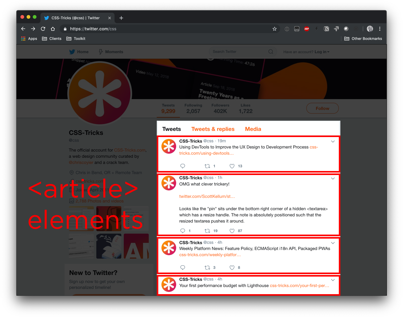
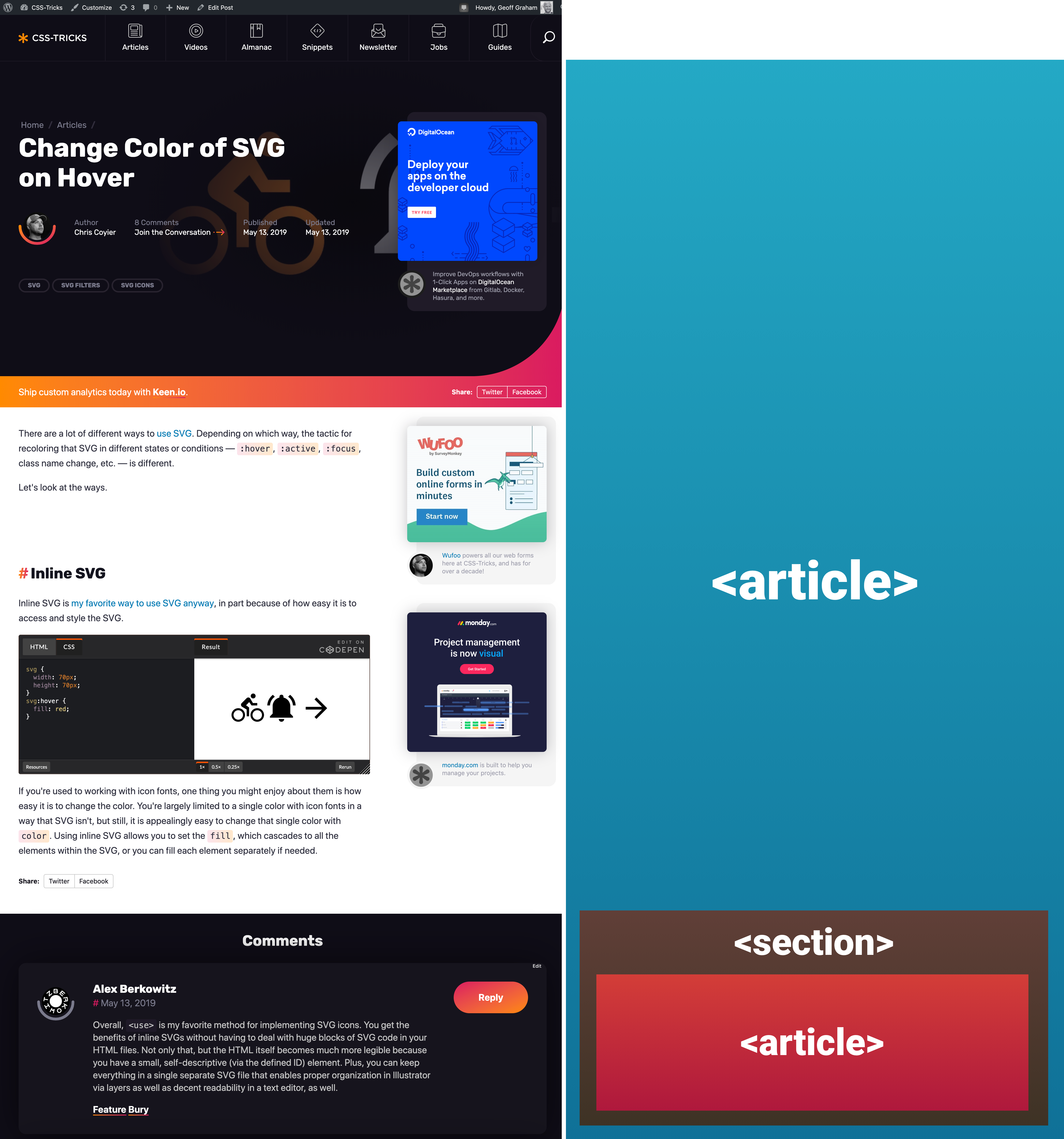


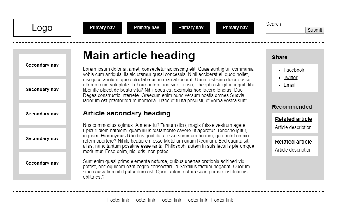
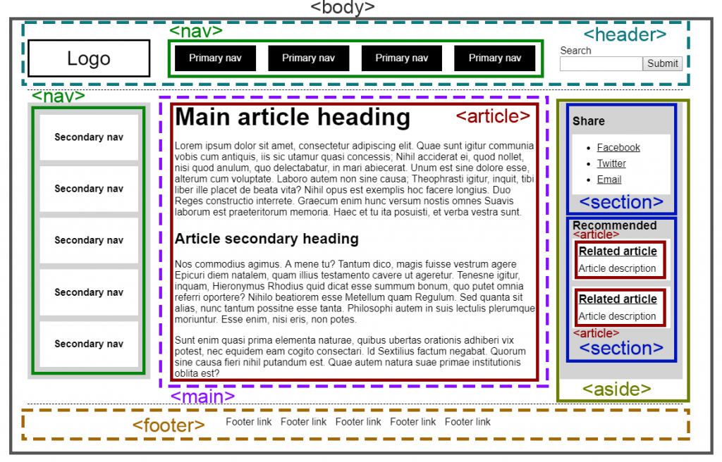
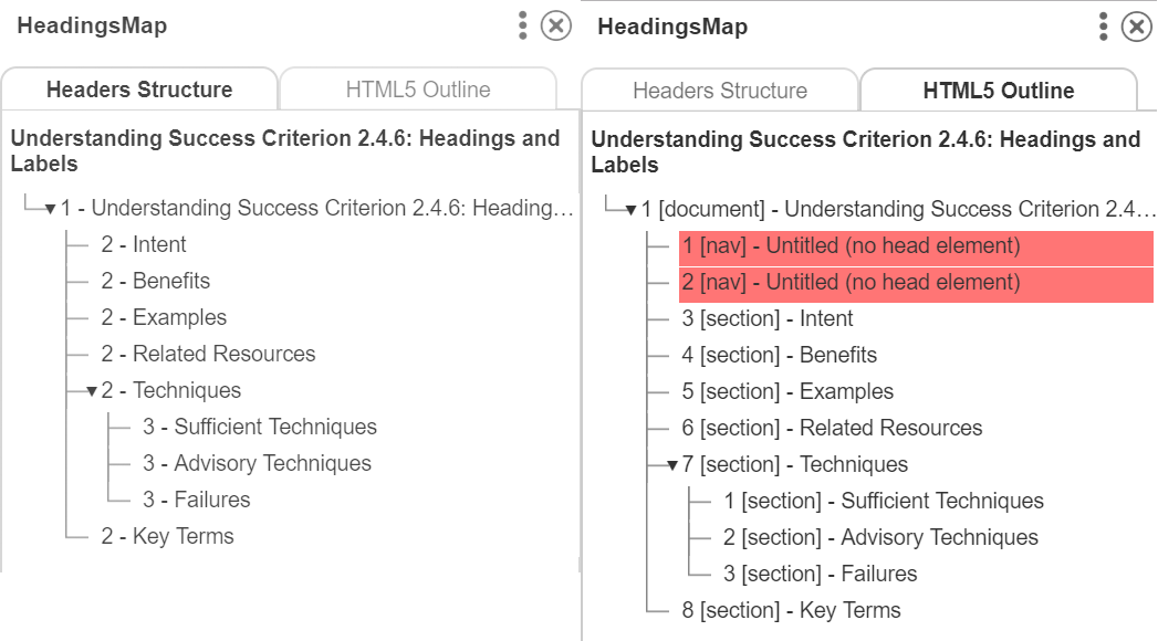
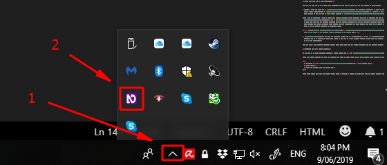


