A Case of Sticky Keys that would not unstick. Windows Accessibility. Solved

My workaday laptop is now an Acer Predator which while being very nice and all started to boot up with Windows Sticky Keys enabled. Now being a long time Windows user I went to the usual control panel, turned it off but it turned back on if the machine was rebooted or you logged out and back in.

The usual Google research was done, registry changes made and still it persisted. As all you needed to do was tap the shift key a few times to turn it off I left it as it was until I had more free time to look into it.

A deeper dive into the machine was done with AUTORUNS which found an odd thing I tossed but still it enabled after login.

So what if it's something to do with this model laptop? A new google found the answer: https://www.google.com/search?q=acer+predator+sticky+keys&gl=US

Aha, Acer and others added a Sticky Keys on/off to their system so there was more than one place this can be controlled which reminds me of the more than one boss stories.

Fix: Press the Acer Predator Sense button till it turns red, then tap button 1. It's fixed and I share this here so others might not spend as much time hunting it down.

BuddyPress 5.0 to Update Password Control to Match WordPress

BuddyPress 5.0 development began in December 2018 after 4.0.0 was released in November. The core BuddyPress team has not published a roadmap for what will be coming in 5.0, but features and fixes added so far can be found on GitHub in the commit log.

One noteworthy addition to the upcoming major release is that the BP Nouveau template pack is being updated to use the same password control as the one used in WordPress core. BuddyPress users will now be able to set their passwords using WordPress’ interface on the registration page and on the user’s general settings page.

Here’s what it will look like in the templates:

By default, BuddyPress will generate a strong password, but the user can still edit it, if necessary. If the user selects a password that is too weak, the submit button will be disabled until the user confirms they want to proceed by checking the checkbox.

BP Nouveau replaced the bp-legacy template packs in 2018, introducing JavaScript-powered templates, integration with the Customizer, and more layout options for BuddyPress navigation and component directories. As a result of the password control update, the src/bp-templates/bp-nouveau/js/password-verify.js template is scheduled to be deprecated and deleted in BuddyPress 6.0.0, so developers will want to take note if using the bp-nouveau-password-verify script as a dependency for custom password control implementations.

BuddyPress 5.0 also adds BP-specific debug into to the Site Health Info screen that was introduced in WordPress 5.2. This release will require WordPress 4.7 or greater for optimal compatibility and older versions will not be supported. Site owners running on older versions of WordPress have time to prepare.

Although the BuddyPress core team and contributors have put out several security and maintenance releases since version 4.0.0, regular project meetings have been sporadic in 2019. BuddyPress 5.0 was expected at the end of May but a new timeline may be discussed at the next meeting, which is tentatively planned for Wednesday, June 12.

Comparison of Data Analysis Tools: Excel, R, Python, and BI Tools

The era of data analysis has already arrived. From the state, government, and enterprises to individuals, big data and data analysis have become trends that everyone is familiar with. But you may not have the professional knowledge of data analysis and programming, or you have learned a lot about the theory of data analysis, but you still can't practice it. Here, I will compare the four tools that are most popular with data analysts, Excel, R, Python, and BI, as the basis for getting started with data analysis.

Data analytics tools

1. Excel

1.1 Usage Scenarios

  • Data processing work under general office requirements.
  • Data management and storage of small and medium-sized companies.
  • Simple statistical analysis for students or teachers (such as analysis of variance, regression analysis, etc.).
  • Combine Word and PowerPoint to create data analysis reports.
  • Assistant tool of data analysts.
  • Production of charts for some business magazines and newspapers (data visualization).

1.2 Advantages

  • It's easy to get started with Excel.
  • The learning resources are very rich.
  • You can do a lot of things with Excel: modeling, visualization, reports, dynamic charts, etc.
  • It can help you understand the meaning of many operations before further learning other tools (such as Python and R).

1.3 Disadvantages

  • To fully master Excel, you need to learn VBA, so the difficulty is still very high.
  • When the amount of data is large, there will be a situation of stuttering.
  • The Excel data file itself can hold only 1.08 million rows without the aid of other tools, and it's not suitable for processing large-scale data sets.
  • The built-in statistical analysis is too simple and has little practical value.
  • Unlike Python, R, and other open source software, there is a charge for the genuine Excel.

2. R

2.1 Usage Scenarios

The functions of R cover almost any area where data is needed. As far as our general data analysis or academic data analysis work is concerned, the things that R can do mainly include the following aspects.

Hadoop vs. Snowflake

A few years ago, Hadoop was touted as the replacement for the data warehouse which is clearly nonsense. This article is intended to provide an objective summary of the features and drawbacks of Hadoop/HDFS as an analytics platform and compare these to the cloud-based Snowflake data warehouse.

Hadoop: A Distributed, File-Based Architecture

First developed by Doug Cutting at Yahoo! and then made open source from 2012 onwards, Hadoop gained considerable traction as a possible replacement for analytic workloads (data warehouse applications), on expensive MPP appliances.

Collective #523


C523_accessibility

Web Accessibility In Context

Be Birchall explains why it’s so important to prioritize accessibility among teams and why there needs to be more awareness raised among developers.

Read it


C523_cssmindset

The CSS Mindset

An article by Max Böck where he lists the essential ideas behind CSS that help understand it better.

Read it


C523_divi

Our Sponsor

The Future of WYSIWYG

Divi takes WordPress to a whole new level with its incredibly advanced visual builder technology. You’ve never built a WordPress website like this before.

Try it


C523_pinker

Pinker.js

A standalone JavaScript library for rendering code/class diagrams on your web page.

Check it out


C523_jellyfish

The Anatomy of a Jellyfish

A creative and technical overview of Maru, an interactive audiovisual website made in collaboration with Plaid for their new album “Polymer”. By Isaac Cohen.

Read it


C523_themeui

Theme UI

Build consistent, themeable React UIs based on design system constraints and design tokens.

Check it out


C523_pipedream

Pipe Dream for Laravel

By giving Pipe Dream a minimum of input in form of a sketch/entity list, it will predict your application schema and feed it into a set of pipes. These pipes will generate all the files needed to get started with a new web project really quick.

Check it out

Collective #523 was written by Pedro Botelho and published on Codrops.

Design Studio & Agency Website Inspiration

If you’re taking on the huge task of designing a studio or agency’s website, it’s important that you get everything just right. Professionalism and ease of navigation needs to balanced perfectly against beautiful design and modern trends.

If you need a little inspiration for this undertaking, we’ve got a few amazing websites to show you. These agency sites are exceedingly well made, so see what you can learn from these impeccable designs.

Dogstudio

Image from Dogstudio

Dogstudio nails its branding by designing a website around its wolf-like character. Everywhere you explore, the beautifully animated dog follows you, changing color, rotating, and moving around the screen. It’s an amazing display of interactivity and 3D web animation.

Everest

Image from Everest

Design studios have lots of content to show off, so it’s important to have good navigation. Everest does it right with a beautiful and functional homepage that takes you through the company’s work. Click something you’re interested in and it smoothly transitions to a whole new area to explore.

Rally

Image from Rally

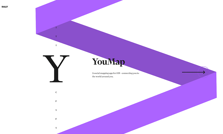
If you’re not sure where to start with a design, try using consistency. This studio’s homepage is made up of a spiral that changes color as you scroll through each project. The colorful ribbon remains on other pages and stretches as you navigate between them.

Okalpha

Image from Okalpha

Websites for agencies are often dark and serious. But that doesn’t mean you can’t have fun with your design! Okalpha’s site is bright and colorful, with a flat look and cartoonish hues. It’s the perfect fit for an upbeat animation studio.

Canvas United

Image from Canvas United

This site is all about clean and interesting UI. There’s plenty of elegant hover and transition animations – even the loading screen includes a beautiful animated logo! The flawless UI design leaves a lasting impression of quality and grace.

Feral

Image from Feral

Many websites opt for digital icons or photography rather than illustrations, but Feral’s website proves that they have a place in web design. Lively sketches are scattered absolutely everywhere, and it makes the site seem unique and personalized.

UIX

Image from UIX

Studios need a good portfolio, and UIX does it perfectly. Widescreen images allow you to get a good look at their work, with quick animations keeping you interested in the content. Short paragraphs and impactful blurbs are broken up with more visual examples. It allows you to get an in-depth look at their design choices and see if the company is the right fit for you.

Prokhorov Design

Image from Prokhorov Design

For portfolio sites, a simple but strong design often works best. This site uses a background of particles that shift into different shapes, while also leaving a comfortable amount of space. Click on a project and the site becomes much more compact as it takes you through the creative process of designing an app.

Visual Soldiers

Image from Visual Soldiers

Content-packed boxes make up this website’s design with links and articles appearing inside them. Click one to explore this colorful site as you navigate through portfolio pieces, articles, and videos.

Hoffman

Image from Hoffman

Nothing hooks people more than a charming intro video, and there’s plenty of interesting photos and videos to be found on this website. Explore to learn more about a company’s branding campaign, and be stunned at the perfectly synergistic design.

Rise

Image from Rise

Though many brands’ websites go over the top with flashy elements and animations, clean and simple design shouldn’t be forgotten! Rise uses space and simplicity to create a breathable website that uses contrast to call attention to important areas. It’s a solid look that gives a sense of reliability.

RFTB Creative Digital Agency

Image from RFTB Creative Digital Agency

If one site inspires you, it should definitely be this one. The building music and slowly scrolling video background create a sense of wonder and curiosity. Follow that up with other great background videos, leading you to plenty of interesting excerpts and you’re already hooked.

Creating Gorgeous and Professional Websites

When you’re creating a site for a professional studio, your main goal is to hook potential customers – and a website that’s beautiful and inspiring is more likely to charm visitors and get them interested in the company.

These twelve great website examples gracefully capture their agency’s vision, all while creating a site that’s easy to navigate and fun to explore. There’s a lot to learn from these designers.

Level up your .sort game

Sorting is a super handy JavaScript method that can display the values of an array in a certain order. Whether that’s real estate listings by price, burger joints by distance, or best nearby happy hours by rating, sorting arrays of information is a common need.

If you’re already doing this with JavaScript on a project, you are will likely using the built-in array .sort method, which is in the same family of array methods that includes .filter, .map and .reduce.

Let's take a look at how to do that!

A quick note about side effects

Before going into the details of how to use .sort, there is a very important detail that needs to be addressed. While many of the ES5 array methods such as .filter, .map, and .reduce will return a new array and leave the original untouched, .sort will sort the array in place. If this is unwanted, an ES6 technique to avoid this is using the spread operator to concisely create a new array.

const foo = ['c','b','a'];
const bar = ['x','z','y'];
const fooSorted = foo.sort();
const barSorted = [...bar].sort();

console.log({foo, fooSorted, bar, barSorted});

/*
{
  "foo":       [ "a", "b", "c" ],
  "fooSorted": [ "a", "b", "c" ],
  "bar":       [ "x", "z", "y" ],
  "barSorted": [ "x", "y", "z" ]
}
*/

foo and fooSorted both reference the same array, but bar and barSorted are now individual arrays.

General overview

The only parameter of the .sort method is a function. The spec refers to this as the compareFn — I will refer to it as the "comparison function" for the rest of the post. This comparison function accepts two parameters, which I will refer to as a and b. a and b are the two elements that we will be comparing. If you do not provide a comparison function, the array will coerce each element into a string and sort according to Unicode points.

If you would like the a to be ordered first in the array, the comparison function should return a negative integer; for b, a positive integer. If you would like the two to maintain their current order, return a 0.

If you don't understand, don't worry! Hopefully it will become much more clear with a few examples.

Comparing numbers

One of the simplest callbacks to write is a number comparison.

const numbers = [13,8,2,21,5,1,3,1];
const byValue = (a,b) => a - b;
const sorted = [...numbers].sort(byValue);
console.log(sorted); // [1,1,2,3,5,8,13,21]

If a is greater than b, a - b will return a positive number, so b will be sorted first.

Comparing strings

When comparing strings, the > and < operators will compare values based on each string’s Unicode value. This means that all uppercase letters will be “less” than all lowercase letters, which can lead to unexpected behavior.

JavaScript does have a method to help with comparing strings: the String.prototype.localeCompare method. This method accepts a comparison string, a locale, and an options object. The options object accepts a few properties (all of which you can view here), but I find that the most useful is "sensitivity." This will affect how comparisons work between letter variations such as case and accent.

const strings = ['Über', 'alpha', 'Zeal', 'über', 'uber', 'Uber', 'Alpha', 'zeal'];

const sortBySensitivity = sensitivity => (a, b) => a.localeCompare(
  b,
  undefined, // locale string -- undefined means to use browser default
  { sensitivity }
);

const byAccent  = sortBySensitivity('accent');
const byBase    = sortBySensitivity('base');
const byCase    = sortBySensitivity('case');
const byVariant = sortBySensitivity('variant'); // default

const accentSorted  = [...strings].sort(byAccent);
const baseSorted    = [...strings].sort(byBase);
const caseSorted    = [...strings].sort(byCase);
const variantSorted = [...strings].sort(byVariant);

console.log({accentSorted, baseSorted, caseSorted, variantSorted});

/*
{
  "accentSorted":  [ "alpha", "Alpha", "uber", "Uber", "Über", "über", "Zeal", "zeal" ],
  "baseSorted":    [ "alpha", "Alpha", "Über", "über", "uber", "Uber", "Zeal", "zeal" ],
  "caseSorted":    [ "alpha", "Alpha", "über", "uber", "Über", "Uber", "zeal", "Zeal" ],
  "variantSorted": [ "alpha", "Alpha", "uber", "Uber", "über", "Über", "zeal", "Zeal" ]
}
*/

To me, baseSorted seems to be the most logical for most alphabetical sorting — ‘ü’, ‘u’, ‘Ü’, and ‘U’ are equivalent, so they remain in the order of the original array.

Running functions before comparing values

You may want to run a comparison function on a value that is derived from each array’s element. First, let’s write a comparison function factory that will "map" over the element before calling the comparison function.

const sortByMapped = (map,compareFn) => (a,b) => compareFn(map(a),map(b));

One use case for this is sorting based on the attribute of an object.

const purchases = [
  { name: 'Popcorn', price: 5.75 }, 
  { name: 'Movie Ticket', price: 12 },
  { name: 'Soda', price: 3.75 },
  { name: 'Candy', price: 5 },
];

const sortByMapped = (map,compareFn) => (a,b) => compareFn(map(a),map(b));
const byValue = (a,b) => a - b;
const toPrice = e => e.price;
const byPrice = sortByMapped(toPrice,byValue);

console.log([...purchases].sort(byPrice));

/*
[
  { name: "Soda", price: 3.75 },
  { name: "Candy", price: 5 },
  { name: "Popcorn", price: 5.75 },
  { name: "Movie Ticket", price: 12 }
]
*/

Another case might be to compare an array of dates.

const dates  = ['2018-12-10', '1991-02-10', '2015-10-07', '1990-01-11'];
const sortByMapped = (map,compareFn) => (a,b) => compareFn(map(a),map(b));
const toDate = e => new Date(e).getTime();
const byValue = (a,b) => a - b;
const byDate = sortByMapped(toDate,byValue);

console.log([...dates].sort(byDate));
// ["1990-01-11", "1991-02-10", "2015-10-07", "2018-12-10"]

Reversing a sort

There are some cases where you may want to reverse the outcome of a comparison function. This is subtly different than doing a sort and then reversing the result in the way ties are handled: if you reverse the outcome, ties will also be reversed in order.

To write a higher order function that accepts a comparison function and returns a new one, you will need to flip the sign of the comparison’s return value.

const flipComparison = fn => (a,b) => -fn(a,b);
const byAlpha = (a,b) => a.localeCompare(b, null, { sensitivity: 'base' });
const byReverseAlpha = flipComparison(byAlpha);

console.log(['A', 'B', 'C'].sort(byReverseAlpha)); // ['C','B','A']

Running a tiebreaker sort

There are times when you may want to have a "tie-breaker" sort — that is, another comparison function that is used in the case of a tie.

By using [].reduce, you can flatten an array of comparison functions into a single one.

const sortByMapped = map => compareFn => (a,b) => compareFn(map(a),map(b));
const flipComparison = fn => (a,b) => -fn(a,b);
const byValue = (a,b) => a - b;

const byPrice = sortByMapped(e => e.price)(byValue);
const byRating = sortByMapped(e => e.rating)(flipComparison(byValue));

const sortByFlattened = fns => (a,b) => 
  fns.reduce((acc, fn) => acc || fn(a,b), 0);

const byPriceRating = sortByFlattened([byPrice,byRating]);

const restaurants = [
  { name: "Foo's Burger Stand", price: 1, rating: 3 },
  { name: "The Tapas Bar", price: 3, rating: 4 },
  { name: "Baz Pizza", price: 3, rating: 2 },
  { name: "Amazing Deal", price: 1, rating: 5 },
  { name: "Overpriced", price: 5, rating: 1 }, 
];

console.log(restaurants.sort(byPriceRating));

/*
{name: "Amazing Deal", price: 1, rating: 5}
{name: "Foo's Burger Stand", price: 1, rating: 3}
{name: "The Tapas Bar", price: 3, rating: 4}
{name: "Baz Pizza", price: 3, rating: 2}
{name: "Overpriced", price: 5, rating: 1}
*/

Writing a random sort

You might want to sort an array "randomly." One technique that I have seen is to use the following function as the comparison function.

const byRandom = () => Math.random() - .5;

Since Math.random() returns a "random" number between 0 and 1, the byRandom function should return a positive number half of the time and a negative number the other half. This seems like it would be a good solution, but unfortunately, since the comparison function is not "consistent" — meaning it may not return the same value when called multiple times with the same values — it may result in some unexpected results.

For example, let's take an array of numbers between 0 and 4. If this byRandom function was truly random, it would be expected that the new index of each number would be spread out equally over enough iterations. The original 0 value would be just as likely to be in index 4 as index 0 in the new array. However, in practice, this function will bias each number to its original position.

See the Pen
Array.sort() Random 👎
by Adam Giese (@AdamGiese)
on CodePen.

The "diagonal" from the top-left will statistically have the greatest value. In an ideal and truly random sort, each table cell would hover around 20%.

The fix for this is to find a way to ensure that the comparison function remains consistent. One way to do this is to map the random value to each array element before the comparison, then map it away after.

const sortByMapped = map => compareFn => (a,b) => compareFn(map(a),map(b));
const values = [0,1,2,3,4,5,6,7,8,9];
const withRandom = (e) => ({ random: Math.random(), original: e });
const toOriginal = ({original}) => original;
const toRandom = ({random}) => random;
const byValue = (a,b) => a - b;
const byRandom = sortByMapped(toRandom)(byValue);

const shuffleArray = array => array
  .map(withRandom)
  .sort(byRandom)
  .map(toOriginal);

This ensures that each element has a single random value that is only calculated once per element rather than once per comparison. This removes the sorting bias towards the original position.

See the Pen
Array.sort() Random 👍
by Adam Giese (@AdamGiese)
on CodePen.

The post Level up your .sort game appeared first on CSS-Tricks.

Designing with Motifs

I love the way Erik Kennedy talks about digital design. Very practical and understandable. Have a listen to a chat with him we had on ShopTalk.

One of his latest blog posts is titled "The #1 Way to Spice Up Your Designs (And Create a More Cohesive Brand)" and it's about something he pegs as more of an intermediate (beyond the basics) level design tip about the idea of motifs.

In music, that might be a bit of a melody that asserts itself periodically and kinda informs the rest of the song. It's equally interesting in design, where a theme — perhaps a geometric element — is sprinkled in tastefully that helps the gestalt. Ties the room together, as they say.

Anyway, if you're serious about getting better at design, his course is where it's at and opens up in mid-June. So, now's the time to think about it.

Direct Link to ArticlePermalink

The post Designing with Motifs appeared first on CSS-Tricks.

Styling In Modern Web Apps

Styling In Modern Web Apps

Styling In Modern Web Apps

Ajay NS

If you search for how to style apps for the web, you’ll come across many different approaches and libraries, some even changing day by day. Block Element Modifier (BEM); preprocessors such as Less and SCSS; CSS-in-JS libraries, including JSS and styled-components; and, lately, design systems. You come across all of these in articles and blogs, tutorials and talks, and — of course — debates on Twitter.

How do we choose between them? Why do so many approaches exist in the first place? If you’re already comfortable with one method, why even consider moving to another?

In this article, I’m going to take a look at the tools I have used for production apps and sites I’ve worked on, comparing features from what I’ve actually encountered rather than summarizing the content from their readmes. This is my journey through BEM, SCSS, styled-components, and design systems in particular; but note that even if you use different libraries, the basic principles and approach remain the same for each of them.

CSS Back In The Day

When websites were just getting popular, CSS was primarily used to add funky designs to catch the user’s attention, such as neon billboards on a busy street:

Microsoft’s first site (left) and MTV’s site from the early 2000s. (Large preview)

Its use wasn’t for layout, sizing, or any of the basic needs we routinely use CSS for today, but as an optional add-on to make things fancy and eye-catching. As features were added to CSS, newer browsers supporting a whole new range of functionality and features appeared, and the standard for websites and user interfaces evolved — CSS became an essential part of web development.

It’s rare to find websites without a minimum of a couple hundred lines of custom styling or a CSS framework (at least, sites that don’t look generic or out of date):

Wired’s modern responsive site from InVision’s responsive web design examples post. (Large preview)

What came next is quite predictable. The complexity of user interfaces kept on increasing, along with the use of CSS; but without any guidelines suggested and with a lot of flexibility, styling became complicated and dirty. Developers had their own ways of doing things, with it all coming down to somehow getting things to look the way the design said it was supposed to be.

This, in turn, led to a number of common issues that many developers faced, like managing big teams on a project, or maintaining a project over a long period of time, while having no clear guides. One of the main reasons this happens even now, sadly, is that CSS is still often dismissed as unimportant and not worth paying much attention to.

CSS Is Not Easy To Manage

There’s nothing built into CSS for maintenance and management when it comes to large projects with teams, and so the common problems faced with CSS are:

  • Lack of code structure or standards greatly reduces readability;
  • Maintainability as project size increases;
  • Specificity issues due to code not being readable in the first place.

If you’ve worked with Bootstrap, you’ll have noticed you’re unable to override the default styles and you might have fixed this by adding !important or considering the specificity of selectors. Think of a big project’s style sheets, with their large number of classes and styles applied to each element. Working with Bootstrap would be fine because it has great documentation and it aims to be used as a solid framework for styling. This obviously won’t be the case for most internal style sheets, and you’ll be lost in a world of cascaded styles.

In projects, this would be like a couple thousand lines of CSS in a single file, with comments if you’re lucky. You could also see a couple of !important used to finally get certain styles to work overriding others.

!important does not fix bad CSS. (Large preview)

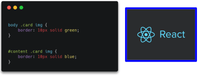
You may have faced specificity issues but not understood how specificity works. Let’s take a look.

(Large preview)

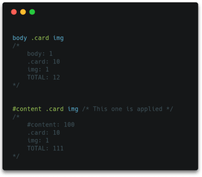
Which of the styles applied to the same element would be applied to the image on the right, assuming they both point to it?

What is the order of weight of selectors such as inline styles, IDs, classes, attributes, and elements? Okay, I made it easy there; they’re in order of weight:

Start at 0; add 1,000 for a style attribute; add 100 for each id; add 10 for each attribute, class or pseudo-class; add 1 for each element name or pseudo-element.

This is a simplified way of calculating and representing specificity which works in usual cases, but do note that the real representation would look like: (0,0,0,0). Here, the first number signifies the style attribute, second the ID, and so on. Each selector can actually have a value greater than 9 and it’s only when there is an equal number of selectors of highest weight that selectors of lower weight are considered.

So, for instance, taking the above example:

(Large preview)
(Large preview)

Do you see why the second example was the correct answer? The id selector clearly has far more weight than element selectors. This is essentially the reason why your CSS rule sometimes doesn’t seem to apply. You can read about this in detail in Vitaly Friedman’s article, “CSS Specificity: Things You Should Know”.

The larger the codebase, the greater the number of classes. These might even apply to or override different styles based on specificity, so you can see how quickly it can become difficult to deal with. Over and above this we deal with code structure and maintainability: it’s the same as the code in any language. We have atomic design, web components, templating engines; there’s a need for the same in CSS, and so we’ve got a couple of different approaches that attempt to solve these different problems.

Block Element Modifier (BEM)

“BEM is a design methodology that helps you to create reusable components and code sharing in front-end development.”

— getbem.com

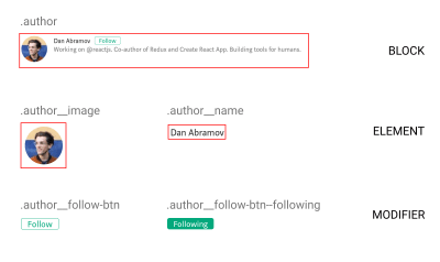
The idea behind BEM is to create components out of parts of apps that are reused or are independent. Diving in, the design process is similar to atomic design: modularize things and think of each of them as a reusable component.

I chose to start out managing styles with BEM as it was very similar the way React (that I was already familiar with) breaks down apps into reusable components.

(Large preview)

Using BEM

BEM is nothing more than a guide: no new framework or language to learn, just CSS with a naming convention to organize things better. Following this methodology, you can implement the patterns you’ve already been using, but in a more structured manner. You can also quite easily do progressive enhancements to your existing codebase as it requires no additional tooling configuration or any other complexities.

Advantages

  • At its heart BEM manages reusable components, preventing random global styles overriding others. In the end, we have more predictable code, which solves a lot of our specificity problems.
  • There’s not much of a learning curve; it is just the same old CSS with a couple of guides to improve maintainability. It is an easy way of making code modular by using CSS itself.

Drawbacks

  • While promoting reusability and maintainability, a side effect of the BEM naming principle is making naming the classes difficult and time-consuming.
  • The more nested your component is in the block, the longer and more unreadable the class names become. Deeply nested or grandchild selectors often face this issue.
<div class="card__body">
  <p class="card__body__content">Lorem ipsum lorem</p>
  <div class="card__body__links">
    <!-- Grandchild elements -->
    <a href="#" class="card__body__links__link--active">Link</a>
  </div>
</div>

That was just a quick intro to BEM and how it solves our problems. If you’d like to take a deeper look into its implementation, check out “BEM For Beginners” published here in Smashing Magazine.

Sassy CSS (SCSS)

Put blandly, SCSS is CSS on steroids. Additional functionality such as variables, nesting selectors, reusable mixins, and imports help SCSS make CSS more of a programming language. For me, SCSS was fairly easy to pick up (go through the docs if you haven’t already) and once I got to grips with the additional features, I’d always prefer to use it over CSS just for the convenience it provided. SCSS is a preprocessor, meaning the compiled result is a plain old CSS file; the only thing you need to set up is tooling to compile down to CSS in the build process.

Super handy features

  • Imports help you split style sheets into multiple files for each component/section, or whichever makes readability easier.
// main.scss
@import "_variables.scss";
@import "_mixins.scss";

@import "_global.scss";
@import "_navbar.scss";
@import "_hero.scss";
  • Mixins, loops, and variables help with the DRY principle and also make the process of writing CSS easier.
@mixin flex-center($direction) {
  display: flex;
  align-items: center;
  justify-content: center;
  flex-direction: $direction;
}

.box {
  @include flex-center(row);
}

Note: SCSS mixin: Check out more handy SCSS features over here.

  • Nesting of selectors improves readability as it works the same way HTML elements are arranged: in a nested fashion. This approach helps you recognize hierarchy at a glance.

BEM With SCSS

It is possible to group the code for components into blocks, and this greatly improves readability and helps in ease of writing BEM with SCSS:

This code is relatively less heavy and complicated as opposed to nesting multiple layers. (Large preview)

Note: For further reading on how this would work, check out Victor Jeman’s “BEM with Sass” tutorial.

Styled-Components

This is one of the most widely used CSS-in-JS libraries. Without endorsing this particular library, it has worked well for me, and I’ve found its features quite useful for my requirements. Take your time in exploring other libraries out there and pick the one that best matches your needs.

I figured a good way to get to know styled-components was to compare the code to plain CSS. Here’s a quick look at how to use styled-components and what it’s all about:

Instead of adding classes to elements, each element with a class is made into a component. The code does look neater than the long class names we have with BEM.

Interestingly, what styled-components does under the hood is take up the job of adding relevant classes to elements as per what’s specified. This is essentially what we do in style sheets (note that it is in no way related to inline styling).

import styled from 'styled-components';
    
const Button = styled.button`
  background-color: palevioletred;
  color: papayawhip;
`;

// Output
<style>
  .dRUXBm {
    background-color: palevioletred;
    color: papayawhip;
  }
</style>

<button class="dRUXBm" />

Note: Styled-components under the hood: read more about inline styling vs CSS-in-JS in “Writing your styles in JS ≠ writing inline styles” by Max Stoiber.

Why Are Styled-Components One Of The Widely Used CSS-In-JS Libraries?

For styling, here we’re just using template literals with normal CSS syntax. This allows you to use the full power of JavaScript to handle the styling for you: conditionals, properties passed in as arguments (using an approach similar to React), and essentially all the functionality that can be implemented by JavaScript.

While SCSS has variables, mixins, nesting, and other features, styled-components only adds on, making it even more powerful. Its approach, based heavily on components, might seem daunting at first since it’s different from traditional CSS. But as you get used to the principles and techniques, you’ll notice that everything possible with SCSS can be done in styled-components, as well as a lot more. You just use JavaScript instead.

const getDimensions = size => {
  switch(size) {
    case 'small': return 32;
    case 'large': return 64;
    default: return 48;
  }
}

const Avatar = styled.img`
  border-radius: 50%;
  width: ${props => getDimensions(props.size)}px;
  height: ${props => getDimensions(props.size)}px;
`;

const AvatarComponent = ({ src }) => (
  <Avatar src={src} size="large" />
);

Note: Template literals in styled-components allow you to use JS directly for conditional styling and more.

Another thing to note is how perfectly this fits into the world of web components. A React component has its own functionality with JavaScript, JSX template, and now CSS-in-JS for styling: it’s fully functional all by itself and handles everything required internally.

Without us realizing, that was the answer to a problem we’ve been talking about for too long: specificity. While BEM was a guideline to enforce component-based structure for elements and styles but still relying on classes, styled-components impose it for you.

Styled-components has a couple of additional features I’ve found especially useful: themes, which can configure a global prop (variable) passed down to each styled-component; automatic vendor prefixing; and automatic clean-up of unused code. The amazingly supportive and active community is just the icing on the cake.

Note: There’s a lot more to check out and take advantage of. Read more in the styled-components docs.

Quick Recap On Features
  • Template literals are used for syntax, the same as traditional CSS.
  • It imposes modular design.
  • It solves specificity issues by handling class names for you.
  • Everything that can be done with SCSS and more, implemented with JS.
Why It Might Not Be For You
  • It obviously relies on JavaScript, which means without it the styles don’t load, resulting in a cluttered mess.
  • Previously readable class names are replaced with hashes that really have no meaning.
  • The concept of components rather than cascading classes might be a bit hard to wrap your head around, especially since this affects the way you arrange things a lot.

Design Systems

As usage of web components increases, as well as the need for atomic design (basically breaking down UI into basic building blocks), many companies are choosing to create component libraries and design systems. Unlike the technologies or approaches on how to handle styling mentioned above, design systems represent an organizational approach to handling components and consistent design across whole platforms or apps.

It’s possible to use an approach we’ve discussed within a design system to organize styles, while the design system itself focuses on the building blocks of the apps rather than internal implementations.

“Design systems are essentially collections of rules, constraints, and principles implemented in design and code.”

Design systems and component libraries are aimed at whole ecosystems spanning different platforms and media, and can determine the overall outlook of the company itself.

“A design system is an amalgamation of style, components, and voice.”
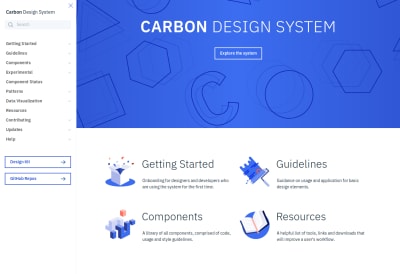
IBM’s Carbon design system
IBM’s Carbon design system (Large preview)

Once they gain momentum, tech businesses sometimes have to scale up extremely fast, and it can be hard for the design and development teams to keep up. Different apps, new features and flows, constant reevaluation, changes, and enhancements are to be shipped as rapidly as possible when the business requires them.

Take the case of a simple modal; for instance, one screen has a confirmation modal which simply accepts a negative or positive action. This is worked on by Developer A. Then the design team ships another screen that has a modal comprising a small form with a few inputs — Developer B takes this up. Developers A and B work separately and have no idea that both of them are working on the same pattern, building two different components that are essentially the same at base level. If different developers worked on the different screens we might even see UI inconsistencies committed to the codebase.

Now imagine a large company of multiple designers and developers — you could end up with a whole collection of components and flows that are supposed to be consistent, but instead are distinct components existing independently.

The main principle of design systems is to help meet business requirements: build and ship new features, functionality, and even full apps while maintaining standards, quality, and consistency of design.

Here are some examples of popular design systems:

When talking about styling in particular, we’d be specifically interested in the component library part, although the design system itself is far more than just a collection of components. A component handles its functionality, template, and styling internally. A developer working on the app needn’t be aware of all of the internal working of the components, but would just need to know how to put them together within the app.

Now imagine a couple of these components that are further made reusable and maintainable, and then organized into a library. Developing apps could be almost as simple as drag-and-drop (well, not exactly, but a component could be pulled in without worrying about any internal aspects of its working). That’s essentially what a component library does.

(Large preview)
(Large preview)

Why You Might Want To Think About Building A Design System

  • As mentioned earlier, it helps the engineering and design teams keep up with rapidly changing business needs while maintaining standards and quality.
  • It ensures consistency of design and code throughout, helping considerably with maintainability over a long period of time.
  • One of the greatest features of design systems is that they bring the design and development teams closer, making work more of a continuous collaboration. Rather than whole pages of mock-ups given to developers to work on from scratch, components and their behaviors are well-defined first. It’s a whole different approach, but a better and faster way to develop consistent interfaces.

Why It Might Not Be The Best Fit For You

  • Design systems require a lot of time and effort up front to plan things out and organize from scratch — both code- and design-wise. Unless really required, it might not be worth delaying the development process to focus on building the design system at first.
  • If a project is relatively small, a design system can add unnecessary complexity and end up a waste of effort when what was actually required was just a couple of standards or guidelines to ensure consistency. Because several high-profile companies have adopted design systems, the hype can influence developers into thinking this is the always best approach, without analyzing the requirements and ensuring this could actually be practical.
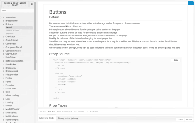
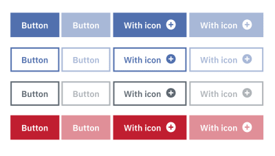
Different appearances of a button
Different appearances of a button (Large preview)

Conclusion

Styling applications is a world in itself, one not often given the importance and attention it deserves. With complex modern user interfaces, it’s only matter of time before your app becomes a mess of unordered styles, reducing consistency and making it harder for new code to be added or changes made to the existing codebase.

Distilling what we’ve discussed so far: BEM, along with SCSS, could help you organize your style sheets better, take a programming approach to CSS, and create meaningful structured class names for cleaner code with minimal configuration. Building over a front-end framework like React or Vue, you might it find it convenient to hand class naming to a CSS-in-JS library if you’re comfortable with a component-based approach, putting an end to all your specificity issues, along with a couple of other benefits. For larger applications and multiple platforms, you might even consider building a design system in combination with one of the other methods, to boost development speeds while maintaining consistency.

Essentially, depending on your requirements and the size and scale of your software, it’s important to spend time determining your best approach to styling.

Smashing Editorial (dm, og, yk, il)

How to Add Scroll Depth Tracking in WordPress with Google Analytics

Do you want to add scroll depth tracking on your WordPress website?

Scroll depth tracking allows you to see how far a user scrolls on any page. This data helps you see if your visitors are actually reading your long posts and when they lose interest, so you can modify the content to keep them engaged.

In this article, we will show you how to easily track user scrolling in WordPress using Google Analytics.

How to Track User Scrolling in WordPress Using Google Analytics

Why Track User Scrolling in WordPress?

Generally, scrolling occurs when a user wants to see your content below the preview screen. It is a primary activity that all users perform to look at your content.

This makes scroll depth tracking an important measure to track user engagement. In addition to that, it gives you plenty of insights about user interaction on your site and helps you improve pages for optimal length.

For example, you can find out how much an average user scrolls when viewing your site, which long reads they liked the most, what makes them lose interest, etc.

With these insights, you can then optimize your pages for better user engagement and higher conversions.

Tracking Scroll Depth in WordPress with Google Analytics

Google Analytics is a free web analytics tool offered by Google to help you better understand your website visitors.

It allows you track who your website visitors are (age, gender, interests), where they are from, which pages they visit, how long they stay on those pages, how far down they scroll on the pages, and more.

Google Analytics tracks the basic metrics like total page views, total number of visitors, top pages, etc. by default.

For more advanced metrics like scroll depth, eCommerce tracking, form submissions, file downloads, event tracking, and others, Google analytics require you to setup custom tracking.

Manually setting up advanced Google analytics tracking requires a lot of technical skills. As a beginner, this is nearly impossible. Even some developers can’t do it properly.

Thankfully, there are easy to use WordPress plugins that can help you track advanced metrics like scroll depth with Google Analytics.

Let’s take a look at two plugins that you can use to setup scroll depth tracking in WordPress.

1. Scroll Depth Tracking in WordPress with MonsterInsights

MonsterInsights is the most popular Google Analytics plugin for WordPress with over 2,000,000+ active installs. It helps you easily install and use Google Analytics on your WordPress website without using any code.

MonsterInsights Best Google Analytics WordPress Plugin

With MonsterInsights, you can enable advanced tracking like eCommerce tracking, file downloads, affiliate links, forms tracking, scroll depth, and more with just a single click (no coding needed).

MonsterInsights comes with scroll-depth tracking enabled by default. This means you don’t even need to configure any settings. All you need to do is setup the MonsterInsights plugin.

First, you need to install and activate the MonsterInsights plugin. For more details, see our step by step guide on how to install a WordPress plugin.

Upon activation, go to Insights » Settings page and then click on the Engagement tab. As shown in the screenshot below, you will see the scroll tracking option enabled by default.

MonsterInsights Scroll Depth Tracking Option

MonsterInsights trigger events in Google Analytics as your website visitors scroll down the page. It will then be tracked with Google Analytics as 25%, 50%, 75%, and 100% scroll.

You can see your scroll tracking stats and other helpful stats right inside your WordPress admin area by going to the MonsterInsights Publishers Report (Insights » Reports » Publishers). The scroll depth data appears next to the Interests section.

Scroll Tracking Reports in WordPress

You can use the scroll depth data to optimize your pages for more conversions. It gives you a better picture of how your visitors are interacting with your content and helps you decide the best place for your important calls to action, ads, and more.

View User Scrolling Data in Google Analytics

Now that you have set up scroll tracking with MonsterInsights, you can view reports also in your Google Analytics account.

Log into your Analytics account and then visit Real-Time » Events to see your real-time or recent scrolling data within the last 30 minutes.

Google Analytics Scroll Tracking in Real-time

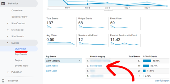
For the complete data, you can go to Behavior » Events » Overview from your Analytics dashboard.

Scroll Depth Data in Google Analytics

You can click on the Scroll Depth link to get more details.

If you want more granular details, then you can use Google Analytics’ secondary dimension feature alongside the Scroll Depth event to see the scroll data for each individual landing page.

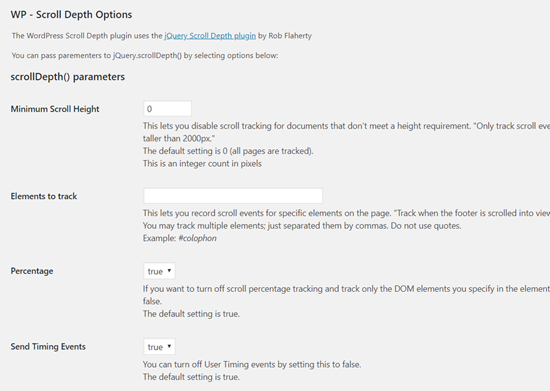
2. Track User Scrolling With WP Scroll Depth Plugin

If you don’t want a comprehensive Google Analytics solution and would rather use a single plugin, then you can use WP Scroll Depth.

The first thing you need to do is install and activate the WP Scroll Depth plugin on your site. For detailed instructions, here’s our step by step guide on how to install a plugin in WordPress.

Upon activation, you need to go to Settings » Scroll Depth to configure the plugin settings.

WP Scroll Depth Plugin Settings

The default options will track scroll depth for all pages on your WordPress site. All you need to do is click on the Save Changes button to store plugin settings.

WP Scroll Depth plugin uses jQuery to track scrolling on your WordPress site. It monitors four scroll points 25%, 50%, 75%, and 100% of the page height. When a user reaches a scroll point, the plugin sends an event to Google Analytics using jQuery.

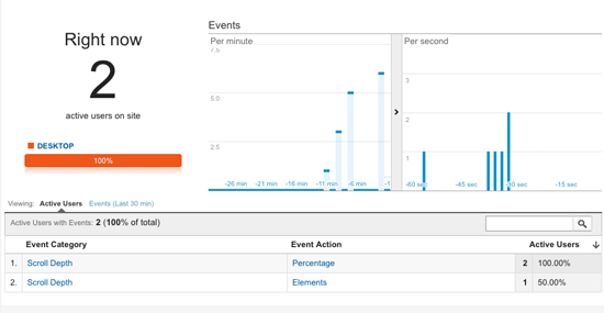
After that, you can view Scroll Depth event data under Real-Time » Events on your Google Analytics dashboard.

WP Scroll Depth Real-time data

We use MonsterInsights on all our websites because it’s the most complete Google Analytics plugin for WordPress, and we recommend all our users to do the same. They have a free MonsterInsights plugin, and you can also upgrade to the premium version to unlock more powerful tracking.

We hope this article helped you learn how to track scroll depth on your WordPress site using Google Analytics. You may also like to see our guide on 10 website marketing data you must track on every WordPress site.

If you liked this article, then please subscribe to our YouTube Channel for WordPress video tutorials. You can also find us on Twitter and Facebook.

The post How to Add Scroll Depth Tracking in WordPress with Google Analytics appeared first on WPBeginner.