Print to video database

Good evening everyone, I created this file to be able to print the data from the database on the screen.
Everything ok but all the data contained in the database appear on the same line.
I would like them to print like this:

nome email titolo dataeora msg
etc. etc.

This is the code:

?php

// dati di connessione al mio database MySQL
$db_host = 'localhost';
$db_user = 'xx';
$db_pass = 'xx';
$db_name = 'xx';

// connessione al DB utilizzando MySQLi
$cn = new mysqli($db_host, $db_user, $db_pass, $db_name);

// verifica su eventuali errori di connessione
if ($cn->connect_errno) {
    echo "Connessione fallita: ". $cn->connect_error . ".";
    exit();
}

$query = "SELECT * FROM test";
$oggetto =$cn->query($query);

echo "<table><tr>";
echo "<th>nome</th><th>email</th><th>titolo</th><th>dataeora</th><th>msg</th>";
echo "</tr>";


while($scorri_oggetto=$oggetto->fetch_assoc()){
?>
<th><?php printf($scorri_oggetto['nome']);?></th>
<th><?php printf($scorri_oggetto['email']);?></th>
<th><?php printf($scorri_oggetto['titolo']);?></th>
<th><?php printf($scorri_oggetto['dataeora']);?></th>
<th><?php printf($scorri_oggetto['msg']);?></th>
<?php
}


echo "</table>";

// chiusura della connessione
$cn->close();
?>  

what am I wrong? Can you fix me? Thanks

Best WordPress Themes

Are you wading through a sea of WordPress themes wanting to find the best option for your company?

Consider this your metaphorical lifesaver. I’ve been exactly where you are right now, and I’ve learned what makes a sturdy and reliable WordPress theme built for the long run by creating my fair share of websites.

A Google search will return an endless list of choices for WordPress themes. But it isn’t until you look closer that you see each of their weaknesses, whether or not they’re adequately built for search engines or if they’re clunky and use an outdated framework that only slows down your site.

This guide dives into the best WordPress themes you can choose to ensure your website is off to a strong start.

The Top 6 Best WordPress Themes of 2020

  1. OceanWP – Best multipurpose free theme
  2. Divi – Best highly customizable theme
  3. Shoptimizer – Best for e-commerce and sales optimization
  4. Underscores – Best theme for developers
  5. Oshine – Best theme for portfolio sites
  6. Stylemix– Best theme for niche sites

Read on to learn why each theme is perfect for their chosen category, along with an in-depth look at their best niche-specific features.

#1 – OceanWP — Best Multipurpose Free Theme

  • Very flexible
  • Free multipurpose theme
  • Great for tight budgets
  • Downloaded 3mm times
Try it today!

If you’re starting a website with WordPress on a budget but still want the quality of a paid theme, you’ll be relieved to find the OceanWP theme. It’s the best free multipurpose theme that enables you to create beautiful sites without the need for a developer or a steep learning curve. It’s no wonder they’ve been downloaded over 3,000,000 times and counting.

Ocean WP offers hundreds of customizable templates with the option of importing and using any one of their pre-built demos for a quick start. Though the theme is free, it’s still built to be fully responsive, with built-in page speed and search engine optimization. This way you don’t have to worry about dealing with an outdated framework.

If you get stuck customizing any part of the theme, OceanWP delivers fast technical assistance. Do you want to build an e-commerce store or a portfolio website? OceanWP is malleable enough to let you do that with elements like custom sidebars, widgets, a portfolio option, popup features, and even an add to cart button.

Though free, OceanWP is hearty enough to be compatible with page builders like Beaver Builder, Thrive Architect, Elementor, Divi, and SiteOrigin.

The point is that OceanWP is generous in its ability to adapt to what you want it to be, with plenty of extensions, theme templates, and functionalities worthy of a paid theme.

#2 – Divi — Best Highly Customizable Theme

  • Very adaptable
  • Custom CSS controls
  • 800+ premade themes
  • $189 for lifetime access
Try it today!

Do you care about customization over anything else? The Divi theme delivers ease of use with its popular WordPress builder to help you create highly customized theme iterations until you’re happy with the results.

Yes, it’s that versatile. And you can know exactly what your theme will look like as you go with their handy visual builder. Divi puts the design wheel in your hands with its easily editable framework and custom CSS controls.

For instance, if you want to recall an iteration from a few edits ago, Divi lets you do that with the edit history log. Because they’re so customizable, it’s a theme that can be used in virtually any niche, including freelancing, blogging, lifestyle, and more.

If you don’t feel like starting a new site design from scratch, you can choose from over 800 premade theme templates made for almost every niche imaginable. Being compatible with several page builders lets you easily add forms, testimonials, or customized blog posts. This, along with their free library of images and icons and reliable customer support, makes Divi a top choice as a WordPress theme.

If you want to commit to Divi long-term, you can pay $189 for lifetime access to updates, premium support, and hundreds of website packs. If you’d rather have a less committed membership, you can choose the $67 a year plan.

With Divi being as sturdy and as versatile as it is, and if you’re planning on keeping your site for more than three years, your best bet is to go with the lifetime access plan.

#3 – Shoptimizer — Best For E-commerce and Sales Optimization

  • Best ecommerce theme
  • Starts at $99
  • Premade templates
  • SEO friendly
Try it today!

What do you get when you combine WordPress with WooCommerce and the Shoptimizer theme? An optimized WordPress site that’s fast and built for conversions and sales.

Shoptimizer is the best ecommerce WordPress theme that delivers a beautifully optimized store you can customize using the Elementor page builder.

With Shoptimizer, you don’t have to worry that your online store will be clunky, load slowly, or have to deal with incompatible plugins. Shoptimizer solves all of that before you even start building your site, because it is made specifically as an e-commerce theme built for page speed and ranking on Google.

Shoptimizer includes pre-designed pages you can modify, along with conversion-driven site elements like offer bars with discount codes, a wishlist functionality, countdown timers for sales, product image zoom, and plenty of call to action options.

You can demo Shoptimizer for an immersive look at their theme. The price starts at $99, and you get a year of support, a demo installation, automated updates, and the ability to use the theme on an unlimited number of domains.

#4 – Underscores — Best Theme For Developers

  • Very customizable theme
  • Developer-friendly designs
  • Minimal CSS
  • Comes absolutely free
Try it today!

Did someone say a completely custom theme from scratch? No, what you actually heard was Underscores, but close enough.

Underscore is perfect if you’re looking for a down-to-the-bones truly customizable starter WordPress theme you can build your own code on sans the styling and pre-built additions.

It’s built with minimal CSS by the creators of WordPress themselves for you to be able to hack it and create a theme you can truly call your own.

Though minimal, it comes with updated HTML5 templates, a 404 page template, two sample CSS layouts, a sample custom header, and custom template tags that prevent code duplication.

If you’re a developer looking to design a one-of-a-kind theme without having to gut a theme first, Underscores is intended to be a reliable, no-nonsense framework you can work from. The starter WordPress theme is free, so you don’t have to worry about renewal fees.

#5 – Oshine — Best Theme For Portfolio Sites

  • Great for creatives
  • 20+ project page styles
  • Highly customizable
  • Costs $59
Try it today!

An online portfolio is a must for any creative today. Oshine is the best theme to help you create stunning online portfolios with multiple pages and layouts.

More than 28,000 creatives use it to change each image’s spacing and aspect ratio, decide how many columns they want in their portfolio, and add plenty of animations to display their body of work.

Features like lazy loading images, hover styles, infinite scrolling, and more than 20 project page styles allow you to create unique portfolios that only look like they took forever to create.

Videographers, photographers, designers, and other freelancers can showcase their talent through a customizable template of their choosing. Whether you like a minimal look or love color and want to showcase a bold brand, you can create it with Oshine.

The theme goes for $59 on Envato Market, and you get six months of support, all their future updates, and an optional special offer for hosting.

#6 – Stylemix — Best Theme For Niche Sites

  • Highly customizable
  • 24/7 support
  • Easy setup out-of-the-box
  • Prices start at $29
Try it today!

Stylemix isn’t a WordPress theme necessarily for a single niche. Instead, it’s a collective of WordPress themes under the same umbrella, ready to be customized for any niche you can think of. This means cryptocurrency, food, manufacturing, education, and even the health and sports industries.

To help you through your site setup, Stylemix provides comprehensive documentation for each individual theme, so you’re never at a loss for how to modify or fix an issue. They offer 24/7 support and a number of plugins like cost calculators and appointment scheduling to seamlessly streamline your business transactions.

Stylemix constantly updates their plugins and offers a lite version for each of them, which maintains page speed. Their Wizard Setup lets you start creating custom pages out of the box with support just an email away to help you with anything you might need.

Stylemix houses an impressive number of niche themes, including some that might be harder to find. Stylemix is a great option if you don’t want to start a niche site with a page builder and would rather work with a template. Their prices range anywhere from $29 to $79, depending on what you’re looking for.

How to Find The Best WordPress Theme For You

Most WordPress themes are already mobile-responsive and optimized for SEO (meaning they follow SEO best practices in how they’re built). Aside from those vital theme features, considering the following criteria is essential in making sure you choose the theme that delivers precisely what you need—both now and as your business grows.

Design

When you’re shopping for WordPress themes, the first thing you notice is the visuals. The overall look and feel of your theme send a message to your audience. If you want your brand to have a professional feel, a playful theme designed for a children’s blog will not be your best choice.

Thankfully, each theme usually states what niche or function it’s designed for. And with most themes offering a demo feature, you can quickly get an idea of what using it actually feels like as you review each page and setting. Make sure you keep your branding, voice, and messaging in mind as you peruse designs.

Support

Does a specific theme provider offer support? Is that theme compatible with theme builders, so you have an easier time designing homepages, landing pages, and optimized blog posts? These are some of the questions to consider when choosing a WordPress theme you’ll want to stick with for the long run.

I’ve had plenty of experience with themes from different theme builders, and some don’t offer the best support system. For example, something to look for is complimentary theme documentation that goes through your theme’s how-tos in detail and doesn’t require you to search on your own for answers.

Another feature to look for is additional theme support and minor modifications you can request through a support ticket or support forum. You should make sure the theme also comes with updates to ensure it’s up to date with the latest WordPress changes.

Niche

Niche is another essential point to consider when choosing the appropriate WordPress theme. You don’t want to pick a theme meant for an e-commerce store when you’re trying to start a lifestyle blog. Just like you wouldn’t want to choose a theme geared for portfolios to create a store selling pet care items.

Once you’ve identified your niche, you can cull your list of WordPress themes significantly. From there, you’ll have an easier time deciding between themes.

Website Elements

Remember to view your website through your customer’s eyes. How many clicks does it take to make a purchase or sign up for your mailing list? Is it an intuitive experience?

We’ve discussed features like mobile-responsive, search engine optimization, page builder compatibility, and more. But when it comes to additional features, look for a WordPress site that offers a straightforward user experience without clutter or the need for unnecessary plugins that slow your site down once it’s published.

Does your theme offer a CSS customization option in case you want to change something you can’t do with a page builder? Or will it require knowledge of HTML for custom changes? More specific features like these mark the difference between a theme that can carry your site through growth or a theme that hits a wall and can only deliver so much.

Summary

There are many WordPress themes to choose from. But once you know what to look for, your list of real prospects is a lot smaller than you thought. When you select a theme, you want it to add to your online brand instead of stunting it with clashing plugins and outdated code.

With powerful themes like Divi and its complementary site builder, or Shoptimizer with its speedy load times and genius search engine optimization features, you can get started creating a memorable website built to last that your audience will enjoy visiting over and over.

AnimXYZ

There are quite a few CSS animation libraries. They tend to be a pile of class names that you can apply as needed like “bounce” or “slide-right” and it’ll… do those things. They tend to be pretty opinionated with nice defaults, and not particularly designed around customization.

It looks like AnimXYZ is designed to be highly customizable, calling itself “the first composable CSS animation toolkit.”

You use as many of the different composable bits as you need to get the in/out animation you want. Play with their builder and you’ll see output like:

<div
  class="square-group"
  xyz="tall-2 duration-6 ease-out-back stagger-1 skew-left-2 big-25% fade-50% right-5"
>
  <div class="square xyz-out"></div>
  <div class="square xyz-out"></div>
  <div class="square xyz-out"></div>
</div>

The class name xyz-out becomes xyz-in to trigger the opposite animation.

I don’t love it when libraries use made up HTML attributes to control themselves. It’s unlikely that web standards will use xyz in the future, but who knows, and if this goes on enough production sites, that door is closed forever. But worse, it encourages other libraries to do the same.

All those attribute values are reminiscent of Tailwind. To use Tailwind effectively, the build process runs PurgeCSS to remove all unused classes, which will serve a tiny fraction of the complete set of classes Tailwind offers. I think of that because the processed stylesheet of AnimXYZ is ~9.7 kB compressed, which is larger than the file size Tailwind uses as an example on their marketing page. The point being, if classes were used, there would probably be a more straightforward way of purging the unused classes, which I bet would make the size almost negligible. Perhaps the JavaScript framework-specific usage is more clever.

But those criticisms aside, it’s cool! Not only are there smart defaults that are highly composable, you have 100% control via CSS Custom Properties.

Don’t miss the XYZ-ray button on the lower right of the website that lets you see what animations are powering what elements. It’s also on the docs which are super nice.

There is just something nice about declarative animations. I remember chatting with Matt Perry about Framer Motion and enjoying its approach.


The post AnimXYZ appeared first on CSS-Tricks.

You can support CSS-Tricks by being an MVP Supporter.

State of JavaScript 2020

We rounded up a bunch of published 2020 annual reports right before the year ended and compiled them into a big ol’ list. The end of the list called out a couple of in-progress surveys, one of which was the 2020 State of JavaScript. Well, the results are in and available to check out!

Just shy of 24,000 folks participated in this year’s survey… almost exactly 2,000 more than 2019.

I love charts like this:

Notice how quickly some technologies take off then start to gain negative opinions, even as the rate of adoption increases.

What I like about this particular survey (and the State of CSS) is how the data is readily available to export in addition to all the great and telling charts. That opens up the possibility of creating your own reports and gleaning your own insights. But here’s what I’ve found interesting in the short time I’ve spent looking at it:

  • React’s facing negative opinions. It’s not so much that everybody’s fleeing from it, but the “shiny” factor may be waning (coming in at 88% satisfaction versus a 93% peak in 2017). Is that because it suffers from the same frustration that devs expressed with a lack of documentation in other surveys? I don’t know, but the fact that we see both growth and a sway toward negative opinions is interesting enough that I’ll want to see where it goes in 2021.
  • Awwwww, Gulp, what happened?! Wow, what a change in perception. Its usage has dipped a bit, but the impression of it is now solidly in “negative opinions” territory. I still use it personally on a number of projects and it does exactly what I need, but I get that there are better build processes these days that don’t require writing a bunch of pipes and whatnot.
  • Hello, Svelte. It’s the most fourth most used framework (15%) but enjoys the highest level of satisfaction (89%). I’m already interested in giving it a go, but this makes me want to dive into it even more — which is consistent with the fact that it also garners the most interest of all frameworks (68%).
  • Javascript is sorta overused and sorta overly complex. Well, according to the polls. It’s just so interesting that the distribution between the opinions is almost perfectly even. At the same time, the vast majority of folks (80.6%) believe JavaScript is heading in the right direction.

Direct Link to ArticlePermalink


The post State of JavaScript 2020 appeared first on CSS-Tricks.

You can support CSS-Tricks by being an MVP Supporter.

8 Year member of DaniWeb, first intro

Hi everyone. I've been a member of this community for 8 years (according to my profile), likely because I created an account with great intentions at the time. I recently received a "we miss you" email, and decidied to (finally) jump in for real. I'm always happy to meet new people, and help out where I can. Hopefully you'll be seeing a bit more of me in the days/weeks/months to come.

Using Grommet In React Applications

Over the years, the React ecosystem has grown with the invention of libraries that help the development of React applications. In this tutorial, we are going to learn to use Grommet for developing responsive, accessible, and mobile-first components for React applications. We’ll take a closer look at its core concepts, some of its use cases, and build a simple example. It’s important to note that Grommet is open-source with 6.9k stars on GitHub.

This tutorial will be beneficial to readers who are interested in developing responsive components in their React application using Grommet. This article requires a basic understanding of React and Styled-components.

What Is Grommet?

Grommet is a React component library that boasts of responsive and accessible mobile-first code components. It does this through its components — which are the building blocks for the library. They include Layouts, Types, Colors, Controls, Inputs, Visualizations Media and utilities. All grommet components are inbuilt with accessibility and responsiveness in mind.

Grommet provides support for W3C’s spec which makes it score a huge point in terms of accessibility. It also provides powerful themes and tools that allow you to customize your color, type, component elements and layout needs according to your project needs.

Some popular alternatives to Grommet include tailwindcss and styled components, although very popular among developers, each framework differ in approach in building applications. Grommet is mobile-first, accessible, responsive and themes out of the box and has support for W3C for easy creation of React applications while Tailwind CSS is a highly customizable and utility framework that allows developers to build applications without the restrictions of CSS such as its cascading rules. Styled-components aim to help developers write reusable React components by allowing us to write CSS code in our JavaScript using object literals and it also uses components as low-level styling construct.

In our project, we will be using Grommet in our projects due to its customizable components, accessibility, and theme properties which we’d need as we go forward in this tutorial.

Using Grommet Components

Grommet like so many other component libraries comes pre-built with some components for layouts and themes such as Box, Card and Header components. To use first you’d need to install the grommet package using NPM or yarn, like the code block below.

npm i grommet styled-components

Or:

yarn add grommet styled-components

From the above, you can see that we also installed styled-components. This is because Grommet uses styled-components for customizing styles in components; it's advisable to install styled-components in your projects.

To use a Grommet component in a React project, you need to import grommet. Let’s build a card component below to explain:

import React from 'react';
import { Grommet, Card } from 'grommet';

export default function GrommetExample() {
  return (
     <Card>
        <CardBody pad="medium">Body</CardBody>
          <Button
            icon={<Icons.Favorite color="red" />}
              hoverIndicator
            />
        </Card>
      );
    }

In the code block above, first imported Grommet and the Card component from grommet package into your file, next we wrapped our component using the Card component we’ve imported. Styles can be added to a Grommet component as objects like we did to the Button or they can be styled using styled-components.

Let’s see more examples of Grommet components by looking at Form components.

Why Grommet?

Grommet's primary purpose is to improve the experience of developers and make for a faster way of building React applications with its mobile-first, accessible, and responsive components. Grommet seamlessly aligns a design and a developer workflow to create a seamless experience, making it very easy for anyone to get started with.

Grommet also provides support for screen readers out of the box, theme variants such as dark-mode are gotten from grommet out of the box and they can be set up using the themeMode prop in a React application, like below.

import React from "react";
import { Grommet, Box, Button, Heading, dark } from "grommet";
import { grommet } from "grommet";
const App = () => {
  const [darkMode, setDarkMode] = React.useState(false);
  return (
    <Grommet full theme={grommet} themeMode={darkMode ? "dark" : "light"}>
      <Box pad="large">
        <Heading level="1">Grommet Darkmode toggle</Heading>
        <Button
          label="Toggle Theme"
          primary
          alignSelf="center"
          margin="large"
          onClick={() => setDarkMode(!darkMode)}
        />
      </Box>
    </Grommet>
  );
};
export default App;

In the code block above, we are using the themeMode property to add a dark mode. Using a ternary operator, we check if the page is on dark mode, we can toggle it to light mode, next we added a button for toggling between the light and dark mode on our application, you can check here for a demo on Codesandbox.

Grommet can also exist with other frameworks and doesn’t add a global style that will affect existing components in your React application, functions and styles can be interpolated into an object literal for styles. Grommet also features Layout components, which features some CSS properties such as flexbox, it also takes in all flexbox properties as props.

Grommet features a big library of SVG icons that are accessible using the <Icon /> component, unlike many other frameworks. Grommet features components for data visualization such as bar charts, maps and even progress trackers.

Several firms use Grommet today to create real-world applications, including Netflix, IBM, Sony, Samsung, Shopify, GitHub and Twilio.

Building A Pricing Component With Grommet

Now we know the basics and core concepts of Grommet, we are going to create a pricing component using Grommet components, it should feature components such as Card, Box and Buttons from the Grommet library.

Without further ado, let’s start!

Setting Up Your Environment

First, let’s create a bare React application, write the code block below on your terminal.

create-react-app grommet-app

The above code will create a bare React application using the create-react-app package. Move into the project directory.

cd grommet-app

Next is to install the dependencies we’d need in our project.

yarn add grommet styled-components

If you’ve done this, then start the project server using the command below.

yarn start

For this project, we’d need a single component for our cards and style with styled-components.

Let’s create the first card below

import React from "react";
import styled from "styled-components";

export default function GrommetCard() {
  return (
    <>
       <CardWrapper>
        <Card left>
          <Div>
            <Div>
              <CardContent>
                <small>Basic</small>
                <h1>$588</h1>
              </CardContent>
              <CardContent>
                <p>500 GB storage</p>
              </CardContent>
              <CardContent>
                <p>2 Users Allowed</p>
              </CardContent>
              <CardContent>
                <p>Send Up To 3 GB</p>
              </CardContent>
            </Div>
            <CardButton secondary>LEARN MORE</CardButton>
          </Div>
        </Card>
   </CardWrapper>
    </>
  );
}

In the code block above, we are using the component CardWrapper to wrap all of our Card components, next we added a new component, CardContent which is used to wrap all of our content in each card component. The CardButton component is a button component that is used on cards on Grommet.

Next, let’s create styles for our application using styled-components. Write the file below:

const primaryGradient = "linear-gradient(hsl(236, 72%, 79%), hsl(237, 63%, 64%))";

const CardWrapper = styled.div`
  display: flex;
  justify-content: center;
  align-items: center;
  height: max-content;
  margin: 20px;
  @media all and (max-width: 1240px) {
    flex-direction: column;
  }
`;

In the above, we defined a style object for our CardWrapper in our application. Let’s add style objects for our Card component above.

const Card = styled.divmin-width: 380px;
  box-shadow: 3px -2px 19px 0px rgba(50, 50, 50, 0.51);
  border-radius: ${(props) =&gt; (props.left ? " 6px 0 0 6px" : props.right ? "0 6px 6px 0" : "6px")};
  background: ${(props) =&gt; (props.secondary === undefined ? "#fff" : primaryGradient)};
  padding: 25px 20px;
  height: ${(props) =&gt; (props.center ? "520px" : "480px")};
  display: flex;
  justify-content: center;
  align-items: center;
  @media all and (max-width: 1240px) {
    margin-bottom: 20px;
    border-radius: 6px;
    height: 480px;
  }
  @media all and (max-width: 420px) {
    min-width: 90%;
  };

Let’s add more styles to our components.

const CardButton = styled.divmin-width: 100%;
  padding: 10px 15px;
  min-height: 50px;
  box-shadow: 1px 1px 0 rgba(0, 0, 0, 0.2), 0px 0px 2px rgba(0, 0, 0, 0.2);
  color: ${(props) =&gt; (props.secondary !== undefined ? "#fff" : "#7c7ee3")};
  background: ${(props) =&gt; (props.secondary === undefined ? "#fff" : primaryGradient)};
  text-align: center;
  margin-top: 25px;
  display: flex;
  align-items: center;
  justify-content: center;
  font-weight: 600;
  font-size: 16px;
  border-radius: 6px;;
const CardContent = styled.divwidth: 100%;
  color: ${(props) =&gt; (props.secondary !== undefined ? "#fff" : "#000")};
  padding-bottom: 10px;
  margin-bottom: 10px;
  border-bottom: 1.3px solid #eee;
  text-align: center;;
const Div = styled.divmin-width: 100%;;

Once we’ve done all this, our project should look similar to the image below.

We need to add more cards to our component using the code block below.

 <Card center secondary>
         <Div>
            <Div>
              <CardContent secondary>
                <small>Premium</small>
                <h1>$788</h1>
              </CardContent>
              <CardContent secondary>
                <p>75 GB storage</p>
              </CardContent>
              <CardContent secondary>
                <p>4 Users Allowed</p>
              </CardContent>
              <CardContent secondary>
                <p>Send Up To 5 GB</p>
              </CardContent>
            </Div>
            <CardButton>LEARN MORE</CardButton>
          </Div>
        </Card>

       <Card right>
          <Div>
            <Div>
              <CardContent>
                <small>PRO</small>
                <h1>$1000</h1>
              </CardContent>
              <CardContent>
                <p>1TB storage</p>
              </CardContent>
              <CardContent>
                <p>Unlimited Users Allowed</p>
              </CardContent>
              <CardContent>
                <p>Send Up To 10 GB</p>
              </CardContent>
            </Div>
            <CardButton secondary>LEARN MORE</CardButton>
          </Div>
        </Card>
      </CardWrapper>
    </>
  );
}

Here, we created two more card components, adding our own custom components with styled-components and used the style objects we defined above to wrap our Grommet components and improve styling.

Our final price card application should look like the image below.

Using Grommet In Production (Building List App)

To see an example of what it’d look like using Grommet in another application, we are going to build a simple app that will allow a user to add, view and delete list items. We will be using in-built React Context API to manage the state of the application, Grommet for our UI components and styled-components for styling our application.

Again, let’s initialize a react app using the command below.

create-react-app list-app

cd into the project directory

cd list-app
yarn add grommet grommet-controls grommet-icons styled-components

In the above code block, we installed:

grommet Our UI component library
grommet-controls, grommet-icons Icons and controls packages we need to install to work with Grommet
styled-components For utilizing tagged literals for styling react components and grommet

Building The App Context

In the application we need to share the user’s data across multiple components, to achieve that we would make use of Context API. With this, we can create an App Context that would hold the lists and logic for our application. You can check out this article to learn more about Context API.

To create our app context, first create a folder called context in the src directory of our application, next create a file called AppContext.js this will be the file for all our app context, let’s do that in the code block below:

import React, { createContext, useState } from 'react';
export const Context = createContext();
const AppContext = ({children}) => {
  const [lists, setLists] = useState([]);
  const removeList = item => {
    let newLists = [...lists];

    lists.map((list, id) => {
      return list === item && newLists.splice(id, 1);
    });
    setLists(newLists);
  }

In the code block above, we imported the context API hook createContext and the useState hook all from React, using the useState component, we created a central state for our application, this was done so that the component can act as a Context Provider for other components in our application. Next, we created a new variable named removeList that takes in an item as a parameter, using the spread operator we are spreading what’s in the state and splicing out the object that’s equal to the item we want to remove.

Next, we will use the logic above to create methods for adding and deleting list items in our application, we do that in the code block below:

return (
    <Context.Provider value={{
      lists,
      addToLists: (newItem) => setLists([...lists, newItem]),
      deleteFromList: (item) => removeList(item)
    }}>
      {children}
    </Context.Provider>
  )
}
export default AppContext;

Here, we are returning the Context.Provider and accepting children props, we are doing this so that other component will be able to access the properties we pass in the value prop, we initialized the lists object to take in our lists, the addToList method takes in a newItem parameter to add new lists to our application state and the deleteFromList removes or deletes an item from the list store.

Building The List Component

In this section, we are going to build our List component using Grommet for our UI components and styled-components to style some parts of our UI. First, create a components folder inside our application src directory, then inside the components folder, create a new file List.js and inside it, write the code below.

import React from "react";
import styled from "styled-components";
import { Card, CardBody, Box, Text, Button } from "grommet";
function List(props) {
  return (
    <StyledDiv>
      <Card>
        <CardBody className="card_body">
          <Box direction="row" className="item_box">
            <Text className="text">{props.list}</Text>
            <Box className="button_box">
              <Button
                onClick={props.deleteList.bind(this, props.list)}
                className="button"
              >
                Delete
              </Button>
            </Box>
          </Box>
        </CardBody>
      </Card>
    </StyledDiv>
  );
}
export default List;

In the code above, we first imported components Card, CardBody, Box, Text and Button from grommet, next we created a List component to take in props, using Grommet components we created a card component with a delete button that will be automatically added to a list. Next is to style our component below:

const StyledDiv = styled.div`
  .button {
    background-color: #8b0000;
    color: white;
    padding: 10px;
    border-radius: 5px;
  }
  .card_body {
    padding: 20px;
    margin-top: 20px;
  }
  .item_box {
    justify-content: space-between;
  }
  .text {
    margin-top: auto;
    margin-bottom: auto;
  }
`;

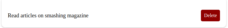
Once we do the above, our component should look like the image below.

Building The List Display Component

This component displays all the lists we’ve added and also automatically generates a delete button as soon as a new list is added.

import React from "react";
import List from "./List";
import { Context } from '../context/AppContext';
function ListDisplay() {
  return (
    <Context.Consumer>
      {(context) => (
        <div className="container">
          {context.lists.length ? 
            context.lists.map((list, id) => (
              <List key={id} list={list} deleteList={context.deleteFromList} />
            )) : null
          }
        </div>
      )}
    </Context.Consumer>
  );
}
export default ListDisplay;

In this component, we created a function ListDisplay and wrapped it using the Context.Consumer from our appContext component, next using a div for our container tag, we destructured the list and deleteList methods from the app context, by doing this we can be able to pass them as props. Next, we map through the lists to return a new list, which we can use in building a single list by passing the returned object as props to the List component.

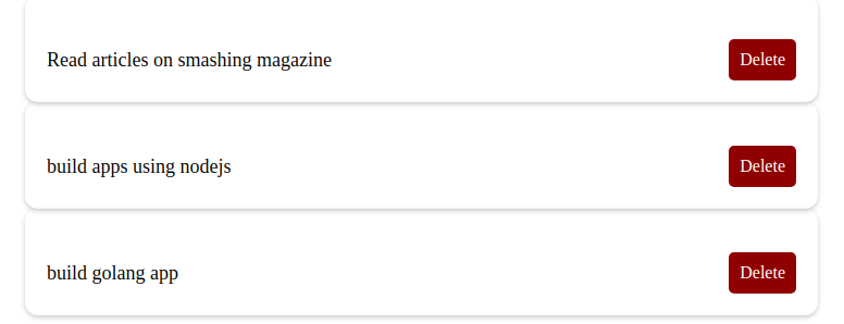
Our component should look like this with lists added:

NavBar Component

This component will be the bulk of our application, here we will wrao our component using the Context.Consumer and similar to our other components, we will be styling with styled components for styling. Let’s build this component below.

import React, { useState } from "react";
import { Heading, Form, TextInput, Button } from "grommet";
import styled from "styled-components";
import { Context } from '../context/AppContext';
function Navbar() {
  const [value, setValue] = useState("");
  return (
    <Context.Consumer>
      {store => (
        <StyledDiv className="container">
          <Heading className="title">Grommet List App</Heading>
          <Form onSubmit={() => store.addToLists(value)} className="form-group">
            <TextInput
              className="form"
              value={value}
              type="text"
              onChange={(e) => setValue(e.target.value)}
              placeholder="Enter item"
            />
            <Button type='submit' className="button">Add to List</Button>
          </Form>
        </StyledDiv>
      )}
    </Context.Consumer>
  );
}
const StyledDiv = styled.div.button {
    margin-top: 10px;
    background-color: purple;
    color: white;
    padding: 10px;
    border-radius: 5px;
  };
export default Navbar;

First, in order to access the properties in the application context provider, we wrapped our component in a Context.Consumer component. Next, we added a Heading tag from Grommet, and then we created an input form for adding our lists by using the method addToList which takes in a value parameter (in our case the value is the user’s input). Last but not least, we added a Submit button to handle the form submit.

Once done correctly, our app should look like this:

Conclusion

In this article, we learned about Grommet, a component library with responsiveness and accessibility in mind. We also went through the process of creating a pricing component application using Grommet and a list application. Have fun using Grommet for your component and UI needs for your next React application. The code for the Grommet list application can be found on Codesandbox and the pricing component can be found here.

Resources

how to use winsound in a situation variable in python tkinter

hello ive been trying to get a sound file to play once i press a button in a situation using winsound but i am unable to get the audio to play here is the code i have

import winsound

import tkinter as tk
from functools import partial # a quick way to make a callback function
import choose_your_own_adventure_game_pt2 as AG
import time
winsound.PlaySound('Adrenaline - Intense Suspense Music (No Copyright).wav', winsound.SND_ASYNC)
print('welcome to the')
AG.title()
time.sleep(1)
print('please read each line carefuly once the gui launches')
time.sleep(13)


class Situation(tk.Frame):

    def __init__(self, master=None, story='', buttons=[],song=None, **kwargs):
        tk.Frame.__init__(self, master, **kwargs)

        story_lbl = tk.Label(self, text=story, justify=tk.LEFT, anchor=tk.NW, font=("Play", 10))
        story_lbl.pack()

        for btn_text, new_situation in buttons:
            btn = tk.Button(self, text=btn_text, command=partial(self.quit_, new_situation),padx=10, pady=10)
            btn.pack()
        if song:
            winsound.PlaySound(song, winsound.SND_ASYNC)
    def quit_(self, new_situation):
        self.destroy()
        load(new_situation)

def load(situation=None):
    frame = Situation(root, **SITUATIONS.get(situation))
    frame.pack()

SITUATIONS = {

    None:{
        'song':
        'intro to the game.wav',
        'story':

"""


hello player you have been chosen to embark on your first adventure,

this as a button based game so all your decisions are based on a press of a button,

you will play as a character named Sarah who has a wolf goddess inside her, the goddess' name is Winter,

you as Sarah will have the powers given to you by Winter to get through this game but if you use too much
of that power at any given time your game will end,

pretty soon you will be asked a series of questions your job is to choose the answer that best suits your style of playing the game

but be warned you may end up loosing in the end, so without furthur addo lets start this thing

welcome to 

MOON LANDING EXPIDITION                                             

male scientist:Hello Sarah can you hear me?


""",

        'buttons':[
            ('YES', 'situation_2'),

            ('NO','situation_2_1')
            ]
        },
    'situation_2':{
        'story':
"""


male scientist:good... do you know where you are?


""",
        'buttons' :[
            ('yes', 'situation_3'),

            ('no', 'situation_3_1')
            ]                  
        },
    'situation_2_1':{
        'story':
"""

male scientist: hmm if you can't hear me
then you wouldn't have responded


""",
        'buttons':[
            ('-_-',None)

            ]

        },
    'situation_3':{
        'story':
"""

male scientist:alright so do you know why you are here?
""",
         'buttons':[
             ('yes','situation_4'),

             ('no','situation_4_1')

             ]

        },
    'situation_3_1':{
        'story':
"""

male scientist: you are in a top secret military space center
""",
       'buttons':[
           ('alright','situation_3')

           ]    
        },
    'situation_4':{
        'story':
"""
male scientist:well then you seem to have the rare ability to read people's minds

(a second scientist enters the room and starts talking to the first on the other side of the glass)

female scientist:Dr. Smith there has been sightings of foreign aircrafts approaching our location

Dr. Smith: alright Susan we need to transport Sarah to the space explorer

Susan:Yes Sir

(Susan looks in your direction)

Susan:Sarah will you please head to the door behind you and follow the yellow lines on the floor
""",
     'buttons':[
         ('what is going on?','situation_5'),
         ('do not press', 'never_gonna_give_you_up'),
         ('am i in danger?','situation_5_1'),
         ('ok','situation_5_2')

         ],    
        },
            'situation_4_1':{
        'story':
"""
male scientist:you were chosen out of five million individuals to take part in a space exploration mission to the planet nexu...

(a second scientist enters the room and starts talking to the first on the other side of the glass)

female scientist:Dr. Smith there has been sightings of foreign aircrafts approaching our location

Dr. Smith: alright Susan we need to transport Sarah to the space explorer

Susan:Yes Sir

(Susan looks in your direction)

Susan:Sarah will you please head to the door behind you and follow the yellow lines on the floor
""",
     'buttons':[
         ('what is going on?','situation_5'),
         ('am i in danger?','situation_5_1'),
         ('ok','situation_5_2')

         ],    
        },    
            'never_gonna_give_you_up':{
                'story':
"""
were no strangers to love...


you know the rules and so do i...

iiiiiiiii just wanna tell you how im feeling 

gotta make you UNDERSTAND!!!

never gonna give you up never gonna let you down 

*rick astly.exe has sotpped working you will die now*
""",
    'buttons':[
        ('death', None)

        ],

                },
    }
def beginning():
    start_button.destroy()
    load() # load the first story
    winsound.PlaySound(None, winsound.SND_ASYNC)
#WINDOW
root = tk.Tk()
root.geometry('500x500-500-300')
root.title('Moon landing expedition')
root.attributes('-fullscreen', True)
#START
start_button = tk.Button(root, text="START", command=beginning)
start_button.place(relx=.5, rely=.5, anchor='c')


#THE LOOP
root.mainloop()

is there anyway i can play a sound file through the SITUATIONS variable?

How to Make a Smart WooCommerce Product Search

Do want to improve the product search in your WooCommerce store?

WooCommerce has a built-in search feature, but it is not very good at finding products. Replacing it with a smarter and faster search improves user experience and brings in more sales.

In this article, we will show you how to make a smart WooCommerce product search for your online store.

Adding a smarter WooCommerce product search to your online store

Why Add a Smart WooCommerce Product Search to Your Store?

By default, WooCommerce comes with a built-in product search feature, but it leaves a lot to be desired.

It does not look for matches in product attributes, reviews, custom fields, or description. It is also very slow and doesn’t offer a good user experience.

This means that users will not be able to find the products they are looking for, and you will lose potential sales.

Product search showing no products found

Luckily, there are some excellent WooCommerce product search plugins that you can use to remedy that. This will allow you to show more helpful product search results, fetch them faster, and get more product sales.

That being said, let’s take a look at how to easily add a smart WooCommerce product search feature to your online store.

Method 1. Make Better WooCommerce Product Search Using Ajax Search for WooCommerce

This method is easier and recommended for most store owners.

For this tutorial, we will be using the pro version of Ajax Search for WooCommerce, which is the best WooCommerce product search plugin on the market.

It looks for the searched keywords in all your products fields including custom fields. The plugin can can also display results without reloading a page, and it is considerably faster than the default WooCommerce search.

There is a free version of this plugin available as well, but it doesn’t have all the powerful features.

First, you need to install and activate the Ajax Search for WooCommerce plugin. For more details, see our step by step guide on how to install a WordPress plugin.

Upon activation, you need to click on the ‘Ajax Search for WooCommerce’ menu in the WordPress admin sidebar to enter your license key. You can find this information under your account on the plugin website.

Enter your license key

After that, you can visit the WooCommerce » Ajax Search Bar page to configure plugin settings. Simply switch to the ‘Search bar’ tab to get started.

Change search appearance

From here, you can choose the appearance of your search box. You can show and hide the button, change the search button label, and replace the placeholder text.

The plugin starts fetching and displaying product results as soon as users start typing. You can customize how many products to show, and how to display instant results.

Configure Ajax search appearance and behavior

Simply switch to the ‘Autocomplete’ tab and review the available options. If you are unsure, then you can leave them as they are. The default settings would work for most online stores.

Next, you need to switch to the Search config page. From here, you can tell the plugin which areas to look at when looking for a match.

Configure search engine

You can check all the options if you want. You can also select custom fields that you may want to be included in search.

Lastly, the plugin also includes Fuzzy matches. These basically include products that might be close to what users are looking for but not an exact match. We recommend keeping this setting at Normal for more relevant and helpful results.

Finally, don’t forget to click on the ‘Save changes’ button to store all your settings.

Displaying Your WooCommerce Product Search on Your Website

Ajax Search for WooCommerce gives you three ways to add the product search box to your WooCommerce store.

  • You can add it to your store’s navigation menu.
  • Display it in the sidebar using a widget
  • Add it manually to a shop page using the shortcode

Adding WooCommerce Product Search to Navigation Menu

Users are likely to look for the search option near your top navigation menu. The plugin makes it easy to place the product search there.

Simply go to Appearance » Menus page. Make sure that your current navigation menu is selected and then add the ‘AJAX Search Bar’ to your navigation menu.

Adding Ajax product search to navigation menu

Don’t forget to click on the Save Menu button to store your settings.

You can now visit your store to see the product search added to your site’s navigation menu.

Preview of live product search in WooCommerce

Adding WooCommerce Product Search to Sidebar Widget

The sidebar is also a popular place to display the product search option.

Simply go to the Appearance » Widgets page and add the ‘AJAX search bar’ widget to your sidebar.

Adding WooCommerce product search to sidebar

Optionally, you can provide a title and choose a layout for your search field from the widget settings.

Don’t forget to click on the ‘Save’ button to save your widget settings.

You can now visit your store and you’ll see the search box in your sidebar.

Sidebar product search preview

Adding WooCommerce Product Search using Shortcode

If you are using a custom landing page for your shop page or product catalog, then you may want to display a product search on that particular page or post.

The plugin comes with a shortcode that allows you to easily do that. Simply edit the post or page where you want to display the search box.

On the edit screen, click on the add new block button (+) and then insert the shortcode block. Inside the shortcode block, you can simply enter the following shortcode:

[wcas-search-form]

Adding the shortcode block

Don’t forget to publish, save, or update your post / page.

You can now visit that particular page or post to see the on-page search box displayed there.

Product search displayed on a page

Method 2. Creating a Smarter WooCommerce Search Using SearchWP

This method is for store owners that also have a lot of non-product related content, and they want to make a better search experience for all their content.

SearchWP is the best WordPress search plugin on the market and comes with a WooCommerce addon too that helps you improve WooCommerce product search too.

The advantage of SearchWP is that it also indexes your blog posts and landing pages.

The disadvantage is that their instant search feature doesn’t display product thumbnails in the results. As a store owner, you want a more visual search experience to engage your customers instantly.

First thing you need to do is install and activate the SearchWP plugin. For more details, see our step by step guide on how to install a WordPress plugin.

Note: You’ll need at least the PRO plan to access the WooCommerce integration.

Upon activation, you need to visit the Settings » SearchWP page and switch to the license tab to enter your license key.

Adding your SearchWP license key

Next, you need to install and activate the WooCommerce Integration extension. You can download it from your account area on SearchWP website and install it as you would install any other WordPress plugin.

Now you are ready to set up your SearchWP custom search engine.

Simply go to Settings » SearchWP page and click on the ‘Sources & Settings’ button.

Choose SearchWP sources

This will bring up a popup where you need to make sure that the checkbox next to products is checked.

Add products source

Next, click on the ‘Done’ button to close the popup and scroll down to the ‘Products’ section.

By default, the plugin will look at the product title, content (description), slug, and excerpt (short description) for matches. You can extend that by clicking on the ‘Add/Remove Attributes’ button.

Add or remove attributes to look for search matches

This will bring up a popup where you can check to include reviews or select custom fields and taxonomies. We have added color and size in the custom fields, and product categories, and product tags in the taxonomies.

Adding product attributes and taxonomies into search

You can now go ahead and click on the ‘Save Engines’ button to save your settings. It will then start rebuilding your search index in the background.

SearchWP automatically looks for your WooCommerce or WordPress search forms and replaces them. Your WooCommerce theme may already have an option to display the search option.

You can go to your website to try out the search feature. You’ll notice that it is slower and will reload the page to show the search results.

Search results page in SearchWP

You can change that behavior by downloading the Live Search extension from SearchWP’s website. After downloading it, you can install and activate it like any other WordPress plugin.

Upon activation, you can simply go to the Appearance » Widgets page and add the ‘SearchWP Live Search’ widget to your sidebar.

SearchWP live search widget

Don’t forget to click on the Save button to save your widget settings.

After that, you can visit your website to see your smart WooCommerce search in action. You’ll notice that SearchWP will display products in live search results but without product thumbnails.

Live search in SearchWP

Which is the best WooCommerce Product Search Plugin?

Ajax Search for WooCommerce and SearchWP are both good at finding products that your default WooCommerce search would not be able to show.

However, Ajax Search for WooCommerce is faster and offers a better user experience. A faster search feature on an eCommerce store ultimately leads to more sales.

It is also easier to use, and you wouldn’t need to install multiple addons to create a better product search on your site.

We hope this article helped you learn how to easily make a smart WooCommerce product search for your online store. You may also want to see our pick of the best WooCommerce plugins that help you grow your store, and our comparison of the best business phone services to add a virtual phone number on your site.

If you liked this article, then please subscribe to our YouTube Channel for WordPress video tutorials. You can also find us on Twitter and Facebook.

The post How to Make a Smart WooCommerce Product Search appeared first on WPBeginner.

What’s the Best Logo Maker? 10 Tools Compared for 2021

You don’t really need to hire a graphic design agency, or perhaps hold a design contest, to come up with the best logo for your business. And no, you don’t require a huge budget or specialized design skills either. You just need to find yourself the best logo maker for your brand.

Passwords to websites

I have scores of entries in Chrome "Settings" / "Passwords" .

When I go to from "Settings" / "Passwords" to the "google account" link Password Manager, the list is a lot shorter.

A bit of background. When I switched my email from Freeserve to Gmail I also started using Outlook on my PC.
Sometime later it seems I unknowingly initiated 'sync' with google. I gather that causes my passwords to be stored in in the google Password Manager.

Can I now delete all the entries in the Settings/Password list?