WordPress Web Design Trends For 2020

Are you keeping up with the latest web design trends in the WordPress World? Looking ahead, we aim to show you some of the important design and technical features that are coming up.

So, as you know, web design is continually evolving as more businesses compete to establish their brand online and stand out from a growing crowd of template-based websites.

In recent years, we’ve seen — and written about — many web design trends that have captured the collective imagination of web designers and brand-conscious businesses.  Suddenly, every website you click through seems to be influenced by web design styles like brutalism, minimalism, modern retro, material, modular, or security-focused design.

And what about using geometry in web designrule-breaking typography, saturated colors, asymmetrical, broken, or slanted layouts, CSS Grids, video headers, parallax, cinemagraphs, customized illustrations, hand-drawn animations, microinteractions, and website push notifications? Yep, we’ve covered those too!

We’ve even debated the merits of using single-page web design and shared with you what the research says about using sidebars in websites.

While some web design trends focus on helping sites stand out from the crowd, other trends are borne out of functional or economic necessity, or even compliance. For example, think of mobile-based design or inclusive web design. It’s hard to imagine building sites today without mobile-friendly designs or taking accessibility into account.

Website owners want great-looking sites that will deliver results. It should be no surprise, then, that the trends listed below incorporate aesthetic design with essential functionality.

WordPress Web Design Trends For 2020

Let’s start with the trend that I believe will dominate the world of WordPress web design not only in 2020 but for many years to come.

The Best WordPress Design Starts Out Of The Blocks

Without a doubt, WordPress Gutenberg block-based web design is the most important WordPress design trend you’ll need to pay attention to in 2020 and beyond.

During the latest State of The Word address delivered in November 2019 at the WordPress Camp US (WCUS) in St. Louis, Missouri, Matt Mullenweg (WordPress co-founder) made it clear that Gutenberg is the future of WordPress web design and web development.

Matt Mullenweg giving a State Of The Word address at WCUS St. Louis, Missouri, 2019
Matt Mullenweg is telling us that all WordPress roads will lead to Gutenberg. (‘State Of The Word’ address at WCUS St. Louis, Missouri, November 2019.)

To appreciate the significance of Matt’s speech, you need to know that Gutenberg is the biggest change WordPress has made in its 16-year history.

Since the release of WordPress 5.0 on December 6, 2018, Gutenberg has had 20 new releases, the number of contributors has grown significantly (from 200 to over 480 in one year), and the adoption of the Gutenberg editor on WordPress sites has almost tripled.

Anyone designing or building WordPress sites today simply cannot afford to ignore just how serious WordPress is about its adoption push for Gutenberg.

WordPress 5.3 Release Screen
WP 5.3 shows that WordPress is serious about Gutenberg.

In the past year, Gutenberg developers have made significant enhancements to the editor (I cover some of these below) and decreased Gutenberg’s average time to load and average time to type. While not everyone has moved away from the WordPress Classic editor yet, more users are responding to the increase in Gutenberg’s post-loading speed by switching to the new editor.  Matt announced during his address that over 270,000 posts per day are now being published using Gutenberg.

You can watch Matt’s full address in the video below:

(Matt’s entire presentation above was created and delivered using Gutenberg.)

So, how is Gutenberg going to affect WordPress web design in 2020?

For a start, Gutenberg will allow more users to start customizing their own sites.

Many of Gutenberg’s new features are already available with WordPress version 5.3. These features include user enhancements like:

  • Smoother block movements as you drag elements on the page with motion settings for improved accessibility.
  • A ‘typewriter’ mode that keeps your vertical place as you type for a more pleasant writing experience.
  • Block previews that let users see what blocks will look like before selecting them.
  • Support for uploading large images such as high-resolution pics from your smartphone. (Shameless plug: use an image compression plugin like Smush when uploading large images to your site and you will never have a problem).
  • Faster block navigation mode for improved usability and accessibility (users can navigate through block menus using their keyboard).
  • The ability to customize navigation menus with elements like background and text colors using an inline navigation menu block.
Gutenberg's new menu customization blocks.
Gutenberg’s new customization blocks give users the ability to design their own navigation menus.

Gutenberg also features new blocks that let you group blocks together (Group block), add white space between blocks (Spacer block), and use custom gradients and multi-buttons on pages and posts.

A composite screenshot of Gutenberg Custom Gradients and Buttons Block.
Hello, custom gradients and buttons!

During his address, Matt also mentioned that one of the most sought after features users wanted from Gutenberg blocks was the ability to add social icons. Gutenberg’s Social Icons block will let users add social icons and buttons anywhere on their posts and pages. I expect different types of social media blocks will be made available for users to choose from.

Gutenberg Social Icons Block.
The Social Icon block is one of the most requested features of Gutenberg.

As more contributors and developers are now focusing on Gutenberg as the way forward, WordPress also announced that it will launch a Block Directory that will allow users to search for and install blocks into their sites using an inline block directory. This includes blocks that will add entire collections to your site, like pattern libraries, for example.

You will be able to design pages on the fly using the Gutenberg block directory.

With Gutenberg’s block directory, users will be able to design pages on the fly. This leads to our next WordPress web design trend for 2020.

One Theme To Rule Them All

WordPress theme developers take note: Gutenberg’s block-based capabilities will give users more freedom to design and customize their own posts and pages. Rather than focusing on developing purpose-specific themes (e.g. an eCommerce or blog-focused theme) that merely accommodate Gutenberg blocks, WordPress theme developers should rethink how to support this new freedom with multi-purpose themes that offer features for building all kinds of websites.

With Gutenberg, you'll be able to create any website you want.

As Matt Mullenweg (WordPress co-founder) recently stated in the State of The Word WCUS,

“What we’re really trying to enable with these fundamental building blocks is that you can look at any website in the world and build that inside WordPress in just a few clicks.”

This represents both a challenge and an opportunity for WordPress theme designers. How do you build themes that users can transform into anything they want?

Let’s take a look at some theme designs that are attempting to do just that:

Neve

WordPress Theme: Neve
Neve by Themeisle.

Neve is a fast-loading, highly customizable, multi-purpose theme that can be used for all kinds of website projects. Although this theme has a minimalist design, it is highly extensible and works perfectly with Gutenberg as well as most page builders.

In addition to being WooCommerce ready, responsive, RTL enabled, and translation ready, this lightweight theme is also fully AMP optimized (see the next web design trend below to learn why this is important).

Genesis Framework

A WordPress theme built with the Genesis framework.
Breakthrough Pro is a WordPress theme built with the Genesis framework by StudioPress.

Genesis Framework developed by StudioPress (now part of WP Engine) aims to move beyond being merely Gutenberg-ready by releasing a number of themes enhanced to be specially optimized for Gutenberg.

Themes like Breakthrough Pro, for example, incorporate Gutenberg theme support for things like block color palettes, font sizes, editor width, and image sizes, custom styling and default Gutenberg block styles that work with the full range of available editor widths, and easy WYSIWYG editing that lets you build pages and posts using Gutenberg blocks with matching front end and admin styles.

Make Fast Sites Faster

Sites not only need to look good, but they also need to load faster. Especially on mobile sites.

Two growing trends to watch out for are  Accelerated Mobile Pages (AMP) and Progressive Web Apps (PWA).

AMP (Accelerated Mobile Pages) are essentially stripped-down HTML versions of your existing webpages designed for faster-loading speeds. Google caches and serves AMP content to make pages load instantaneously to users in its search results.

Themes like Neve, which I discussed earlier are AMP optimized, so no special configurations are required.

Amp Optimized WordPress Theme
This website was built using Neve – an AMP optimized WordPress theme.

PWA plugins for WordPress allow users to return to your site back to your website by launching the app from their home screen and interact with your website through an app-like interface.

Converting your WordPress website into a Progressive Web App allows users to return to your site by launching an app from their mobile phones and interact with your website through an app-like interface.

Super PWA WordPress plugin.
Use a plugin like Super PWA to turn your WordPress site into an app.

In a world where milliseconds can make a huge difference to whether visitors choose your site or click through to someone else’s and a one-second delay can decrease conversion rates by as much as 7%, WordPress sites that can load even faster than its competitors will keep attracting users’ eyeballs and winning clicks.

WordPress theme designers and web developers can stay ahead of this trend by developing mobile-friendly WordPress themes that won’t require the need of AMP at all and converting sites into PWAs.

Make Sites You Can Talk To

More users are searching online using their mobile devices and using voice search features. According to a voice search study by Backlinko, page speed plays a significant role in voice search SEO, where the average voice search result page loads in 4.6 seconds (52% faster than the average page).

You can add voice search capabilities to WordPress sites using plugins.

WP Fastest Site Search

WP Fastest Site Search WordPress plugin.
WP Fastest Site Search plugin lets you add voice search to WordPress.

WP Fastest Site Search not only lets you add voice search capabilities to WordPress sites, but it also replaces the standard WordPress search widget and adds other search enhancement features like autocomplete, spell correct, PDF search, and image search in addition to search filters and search results pages.

Adding voice search plugins to WordPress, however, is not enough. You will also need to learn how to optimize your WordPress site for voice search. Voice search optimization helps users find what they are looking for faster and this requires fast-loading, mobile-optimized sites. Also, it’s important to focus on areas like content readability to make sure that the site can answer readers’ questions. WPAstra has written a great article on voice search SEO.

Make Sites That Talk Back

Users not only expect to find and get what they are looking for faster online, but they also expect to get instant replies to their queries.

Just think about how ‘waiting’ has evolved for users online We have gone from drumming our fingers nervously on the table as we wait for email replies, to watching anxiously as animated dots on mobile screens tell us that someone is replying to our text messages. Technology has conditioned users to expect instant gratification and now we have to deliver.

The solution? AI chatbots.

Olark Live Chat

Olark Live Chat
Add live chat to your WordPress site.

Live chat integrated with AI technologies allows businesses to respond and engage immediately with customers who land on their website. If someone is not available to respond live, AI scripts can take over to direct users appropriately and provide a feeling of instant support. Sometimes, all users need is to feel they’re loved, even if only by a caring bot.

WordPress, You Move Me

Most users stick around a website for less than 15 seconds. That’s how long you’ve got to grab their attention.

Integrating motion UI features such as animated elements and transitions into your web design can help grab your visitors’ attention as they enter or leave your site. The key here is to strike the right balance between grabbing their attention and then directing them to whatever it is they are searching for.

If you don’t know how to start adding motion to your website, start where most WordPress users start… with a plugin!

Animate It!

AnimateIt WordPress Plugin
Add animations to your content and grab your visitor’s attention.

Animate it! lets you add CSS3 animations to content on posts widgets and pages when visitors enter, exit, scroll, or click on elements on your site.

Video Backgrounds

Video backgrounds are another way to add motion to your WordPress site. You can use the Gutenberg Cover Block to add a video background to your pages.

Cover blocks let you easily add video animation to WordPress

When adding videos and animations, just make sure that your site still loads fast. Install our Smush and Hummingbird plugins to help you with this.

Say Hello From Ahlo To Zialo

While businesses aim to expand globally in areas like eCommerce and the internet keeps making the world a smaller place, more cultures around the world are trying to preserve their uniqueness.

In 2020 and beyond, multilingual WordPress sites that allow users to view content in their own language are going to become more popular.

While WordPress itself currently does not support bilingual or multilingual sites out-of-the-box, it does support WordPress being translated into all languages. Also, there are plugins that will allow you to easily create a multilingual site.

WPML

WPML - WordPress Multilingual Plugin.
WPML – WordPress Multilingual Plugin

WPML (WordPress Multilingual Plugin) lets you translate WordPress sites into many different languages and integrates with WooCommerce, allowing sites to interact with users in over 100 countries and languages. Other popular language translation plugins include Polylang, Weglot, and TranslatePress.

It’s important to note that for years, WordPress has been supporting developers that help improve its multilingual capabilities. WordPress is not looking to replace translation plugins or make multilingual WordPress a core offering.

Simon Wheatley quote about multilingual WordPress project
WordPress supports plugins that improve its multilingual capabilities.

Everyone’s Got An Opinion And Something To Say

Imagine being able to design and develop WordPress sites using real-time collaboration. Different departments would be able to give valuable input into specific areas of the site as it is being developed, resulting in better sites for users and development teams.

Although real-time collaboration in WordPress is not quite there yet, it is on its way. Leonardo Losovitz has written a great article on how Gutenberg is reinventing the experience of creating, editing, and managing content in WordPress and helping web designers assist users.

Gutenberg will soon make it possible to collaborate with other WordPress in real-time.

Real Time Collaboration Using Gutenberg.
Gutenberg is here to stay and will soon help WordPress users build sites collaboratively. Image source: GitHub

Start Designing Tomorrow’s WordPress Sites Today

As you can see from the above, Gutenberg is the most significant development to affect WordPress and will influence all future WordPress web design trends and developments. Ignore this at your own peril.

WordPress web design from 2020 will focus on sites that integrate design and functionality, load extremely fast, and cater to a growing mobile user base worldwide. Knowing this should help you build better sites.

We’ve covered many web design trends in the past and we’ll keep predicting trends in the future. We’ll even show you where to get web design inspiration from, so if you’re a web designer or a web developer, make sure to subscribe to receive our latest updates and stay on-trend.

How Email Verification Tools Can Help Grow Your Market

Of the many channels explored by marketing managers, email is probably one of the most important. It’s a great way to touch base with your customers, announce new collections and services and get feedback. Done right, email marketing can have an ROI of 3400%! But, this is not the result of every company that uses email marketing sees. One of the reasons for this could be a bad email list. This is where email verification tools come in.

Weekly Platform News: Internet Explorer Mode, Speed Report in Search Console, Restricting Notification Prompts

In this week's roundup: Internet Explorer finds its way into Edge, Google Search Console touts a new speed report, and Firefox gives Facebook's notification the silent treatment.

Let's get into the news!

Edge browser with new Internet Explorer mode launches in January

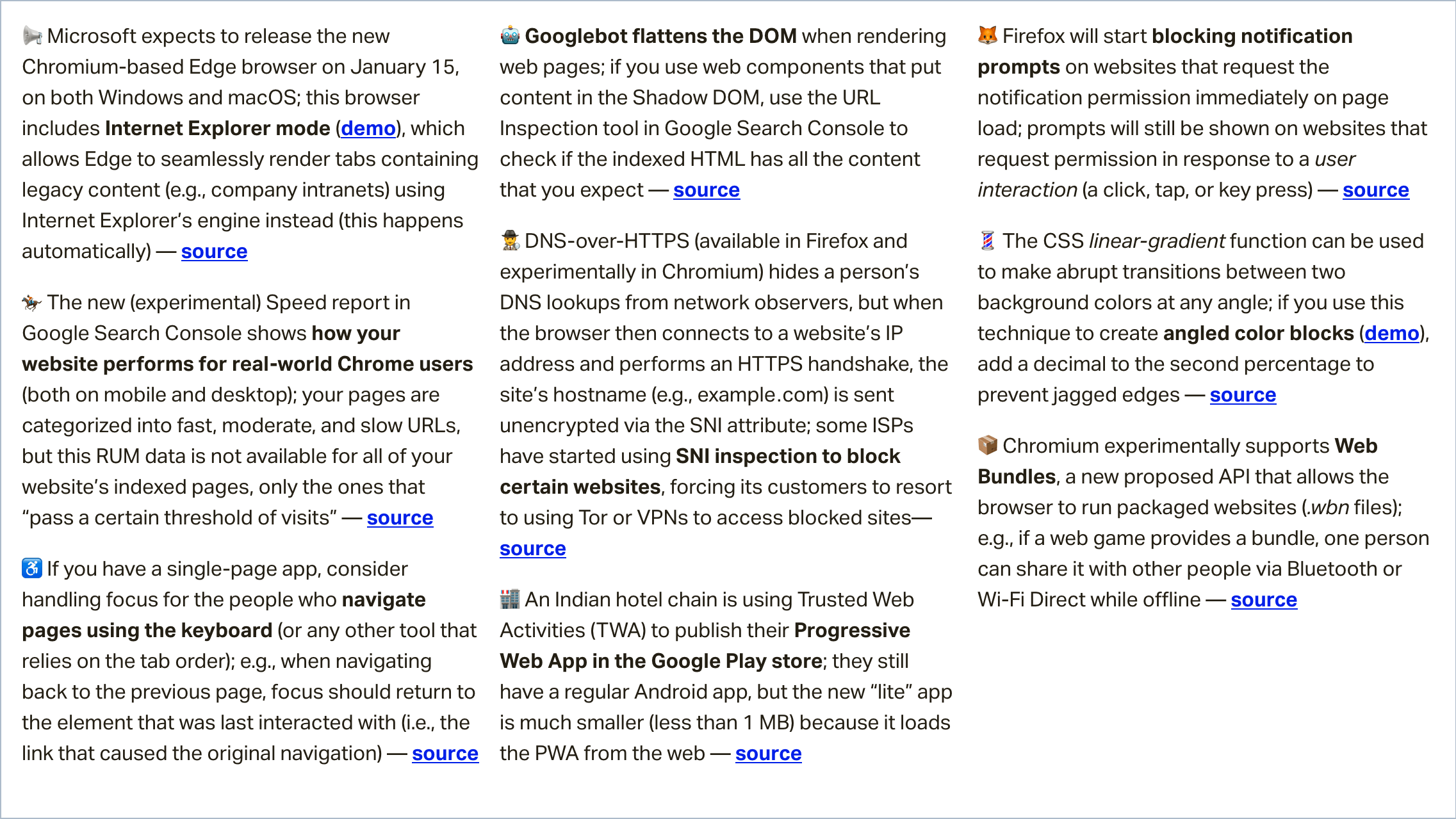
Microsoft expects to release the new Chromium-based Edge browser on January 15, on both Windows and macOS. This browser includes a new Internet Explorer mode that allows Edge to automatically and seamlessly render tabs containing specific legacy content (e.g., a company’s intranet) using Internet Explorer’s engine instead of Edge’s standard engine (Blink).

Here’s a sped-up excerpt from Fred Pullen’s presentation that shows the new Internet Explorer mode in action:

(via Kyle Pflug)

Speed report experimentally available in Google Search Console

The new Speed report in Google’s Search Console shows how your website performs for real-world Chrome users (both on mobile and desktop). Pages that "pass a certain threshold of visits" are categorized into fast, moderate, and slow pages.

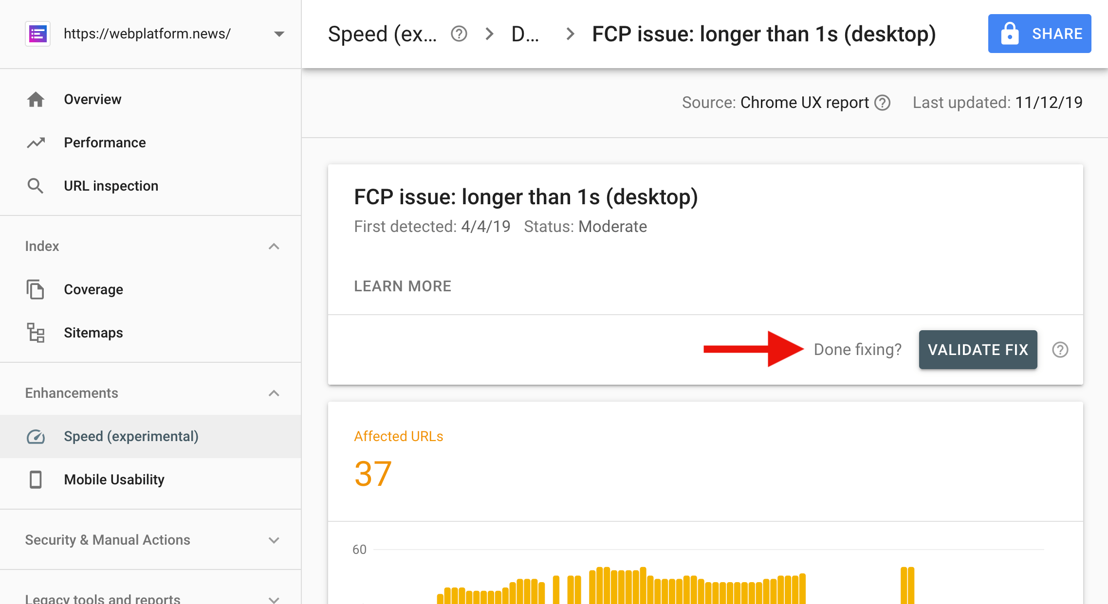
Tip: After fixing a speed issue, use the “Validate fix” button to notify Google Search. Google will verify the fix and re-index the pages if the issue is resolved.

(via Google Webmasters)

Facebook’s notification prompt will disappear in Firefox

Firefox will soon start blocking notification prompts on websites that request the notification permission immediately on page load (Facebook does this). Instead of the prompt, a small “speech balloon” icon will be shown in the URL bar.

Websites will still be able to show a notification prompt in Firefox as long as they request permission in response to a user interaction (a click, tap, or key press).

(via Marcos Càceres)

More news...

Read more news in my weekly newsletter for web developers. Pledge as little as $2 per month to get the latest news from me via email every Monday.

More News →

The post Weekly Platform News: Internet Explorer Mode, Speed Report in Search Console, Restricting Notification Prompts appeared first on CSS-Tricks.

Learn UI Design

Erik Kennedy's course Learn UI Design is open for enrollment for less than a week. Disclosure, that link is our affiliate link. I'm linking to it here because I think this is worthy of your time and money if you're looking to become a good UI designer.

I think of Erik sorta like the Wes Bos of design teaching. He really gets into the nitty-gritty and the why of good design. Design is tricky in that way. Adjusting some colors, spacing, and lines and stuff can feel so arbitrary at times. But you still have a sense for good and bad. The trick is honing your eye for spotting what is bad in a design and how to fix it. Erik excels at teaching that.

The course is a thousand bucks. Not very cheap. Personal lessons double that. It's reasonable for you to have some questions.

Yes, it's pro-quality. Yes, it's 20 hours of video. Yes, you have lifetime access and can complete it on your own schedule. Yes, students get design jobs after completing it. Yes, there's a student community with 1,000+ folks. Yes, you can use Sketch or Figma.

It's a lot. It's very modern and made to teach you how to be a designer in today's world. So no, it's not free or even inexpensive — but it's good.

Direct Link to ArticlePermalink

The post Learn UI Design appeared first on CSS-Tricks.

Proven Ways to Boost Your Conversion Rate with Social Proof

Proven Ways to Boost Your Conversion Rate with Social ProofMarketing and Psychology might seem two very distant lines of study. But when combined they can work miracles. Marketers have been leveraging the power of psychology to increase sales and grow their business for years. The most common form in which it exists is via the placement of a product, its color, its packaging and […]
The post Proven Ways to Boost Your Conversion Rate with Social Proof appeared first on WPExplorer.

bbPress 2.6 Released After 6 Years, Includes Per-Forum Moderation and Engagements API

On Tuesday, John James Jacoby announced that bbPress 2.6 was available to the public after a six-year wait in a post titled bbPress 2.6 — Better Great Than Never. The announcement landed with a whimper as it was overshadowed by the release of WordPress 5.3 on the same day.

bbPress is an official WordPress project for powering forums. It was initially launched on December 28, 2004, by Matt Mullenweg as a standalone project. During the first iteration’s heyday, it was popular within the WordPress community as a simple forum solution. In 2011, bbPress 2.0 relaunched as a WordPress plugin with Jacoby as the lead developer.

The bbPress team is primarily comprised of four part-time contributors with nearly no volunteers available for user testing. Stephen Edgar, Brandon Allen, and Sergey Biryukov were the primary developers other than Jacoby behind version 2.6.

“Jennifer M. Dodd deserves a mention for her contributions to 2.6 early on; she’s largely moved on but is wonderful,” said Jacoby. “Behind the scenes in the meta and forums teams are Samuel ‘Otto’ Wood, Dion Hulse, Mika Epstein, Marius Jensen, and countless others who provide feedback and feature requests upstream based on how WordPress.org uses bbPress.”

Contributors resolved 420 open tickets with 1,737 code commits over the multi-year span it took for version 2.6 to drop. The new version ships with hundreds of bug fixes and improvements. Its features include per-forum moderation, new platforms to import forum content from, and an Engagements API.

The new Engagements API connects user IDs to the various types of content in bbPress, such as forums, topics, replies, and topic tags. This works as a sort of relationship system between users and any content they interact with on the forums. In previous versions of bbPress, all of this data was saved in the user metadata table.

Per-forum moderation is a key feature for forums, but it has been one of the missing elements in bbPress. The new feature takes advantage of the Engagements API to connect user IDs to forum IDs. In turn, this allows site owners to create moderators for individual forums. This feature works in contrast to the existing “moderator” role in bbPress, which provides users global moderation powers.

Why the 6-Year Wait?

You could be forgiven for wondering if bbPress was all but dead. The last minor release happened in 2017 when the team dropped version 2.5.14. The same year, bbPress 2.6 was headed toward a third beta and even had a few release candidates.

“There was not very much feedback on the 2.6 beta or RC, and I had just transitioned into my role at Sandhills Development,” said Jacoby. “I decided it was better to concentrate on doing a good job where I could make a direct impact on people’s lives, rather than have no idea if I was doing a good job at all with bbPress.”

Jacoby did not want to release a potentially buggy version 2.6 and take on the support burden at the time. Doing so would have interfered with his responsibilities at his new job. “Younger me would have tried to do both, and failed at both,” said Jacoby.

Why such a long wait between releases? Most likely, it was for the same reason the Twitter announcement got fewer than a couple of dozen likes and even fewer retweets. There is not much community engagement with the project. On the flip side, the bbPress team has not been active on social media or the project’s official blog in the past two years.

Despite the lack of community engagement, bbPress is currently installed on over 300,000 sites. It runs the forums at WordPress.org, WordPress.com, CSS-Tricks, and other large communities. However, there is not much help sent back to the bbPress project from most places.

“On WordPress.org, bbPress is just one piece of a very complex puzzle, and everything is mostly in maintenance mode all the time,” said Jacoby. “The forums team focuses on the needs of the forums and the meta team helps maintain the code itself, but WordPress has made it easier and more rewarding to contribute to; so contributors graduate up to WordPress core and rarely look back.”

The idea behind switching bbPress 2.x to a WordPress plugin from its standalone roots was that it would be simpler for the larger WordPress community to pitch in. Jacoby said that contributions have improved since the pre-plugin era, but it has not helped enough. “There’s more attention and accolades with WordPress and Gutenberg than there are with the bb’s or GlotPress,” he said.

One of bbPress’ biggest problems is the lack of resources. There is no commercial element to the plugin and no major companies are funding anyone to work on the project full time.

“For an open-source project to be sustainable long-term, it needs to have an economy behind it,” said Jacoby. “Without an economy, what’s the real goal? Market share? Building better forum software? Those are not enough by itself when people need to make a living, and when less work with WooCommerce can help you earn a better living.”

The Future of Forums

Six years between major releases is a lifetime in technological years, plenty enough time for another company to claim the WordPress forum market share. However, bbPress managed to keep its crown as the most-used WordPress forum plugin during the wait. It does beg the question of whether companies or developers see a future for forums.

With so many alternative options for user engagement, are forums a dying breed of software?

“If forums are dying, it’s a slow death, according to the numbers anyway,” said Jacoby. “Chat apps like Slack and Discord (or Twitch and YouTube) are where people do forum-type stuff these days. Moderating your own community takes dedication and work, and if you’re going to do work, why not build an audience someplace else instead?”

Jacoby has hope for the future, however. “I can imagine a bunch of reasons why forums seem unattractive,” he said, “but to me they are still what everyone circles back around to, just like having their own blogs!”

Passing a value from a drop-down list to a SELECT statement

Hello, I am new to this site and to php and mySQL...and I need some help. I know this topic is all over the web but after a couple of days of looking and refering to several text books it still doesn't work so please bear with me.

I have created a web page with an associated mySQL database for our local women's golf club. I am trying to create a routine that will allow active members to get a web page displaying a listing of other members who live near them (in the same city/town). I have created a drop-down list in file 1 (memberSelect.php) with the following code below.

I want to pass the the value selected (town) to file 2 (activeMemberListing_NearMe.php) using the POST method. The code in file 2 is as follows below.

The While loop processes query results and displayes all records found. Note - I know this while loop works as it is taken from another file that successfully calls a SELECT statement and simply lists all active members of the club.

When I open file 1, select a city and click the "List Members" button I end up right back at file 1. This leads me to believe that I am passing nothing with the the "IF($cityID == 0)" code line in file 2 being true and thereby returning me to file 1.

I know this is a static selection list but before I move to a dynamic selection list I want to know why this doesn't work. Any help will be greatly appreciated.

Kathy

File 1
<?php

        //  2nd select routine

        echo' <form action="activeMemberListing_NearMe.php" method="post">';
        echo'   <table> <tr> <td>';

        echo'             <select name="town">';
        echo'               <option value="0" name="town" selected="selected">...Select City...</option>';
        echo'                 <option value="Carson City">Carson City</option>';
        echo'                 <option value="Gardnerville">Gardnerville</option>';
        echo'                 <option value="Markleeville">Markleeville</option>';
        echo'                 <option value="Minden">Minden</option>';
        echo'                 <option value="Smith">Smith</option>';
        echo'                 <option value="South Lake Tahoe">South Lake Tahoe</option>';
        echo'                 <option value="Stateline">Stateline</option>';
        echo'                 <option value="Wellington">Wellington</option>';
        echo'                 <option value="Zepher Cove">Zepher Cove</option>';
        echo'             </select>';               
        echo'           </td> <td></td> <td>';
        echo'             <input type="submit" value="List Members" />';
        echo'           </td> </tr> </table>';  
        echo' </form>';

    ?>      

File 2

 if($dbSuccess)
        {
              //  Get the details of the member's form the selected city 
            $cityID = $_POST["town"];   
            if ($cityID == 0) 
             {
                echo "<script type='text/javascript'> document.location = 'memberSelect.php'; </script>";
             }   // end if          

          $activeMembersNearMe_SQLselect = "SELECT FirstName, FullName, Address, City, State, Zip, HomePhone, CellPhone, Email, Picture ";
          $activeMembersNearMe_SQLselect .= "FROM ";
          $activeMembersNearMe_SQLselect .= "members ";
          $activeMembersNearMe_SQLselect .= "WHERE Status = 'Active' AND City = '".$cityID."' ";
          $activeMembersNearMe_SQLselect .= "ORDER BY FirstName , LastName ";

          $activeMembersNearMe_SQLselect_Query = mysqli_query($dbConnected,$activeMembersNearMe_SQLselect); 

          $index = 1;

          while ($row = mysqli_fetch_array($activeMembersNearMe_SQLselect_Query))

Building an AR Game With Hololens, Part 1: Introduction

An AR game built with Hololens

Microsoft’s Hololens is a truly amazing platform. Although out of the hands of the average consumer and more designed for the enterprise (as recently enforced by MS), it still demonstrates what can be done in the AR space. Also, with MS partnering with Epic, and not just Unity, the next generation of Hololens apps may be more consumer-friendly. That all being said, I have been working with the Hololens for some time and have noticed a lack of detailed help for some common applications.

You may also like: MS Hololens and How to Get Started

The purpose of this series is to help fill in the blanks and put together as many resources available on how to build a simple game. In this series, we will design a very rudimentary game using the main aspects of Hololens v1 to provide a good, in-depth understanding of how to use this piece of hardware. Please note: This is not a game development tutorial, and that is not the purpose of this tutorial series. However, since Hololens development uses Unity and now Epic, it will be necessary at times and I will discuss those relevant concepts.

Some CSS Grid Strategies for Matching Design Mockups

The world of web development has always had a gap between the design-to-development handoff. Ambitious designers want the final result of their effort to look unique and beautiful (and true to their initial vision), whereas many developers find more value in an outcome that is consistent, dependable, and rock solid (and easy to code). This dynamic can result in sustained tension between the two sides with both parties looking to steer things their own way.

While this situation is unavoidable to some extent, new front-end technology can play a role in bringing the two sides closer together. One such technology is CSS grid. This post explores how it can be used to write CSS styles that match design layouts to a high degree of fidelity (without the headache!).

A common way that designers give instructions to front-end developers is with design mockups (by mockups, we’re talking about deliverables that are built in Sketch, XD, Illustrator, Photoshop etc). All designers work differently to some degree (as do developers), but many like to base the structure of their layouts on some kind of grid system. A consistent grid system is invaluable for communicating how a webpage should be coded and how it should respond when the size of the user’s screen differs from the mockup. As a developer, I really appreciate designers who take the trouble to adopt a well thought-out grid system.

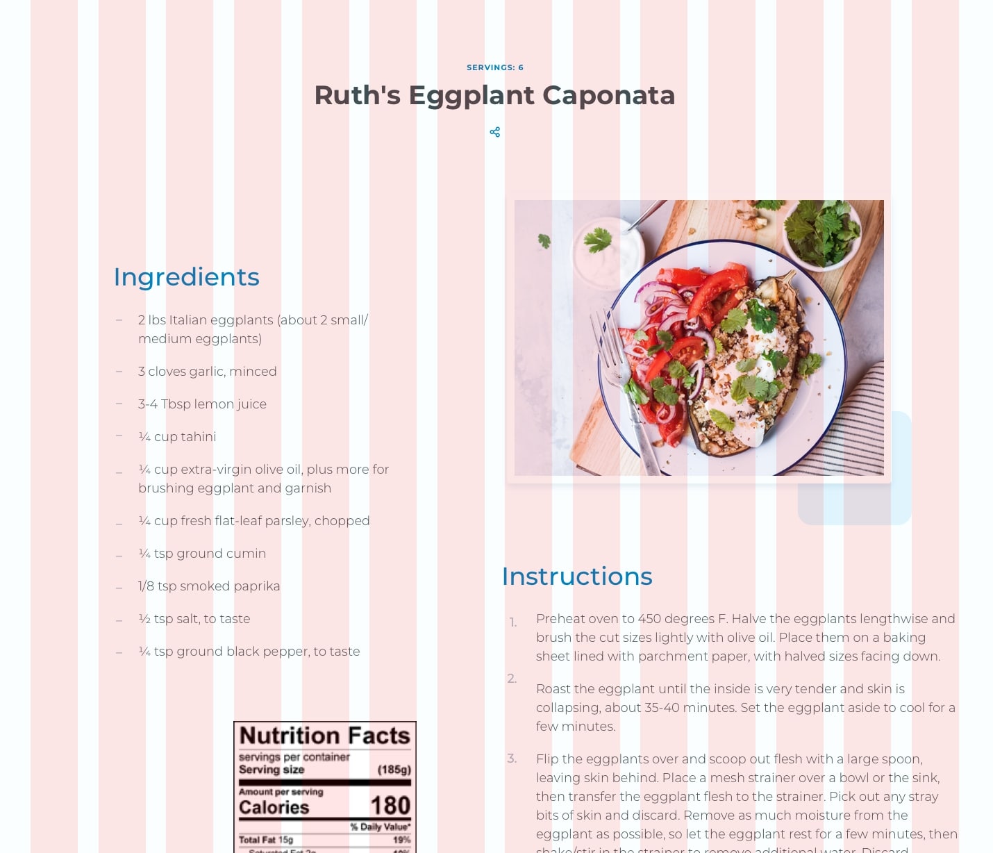
A 12-column layout is particularly popular, but other patterns are common as well. Software like Sketch and XD makes creating pages that follow a preset column layout pretty easy — you can toggle an overlay on and off with the click of a button.

A grid layout designed in Sketch (left) and Adobe XD (right)

Once a grid system is implemented, most design elements should be positioned squarely within it. This approach ensures that shapes line up evenly and makes for a more appealing appearance. In addition to being visually attractive, a predictable grid gives developers a distinct target to shoot for when writing styles.

Unfortunately, this basic pattern can be deceptively difficult to code accurately. Frameworks like Bootstrap are often used to create grid layouts, but they come with downsides like added page weight and a lack of fine-grained control. CSS grid offers a better solution for the front-end perfectionist. Let's look at an example.

A 14-column grid layout

The design above is a good application for grid. There is a 14-column pattern with multiple elements positioned within it. While the boxes all have different widths and offsets, they all adhere to the same grid. This layout can be made with flexbox — and even floats — but that would likely involve some very specific math to get a pixel-perfect result across all breakpoints. And let’s face it: many front-end developers don’t have the patience for that. Let’s look at three CSS grid layout strategies for doing this kind of work more easily.

Strategy 1: A basic grid

See the Pen
Basic Grid Placement
by chris geel (@RadDog25)
on CodePen.

The most intuitive way to write an evenly spaced 12-column layout would probably be some variation of this. Here, an outer container is used to control the outside gutter spacing with left and right padding, and an inner row element is used to restrain content to a maximum width. The row receives some grid-specific styling:

display: grid;
grid-template-columns: repeat(12, 1fr);
grid-gap: 20px;

This rule defines the grid to consist of 12 columns, each having a width of one fractional unit (fr). A gap of 20px between columns is also specified. With the column template set, the start and end of any child column can be set quite easily using the grid-column property. For example, setting grid-column: 3/8 positions that element to begin at column three and span five columns across to column eight.

We can already see a lot of value in what CSS grid provides in this one example, but this approach has some limitations. One problem is Internet Explorer, which doesn’t have support for the grid-gap property. Another problem is that this 12-column approach does not provide the ability to start columns at the end of gaps or end columns at the start of gaps. For that, another system is needed.

Strategy 2: A more flexible grid

See the Pen
More Flexible Grid Placement
by chris geel (@RadDog25)
on CodePen.

Although grid-gap may be a no go for IE, the appearance of gaps can be recreated by including the spaces as part of the grid template itself. The repeat function available to grid-template-columns accepts not just a single column width as an argument, but repeating patterns of arbitrary length. To this end, a pattern of column-then-gap can be repeated 11 times, and then the final column can be inserted to complete the 12-column / 11 interior gap layout desired:

grid-template-columns: repeat(11, 1fr 20px) 1fr;

This gets around the IE issue and also allows for columns to be started and ended on both columns or gaps. While being a nice improvement over the previous method, it still has some room to grow. For example, what if a column was to be positioned with one side spanning to the outer edge of the screen, and the other fit within the grid system? Here’s an example:

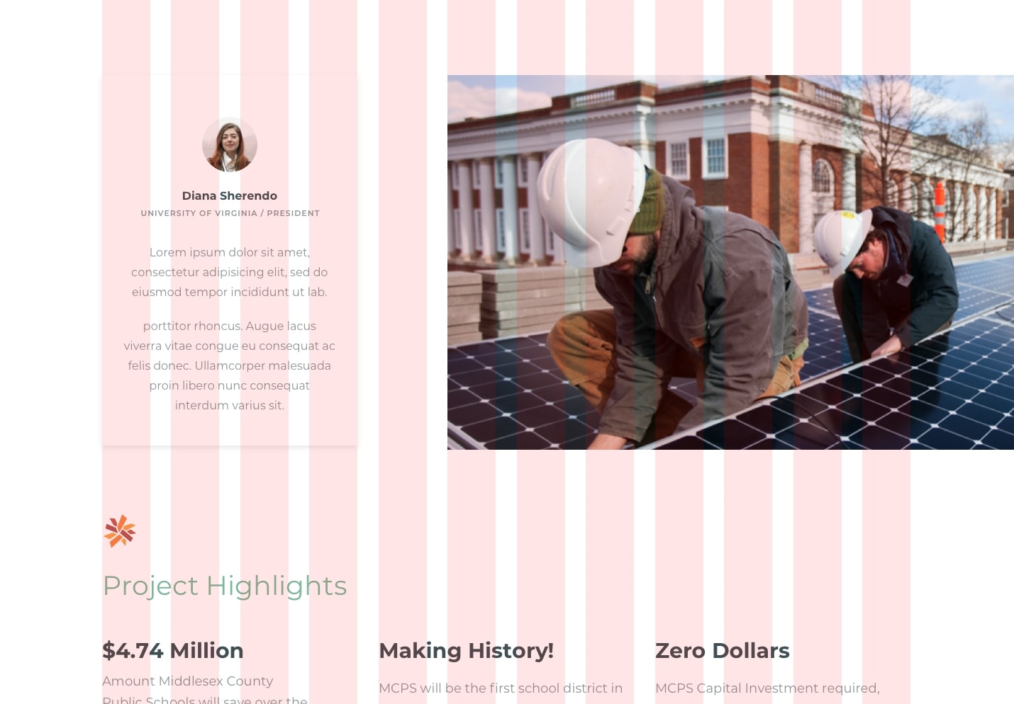
A grid Layout with an that's item flush to the outer edge

In this layout, the card (our left column) begins and ends within the grid. The main image (our right column) begins within the grid as well, but extends beyond the grid to the edge of the screen. Writing CSS for this can be a challenge. One approach might be to position the image absolutely and pin it to the right edge, but this comes with the downside of taking it out of the document flow (which might be a problem if the image is taller than the card). Another idea would be to use floats or flexbox to maintain document flow, but this would entail some tricky one-off calculation to get the widths and spacing just right. Let’s look at a better way.

Strategy 3: An even more flexible grid

See the Pen
Right Edge Aligned image with grid
by chris geel (@RadDog25)
on CodePen.

This technique builds on the idea introduced in the last revision. Now, instead of having the grid exist within other elements that define the gutter sizes and row widths, we’re integrating those spaces with the grid’s pattern. Since the gutters, columns, and gaps are all incorporated into the template, child elements can be positioned easily and precisely on the grid by using the grid-column property.

$row-width: 1140px;
$gutter: 30px;
$gap: 20px;
$break: $row-width + 2 * $gutter;
$col-width-post-break: ($row-width - 11 * $gap) / 12;
  
.container {
  display: grid;
  grid-template-columns: $gutter repeat(11, calc((100% - 2 * #{$gutter} - 11 * #{$gap})/12) #{$gap}) calc((100% - 2 * #{$gutter} - 11 * #{$gap})/12) $gutter;
  @media screen and (min-width: #{$break}) {
    grid-template-columns: calc(0.5 * (100% - #{$row-width})) repeat(11, #{$col-width- post-break} #{$gap}) #{$col-width-post-break} calc(0.5 * (100% - #{$row-width}));
  }
}

Yes, some math is required to get this just right. It’s important to have the template set differently before and after the maximum width of the row has been realized. I elected to use SCSS for this because defining variables can make the calculation a lot more manageable (not to mention more readable for other developers). What started as a 12-part pattern grew to a 23-part pattern with the integration of the 11 interior gaps, and is now 25 pieces accounting for the left and right gutters.

One cool thing about this approach is that it can be used as the basis for any layout that adheres to the grid once the pattern is set, including traditionally awkward layouts that involve columns spanning to outside edges. Moreover, it serves as a straightforward way to precisely implement designs that are likely to be handed down in quality mockups. That is something that should make both developers and designers happy!

There are a couple of caveats...

While these techniques can be used to crack traditionally awkward styling problems, they are not silver bullets. Instead, they should be thought of as alternative tools to be used for the right application.

One situation in which the second and third layout patterns are not appropriate are layouts that require auto placement. Another would be production environments that need to support browsers that don’t play nice with CSS grid.

The post Some CSS Grid Strategies for Matching Design Mockups appeared first on CSS-Tricks.

Blockchain for Logistics: Considerations for Successful Implementation

Almost all major manufacturing companies have a global footprint and continuously move materials from one geographical region to another. Multiple service providers — Freight Forwarders, third party logistics service providers, and carriers — work together in moving materials and act as parts of one single shipping network. Effective collaboration among all these different types of organizations is critical to the success of any supply chain.

Blockchain architecture, which was evolved from distributed computing theory, helps creating a distributed digital ledger that can be shared among different parties and still keep the data clean and accurate. After creating the first impact in digital currencies, Blockchain is now a significant focus area in Logistics.

6 Metrics You Need to Optimize for Performance in Machine Learning

6 Metrics to Optimize Performance in Machine Learning

There are many metrics to measure the performance of your machine learning model depending on the type of machine learning you are looking to conduct. In this article, we take a look at performance measures for classification and regression models and discuss which is better-optimized. Sometimes the metric to look at will vary according to the problem that is initially being solved.

You may also like:  Machine Learning Models: Deployment Activities

Examples of metrics in Machine Learning

Scala: Sorting Lists of Objects

One of the most common ADT that a developer uses in their day-to-day coding is List. And one of the most common operations a developer performs on a list is to order it or sort it with given criteria. In this article, I will focus on sorting a list of objects in Scala.

Mainly, there are two ways of sorting a list in Scala, i.e.

Running Big Data Analytics on Bare Metal Cloud

Big data analytics can be defined as a collection of technologies and processes used to crunch through complex data sets in order to discover market trends, correlations, and hidden data patterns. It enables organizations to make informed business decisions and aids researchers in verifying their scientific models.

Big Data Analytics has become an essential part of any business, be it financial analysis, retail, advertising, or healthcare. The amount of data worldwide has been growing exponentially and is estimated to jump from 33ZB this year to 175ZB in 2025. Not only does this create immense opportunities, but it also raises a huge demand for the infrastructure to run big data analytics on and poses new challenges for data engineers.