DevOps has come a long way and it has become the driving force of the software industry today. While many companies would like to embrace DevOps culture, the need for a better understanding is required initially to make a strategic plan around the DevOps approach.
Apart from hiring the experts with good domain knowledge, the other important aspect is to attend conferences and learn from the industry experts working in other companies that are already successful with their DevOps implementation. We all know, nothing can beat listening to the industry experts talk and learning from them.
Every company is a software company now, and every company will become a DevOps company soon.
“It is not the strongest of the species that survives, nor the most intelligent that survives. It is the one that is the most adaptable to change.” — Charles Darwin
Why DevOps?
It is our quick response to quickly changing technology trends that generates excitement and drives business growth. DevOps helps grow your business performance exponentially by delivering the expected features faster to the market. DevOps was born out of a long history of software development, and it’s a well-thought approach.
DevOps has evolved big time since many of us thought it was just a buzzword. Now we know that is a myth. DevOps has become a main focus and has been shaping the world of software for the last few years. Experts say that DevOps is going to be the mainstream and its popularity is going to reach its peak in 2019.
Below is the Google trend shown for the term “DevOps” and a hypothesis of its projected growth in 2019.
DevOps and Site Reliability Engineering (SRE) both seem to rule the world of software development, and at the same time, both appear to overlap or confuse people to some extent. Today, we will try to analyze both terms and see if we can see some differentiating factors between the two.
DevOps Engineer
The term "DevOps Engineer" strives to dim this divide between Dev and Ops conjointly and suggests that the best approach is to hire engineers who can be excellent coders as well as handle all the Ops functions.
Organizations across the world are excited to make a cultural change or shift and adapt to DevOps as early as possible. While everybody is just talking about how fast they can practice this approach, they forget about the security aspect involved with this change. DevOps might initially involve that needed change in the culture, but as it embeds across the organization, it requires more scrutiny at each phase and has to be taken seriously. Shifting security to the left can help organizations to be more secure and do well in the future.
The customer is the king, and the market has numerous alternatives these days, more choices and more power to consumers. The ultimate goal of any firm whether product/service based should be to deliver quality and continuously make sure the customer info/data is secure. In the software development field, the Continuous Delivery of software is supported by build and deployment automation commonly called a Continuous Integration/Continuous Deployment (CICD) pipeline. The CICD pipeline makes it possible to employ rapid changes daily to address customer needs and demands. The CI/CD pipeline can be automated as well, and hence Security has to be a design constraint these days. Thinking security right from the beginning requires security to be built into software instead of being bolted on, Security is no more an add-on.
Early DevOps practitioners have shown DevOps to be more than just a cultural aspect or a set of tools – they have confirmed it to be a crucial success factor and a competency well worth developing in today’s environment of rapid evolution, technological advancement, and huge customer or employee expectations. The demand for DevOps in organizations is high and need of the hour, but it is not something that can be adopted on to the average team just like that. When this happens, the current organizational undercurrents will weaken the effectiveness of such a program. Rather, the development, operations, and overarching management processes must be redesigned anew and from the scratch. DevOps can be profoundly disruptive to a business, it has an enduring and strong impact on organizational success. After all, IT is the core of almost any business and the effectiveness and agility gained there will have a notable impact on the readiness and coordination of the organization as a whole.
The term DevOps has entered into our general language and has gathered much attention and focus these days.
DevOps, as we all know, it is the word on the lips of every software enthusiast around the world. DevOps has come a long way and is taking center stage in the world of software development.
What Exactly Is DevOps?
DevOps is a cultural methodology in which professionals are groomed to adapt to a new and emergent environment in software-powered organizations. Teams are trained to follow a specific set of rules, steps, and tools to achieve success in DevOps. When it comes to DevOps adoption, having the right attitude, employing the proper tools, and learning the stages of the DevOps cycle are imperative.
Microservices is the most talked-about term in the software industry today. Microservices architecture is what every software-powered company wants to embrace to eliminate the complexities of building larger applications with more dependencies. Microservices architecture is all about breaking down the large applications into small, individual, separate and scalable parts to make sure the dependency and failure effects are bare minimum or nil. The Microservices architecture also increases the overall efficiency since they are more comfortable to plug and play, and easy to manage. This article from smart bear explains microservices architecture in more detail.
Microservices and DevOps go hand-in-hand, and we want you to get some real knowledge on microservices not just by browsing the internet, but also by going through some of these books we are about to list. Our article, "Our journey to microservices: mono repo vs. multiple repositories," talks about our own journey towards microservices and some advanced concepts of a monorepo and multiple repositories.
DevOps has evolved big time since many of us thought it was just a buzzword. Now we know that is a myth. DevOps has become a main focus and has been shaping the world of software for the last few years. Experts say that DevOps is going to be the mainstream and its popularity is going to reach its peak in 2018.
Below is the Google trend shown for the term "DevOps" and a hypothesis of its projected growth in 2018.
Your product could be the most amazing and useful product in the world, but if your packaging is not on point, then your entire business could be in some major trouble.
Imagine this scenario: You’ve designed the best product in your field, invested all of your funds into creating the product, and put packaging design on the back burner. You get on a free mock-up website, make something in an hour, call it day, and show it to your investors.
Terrible idea.
In my personal opinion, you should put just as much effort into the packaging design of your product as you put into the product itself.
According to science, it only takes a person 1/10th of a second to create or form an opinion about someone or something. That gives you literally not even one second to give someone a great first impression.
The first thing your potential customer is going to see is your packaging. And you better hope to goodness that you’ve aced your first impression and wowed your target audience with your packaging design.
Best Packaging Design Ideas for 2019
I’ve rounded up 20 of my favorite packaging designs for you to be inspired by for your next design project.
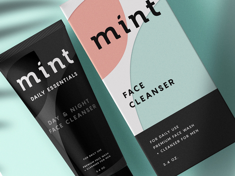
This face wash for men is so simplistic in its design that it’s easy and enjoyable for the eye to look at. The black color of the face wash gives off tones of luxury and the pastel colors on the box, combined with flat design, simply works for this packaging.
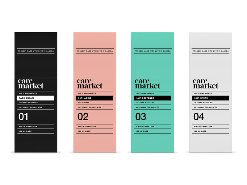
2. Care Market
Continuing on with the pastel trend, we have Care Market packaging design. The palette they chose here is lovely, as pastels have been all over the place this year. The consistency in font usage is just perfect, using only two different fonts and using dividing lines between each new phrase.
This packaging design shows us that you don’t need elaborate graphic designs to exude elegance and professionalism. All you need is a great color palette, and nice, coinciding fonts.
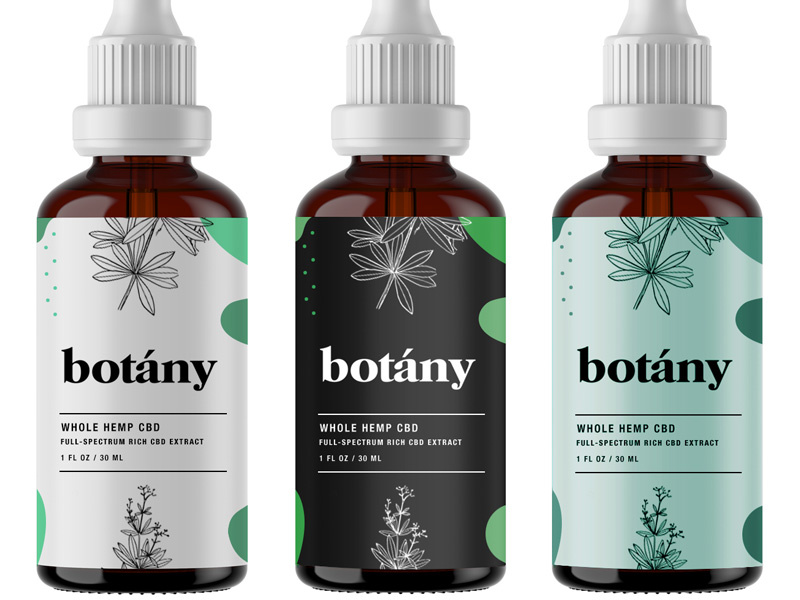
Less is more, as the saying goes, and botany nailed it. Minimalist, flat design is the key here and with three different color schemes that all complement each other, I can wholeheartedly say, I believe this design will catch the eye of anyone who is looking for a high-quality serum.
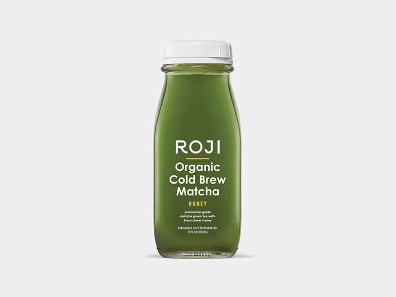
4. Roji
When someone is looking for a healthy drink, they’re going to be looking for sleek, professional fonts that look organic. My favorite part of this packaging design is that the designer thought through the choice of font colors.
Since the bottle is made of glass, you’ll be able to see its contents and the yellow font matches the beverage inside the bottle. The yellow-colored font perfectly complements the contents of the bottle. A simple, well-thought-out packaging design overall.
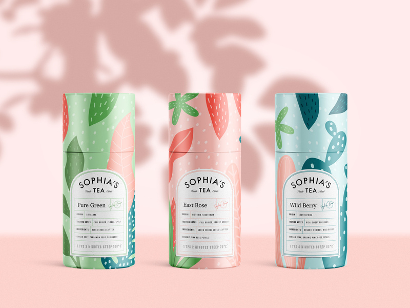
5. Sophia’s Tea
Stepping out a little bit from the pastel color palettes and into something a little bolder, we have Sophia’s Tea packaging design. Flat design really has taken the lead in 2019. We see it all over the place. And luckily for us designers, it makes our job a little easier.
What I appreciate about this design is that the name of each drink matches the design of each recipient. The color scheme on each bottle matches each other, making a buyer recognize the brand, if they were to see each bottle on a shelf in a store.
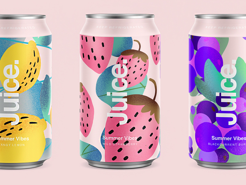
6. Juice.
Since we’re on a drink roll, check out this summery packaging design for juice. Again, we’re hit with flat design and beautiful colors. The font sticks out perfectly on the foreground of the design. Juice. Simple, clean, clear, and to the point.
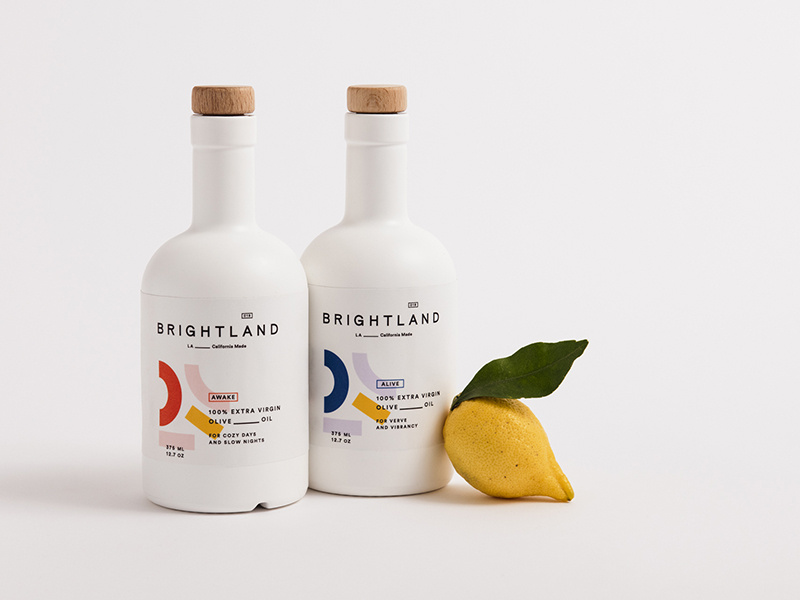
7. Brightland
I’ve never seen an olive oil packaged quite like this. At first glance, you would wonder what this beautiful bottle is doing in the oil section.
You’re inclined to pick it up, you read that it’s olive oil, you’re shook, you compare prices between this and another oil, you realize it’s the same price, and naturally you buy the more beautiful packaging design of the two products. Hit people with original, innovative designs and you’re sales will skyrocket.
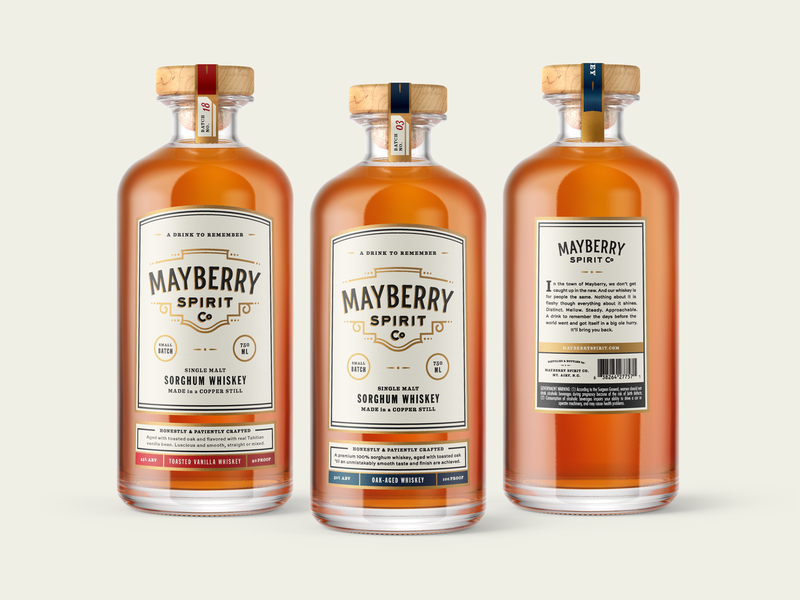
This bottle makes me want to have a nice, classy night at home with all my friends. The vintage font works beautifully with the design of the bottle, and I love that the color schemes match the rich color of the whiskey itself.
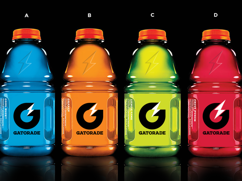
9. Gatorade
Here are some rebranding sketches for Gatorade. Simple design that gets across, yet still embraces the originality of the Gatorade logo. You won’t lose any brand recognizability, and it looks more modern.
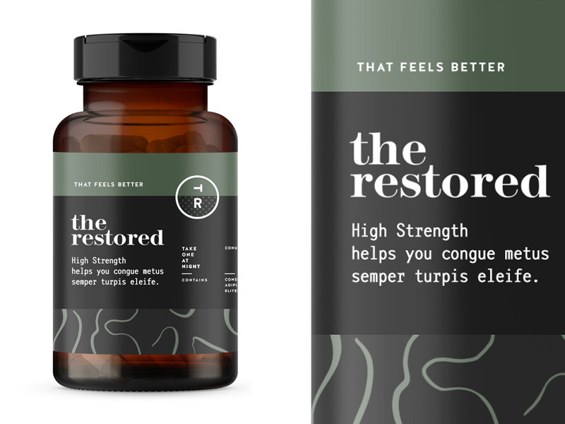
10. The Restored
The packaging design for these vitamins is everything. The manly, muted earth tones will remind a person of organic produce, making them trust your brand even more. Color association is very important when it comes to designing your packaging and establishing your brand, so choose wisely!
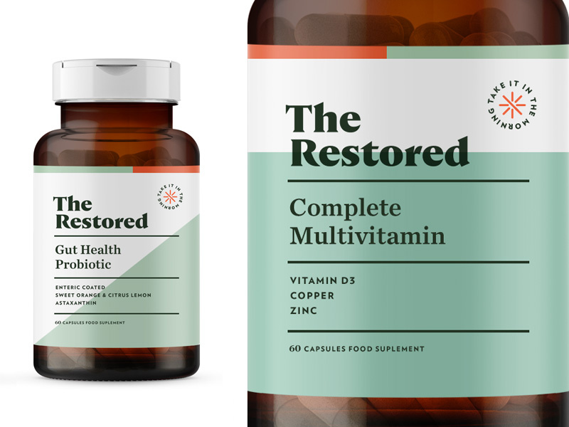
11. The Restored
Here’s a second version to Restored vitamins. This packaging design is a touch more feminine, using a more pastel green, and creating more dimension in the background by using two different colors. The pop of orange in the corner brings the eyes to the directions.
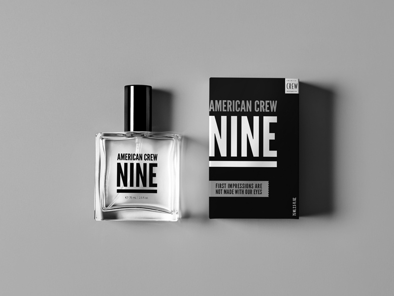
12. American Crew Fragrance
This simplistic design is one way on the box and reversed on the bottle. By using one font, they really had to play with the scaling and spacing of letters and words to make it interesting and captivating. Again, packaging design can be simple and just as engaging as a super complicated design.
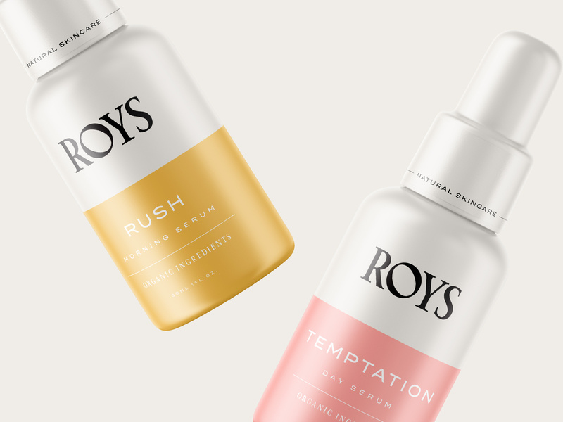
13. Roys Morning Serum
Roys morning serum has two beautiful colors: a muted pink and a relaxing gold. Color association is everything. If you can convince your customers that your product is what they need and you really sell your product by having a luxurious packaging, you’ll have clients talking about you for days.
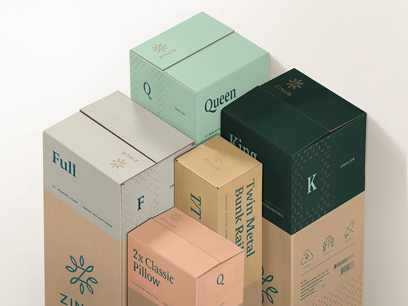
14. Zinus
You can recognize an eco-friendly package design from a mile away, and most people are becoming very concerned and aware of their consumerism and trash contribution to the world. Using a bio-degradable packaging or using recycled material will help you loads when it comes to sales. And you’ll be helping the world. It’s a win-win.
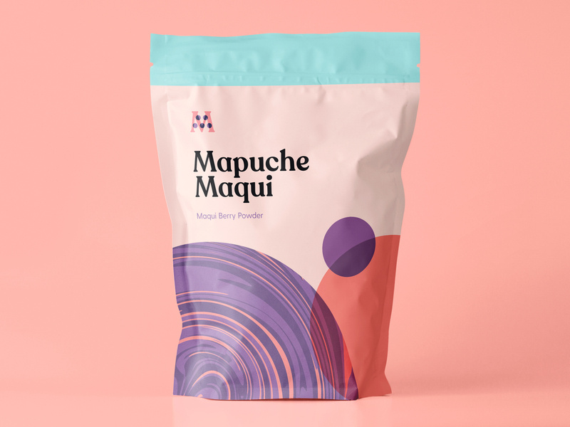
15. Mapuche Maqui
Sometimes, making healthy choices isn’t the easiest or most fun, so presenting a fun looking health product can be key in your sales. This berry powder packaging design looks fun and friendly, used flat design, a beautiful color palette, and bold font. With all these elements combined, surely it’ll catch the eye of a customer.
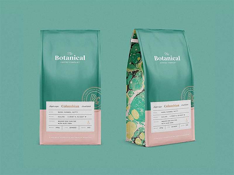
16. Botanical Coffee Co
This coffee design is so relaxing to look at. The intricate design on the sides, the simplicity on the front, and the choice of font combinations are just lovely. Again, going with flat design and pastels. See the pattern?
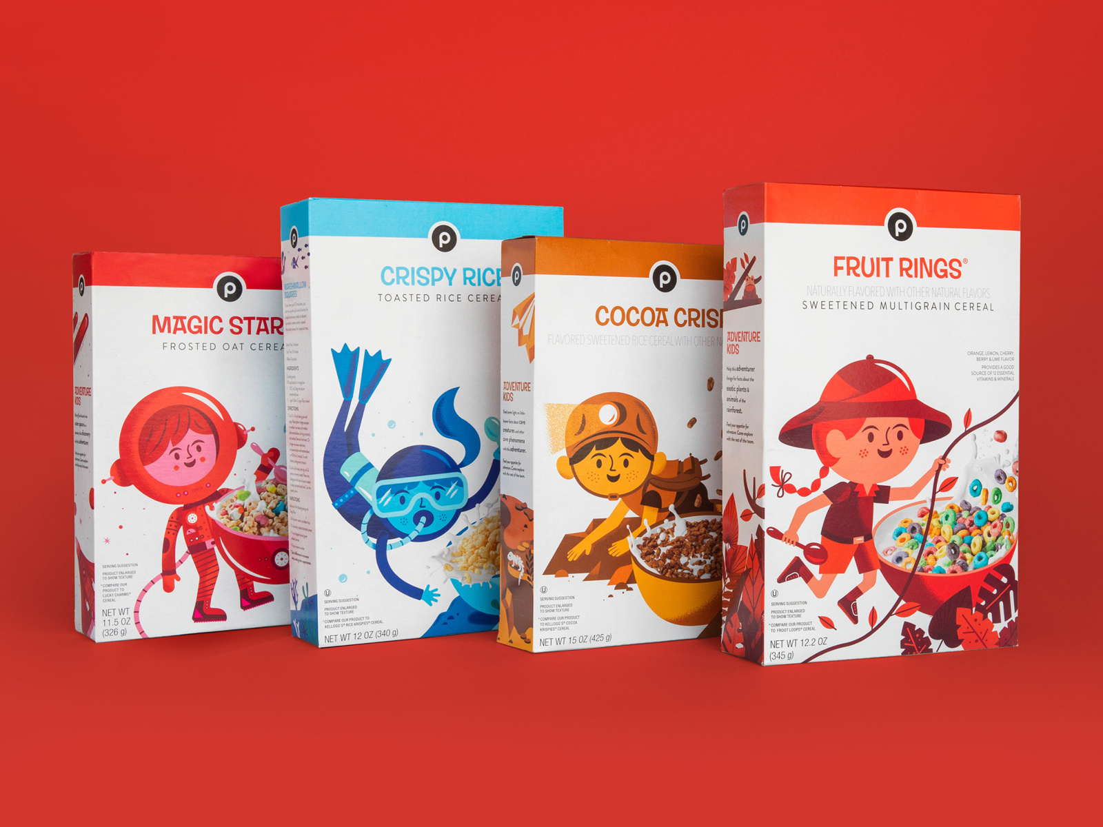
17. Publix Cereal Line
Did you know that the color red increases your appetite significantly? The designer here for kids cereal certainly knew what they were doing. By combining real-life elements and flat design, kids will surely be intrigued by this design and be inclined to beg their parents for the cereal.
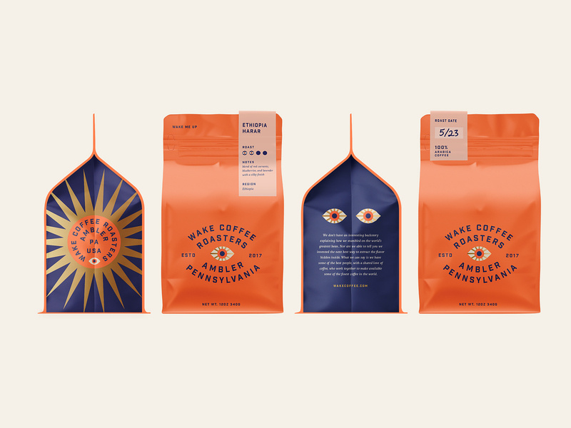
18. Coffee
This coffee packaging is so bright and captivating, yet still has colors that are easy on the eyes. When choosing your color palette, you need to be sure that you’re choosing colors that soothe and colors that people want to look at. And of course, brand colors that represent you and that your audience will enjoy.
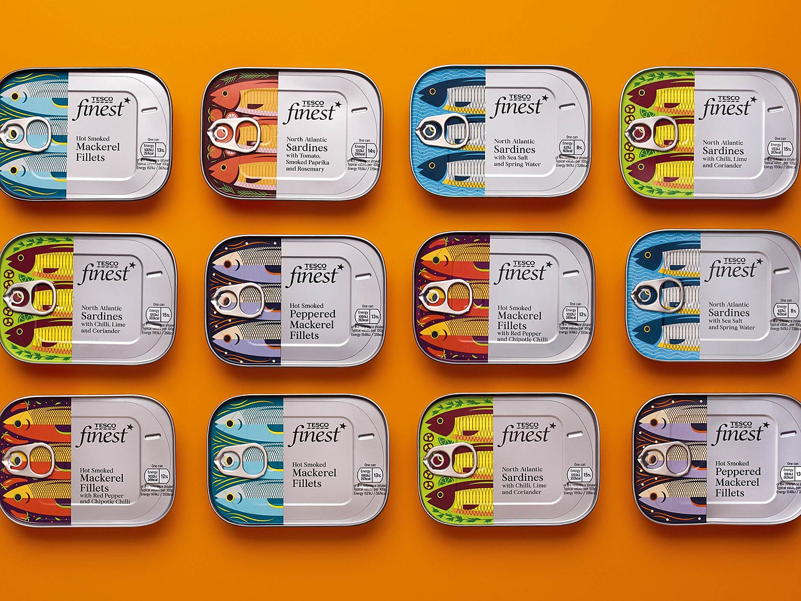
19. Tesco Fish
Check out these “fishy” illustrations! What I really enjoyed about this packaging design was the fish. I love the very finely defined, cut-off design of the fish, and then the can and text. Each fish is design to represent its kind, and I find this design very creative, colorful, and appetizing.
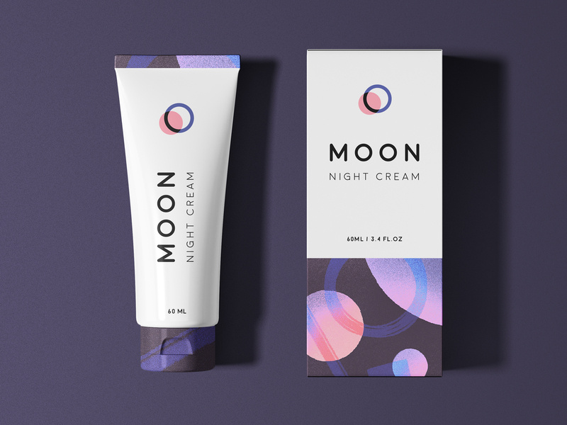
20. Moon
And finally, we have Moon Night Cream. Notice how to colors and graphic designs represent the night. So simple, clean, and fresh-looking that you actually can’t wait to use this cream tonight before bed.
Wrapping things up
As we all know, packaging is everything when it comes down to actually selling your product. Make sure your design represents you, your brand, and your product, and is creative and makes people feel like they need what you have to offer, in their lives.
I hope you found this article inspiring and you’re more than ready to jump into your next design project.
When rendering a 3D object you’ll always have to assign it a material to make it visible and to give it a desired appearance, whether it is in some kind of 3D software or in real-time with WebGL.
Many types of materials can be mimicked with out-of-the-box programs in libraries like Three.js, but in this tutorial I will show you how to make objects appear glass-like in three steps using—you guessed it—Three.js.
Step 1: Setup and Front Side Refraction
For this demo I’ll be using a diamond geometry, but you can follow along with a simple box or any other geometry.
Let’s set up our project. We’ll need a renderer, a scene, a perspective camera and our geometry. In order to render our geometry we will need to assign it a material. Creating this material will be the main focus of this tutorial. So go ahead and create a new ShaderMaterial with a basic vertex, and fragment shader.
Contrary to what you’d expect, our material will not be transparent, in fact we will sample and distort anything that’s behind our diamond. To do that we will need to render our scene (without the diamond) to a texture. I’m simply rendering a full screen plane with an orthographic camera, but this could just as well be a scene full of other objects. The easiest way to split the background geometry from the diamond in Three.js is to use Layers.
this.orthoCamera = new THREE.OrthographicCamera( width / - 2,width / 2, height / 2, height / - 2, 1, 1000 );
// assign the camera to layer 1 (layer 0 is default)
this.orthoCamera.layers.set(1);

const tex = await loadTexture('texture.jpg');
this.quad = new THREE.Mesh(new THREE.PlaneBufferGeometry(), new THREE.MeshBasicMaterial({map: tex}));

this.quad.scale.set(width, height, 1);
// also move the plane to layer 1
this.quad.layers.set(1);
this.scene.add(this.quad);
Alright, time for a little bit of theory now. Transparent materials like glass are visible because they bend light. That is because light travels slower in glass than it does in air, when a lightwave hits a glass object at an angle, this change in speed causes the wave to change direction. This change in direction of a wave is what describes the phenomenon of refraction.
To replicate this in code we will need to know the angle between our eye vector and the surface (normal) vector of our diamond in world space. Let’s update our vertex shader to calculate these vectors.
In our fragment shader we can now use eyeVector and worldNormal as the first two parameters of glsl’s built-in refract function. The third parameter is the ratio of indices of refraction, meaning the index of refraction (IOR) of our fast medium—air—divided by the IOR of our slow medium—glass. In this case that will be 1.0/1.5, but you can tweak this value to achieve your desired result. For example the IOR of water is 1.33 and diamond has an IOR of 2.42.
Nice! We successfully wrote a refraction shader. But our diamond is hardly visible… That is partly because we’ve only handled one visual property of glass. Not all light will pass through the material to be refracted, in fact, part of it will be reflected. Let’s see how we can implement that!
Step 2: Reflection and the Fresnel equation
For the sake of simplicity, in this tutorial we are not going to calculate proper reflections but just use a white color for our reflected light. Now, how do we know when to reflect and when to refract? In theory this depends on the refractive index of the material, when the angle between the incident vector and the surface normal is greater than the critical angle, the light wave will be reflected.
In our fragment shader we will use the Fresnel equation to calculate the ratio between reflected and refracted rays. Unfortunately, glsl does not have this equation built-in as well, but you can just copy it from here:
We can now simply mix the refracted texture color with our white reflection color based on the Fresnel ratio we just calculated.
uniform sampler2D envMap;
uniform vec2 resolution;
varying vec3 worldNormal;
varying vec3 viewDirection;
float Fresnel(vec3 eyeVector, vec3 worldNormal) {
	return pow( 1.0 + dot( eyeVector, worldNormal), 3.0 );
}
void main() {
// get screen coordinates
vec2 uv = gl_FragCoord.xy / resolution;
vec3 normal = worldNormal;
// calculate refraction and add to the screen coordinates
vec3 refracted = refract(eyeVector, normal, 1.0/ior);
uv += refracted.xy;
// sample the background texture
vec4 tex = texture2D(envMap, uv);
vec4 output = tex;
// calculate the Fresnel ratio
float f = Fresnel(eyeVector, normal);
// mix the refraction color and reflection color
output.rgb = mix(output.rgb, vec3(1.0), f);
gl_FragColor = vec4(output.rgb, 1.0);
}
That’s already looking a lot better, but there’s still something off about it… Ah right, we can’t see the other side of transparent object. Let’s fix that!
Step 3: Multiside refraction
With the things we’ve learned so far about reflections and refractions we can understand that light can bounce back and forth a couple times inside the object before exiting it.
To achieve a physically correct result we will have to trace each ray, but unfortunately this computation is way too heavy to render in real-time. So instead, I will show you a simple approximation to at least visualize the back faces of our diamond.
We’ll need the world normals of our geometry’s front and back faces in one fragment shader. Since we cannot render both sides at the same time we’ll need to render the back face normals to a texture first.
Let’s make a new ShaderMaterial like we did in step 1, but this time we will render the world normals to gl_FragColor.
And finally we combine the front and back face normals.
float a = 0.33;
vec3 normal = worldNormal * (1.0 - a) - backfaceNormal * a;
In this equation, a is simply a scalar value indicating how much of the back face’s normal should be applied.
We did it! We can see all sides of our diamond, only because of the refractions and reflections we have applied to its material.
Limitations
As I already explained, it is not quite possible to render physically correct transparent materials in real-time with this method. Another problem occurs when rendering multiple glass objects in front of each other. Since we only sample the environment once we won’t be able to see through a chain of objects. And lastly, a screen space refraction like I demoed here won’t work very well near the edges of the canvas since rays may refract to values outside of its boundaries and we didn’t capture that data when rendering the background scene to the render target.
Of course, there are ways to overcome these limitations, but they might not all be great solutions for your real-time rendering in WebGL.
I hope you enjoyed following along with this demo and you have learned something from it. I’m curious to see what you can do with it! Let me know on Twitter. Also don’t hesitate to ask me anything!
Do you want to launch a website for an Australian user base? Are you a business owner selling online to Australia? Do you want to connect with more Australian customers? If you answered “yes” to one or more of these questions, it’s time to invest in some of the best WordPress hosting Australia has to offer.
(This is a sponsored post.) Spend enough time running websites through PageSpeed Insights and you’ll notice that Google has a major beef with traditional image formats like JPG, PNG and even GIF. As well it should.
Even if you resize your images to the exact specifications of your website and run them through a compressor, they can still put a strain on performance and run up bandwidth usage. Worse, all of that image manipulation can compromise the resulting quality.
Considering how important images are to web design, this isn’t an element we can dispose of so easily nor can we afford to cut corners when it comes to optimizing them. So, what’s the solution?
Here’s what Google suggests:
PageSpeed Insights demonstrates how much storage and bandwidth websites stand to save with WebP. (Source: PageSpeed Insights) (Large preview)
Years ago, Google aimed to put a stop to this problem by creating a next-gen image format called WebP. You can see in this screenshot from PageSpeed Insights that Google recommends using WebP and other next-gen formats to significantly reduce the size of your images while preserving their quality.
And if .75 seconds doesn’t seem like much to you (at least in this example), it could make a big difference in the lives of your visitors, the people who sit there wondering how long is too long to wait. Just one less second of loading could make a world of difference to your conversion rate.
But is WebP the best solution for this problem? Today, we’re going to examine:
Google developed WebP back in 2010 after acquiring a company called On2 Technologies. On2 had worked on a number of video compression technologies, which ended up serving as the basis for Google’s new audiovisual format WebM and next-gen image format WebP.
Originally, WebP used lossy compression in an attempt to create smaller yet still high-quality images for the web.
Lossy compression is a form of compression used to greatly reduce the file sizes of JPGs and GIFs. In order to make that happen, though, some of the data (pixels) from the file needs to be dropped out or “lost”. This, in turn, leads to some degradation of the quality of the image, though it’s not always noticeable.
WebP entered the picture with a much more efficient use of lossy compression (which I’ll explain below) and became the much-needed successor to JPG.
KeyCDN shows how five images differ in size between the original, a compressed JPG and a WebP. (Source: KeyCDN) (Large preview)
Notice how significant a difference this is in terms of file size, even after the JPG has been compressed to a comparable quality. As Adrian James explains here, though, you have to be careful with WebP compression.
“Compression settings don’t match up one-to-one with JPEG. Don’t expect a 50%-quality JPEG to match a 50%-quality WebP. Quality drops pretty sharply on the WebP scale, so start at a high quality and work your way down.”
Considering how much more file sizes shrink with WebP compared to JPG, though, that shouldn’t be too much of a sticking point. It’s just something to think about if you’re considering pushing the limits of what WebP can do even further.
Now, as time passed, Google continued to develop WebP technology, eventually getting it to a point where it would support not just true-color web graphics, but also XMP metadata, color profiles, tiling, animation, and transparency.
Eventually, Google brought lossless compression to WebP, turning it into a viable contender for PNG, too.
Lossless Compression For WebP
Lossless compression does not degrade image quality the way lossy does. Instead, it achieves smaller file sizes by removing excess metadata from the backend of the file. This way, the quality of the image remains intact while reducing its size. That said, lossless compression can’t achieve the kinds of file sizes lossy compression can.
That was until WebP’s lossless compression came along.
You can see some beautiful examples of how WebP’s lossy and lossless compression stands up against PNG in Google’s WebP galleries:
The Google WebP Galleries show how PNG images compare in quality and size to compressed WebPs. (Source: Google) (Large preview)
If there’s any degradation in the quality of the WebP images, it’s going to be barely noticeable to your visitors. The only thing they’re really going to notice is how quickly your site loads.
What Are The Advantages Of Using WebP?
It’s not enough to say that WebP is “better” than JPG and PNG. It’s important to understand the mechanics of how WebP works and why it’s so beneficial to use over other file formats as a result.
With traditional image formats, compression always results in a tradeoff.
JPG lossy compression leads to degradation of the clarity and fineness of an image. Once applied, it cannot be reversed.
WebP lossy compression, on the other hand, uses what’s known as prediction coding to more accurately adjust the pixels in an image. As Google explains, there are other factors at work, too:
“Block adaptive quantization makes a big difference, too. Filtering helps at mid/low bitrates. Boolean arithmetic encoding provides 5%-10% compression gains compared to Huffman encoding.”
On average, Google estimates that WebP lossy compression results in files that are between 25% and 34% smaller than JPGs of the same quality.
As for PNG lossless compression, it does work well in maintaining the quality of an image, but it doesn’t have as significant an impact on image size as its JPG counterpart. And certainly not when compared to WebP.
WebP handles this type of compression more efficiently and effectively. This is due to the variety of compression techniques used as well as entropy encoding applied to images. Again, Google explains how it works:
“The transforms applied to the image include spatial prediction of pixels, color space transform, using locally emerging palettes, packing multiple pixels into one pixel and alpha replacement.”
On average, Google estimates that WebP lossless compression results in files that are roughly 26% smaller than PNGs of the same quality.
That’s not all. WebP has the ability to do something that no other file formats can do. Designers can use WebP lossy encoding on RGB colors and lossless encoding on images with transparent backgrounds (alpha channel).
Animated images, otherwise served in GIF format, also benefit from WebP compression systems. There are a number of reasons for this:
GIF
WebP
Compression
Lossless
Lossless + lossy
RBG Color Support
8-bit
24-bit
Alpha Channel Support
1-bit
8-bit
As a result of this powerful combo of lossless and lossy compression, animated videos can get down to much smaller sizes than their GIF counterparts.
Google estimates the average reduction to be about 64% of the original size of a GIF when using lossy compression and 19% when using lossless.
Acceptance Of WebP Among Browsers, Devices And CMS
As you can imagine, when WebP was first released, it was only supported by Google’s browsers and devices. Over time, though, other platforms have begun to provide support for WebP images.
Let’s take a look at where you can expect full acceptance of your WebP images, where you won’t and then we’ll discuss what you can do to get around this hiccup.
As of writing this in 2019, Can I use… has accounted for the following platforms that support WebP:
‘Can I Use’ breaks down which browsers and versions of those browsers provide support for WebP. (Source: Can I use...) (Large preview)
The latest versions of the following platforms are supported:
Edge
Firefox
Chrome
Opera
Opera Mini
Android Browser
Opera Mobile
Chrome for Android
Firefox for Android
UC Browser for Android
Samsung Internet
QQ Browser
Baidu Browser
The platforms that continue to hold back support are:
Internet Explorer
Safari
iOS Safari
KaiOS Browser
It’s not just browsers that are on the fence about WebP. Image editing software and content management systems are, too.
ImageMagick, Pixelmator and GIMP all support WebP, for instance. Sketch enables users to export files as WebP. And for software that doesn’t natively support WebP, like Photoshop, users can usually install a plugin which will allow them to open and save files as WebP.
Content management systems are in a similar spot. Some have taken the lead in moving their users over to WebP, whether they uploaded their files in that format or not. Shopify and Wix are two site builders that automatically convert and serve images in WebP format.
Although there are other platforms that don’t natively support WebP, there are usually extensions or plugins you can use to upload WebP images or convert uploaded ones into this next-gen format.
WordPress is one of those platforms. Drupal is another popular CMS that provides users with WebP modules that add WebP support. Magento is yet another.
It’s pretty rare not to find some sort of add-on support for WebP. The only example that I’m aware of that doesn’t accept it is Squarespace.
Challenges Of Converting And Delivering WebP
Okay, so WebP doesn’t have 100% support on the web. Not yet anyway. That’s okay. For the most part, we have some sort of workaround in terms of adding support to the tools we use to design and build websites.
But what do we do about the browser piece? If our visitors show up on an iOS device, how do we make sure they’re still served an image if our default image is WebP?
First, you need to know how to convert images into WebP.
Last year, front end developer Jeremy Wagner wrote up a guide for Smashing Magazine on this very topic. In it, he covers how to convert to WebP using:
Sketch,
Photoshop,
The command line,
Bash,
Node.js,
gulp,
Grunt,
webpack.
Any of these options will help you convert your PNGs and JPGs into WebPs. Your image editing software will only get you halfway to your destination though.
It’ll handle the conversion, but it won’t help you modify your origin server so that it knows when to deliver WebPs and when to deliver a traditional image format to visitors.
Some of these methods let you dictate how your server delivers images based on the restraints of your visitors’ browsers. Still, it takes a bit of work to modify the origin servers to make this happen. If you’re not comfortable doing that or you don’t want to deal with it, KeyCDN has a solution.
The Solution: Simplify WebP Delivery With KeyCDN
KeyCDN understands how important it is to have a website that loads at lightning-fast speeds. It’s what KeyCDN is in the business to do. That’s why it’s no surprise that it’s developed a built-in WebP caching and image processing solution that helps developers more easily deliver the right file formats to visitors.
What Is WebP Caching?
Caching is an integral part of keeping any website running fast. And WebP caching is only going to make it better. Essentially, it’s a form of content negotiation that takes place in the HTTP header.
It works like this:
Someone visits a website that has KeyCDN’s WebP caching enabled. The visitor’s browser sends an accept HTTP header as part of the request to the server with a list of asset types it prefers. But rather than go to the origin server (at the web host), the request is processed by the edge server (at KeyCDN). The edge server reviews the list of acceptable file types and sends a content-type header in response.
An example of a content-type request that KeyCDN sends to browsers that accept WebP. (Source: KeyCDN)
So, for Google Chrome visitors, the content-type: image/webp would automatically be accepted and the cached WebP assets would be delivered to the browser.
For Safari users, on the other hand, the request would go unaccepted. But that’s okay. Your CDN will know which file format to send instead. In the first line in the example above, you can see that the original image format is JPG, so that’s the version of the file that would be delivered.
As you can see, there’s no need to modify the origin server or prepare multiple versions of your files in order to account for WebP compatibility. KeyCDN WebP caching handles all of it.
How Do You Use KeyCDN WebP Caching?
There are two ways in which KeyCDN users can take advantage of the WebP caching feature.
Image Processing Through KeyCDN
The first requires nothing more than flipping a switch and turning on KeyCDN’s image processing. Once enabled, the accept request header will automatically load.
You can, of course, use the image processing service for more than just WebP caching. You can use it to adjust the size, crop, rotation, blur, and other physical attributes of your delivered images. But if you’re trying to simplify your image delivery system and simply want to speed things up with WebP, just enable the feature and let KeyCDN do the work.
WebP Caching Through Your Origin Server
Let’s say that you generated your own WebP image assets. You can still reap the benefits of KeyCDN’s WebP caching solution.
To do this, you’ll need to correctly generate your WebPs. Again, here’s a link to the guide that shows you how to do that.
It’s then up to you to configure your origin server so that it only delivers WebPs when accept: image/webp is present. KeyCDN provides some examples of how you’ll do this with Nginx:
KeyCDN demonstrates how you can modify the origin server with Apache to deliver your own cached WebP assets. (Source: KeyCDN)
Obviously, this option gives you more control over managing your image formats and how they’re served to visitors. That said, if you’re new to using WebP, KeyCDN’s automated WebP caching and image processing is probably your best bet.
An Alternative For WordPress And Magento Designers
If you design websites in WordPress or Magento, KeyCDN has plugins you can use to add WebP support and caching.
The Cache Enabler plugin offers delivery support for WebPs in WordPress. (Source: Cache Enabler) (Large preview)
Cache Enabler checks to see if your images have a WebP version. If it exists and the visitor’s browser supports it, that’s what it will deliver in the cached file. If it doesn’t exist, then it’ll simply turn to the JPG, PNG or GIF that’s there.
Magento developers have a simplified workaround for converting and delivering WebP, too. First, you’ll need to install the Webp extension. Then, you’ll have to configure the WebP binaries on your server.
Wrapping Up
There’s a reason why Google went to the trouble of developing a new image format and why more and more browsers, design systems and content management systems are supporting it.
Images can cause a lot of problems for websites that have otherwise been built to be lean and mean. If they’re not uploaded at the right size, if they’re not compressed and if caching isn’t enabled, your images could be the reason that your website’s speed is driving visitors away.
But with WebP, your website is sure to load more quickly. What’s more, there doesn’t need to be a tradeoff between image quality (or quantity!) in order to gain that speed. WebP efficiently compresses files while preserving the integrity of the image content.
If you’re really struggling to increase the speed of your website then WebP should be the next tool you turn to for help.
Best I could tell from the last time I compiled the most wished-for features of CSS, styling form controls was a major ask. Top 5, I'd say. And of the native form elements that people want to style, Greg Whitworth has some data that the <select> element is more requested than any other element — more than double the next element — and it's the one developers most often customize in some way.
Developers clearly want to style select dropdowns.
You actually do a little. Perhaps more than you realize.
Notably, this is an entirely cross-browser solution. It's not something limited to only the most progressive desktop browsers. There are some visual differences across browsers and platforms, but overall it's pretty consistent and gives you a baseline from which to further customize it.
That's just the "outside"
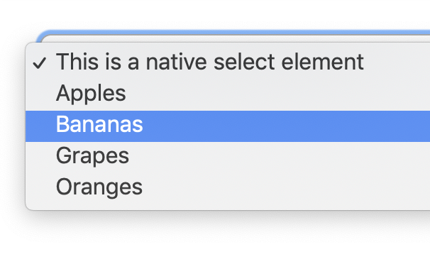
Open the select. Hmm, it looks and behaves like you did nothing to it at all.
Styling a <select> doesn't do anything to the opened dropdown of items. (Screenshot from macOS Chrome)
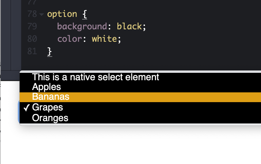
Some browsers do let you style the inside, but it's very limited. Any time I've gone down this road, I've had a bad time getting things cross-browser compliant.
Firefox letting me set the background of the dropdown and the color of a hovered option.
Greg's data shows that only 14% (third place) of developers found styling the outside to be the most painful part of select elements. I'm gonna steal his chart because it's absolutely fascinating:
Frustration
%
Count
Not being able to create a good user experience for searching within the list
27.43%
186
Not being able to style the <option> element to the extent that you needed to
17.85%
121
Not being able to style the default state (dropdown arrow, etc.)
14.01%
95
Not being able to style the pop-up window on desktop (e.g. the border, drop shadows, etc.)
11.36%
77
Insertion of content beyond simple text in the <select> control or its <option>s
11.21%
76
Insertion of arbitrary HTML content in an <option> element
7.82%
53
Not being able to create distinctive unselected/placeholder style and behavior
3.39%
23
Being able to generate new options from a large dataset while the popup is open
3.10%
21
Not being able to style the currently selected <option>(s) to the extent you needed to
1.77%
12
Not being able to style the pop-up window on mobile
1.03%
7
Being able to have the options automatically repeat on scroll (i.e., if you have an list of options 1 – 100, as you reach 100 rather than having the user scroll back to the top, have 1 show up below 100)
1.03%
7
Boiled down, the most painful parts of styling selects are:
Search
Styling the open dropdown, including the individual options, including more than just text
Updating the element without closing it
Styling for cases where "nothing" is selected and when an item is selected
I'm surprised multi-select didn't make the cut. Maybe it's not on the table for <select> since it wouldn't be backwards-compatible?
Browser evolution
Edge recently announced they are improving the look of form controls, but no word just yet on standards or how to customize them.
Select styles in Edge/Chromium before (left) and after (right)
It seems like there is good momentum, though. If you want more information and to follow along with all this progress (I know I will!):
Hi All,
I am trying to create multiple codeigniter sessons for multiple users. I will explain my scenario.
I have developed an application using codeigniter and launched in an ecommerce platfomr so that many shop owners installed my application.
Now from my admin front, I have access to check for each particular user's app interface using the session and redirect method.
I want to make the sessions for all users open in different tabs, when I click on one button.
I have used a for loop.
The iteration works perfect and data are for each user are retrieved perfectly.
But the redirect method opens the session for the first user alone and stops there.
I am just breaking my head on this issue.
I need your help in this issue. I would be very grateful since this is eating my time.
We all want to read websites in our native language. I know this is not exactly a groundbreaking statement but you would be surprised at how many websites assume they can just add their content in English and the whole world will want to read it. In fact, out of the approximately 7.5 billion people […]


 We all want to read websites in our native language. I know this is not exactly a groundbreaking statement but you would be surprised at how many websites assume they can just add their content in English and the whole world will want to read it. In fact, out of the approximately 7.5 billion people […]