Meetup.com Introduces RSVP Fees for Members, WordPress Meetup Groups Unaffected by Pricing Changes

Meetup, a subsidiary of WeWork, has announced a significant change to its pricing structure that will require members to pay a $2 fee in order to RSVP to events. The change will go into effect in October, ostensibly to distribute meetup costs more evenly between organizers and members. Some meetup organizers have received the following message:

Meetup is always looking for ways to improve the experience for everyone in our community. One of the options we are currently exploring is whether we reduce cost for organizers and introduce a small fee for members.

Beginning in October, members of select groups will be charged a small fee to reserve their spot at events. The event fee can be paid by members or organizers can cover the cost of events to make it free for members.

Organizers have the option to subsidize the $2 fee for members who RSVP so that it is entirely free for those who attend, but for popular groups this can become cost prohibitive. If 1,000 members RSVP for an event, the organizer would owe $2,000 to host it.

The new pricing does not apply to non-profit groups or Pro Networks. WordPress community organizer Andrea Middleton has confirmed that Meetup’s pricing changes will not affect groups that are part of the official WordPress chapter. In 2018, WordPress had 691 meetup groups in 99 countries with more than 106,000 members. According to Meetup.com, groups in the official chapter now number 780 in 2019. Middleton encouraged any outlying WordPress meetup groups to join the official chapter by submitting an application.

Meetup organizers and members who are affected by the pricing hike are unhappy about the changes. If the angry responses on Twitter are any indication, people are leaving the platform in droves. Many organizers have announced that they are cancelling their subscriptions and looking to migrate to other platforms, such as Kommunity or gettogether.community, an open source alternative for managing local events.

No competitor has the reach or brand recognition that Meetup has. Some groups will inevitably resort to using Eventbrite or Facebook to manage local meetups but neither of these are focused on promoting or growing these types of local events. Discovery and new meetup marketing are Meetup.com’s forte, but the platform has been fairly stagnant when it comes to improving the user experience.

“This new move is quite onerous on users, and WP is lending support to the platform, which is proprietary and for-profit,” Morten Rand-Hendriksen said. “The optics and messaging are not great. When tools we use start to act in problematic ways, and we keep using them, we are tacitly agreeing to and even promoting that behavior even if it is not directly affecting us.”

Andrea Middleton responded, acknowledging that WordPress’ use of certain platforms will sometimes involve compromise.

“It’s true that WordPress contributors use various proprietary and for-profit tools to help us achieve various outreach and coordination goals,” Middleton said. “I think we strive for a balance between expediency and idealism, but of course any compromise results in a loss of one or the other.”

Given the immediate backlash following Meetup.com’s announcement of the pricing changes, it would not be surprising to see the decision reversed. The company characterized the move as an “exploration” and plans to roll it out gradually to more meetups. For organizers who are looking to charge more on top of the fee to cover event costs, Meetup said this feature is coming soon.

AMP Project Joins OpenJS Foundation Incubation Program

Last week at the AMP Contributor Summit 2019 in New York City, the AMP project announced that it will be joining the OpenJS Foundation incubation program. OpenJS was formed by a recent merger between the JS Foundation and the Node.js Foundation. AMP will join webpack, jQuery, Mocha, Node.js, ESLint, Grunt, and other open source projects that have OpenJS as their legal entity.

Over the past year, AMP has been evolving its governance, moving to an open, consensus-seeking governance model in 2018, similar to the one adopted by the Node.js project. One of the primary objectives of changing AMP’s governance and moving to a foundation was to foster a wider variety of contributions to the project and its technical and product roadmap. The incubation process will address AMP’s lack of contributor diversity and inclusion, as only past or current Google employees have commit rights on the code base.

In recognition of how the project’s connection to Google has been problematic for adoption, the company is transferring AMP’s domains and trademarks to OpenJS, which is a vender-neutral organization, as outlined in the FAQs of OpenJS’ announcement:

The OpenJS Foundation prides itself on vendor neutrality. Our vested interest resides solely in the ecosystem and the projects that contribute to that ecosystem. The OpenJS Foundation’s Cross Project Council is committed to supporting AMP in addressing these issues and ensure continued progress. During onboarding, AMP will also go through a multi-step process including adopting the OpenJS Foundation Code of Conduct, transferring domains and trademarks and more to graduation from incubation. AMP has made incredible strides by adopting a new governance model and by joining the OpenJS Foundation, they’ve made their intentions clear-AMP is committed to its vision of “A strong, user-first open web forever.”

Google is, however, a Platinum member of the OpenJS Foundation with annual dues of more than $250K per year. This membership guarantees the company direct participation in running the Foundation, a guaranteed board seat, and have a direct voice in budget and policy decisions. Google plans to maintain its team of employees who contribute full time to the AMP project.

According to Tobie Langel, a member AMP’s advisory committee, one of the changes in moving to the OpenJS Foundation is AMP’s governance model will no longer be under the purview of Google and the ultimate goal is that Google will cease funding AMP directly. Instead, the company will direct funds through the foundation and work to remove the project’s Google dependencies for its infrastructure and tooling.

OpenJS Aims to Disentangle AMP Runtime from Google Cache

Gaining full infrastructural independence from Google will be no small feat for AMP contributors. The OpenJS Foundation’s announcement states that one of the long term goals in moving the project over is to disentangle the AMP runtime from the Google AMP Cache:

The end goal is to separate the AMP runtime from the Google AMP Cache. The Project is currently in the incubating stage and Project leaders are still determining the next steps. Ideally, hosting and deployment of the AMP runtime to the CDN would fall under the purview of the OpenJS Foundation, much like the foundation is handling other projects CDNs, such as the jQuery CDN.

Untangling the runtime from the cache is a complex endeavor requiring significant investments of time and effort which would be planned and implemented in collaboration with the foundation and industry stakeholders during and after incubation.

The OpenJS Foundation CPC is committed to having a long-term strategy in place to address this issue by the end of AMP’s incubation.

AMP is used on more than 30 million domains. While many see this news as a positive move towards AMP’s eventual independence from Google, it doesn’t remove Google’s power to compel publishers to support the AMP standard by prioritizing AMP pages in search results. The news was received with skepticism by commenters on Hacker News and Reddit, who deemed it “mostly meaningless window-dressing,” given how aggressively Google is pushing AMP in its search engine. AMP remains deeply controversial and moving it to a foundation that is heavily financially backed by Google is not enough to win over those who see it as Google’s attempt to shape the web for its own interests.

Inside Look at GoDaddy’s Onboarding Process for Managed WordPress Hosting

The Tavern was provided access to test GoDaddy’s onboarding process, which is a part of its managed WordPress hosting service. The company has revamped its system since we covered it in 2016. The web host has had time to garner feedback since then and build an easy-to-use, headache-free way to launch WordPress sites.

GoDaddy has been making waves in the WordPress community over the past few years and is quickly becoming one of the most dominant businesses in the ecosystem. Several of the company’s free WordPress themes consistently rank in the theme directory’s popular list. Most of them are child themes of their popular Primer theme, which boasts 40,000+ active installs when not counting child theme installs. The real count should be north of 200,000.

GoDaddy provided access to its Pro 5+ tier, which is its highest level of managed WordPress hosting. They have three lower tiers, each at different price points and with fewer features. Regular pricing for the tiers range between $9.99 and $34.99 per month. All levels include automatic backups, security scans, caching, and a slew of other features that are not always easy to figure out for new users.

Aaron Campbell , GoDaddy’s head of WordPress Ecosystem & Community, said that their hosting service is growing quickly. “We were among the largest WordPress hosts when we launched our Managed WordPress Hosting in 2014,” he said. “Within 2 years our offering became the largest Managed WordPress platform in the world and remains so to this day.”

GoDaddy launched its basic onboarding process later in 2014. They iterated on that version through 2018. “When Gutenberg went into core in WordPress 5.0 we saw an opportunity to redefine the WordPress onboarding and imagine what a ‘Gutenberg native’ experience would look like,” said Campbell. “Meaning, do what Gutenberg uniquely enables us to do over what was possible before–things that couldn’t be done by making existing themes Gutenberg ‘compatible’ we had to build from the ground up.”

Based on my experience with the product, I would have no qualms about recommending it to new or even more experienced users. Even those with no experience running WordPress can create a new site without trouble in far less time than it’d take to go through the normal, more complex process.

How the Onboarding Process Works

One of the hardest things to know prior to signing up for a service and handing over your credit card number is how the service works. For this reason, I snagged a few screenshots and will do a quick walk-through of the process.

Once you are ready to build your new website, the service provides a “Set up” link that sends you to GoDaddy’s onboarding screen. There are three paths to choose from. The first and most prominent is to view the available templates, which is the path that new users would choose. You can also manually set up WordPress or migrate an existing site.

Starting screen for GoDaddy's managed WordPress hosting.

When selecting to view templates, the service presents over 50 options to choose from. The templates are further grouped by category based on the type of site a user might want to create. I chose the “Beckah J.” option because it worked for my idea of creating a life-wellness site.

Each of the templates are created from GoDaddy’s new Go WordPress theme, which is currently available via GitHub and awaiting review for placement in the official WordPress theme directory.

Theme selection for GoDaddy's managed WordPress hosting.

After selecting a template, the process moves to a preview screen, which has buttons to switch between desktop, tablet, and mobile views. From that point, you can choose to use the template or go back and select another.

This was the first point of the process that felt like it needed polishing. The preview frame was too small to get a feel for what the site would look like on desktop or tablet. This is a fixable problem. There’s plenty of screen real estate GoDaddy could use to make the preview nicer.

Theme preview for GoDaddy's managed WordPress hosting.

The next screen allows users to enter information about what type of site they want to run. Depending on which of the following checkboxes are ticked, GoDaddy will set up the site differently.

  • Provide information
  • Write blog posts
  • Display my portfolio
  • Sell physical goods to my customers
  • Sell digital goods to my customers to download
User questions for GoDaddy's managed WordPress hosting.

After completing the final form, GoDaddy begins creating the site. The host sets up the site with one or more of several plugins based on the choices made in the previous form.

The site installation process was slower than I had expected. We live in a fast-paced world where users expect things to happen nearly instantly. I admit I was antsy while waiting for the process to complete, in part because everything else happened so quickly. I wondered if I had time to grab a sandwich. In reality, it was much faster than manually setting up a WordPress install, but the setup did take a few minutes of waiting. My experience may have been an anomaly too. Sometimes these things take time.

Site setup process for GoDaddy's managed WordPress hosting.

A Website Ready to Go

Out of the box, my newly-created site had five custom pages ready based on my choices during the onboarding process.

  • Blog
  • Get in Touch
  • Home
  • My Account
  • My Cart

It was nice to see WooCommerce ready and a contact form set up with my email (handled by the CoBlocks plugin). I would rather have seen contact, account, and cart page slugs for their respective pages, but that’s a personal preference.

The site came with seven plugins installed, five of which were activated.

  • Akismet (deactivated)
  • CoBlocks
  • Gravity Forms (deactivated)
  • Sucuri Security
  • WooCommerce
  • WP101 Video Tutorials
  • Yoast SEO

CoBlocks along with theme integration for the block editor is what made the process of working with the website a breeze. GoDaddy acquired the CoBlocks plugin in April. At the time, the plugin had 30,000+ active installs. It has since grown to 80,000+ in the few months since GoDaddy has taken over.

The Onboarding Process Provides a Nice User Experience

I’ve been critical of GoDaddy over the years. I am a customer of one of their other hosting products that launched years ago. That particular site is stuck on PHP 5.6, which has given me the feeling that the company is not focused on its older projects. However, Campbell said they are in the process of moving users on legacy hosting products to a newer platform.

I’ve been cautiously optimistic about the work GoDaddy has been doing within the WordPress community. They’ve more than shown their commitment to the WordPress platform over the past few years.

Despite a couple of minor hiccups, the onboarding process the hosting giant has built is one of the best experiences I have ever had launching a WordPress site. Even as an old pro, I’d consider using it for future projects, particularly when setting up sites for less tech-savvy family and friends.

VikAppointments: Book & Schedule Appointments Like A Boss

VikAppointments: Book & Schedule Appointments Like A BossIf you run a service-based business, scheduling and managing your appointments manually is challenging and time-consuming. Additionally, booking appointments manually means you’re prone to human errors that can cost you business. What to do? You can streamline the process using a plugin such as VikAppointments. VikAppointments is the perfect solution for any service business that […]

The post VikAppointments: Book & Schedule Appointments Like A Boss appeared first on WPExplorer.

set html5 <video> as background to div

Hello i want to show html5 video with content over it . Like background image. The whole div html5 video must be of 400px height

        <div style="height: 400px">
         <video controls poster="{{item.media_pic}}">
        <source src="{{item.image_path}}" type="video/webm" />
        <source src="{{item.image_path}}" type="video/mp4">
        <source src="{{item.image_path}}" type="video/ogg">
        Your browser does not support HTML5 video.
      </video>
      <ion-row>
        <ion-col col-4>
          some text
        </ion-col>
        <ion-col col-8>
        button         
        </ion-col>
      </ion-row>
    </div>

New Alexa Tools Empower Developers to Build, Test, and Tune Skills

Amazon recently announced three features that will help developers better build, test, and tune Alexa skills. A Natural Language Understanding (NLU) Evaluation Tool allows developers to batch-test utterances for a skill's interpretation against expectations. Utterance Conflict Detection allows developers to uncover utterances accidentally mapped to multiple intents.

Weaving One Element Over and Under Another Element

In this post, we’re going to use CSS superpowers to create a visual effect where two elements overlap and weave together. The epiphany for this design came during a short burst of spiritual inquisitiveness where I ended up at The Bible Project’s website. They make really cool animations, and I mean, really cool animations.

My attention, however, deviated from spiritualism to web design as I kept spotting these in-and-out border illustrations.

Screenshot form The Bible Project website.

I wondered if a similar could be made from pure CSS… and hallelujah, it’s possible!

See the Pen
Over and under border design using CSS
by Preethi Sam (@rpsthecoder)
on CodePen.

The principal CSS standards we use in this technique are CSS Blend Modes and CSS Grid.

First, we start with an image and a rotated frame in front of that image.

<div class="design">
  <img src="bird-photo.jpg">
  <div class="rotated-border"></div>
</div>
.design {
  position: relative;
  height: 300px;
  width: 300px;
}

.design > * {
  position: absolute;
  height: 100%;
  width: 100%;
}

.rotated-border {
  box-sizing: border-box;
  border: 15px #eb311f solid;
  transform: rotate(45deg);
  box-shadow: 0 0 10px #eb311f, inset 0 0 20px #eb311f;
}

The red frame is created using border. Its box-sizing is set to include the border size in the dimensions of the box so that the frame is centered around the picture after being rotated. Otherwise, the frame will be bigger than the image and get pulled towards the bottom-right corner.

Then we pick a pair of opposite corners of the image and overlay their quadrants with their corresponding portion in a copy of the same image as before. This hides the red frame in those corners.

We basically need to make a cut portion of the image that looks like below to go on top of the red frame.

The visible two quadrants will lay on top of the .rotated-border element.

So, how do we alter the image so that only two quadrants of the image are visible? CSS Blend Modes! The multiply value is what we’re going to reach for in this instance. This adds transparency to an element by stripping white from the image to reveal what’s behind the element.

Chris has a nice demo showing how a red background shows through an image with the multiply blend mode.

See the Pen
Background Blending
by Chris Coyier (@chriscoyier)
on CodePen.

OK, nice, but what about those quadrants? We cover the quadrants we want to hide with white grid cells that will cause the image to bleed all the way through in those specific areas with a copy of the bird image right on top of it in the sourcecode.

<div id="design">
    <img src="bird-photo.jpg">
    <div class="rotated-border"></div>

    <div class="blend">
      <!-- Copy of the same image -->
      <img src="bird-photo.jpg">
      <div class="grid">
        <!-- Quadrant 1: Top Left -->
        <div></div>
        <!-- Quadrant 2: Top Right -->
        <div data-white></div>
        <!-- Quadrant 3: Bottom Left -->
        <div data-white></div>
        <!-- Quadrant 4: Bottom Right -->
        <div></div>
      </div>
    </div>

</div>
.blend > * {
  position: absolute;
  height: 100%;
  width: 100%;
}

/* Establishes our grid */
.grid {
  display: grid;
  grid: repeat(2, 1fr) / repeat(2, 1fr);
}

/* Adds white to quadrants with this attribute */
[data-white]{
  background-color: white;
}

The result is a two-by-two grid with its top-right and bottom-left quadrants that are filled with white, while being grouped together with the image inside .blend.

To those of you new to CSS Grid, what we’re doing is adding a new .grid element that becomes a "grid" element when we declare display: grid;. Then we use the grid property (which is a shorthand that combines grid-template-columns and grid-template-rows) to create two equally spaced rows and columns. We’re basically saying, "Hey, grid, repeat two equal columns and repeat two equal rows inside of yourself to form four boxes."

A copy of the image and a grid with white cells on top of the red border.

Now we apply the multiply blend mode to .blend using the mix-blend-mode property.

.blend { mix-blend-mode: multiply; }

The result:

As you can see, the blend mode affects all four quadrants rather than just the two we want to see through. That means we can see through all four quadrants, which reveals all of the red rotated box.

We want to bring back the white we lost in top-left and bottom-right quadrants so that they hide the red rotated box behind them. Let’s add a second grid, this time on top of .blend in the sourcecode.

<div id="design">
  <img src="bird-photo.jpg">
  <div class="rotated-border"></div>
    
  <!-- A second grid  -->
  <!-- This time, we're adding white to the image quandrants where we want to hide the red frame  -->
  <div class="grid">
    <!-- Quadrant 1: Top Left -->
    <div data-white></div>
    <!-- Quadrant 2: Top Right -->
    <div></div>
    <!-- Quadrant 3: Bottom Left -->
    <div></div>
    <!-- Quadrant 4: Bottom Right -->
    <div data-white></div>
  </div>

  <div class="blend">
    <img src="bird-photo.jpg">
    <div class="grid">
      <!-- Quadrant 1: Top Left -->
      <div></div>
      <!-- Quadrant 2: Top Right -->
      <div data-white></div>
      <!-- Quadrant 3: Bottom Left -->
      <div data-white></div>
      <!-- Quadrant 4: Bottom Right -->
      <div></div>
    </div>
  </div>

</div>

The result!

Summing up, the browser renders the elements in our demo like this:
​​

  1. ​​At bottommost is the bird image (represented by the leftmost grey shape in the diagram below)
  2. ​​Then a rotated red frame
  3. ​​On top of them is a grid with top-left and bottom-right white cells (corners where we don’t want to see the red frame in the final result)
  4. ​​Followed by a copy of the bird image from before and a grid with top-right and bottom-left white cells (corners where we do want to see the red frame) – both grouped together and given the blending mode, multiply​.

You may have some questions about the approach I used in this post. Let me try to tackle those.

What about using CSS Masking instead of CSS Blend Modes?

For those of you familiar with CSS Masking – using either mask-image or clip-path – it can be an alternative to using blend mode.

I prefer blending because it has better browser support than masks and clipping. For instance, WebKit browsers don't support SVG <mask> reference in the CSS mask-image property and they also provide partial support for clip-path values, especially Safari.

Another reason for choosing blend mode is the convenience of being able to use grid to create a simple white structure instead of needing to create images (whether they are SVG or otherwise).

Then again, I’m fully on board the CSS blend mode train, having used it for knockout text, text fragmentation effect... and now this. I’m pretty much all in on it.

Why did you use grid for the quadrants?

The white boxes needed in the demo can be created by other means, of course, but grid makes things easier for me. For example, we could've leaned on flexbox instead. Use what works for you.

Why use a data-attribute on the grid quadrant elements to make them white?

I used it while coding the demo without thinking much about it – I guess it was quicker to type. I later thought of changing it to a class, but left it as it is because the HTML looked neater that way… at least to me. :)

Is multiply the only blend mode that works for this example?

Nope. If you already know about blend modes then you probably also know you can use either screen, darken, or lighten to get a similar effect. (Both screen and lighten will need black grid cells instead of white.)

The post Weaving One Element Over and Under Another Element appeared first on CSS-Tricks.

Collective #557


C557_viz

roughViz

A reusable JavaScript library for creating sketchy/hand-drawn styled charts in the browser.

Check it out


C557_counters

The wondrous world of CSS counters

An in-depth look at CSS counters, how they’ve expanded with better support for internationalization and how it’s possible to implement a pure CSS Fizzbuzz solution with them.

Read it


C557_w3c

The W3C At Twenty-Five

In this article, Rachel Andrew explains how the W3C works and shares her “Web Story” to explain why the Web Standards process is so vitally important for everyone to have an open web platform where they can share their stories and build awesome things for the web together.

Read it


C557_openbook

The Open Book Project

Joey Castillo is on a mission to create a simple book reading device that anyone with a soldering iron can build for themselves.

Check it out


Screen-Shot-2019-10-14-at-15.36.53

Able

Able is a bootstrapped community for people to read and write about software.

Check it out


Collective #557 was written by Pedro Botelho and published on Codrops.

Stop Animations During Window Resizing

Say you have page that has a bunch of transitions and animations on all sorts of elements. Some of them get triggered when the window is resized because they have to do with size of the page or position or padding or something. It doesn't really matter what it is, the fact that the transition or animation runs may contribute to a feeling of jankiness as you resize the window. If those transitions or animations don't deliver any benefit in those scenarios, you can turn them off!

The trick is to apply a class that universally shuts off all the transitions and animations:

let resizeTimer;
window.addEventListener("resize", () => {
  document.body.classList.add("resize-animation-stopper");
  clearTimeout(resizeTimer);
  resizeTimer = setTimeout(() => {
    document.body.classList.remove("resize-animation-stopper");
  }, 400);
});

Now we have a resize-animation-stopper class on the <body> that can force disable any transition or animation while the window is being resized, and goes away after the timeout clears.

.resize-animation-stopper * {
  animation: none !important;
  transition: none !important;
}

There is probably some more performant way of doing this than setTimeout, but that's the concept. I use this right here on this very site (v17) after noticing some significant resizing jank. It hasn't entirely eliminated the jank but it's noticeably better.

Here's an example:

See the Pen
Turn off animation on resize?
by Chris Coyier (@chriscoyier)
on CodePen.

That demo is mostly just for the working code. There probably isn't enough going on transitions-wise to notice much resize jank.

The post Stop Animations During Window Resizing appeared first on CSS-Tricks.

How to “Easily” Add Anchor Links in WordPress (Step by Step)

We occasionally use anchor links in our longer WordPress posts to help users quickly jump to the section they want to read.

Anchor links are often used in the table of content sections because they help users move up and down a lengthier article without reloading the page. It can also help with SEO as Google may show them below your search listings for easy navigation (more on this later).

In this step by step guide, we will explain what are anchor links and show you how to easily add anchor links in WordPress.

Adding anchor links in WordPress

Ready? Let’s start with a live example of anchor links.

Below is a list of all the topics we will cover in this guide. Go ahead and click on any of these links, and you’ll be taken to that specific section.

An anchor link is a type of link on the page that brings you to a specific place on that same page. It allows users to jump to the section they’re most interested in.

Take a look at the animated screenshot below:

Anchor link preview

As you can see, clicking on the anchor link takes the user to the specific section on the same page.

Anchor links are commonly used in lengthier articles as the table of content which allows users to quickly jump to the sections they want to read.

Why and when you should use anchor links?

An average user spends less than a few seconds before deciding if they want to stay or leave your website. You have just those few seconds to convince users to stay.

The best way to do that is to help them quickly see the information they’re looking for.

Anchor links make this easier by allowing users to skip the rest of the content and jump directly to the part that interests them. This improves user experience and helps you win new customers / readers.

Anchor links are also great for WordPress SEO. Google can display an anchor link in the search results as a “jump to link”.

Jump to link in search results

Sometimes Google can also display several links from that page as jump to links, and this is proven to increase the click-through rate in search results. In other words, you get more traffic to your website.

Multiple jump to links below a search result

Having said that, let’s take a look at how to easily add anchor links in WordPress.

If you just want to add a few anchor links in your article, then you can easily do so manually.

Basically you need to add two things for an anchor text to work as intended.

  1. Create an anchor link with a # sign before the anchor text.
  2. Add the id attribute to the text where you want the user to be taken.

Let’s start with the anchor link part.

Step 1. Creating an anchor link

First you need to select the text that you want to link and then click on the insert link button in the WordPress Gutenberg editor.

Add a link in WordPress

This will bring up the insert link popup where you usually add the URL or look for a post or page to link.

However, for an anchor link, you’ll simply use # as prefix and enter the keywords for the section you want the user to jump to.

Creating anchor link

After that click on the enter button to create the link.

Some helpful tips on choosing what text to use as your anchor # link:

  • Use the keywords related to the section you are linking to.
  • Don’t make your anchor link unnecessarily long or complex.
  • Use hyphens to separate words and make them more readable.
  • You can use capitalization in anchor text to make it more readable. For example: #Best-Coffee-Shops-Manhattan.

Once you add the link, you will be able to see the link you have created in the editor. However, clicking on the link doesn’t do anything.

That’s because the browsers cannot find the anchor link as an ID.

Let’s fix that by pointing browsers to the area, section, or text that you want to show when users click on the anchor link.

Step 2. Add the ID attribute to the linked section

In the content editor, scroll down to the section that you want the user to navigate to when they click on the anchor link. Usually, it is a heading for a new section.

Next, click to select the block and then in the block settings click on the Advanced tab to expand it. You can simply click on the ‘Advanced’ tab under the heading block settings.

HTML Anchor

After that, you need to add the same text that you added as the anchor link under the ‘HTML Anchor’ field. Make sure that you add the text without the # prefix.

You can now save your post and see your anchor link in action by clicking on the preview tab.

What if the section you want to show is not a heading but just a regular paragraph or any other block?

In that case, you need to click on the three-dot menu on the block settings and select ‘Edit as HTML’.

Edit as HTML

This will allow you to edit the HTML code for that particular block. You need to select find the HTML tag for the element you want to point to. For example, <p> if it is a pagraph, or <table> if it is a table block, and so on.

Now, you need to add your anchor as the ID attribute to that tag, like the following code:

<p id="best-coffee-shops-manhattan">

You will now see a notice that this block contains unexpected or invalid content. You need to click on the convert to HTML to preserve the changes you made.

Convert to HTML

How to Manually Add Anchor Link in Classic Editor

If you are still using the older classic editor for WordPress, then here is how you can add the anchor link.

Step 1. Create the anchor link

First, select the text that you want to change into the anchor link and then click on the ‘Insert Link’ button.

Adding an anchor link in Classic Editor

After that, you need to add your anchor link with a # sign prefix followed by the slug you want to use for the link.

Step 2. Add the ID attribute to the linked section

The next step is to point the browsers to the section you want to show when users click on your anchor link.

For that, you’ll need to switch to the ‘Text’ mode in the classic editor. After that scroll down to the section that you want to show.

Adding anchor ID in Classic Editor

Now locate the HTML tag you want to target. For example, <h2>, <h3>, <p>, and so on.

You need to add the ID attribute to it with your anchor link’s slug without the # prefix, like this:

<h2 id="best-coffee-shops-manhattan">

You can now save your changes and click on the preview button to see your anchor link in action.

How to Manually Add Anchor Links in HTML

If you are used to writing in the Text mode of the old Classic Editor in WordPress, then here is how you would manually create an anchor link in HTML.

First, you need to create the anchor link with a # prefix using the usual <a href=""> tag, like this:

<a href="#best-coffee-shops-manhattan">Best Coffee Shops in Manhattan</a>

Next, you need to scroll down to the section that you want to show when users click on the link.

Usually, this section is a heading (h2, h3, h4, etc.), but it could be any other HTML element or even a simple paragraph <p> tag.

You need to add the ID attribute to the HTML tag, and then add the anchor link slug without the # prefix.

<h2 id="best-coffee-shops-manhattan">Best Coffee Shops in Manhattan</h4>

You can now save your changes and preview your website to test the anchor link.

This method is suitable for users who regularly publish long-form articles and need to create table of contents with anchor links.

The first thing you need to do is install and activate the Easy Table of Contents plugin. For more details, see our step by step guide on how to install a WordPress plugin.

This plugin allows you to automatically generate a table of contents with anchor links. It uses headings to guess the content sections, and you can customize it fully to meet your needs.

Upon activation, simply go to Settings » Table of Contents page to configure plugin settings.

Easy Table of Contents plugin settings

First, you need to enable it for the post types where you want to add table of contents. By default, the plugin is enabled for pages, but you can also enable it for your posts as well.

You can also enable the auto-insert option. This allows the plugin to automatically generate the table of contents for all articles, including the older articles that match the criteria.

If you only want to automatically generate table of contents for specific articles, then you can leave this option unchecked.

Next, scroll down a little to select where you want to display the table of contents and when you want it to be triggered.

Select where and when to display table of contents

You can review other advanced settings on the page and change them as needed.

Don’t forget to click on the ‘Save Changes’ button to store your settings.

If you enabled the auto-insert option, then you can now view an existing article with the specified number of headings.

You’ll notice that the plugin will automatically display a table of contents before the first heading in the article.

If you wanted to manually generate table of contents for specific articles, then you need to edit the article where you want to display a table of contents with anchor links.

On the post edit screen, scroll down to the ‘Table of Contents’ tab below the editor.

Manually add table of contents with anchor links

From here, you can check the ‘Insert table of contents’ option and select the headings you want to include as anchor links.

You can now save your changes and preview your article. The plugin will automatically display a list of anchor links as your table of contents.

Table of contents preview

For more detailed instructions, see our article on how to add table of contents in WordPress.

We hope this article helped you learn how to easily add anchor links in WordPress. You may also want to see our tips on how to properly optimize your blog posts for SEO and our pick of the best WordPress page builder plugins.

If you liked this article, then please subscribe to our YouTube Channel for WordPress video tutorials. You can also find us on Twitter and Facebook.

The post How to “Easily” Add Anchor Links in WordPress (Step by Step) appeared first on WPBeginner.

Animating Apps With Flutter

Animating Apps With Flutter

Animating Apps With Flutter

Shubham

Apps for any platform are praised when they are intuitive, good-looking, and provide pleasant feedback to user interactions. Animation is one of the ways to do just that.

Flutter, a cross-platform framework, has matured in the past two years to include web and desktop support. It has garnered a reputation that apps developed with it are smooth and good-looking. With its rich animation support, declarative way of writing UI, “Hot Reload,” and other features, it is now a complete cross-platform framework.

If you are starting out with Flutter and want to learn an unconventional way of adding animation, then you are at the right place: we will explore the realm of animation and motion widgets, an implicit way of adding animations.

Flutter is based on the concept of widgets. Each visual component of an app is a widget — think of them as views in Android. Flutter provides animation support using an Animation class, an “AnimationController” object for management, and “Tween” to interpolate the range of data. These three components work together to provide smooth animation. Since this requires manual creation and management of animation, it is known as an explicit way of animating.

Now let me introduce you to animation and motion widgets. Flutter provides numerous widgets which inherently support animation. There’s no need to create an animation object or any controller, as all the animation is handled by this category of widgets. Just choose the appropriate widget for the required animation and pass in the widget’s properties values to animate. This technique is an implicit way of animating.

Animation hierarchy in Flutter. (Large preview)

The chart above roughly sets out the animation hierarchy in Flutter, how both explicit and implicit animation are supported.

Some of the animated widgets covered in this article are:

  • AnimatedOpacity
  • AnimatedCrossFade
  • AnimatedAlign
  • AnimatedPadding
  • AnimatedSize
  • AnimatedPositioned.

Flutter not only provides predefined animated widgets but also a generic widget called AnimatedWidget, which can be used to create custom implicitly animated widgets. As evident from the name, these widgets belong to the animated and motion widgets category, and so they have some common properties which allow us to make animations much smoother and better looking.

Let me explain these common properties now, as they will be used later in all examples.

  • duration
    The duration over which to animate the parameters.
  • reverseDuration
    The duration of the reverse animation.
  • curve
    The curve to apply when animating the parameters. The interpolated values can be taken from a linear distribution or, if and when specified, can be taken from a curve.

Let’s begin the journey by creating a simple app we’ll call “Quoted”. It will display a random quotation every time the app starts. Two things to note: first, all these quotations will be hardcoded in the application; and second, no user data will be saved.

Note: All of the files for these examples can be found on GitHub.

Getting Started

Flutter should be installed and you’ll need some familiarity with the basic flow before moving on. A good place to start is, “Using Google’s Flutter For Truly Cross-Platform Mobile Development”.

Create a new Flutter project in Android Studio.

New flutter project menu in Android Studio. (Large preview)

This will open a new project wizard, where you can configure the project basics.

Flutter project type selection screen. (Large preview)

In the project type selection screen, there are various types of Flutter projects, each catering to a specific scenario.. For this tutorial, choose Flutter Application and press Next.

You now need to enter some project-specific information: the project name and path, company domain, and so on. Have a look at the image below.

Flutter application configuration screen. (Large preview)

Add the project name, the Flutter SDK path, project location, and an optional project description. Press Next.

Flutter application package name screen. (Large preview)

Each application (be it Android or iOS) requires a unique package name. Typically, you use the reverse of your website domain; for example, com.google or com.yahoo. Press Finish to generate a working Flutter application.

The generated sample project. (Large preview)

Once the project is generated, you should see the screen shown above. Open the main.dart file (highlighted in the screenshot). This is the main application file. The sample project is complete in itself, and can be run directly on an emulator or a physical device without any modification.

Replace the content of the main.dart file with the following code snippet:

import 'package:animated_widgets/FirstPage.dart';
import 'package:flutter/material.dart';

void main() => runApp(MyApp());
class MyApp extends StatelessWidget {
 @override
 Widget build(BuildContext context) {
   return MaterialApp(
     title: 'Animated Widgets',
     debugShowCheckedModeBanner: false,
     theme: ThemeData(
       primarySwatch: Colors.blue,
       accentColor: Colors.redAccent,
     ),
     home: FirstPage(),
   );
 }
}

This code cleans up the main.dart file by just adding simple information relevant to creating a new app. The class MyApp returns an object: a MaterialApp widget, which provides the basic structure for creating apps conforming to Material Design. To make the code more structured, create two new dart files inside the lib folder: FirstPage.dart and Quotes.dart.

The FirstPage.dart file. (Large preview)

FirstPage.dart will contain all the code responsible for all the visual elements (widgets) required for our Quoted app. All the animation is handled in this file.

Note: Later in the article, all of the code snippets for each animated widget are added to this file as children of the Scaffold widget. For more information, This example on GitHub could be useful.

Start by adding the following code to FirstPage.dart. This is the partial code where other stuff will be added later.

import 'dart:math';

import 'package:animated_widgets/Quotes.dart';
import 'package:flutter/material.dart';


class FirstPage extends StatefulWidget {
 @override
 State createState() {
   return FirstPageState();
 }
}

class FirstPageState extends State with TickerProviderStateMixin {

 bool showNextButton = false;
 bool showNameLabel = false;
 bool alignTop = false;
 bool increaseLeftPadding = false;
 bool showGreetings = false;
 bool showQuoteCard = false;
 String name = '';


 double screenWidth;
 double screenHeight;
 String quote;


 @override
 void initState() {
   super.initState();
   Random random = new Random();
   int quoteIndex = random.nextInt(Quotes.quotesArray.length);
   quote = Quotes.quotesArray[quoteIndex];
 }

 @override
 Widget build(BuildContext context) {

   screenWidth = MediaQuery.of(context).size.width;
   screenHeight = MediaQuery.of(context).size.height;

   return Scaffold(
     appBar: _getAppBar(),
     body: Stack(
       children: [
         // All other children will be added here.
      // In this article, all the children widgets are contained
      // in their own separate methods.
      // Just method calls should be added here for the respective child.
       ],
     ),
   );
 }
}
The Quotes.dart file. (Large preview)

The Quotes.dart file contains a list of all the hardcoded quotations. One point to note here is that the list is a static object. This means it can be used at other places without creating a new object of the Quotes class. This is chosen by design, as the above list act simply as a utility.

Add the following code to this file:

class Quotes {
 static const quotesArray = [
   "Good, better, best. Never let it rest. 'Til your good is better and your better is best",
   "It does not matter how slowly you go as long as you do not stop.",
   "Only I can change my life. No one can do it for me."
 ];
}

The project skeleton is now ready, so let’s flesh out Quoted a bit more.

AnimatedOpacity

To lend a personal touch to the app, it would be nice to know the user’s name, so let’s ask for it and show a next button. Until the user enters their name, this button is hidden, and it will gracefully show up when a name is given. We need some kind of visibility animation for the button, but is there a widget for that? Yes, there is.

Enter AnimatedOpacity. This widget builds on the Opacity widget by adding implicit animation support. How do we use it? Remember our scenario: we need to show a next button with animated visibility. We wrap the button widget inside the AnimatedOpacity widget, feed in some proper values and add a condition to trigger the animation — and Flutter can handle the rest.

_getAnimatedOpacityButton() {
  return AnimatedOpacity(
    duration: Duration(seconds: 1),
    reverseDuration: Duration(seconds: 1),
    curve: Curves.easeInOut,
    opacity: showNextButton ? 1 : 0,
    child: _getButton(),
  );
}
Opacity animation of next button. (Large preview)

The AnimatedOpacity widget has two mandatory properties:

  • opacity
    A value of 1 means completely visible; 0 (zero) means hidden. While animating, Flutter interpolates values between these two extremes. You can see how a condition is placed to change the visibility, thus triggering animation.
  • child
    The child widget that will have its visibility animated.

You should now understand how really simple it is to add visibility animation with the implicit widget. And all such widgets follow the same guidelines and are easy to use. Let’s move on to the next one.

AnimatedCrossFade

We have the user’s name, but the widget is still waiting for input. In the previous step, as the user enters their name, we display the next button. Now, when the user presses the button, I want to stop accepting input and show the entered name. There are many ways to do it, of course, but perhaps we can hide away the input widget and show an uneditable text widget. Let’s try it out using the AnimatedCrossFade widget.

This widget requires two children, as the widget crossfades between them based on some condition. One important thing to keep in mind while using this widget is that both of the children should be the same width. If the height is different, then the taller widget gets clipped from the bottom. In this scenario, two widgets will be used as children: input and label.

_getAnimatedCrossfade() {

  return AnimatedCrossFade(

    duration: Duration(seconds: 1),

    alignment: Alignment.center,

    reverseDuration: Duration(seconds: 1),

    firstChild: _getNameInputWidget(),

    firstCurve: Curves.easeInOut,

    secondChild: _getNameLabelWidget(),

    secondCurve: Curves.easeInOut,

    crossFadeState: showNameLabel ? CrossFadeState.showSecond : CrossFadeState.showFirst,

  );

}
Cross-fading between the input widget and name widget. (Large preview)

This widget requires a different set of mandatory parameters:

  • crossFadeState
    This state works out which child to show.
  • firstChild
    Specifies the first child for this widget.
  • secondChild
    Specifies the second child.

AnimatedAlign

At this point, the name label is positioned at the center of the screen. It will look much better at the top, as we need the center of the screen to show quotes. Simply put, the alignment of the name label widget should be changed from center to top. And wouldn’t it be nice to animate this alignment change along with the previous cross-fade animation? Let’s do it.

As always, several techniques can be used to achieve this. Since the name label widget is already center-aligned, animating its alignment would be much simpler than manipulating the top and left values of the widget. The AnimatedAlign widget is perfect for this job.

To initiate this animation, a trigger is required. The sole purpose of this widget is to animate alignment change, so it has only a few properties: add a child, set its alignment, trigger the alignment change, and that’s it.

_getAnimatedAlignWidget() {

  return AnimatedAlign(

duration: Duration(seconds: 1),

curve: Curves.easeInOut,

alignment: alignTop ? Alignment.topLeft : Alignment.center,

child: _getAnimatedCrossfade(),

  );

}
Alignment animation of the name widget. (Large preview)

It has only two mandatory properties:

  • child:
    The child whose alignment will be modified.
  • alignment:
    Required alignment value.

This widget is really simple but the results are elegant. Moreover, we saw how easily we can use two different animated widgets to create a more complex animation. This is the beauty of animated widgets.

AnimatedPadding

Now we have the user’s name at the top, smoothly animated without much effort, using different kinds of animated widgets. Let’s add a greeting, “Hi,” before the name. Adding a text widget with value “Hi,” at the top will make it overlap the greeting text widget, looking like the image below.

The greeting and name widgets overlap. (Large preview)

What if the name text widget had some padding on the left? Increasing the left padding will definitely work, but wait: can we increase the padding with some animation? Yes, and that is what AnimatedPadding does. To make all this much better looking, let’s have the greetings text widget fade in and the name text widget’s padding increase at the same time.

_getAnimatedPaddingWidget() {

  return AnimatedPadding(

    duration: Duration(seconds: 1),

    curve: Curves.fastOutSlowIn,

    padding: increaseLeftPadding ? EdgeInsets.only(left: 28.0) : EdgeInsets.only(left: 0),

    child: _getAnimatedCrossfade(),

  );

}

Since the animation above should occur only after the previous animated alignment is complete, we need to delay triggering this animation. Digressing from the topic briefly, this is a good moment to talk about a popular mechanism to add delay. Flutter provides several such techniques, but the Future.delayed constructor is one of the simpler, cleaner and more readable approaches. For instance, to execute a piece of code after 1 second:

Future.delayed(Duration(seconds: 1), (){
    sum = a + b;    // This sum will be calculated after 1 second.
    print(sum);
});

Since the delay duration is already known (calculated from previous animation durations), the animation can be triggered after this interval.

// Showing “Hi” after 1 second - greetings visibility trigger.
_showGreetings() {
  Future.delayed(Duration(seconds: 1), () {
    setState(() {
        showGreetings = true;
    });
  });
}

// Increasing the padding for name label widget after 1 second - increase padding trigger.
_increaseLeftPadding() {
  Future.delayed(Duration(seconds: 1), () {
    setState(() {
    increaseLeftPadding = true;
    });
  });
}
Padding animation of the name widget. (Large preview)

This widget has only two mandatory properties:

  • child
    The child inside this widget, which padding will be applied to.
  • padding
    The amount of space to add.

AnimatedSize

Today, any app having some kind of animation will include zooming in to or out of visual components to grab user attention (commonly called scaling animation). Why not use the same technique here? We can show the user a motivational quote that zooms in from the center of the screen. Let me introduce you to the AnimatedSize widget, which enables the zoom-in and zoom-out effects, controlled by changing the size of its child.

This widget is a bit different from the others when it comes to the required parameters. We need what Flutter calls a “Ticker.” Flutter has a method to let objects know whenever a new frame event is triggered. It can be thought of as something that sends a signal saying, “Do it now! … Do it now! … Do it now! …”

The AnimatedSize widget requires a property — vsync — which accepts a ticker provider. The easiest way to get a ticker provider is to add a Mixin to the class. There are two basic ticker provider implementations: SingleTickerProviderStateMixin, which provides a single ticker; and TickerProviderStateMixin, which provides several.

The default implementation of a Ticker is used to mark the frames of an animation. In this case, the latter is employed. More about mixins.

// Helper method to create quotes card widget.
_getQuoteCardWidget() {
  return Card(
    color: Colors.green,
    elevation: 8.0,
    child: _getAnimatedSizeWidget(),
  );
}
// Helper method to create animated size widget and set its properties.
_getAnimatedSizeWidget() {
  return AnimatedSize(
    duration: Duration(seconds: 1),
    curve: Curves.easeInOut,
    vsync: this,
    child: _getQuoteContainer(),
  );
}
// Helper method to create the quotes container widget with different sizes.
_getQuoteContainer() {
  return Container(
    height: showQuoteCard ? 100 : 0,
    width: showQuoteCard ? screenWidth - 32 : 0,
    child: Center(
    child: Padding(
        padding: EdgeInsets.symmetric(horizontal: 16),
        child: Text(quote, style: TextStyle(color: Colors.white, fontWeight: FontWeight.w400, fontSize: 14),),
    ),
    ),
  );
}
// Trigger used to show the quote card widget.
_showQuote() {
  Future.delayed(Duration(seconds: 2), () {
    setState(() {
        showQuoteCard = true;
    });
  });
}
Scaling animation of the quotes widget. (Large preview)

Mandatory properties for this widget:

  • vsync
    The required ticker provider to coordinate animation and frame changes.<
  • child
    The child whose size changes will be animated.

The zoom in and zoom out animation is now easily tamed.

AnimatedPositioned

Great! The quotes zoom in from the center to grab the user’s attention. What if it slid up from the bottom while zooming in? Let’s try it. This motion involves playing with the position of the quote widget and animating the changes in position properties. AnimatedPositioned is the perfect candidate.

This widget automatically transitions the child’s position over a given duration whenever the specified position changes. One point to note: it works only if its parent widget is a “Stack.” This widget is pretty simple and straightforward to use. Let’s see.

// Helper method to create the animated positioned widget.
// With position changes based on “showQuoteCard” flag.
_getAnimatedPositionWidget() {
  return AnimatedPositioned(
    duration: Duration(seconds: 1),
    curve: Curves.easeInOut,
    child: _getQuoteCardWidget(),
    top: showQuoteCard ? screenHeight/2 - 100 : screenHeight,
    left: !showQuoteCard ? screenWidth/2 : 12,
  );
}
Position with scaling animation of quotes. (Large preview)

This widget has only one mandatory property:

  • child
    The widget whose position will be changed.

If the size of the child is not expected to change along with its position, a more performative alternative to this widget would be SlideTransition.

Here is our complete animation:

All the animated widgets together. (Large preview)

Conclusion

Animations are an integral part of user experience. Static apps or apps with janky animation not only lower user retention but also a developer’s reputation to deliver results.

Today, most popular apps have some kind of subtle animation to delight users. Animated feedback to user requests can also engage them to explore more. Flutter offers a lot of features for cross-platform development, including rich support for smooth and responsive animations.

Flutter has great plug-in support which allows us to use animations from other developers. Now that it has matured to version 1.9, with so much love from the community, Flutter is bound to get better in the future. I’d say now is a great time to learn Flutter!

Further Resources

Editor’s Note: A huge Thank You to Ahmad Awais for his help in reviewing this article.

Smashing Editorial (dm, og, yk, il)

How to Create an Interactive 3D Character with Three.js

Ever had a personal website dedicated to your work and wondered if you should include a photo of yourself in there somewhere? I recently figured I’d go a couple steps further and added a fully interactive 3D version of myself that watched the user’s cursor as they navigated around my screen. And ass if that wasn’t enough, you could even click on me and I’d do stuff. This tutorial shows you how to do the same with a model we chose named Stacy.

Here’s the demo (click on Stacy, and move your mouse around the Pen to watch her follow it).

We’re going to use Three.js, and I’m going to assume you have a handle on JavaScript.

See the Pen
Character Tutorial – Final
by Kyle Wetton (@kylewetton)
on CodePen.

The model we use has ten animations loaded into it, at the bottom of this tutorial, I’ll explain how its set up. This is done in Blender and the animations are from Adobe’s free animation repo, Mixamo.

Part 1: HTML and CSS Project Starter

Let’s get the small amount of HTML and CSS out of the way. This pen has everything you need. Follow along by forking this pen, or copy the HTML and CSS from here into a blank project elsewhere.

See the Pen
Character Tutorial – Blank
by Kyle Wetton (@kylewetton)
on CodePen.

Our HTML consists of a loading animation (currently commented out until we need it), a wrapper div and our all-important canvas element. The canvas is what Three.js uses to render our scene, and the CSS sets this at 100% viewport size. We also load in two dependencies at the bottom of our HTML file: Three.js, and GLTFLoader (GLTF is the format that our 3D model is imported as). Both of these dependencies are available as npm modules.

The CSS also consists of a small amount of centering styling and the rest is just the loading animation; really nothing more to it than that. You can now collapse your HTML and CSS panels, we will delve into that very little for the rest of the tutorial.

Part 2: Building our Scene

In my last tutorial, I found myself making you run up and down your file adding variables at the top that needed to be shared in a few different places. This time I’m going to give all of these to you upfront, and I’ll let you know when we use them. I’ve included explanations of what each are if you’re curious. So, our project starts like this. In your JavaScript add these variables. Note that because there is a bit at work here that would otherwise be in global scope, we’re wrapping our entire project in a function:

(function() {
// Set our main variables
let scene,  
  renderer,
  camera,
  model,                              // Our character
  neck,                               // Reference to the neck bone in the skeleton
  waist,                               // Reference to the waist bone in the skeleton
  possibleAnims,                      // Animations found in our file
  mixer,                              // THREE.js animations mixer
  idle,                               // Idle, the default state our character returns to
  clock = new THREE.Clock(),          // Used for anims, which run to a clock instead of frame rate 
  currentlyAnimating = false,         // Used to check whether characters neck is being used in another anim
  raycaster = new THREE.Raycaster(),  // Used to detect the click on our character
  loaderAnim = document.getElementById('js-loader');

})(); // Don't add anything below this line

We’re going to set up Three.js. This consists of a scene, a renderer, a camera, lights, and an update function. The update function runs on every frame.

Let’s do all this inside an init() function. Under our variables, and inside our function scope, we add our init function:

init(); 

function init() {

}

Inside our init function, let’s reference our canvas element and set our background color, I’ve gone for a very light grey for this tutorial. Note that Three.js doesn’t reference colors in a string like so “#f1f1f1”, but rather a hexadecimal integer like 0xf1f1f1.

const canvas = document.querySelector('#c');
const backgroundColor = 0xf1f1f1;

Below that, let’s create a new Scene. Here we set the background color, and we’re also going to add some fog. This isn’t that visible in this tutorial, but if your floor and background color are different, it can come in handy to blur those together.

// Init the scene
scene = new THREE.Scene();
scene.background = new THREE.Color(backgroundColor);
scene.fog = new THREE.Fog(backgroundColor, 60, 100);

Next up is the renderer, we create a new renderer and pass an object with the canvas reference and other options. The only option we’re using here is that we’re enabling antialiasing. We enable shadowMap so that our character can cast a shadow, and we set the pixel ratio to be that of the device, this is so that mobile devices render correctly. The canvas will display pixelated on high density screens otherwise. Finally, we add our renderer to our document body.

// Init the renderer
renderer = new THREE.WebGLRenderer({ canvas, antialias: true });
renderer.shadowMap.enabled = true;
renderer.setPixelRatio(window.devicePixelRatio);
document.body.appendChild(renderer.domElement);

That covers the first two things that Three.js needs. Next up is a camera. Let’s create a new perspective camera. We’re setting the field of view to 50, the size to that of the window, and the near and far clipping planes are the default. After that, we’re positioning the camera to be 30 units back, and 3 units down. This will become more obvious later. All of this can be experimented with, but I recommend using these settings for now.

// Add a camera
camera = new THREE.PerspectiveCamera(
  50,
  window.innerWidth / window.innerHeight,
  0.1,
  1000
);
camera.position.z = 30 
camera.position.x = 0;
camera.position.y = -3;

Note that scene, renderer and camera are initially referenced at the top of our project.

Without lights our camera has nothing to display. We’re going to create two lights, a hemisphere light, and a directional light. We then add them to the scene using scene.add(light).

Let’s add our lights under the camera. I’ll explain a bit more about what we’re doing afterwards:

// Add lights
let hemiLight = new THREE.HemisphereLight(0xffffff, 0xffffff, 0.61);
hemiLight.position.set(0, 50, 0);
// Add hemisphere light to scene
scene.add(hemiLight);

let d = 8.25;
let dirLight = new THREE.DirectionalLight(0xffffff, 0.54);
dirLight.position.set(-8, 12, 8);
dirLight.castShadow = true;
dirLight.shadow.mapSize = new THREE.Vector2(1024, 1024);
dirLight.shadow.camera.near = 0.1;
dirLight.shadow.camera.far = 1500;
dirLight.shadow.camera.left = d * -1;
dirLight.shadow.camera.right = d;
dirLight.shadow.camera.top = d;
dirLight.shadow.camera.bottom = d * -1;
// Add directional Light to scene
scene.add(dirLight);

The hemisphere light is just casting white light, and its intensity is at 0.61. We also set its position 50 units above our center point; feel free to experiment with this later.

Our directional light needs a position set; the one I’ve chosen feels right, so let’s start with that. We enable the ability to cast a shadow, and set the shadow resolution. The rest of the shadows relate to the lights view of the world, this gets a bit vague to me, but its enough to know that the variable d can be adjusted until your shadows aren’t clipping in strange places.

While we’re here in our init function, lets add our floor:

// Floor
let floorGeometry = new THREE.PlaneGeometry(5000, 5000, 1, 1);
let floorMaterial = new THREE.MeshPhongMaterial({
  color: 0xeeeeee,
  shininess: 0,
});

let floor = new THREE.Mesh(floorGeometry, floorMaterial);
floor.rotation.x = -0.5 * Math.PI; // This is 90 degrees by the way
floor.receiveShadow = true;
floor.position.y = -11;
scene.add(floor);

What we’re doing here is creating a new plane geometry, which is big: it’s 5000 units (for no particular reason at all other than it really ensures our seamless background).

We then create a material for our scene. This is new. We only have a couple different materials in this tutorial, but it’s enough to know for now that you combine geometry and materials into a mesh, and this mesh is a 3D object in our scene. The mesh we’re making now is a really big, flat plane rotated to be flat on the ground (well, it is the ground). Its color is set to 0xeeeeee which is slightly darker than our background. Why? Because our lights shine on this floor, but our lights don’t affect the background. This is a color I manually tweaked in to give us the seamless scene. Play around with it once we’re done.

Our floor is a Mesh which combines the Geometry and Material. Read through what we just added, I think you’ll find that everything is self explanatory. We’re moving our floor down 11 units, this will make sense once we load in our character.

That’s it for our init() function for now.

One crucial aspect that Three.js relies on is an update function, which runs every frame, and is similar to how game engines work if you’ve ever dabbled with Unity. This function needs to be placed after our init() function instead of inside it. Inside our update function the renderer renders the scene and camera, and the update is run again. Note that we immediately call the function after the function itself.

function update() {
  renderer.render(scene, camera);
  requestAnimationFrame(update);
}
update();

Our scene should now turn on. The canvas is rendering a light grey; what we’re actually seeing here is both the background and the floor. You can test this out by changing the floors material color to 0xff0000. Remember to change it back though!

We’re going to load the model in the next part. Before we do though, there is one more thing our scene needs. The canvas as an HTML element will resize just fine the way it is, the height and width is set to 100% in CSS. But, the scene needs to be aware of resizes too so that it can keep everything in proportion. Below where we call our update function (not inside it), add this function. Read it carefully if you’d like, but essentially what it’s doing is constantly checking whether our renderer is the same size as our canvas, as soon as it’s not, it returns needResize as a boolean.

function resizeRendererToDisplaySize(renderer) {
  const canvas = renderer.domElement;
  let width = window.innerWidth;
  let height = window.innerHeight;
  let canvasPixelWidth = canvas.width / window.devicePixelRatio;
  let canvasPixelHeight = canvas.height / window.devicePixelRatio;

  const needResize =
    canvasPixelWidth !== width || canvasPixelHeight !== height;
  if (needResize) {
    renderer.setSize(width, height, false);
  }
  return needResize;
}

We’re going to use this inside our update function. Find these lines:

renderer.render(scene, camera);
requestAnimationFrame(update);

ABOVE these lines, we’re going to check if we need a resize by calling our function, and updating the cameras aspect ratio to match the new size.

if (resizeRendererToDisplaySize(renderer)) {
  const canvas = renderer.domElement;
  camera.aspect = canvas.clientWidth / canvas.clientHeight;
  camera.updateProjectionMatrix();
}

Our full update function should now look like this:

function update() {

  if (resizeRendererToDisplaySize(renderer)) {
    const canvas = renderer.domElement;
    camera.aspect = canvas.clientWidth / canvas.clientHeight;
    camera.updateProjectionMatrix();
  }
  renderer.render(scene, camera);
  requestAnimationFrame(update);
}

update();

function resizeRendererToDisplaySize(renderer) { ... }

Here’s our project in its entirety so far. Next up we’re going to load the model.

See the Pen
Character Tutorial – Round 1
by Kyle Wetton (@kylewetton)
on CodePen.

Part 3: Adding the Model

Our scene is super sparse, but it’s set up and we’ve got our resizing sorted, our lights and camera are working. Let’s add the model.

Right at the top of our init() function, before we reference our canvas, let’s reference the model file. This is in the GLTf format (.glb), Three.js support a range of 3D model formats, but this is the format it recommends. We’re going to use our GLTFLoader dependency to load this model into our scene.

const MODEL_PATH = 'https://s3-us-west-2.amazonaws.com/s.cdpn.io/1376484/stacy_lightweight.glb';

Still inside our init() function, below our camera setup, let’s create a new loader:

var loader = new THREE.GLTFLoader();

This loader uses a method called load. It takes four arguments: the model path, a function to call once the model is loaded, a function to call during the loading, and a function to catch errors.

Lets add this now:

var loader = new THREE.GLTFLoader();

loader.load(
  MODEL_PATH,
  function(gltf) {
   // A lot is going to happen here
  },
  undefined, // We don't need this function
  function(error) {
    console.error(error);
  }
);

Notice the comment “A lot is going to happen here”, this is the function that runs once our model is loaded. Everything going forward is added inside this function unless I mention otherwise.

The GLTF file itself (passed into the function as the variable gltf) has two parts to it, the scene inside the file (gltf.scene), and the animations (gltf.animations). Let’s reference both of these at the top of this function, and then add the model to the scene:

model = gltf.scene;
let fileAnimations = gltf.animations;

scene.add(model);

Our full loader.load function so far looks like this:

loader.load(
  MODEL_PATH,
  function(gltf) {
  // A lot is going to happen here
    model = gltf.scene;
    let fileAnimations = gltf.animations;

    scene.add(model);
    
  },
  undefined, // We don't need this function
  function(error) {
    console.error(error);
  }
);

Note that model is already initialized at the top of our project.

You should now see a small figure in our scene.

little-stacy

A couple of things here:

  • Our model is really small; 3D models are like vectors, you can scale them without any loss of definition; Mixamo outputs the model really small, and for that reason we will need to scale it up.
  • You can include textures inside a GLTF model, there are a number of reasons why I didn’t, the first is that decoupling them allows for smaller file sizes when hosting the assets, the other is to do with color space and I cover that more in the section at the bottom of this tutorial which deals with how to set 3D models up.

We added our model prematurely, so above scene.add(model), let’s do a couple more things.

First of all, we’re going to use the model’s traverse method to find all the meshs, and enabled the ability to cast and receive shadows. This is done like this. Again, this should go above scene.add(model):

model.traverse(o => {
  if (o.isMesh) {
    o.castShadow = true;
    o.receiveShadow = true;
  }
});

Then, we’re going to set the model’s scale to a uniformed 7x its initial size. Add this below our traverse method:

// Set the models initial scale
model.scale.set(7, 7, 7);

And finally, let’s move the model down by 11 units so that it’s standing on the floor.

model.position.y = -11;

proper-scaled

Perfect, we’ve loaded in our model. Let’s now load in the texture and apply it. This model came with the texture and the model has been mapped to this texture in Blender. This process is called UV mapping. Feel free to download the image itself to look at it, and learn more about UV mapping if you’d like to explore the idea of making your own character.

We referenced the loader earlier; let’s create a new texture and material above this reference:

let stacy_txt = new THREE.TextureLoader().load('https://s3-us-west-2.amazonaws.com/s.cdpn.io/1376484/stacy.jpg');

stacy_txt.flipY = false; // we flip the texture so that its the right way up

const stacy_mtl = new THREE.MeshPhongMaterial({
  map: stacy_txt,
  color: 0xffffff,
  skinning: true
});

// We've loaded this earlier
var loader - new THREE.GLTFLoader()

Lets look at this for a second. Our texture can’t just be a URL to an image, it needs to be loaded in as a new texture using TextureLoader. We set this to a variable called stacy_txt.

We’ve used materials before. This was placed on our floor with the color 0xeeeeee, we’re using a couple of new options here for our models material. Firstly, we’re passing the stacy_txt texture to the map property. Secondly we are turning skinning on, this is critical for animated models. We reference this material with stacy_mtl.

Okay, so we’ve got our textured material, our files scene (gltf.scene) only has one object, so, in our traverse method, let’s add one more line under the lines that enabled our object to cast and receive shadows:

model.traverse(o => {
 if (o.isMesh) {
   o.castShadow = true;
   o.receiveShadow = true;
   o.material = stacy_mtl; // Add this line
 }
});

stacy_mtl

Just like that, our model has become the fully realized character, Stacy.

She’s a little lifeless though. The next section will deal with animations, but now that you’ve handled geometry and materials, let’s use what we’ve learned to make the scene a little more interesting. Scroll down to where you added your floor, I’ll meet you there.

Below your floor, as the final lines of your init() function, let’s add a circle accent. This is really a 3D sphere, quite big but far away, that uses a BasicMaterial. The materials we’ve used previously are called PhongMaterials which can be shiny, and also most importantly can receive and cast shadows. A BasicMaterial however, can not. So, add this sphere to your scene to create a flat circle that frames Stacy better.

let geometry = new THREE.SphereGeometry(8, 32, 32);
let material = new THREE.MeshBasicMaterial({ color: 0x9bffaf }); // 0xf2ce2e 
let sphere = new THREE.Mesh(geometry, material);
sphere.position.z = -15;
sphere.position.y = -2.5;
sphere.position.x = -0.25;
scene.add(sphere);

Change the color to whatever you want!

Part 4: Animating Stacy

Before we get started, you may have noticed that Stacy takes a while to load. This can cause confusion because before she loads, all we see is a colored dot in the middle of the page. I mentioned that in our HTML we had a loader that was commented out. Head to the HTML and uncomment this markup.

<!-- The loading element overlays everything else until the model is loaded, at which point we remove this element from the DOM -->  
<div class="loading" id="js-loader"><div class="loader"></div></div>

Then again in our loader function, once the model has been added into the scene with scene.add(model), add this line below it. loaderAnim has already been referenced at the top of our project.

loaderAnim.remove();

All we’re doing here is removing the loading animation overlay once Stacy has been added to the scene. Save and then refresh, you should see the loader until the page is ready to show Stacy. If the model is cached, the page might load too quickly to see it.

Anyway, onto animating!

We’re still in our loader function, we’re going to create a new AnimationMixer, an AnimationMixer is a player for animations on a particular object in the scene. Some of this might look foreign, and is potentially outside of the scope of this tutorial, but if you’d like to know more, check out the Three.js docs page on the AnimationMixer. You won’t need to know more than what we handle here to complete the tutorial.

Add this below the line that removes the loader, and pass in our model:

mixer = new THREE.AnimationMixer(model);

Note that mixer is referenced at the top of our project.

Below this line, we’re going to create a new AnimationClip, we’re looking inside our fileAnimations to find an animation called ‘idle’. This name was set inside Blender.

let idleAnim = THREE.AnimationClip.findByName(fileAnimations, 'idle');

We then use a method in our mixer called clipAction, and pass in our idleAnim. We call this clipAction idle.

Finally, we tell idle to play:

idle = mixer.clipAction(idleAnim);
idle.play();

It’s not going play yet though, we do need one more thing. The mixer needs to be updated in order for it to run continuously through an animation. In order to do this, we need to tell it to update inside our update() function. Add this right at the top, above our resizing check:

if (mixer) {
  mixer.update(clock.getDelta());
}

The update takes our clock (a Clock was referenced at the top of our project) and updates it to that clock. This is so that animations don’t slow down if the frame rate slows down. If you run an animation to a frame rate, it’s tied to the frames to determine how fast or slow it runs, that’s not what you want.

sway-zoom

Stacy should be happily swaying side by side! Great job! This is only one of 10 animations loaded inside our model file though, soon we will pick a random animation to play when you click on Stacy, but next up, let’s make our model even more alive by having her head and body point toward our cursor.

Part 5: Looking at our Cursor

If you don’t know much about 3D (or even 2D animation in most cases), the way it works is that there is a skeleton (or an array of bones) that warp the mesh. These bones position, scale and rotation are animated across time to warp and move our mesh in interesting ways. We’re going to hook into Stacys skeleton (ek) and reference her neck bone and her bottom spine bone. We’re then going to rotate these bones depending on where the cursor is relative to the middle of the screen. In order for us to do this though, we need to tell our current idle animation to ignore these two bones. Let’s get started.

Remember that part in our model traverse method where we said if (o.isMesh) { … set shadows ..}? In this traverse method (don’t do this), you can also use o.isBone. I console logged all the bones and found the neck and spine bones, and their namess. If you’re making your own character, you’ll want to do this to find the exact name string of your bone. Have a look here… (again don’t add this to our project)

model.traverse(o => {
if (o.isBone) {
  console.log(o.name);
}
if (o.isMesh) {
  o.castShadow = true;
  o.receiveShadow = true;
  o.material = stacy_mtl;
}

I got an output of a lot of bones, but the ones I was trying to find where these (this is pasted from my console):

...
...
mixamorigSpine
...
mixamorigNeck
...
...

So now we know our spine (from here on out referenced as the waist), and our neck names.

In our model traverse, let’s add these bones to our neck and waist variables which have already been referenced at the top of our project.

model.traverse(o => {
  if (o.isMesh) {
    o.castShadow = true;
    o.receiveShadow = true;
    o.material = stacy_mtl;
  }
  // Reference the neck and waist bones
  if (o.isBone && o.name === 'mixamorigNeck') { 
    neck = o;
  }
  if (o.isBone && o.name === 'mixamorigSpine') { 
    waist = o;
  }
});

Now for a little bit more investigative work. We created an AnimationClip called idleAnim which we then sent to our mixer to play. We want to snip the neck and skeleton tracks out of this animation, or else our idle animation is going to overwrite any manipulation we try and create manually on our model.

So the first thing I did was console log idleAnim. It’s an object, with a property called tracks. The value of tracks is an array of 156 values, every 3 values represent the animation of a single bone. The three being the position, quaternion (rotation) and the scale of a bone. So the first three values are the hips position, rotation and scale.

What I was looking for though was this (pasted from my console):

3: ad {name: "mixamorigSpine.position", ...
4: ke {name: "mixamorigSpine.quaternion", ...
5: ad {name: "mixamorigSpine.scale", ...

…and this:

12: ad {name: "mixamorigNeck.position", ...
13: ke {name: "mixamorigNeck.quaternion", ...
14: ad {name: "mixamorigNeck.scale", ...

So inside our animation, I want to splice the tracks array to remove 3,4,5 and 12,13,14.

However, once I splice 3,4,5 …. My neck becomes 9,10,11. Something to keep in mind.

Let’s do this now. Below where we reference idleAnim inside our loader function, add these lines:

let idleAnim = THREE.AnimationClip.findByName(fileAnimations, 'idle');

// Add these:
idleAnim.tracks.splice(3, 3);
idleAnim.tracks.splice(9, 3);

We’re going to do this to all animations later on. This means that regardless of what she’s doing, you still have some control over her waist and neck, letting you modify animations in interesting ways in real time (yes, I did make my character play air guitar, and yes I did spend 3 hours making him head bang with my mouse while the animation ran).

Right at the bottom of our project, let’s add an event listener, along with a function that returns our mouse position whenever it’s moved.

document.addEventListener('mousemove', function(e) {
  var mousecoords = getMousePos(e);
});

function getMousePos(e) {
  return { x: e.clientX, y: e.clientY };
}

Below this, we’re going to create a new function called moveJoint. I’ll walk us through everything that these functions do.

function moveJoint(mouse, joint, degreeLimit) {
  let degrees = getMouseDegrees(mouse.x, mouse.y, degreeLimit);
  joint.rotation.y = THREE.Math.degToRad(degrees.x);
  joint.rotation.x = THREE.Math.degToRad(degrees.y);
}

The moveJoint function takes three arguments, the current mouse position, the joint we want to move, and the limit (in degrees) that the joint is allowed to rotate. This is called degreeLimit, remember this as I’ll talk about it soon.

We have a variable called degrees referenced at the top, the degrees come from a function called getMouseDegrees, which returns an object of {x, y}. We then use these degrees to rotate the joint on the x axis and the y axis.

Before we add getMouseDegrees, I want to explain what it does.

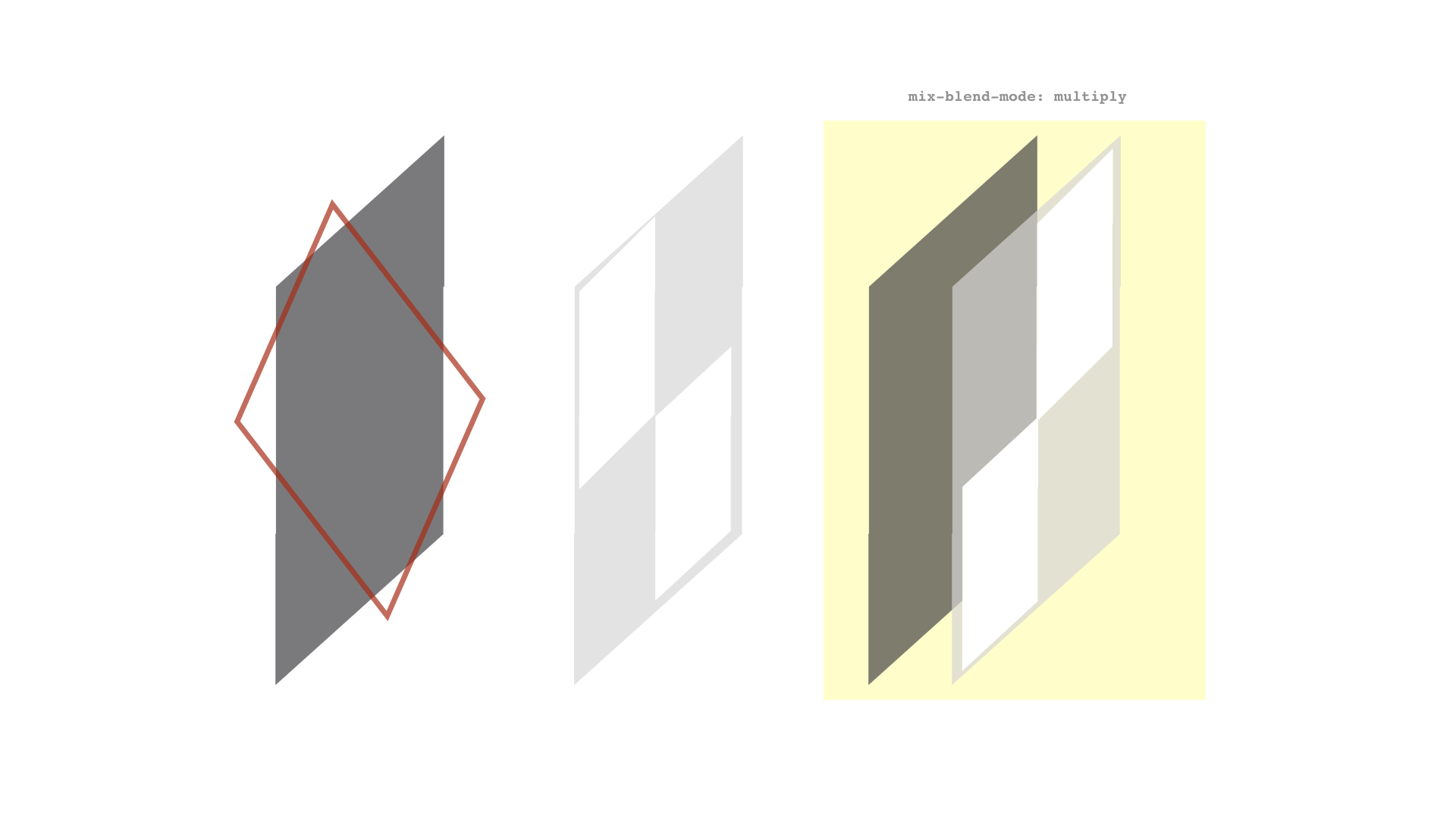
getMouseDegrees does this: It checks the top half of the screen, the bottom half of the screen, the left half of the screen, and the right half of the screen. It determines where the mouse is on the screen in a percentage between the middle and each edge of the screen.

For instance, if the mouse is half way between the middle of the screen and the right edge. The function determines that right = 50%, if the mouse is a quarter of the way UP from the center, the function determines that up = 25%.

Once the function has these percentages, it returns the percentage of the degreelimit.

So the function can determine your mouse is 75% right and 50% up, and return 75% of the degree limit on the x axis and 50% of the degree limit on the y axis. Same for left and right.

Here’s a visual:

rotation_explanation

I wanted to explain that because the function looks pretty complicated, and I won’t bore you with each line, but I have commented every step of the way for you to investigate it more if you want.

Add this function to the bottom of your project:

function getMouseDegrees(x, y, degreeLimit) {
  let dx = 0,
      dy = 0,
      xdiff,
      xPercentage,
      ydiff,
      yPercentage;

  let w = { x: window.innerWidth, y: window.innerHeight };

  // Left (Rotates neck left between 0 and -degreeLimit)
  
   // 1. If cursor is in the left half of screen
  if (x <= w.x / 2) {
    // 2. Get the difference between middle of screen and cursor position
    xdiff = w.x / 2 - x;  
    // 3. Find the percentage of that difference (percentage toward edge of screen)
    xPercentage = (xdiff / (w.x / 2)) * 100;
    // 4. Convert that to a percentage of the maximum rotation we allow for the neck
    dx = ((degreeLimit * xPercentage) / 100) * -1; }
// Right (Rotates neck right between 0 and degreeLimit)
  if (x >= w.x / 2) {
    xdiff = x - w.x / 2;
    xPercentage = (xdiff / (w.x / 2)) * 100;
    dx = (degreeLimit * xPercentage) / 100;
  }
  // Up (Rotates neck up between 0 and -degreeLimit)
  if (y <= w.y / 2) {
    ydiff = w.y / 2 - y;
    yPercentage = (ydiff / (w.y / 2)) * 100;
    // Note that I cut degreeLimit in half when she looks up
    dy = (((degreeLimit * 0.5) * yPercentage) / 100) * -1;
    }
  
  // Down (Rotates neck down between 0 and degreeLimit)
  if (y >= w.y / 2) {
    ydiff = y - w.y / 2;
    yPercentage = (ydiff / (w.y / 2)) * 100;
    dy = (degreeLimit * yPercentage) / 100;
  }
  return { x: dx, y: dy };
}

Once we have that function, we can now use moveJoint. We’re going to use it for the neck with a 50 degree limit, and for the waist with a 30 degree limit.

Update our mousemove event listener to include these moveJoints:

document.addEventListener('mousemove', function(e) {
    var mousecoords = getMousePos(e);
  if (neck && waist) {
      moveJoint(mousecoords, neck, 50);
      moveJoint(mousecoords, waist, 30);
  }
  });

Just like that, move your mouse around the viewport and Stacy should watch your cursor wherever you go! Notice how idle animation is still running, but because we snipped the neck and spine bone (yuck), we’re able to controls those independently.

This may not be the most scientifically accurate way of doing it, but it certainly looks convincing enough to create the effect we’re after. Here’s our progress so far, dig into this pen if you feel you’ve missed something or you’re not getting the same effect.

See the Pen
Character Tutorial – Round 2
by Kyle Wetton (@kylewetton)
on CodePen.

Part 6: Tapping into the rest of the animations

As I mentioned earlier, Stacy actually has 10 animations loaded into the file, and we’ve only used one of them. Let’s head back to our loader function and find this line.

mixer = new THREE.AnimationMixer(model);

Below this line, we’re going to get a list of AnimationClips that aren’t idle (we don’t want to randomly select idle as one of the options when we click on Stacy). We do that like so:

let clips = fileAnimations.filter(val => val.name !== 'idle');

Now below that, we’re going to convert all of those clips into Three.js AnimationClips, the same way we did for idle. We’re also going to splice the neck and spine bone out of the skeleton and add all of these AnimationClips into a variable called possibleAnims, which is already referenced at the top of our project.

possibleAnims = clips.map(val => {
  let clip = THREE.AnimationClip.findByName(clips, val.name);
  clip.tracks.splice(3, 3);
  clip.tracks.splice(9, 3);
  clip = mixer.clipAction(clip);
  return clip;
 }
);

We now have an array of clipActions we can play when we click Stacy. The trick here though is that we can’t add a simple click event listener on Stacy, as she isn’t part of our DOM. We are instead going to use raycasting, which essentially means shooting a laser beam in a direction and returning the objects that it hit. In this case we’re shooting from our camera in the direction of our cursor.

Let’s add this above our mousemove event listener:

// We will add raycasting here
document.addEventListener('mousemove', function(e) {...}

So paste this function in that spot, and I’ll explain what it does:

window.addEventListener('click', e => raycast(e));
window.addEventListener('touchend', e => raycast(e, true));

function raycast(e, touch = false) {
  var mouse = {};
  if (touch) {
    mouse.x = 2 * (e.changedTouches[0].clientX / window.innerWidth) - 1;
    mouse.y = 1 - 2 * (e.changedTouches[0].clientY / window.innerHeight);
  } else {
    mouse.x = 2 * (e.clientX / window.innerWidth) - 1;
    mouse.y = 1 - 2 * (e.clientY / window.innerHeight);
  }
  // update the picking ray with the camera and mouse position
  raycaster.setFromCamera(mouse, camera);

  // calculate objects intersecting the picking ray
  var intersects = raycaster.intersectObjects(scene.children, true);

  if (intersects[0]) {
    var object = intersects[0].object;

    if (object.name === 'stacy') {

      if (!currentlyAnimating) {
        currentlyAnimating = true;
        playOnClick();
      }
    }
  }
}

We’re adding two event listeners, one for desktop and one for touch screens. We pass the event to the raycast() function but for touch screens, we’re setting the touch argument as true.

Inside the raycast() function, we have a variable called mouse. Here we set mouse.x and mouse.y to be changedTouches[0] position if touch is true, or just return the mouse position on desktop.

Next we call setFromCamera on raycaster, which has already been set up as a new Raycaster at the top of our project, ready to use. This line essentially raycasts from the camera to the mouse position. Remember we’re doing this every time we click, so we’re shooting lasers with a mouse at Stacy (brand new sentence?).

We then get an array of intersected objects; if there are any, we set the first object that was hit to be our object.

We check that the objects name is ‘stacy’, and we run a function called playOnClick() if the object is called ‘stacy’. Note that we are also checking that a variable currentlyAnimating is false before we proceed. We toggle this variable on and off so that we can’t run a new animation when one is currently running (other than idle). We will turn this back to false at the end of our animation. This variable is referenced at the top of our project.

Okay, so playOnClick. Below our rayasting function, add our playOnClick function.

// Get a random animation, and play it 
 function playOnClick() {
  let anim = Math.floor(Math.random() * possibleAnims.length) + 0;
  playModifierAnimation(idle, 0.25, possibleAnims[anim], 0.25);
}

This simply chooses a random number between 0 and the length of our possibleAnims array, then we call another function called playModifierAnimation. This function takes in idle (we’re moving from idle), the speed to blend from idle to a new animation (possibleAnims[anim]), and the last argument is the speed to blend from our animation back to idle. Under our playOnClick function, lets add our playModifierAnimation and I’ll explain what its doing.

function playModifierAnimation(from, fSpeed, to, tSpeed) {
  to.setLoop(THREE.LoopOnce);
  to.reset();
  to.play();
  from.crossFadeTo(to, fSpeed, true);
  setTimeout(function() {
    from.enabled = true;
    to.crossFadeTo(from, tSpeed, true);
    currentlyAnimating = false;
  }, to._clip.duration * 1000 - ((tSpeed + fSpeed) * 1000));
}

The first thing we do is reset the to animation, this is the animation that’s about to play. We also set it to only play once, this is done because once the animation has completed its course (perhaps we played it earlier), it needs to be reset to play again. We then play it.

Each clipAction has a method called crossFadeTo, we use it to fade from (idle) to our new animation using our first speed (fSpeed, or from speed).

At this point our function has faded from idle to our new animation.

We then set a timeout function, we turn our from animation (idle) back to true, we cross fade back to idle, then we toggle currentlyAnimating back to false (allowing another click on Stacy). The time of the setTimeout is calculated by combining our animations length (* 1000 as this is in seconds instead of milliseconds), and removing the speed it took to fade to and from that animation (also set in seconds, so * 1000 again). This leaves us with a function that fades from idle, plays an animation and once it’s completed, fades back to idle, allowing another click on Stacy.

Notice that our neck and spine bones aren’t affected, giving us the ability to still control the way those rotate during the animation!

That concludes this tutorial, here’s the completed project to reference if you got stuck.

See the Pen
Character Tutorial – Final
by Kyle Wetton (@kylewetton)
on CodePen.

Before I leave you though, if you’re interested in the workings of the model and animations itself, I’ll cover some of the basics in the final part. I’ll leave you to research some of the finer aspects, but this should give you plenty insight.

Part 7: Creating the model file (optional)

You’ll require Blender for this part if you follow along. I recommend Blender 2.8, the latest stable build.

Before I get started, remember I mentioned that although you can include texture files inside your GLTF file (the format you export from Blender in), I had issues where Stacy’s texture was really dark. It had to do with the fact that GLTF expects sRGB format, and although I tried to convert it in Photoshop, it still wasn’t playing ball. You can’t guarantee the type of file you’re going to get as a texture, so the way I managed to fix this issue was instead export my file without textures, and let Three.js add it natively. I recommend doing it this way unless your project is super complicated.

Any way, here’s what I started with in Blender, just a standard mesh of a character in a T pose. Your character most definitely should be in a T pose, because Mixamo is going to generate the skeleton for us, so it is expecting this.

blender-1

You want to export your model in the FBX format.

blender-2

You aren’t going to need the current Blender session any more, but more on that soon.

Head to www.mixamo.com, this site has a bunch of free animations that are used for all sorts of things, commonly browsed by Indie game developers, this Adobe service goes hand-in-hand with Adobe Fuse, which is essentially a character creator software. This is free to use, but you will need an Adobe account (by free I mean, you won’t need a Creative Cloud subscription). So create one and sign in.

The first thing you want to do is upload your character. This is the FBX file that we exported from Blender. Mixamo will automatically bring up the Auto-Rigger feature once your upload is complete.

mixamo-3

Follow the instructions to place the markers on the key areas of your model. Once the auto-rigging is complete, you’ll see a panel with your character animating!

mixamo-4

Mixamo has now created a skeleton for your model, this is the skeleton we hooked into in this tutorial.

Click next, and then select the animations tab in the top left. Let’s find an idle animation to start with, use the search bar and type ‘idle’. The one we used in this tutorial is called “Happy idle” if you’re interested.

Clicking on any animation will preview it, explore this site to see some crazy other ones. But an important note: this particular project works best with animations where the feet end up where they began, in a position similar to our idle animation, because we’re cross fading these, it looks most natural when the ending pose is similar to the next animations starting pose, and visa versa.

mixamo-5

Once you’re happy with your idle animation, click Download Character. Your format should be FBX and skin should be set to With Skin. Leave the rest as default. Download this file. Keep Mixamo open.

Back in Blender, import this file into a new, empty session (remove the light, camera and default cube that comes with a new Blender session).

If you hit the play button (if you don’t have a timeline in your session, you can toggle the Editor Type on one of your panels, at this point I recommend an intro into Blenders interface if you get stuck).

mixamo-6

At this point you want to rename the animation, so change to the Editor Type called Dope Sheet and the select Action Editor as the sub section.

dope-sheet

Click on the drop down next to + New and select the animation that Mixamo includes in this file. At this point you can rename it in the input field, lets call it ‘idle’.

mixamo-6

Now if we exported this file as a GLTF, there will be an animation called idle in gltf.animations. Remember we have both gltf.animatons and gltf.scene in our file.

Before we export though, we need to rename our character objects appropriately. My setup looks like this.

Screen Shot 2019-10-05 at 1.43.18 PM

Note that the bottom, child stacy is the object name referenced in our JavaScript.

Let’s not export yet, instead I’ll quickly show you how to add a new animation. Head back to Mixamo, I’ve selected the Shake Fist animation. Download this file too, we still want to keep the skin, others probably would mention that you don’t need to keep the skin this time, but I found that my skeleton did weird things when I didn’t.

Let’s import it into Blender.

blender-5

At this point we’ve got two Stacys, one called Armature, and the one we want to keep, Stacy. We’re going to delete the Armature one, but first we want to move its current Shake Fist animation to Stacy. Let’s head back to our Dope Sheet > Animation Editor.

You’ll see we now have a new animation alongside idle, let’s select that, then rename it shakefist.

blender-6

blender-7

We want to bring up one last Editor Type, keep your Dope Sheet > Action Editor open, and in another unused panel (or split the screen to create a new one, again it helps if you get through an intro into Blenders UI).

We want the new Editor Type to be Nonlinear Animation (NLA).

blender-9

Click on stacy. Then click on the Push Down button next to the idle animation. We’ve now added idle as an animation, and created a new track to add our shakefist animation.

Confusingly, you want to click on stacy‘s name again before we we proceed.

blender-11

The way we do this is to head back to our Animation Editor and select shakefist from the drop down.

blender-12

Finally, we can use the Push Down button next to shakefist in the NLA editor.

blender-13

You should be left with this:

blender-15

blender-14

We’ve transferred the animation from Armature to Stacy, we can now delete Armature.

blender-15

Annoyingly, Armature will drop its child mesh into the scene, delete this too

blender-16

You can now repeat these steps to add new animations (I promise you it gets less confusing and faster the more you do it).

I’m going to export my file though:

blender-17

Here’s a pen from this tutorial except it’s using our new model! (Disclosure: Stacy’s scale was way different this time, so that’s been updated in this pen. I’ve had no success at all scaling models in Blender when Mixamo has already added the skeleton to it, it’s much easier to do it in Three.js after it’s loaded).

See the Pen
Character Tutorial – Remix
by Kyle Wetton (@kylewetton)
on CodePen.

The end!

How to Create an Interactive 3D Character with Three.js was written by Kyle Wetton and published on Codrops.

Best Classifieds & Directory Plugin for your WordPress Website

A website directory is one where the names, emails, contacts, and other information of like or related individuals or organizations are grouped together so they can be accessed from one location. Examples would be a directory of property listings, blood banks, restaurants, etc. Online directories make it easy for people to locate any listed service, […]

The post Best Classifieds & Directory Plugin for your WordPress Website appeared first on WPArena.