RavenDB has had support for spatial queries for a long time. In RavenDB 4.0 we did a whole bunch of work to make spatial queries better. In particular, we have separate the concepts of searching and ordering for spatial queries. In most cases, if you are doing a spatial query, you'll want to sort the results by their distance. The classic example is: "Give me the Pizza stores within 5 km from me". I'll usually also want to see them listed by their distance. But there are other ways to go about it. For example, if I want to see a concert by Queen, I want to sort them by distance, but I don't want to do any spatial filtering.
It gets interesting when you combine different spatial operations at the same time. For example, consider the following query. Here is how you can search for a house in a particular school district, but want to find the one that is nearest to the office. The two spatial queries aren't related at all to one another.
Mid-Century Modern Illustration: Creating A Cover Book With Illustrator And InDesign
Mid-Century Modern Illustration: Creating A Cover Book With Illustrator And InDesign
Manuela Langella
In this tutorial, I’m going to show you how to create a beautiful cover design inspired by the 1950s. Specifically, the cover will be for a children’s book, so we’re going to create a well-known character: Little Red Riding Hood.
The interesting aspect of this design is that we are going to create its purely retro character that was typical for cartoons back then. As an illustrator, I have always been fascinated by the graphics of the last half-century. I grew up watching many cartoons, books, and comics characterized by that style, although I wasn’t exactly born in the 50s.
This is the reason why I want you to soak in a little inspiration from 1950. In this article, I’ll explain why I chose this precise historical period to inspire me and where my love for this type of artwork comes from. I’ll also share some ideas which you can find online if you are looking for a little inspiration to give this a try yourself.
In order to follow along, you can download the files and practice on my self-made drawing or, if you like, you can create one of your own. The important thing is that you follow all of the steps and tips if you want to create an absolutely fascinating retro design!
You will then discover the world of retro colors and all those effects that will allow us to have retro effects: I’m talking about brushes, textures, and patterns. Once the design is finished, the cover design is ready. Finally, we will prepare our cover in InDesign to export for print.
Growing up, I read so many comics and watched so many cartoons. But not any kind — just the ones that had been drawn in a mid-century style. I’m not sure why that particular design atttracted me that much; maybe it was because of the simple lines used in the drawings or the pastel colors that were used to create the comics and cartoons.
As an illustrator and graphic designer, I always search for inspiration and like to browser through Pinterest. (It’s a great place to discover some very special ideas!)
While searching for some retro inspiration for this tutorial, I found a couple of illustrations that captured my attention:
I absolutely love the hilarious way these artists have represented people and things in their artwork — the exaggeration, the details in simplicity, and the vibrant colors. Aren’t they something!
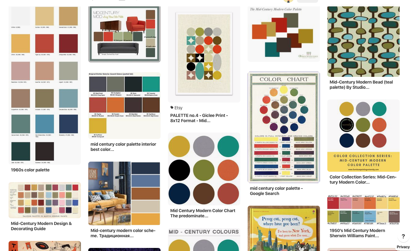
I’ve always wanted to know everything about drawings and designs created during the mid-century age, and the more I research, the more I keep rediscovering a world created with beautiful patterns, Scandinavian colors, and simple but very communicative designs.
2. Looking For Inspiration
There is so much to discover about mid-century designs. Here some examples of very inspiring advertisements and illustrations.
For this tutorial, I wanted to find something to draw that is well known to everyone, so that it’s not too difficult to understand how the details can be applied to an illustration of your choice later on when you want to try out the steps on your own.
3.1. How To Import A Hand-Drawn Design
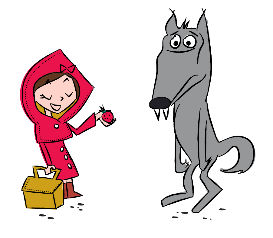
So, Little Red Riding Hood came to mind. I’m going to guess that everybody is familiar with this fairy tale, and we all have an idea of how Little Red Riding Hood looks like. As children, we have seen her at least once, i.e. in a book or a cartoon.
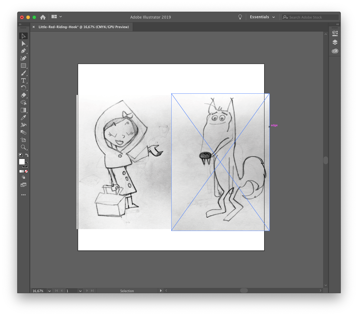
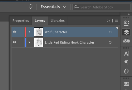
As with all of my designs, I begin drawing my idea by hand. Below, you’ll see the two original drawings (including the erasures and the yellow color of recycled paper):
Note: You can download the start images over here.
To achieve the retro look, let’s take a look now at which elements I used for the principal characters:
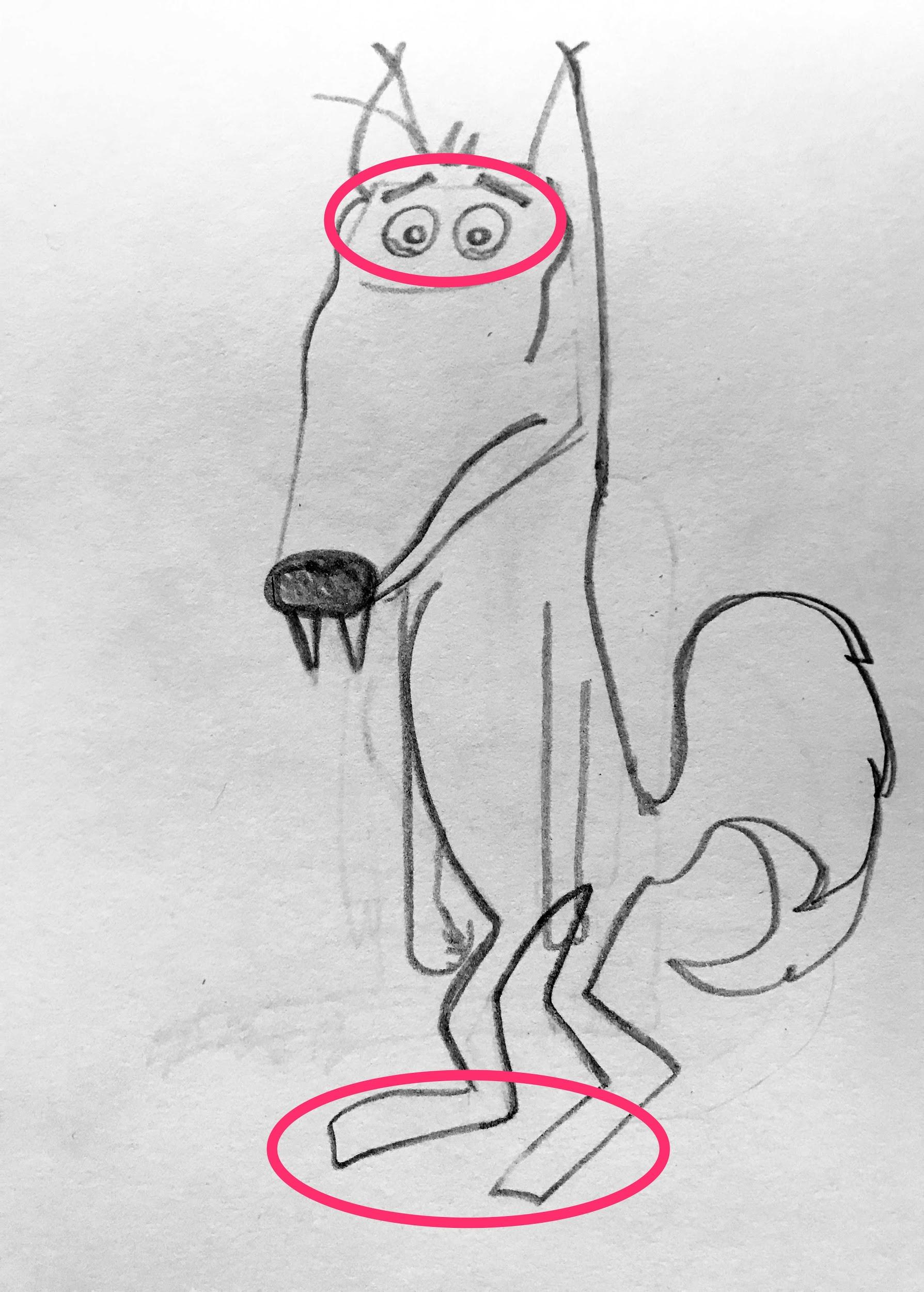
For Little Red Riding Hood, I used many edges on the hood, the eyes, eyebrows, elbows, and feet. The face is pretty simple, too, and has a triangular shape. (Large preview)
Edges are one of the most useful details used for mid-century graphics and designs. I think edges give a very funny nature to the design, making it very playful and childish.
The little coat I used is also typical of 50s clothing:
Funny note: In his book, “Modern Cartooning: Essential Techniques for Drawing Today’s Popular Cartoons”, Christopher Hart shows two ways to draw the same shoe:
“It’s funnier to draw the boots in a quirky manner. The disadvantage is that they only come in a size 7.”
I decided to give the wolf typical facial expressions that were widely used in retro cartoons. Take a look at the image below (taken once again from Christopher Hart book):
Now that you know how to get started, we can finally begin to bring our illustration to life!
Let’s fire up Adobe Illustrator.
3.2. How To Create A Basic Design
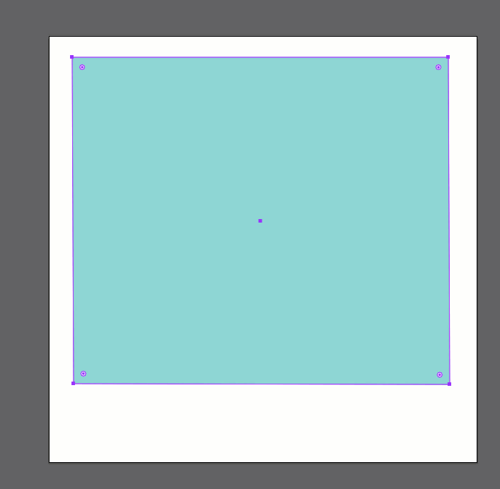
Once you open Illustrator, start with creating a new document first. I will create a square artboard for a square book cover. (Many children’s books have a square shape.)
Let’s go to File → New. In the open Window, I chose Print because I’d like to have my design printed. Then, I set 3000px × 3000px for the artboard size. Finally, I name it Little Red Riding Hood. See my setting below:
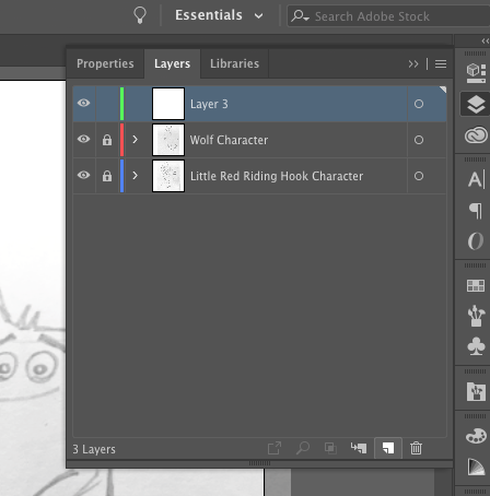
Now you have to import the drawings. (I’ve provided the files for you here.)
Go to File → Place, choose the folder where you saved the drawings, and put them onto the artboard. Since the files are bigger than our artboard, just resize them to fit in.
Once we have done, let’s go to the further step: create a brush to draw in Illustrator.
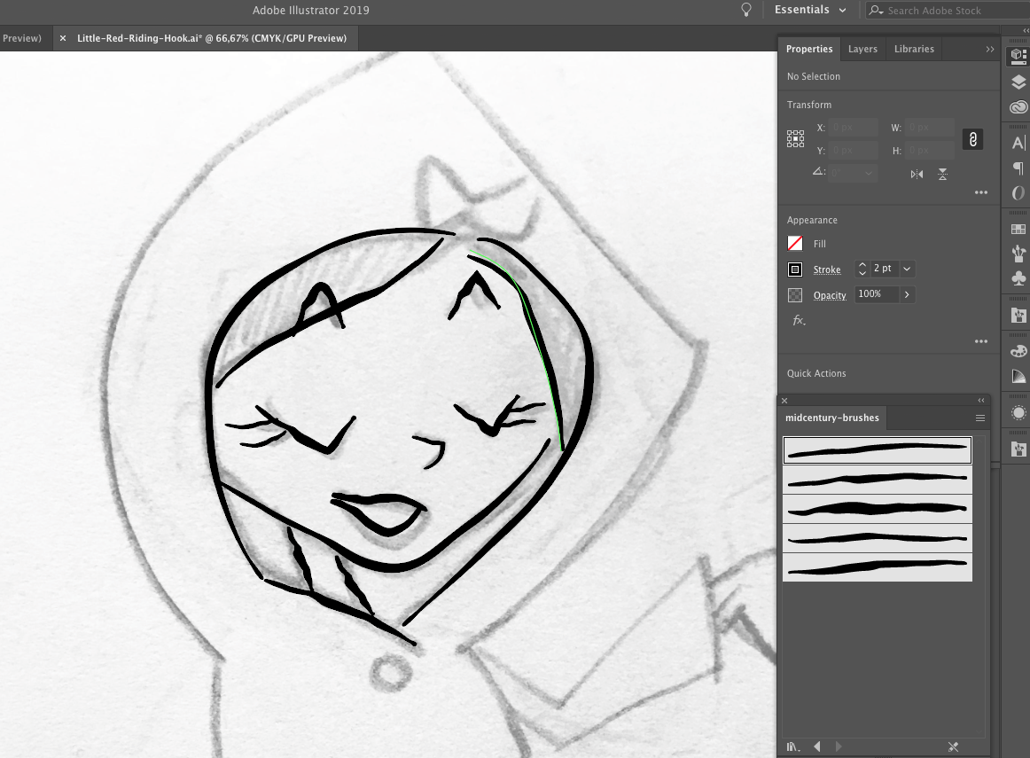
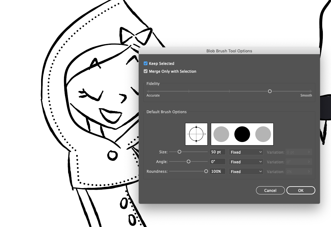
3.3. How To Create A Retro Brush
I have drawn some brushes myself, inventing something always based on the 50s style. As you can see in some examples below, used lines are not perfect. They always give the impression of something handmade.
So I grabbed my iPad and drawn some lines I liked in Procreate. I wanted to give the brushes a hand-drawn look, typical from 50s design, so this is my result:
Note: For our mid-century-inspired illustration, I’ve provided the brushes for you here— feel free to download and use them.
So, let’s go back to Illustrator and see how the brushes can be installed.
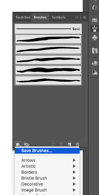
Open the file you just downloaded and open it in Illustrator. Be sure your Brush Panel is open by clicking on Window → Brushes. Select the first brush from the file you just opened and drag it into the Brush Panel as shown below:
As you can see, after I dragged the brush in the Brush Panel, I selected “Art brush” from the open window and renamed the brush. I checked the “Stretch to fit stroke length” option and then selected “Tint” as Colorization Method. This way, we will be able to change our brush color as well.
Let’s go on and drag all the brushes in the Brush Panel, following the same instructions as above. At the end, you should have five brushes:
Nice! Your very own custom mid-century-inspired brushes!
Note: If you want your brushes be permanent in Illustrator, select them all and click on the first left icon at the bottom of the panel (“Brush Library Menu”). Then click on “Save Brushes”.
You can choose to work with just one or all of the brushes — it’s up to you. I suggest to use the first one for thinner lines, and the other ones for thicker lines. Of course, you can set the size of the brushes in any way you like.
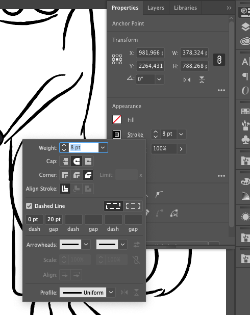
Another cute detail are the dotted lines on LRRH’s coat. They are very simple: open the Properties panel and click on Stroke. Check the Dashed Line and give 0 pt dash and 20 pt gap:
Now that we’ve completed this step, we can now continue to the next one: adding colors, textures, and effects.
4. Colors, Textures And Patterns
4.1. Coloring Characters
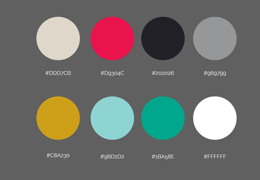
The first thing we need is a palette to color our characters. I researched some colors on Pinterest and saved many interesting palettes on my Pinterest wall:
Let’s insert our palette in the Swatches. Create some circles with these colors in Illustrator, then select them and open the Swatches panel through Windows → Swatches. With color circles selected, click on New Color Group:
In the pop-up window, click on “Selected Artwork”, including “Convert Process to Global (the palette will be permanent in the Swatches panel) and “Include Swatches for Tints”.
I used some other brushes to create shadow effects on the characters. The brushes are default in Illustrator; you can find them by clicking Brush Library Menu → Artistic → ChalkCharcoalPencil.
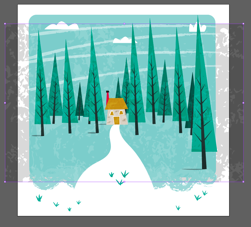
Again, let’s work with the Chalk brushes see 4.2. above. With the same color applied as the background. Brush some lines at the bottom of the rectangle to give some art effects:
We will add some others brush effects to the sky. Create a new layer above the sky one and rename it as “Brushes effect”. With another charcoal brush (I used charcoal feather), draw some lines in the sky. The color is #FFFFFF with opacity set to 50%. See the image below.
Now that wasn’t that hard, was it? Let’s draw some clouds now. You can use the Pencil tool (N) with #FFFFFF as the color and draw some simple shapes like the ones shown below:
By using the Rectangle tool (M), you can create simple shapes so let’s try to create a little house in the background as well. In order to make it a bit deformed, we need to use the Direct Selection tool (A), then grab and drag the angles.
Let’s move on to the trees now. With the Polygon Tool, click just once on your artboard, so that a window appeary. Set “3 sides” and 100 px for Radius:
For the triangle you just created, set the background color on #1BA58E. To make it look a bit deformed, use the the Direct Selection tool (A), then grab and drag the angles like we did when we created the house earlier.
Let’s now group all tree elements, duplicate it or create some other trees to fill the scene. Put every tree on a different layer and play with layers to give depth to the scene.
Be brave. Try different shades of green for the trees:
Let’s now add some effect to the trees, to make them more “retro”. I applied this effects just to the trees, but you are free to apply it to the entire design.
First of all, we need a texture. Since we work in vectors, we should apply a vector texture. You can download one for free (just googling “vector textures”. Anyway, I provided a vector texture for you here.
Download the texture and open it in Illustrator. Create a new layer and rename it as “Texture”.
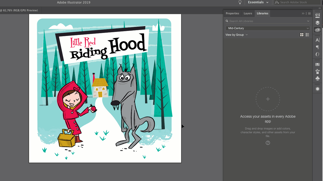
As the very last thing, let’s create the title. Draw two simple black and white rectangles using the Rectangle tool (M) and write the title ad I show you in the image below. The fonts I used are Fontdiner Swanky and Fontdiner Sparkly (both free to download).
Congratulations! You just finished your first Mid-Century Cover!
Next step is to complete our cover in InDesign. Ready?
5. How To Organize A Cover Into InDesign
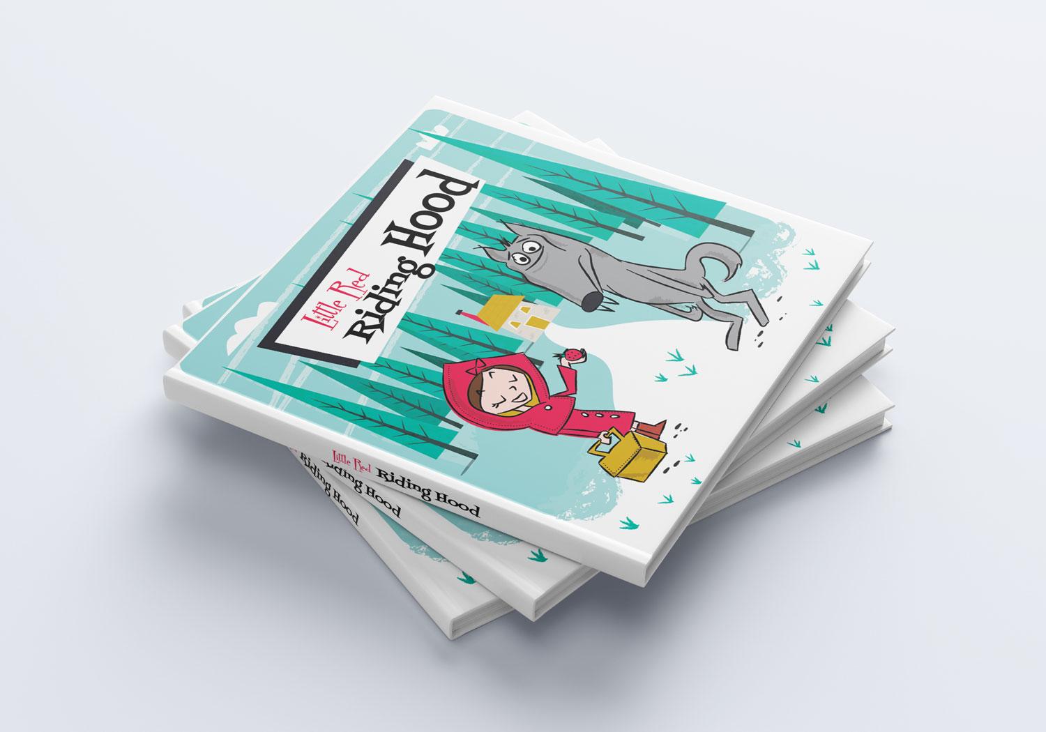
Now I need to work in InDesign to prepare my cover for the print. Consider that we will need the front and back cover and must calculate a space for the spine.
I want my front cover size be 18 x 18 cm (7.00 × 7.00 in). Since I need to create everything in a single artboard, I need to put the pages side by side, plus a space more for the spine.
So, let’s set 37 cm width (18 cm front + 18 cm back + 1 cm spine) and 18 cm height. Other settings are 0,3 cm Margins and 0,3 cm Bleed.
A quick back to Illustrator to save our cover design. If you have Adobe CC, you can use the Library to save your design. Open Window > Libraries, select everything on your artboard and drag to the library:
Let’s talk about view controllers. Right off the hop, stop making a mess of your view controllers and start putting your code in logical places – view controllers are for views, and views only. It’s very tempting to throw all sorts of logic into a view controller, but when we separate concerns, we write code that’s easier to understand and easier to reuse.
There are handfuls of responsibilities we can dump into a view controller: data fetching, data transformation, user input, model-view binding, model mutation, animations, and navigation flow, just to name a few. But, we shouldn’t house all of these responsibilities in one place; otherwise, we’re working with a confusing and unwieldy view controller.
The Problem Domain: A Typical Enterprise Technology Landscape
The enterprise IT landscape of a corporate house typically consists of a conglomerate of disparate technology stacks — ranging from huge legacy proprietary monoliths hosting the systems of records to the modern componentized systems of engagements. The very diverse nature of the 360-degree landscape involves diverse skills, reciprocal governance needs, and completely different program governance strategies. The problem at hand is how to integrate such a complex landscape.
Figure 1: An interconnected but disparate enterprise technology landscape
The User’s Perspective: Using Story Structure To Stand In Your User’s Shoes
The User’s Perspective: Using Story Structure To Stand In Your User’s Shoes
John Rhea
Every user interaction with your website is part of a story. The user—the hero—finds themselves on a journey through your website on the way to their goal. If you can see this journey from their perspective, you can better understand what they need at each step, and align your goals with theirs.
My first article on websites and story structure, Once Upon a Time: Using Story Structure for Better Engagement, goes into more depth on story structure (the frame around which we build the house of a story) and how it works. But here’s a quick refresher before we jump into implications:
The Hero’s Journey
Most stories follow a simple structure that Joseph Campbell in his seminal work, Hero with a Thousand Faces, called the Hero’s Journey. We’ll simplify it to a hybrid of the plot structure you learned in high school and the Hero’s Journey. We’ll then take that and apply it to how a user interacts with a website.
Once upon a time… a hero went on a journey. (Large preview)
Ordinary World
The ordinary world is where the user starts (their every day) before they’ve met your website.
Inciting Incident/Call To Adventure
Near the beginning of any story, something will happen to the hero that will push (or pull) them into the story (the inciting incident/call to adventure). It will give them a problem they need to resolve. Similarly, a user has a problem they need to be solved, and your website might be just the thing to solve it. Sometimes though, a hero would rather stay in their safe, ordinary world. It’s too much cognitive trouble for the user to check out a new site. But their problem — their call to adventure — will not be ignored. It will drive the user into interacting with your site.
Preparation/Rising Action
They’ve found your website and they think it might work to solve their problem, but they need to gather information and prepare to make a final decision.
The Ordeal/Climax
In stories, the ordeal is usually the fight with the big monster, but here it’s the fight to decide to use your site. Whether they love the video game news you cover or need the pen you sell or believe in the graphic design prowess of your agency, they have to make the choice to engage.
The Road Back/Falling Action
Having made the decision to engage, the road back is about moving forward with that purchase, regular reading, or requesting the quote.
Resolution
Where they apply your website to their problem and their problem is *mightily* solved!
Return With Elixir
The user returns to the ordinary world and tells everyone about their heroic journey.
The User’s Perspective
Seeing the website from the user’s perspective is the most important part of this. The Hero’s Journey, as I use it, is a framework for better understanding your user and their state of mind during any given interaction on your site. If you understand where they are in their story, you can get a clearer picture of where and how you fit in (or don’t) to their story. Knowing where you are or how you can change your relationship to the user will make a world of difference in how you run your website, email campaigns, and any other interaction you have with them.
Numerous unsubscribes might not be a rejection of the product, but that you sent too many emails without enough value. Great testimonials that don’t drive engagement might be too vague or focused on how great you are, not what solutions you solve. A high bounce rate on your sign up page might be because you focused more on your goals and not enough on your users’ goals. Your greatest fans might not be talking about you to their friends, not because they don’t like you, but because you haven’t given them the opportunity for or incentivized the sharing. Let’s look at a few of these problems.
Plan For The Refusal Of The Call To Adventure
Often the hero doesn’t want to engage in the story or the user doesn’t want to expend the cognitive energy to look at another new site. But your user has come to your site because of their call to adventure—the problem that has pushed them to seek a solution—even if they don’t want to. If you can plan for a user’s initial rejection of you and your site, you’ll be ready to counteract it and mollify their concerns.
Follow up or reminder emails are one way to help the user engage. This is not a license to stuff your content down someone’s throat. But if we know that one or even seven user touches aren’t enough to draw someone in and engage them with your site, you can create two or eight or thirty-seven user touches.
Sometimes these touches need to happen outside of your website; you need to reach out to users rather than wait for them to come back to you. One important thing here, though, is not to send the same email thirty-seven times. The user already refused that first touch. The story’s hero rarely gets pulled into the story by the same thing that happens again, but rather the same bare facts looked at differently.
So vary your approach. Do email, social media, advertising, reward/referral programs, and so on. Or use the same medium with a different take on the same bare facts and/or new information that builds on the previous touches. Above all, though, ensure every touch has value. If it doesn’t, each additional touch will get more annoying and the user will reject your call forever.
Nick Stephenson is an author who tries to help other authors sell more books. He has a course called Your First 10K Readers and recently launched a campaign with the overall purpose of getting people to register for the course.
Before he opened registration, though, he sent a series of emails. The first was a thanks-for-signing-up-to-the-email-list-and-here’s-a-helpful-case-study email. He also said he would send you the first video in a three-part series in about five minutes. The second email came six minutes later and had a summary of what’s covered in the video and a link to the video itself. The next day he emailed with a personal story about his own struggles and a link to an article on why authors fail (something authors are very concerned about). Day 3 saw email number four… you know what? Let’s just make a chart.
Day
Value/Purpose
Email #
1
Case Study
1
1
Video 1 of 3
2
2
Personal Story and Why Authors Fail Article
3
3
Video 2 of 3
4
4
Honest discussion of his author revenue and a relevant podcast episode
5
5
Video 3 of 3
6
6
Testimonial Video
7
7
Registration Opens Tomorrow
8
8
Registration Info and a pitch on how working for yourself is awesome
9
By this point, he’s hooked a lot of users. They’ve had a week of high quality, free content related to their concerns. He’s paid it forward and now they can take it to the next level.
I’m sure some people unsubscribed, but I’m also sure a lot more people will be buying his course than with one or even two emails. He’s given you every opportunity to refuse the call and done eight different emails with resources in various formats to pull you back in and get you going on the journey.
I’ve Traveled This Road Before
It takes a lot less work to follow a path than to strike a new one. If you have testimonials, they can be signposts in the wilderness. While some of them can and should refer to the ordeal (things that might prevent a user from engaging with you), the majority of them should refer to how the product/website/thing will solve whatever problem the user set out to solve.
“This article was amazing!” says the author’s mother, or “I’m so proud of how he turned out… it was touch-and-go there for a while,” says the author’s father. While these are positive (mostly), they aren’t helpful. They tell you nothing about the article.
Testimonials should talk about the road traveled: “This article was awesome because it helped me see where we were going wrong, how to correct course, and how to blow our competitor out of the water,” says the author’s competitor. The testimonials can connect with the user where they are and show them how the story unfolded.
This testimonial for ChowNow talks about where they’ve been and why ChowNow worked better than their previous setup.
“I struggled with the same things you did, but this website helped me through.” (Large preview)
So often we hear a big promise in testimonials. “Five stars”, “best film of the year,” or “my son always does great.” But they don’t give us any idea of what it took to get where they are, that special world the testifier now lives in. And, even if that company isn’t selling a scam, your results will vary.
We want to trumpet our best clients, but we also want to ground those promises in unasterisked language. If we don’t, the user’s ordeal may be dealing with our broken promises, picking up the pieces and beginning their search all over again.
The Ordeal Is Not Their Goal
While you need to help users solve any problems preventing them from choosing you in their ordeal, the real goal is for them to have their problem solved. It’s easy to get these confused because your ordeal in your story is getting the user to buy in and engage with your site.
Your goal is for them to buy in/engage and your ordeal is getting them to do that. Their goal is having their problem solved and their ordeal is choosing you to solve that problem. If you conflate your goal and their goal then their problem won’t get solved and they won’t have a good experience with you.
This crops up whenever you push sales and profits over customer happiness. Andrew Mason, founder of Groupon, in his interview with Alex Bloomberg on the podcast “Without Fail”, discusses some of his regrets about his time at Groupon. The company started out with a one-deal-a-day email — something he felt was a core of the business. But under pressure to meet the growth numbers their investors wanted (their company goals), they tried things that weren’t in line with the customer’s goals.
Note: I have edited the below for length and clarity. The relevant section of the interview starts at about 29:10.
Alex: “There was one other part of this [resignation] letter that says, ‘my biggest regrets are the moments that I let a lack of data override my intuition on what’s best for our company’s customers.’ What did you mean by that?”
Andrew: “Groupon started out with these really tight principles about how the site was going to work and really being pro customer. As we expanded and as we went after growth at various points, people in the company would say, ‘hey why don’t we try running two deals a day? Why don’t we start sending two emails a day?’ And I think that sounds awful, like who wants that? Who wants to get two emails every single day from a company? And they'd be like, ‘Well sure, it sounds awful to you. But we’re a data driven company. Why don’t we let the data decide?’ ...And we’d do a test and it would show that maybe people would unsubscribe at a slightly higher rate but the increase in purchasing would more than make up for it. You'd get in a situation like: ‘OK, I guess we can do this. It doesn’t feel right, but it does seem like a rational decision.’ ...And of course the problem was when you’re in hypergrowth like [we were] ...you don’t have time to see what is going to happen to the data in the long term. The churn caught up with [us]. And people unsubscribed at higher rates and then before [we] knew it, the service had turned into… a vestige of what it once was.”
— Without Fail, Groupon's Andrew Mason: Pt. 2, The Fall (Oct. 8, 2018)
Tools For The Return With The Elixir
Your users have been on a journey. They’ve conquered their ordeal and done what you hoped they would, purchased your product, consumed your content or otherwise engaged with you. These are your favorite people. They’re about to go back to their ordinary world, to where they came from. Right here at this pivot is when you want to give them tools to tell how awesome their experience was. Give them the opportunity to leave a testimonial or review, offer a friends-and-family discount, or to share your content.
SunTrust allows electronic check deposit through their mobile app. For a long while, right after a deposit, they would ask you if you wanted to rate their app. That’s the best time to ask. The user has just put money in their account and are feeling the best they can while using the app.
“Money, money, money! Review us please?” (Large preview)
The only problem was is that they asked you after every deposit. So if you had twelve checks to put in after your birthday, they’d ask you every time. By the third check number, this was rage inducing and I’m certain they got negative reviews. They asked at the right time, but pestered rather than nudged and — harkening back to the refusal of the call section — they didn’t vary their approach or provide value with each user touch.
Note: Suntrust has since, thankfully, changed this behavior and no longer requests a rating after every deposit.
Whatever issue you’re trying to solve, the Hero’s Journey helps you see through your user’s eyes. You’ll better understand their triumphs and pain and be ready to take your user interactions to the next level.
So get out there, put on some user shoes, and make your users heroic!
I use AWS CodeCommit to hold the work-in-progress articles for this blog. It's free, it's private, and it's not living on a disk drive in my house.
To access my repositories, I use SSH private key authentication. Unlike GitHub, CodeCommit doesn't just let you attach a public key to a repository. Instead, you associate a public key with a user token, and must use that user token to access the repository. That's not too onerous, because you can put the token in your .ssh/config:
Before you begin to build a house and break ground on the foundation you better have a blueprint and know exactly what you’re going to build. In physical construction, we really need to plan things out ahead of time to ensure that we have the right materials at hand and that things come together as we want them to.
This is a fundamental constraint of physical construction and it forces us to think about and construct physical things in certain ways. Virtual things do not have the same limitations and so in many cases, we can find more effective and efficient ways of constructing virtual things then if we were to just follow a similar plan that we would for constructing a physical thing.
200: What I’ve Learned About Podcasting in My First 200 Episodes
Lessons Learned in 200 Episodes of Podcasting
Today’s episode is #200, and while it’s a podcast about blogging, today I want to talk about podcasting and share some of the big lessons I’ve learned about this medium since starting this podcast 2 years ago. Continue reading “200: What I’ve Learned About Podcasting in My First 200 Episodes”
This guest post is by Anders Vinther of The WordPress Security Checklist.
WordPress Security is about as sexy as cleaning your house. And as a serious blogger, you already know that securing your site properly is not a trivial task.
That makes it a fantastic topic for myth fabrication.
In this post, I’ve compiled the top ten WordPress security myths for your easy consumption, followed by a light sprinkle of facts to debunk the myths.
Here are the myths:
WordPress is not secure.
Nobody wants to hack my blog.
My WordPress site is 100% secure.
I only use themes and plugins from wordpress.org so they are secure.
Updating WordPress whenever I log in is cool.
Once my WordPress site is setup my job is finished.
I’ll just install xyz plugin and that’ll take care of security for me.
If I disable a plugin or theme, there is no risk.
If my site is compromised I will quickly find out.
My password is good enough.
Myth 1. WordPress is not secure
When people experience security problems with their WordPress sites, they tend to blame WordPress. However, the WordPress core is very secure. And when a security hole is found, the development team is very quick to respond.
The most frequent causes for compromised WordPress sites are in fact:
outdated software
insecure themes and plugins
bad passwords
stolen FTP credentials
hosting problems.
For more on this topic, see WordPress Security Vulnerabilities.
Myth 2. Nobody wants to hack my blog
Most hacking attempts are automated. There are rarely personal or political motives behind WordPress hacking—more often the motives involve financial gain.
Maybe you’re thinking, “But I don’t have anything for sale on my site. I don’t have credit card information or any other sensitive information. What could they possibly steal from my site?”
What you do have is resources.
Possible ways to exploit your site are:
the insertion of spam links in your content to boost SEO for other sites
through malware infections of your visitors computers, e.g. to steal their financial information
redirecting your traffic to other sites.
For more details, see Are Small Sites Targeted For Hacking?
Myth 3. My WordPress site is 100% secure
No site that’s accessible on the internet will ever be 100% secure. Security vulnerabilities will always exist.
That is why you need a backup and recovery plan. If disaster strikes, you need to have a good backup available, and a plan for how to restore your site.
For more, see:
WordPress Backup – The Plugin and The Plan
How To Restore A WordPress Site
The WordPress Rescue Plan
Myth 4. I only use themes and plugins from wordpress.org so they are secure
The WordPress Team reviews themes and plugins before they are included in the wordpress.org repository. However they do not have the resources to review updates.
Themes and plugins are developed by programmers from all over the world. Their experience and programming skills vary greatly, and so does the quality of their work. Even the best programmers make mistakes and all software contains bugs. Just pick a random plugin, look at the change log and you will see that bugs are routinely discovered and fixed. Even the best plugins developed by the most renowned people could contain undiscovered security risks.
Is it safer to get your themes and plugins from wordpress.org? Absolutely.
Is it guaranteed that there are no security problems with themes and plugins from wordpress.org? Absolutely not.
For more information, see:
WordPress Plugin Management
WordPress Theme Reviews
Why You Should Never Search For Free WordPress Themes
Myth 5. Updating WordPress whenever I log in is cool
You need to keep WordPress core, plugins, and themes updated at all times. Whenever a security update is released the whole world can see what the problem was. This obviously exposes any site that has not been updated. Unless you log in to your WordPress admin dashboard every day, you’ll need a plugin that will notify you when updates are available.
More information can be found in the article, Update Notifications.
Myth 6. Once my WordPress site is set up, my job is finished
Having a WordPress site is an ongoing commitment—it’s like having a dog. As a bare minimum your WordPress blog needs to be maintained when new updates come out. This is crucial even if you do not write new posts or otherwise update the content.
If you simply leave your WordPress site behind like an abandoned holiday pet, chances are that you will be helping the bad guys carry out their malicious schemes to control the world. So if you will not or cannot keep your WordPress site updated, it’s better if you take it down!
Myth 7. I’ll just install xyz plugin and that’ll take care of security for me
You do need security plugins. And you need the right mix of security plugins. However, keeping your WordPress site secure goes well beyond what you install on your site.
Other factors you need to consider include:
securing the computer you use to connect to your hosting account (anti-virus, malware and firewalls)
creating and managing strong passwords
using Secure FTP to access your hosting account
protecting sensitive WordPress files from access from the internet
off-site WordPress monitoring.
Myth 8. If I disable a plugin or theme, there is no risk
All files that exist in your WordPress folder are accessible from the internet unless you specifically protect them. This means even disabled themes and plugins can be exploited if they are vulnerable.
The best practice is to remove anything you do not use. Or, at a minimum, make sure you keep de-activated themes and plugins updated.
Myth 9. If my site is compromised I will quickly find out
Professional hackers are not interested in you finding out that your site has been compromised. Therefore you might not find out what has happened until quite some time after a hack has occurred—if you find out at all.
Some types of hacks that are difficult to spot include:
redirection of all traffic coming from a search engine (so if you enter the URL in your browser or use a bookmark, everything will look normal)
the inclusion of hidden text in your posts and pages.
You need some kind of off-site monitoring of your WordPress site. For more details, see:
Off Site Monitoring for WordPress
Backdoor Tool Kit – Today’s Scary Web Malware Reality
Myth 10. My password is good enough
Unless your WordPress admin password looks something like LR!!g&6uTFL%MD8cyo, you need to change your password management strategy. And make sure you do not reuse passwords on multiple websites.
Amazingly password and 123456 are still the two most used passwords! To find out more about this issue—and how to solve it—see:
25 most used passwords
LastPass Password Manager
Don’t get caught out!
Getting WordPress security right is not trivial. That’s probably the reason why too many bloggers stick their heads in the sand when it comes to protecting their valuable assets.
While you do need to be pro-active and take action WordPress Security is by no means an impossible task. The same way you would add an alarm to your car and get a guard dog for your house you need to secure your website. Don’t get caught with sand in your ears, nose, and mouth when the hackers come knocking on your door. Act now!
Check out Anders Vinther’s free WordPress Security Checklist, which is all about protecting your WordPress assets properly and sleeping well at night.
The post Top 10 WordPress Security Myths appeared first on ProBlogger.
Top 10 WordPress Security Myths https://problogger.com/top-10-wordpress-security-myths/ http://www.problogger.net/archives/category/blog-networks/feed/ Blog Networks – ProBlogger Blog Tips to Help You Make Money Blogging – ProBlogger https://problogger.com/wp-content/uploads/powerpress/problogger_podcast-891.jpg