7 Practical Uses for the ::before and ::after Pseudo-Elements in CSS

CSS ::before and ::after pseudo-elements allow you to insert “content” before and after any non-replaced element (e.g. they work on a <div> but not an <input>). This effectively allows you to show something on a web page that might not be present in the HTML content. You shouldn’t use it for actual content because it’s not very accessible in that you can’t even select and copy text inserted on the page this way —  it’s just decorative content.

In this article, I’ll walk you through seven different examples that showcase how ::before and ::after can be used to create interesting effects.

Note that for most examples, I am only explaining the parts of the code that deal specifically with CSS pseudo-elements. That said, all of the CSS is available in the embedded demos if you want to see the code for additional styling.

Styling Broken images

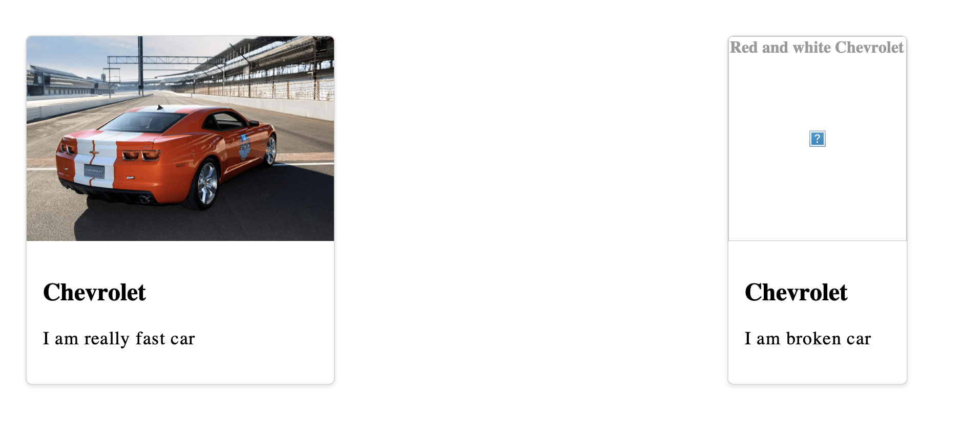
When a user visits your website, their internet connection (or a factor beyond your control) might prevent your images from downloading and, as a result, the browser shows a broken image icon and and the image’s alt text (if it’s actually there).

A broken image icon with alt text that says Red and white Chevrolet.

How about showing a custom placeholder instead? You can pull this off using ::before and ::after with a bit of CSS positioning.

Two card elements, both with a large image, a title, and a description. The card on the left has a red Chevrolet Camaro image. The card on the right shows alt text centered in a gray placeholder area that says Red and white Chevrolet.

First, we need to use relative positioning on the image element. We are going to use absolute positioning on one of the pseudo-elements in a bit, so this relative position makes sure make sure the pseudo-element is positioned within the content of the image element, rather than falling completely out of the document flow.

img {
  display: block; /* Avoid the space under the image caused by line height */
  position: relative;
  width: 100%
}

Next, let’s create the region of the broken image effect using the image’s ::before pseudo-element. We’re going to style this with a light gray background and slightly darker border to start.

img::before {
  background-color: hsl(0, 0%, 93.3%);
  border: 1px dashed hsl(0, 0%, 66.7%);
  /* ... */
}

<img> is a replaced element. Why are you using ::before pseudo-element on it? It wont work!. Correct. In this scenario the pseudo-element will show in Chrome and Firefox when the image fails to load, which is exactly what you want. Meanwhile, Safari only shows the styling applied to the alt text.

The styling is applied to the top-left corner of the broken image.

Two card elements, both with a large image, a title, and a description. The card on the left has a red Chevrolet Camaro image. The card on the right shows alt text that says Red and white Chevrolet.

So far, so good. Now we can make it a block-level element (display: block) and give it a height that fills the entire available space.

img::before {
  /* ... */
  display: block;
  height: 100%;
}
Two card elements, both with a large image, a title, and a description. The card on the left has a red Chevrolet Camaro image. The card on the right shows alt text that says Red and white Chevrolet inside of a gray placeholder area. That area is highlighted with a red border.
Things are already starting to look better!

We can refine the style a little more. For example, let’s round the corners. We should also give the alt text a little breathing room by giving the pseudo-element full width and absolute positioning for better control placing things where we want.

img::before {
  /* ... */
  border-radius: 4px;
  content: "";
  position: absolute;
  width: 100%;
}

If you stopped here and checked your work, you might be scratching your head because the alt text is suddenly gone.

Two card elements, both with a large image, a title, and a description. The card on the left has a red Chevrolet Camaro image. The card on the right shows a gray placeholder area.

That’s because we set content to an empty string (which we need to display our generated content and styles) and cover the entire space, including the actual alt text. It’s there, we just can’t see it.

We can see it if we display the alt text in an alternate (get it?) way, this time with help form the ::after pseudo-element. The content property is actually capable of displaying the image’s alt attribute text using the attr() function:

img::after {
  content: attr(alt);

  /* Some light styling */
  font-weight: bold;
  position: absolute;
  height: 100%;
  left: 0px;
  text-align: center;
  top: 1px;
  width: 100%;
}

This is awesome! In Chrome, at least.

Two card elements, both with a large image, a title, and a description. The card on the left has a red Chevrolet Camaro image. The card on the right shows alt text inside of a gray placeholder area.

But, in Firefox, not so much.

Two card elements, both with a large image, a title, and a description. The card on the left has a red Chevrolet Camaro image. The card on the right shows alt text on top of alt text inside of a gray placeholder area.
The generated content is colliding with the actual alt text in Firefox.

A quick fix is to target the alt attribute directly using an attribute selector (in this case, img[alt]), and target similar styles there so things match up with Chrome.

img[alt] {
  text-align: center;
  font-weight: bold;
  color: hsl(0, 0%, 60%);
}

Now we have a great placeholder that’s consistent in Chrome and Firefox.

Custom blockquote

Blockquotes are quotes or an excerpts from a cited work. They’re also provide a really great opportunity to break up a wall of text with something that’s visually interesting.

There are all kinds of ways to style blockquotes. Chris has a set of five styles that go all the way back to 2007.

I want to look at another technique, one that incorporates ::before and ::after. Like we saw with the last example, we can use the content property to display generated content, and apply other properties to dress it up. Let’s put large quotation marks at the start and end of a blockquote.

Firefox 91

The HTML is straightforward:

<blockquote>
  <!-- Your text here -->
</blockquote>

A few cosmetics in the CSS:

blockquote {
  font-style: italic;
  line-height: 1.618;
  font-size: 1.2em;
  width: 30em;
  position: relative;
  padding: 40px 80px;
}

Note the position: relative in there because, as you’ll learn, it’s essential for positioning the blockquotes.

As you’ve probably guessed, we’re going to use ::before for the first quotation mark, and ::after for the closing one. Now, we could simply call the content property on both and generate the marks in there. But, CSS has us covered with open-quote and close-quote values.

blockquote::before {
  content: open-quote;
  /* Place it at the top-left */
  top: 0;
  left: 0;
}

blockquote::after {
  content: close-quote;
  /* Place it at thee bottom-right */
  bottom: 0;
  right: 0;
}

This gets us the quotation marks we want, but allow me to button up the styles a bit:

blockquote::before,
blockquote::after {
  background-color: #cccccc;
  display: block;
  width: 60px;
  height: 60px;
  line-height: 1.618;
  font-size: 3em;
  border-radius: 100%;
  text-align: center;
  position: absolute;
}

Icon Bullet List

We have ordered (<ol>) and unordered (<ul>) lists in HTML. Both have default styling dictated by the browser’s User Agent stylesheet. But with ::before pseudo-element, we can override those “default” styles with something of our own. And guess what? We can use emojis (😊) on the content property!

.name-list li::before {
  content: "😊";
  margin-right: 15px;
  font-size: 20px;
}

While this is great and all, it’s worth noting that we could actually reach for the ::marker pseudo-element, which is designed specifically for styling list markers. Eric Meyer shows us how that works and it’s probably a better way to go in the long run.

Animated toggle switch

One of the neatest tricks for styling forms is creating a toggle switch out of a standard HTML checkbox. In fact, Preethi Sam recently shared one approach for it when showing off a handful of other checkbox styling tricks using CSS masks.

True to its name, a toggle switch is used to toggle or switch between the checked and unchecked states of a checkbox element.

<form class="container">
  <label class="switch">
    <input type="checkbox" />
  </label>
</form>

The customization is all thanks to modifications added to the <input> element via the ::before and ::after pseudo-elements. But first, here is some baseline CSS for the <form> element:

.container {
  background: #212221;
  background: linear-gradient(to right, #1560bd, #e90);
  border-radius: 50px;
  height: 40px;
  position: relative;
  width: 75px;    
}
We’re not quite there, but see how the checkbox element is displayed.

We’re going to “hide” the checkbox’s default appearance while making it take up the full amount of space. Weird, right? It’s invisible but still technically there. We do that by:

  • changing its position to absolute,
  • setting the appearance to none, and
  • setting its width and height to 100%.
input {
  -webkit-appearance: none; /* Safari */
  cursor: pointer; /* Show it's an interactive element */
  height: 100%;
  position: absolute;
  width: 100%;
}

Now, let’s style the <input> element with its ::before pseudo-element. This styling will change the appearance of the input, bringing us closer to the final result.

input::before {
  background: #fff;
  border-radius: 50px;
  content: "";
  height: 70%;
  position: absolute;
  top: 50%;
  transform: translate(7px, -50%); /* Move styling to the center of the element */
  width: 85%;
}

What, wait? You’d think that ::before wouldn’t work with a replaced element, like <input>. And that’s true, but only when the input type is image which is equivalent to an <img> element. Other form controls, like a checkbox, are defined as non-replaced elements in the HTML spec.

Next, we need to create the “toggle” button and it just so happens we still have the ::after pseudo-element available to make it. But, there are two things worth mentioning:

  1. The background is a linear-gradient.
  2. The “toggle” button is moved to the center of the <input> with the transform property.
input::after {
  background: linear-gradient(to right, orange, #8e2de2);
  border-radius: 50px;
  content: "";
  height: 25px;
  opacity: 0.6;
  position: absolute;
  top: 50%;
  transform: translate(7px, -50%);
  transition: all .4s;
  width: 25px;
}

Try clicking on the toggle button. Nothing happens. That’s because we’re not actually changing the checked state of the <input>. And even if we were, the result is… unpleasant.

The fix is to apply the :checked attribute to the ::after pseudo-element of the <input>. By specifically targeting the checked state of the checkbox and chaining it to the ::after pseudo-element, we can move the toggle back into place.

input:checked::after {
  opacity: 1;
  transform: translate(170%, -50%);
}

Gradient border

We can decorate images with borders to make them stand out or fit more seamlessly within a design. Did you know we can use a gradient on a border? Well, we can with ::before (there are other ways, too, of course).

The core idea is to create a gradient over the image and use the CSS z-index property with a negative value. The negative value pulls the gradient below the image in the stacking order. This means the image always appears on top as long as the gradient has a negative z-index.

.gradient-border::before {
  /* Renders the styles */
  content: "";
  /* Fills the entire space */
  position: absolute;
  top: 0;
  left: 0;
  bottom: 0;
  right: 0;
  /* Creates the gradient */
  background-image: linear-gradient(#1a1a1a, #1560bd);
  /* Stacks the gradient behind the image */
  z-index: -1;
}

figure {
  /* Removes the default margin */
  margin: 0;
  /* Squeezes the image, revealing the gradient behind it */
  padding: 10px;
}

Gradient overlays

This is similar to what we did in the previous example, but here, we’re applying the gradient on top of the image. Why would we do that? It can be a nice way to add a little texture and depth to the image. Or perhaps it can be used to either lighten or darken an image if there’s text on top it that needs extra contrast for legibility.

While this is similar to what we just did, you’ll notice a few glaring differences:

figure::before {
  background-image: linear-gradient(to top right, #1a1a1a, transparent);
  content: "";
  height: 100%;
  position: absolute;
  width: 100%;
}

See that? There’s no z-index because it’s OK for the gradient to stack on top of the image. We’re also introducing transparency in the background gradient, which lets the image bleed through the gradient. You know, like an overlay.

Custom radio buttons

Most, if not all, of us try to customize the default styles of HTML radio buttons, and that’s usually accomplished with ::before and ::after, like we did with the checkbox earlier.

Firefox 91

We’re going to set a few base styles first, just to set the stage:

/* Centers everything */
.flex-center {
  align-items: center;
  display: flex;
  justify-content: center;
}

/* Styles the form element */
.form {
  background: #ccc;
  height: 100vh;
  width: 100%;
}

/* Styles the inputs */
.form-row {
  background: #fff;
  border-radius: 50px;
  height: 40px;
  margin: 10px;
  overflow: hidden;
  position: relative;
  width: 150px;
}

Now let’s remove the default styling of the radio buttons, again, with appearance: none;

.form-input {
  -webkit-appearance: none; /* Safari */
  appearance: none;
}

::before should be positioned at the top-left corner of the radio button, and when it’s checked, we change its background color.

.form-input::before {
  /* Renders the styles */
  content: '';
  /* Shows that it's interactive */
  cursor: pointer;
  /* Positions it to the top-left corner of the input */
  position: absolute;
  top: 0;
  left: 0;
  /* Takes up the entire space */
  height: 100%;
  width: 100%;
}

/* When the input is in a checked state... */
.form-input:checked::before {
  /* Change the background color */
  background: #21209c;
}

We still need to iron a few things out using ::after. Specifically, when the radio button is checked, we want to change the color of the circular ring to white because, in its current state, the rings are blue.

.form-input::after {
  /* Renders the styles */
  content: '';
  /* Shows that it's interactive */
  cursor: pointer;
  /* A little border styling */
  border-radius: 50px;
  border: 4px solid #21209c;
  /* Positions the ring */
  position: absolute;
  left: 10%;
  top: 50%;
  transform: translate(0, -50%);
  /* Sets the dimensions */
  height: 15px;
  width: 15px;
}

/* When the input is in a checked state... */
.form-input:checked::after {
  /* Change ::after's border to white */
  border: 4px solid #ffffff;
}

The form label is still unusable here. We need to target the form label directly to add color, and when the form input is checked, we change that color to something that’s visible.

.form-label {
  color: #21209c;
  font-size: 1.1rem;
  margin-left: 10px;
}

Click the buttons, and still nothing happens. Here what’s going on. The position: absolute on ::before and ::after is covering things up when the radio buttons are checked, as anything that occurs in the HTML document hierarchy is covered up unless they are moved to a new location in the HTML document, or their position is altered with CSS. So, every time the radio button is checked, its label gets covered.

You probably already know how to fix this since we solved the same sort of thing earlier in another example? We apply z-index: 1 (or position: absolute) to the form label.

.form-label {
  color: #21209c;
  font-size: 1.1rem;
  margin-left: 10px;
  z-index: 1; /* Makes sure the label is stacked on top */
  /* position: absolute; This is an alternative option */
}

Wrapping up

We covered seven different ways we can use the ::before and ::after pseudo-elements to create interesting effects, customize default styles, make useful placeholders, and add borders to images.

By no means did we cover all of the possibilities that we can unlock when we take advantage of these additional elements that can be selected with CSS. Lynn Fisher, however, has made a hobby out of it, making amazing designs with a single element. And let’s not forget Diana Smith’s CSS art that uses pseudo-elements in several places to get realistic, painting-like effects.


The post 7 Practical Uses for the ::before and ::after Pseudo-Elements in CSS appeared first on CSS-Tricks. You can support CSS-Tricks by being an MVP Supporter.

Revealing Critical App Bugs Before the Launch: Methods and Tips

A bug a day keeps users away. That is the mantra that all developers must live by. When writing thousands of lines of code, however, some slip-ups are bound to occur.

This is where you and I, the quality analysts come in. Developers often dislike us because nobody wants to be told that their creation has a problem right after they finish making it.

How To Build Your Own Mouseless Development Environment

Once upon a time, in the magical land of Software development, there was a young developer, your humble servant, discovering Linux for the first time. Suddenly, I had access to the Linux shell, a tool offering many ways to automate everything I didn’t want to do again and again.

But Ubuntu wasn’t without drawbacks. I was often the victim of display bugs and crashes, and it was getting slower and slower as time passed.

One day, something terrible happened: I had to update Ubuntu to its next major version. Everything crashed. I couldn’t start my system anymore. I had no idea how I could solve the problems I was facing because I had no idea how Linux was working under the hood. Ubuntu was abstracting all the nitty-gritty for me not to care about it.

I had to reinstall everything manually — Ubuntu and all my tools. The worst part was reconfiguring everything. All and all, it took me days to get back to the system I had before the crash. But I didn’t know any other alternative, so I kept using Ubuntu for years. During this time, I’ve never managed to update it to its next major version without the need to reinstall everything manually, again and again.

My life as a developer changed again when my company hired two great developers. They knew a lot about Linux and the different distributions I could use. They guided me, showed me the tools which solved all the problems I had with Ubuntu. These tools improved my workflow drastically; they showed me how practical it was for a developer to keep the hands on the keyboard as much as possible.

This happened six years ago. I still use the same development environment today. I use the keyboard 92.8% of the time to manage all my tools, using keystrokes that make sense and which are easy to remember. I can reinstall my whole system with a bunch of scripts I’ve written, including all the tools I use and their configurations.

Today, I’d like to share with you these tools so that you too can increase your efficiency and your comfort in your daily job. They work well together — shaping what I call my Mouseless Development Environment. More precisely, we’ll discuss:

  • Why using the Linux shell can be very powerful when working with plain text (including code);
  • Why using the dreaded Arch Linux;
  • The advantage of a tiling window manager;
  • How to have a great terminal experience with URxvt, tmux, and tmuxp;
  • Why Vim can become your best friend.

Note: The tools I advocate in this article work on Linux-based systems. You can also use them with macOS except for i3. For Windows, the easiest way is to use the Windows Linux Subsystem (WSL) to install and use them.

I would have never discovered this new way of working without trying these tools. That’s why I encourage you to install them, experiment with them, and see by yourself if you fall in love as I did.

Mouseless With The Shell

As a developer, it’s almost impossible to avoid using a shell. This is a powerful tool that can simplify your workflow by automating away all the boring tasks.

The Benefits Of The Shell

Before speaking about the benefits of using the shell and the terminal, let’s explain briefly what’s the difference between these two ideas.

The terminal is a graphical interface that allows you to interact with the shell. On Linux, this shell is often Bash, but it can be another one too, e.h. Zsh. The shell is an interpreter. You can feed it with commands and it will execute them to perform some actions. It will also, sometimes, give you an output back. The terms “command-line” and “shell” are synonyms.

If we would compare the Mouseless Development Environment to the solar system, the shell would be the sun and everything else would turn around it. It’s because the shell is really powerful: it allows you to run many small programs which work very well together. They’re called CLIs (Command-Line Interfaces).

The big advantage of these tools: they are very simple and limited in isolation, but you can chain them for powerful results. For example, you can use altogether the CLIs “history”, “sort”, “uniq” and “head” to display the CLIs you use the most and the frequency of their use.

There are many CLIs available out there. First, because the Linux shell is around for a long time; developers had time to develop many tools and make them reliable. Second, because it’s easier to develop CLIs than GUIs (Graphical User Interfaces). Designing and implementing these graphical interfaces takes a lot more work. CLIs have only textual interfaces, which are easier to develop, to change, and to maintain.

It’s also why CLIs are fast: no need to mess up with the display and other graphical elements. It was one of my main problems with Ubuntu: its desktop environment, Unity, was quite heavy, slow, and buggy. At least in my experience. Using more GUIs on top made things worse.

Another big advantage of the command-line: you can write shell scripts to automate all the boring tasks you repeat day after day. For example, if you need to resize images to the same size very often, you can write a script for that. If you often search in some specific type of files, you can automate that too. The sky’s the limit.

CLIs have drawbacks, too. It’s a bit more daunting to use for beginners, but there are ways to get quickly what you need even if you don’t know how to use a specific CLI.

Finally, if you have some tasks to do on remote servers, you’ll often end up using the shell. They don’t have any graphical interface most of the time, so you won’t have any choice. In these cases, it’s necessary to know your way around the command-line.

A Mouseless Approach

Because the shell has a textual interface, your hands stay on your keyboard when you use it. This is something I never really considered during my first years as a developer, but it’s a big advantage.

In my experience, avoiding the hundreds of hand movements between the keyboard and the mouse saves a lot of cognitive energy. I was shocked to discover how comfortable it was when I really tried to stick to my keyboard. As a bonus, I feel like a hacker using solely my keyboard with my shell, even if I only write my shopping list! How great is that?

I have to admit, I was very skeptical about this “mouseless” idea before trying it. With the tools I describe below, I didn’t have to change all my habits from one day to another: you can use the mouse with them, too. But they really shine when they’re managed with the keyboard.

Even if it was never really proved, I also believe that staying on the keyboard makes us more efficient. As the book The Pragmatic Programmer pointed out:

“Using only keystrokes for common editing operations is more efficient than mouse or menu-driven commands because your hands never leave the keyboard.”

That being said, efficiency is not the main goal here. I love staying on my keyboard and using all these tools because I can entirely focus on the tasks at hand. It motivates me to start working and get my tasks done.

The Bedrock: Arch Linux

At the beginning of my mouseless journey, one of my new friends advised me to use Arch Linux instead of Ubuntu. Again, skepticism was creeping, doubts were invading my poor brain. Arch Linux? This horrible Linux distribution you need to install and configure entirely manually? This unstable system became a joke for many?

Sometimes, stereotypes have nothing to do with reality, and Arch Linux is the perfect example for this idea. I’ve used Windows (from 98 to 7), macOS, and I tried other Linux distributions too. My conclusion, without doubt: Arch Linux is the most stable of all.

That being said, Arch Linux it’s not a requirement for a Mouseless Development Environment. You can use all the other tools described in this article with other Linux distributions, too. You can also use them with macOS (except i3), or Windows if you have the Windows Subsystem for Linux (WSL). But, before you do so, let me tell you why you should seriously consider Arch Linux.

A Rolling Release System

Arch Linux has a rolling release system. It means that you need to update your whole system often, weekly or bi-weekly. To come back to Ubuntu, it has a long-term support system: you only need to update it a couple of times a year, or even less if you want to.

Many developers think that a rolling release system makes your development environment unstable, which explain partly the reputation of Arch Linux. But I never had a problem in six years of daily use, and my friends using it either. On another side, the advantages of a rolling system are great:

  • All the applications I use are constantly up-to-date. No need to compile them manually to have the most recent version when needed.
  • Updating your system often means that less changes will be introduced at once. As a result, there are less chances for crashes, too.

I told you my experience with Ubuntu and the crashes I had when updating it. I never had any problem with Arch Linux.

Everything You Need

Additionally, the repositories of Arch Linux are huge. It’s very likely that you’ll find every tool you need in there. If you don’t, you can look at the AUR (Arch User Repositories), where there is everything else. The AUR is not an official repository, so there could be some security problems with the applications found there. Again, I never had any problem with them, but it’s possible. As long as you stick to the official repositories and you don’t install everything and anything from the AUR, you won’t have any problem.

A Learning Opportunity

Let’s also mention that Arch Linux is a very minimal distribution. It doesn’t impose many useless applications when you install it. Speaking of which, you need to install the whole distribution manually using the shell. The task can feel daunting but, on the other side, you’ll learn a lot from the experience.

As I mentioned at the beginning of this article, knowing a minimum of how Linux-based systems work under the hood can help you when your system is behaving weirdly, or when it crashes. It’s not as complex as it might seem and, if you’re a developer, I would argue that it’s mandatory. The Web, your phone, or your Raspberry Pie run on Linux nowadays.

Last but not least, the Arch Wiki is the best place you can find for anything Linux-related. It helped me a lot over the years, even when I was using Ubuntu. It’s a great place for troubleshooting your system and finding new tools.

Managing Your Windows With i3

Now that we reviewed why Arch Linux can be a solid bedrock for your Mouseless Development Environment, let’s see what we can add on top.

But first, a bit of theory. Operating systems have often three layers, more or less coupled with each other:

  1. The kernel, which directly dabbles with the hardware of your computer;
  2. The shell, an interface for you, or some applications, to interact with the kernel;
  3. A display layer on top, like a desktop manager or a tiling windows manager.

Gnome or Unity are both desktop managers for Linux-based systems. They manage your windows and many other things, like your status bar or your application launcher. Tiling windows managers are an alternative to desktop managers, and they’re often smaller and more focused on manipulating windows.

The tiling window manager i3 is indeed very light: I’m using it right now on a ten-year-old computer (Lenovo x220) and it doesn’t slow down. It’s also simple to use, the documentation is great, and most importantly, you can manage your windows with your keyboard only (if you want to).

The basics of i3 are simple: you can open windows in different workspaces representing an entire screen. It’s very similar to the virtual desktops many Linux desktop managers have. Then, when you open your favorite applications, the screen will be automatically shared depending on the number of windows on the screen.

For example, if you open Firefox, its window will take 100% of the screen. If you open three instances of Firefox, each of them will take 33% of the screen.

You can also change the layout of the windows. Instead of having all the window visible on the screen, you can stack them on each other and go through them with a simple keystroke. If you need some “normal” floating windows, you can configure them too.

The goal of i3 is to simplify the management of all your windows. Instead of using your mouse to move them and resize them each time you open new ones, you can use keystrokes to do the same operation only when you need to.

Does it look too complicated? I was efficient with i3 two days after trying it. I’m no genius; if I could do it, you can do it, too.

The cherry on the cake: like every tool described in this article, you can customize i3 and its keystrokes as your heart’s content.

The only drawback of i3: it’s not available for macOS. But there are great alternatives, like the tiling windows manager Amethyst or Divvy.

Level Up Your Terminal With URxvt, tmux, And tmuxp

The terminal is the interface giving you access to the shell. Even if the shell is the real deal, we can make it easier to use with a couple of tools.

The Path of Simplicity With URxvt

I like simplicity, and that’s partly why I love the development environment I describe in this article. Speaking of which, URxvt is one of the simplest terminals you can find. It’s also fast and reliable. In six years, I never saw it crashing or even slowing down. It does what it’s supposed to do: allowing you to use the shell. No more, no less.

The Terminal Multiplexer With tmux

Even if I like the simplicity of URxvt, I also like having a good terminal multiplexer I can rely upon, like tmux.

What’s a terminal multiplexer? It lets you open sessions containing multiple shells. These sessions are persisted in the background: even if your terminal crashes or if you close it by accident, your shells won’t disappear. You can recover them in another terminal whenever you want (as if nothing happened).

This is useful on your local computer, but it’s even better on a remote server. You can, for example, connect to a server via SSH, run a script, close your SSH connection and your terminal on your local machine, and go home. Because your shell is still running on your server thanks to tmux, your script will still run, too.

That’s not all: tmux is a bit of a jack-of-all-trades, in a good sense. You can use it to open multiple windows containing multiple panes in one terminal. You can think of a window as the entire terminal, and a pane as a shell taking a percentage of the window.

Does it remind you of i3? It follows the same principles, but it can only create new shells. That’s why many users who are happy with i3 don’t see any point in using tmux. Personally, I like to use both.

As always, you can manipulate tmux’s windows and panes with your keyboard, and you can configure tmux itself following your craziest wishes.

tmuxp

Let’s imagine that you want to use tmux for the disrupting application you’re developing right now. You need first to open a terminal. Then, you need to create as many tmux’s windows as you need and divide these windows with the panes you want.

Remember: A pane represents a shell. In each of these shells, you can then run all the CLIs you need for a specific project: for example, running a docker container, or displaying some logs.

But you can also automate all of that, and it’s where the real power of tmux — in the context of a development environment — really shines. Using another CLI called tmuxp, you can write down in a YAML configuration file what windows, panes, and whatever command you want. Then, you can load this configuration and create automatically your customized tmux session.

I have one of these configuration files for each of my projects. It saves me a lot of time and energy. As I was saying above, this is one of the major benefits of using the shell.

Editor Plus Shell Equals IDE

Since the shell is so powerful, why not have an editor directly running in it? Why not use Vim?

Like Arch Linux, Vim has the reputation to be hard to learn. It’s more subtle: it’s pretty easy to be productive with it, but it takes a long time to master. If you run Linux and you have Vim installed, you can learn the basics in 20 minutes by running vimtutor in your shell.

Vim offers many functionalities which can be extended further with countless plugins. Additionally, you can directly interact with your shell using Vim, using whatever CLI you want directly in your editor. It will transform Vim into a full-blown IDE.

Vim has another big advantage: you can use it to develop in many programming languages. I don’t like to switch between different IDEs each time I need to program in PHP, Golang, or Clojure. The interface is different, I need to configure each of these editors separately, and I can’t really save the configurations somewhere to use it again when I reinstall these tools.

With Vim, I can code in any language I want while staying in the same editor. Like VS Code, you can use LSPs (Language Server Providers) to enable auto-completion, linting, and automatic refactoring for the most common programming languages (and even more esoteric ones).

Vim is also fast. It doesn’t require many resources to run. I often have 6 or 7 instances of the editor open at all times on my old computer — without any problems. In comparison, I used IntelliJ IDEs for years and, when I was opening two of them, my whole system was beginning to slow down. It’s really practical when I work on different projects at the same time, like a bunch of microservices, for example.

Should I add that Vim is highly configurable? Instead of having many functionalities directly in your IDE (including some you’ll never use), you can choose what you exactly need and discard what you don’t.

A Set Of Coherent Keystrokes

If Arch Linux is the bedrock of my Mouseless Development Environment, then i3, Zsh, tmux, and Vim are the workbenches for my creative needs. It gives me a level of comfort I’ve never experienced with any other tools.

But you might wonder why you should use all these new tools and their keystrokes when you can already use the shortcuts for the tools you already know?

Well, the shortcuts of most applications out there are often meaningless. It’s a soup of keys that have no relations with each other. As a result, they are hard to remember, and they can be quite different from one tool to another.

The tools I describe in this article are meant to fit nicely with each other. You can almost use the same keystroke for each of them. Only one key will differ, for the system to know what tool you want to act on. It makes the different keystrokes way easier to remember.

Additionally, Vim was designed to have keystrokes that make sense by creating a simple language that you can rely upon. For example, in order to delete a word, you can hit daw. To delete a paragraph, it’s dap. Since many CLIs are based on Vim’s keystrokes, learning Vim will open the door to many other CLIs.

Installing Automatically Your Mouseless Development Environment

Installing Arch Linux manually is good to learn a lot about Linux-based systems, but it gets old when you need to do it each time you want to install your system on a new computer. That’s why I’ve created my own scripts to install my whole Mouseless Development Environment. They install Arch Linux as well as all of the tools I use with their configurations. When I need to use a new computer, I can simply run these scripts, and voila!

Are You Ready To Be A Mouseless Developer?

Because of the flexibility, I have with my development environment, I can also switch tools easily. For example, if I don’t want to use tmux anymore, I can replace it with another terminal multiplexer. If I don’t like i3’s status bar or my application launcher, I can replace them, too.

As you might have guessed, configuring this kind of system needs some time, motivation and effort. That’s why I wrote a book called “Building Your Mouseless Development Environment”. It describes in detail how to configure all the tools, how to create scripts to install the whole system with one command, and how to customize everything for your personal needs. If you don’t know much about the Linux shell, it lets you build a custom project to get familiar with it.

If you’re interested, you’ll find a sample of the book here as well as its entire table of content.

I think the best way to find out if you’d like this kind of system is simply to try it. I can guarantee you one thing: you’ll learn a lot along the way!

Further Reading on Smashing Magazine

How to run a Python script as a service in Windows?

I am sketching the architecture for a set of programs that share various interrelated objects stored in a database. I want one of the programs to act as a service which provides a higher level interface for operations on these objects, and the other programs to access the objects through that service.

I am currently aiming for Python and the Django framework as the technologies to implement that service with and I'd like to know if it's possible to run a Python programs as a Windows service (i. e. run it automatically without user login)?

I have little experience with Windows programming and no experience at all with Windows services.

Thank you

Video optimization for the web simplified with ImageKit

It is easy to convey a complex idea through a video.

For example, this landing page of a developer-focused tool demonstrates the real-time resizing of images using URL parameters. However, to present the same idea using a static image would have been slightly tricky.

There are obvious benefits of using videos in terms of getting user’s attention. But, using videos on the web introduces performance problems. Video files use more bytes and take longer to transfer. This becomes a problem for viewers, especially on mobile phones with slow network connection speed.

As web developers, we need to ensure that the viewer experience doesn’t deteriorate because our marketing team wants to use videos. This reiterates the fact that video optimization for the web is an inevitable concern.

What is video optimization?

Simply put, video optimization is a set of techniques to reduce video size in bytes without negatively impacting perceived video quality. We will talk about how you can use different techniques in this post.

Importance of optimizing videos on the website

Before we jump right into the core, Here’s an interesting fact: The median video bytes have increased from 768KB to 2.0MB on mobile in the last two years on 7.4M URLs analyzed by httparchive.org.

This trend will continue in the future as more and more businesses leverage videos to gain user attention.

If we optimize videos, it can have a substantial bandwidth saving that will translate into better website performance which in return will improve the user’s experience.

Techniques to optimize video for the web

First, let me give you a cheat sheet that you can refer to, and then we will talk about each of the following items in more detail:

  1. Correct preload attribute value:
    1. If there is a high chance that the video will be watched, use preload:auto. This will leave the decision to load video content to the browser.
    2. If there is a low chance that the video will be watched, use preload:none. It won’t load any bytes. For third-party videos embedded on your page, always use this.
    3. If you are unsure and want to balance playback speed and bandwidth consumption, use preload: metadata. This will only load metadata, allowing the browser to issue a byte-range request later to start playback.
  2. Remove audio from silent videos It might sound obvious. Still, there is a good chance that you are using muted attribute and the underlying video file has an audio channel that is consuming extra bytes. Using ImageKit.io, you can pass ac-none query parameters in the URL to remove the audio channel.
  3. Load correctly sized videos Now, this is a very important point. Consider this, delivering a small size video on mobile compared to desktop. The video will download faster, use less data on mobile (of course, less battery consumption). Using ImageKit.io’s URL-based video manipulation parameters, you can resize the video to the desired dimension in the HTML without dealing with any resizing software.
  4. Compress videos the right way You should compress the video and export it to multiple video formats, including WebM, MPEG-4/H.264. It is essential to do this right as any hiccup here can hurt the user’s experience & the content conveyed. We will learn soon how you can automate this completely using ImageKit.io without writing any code.
  5. Optimize <source> order Put the smallest video first and the largest last. For example, video compressions in three different formats at 10MB, 12MB, and 13MB declare the smallest first and the largest last.
<video width="400" height="300" controls="controls">
  <!-- WebM: 10 MB -->
  <source src="video.webm" type="video/webm" />
  <!-- MPEG-4/H.264: 12 MB -->
  <source src="video.mp4" type="video/mp4" />
  <!-- Ogg/Theora: 13 MB -->
  <source src="video.ogv" type="video/ogv" />
</video>
  1. Ensure there is no wasteful downloading of videos While implementing webpage for desktops, we often forget about small screen devices. If you do not want to play video on the small screen, ensure that the video element is not visible by display:none so that browser doesn’t trigger any video requests for mobile devices.

Automate video optimization and simplify resizing

If you are someone using a good number of videos on your website optimizing them one by one for the varied set of user devices might seem a tedious task! And thus this calls for automating video optimization for optimal performance.

ImageKit.io is a cloud-based service that offers URL-based video APIs to resize and optimize video assets.

Most of the methods you have learned so far are related to correct attributes and CSS classes. However, the three most important ones require you to modify the video content:

  1. Load correctly sized videos. It means multiple variants based on the device.
  2. Compress video using correct codec and format.
  3. Remove audio from silent videos.

Tools like FFmpeg can help you with the above three tasks, but it will be cumbersome if you have tons of videos. Not to mention hundreds of options in the FFmpeg manual will not make your job easy.

ImageKit.io’s video API to rescue!

Real-time video resizing API

ImageKit offers comprehensive capabilities covering all the commonly used video transformations you will need for your web applications.

Here are a few examples:

Resize videos – Basic height & width manipulation

Let’s assume we have an original video which is 1280x720px

<https://ik.imagekit.io/demo/sample-video.mp4>

To get a 300px wide video, we will add a tr query parameter with value w-300 as shown below:

https://ik.imagekit.io/demo/sample-video.mp4?tr=w-300

Notice that height is automatically adjusted to maintain the aspect ratio.

Similarly, you can use the h (height) parameter to adjust the video’s height and width according to aspect ratio.

Cropping & preserving the aspect ratio

If only one of the height(h) or width(w) is specified, then ImageKit.io adjusts the other dimension accordingly to preserve the aspect ratio, and no cropping occurs.

But when you specify both height(h) and width(w) dimension and want to preserve the aspect ratio – you have the following three options:

  • Crop some part of the video. You can choose which area to crop by controlling the focus point.
  • Add padding around the video. You can control the background color of the padding to match the layout.
  • Let ImageKit change either height or width so that the whole video content is visible. In this case, only one of the heights or widths matches the request dimension.

ImageKit offers a wide variety of video cropping strategies to get your desired output. Let’s understand different cropping options with examples.

No cropping – forcefully fitting the image in requested dimensions.

If you need an image in the exact dimension as requested, even if the aspect ratio is not preserved, use the c-force parameter.

URL – https://ik.imagekit.io/demo/sample-video.mp4?tr=w-200,h-200,c-force

Notice that the aspect ratio is changed and the video looks squeezed.

Default center cropping

This is the default crop strategy. If nothing is specified in the URL, this strategy gets applied automatically. The output video’s dimension (height and width) in this strategy is the same as requested, and the aspect ratio is preserved. This is accomplished by resizing the video to the requested dimension and then cropping extra parts to get desired height & width.

URL – https://ik.imagekit.io/demo/sample-video.mp4?tr=w-400,h-200

Notice that the video’s dimension matches 400×200, but the content is cropped from all edges, i.e., by default, ImageKit will extract the video from the center. You can change this behavior using the focus parameter.

Fit inside the container (no cropping)

If you want the image to fit inside the requested height & width container, use c-at_max.

In this case, full video content is preserved, i.e., no cropping happens, the aspect ratio is maintained, but the resulting height & width might differ from what is requested. Let’s see how.

The output video is less than or equal to the dimensions specified in the URL, i.e., at least one dimension will exactly match the output dimension requested, and the other dimension will be equal to or smaller than the corresponding output dimension requested. This ensures that the output video fits nicely inside the requested height & width container.

It is equivalent to object-fit:contain or background-size:contain CSS properties.

URL – https://ik.imagekit.io/demo/sample-video.mp4?tr=w-200,h-200,c-at_max

Notice that the aspect ratio is maintained, and there is no cropping. But the height is reduced so that the video fits within a 200×200 container.

Fill container (no cropping)

If you want the video to cover the whole container, use c-at_least. The entire video content is preserved, i.e., no cropping, the aspect ratio is maintained, but the resulting height & width might be different from what is requested.

One of the dimensions will be the same as what is requested, while the other dimension will be equal to or larger than what is asked for.

It is roughly equivalent to object-fit:cover or background-size:cover CSS properties.

URL – https://ik.imagekit.io/demo/sample-video.mp4?tr=w-200,h-200,c-at_least

Notice that the height is 200px as requested, but the width is more than 200px. The aspect ratio is maintained, and there is no cropping.

No cropping – add padding around the image.

If you don’t want the video to be cropped while maintaining the aspect ratio, you can add padding around the edges to get the desired dimension. You can also control this padding’s background color to match it with your website layout and theme.

https://ik.imagekit.io/demo/sample-video.mp4?tr=w-400,h-200,cm-pad_resize,bg-F3F3F3

The video is exactly 400×200, and there is no cropping. Extra padding with background color F3F3F3 has been added to get 400×200 output dimensions.

Compress videos – Automatic video optimization

ImageKit.io offers multiple video optimization features that work out of the box. For example, automatic best format selection and quality optimization reduce the final size of the output video.

  • Automatic video format conversion
  • Quality optimization

Automatic video format conversion

Format optimization is the process of delivering the best video format to the end-user while taking into account various factors such as requesting device capabilities, browser support for certain video formats, and your preferences. Ensuring the right format helps you reduce the size of the video and, subsequently, the playback time.

MP4 using H.264 is widely supported; however, support for WebM (vp9) is limited.

ImageKit chooses between H.264 and VP9 codec and automatically delivers the video in the appropriate format based on browser support. The video URL remains the same, but the file is modified. This behavior is transparent for your users. The result is a small video file and a faster playback time.

You can turn this on with a single click, and format conversion will be automatic. That’s how simple video optimization is with ImageKit.

Video Quality optimization

There is a trade-off between visual quality and file sizes. However, it is possible to compress a video file without any loss in perceptual visual quality.

ImageKit.io allows you to choose a quality level between 1 and 100. 1 results in the lowest perceptual quality and smallest file size. 100 results in the highest perceptual quality and biggest file size.

You can set a default video quality once, and all videos will be compressed using this value.

Remove audio from silent videos

With the audio codec (ac) parameter, you can remove the audio channel from the video file. This is going to optimize your videos and make them lighter.

Set ac-none in the URL like this:

https://ik.imagekit.io/demo/sample-video.mp4?tr=ac-none

Conclusion

Well, that’s it. We have covered an exhaustive list of techniques to master video optimization on the web. If you have stayed till the end, it means you are serious about optimizing videos on your website.

ImageKit has been empowering 700+ companies and more than 60,000 developers across the globe in handling their media.

It’s your turn now; Sign-up for a forever free account with ImageKit and start optimizing your media today!

The post Video optimization for the web simplified with ImageKit appeared first on Codrops.

What scans can I use to complement my first scan?

I'm currently studying a peneteration/hacking course. I am trying to use nmap against a target to find all the ports that are filtered.

I thought if I used an ACK-scan nmap would give me all the filtered ports. I used
nmap -sA -p- target
and the result was All the 65535 ports scanned are unfiltered. Is this even reasonable? What other scans can I use to complement my first scan?

How to Set Up Business Call Forwarding From Your Website

Do you want to set up business call forwarding from your website?

For many small businesses, calls from potential customers generate significant sales and revenue. This is why it’s important to properly set up business call forwarding from your website.

In this article, we will share a step by step guide on how to easily set up business call forwarding from your WordPress site.

Setting call forwarding from your website

What Do You Need to Set Up Business Call Forwarding from Your Website?

Normally, you can just add a phone number to your WordPress website or online store. Your website visitors can use the phone number to make a call.

However, regular phone services don’t come with advanced features like call forwarding, business hours, call waiting, etc. Plus, they cost a lot more even for even basic features like basic call forwarding.

For proper business call forwarding, you’ll need a smart business phone service provider.

We recommend using Nextiva. It is the best business phone service on the market and allows you to easily manage your business calls at much lower costs than landline or mobile phone services.

Note: We use Nextiva at WPBeginner for our business phone number.

Nextiva website

Nextiva provides VoIP phone service, which means instead of landlines it uses the internet to make and receive phone calls.

Using VoIP allows you to reduce costs and take advantage of advanced features like call forwarding, call recordings, voicemail, call waiting, and more. Plus, you can choose a number in any location or get a toll-free number.

More importantly, you can manage calls on your existing mobile phone, computers, or even a desk phone too.

You can even share one number with multiple team member which is great for remote teams like ours.

That being said, let’s take a look at how to set up business call forwarding from your website.

Setting Up Business Call Forwarding

First, you need to sign up for a Nextiva account. During sign up, you’ll be allowed to choose a business phone number, and you can also connect your existing phone number as well.

Once you have set up your account, you can make and receive calls from your business phone number on whatever device you choose.

After that, you can set up call forwarding for your website.

Simply head over to Users » Actions » Voice Settings page and select Forwarding from the left menu.

Selective call forwarding

From here, you can enter any phone number under the ‘Call forward (selective)’ section.

Below that, you can choose when to forward a call by clicking on the Forwarding Conditions. You can add conditions based on schedule, by phone number, and more.

Forwarding conditions

Apart from selective call forwarding, you can also set up always-on call forwarding, busy call forwarding, or forward calls when unanswered.

Additional call forwarding options in Nextiva

Once you have set up call forwarding, don’t forget to test it out before adding it to your website.

Adding a Click to Call Option in WordPress

Now that you have enabled business call forwarding, you may want to add click to call buttons to your website.

First thing you need to do is install and activate the WP Call Button plugin on your site. For more details, see our step by step guide on how to install a WordPress plugin.

Upon activation, you need to visit Settings » WP Call Button page to configure plugin settings.

WP Call button settings

The plugin comes with a sticky button that floats on-screen across your website. You can hide or show it on certain posts or pages. You can also choose to show it only on mobile devices.

If you would like to display the button manually, then you can switch to the Static Call Button tab. From here, you can choose button settings and copy a shortcode.

Static button

Once you are finished with settings, you can also add a sticky call button in your posts and pages using a block or a widget.

Adding call button using block editor

In the block settings, you can choose colors, text size, alignment, and show or hide the phone icon.

Once you are finished, you can save your changes and visit your website to see your call now button in action.

Call button preview

For more ways to add a clickable phone number in WordPress, see our tutorial on how to add a click to call button in WordPress.

Your users can now click to call your phone number and their calls will be forwarded based on your call forwarding settings.

We always recommend website owners to provide more than one way for customers to contact your business. Along with phone, it’s a good idea to have a contact form and if possible offer a live chat or chatbot solution on your site.

We hope this article helped you learn how to set up business call forwarding from your website. You may also want to see our see our guide on how to track button clicks in WordPress, and our expert comparison of the best email marketing services.

If you liked this article, then please subscribe to our YouTube Channel for WordPress video tutorials. You can also find us on Twitter and Facebook.

The post How to Set Up Business Call Forwarding From Your Website appeared first on WPBeginner.

How Web Development Tools Are Helping Users Keep Pace With Rapid Change

Several years ago, I wrote about website builders for a living. Yes, that’s a thing. Back then there seemed to be a gulf between drag-and-drop tools and full-blown web development. Today, it’s heartening to see the likes of Wix adding more code-heavy options to their repertoire.

Judging by Velo by Wix’s report, I’m not alone in feeling that way.

The Covid-19 pandemic has forced much of the world online. Billions of people have been working, dating, and doom scrolling on the web more than ever before. To meet this change, businesses have been beefing up their online offering. Demand for web developers and development tools is higher than ever.

The team at Velo by Wix — which offers a full-stack Rapid Web Development platform — wanted to examine what this mass digital migration means for the industry. What web development platforms are being used? Who are they being used by, and why?

To answer those questions, Velo has conducted a survey of 1,200 developers and the resulting Rapid Web Development Report is pretty fascinating. In the space between drag-and-drop website builders and from-the-ground-up development, there’s an awful lot of demand, and not always for the reasons you might expect.

What Are Rapid Web Development Platforms?

Before getting into the meat and potatoes of the report, we should be clear on how Velo defines Rapid Web Development (RWD). In the broadest sense, it means using builders or tools that streamline the development process.

We all recognize the spectrum these things sit on, even if we haven’t put a name to it. From no- and low-code platforms like Wix and Weebly to techier visual tools like, well, Velo by Wix, they’re what we use when we want or need to quickly build sites and web apps — without coding everything from scratch.

Convenience and accessibility have long been the selling points of Rapid Web Development platforms. They handle many of the foundational aspects of sites so developers (or business owners, bloggers or activists) can focus instead on the functionality of their project.

They provide ready-made or built-in solutions for many aspects of the site. These include:

  • Infrastructure
  • Databases
  • Content management
  • Design
  • Servers
  • Security and privacy
  • Deployment
  • Maintenance
  • Business solutions
  • Search engine optimization

In short, they take care of the foundations while still giving control. Each of the aspects listed above could be full-time jobs on their own (at Smashing Magazine we’ve published enough articles on them to know), so the value of assistive tools is undeniable.

Key Findings

Let’s cover the key points before getting into the nitty-gritty. The report uses data from 1,200 respondents, 60% of whom describe themselves as entrepreneurs or freelancers. Together with agencies, these make up the majority of RWD users.

Those surveyed typically use Rapid Web Development platforms to support and grow their businesses, with speed, flexibility, and cost-effectiveness being their main appeals — especially in the Covid-19 era. Convenience trumps technical capabilities. The real value of such tools is how they can facilitate the running of businesses.

The Times They Are A-Changin’

Such a sharp focus on business makes sense given what’s gone on in the last 18 months. To call the Covid-19 a time of upheaval would be an understatement. Even the ever-changing web has been shaken up.

Of those surveyed, 42% said the pandemic has been a time of large or extreme change. There has been something of mass migration to e-commerce, with businesses having to move online to meet the demand.

Few businesses can afford to take months building bespoke web presences. The streamlined, out-of-the-box convenience and scalability of Rapid Web Development platforms have always made commercial sites a natural fit. This bears out in the report, with more than 80% of respondents saying RWD tools helped their businesses during the pandemic.

No Time To Waste

When it comes to the whys, 61% of respondents said they use Rapid Web Development platforms because they "improve efficiency." That and "productivity" were the two most popular choices.

Why Use Rapid Web Development Platforms?

You also get a sense of how varied the use cases really are. While 56% of respondents said they use one RWD platform, the other 44% use multiple. Different builders have always had different strengths (Squarespace for design, Shopify for online shops, and so on), but it’s still interesting to see so many people seek efficiency and yet still find themselves using multiple platforms.

E-Commerce Thrives

In keeping with the march online, 44% of respondents said they use Rapid Web Development platforms to build e-commerce sites. This was the most common answer by far. Cost-effectiveness was the deciding factor for 64% of that subset. When people want to sell online, they want to get set up quickly and affordably. Add hospitality and restaurants into the mix and you have a hefty portion of the Rapid Web Development user base.

What Markets Are RWDs Used For?

That said, it’s clearly not all about the money. The second most common usage of Rapid Web Development was blogging and media, closely followed by tech. Having an online presence is invaluable across countless sectors, and website builders remain a popular way of achieving that.

Buckling Frameworks

A particularly insightful part of the report examines how Rapid Web Development platforms fit within the wider frameworks ecosystem. Gone are the days where website builders are only used by those who can’t code. Their convenience and flexibility make them viable options for just about everyone.

The most used framework among those surveyed was React, with just under two-thirds saying they were familiar with it. Angular was second with 33.6% and Vue third with 30.9%. Technical know-how is solid.

Despite that familiarity, frameworks are mainly used because they’re familiar, not necessarily because they’re loved. Only 25% of respondents said they use the frameworks they use because they like the product. Not a number totally out of the blue, but pretty damning all the same.

The appeal of web development tools takes on another dimension with this in mind. When faced with a one-off project like, say, a portfolio website, why would someone use a framework they don’t even like? Maybe they’d rather rustle something up with a builder in half the time.

Cost A Major Factor

Not everyone has the resources to hire a development team out of the gate. It’s a major investment of not only money, but time, too. When all is said and done, offsetting that cost is the main appeal of Rapid Web Development platforms.

When asked why they use them, the top three reasons from respondents were:

Percentage Reason
64% “It’s more cost effective.”
61% “Keeps pace with customer needs.”
46% “Gives leg up on competition.”

That one-two of being affordable and up to date is far ahead of any other factors. Even if those issues aren’t quite removed, they’re much more manageable.

Meanwhile, openness was something users didn’t care much about when it came to RWD tools. There is a time and place for open-source code and total technical control, and it ain’t business websites in a pandemic.

Tools In The Toolbox

There is no one right way to do web development. The overarching sense one gets from the Rapid Web Development Report is that a greater variety of tools ensures we can each build websites and applications in ways that are right for us.

As the report itself summarises, users “aren’t committed to one specific technology, but to practicality.” Each platform is a tool in our web development toolbox. Sometimes only a React app from scratch will do. Other times, however, assistive technology is the only way to get the results you're looking for, by the deadline you need to meet.

This has rung especially true during the pandemic, with countless businesses moving online and turning to Rapid Web Development tools to help them keep up with seemingly relentless change.

Would-be web developers sit on a spectrum all the way from total beginners to full-stack experts, and everything in between. It’s reassuring to see tools reflecting that reality and helping people get online.