Set Up Okta as Identity Provider on Mulesoft Anypoint Platform

MuleSoft Anypoint Platform can be configured for Single Sign-On (SSO) using Okta, OpenAM, or PingFederate. SSO is useful to authenticate and access multiple applications/websites by logging in only once. Identity Management can be configured using one of the below SSO standards:

  1. OpenID Connect
  2. SAML 2.0

Configuring Okta

  • Create an account on Okta if you do not have one already.
  • Once you log in, create a new application by clicking on the Application menu tab.

okta-idp-create-application-add

Migrating to Serverless and Making It Work Post-Transition

The Cloud Spectrum

To understand more easily the wider context of migrating legacy systems into a serverless form, we should first understand the cloud spectrum. This spectrum ranges from on-premises workloads to virtual machines, containers, and cloud functions. Serverless typically falls within the cloud functions area, as function as a service (FaaS), but now it’s an umbrella term growing to include back-end as a service (BaaS), such as fully managed databases.

The first thing when looking at legacy transitions is understanding where you are on the cloud spectrum.

A Guide To Undoing Mistakes With Git

Working with code is a risky endeavour: There are countless ways to shoot yourself in the foot! But if you use Git as your version control system, then you have an excellent safety net. A lot of “undo” tools will help you recover from almost any type of disaster.

In this first article of our two-part series, we will look at various mistakes — and how to safely undo them with Git!

Discard Uncommitted Changes in a File

Suppose you’ve made some changes to a file, and after some time you notice that your efforts aren’t leading anywhere. It would be best to start over and undo your changes to this file.

The good news is that if you haven’t committed the modifications, undoing them is pretty easy. But there’s also a bit of bad news: You cannot bring back the modifications once you’ve undone them! Because they haven’t been saved to Git’s “database”, there’s no way to restore them!

With this little warning out of the way, let’s undo our changes in index.html:

$ git restore index.html

This command will restore our file to its last committed state, wiping it clean of any local changes.

Restore a Deleted File

Let’s take the previous example one step further. Let’s say that, rather than modifying index.html, you’ve deleted it entirely. Again, let’s suppose you haven’t committed this to the repository yet.

You’ll be pleased to hear that git restore is equipped to handle this situation just as easily:

$ git restore index.html

The restore command doesn’t really care what exactly you did to that poor file. It simply recreates its last committed state!

Discard Some of Your Changes

Most days are a mixture of good and bad work. And sometimes we have both in a single file: Some of your modifications will be great (let’s be generous and call them genius), while others are fit for the garbage bin.

Git allows you to work with changes in a very granular way. Using git restore with the -p flag makes this whole undoing business much more nuanced:

$ git restore -p index.html

Git takes us by the hand and walks us through every chunk of changes in the file, asking whether we want to throw it away (in which case, we would type y) or keep it (typing n):

Using the --amend option allows you to change this very last commit (and only this one):

$ git commit --amend -m "A message without typos"

In case you’ve also forgotten to add a certain change, you can easily do so. Simply stage it like any other change with the git add command, and then run git commit --amend again:

$ git add forgotten-change.txt

$ git commit --amend --no-edit

The --no-edit option tells Git that we don’t want to change the commit’s message this time.

Revert the Effects of a Bad Commit

In all of the above cases, we were pretty quick to recognize our mistakes. But often, we only learn of a mistake long after we’ve made it. The bad commit sits in our revision history, peering snarkily at us.

Of course, there’s a solution to this problem, too: the git revert command! And it solves our issue in a very non-destructive way. Instead of ripping our bad commit out of the history, it creates a new commit that contains the opposite changes.

Performing that on the command line is as simple as providing the revision hash of that bad commit to the git revert command:

$ git revert 2b504bee

As mentioned, this will not delete our bad commit (which could be problematic if we have already shared it with colleagues in a remote repository). Instead, a new commit containing the reverted changes will be automatically created.

Restore a Previous State of the Project

Sometimes, we have to admit that we’ve coded ourselves into a dead end. Perhaps our last couple of commits have yielded no fruit and are better off undone.

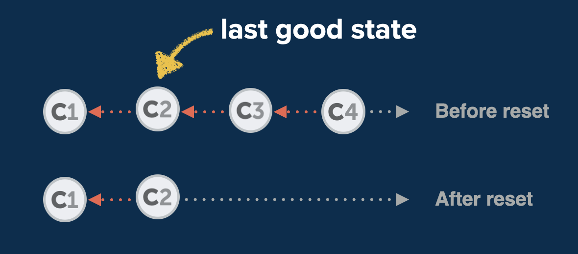
Luckily, this problem is pretty easy to solve. We simply need to provide the SHA-1 hash of the revision that we want to return to when we use the git reset command. Any commits that come after this revision will then disappear:

$ git reset --hard 2b504bee

The --hard option makes sure that we are left with a clean working copy. Alternatively, we can use the --mixed option for a bit more flexibility (and safety): --mixed will preserve the changes that were contained in the deleted commits as local changes in our working copy.

The first thing to know about reflog is that it’s ordered chronologically. Therefore, it should come as no surprise to see our recent git reset mistake at the very top. If we now want to undo this, we can simply return to the state before, which is also protocoled here, right below!

We can now copy the commit hash of this safe state and create a new branch based on it:

$ git branch happy-ending e5b19e4

Of course, we could have also used git reset e5b19e4 to return to this state. Personally, however, I prefer to create a new branch: It comes with no downsides and allows me to inspect whether this state is really what I want.

Restore a Single File From a Previous State

Until now, when we’ve worked with committed states, we’ve always worked with the complete project. But what if we want to restore a single file, not the whole project? For example, let’s say we’ve deleted a file, only to find out much later that we shouldn’t have. To get us out of this misery, we’ll have to solve two problems:

  1. find the commit where we deleted the file,
  2. then (and only then) restore it.

Let’s go search the commit history for our poor lost file:

$ git log -- <filename>

The output of this lists all commits where this file has been modified. And because log output is sorted chronologically, we shouldn’t have to search for long — the commit in which we deleted the file will likely be topmost (because after deleting it, the file probably wouldn’t show up in newer commits anymore).

With that commit’s hash and the name of our file, we have everything we need to bring it back from the dead:

$ git checkout <deletion commit hash>~1 -- <filename>

Note that we’re using ~1 to address the commit before the one where we made the deletion. This is necessary because the commit where the deletion happened doesn’t contain the file anymore, so we can’t use it to restore the file.

You Are Now (Almost) Invincible

During the course of this article, we’ve witnessed many disasters — but we’ve seen that virtually nothing is beyond repair in Git! Once you know the right commands, you can always find a way to save your neck.

But to really become invincible (in Git, that is), you’ll have to wait for the second part of this series. We will look at some more hairy problems, such as how to recover deleted branches, how to move commits between branches, and how to combine multiple commits into one!

In the meantime, if you want to learn more about undoing mistakes with Git, I recommend the free “First Aid Kit for Git”, a series of short videos about this very topic.

See you soon in part two of this series! Subscribe to the Smashing Newsletter to not miss that one. ;-)

Let’s use (X, X, X, X) for talking about specificity

I was just chatting with Eric Meyer the other day and I remembered an Eric Meyer story from my formative years. I wrote a blog post about CSS specificity, and Eric took the time to point out the misleading nature of it (I remember scurrying to update it). What was so misleading? The way I was portraying specificity as a base-10 number system.

Say you select an element with ul.nav. I insinuated in the post that the specificity of that selector was 0011 (eleven, essentially), which is a number in a base-10 system. So I was saying tags = 0, classes = 10, IDs = 100, and a style attribute = 1000. If specificity was calculated in a base-10 number system like that, a selector like ul.nav.nav.nav.nav.nav.nav.nav.nav.nav.nav.nav (11 class names) would have a specificity of 0111, which would be the same as ul#nav.top. That’s not true. The reality is that it would be (0, 0, 11, 1) vs. (0, 1, 0, 1) with the latter easily winning.

That comma-separated syntax like I just used solves two problems:

  1. It doesn’t insinuate a base-10 number system (or any number system)
  2. It has a distinct and readable look

I like the (X, X, X, X) look. I could see limiting it to (X, X, X) since a style attribute isn’t exactly a selector and usually isn’t talked about in the same kind of conversations. The parens make it more clear to me, but I could also see a X-X-X (dash-separated) syntax that wouldn’t need them, or a (X / X / X) syntax that probably would benefit from the parens.

Selectors Level 3 uses dashes briefly. Level 2 used both dashes and commas in different places.

Anyway, apparently I get the bug to mention this every half-decade or so.


The post Let’s use (X, X, X, X) for talking about specificity appeared first on CSS-Tricks.

You can support CSS-Tricks by being an MVP Supporter.

Creating Colorful, Smart Shadows

A bona fide CSS trick from Kirupa Chinnathambi here. To match a colored shadow with the colors in the background-image of an element, you inherit the background in a pseudo-element, kick it behind the original, then blur and filter it.

.colorfulShadow {
  position: relative;
}

.colorfulShadow::after {
  content: "";
  width: 100%;
  height: 100%;
  position: absolute;
  background: inherit;
  background-position: center center;
  filter: drop-shadow(0px 0px 10px rgba(0, 0, 0, 0.50)) blur(20px);
  z-index: -1;
}

Negative z-index is always a yellow flag for me as that only works if there are no intermediary backgrounds. But the trick holds. There would always be some other way to layer the backgrounds (like a <span> or whatever).

For some reason this made me think of a demo I saw (I can’t remember who to credit!). Emojis had text-shadow on them, which really made them pop. And those shadows could also be colorized to a similar effect.

Direct Link to ArticlePermalink


The post Creating Colorful, Smart Shadows appeared first on CSS-Tricks.

You can support CSS-Tricks by being an MVP Supporter.

The 7 Categories Of Engineering Management

Ian Nowland, the SVP of Core Engineering at DataDog, joins the Dev Interrupted podcast to discuss how he takes his ego out of being a manager and the seven categories he uses when coaching his teams.

Coaching Managers at Datadog


Dynamic CSS Masks with Custom Properties and GSAP

I recently redesigned my personal website to include a fun effect in the hero area, where the user’s cursor movement reveals alternative styling on the title and background, reminiscent of a spotlight. In this article we’ll walk through how the effect was created, using masks, CSS custom properties and much more.

Duplicating the content

We start with HTML to create two identical hero sections, with the title repeated.

<div class="wrapper">
 <div class="hero">
  <h1 class="hero__heading">Welcome to my website</h1>
 </div>

 <div class="hero hero--secondary" aria-hidden="true">
  <p class="hero__heading">Welcome to my website</p>
 </div>
</div>

Duplicating content isn’t a great experience for someone accessing the website using a screenreader. In order to prevent screenreaders announcing it twice, we can use aria-hidden="true" on the second component. The second component is absolute-positioned with CSS to completely cover the first.

Hero section with bright gradient positioned over the dark section
The two sections with the same content are layered one on top of the other

Using pointer-events: none on the second component ensures that the text of the first will be selectable by users.

Styling

Now we can add some CSS to style the two components. I deliberately chose a bright, rich gradient for the “revealed” background, in contrast to the dark monochrome of the initial view.

Somewhat counterintuitively, the component with the bright background is actually the one that will cover the other. In a moment we’ll add the mask, so that parts of it will be hidden — which is what gives the impression of it being underneath.

Text effects

There are a couple of different text effects at play in this component. The first applies to the bright text on the dark background. This uses -webkit-text-stroke, a non-standard CSS property that is nonetheless supported in all modern browsers. It allows us to outline our text, and works great with bold, chunky fonts like the one we’re using here. It requires a prefix in all browsers, and can be used as shorthand for -webkit-stroke-width and -webkit-stroke-color.

In order to get the “glow” effect, we can set the text color to a transparent value and use the CSS drop-shadow filter with the same color value. (We’re using a CSS custom property for the color in this example):

.heading {
  -webkit-text-stroke: 2px var(--primary);
  color: transparent;
  filter: drop-shadow(0 0 .35rem var(--primary));
}

See the Pen Outlined text by Michelle Barker (@michellebarker) on CodePen.dark

The text on the colored panel has a different effect applied. The intention was, for it to feel a little like an x-ray revealing the skeleton underneath. The text fill has a dotted pattern, which is created using a repeated radial gradient. To get this effect on the text, we in fact apply it to the background of the element, and use background-clip: text, which also requires a prefix in most browsers (at the time of writing). Again, we need to set the text color to a transparent value in order to see the result of the background-clip property:

.hero--secondary .heading {
  background: radial-gradient(circle at center, white .11rem, transparent 0);
  background-size: .4rem .4rem;
  -webkit-background-clip: text;
  background-clip: text;
  color: transparent;
}

See the Pen Dotted text by Michelle Barker (@michellebarker) on CodePen.dark

Creating the spotlight

We have two choices when it comes to creating the spotlight effect with CSS: clip-path and mask-image. These can produce very similar effects, but with some important differences.

Clipping

We can think of clipping a shape with clip-path as a bit like cutting it out with scissors. This is ideal for shapes with clean lines. In this case, we could create a circle shape for our spotlight, using the circle() function:

.hero--secondary {
  --clip: circle(20% at 70%);
  -webkit-clip-path: var(--clip);
  clip-path: var(--clip);
}

(clip-path still needs to be prefixed in Safari, so I like to use a custom property for this.)

clip-path can also take an ellipse, polygon, SVG path or a URL with an SVG path ID.

See the Pen Hero with clip-path by Michelle Barker (@michellebarker) on CodePen.dark

Masking

Unlike clip-path the mask-image property is not limited to shapes with clean lines. We can use a PNGs, SVGs or even GIFs to create a mask. We can even use gradients: the blacker parts of the image (or gradient) act as the mask whereas the element will be hidden by the transparent parts.

We can use a radial gradient to create a mask very similar to the clip-path circle:

.hero--secondary {
  --mask: radial-gradient(circle at 70%, black 25%, transparent 0);
  -webkit-clip-path: var(--mask);
  clip-path: var(--mask);
}

Another advantage is that there are additional mask properties than correspond to CSS background properties — so we can control the size and position of the mask, and whether or not it repeats in much the same way, with mask-size, mask-position and mask-repeat respectively.

See the Pen Hero with mask by Michelle Barker (@michellebarker) on CodePen.dark

There’s much more we could delve into with clipping and masking, but let’s leave that for another day! I chose to use a mask instead of a clip-path for this project — hopefully the reason will become clear a little later on.

Tracking the cursor

Now we have our mask, it’s a matter of tracking the position of the user’s cursor, for which we’ll need some Javascript. First we can set custom properties for the center co-ordinates of our gradient mask. We can use default values, to give the mask an initial position before the JS is executed. This will also ensure that non-mouse users see a static mask, rather than none at all.

.hero--secondary {
  --mask: radial-gradient(circle at var(--x, 70%) var(--y, 50%), black 25%, transparent 0);
}

In our JS, we can listen for the mousemove event, then update the custom properties for the x and y percentage position of the circle in accordance with the cursor position:

const hero = document.querySelector('[data-hero]')

window.addEventListener('mousemove', (e) => {
  const { clientX, clientY } = e
  const x = Math.round((clientX / window.innerWidth) * 100)
  const y = Math.round((clientY / window.innerHeight) * 100)
	
  hero.style.setProperty('--x', `${x}%`)
  hero.style.setProperty('--y', `${y}%`)
})

See the Pen Hero with cursor tracking by Michelle Barker (@michellebarker) on CodePen.dark

(For better performance, we might want to throttle or debounce that function, or use requestAnimationFrame, to prevent it repeating too frequently. If you’re not sure which to use, this article has you covered.)

Adding animation

At the moment there is no easing on the movement of the spotlight — it immediately updates its position when the mouse it moved, so feels a bit rigid. We could remedy that with a bit of animation.

If we were using clip-path we could animate the path position with a transition:

.hero--secondary {
  --clip: circle(25% at 70%);
  -webkit-clip-path: var(--clip);
  clip-path: var(--clip);
  transition: clip-path 300ms 20ms;
}

Animating a mask requires a different route.

Animating with CSS Houdini

In CSS we can transition or animate custom property values using Houdini – a set of low-level APIs that give developers access to the browser’s rendering engine. The upshot is we can animate properties (or, more accurately, values within properties, in this case) that aren’t traditionally animatable.

We first need to register the property, specifying the syntax, whether or not it inherits, and an initial value. The initial-value property is crucial, otherwise it will have no effect.

@property --x {
  syntax: '';
  inherits: true;
  initial-value: 70%;
}

Then we can transition or animate the custom property just like any regular animatable CSS property. For our spotlight, we can transition the --x and --y values, with a slight delay, to make them feel more natural:

.hero--secondary {
  transition: --x 300ms 20ms ease-out, --y 300ms 20ms ease-out;
}

See the Pen Hero with cursor tracking (with Houdini animation) by Michelle Barker (@michellebarker) on CodePen.dark

Unfortunately, @property is only supported in Chromium browsers at the time of writing. If we want an improved animation in all browsers, we could instead reach for a JS library.

Animating with GSAP

In CSS we can transition or animate custom property values using Houdini –I love using the Greensock(GSAP) JS animation library. It has an intuitive API, and contains plenty of easing options, all of which makes animating UI elements easy and fun! As I was already using it for other parts of the project, it was a simple decision to use it here to bring some life to the spotlight. Instead of using setProperty we can let GSAP take care of setting our custom properties, and configure the easing using the built in options:

import gsap from 'gsap'

const hero = document.querySelector('[data-hero]')

window.addEventListener('mousemove', (e) => {
  const { clientX, clientY } = e
  const x = Math.round((clientX / window.innerWidth) * 100)
  const y = Math.round((clientY / window.innerHeight) * 100)
	
  gsap.to(hero, {
    '--x': `${x}%`,
    '--y': `${y}%`,
    duration: 0.3,
    ease: 'sine.out'
  })
})

See the Pen Hero with cursor tracking (GSAP) by Michelle Barker (@michellebarker) on CodePen.dark

Animating the mask with a timeline

The mask on my website’s hero section is slightly more elaborate than a simple spotlight. We start with a single circle, then suddenly another circle “pops” out of the first, surrounding it. To get an effect like this, we can once again turn to custom properties, and animate them on a GSAP timeline.

Our radial gradient mask becomes a little more complex: We’re creating a gradient of two concentric circles, but setting the initial values of the gradient stops to 0% (via the default values in our custom properties), so that their size can be animated with JS:

.hero {
  --mask: radial-gradient(
    circle at var(--x, 50%) var(--y, 50%),
    black var(--maskSize1, 0%), 
    transparent 0, 
    transparent var(--maskSize2, 0%),
    black var(--maskSize2, 0%), 
    black var(--maskSize3, 0%), 
    transparent 0);
}

Our mask will be invisible at this point, as the circle created with the gradient has a size of 0%. Now we can create a timeline with GSAP, so the central spot will spring to life, followed by the second circle. We’re also adding a delay of one second before the timeline starts to play.

const tl = gsap.timeline({ delay: 1 })

tl
  .to(hero, {
    '--maskSize1': '20%',
    duration: 0.5,
    ease: 'back.out(2)'
  })
  .to(hero, {
    '--maskSize2': '28%',
     '--maskSize3': 'calc(28% + 0.1rem)',
    duration: 0.5,
    delay: 0.5,
    ease: 'back.out(2)'
})

See the Pen Hero with cursor tracking (GSAP) by Michelle Barker (@michellebarker) on CodePen.dark

Using a timeline, our animations will execute one after the other. GSAP offers plenty of options for orchestrating the timing of animations with timelines, and I urge you to explore the documentation to get a taste of the possibilities. You won’t be disappointed!

Smoothing the gradient

For some screen resolutions, a gradient with hard color stops can result in jagged edges. To avoid this we can add some additional color stops with fractional percentage values:

.hero {
  --mask: radial-gradient(
    circle at var(--x, 50%) var(--y, 50%),
    black var(--maskSize1, 0%) 0,
    rgba(0, 0, 0, 0.1) calc(var(--maskSize1, 0%) + 0.1%),
    transparent 0,
    transparent var(--maskSize2, 0%),
    rgba(0, 0, 0, 0.1) calc(var(--maskSize2, 0%) + 0.1%),
    black var(--maskSize2, 0%),
    rgba(0, 0, 0, 0.1) calc(var(--maskSize3, 0%) - 0.1%),
    black var(--maskSize3, 0%),
    rgba(0, 0, 0, 0.1) calc(var(--maskSize3, 0%) + 0.1%),
    transparent 0
  );
}

This optional step results in a smoother-edged gradient. You can read more about this approach in this article by Mandy Michael.

A note on default values

While testing this approach, I initially used a default value of 0 for the custom properties. When creating the smoother gradient, it turned out that the browser didn’t compute those zero values with calc, so the mask wouldn’t be applied at all until the values were updated with JS. For this reason, I’m setting the defaults as 0% instead, which works just fine.

Creating the menu animation

There’s one more finishing touch to the hero section, which is a bit of visual trickery: When the user clicks on the menu button, the spotlight expands to reveal the full-screen menu, seemingly underneath it. To create this effect, we need to give the menu an identical background to the one on our masked element.

:root {
  --gradientBg: linear-gradient(45deg, turquoise, darkorchid, deeppink, orange);
}

.hero--secondary {
  background: var(--gradientBg);
}

.menu {
  background: var(--gradientBg);
}

The menu is absolute-positioned, the same as the masked hero element, so that it completely overlays the hero section.

Then we can use clip-path to clip the element to a circle 0% wide. The clip path is positioned to align with the menu button, at the top right of the viewport. We also need to add a transition, for when the menu is opened.

.menu {
  background: var(--gradientBg);
  clip-path: circle(0% at calc(100% - 2rem) 2rem);
  transition: clip-path 500ms;
}

When a user clicks the menu button, we’ll use JS to apply a class of .is-open to the menu.

const menuButton = document.querySelector('[data-btn="menu"]')
const menu = document.querySelector('[data-menu]')

menuButton.addEventListener('click', () => {
  menu.classList.toggle('is-open')
})

(In a real project there’s much more we would need to do to make our menu fully accessible, but that’s beyond the scope of this article.)

Then we need to add a little more CSS to expand our clip-path so that it reveals the menu in its entirety:

.menu.is-open {
  clip-path: circle(200% at calc(100% - 2rem) 2rem);
}

See the Pen Hero with cursor tracking and menu by Michelle Barker (@michellebarker) on CodePen.dark

Text animation

In the final demo, we’re also implementing a staggered animation on the heading, before animating the spotlight into view. This uses Splitting.js to split the text into <span> elements. As it assigns each character a custom property, it’s great for CSS animations. The GSAP timeline however, is a more convenient way to implement the staggered effect in this case, as it means we can let the timeline handle when to start the next animation after the text finishes animating. We’ll add that to the beginning of our timeline:

// Set initial text styles (before animation)
gsap.set(".hero--primary .char", {
  opacity: 0,
  y: 25,
});

/* Timeline */
const tl = gsap.timeline({ delay: 1 });

tl
  .to(".hero--primary .char", {
    opacity: 1,
    y: 0,
    duration: 0.75,
    stagger: 0.1,
  })
  .to(hero, {
    "--maskSize1": "20%",
    duration: 0.5,
    ease: "back.out(2)",
  })
  .to(hero, {
    "--maskSize2": "28%",
    "--maskSize3": "calc(28% + 0.1rem)",
    duration: 0.5,
    delay: 0.3,
    ease: "back.out(2)",
  });

I hope this inspires you to play around with CSS masks and the fun effects that can be created!

The full demo

The post Dynamic CSS Masks with Custom Properties and GSAP appeared first on Codrops.

Using Selenium To Clear Browsing Data In Chrome

When working with pages in several automating projects I noticed that the fields like login ID, search fields, etc., are getting saved on the page. Thus, when my Selenium test runs, I need to put additional code to clear those fields if those are populated. I needed a way to clear the browsing data through my test before I went to the page.

I attempted a few solutions from here and here. However, these worked on older versions of the Chrome browser. Next, I tried out the solution from here. It worked in part but I needed to also set the time range as AllTime.

Processing Messages in Order With CompletableFuture

When Performance Is the Main Consideration

In the microservices world, we receive messages from different sources like JMS, AMQP, EventBus and try to process them as quickly as possible. Multithreading with Thread Pool can help us to do that.

But if we want to treat messages of the same categories (same users, same products...) in the order we receive them, it could get more complicated.

How to Speed Up Your eCommerce Website (14 Proven Tips)

Do you want to speed up your eCommerce website?

Speed is crucial for the success of an eCommerce site. It not only improves customer experience, but it directly impacts conversions and sales.

In this guide, we’ll show you how to easily speed up your eCommerce store to improve performance and conversions.

Improving eCommerce website speed

Why Speed Matters for Your eCommerce Store

Speed is extremely important when it comes to user experience. No one likes a slow website, a slow computer, or a slow app.

But for online stores, a slow website can actually costs you business.

For instance, a study found that a single-second delay in page load time results in 7% loss in conversions, 11% fewer page views, and 16% decrease in customer satisfaction.

StrangeLoop study

In simpler words, slow websites can lead to lower sales.

Now apart from user experience and sales, eCommerce site speed also affects your SEO rankings. Search engines like Google consider speed as an important user experience indicator and ranking factor.

In fact, Google’s page experience search update is solely focused on user experience metrics like bounce rate and website speed. A faster eCommerce website will help you bring more free traffic from search engines.

That being said, let’s take a look at how to easily bump up your eCommerce store speed and performance.

Here is a quick overview of the topics we’ll cover in this guide.

1. Choose a Better Ecommerce Hosting Provider

All eCommerce performance optimization you make to your website will have little impact if you don’t have a good eCommerce hosting provider.

Not all WordPress hosting companies are the same. For better performance, you need to choose an eCommerce hosting provider that does the following:

  • Provides a stable and up-to-date platform to host your eCommerce store.
  • It is optimized for WordPress, WooCommerce, or any other eCommerce plugin that you may want to use
  • Their servers are optimized for speed and performance. This means built-in caching, security, and other features to improve performance

We recommend using SiteGround. They are one of the officially recommended WordPress hosting providers.

SiteGround servers run on Google Cloud Platform which is known for high performance. They have built-in caching and even have their own optimization plugin that automatically implements many of the performance tips that we’ll recommend later in this article.

If you are looking for alternatives, then check out our list of best WooCommerce hosting providers.

After setting up your eCommerce store on a good hosting service, you can implement the following optimization tips to boost performance.

2. Install a WordPress Caching Plugin

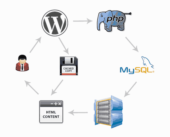
WooCommerce is a dynamic eCommerce platform. This means all your product data is stored in a database and product pages are generated when a user visits your website.

To do this, WordPress needs to run the same process each time. If more people visit your eCommerce store at the same time, then it will slow down and may even crash.

A caching plugin, helps you fix that issue.

Instead of generating pages each time, a caching plugin shows user a cached version of the HTML page. This frees up your server resources and allows it to run more efficiently thus improving website loading time.

How caching works in WordPress

There are some great WordPress caching plugins available, and popular WordPress hosting companies like SiteGround and Bluehost offer their own caching systems.

We recommend using WP Rocket. It is the best WordPress caching plugin on the market with the most beginner-friendly settings.

Unlike other WordPress caching solutions, WP Rocket doesn’t wait for users to visit a page to generate a cached version. Instead, it automatically prepares a cache of your website and keeps it up to date.

With the right WP Rocket settings, you can easily get near perfect scores in speed test tools like Pingdom, GTMetrix, Google Pagespeed Insights, and more.

For details and instructions, see our article on how to install and set up WP Rocket in WordPress.

Top WordPress hosting companies, like SiteGround and Bluehost offer their own caching solutions too.

SiteGround SG Optimizer

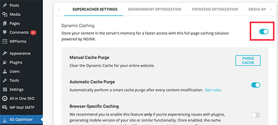
SiteGround allows you to easily turn on caching on your eCommerce store by using their SG Optimizer plugin.

This all-in-one performance tool includes caching, performance tweaks, WebP image conversion in WordPress, database optimization, CSS minification, GZIP compression, and more.

Simply install and activate the SG Optimizer plugin in WordPress. For more details, see our step by step guide on how to install a WordPress plugin.

Upon activation, click on the SG Optimizer menu in your WordPress admin sidebar to access plugin settings. From here, you need to turn on the Dynamic Caching option.

Turn on caching in SiteGround

Turn on Caching on Bluehost

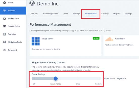
Similarly, Bluehost also allows you to use its built-in caching system for optimizing WooCommerce. Simply login to your Bluehost dashboard and go to My Sites page. If you have multiple sites, then select your site and then switch to the Performance tab.

Bluehost caching levels

From here you can select a caching level for your website. For instance, you can choose eCommerce but if your website still remains slow then you can come back here and increase the caching level.

3. Use Latest PHP Version

WordPress and WooCommerce are both mainly written in the PHP programming language.

With each new version, PHP improves in performance and becomes faster. It also fixes bugs and patches security issues that may compromise your website’s stability and speed.

This is why you should always use the latest PHP version.

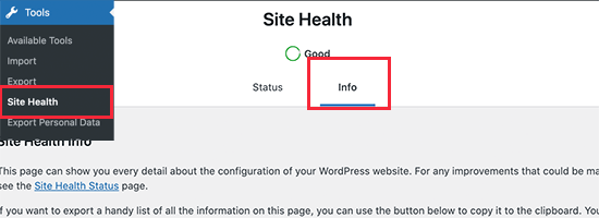
You can find out your eCommerce store’s PHP version by visiting Tools » Site Health in your WordPress dashboard and switching to the ‘Info’ tab.

Site Health in WordPress

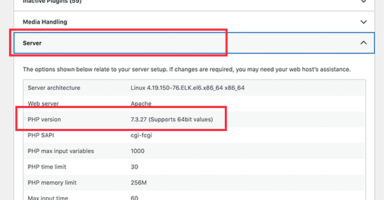
From here, you need to click on the ‘Server’ section to expand it, and you’ll be able to see the PHP version used by your server.

PHP version in WordPress site health

If your website is running on a PHP version lower than 8.0, then you should reach out to your hosting provider and ask them to update it for you.

For more details, see our article on how PHP updates impact your website.

Note: Some managed WordPress hosting companies like SiteGround have built their own Ultrafast PHP to improve overall server response time. Others are using PHP FastCGI to help customers improve eCommerce speed.

4. Latest Version of WordPress & WooCommerce

WordPress and WooCommerce developers spend a significant amount of time on improving performance during each development cycle. This makes both apps run more efficiently and use fewer server-side resources.

Each new version also fixes bugs and strengthens security which is crucial for an eCommerce business.

As the store owner, it is your responsibility to make sure that you are using the latest version of WordPress, WooCommerce, other plugins, and your WordPress theme.

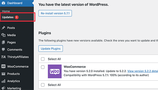
Simply go to Dashboard » Updates page to install all available updates.

Installing updates

5. Optimize Product Images for Performance

Product images are one of the most visually important things for an online store. Better product images keep customers engaged and can help boost sales conversion.

This is why it’s important to add high-quality product images. However, you need to make sure that large image file sizes are properly optimized.

There are two ways to optimize product images for the web without losing quality.

First, you can optimize each product image on your computer before uploading it to your website. This requires image editing software like Adobe Photoshop, Affinity, Gimp, etc.

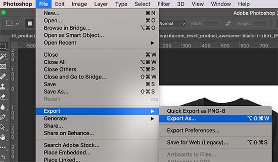
Most of them have an option to export an image for the web. You can also adjust the quality of the image before saving it for upload.

Export for web in Adobe Photoshop

Alternately, you can use an image compression plugin for WordPress. These plugins automatically optimize your product image size for better site performance.

Aside from image compression, the image file type you choose can also help. For example, JPEG images are better for images that have a lot of color, whereas png images are better for transparent images.

6. Use a DNS Level Website Firewall

Brute force and DDoS attacks are common internet nuisances. Basically, hackers try to overload your server to break in, steal data or install malware.

Most hosting companies have basic safeguards that protect your websites from such attacks. However, one downside of these attacks is that they make your website loads extremely slow.

This is where you need a Website Application Firewall (WAF).

Now, common WordPress firewall plugins run on your own webserver. This makes them a little less efficient as they cannot block suspicious attacks until they reach your server.

On the other hand, a DNS-level firewall is able to filter your traffic on the cloud and block suspicious attacks even before they reach your website.

Website firewall

We recommend using Sucuri. It is the best WordPress firewall plugin with a comprehensive security suite.

Sucuri also comes with a powerful CDN (content delivery network). A CDN serves your website’s static content (images, stylesheets, JavaScript) from a global network of servers. This further reduces your server load and improves overall site load time.

If you are looking for a free option, then Cloudflare free CDN gives you basic level DNS firewall protection.

7. Choose a Better WordPress Theme

Choose better eCommerce theme

WordPress themes control the appearance of your eCommerce store. However, not all of them are optimized for performance and often add too much clutter which makes your website slower.

When choosing a WordPress theme for an eCommerce store, you need to find the balance between functionality and speed. Theme features like sliders, carousels, web fonts and icon fonts can slow down your website.

We recommend going for a simple theme and then use plugins to add the features you need. This gives you better control over both the performance and appearance of your online store.

WordPress themes by StudioPress, Elegant Themes, and Astra are all optimized for performance. For more individual theme recommendations, see our expert pick of the best WooCommerce themes for WordPress.

8. Use Better WordPress Plugins

One of the most often asked questions by WordPress beginners is that how many plugins they can use on their store without affecting performance?

The answer is as many as you like.

The total number of plugins does not affect the performance of your online store. It’s the quality of code that does.

A single poorly coded WordPress plugin may load too many scripts or stylesheets that could affect page load speed.

On the other hand, a well coded plugin would use standard best practices to minimize the performance impact. We recommend testing your plugins for performance impact before and after installing them.

We also maintain a list of must have WooCommerce plugins where we hand-picked essential WooCommerce plugins used by most online stores.

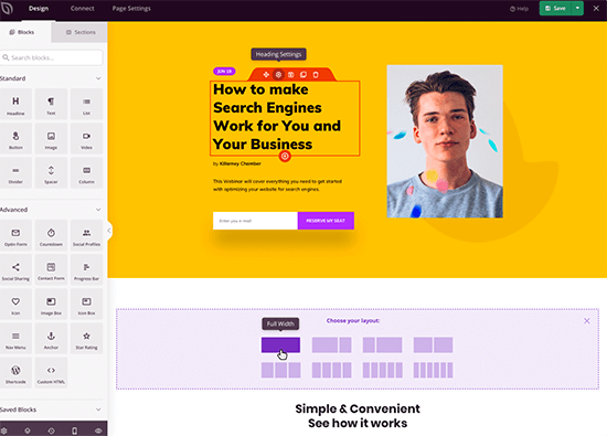
For example, the SeedProd drag & drop landing page builder helps you build blazing fast eCommerce landing pages without writing any code.

SeedProd Page Builder

For more on this topic, see our guide on how to choose the best WordPress plugins. It has a step by step process on how to evaluate WordPress plugins and picking the right one for your online store.

9. Reduce External HTTP Requests

A typical eCommerce page contains several components. For instance images, CSS and JavaScript files, video embeds, and more.

Each such component is separately loaded by users’ browsers by making an HTTP request to your server. More HTTP requests mean longer page load times.

Your server may also be fetching things from third-party tools and services like Google Analytics, social media retargeting, and other services. These are called external HTTP requests. These can take even longer to finish on a typical web page load.

It is ok to have these scripts on your WordPress website, but if they are affecting your website’s performance, then you need to consider reducing them.

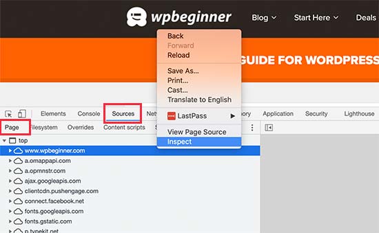
You can view external HTTP requests by visiting your website and opening the Inspect tool in your browser. From here, switch to the Sources » Page tab to view all external HTTP requests.

External HTTP requests

10. Reduce Database Requests

WordPress and WooCommerce use database to store a lot of content and settings. Your WordPress theme and plugins also make database queries to fetch and display that information on screen.

Database queries are extremely fast, and your website can run hundreds of those in mere milliseconds. However, if your website is handling a traffic spike, then these queries can slow down your page load time.

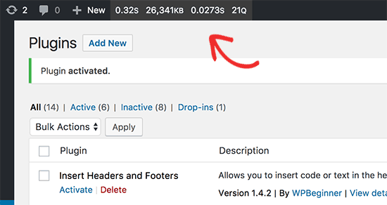
You can check the database calls by using a plugin like Query Monitor in WordPress. Upon activation, the plugin will add the query monitor menu into your WordPress admin bar.

Query monitor menu

However, minimizing these requests may not be possible for beginner-level users. For instance, you may need to modify your WordPress theme to reduce database calls.

If you are comfortable editing your WordPress theme files or debug code, then you can look for database calls that can be avoided.

Other users, can try finding a better WordPress theme and alternate plugins to reduce database calls if needed.

11. Optimize WordPress Database

Over a period of time, your WordPress database may get bloated with information that you may not need anymore.

This clutter can potentially slow down database queries, backup processes, and overall WordPress performance. From time to time, it’s important to optimize your WordPress database to declutter unnecessary information.

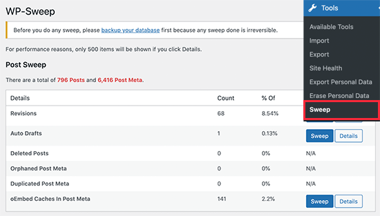
Simply install and activate the WP Sweep plugin. Upon activation, simply go to Tools » Sweep to clean up your WordPress database.

WordPress database optimization

For more on this topic, see our article on how to optimize WordPress database for speed and performance.

12. Use Staging Sites to Track Performance Issues

Making changes to a live eCommerce store can cause issues. For instance, a customer may loose their order, or your site may go down during a sale event.

A staging site helps you easily try out performance optimization tips, new plugins, or a theme without affecting your live store.

Basically, a staging site is a clone of your live website that is used for testing changes before making them live.

Many popular WordPress hosting companies offer 1-click staging site set up. Once set up, you can try your changes and track your page load speed and performance.

Once you are ready to implement those changes, you can simply deploy staging site to the live version.

For step by step instructions, see our tutorial on how to create a staging site for WordPress.

13. Offload Ecommerce Emails

Offload eCommerce emails

Emails play a very important role on an eCommerce store. They are used to deliver order confirmations, invoices, password reset emails, sales and marketing messages, and more.

However, many beginners don’t realize this and use their hosting provider’s limited email functionality for eCommerce emails.

Most hosting companies don’t support the default WordPress mail function. Some even disable it to prevent spam and abuse.

This is why you need to use a dedicated SMTP email service provider along with the WP Mail SMTP plugin. These companies specialize in sending mass emails and ensure higher deliverability, which means your emails don’t end up in the spam folder.

We recommend using SMTP.com as one of the best SMTP service provider for transactional emails.

It is easy to set up and works with WooCommerce and all top WordPress contact form plugins. Plus, they offer a 30-day free trial with up to 50,000 emails.

If you want to look at others, then do check out Sendinblue or Mailgun.

14. Use Better Conversion Rate Optimization Tools

When it comes to eCommerce website, conversion rate optimization (CRO) is important for increasing sales.

A typical online store has many dynamic elements to increase conversions such as free shipping bar on homepage, black friday sale countdown timer in website header, exit-intent popup on checkout pages, or even spin a wheel gamification on mobile site to reduce abandonment.

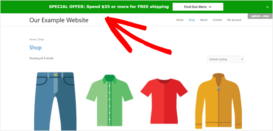
Free shipping bar example

Often store owners and retailers use a combination of tools and plugins to add these dynamic elements. The challenge is that not all of them are properly optimized for speed.

This is why it’s important to choose conversion optimization tools that offer a suite of features in one platform, so you’re not loading multiple external scripts.

Below is a list of popular conversion optimization tools that we use on our eCommerce websites:

  • OptinMonster – it’s the most powerful conversion optimization toolkit that lets you create personalized popups, gamification campaigns, floating bars, and more.
  • LiveChat.com – it’s the best live chat software. They also offer ChatBot automation software as well that works for both WooCommerce and Shopify.
  • TrustPulse – it’s the best social proof software in the market that’s optimized for speed. You can use it to show real-time user activity without slowing down your site.

When it comes to analytics and A/B testing tools, we recommend only using what’s absolutely needed.

For example, if you’re launching a new landing page or website design, it’s important to run heatmap analytics. However after a short period of analysis, we recommend disabling heatmaps so it doesn’t slow down your website speed.

Similarly for A/B testing tools, you don’t need to run those scripts on every page of your website. You can selectively load A/B testing scripts on specific pages, and when you’re done with the test, don’t forget to remove the script.

We hope this article helped you speed up your eCommerce website. You may also want to see our WordPress security handbook or check out our WooCommerce SEO guide to get free traffic from search engines to your online store.

If you liked this article, then please subscribe to our YouTube Channel for WordPress video tutorials. You can also find us on Twitter and Facebook.

The post How to Speed Up Your eCommerce Website (14 Proven Tips) appeared first on WPBeginner.

The Developer’s Guide to Relationship-based Access Control

If you’ve never heard of ReBAC (relationship-based access control), that’s fine. It’s not too difficult and we’ll walk you through it. Chances are, you’re already using this model in your current applications! Allow us to tell you why ReBAC is such an interesting model for access control and how you can start implementing it.


What is ReBAC? 

Relationship-based access control is a model where access decisions are based on the relationships a subject has. When the subject (often a user, but possibly also a device or application) wants to access a resource, our system will either allow or deny this access based on the specific relationships the subject has.

convert pseudo to python code

for(#iterations)
solve non linear solution
get new flux klinkages
solve LD and Lq
solve new Id and Iq
if (abs(Id_new - Id_old) < 0.01)
break
else
put in the new Id_new and Iq_new

Smashing Podcast Episode 36 With Miriam Suzanne: What Is The Future Of CSS?

In this episode, we’re starting our new season of the Smashing Podcast with a look at the future of CSS. What new specs will be landing in browsers soon? Drew McLellan talks to expert Miriam Suzanne to find out.

Show Notes

Weekly Update

Transcript

Drew McLellan: She’s an artist, activist, teacher and web developer. She’s a co-founder of OddBird, a provider of custom web applications, developer tools, and training. She’s also an invited expert to the CSS Working Group and a regular public speaker and author sharing her expertise with audiences around the world. We know she knows CSS both backwards and forwards, but did you know she once won an egg and spoon race by taking advantage of a loophole involving macaroni? My smashing friends, please welcome Miriam Suzanne. Hi, Miriam. How are you?

Miriam Suzanne: I’m smashing, thank you.

Drew: That’s good to hear. I wanted to talk to you today about some of the exciting new stuff that’s coming our way in CSS. It feels like there’s been a bit of an acceleration over the last five years of new features making their way into CSS and a much more open and collaborative approach from the W3C with some real independent specialists like yourself, Rachel Andrew, Lea Verou and others contributing to the working group as invited experts. Does it feel like CSS is moving forward rapidly or does it still feel horribly slow from the inside?

Miriam: Oh, it’s both, I think. It is moving quite fast and quite fast is still sometimes very slow because there’s just so many considerations. It’s hard to really land something everywhere very quickly.

Drew: It must feel like there’s an awful lot of work happening on all sorts of different things and each of them edging forward very, very slowly, but when you look at the cumulative effect, there’s quite a lot going on.

Miriam: Yeah, exactly, and I feel like I don’t know what kicked off that change several years ago, whether it was grid and flexbox really kicked up interest in what CSS could be, I think, and there’s just been so much happening. But it’s interesting watching all the discussions and watching the specs. They all refer to each other. CSS is very tied together. You can’t add one feature without impacting every other feature and so all of these conversations have to keep in mind all of the other conversations that are happening. It’s really a web to try to understand how everything impacts everything else.

Drew: It feels like the working group very much always looking at what current practice is and seeing what holes people are trying to patch, what problems they’re trying to fix, often with JavaScript, and making a big messy ball of JavaScript. Is that something that’s a conscious effort or does it just naturally occur?

Miriam: I would say it’s very conscious. There’s also a conscious attempt to then step back from the ideas and say, "Okay, this is how we’ve solved them in JavaScript or using hacks, workarounds, whatever." We could just pave that cow path, but maybe there’s a better way to solve it once it’s native to CSS and so you see changes to things like variables. When they move from preprocessors like Sass and Less to CSS, they become something new. And that’s not always the case, sometimes the transition is pretty seamless, it’s more just take what’s already been designed and make it native. But there’s a conscious effort to think through that and consider the implications.

Drew: Yeah, sometimes a small workaround is hiding quite a big idea that could be more useful in itself.

Miriam: And often, hiding overlapped ideas. I was just reading through a lot of the issues around grid today because I’ve been working on responsive components, things like that, and I was like, "Okay, what’s happening in the grid space with this?" And there’s so many proposals that mix and overlap in really interesting ways. It can be hard to separate them out and say, "Okay, should we solve these problems individually or do we solve them as grouped use cases? How exactly should that be approached?"

Drew: I guess that can be, from the outside, that might seem like a frustrating lack of progress when you say, "Why can’t this feature be implemented?" It’s because when you look at that feature, it explodes into something much bigger that’s much harder to solve.

Miriam: Exactly.

Drew: Hopefully, solving the bigger problem makes all sorts of other things possible. I spent a lot of my career in a position where we were just sort of clamoring for something, anything, new to be added to CSS. I’m sure that’s familiar to you as well. It now seems like it’s almost hard to keep track of everything that’s new because there’s new things coming out all the time. Do you have any advice for working front-enders of how they can keep track of all the new arrivals in CSS? Are there good resources or things they should be paying attention to?

Miriam: Yeah, there are great resources if you really want a curated, a sense of what you should be watching. But that’s Smashing Magazine, CSS-Tricks, all of the common blogs and then various people on Twitter. Browser implementers as well as people on the working group as well as people that write articles. Stephanie Eckles comes to mind, ModernCSS. There’s a lot of resources like that. I would also say, if you keep an eye on the release notes from different browsers, they don’t come out that often, it’s not going to spam your inbox every day. You’ll often see a section in the release notes on what have they released related to CSS. And usually in terms of features, it’s just one or two things. You’re not going to become totally overwhelmed by all of the new things landing. They’ll come out six weeks to a couple of months and you can just keep an eye on what’s landing in the browsers.

Drew: Interesting point. I hadn’t thought of looking at browser release notes to find this stuff. Personally, I make efforts to follow people on Twitter who I know would share things, but I find I just miss things on Twitter all the time. There’s lots of cool stuff that I never get to see.

Drew: In that spirit, before we look too far into the future into what’s under development at the moment, there are quite a few bits of CSS that have already landed in browsers that might be new to people and they might be pretty usable under a lot of circumstances. There are certainly things that I’ve been unaware of.

Drew: One area that comes to mind is selectors. There’s this "is" pseudo-class function, for example. Is that like a jQuery "is" selector, if you remember those? I can barely remember those.

Miriam: I didn’t use jQuery enough to say.

Drew: No. Now even saying that, it’s so dusty in my mind, I’m not even sure that was a thing.

Miriam: Yeah, "is" and "where", it’s useful to think of them together, both of those selectors. "Is" sort of landed in most browsers a little bit before "where", but at this point I think both are pretty well-supported in modern browsers. They let you list a number of selectors inside of a single pseudo-class selector. So you say, ":is" or ":where" and then in parentheses, you can put any selectors you want and it matches an element that also matches the selectors inside. One example is, you can say, "I want to style all the links inside of any heading." So you can say "is", H1, H2, H3, H4, H5, H6, put a list inside of "is", and then, after that list say "A" once. And you don’t have to repeat every combination that you’re generating there. It’s sort of a shorthand for bringing nesting into CSS. You can create these nested "like" selectors. But they also do some interesting things around specificity... Sorry, what were you going to say?

Drew: I guess it’s just useful in making your style sheet more readable and easy to maintain if you’re not having to longhand write out every single combination of things.

Miriam: Right. The other interesting thing you can do with it is you can start to combine selectors. So you can say, "I’m only targeting something that matches both the selectors outside of "is" and the selectors inside of "is"". It has to match all of these things." So you can match several selectors at once, which is interesting.

Drew: Where does "where" come into it if that’s what "is" does?

Miriam: Right. "Where" comes into it because of the way that they handle specificity. "Is" handles specificity by giving you the entire selector gets the specificity of whatever is highest specificity inside of "is." "Is" can only have one specificity and it’s going to be the highest of any selector inside. If you put an "id" inside it, it’s going to have the specificity of an "id." Even if you have an "id" and a class, two selectors, inside "is", It’s going to have the specificity of the "id."

Miriam: That defaults to a higher specificity. "Where" defaults to a zero specificity, which I think is really interesting, especially for defaults. I want to style an audio element where it has controls, but I don’t want to add specificity there, I just want to say where it’s called for controls, where it has the controls attribute, add this styling to audio. So a zero-specificity option. Otherwise, they work the same way.

Drew: Okay. So that means with a zero specificity, it means that, then, assuming that somebody tries to style those controls in the example, they’re not having to battle against the styles that have already been set.

Miriam: That’s right, yeah. There’s another interesting thing inside of both of those where they’re supposed to be resilient. Right now, if you write a selector list and a browser doesn’t understand something in that selector list, it’s going to ignore all of the selectors in the list. But if you do that inside of "is" or "where", if an unknown selector is used in a list inside of "is" or "where", it should be resilient and the other selectors should still be able to match.

Drew: Okay, so this is that great property of CSS, that if it doesn’t understand something, it just skips over it.

Miriam: Right.

Drew: And so, you’re saying that if there’s something that it doesn’t understand in the list, skip over the thing it doesn’t understand, but don’t throw the baby out with the bathwater, keep all the others and apply them.

Miriam: Exactly.

Drew: That’s fascinating. And the fact that we have "is" and "where" strikes me as one of those examples of something that sounds like an easy problem. "Oh, let’s have an "is" selector." And then somebody says, "But what about specificity?"

Miriam: Right, exactly.

Drew: How are we going to work that out?

Miriam: Yeah. The other interesting thing is that it comes out of requests for nesting. People wanted nested selectors similar to what Sass has and "is" and "where" are, in some ways, a half step towards that. They will make the nested selectors easier to implement since we already have a way to, what they call "de-sugar" them. We can de-sugar them to this basic selector.

Drew: What seems to me like the dustiest corners of HTML and CSS are list items and the markers that they have, the blitz or what have you. I can remember, probably back in Frontpage in the late ’90s, trying to style, usually with proprietary Microsoft properties, for Internet Explorer back in the day. But there’s some good news on the horizon for lovers of markers, isn’t there?

Miriam: Yeah, there’s a marker selector that’s really great. We no longer have to remove the markers by saying... How did we remove markers? I don’t even remember. Changing the list style to none.

Drew: List style, none. Yup.

Miriam: And then people would re-add the markers using "before" pseudo-element. And we don’t have to do that anymore. With the marker pseudo-element, we can style it directly. That styling is a little bit limited, particularly right now, it’s going to be expanding out some, but yeah, it’s a really nice feature. You can very quickly change the size, the font, the colors, things like that.

Drew: Can you use generated content in there as well?

Miriam: Yes. I don’t remember how broad support is for the generated content, but you should be able to.

Drew: That’s good news for fans of lists, I guess. There’s some new selectors. This is something that I came across recently in a real-world project and I started using one of these before I realized actually it wasn’t as well supported as I thought, because it’s that new. And that’s selectors to help when "focus" is applied to elements. I think I was using "focus within" and there’s another one, isn’t there? There’s-

Miriam: "Focus visible."

Drew: What do they do?

Miriam: Browsers, when they’re handling "focus", they make some decisions for you based on whether you’re clicking with a mouse or whether you’re using a keyboard to navigate. Sometimes they show "focus" and sometimes they don’t, by default. "Focus visible" is a way for us to tie into that logic and say, "When the browser thinks focus should be visible, not just when an item has focus, but when an item has focus and the browser thinks focus needs to be visible, then apply these styles." That’s useful for having outline rings on focus, but not having them appear when they’re not needed, when you’re using a mouse and you don’t really need to know. You’ve clicked on something, you know that you’ve focused it, you don’t need the styling there. "Focus visible" is really useful for that. "Focus within" allows you to say, "Style the entire form when one of its elements has focus," which is very cool and very powerful.

Drew: I think I was using it on a dropdown menu navigation which is-

Miriam: Oh, sure.

Drew: ... a focus minefield, isn’t it?

Miriam: Mm-hmm (affirmative).

Drew: And "focus within" was proven very useful there until I didn’t have it and ended up writing a whole load of JavaScript to recreate what I’d achieved very simply with CSS before it.

Miriam: Yeah, the danger always with new selectors is how to handle the fallback.

Drew: One thing I’m really excited about is this new concept in CSS of aspect ratio. Are we going to be able to say goodbye to the 56% top padding hack?

Miriam: Oh, absolutely. I’m so excited to never use that hack again. I think that’s landing in browsers. I think it’s already available in some and should be coming to others soon. There seems to be a lot of excitement around that.

Drew: Definitely, it’s the classic problem, isn’t it, of having a video or something like that. You want to show it in like a 16 by 9 ratio, but you want to set the dimensions on it. But maybe it’s a 4 by 3 video and you have to figure out how to do it and get it to scale with the right-

Miriam: Right, and you want it to be responsive, you want it to fill a whole width, but then maintain its ratio. Yeah, the hacks for that aren’t great. I use one often that’s create a grid, position generated content with a padding top hack, and then absolute position the video itself. It’s just a lot to get it to work the way you want.

Drew: And presumably, that’s going to be much more performance for the layout engines to be able to deal with and-

Miriam: Right. And right away, it’s actually a reason to put width and height values back on to replaced elements like images, in particular, so that even before CSS loads, the browser can figure out what is the right ratio, the intrinsic ratio, even before the image loads and use that in the CSS. We used to strip all that out because we wanted percentages instead and now it’s good to put it back in.

Drew: Yes, I was going to say that when responsive web design came along, we stripped all those out. But I think we lost something in the process, didn’t we, of giving the browser that important bit of information about how much space to reserve?

Miriam: Yeah, and it ties in to what Jen Simmons has been talking about lately with intrinsic web design. The idea with responsive design was basically that we strip out any intrinsic sizing and we replace it with percentages. And now the tools that we have, flex and grid, are actually built to work with intrinsic sizes and it’s useful to put those all back in and we can override them still if we need to. But having those intrinsic sizes is useful and we want them.

Drew: Grid, you mentioned, I think sort of revolutionized the way we think about layout on the web. But it was always sort of tempered a little bit by the fact that we didn’t get subgrid at the same time. Remind us, if you will, what subgrid is all about and where are we now with support?

Miriam: Yeah. Grid establishes a grid parent and then all of its children layout on that grid. And subgrid allows you to nest those and say, "Okay, I want grandchildren to be part of the grandparent grid." Even if I have a DOM tree that’s quite a bit nested, I can bubble up elements into the parent grid, which is useful. But it’s particularly useful when you think about the fact that CSS in general and CSS Grid in particular does this back and forth of some parts of the layout are determined based on the available width of the container. They’re contextual, they’re outside-in. But then also, some parts of it are determined by the sizes of the children, the sizes of the contents, so we have this constant back and forth in CSS between whether the context is in control or whether the contents are in control of the layout. And often, they’re intertwined in very complex ways. What’s most interesting about subgrid is it would allow the contents of grid items to contribute back their sizing to the grandparent grid and it makes that back and forth between contents and context even more explicit.

Drew: Is that the similar problem that has been faced by container queries? Because you can’t really talk about the future of CSS and ask designers and developers what they want in CSS without two minutes in somebody saying, "Ah, container queries, that’s what we want." Is that a similar issue of this pushing and pulling of the two different context to figure out how much space there is?

Miriam: Yeah, they both are related to that context-content question. Subgrid doesn’t have to deal with quite the same problems. Subgrid actually works. It is actually able to pass those values both directions because you can’t change the contents based on the context. We sort of cut off that loop. And the problem with container queries has always been that there’s a potential infinite loop where if we allow the content to be styled based on its context explicitly, and you could say, "When I have less than 500 pixels available, make it 600 pixels wide." You could create this loop where then that size changes the size of the parent, that changes whether the container query applies and on and on forever. And if you’re in the Star Trek universe, the robot explodes. You get that infinite loop. The problem with container queries that we’ve had to solve is how do we cut off that loop.

Drew: Container queries is one of the CSS features that you’re one of the editors for, is that right?

Miriam: Yeah.

Drew: So the general concept is like a media query, where we’re looking at the size of a viewport, I guess, and changing CSS based on it. Container queries are to do that, but looking at the size of a containing element. So I’m a hero image on a page, how much space have I got?

Miriam: Right. Or I’m a grid item in a track. How much space do I have in this track? Yeah.

Drew: It sounds very difficult to solve. Are we anywhere near a solution for container queries now?

Miriam: We are very near a solution now.

Drew: Hooray!

Miriam: There’s still edge cases that we haven’t resolved, but at this point, we’re prototyping to find those edge cases and see if we can solve all of them. But the prototypes we’ve played with so far surprisingly just work in the majority of cases, which has been so fun to see. But it’s a long history. It’s sort of that thing with... Like we get "is" because it’s halfway to nesting. And there’s been so much work over the last 10 years. What looks like the CSS Working Group not getting anywhere on container queries has actually been implementing all of the half steps we would need in order to get here. I came on board to help with this final push, but there’s been so much work establishing containment and all these other concepts that we’re now relying on to make container queries possible.

Drew: It’s really exciting. Is there any sort of timeline now that we might expect them to get into browsers?

Miriam: It’s hard to say exactly. Not all browsers announce their plans. Some more than others. It’s hard to say, but all of the browsers seem excited about the idea. There’s a working prototype in Chrome Canary right now that people can play with and we’re getting feedback through that to make changes. I’m working on the spec. I imagine dealing with some of the complexity in the edge cases. It will take some time for the spec to really solidify, but I think we have a fairly solid proposal overall and I hope that other browsers are going to start picking up on that soon. I know containment, as a half step, is already not implemented everywhere, but I know Igalia is working to help make sure that there’s cross-browser support of containment and that should make it easier for every browser to step up and do the container queries.

Drew: Igalia are an interesting case, aren’t they? They were involved in a lot of the implementation on Grid initially, is that right?

Miriam: Yes. I understand they were hired by Bloomberg or somebody that really wanted grids. Igalia is really interesting. They’re a company that contributes to all of the browsers.

Drew: They’re sort of an outlier, it seems. All the different parties that work on CSS, is mostly, as you’d expect, mostly browser vendors. But yes, they’re there as a sort of more independent developer, which is very interesting.

Miriam: A browser vendor vendor.

Drew: Yes. Definitely. Another thing I wanted to talk to you about is this concept that completely twisted my mind a little bit while I started to think about it. It’s this concept of cascade layers. I think a lot of developers might be familiar with the different aspects of the CSS cascade thing, specificity, source order, importance, origin. Are those the main ones? What are cascade layers? Is this another element of the cascade?

Miriam: Yeah. It is another element very much like those. I think often when we talk about the cascade, a lot of people mainly think of it as specificity. And other things get tied into that. People think of importance as a higher specificity, people think of source order as a lower specificity. That makes sense because, as authors, we spend most of our time in specificity.

Miriam: But these are separate things and importance is more directly tied to origins. This idea of where do styles come from. Do they come from authors like us or browsers, the default styles, or do they come from users? So three basic origins and those layer in different ways. And then importance is there to flip the order so that there’s some balance of control. We get to override everybody by default, but users and browsers can say, "No, this is important. I want control back." And they win.

Miriam: For us, importance acts sort of like a specificity layer because normal author styles and important author styles are right next to each other so it makes sense that we think of them that way. But I was looking at that and I was thinking specificity is this attempt to say... It’s a heuristic. That means it’s a smart guess. And the guess is based on we think the more narrowly targeted something is, probably the more you care about it. Probably. It’s a guess, it’s not going to be perfect, but it gets us partway. And that is somewhat true. The more narrowly we target something, probably the more we care about it so more targeted styles override less targeted styles.

Miriam: But it’s not always true. Sometimes that falls apart. And what happens is, there’s three layers of specificity. There’s id’s, there’s classes and attributes, and there there’s elements themselves. Of those three layers, we control one of them completely. Classes and attributes, we can do anything we want with them. They’re reusable, they’re customizable. That’s not true of either of the other two layers. Once things get complex, we often end up trying to do all of our cascade management in that single layer and then getting angry, throwing up our hands, and adding importance. That’s not ideal.

Miriam: And I was looking at origins because I was going to do some videos teaching the cascade in full, and I thought that’s actually pretty clever. We, as authors, often have styles that come from different places and represent different interests. And what if we could layer them in that same way that we can layer author styles, user styles, and browser styles. But instead, what if they’re... Here’s the design system, here’s the styles from components themselves, here’s the broad abstractions. And sometimes we have broad abstractions that are narrowly targeted and sometimes we have highly repeatable component utilities or something that need to have a lot of weight. What if we could explicitly put those into named layers?

Miriam: Jen Simmons encouraged me to submit that to the working group and they were excited about it and the spec has been moving very quickly. At first, we were all worried that we would end up in a z-index situation. Layer 999,000 something. And as soon as we started putting together the syntax, we found that that wasn’t hard to avoid. I’ve been really excited to see that coming together. I think it’s a great syntax that we have.

Drew: What form does the syntax take on, roughly? I know it’s difficult to mouth code, isn’t it?

Miriam: It’s an "@" rule called "@layer." There’s actually two approaches. You can also use, we’re adding a function to the "@import" syntax so you could import a style sheet into a layer, say, import Bootstrap into my framework layer. But you can also create or add to layers using the "@layer" rule. And it’s just "@layer" and then the name of the layer. And layers get stacked in the order they’re first introduced, which means that even if you’re bringing in style sheets from all over and you don’t know what order they’re going to load, you can, at the top of your document, say, "Here are the layers that I’m planning to load, and here’s the order that I want them in." And then, later, when you’re actually adding styles into those layers, they get moved into the original order. It’s also a way of saying, "Ignore the source order here. I want to be able to load my styles in any order and still control how they should override each other."

Drew: And in its own way, having a list, at the top, of all these different layers is self-documenting as well, because anybody who comes to that style sheet can see the order of all the layers.

Miriam: And it also means that, say, Bootstrap could go off and use a lot of internal layers and you could pull those layers in from Bootstrap. They control how their own layers relate to each other, but you could control how those different layers from Bootstrap relate to your document. So when should Bootstrap win over your layers and when should your layers win over Bootstrap? And you can start to get very explicit about those things without ever throwing the "important" flag.

Drew: Would those layers from an imported style sheet, if that had its own layers, would they all just mix in at the point that the style sheet was added?

Miriam: By default, unless you’ve defined somewhere else previously how to order those layers. So still, your initial layer ordering would take priority.

Drew: If Bootstrap, for example, had documented their layers, would you be able to target a particular one and put that into your layer stack to change it?

Miriam: Yes.

Drew: So it’s not an encapsulated thing that all moves in one go. You can actually pull it apart and...

Miriam: It would depend... We’ve got several ideas here. We’ve built in the ability to nest layers that seemed important if you were going to be able to import into a layer. You would have to then say, "Okay, I’ve imported all of Bootstrap into a layer called frameworks," but they already had a layer called defaults and a layer called widgets or whatever. So then I want a way to target that sublayer. I want to be able to say "frameworks widgets" or "frameworks defaults" and have that be a layer. So we have a syntax for that. We think that all of those would have to be grouped together. You couldn’t pull them apart if they’re sublayered. But if Bootstrap was giving you all those as top level layers, you could pull them in at the top level, not group them. So we have ways of doing both grouping or splitting apart.

Drew: And the fact that you can specify a layer that something is imported into that doesn’t require any third-party script to know about layers or have implemented it, presumably, it just pulls that in at the layer you specify.

Miriam: Right.

Drew: That would help with things pretty much like Bootstrap and that sort of thing, but also just with the third party widgets you’re then trying to fight with specificity to be able to re-style them and they’re using id’s to style things and you want to change the theme color or something and you having to write these very specific... You can just change the layer order to make sure that your layers would win in the cascade.

Miriam: Yup. That’s exactly right. The big danger here is backwards compatibility. It’s going to be a rough transition in some sense. I can’t imagine any way of updating the cascade or adding the sort of explicit rules to the cascade without some backwards compatibility issues. But older browsers are going to ignore anything inside a layer rule. So that’s dangerous. This is going to take some time. I think we’ll get it implemented fairly quickly, but then it will still take some time before people are comfortable using it. And there are ways to polyfill it particularly using "is." The "is selector gives us a weird little polyfill that we’ll be able to write. So people will be able to use the syntax and polyfill it, generate backwards-compatible CSS, but there will be some issues there in the transition.

Drew: Presumably. And you’re backwards-compatible to browsers that support "is."

Miriam: That’s right. So it gets us a little farther, but not... It’s not going to get us IE 11.

Drew: No. But then that’s not necessarily a bad thing.

Miriam: Yeah.

Drew: It feels like a scoping mechanism but it’s not a scoping mechanism, is it, layers? It’s different because a scope is a separate thing and is actually a separate CSS feature that there’s a draft in the works for, is that right?

Miriam: Yeah, that’s another one that I’m working on. I would say, as with anything in the cascade, they have sort of an overlap. Layers overlap with specificity and both of them overlap with scope.

Miriam: The idea with scope, what I’ve focused on, is the way that a lot of the JavaScript tools do it right now. They create a scope by generating a unique class name, and then they append that class name to everything they consider within a scope. So if you’re using "view" that’s everything within a view component template or something. So they apply it to every element in the HTML that’s in the scope and then they also apply it to every single one of your selectors. It takes a lot of JavaScript managing and writing these weird strings of unique ids.

Miriam: But we’ve taken the same idea of being able to declare a scope using an "@scope" rule that declares not just the root of the scope, not just this component, but also the lower boundaries of that scope. Nicole Sullivan has called this "donut scope", the idea that some components have other components inside of them and the scope only goes from the outer boundaries to that inner hole and then other things can go in that hole. So we have this "@scope" rule that allows you to declare both a root selector and then say "to" and declare any number of lower boundaries. So in a tab component it might be "scope tabs to tab contents" or something so you’re not styling inside of the content of any one tab. You’re only scoping between the outer box and that inner box that’s going to hold all the contents.

Drew: So it’s like saying, "At this point, stop the inheritance."

Miriam: Not exactly, because it doesn’t actually cut off inheritance. The way I’m proposing it, what it does is it just narrows the range of targeted elements from a selector. So any selector you put inside of the scope rule will only target something that is between the root and the lower boundaries and it’s a targeting issue there. There is one other part of it that we’re still discussing exactly how it should work where, the way I’ve proposed it, if we have two scopes, let’s call them theme scopes. Let’s say we have a light theme and a dark theme and we nest them. Given both of those scopes, both of them have a link style, both of those link styles have the same specificity, they’re both in scopes. We want the closer scope to win in that case. If I’ve got nested light and dark and light and dark, we want the closest ancestor to win. So we do have that concept of proximity of a scope.

Drew: That’s fascinating. So scopes are the scope of the targeting of a selector. Now, I mentioned this idea of inheritance. Is there anything in CSS that might be coming or might exist already that I didn’t know about that will stop inheritance in a nice way without doing a massive reset?

Miriam: Well, really, the way to stop inheritance is with some sort of reset. Layers would actually give you an interesting way to think about that because we have this idea of... There’s already a "revert" rule. We have an "all" property, which sets all properties, every CSS property, and we have a "revert" rule, which reverts to the previous origin. So you can say "all revert" and that would stop inheritance. That would revert all of the properties back to their browser default. So you can do that already.

Miriam: And now we’re adding "revert layer", which would allow you to say, "Okay I’m in the components layer. Revert all of the properties back to the defaults layer." So I don’t want to go the whole way back to the browser defaults, I want to go back to my own defaults. We will be adding something like that in layers that could work that way.

Miriam: But a little bit, in order to stop inheritance, in order to stop things from getting in, I think that belongs more in the realm of shadow DOM encapsulation. That idea of drawing hard boundaries in the DOM itself. I’ve tried to step away from that with my scope proposal. The shadow DOM already is handling that. I wanted to do something more CSS-focused, more... We can have multiple overlapping scopes that target different selectors and they’re not drawn into the DOM as hard lines.

Drew: Leave it to someone else, to shadow DOM. What stage are these drafts at, the cascade layers and scope? How far along the process are they?

Miriam: Cascade layers, there’s a few people who want to reconsider the naming of it, but otherwise, the spec is fairly stable and there’s no other current issues open. Hopefully, that will be moving to candidate recommendation soon. I expect browsers will at least start implementing it later this year. That one is the farthest along because for browsers, it’s very much the easiest to conceptualize and implement, even if it may take some time for authors to make the transition. That one is very far along and coming quickly.

Miriam: Container queries are next in line, I would say. Since we already have a working prototype, that’s going to help a lot. But actually defining all of the spec edge cases... Specs these days are, in large part, "How should this fail?" That’s what we got wrong with CSS 1. We didn’t define the failures and so browsers failed differently and that was unexpected and hard to work with. Specs are a lot about dealing with those failures and container queries are going to have a lot of those edge cases that we have to think through and deal with because we’re trying to solve weird looping problems. It’s hard to say on that one, because we both have a working prototype ahead of any of the others, but also it’s going to be a little harder to spec out. I think there’s a lot of interest, I think people will start implementing soon, but I don’t know exactly how long it’ll take.

Miriam: Scope is the farthest behind of those three. We have a rough proposal, we have a lot of interest in it, but very little agreement on all the details yet. So that one is still very much in flux and we’ll see where it goes.

Drew: I think it’s amazing, the level of thought and work the CSS Working Group are putting into new features and the future of CSS. It’s all very exciting and I’m sure we’re all very grateful for the clever folks like yourself who spend time thinking about it so that we get new tools to use. I’ve been learning all about what’s coming down the pike in CSS, what have you been learning about lately, Miriam?

Miriam: A big part of what I’m learning is how to work on the spec process. It’s really interesting and I mean the working group is very welcoming and a lot of people there have helped me find my feet and learn how to think about these things from a spec perspective. But I have a long ways to go on that and learning exactly how to write the spec language and all of that. That’s a lot in my mind.

Miriam: Meanwhile, I’m still playing with grids and playing with custom properties. And while I learned both of those, I don’t know, five years ago, there’s always something new there to discover and play with, so I feel like I’m never done learning them.

Drew: Yup. I feel very much the same. I feel like I’m always a beginner when it comes to a lot of CSS.

Drew: If you, dear listener, would like to hear more from Miriam, you can find her on Twitter where she’s @TerribleMia, and her personal website is miriamsuzanne.com. Thanks for joining us today, Miriam. Do you have any parting words?

Miriam: Thank you, it’s great chatting with you.

Chapter 8: CSS

In June of 2006, web developers and designers from around the world came to London for the second annual @media conference. The first had been a huge success, and @media 2006 had even more promise. Its speaker lineup was pulled from some of the most exciting and energetic voices in the web design and browser community.

Chris Wilson was there to announce the first major release to Microsoft’s Internet Explorer in nearly half a decade. Rachel Andrew and Dave Shea were swapping practical tips about CSS and project management. Tantek Çelik was sharing some of his recent work on microformats. Molly Holzschlag, Web Standards Project lead at the time, prepared an illuminating talk on internationalization and planned to join a panel about the latest developments of CSS.

The conference kicked off on Thursday with a keynote talk by Eric Meyer, a pioneer and early adopter of CSS. The keynote’s title slide read “A Decade of Style.” In a captivating and personal talk, Meyer recounted the now decade-long history of Cascading Style Sheets, or CSS. His own professional history intertwined and inseparable from that of CSS, Meyer used his time on the stage to look at the language’s roots and understand better the decisions and compromises that had led to the present day.

At the center of his talk, Meyer unveiled the secret to the success of CSS: “Never underestimate the effect of a small, select group of passionate experts.” CSS, the open and accessible design language of the Web, thrived not because of the technology itself, but because of people—the people who built it (and built with it) and what they shared as they learned along the way. The history of CSS, Meyer concluded, is the history of the people who made it.

Fifteen years after that talk, and nearly three decades after its creation, that is still true.


On Thursday morning, October 20th, 1994, attendees of another conference, the Second International WWW Conference, shuffled into a room on the second floor of the Ramada Hotel in Chicago. It was called the Gold Room. The Grand Hall across the way was quite a bit larger—reserved for the keynote presentations on the day—but the Gold Room would work just fine for the relatively smaller group that had managed to make the early morning 8:30 a.m. panel.

Most in attendance that morning would have been exhausted and bleary-eyed, tired from late-night networking events that had spanned the previous three nights. Thursday was Developer Day, the final day of the conference.

The Chicago conference had been preceded six months earlier by the first WWW conference in Geneva. The contrast would have been immediately apparent. Rather than breakout sessions focused on standards and specs, the halls buzzed with industry insiders and commercial upstarts selling their wares. In a short amount of time, the Web had gone mainstream. The conference in Chicago reflected that shift in tone: it was an industry event, with representatives from Microsoft, HP, Silicon Graphics, and many more.

The theme of the conference was “Mosaic and the Web,” and the site of Mosaic’s creation, NCSA, had helped to organize the event. It was a fact made more dramatic by a press release from Netscape, a company mostly staffed by former NCSA employees, just days earlier. The first version of their browser—dramatically billed as “Mosaic killer”—was not only in beta, but would be free upon release (a decision that would later be reversed). Most members of the Netscape team were in attendance, in commercial opposition of their former employer and biggest rival.

The grand intrigue of commercial clashes somewhat overshadowed the first morning session on the last day of the conference, “HTML and SGML: A Technical Presentation.” This, in spite of the fact that the Web’s creator, Sir Tim Berners-Lee, was leading the panel. The final presenter was Håkon Wium Lie, who worked with Berners-Lee and Robert Calliau at CERN. It was about a new proposal for a design language that Lie was calling Cascading HTML Style Sheets. CHSS for short.

The proposal had come together in a hurry. A conversation with standards editor Dave Ragget helped convince Lie of the urgency. Running right up to the deadline, Lie had posted the first draft of his proposal ten days before the conference.


Lie had come to the Web early and enthusiastically. Early enough to have used Nicola Pellow’s line-mode browser to telnet into the very first website. And enthusiastic enough to join Berners-Lee and the web team at CERN shortly after graduating from the MIT media lab in 1992. “I heard the big bang and came running,” is how Lie puts it.

Hakon Wium Lie (Credit: Heinrich-Böll-Stiftung)

Not long after he began at CERN, the language of the web shifted. Realizing that the web’s audience could not stare at black text on a white background all day, the makers of Mosaic introduced a tag that let website creators add inline images to their website. Once the gate was open, more features rushed out. Mosaic added even more tags for colors and fonts and layout. Lie, and the team at CERN, could only sit on the sidelines and watch, a fact Lie would later comment on, saying, “It was like: ‘Darn, we need something quick, otherwise they’re going to destroy the HTML language.’”

The impending release of Netscape in 1994 offered no relief. Marc Andreessen and his team at Netscape promised a consumer-focused web browser. Berners-Lee had developed HTML—the singular language of the web—to describe documents, not to design them. To fill that gap, browsers stuffed the language of HTML with tags to allow designers to create dynamic and stylized websites.

The problem was, there was not yet a standard way of doing this. So each browser added what they felt was necessary and others were forced to either follow suit or go their own way. “As soon as images were allowed inline in HTML documents, the web became a new graphical design medium,” programmer and soon-to-be W3C member Chris Lilley posted to www-talk around that time, “If style sheets or similar information are not added to HTML, the inevitable price will be documents that only look good on a particular browser.”

Lie’s proposal—which he began working on almost as soon as he joined up at CERN—was for a second language. CHSS used style sheets: separate documents that described the visual design of HTML without affecting its structure. So you could change your HTML and your style sheet stayed the same. Change the style sheet and HTML stayed the same. Content lived in one place, and presentation in another.

There were other style sheet proposals. Rob Raisch from O’Reilly and Viola creator Pei-Yuan Wei each had their own spin. Working at CERN, where the web had been created, helped boost the profile of CHSS. Its relative simplicity also made it appealing to browser makers. The cascade in Cascading HTML Style Sheets, however, set it apart.

Each person experiences the web through a prism of their own experience. It is viewed through different devices, under different conditions. On screen readers and phones and on big screen TVs. One’s perception of how a page should look based on their situation runs in stark contrast to both the intent of the website’s author and the limitations and capabilities of browsers. The web, therefore, is chaotic. Multiple sources mingle and compete to decide the way each webpage is perceived.

The cascade brings order to the web. Through a simple set of rules, multiple parties—the browser, the user, and the website author—can define the presentation of HTML in separate style sheets. As rules flow from one style sheet to the next, the cascade balances one rule against another and determines the winner. It keeps design for the web simple, inheritable, and embraces its natural unstable state. It has changed over time, but the cascade has made the web adaptable to new computing environments.

After Lie gave his presentation on the second floor of the Ramada Hotel in Chicago, it was the cascade that monopolized discussions. The makers of the web used the CHSS proposal as a springboard for a much wider conversation about author intent and user preferences. In what situation, in other words, the author of a website’s design should override the preference of a user or the determination of a browser. Productive debate spilled outside of the room and onto the www-talk mailing list, where it was picked up by Bert Bos.

Bert Box speaking in front of a presentation slide.
Bert Bos (Credit: dotConferences)

Bos was a Dutch engineer, studying mathematics at the University of Groningen in the Netherlands. Before he graduated, he created a browser called Argo, a well-known and useful tool for several of the University’s departments. Argo was notable for two reasons. The first was that it included an early iteration of what would later be known as applets. The second was that it included Bos’ own style sheet implementation, one that was not too unlike CHSS. He recognized an opportunity.

“Most of the content of CSS1 was discussed on the whiteboard in Sophia-Antipolis in July 1995… Whenever I encounter difficult technical problems, I think of Bert and that whiteboard.”

Hakon Wium Lie

Lie and Bos began working together, merging their proposals into something more refined. The following year, in the spring of 1995, the third WWW conference was held in Darmstadt, Germany. Netscape, having just been released six months earlier, was already coasting on a new wave of popularity led by their new CEO Jim Barksdale. A few months away from the most successful IPO in history, Netscape would soon launch itself into the stratosphere, with the web riding shotgun, still adding new, non-standard HTML features whenever they could.

Lie and Bos had only ever communicated remotely. In Germany, they met in person for the first time and gave a joint presentation on a new proposal for Cascading Style Sheets, CSS (the H dropped by then).

It stood in contrast to what was available at the time. With only HTML at their disposal, web designers were forced to create “page layout via tables and Netscapisms like FONT SIZE,” as one Suck columnist wrote at the time, later quoted in a dissertation written by Lie. Table-bloated webpages were slow to load, and difficult to understand by accessible devices like screen readers. CSS solved those issues. That same writer, though not believing in its longevity, praised CSS for its “simple elegance, but also… its superfluousness and redundancy.”

Shortly after the conference, Bos joined Lie at the W3C. They began drafting a specification that summer. Lie recalls the frenzied and productive work they did fondly. “Most of the content of CSS1 was discussed on the whiteboard in Sophia-Antipolis in July 1995… Whenever I encounter difficult technical problems, I think of Bert and that whiteboard.”


Chris Wilson, in 1995, was already something of an expert in browsers. He had worked at NCSA on the Mosaic team, one of two programmers who created the Windows version. In the basement of the NCSA lab, Wilson was an eager participant in the conversations that helped define the early web.

Most of his colleagues at NCSA packed up and moved to Silicon Valley to work on Netscape’s Mosaic killer. Wilson chose something different. He settled farther north, in Seattle. His first job was with Spry, working on a Mosaic-licensed browser for their Internet In a Box package. However, as an engineer it was hard for Wilson to avoid the draw of Microsoft in Seattle. By 1995, he worked there as a software developer, and by 1996, he was moved to the Internet Explorer team just ahead of the browser’s version 2 release.

Internet Explorer was Microsoft’s late entry to the browser market. Bill Gates had notoriously sidestepped the Internet and the web for years, before completely reversing his company’s position. In that time, Netscape had captured a swiftly expanding market that didn’t exist when they started. They had released two wildly successful versions of their user-friendly, cross-platform browser. Their window to the web was adorned with built-in email, an easy install process, and a new language called JavaScript that let developers add lively animations to a web that had been previously inert.

Microsoft offered comparatively little. Internet Explorer began as a port of Mosaic, but by the time Wilson signed on, it rested on a rewritten codebase. Besides a few built-in native Microsoft features that appealed to the enterprise market, Internet Explorer had been unable to set themselves apart from the sharp focus and pace of Netscape.

Microsoft needed a differentiator. Wilson thought he had one. “There’s this thing called style sheets,” Wilson recalls telling his boss at the time, “it lets you control the fonts and you and you get to make really pretty looking pages, Netscape isn’t even looking at this stuff.” Wilson got approval to begin working on CSS on the spot.

At the time, the CSS specification wasn’t yet complete. To bridge the gap of how things were supposed to work, Wilson met regularly with Lie, Bos, and other members of the W3C. They would make edits to their draft specification, and Wilson would try it out in his browser. Rinse and repeat. Later, they even brought Vidur Apparao from Netscape into their discussions, which became more formal. Eventually, they became the CSS Working Group.

Internet Explorer 3 was released in August of 1996. It was the first browser to have any support for CSS, a language that hadn’t yet been formally recommended by the W3C. Later, that would become an issue. “There are still a lot of IE3s out there,” Lie would later say a few years after its initial release, “and since they don’t conform to the specification, it’s very hard to write a style sheet that will work well with IE3 while also working well with later browsers.”

Screenshot of a page opened in Internet Explorerversion 3. There's an illustration of a brown dog with a blue floppy disk in its mouth. Internet Explorer 3 information is open in a separate window on the right.
Internet Explorer 3 (Credit: My Internet Explorer)

At the time, however, it was imminently necessary. A working version of CSS powered by a browser at the largest tech company in the world lent stability. Table-based layouts and Netscape-only tags were still more widely adopted, but CSS now stood a chance.

By 1997, the W3C split the HTML working group into three parts, with CSS getting its own dedicated group formed from the ad-hoc Internet Explorer 3 team. It would be chaired by Chris Lilley, who came to the web as a computer graphics specialist. Lilley had pointed out years earlier the need for a standardized web technology for design. At the W3C, he would lead the effort to do just that.

The first formal Recommendation of CSS was published in December of 1997. Six months later, CSS version 2 was released.

As chair of the working group, Lilley was active on the www-talk mailing list. He’d often solicit advice or answer questions from developers. On one such exchange, he received an email from one Eric Meyer. “Hey, I threw together these test pages, I don’t know if you’d be interested in them,” was how Meyer remembers the message, adding that he didn’t realize that “there was nothing else quite like it in existence.”


Eric Meyer was at the web conference in Chicago where Håkon Lie first demoed CSS, though not at the session. He didn’t get a chance to actually see CSS until a few years later, at the fifth annual Web Conference in Paris. He was there to present a paper on web technology he had developed while working as the Case Western webmaster. His real purpose there, however, was to discover the probable future of the web.

He attended one panel featuring Håkon Lie and Bert Bos, alongside Dave Raggett. They each spoke to the capabilities of CSS as part of the W3C specification. Chris Wilson was there too, nursing a bit of a cold but nevertheless emphatically demoing a working version of CSS in Internet Explorer 3. “I’d never even heard of CSS before, but by the time that panel was over, the top of my head felt like it had blown off,” Meyer would later say, “I was instantly sold. It just felt right.”

Eric A. Meyer (Credit meyerweb.com)

Meyer got home and began experimenting with CSS. But he quickly hit a wall. He had a little more than a spec to go off of—there wasn’t such a thing as formal documentation or CSS tutorials—but something felt off. He’d code a bit of CSS and expect it to work one way, and it’d work another.

That’s when he began to pull together test pages. Meyer would isolate his code to a single feature of CSS. Then he’d test that across browsers, and document their inconsistencies, alongside how he thought they should work. “I think it was mostly the sheer joy of crawling through a new system, pulling it apart, figuring out how it worked, and documenting what worked and what didn’t. I don’t know exactly why those kinds of things excite me, but they do.” Over the years, Meyer has built a career on top of this type of experimentation.

Those test pages—posted to Meyer’s website and later to other blogs—carefully arranged and unknowingly documented the proper implementation of CSS according to its specification. Once Chris Lilley got a hold of them, the CSS Working Group helped Meyer transform them into the official W3C CSS Test Suite, an important tool to assist browsers working to introduce CSS.

Test pages and tutorials on Meyer’s personal site soon became regular columns on popular blogs. Then O’Reilly approached him about writing a book, which eventually became CSS: The Definitive Guide. Research for the book connected Meyer to the people that were building CSS inside of the W3C and browsers. He, in turn, shared what he learned with the web development community. Before long, Meyer had cemented a legacy as a central figure in the history of CSS.

His work continued. When the Web Standards Project reached out to programmer John Allsopp to form a committee dedicated to CSS, he immediately thought of Meyer. Meyer was joined by Allsopp and several others: Sue Sims, Ian Hickson, David Baron, Roland Eriksson, Ken Gunderson, Brade McDaniel, Liam Quinn and Todd Fahrner. Collectively, their official title was the CSS Action Committee, but they often went by CSS Samurai.

CSS was a properly standardized design language. If done right, it could shake loose the Netscape-only features and table-based layouts of the past. But browsers were not catching up to CSS quick enough for some developers. And when they did, it was frequently an afterthought. “You really can’t imagine, unless you lived through it, just how buggy and inconsistent and frustrating browser support for CSS was,” Meyer would later recall. The goal of the CSS Samurai was to fix that.

The committee took a familiar Web Standards Project approach, publishing public reports about lack of browser support on the one hand, and privately meeting with browser makers to discuss changes on the other. A third objective of the committee was to speak to developers directly. Grassroots education became a central goal to the work of the CSS Samurai, an effective instrument of change from the ground up.

Netscape provided the greatest hurdle. Wholly dependent on JavaScript, Netscape used a non-standard version of CSS known as JSSS, a language which by now has been largely forgotten. The browser processed style sheets dynamically using JavaScript to render the page, which made its support uneven and often slow to load. It would not be until the release of the Gecko rendering engine in the early 2000’s, that JSSS would be removed. As Netscape transformed into Mozilla in the wake of that change, it would finally come around to a functional CSS implementation.

But with other browsers, particularly with versions of Internet Explorer that were capturing larger segments of the market, WaSP proved successful. The hearts and minds of developers were with them, as they entered a new era of styling on the web.


There was at least one conversation over coffee that saved CSS. There may have been more, but the conversation in question happened in 1999, between Todd Fahrner and Tantek Çelik. Fahrner was a member of the Web Standards Project and a CSS Samurai, often on the front-lines of change. Among untold work with and for the web, he helped Meyer with the CSS Test Suite and developed a practical litmus test for CSS support known as the Acid Test.

Çelik worked at Microsoft. He was largely responsible for bringing web standards support into Internet Explorer for Mac, years before other major browsers would do the same. Çelik would have a long and lasting impact on the development of CSS. He would soon join the Web Standards Project Steering Committee. Later, as a member of the CSS Working Group, he would contribute and help edit several specifications.

On that particular day, over coffee, the topic of conversation was the web’s existential crisis. For years, browsers had added ad-hoc, uneven and incompatible versions of CSS. With a formalized Recommendation from the W3C, there was finally an objectively correct way of doing things. But if browsers took the new, correct rules from the W3C and applied them to all of the sites that had relied on the old, incorrect rules from before, they would suddenly look broken.

What they needed was a toggle. Some sort of switch that developers could turn on to signal that they wanted the new, correct rules. That day, Fahrner proposed using the doctype declaration. It’s a bit of text at the top of the HTML page that specifies a document type definition (the one Dan Connolly had spent years at the W3C standardizing). The practice became known as doctype switching. It meant that new sites could code CSS the right way, and old sites would continue to work just fine.

When Internet Explorer for Mac version 5 was released, it included doctype switching. Before long, all the browsers did. That swung the door open for standards-compliant CSS in browsers.


“We have not learned to design the Web.” So read the first line of the introduction of Molly Holzschlag’s 2003 book Cascading Style Sheets: The Designer’s Edge. It was a bold statement, not the first or the last from Holzschlag—who has had a profound and lasting impact on the evolution of the web. Throughout her career Holzschlag has been a restless advocate for people that use the web, even when that has clashed with makers of web technology. Her decades long history with the web has spanned well beyond CSS, to almost every aspect of its development and evolution.

Holzschlag goes on. “To get to this point in the web’s history, we’ve had to borrow guidelines from other media, hack and workaround our way through browser inconsistencies, and bend markup so far out of its normal shape that we’ve broken it.”

Molly Holzschlag

At the end of 2000, Netscape released the sixth version of their browser. Internet Explorer 6 came out not long after. The style sheets for these browsers were far more capable than any that had come before. But Microsoft wouldn’t release another browser for five years. Netscape, all but defeated by Microsoft, would take years to regroup and reform as the more capable and standards-compliant Firefox.

The work of the Web Standards Project and the W3C had brought a working version of CSS to the web. But it was incomplete, and often difficult to understand. And developers had to take older browsers into account, which many people still used.

In the early 2000’s, creators of the web were caught between a past riddled with inconsistency and a future that captured their imagination. “Designers and developers were pushing the bounds of what browsers were capable of,” web developer Eevee recalls about using CSS at the time, “Browsers were handling it all somewhat poorly. All the fixes and workarounds and libraries were arcane, brittle, error-prone, and/or heavy.”

Most web designers continued to rely on a combination of HTML table hacks and Netscape-specific tags to create advanced designs. Level two of CSS offered even more possibilities, but designers were hesitant to go all in and risk a bad experience for Netscape users. “Netscape Navigator 4 was holding everyone back,” developer Dave Shea would later say, “It just barely supported CSS, and certainly not in any capacity that we could start building completely table-less sites. And the business case for continued support was too strong to ignore.”

Beneath the surface, however, a vibrant and influential community spread new ideas through blogs and mailing lists and books. That community introduced clever solutions with equally clever names. The “Holly Hack” and “clearfix” from the Position is Everything, maintained by Holly Bergevin and John Gallant. Douglas Bowman’s “Sliding Doors of CSS,” Dan Webb and Patrick Griffith’s “Suckerfish Dropdowns” and Dan Ciederholm’s “Faux Columns” all came from Jeffrey Zeldman’s A List Apart blog. Even Meyer and Allsopp created the CSS Discuss mailing list as a workshop for innovative ideas and practice.

“It’s going to be the people using CSS in the next few years who will come up with the innovative design ideas we need to help drive the potential of the Web in general.”

Molly Holzschlag

And yet, so much of the energy of that community was spent on hacks and workarounds and creative solutions. The most interesting design ideas came always attached with a caveat, a bit of code to make it work in this browser or that. The first edition of CSS Anthology **by Rachel Andrew, which became a handbook for many CSS developers, featured an entire chapter on what to do about Netscape 4.

The innovators of CSS—beset by disparities difficult to explain—were forced to pick apart the language and find a way through to their designs. In the wake of that newness came a creative surge. Some of the most expressive and shrewd designs in the web’s history came out of this era.

That very same community, however, often fell to a collective preoccupation with what they could make CSS do. A culture that, at times, overvalued hacks and workarounds. Largely out of necessity, shared education focused on the how rather than the why. Too-clever techniques that sometimes outpaced their usefulness.

That would begin to change. Holzschlag ended the introduction to her book on CSS with a nod to the future. “It’s going to be the people using CSS in the next few years who will come up with the innovative design ideas we need to help drive the potential of the Web in general.”


Dave Shea was an ideological disciple of the Web Standards Project, an active member of a growing CSS community. He agreed with Holzschlag. “We entered a period where individuals could help shape the future of the web,” he would later describe the moment. Like others, he was frustrated with the limitations of browsers without CSS support.

The antidote to this type of frustration was often to have a bit of fun. Though getting larger by the day, the web design community was small and familiar. For some, it became a hobby to disseminate inspiration. Domino Shriver compiled a list of CSS designs in his site, WebNoveau, later maintained by Meryl Evans. Each day, new web pages designed with CSS would be posted to its homepage. Chris Casciano’s Daily CSS Fun amended that approach. Each day he’d post a new style sheet for the same HTML file, capturing the wide range of designs CSS made possible. In May of 2003, Shea produced his own take on the format when he launched the CSS Zen Garden. The project rested on a simple premise. Each page used exactly the same HTML file with exactly the same content. The only thing that was different was the page’s style sheet, the CSS that was applied to that HTML. Rather than create them himself, Shea solicited style sheets from developers all over the world to create a digital gallery of CSS inspiration. Designs ranged from constructed minimalism to astonishingly baroque. It was a playground to explore what was possible.

At once a source of influence, a practical demonstration of CSS advantages, and a showcase of great web design, the Zen Garden spread to the far ends of the web. What began with five designs soon turned into a website filled with dozens of different designs. And then more. “Hundreds of designers have made their mark—and sometimes their reputations—by creating Zen Garden layouts,” author Jeffrey Zeldman would later say in his book Designing with Web Standards, “and tens of thousands all over the world have learned to love CSS because of it.”

Though Zen Garden would become the most well-known, it was only one contribution to a growing oeuvre of inspiration projects on the web. Web creators wanted to look to the future.

In 2005, Shea published a book based on the project with Molly Holzschlag called The Zen of CSS Design. By then, CSS had web designers’ full attention.


In 1998, in an attempt to keep pace with Microsoft, Netscape made the decision to release their browser for free, and to open source its source code under a newly formed umbrella project known as Mozilla that would ultimately lead to the release of the Firefox browser in 2003.

David Baron and Ian Hickson both began their careers at Mozilla in the late 1990’s as volunteers, and later interns, on the Mozilla Quality Assurance team, identifying standards-compliance bugs. It was through the course of their work that they became deeply familiar not just with how CSS was supposed to work, but how, in practice, it was being used inside of a standards-driven browser. During that time, Hickson and Baron became an integral part of a growing CSS community, and joined the CSS Samurai. They helped write and run the tests for the CSS Test Suite. They became active participants in the www-style mailing list, and later, the CSS Working Group itself.

While Meyer was writing his first book, CSS: The Definitive Guide, he recalls asking Baron and Hickson for help in understanding how some parts of CSS worked. “I doubt that I will ever stop owing them for their dedication to getting me through the wilderness of my own misunderstandings,” he would later say. It was their attention to detail that would soon make them an incredible asset.

Browsers understand style sheets, the language of CSS, based on the words of the specifications at the W3C. If the language is not specific enough, or if not every edge case or feature combination has been considered, this can lead to incompatibilities among browsers. While working at the W3C, Hickson and Baron helped bring the vague language of its technical specifications into clearer focus. They made the definition of CSS more precise, consistent, and easier to implement correctly.

Their work, alongside Bert Bos, Tantek Çelik, Håkon Lie and others, led to a substantial revision of the second version of CSS, what CSS Working Group member Elika Etemad would later describe as “a long process of plugging the holes, fixing errors, and building test suites for the core CSS standard.” It was tireless work, as much about conversation with browser programmers as actual technical work and writing.

It was also a job nobody thought would take very long. There had been two versions of CSS released in a few years. A minor revision was expected to take a fraction of the time. One night at a conference a few months in, several CSS editors commented that if they stayed up late one night, they might be able to get it done before the next day. Instead, the work would take nearly a decade.

For years, Elika Etemad, then known only as ‘fantasai’, had been an active member of the www-style mailing list and Mozilla bug tracker. It had put her in conversations with browser makers, and members of the W3C. Though she had spoken with many different members of the CSS Working Group over the years, some of her most engaged and frequent discussions were with David Baron and Ian Hickson. Like Hickson and Baron, ‘fantasai’ was uncovering bugs and spec errors that no one else had noticed—and happily reporting what she found.

Elike Etemad speaking in front of a podium for CSS Day.
Elika Etemad (Credit: Web Conferences Amsterdam)

That work earned her an invite to the W3C Technical Plenary in 2004. Each year, members of the W3C working groups travel to shifting locations (2020 was the first year it was held virtually) for the event. W3C discussions are mostly done through emails and conference calls and editorial comments. For some members, the plenary is the only time they see each other face to face all year. In 2004, it was held in the south of France, in a town called Mandelieu-la-Napoule, overlooking the Bay of Cannes. It was there that Etemad met Baron and Hickson in person for the first time.

The CSS Working Group, several years into their work on CSS 2.1, invited Etemad to join them. Microsoft had all but pulled back from the standards process after the release of Internet Explorer 6 in 2001. The working group had to work with actively developed browsers like Mozilla and Opera while constrained by the stagnant IE6. They spent years ironing out the details, always feeling on the verge of completion. “We’re almost out of issues, and the new issues we are getting are usually minor stuff like typo fixes and so forth,” Hickson posted in 2006, still years away from a final specification.

During this time, the CSS Working Group was also working on something new. Hickson and Baron had learned from CSS 2.1, an exhaustive but monolithic specification. “We succeeded,” Hickson would later comment, “but boy are they insanely complicated. What we should have done instead is just break the constraints and come up with something simpler, ideally something that more closely matched what browsers implemented at the time.” Over time, the CSS Working Group began to shift their approach. Specifications would no longer be a single, immutable document. It would change over time to accommodate real-world browser implementations.

Beginning with CSS3, also transitioned to a new format to cover a wider set of features and maintain pace with browser development. CSS3 consists of a number of modules, each that addresses a single area of functionality—including color, font, text, and more advanced concepts like media queries. “Some of the CSS3 modules out there are ‘concept albums,’” ‘fantasai’ describes, “specs that are sketching out the future of CSS.” These “concepts” are developed independently and at a variable pace. Each CSS3 module has its own editors. Collectively, they have contributed to a bolder vision of CSS. Individually, they are developed alongside real-world browser implementations and, on their own, can more deftly adapt to change.

The modular approach to CSS3 would prove effective. The second decade of CSS would introduce sweeping changes and refreshing new features. The second decade of CSS would be different than the first. New features would lead to new designs, and eventually, a new web.


The post Chapter 8: CSS appeared first on CSS-Tricks.

You can support CSS-Tricks by being an MVP Supporter.