There is something about social media that human beings are not psychologically prepared for. UI elements addict us and influence us. Read why social media is a civilization-level problem in this great article by .
In case you didn’t know about it: Tauri is a framework for building tiny, blazing fast binaries for all major desktop platforms. Developers can integrate any front-end framework that compiles to HTML, JS and CSS for building their user interface.
In the previous article, we faced a problem with a shared variable that shouldn't be shared or at least one that we have to define the order for updating this variable.
Uh, what’s @property? It’s a new CSS feature! It gives you superpowers. No joke, there is stuff that @property can do that unlocks things in CSS we’ve never been able to do before.
While everything about @property is exciting, perhaps the most interesting thing is that it provides a way to specify a type for custom CSS properties. A type provides more contextual information to the browser, and that results in something cool: We can give the browser the information is needs to transition and animate those properties!
But before we get too giddy about this, it’s worth noting that support isn’t quite there. As it current stands at the time of this writing, @property is supported in Chrome and, by extension, Edge. We need to keep an eye on browser support for when we get to use this in other places, like Firefox and Safari.
First off, we get type checking
@property --spinAngle {
  /* An initial value for our custom property */
  initial-value: 0deg;
  /* Whether it inherits from parent set values or not */
  inherits: false;
  /* The type. Yes, the type. You thought TypeScript was cool */
  syntax: '<angle>';
}

@keyframes spin {
  to {
    --spinAngle: 360deg;
  }
}
That’s right! Type checking in CSS. It’s sorta like creating our very own mini CSS specification. And that’s a simple example. Check out all of the various types we have at our disposal:
length
number
percentage
length-percentage
color
image
url
integer
angle
time
resolution
transform-list
transform-function
custom-ident (a custom identifier string)
Before any of this, we may have relied on using “tricks” for powering animations with custom properties.
What cool stuff can we do then? Let’s take a look to spark our imaginations.
Let’s animate color
How might you animate an element either through a series of colors or between them? I’m a big advocate for the HSL color space which breaks things down into fairly understandable numbers: hue, saturation, and lightness, respectively.
Animating a hue feels like something fun we can do. What’s colorful? A rainbow! There’s a variety of ways we could make a rainbow. Here’s one:
In this example, CSS Custom Properties are set on the different bands of the rainbow using :nth-child() to scope them to individual bands. Each band also has an --index set to help with sizing.
To animate those bands, we might use that --index to set some negative animation delays, but then use the same keyframe animation to cycle through hues.
That might work out okay if you want a “stepped” effect. But, those keyframe steps aren’t particularly accurate. I’ve used steps of 14% as a rough jump.
We could animate the border-color and that would get the job done. But, we’d still have a keyframe step calculation issue. And we need to write a lot of CSS to get this done:
Enter @property. Let’s start by defining a custom property for hue. This tells the browser our custom property, --hue, is going to be a number (not a string that looks like a number):
Hue values in HSL can go from 0 to 360. We start with an initial value of 0. The value isn’t going to inherit. And our value, in this case, is a number. The animation is as straightforward as:
@keyframes rainbow {
  to {
    --hue: 360;
  }
}
Yep, that’s the ticket:
To get the starting points accurate, we could play with delays for each band. This gives us some cool flexibility. For example, we can up the animation-duration and we get a slow cycle. Have a play with the speed in this demo.
It may not be the “wildest” of examples, but I think animating color has some fun opportunities when we use color spaces that make logical use of numbers. Animating through the color wheel before required some trickiness. For example, generating keyframes with a preprocessor, like Stylus:
@keyframes party
  for $frame in (0..100)
    {$frame * 1%}
      background 'hsl(%s, 65%, 40%)' % ($frame * 3.6)
We do this purely because this isn’t understood by the browser. It sees going from 0 to 360 on the color wheel as an instant transition because both hsl values show the same color.
@keyframes party {
  from {
    background: hsl(0, 80%, 50%);
  }
  to {
    background: hsl(360, 80%, 50%);
  }
}
The keyframes are the same, so the browser assumes the animation stays at the same background value when what we actually want is for the browser to go through the entire hue spectrum, starting at one value and ending at that same value after it goes through the motions.
Think of all the other opportunities we have here. We can:
animate the saturation
use different easings
animate the lightness
Try rgb()
Try degrees in hsl() and declare our custom property type as <angle>
What’s neat is that we can share that animated value across elements with scoping! Consider this button. The border and shadow animate through the color wheel on hover.
Animating color leads me think… wow!
Straight-up numbering
Because we can define types for numbers—like integer and number—that means we can also animate numbers instead of using those numbers as part of something else. Carter Li actually wrote an article on this right here on CSS-Tricks. The trick is to use an integer in combination with CSS counters. This is similar to how we can work the counter in “Pure CSS” games like this one.
The use of counter and pseudo-elements provides a way to convert a number to a string. Then we can use that string for the content of a pseudo-element. Here are the important bits:
Take that a little further and you’ve got yourself a working stopwatch made with nothing but CSS and HTML. Click the buttons! The rad thing here is that this actually works as a timer. It won’t suffer from drift. In some ways it may be more accurate than the JavaScript solutions we often reach for such as setInterval. Check out this great video from Google Chrome Developer about JavaScript counters.
What other things could you use animated numbers for? A countdown perhaps?
Animated gradients
You know the ones, linear, radial, and conic. Ever been in a spot where you wanted to transition or animate the color stops? Well, @property can do that!
Consider a gradient where we‘re creating some waves on a beach. Once we’ve layered up some images we could make something like this.
There is quite a bit going on there. But, to break it down, we’re creating each color stop with calc(). And in that calculation, we add the value of --wave. The neat trick here is that when we animate that --wave value, all the wave layers move.
This is all the code we needed to make that happen:
Without the use of @property, our waves would step between high and low tide. But, with it, we get a nice chilled effect like this.
It’s exciting to think other neat opportunities that we get when manipulating images. Like rotation. Or how about animating the angle of a conic-gradient… but, within a border-image. Bramus Van Damme does a brilliant job covering this concept.
Let’s break it down by creating a charging indicator. We’re going to animate an angle and a hue at the same time. We can start with two custom properties:
Unfortunately, border-image doesn‘t play nice with border-radius. But, we could use a pseudo-element behind it. Combine it with the number animation tricks from before and we’ve got a full charging/loading animation. (Yep, it changes when it gets to 100%.)
Transforms are cool, too
One issue with animating transforms is transitioning between certain parts. It often ends up breaking or not looking how it should. Consider the classic example of a ball being throw. We want it to go from point A to point B while imitating the effect of gravity.
But, we’ll soon see that it doesn’t look anything like we want.
Before, we may have reached for wrapper elements and animated them in isolation. But, with @property, we can animate the individual values of the transform. And all on one timeline. Let’s flip the way this works by defining custom properties and then setting a transform on the ball.
The result? The curved path we had hoped for. And we can make that look different depending on the different timing functions we use. We could split the animation into three ways and use different timing functions. That would give us different results for the way the ball moves.
Consider another example where we have a car that we want to drive around a square with rounded corners.
We can use a similar approach to what we did with the ball:
All that‘s left is the car‘s rotation. We‘re going with a 5% window around the corners. It’s not precise but it definitely shows the potential of what’s possible:
And there we have it, a car driving around a curved square! No wrappers, no need for complex Math. And we composed it all with custom properties.
Powering an entire scene with variables
We‘ve seen some pretty neat @property possibilities so far, but putting everything we’ve looked at here together can take things to another level. For example, we can power entire scenes with just a few custom properties.
Consider the following concept for a 404 page. Two registered properties power the different moving parts. We have a moving gradient that’s clipped with -webkit-background-clip. The shadow moves by reading the values of the properties. And we swing another element for the light effect.
That’s it!
It’s exciting to think about what types of things we can do with the ability to define types with @property. By giving the browser additional context about a custom property, we can go nuts in ways we couldn’t before with basic strings.
What ideas do you have for the other types? Time and resolution would make for interesting transitions, though I’ll admit I wasn’t able to make them work that way I was hoping. url could also be neat, like perhaps transitioning between a range of sources the way an image carousel typically does. Just brainstorming here!
I hope this quick look at @property inspires you to go check it out and make your own awesome demos! I look forward to seeing what you make. In fact, please share them with me here in the comments!
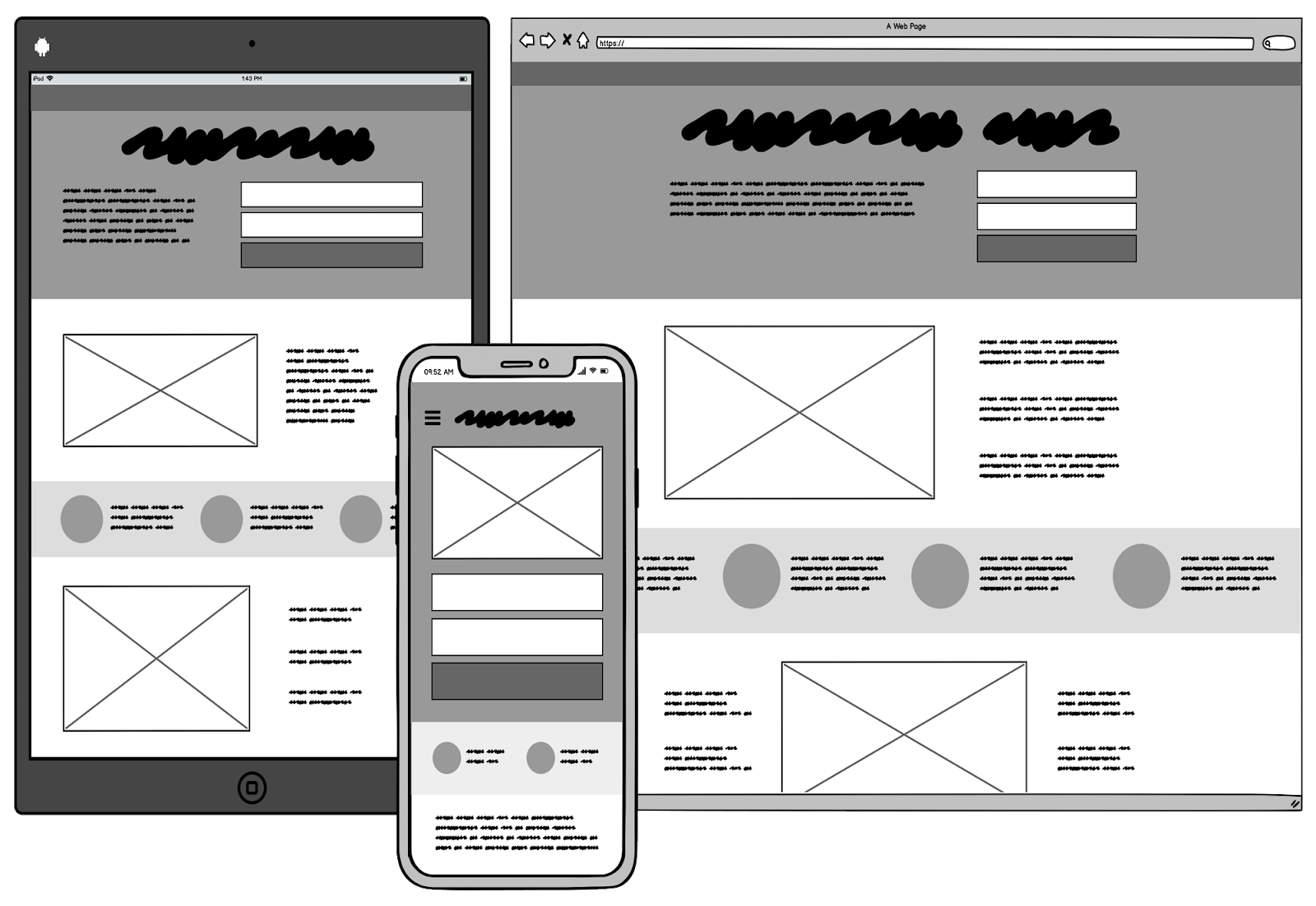
The internet has connected 4.66 billion people with each other as of October 2020. A total of 59% of the world’s total population. Amazingly, this is not even the surprising part. The stat to look out for is mobile users and their rise in the internet world. Out of 4.66 billion people connected to the internet, 4.28 billion are mobile internet users. A number that reminds us of how vital mobile users are and why we need to keep them on priority. As surprising as these numbers are, everyone saw this coming with the sudden rise in mobile users and mobile sales all around the world. As a web developer, we have been prepared in shifting our design methodologies and development tactics according to mobile users for some time now. One such design paradigm is the mobile-first design which is a witness to our commitment to mobile internet users all around the world. A design strategy that starts with mobile users and works around their interest. This post takes the mobile-first design into the centre and explores the complexities of mobile-first design development and testing and how it affects our business in a positive way.
What is a Mobile-First Design?
Mobile-first design is the process of planning and developing a website keeping in mind the mobile-users first. This methodology of development changed from desktop-first, which has always been the way, reacting to the surge in mobile internet users around the world. Mobile-first design is a part of progressive advancement method in which we progress towards more advance design slowly.
Progressive advancement starts from a basic design fulfilling the requirements of the mobile device. This basic design consists of minimal elements on the webpage eliminating everything that a mobile user is not interested in. From here, we take another step and add a few more elements increasing the complexity of our design while sticking to the modern web design techniques and mobile-friendliness. This goes on until we are satisfied and have implemented all the necessary modules in our application.
Mobile-first design is a practice of starting the development with respect to the mobile user or a mobile device first. Contributing 52% of the internet traffic today, a mobile-first website can help us lift the overall engagement and make us visible on the internet (on Google). With the start of mobile-first indexing, Google has also twisted their algorithm to show that mobile users are the priority today. Mobile-first design is not a complex task but a series of small development changes that can help your website render perfectly on the mobile with a happy user. To develop a mobile-first design website, we need to absorb some habits and remember a few tips to test the application efficiently.
How To Develop a Mobile-First Design
The journey of developing a mobile-first design can be roughly divided into the following stages:
Wireframing
Wireframe’s importance in a mobile-first design is similar to a map when we construct a new building. Wireframe provides an architectural way of how things are going to be. With wireframes in hand, not only technical teams, everyone related to the project can understand the high-level view of the application or in user’s terms: how will my application look?
While clients and analysts can tick mark their checklist of requirements, developers can understand how the elements will be laid down on to the application.
A research paper published by KPMG, determining “Unsuccessful Information Technology Projects” revealed poor project planning as one of the reasons for project failure. The other good reason to use wireframes is that they increase the efficiency of the developers because of the clearer objectives. A similar result can be seen with TDD and BDD approach in testing.
Use Responsiveness and A Responsive Framework
A responsive framework is a crucial step in mobile-first design development. A responsive website adjusts itself with the environment it is rendered on such as screen size, platform or orientation. Mobile devices do not have a fixed size in the market. An overwhelming list on Screensiz will make you believe that applying media queries and meta tag will not work for all the devices and a generic approach is the only solution. Responsiveness is not only adjusting to the screen of the device, but also to the user’s experience. For example, images are an important part of a web page. Even though a user may skim the content, they will glance at an image at least once. It needs to be perfect! But while shrinking the aspect ratio of the webpage, we unknowingly focus out the image subject from the image. In the following image, the comparison speaks this point as the family becomes out of focus on a smaller screen device:
Simply resizing is a risky business as an image may lose its importance altogether. A good responsive website takes care of this aspect and render a different lower quality but cropped image on a smaller screen as below:
Or if I just show the mobile image, it has been cropped to as follows:
Since the focus is not the tree but the family, we need the users to see our subject with clarity. This is a responsive nature according to the user experience which is a part of a responsive website.
A responsive framework keeps the responsive needs in mind and has built-in capabilities to enhance the responsiveness of the website. With a responsive framework, the developers need not take care of every little thing and can focus on major issues such as the image resizing shown above. Responsive frameworks are more successful and popular in a mobile-first design strategy.
Follow the thumb rule
Before placing our content on the web page, we have to decide the location of each element with respect to the interaction habits of mobile users. A simple reason for this thought is the generic way most people use their phone; with one hand.
The green zone in the above image shows the easily accessible area on a mobile screen. Our most important elements, such as CTAs, should reside in the green zone for a mobile-user to access easily. Remember that the user is not using a mouse to operate a mobile device. Reaching the red zone will take efforts and repeated actions of which, voluntarily or involuntarily, a user always notices.
The below-given image shows the efforts a user would have to take with a very small design change (which in my way, is not a mobile-first design):
This small change can lead to increased user engagement demanding no efforts from our user.
Untangle Your Mobile-First Content and Design
Designing a web page desktop-style demands no extra attention towards the content. The screen is big and can accommodate whatever content you wish to add. The same attitude does not work in a mobile-first way. When the screen is smaller and we have only less than 3 seconds to impress a user, the content needs to be concise and to the point. A good solution to replace a lot of content from your screen is to use images, a hierarchical method of design or through a better user interface.
The content thoughts are to be replicated when we work with elements in a mobile-first design for the same reason of lesser screen space. Providing a congested screen with too many elements spread throughout confuses a user and slides him away from the CTA conversion goal. This is also called a minimalistic approach (or minimalism) in web design. A minimalistic approach distributes too few elements on to the screen leaving out a considerable white space for the user. The following image shows the minimalistic design:
But a mobile design is different from a mobile-first design. Eventually, we would have to extend this web page for the desktop users too. Minimalism on the desktop is also a good approach given that the font-size and hero images are equally proportionate.
Decluttering our design and content reminds us why it is important to move from basic to advanced and not vice-versa (also called graceful degradation). Had it been the desktop design at the start, the team has to conduct the brainstorm sessions first to fill a large screen and then removing them one by one for the mobile device. By that time, management becomes too complex, hard to confine our elements and takes too much time and efforts. Therefore, start basic with a minimal design and then move forward which is the initial step in a mobile-first design strategy.
Prioritize UI and UX
A mobile-first design needs to revolve around mobile users to increase engagements and conversions on our web application. While animations and transitions are as fancy to look as to touch, the user experience is much more than explicit elements. Our user experience need not be too ostentatious but should engage the users without them realising our intentions. For example, elements should be extremely easy to find on a web page. A mobile user should never struggle to find the search button Conventional locations of the elements work in this case such as a navigation bar is always expected to be in the corner (left or right).
Another aspect in prioritizing the user experience is to enlarge the touch targets for comfortable interaction. Unlike a desktop with a small pointed arrow, we touch our screens with our thumbs which require a considerable large area. A mobile-first design encourages large clickable elements with white space between them to avoid unwanted clicks.
It is not a bad idea to keep these parameters intact while progressing towards the desktop side. Businesses have started to keep a better UI including large boxes to touch on desktops as well which shows their mobile-first design approach clearly. Enlarging elements also include determining the best font-size for your web page considering the smaller screen size. Font-size are easier to switch through media queries and you can follow the following chart to decide which size to go for in which scenario:
Remember that font-type also affects the font-size visibility and readability on a mobile device. Therefore, it is better to test and find your perfect size taking the above chart for reference.
Tip: A small thing to remember in developing a mobile-first design is to avoid hover-only elements on your web page. Hovering is a great tool on desktops but mobiles do not have any support for hover. They work on touch interaction. You can keep the hover design along with the touch facility but constructing elements only with hover property is not a good idea.
CTA Placement
CTA is an important button. It helps in conversion goals and every business wants its users to click that button and increase their conversion rate. Therefore it demands special attention from the team members. The location of the CTA is the first thing that should be finalised carefully reminding yourself not to let our user work too hard.
CTAs should always be in the reach of the thumb (remember the green zone?) and on the first presented screen (above the fold) as well.
Apart from CTA placement, the message and presentation of a CTA is also an art in itself but let’s leave that for mobile-friendliness discussions.
Navigation Bar
The navigation bar on a mobile-first design needs simplification more than the desktop ones. While the desktop design has also transformed navigation bars into different unique designs, mobile-first is still enjoying the conventional hamburger menu style. People expect that today! If a user cannot find an option on the landing screen, he looks for those three horizontal lines that he knows will take him to what he is looking for.
The following image shows LambdaTest transformation of the navigation bar on two different devices:
The mobile-first approach helps us in shrinking down the available links on the navigation menu as long lists of links are not appreciated well. For those who cannot sacrifice, a nested layout seems a better choice than intimidating the user with a long list of links. In addition, it also keeps our presentation clean and encourages minimal design with decluttered content approach.
Say No To Heavy Elements
A web page’s loading speed has become a make or breaks parameter in website designing. An Unbounce survey shows that 70% of the customers are influenced by a website’s speed. Their decisions are affected by the FCP or full page load. Rendering the FCP (the first thing visible on your website) is a better choice as the user has something to get engaged in.
Google recommends a loading time of 2 seconds and under. Currently, the majority of these websites do not follow this criteria. As much as 57% of peopleleave a website that takes more than three seconds to load. The conversion rates also take a toll when the page speed is higher than expected affecting business directly. So, how can we save ourselves from this?
Using lighter elements on a web page crafted for mobile users is the first step to go for. If images exist, they probably should be in a lossless algorithm format such as JPEG and of lower size. Resizing them to a lower ratio helps too since the mobile user is rarely concerned about high-quality images apart from the product images. Using CDNs can also help in decreasing the page load time. For a WordPress website, plugins should be as minimal and light-weight as possible. Static plugins are a good start but eventually, the elements on a web page should be lighter, using asynchronous algorithms for FCP and should make fewer requests to the server.
How to test a mobile-first design?
The above points assist us during the development of a mobile-first design that starts with a basic minimal design for the mobile user and increases the complexities without hindering the user experience. But an equally important aspect of a web application is testing it. Testing an application can point out hidden bugs and functionalities that either is not liked by the people or behave inappropriately. Let’s check out how we can go ahead and polish our mobile-first website by testing it.
Use Tools
Similar to using responsive frameworks in the development which gives us in-built functionality and takes care of common code, tools do the same in testing. A mobile web testing tool not only creates an environment for the website to render as, on a mobile device, but it also provides certain features that are extremely important for a mobile-first design.
LT Browser is a browser made specifically for mobile web testing and responsive testing of the website. It provides 45+ screen sizes for the testers to render their website on. With such a tool, you can easily find bugs using in-built debuggers and leverage hot reload features to help you in development as well. With built-in integrations and performance reports, you can analyze the performance and share it with your teammates easily.
LT Browser showing two devices side-by-side with different orientations
Test & Debug on the go – Using LT Browser users can test and debug their websites on the go, its in-built developer’s tool really comes in handy to make a website seamless across devices.
Network Throttling: This is an amazing and unique feature offered by LT Browser utilizing which a user can check how the website performs under high and low network bandwidth.
Local Testing: Local testing allows the developer to test their website even before pushing their website online. With the local tunnel, they can view the website on any of the 45+ devices from their local system.
Performance Report: To analyse the final website performance, developers and testers can view the google lighthouse based performance report that will help them change certain website aspect in order to score more both on mobile and desktop devices.
Tools help you increase productivity and keep you efficient during the process. The choice of tools is the personal choice of the tester but they definitely should play a part in the overall testing.
Cross-Browser Testing
Cross-browser testing is the process of analyzing your website on different target browsers, operating systems and resolutions. For a mobile-friendly website to be successful, it should render as intended on a mobile screen without worrying about the platform and browser used. This can be tested through cross-browser tools like LambdaTest
As a tester and a developer, it is definitely not a good idea to take these efforts manually. There is an overwhelming number of OS, browser and resolution combinations that will take too much efforts to install and test. A better way is to go for online cross-browser testing tools with mobile browser and OS support or a mobile-specific browser like LT Browser discussed above.
So, what are we looking for in a cross-browser testing process?
Cross-browser testing looks for issues with the elements of a web page and whether they are supported or not. While functionality testing is another segment of testing, cross-browser testing points out the cross-browser compatibility issues. For example, if you have used CSS subgrids on the web page, they might not render on Google Chrome version 62. The same goes for Javascript libraries and other code. With a browser matrix in our hand, we can rest assured after performing the testing that our user will not be confused as he would when an element crashes on the webpage.
Validate HTML and CSS code
Every mishap on the web page is not the browser’s fault, sometimes programmers commit mistakes too! Since a web page is rendered or parsed by the browser and not compiled, errors and warnings do not stop a web page from loading. Now we have performed cross-browser testing but still cannot find an issue with a missing element is generally a wrong syntax fault. Such syntax errors and not following the W3C web standards can land us in trouble when we progress from mobile-first to complete desktop designs.
HTML and CSS code is very easy to validate. There are a lot of tools available which can do this job for us. Some of them are Validator.nu, W3CMarkup Validator and W3C CSS Validator.
Network Performance
In our efforts to test the page load speed of the web page, a major hurdle is a network. A slower network means slower downloading of web pages and more page load time. For a mobile-first design, it is extremely important to cover all types of users while performing the testing. One such section is the users with slower networks such as 3G network constituting 12% of North American internet users. Only 4% of people use the 5G network in North America now. Imagine this number for countries with poor network infrastructures!!
Network performance can be tested on a real device by switching the connections or through an online tool that provides such features. LT Browser has a network throttling feature to test the website on different connections which helps while performing responsive or cross-browser testing.
A/B Testing
A/B Testing is a type of variation testing or split testing that shows different variations of a web page to different segments of users. Website owners then analyze the performance of both versions and choose the better performing one. For a mobile-first design application, we may develop everything perfectly following every rule in the textbook but the final verdict is up to the user. If the user is not pressing that shiny CTA button, we need to fix that by knowing what the user wants.
A popular question in A/B testing is, where do we create the variation? We cannot jumble up every element on the web page and create fifty variations for the users. This can have an adverse impact on the business. To understand where we are going wrong and which elements need adjustments we can choose the Heatmap features. Heatmap allows the web app owners to see the user’s engagement with the web page and which part are they ignoring.
A famous case study of A/B testing includes the 40% improved sales on a varying page of EA Sports’ SimCity 5 from this:
To this:
Buyers were least interested in the pre-order offer I guess!!
Usability Testing
The final step in completing our mobile-first web design is to present it to real-users and take their feedback. A/B testing is good, but even if you see the Heatmap of the web page, you cannot talk to a real user and ask them why are they not pressing the CTA button? Usability testing covers this hole.
Usability testing is performed with the real users who should be the target audience of the application. For example, you cannot ask a poet to check out a coding website right? Once these users are selected, we ask them to either record their session, their screens and speak their thoughts out loud. Sometimes, the testers can sit with the users too and make their notes by asking the questions. Sometimes, we can just ask them to fill a form with various options. Whatever way you do, usability testing is important and uncovers hidden bugs that are hard to find in a mobile-first design which is a tricky business in itself.
Why does mobile presence matter?
Our analysis of mobile-first design and its development techniques will make you wonder, why should I do mobile-first design? Does mobile presence matter that much?
A few days ago, I was going through my website on Google Search Console and the popped up message was the following:
Mobile-first design is so important today that Google considers mobile-first indexing as the primary search index technique and increasing the visibility on mobile searches which constitutes 52% of the internet traffic!! But this is from Google’s side, what do we have in the box for us?
Better Google Ranking
A mobile-first design is mobile-friendly. It is for mobile users. Therefore, Google realizes that we have a website that is perfect for a mobile user and makes us more visible on queries generated from a smartphone. As a result, our rankings improve. Better Google ranking attracts other businesses as we are more visible and can advertise for them on our website if we want. Since users generally do not remember the web site’s name, a Google search will help us generate traffic and conversions.
Higher Conversion Rates
A mobile-first design will ensure a decrease in the bounce rate. When bounce rates are low and people are actually interested in your website, they will stick to it and will also return back often. Given that the CTA is positioned right with all the eligibility criteria satisfied, a mobile-first design will push your conversion rates higher directly generating a better engagement and goal establishments. As a result, you will get a steady business from your application.
Large Audience Coverage
Businesses also generate a large audience base when they are visible on the Google rankings and have built a mobile-first design. A large audience base is the strength of any business. They require lesser efforts to be engaged as the trust has been established. On the other hand, seeing a larger involvement with your application, you can also introduce other features and services. Such a strong base is a marketing bonus for businesses.
Better Market Presence
Satisfying all the three requirements discussed above directly results in a better market presence. Even though mobile-first designs are recommended for every business, they are currently rare. Mobile-first design is yet to become a standard in web development and choosing it will keep you ahead in the race. A Google search keyword that shows your link in the query results increases your market presence among the competitors. They not only have to work harder to overtake you, but they might also need to restructure their designs if they are still working on desktop ones.
A better market presence means better word of mouth about your happenings, features and upcoming highlights. Such a presence is a direct cause for better revenues and a better future.
Is Mobile-First similar to Mobile-Responsive?
A short answer; no! Mobile-first is a design method. With the mobile-first design, we develop our web application for mobile users first. This starts from a very basic design and gradually advances towards a more complex design structure while keeping in view the mobile-friendliness and mobile users on priority. Mobile-first design is not a development technique but a design strategy that works as a catalyst in development. The developers can get a clear objective and work faster with the defined design.
Mobile-responsive is the ability of the website to adjust itself according to the mobile screen size. A mobile-responsive design need not start with the mobile version of the website and neither takes the thumb area or content relevance into account. Mobile-responsiveness is just concerned with rendering the website on a smaller device.
A mobile-responsive design strategy can be considered a part of the mobile-first design since to produce a mobile-first design, the application needs to be responsive in nature. The mobile-responsive design strategy was a good call when the mobile users had just started to increase. Today, there have been extensive researches on mobile designs in which a mobile-responsive design strategy is hard to survive. To cater to the needs of 4.2 billion mobile internet users, we need a mobile-first design.
Alex and Chris talk about the glory that is having all of CodePen’s code base in a single repository. This was a slow journey of a couple of years. The biggest step was what jokingly named “CodePen in Stereo” which involved consolidating everything Node-based on CodePen (mostly a bunch of lambdas) into a single repo, but still having a second repo for our Rails stuff. The final leap was consolidating those.
This opened up some cool doors for us, like having a sub-project that is our design system that any other sub-project can use. This meant getting into stuff like Lerna and Yarn Workspaces. We were also particularly excited about making sure that every single bit of code we run is right in our main repo meaning it won’t be forgotten or neglected and can share resources and dependencies from elsewhere in the code base.
Just as meaningful, it consolidates the human action around the code. A monorepo means all the branches and pull requests are in one place. All the issues are in one place. When you git pull you get everything you need. When you spin up our scriped dev environment, it can be sure it has everything it needs.
Chris wrote a bit more about it here, including touching on why others might not like the idea of a monorepo, which we get deeper into in the podcast.
Simplify your infrastructure and cut your cloud bills in half with Linode’s Linux virtual machines. Develop, deploy, and scale your modern applications faster and easier.
Whether you’re developing a personal project or managing larger workloads, you deserve simple, affordable, and accessible cloud computing solutions.
Get started on Linode today with a $100 in free credit for listeners of CodePen Radio. You can find all the details at linode.com/codepen.
Linode has data centers around the world with the same simple and consistent pricing regardless of location. Choose the data center nearest to you.
You also receive 24/7/365 human support with no tiers or hand-offs regardless of your plan size. You can choose shared and dedicated compute instances or you can use your $100 in credit on S3-compatible object storage, Managed Kubernetes, and more. If it runs on Linux, it runs on Linode.
Visit linode.com/codepen and click on the “Create Free Account” button to get started.
If you plan to add social media posts to a website, add a few colorful, informative, and responsive charts. Or, simply spice things up with a few carefully placed animations, you may need to enlist the aid of a plugin to do it well.
If you really want to take your site or business to the next level, it only makes sense to seek out one of the best WordPress plugins in a given category. So, you won’t get just good results, but awesome results.
Which is presumably why you’re reading this article.
Since all useful WordPress plugins are obviously not created equal you might want to do some comparisons to see what might perform best for you.
Or you could simply check out the following selection of 9 top WordPress plugins. Select one that provides the functionality you’re looking for, and get on with it.
Automated processes can save time, minimize or eliminate stress, give you error-free performance, and make all interested parties happier than was previously the case.
At least that is what Amelia can do for fitness centers, beauty parlors, training centers, consulting firms, photographers and other businesses as 30,000+ businesses already benefit from Amelia scheduling.
Amelia automates the appointment booking process, while at the same time giving clients and employees full control over their respective actions.
Clients can make, change, or cancel appointments 24/7.
Appointments are only made at times that are convenient for the parties concerned (usually a client and an employee).
Selling packages of appointment for a single price is possible
There is no limit to the number of clients, the number of appointments that can be booked, or the number of employees, plus Amelia can serve multiple locations.
This Enterprise-Level booking manager can schedule events as well as appointments.
Business owners can check overall status at any time. Clients do not have to login to WordPress to cancel or reschedule an appointment.
wpDataTables is a WordPress table and chart plugin that gives its users the easiest way to create responsive tables and charts from a variety of sources and in a variety of formats.
wpDataTables –
creates simple tables, data tables, and 3 types of charts
easily manages massive amounts of data and organizes the data into intuitive and interactive tables and charts
accepts data from Google spreadsheets, Excel files, CSV files, and other sources
generates real-time data directly from MySQL
features conditional formatting techniques for highlighting and color-coding key data
While wpDataTables can be used by anyone and in any industry, this popular plugin has proven to be particularly useful when working with financial statistics, operational statistics, large product inventories, complex analyses, and comparisons.
Click on the banner to review the full range of wpDataTables’ features and capabilities.
Cross-selling is an established marketing practice in which products from different product lines are combined or bundled, a practice that can be difficult without a well-planned system as WPC Product Bundles for promotion offering, stock management and order packaging to keep the ball rolling.
WPC Product Bundles can bring about to your business –
Combine simple products, variable products, selected variations of a product to form a bundle (e.g., combine a t-shirt with jeans and shoes)
Display bundled products with an appalling interface of your preference: ddSlick, Select2, HTML tags or Radio Buttons
Use drag and drop to rearrange the order of bundled products
Auto-calculate or manually set regular and sale prices
Smartly manage inventory, tax, shipping charges, and order invoice
Plus, WPC Product Bundles can work with many other WPC plugins (ie. Smart Wishlist, Quick View, and Compare) to strengthen the user experience and sales boosting effects.
Click on the banner to learn more about the benefits of this top-rated product bundling plugin.
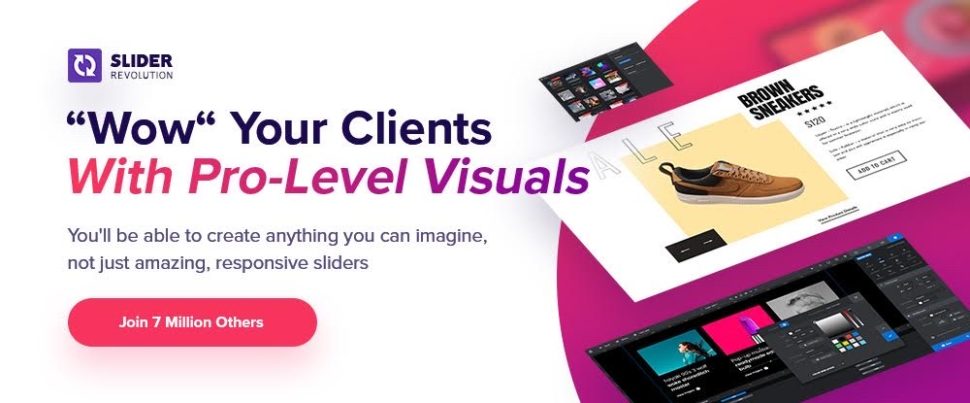
Slider Revolution’s new template library isn’t just for building sliders. It’s also for creating stunning and responsive hero sections and other web page sections and content elements.
Slider Revolution’s drag and drop intuitive editor will save you hours of work on every project
Everything you need is there for creating jaw-dropping designs
Royalty-free background images, videos, font icons, and more are at your fingertips
Personalization is more important than ever. Without it, your site shows the same message to every visitor. Every time they visit…
Logic Hop shows the right message to the right person and helps you increase conversions. Features like geolocation, dynamic text replacement and integrations with WooCommerce and Gravity Forms make Logic Hop the best personalization tool on the market.
Try Logic Hop and see what personalization can do for you.
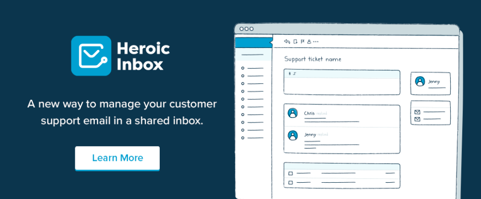
Instead of relying on a slap-dash method of trying to manage a customer support staff’s email inbox, Heroic inbox makes it much easier for staff members to work together.
With a snappy UI and fast workflows to work with, your support staff can quickly achieve Inbox Zero status and maintain it
Heroic Inbox tracks the key metrics involved in inbox management, so you can always see how the staff is performing
“More and Better” is always a nice place to be, and Ads Pro, the best ad manager for WordPress puts your ad management operation firmly in that place with its –
20+ ad display techniques
25+ ready-to-use user friendly and responsive ad templates
Intuitive Frontend User Panel and Order Form and Statistics Module
4 Payment methods and 3 Billing modules
Click on the banner to learn more about how ads Pro can help you.
Flow-Flow is a friendly, fast, and powerful way to customize the design and behavior of your site’s social media feed.
You can add as many social feeds to a stream as you need
Flow-Flow is responsive, highly customizable, and no coding is required to set it up
A free Lite test drive version is available
Flow-Flow has been Envato’s best-selling social media plugin since 2014.
*****
WordPress plugins are great tools for adding and extending functionality to WordPress and WordPress user sites. To get the greatest value for your money, we recommend that you always set your sites on getting the best plugin in its category.
As you can see from the above selection, best-in-class useful WordPress plugins can be reasonably priced. Any one of these is capable of turning a website into a conversion and money-making machine.
These essential plugins for WordPress are easy to set up and work with, and were designed to make life easy for WordPress website administrators.
While many of the popular digital marketing tools often double up as sales funnel tools, the truth of the matter is, if you're looking for only the very best sales funnel tools, you'll probably want something that's more purpose-built.
Most WordPress themes come with built-in styles that automatically transform your navigation menus into a mobile menu. However, you may not wish to use the same menu on mobile or may want to use a different menu style.
In this article, we will show you how to easily hide a mobile menu in WordPress using a plugin or code method.
Method 1. Hide a Mobile Menu in WordPress using a Plugin
This method is easier and is recommended for beginners. We’ll use a plugin to hide your existing mobile menu provided by your WordPress theme and then use a different menu or no menu at all on mobile devices.
First, you need to visit the Appearance » Menus page and create a new navigation menu that you would like to display on mobile devices.
On the next screen, you need to provide a name for your new menu that helps you identify it later. We’ll call it ‘Mobile Menu’. After that, you can select the items you want to add to your menu from the left column.
Once you are finished adding items to your menu, don’t forget to click on the Save Menu button to save your menu.
Upon activation, you need to visit Mobile Menu Options page to configure plugin settings. From here, you need to select whether you want to display your mobile menu on the right or to the left by turning the toggle On.
From the drop-down menu, select the mobile menu you created earlier.
Next, you need to scroll down to the ‘Hide Original Theme Menu’ section. This is where you can tell the plugin to hide a mobile menu created by your WordPress theme.
By default, the plugin will use commonly used element identifiers used by most popular WordPress themes. Most users wouldn’t need to do anything here.
However, if the plugin fails to hide your theme’s menu, then you can come back here and click on the ‘Find Element’ button to simply point to your theme’s navigation menu.
Don’t forget to click on the Save Changes button to store your settings.
Now that we have set up the plugin, we need to tell WordPress site to display our mobile menu to the new menu location added by the plugin.
Simply, go to the Appearance » Menus page. Make sure the mobile menu you created earlier is selected in the drop down menu. Below your menu item choose the location you selected in the plugin settings (e.g. Left Mobile Menu or Right Mobile Menu).
You can now visit your website to see your new menu in action. The plugin will now hide your theme’s mobile menu and display a custom menu instead.
WP Mobile Menu plugin allows you to change the color of the menu bar, change opacity, add icons, and more in the settings. Feel free to play around with those settings.
Method 2. Hide Mobile Menu using CSS Code
This method is a bit advanced and requires some custom CSS to be used.
For this method, you can choose to use two different approaches. You can just hide a complete mobile menu using CSS, or you can hide individual menu items on mobile devices.
1. Hiding a complete menu on mobile devices using CSS
First, you need to figure out the element you need to modify using custom CSS. To do that, simply go to your website and take the mouse over to your navigation menu. After that, right click and select Inspect tool.
Your browser screen will split into two, and you’ll see the source code of your webpage. Now this navigation menu is not the one you need to target because it is visible on the desktop screen.
You need to rearrange your browser screen by dragging it from the corner to a smaller size until the desktop navigation menu is replaced by the mobile menu.
You need to figure out the identifier and CSS class used by your WordPress navigation menu. You can do that by moving your mouse on the source code until the menu area is highlighted.
As you can see in the screenshot above, our test theme is using the navbar-toggle-wrapper class.
After that, you need to go to Appearance » Customize page in WordPress admin area to launch theme customizer. Here, you need to switch to the ‘Additional CSS’ tab and click on the mobile icon at the bottom right corner of the left panel.
The customizer will now show a preview of how your site will look on mobile devices. You can now enter the following CSS code and see your mobile menu disappear in the preview panel.
.navbar-toggle-wrapper {
display:none;
}
Don’t forget to replace the .navbar-toggle-wrapper with the identifier used by your WordPress theme.
After that, click on the ‘Publish’ button at the top to save your changes.
2. Hiding specific menu items in mobile menu using CSS
This method allows you to create a navigation menu and then selectively show or hide items that you don’t want to display on mobile or desktop devices.
The advantage of this method is that you can use the same navigation menu for mobile and desktop and simply hide the items that you don’t want to be seen.
First, you need to go to Appearance » Menus page and click on the Screen Options button at the top right corner of the screen. From here, you need to check the box next to the ‘CSS Classes’ option.
After that. you need to scroll down to a menu item that you want to hide on mobile devices and click to expand it. In the menu item settings, you’ll now see the option to add a CSS class. Go ahead and add .hide-mobile CSS class there.
Repeat the process for all menu items you don’t want to show on mobile.
Similarly, you can also click on the menu items that you want to hide on desktop computers. This time, add the .hide-desktop CSS class instead.
Once you are finished, don’t forget to click on the Save Menu button to store your changes.
Now we will add custom CSS to hide these menu items. Simply go to the Appearance » Customize page to launch the Theme Customizer and click on the Additional CSS tab.
You need to add the following CSS code in the CSS box.
Don’t forget to click on the Publish button to save your changes.
You can now visit your website and you will notice that items that you wanted to hide on desktop are no longer visible in the menu. Adjust your browser screen to a smaller size and you will notice the same for the mobile menu as well.
It's nice being here with you in your big family. My name is Rajesh and I'm the owner of Technologycounter.com, a Indian software company.
Im Rajesh. Im a Software Strategist & Digital Marketing Specialist living in India. I am a fan of yoga, fitness, and arts. Im also interested in photography and travel.
Thank you very much and hope to share a lot of useful information here!
I have developed a software in VB6. I want to give a menu option for back up. ie. to copy the database files to a pendrive
I have given the below code
 Dim sourcefile,Destinationfile as string
  sourcefile = App.Path & "\HHA.mdb"
  Destinationfile = Textdrive.text & "\HHA.mdb"
  Filecopy sourcefile,Destinationfile

  When worked out the above code -Permission Denied - message is displayed.

  My source file="C:\My Documents\HHA\HHA.mdb"

  When I changed my source file to "K:\HHA\Support\HHA.mdb"  - the copying worked well.ie. From the C drive copying is not allowed
  Any body can help me? Any idea...


 In my
In my 


