Install and Configuration of Apache Hive-3.1.2 on Multi-Node

The Apache Hive is a data warehouse system built on top of the Apache Hadoop. Hive can be utilized for easy data summarization, ad-hoc queries, analysis of large datasets stores in various databases or file systems integrated with Hadoop. Ideally, we use Hive to apply structure (tables) on persisted a large amount of unstructured data in HDFS and subsequently query those data for analysis. 

The objective of this article is to provide step by step procedure in sequence to install and configure the latest version of Apache Hive (3.1.2) on top of the existing multi-node Hadoop cluster. In a future post, I will detail how we can use Kibana for data visualization by integrating Elastic Search with Hive. Apache Hadoop — 3.2.0 was deployed and running successfully in the cluster. Here is the list of environment and required components.

10 Cyber Security Tools to Watch Out for in 2021

With an immense number of companies and entities climbing onto the digital bandwagon, cybersecurity considerations have come up as limelight. Besides, new technologies such as Big Data, IoT, and Artificial Intelligence/Machine Learning are gradually more making inroads into our everyday lives, the threats related to cybercrime are mounting as well. Additionally, the usage of mobile and web apps in transacting financial information has put the complete digital stuff exposed to cybersecurity breaches. The inherent risks and vulnerabilities found in such apps can be exploited by attackers or cybercriminals to draw off crucial information data counting money. Internationally, cyber-security breaches have caused a yearly loss of USD 20.38 million in 2019 (Source: Statista). Plus, cybercrime has led to a 0.80 percent loss of the entire world’s Gross domestic product, which sums up to approx. USD 2.1 trillion in the year 2019 alone (Source: Cybriant.com).

Statista Report 2018 “Security Threats at All-Time High”. The no. of security threats or vulnerabilities in all kinds of Information Technology software is at an all-time high.

Best IoT Testing Tools, Strategies, and Products

Creating a cool IoT device or life-changing IoT software is only the first step towards a products’ success. Executing proper QA testing on your IoT product confirms that your IoT device can withstand security threats, connectivity issues, and performance malfunction.

That requires a lot of testing. 

How to Make an Area Chart With CSS

You might know a few ways to create charts with pure CSS. Some of them are covered here on CSS-Tricks, and many others can be found on CodePen, but I haven’t seen many examples of “area charts” (imagine a line chart with the bottom area filled in), particularly any in HTML and CSS alone. In this article, we’ll do just that, using a semantic and accessible HTML foundation.

A red area chart against a dark gray background.

Let’s start with the HTML

To simplify things, we will be using <ul> tags as wrappers and <li> elements for individual data items. You can use any other HTML tag in your project, depending on your needs.

<ul class="area-chart">
  <li> 40% </li>
  <li> 80% </li>
  <li> 60% </li>
  <li> 100% </li>
  <li> 30% </li>
</li>

CSS can’t retrieve the inner HTML text, that is why we will be using CSS custom properties to pass data to our CSS. Each data item will have a --start and an --end custom properties.

<ul class="area-chart">
  <li style="--start: 0.1; --end: 0.4;"> 40% </li>
  <li style="--start: 0.4; --end: 0.8;"> 80% </li>
  <li style="--start: 0.8; --end: 0.6;"> 60% </li>
  <li style="--start: 0.6; --end: 1.0;"> 100% </li>
  <li style="--start: 1.0; --end: 0.3;"> 30% </li>
</li>

Here’s what we need to consider…

There are several design principles we ought to consider before moving into styling:

  • Units data: We will be using unit-less data in our HTML (i.e. no px, em , rem , % or any other unit). The --start and --end custom properties will be numbers between 0 and 1.
  • Columns width: We won’t set a fixed width for each <li> element. We won’t be using % either, as we don’t know how many items are there. Each column width will be based on the main wrapper width, divided by the total number of data items. In our case, that’s the width of the <ul> element divided by the number of <li> elements.
  • Accessibility: The values inside each <li> is optional and only the --start and --end custom properties are required. Still, it’s best to include some sort of text or value for screen readers and other assistive technologies to describe the content.

Now, let’s start styling!

Let’s start with general layout styling first. The chart wrapper element is a flex container, displaying items in a row, stretching each child element so the entire area is filled.

.area-chart {
  /* Reset */
  margin: 0;
  padding: 0;
  border: 0;

  /* Dimensions */
  width: 100%;
  max-width: var(--chart-width, 100%);
  height: var(--chart-height, 300px);

  /* Layout */
  display: flex;
  justify-content: stretch;
  align-items: stretch;
  flex-direction: row;
}

If the area chart wrapper is a list, we should remove the list style to give us more styling flexibility.

ul.area-chart,
ol.area-chart {
  list-style: none;
}

This code styles all of the columns in the entire chart. With bar charts it’s simple: we use background-color and height for each column. With area charts we are going to use the clip-path property to set the region that should be shown.

First we set up each column:

.area-chart > * {
  /* Even size items */
  flex-grow: 1;
  flex-shrink: 1;
  flex-basis: 0;

  /* Color */
  background: var(--color, rgba(240, 50, 50, .75));
}

To create a rectangle covering the entire area, we will reach for the clip-path property and use its polygon() function containing the coordinates of the area. This basically doesn’t do anything at the moment because the polygon covers everything:

.area-chart > * {
  clip-path: polygon(
    0% 0%,     /* top left */
    100% 0%,   /* top right */
    100% 100%, /* bottom right */
    0% 100%    /* bottom left */
  );
}

Now for the best part!

To show just part of the column, we clip it to create that area chart-like effect. To show just the area we want, we use the --start and --end custom properties inside the clip-path polygon:

.area-chart > * {
  clip-path: polygon(
    0% calc(100% * (1 - var(--start))),
    100% calc(100% * (1 - var(--size))),
    100% 100%,
    0% 100%
  );
}

Seriously, this one bit of CSS does all of the work. Here’s what we get:

Working with multiple datasets

Now that we know the basics, let’s create an area chart with multiple datasets. Area charts often measure more than one set of data and the effect is a layered comparison of the data.

This kind of chart requires several child elements, so we are going to replace our <ul> approach with a <table>.

<table class="area-chart">
  <tbody>
    <tr>
      <td> 40% </td>
      <td> 80% </td>
    </tr>
    <tr>
      <td> 60% </td>
      <td> 100% </td>
    </tr>
  </tbody>
</table>

Tables are accessible and search engine friendly. And if the stylesheet doesn’t load for some reason, all the data is still visible in the markup.

Again, we will use the --start and --end custom properties with numbers between 0 and 1.

<table class="area-chart">
  <tbody>
    <tr>
      <td style="--start: 0; --end: 0.4;"> 40% </td>
      <td style="--start: 0; --end: 0.8;"> 80% </td>
    </tr>
    <tr>
      <td style="--start: 0.4; --end: 0.6;"> 60% </td>
      <td style="--start: 0.8; --end: 1.0;"> 100% </td>
    </tr>
  </tbody>
</table>

So, first we will style the general layout for the wrapping element, our table, which we’ve given an .area-chart class:

.area-chart {
  /* Reset */
  margin: 0;
  padding: 0;
  border: 0;

  /* Dimensions */
  width: 100%;
  max-width: var(--chart-width, 600px);
  height: var(--chart-height, 300px);
}

Next, we will make the <tbody> element a flex container, displaying the <tr> items in a row and evenly sized:

.area-chart tbody {
  width: 100%;
  height: 100%;

  /* Layout */
  display: flex;
  justify-content: stretch;
  align-items: stretch;
  flex-direction: row;
}
.area-chart tr {
  /* Even size items */
  flex-grow: 1;
  flex-shrink: 1;
  flex-basis: 0;
}

Now we need to make the <td> elements cover each other, one element on top of each other so we get that layered effect. Each <td> covers the entire area of the <tr> element that contains it.

.area-chart tr {
  position: relative;
}
.area-chart td {
  position: absolute;
  top: 0;
  right: 0;
  bottom: 0;
  left: 0;
}

Let’s put the magical powers of clip-path: polygon() to use! We’re only displaying the area between the --start and --end custom properties which, again, are values between 0 and 1:

.area-chart td {
  clip-path: polygon(
    0% calc(100% * (1 - var(--start))),
    100% calc(100% * (1 - var(--end))),
    100% 100%,
    0% 100%
  );
}

Now let’s add color to each one:

.area-chart td {
  background: var(--color);
}
.area-chart td:nth-of-type(1) {
  --color: rgba(240, 50, 50, 0.75);
}
.area-chart td:nth-of-type(2) {
  --color: rgba(255, 180, 50, 0.75);
}
.area-chart td:nth-of-type(3) {
  --color: rgba(255, 220, 90, 0.75);
}

It’s important to use colors with opacity to get a nicer effect, which is why we’re using rgba() values. You could use hsla() here instead, if that’s how you roll.

And, just like that:

Wrapping up

It doesn’t matter how many HTML elements we add to our chart, the flex-based layout makes sure all the items are equally sized. This way, we only need to set the width of the wrapping chart element and the items will adjust accordingly for a responsive layout.

We have covered one technique to create area charts using pure CSS. For advanced use cases, you can check out my new open source data visualization framework, ChartsCSS.org. See the Area Chart section to see how area charts can be customized with things like different orientations, axes, and even a reversed order without changing the HTML markup, and much more!


The post How to Make an Area Chart With CSS appeared first on CSS-Tricks.

You can support CSS-Tricks by being an MVP Supporter.

Testing Streamlit Apps Using SeleniumBase

all checks have passed

When I’ve worked at Streamlit, I’ve seen hundreds of impressive data apps ranging from computer vision applications to public health tracking of COVID-19 and even simple children’s games. I believe the growing popularity of Streamlit comes from the fast, iterative workflows through the Streamlit “magic” functionality and auto-reloading the front-end upon saving your Python script. Write some code, hit ‘Save’ in your editor, and then visually inspect each code change's correctness. And with the unveiling of Streamlit sharing for easy deployment of Streamlit apps, you can go from idea to coding to deploying your app in just minutes!

Once you've created a Streamlit app, you can use automated testing to future-proof it against regressions. This post will show how to programmatically validate that a Streamlit app is unchanged visually using the Python package SeleniumBase.

How to Spend Money to Make Money With Your Website (And Why)

Do you really need to spend money to make money? If you’ve ever tried to make money, someone has probably told you that you need to spend money first. But we’re not talking about brick and mortar businesses in this post – so is this adage still true if you want to make money online with your own website? I mean, there are free web hosts, free SEO tools, and lots of other “free” things that can help you grow your business.

How to Add the WordPress Logout Link to Navigation Menu

Do you want to add a WordPress logout link to your site?

If you run a membership site, bbPress forum, eCommerce store, or a learning management system (LMS) using WordPress, having a prominent logout link is helpful for your users.

In this article, we will show you how to add the WordPress logout link to your navigation menu, as well as to other areas of your site.

Adding a logout link in WordPress navigation menu

The Logout Link for WordPress

Normally you can log out of your WordPress site by clicking on the logout link. This link is located below your profile picture in the top right corner of the WordPress admin bar.

All you have to do is take your mouse over to your username, and it will appear in the dropdown menu.

Log out link in WordPress admin bar

In case you or your site administrator have disabled the WordPress admin bar, then you will not be able to see the WordPress logout link.

The good thing is that the WordPress logout link can be directly accessed to log out of your current WordPress session.

The logout link for your WordPress site looks like this:

http://example.com/wp-login.php?action=logout

Don’t forget to replace example.com with your own domain name.

You can access this link directly in your browser window to log out of your WordPress site.

When you visit the WordPress logout link, it will take you to a warning page. You will need to click on the logout link to confirm that you really want to log out.

Logout confirmation

You can also manually add this logout link anywhere on your WordPress site. Let’s take a look at how to do that.

Video Tutorial

If you don’t like the video or need more instructions, then continue reading.

Adding the Logout Link in WordPress Navigation Menus

Adding the WordPress logout link in your site’s navigation menu will make it easily accessible from any page on your website.

Simply head over to the Appearance » Menus page in your WordPress admin. After that, you need to click on the custom links tab to expand it and add the logout link in the URL field.

Logout link in navigation menu

Once you are done, click on the ‘Add to menu’ button, and you will notice the link appear in the right column. You can adjust its position by simply dragging it up or down.

Don’t forget to click on the ‘Save Menu’ button to store your changes.

You can now visit your website to see the logout link in your navigation menu.

Logout link in the navigation menu

The problem with adding the logout link in the menu is that it is visible to all users (both logged-in and logged-out). It only makes sense to show the logout link to users who are actually logged in.

You can do that by following our instructions on how to show different menus to logged in users.

Add WordPress Logout Link in the Sidebar Widget

WordPress comes with a default widget called Meta. This widget shows a bunch of useful links including a logout or login link to users.

Meta widget in WordPress

Some people find the other links in the Meta widget are not quite as useful.

As an alternate, you can also add a plain text or custom HTML widget with the logout link in plain HTML. Here is the HTML code you’ll need to add:

<a href="http://example.com/wp-login.php?action=logout">Logout</a>

Logout HTML widget

Adding a Dynamic Login / Logout Link in WordPress

If you manually add a logout link in WordPress, then the problem is that it does not change based on the user’s login status.

To fix that, you can use a plugin to dynamically display the login or logout link based on the user’s session.

First, you’ll need to install the Login or Logout Menu Item plugin. For details, see our step-by-step guide on how to install a WordPress plugin.

After you install and activate the plugin, you’ll go to Appearance » Menus in your WordPress admin and add the Login/Logout link to your menu.

Login Logout menu WordPress plugin

After you hit ‘Save Menu’ and check your WordPress website, you’ll see the link in your menu.

Login link in menu

When you click on it, it’ll take you to a page to login, or if you’re already logged in, it will log you out.

This method also works with WooCommerce, MemberPress, and other WordPress eCommerce platforms.

We hope this article helped you find the direct WordPress logout link and add it to your navigation menu. You may also want to see our guide on how to add a call button in WordPress, and how to track link / button clicks in WordPress to make data-driven decisions.

If you liked this article, then please subscribe to our YouTube Channel for WordPress video tutorials. You can also find us on Twitter and Facebook.

The post How to Add the WordPress Logout Link to Navigation Menu appeared first on WPBeginner.

Designing An Attractive And Usable Data Importer For Your App

If you’ve ever tried to import data into an app before, you know, as a user, how varied the experience can be. In some cases, the user is overwhelmed with instructions on how to use the importer. In others, there’s no direction at all. And while that might look nicer than an importer overrun with directions and links to documentation on how to use it, a completely useless UI will also cause users frustration once the inevitable errors start getting thrown.

So, when you’re designing an app or software that needs a data importer, how do you ensure this doesn’t happen to your end users? Do you try to custom build or find a Goldilocks solution that strikes the right balance between minimal and informative? And what should that even look like?

Today, I want to look at four ways to ensure that the user interface design of your data importer doesn’t get in the way of a positive user experience.

Quick note before I start: I’ll be using live data importer examples to demonstrate how to design this on your own. However, if you’d rather just use a ready-made data importer, but don’t have time to review the existing options against these good design practices, Flatfile Concierge is what you’re looking for. I’ll show some examples of it as we go along and tell you a bit more about it at the end of this post.

UI Design Tips For Your Software’s Data Importer

There are many challenges in data onboarding for apps and software. But if you can get the UI right — in other words, provide your end users with an attractive and usable importer — you can effectively minimize those challenges.

Here’s what your data importer should look like if you want to make that a reality for your users:

1. Format The Instructions For Readability

It doesn’t matter how straightforward the data import process is. You can never assume that your end users will automatically know how to format their file(s), which file types are allowed and what sort of file size limitations there may be.

So, the main importer page must have instructions for them. Just be careful about going overboard.

If you leave them with a wall of text explaining what the importer is for, they’ll get annoyed with the redundant information holding them up from getting started. And if you spell out each possible step in minute detail, their eyes are going to glaze over. Worst-case scenario, they’ll start the experience feeling as though they’re being talked down to. None of these outcomes is ideal.

To find the sweet spot, aim for the following:

Simplify the instructions into 100 words or less.

PayPal’s invoice importer is a good example of this:

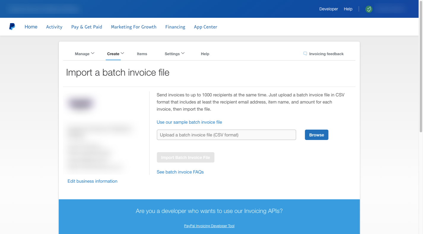
There’s a single paragraph on this page that tells users that files need to:

  • Be in CSV format;
  • Include fields for the email address, item name, and invoice amount;
  • Include no more than 1000 invoices.

For anyone that misses the bit about the file format, they’ll get a reminder of it in the upload field.

The rest of the information (the link to the file template and FAQs on how to batch invoice) is linked out to other pages, which keeps this importer page nice and short.

When possible, I’d recommend formatting the instructions using paragraphs, bulletpoints, bolded headers or white space. This would be similar to how you’d structure text for readability on a web or app page.

QuickBooks Self-Employed shows us how this might work:

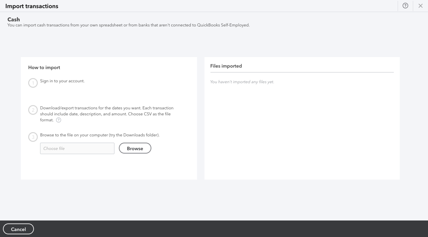
There are three steps presented and each is kept short and to the point. By adding extra space between and around them, reading the export/import instructions will seem less daunting.

One last thing you can do is to make the “Import” button stand out so that users that use the importer more than once can quickly skip past the instructions on subsequent uses.

Here’s how this might look if you use Flatfile as your data importer:

The button stands out clear as day on this page. And for those who have used this importer before, they won’t need to read through the instructions on the right for a reminder of what kinds of file types are allowed. There’s a note right beneath the button that clarifies this.

What’s more, the button is in the top-left corner, which is where most users’ eyes initially focus on a new page. So, the strong color of the button coupled with the priority placement will help users quickly get the import process started.

2. Show Them All The Import Options That Are Available

Consumers often expect companies to provide them with options. This is something we’ve seen a lot lately in e-commerce, with shoppers wanting various purchase options available (e.g. pick up in-store, curbside pickup, two-day delivery, etc.)

If it makes sense to do so for your app, consider giving your users the same kind of flexibility and control over how they import their data. And when you do, design each option so that it’s clear — just by looking at it — what action comes next.

For instance, this is the expense and income importer for AND.CO:

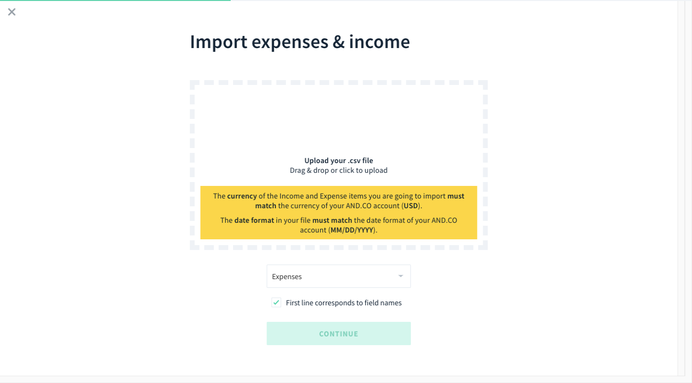
The block with the dashed border tells users that they have at least one option: Drag-and-drop their CSV file into the widget to upload. While an importer design like this doesn’t always allow for click-to-upload, this one does (per the instructions).

Flatfile uses a similar design at the top of the import page:

The difference between these two examples is that Flatfile includes an upload button inside the dashed-border box so that it’s clear that both import options are available.

There’s also a third option beneath this block:

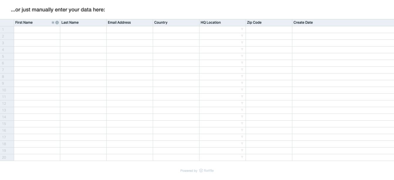
It’s a good idea to include a manual import option if your end users will return to the importer to add small handfuls of data and don’t want to prepare a file every time.

One last way to present import options is through the use of third-party software logos as Asana does:

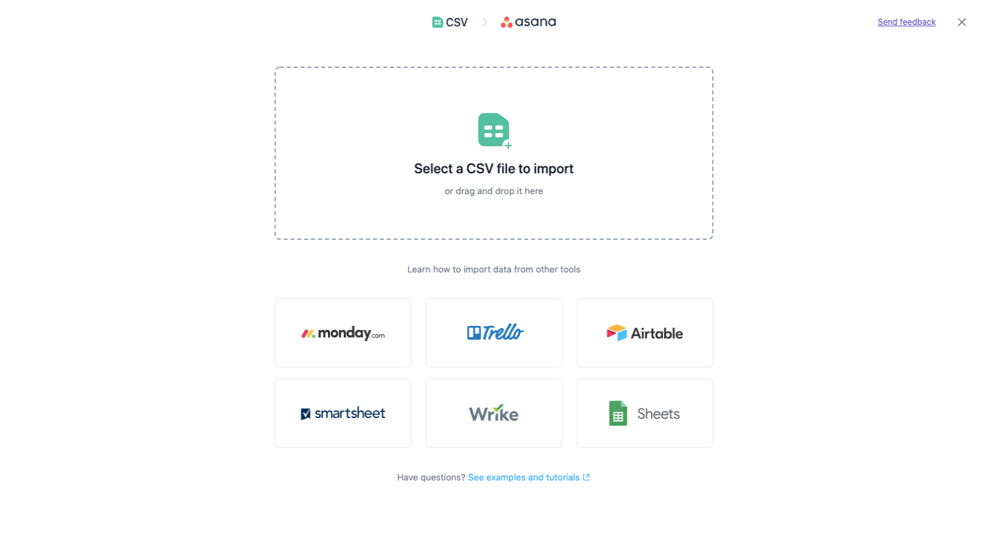
The standard CSV file import option is available at the top of the page. Beneath that, though, are apps that their users are most likely to have stored their project data in.

As you can see, the visual presentation of the import options is just as important as the instructions provided. So, rather than try to get creative here, just use a tried-and-true design that your end users will be familiar with and will help them instantly identify the import option they prefer.

3. Make Complex Imports Look Easy

At this stage of the data import process, things can get a little hairy. Even if you have a flawless import process on the backend, the way it’s presented to your end users can be a problem if the complexities of the process start to show through.

There are two things you can do with the UI to keep that from happening. This point will cover what you can do if the import process itself is complex.

HubSpot is a robust marketing and sales software, so it’s no surprise the data import process would take a while. Regardless, it starts simply enough, asking users if they’re going to import their data or pull it in from another platform:

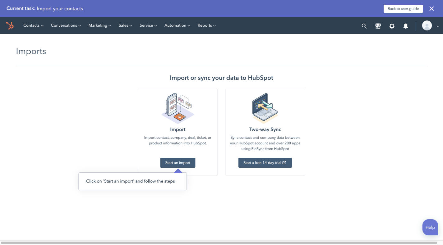
Now, this design goes against what I just talked about in the last point about designing the first page. However, there’s a reason why this was a good choice.

Let’s say this HubSpot user decides to import their data from a CSV file. They’d select “Import” and then go to this page:

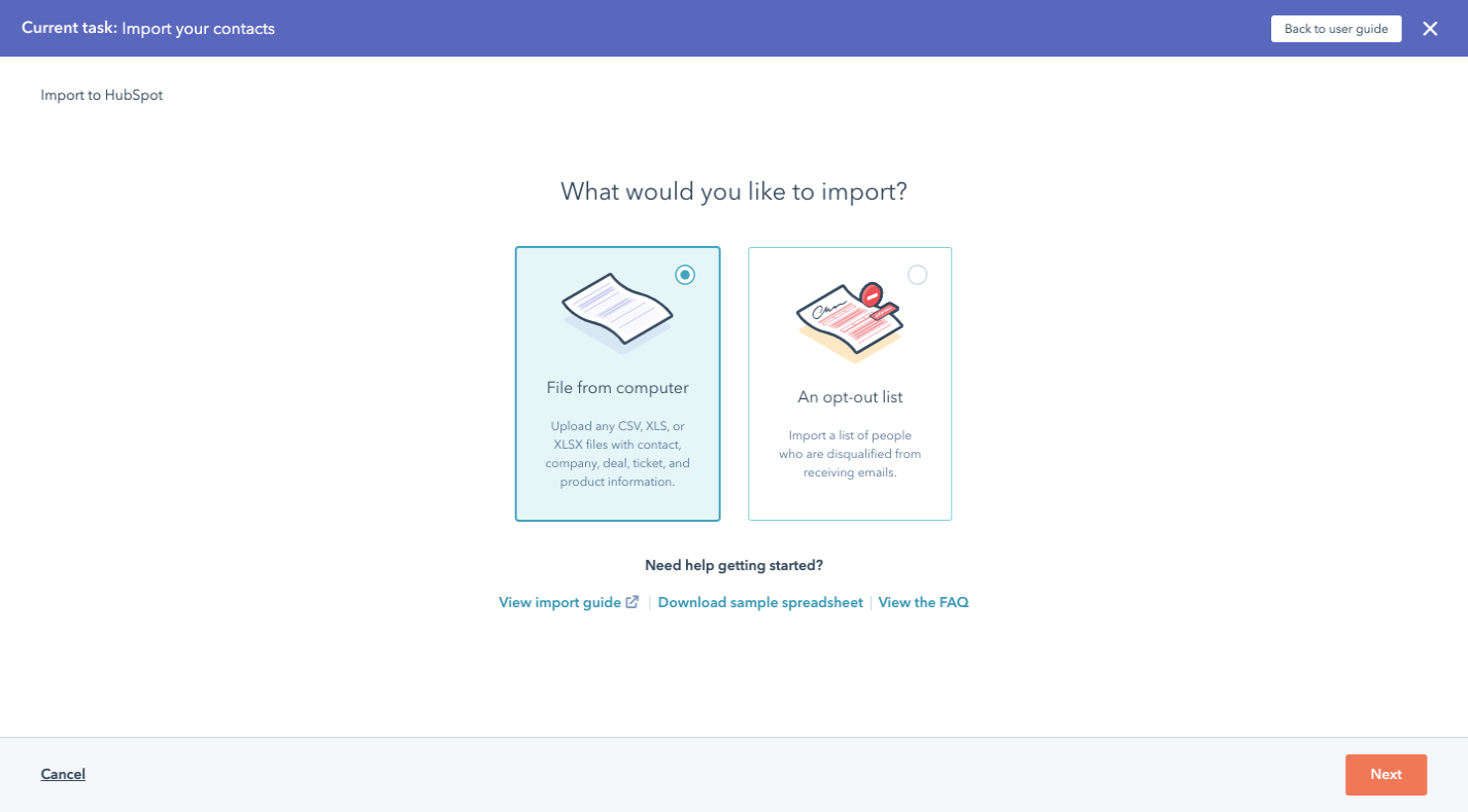
If HubSpot used the typical import page design, this page would require users to pause and then get acquainted with the new interface before moving on.

So, this is something to consider if you have a complex data onboarding process that needs to be broken up into multiple steps before the actual import begins.

Assuming the user just wants to import a CSV, XLS or XLSX, they’ll find themselves here next:

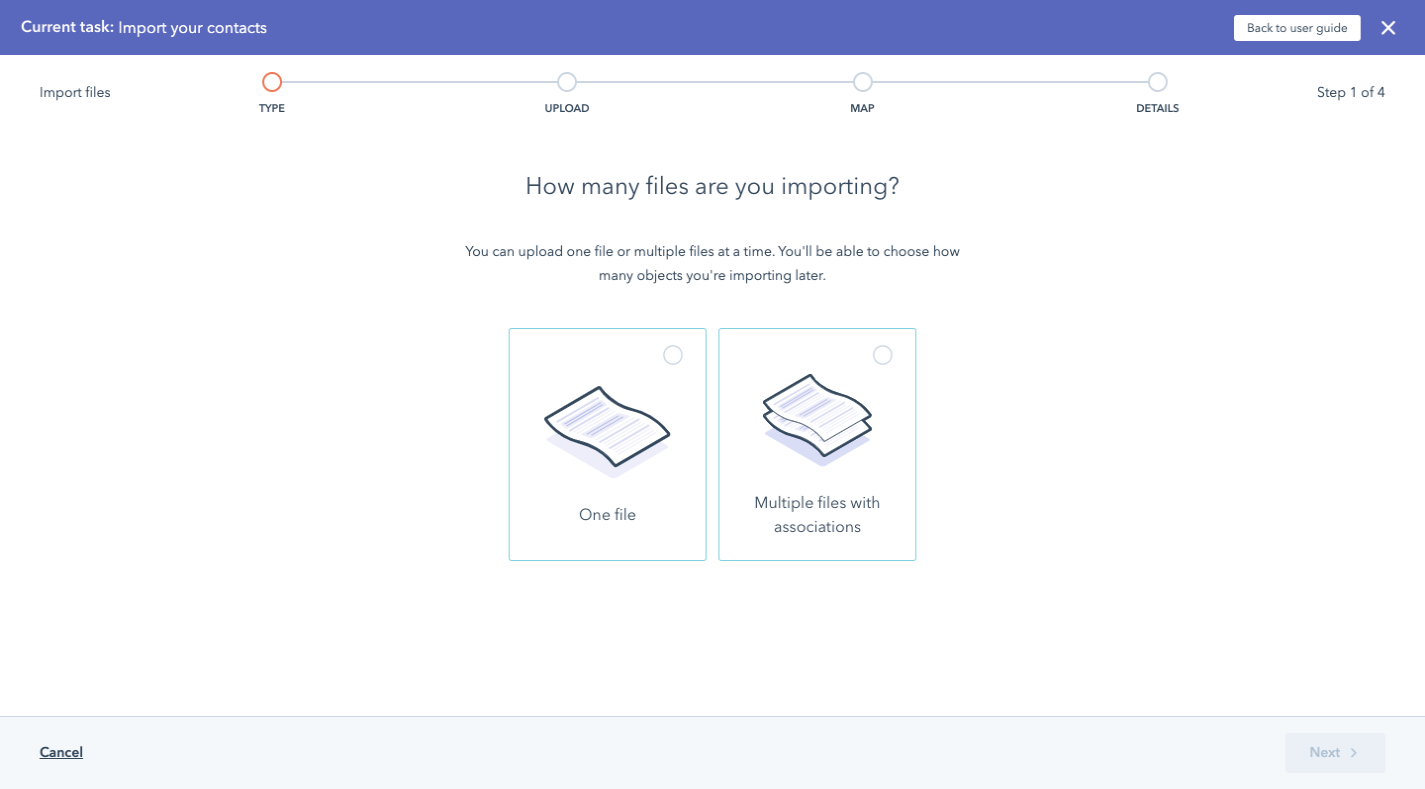
What’s nice about this approach is that it prevents users from having to go through the importer once for every file they have to upload. If there’s related data, they can select ‘Multiple files with associations’ and the importer will help them make those connections:

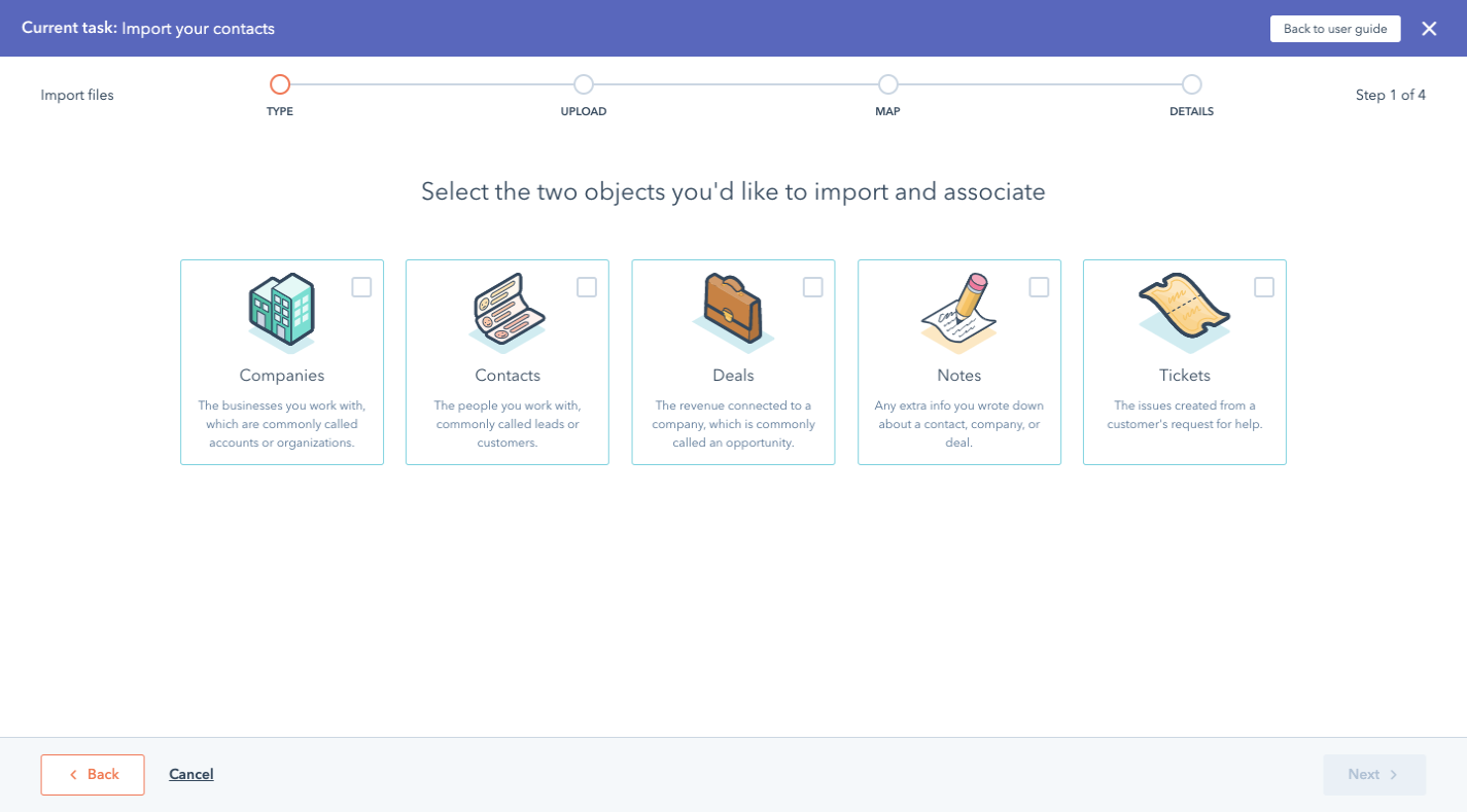
This way, it’s not the users’ responsibility to merge the data in their files. Nor do they have to spend hours going through their imported records to merge related records. This importer helps them do it.

The next screen is similar to the “How many files are you importing?” screen. This one appears, however, when the user selects “One file”:

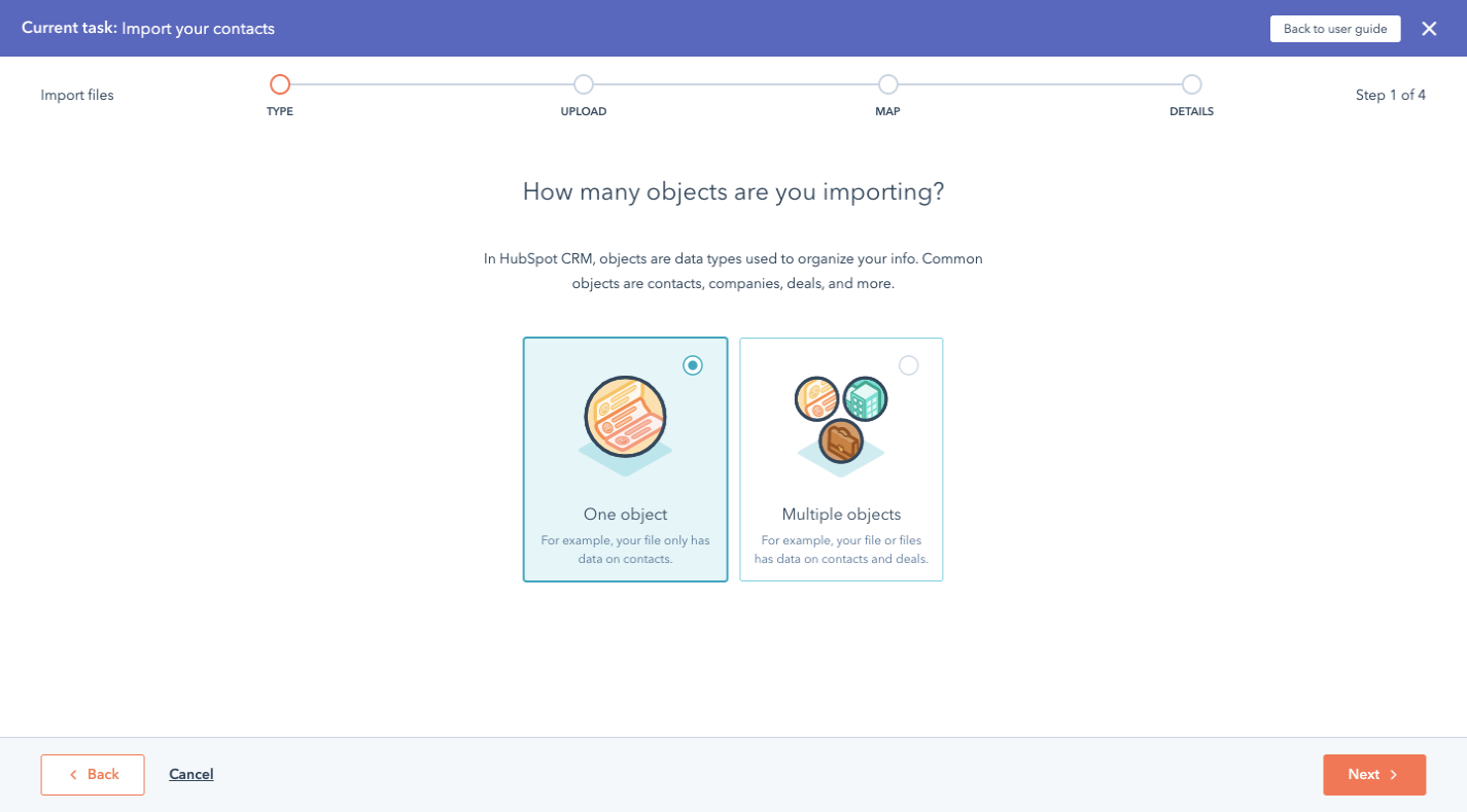
This again is aimed at keeping users from importing data and then spending excessive amounts of time cleaning it up.

Next, we have the part of the process where the user finally sees the importer. While it’s not exactly like the designs we looked at before, it’s still intuitive enough where users will know how to upload their files into it:

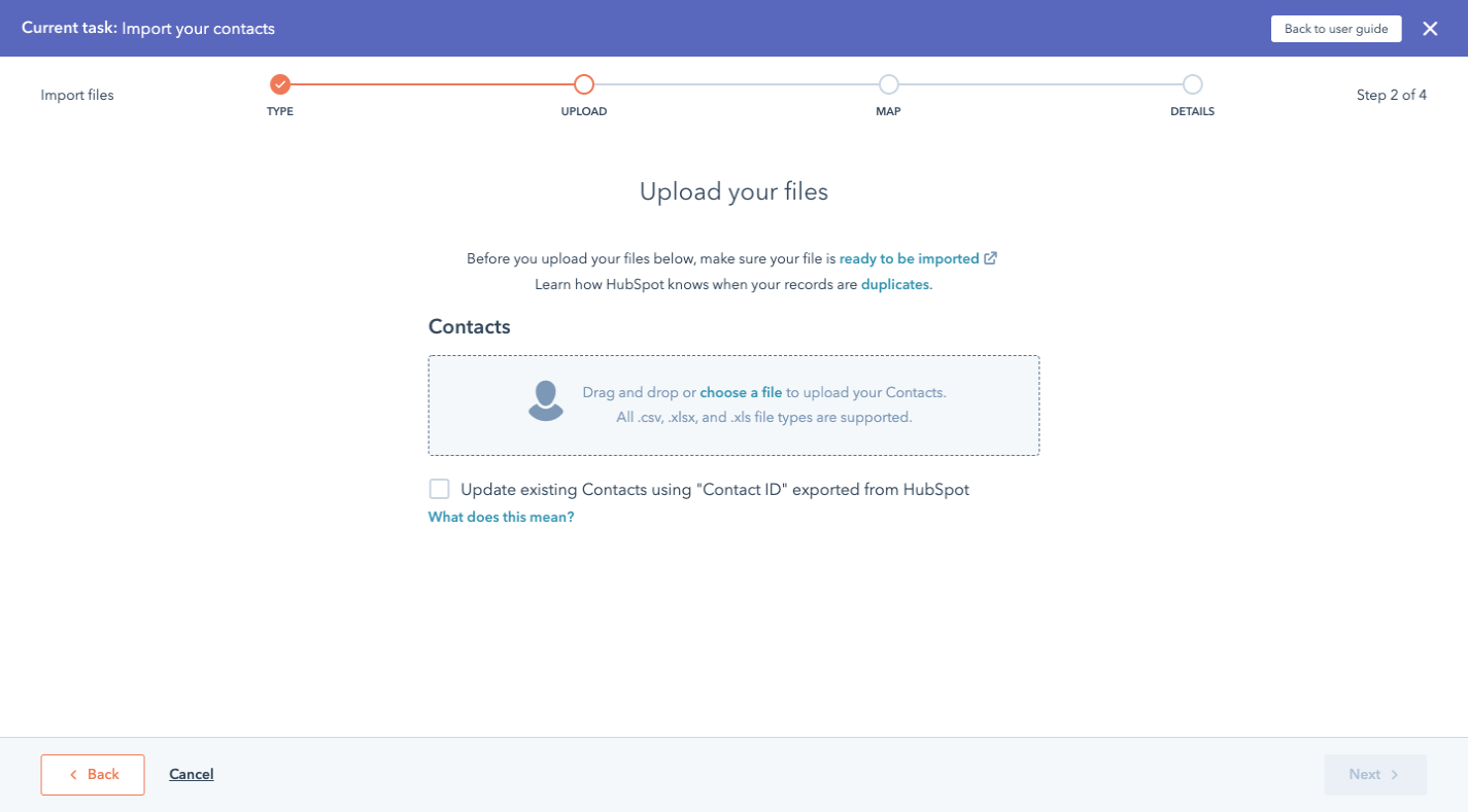
While I realize this is a lot of steps to get to a page that other software would show first, think about how much quicker these users are able to get inside HubSpot and to start working.

If you have a complex upload process (i.e. multiple files, object associations, etc.), consider using a similar design with each question on its own page as well as consistently presented options.

4. Use Color To Make Data Cleanup Speedy

The other way to simplify an otherwise complex import process is applicable to all data importers. In particular, this tip pertains to the final steps in the data onboarding process:

  • Data validation
  • Data sanitization

Now, having a data importer that can actually do some of this work is going to be a huge help. However, it’s ultimately up to your end users to review what they’ve imported and to approve it before they allow it inside the software.

To help them not be so overwhelmed by all the data and everything they need to address, use color to guide them through it.

For this example, we’re going to look at ClickUp. And if it looks familiar to you, that’s because it should. It was built using Flatfile’s data importer.

Let’s start with the first part of the data validation process:

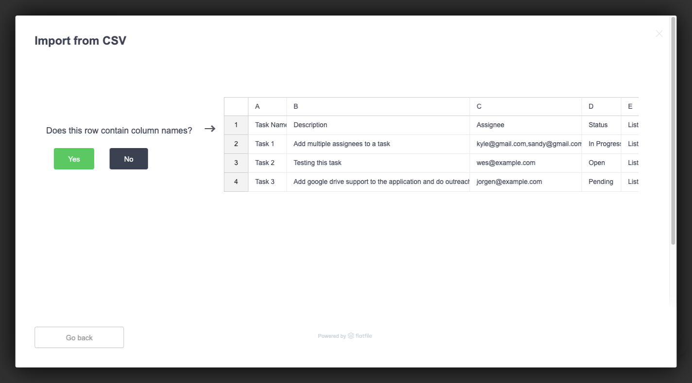
This page is straightforward enough. It shows the user a snippet from their imported data and asks them if the row pointed to contains column names.

But look at the green “Yes” button. While this is a design tactic we use for web and app interfaces (i.e. make the desired call-to-action a positive and eye-catching color), there’s another reason this is here.

Assuming the column names are there and ClickUp can easily interpret the data, this is what the user sees next:

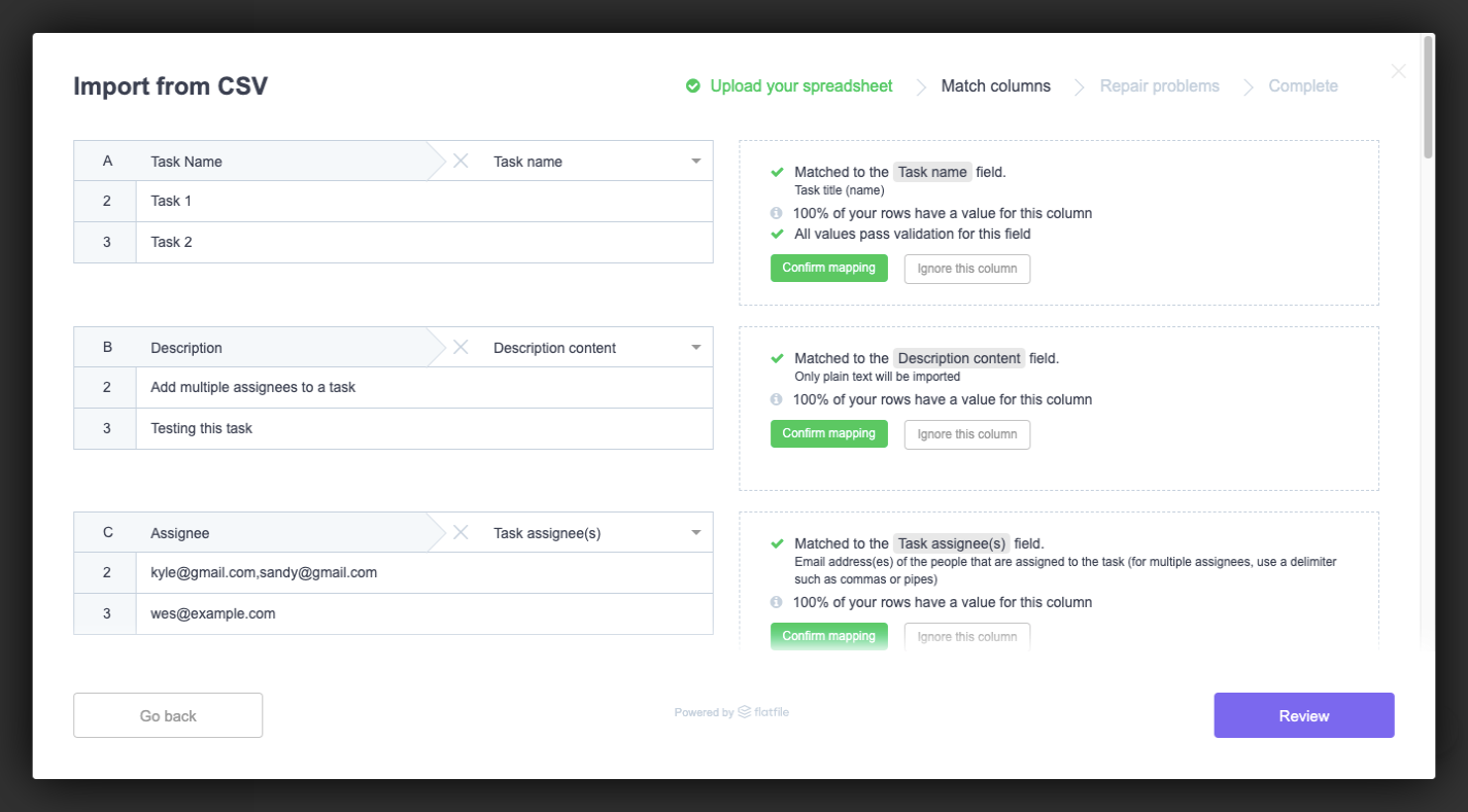
This is the data importer’s attempt at making light work of data validation. On the left are all the identified columns from the file.

On the right is information about how the columns were matched to ClickUp’s fields. There are also three possible data validation options:

  1. Confirm mapping (in green);
  2. Ignore this column (in a grey ghost button);
  3. Include as a custom field (in another ghost button).

The green button here matches what we saw on the last screen. So, users have already been conditioned to view this green button as an affirmative, which will help them quickly go through all the results and confirm the fields that were correctly matched.

Green and grey aren’t the only colors that should appear in your data importer.

If errors should arise (which isn’t a bad thing), your users should have a chance to fix them before the data gets uploaded. Depending on where in the app the errors appear, you might want to design them differently.

For instance, ClickUp uses an orange warning symbol to call out issues with values during validation:

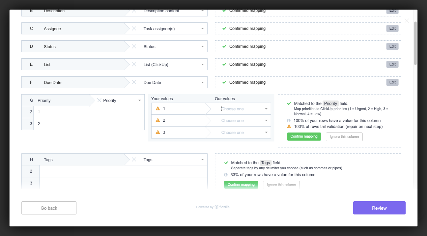
This allows ClickUp to tell users, “Yes, the column names match, but your values don’t line up with what we use.”

ClickUp then uses a red highlighter during data sanitization to point out errors with fields:

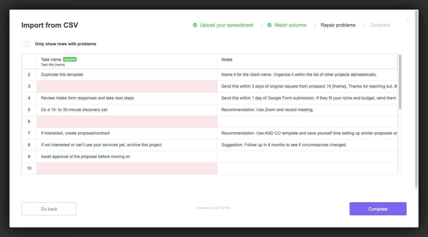
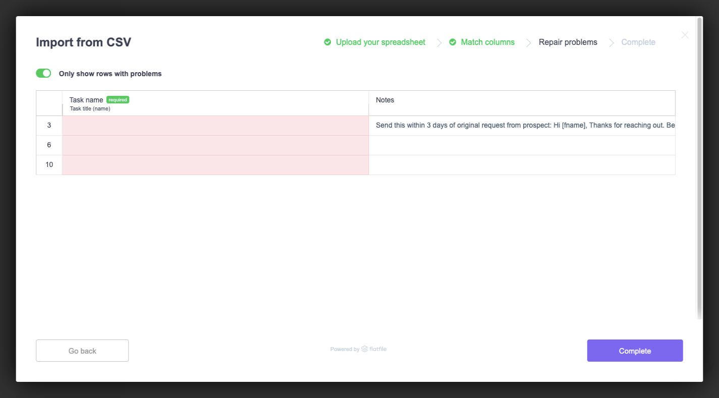
This is the final step before upload, so this is ClickUp’s last attempt at getting its users to perfect their data import. In this case, ClickUp highlights a field in red if it’s marked as required but contains no data.

The color alone should call attention to the fields. However, what if the user had imported a file with hundreds or thousands of rows and doesn’t see the red at first glance? Giving them a way to zero in on these red lines would be super valuable.

And ClickUp’s “Only show rows with problems” toggle does this:

Let’s face it: Unless your data importer tells your users when and where there’s a problem with their data, they’re probably not going to give it a second glance. That is, not until they’re in the software and wondering why their records are all messed up.

Of course, they’ll blame it on the importer and the software; not on their own negligence. So, providing these colorful markers throughout the process will be a huge help.

Wrapping Up

As I mentioned before, if you’re not confident that you can pull off the tricky balancing act between building a friction- and error-free data importer while designing it to be attractive, intuitive and helpful, then why bother?

As we’ve already seen, Flatfile Concierge is a ready-made data importer solution that’s not only built to handle a wide range of data import scenarios, but it looks great, too. By letting it power your data import process, you can devote more time to building products and your clients can dedicate more time to providing their users with better customer service and support.