2020 has been quite the year, and it’s only July. None of us can be certain what the rest of the year looks like, in particular for travel and events where lots of folks gather together. Given the uncertainty and the success of our online workshop series and Meets events, we’re taking all of our 2020 conferences online. How will that work? Read on to find out!
All of our online conference events will take place on the Hopin platform. We roadtested this platform for our Smashing Meets, and we love the way it allows for social chat and side events alongside the main conference. It’s as close as we can get to an in-person experience.
I just attended my second meetup with @hopinofficial and I can say this is the future of conferences.
Such a great experience!
— Pablo E. Carvallo (@pabloecarvallo) June 4, 2020
First Up: The Rescheduled SmashingConf Live!
We will be presenting SmashingConf Live on August 20th-21st. Two half-days, with four talks each day on UX, data visualization, CSS, and JavaScript.
Meet other people in our chat or network on our event platform. Join in on our Design and Coding Tournament, or enjoy watching folks taking part.
Join one of the many sessions! Listen to one of the fireside chats on privacy, web performance, and Machine Learning (ML). Get your website reviewed by one of our speakers.
Take a look at the full schedule. If you have bought a ticket to the postponed SmashingConf Live, your ticket will still be valid. We still have tickets available: register here and we will see you at the event.
We are still scheduling new workshops and repeats of our most popular workshops. Purchase a workshop with your conference ticket and save 100USD.
Then, we have moved our in-person events online. These will be as close as possible to the in-person experience, with side-events, a mystery speaker, and all the fun you expect from a SmashingConf.
September 7th–8th: SmashingConf Freiburg Online
The Freiburg conference is moving online on the original dates: September 7th–8th. One track, two days and 13 speakers, with all of the actionable insights you expect from SmashingConf. We’ll be running the event tied to the timezone in Germany — making this a great event for Europeans. Check out the schedule, and buy tickets here.
October 13th–14th: SmashingConf Austin (and New York) Online
We have combined the programming for New York and Austin as these two events were so close together and similar to each other. We’ll be running this event in Central time, just as if we were all in Austin. Check out the schedule, and buy tickets here. We’d love to see you in October!
November 10th–11th: SmashingConf San Francisco Online
In PST join us for a virtual San Francisco event on November 10th–11th. The schedule and tickets are online for you to take a look. We’ll be sure to have a great celebration for our final event of 2020!
Existing Ticketholders
We have moved your in-person ticket to the 2021 edition of your chosen conference and in order that you don’t miss out this year, you are invited to the online version of the event you registered for. Two for the price of one as our thanks for your support. If that doesn’t work out for you, we do have options as explained in the email. Didn’t get the email? Drop the team a line at hello@smashingconf.com and we will get back to you.
Join Us!
There are tickets now on sale for all of the above events — we are really looking forward to all of them! One thing we have learned with our online workshops is that taking events online means that lots of people can attend who can’t travel to conferences even in more usual times. That’s really exciting, and we look forward to sharing some days of learning and fun with you all!
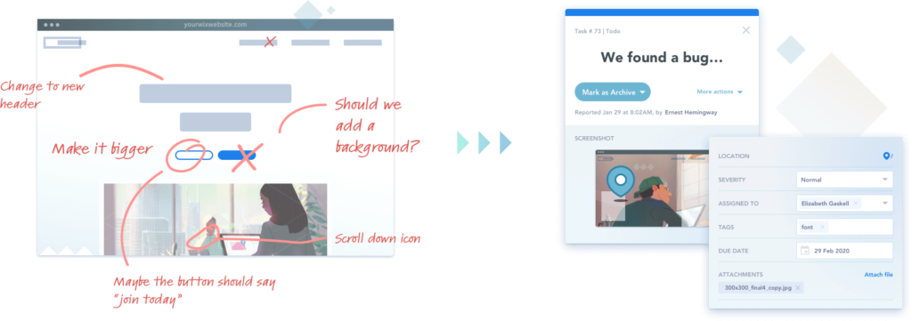
Whether you work for an agency or you are a freelance web designer, developer or both, you are undoubtedly familiar with the common nightmare of getting feedback and tracking bugs and issues on your projects, especially from clients who do not possess technical skills. There are various ways that we try to get input from clients while we work on their projects, but most of them – like support tickets, long email chains, spreadsheets, or an even more frustrating combination of all of the above – do not provide the tools or centralization we need to have an effective, streamlined way to collect website feedback. In those instances we usually end up with important information we need quick access to stored in numerous different places where it can get lost, overlooked, or forgotten.
So how can we save time, money, and anxiety when we’re working on client projects and need their input? Fortunately there is a tool that is made for just such a solution! BugHerd takes care of all of these issues and puts them in one, simple, easy-to-access place, where you and your clients can comment on and resolve issues right on top of your website project. As they say, it’s like sticky notes on a website. What could be more intuitive?
In this article we’ll take a look at some of the key features BugHerd has to offer, what it takes to set up, and how you can start using BugHerd today. Best of all, Bugherd offers a FREE 14-day trial with no credit card required upfront, so you can take it for a test run and decide for yourself without any risk. Let’s take a look!
Flexible setup. Install in minutes.
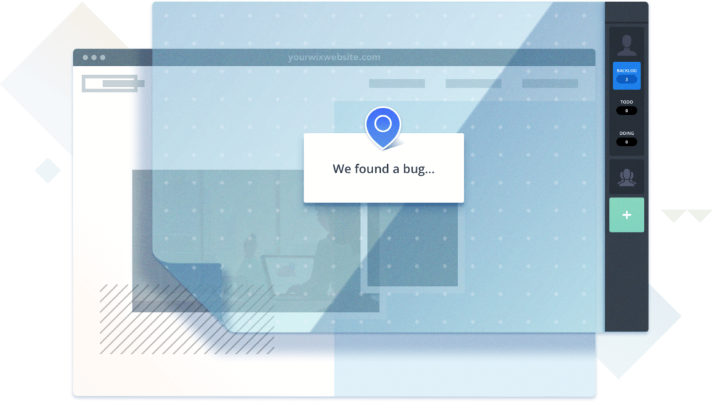
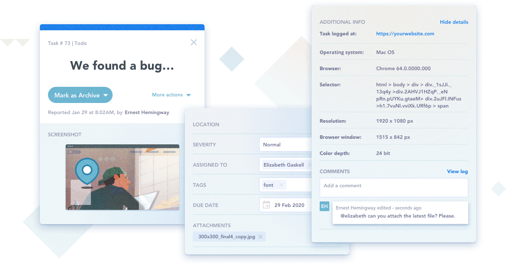
You can use BugHerd as a browser extension or a JavaScript snippet or both together for maximum flexibility. The browser extension takes 2 minutes to install, and you can simply copy the JS snippet into your website’s code to make it work across all browsers on desktop and mobile. Once installed, BugHerd acts like a transparent layer on your website that only your team, and your clients, can see. Website feedback and tasks are pinned directly on the page to an element, complete with metadata like screenshots, CSS selector data, Operating System & Browser Data. Users can also annotate screenshots with design feedback if they wish, and only those who have been invited to give feedback can see the BugHerd sidebar when visiting the website.
How It Works
Simply point & click on any element to report an issue or provide website feedback, then it is “pinned” directly to the website issue. Designers and developers can then access the issue and its details directly on the site, so you’re not having to dig through emails or spreadsheets to find any outstanding tasks.
Tasks and the technical details are also sent to a Task Board (a kanban board with a customizable workflow) where they can be assigned to team members and tracked to completion. This makes BugHerd perfect for using with remote teams and clients to ensure everyone is on the same page.
Imagine eliminating those emails back and forth where the client is giving website feedback and requests a change, describing where they want it on the page in such a way that you have to send them a screenshot with arrows asking, “Is this what you were talking about?” Instead, the client (or your team) “pins” their website feedback directly on the page in the exact location they want to discuss! No more back and forth, and no more digging through spreadsheets or other tools trying to find something.
Additional Features
Automatically attach screenshots with every bug report.
3rd-Party integrations with services like Zapier, GitHub, Slack, Basecamp and more.
Version control sync that lets you update tasks with commit messages.
Unlimited projects.
Inline tagging.
Upload additional files like specs, logs or mockups and attach them to website feedback and issues.
Real-time comment feed.
Permission management lets you control who has access to what.
Looking For The Easiest Tool To Collect and Manage Website Feedback? Give BugHerd a try!
BugHerd is a must-have tool for web designers and developers, with a variety of affordable pricing plans that make it an invaluable tool to add to your team’s arsenal. You get contextualized website feedback directly on your project’s pages. Your tasks can easily be delegated, prioritized, tracked, and stay organized both on the project itself and on the taskboard, which is easy to sort, search, and filter through to find what you need. Your productivity will be increased dramatically, as you will be spending far less time on miscommunications with clients. And finally, it’s quick, easy, and FREE to set up and try it out for yourself! So give BugHerd a try – we’re confident you will thank us later.
DigitalOcean has transformed the way teams and individual developers host apps and other web dev projects. It’s a unique form of hosting that removes the need to manage your own development infrastructure through powerful and reliable cloud hosting. DigitalOcean has also made this unique form of hosting more affordable. Why would anyone need DigitalOcean alternatives then?
Do you want to add syntax highlighting in WordPress comments? By default, WordPress does not come with any syntax highlighting for comments, posts, or pages.
If you have articles about coding or programming on your website, then sometimes your users may want to leave code examples in comments.
In this article, we’ll show you how to easily add syntax highlighting in WordPress comments.
Why and When You Need Syntax Highlighting in WordPress Comments
WordPress does not allow you to just paste code snippets inside your articles due to security reasons.
You can show some code samples by adding the code block in your post or pages using the block editor.
After that, you can add your code snippet inside the text area of the code block.
You can now save changes to your post or page and preview it to see your code in action.
Depending on your WordPress theme, it will usually be displayed in a very simple block of text and without any syntax highlighting.
This does not look good, and it is not very helpful for your users.
Syntax highlighting is a styling format commonly used to display code. It adds line numbers and colors to highlight code patterns which makes it easy to understand.
Here is an example of a code snippet with some syntax highlighting. Notice the line numbers and colors used to highlight different elements in the code:
<html>
	<head>
		<title>My Awesome Website</title>
	</head>
	<body>
		<h1>Welcome to My Homepage</h1>
	</body>
</html>
Now if you run a WordPress blog about coding or programming, then you need syntax highlighting to properly display code inside your articles.
You may also want your users to be able to use the same syntax highlighting in comments, which will make comments more interesting and engaging for users.
That being said, let’s take a look at how to add syntax highlighting in WordPress comments, posts, and pages.
Adding Syntax Highlighter in WordPress
The easiest way to add syntax highlighting in WordPress is by using the Syntax Highlighter Evolved. It is super easy to use and allows you to enable syntax highlighting in WordPress posts, pages, and comments.
Upon activation, you need to edit the post or page where you want to add code. On the post edit screen, click on the (+) icon to add a new block and then insert the ‘SyntaxHighlighter Code’ block to your content area.
You will now see a new code block in the post editor where you can enter your code. After adding the code, you need to select the block settings from the right column.
From here, you can select the programming language for your code, show or hide line numbers, make links clickable, and more.
Once you are finished, go ahead and save your post or page. You can now visit your website to see your code with syntax highlighting.
That was easy, wasn’t it?
However, WordPress comments don’t have block editor support. Let’s see how your users can use Syntax Highlighter Evolved with their comments.
Adding Syntax Highlighting in WordPress Comments
Syntax Highlighter Evolved is enabled for WordPress comments by default. However, in order to use it in the comments, the code needs to be wrapped around shortcodes.
The plugin comes with several shortcodes named after all popular programming and scripting languages.
Simply wrap your code around square brackets with the language name. For example, if you are going to add PHP code, then you will add it like this:
[php]

<?php

private function get_time_tags() {

$time = get_the_time('d M, Y');

return $time;

}

?>

[/php]
Similarly, if you wanted to add an HTML code, then you will wrap it around the HTML shortcode like this:
While it is easy to use syntax highlighting with shortcodes, the problem is that your users wouldn’t know that they can do that.
Luckily, there is a quick way to let them know that they can use syntax highlighting with shortcodes.
For that, you’ll need to add a custom code snippet to your WordPress site. If you have not done this before, then take a look at our guide on how to add custom code in WordPress.
function wpbeginner_comment_text_before($arg) {

$arg['comment_notes_before'] .= "<p class='comment-notice'>You can use shortcodes for syntax highlighting when adding code. For example, [php][/php] or [html][/html]</p>";

return $arg;

}

add_filter('comment_form_defaults', 'wpbeginner_comment_text_before');
This code simply displays a notice just before the comment field in the WordPress comment form. However, it does not display the notice for logged in users.
You can now open a new browser window in the incognito mode or simply log out of your WordPress admin area. After that, you can visit any post on your blog to see thee syntax highlighting notice in action.
You can also add custom CSS to style this text. We have used the following custom CSS code on our demo site, feel free to use this as a starting point.
I’m all for updating and upgrading mobile apps. I think if you’re not constantly looking at ways to improve the user experience, it’s just too easy to fall behind.
That said, a redesign should be done for the right reasons.
If it’s an existing app that’s already popular with users, any changes made to the design or content should be done in very small, incremental, strategic chunks through A/B testing.
If your app is experiencing serious issues with user acquisition or retention, then a redesign is probably necessary. Just be careful. You could end up making things even worse than they were before.
Let’s take a look at some recent redesign fails and review the lessons we can all learn from them.
Lesson #1: Never Mess With A Classic Interface (Scrabble GO)
However, that all changed in early 2020 when the app was sold to Scopely and it was redesigned as an ugly, confusing and overwhelming mess of its former self.
Let me introduce you to Scrabble GO as it stands today.
The splash screen introducing gamers into the app looks nice. Considering how classically simply and beautiful the board game is, this is a good sign. Until this happens:
I don’t even know where to start with this, but I’m going to try:
The colors are way over-the-top and there are too many.
Since “Start New Game” is the primary action users want to take, it should be the only button in that color, but “Level 5” and “Level 6” distract from it.
The interface is so cluttered that it’s hard to focus on any particular part of it.
There’s no sense of control or priority within the design.
The navigation has gated pages! And I’m not sure what that icon on the left is supposed to be… gems and rewards? Why then is there a gem counter in the top banner?
Beyond the UI of the homescreen, the UI and UX within the game board have been altered, too.
Take, for instance, this plea from @lageerdes on Twitter:
Twitter user @lageerdes asks Scrabble GO why the old functionality is gone. (Source: Twitter) (Large preview)
It took Scrabble GO over a week to tell @lageerdes something that could’ve easily been spelled out in a game FAQ or Settings page. These aren’t the only classic features that the new app has either complicated or done away with.
Now, Scopely took note of the negative comments from users and promised to revamp the app accordingly (which was promising). But rather than revert back to the old and much-loved design, it just added a new mode:
You’d think that the mode switcher would be more prominently displayed — like in the menu bar. Instead, it’s buried under the “Profile Settings” tab and there’s no indication anywhere in the app that the classic mode even exists.
Sadly, classic mode isn’t much of an improvement (classic is on the right):
The new Scrabble GO home screen versus the newly designed classic mode home screen. (Source: Scrabble GO) (Large preview)
The colors are toned down, some of the elements in the top-half have been cut out or minimized, but it doesn’t address any of the users’ issues with the app or game play.
Worse, many users are reporting the app crashes on them, as this complaint from Twitter user @monicamhere demonstrates:
Twitter user @monicamhere complains to Scrabble GO about the app crashing. (Source: Twitter) (Large preview)
I suspect this is happening because the developers jammed a second overloaded mode into the app rather than simply refine the existing one based on user feedback.
So, what’s the lesson here?
For starters, don’t mess with a classic.
The old mobile app closely resembled the physical board game and it was a huge part of its appeal. When you throw out an old design for something (seemingly) more trendy, you run the risk of alienating once-loyal users.
Also, if it ain’t broke, don’t fix it.
Previously, the app was very easy to use and came with all the features and functionality users were familiar with from the board game. Now, they’re left with a non-intuitive and distracting mess.
If your users are telling you to ditch the redesign, listen to them.
Who are you building this app for? Yourself or the users who are going to play with it and put money into your pocket?
Listen to what your users have to say. It’s valuable feedback that could make a world of difference in the user experience.
Lesson #2: Never Mislead Users At Checkout (Instacart)
This is an interesting case because the people who objected to this particular Instacart UI update weren’t its primary users.
Here’s why the change was an issue:
Users go onto the Instacart website or mobile app and do their grocery shopping from the local store of their choice. It’s a pretty neat concept:
Instacart users can do virtual shopping with grocery stores like Wegmans. (Source: Instacart) (Large preview)
Users quickly search for items and add them to their virtual shopping cart. In many cases, they have the option to either do curbside pickup or have the groceries delivered to their front doorstep. Either way, a dedicated “shopper” picks out the items and bags them up.
When the user is done shopping, they get a chance to review their cart and make final changes before checking out.
On the checkout page, users get to pick when they want their order fulfilled. Beneath this section, they find a high-level summary of their charges:
Instacart checkout sums up the total costs of a user’s order. (Source: Instacart) (Large preview)
At first glance, this all appears pretty-straightforward.
The cost of their cart is $174.40, which they already knew.
They argued that this is a dark pattern. And it is. Let me explain:
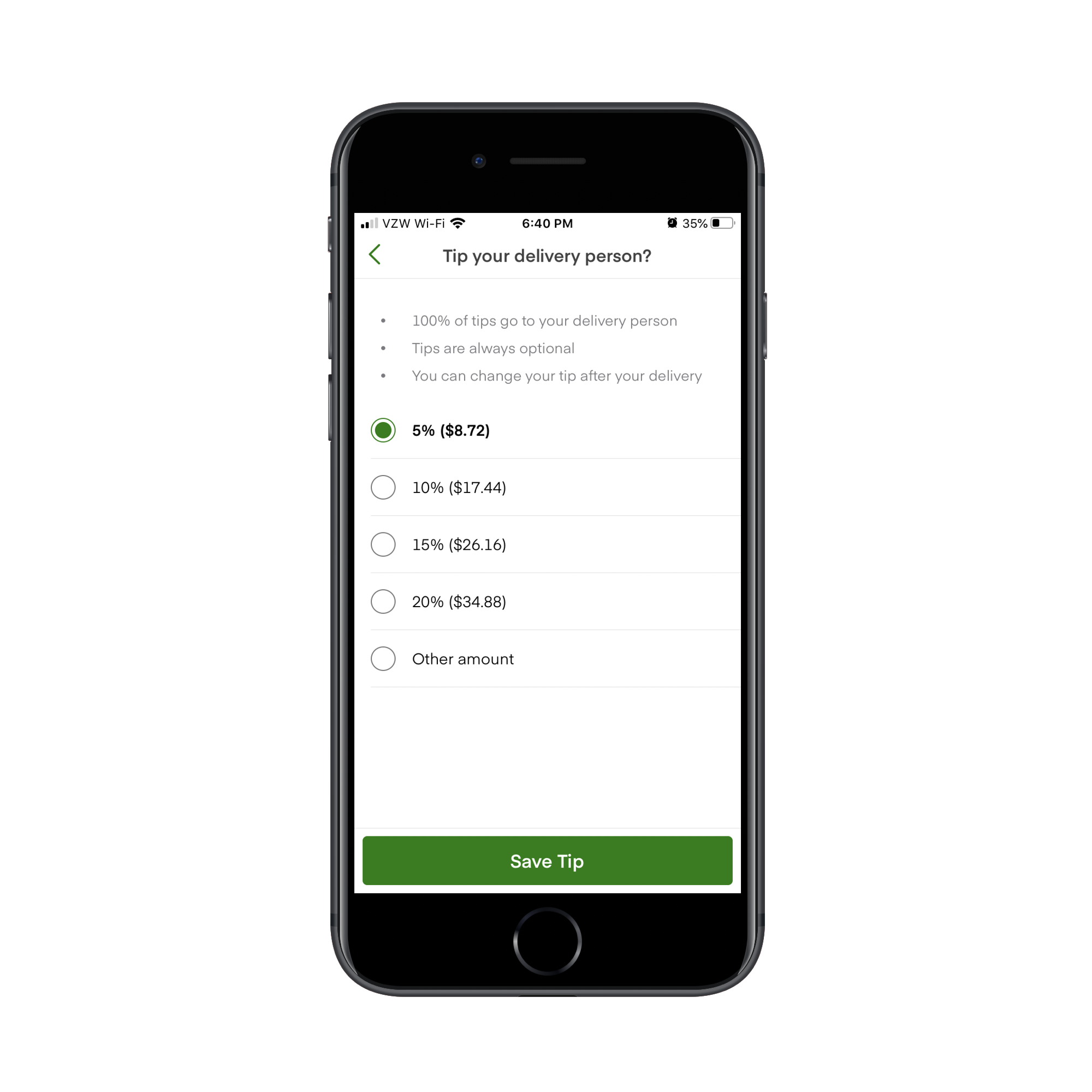
The first thing that’s wrong is that the Delivery Tip isn’t included with the rest of the line items. If it’s part of the calculation, it should be present down there and not separated out in its own section.
The second thing that’s wrong is that the tip is automatically set at 5% or $2.00. This was the shoppers’ biggest grievance at the time. They believed that because the “(5.0%)” in the delivery tip line wasn’t there in 2018, users might’ve seen the amount and thought “That seems reasonable enough” and left it at that. Whereas if you spell out the percentage, users may be inclined to leave more money.
For users who take the time to read through their charges and realize that they can leave a larger tip, this is what the tip update page looks like for small orders:
Instacart enables users to change the way they tip the delivery person. (Source: Instacart) (Large preview)
It’s oddly organized as the pre-selected amount sits at the very bottom of the page. And then there’s a random $6 tip included as if the app creators didn’t want to calculate what 20% would be.
That’s not how the tip is presented to users with larger orders though:
Instacart enables users to customize the tip they leave the delivery person, from 5% to 20% or they can customize the amount. (Source: Instacart) (Large preview)
It’s a strange choice to present users with a different tip page layout. It’s also strange that this one includes an open field to input a custom tip (under “Other amount”) when it’s not available on smaller orders.
If Instacart wants to avoid angering its shoppers and users, there needs to be more transparency about what’s going on and they need to fix the checkout page.
If you’re building an app that provide users with delivery, pickup or personal shopper services (which is becoming increasingly more common), I’d recommend designing your checkout page like Grubhub’s:
The Grubhub checkout page recaps the user’s order and provides tip amounts in percentages. (Source: Grubhub) (Large preview)
Users not only get a chance to see their items at the time of checkout, but the tip line is not deceptively designed or hidden. It sticks right there to the bottom of the page.
What’s more, tips are displayed as percentage amounts instead of random dollars. For U.S. consumers that are used to tipping 20% for good service, this is a much better way to ensure they leave a worthwhile tip for service workers rather than assume the dollar amount is okay.
And if they want to leave more or less, they can use the “Custom” option to input their own value.
Lesson #3: Never Waver In Your Decision To Roll Back (YouTube)
When the majority of your users speak up and say, “I really don’t like this new feature/update/design”, commit to whatever choice you make.
If you agree that the new feature sucks, then roll it back. And keep it that way.
If you don’t agree, then tweak it or just give it time until users get back on your side.
Just don’t flip-flop.
Here’s what happened when YouTube switched things up on its users… and then switched them again:
The Verge and XDA Developers report on a new placement of YouTube comments in 2019. (Source: Verge) (Large preview)
Before this test, comments appeared at the very bottom of the app, beneath the “Up next” video recommendations. With this update, however, they were moved behind this new button. Users would only see comments if they clicked it.
The response to the redesign clearly wasn’t positive as YouTube rolled back the update.
In 2020, YouTube decided to play around with the comments section again. Unlike the 2019 update, though, YouTube’s committed to this one (so far).
Here’s where the comments appear now:
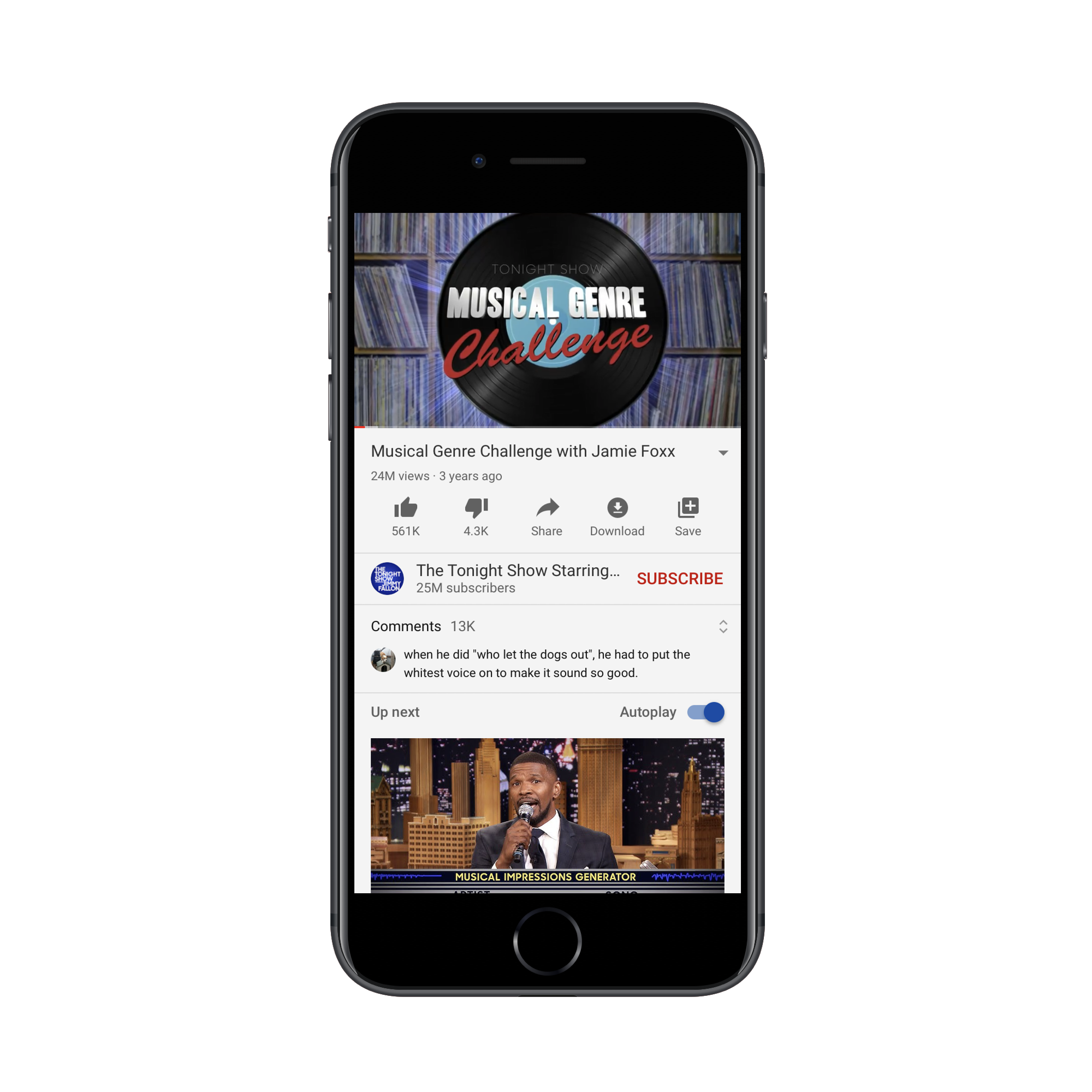
The YouTube comments redesign puts the comments above the 'Up next' section. (Source: YouTube) (Large preview)
They’re sandwiched between the “Subscribe” bar and the “Up next” section.
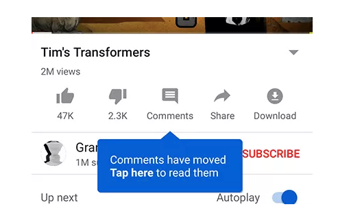
If YouTube users go looking for the comments section in the old spot, they’re going to find this message now:
A notice appears when YouTube users go looking for comments in the old location. (Source: YouTube) (Large preview)
This is a nice touch. Think about how many times you’ve had to redesign something in an app or on a website, but had no way of letting regular users know about it. Not only does this tell them there’s been a change, but “Go To Comments” takes them there.
With this tooltip, YouTube doesn’t assume that users will zero in on the new section right away. It shows them where it is:
YouTube users see tooltip that shows them where the new comments section is. (Source: YouTube) (Large preview)
I actually think this is a good redesign. YouTube might be a place for some users to mindlessly watch video after video, but it’s a social media platform as well. By hiding the comments section under a button or tucking them into the bottom of the page, does that really encourage socialization? Of course not.
That said, users aren’t responding well to this change either, as Digital Information World reports. From what I can tell, the backlash is due to Google/YouTube disrupting the familiarity users have with the app’s layout. There’s really nothing here that suggests friction or disruption in their experience. It’s not even like the new section gets in the way or impedes users from binge-watching videos.
This is a tricky one because I don’t believe that YouTube should roll this update back.
There must be something in YouTube’s data that’s telling it that the bottom of the app is a bad place for comments, which is why it’s taking another stab at a redesign. It might be low engagement rates or people expressing annoyance at having to scroll so much to find them.
As such, I think this is a case for a mobile app developer not to listen to its users. And, in order to restore their trust and satisfaction, YouTube will need to hold firm to its decision this time.
Is A Mobile App Redesign The Best Idea For You?
Honestly, it’s impossible to please everyone. However, your goal should be to please, at the very least, most of your users.
So, if you’re planning to redesign your app, I’d suggest taking the safe approach and A/B testing it first to see what kind of feedback you get.
That way, you’ll only push out data-backed updates that improve the overall user experience. And you won’t have to deal with rolling back the app or the negative press you get from media outlets, social media comments, or app store reviews.


 The Freiburg conference is moving online on the original dates: September 7th–8th. One track, two days and 13 speakers, with all of the actionable insights you expect from SmashingConf. We’ll be running the event tied to the timezone in Germany — making this a great event for Europeans. Check out the schedule, and buy tickets here.
 We have combined the programming for New York and Austin as these two events were so close together and similar to each other. We’ll be running this event in Central time, just as if we were all in Austin. Check out the schedule, and buy tickets here. We’d love to see you in October!
 In PST join us for a virtual San Francisco event on November 10th–11th. The schedule and tickets are online for you to take a look. We’ll be sure to have a great celebration for our final event of 2020!
 (cr, aa, il)